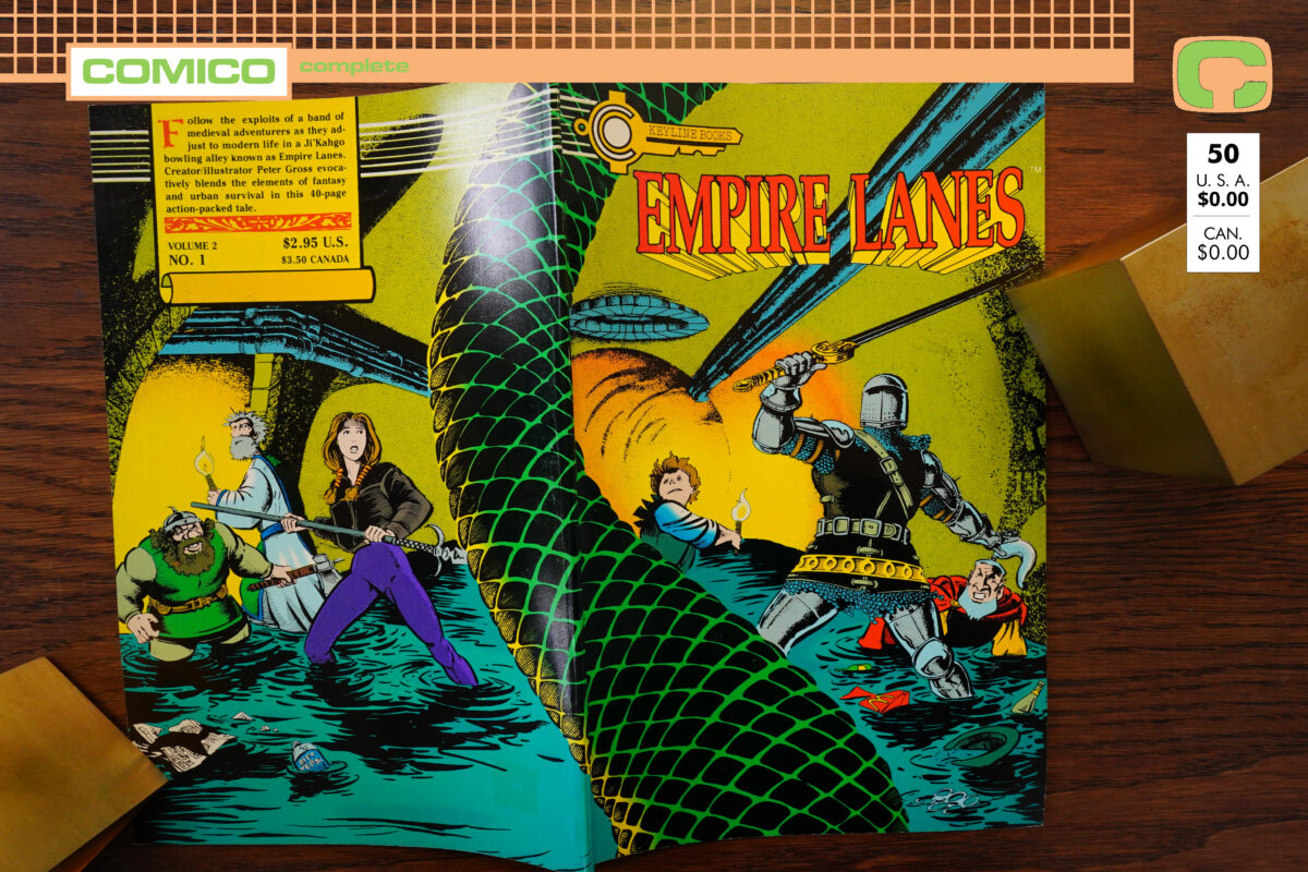

Empire Lanes (1989) by Peter Gross
Sorry; time flies — it’s been a while since the previous post in this blog series, and it’s for the stupidest of reasons: Comico published three “issues” of Empire Lanes over a few months. First this one, then a collection of the previous four issues, and then the new “proper” #1.
I just couldn’t make up my mind whether to do them all in one blog post, or do it in three posts, and so I mysteriously lost the will to post at all.
So today I just finally sat down and without making up my mind, I’m apparently doing three posts.
Do you feel lucky?
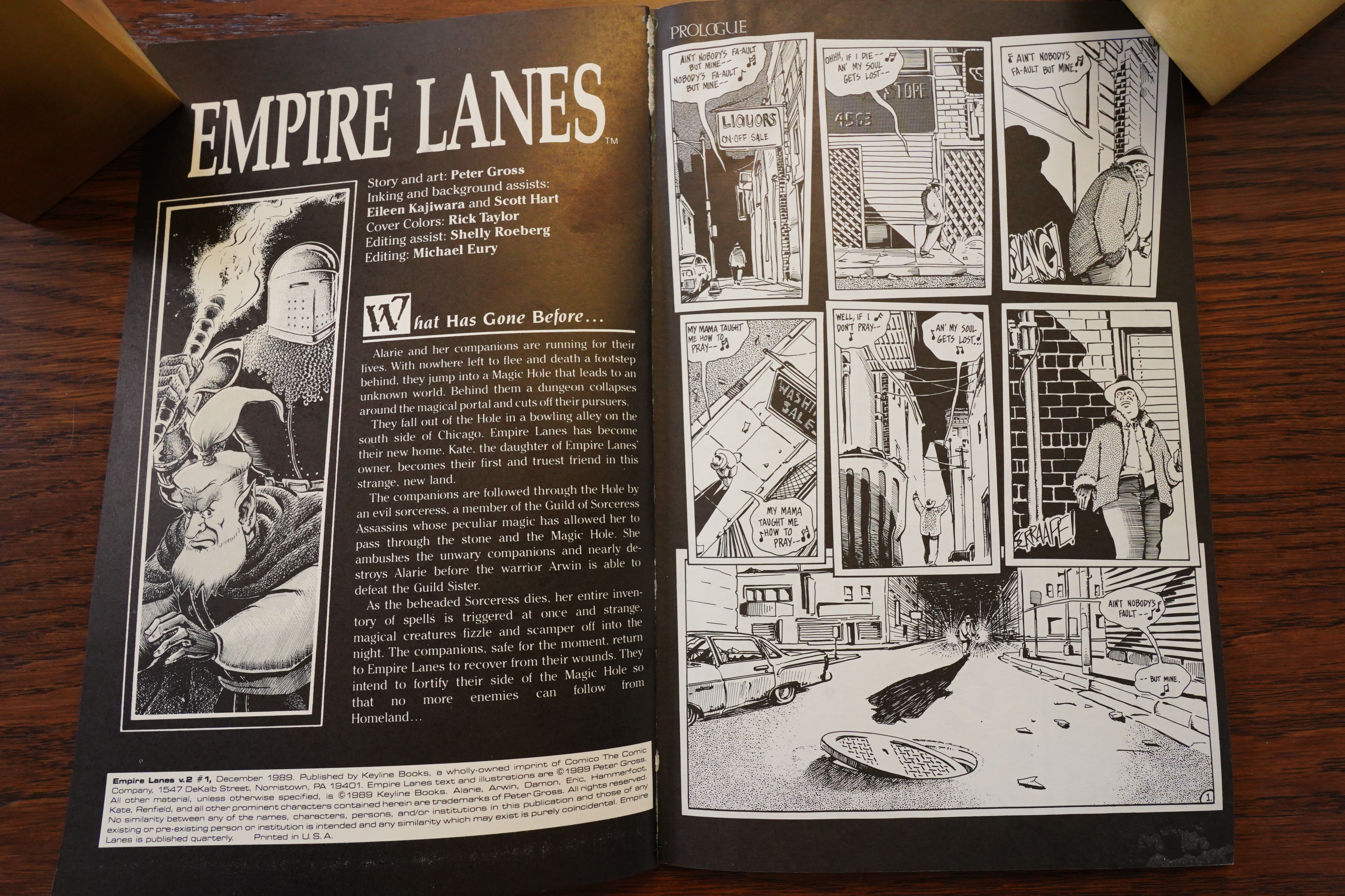
Anyway, this is yet another series previously published that Comico picked up. I can’t think of any other comics publishing company that had such a large percentage of their series being “pick-ups” like this as Comico. Pretty odd.
Unusually, though, is that this is in black and white, and Comico has established a new imprint: “Keyline Comics”. Was the idea to have a separate imprint just to keep the black-and-white comics separate? Wouldn’t that be weird?
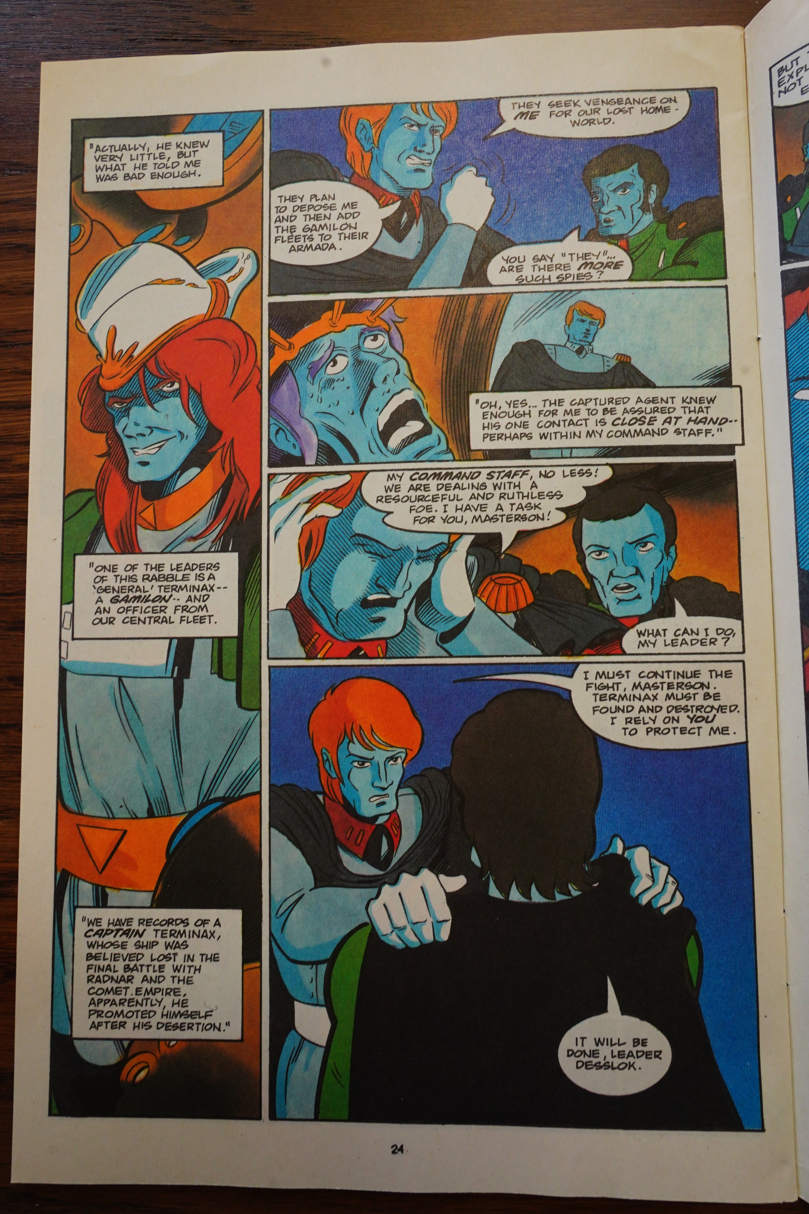
Because this isn’t totally unlike other Comico pick-ups — it’s about a bunch of fantasy people (dwarfs, “halflings”, magicians) dropping into our world. Just like Trollords. Of course, that was more of a straightforward comedy book, while this is going more for “funny fantasy”, if that makes sense…
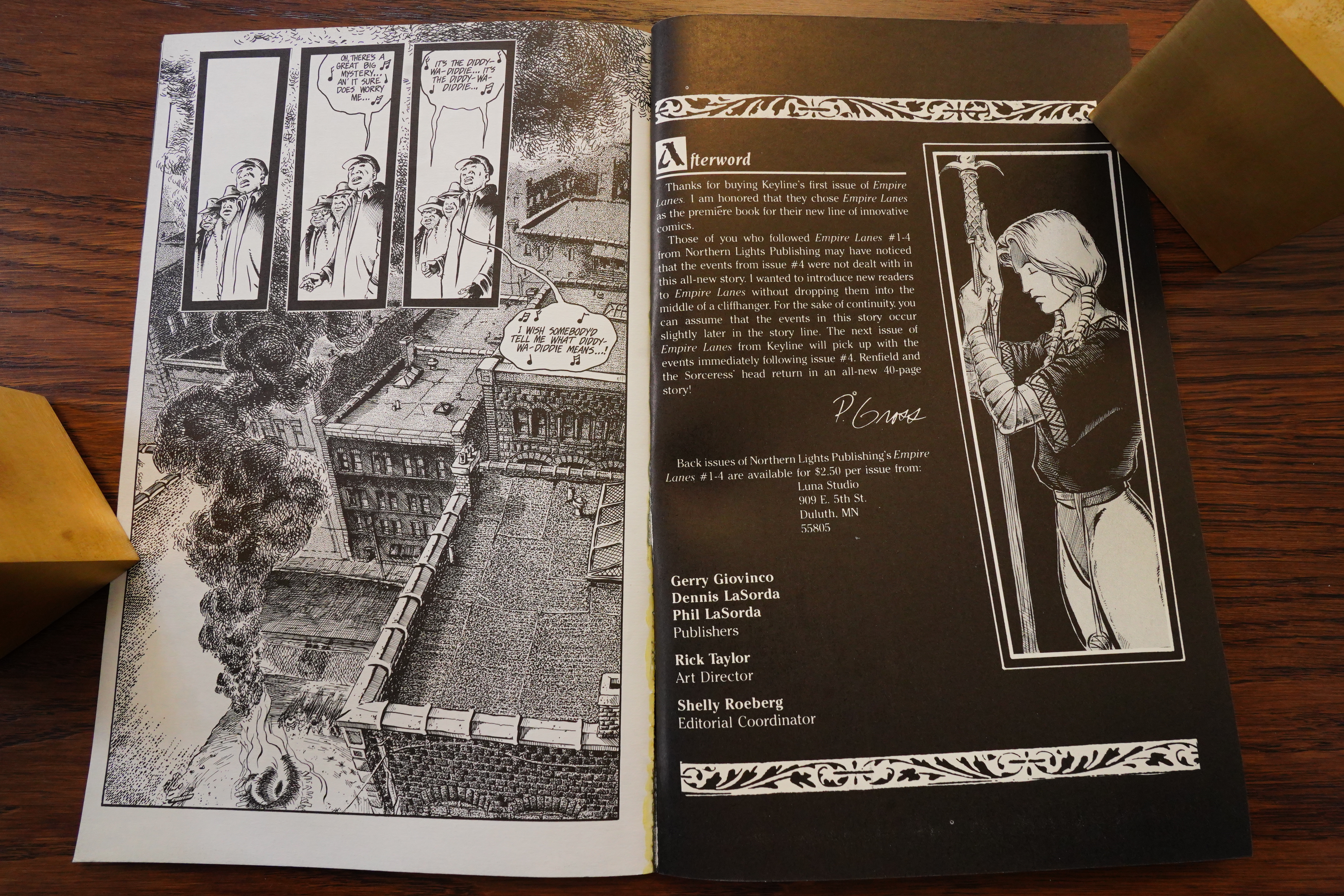
Er… so… OK, “innovative publishing formats” — I guess that means black and white? And “prestige format”? (This book has heavier cardboard covers.)
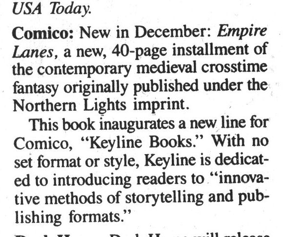
Speakeasy #104, page #17:
Keyline Books is a new imprint
from Comico, which promises “a
new style of stories, a new mode
of printing, a new line of excite-
ment”, with an emphasis on
innovative story-telling and
formats. The first of these will be
Peter Gross’s EMPIRE LANES, a
new story featuring the strip pre-
viously seen from Northern
Lights (well, it’s new-ish). It is set
in medieval times, and continues
the storyline from the original
series (although it will make
sense to first time readers as
well). The 40 black and white
square bound book will sell for
$2.95. Gross’s work has previous-
ly been seen in FISH POLICE and
STRIP AIDS.
So while they’re introducing a new line, this book is the only thing that’s announced?
No, there’s more in the pipeline. But here they’re just calling it “Comico’s black-and-white imprint”, so I guess it’s as simple as that.
I’ve said this several times in this blog series — Dave Sim sure was influential this period, eh? But I guess there’s an explanation for the Simness of some of the books that came over to Comico in this period: Diana Schutz, the editor, was Canadian and a friend of Sim, so it’s not unnatural that creators influenced by Sim would gravitate towards Comico.
On the other hand, this doesn’t look very Simian.
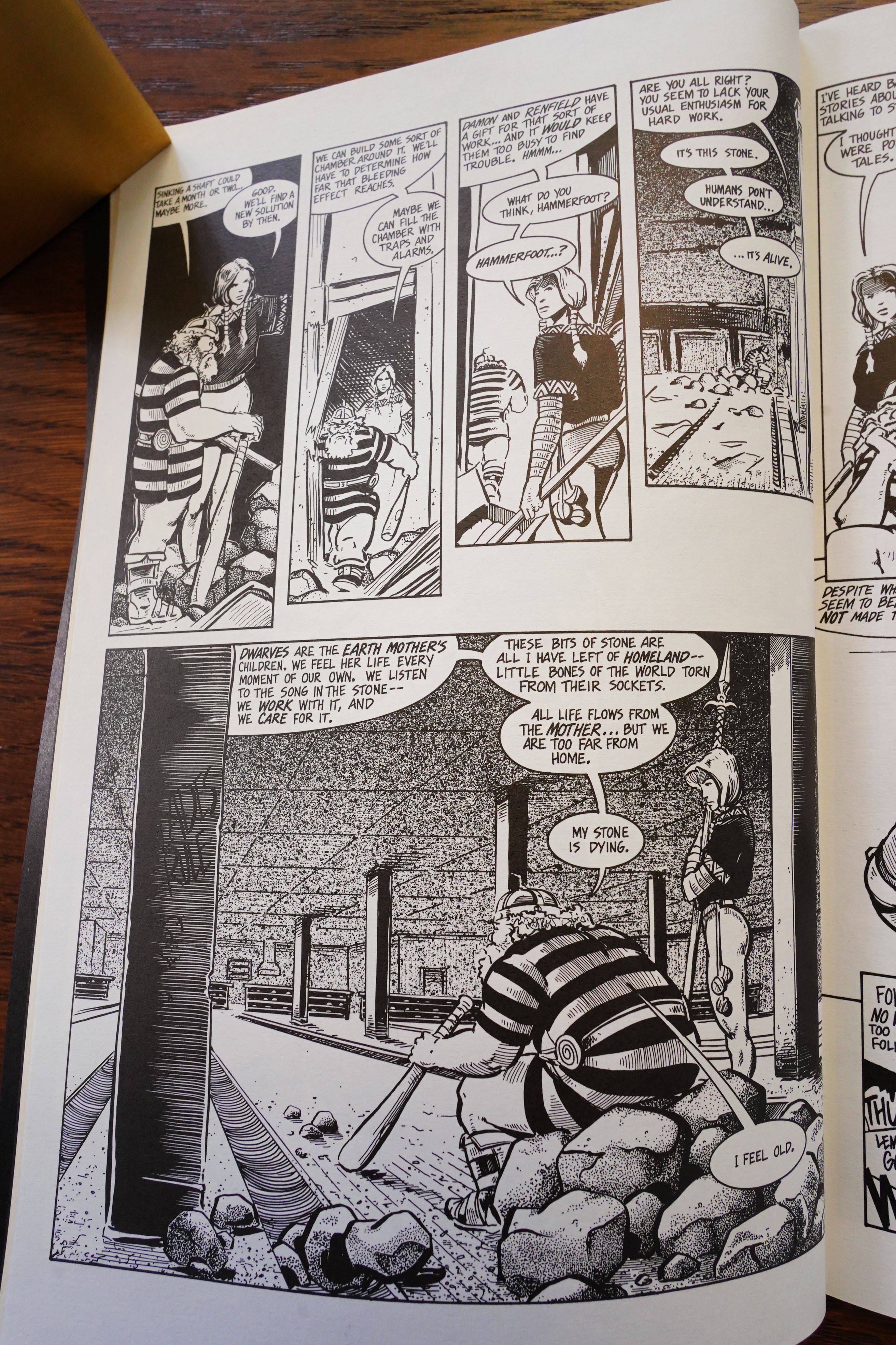
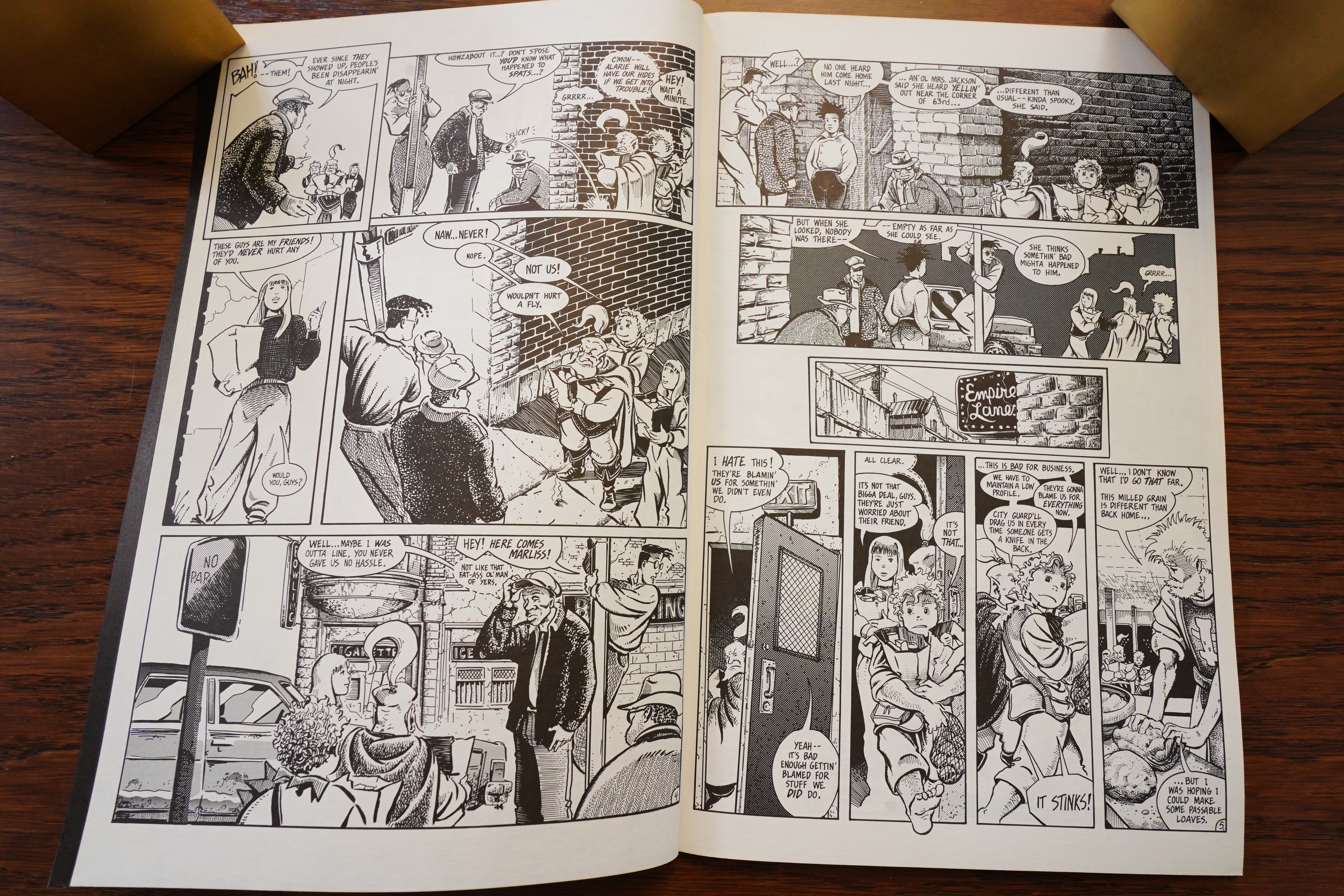
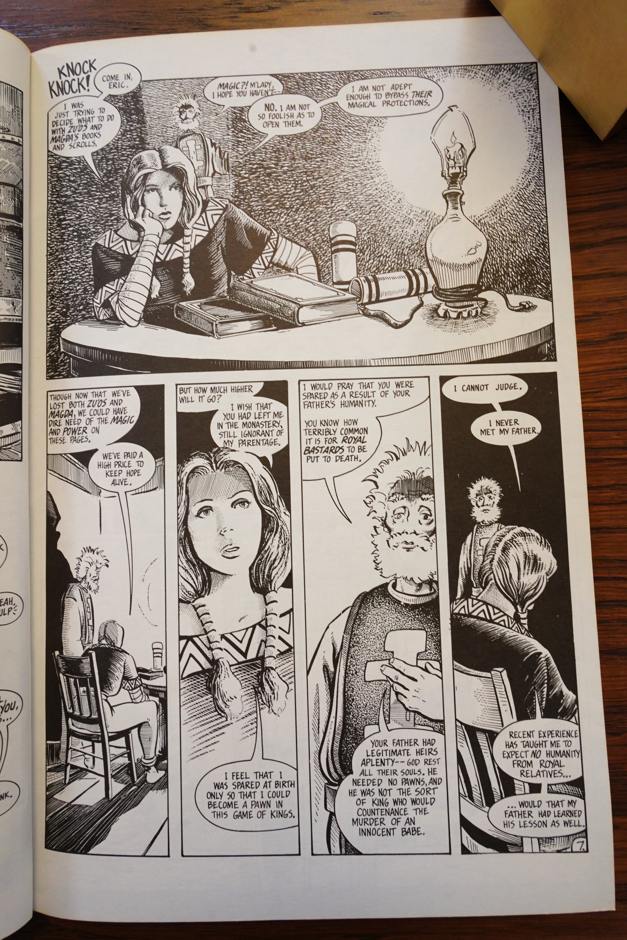
Oh, yeah — what’s this series about? Well, we do get an introduction to the concepts here without getting too bogged down in the on-going storyline. But what we learn isn’t very … encouraging? It seems basically to be “some characters from Lord of the Rings, but on Earth, now”. The dwarfs even have the same character tics as Tolkien’s…
Ah yeah, I wasn’t imagining the Sim influence.
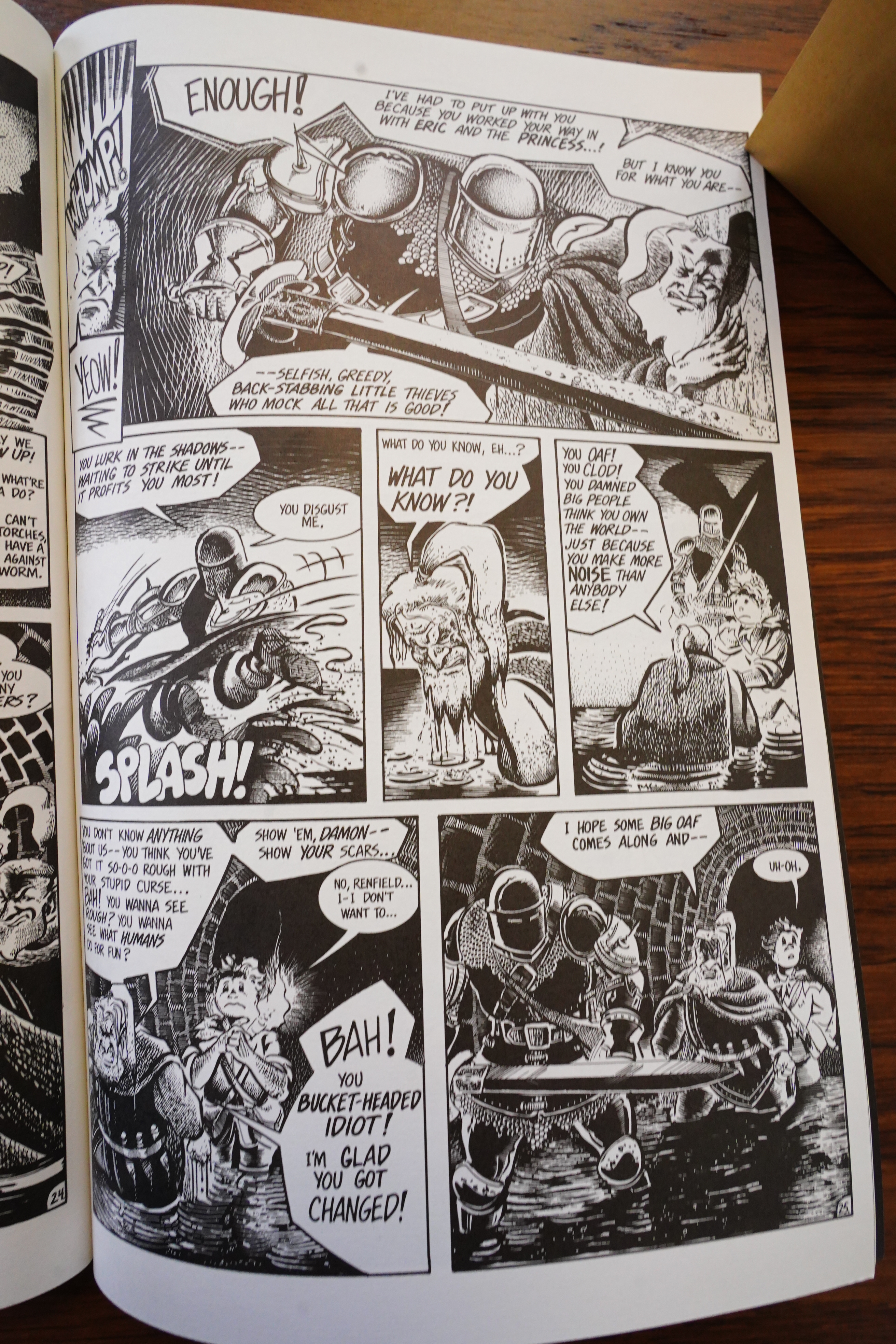
Tolkien didn’t have his characters bicker this much, though. So that’s new.
The creator explains what this book is — set “in the future” from the ongoing storyline, which is pretty… original, I guess?
Reading this book, I think I have actually read some Empire Lanes before. I think I may have had one of the original series…
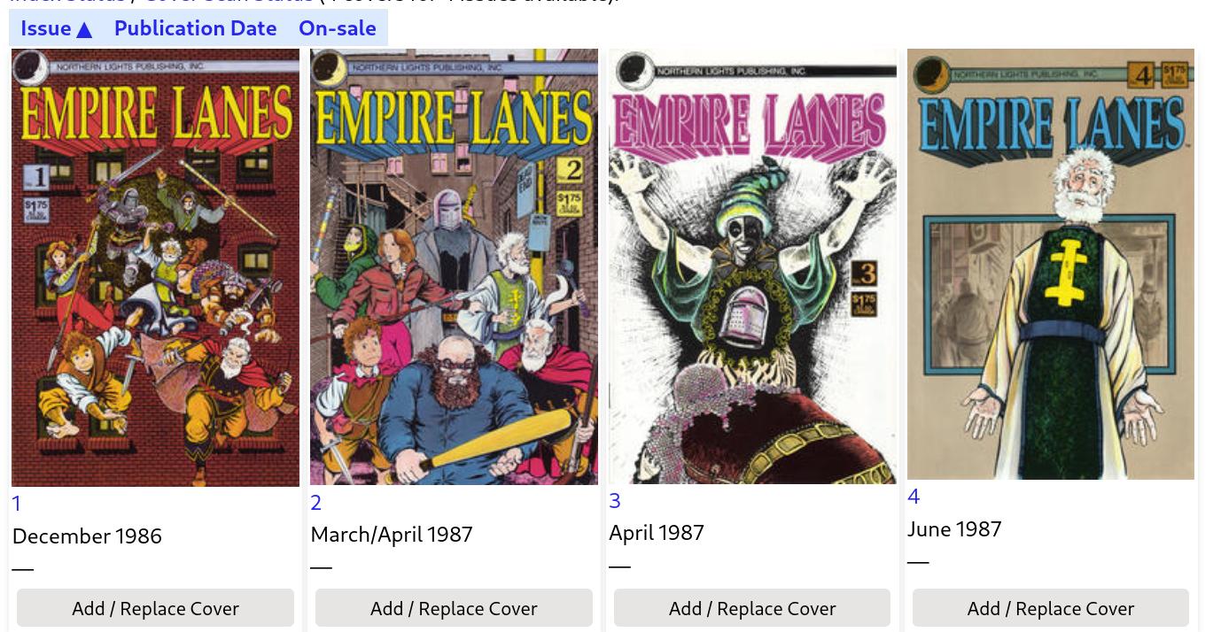
No! Looking at these covers, I’m pretty sure I’ve read them all before! Or most! Back in the 80s! Huh.
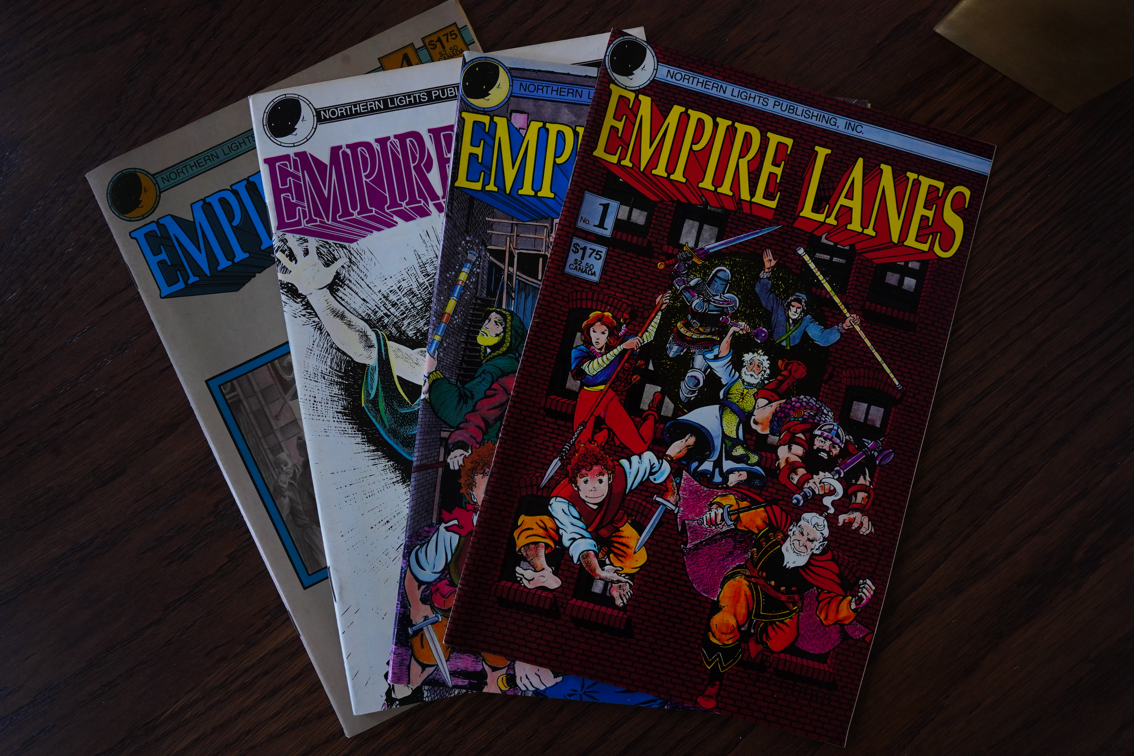
Wow! I was right! I still have them! And I found them! (In a short box marked “Singles”.)
Well, that’s surprising.
Anyway, I quite liked this issue — OK, the concepts seemed very derivative, but the artwork’s good, an engaging storyline, and some gags that worked.
Amazing Heroes #175, page #90:
Some of you might remember Empire
Lanes as one of the handful of well-
crafted black-and-white titles to come
out towards the end of the b&w boom
in the mid-’80s. It was a well-drawn,
well-written book, one of those titles
in which you could see the creator (in
this case writer/artist Peter Gross) take
huge leaps from issue to issue. It only
lasted five issues when the black-and-
white market collapsed and the book
was swept down into an inky black
hole along with a lot of less worthy
efforts. Now, Empire Lanes is back,
published by Keyline Books, Comico’s
new black-and-white imprint.
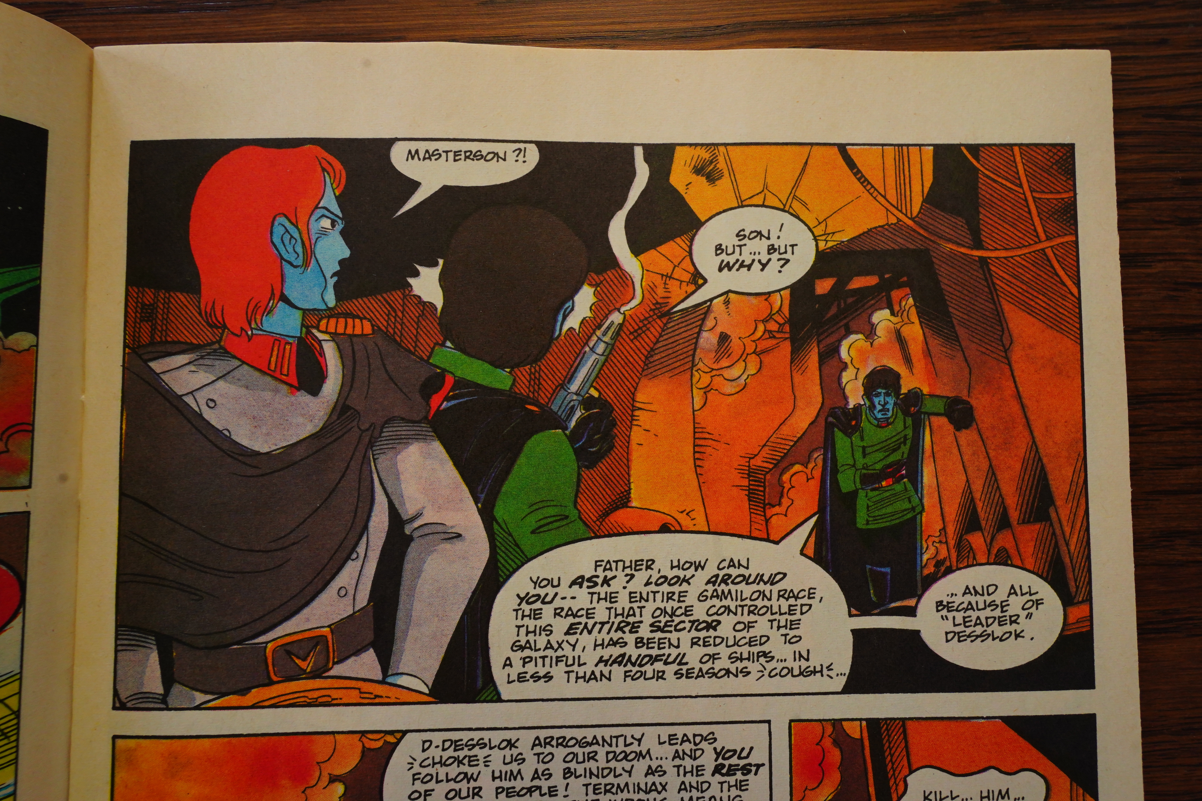
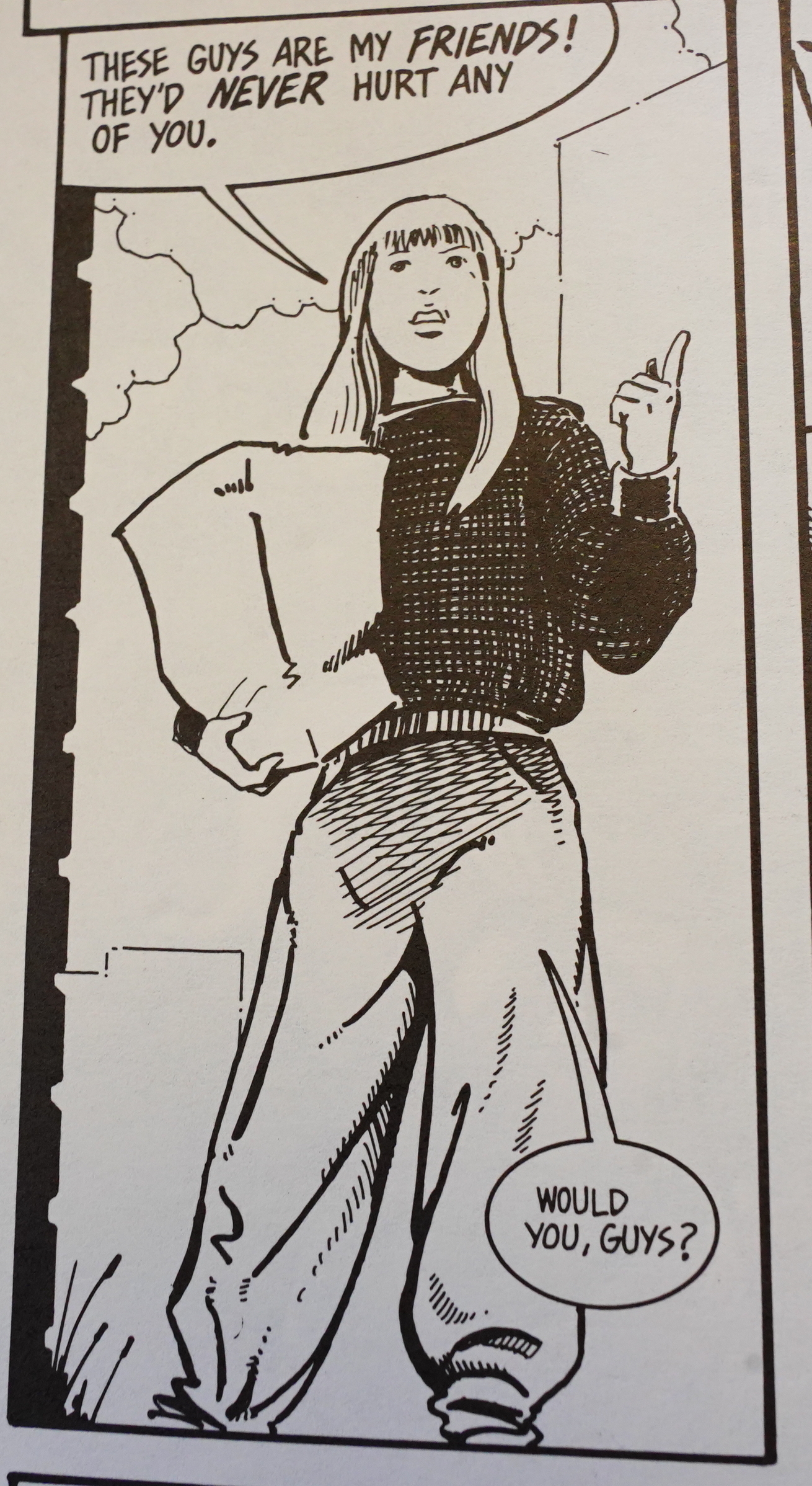
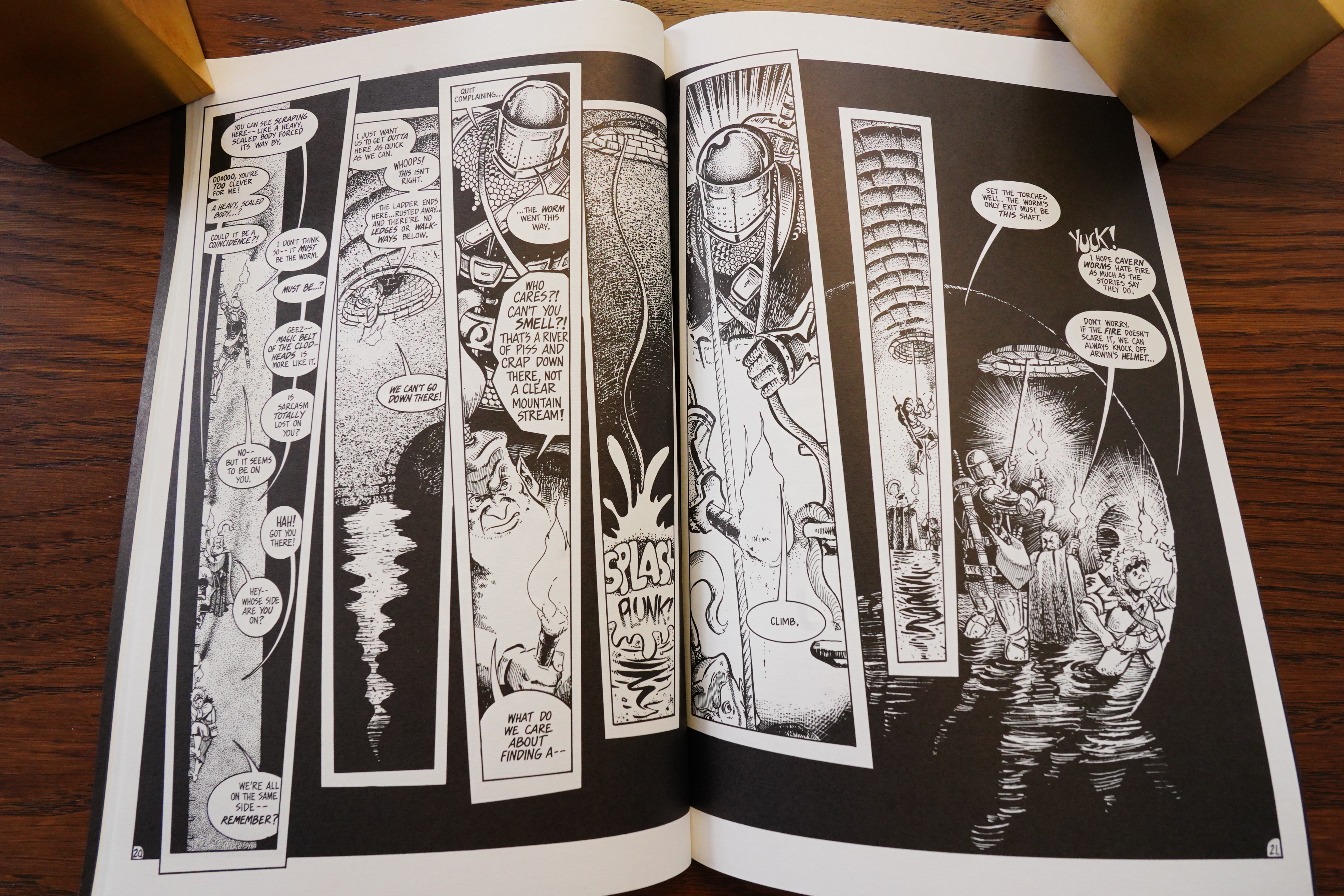
Empire Lanes involves a group of
adventurers patterned after the basic
Dungeons and Dragons character
types. There’s a warrior princess, a
knight, a halfling, a dwarf, a cleric,
etc.. The significant difference
between Empire and DC’s Dungeons
and Dragons comic is that these
adventurers are trapped in the world
of present-day Chicago, carried there
by a magic gateway in order to escape
their adversaries. It’s “Strangers in a
Strange Land,” but to Gross’s credit
this aspect of the story isn’t dwelt
upon. Gross seems more interested in
telling stories where the basic good vs.
evil morality of the adventurers is
compared to the more ambiguous
moralities of contemporary men and
women. How to deal with slums or
childbeating? What about dragons that
may not be dragons? These are the
issues Gross addresses.
Empire Lanes is gratifying because
Gross imbues his cast with something
beyond cliched characteristics. True,
the halflings are cute and mischievous,
but they also express their anger and
resentment at being treated like
second-class citizens by larger, taller
members of the group. The cleric has
doubts about the omnipotence of his
diety because his summons for aid go
unanswered.
As interesting as the stories are, the
main reason to buy Empire Lanes is
Gross’s artwork. His sense of com-
position and his use of black are
excellent. He also happens to be able
to draw people, not only hyperex-
tended demigods and overinflated
bimbettes.
Retailers who stock gaming material
make note: Empire Lanes will surely
appeal to gamers. Rack it near Dragon
magazine.
GRADE: !!!!!
— Jeffrey Lang
Amazing Heroes Preview Special #10, page #46:
The reception to Keyline’s Empire Lanes
special has been so positive that the series
will be continuing in its own quarterly series.
Briefly, the story involves classic Dungeons
and Dragons-type characters trapped in
modern-day Chicago. Expect light, fun
adventure in this one.
OK, I guess I’ll be re-reading the first four issues in a couple of days when I cover the Empire Lanes collection.