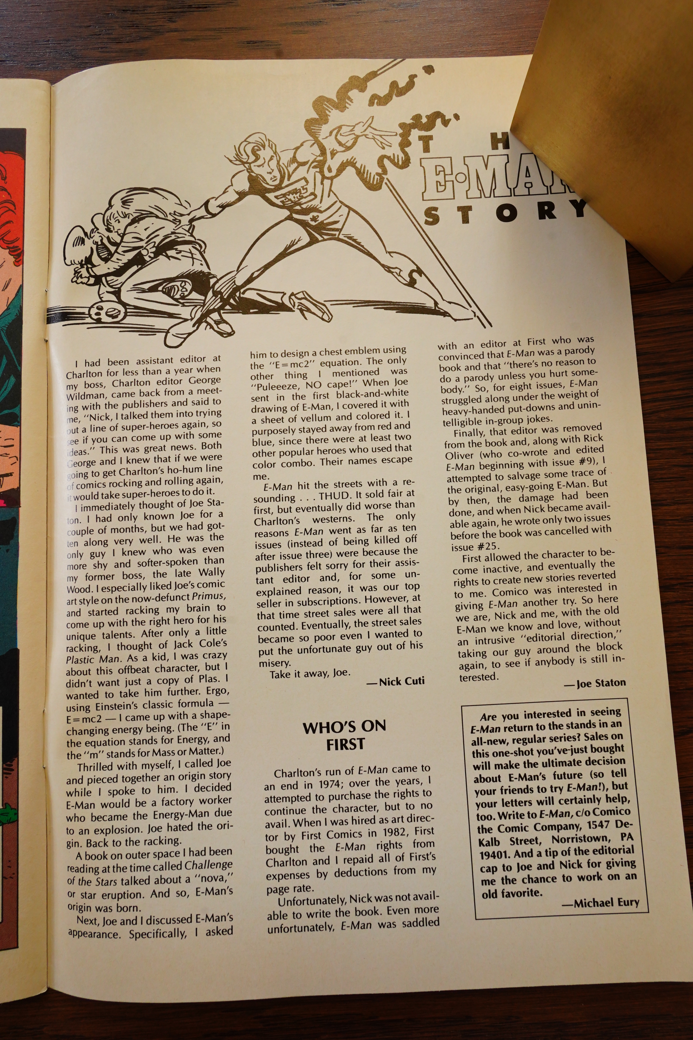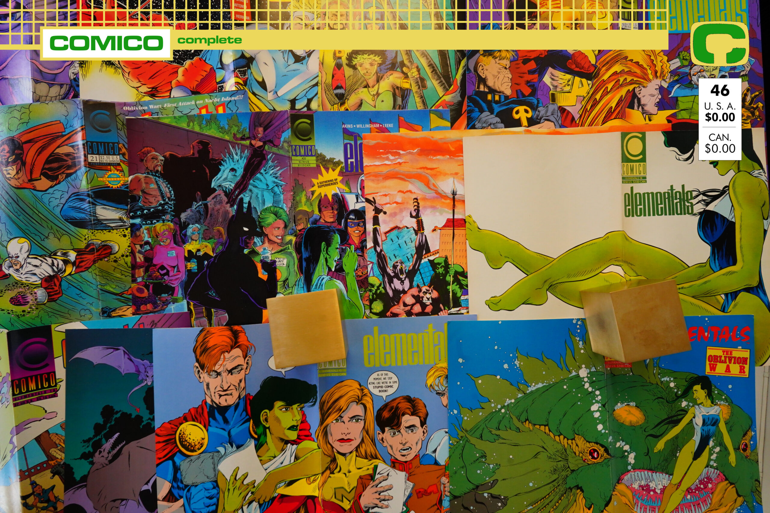
Elementals (1989) #1-26 by Bill Willingham and others
So what’s this then? Well, we’re starting off here with Elementals Specials #2. The first issue of this had been published many years before, but Willingham is back now, so er uhm er, let’s have a second special?

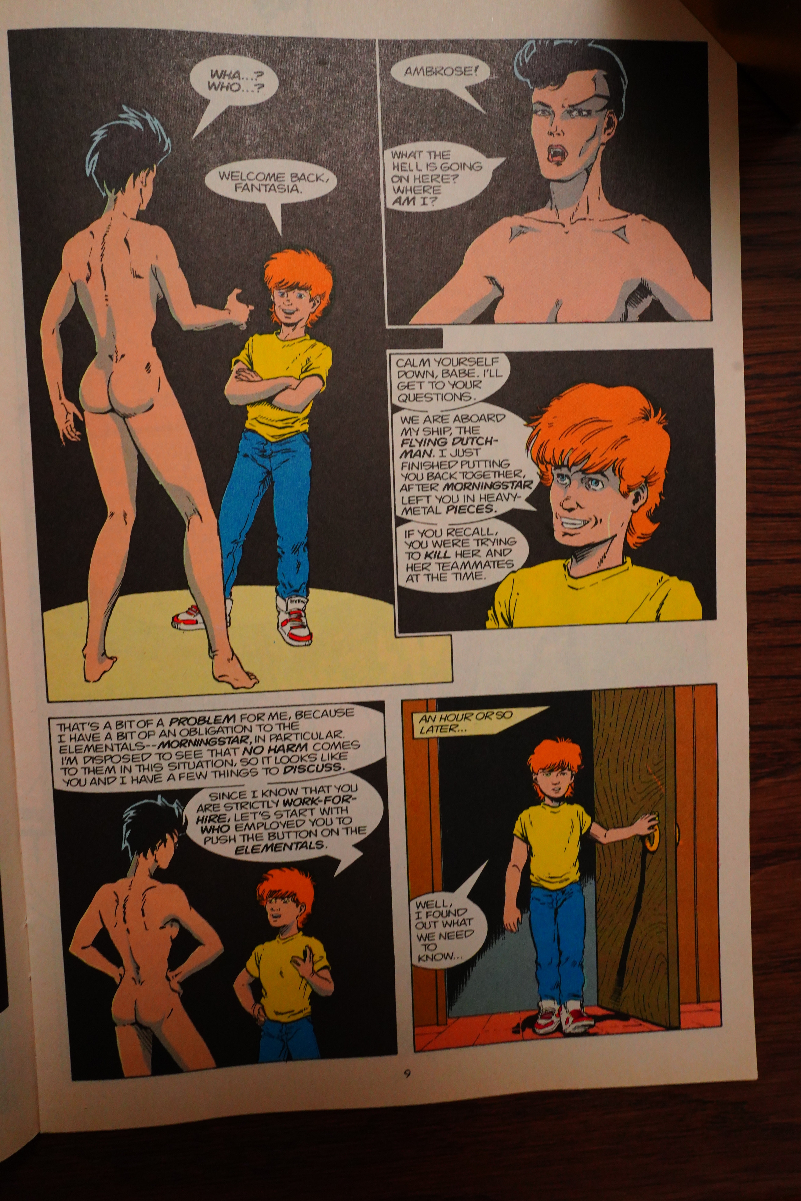
I can’t claim to be an expert in comics publishing — I’ve published exactly zero comics. But the back history here is that Willingham had gotten progressively less involved in doing Elementals — you could see his interest wane issue by issue, until the final handful of issues was done without his involvement at all.
But Comico had talked Willingham into returning, and instead of launching with a new #1, they start with… Elementals Special #2, which doesn’t mention Willingham on the cover at all, and has nothing to do with the first special, but instead just continues on directly from Elementals #22 (his previous final issue, so I guess we’re supposed to ignore #23-29). And it continues into the new Elementals #1, which just leaves us with the question…
WHYYYYYY
Surely this has to be the most convoluted way possible to reintroduce people to Elementals?
But on the other hand, Elementals v1 continued for 26 issues, so what do I know.
In any case, Willingham does the artwork here, too, so I guess that’s pretty special.
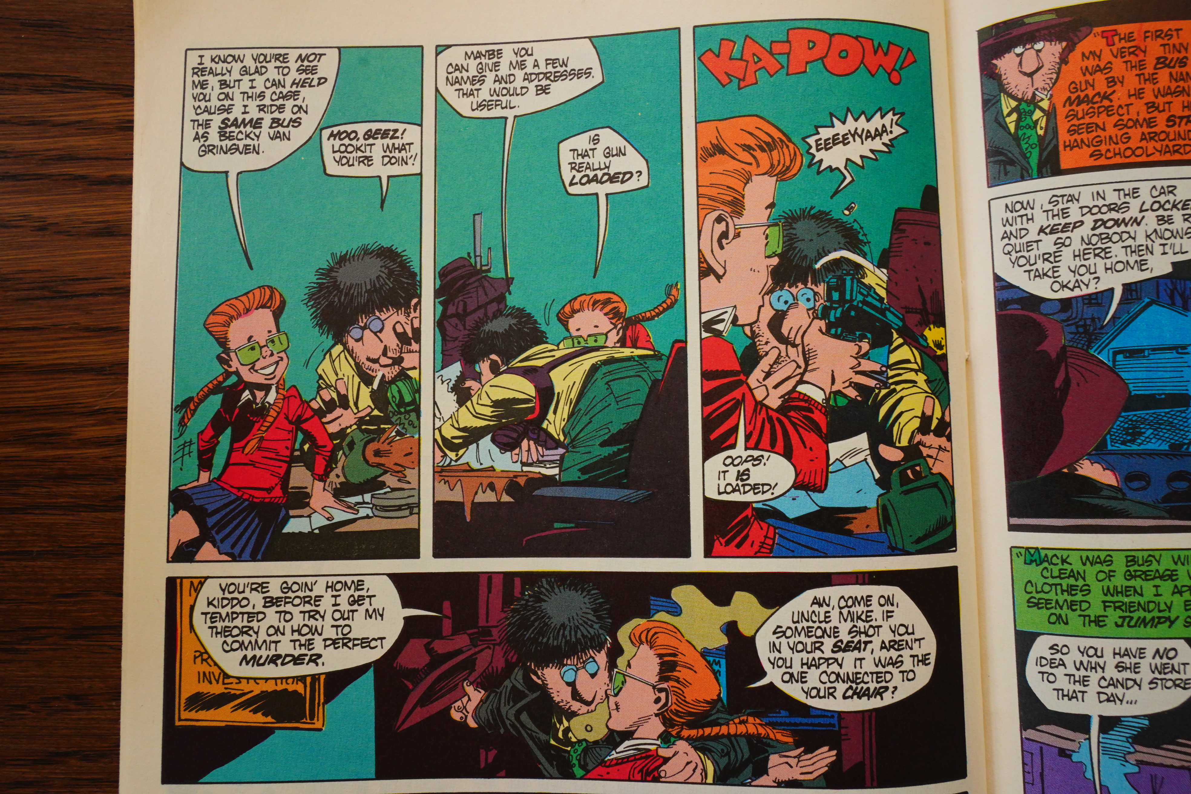
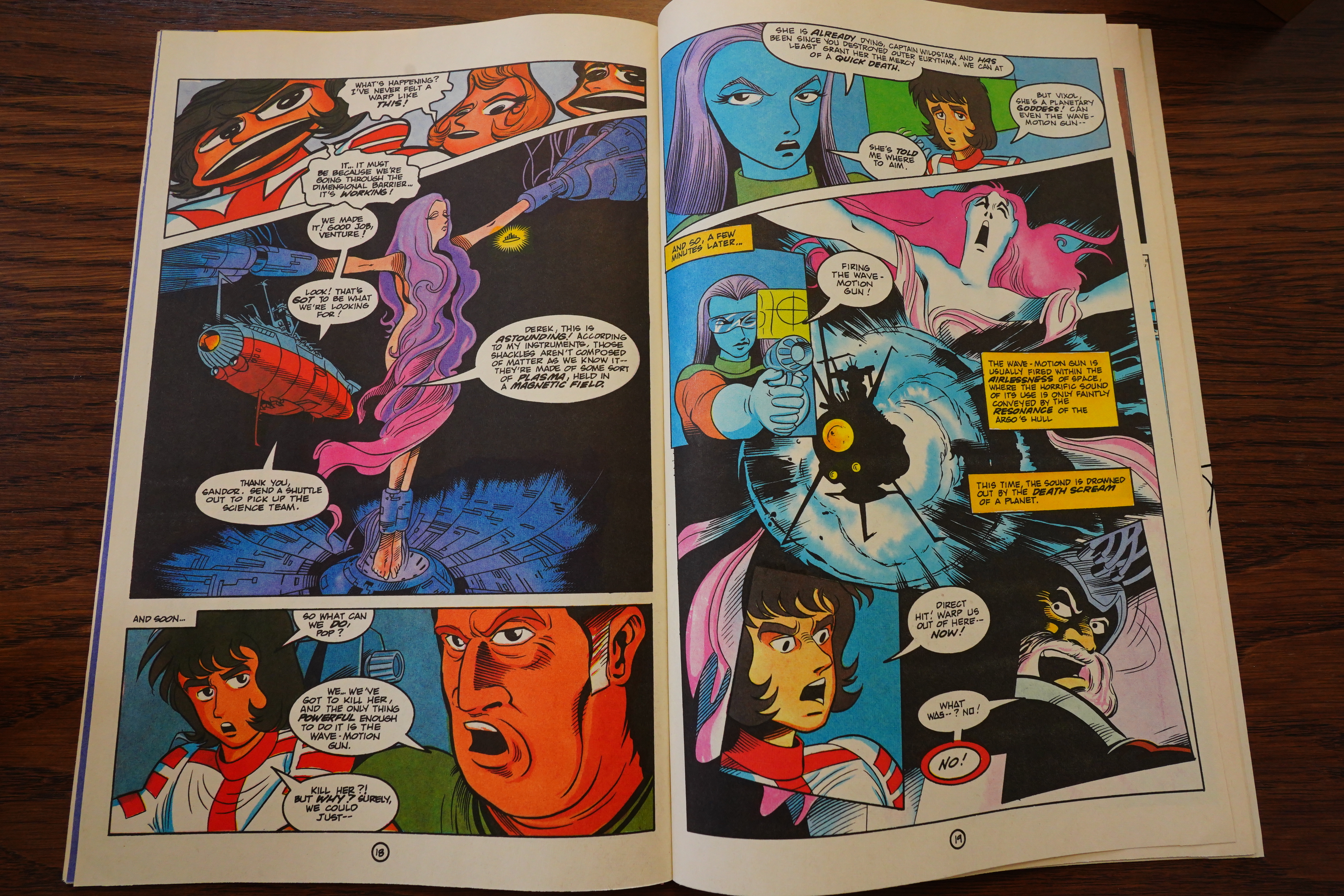
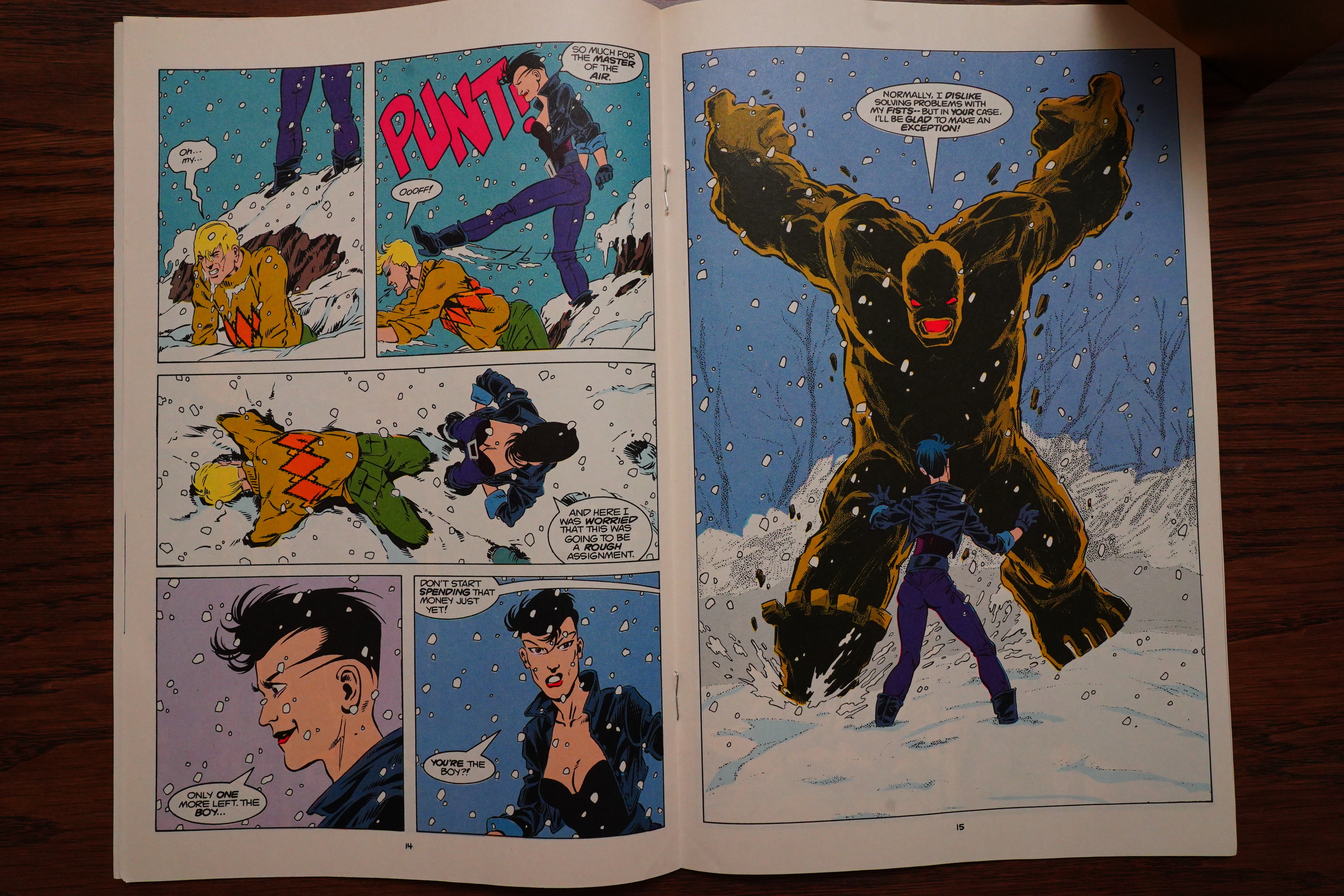
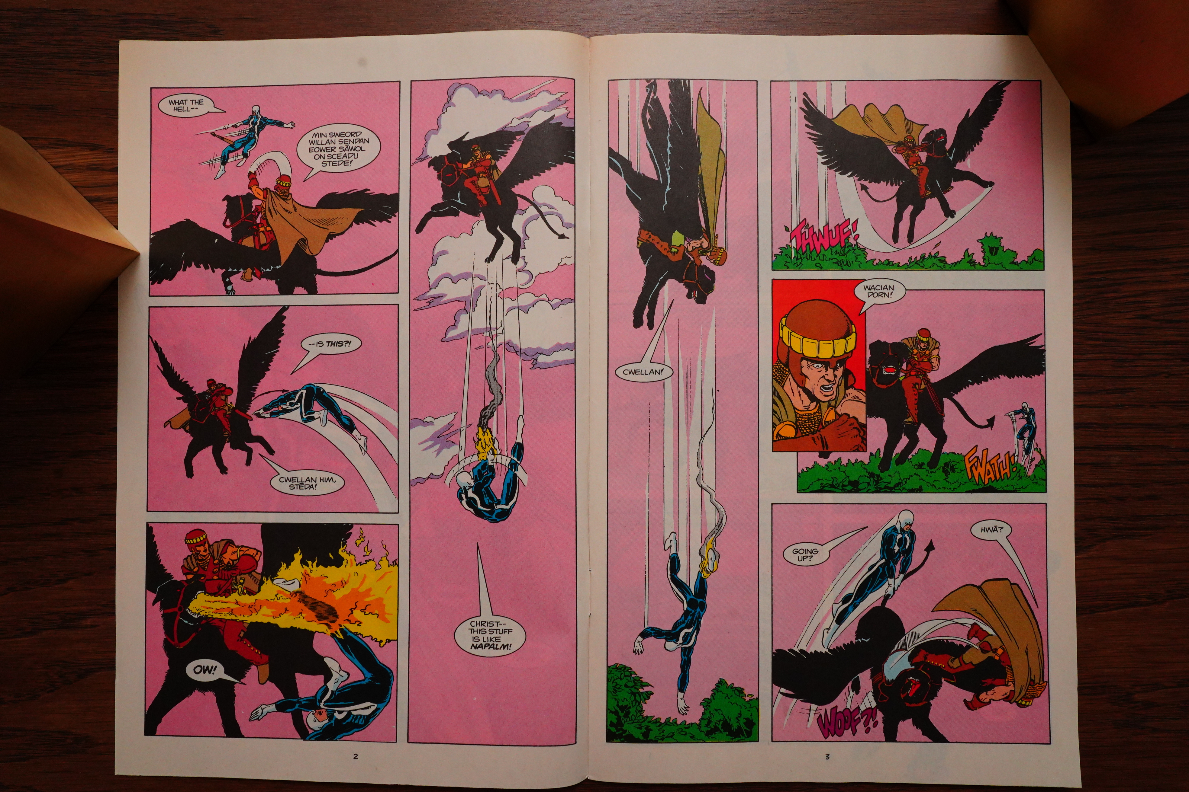
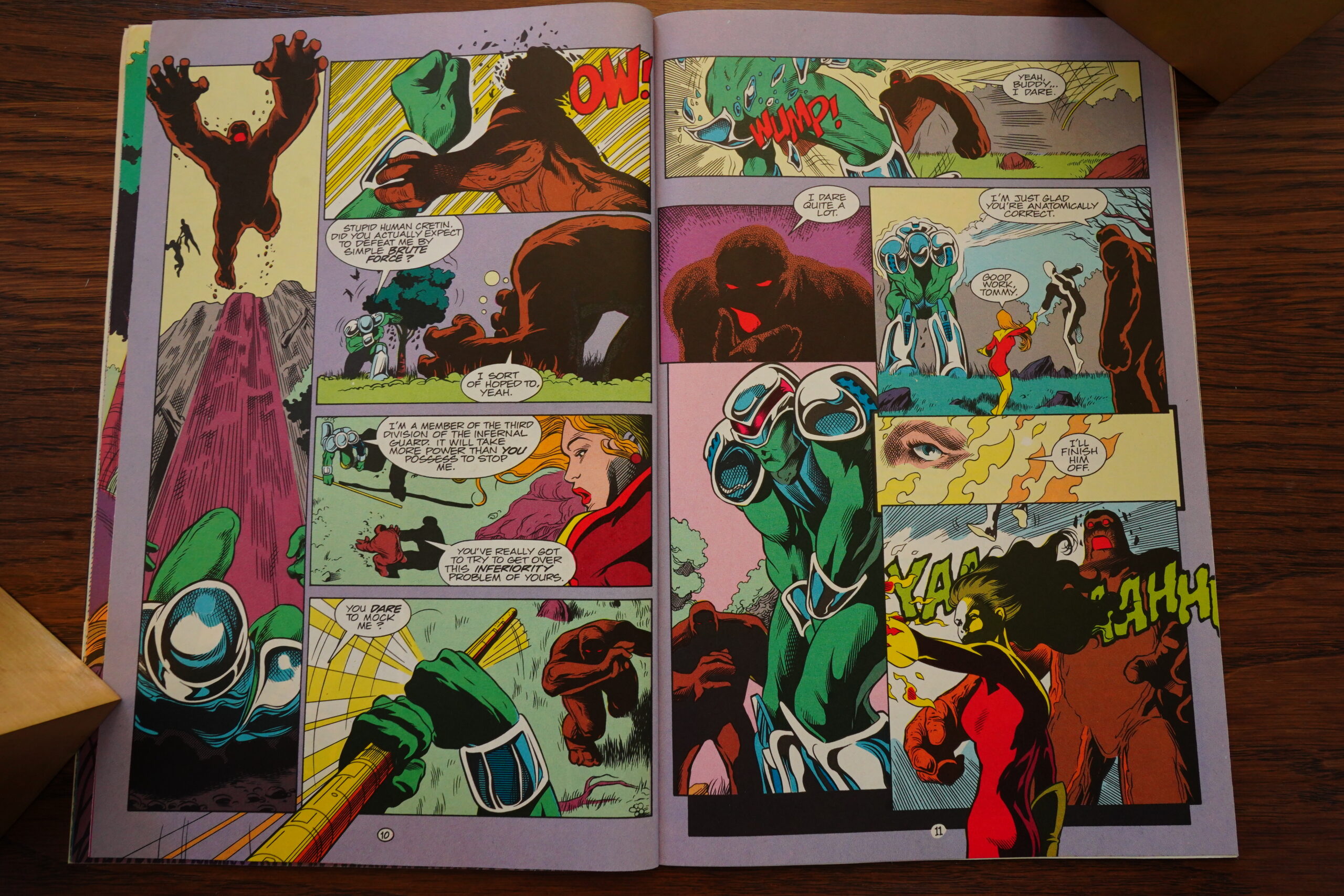
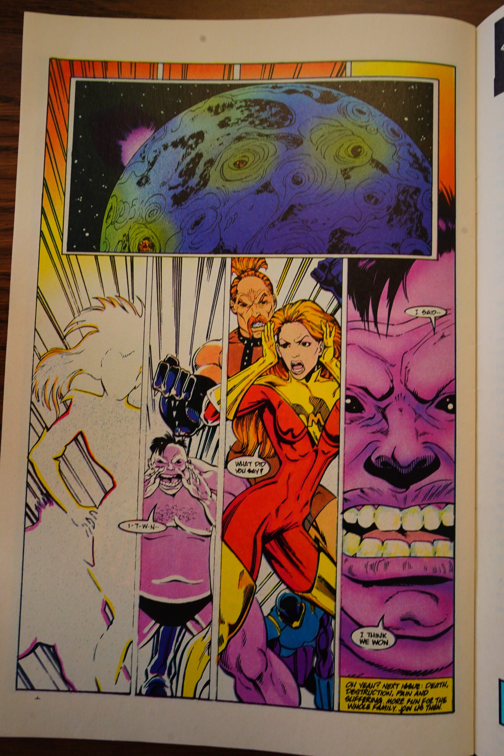
Epic fight sequence!
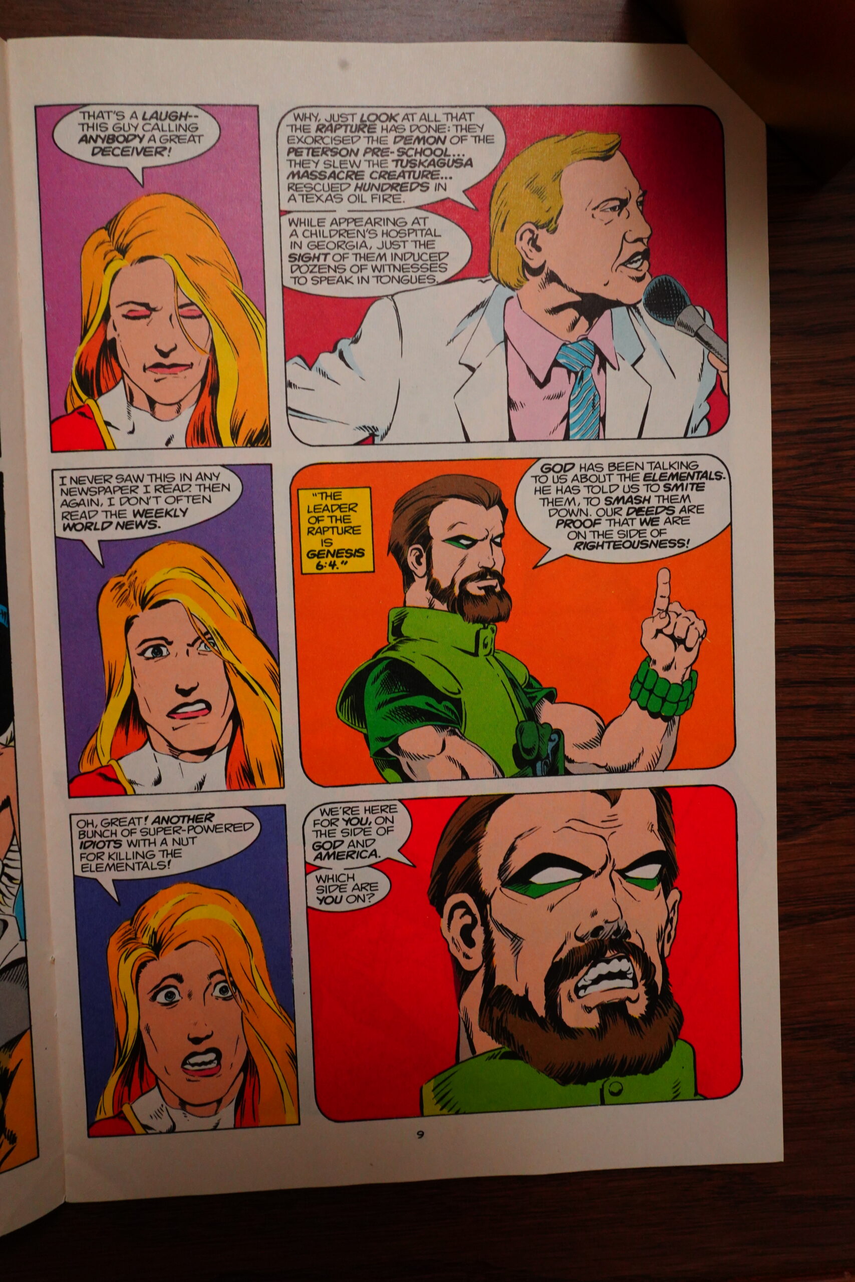
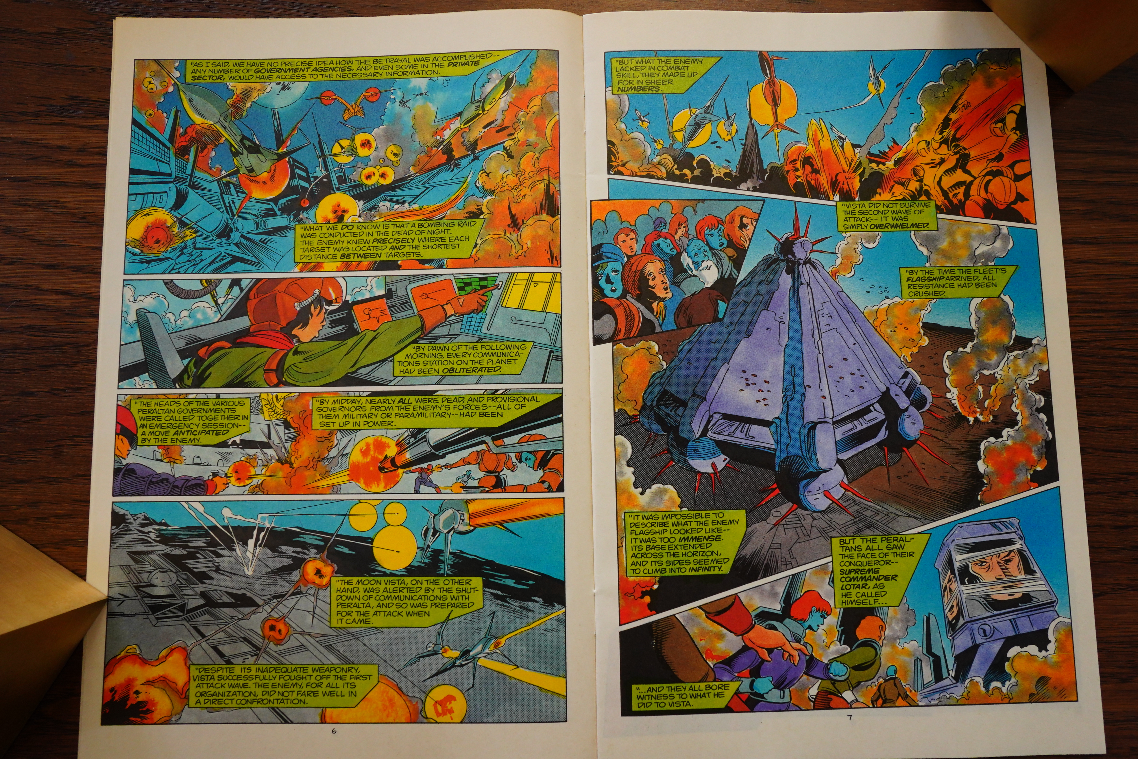
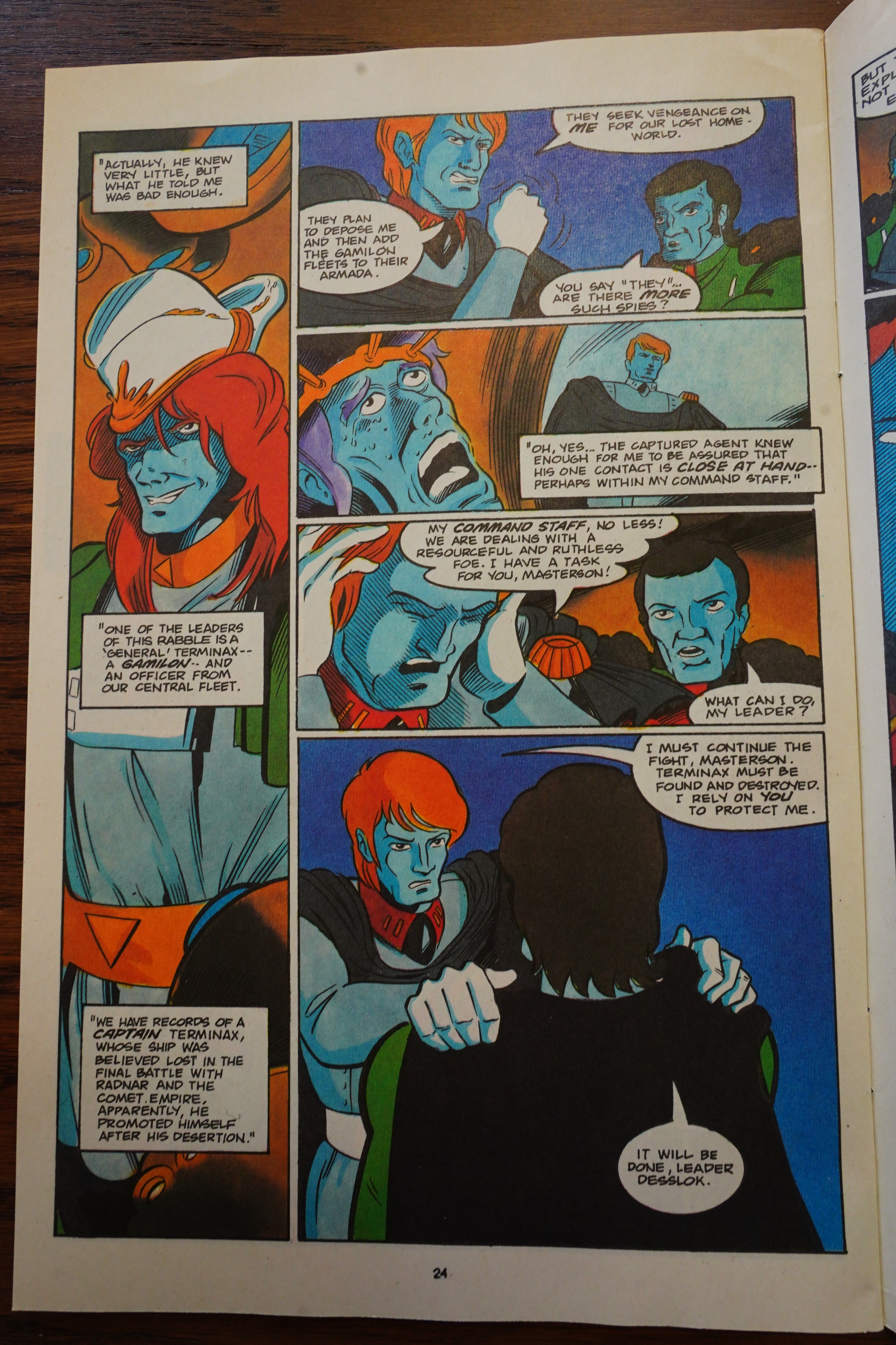
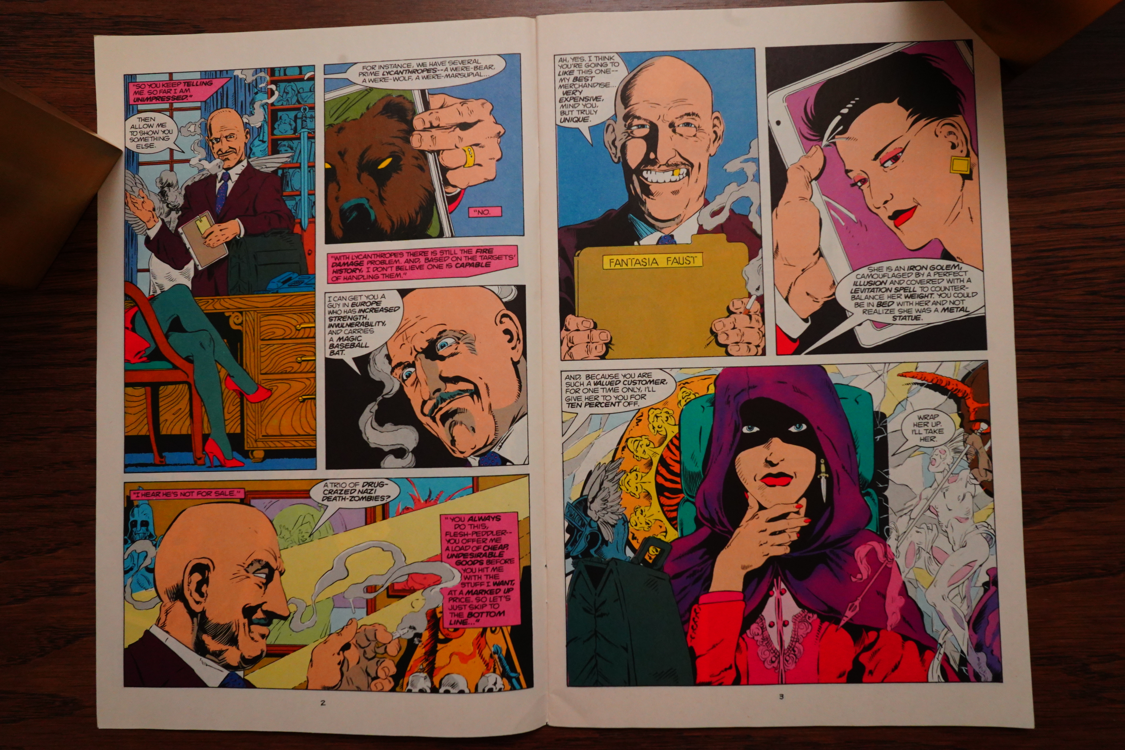
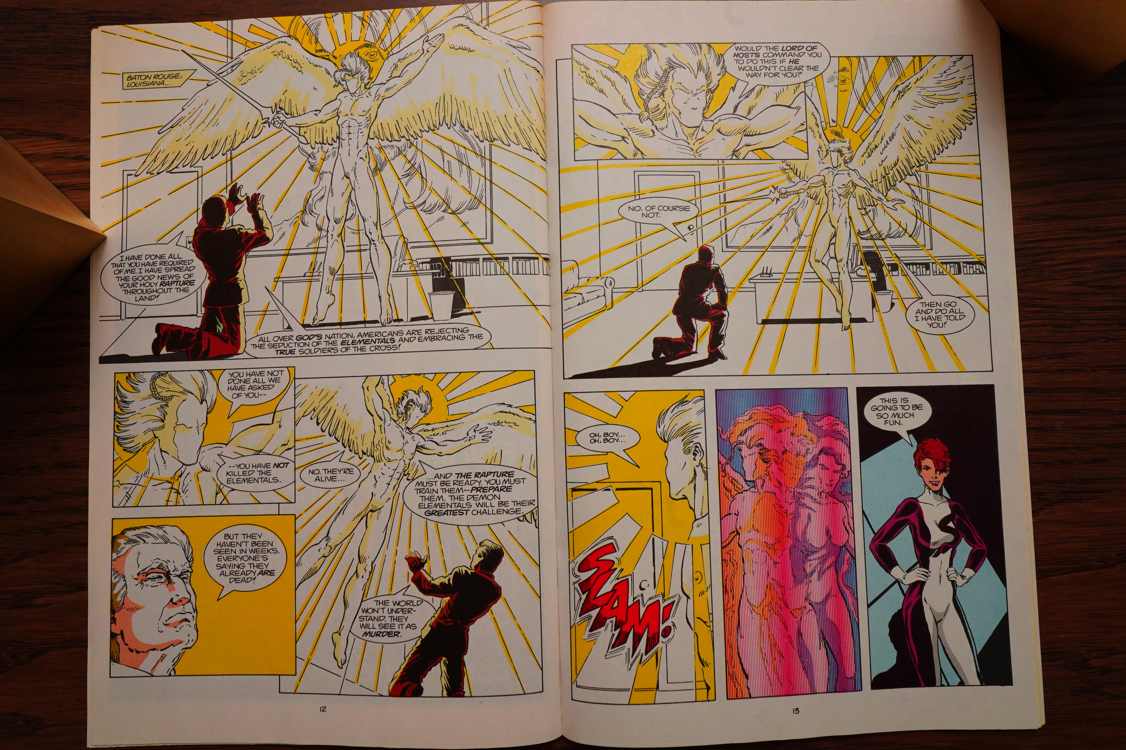
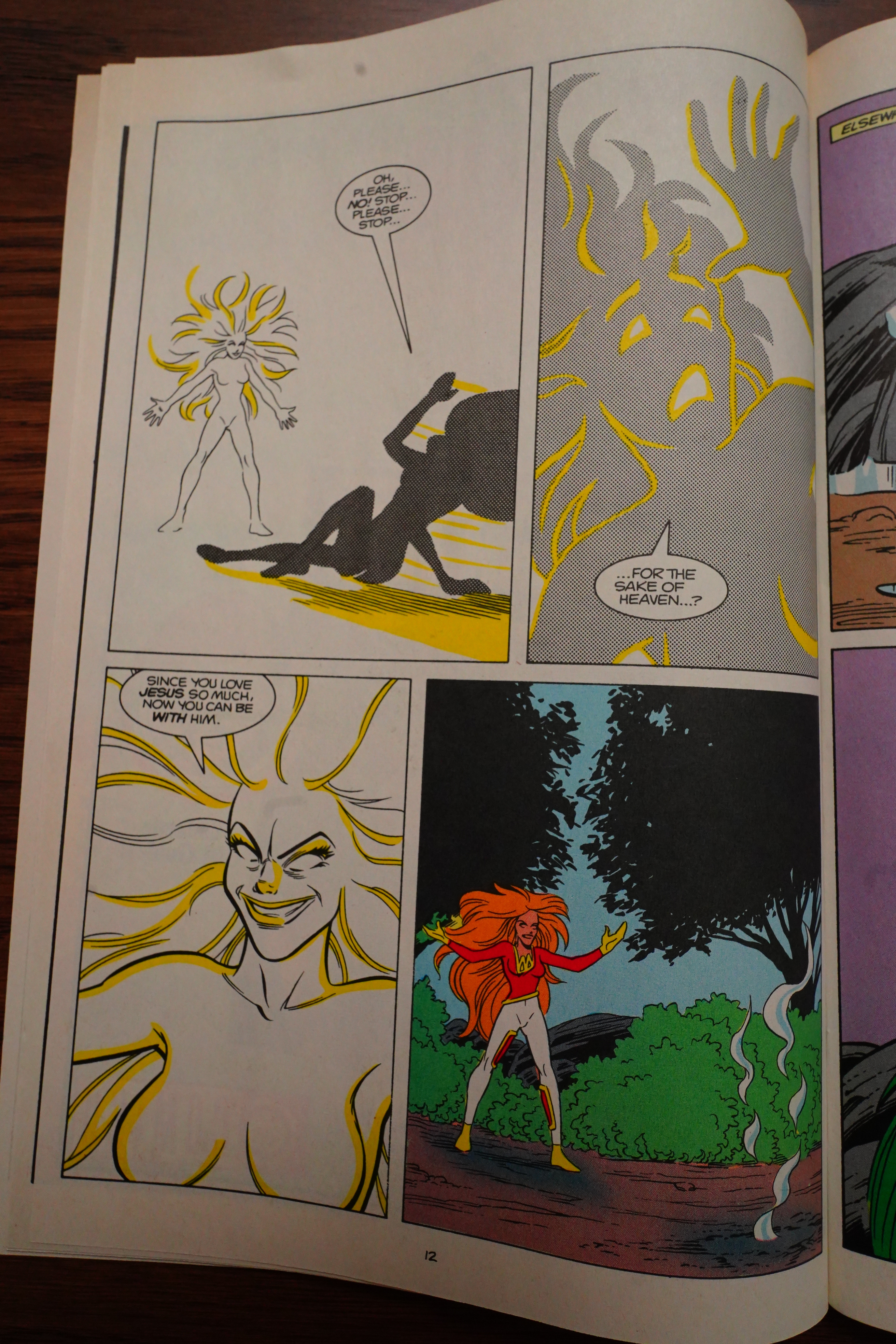
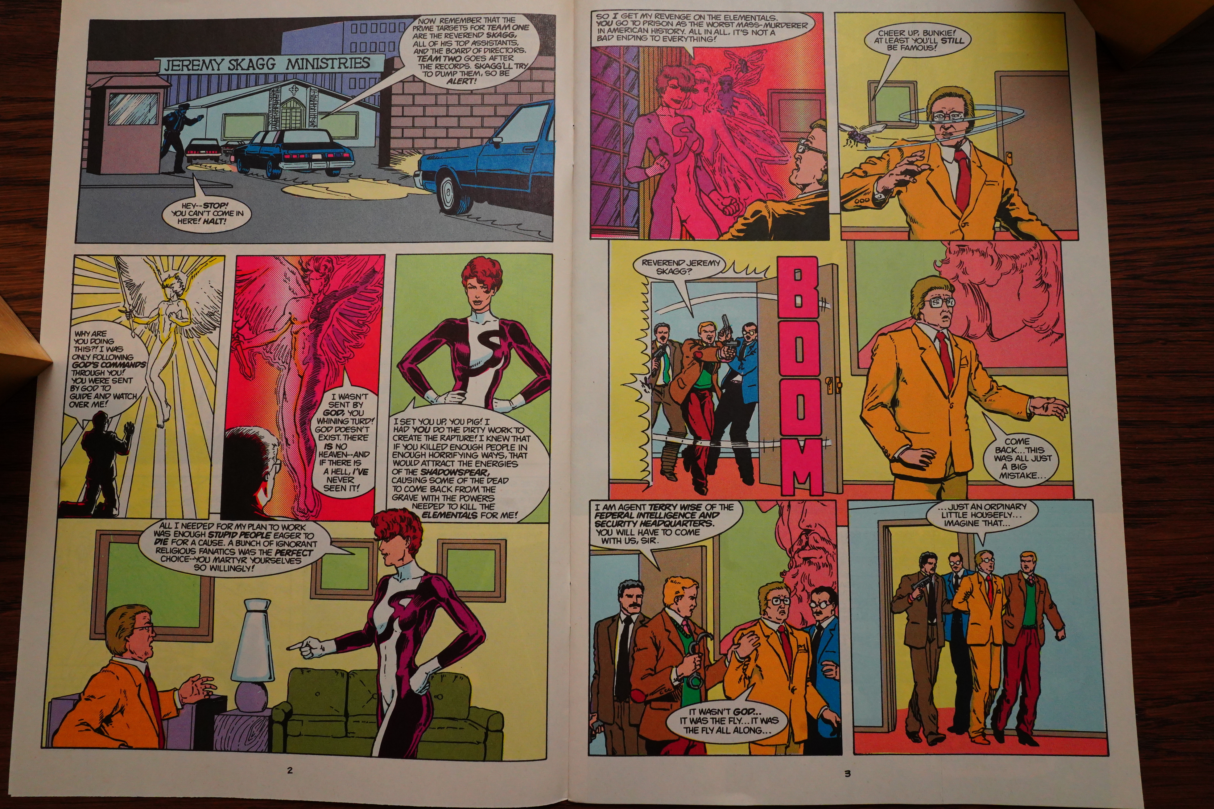
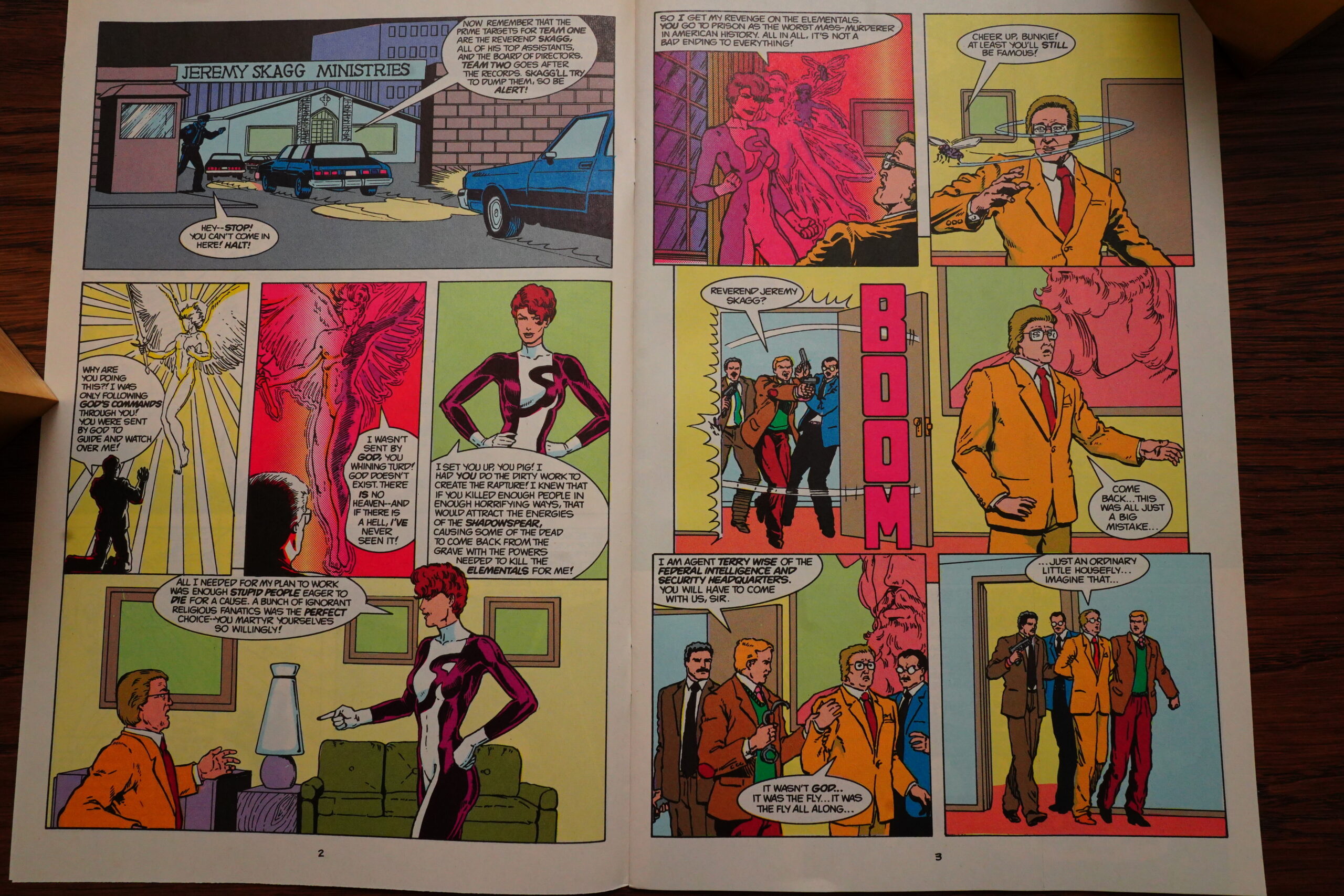
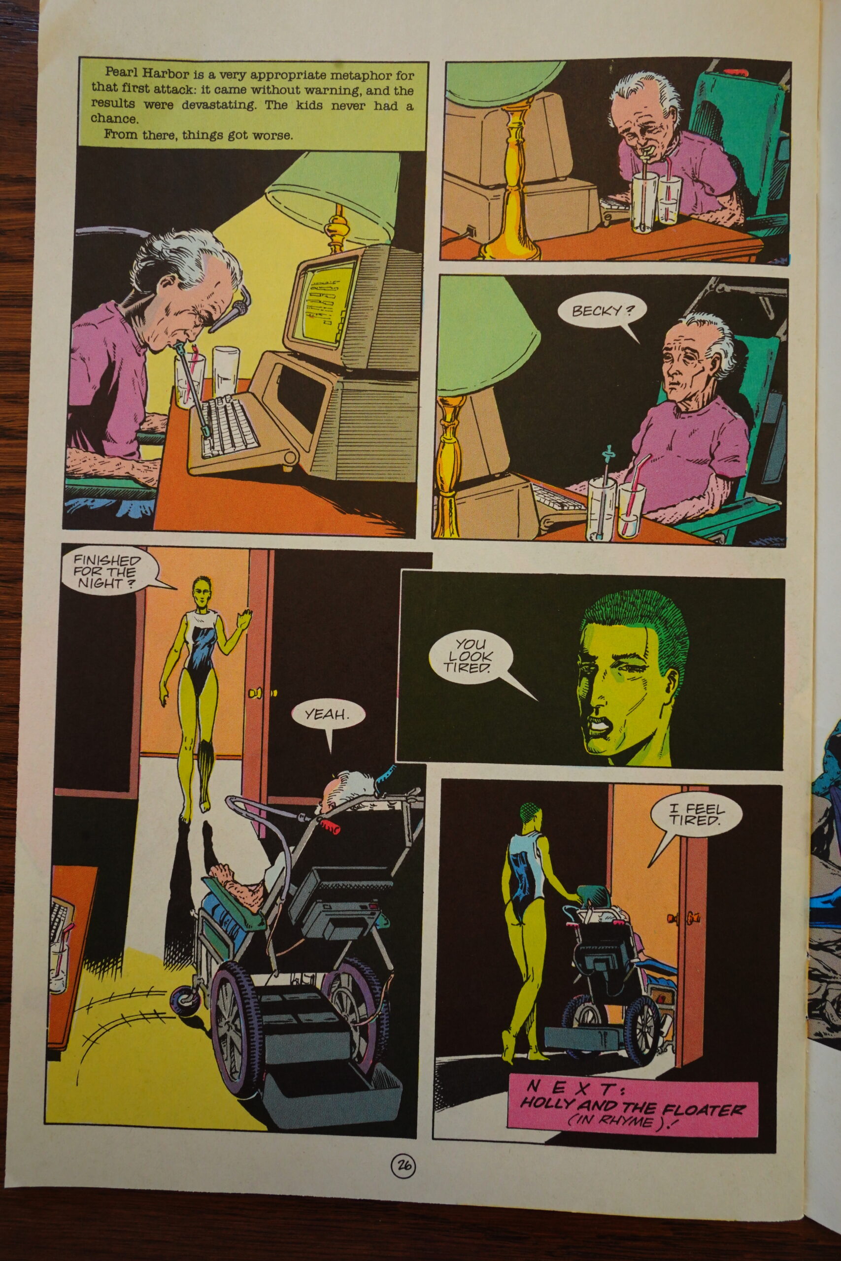
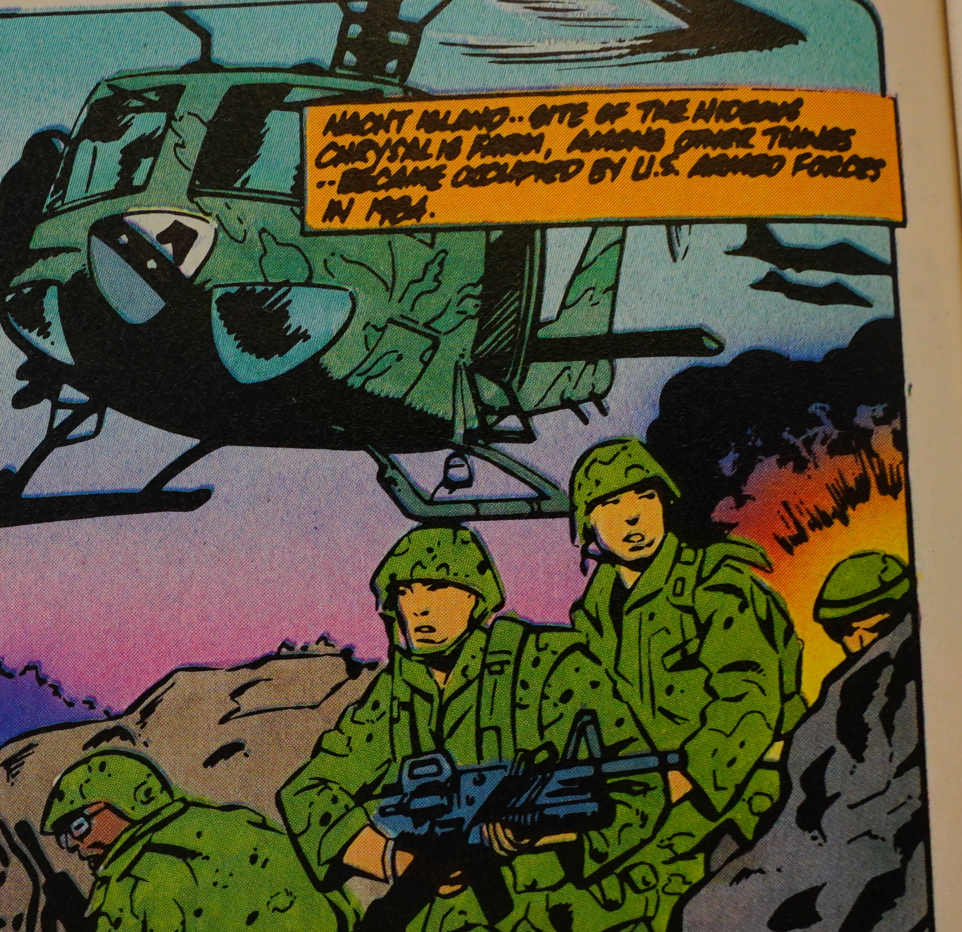
Oh, right… #22 had yet another big bad evil conspiracy going on (there were so many that I lost count): This one involved this preacher guy, Jimmy Swaggart with the serial number filed off, torturing and killing 1,200 people to make his own super-hero team.

More epic fight sequence!
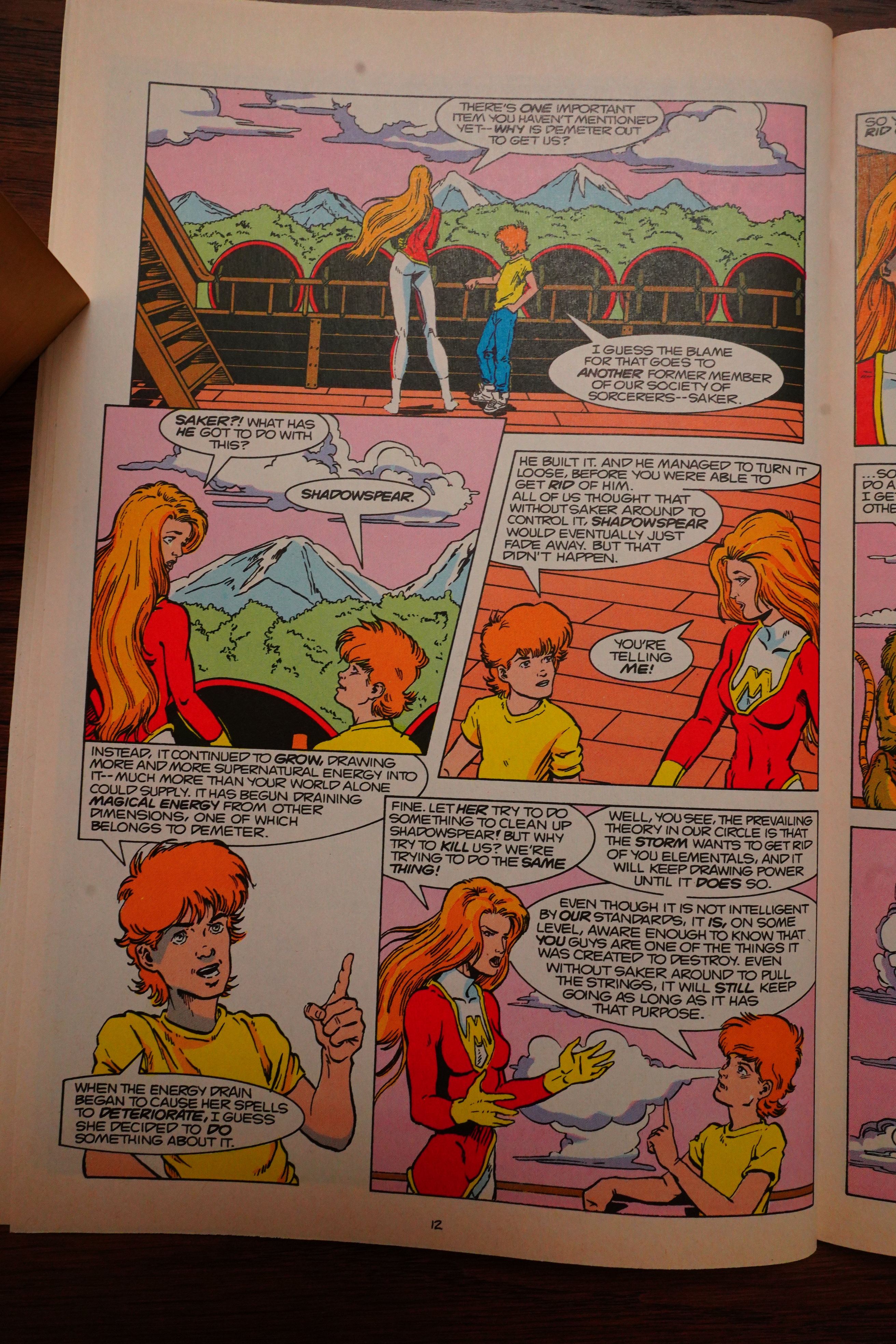
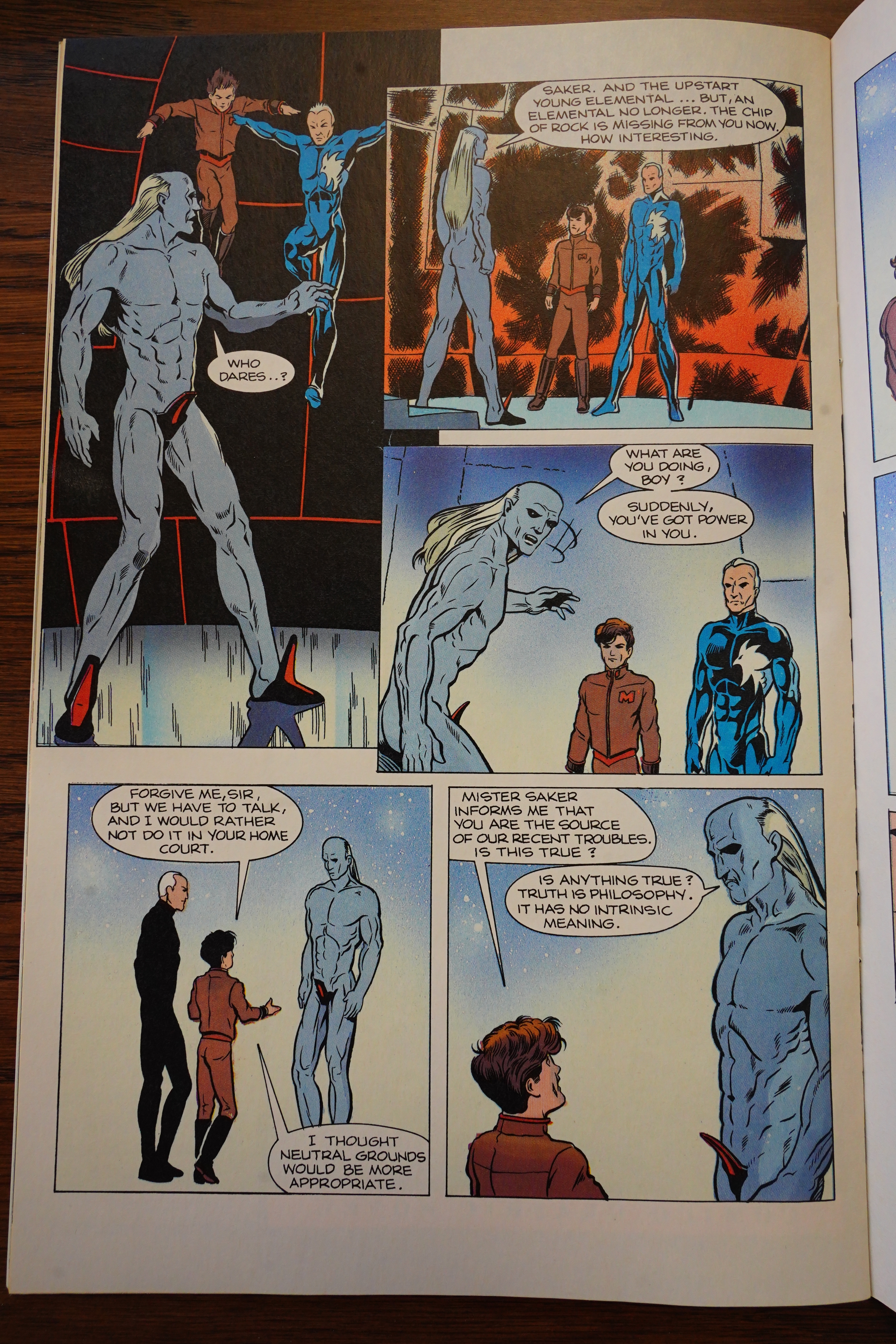
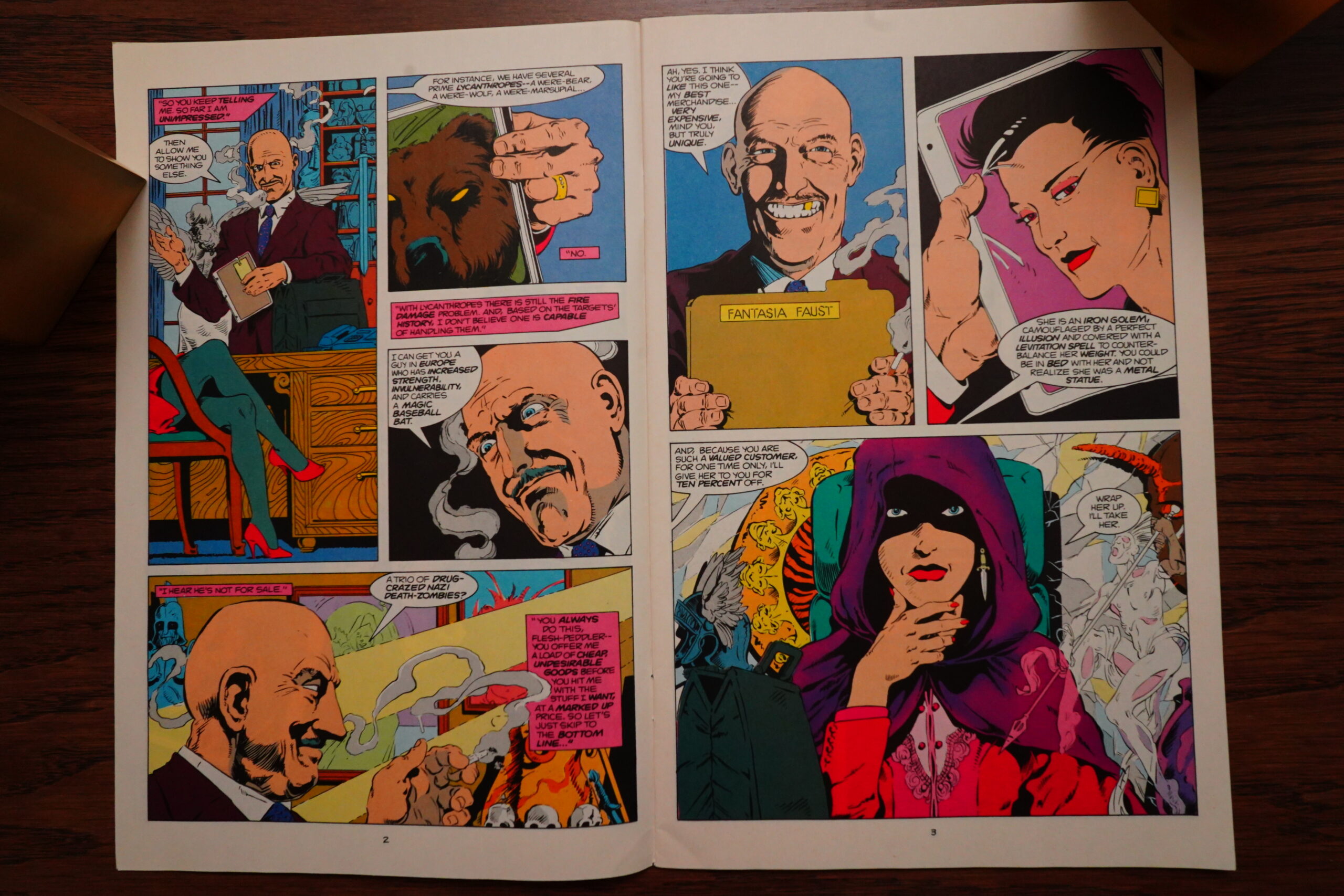
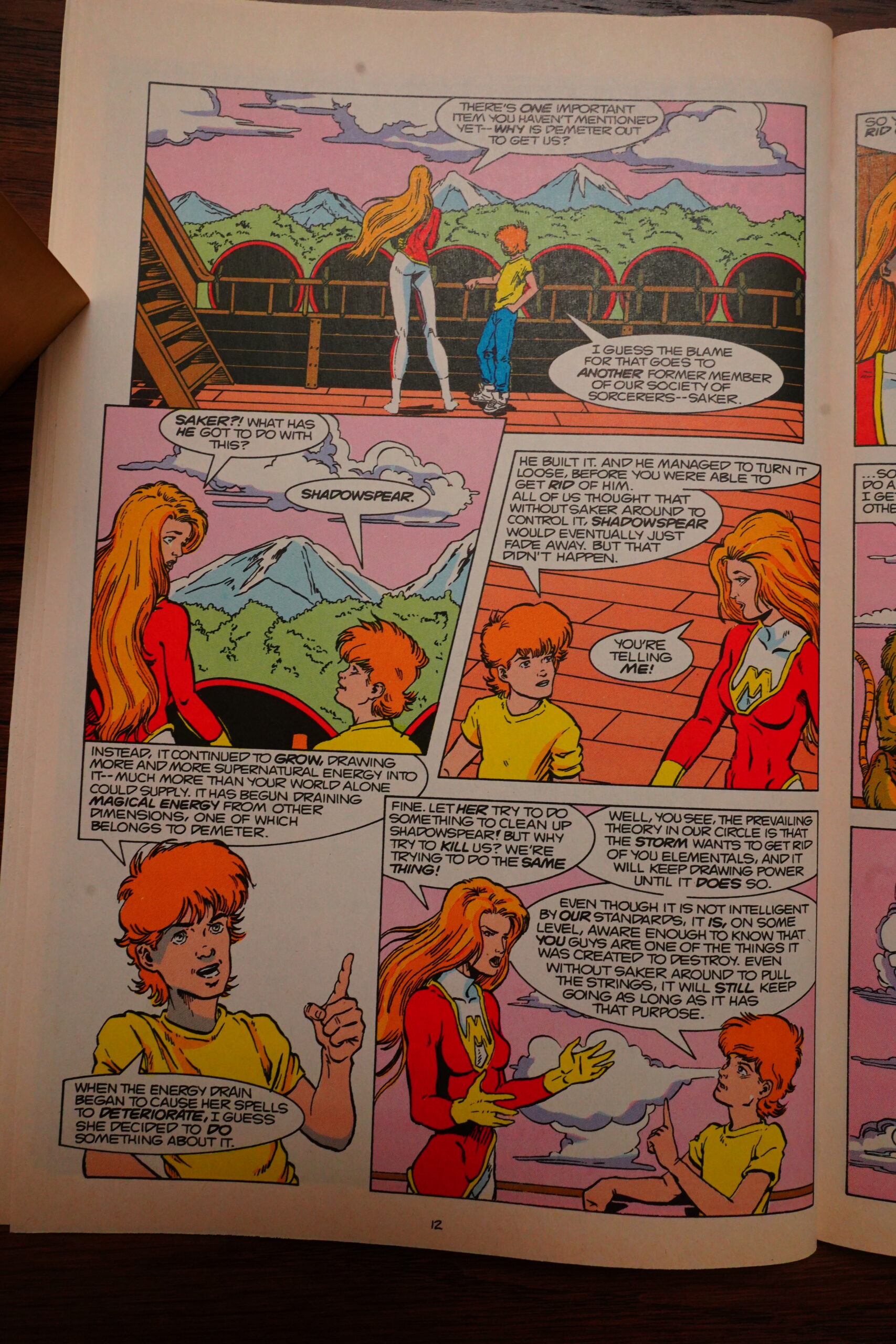
Oh, right… there was also a magic-based conspiracy going on? The guy above is an ancient wizard or something.

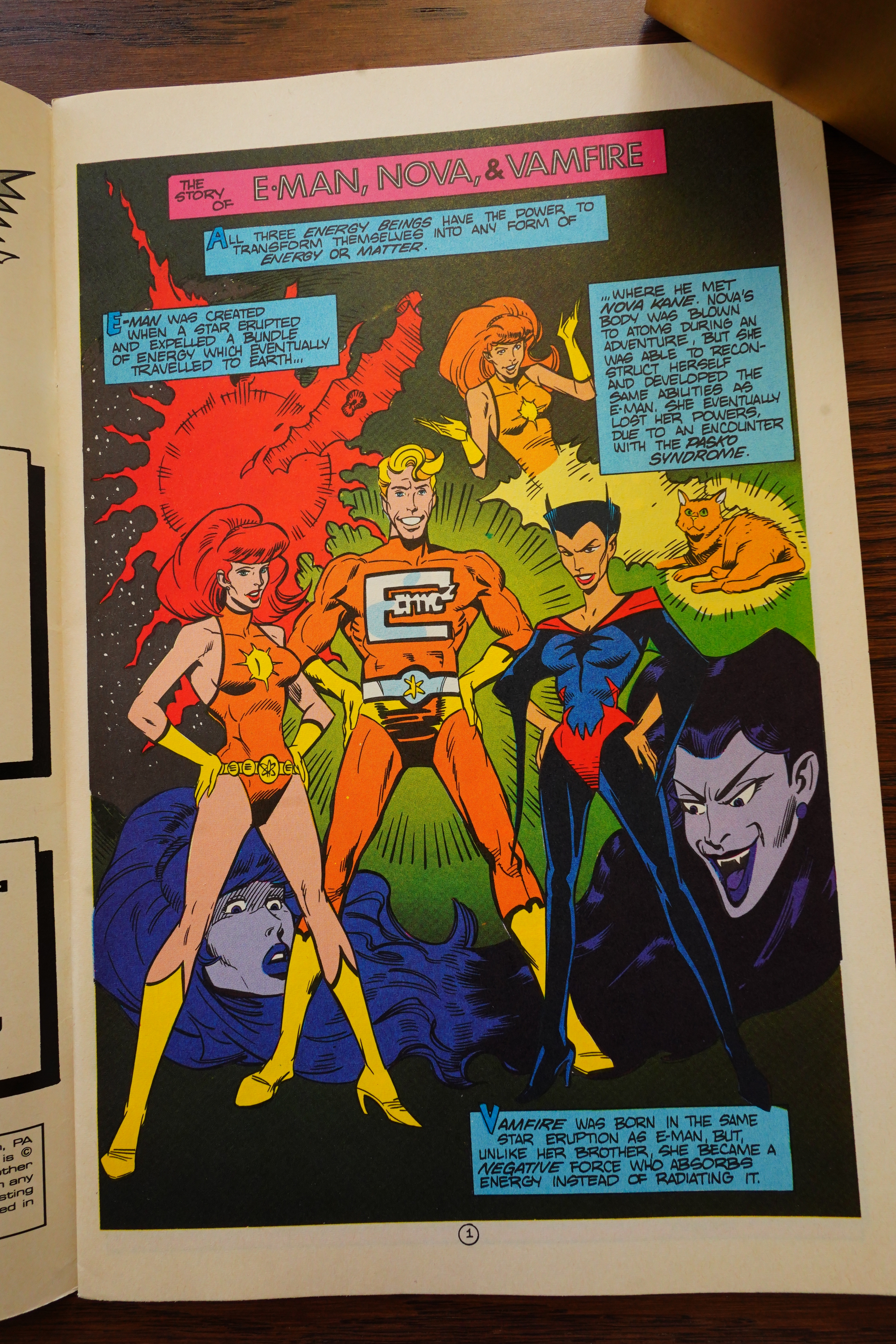
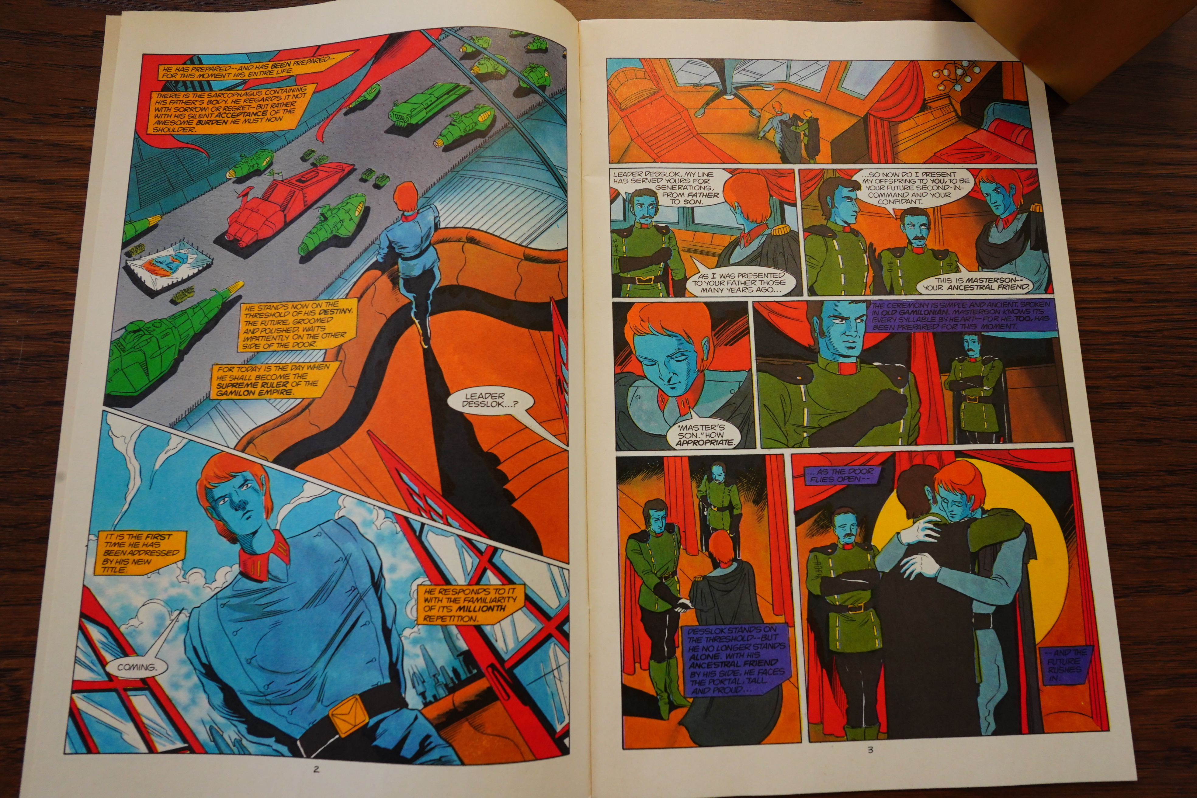
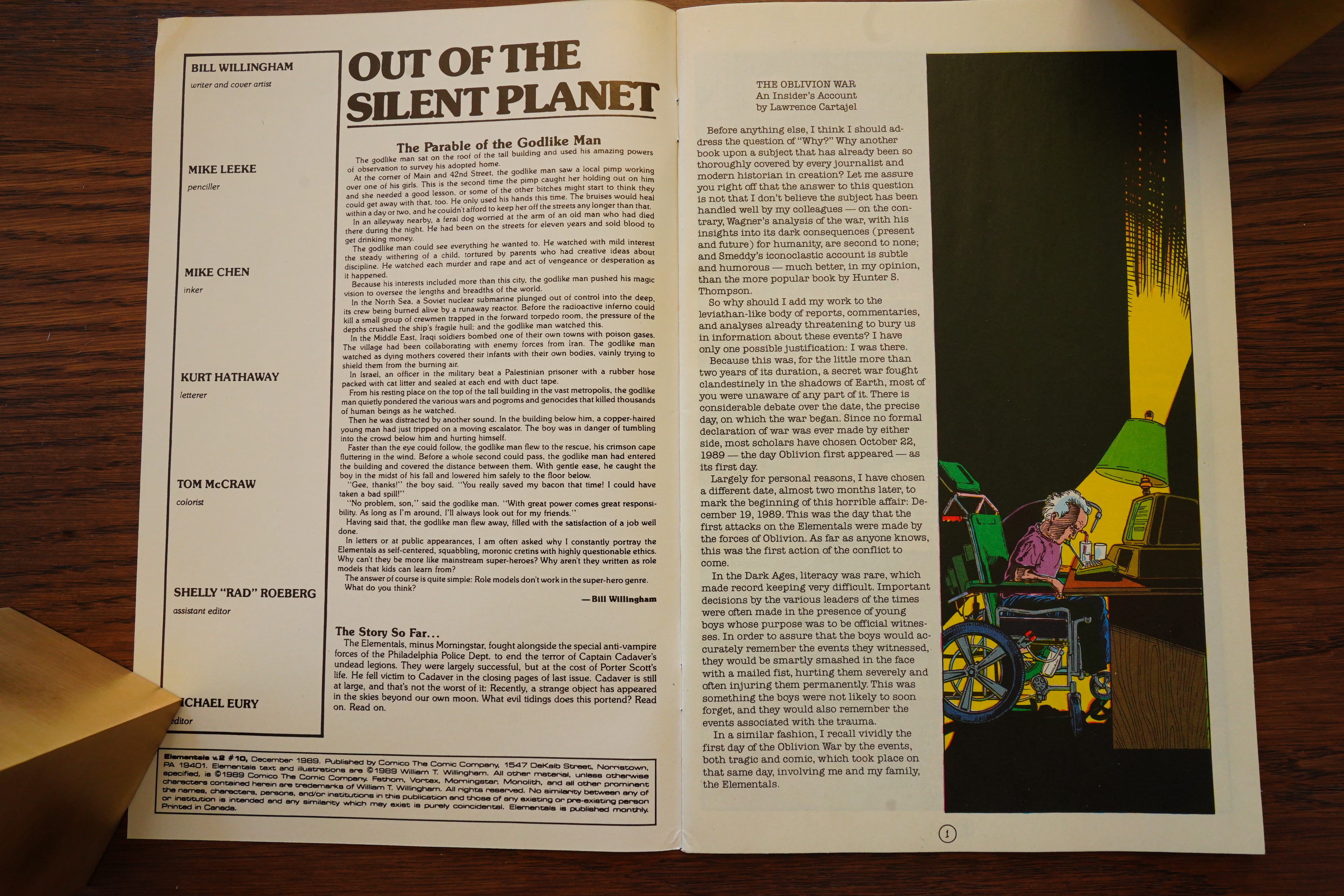
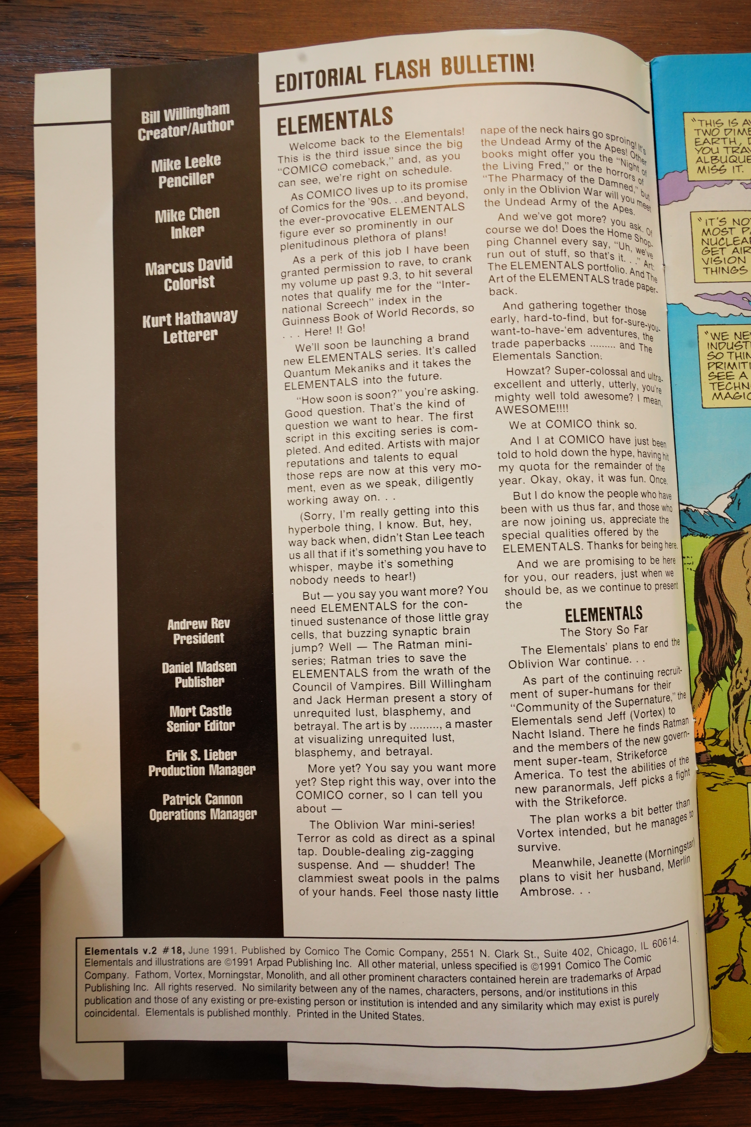
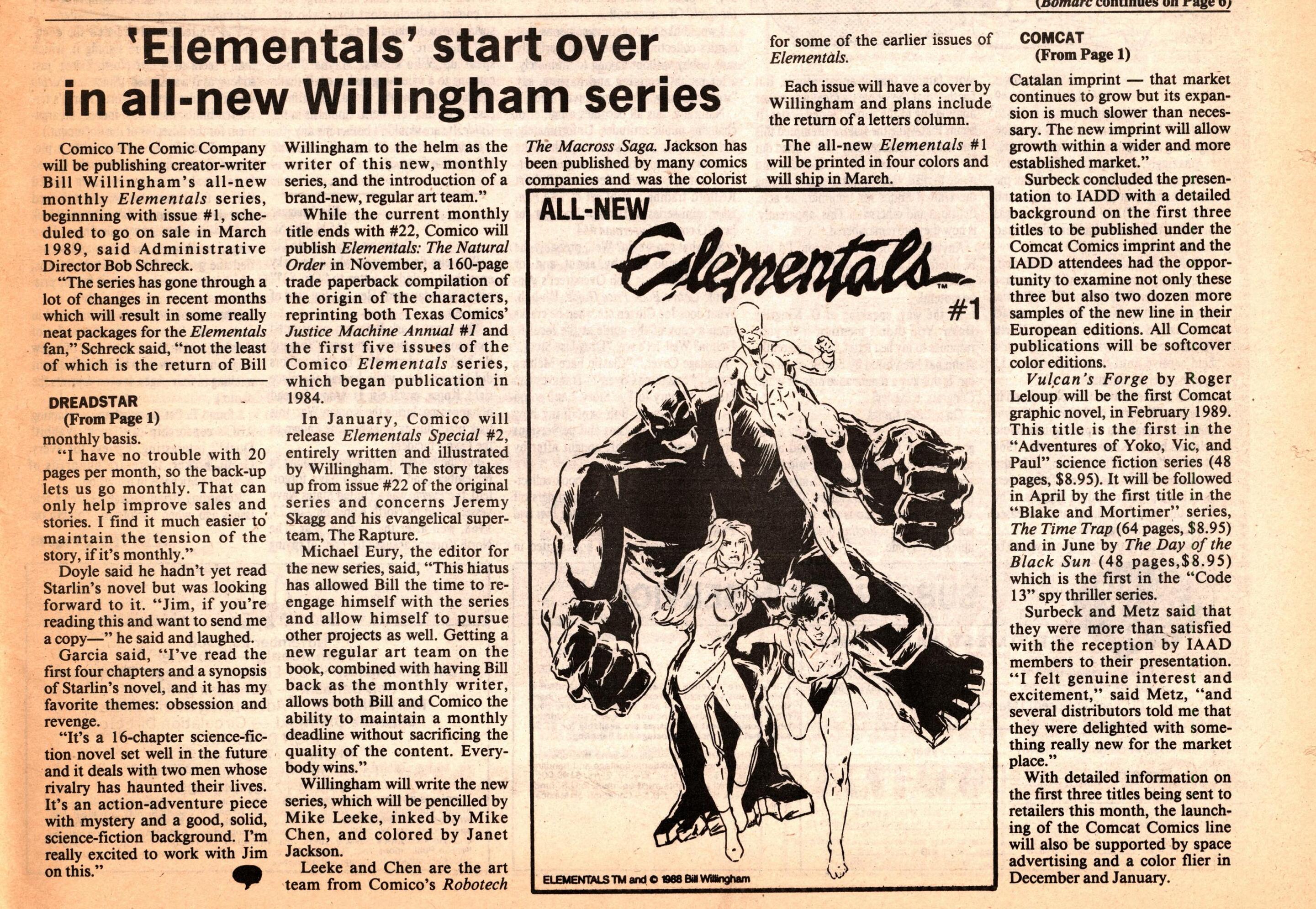
Which brings us to Elementals v2 #1. The regular art team is Mike Leeke and Mike Chen, with Willingham doing the covers and writing. Or… is that what “script” means here? In the original Elementals run, Willingham was often credited with “plot” while a different guy was credited with “script”, which in that context meant “write the dialogue”. But I guess now it means “writer”? Why not just say “writer”?
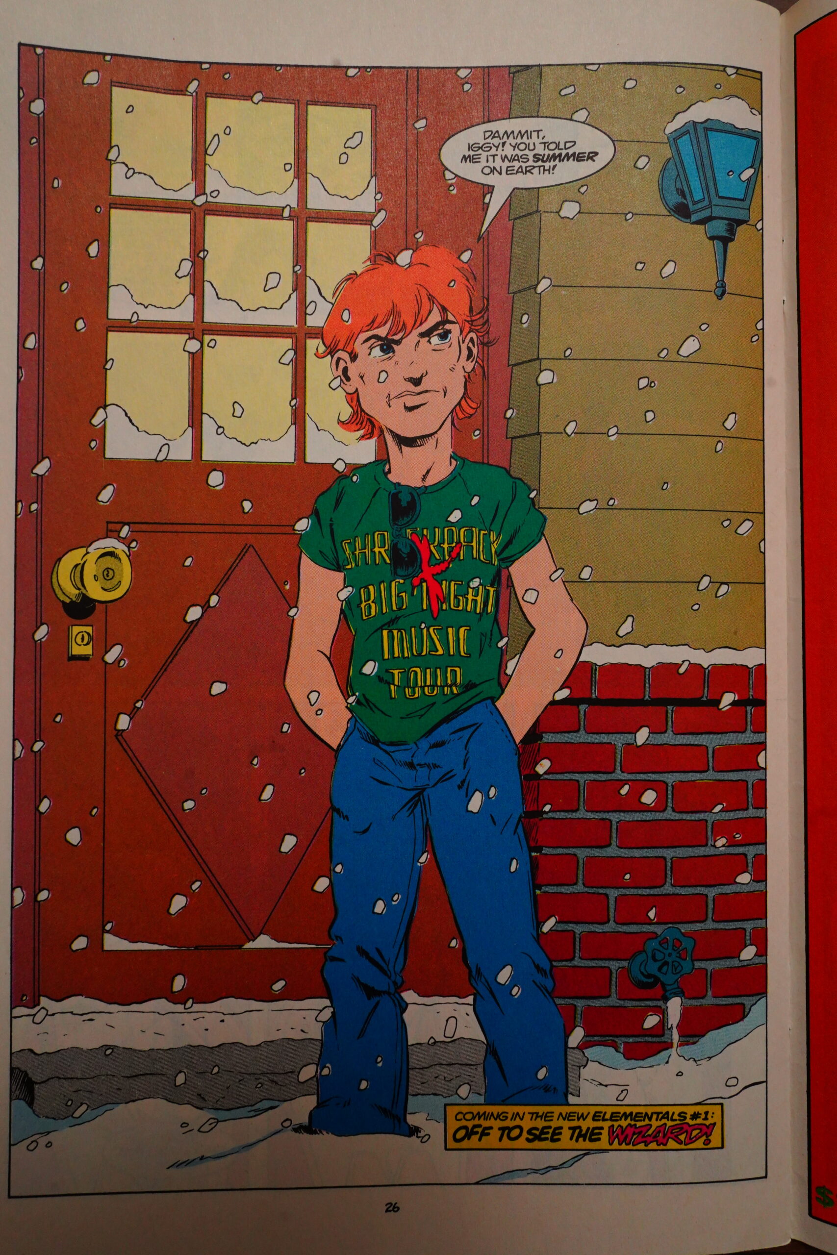
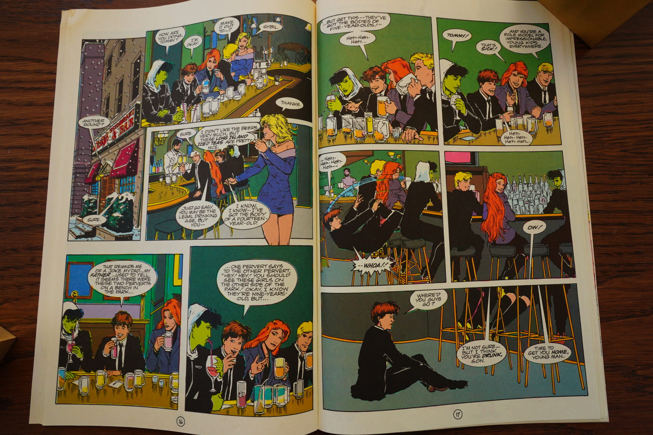
Anyway, Willingham is being all edgy again!
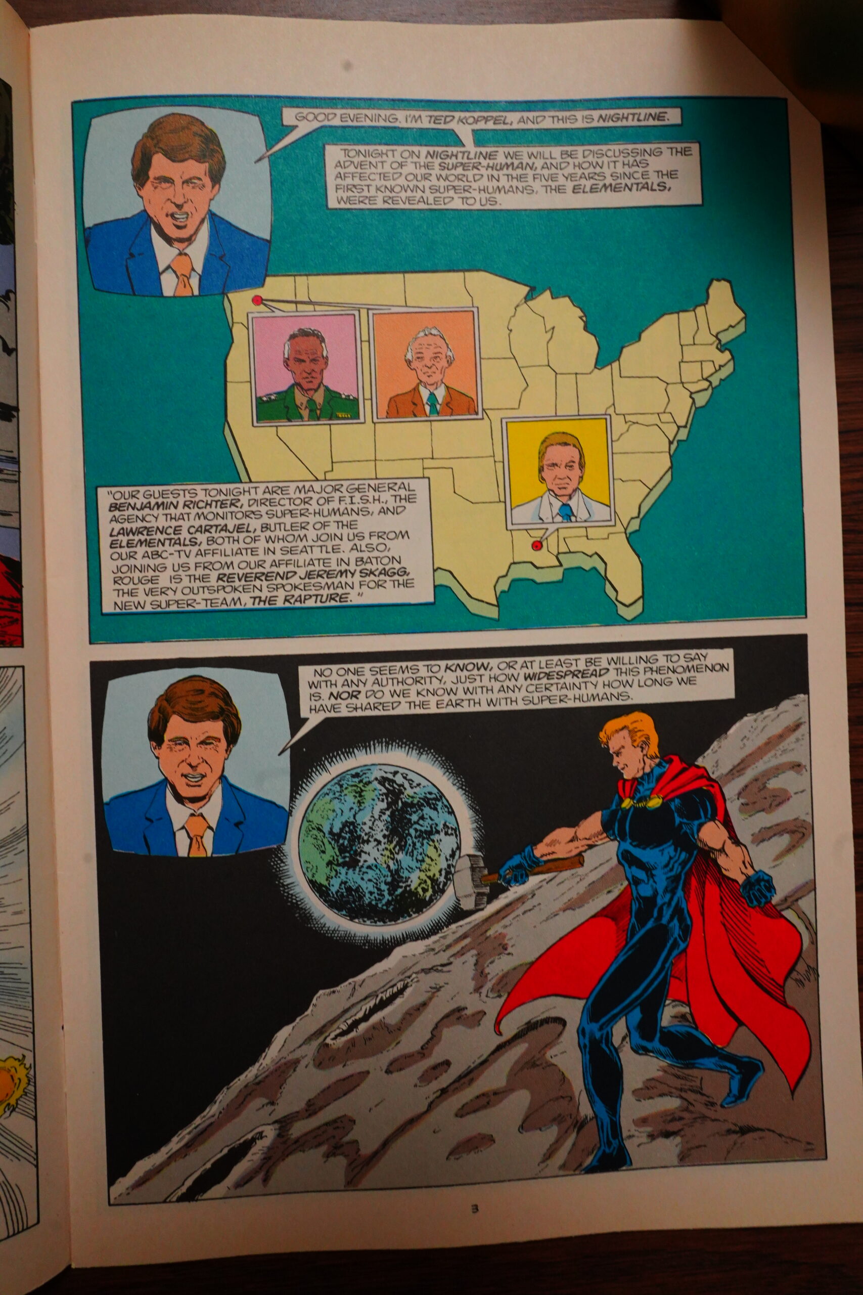
Willingham reintroduces the characters to the readers through a newscast, which makes sense — Elementals had been gone a couple years (I think?), and this is quite an efficient way to do that.
Yeah, it’s a Willingham book for sure.
Edgy!
OK, I assumed that Willingham was done with infodumping after the TV show, but I guess there was more to get through…
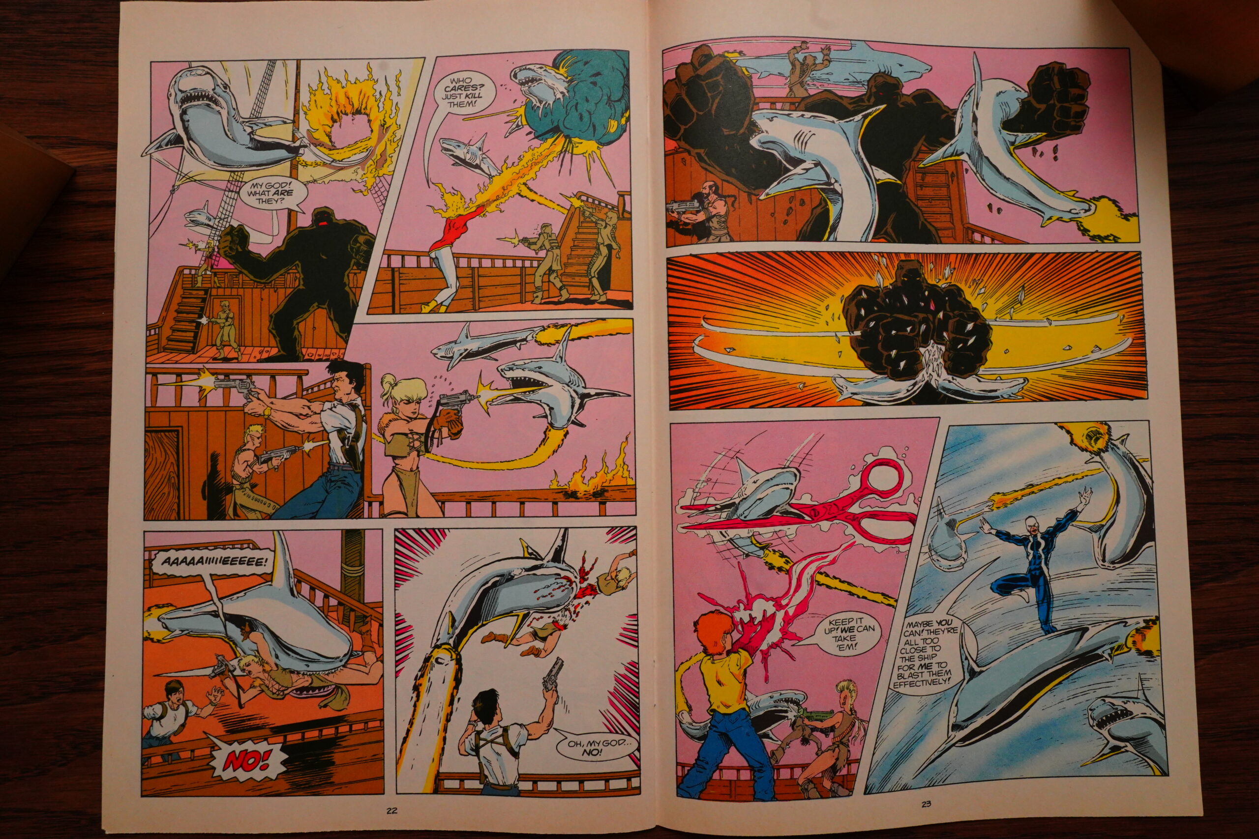
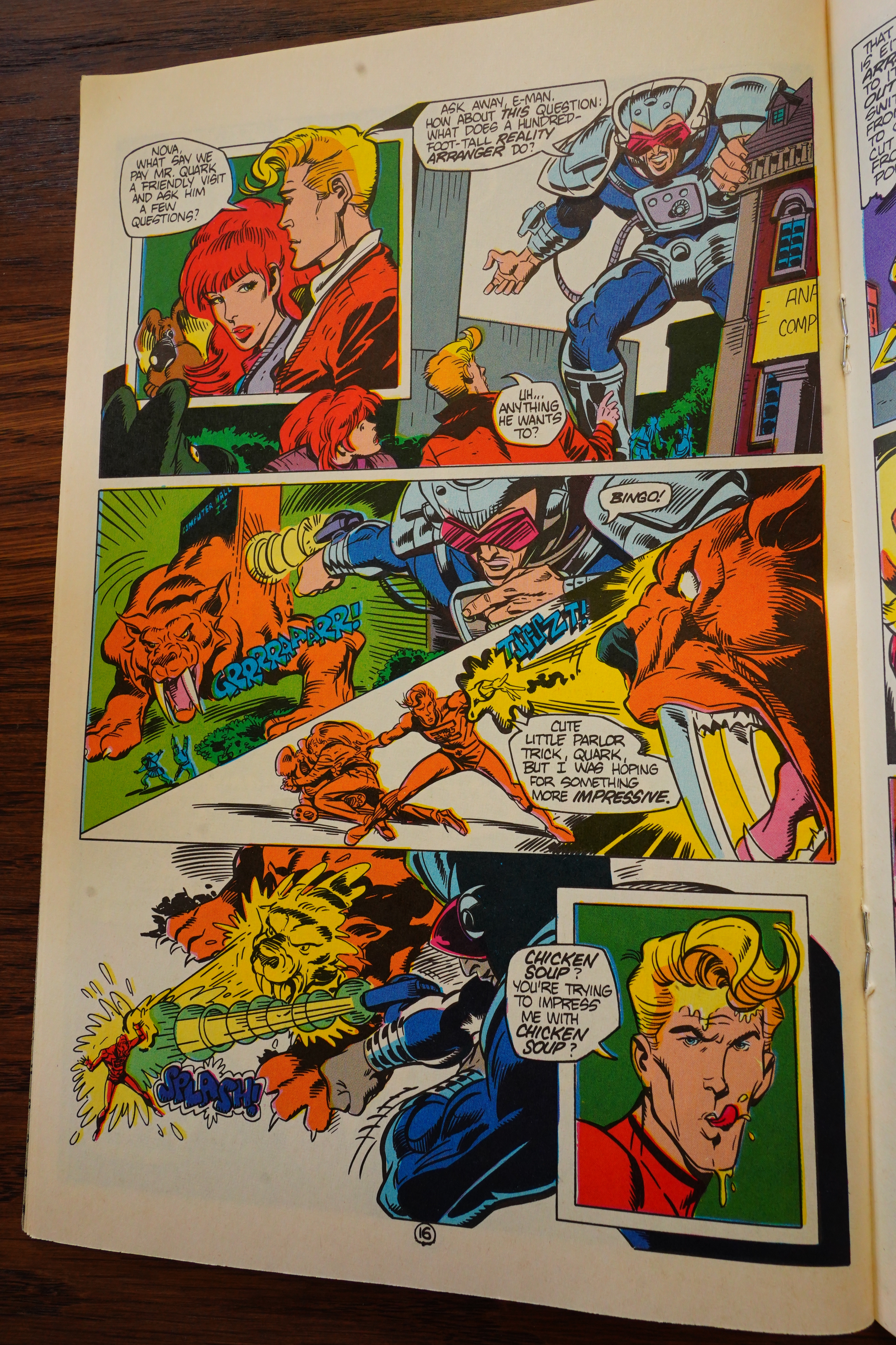
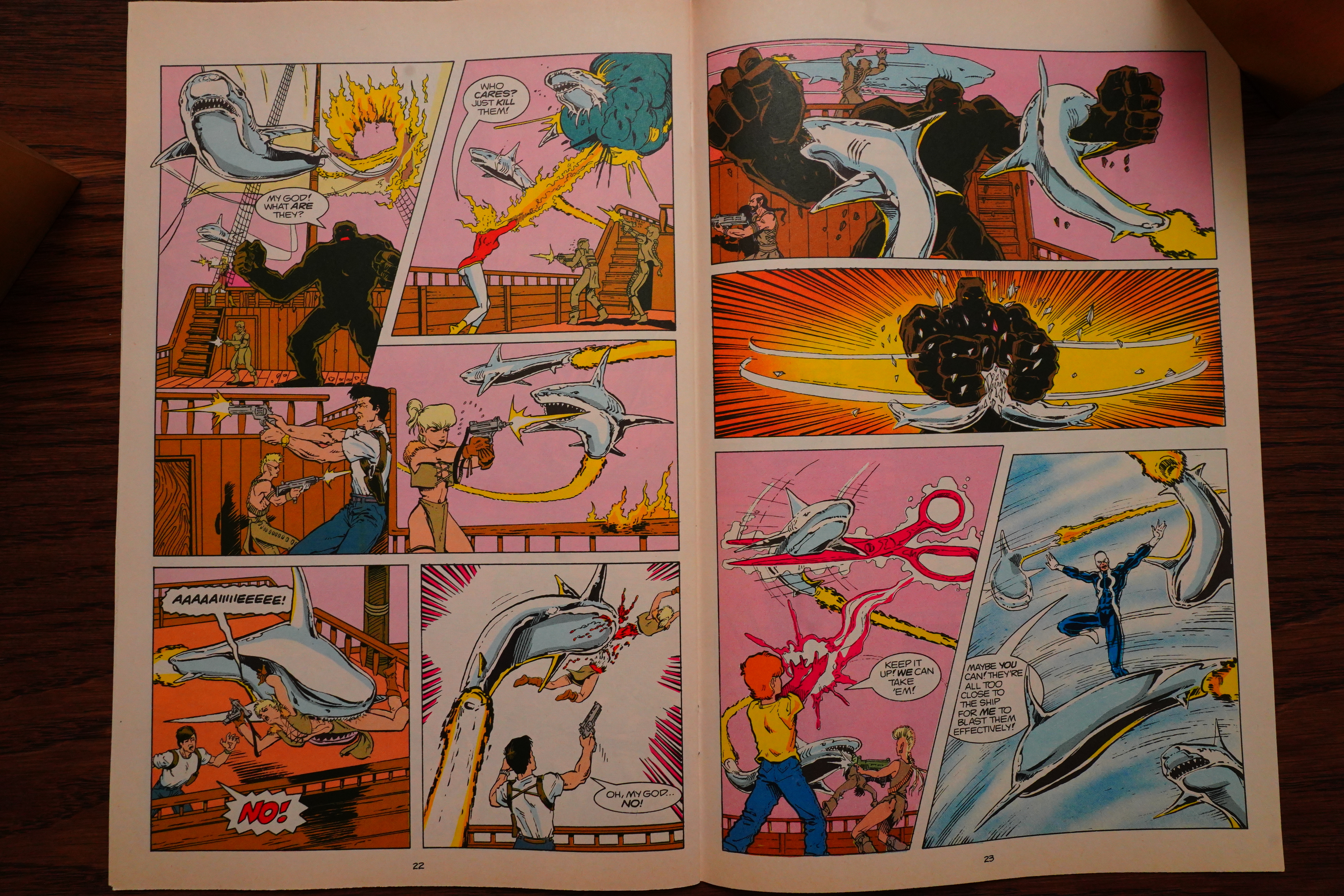
Whoa! Flying metal jet-propelled magic sharks! Neat.
The editor acknowledges the many, many loose plot strands, but assures us that we’ll get resolutions.
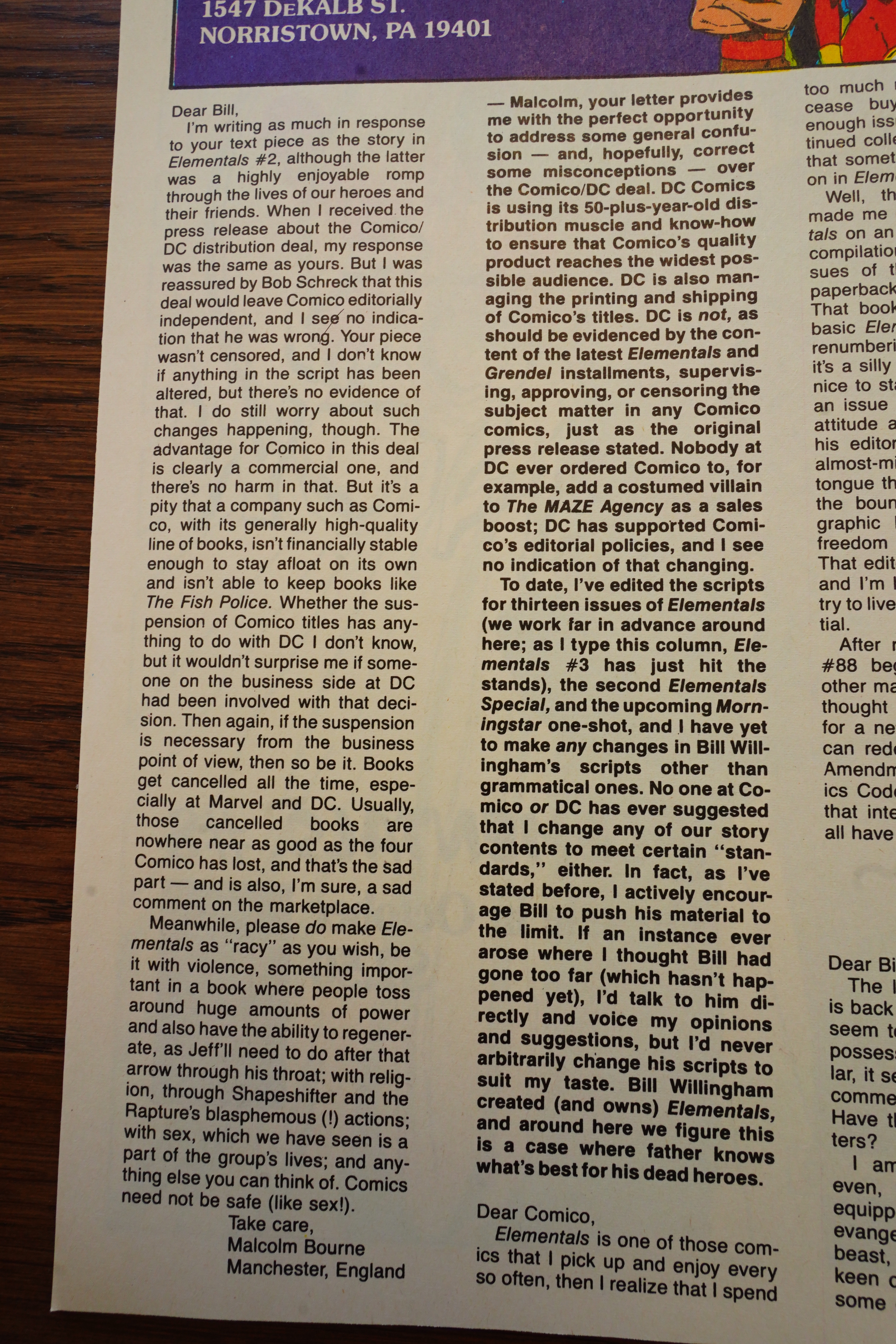
“Written early last February”… In 1988?! Or Feb 1989? Anyway, Willingham is really sceptical that DC will allow him to be all edgy and stuff. (DC had, at this point, taken over “distribution” of Comico books. Which, as far as I’m able to tell (because people are never on the up and up about these “business secrets”) means that DC paid for printing, and then collected money from the distributors and then paid Comico. The reason for these shenanigans is that Comico didn’t have money to pay the printers themselves, and had by this point, stiffed several of them, so presumably printers just refused to do business with them. So what’s in it for DC? Well, they get more volume in the direct market, and there was speculation that somebody at DC just had a KPI depending on volume… But I don’t think anybody (who was on the inside) has actually explained what this was all about.)
(Of course, Willingham would go to work for DC directly later, and would create the successful Fables series for them.)

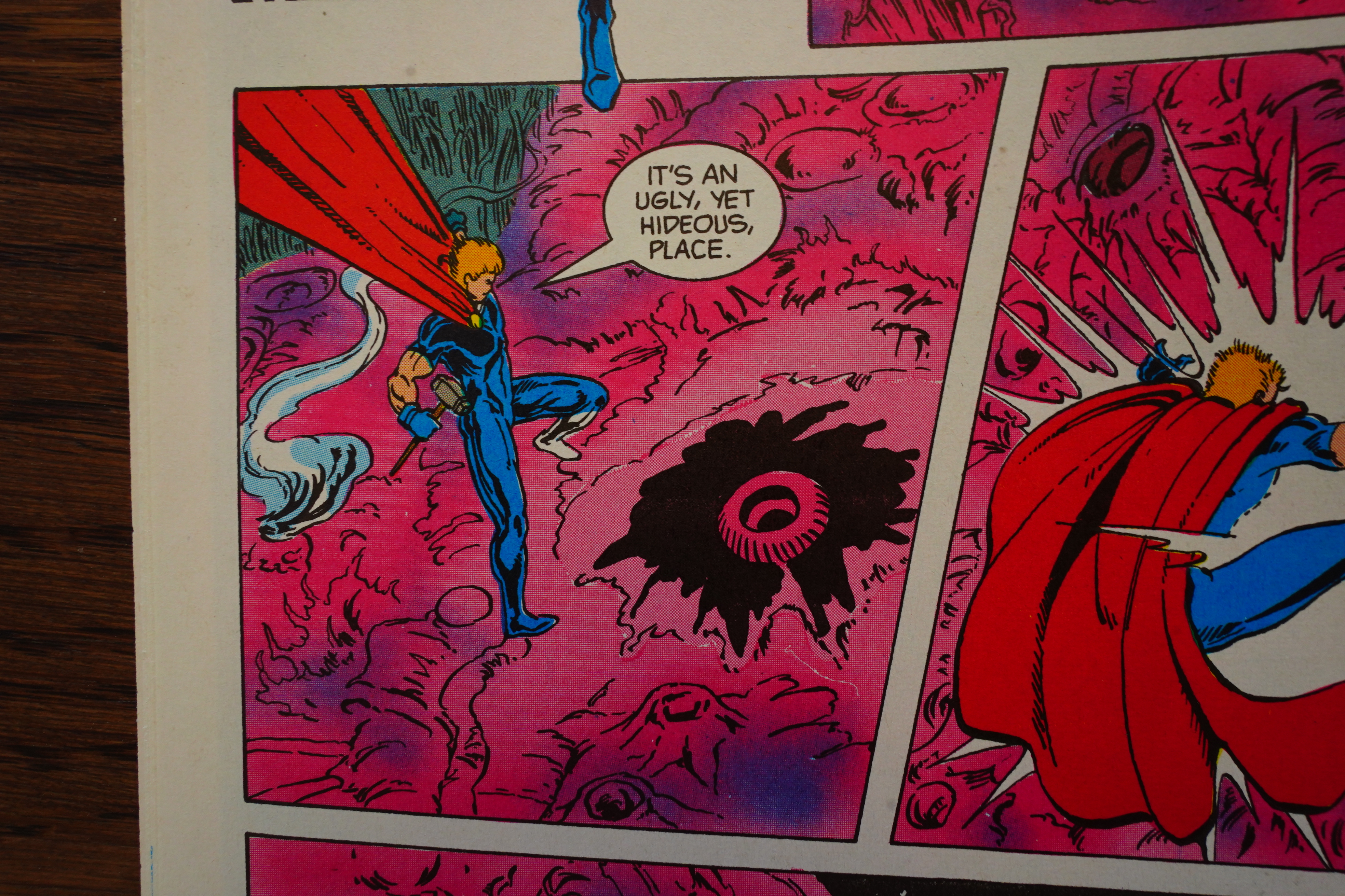
Speaking of Fables — you can see that Willingham’s enthusiasm for incredible creatures like this is just way higher than his enthusiasm for super-heroes, right? (The Elementals have taken refuge in a fairy-tale land, sort of.)
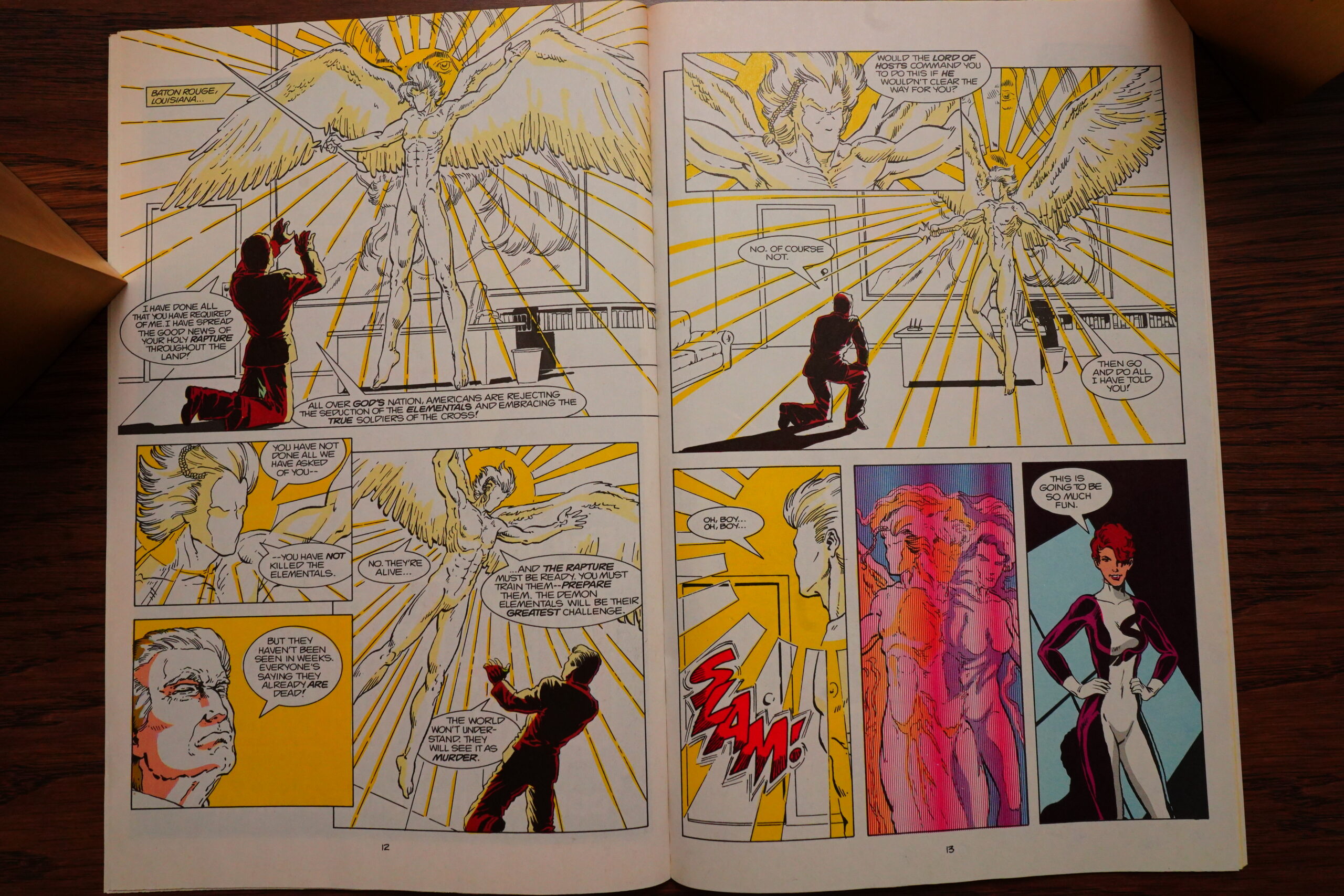
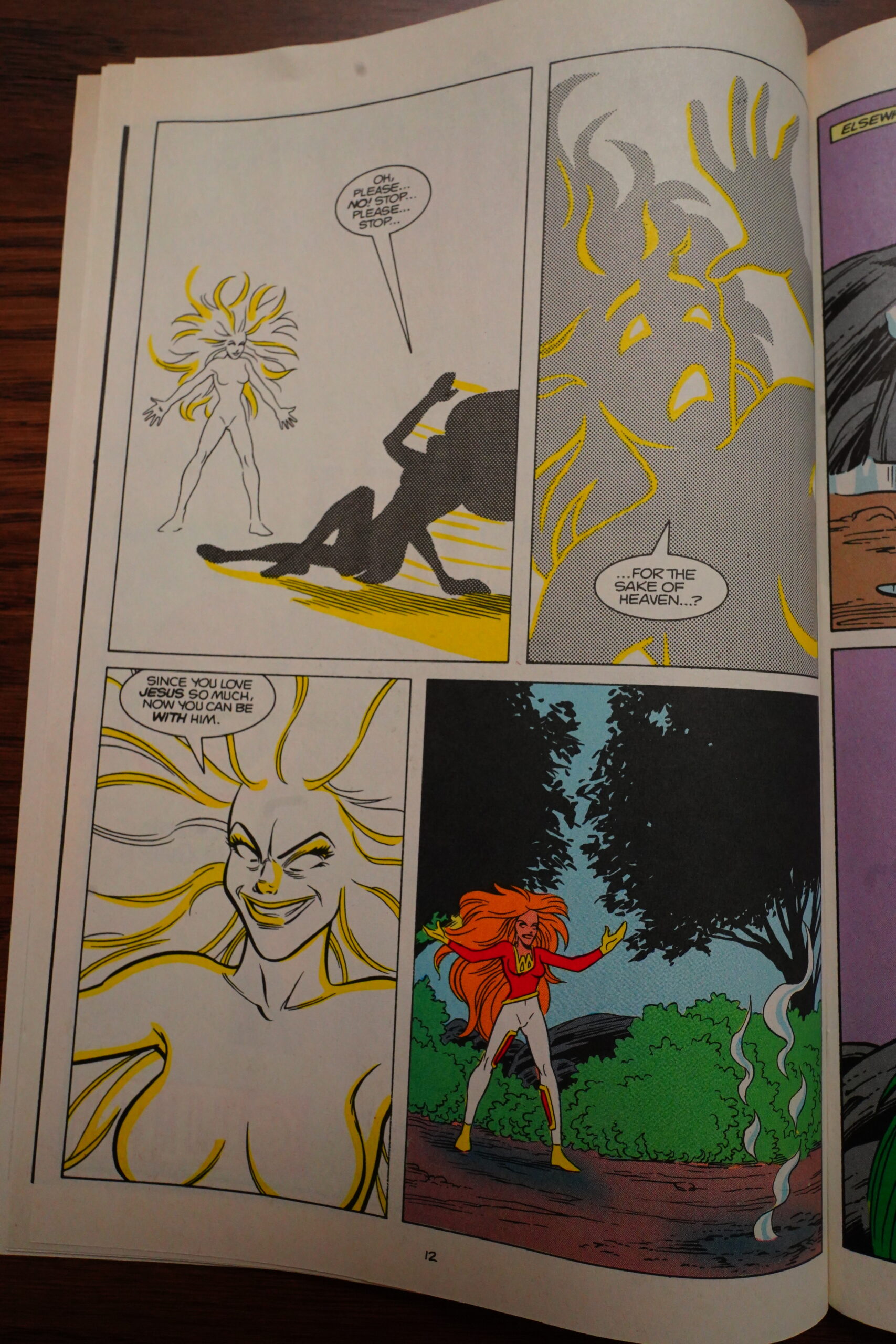
Back on the farm, we get this scene — Jimmy Swaggart did all those murders because an angel told him to… but the angel is revealed to be that shape-changer woman! It just feels a bit clunky, right? Why tell the reader immediately who’s behind all this? Preserving some storytelling tension here would have made sense, I think…

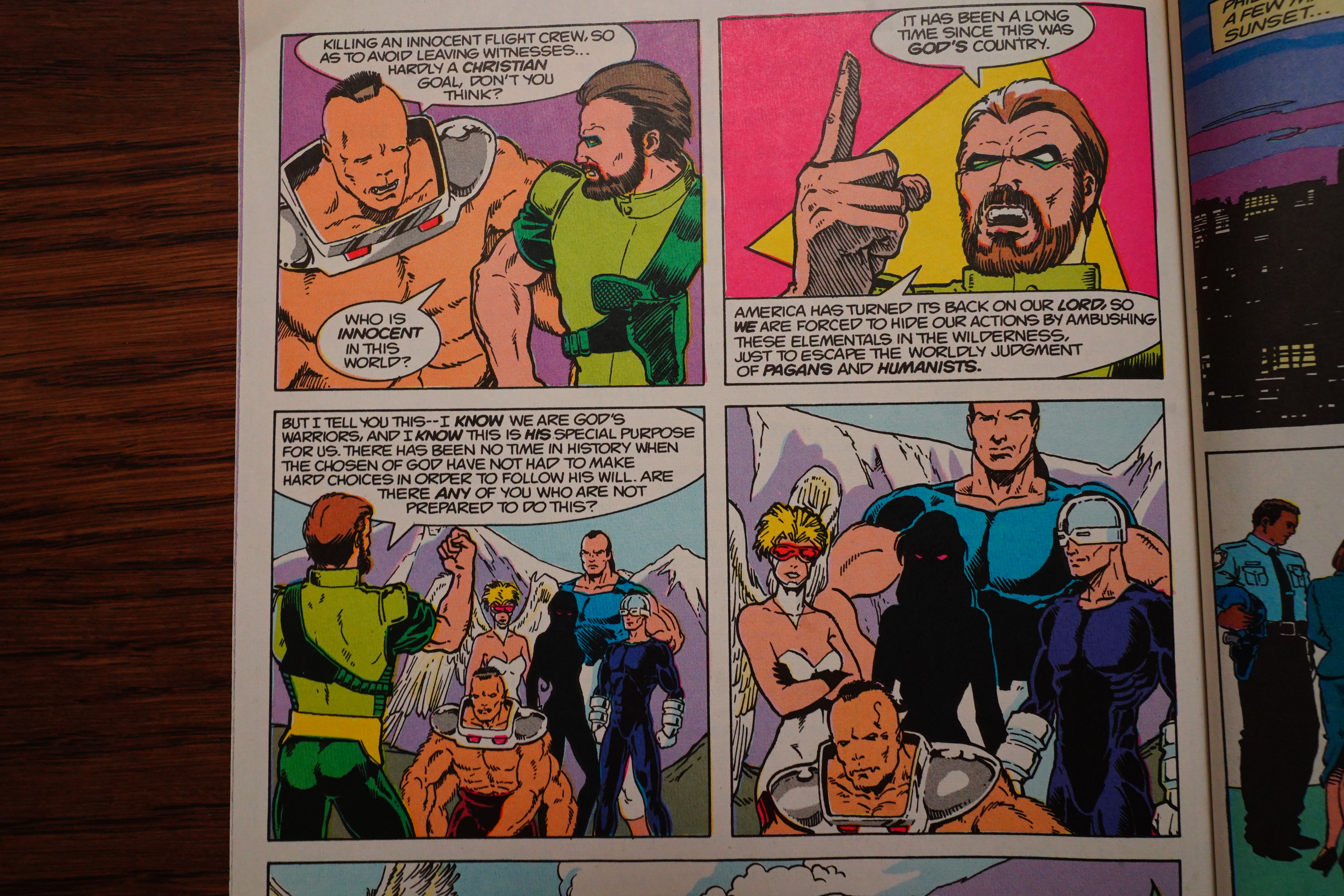
Swaggart’s team of fanatical Christian soldiers do some theology.
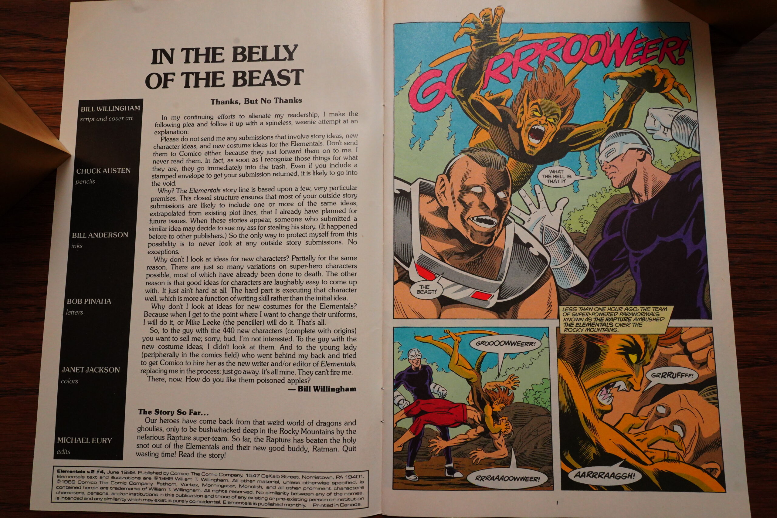
Chuck Austen does the art on a fill-in issue… but that editorial is a bit risible. Tough guy talk like that comes off a bit silly in an Elementals editorial.
And how dare somebody write to Comico with an offer to write Elementals! How dare they! It’s not like Elementals had gone through other writers before! Except it had! Oh well! How dare they!
Chuck Austen’s artwork is very Chuck Austen-like — he doesn’t really make much of an effort to follow the model sheets, but that’s OK.
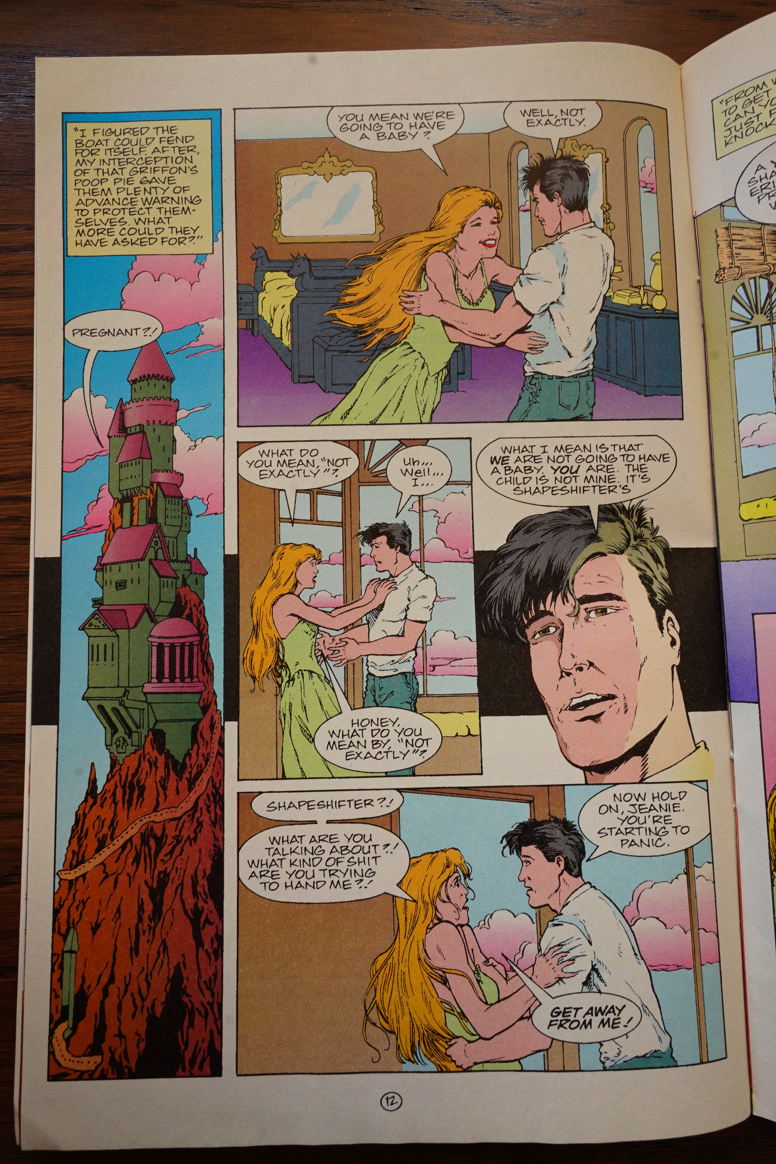
Willingham said he was going to be pushing the boundaries of tastelessness (or something) to test DC — so here he has his vampire character (he’s a total disgusting doofus; it’s ironic) kill a pregnant woman by eating her baby.
Didn’t work! DC still distributed it.
*sigh* Of course the shapechanger woman had to do a full “here’s why I tricked you, you moron” speech… Very clunky.
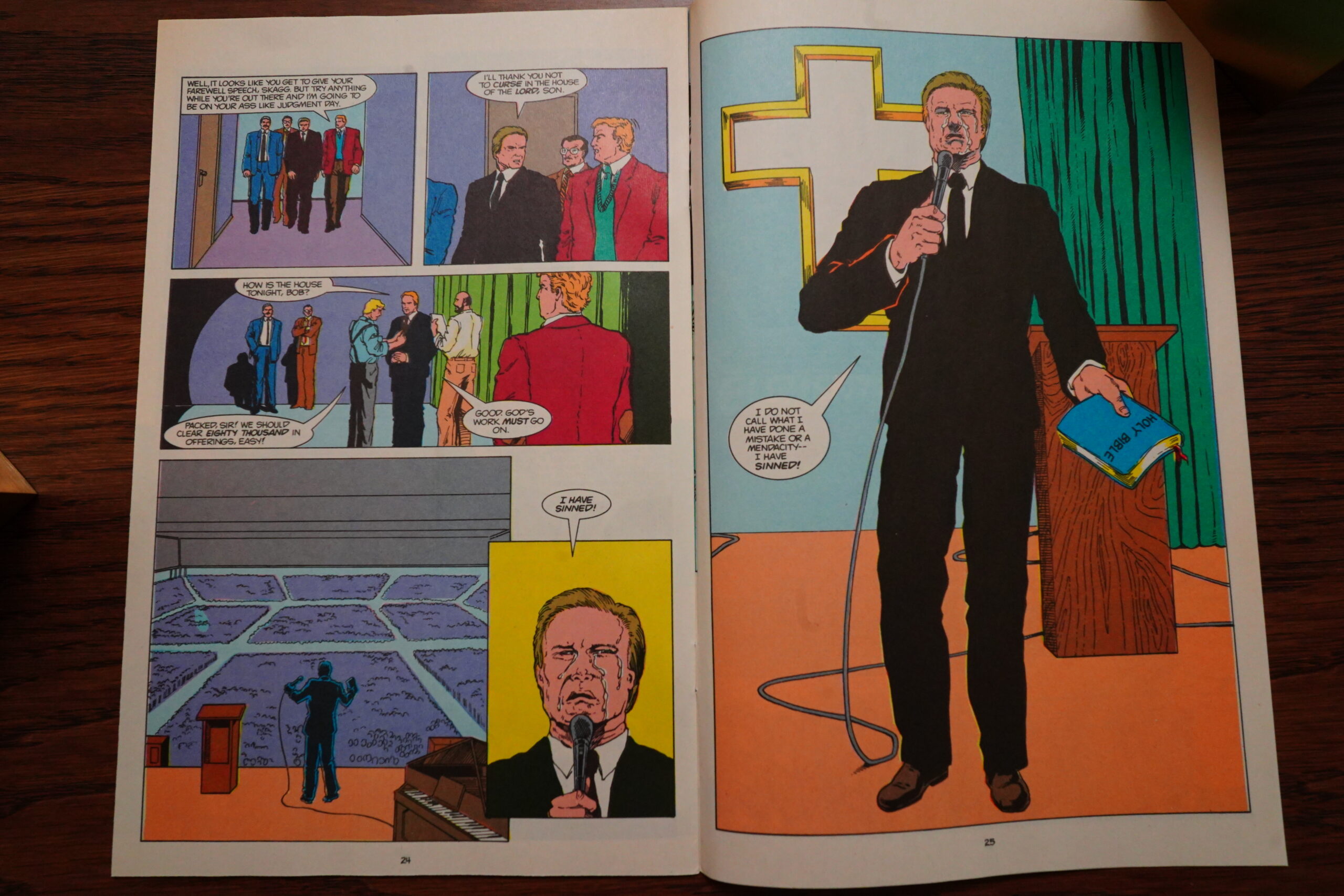
But you gotta like Willingham’s genuine disgust for Jimmy Swaggart.
Hm… I think what I’ve written here must come off like I didn’t like this run of Elementals so far? Sorry! I seem to have picked out pages to comment where I have something to nitpick?
Because the series is a hoot — it moves along quickly, is very inventive (especially with the fantastical animals and stuff), and it’s quite amusing. For the first time in Elementals’ history, the book actually works: It feels tightly plotted, and doesn’t just flail around aimlessly.
I’m shocked at how much I’m enjoying it so far, so let’s hope it keeps it up.
*sound effect signifying that two weeks have passed*
Hey, I got busy with other things, but I’m now continuing this blog post… I’ve forgotten most of what the series was about, so I apologise for this blog post possibly being even more disjointed than usual.
Willingham is so controversial!
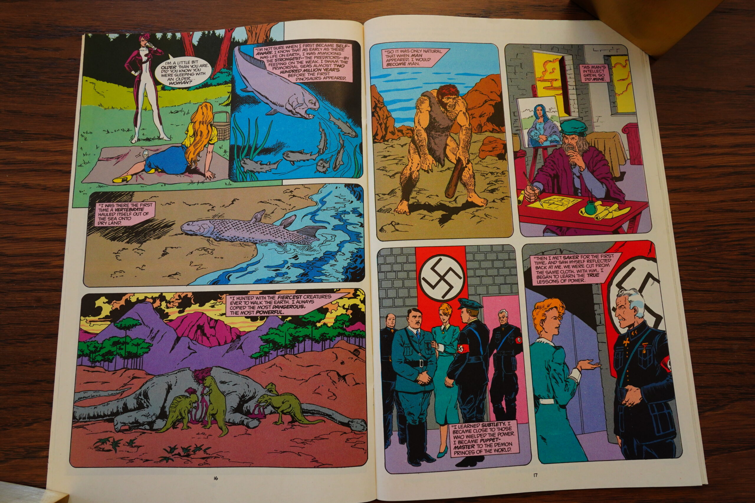
It turns out that Morningstar’s long-time boyfriend was actually a shapeshifter (one of their enemies), and that she’s been around for millions of years.
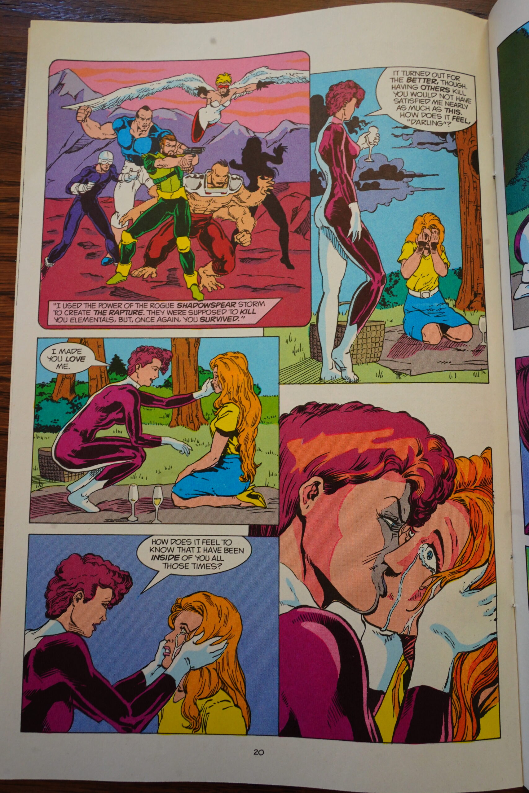
So I guess you could say that this is a long term plot that’s paying off… although… It’s like “wat”. Like, what’s the point? The shapeshifter apparently orchestrated this just so that Morningstar would get so depressed and traumatised that she’d kill herself, which… I mean, if you’re millions of years old, you have to find ways to keep yourself entertained, but…

I think this is supposed to be a joke? I.e., Thor is a moron, so he says stupid things.
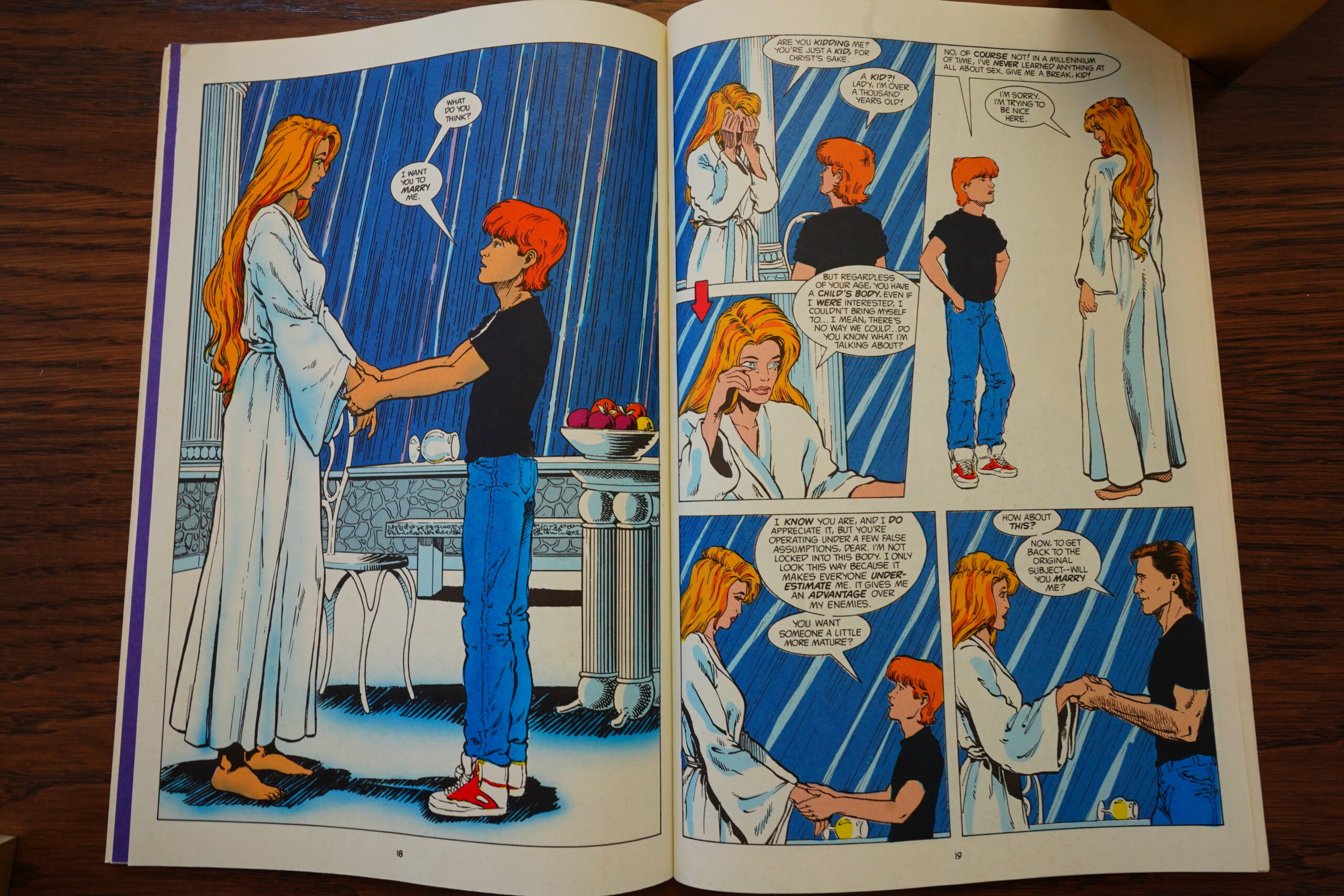
Morningstar bounces back from her shapeshifter boy/girlfriend by … marrying a boy/man shapeshifter instead (the next day). How’s that for versatility?
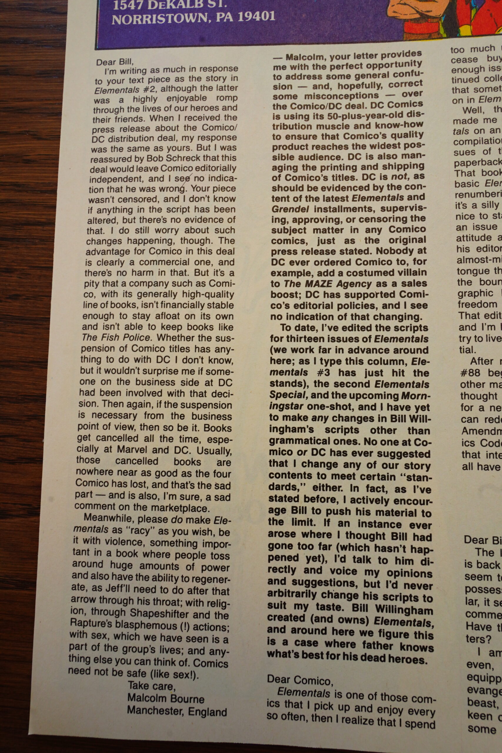
Finally somebody comes clean (sort of) on the DC “distribution” thing — DC is “managing” the printing, which I guess means “is paying the printers because no printers are willing to take a chance on Comico any more”.
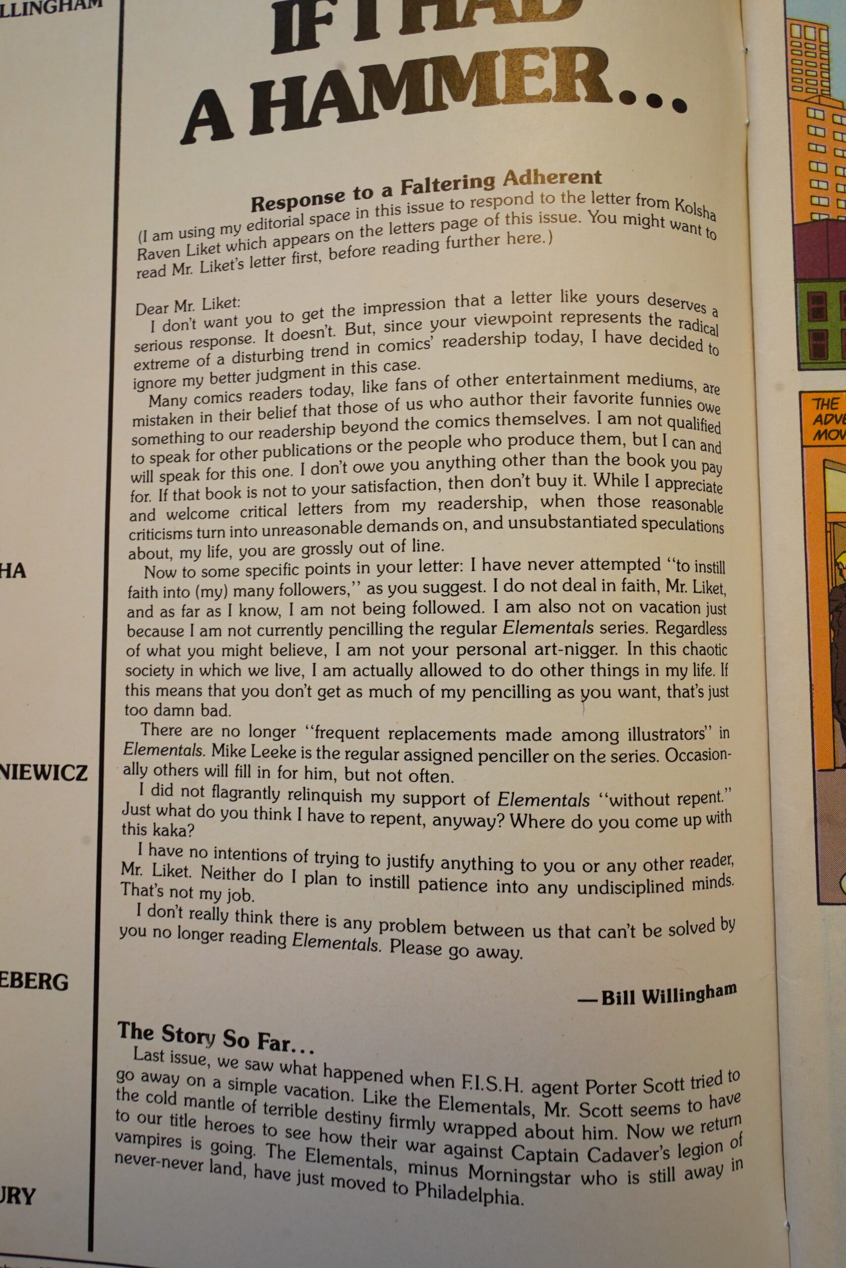
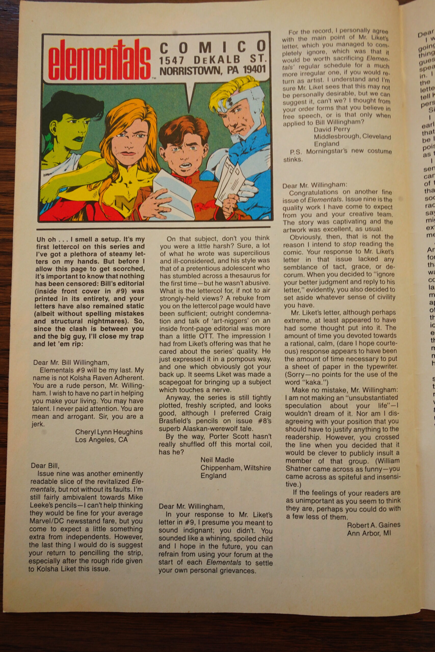
Willingham writes a thoughtful response to a letter writer who wanted Willingham to do more artwork. I mean, he throws a childish temper tantrum. He’s always so controversial:
So what was the heinous letter this is in proportional response to?

Yup, thought so.
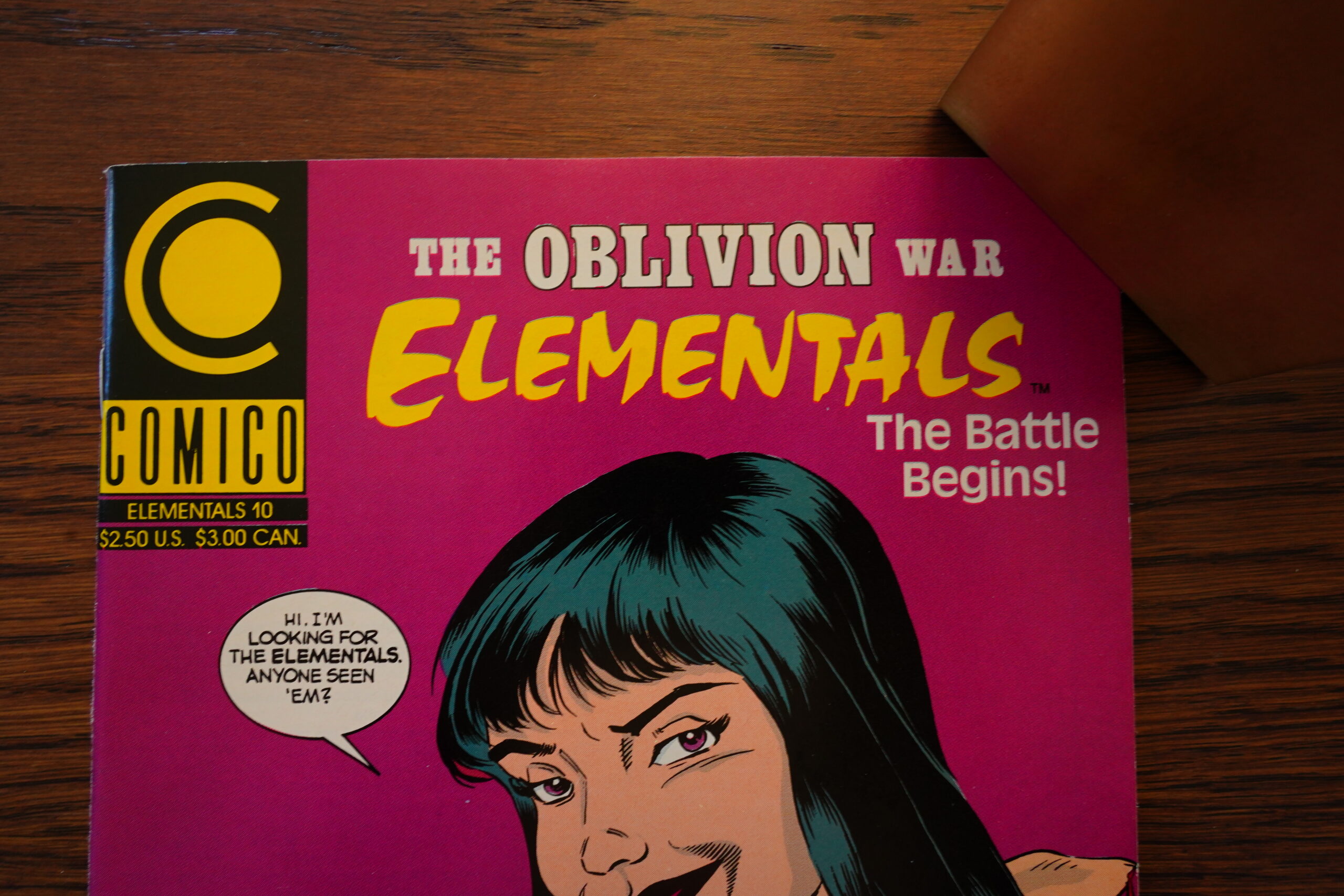
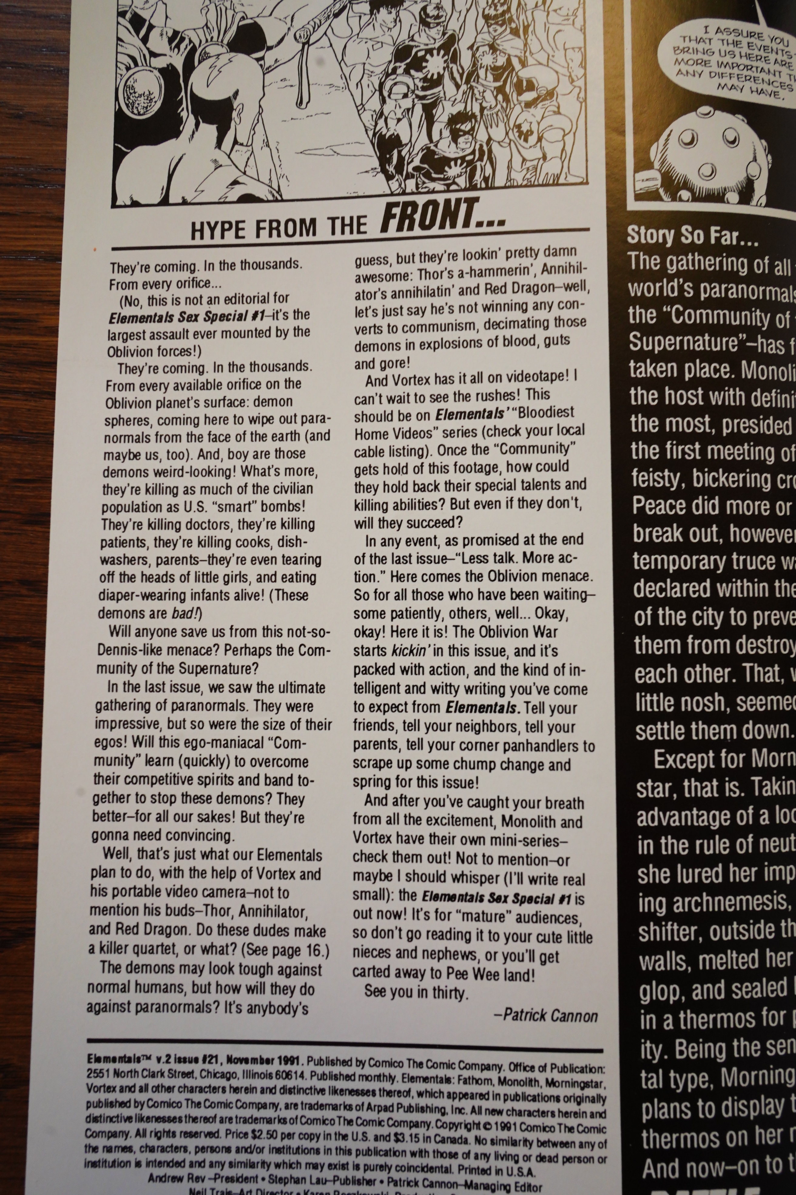
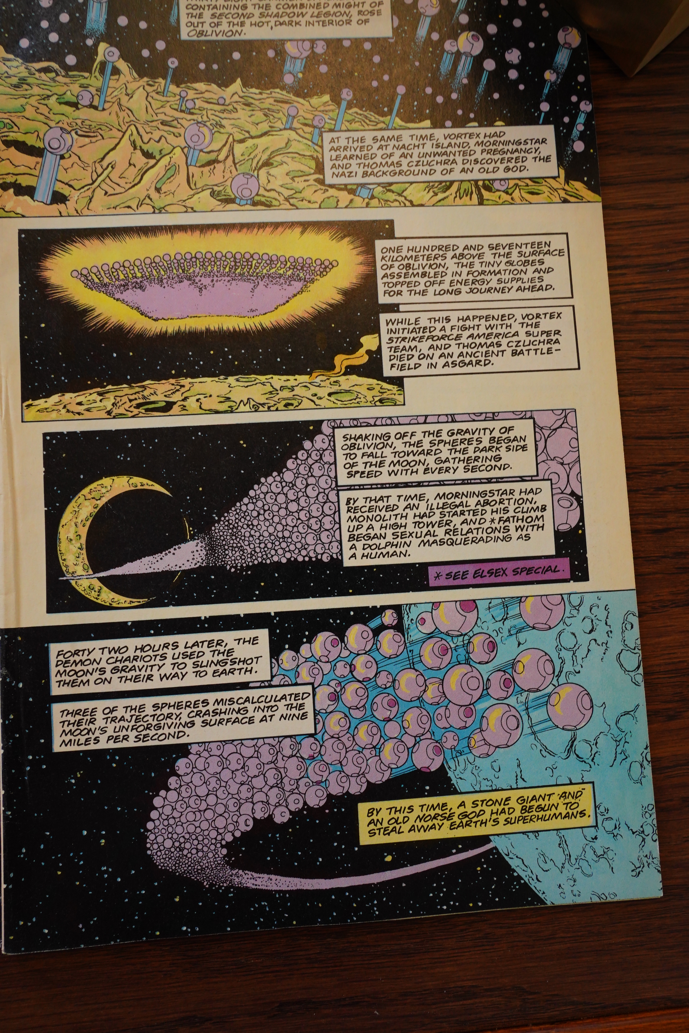
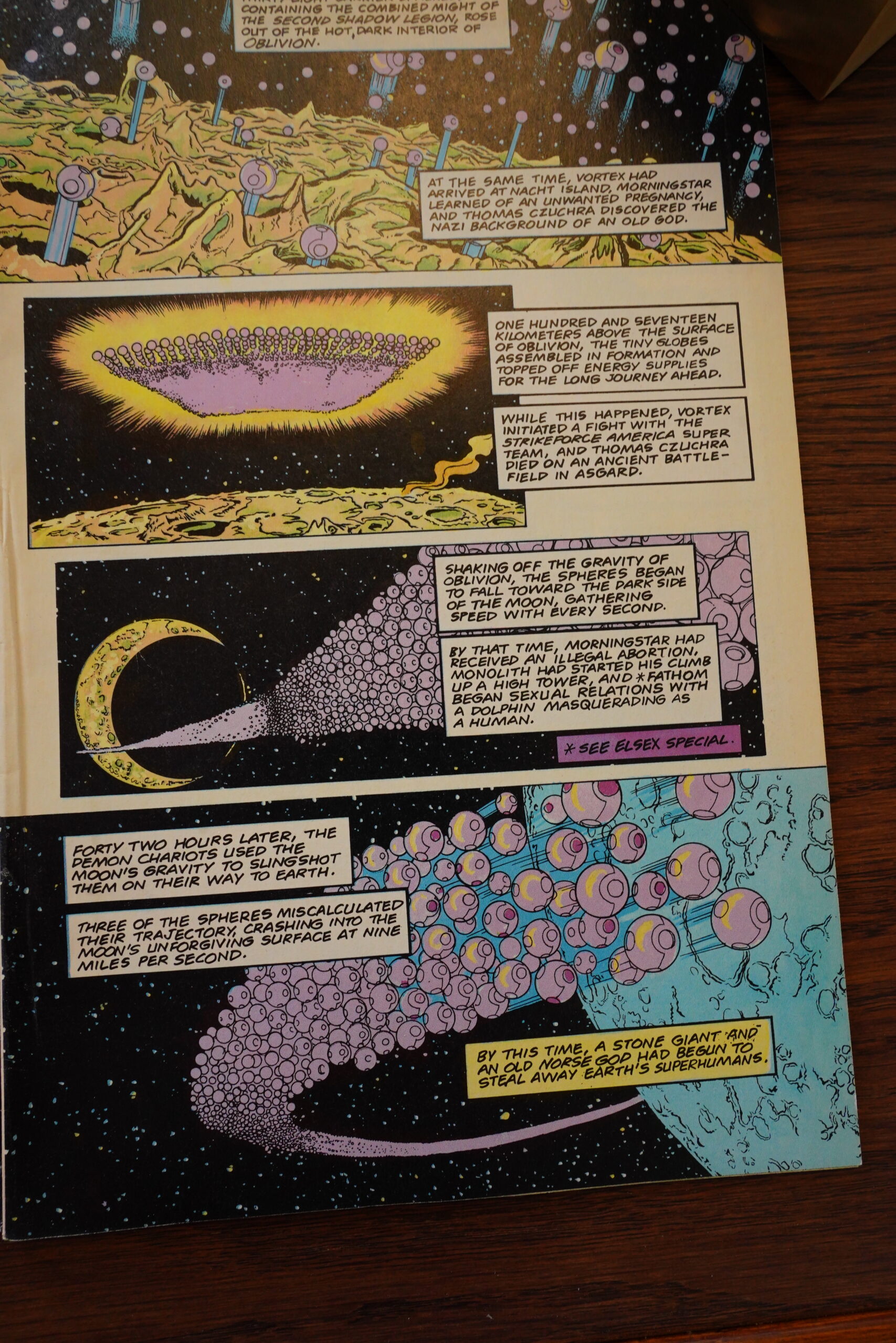
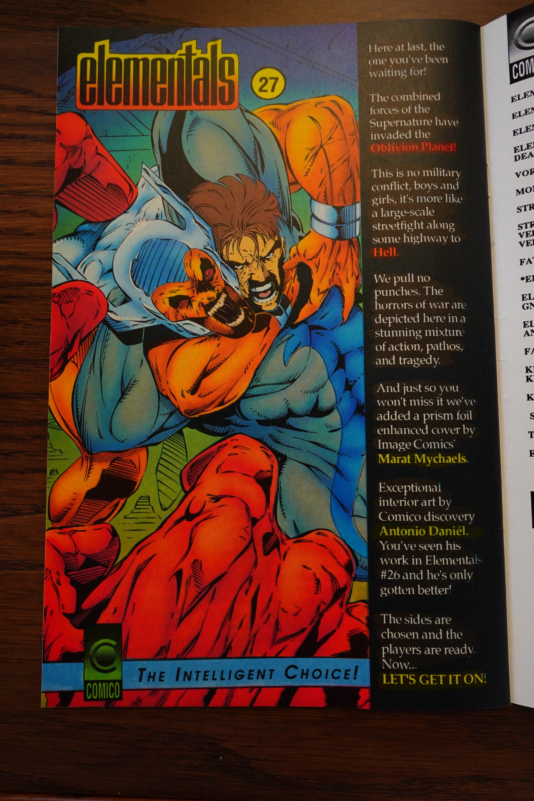
With #10, the Oblivion War starts! Exciting!
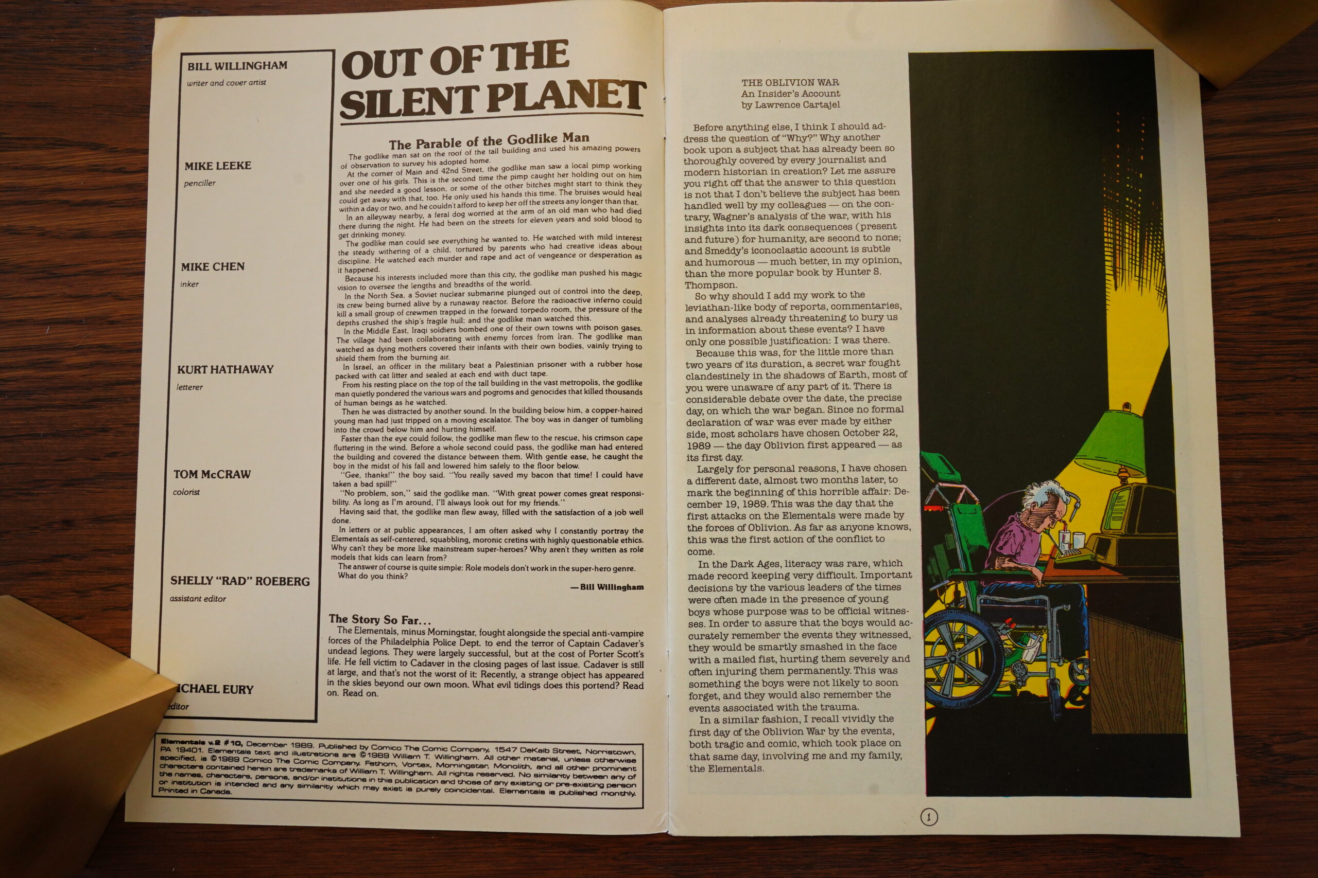
There’s a ponderous introduction and everything. I’m sure Willingham will be able to follow up this premise completely, and not just drop the storyline when he grows tired of it after a couple months!
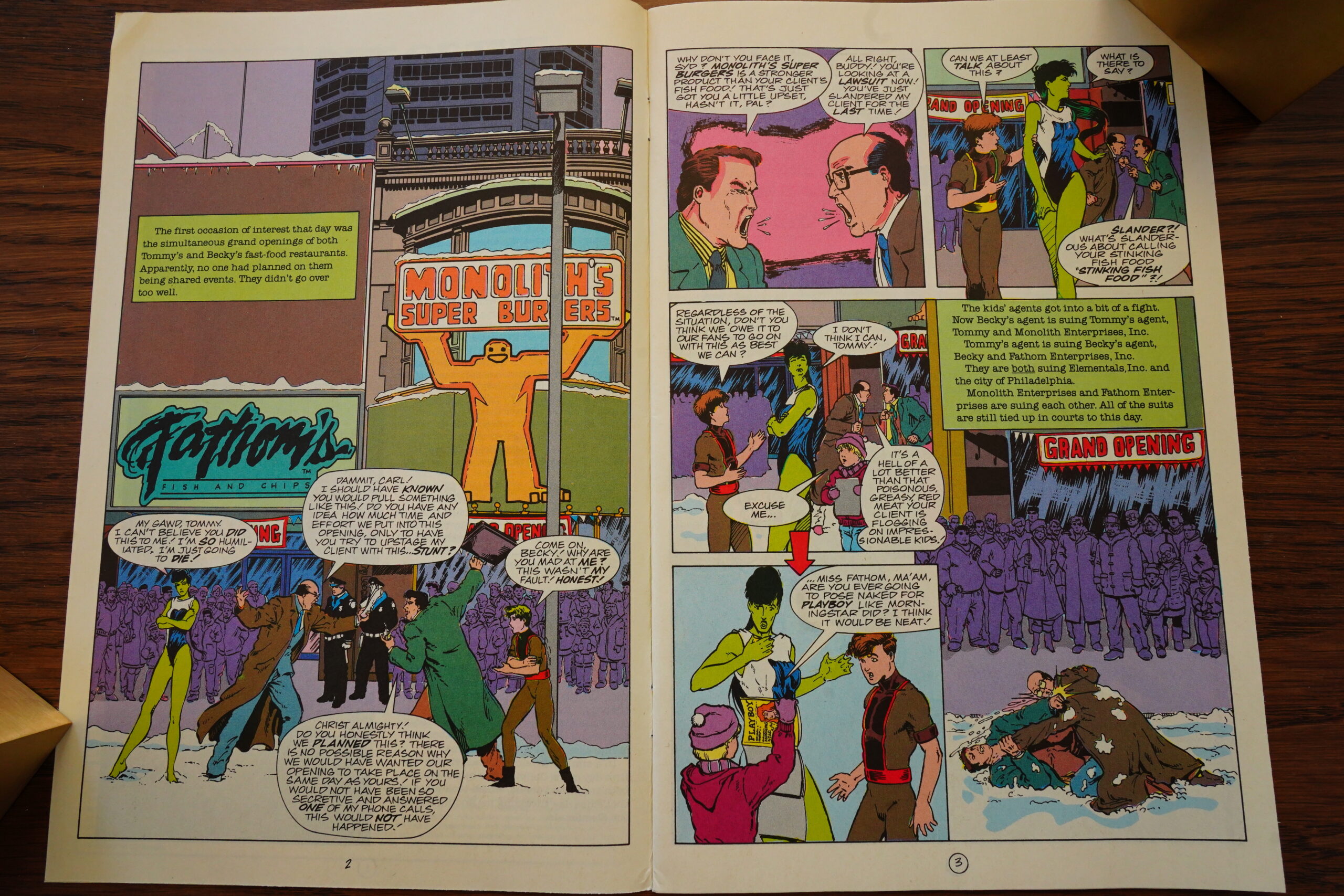
But first the Elementals have to sue each other because they’re starting competing fast food shops (on the same block).
Oh, Willingham! You’re so controversial!
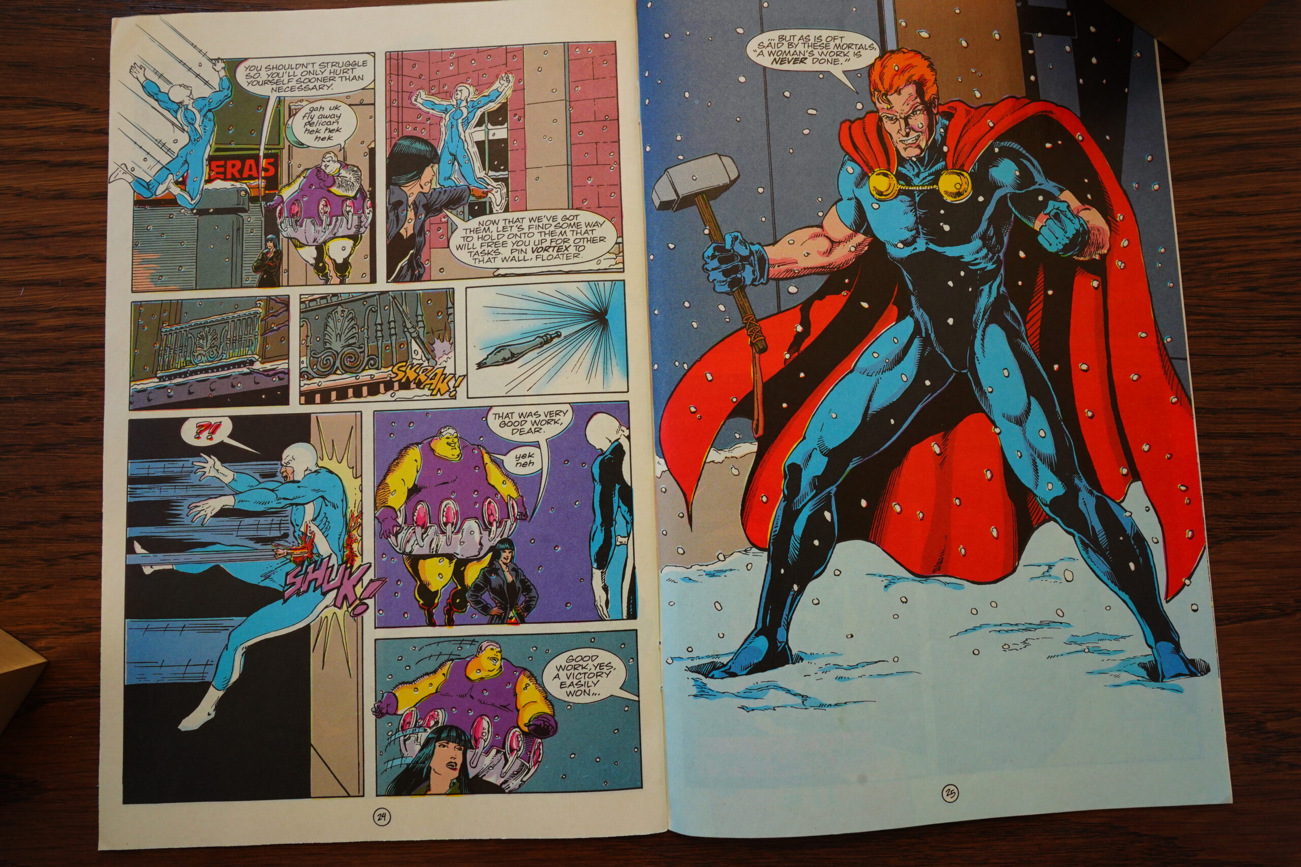
Yeah, that’s Thor for you.
More presages! Sounds like this Oblivion Was is going to be all-encompassing and gruesome!
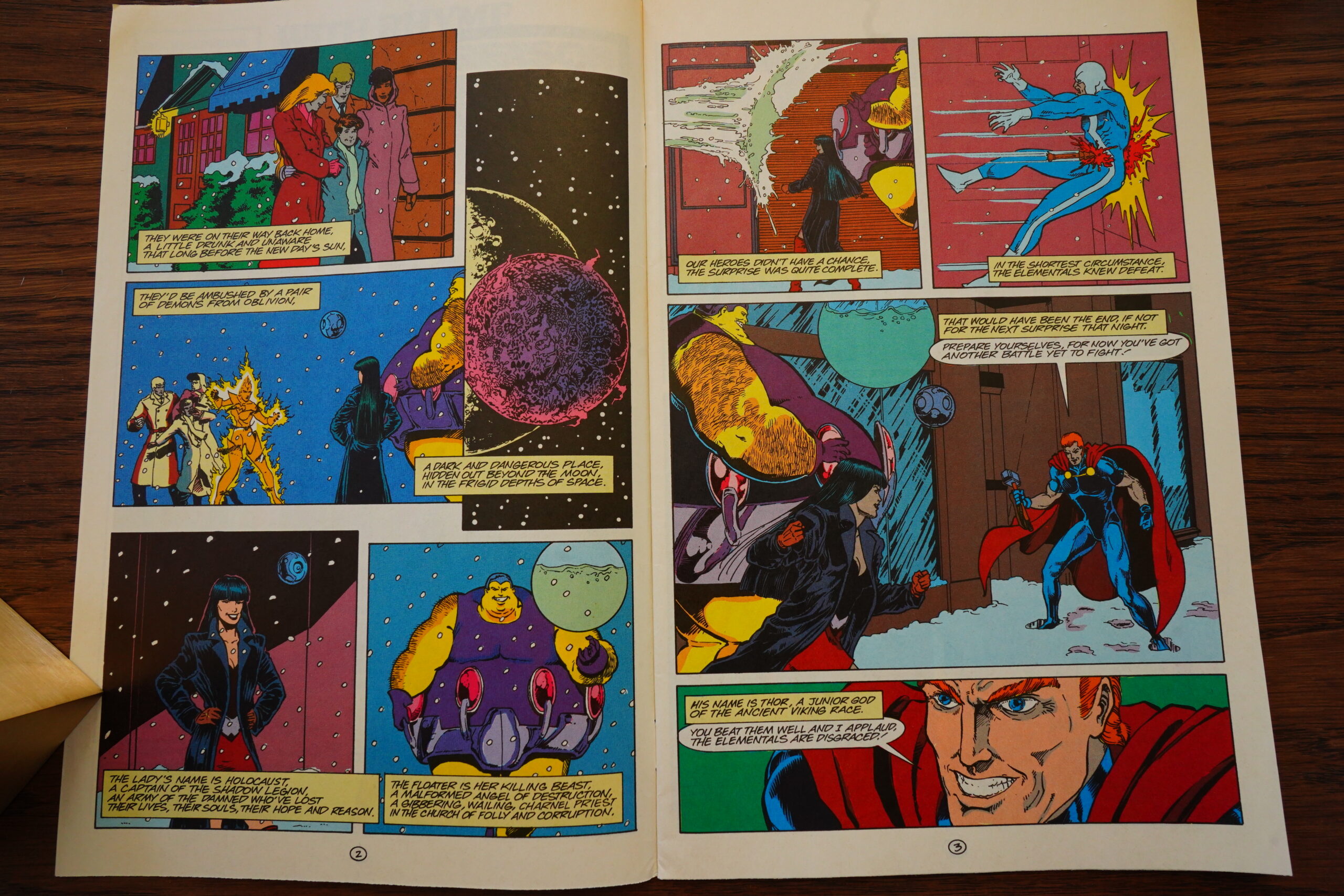
So horrid that we get an entire issue in “verse” form. I mean, some of those lines rhyme… sort of… and the meter used here is… is…
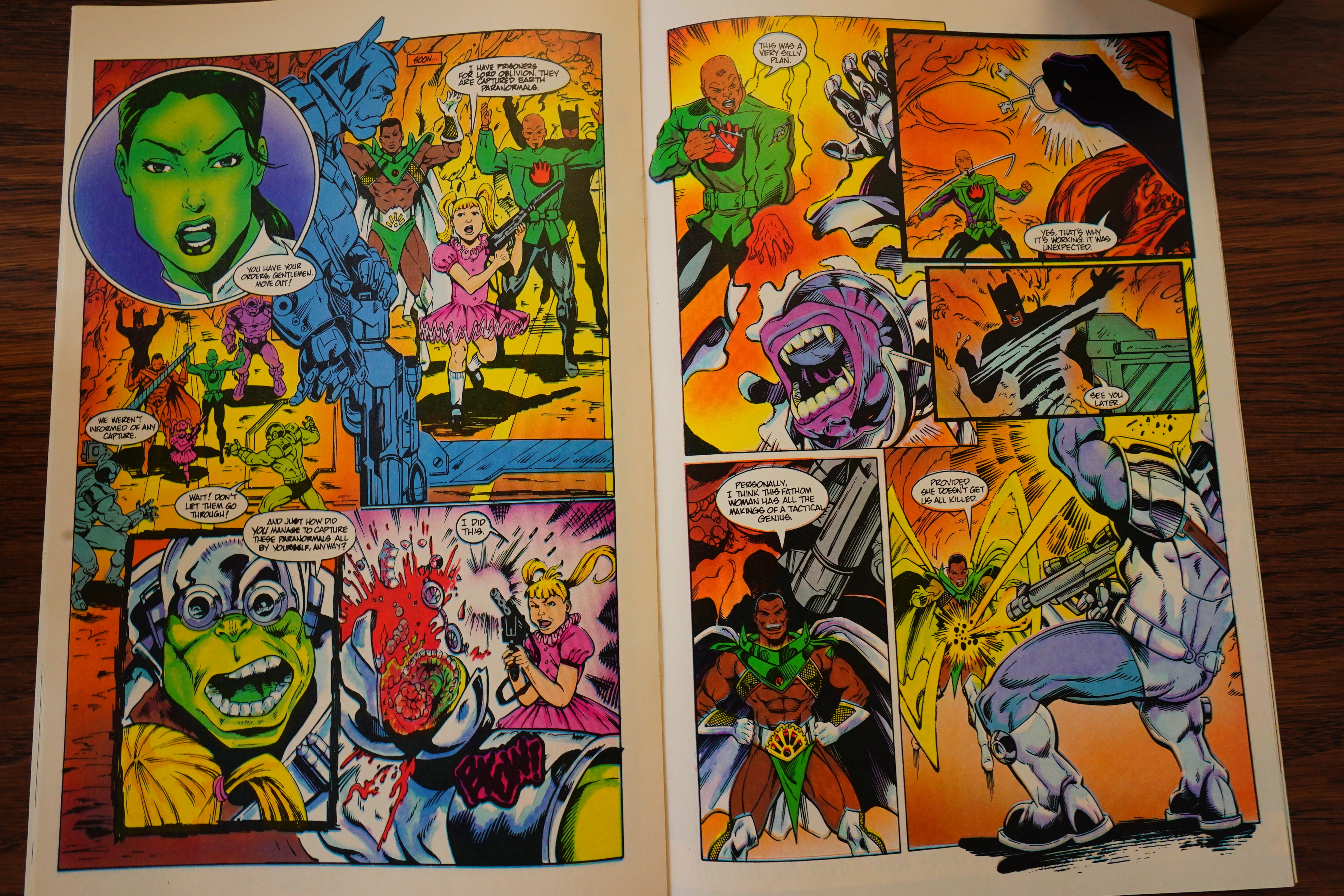
Well, the battle tactics are solid, at least.
By March 1990, Comico was down to two titles? And it looks like everybody who was working for Comico had left — except the publishers. But they’ve got two new people in.

And then there’s an issue where half the pages are done in this super dramatic voice… but… again, it doesn’t go anywhere. I guess Willingham is just easily amused.
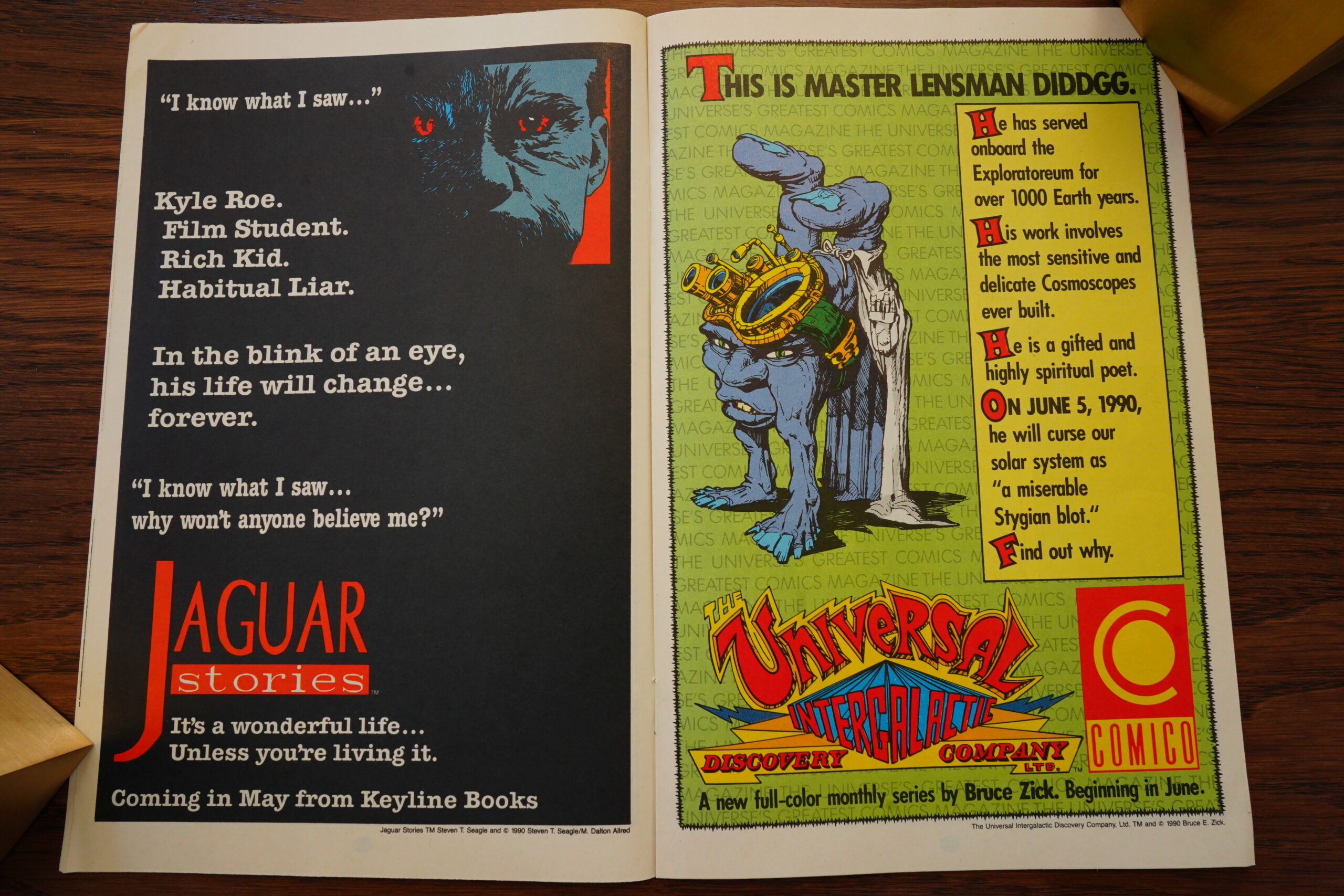
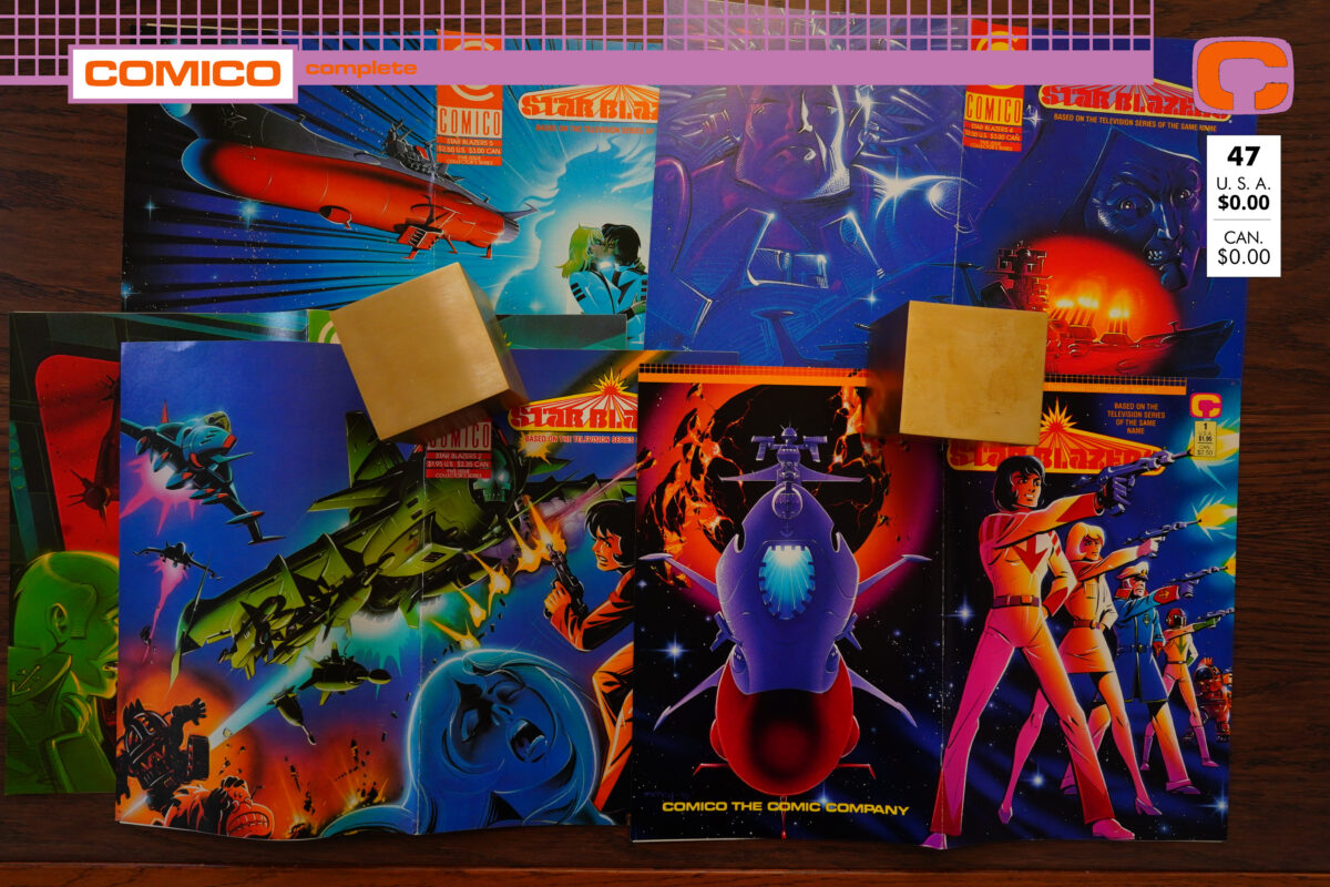
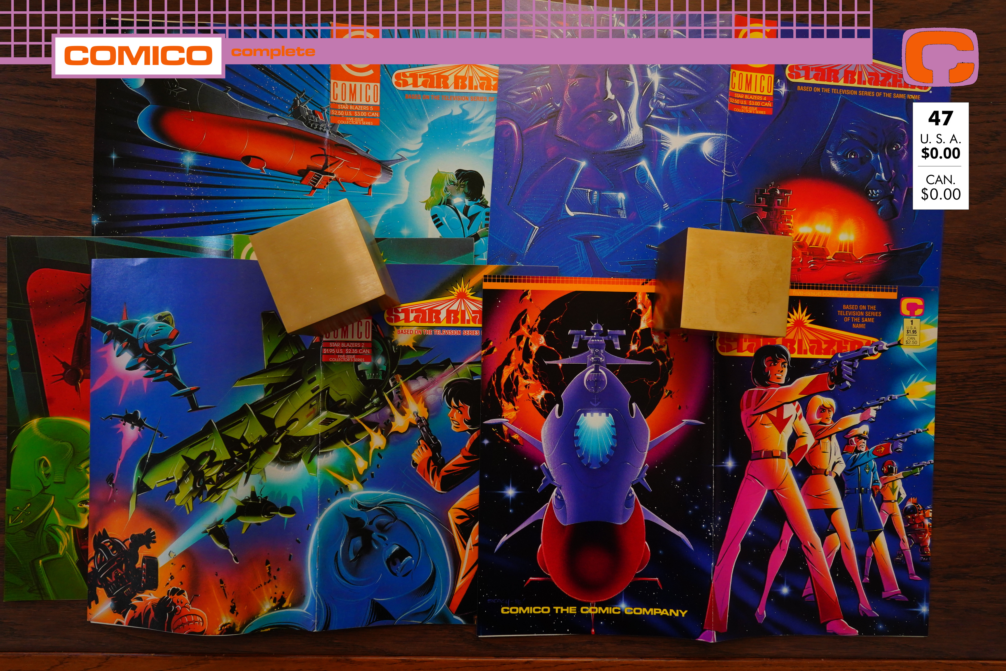
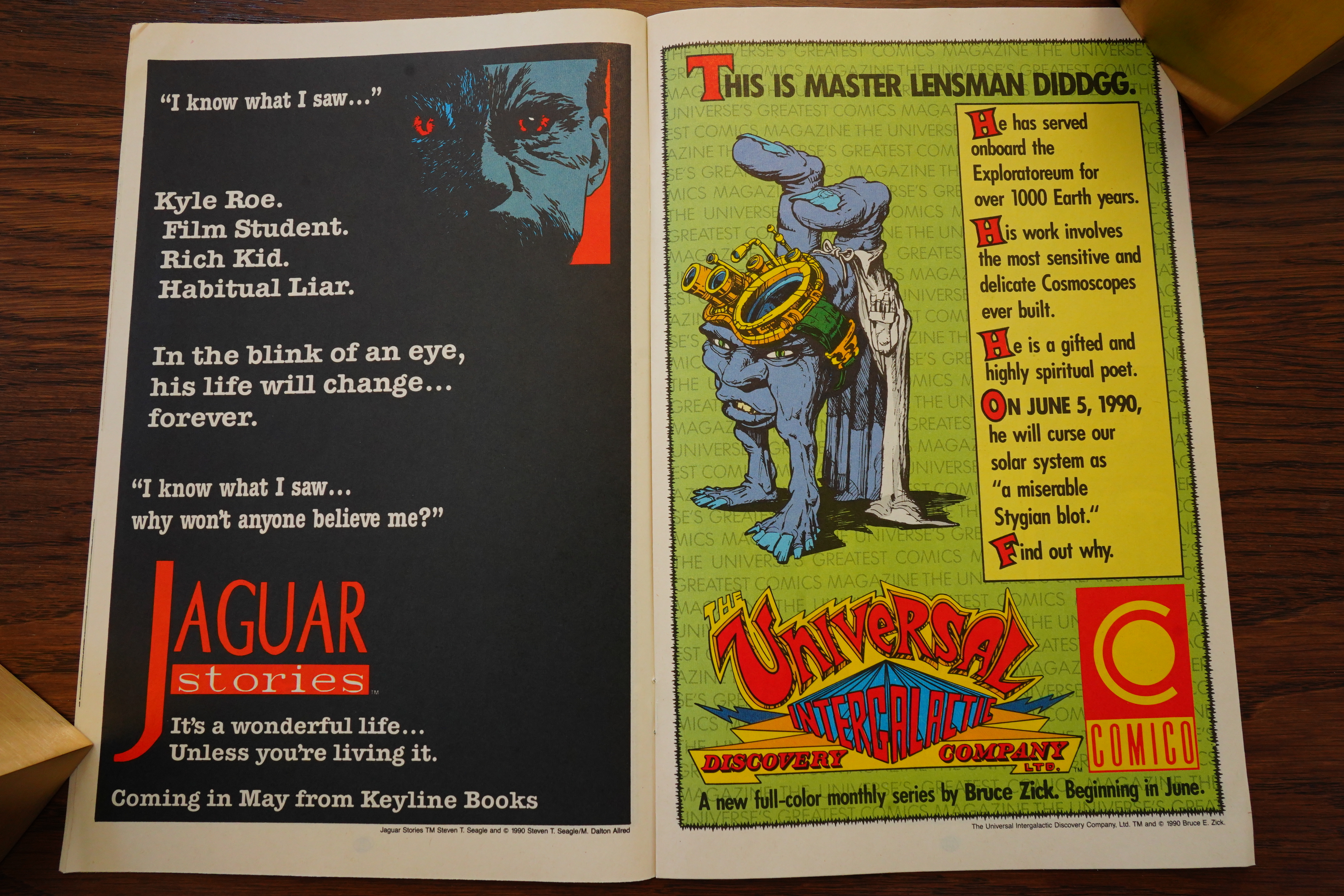
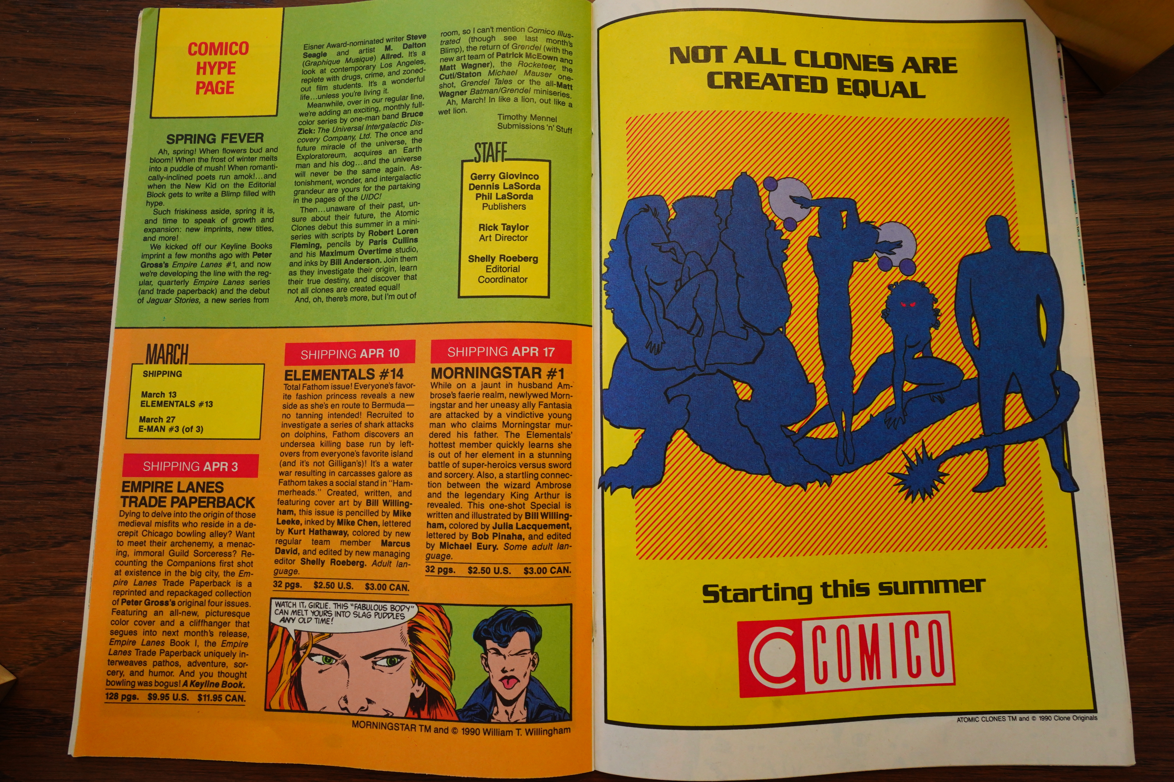
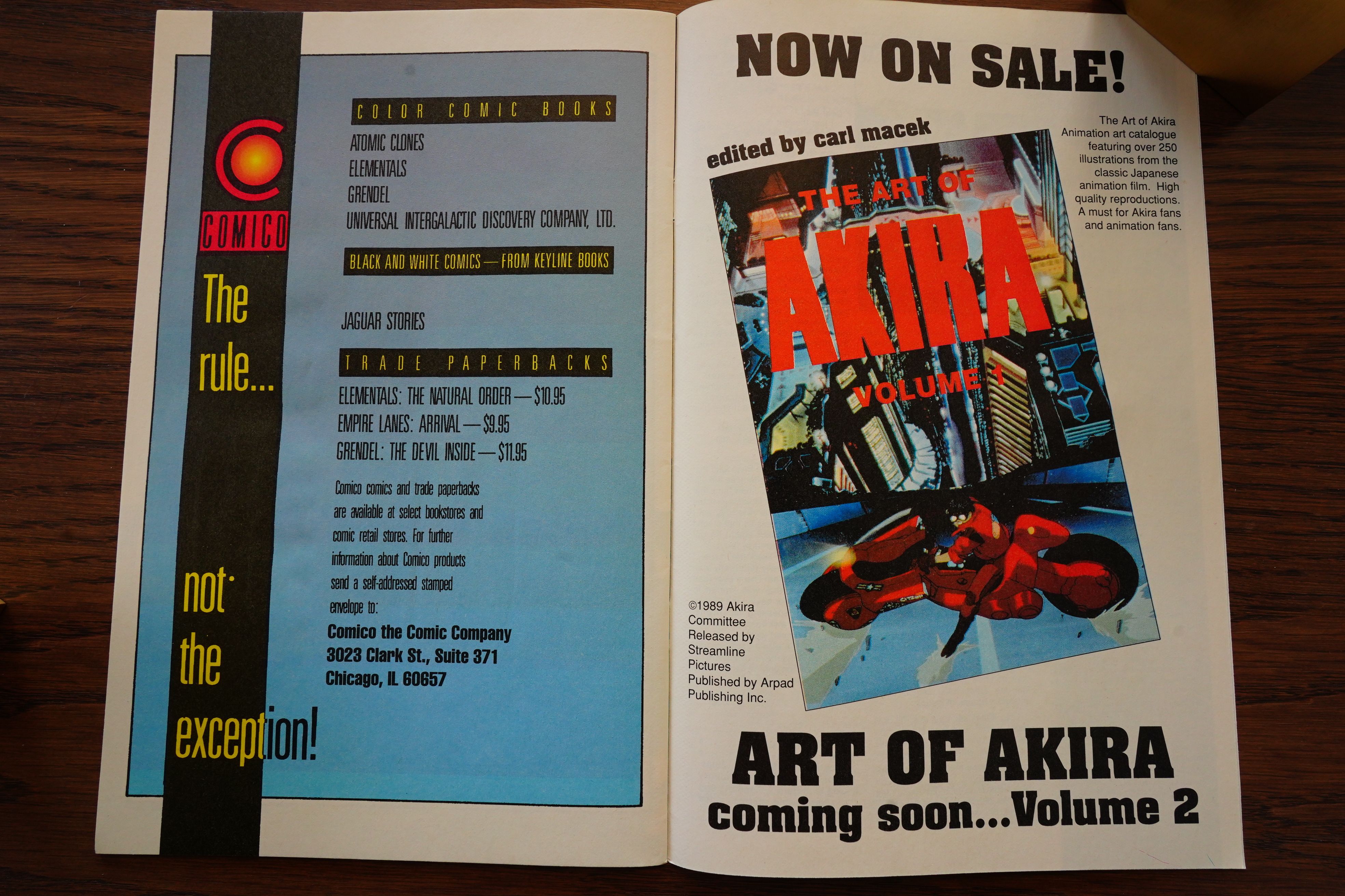
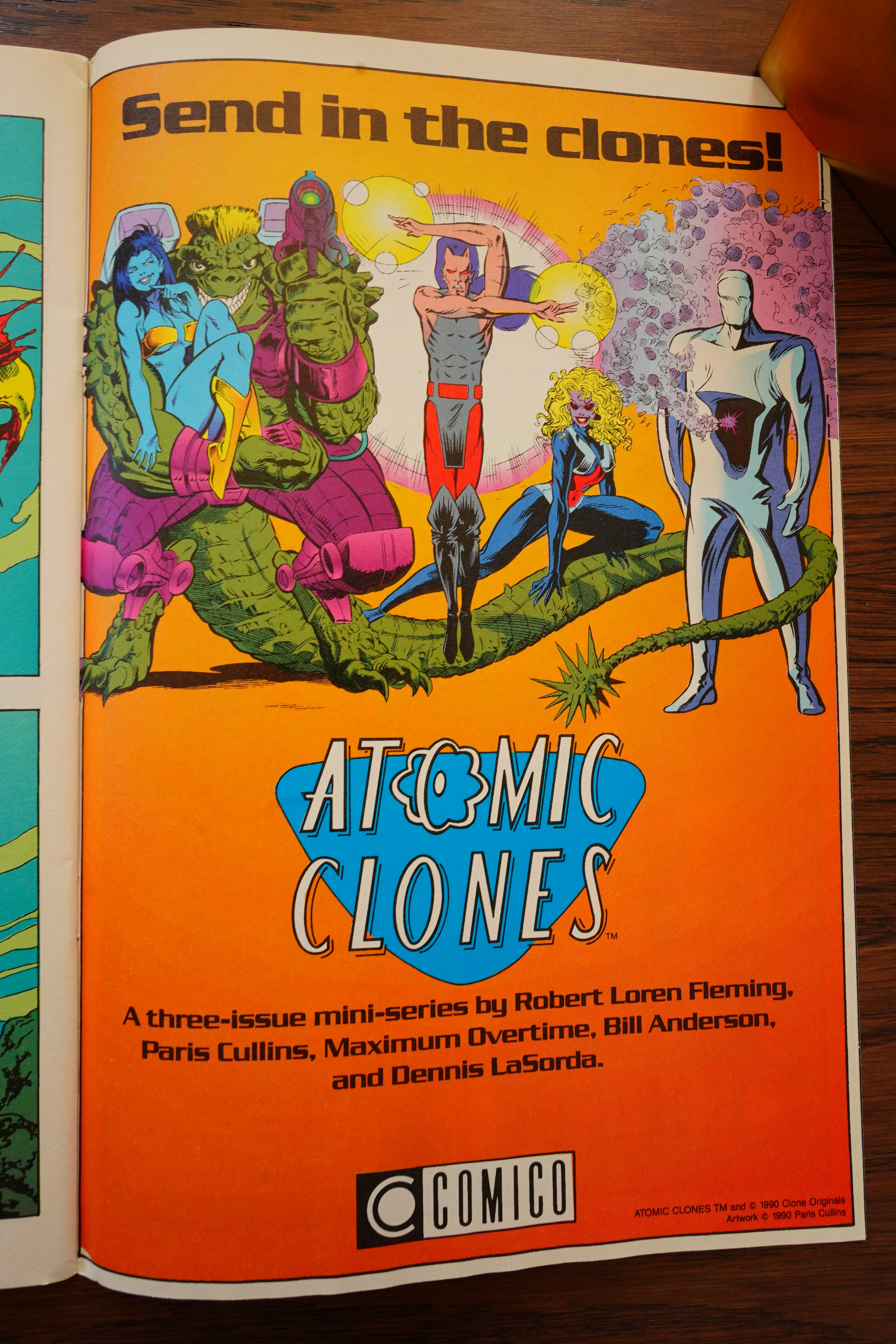
New series are announced: Jaguar Stories (never published), The Universal Intergalactic Discovery Company (never published)…

… and Atomic Clones (never published). So Comico was ramping up, but they’d go bankrupt in July, so these things were never published. I’m surprised that the creators didn’t take them somewhere else, though — many of the other series continued elsewhere.
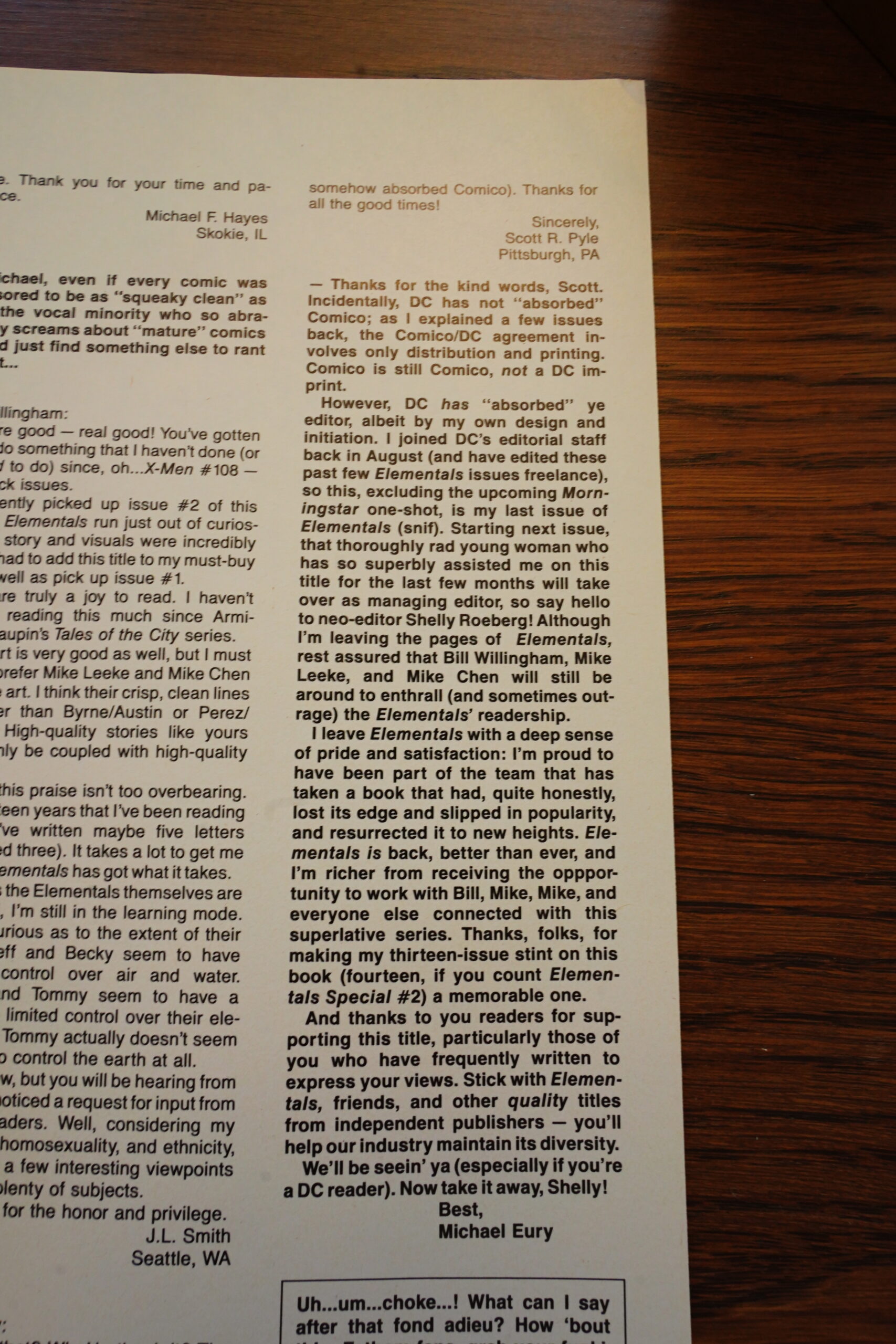
Michael Euro, the editors, also leaves the sinking ship (for DC Comics).
After four issues with some Oblivion Was content, the branding is gone from the cover.
Oh, even the colourists (who had been working for Comico for years) are gone, and so is the usual letterer.
And, yeah, this issue doesn’t mention the Oblivion War at all, so I guess Willingham just grew bored with the thing. Who could have predicted that!
Heh.

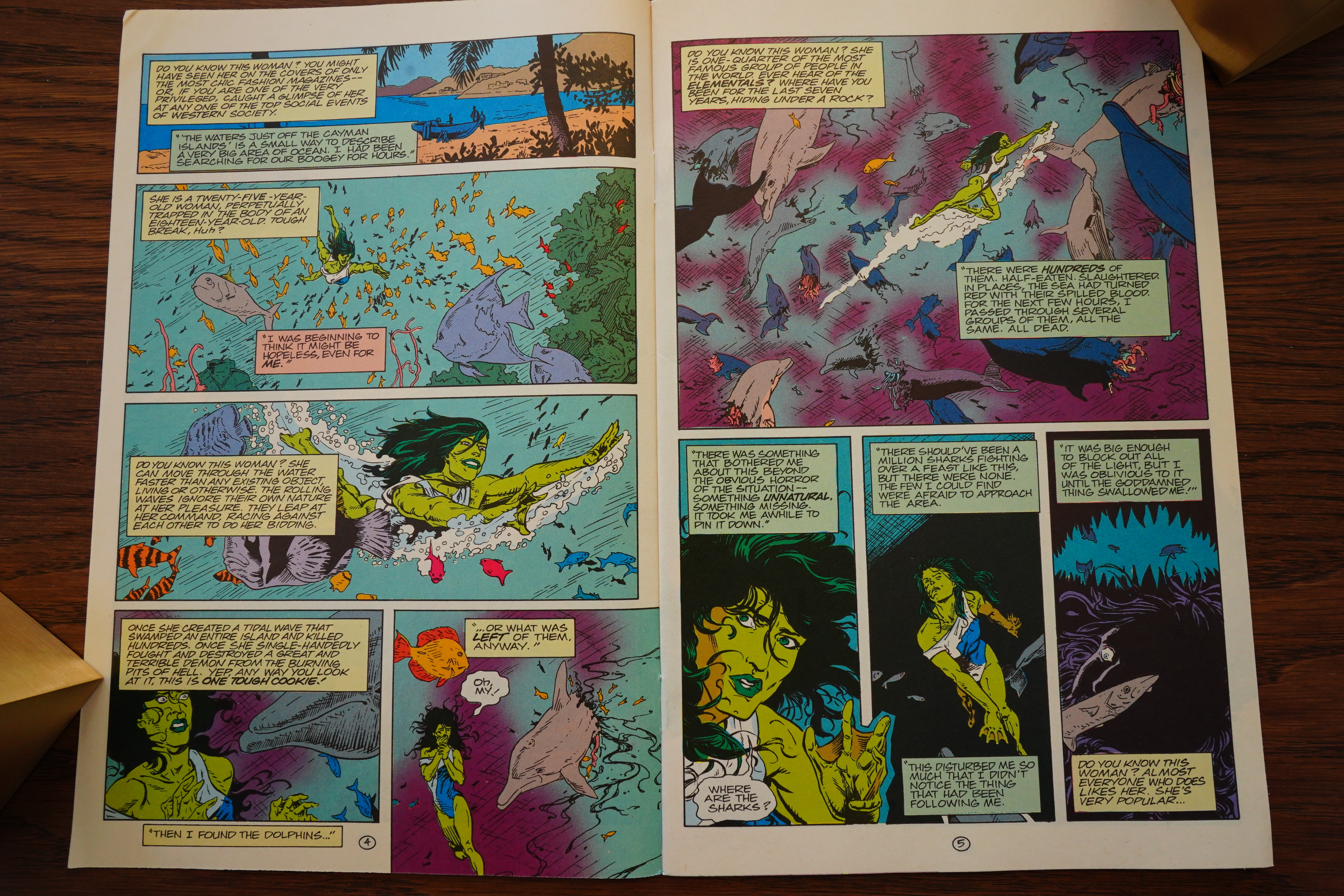
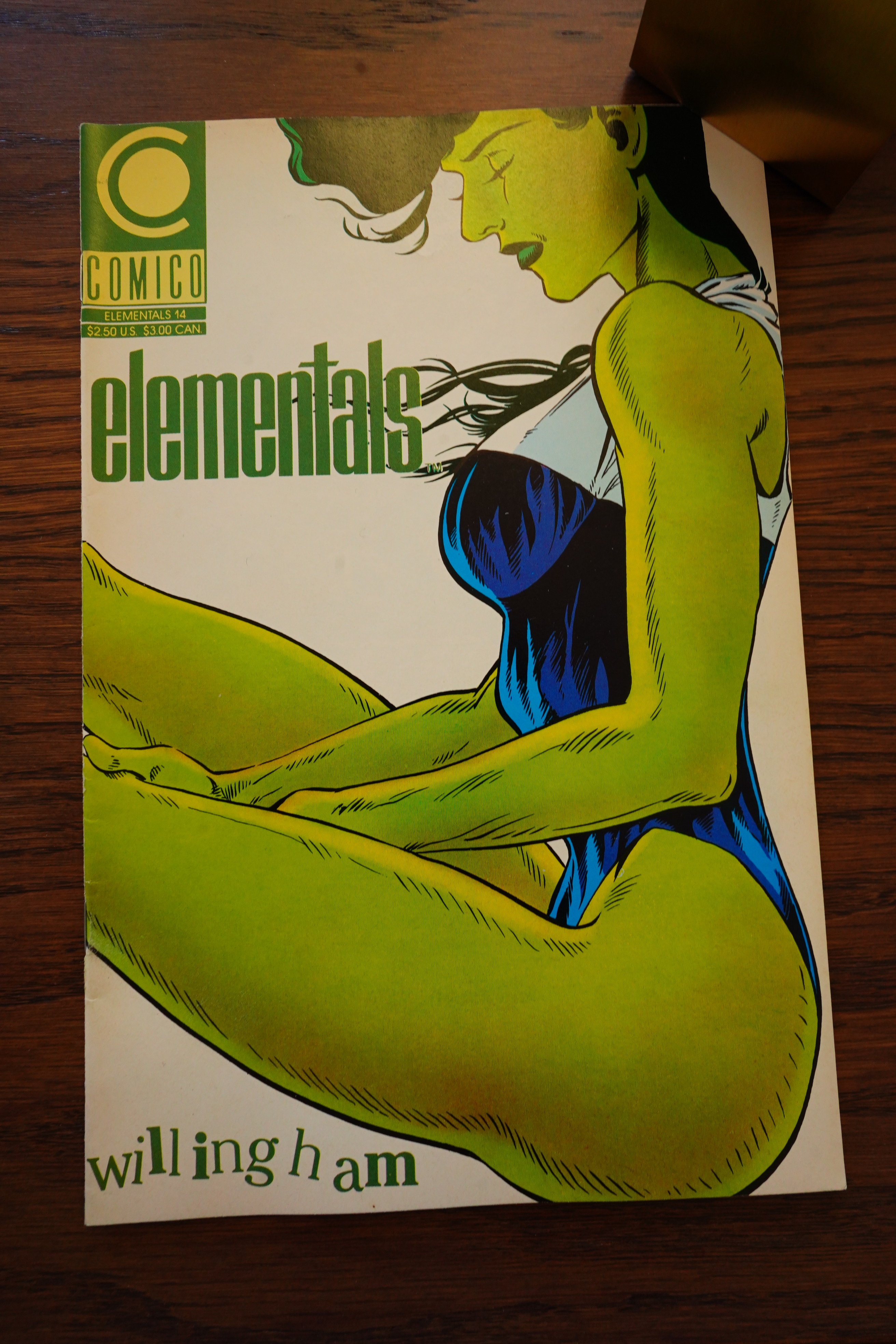
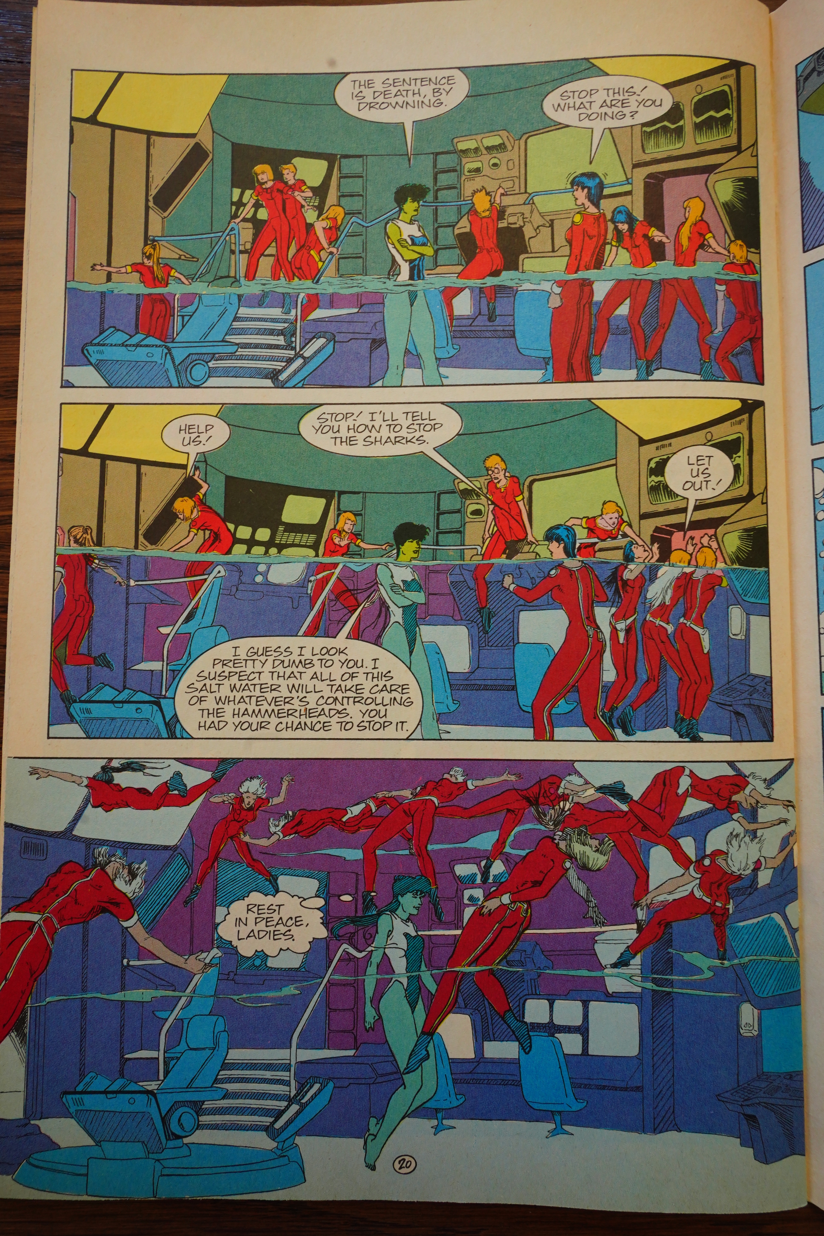
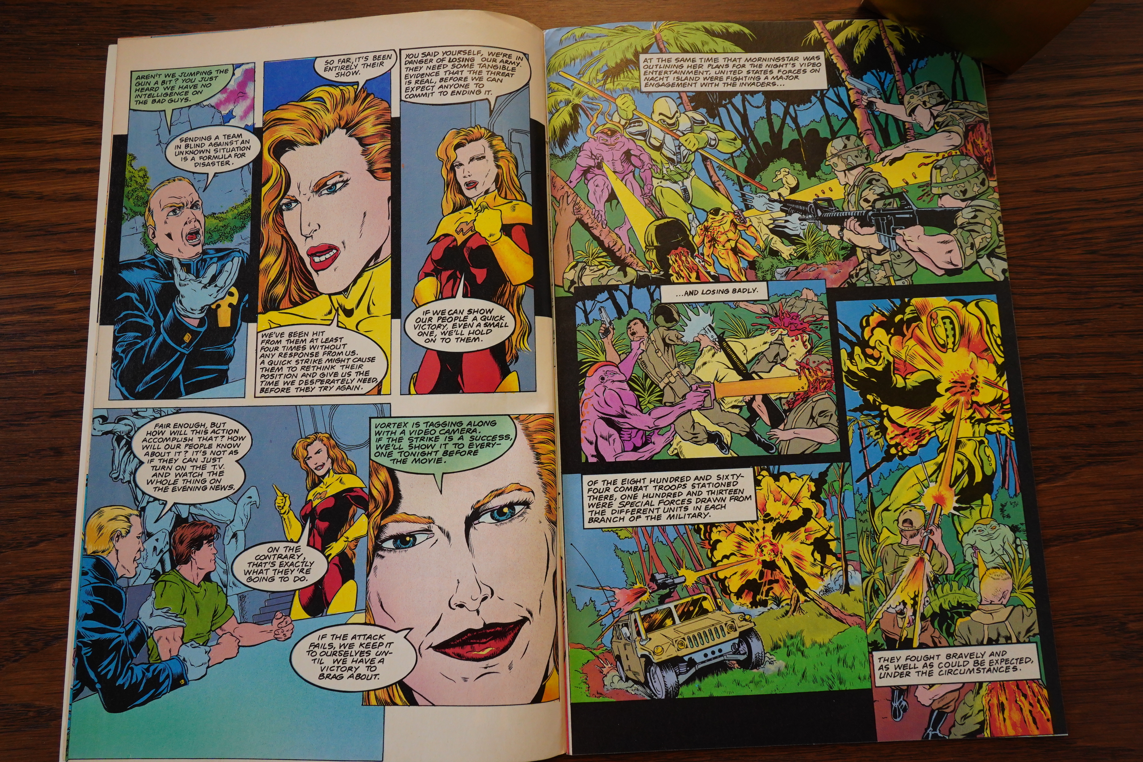
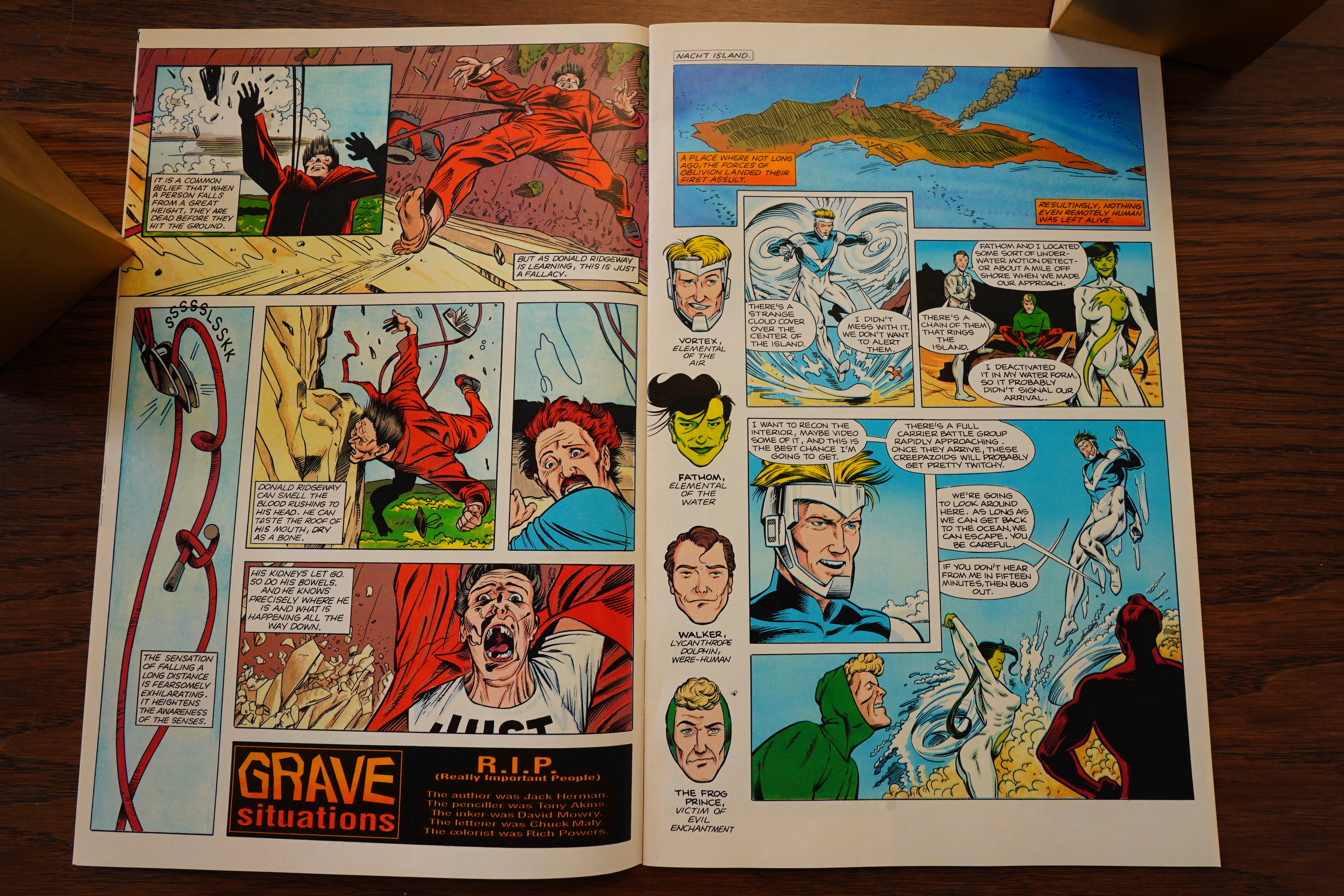
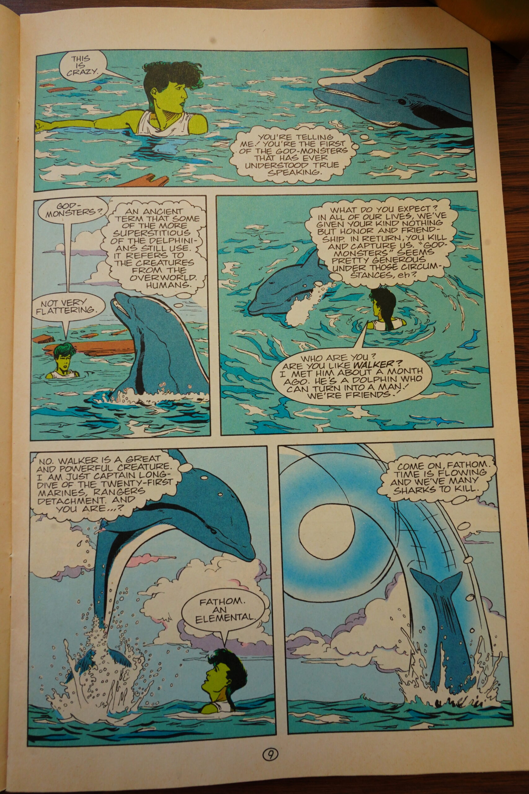
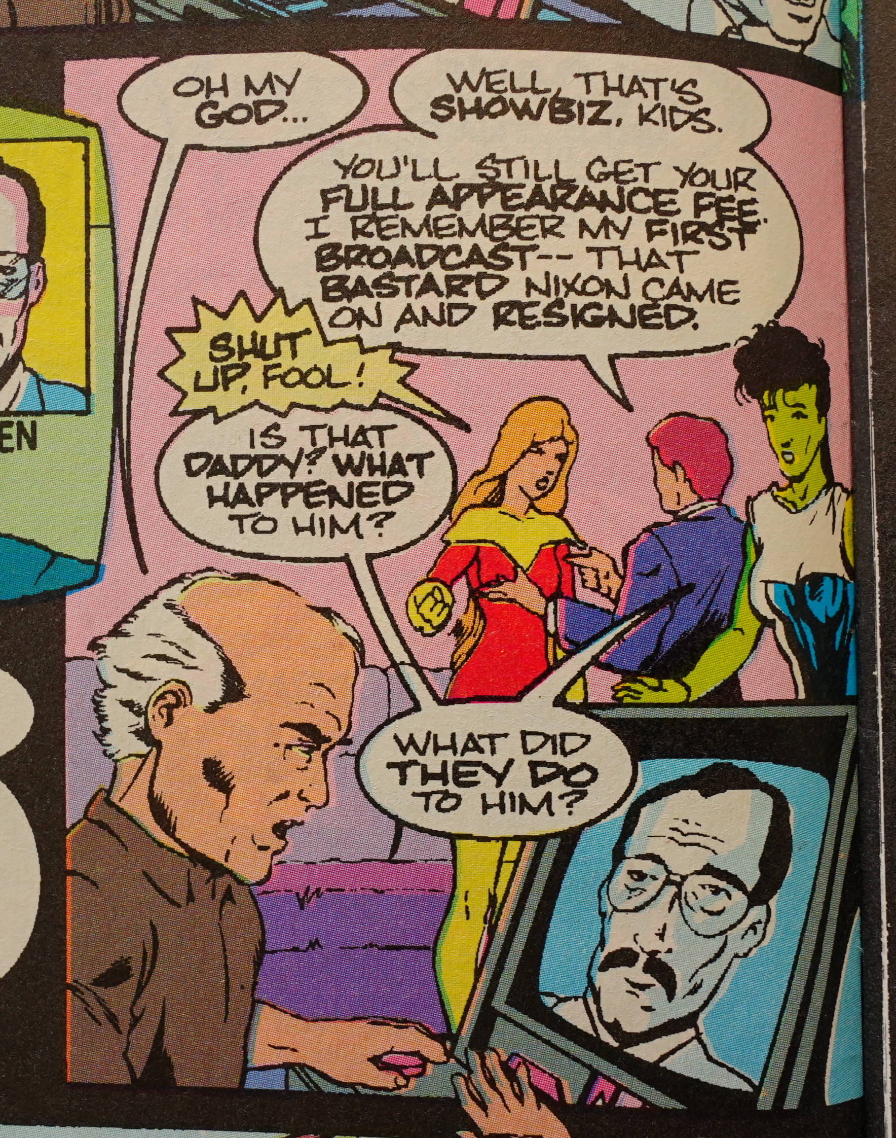
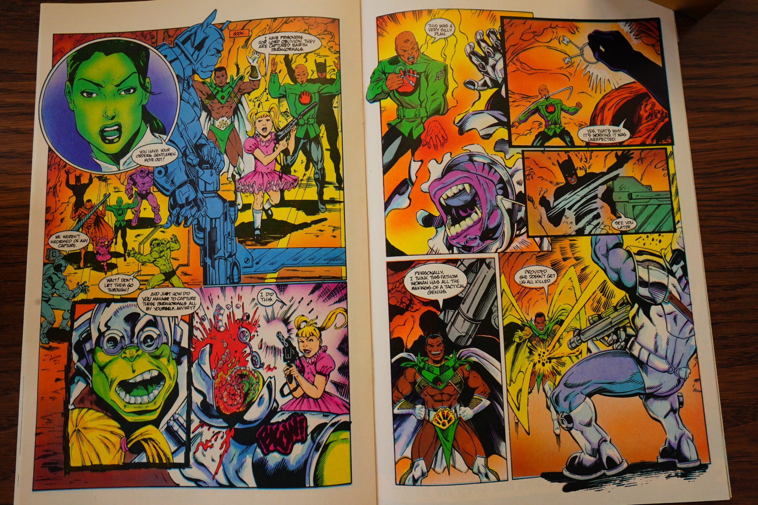
Willingham is having fun with super-hero tropes, but it also means that… things don’t really make much sense. Fathom discovers a group of people controlling sharks that have been sent out to murder people and dolphins (!), so instead of trying to figure out why, she just kills everybody. It makes for an amusing and efficient scene, but since Elementals is already so disjointed and strange, it just adds to the “don’t even try to think about it”-ness of it all.
Readers weren’t impressed by Willingham’s snit.
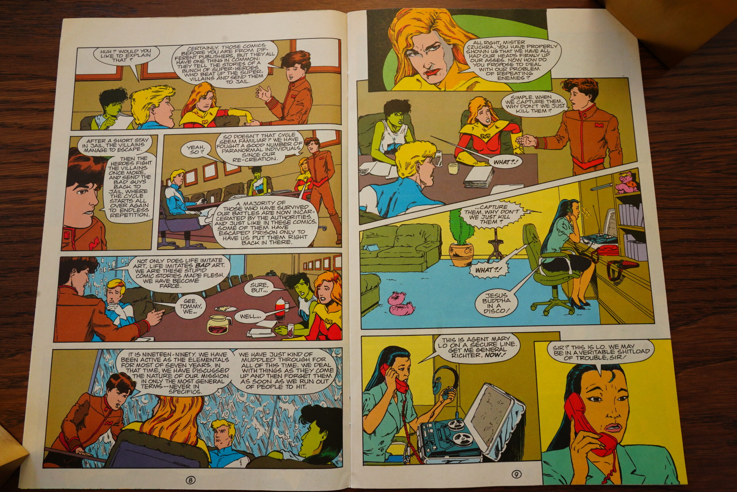
The Elementals spend an issue debating morals — should they just kill all the bad guys or what?
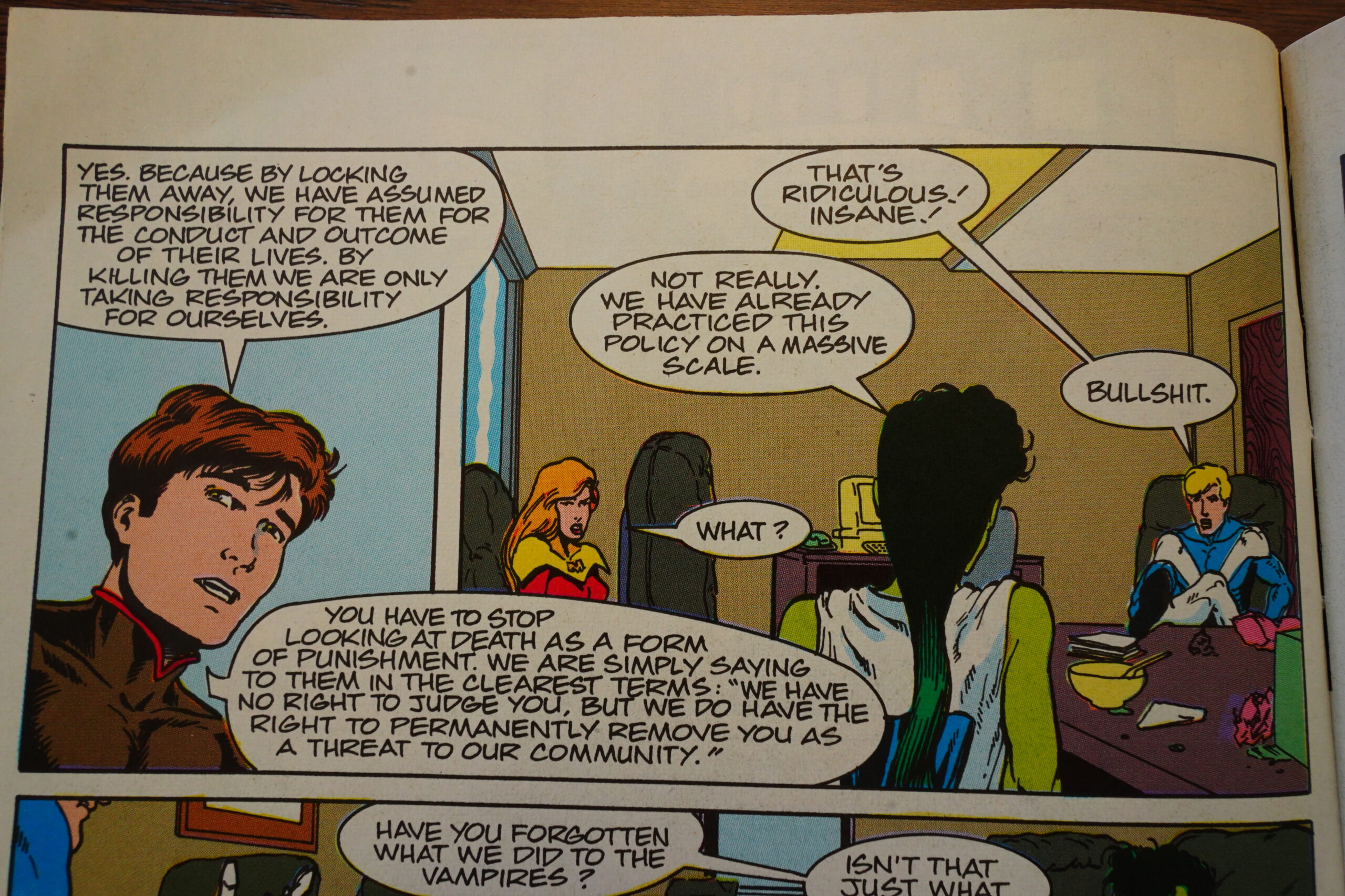
They decide — yes, probably. Is Willingham an effective altruist, perhaps?
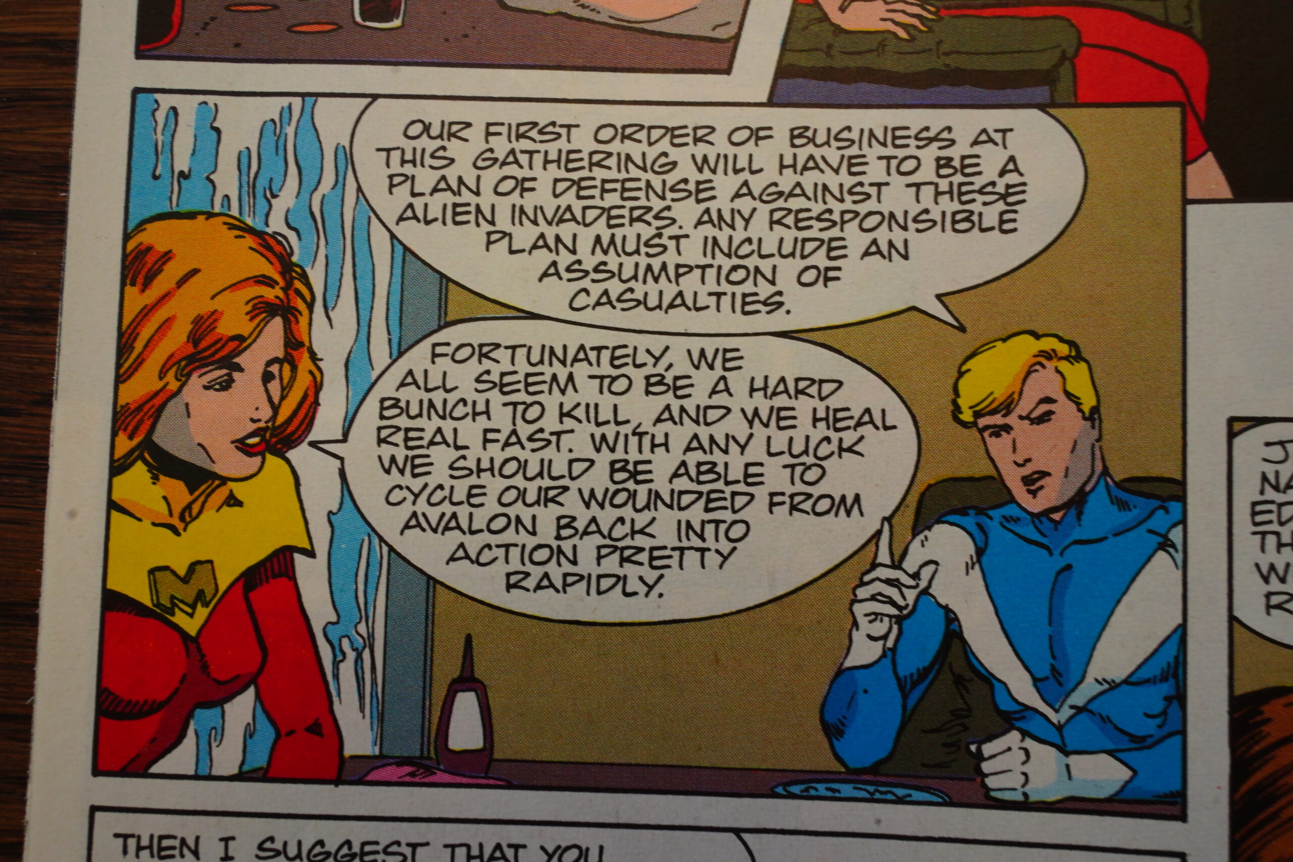
Oh! There’s a mention of the Oblivion War!? “These alien invaders”. That’s the first mention in several issues…
Perhaps we’ll get to see Fathom in a buzz cut again!

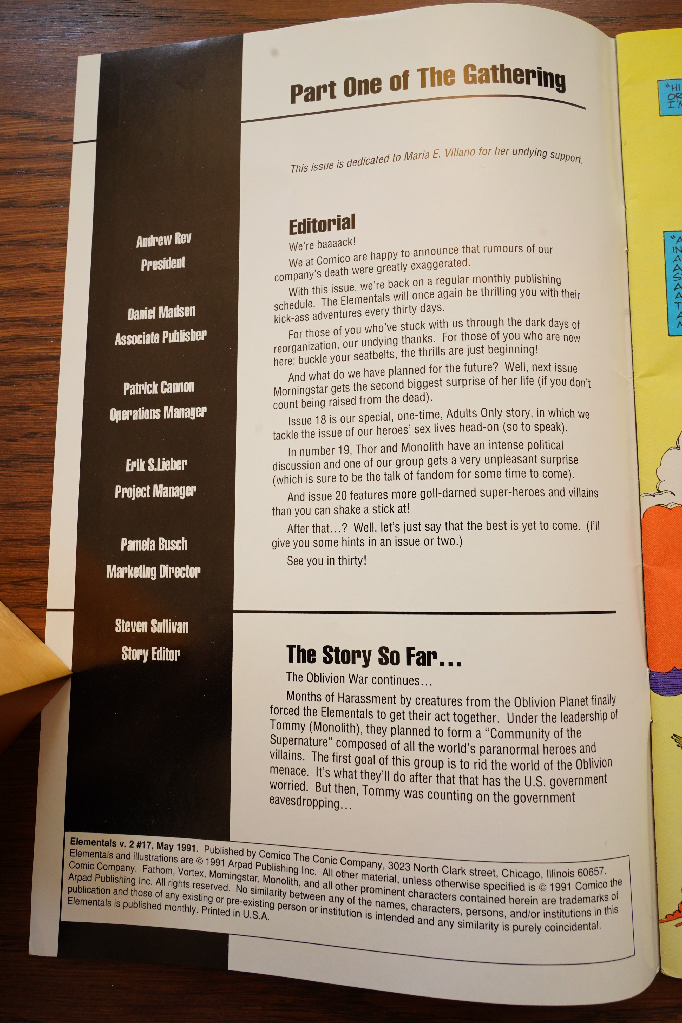
“We’re back!” Did we go anywhere? Well, the previous issue was three months late, and then this issue…
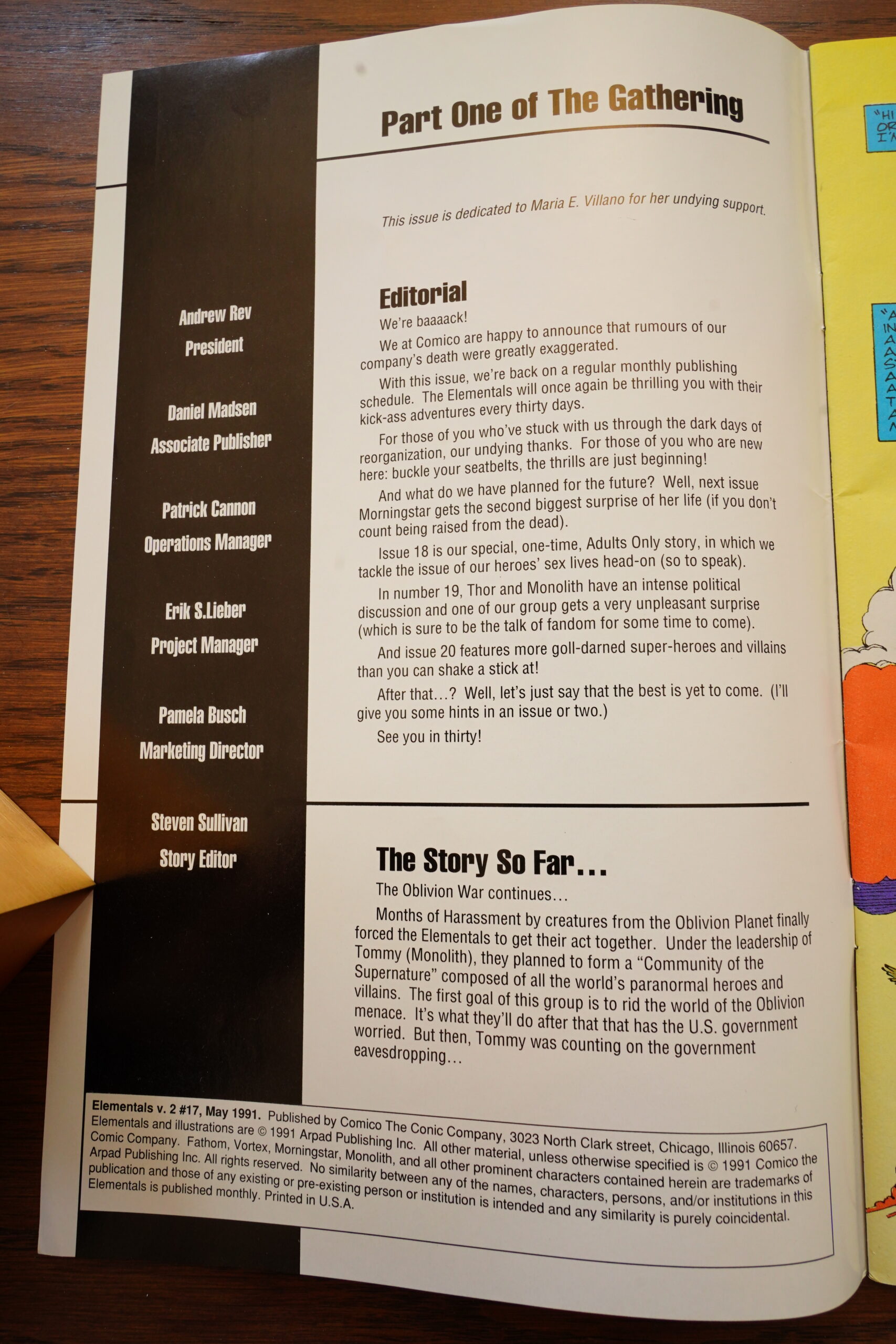
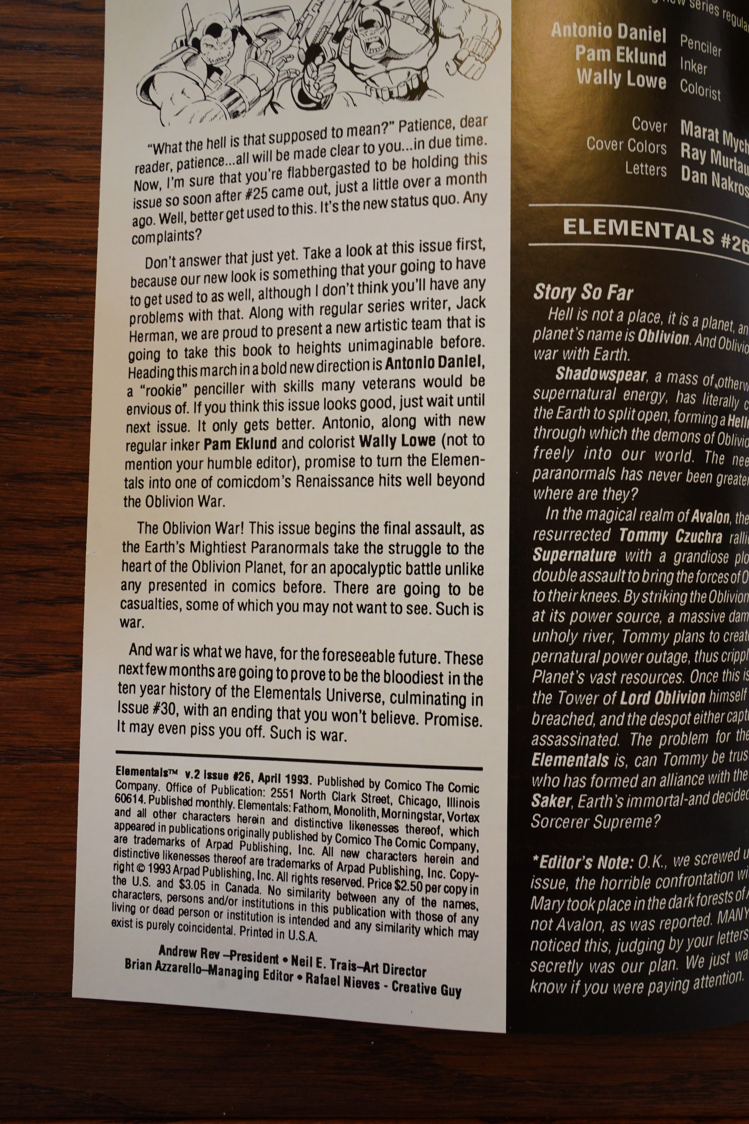
… arrives about a year later… from “Comico The Conic Company”. (But that may be a misspelling.) Because meanwhile, Comico finally went properly bankrupt, and the remaining bits of the company were bought by Andrew Rev. Most of the properties managed to escape his clutches, but apparently Willingham must have made a deal with him? Because the Elementals are now copyright by Arpad Publishing (which is Andrew Rev) instead of by Willingham himself.
Confusingly enough, there are zero credits for any of the creators involved in this issue — we just get the list of people working for the new Conic Company.
We do get a hint of a reintroduction of the Elementals
concept, but it’s over after a couple of portentous pages.

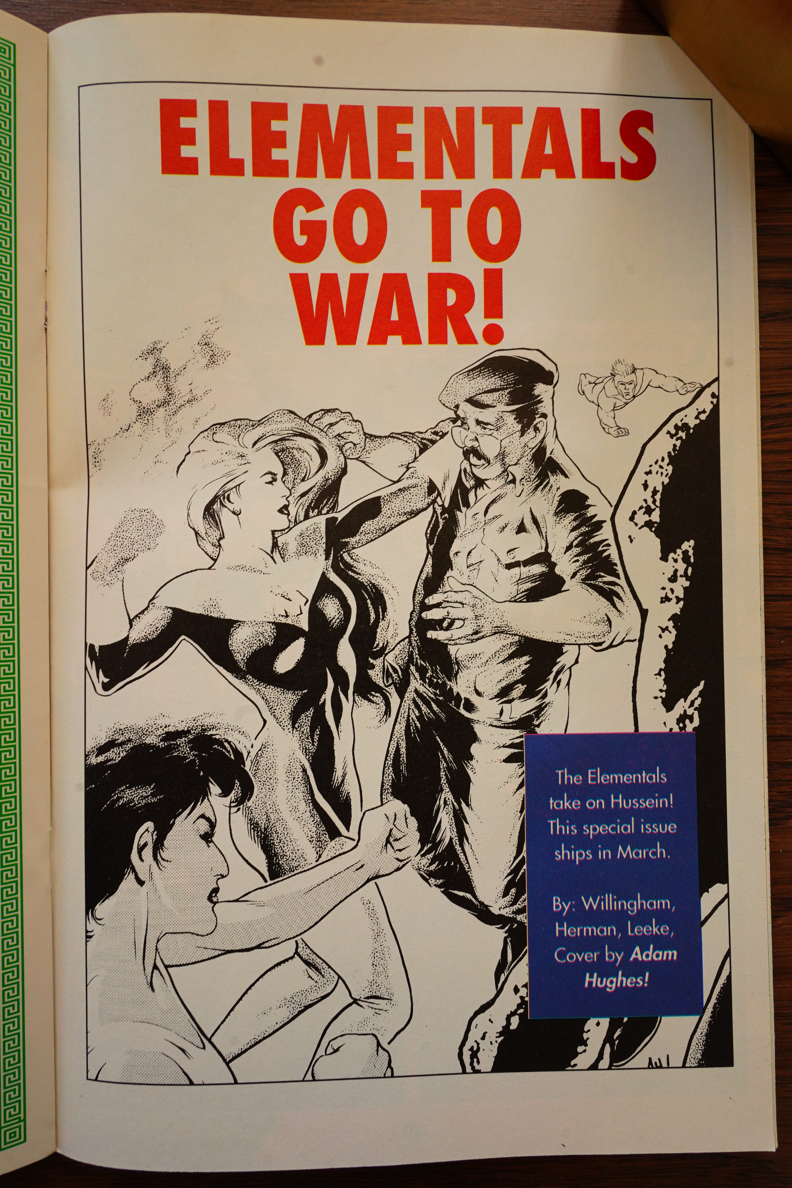
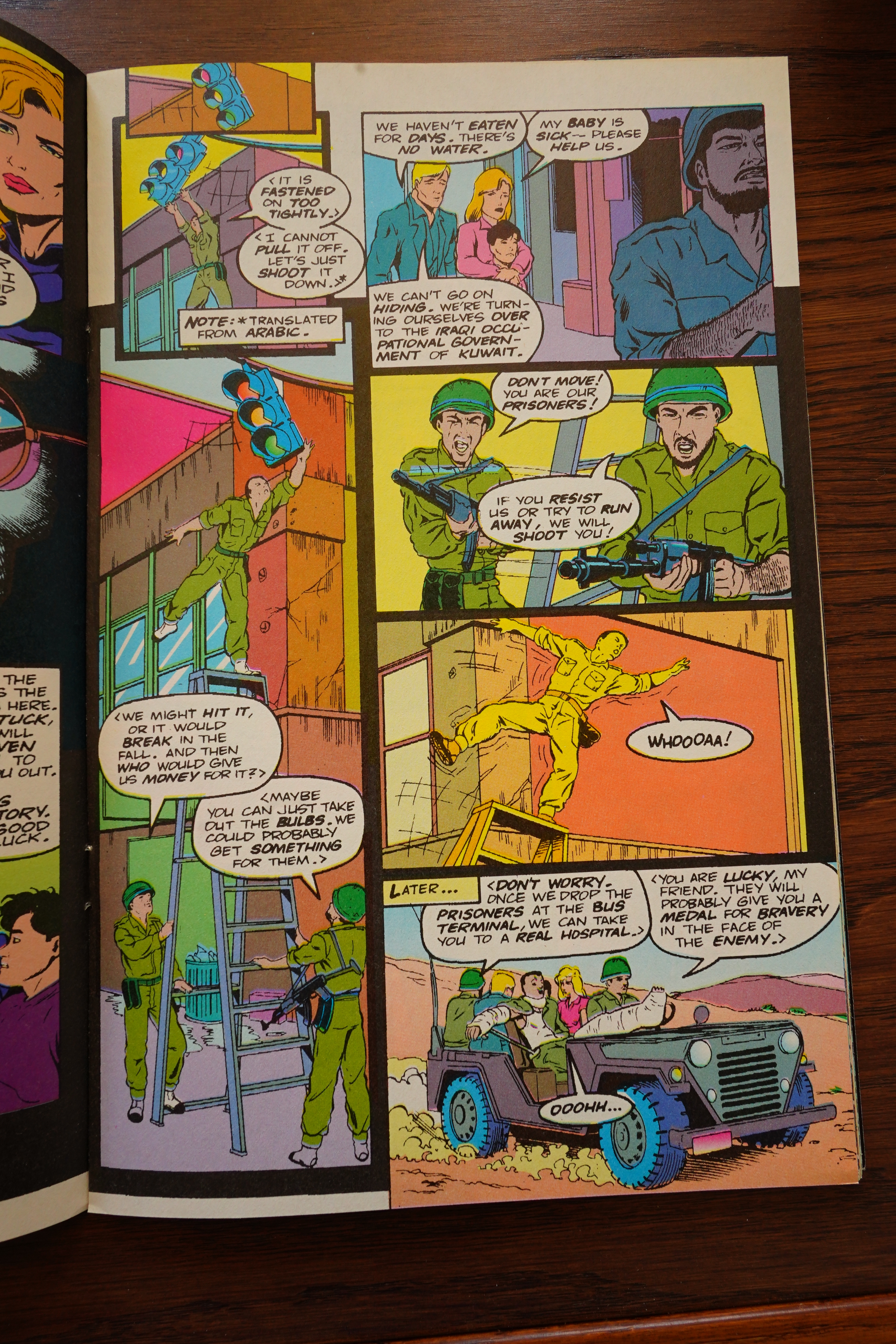
Oh… how topical… Elementals kick Saddam Hussein’s ass?
Well, I guess that works as a reintroduction… but I wonder how much of this issue was ready to go when Comico went under. They usually had half a year’s worth of comics in their files before going to press, so it seems likely that all of this was done under the ancien regime.

I mean, why would they still be running ads for Atomic Clones and the Intergalactic thing (and Grendel), none of which would be published by the new Comico.
Looks like Rev got the back issues in the deal. But… the comics are now under the banner “Empire Lanes Comics”? How confusing.
Well, as first issues from a new publishing ventures go, I guess I’ve seen a lot that have been a whole lot more amateurish. But it’s a stark contrast from the previous Comico, who were really particular about details like speeling and getting creators credited (as well as having some kind of design).
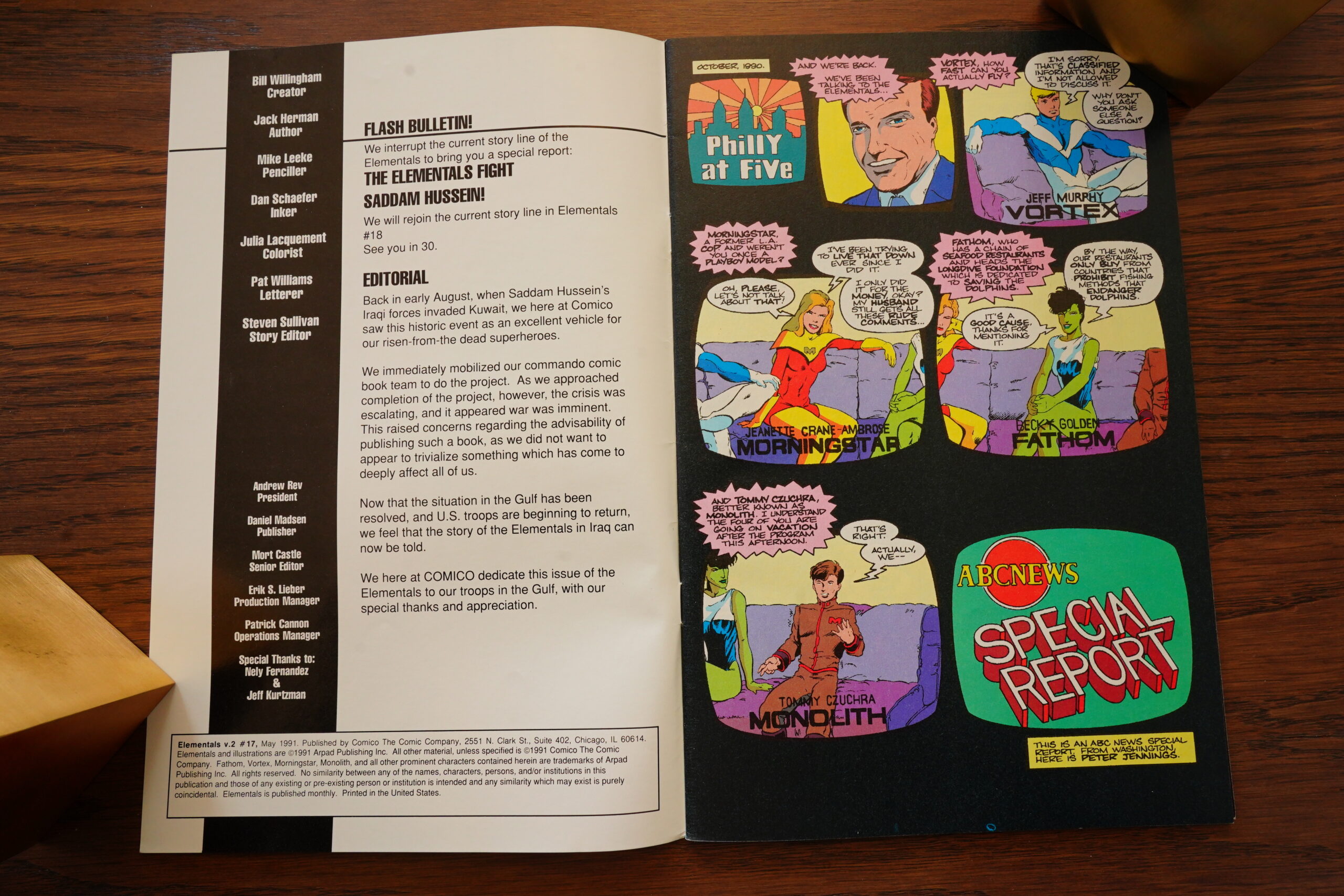
OK, so we get a random Iraq War issue… and it’s not written by Willingham at all, but is by Jack Herman (who was responsible for some of the worst Elementals v1 issues).
Like what I said about production… this issue looks really bad. Did they scan the artwork at low resolution or something?

The storytelling in this issue is really bad. Fortunately, it’s just one issue, and then Willingham is back again.
The unnamed editor writing this announces a slew of Elementals spin-offs — it seems like this is what Rev Comico is going to go all in on: Just a whole bunch of Elementals things. Many of the things announced here will never see the light of day, though.
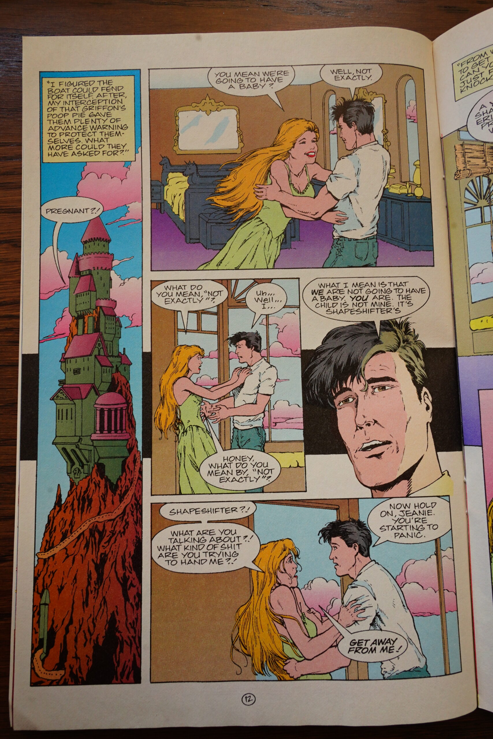
Oh yeah, back at the ranch… Remember Mornigstar having had that shapeshifter for a boyfriend? Well, she’s pregnant! Surprise! But then she has an abortion… but the fetus probably survived. I’m sure that’ll come up in future issues (unless Willingham forgets, as he has a tendency to do). But it’s a pretty fun issue anyway.
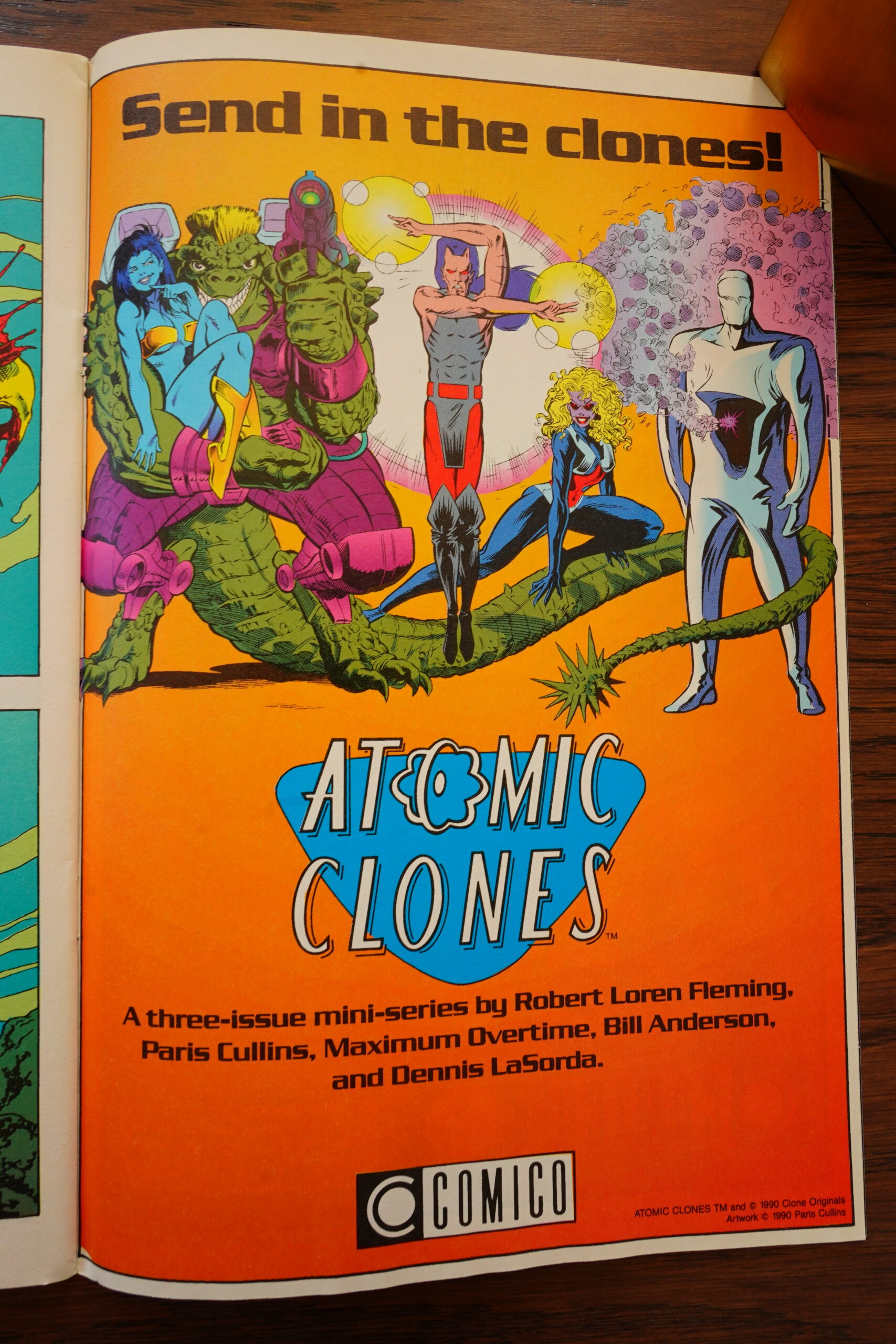
Still ads for Atomic Clones, which would never be published.
Kelley Jones starts doing a bunch of covers, and they’re kinda cool. (The other covers are for the Monolith mini series.)
Suddenly we drop the old colouring, and go to “full process” or whatever they used to call this.
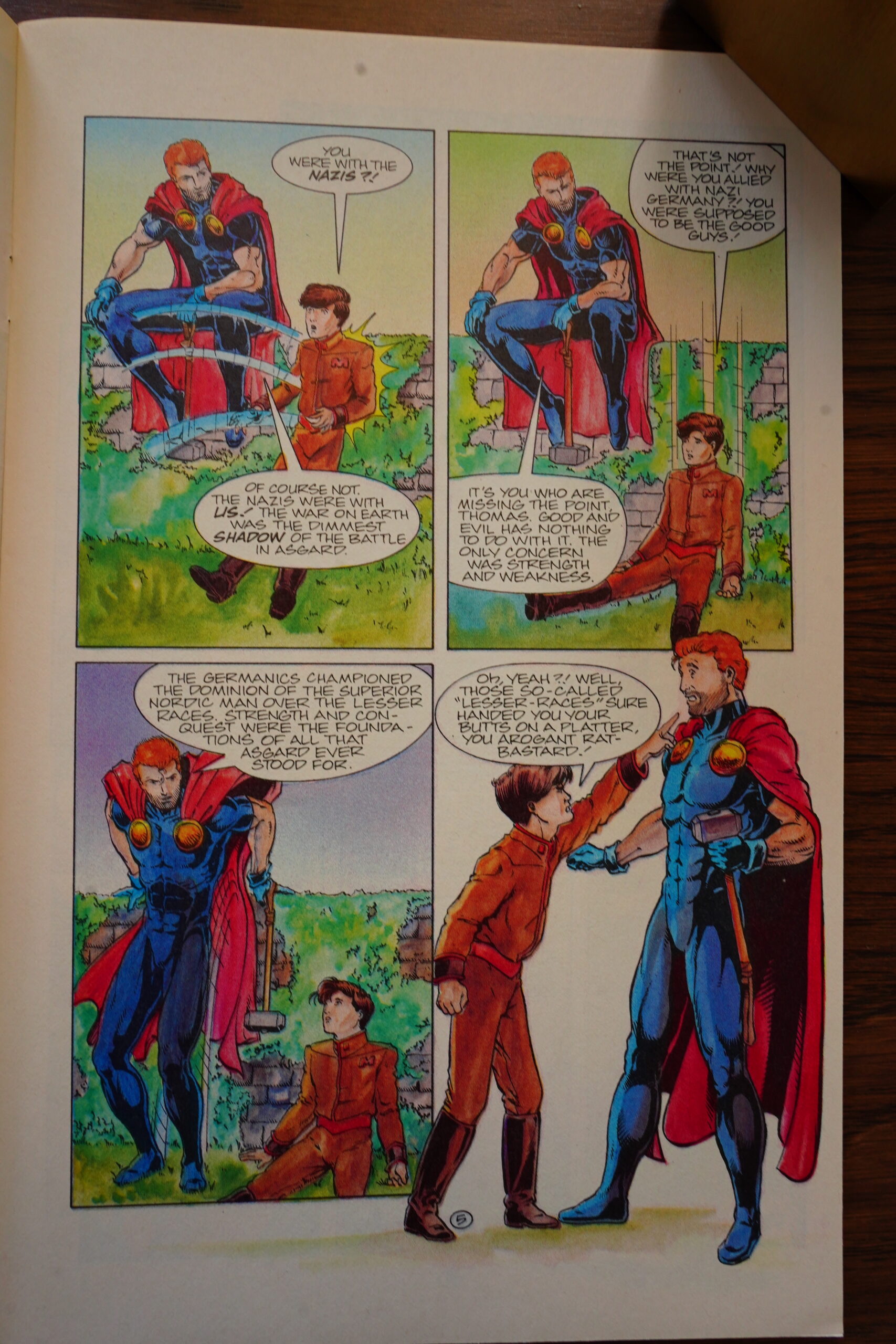
Looks pretty good. (And it turns out that Thor was a Nazi instead of just a goofball (or something).)
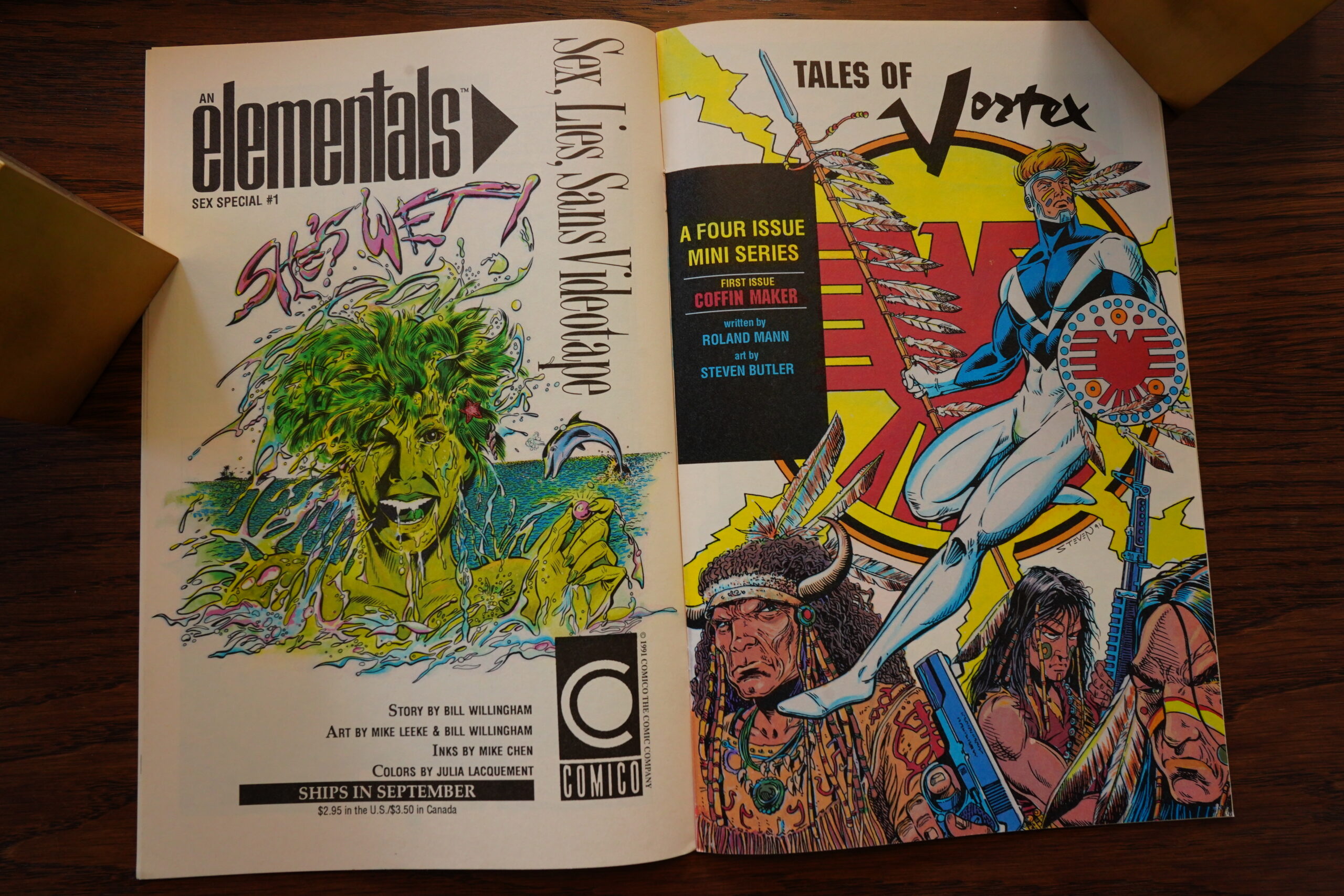
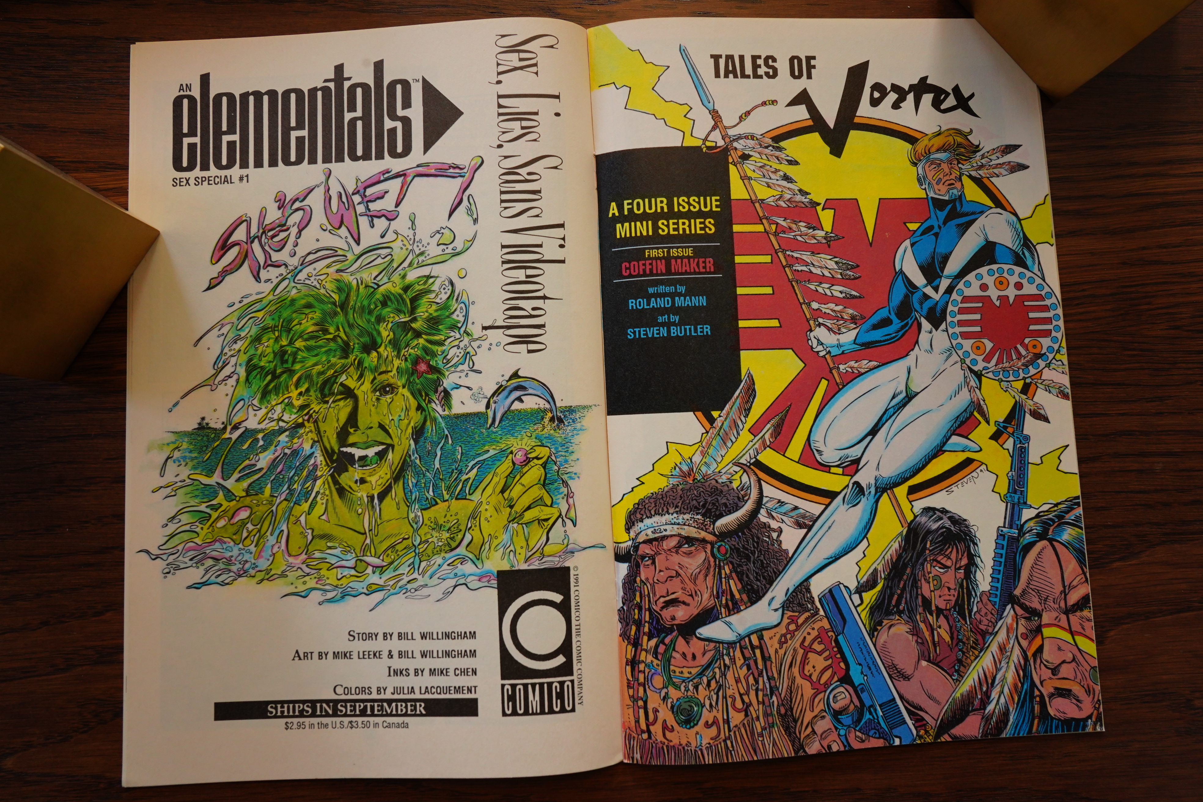
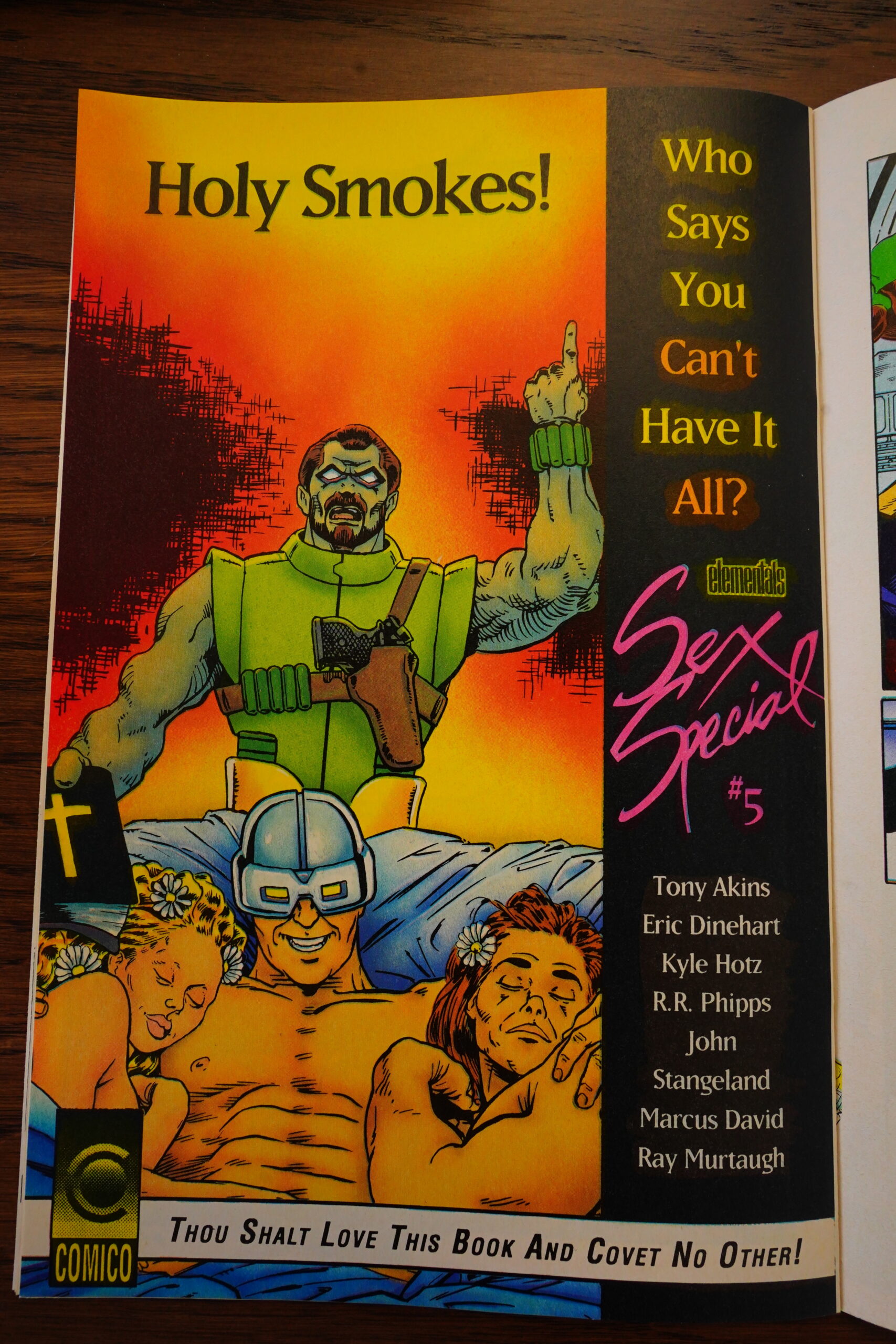
Ah yeah — the very first Elementals Sex Special. There are many more to come… I’m so looking forward to reading all of those. (I haven’t even peeked at them yet, so I’m not sure how X-rated they are.)
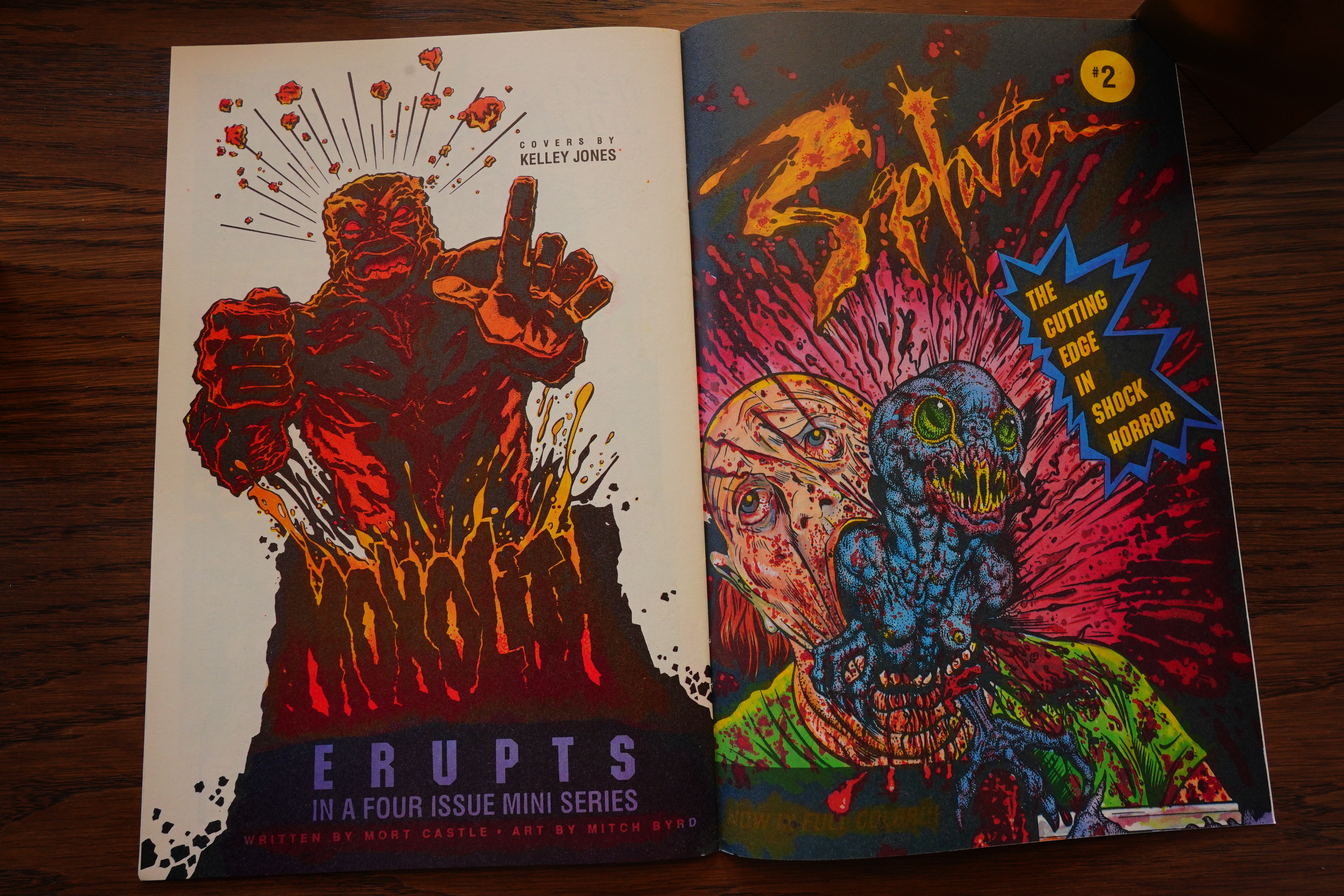
A four part Vortex mini is announced, but only two issues would go on to be published.
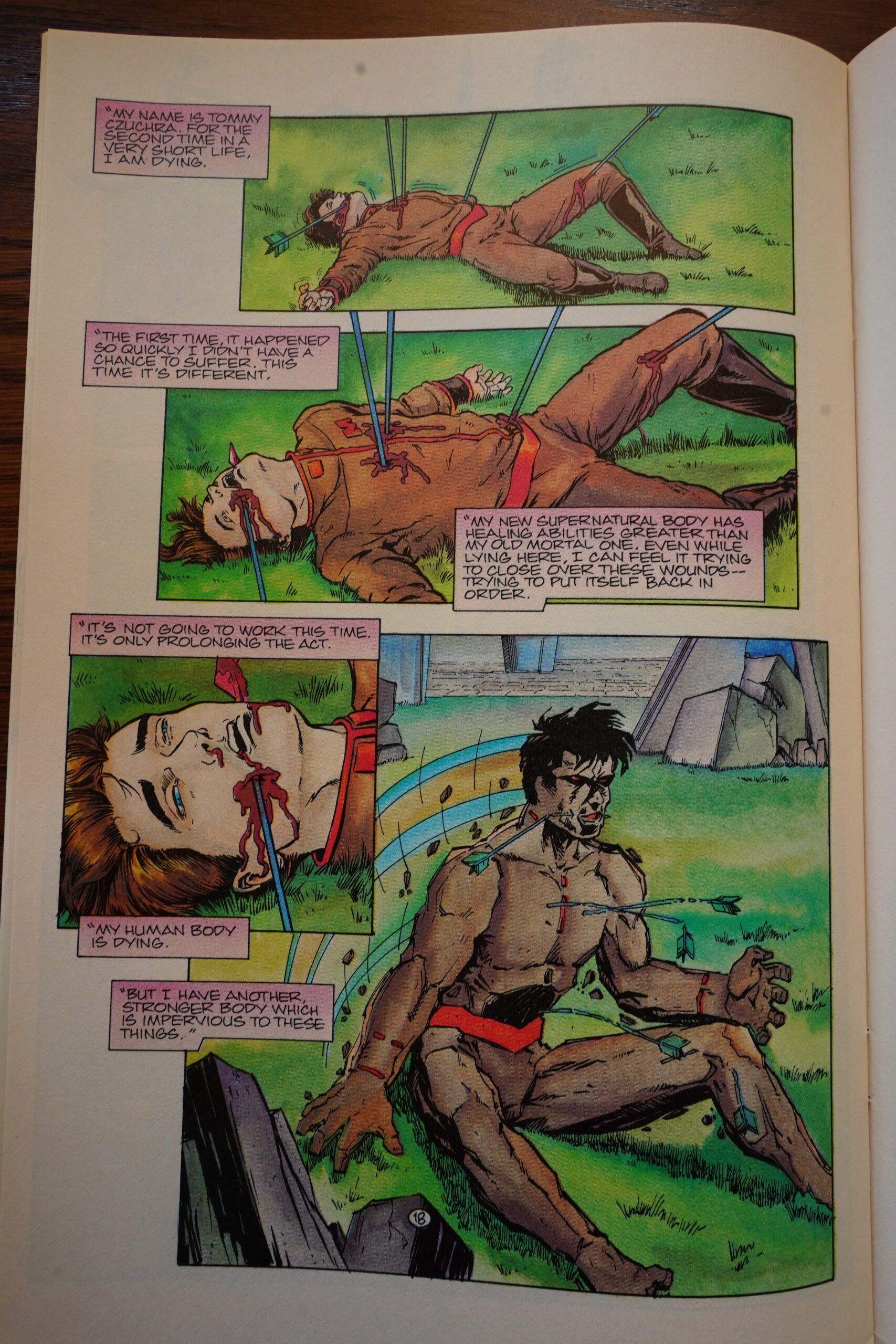
The cover promised us a death! And … the Monolith civilian character is apparently killed? But aren’t the Elementals dead already? And were then killed some more later, but still returned to life? Anyway, that’s apparently not the promised death (masterful fake-out), but instead this:
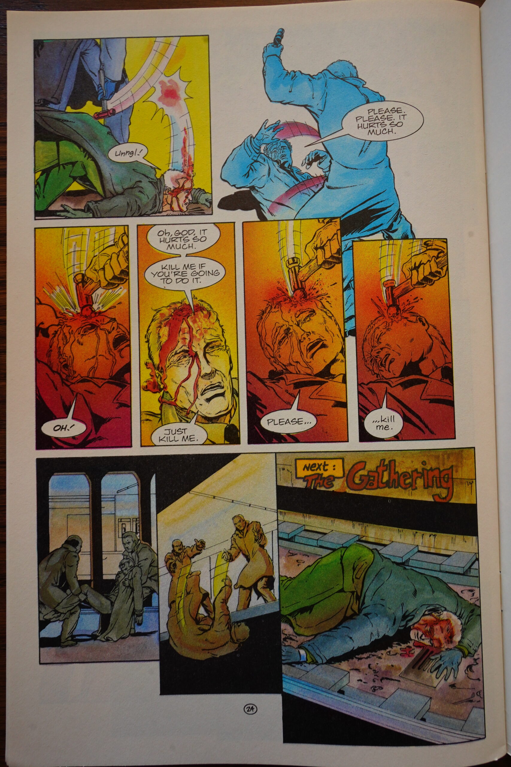
The old guy being painfully killed here by expert assassins (hired by the secret gummint organisation that are kinda running Elementals) is the leader of a rival secret gummint organisation… but it’s been so long since we’ve heard about that drama that it feels like it comes rather out of the blue. Par for the course with Elementals, I guess.
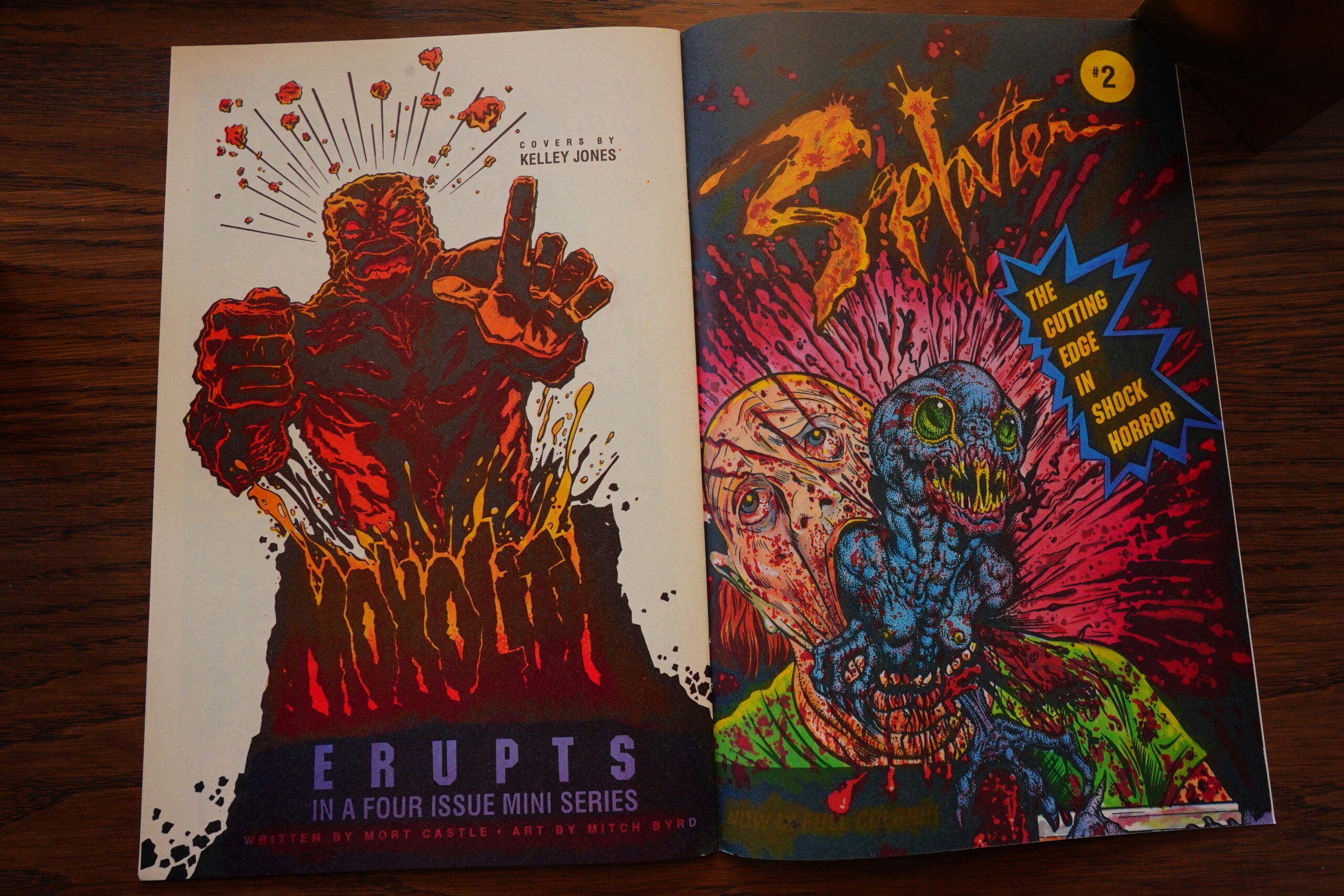
Splatter? That’s not a Comico series…
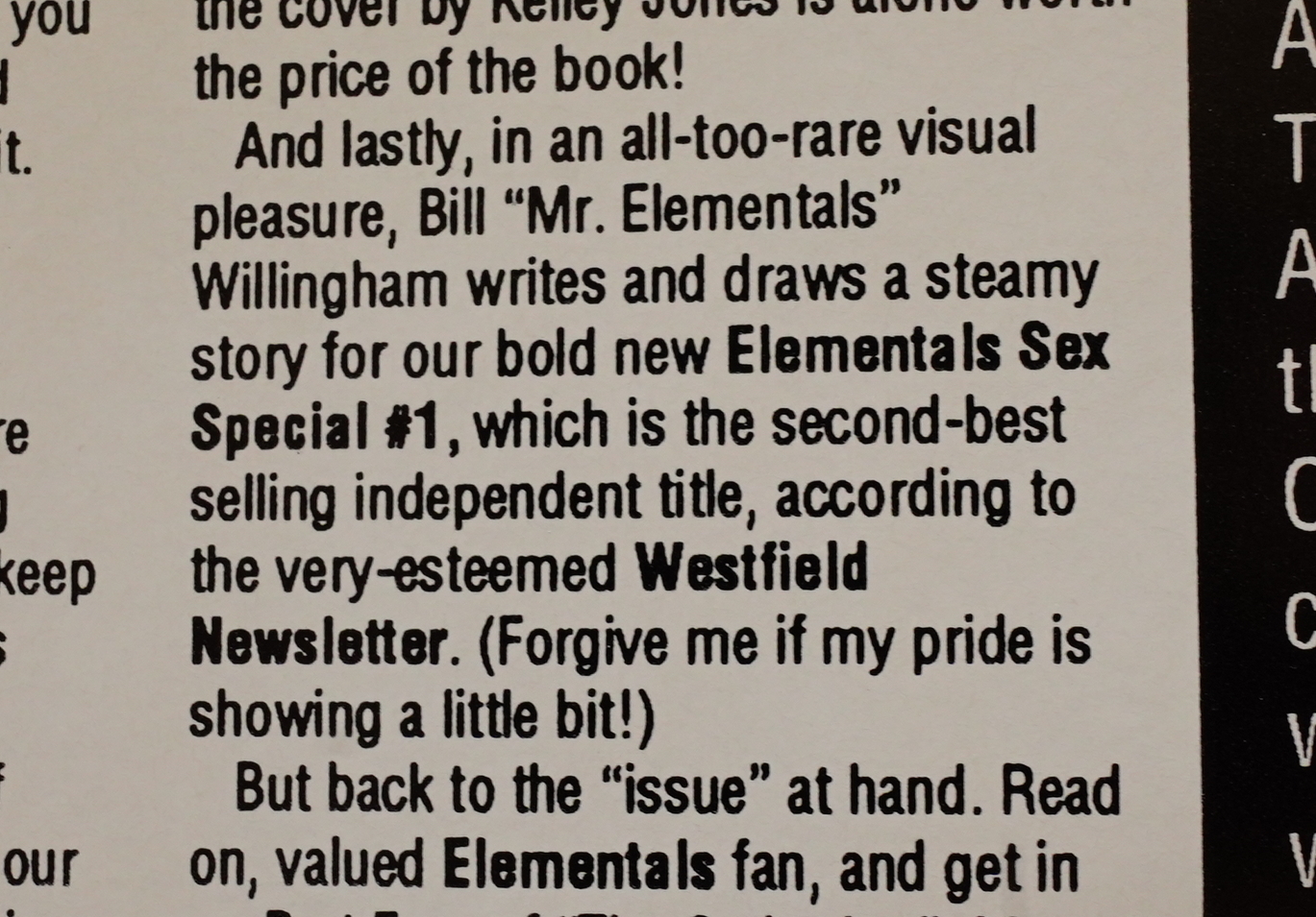
The Westfield Newsletter apparently claims that Elementals Sex Special is a huge hit.

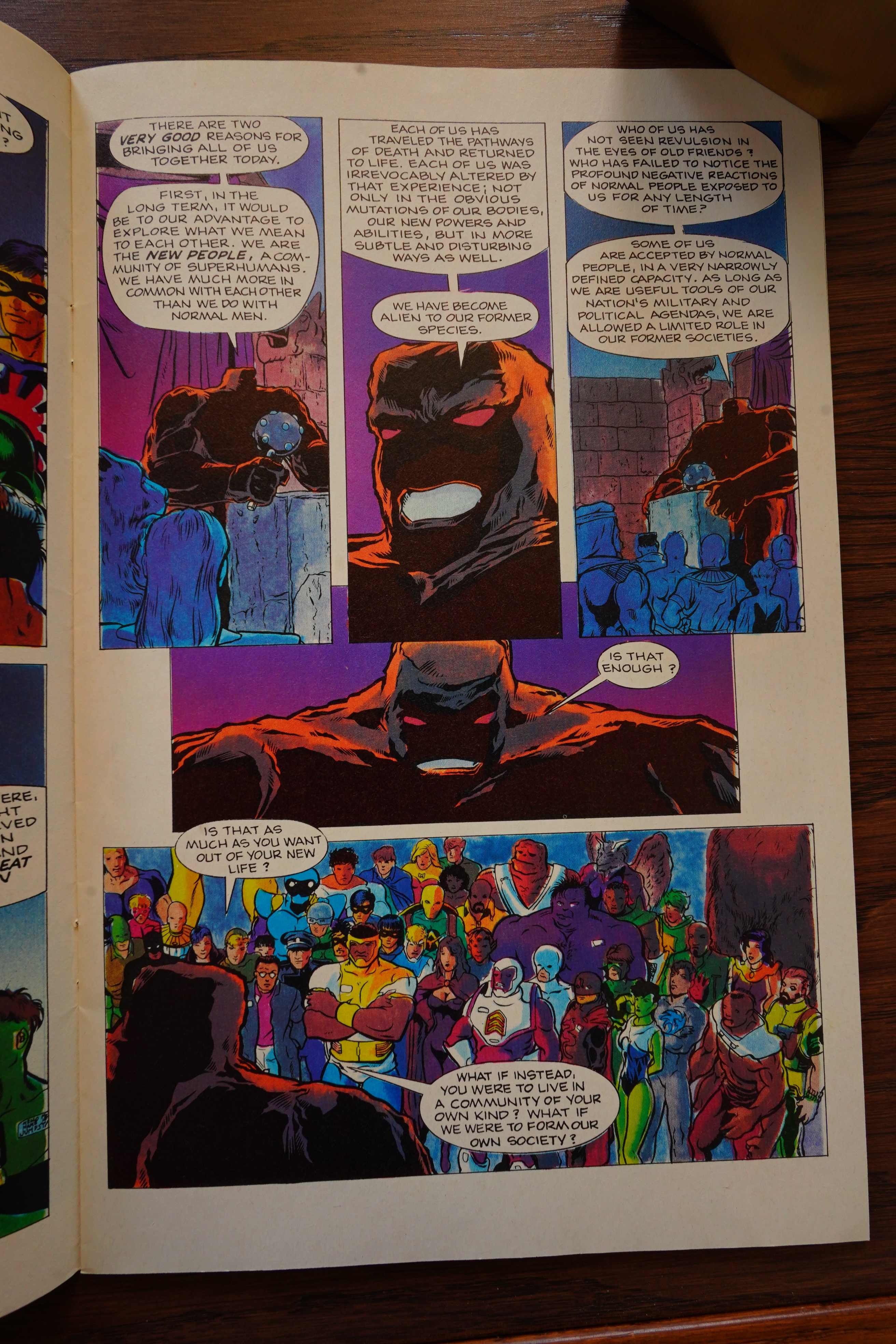
OK, Monolith outlines the plan: They’re going to make a … society of super beings because… humans hate them. So that’s like a riff on many X-Men plots, of course, but it really hasn’t been established that humans hate super-heroes in this world — they rather fawn on them, and buy their burgers and stuff. So it doesn’t really make much sense.
I’ve read that Willingham would return to these themes later in his Fables series, and then went on to announce that the entire thing was a metaphor for Israel, so perhaps that’s what’s on his mind here as well? I dunno.

Leatherface? Splatter? Klownshock!? Oh, it’s a separate published called Northstar, which I guess is probably also owned by Rev?
Er… why would an editorial recap the issue we’re just about to read? Odd.
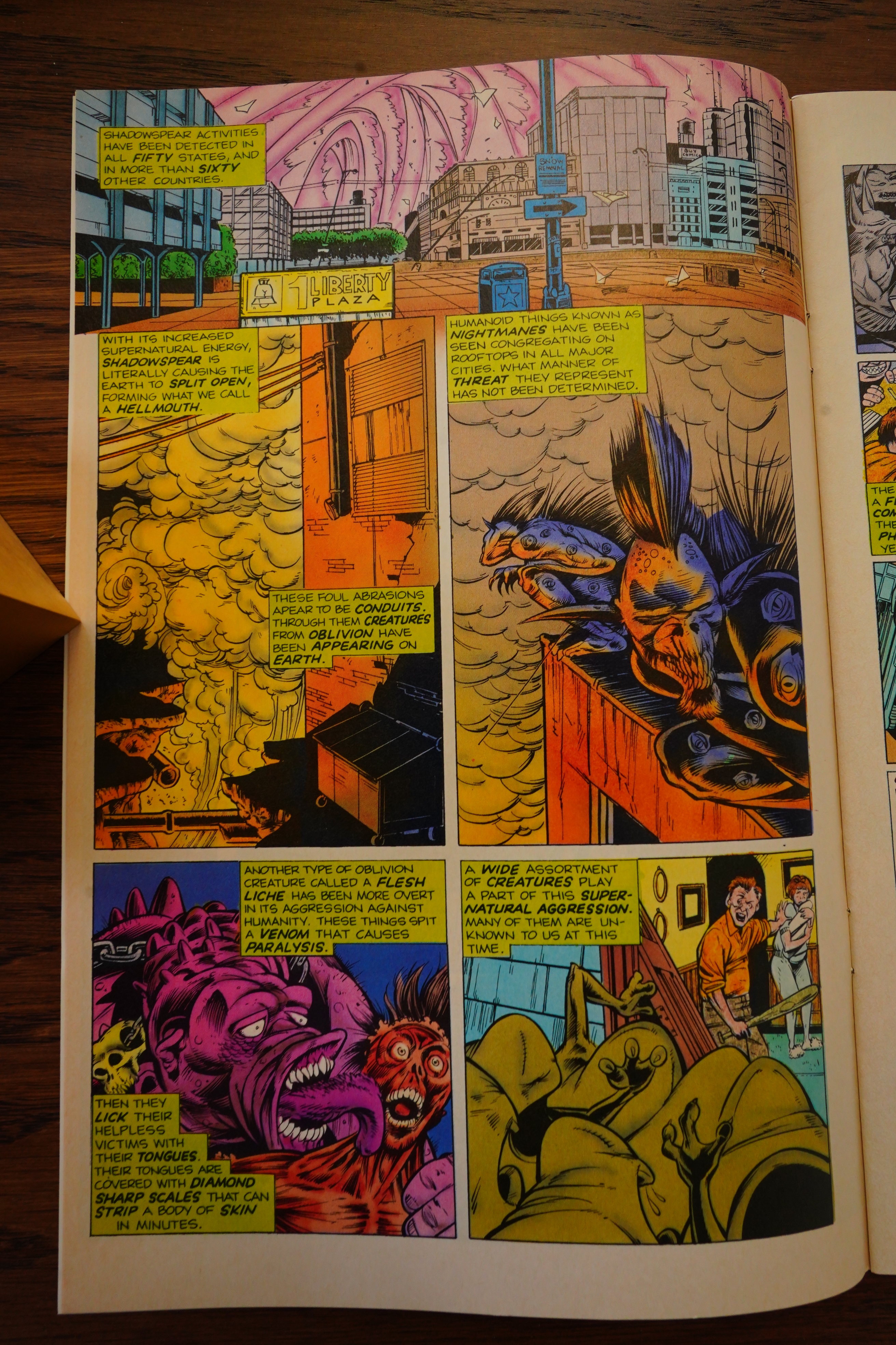
And then we get some ramp-up on the Oblivion War thing, at least.
War is hell!

A Kelley Jones portfolio from Comico? I did some googling, but this didn’t seem to ever happen.
Heh, Willingham throws another tantrum in response to some pushback on his previous snit… but then says something interesting: “Since I no longer have no relationship with Comico…” So he’s quit? Were all the previous RevConico Elementals issues just part of the backlog at RealComico? Let’s see… I guess that could be possible: Somebody stated that Comico used to have at least half a year’s worth of books in hand before publishing, so I guess we would reach the end of that now…
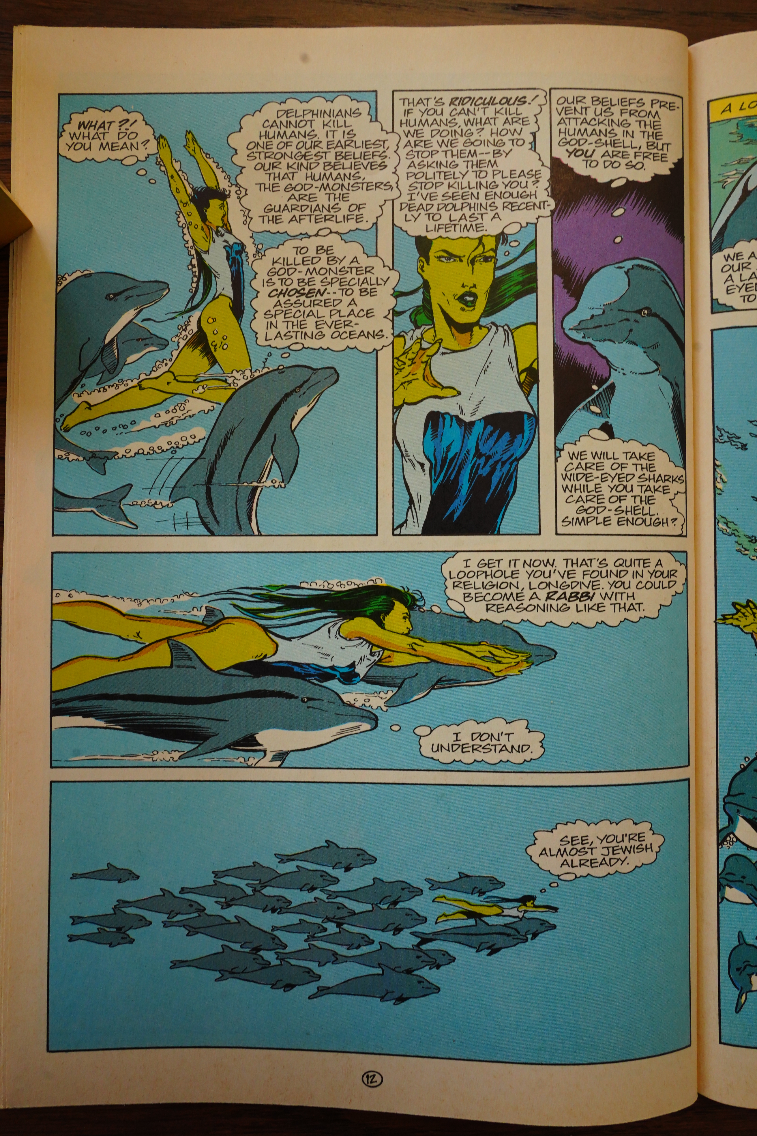
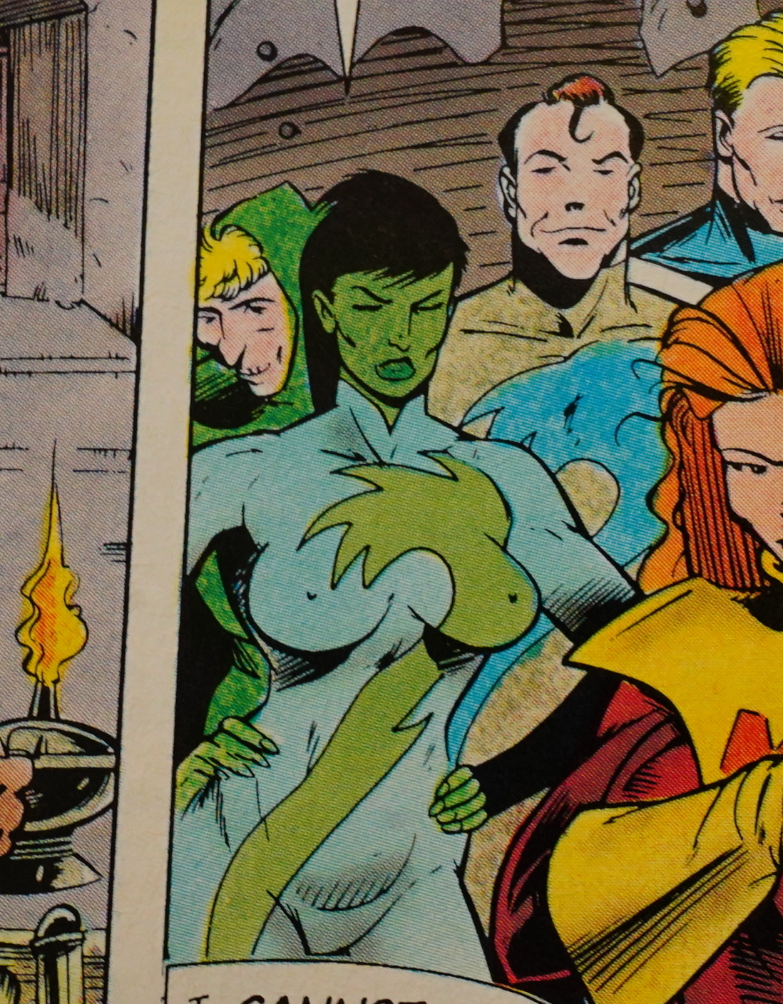
Anyway, the editor(s) also answer the mail, and say that yes indeed, the Willingham text was indeed racist, and not only that, but the Fathom scene was anti-Semitic. I don’t recall whether I snapped a pic of the page above, but here it is:

Nah. That’s just a joke, man. A pretty clichéd joke — rabbis amusingly finding work-arounds for strict rules isn’t exactly a new observation (a la “jesuitical”).
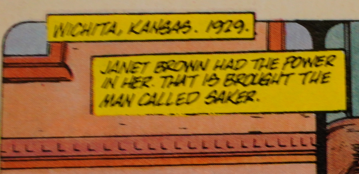
This, on the other hand, is a very original simile.
And speaking of original — that’s some character design work.

And indeed, Willingham leaves the book, and Jack Herman (*sigh*) takes over the writing. We also have a brand new art team, which could point even more to the “we were just publishing backlog” idea.

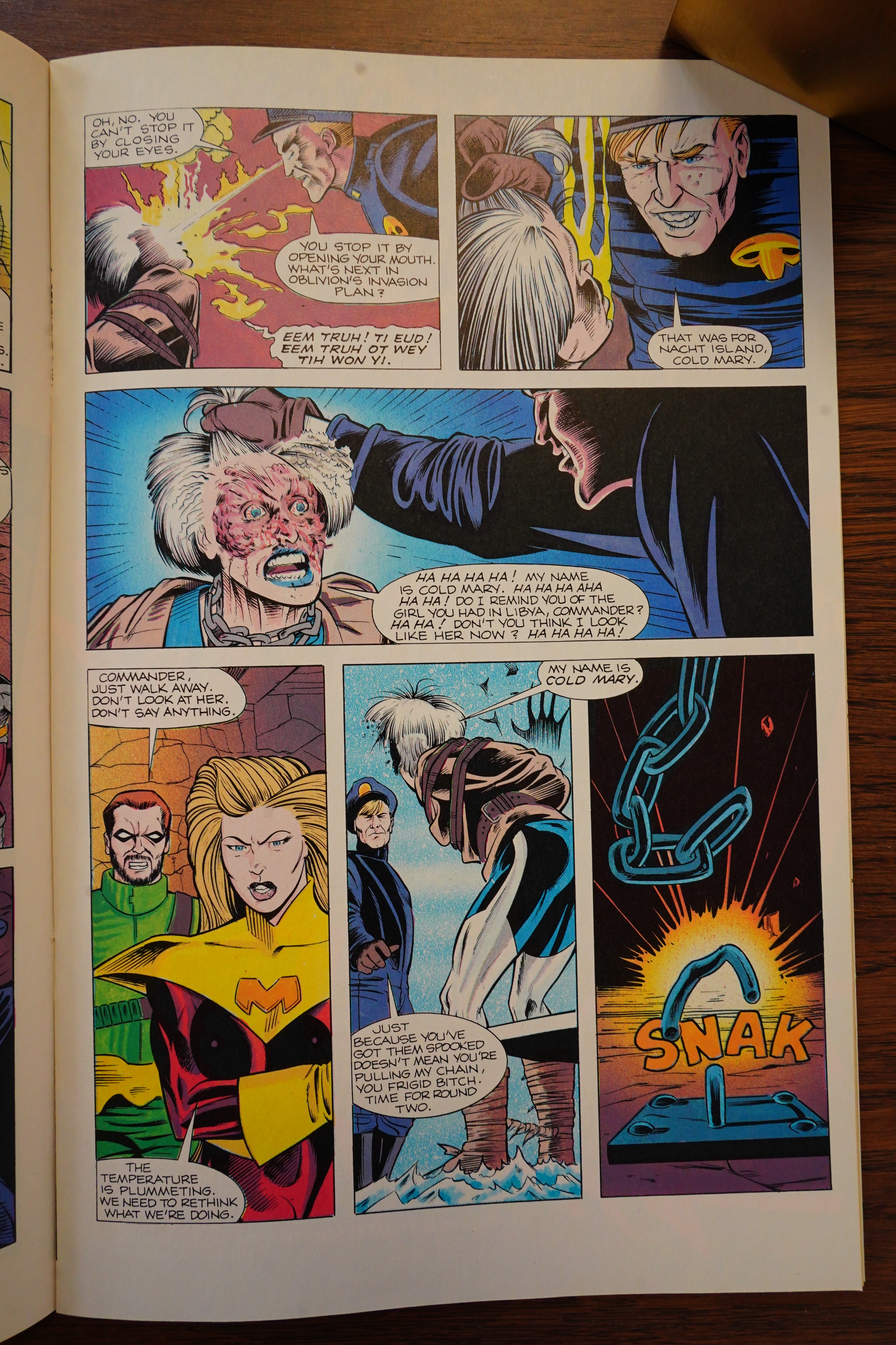
Herman also tries to be all edgy, so he has the heroes torturing one of the… er… villains? It’s never exactly established who Cold Mary (there’s also a character called Bloody Mary…) is, but she’s part of the invading demonic forces?
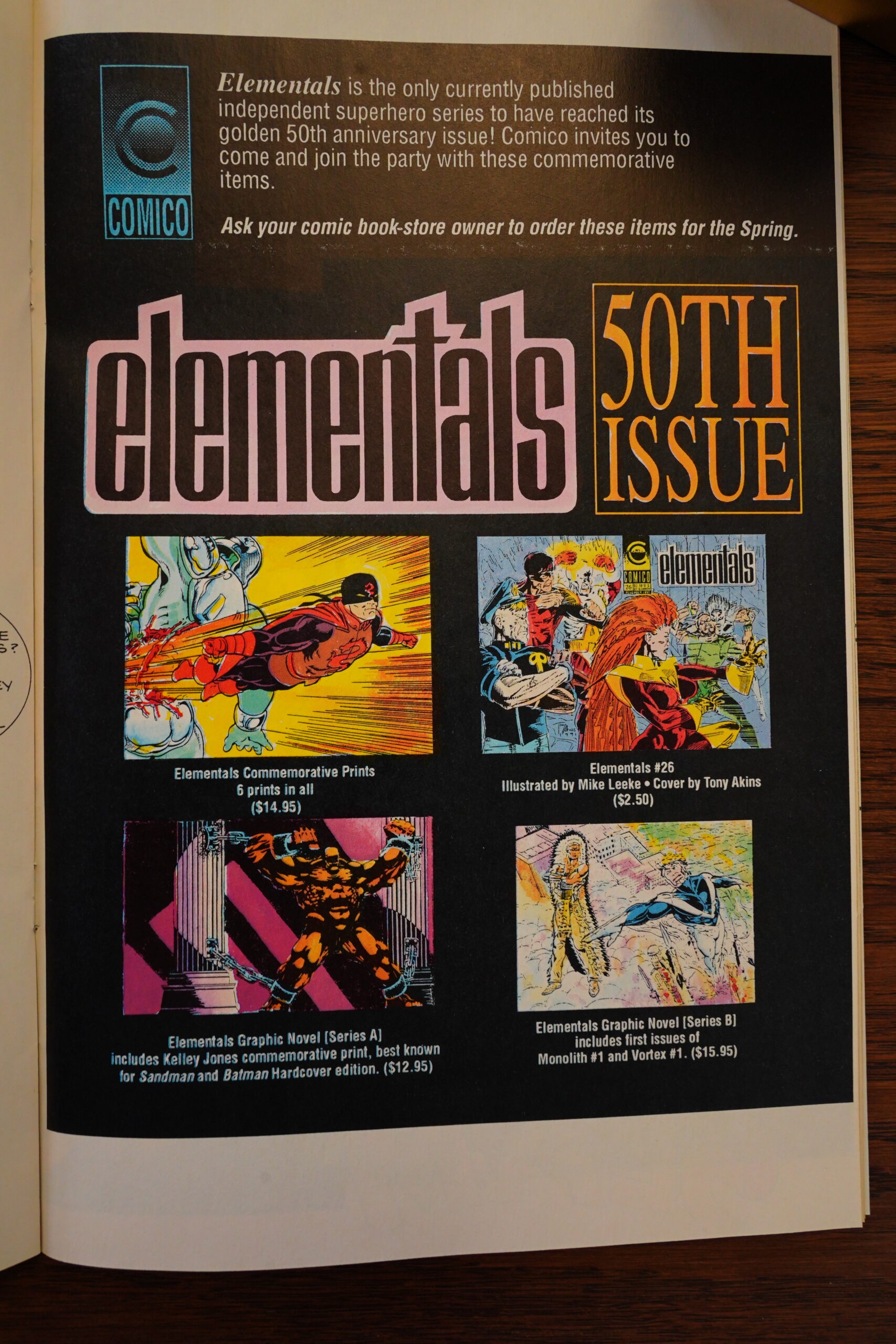
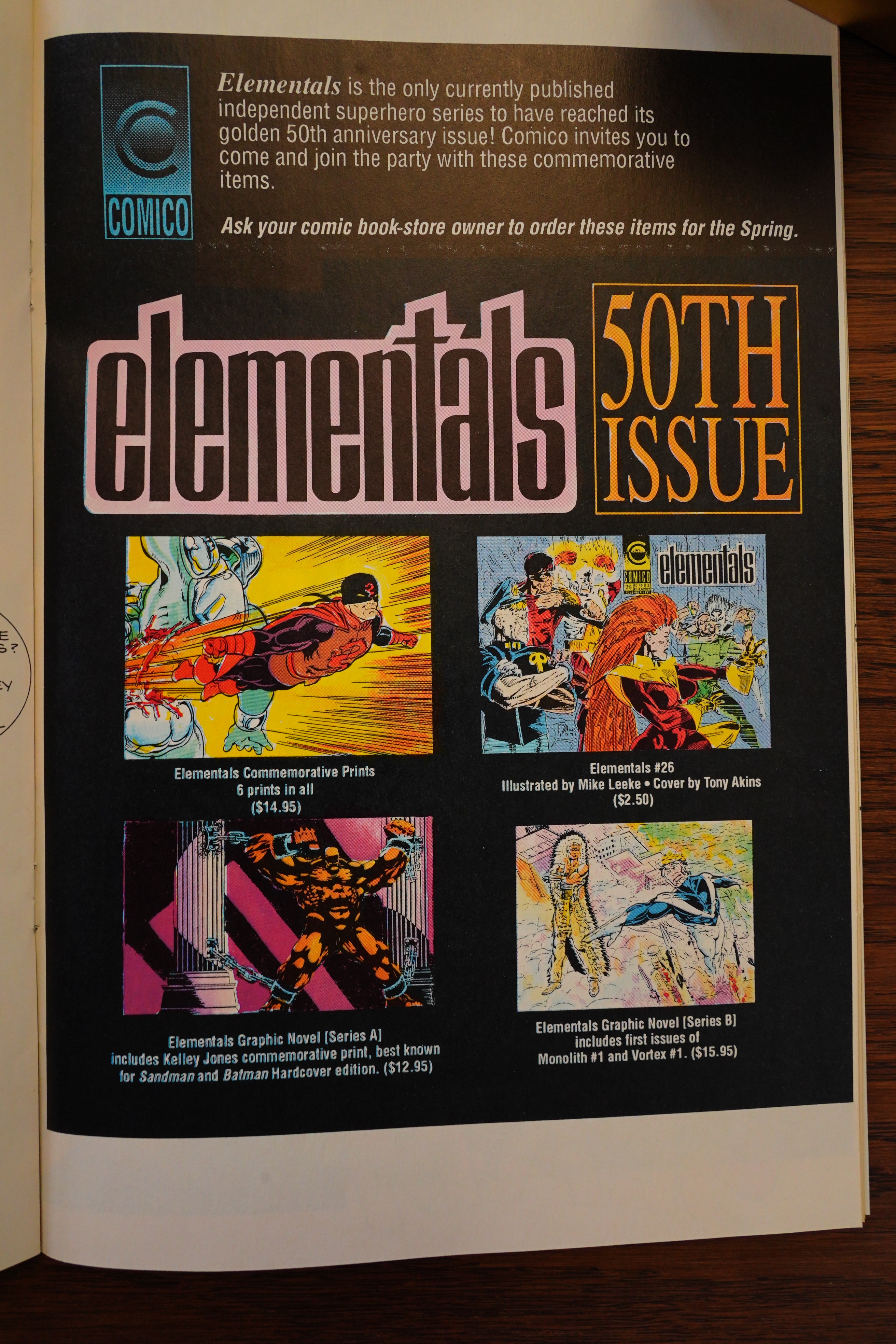
Comico tries to drum up some excitement about there now being 50 issues of Elementals. I guess it is something of an achievement.
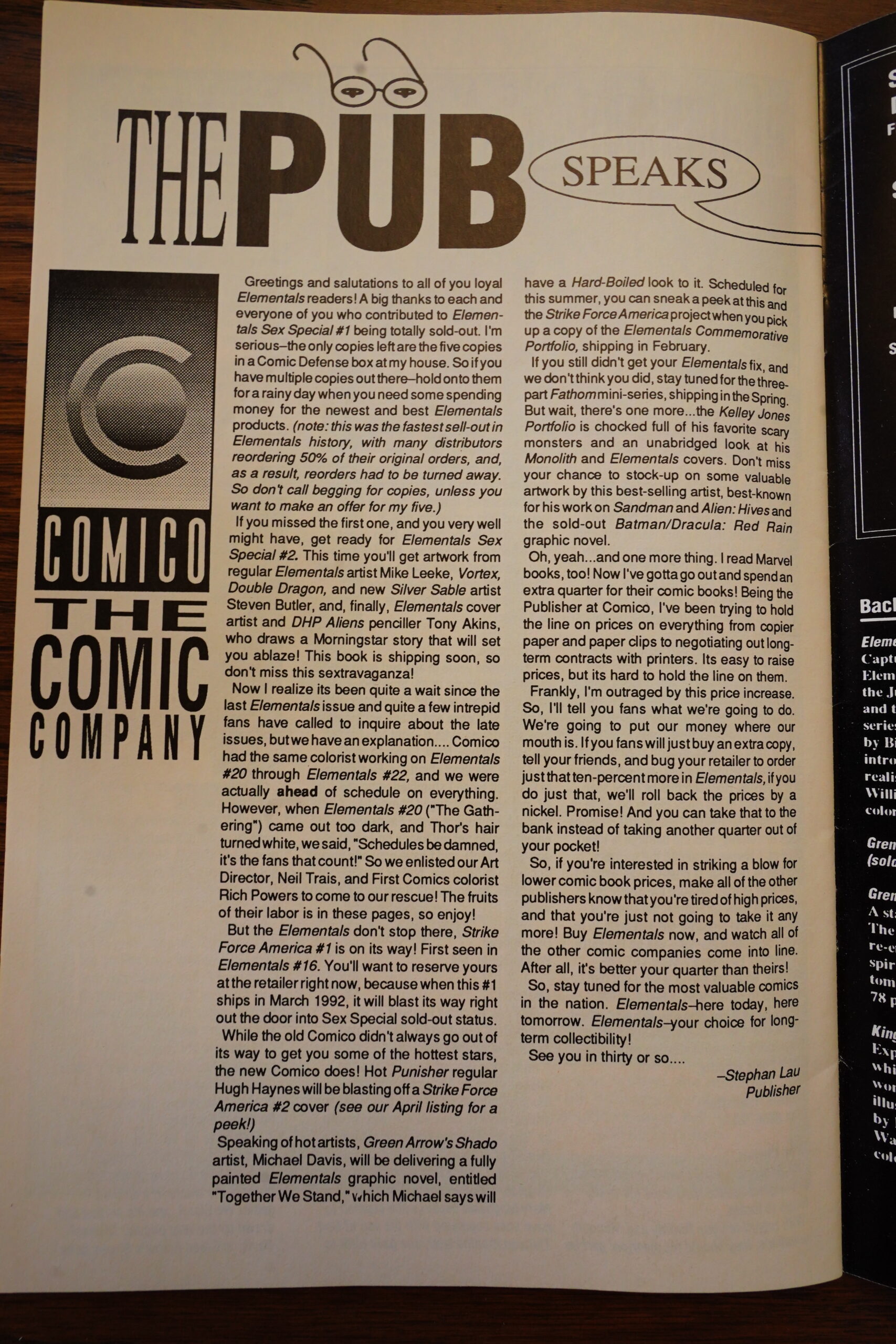
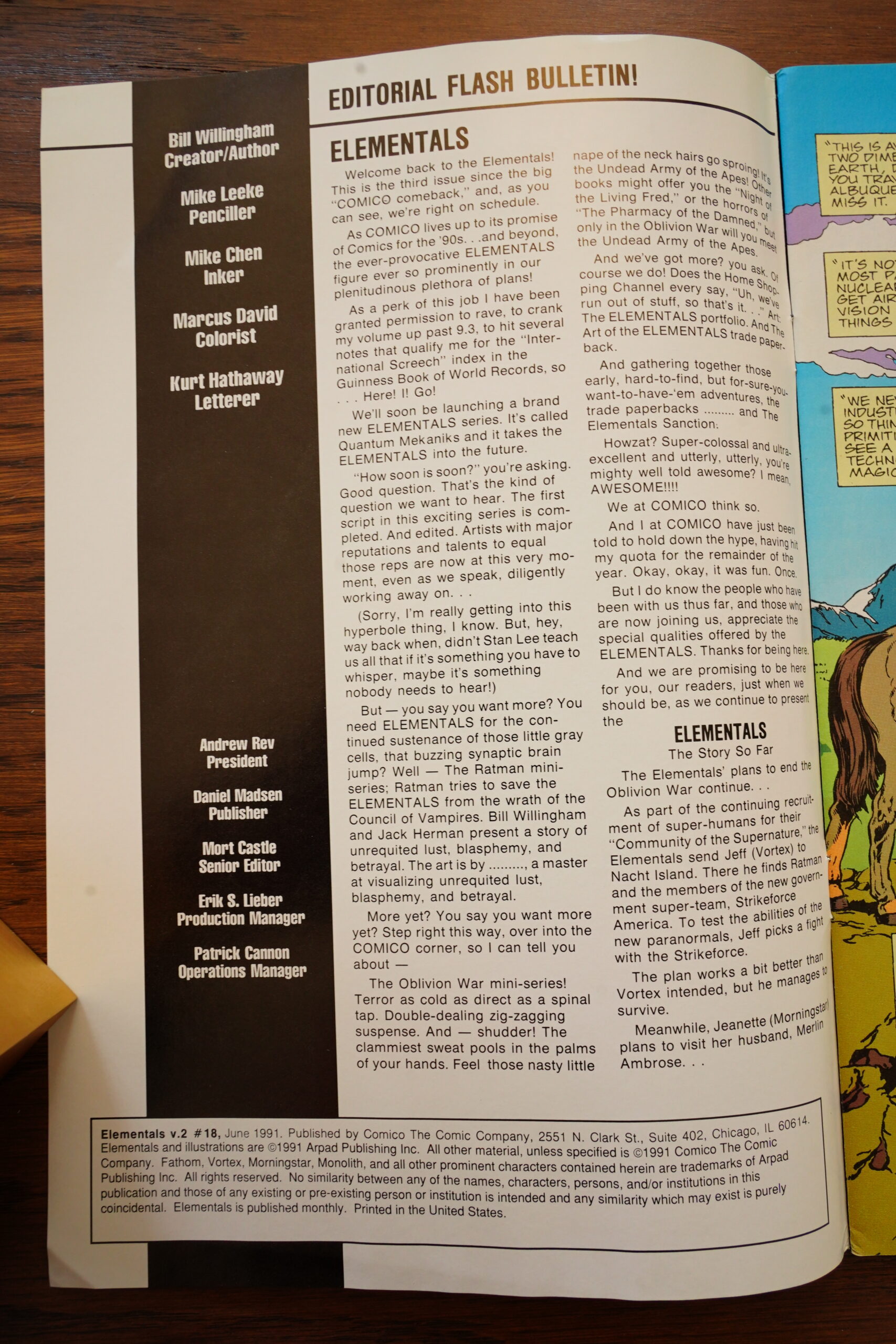
Did I miss something? Stephan Lau is now the publisher… was he the publisher all along after Rev took over? This is his first and final column — “see you in thirty” seems to point to wanting to make this a regular thing, but nope.

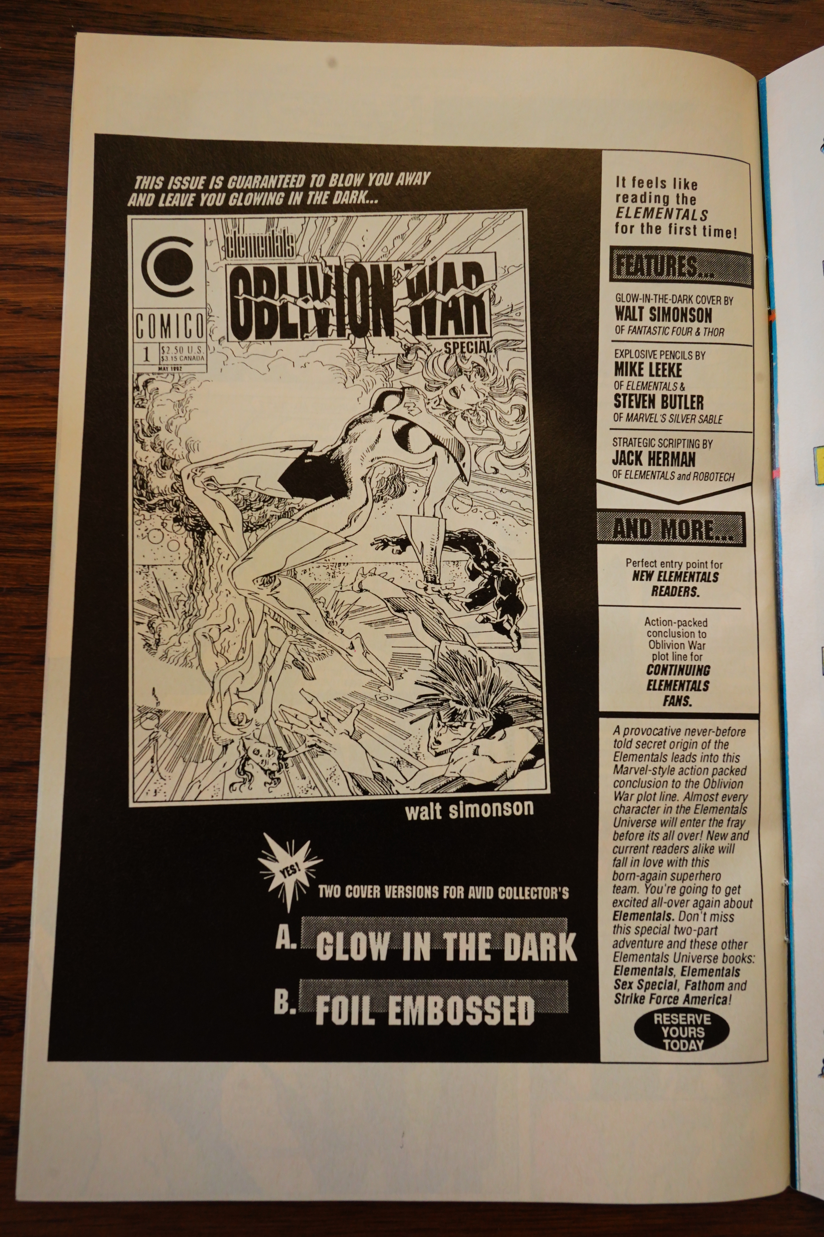
So… there’s going to be a Oblivion War special? Where they’re going to do the actual ending of this long gestating mess? With a glow-in-the-dark Walt Simonson cover.
Apparently this never happened, but Comico would go on to publish something called “Oblivion” three years later, but that doesn’t seem to have anything to do with Elementals? There’s also an Elementals special called “How The War Was Won”, so perhaps that has the conclusion. Time will tell.

There’s a Strike Force spin-off, too.

War is hell.
I think the redesign of Fathom’s suit was supposed to have a sexy cut-out, but the new art team, er, took it a bit further.

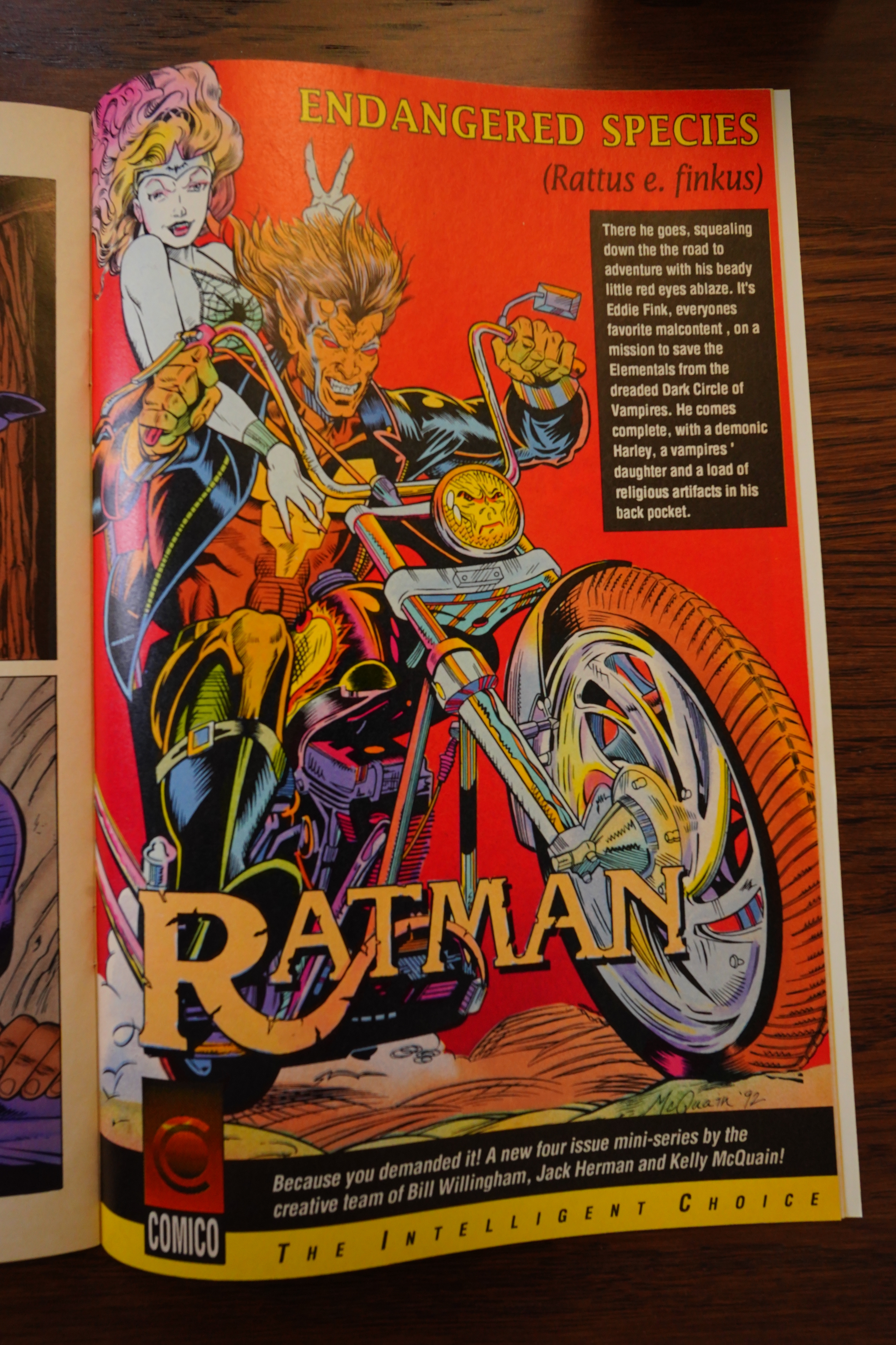
A Ratman mini-series… by Bill Willingham!? I thought he quit? This series didn’t happen, of course.

The final issue arrives in April 1993 — half a year after the previous one, apparently. And the Oblivion War is going to last until #30 now?
The final issue is perhaps the messiest of them all, what with the missing proff-reading…
… and a horrific printing job.
#metoo
It’s a typical Jack Herman issue — it’s just a bowl of unstructured and borderline unreadable nonsense.
This issue didn’t happen, either, so I guess Comico was going bankrupt again?
And this is how the final issue of Elementals ended.
But a further issue is teased.
Man, what a mess. Elementals v2 started off so well — it was fun and fast moving. Then Willingham seemed to lose interest again pretty quickly, so we got all kinds of plot lines that went nowhere… and then Comico went bankrupt, which put a damper on the proceedings. But when the series came back, it was just a soggy mess: The “Oblivion War” thing went on and on and on, but was never actually interesting.
And then it just stops.
The Superhero Book, page #223:
But Willingham came and went, and Elemen-
tals issues written and drawn by others lacked his
magic and verve. In early 1989, Comico devised a
“best of both worlds” scenario to keep Willingham
on the title and publish what had become a strong
seller for the company on a monthly schedule: Ele-
mentals was relaunched with vol. 2 issue #1, with
Willingham scripting and providing cover art, but
with Mike Leeke and Mike Chen on interior art.
(superstar artist Adam Hughes, then an up-and-
comer, guest-penciled Elementals #12). This plan
worked well-until bankruptcy forced Comico to
close its doors in the early 1990s. Not long there-
after, a new financier revived Comico and purchased
Elementals from its creator. Willingham and the
artists and editors involved with the earlier, ground-
breaking series chose not to participate in this new
venture, and the new publisher pandered to the
marketplace with some gratuitously exploitative
comics involving the characters (including Elemen-
tals Sex Special #1-#4 and Elementals Sexy Lin-
gerie Special #1). The new Comico was dead by the
mid-1990s, and it took Elementals to the grave with
it, an unfortunate conclusion to a once-celebrated
series. – ME
Back Issue #24, page #83:
A SECOND VOLUME, A SECOND CHANCE
While the first volume of The Elementals wound down,
Michael Eury’s comics career began as assistant to
Diana Schutz. By the spring of ’88, Eury became a full
editor and one of his responsibilities was The
Elementals. Why? “Other than her childhood love of
Supergirl, Diana has limited interest in super-heroes,
so since I was a super-hero fan, it made sense that I
inherit Elementals,” Eury explains.
Why did Willingham return to the book? Eury says,
“My vague recollection is that in volume 2
[Willingham] was reenergized by being able to single-
handedly chart the series’ direction as its writer, with
other artists handling the interiors. Being a neophyte
editor, I really had no say in the book’s direction-
especially since it was a creator-owned book, in an
era where certain creators were gaining clout and
control over their material.”
For the artwork, Comico’s publishers turned to an
old friend who made a name for himself in the emerging
field of anime adaptations.
To lay the educational foundation for a career in
comic-book illustrations, Mike Leeke attended what is
now known as the Philadelphia University of Art,
where he made the acquaintance of Gerry Giovinco,
Bill Cuccinatta, and Matt Wagner, three of Comico’s
co-founders, who were putting out a school newspaper
that was-no surprise-90% comics.
After Comico got off the ground, they needed
pencilers for its expanding range of Robotech titles,
and Leeke received his first professional comics
assignment: “They’d seen my work over the years and
knew that I was heavily influenced by Japanese animation.
I immediately said yes and quit school the next day.”
Leeke penciled Robotech: The Macross Saga’s covers
starting with #3 and the interiors three issues later. For
each issue, he viewed an episode of the cartoon,
selecting which scenes would go into the story before
turning it over to scripter Jack Herman.
Soon, a rush inking job on the title was needed just
as Giovinco discovered Mike Chen at the Joe Kubert
School of Cartoon and Graphic Art. Leeke remembers
seeing Chen’s first inks: “I was in the office and they
showed me what was coming in. I freaked
out. I was in love with his inks from the
moment I saw them.” From there, “the Two
Mikes” became a highly praised team.
However, sales eventually necessitated
the Robotech books’ retirement just as the
Elementals assignment opened up. Having become
good friends with Willingham, Leeke says, “I guess Bill
pitched my name as one of the people he would like
on the book if I was available.” Now Leeke could
draw in his more natural dramatic style.
As for Willingham’s scripts, Leeke remembers,
“I didn’t have to make up anything” as he did
for Robotech. From specific instructions
(down to the camera angles) to even
the reference material for the backdrops
(or where to find it), Willingham’s scripts
had it all, which Leeke found refreshing.
Part of keeping the stories fresh for
Leeke involved not knowing future
events. “Each time I got a script, I
would always get on the phone imme-
diately and beg [Willingham] to tell
me what’s going to happen next.
And he would say, ‘You’ll have to
wait until the next issue.””
Willingham’s relocation of the team
to Philadelphia took advantage of
Leeke’s familiarity with the city. “One of the
things that Bill started when he was drawing
the book was, he had the Elementals placed in the
real world. That meant having real places, real items,
real food stuff, real restaurants, real celebrities
show up in the book. He wanted me to continue
that, so that meant I had to go out and get a lot
of photo reference, which was fun.” Before the
advent of the Internet, a script set in Seattle
required Leeke to visit his local library for visual
references. But with the Philly setting, Leeke
could grab his camera and snap away at
what were often exact addresses.
Back Issue #24, page #83:
A COSTLY EXPERIMENT
Wanting to expand beyond the direct-sales system,
Comico had, in 1987, arranged for newsstand distribution
of its titles. For the better part of a century, the various
national magazine distributors provided product to
newsstands across the continent. Print runs were
often based on guesswork, and any unsold product
would be returned to the publisher for full credit.
Unfortunately, after tallying the returns on its widely
unknown publications, Comico accrued a devastating
debt, the full extent of which was secreted by its
owners from the editorial and marketing staff. In 1989,
Comico struck a deal with DC Comics to distribute
its titles into the direct market, hoping that by
grouping them under DC’s umbrella they would
find a wider audience. That experiment quickly
failed, and Comico’s finances were strained to the
point where the company went into bankruptcy
and sought a new owner.
Enter Andrew Rev. A fan with no training in
comics publishing, Rev purchased Comico and
moved the editorial operations to Chicago, minus
Shelly Roeberg. His position secure on Elementals, art
director Neil Trais became Leeke’s contact. But Leeke
soon discovered that Trais was a neo-pro with very little
authority, mostly serving as insulation between Rev and
the freelancers. “As time went on, I began to discover
that from my point of view, [Rev] didn’t know a lot
about the industry, didn’t seem to take advice about
how to deal with certain things, and didn’t seem to
care about anybody else’s opinion. He was going to
do things his own way, even if it meant burning
bridges with important people.”
[…]
Sexually explicit comic books were proving profitable at the
time and Rev wasn’t a man to leave a trend unexploited, which tossed
a spanner into plans already in production. A tale involving Walker,
a dolphin/were-human, and Fathom consummating their deep friendship
was scheduled to be #17 of the regular series. Around the same time,
Rev pushed into production a stand-alone special revolving around Operation
Desert Storm. A last-second decision by Rev changed issue #17 into The
Elementals Sex Special #1. However, with issues #18 and 19 already in production,
the former Desert Storm story became Elementals #17.
Leeke recalls, “I’m sure fans were sitting there, going, ‘What’s going on with
the Oblivion War here? We’re in the middle of a storyline and all of a sudden,
this Iraq Special takes place and it has nothing to do with the current storyline.””
Soon, checks to Leeke began coming late and bouncing. The artist tried
to settle the situation with Trais, who was powerless to solve the problem.
At this point, Leeke began dealing with Rev directly, holding art pages virtual
hostages. “I would draw the pages up, then make Xerox copies of them, only
with white Xs going across the entire page so [Rev] couldn’t reproduce the
artwork.” Leeke then waited for the checks to clear before sending in the originals.
“That went on for several months until he got used to the idea that he was
never going to get any artwork out of me unless he pre-paid for it. Every month,
for a while there, I would get the check in advance and then I would start
working on the pages.”
In addition, convention appearances found Leeke fielding questions from other
freelancers concerning their own payments. “I was quickly becoming another
face to answer for Andrew Rev’s mistakes,” Leeke grimaces. “I sympathized
with all the freelancers that got burned-I was one of them-but I knew it
was time I started looking for other work.”
[…]
Leeke enjoyed working with Herman for their brief time together. “Jack
Herman was the heir apparent to write The Elementals,” Leeke says.
“Amazingly, Bill and Jack have similar styles of writing and the ideas that Jack
had for the Elementals seemed to be a natural continuation of what Bill was
doing, so it’s almost seamless. If you were reading the book, you’d never
know that there was a change in the writing.”
One of the conditions of the sale required Willingham to produce what he
calls in his F.A.Q. at Comicon.com “an exhaustive bible on how to continue the
series to its logical conclusion. This document, filling two of the largest three-ring
binders made, was very probably the largest, most complex series bible ever
produced for a single comic-book title.
“The last time I had any occasion to visit the Comico offices, one of the
volumes of the series bible was being used-very effectively, I have to admit-
as a doorstop.”
Heh heh.
But OK, I guessed wrong — the Rev Comico issues were produced for Rev.
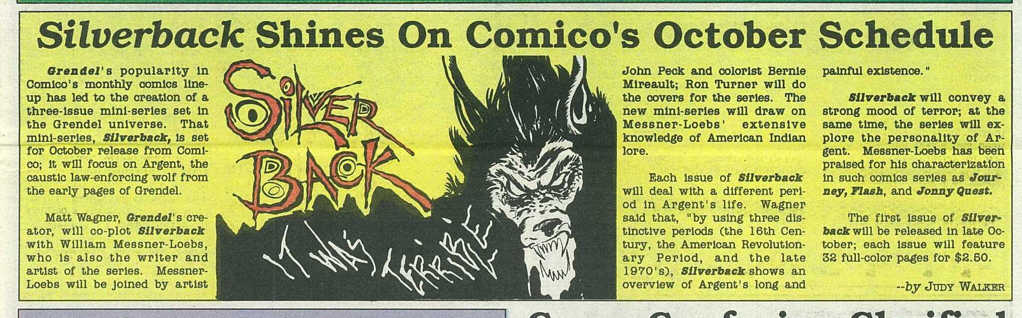
Amazing Heroes #159, page #50:
* ELEMENTALS
By Michael Eury
“When is Bill Willingham coming back to do more Elementals
stories?” “When is Comico going to drop those fill-ins and put
continuity back into Elementals?”
Recently, Comico has been deluged with mail asking those
very questions, and, after months of preparation, we’re doing
something to answer them-something exciting!
Bill Willingham is back at the creative helm of comicdom’s
most provocative super-team, now as the writer and cover artist
(and interior artist of occasional Elementals Specials, like Special
#2, now on sale), reintroducing the much lamented issue-to-issue
continuity to the series.
Joining Willingham as the all-new art team on Elementals are
penciller Mike Leeke and inker Mike Chen, two pros who rose
to fame from their previous collaboration on Robotech: The
Macross Saga-and if you think Leeke and Chen can only draw
robots, then the following pages will surprise you. Rounding
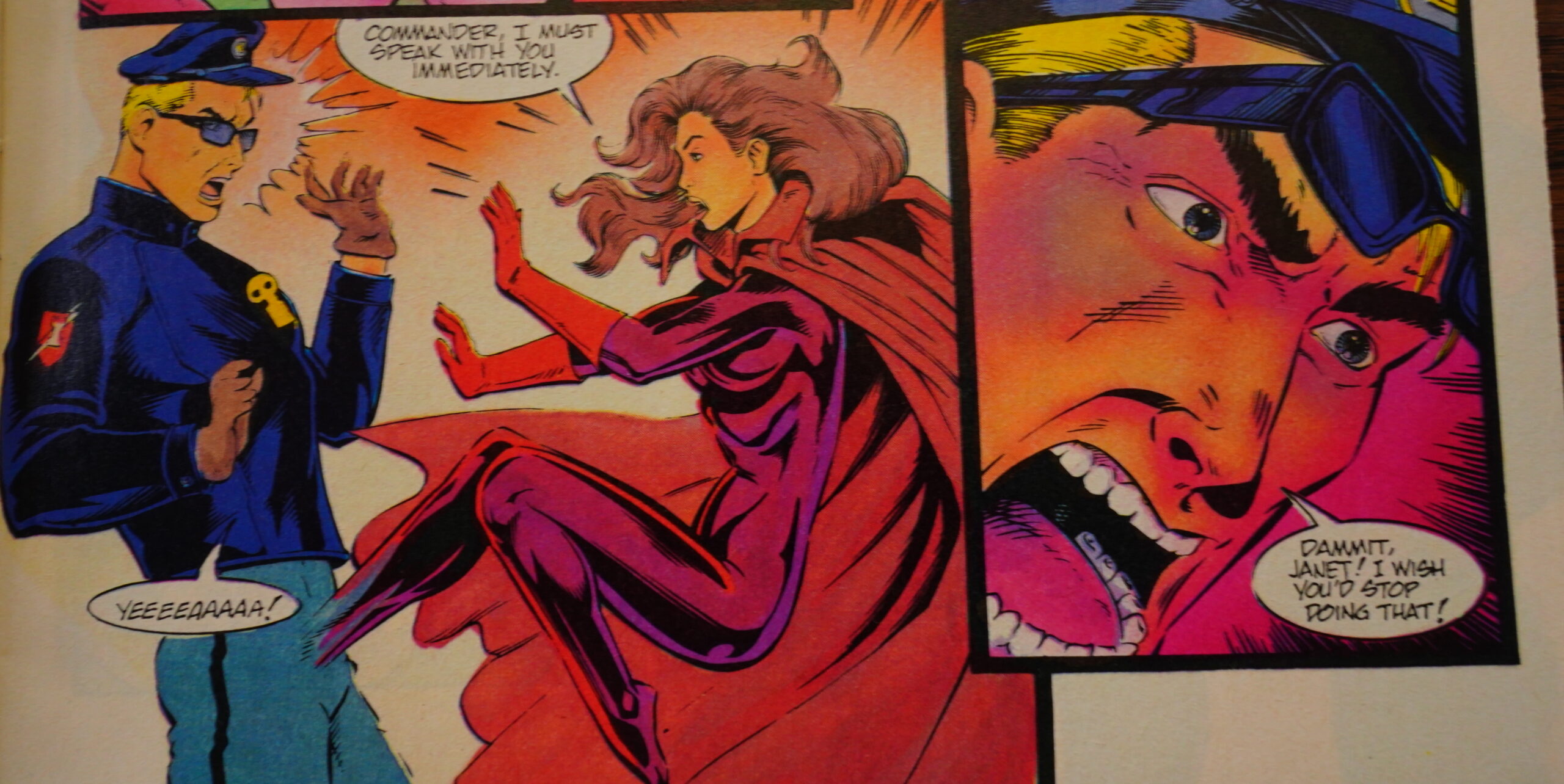
out the book’s creative personnel are colorist Janet Jackson, let-
terer Bob Pinaha, and editor Michael Eury.
With its new art team, new direction, and the return of Bill
Willingham, this rejuvenated Elementals series is something
special-so special, in fact, that Comico is relaunching the series
in late March with an all-new first issue!
It’s a small world… Eury writes enthusiastically about Elementals for Amazing Heroes, and then he’s the editor a few months later.
Amazing Heroes #161, page #30:
Elementals suspended publication be-
cause, according to Willingham, he
and Comico were “kind of on the
outs.” But mostly, it was “just because
I was a little bit burned out on the
Elementals. I was not all that excited
about the book so I was thinking about
ending the contract with Comico” and
cancelling Elementals.
Instead, Willingham explained, he
and Comico discussed Elementals and
other projects and decided Elementals
would continue with Willingham writ-
ing, but not drawing it. Though he
doesn’t consider himself a slow artist,
drawing the comic regularly without
sufficient inspiration took too much
time.
Finding A New Team
During the hiatus, Willingham re-
charged his creative batteries and
commenced plans for the new Ele-
mentals. Once the contract for the new
series was signed, a creative team had
to be assembled.
For the art, Willingham made a
short list of talent that he’d like to see
handle his creations. Among his “fan-
tasy choices” were Paul Smith and
Kevin Nowlan. His first “real” choice
was Adam Hughes, who was pegged
for Comico’s detective series, The
Maze Agency, before Willingham
could nab him. His second choice was
an old friend of his, Mike Leeke,
whom he knew when he lived in
Philadelphia.
Leeke and inker Mike Chen are best
known as the art team on Robotech:
The Macross Saga. As fortune would
have it, Macross was approaching its
final issue so Leeke would be avail-
able. Thus, when he was offered the
assignment, he accepted. Leeke is no
stranger to the comic, having once ap-
peared in Elementals #10 as an agent
of F.I.S.H.
The Comics Journal #278, page #81:
The problem is they were a victim of
their own success, and I think they got to the
point where they thought, “We’re a success-
ful company. The books we do sell. So there-
fore, let’s abandon that caution and just start
doing all sorts of stuff.” Part of that is you
hire editors and things, and different editors
want to bring in different projects and we’re
getting attention and so lots of people that
would not have been willing to work with a
small company like Comico are now will-
ing to see it as a legitimate company with
fellows like Art Adams coming through the
door. Of course, you want to publish them
because they’re people that get work at real
companies. So I suspect that had something
to do with it, and then it was exacerbated
by the fact that Comico thought they could
put together a newsstand distribution deal
that just sucked money out of the company
like nobody’s business. So lots of mistakes.
It finally reached that critical mass where,
you know, the money guy, Dennis Lasorda,
whose money came from his physical-thera-
py practice, I think, finally realized that con-
tinuing to underwrite the company that was
bleeding money the way it was by now was
just throwing good money after bad, and fi-
nally opted out.
DEPPEY: One final question: I’m assuming that
you still own Elementals…
WILLINGHAM: No.
DEPPEY: No?
WILLINGHAM: No. The final act of Comico, when
Andrew Rev came in, he was gonna bail out
Comico. All I knew about him was he was a
money guy from Chicago, a comics fan, and
he was going to refinance Comico, come to
the rescue, all that kind of stuff. By this time,
I had decided that I didn’t want to just hang
on to another company that’s fighting for its
life, that I actually want to attempt to work
with publishers that kind of have a better
idea of what they’re doing. So I wanted out
of Comico. Elementals was still contracted
and if Andrew Rev bought out the company,
he was going to buy the existing contracts as
well. There were two ways to get out of it. One
was the way Matt Wagner took with Grendel,
which was just to fight tooth and nail for years
at a time to finally wrest his property away
from Andrew Rev. I went the other route. I
thought, “Well, I’m probably done with El-
ementals, anyway. I’m a little tired of it. I’m
not gonna continue.” By this time, I’d gotten
some bad vibes from this fellow that I did not
want to work with him as the new publisher.
I thought, “Well, I bet he won’t try to hold
me to a contract if he can keep the rights.” So
I sold him the rights to The Elementals. The
original Comico people were being pretty
cagey about what the buyout deal was. The
impression they gave me was that Andrew
Rev was just going to be a new partner, like
the Lasordas and the other original partners,
and this was a way I thought that I could leave
him in good faith with not taking my toys with
me. Saying, “Look, you can have The Elemen-
tals. I’ll get a little money out of it. We’ll leave
on good terms. No harm, no foul.” What
I didn’t realize was that the deal was actu-
ally that the original partners were gone and
Andrew Rev would be the only owner and
publisher. A little bit regretful, but Andrew
Rev now has the rights. Has had ’em since he
bought out Comico and has never protected
the rights, and Andrew Rev has dropped out
of sight in the years since this happened, so I
suspect that, for all time, Elementals is a dead
property.
DEPPEY: Have you ever contemplated hunting
him down and trying to get them back, or do
you care?
WILLINGHAM: Well, for a while, like every year
as kind of an anniversary joke, I’d call him
up and offer him a buck for the rights back.
I stopped doing that when I realized that ev-
ery time it started a new conversation where
he thought that we were speaking to each
other again, and would try and get me to do
more stuff and talk me into whatever his lat-
est scheme was. So I stopped doing that. I
understand from Jim Lee that he attempted
to buy the rights to The Elementals from An-
drew Rev a couple of times, and found the
fellow impossible to deal with. You might
have to check this, but the story I was told
was that Jim Lee would offer a stack of mon-
ey so high, and Rev would conclude because
of that, “Well, if he’s offering me this much,
it must be worth this much,” and come back
with an outrageous offer that, if Jim Lee met
that, then, of course, Rev would heighten it
again. [Lee] found him just as impossible to
deal with as I did and gave up.
As of now, no one knows where Andrew
Rev is. He no longer maintains a publishing
office in Chicago. I’ve heard various rumors,
including that he’s a guy on the streets now,
but yeah, those rights are gone forever. I
don’t think, even if people were to track him
down, that anyone would be able to get those
rights from him.
DEPPEY: I suppose the big question is: Do you
have anything that you still want to do with the
characters?
WILLINGHAM: No, not really.
Amazing Heroes #161, page #67:
We’ve seen it before. A once-popular
comic ends its indistinct run with the
promise of returning anew with
everything that killed its popularity
left behind. The “new” series usually
has a different, but stable, creative
team while the talent that originally
established the title either takes on a
supervisory position or disappears
altogether. In Elementals’ case, Bill
Willingham hasn’t disappeared, taking
on the writing though not the art.
The $64,000 question is: Can
Willingham and his new team bring
Elementals back up from its latter-
issue slump? My impression right now
is a most definite yes. After reading
Elementals Special #2 and this issue,
I’m convinced Willingham and
Comico are dedicated to putting
Elementals back on the right track.
Though I’m sure continuity buffs
will be rankled, I think Willingham
did the right thing in overstepping the
later Elementals issues that he did not
do. Just like Howard Chaykin on
American Flagg!, Willingham’s vision
on Elementals is really the only appro-
priate one. Anyway, picking up at
Elementals #22 is probably better for
continuity rather than trying to explain
so much that was ignored in issues
#23-29.
However, we don’t pick up exactly
where we left off. Way back when, the
threat of the religious super-team, the
Rapture, was established. While it is
acknowledged this issue, confronta-
tion will evidently have to wait. No
matter…anticipation keeps things
interesting. But don’t worry fight fans,
there’s an aerial dogfight best des-
cribed as “Top Gun meets Jaws” that
shouldn’t be missed.
Another $64,000 question is: Are
Leeke and Chen worthy successors to
the Willingham throne? Well, I think
so. Leeke has made a successful trans-
ition from animation-influenced art to
super-hero art without losing his dis-
tinctive style. I can imagaine the effort
it must’ve taken and I’m impressed.
No, Leeke and Chen aren’t
Willingham, but it wouldn’t be fair to
expect them to be. On their own
merits, they’re more than adequate
replacements. Their art is clean, clear,
and meticulous; a look about which
I never complain. No one should be
disappointed with their work here.
Elementals was always an excep-
tional book, standing a step above
other super-hero comics with very
provocative and imaginative themes,
graphic presentation, and a unique
wit. This new series looks to follow
in that tradition. It’s gotten a good start
and should only get better.
GRADE: MINT
-Darwin McPherson
The Comics Journal #137, page #12:
Elementals creator Bill Willingham
has signed a contract selling the series
to Rev. Willingham declined to men-
tion the terms of the agreement, citing
a “confidentiality clause”. He did say
that eight of his Elementals issues, plus
a four-part Ratman series, “are in the
can.” He’s still in dispute with Com-
ico over original art which he legally
owns, but which is being held by a col-
or separator in lieu of payment by
Comico. “Nobody at Comico will tell
me where it is,” Willingham said. The
Comico office did not return messages
from The Comics Journal. All of the
creators interviewed for this story re-
ported that they have also been unable
to reach Comico or the LaSorda broth-
ers. When the Journal attempted to call
Phil LaSorda’s home they were notified
by the telephone company that the
number had been changed to an un-
published number “at the customer’s
request.”
The Comics Journal #141, page #22:
Rev Keeps Comico,
Buys Into Northstar
Andrew Rev’s takeover of Comico won an ap-
peal in a Philadelphia bankruptcy court in ear-
ly February, defeating a last-minute challenge
by rival suitor Malibu Graphics. Rev has also
invested in another dormant independent,
Northstar Publishing.
Malibu had bought the claims of several
secondary creditors and filed its own claim for
Comico on Dec. 26, the day before bankruptcy
judge David Scholl approved Rev’s plan. Court
records list Comico as having $211,424 in assets
and $1.19 million in debts, chiefly to its former
printer Sleepeck Printing and its former distrib-
utor DC Comics.
Several of the parties in the dispute told their
sides of the story in February to the Philadelphia
Business Journal. Malibu executive vice presi-
dent David Olbrich said his company wanted
Comico because “we were attracted to the im-
age of the Comico name…the original owners
did a good job of imprinting it in the market-
place.” Olbrich said Malibu had entered the case
so late because the Rev plan had been “portrayed
as having been a done deal.” Rev said of the
Malibu bid, “It’s too late. My feeling is, where
were you when the company needed you?”
Comico co-founder Dennis LaSorda said he and
his brother Phil would like to get back into com-
ics one day, as part of a revived Comico or in
a new company: “We’re definitely interested in
starting over again in a totally new venture.”
The Business Journal article describes Rev,
38, as a native of Hungary who “has done con-
sulting on information systems for Citibank and
has been involved in the direct mail business.”
Also in February, Rev completed his pur-
chase of rights to the Comico series Elemen-
tals from creator Bill Willingham.
As reported last issue, DC ended its distribu-
tion agreement with Comico as part of the
bankruptcy settlement. In a Jan. 22 press re-
lease, DC executive vice president Paul Levitz
said, “We were pleased to be able to help Com-
ico through a difficult period, and are happy that
they are once more going to be printing and
distributing their own books. We all at DC wish
Comico well for the future – our industry needs
more strong independent publishers to round out
the variety of good comics and comic-related
product.” DC marketing manager John S. Pope
said the crossover book Batman/Grendel would
be published “as soon as contractual details can
be finalized.”
In another deal, Rev has acquired an unspe-
cified stake in Northstar, a small comics pub-
lisher in Chicago which has admitted suffering
from cash-flow problems. No Northstar com-
ics have shipped since last summer. “We have
had an honest to goodness hiatus,” Northstar
Faust’s creators say they’ve left Northstar.
editor Mort Castle told the Journal. “We have
done some major reorganizing and realigning.
We are still in there.” Rev’s involvement in the
company, Castle said, “is a major one.” Both
Castle and Northstar publisher Dan Madsen are
staying with the company.
Well, that explains the Northstar ads.
There’s not that much to find about Elementals v2 on the intertubes, but here’s something:
The story is engaging and throws enough of the cliches of super-hero stories out the window that one doesn’t recognize the flaws. Two of the Elementals are unnamed in the story, but they serve mainly as foot soldiers in this issue. In reading the story, that doesn’t serve as too much of a problem, though. This story is about the confrontation with Demeter. It also uses superheroes that kill, curse and complain. In 1989, this was practically unheard of.