1987: Night and the Enemy

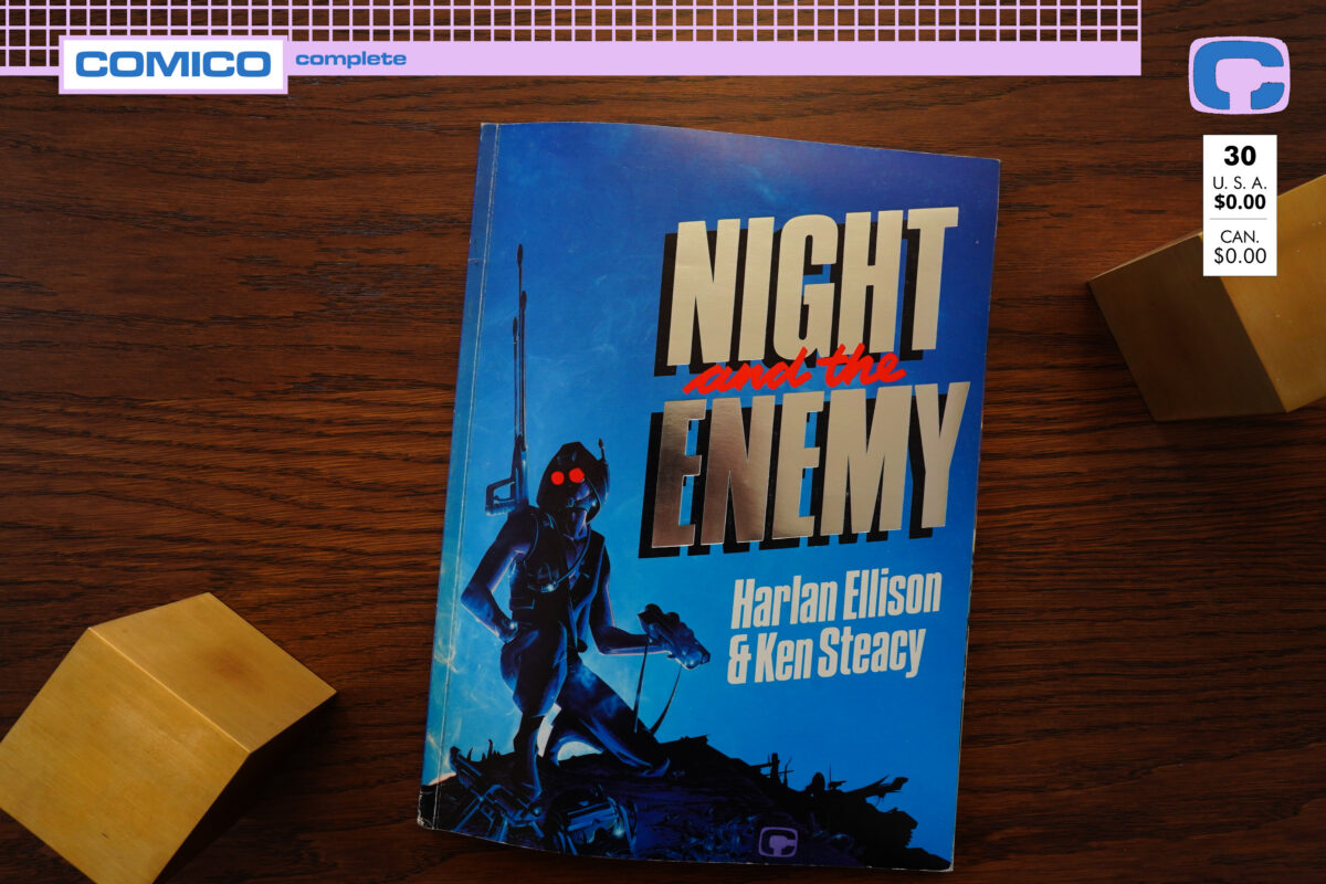
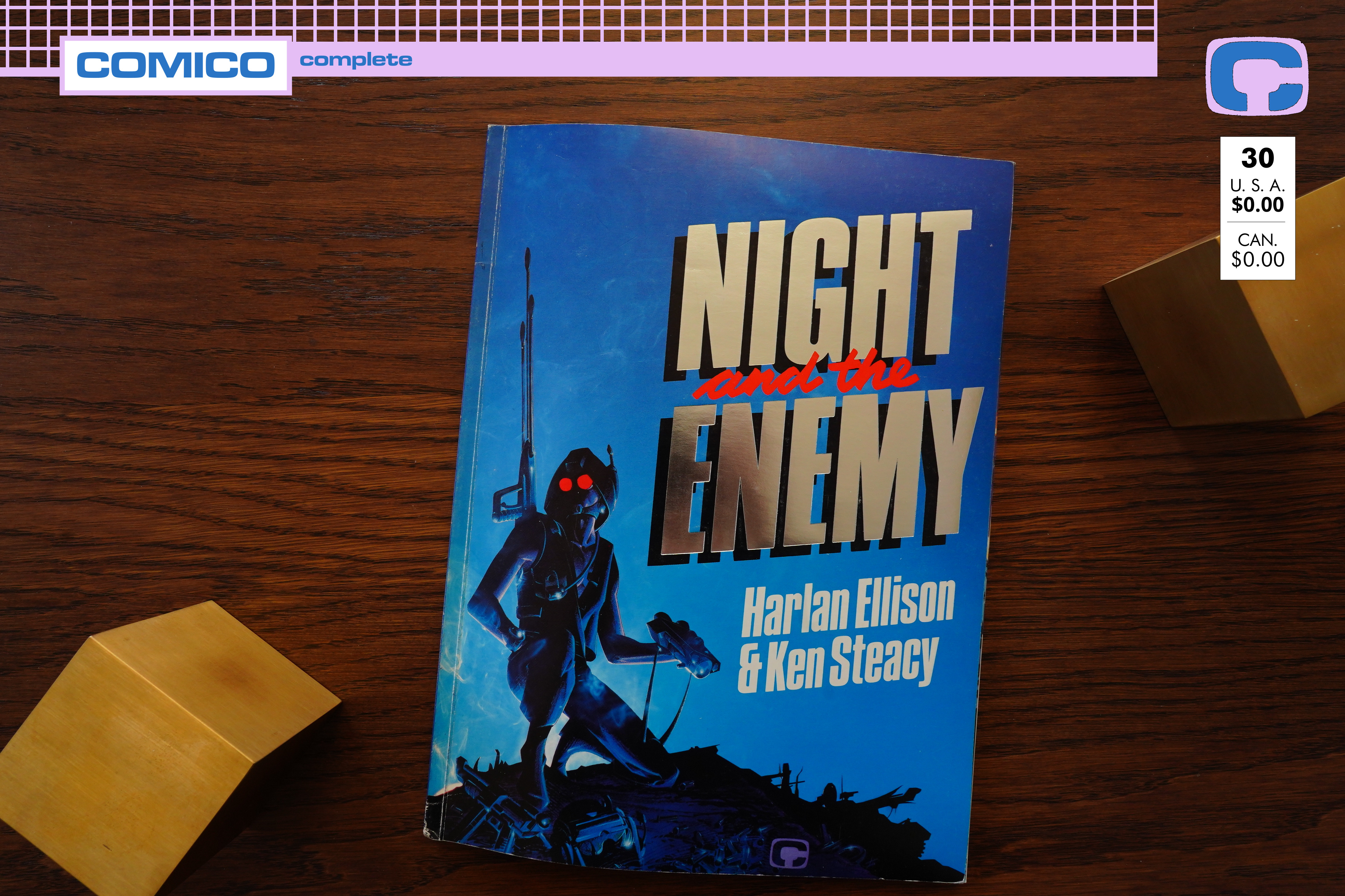
Night and the Enemy (1987) by Harlan Ellison and Ken Steacy
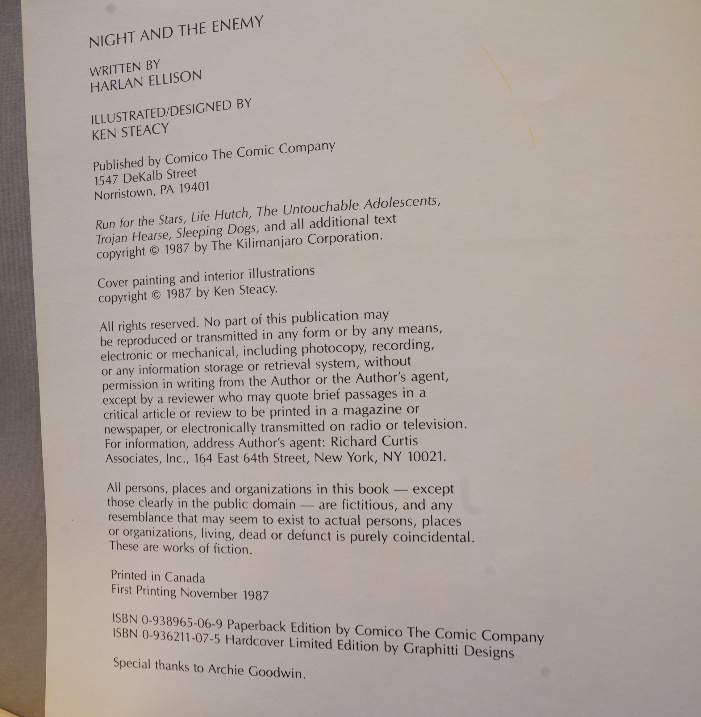
So, what’s this then? As usual with Comico reprints, this doesn’t actually mention that it’s a reprint… or what it is at all, really. The “special thanks” is a hint to those in the know — these pieces were originally printed in Epic Magazine (edited by Goodwin), and they’re adaptations of old, old Harlan Ellison short stories.
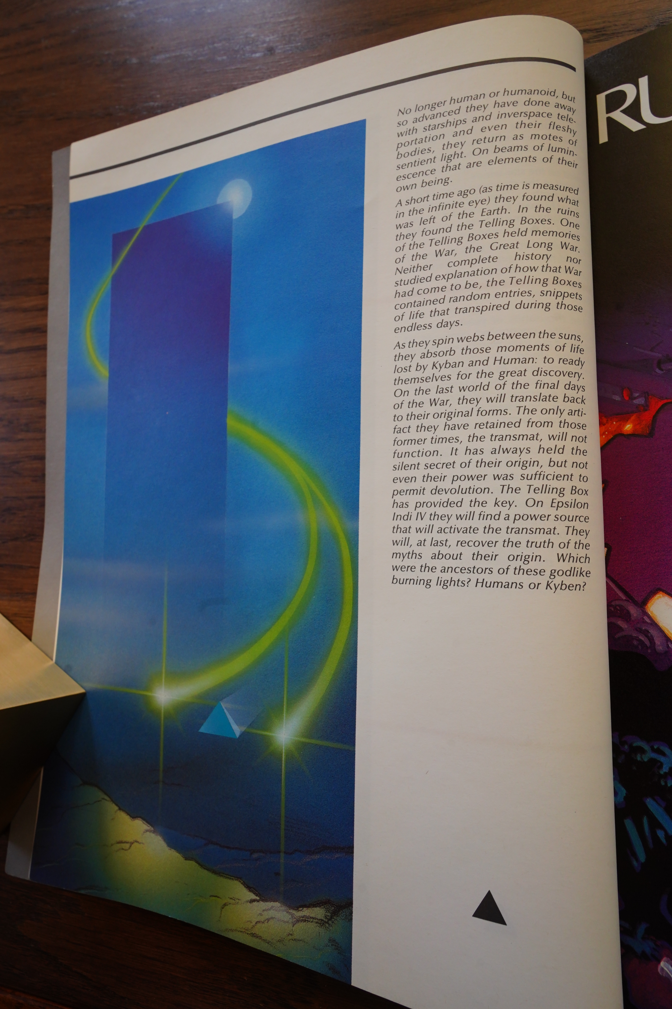
But this edition does have something new — a framing story told from the point of view of the aliens in the final story in the collection. Which is nice.
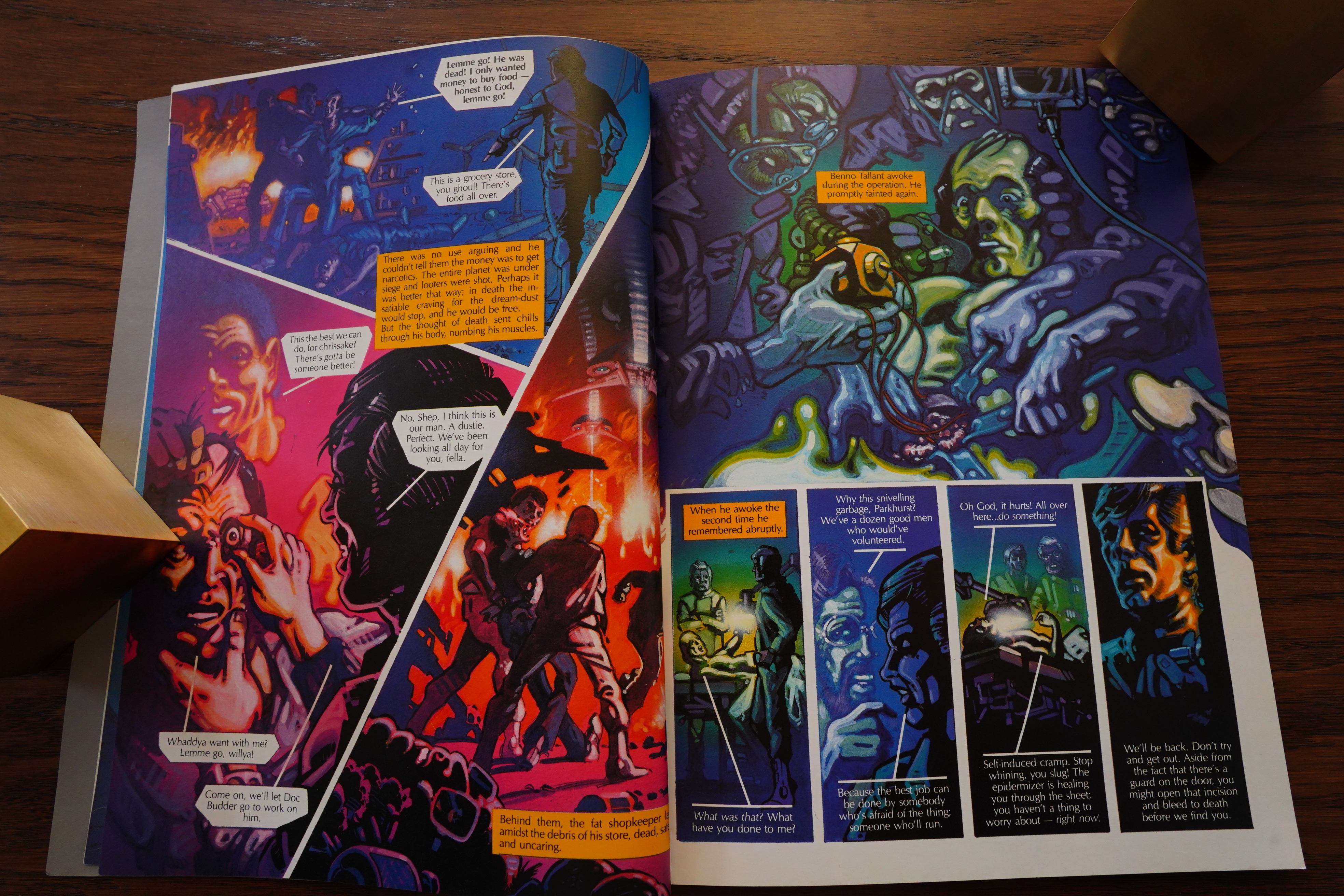
The stories have been reorganised a bit — and possibly given some new text to tie them together? Like this one was originally the third (I think), but comes first here.
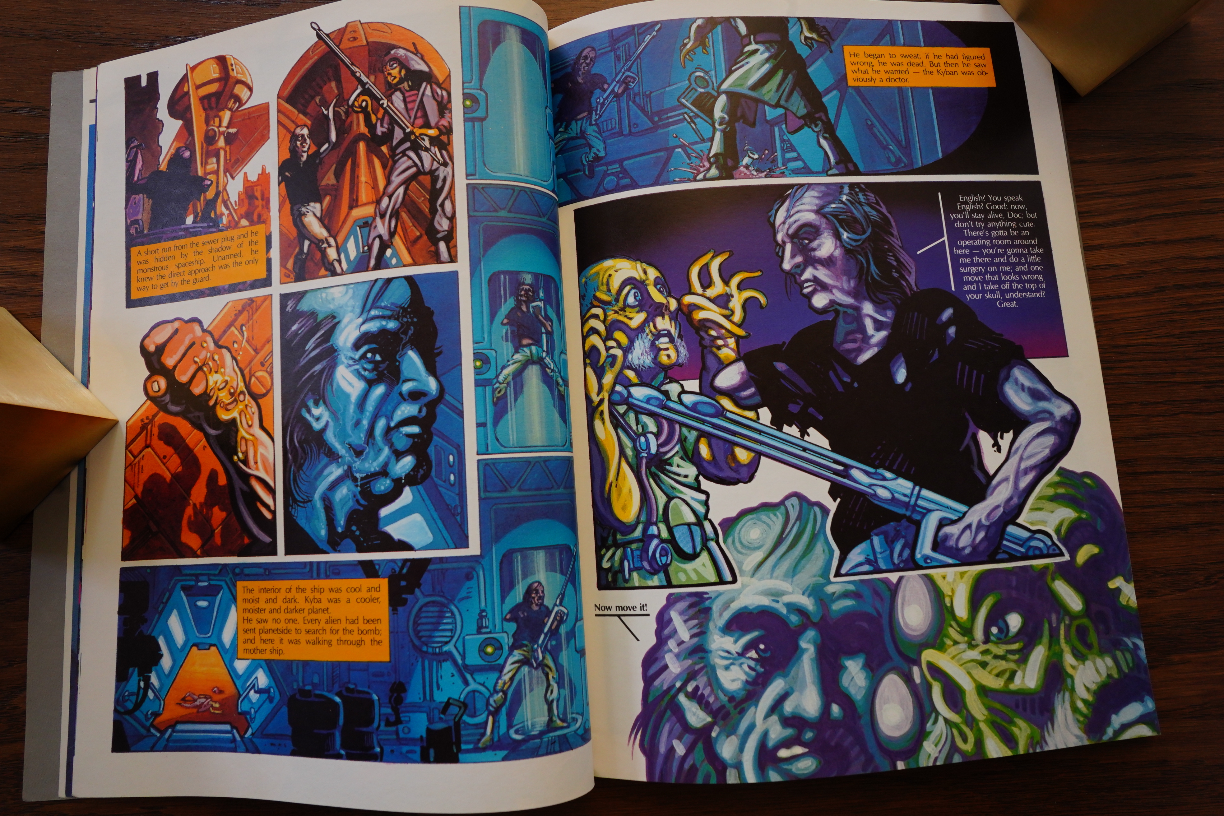
The adaptations are pretty text heavy, but they work well anyway. I’ve always liked Steacy’s artwork — this book was one of the few Comico books I bought at the time.
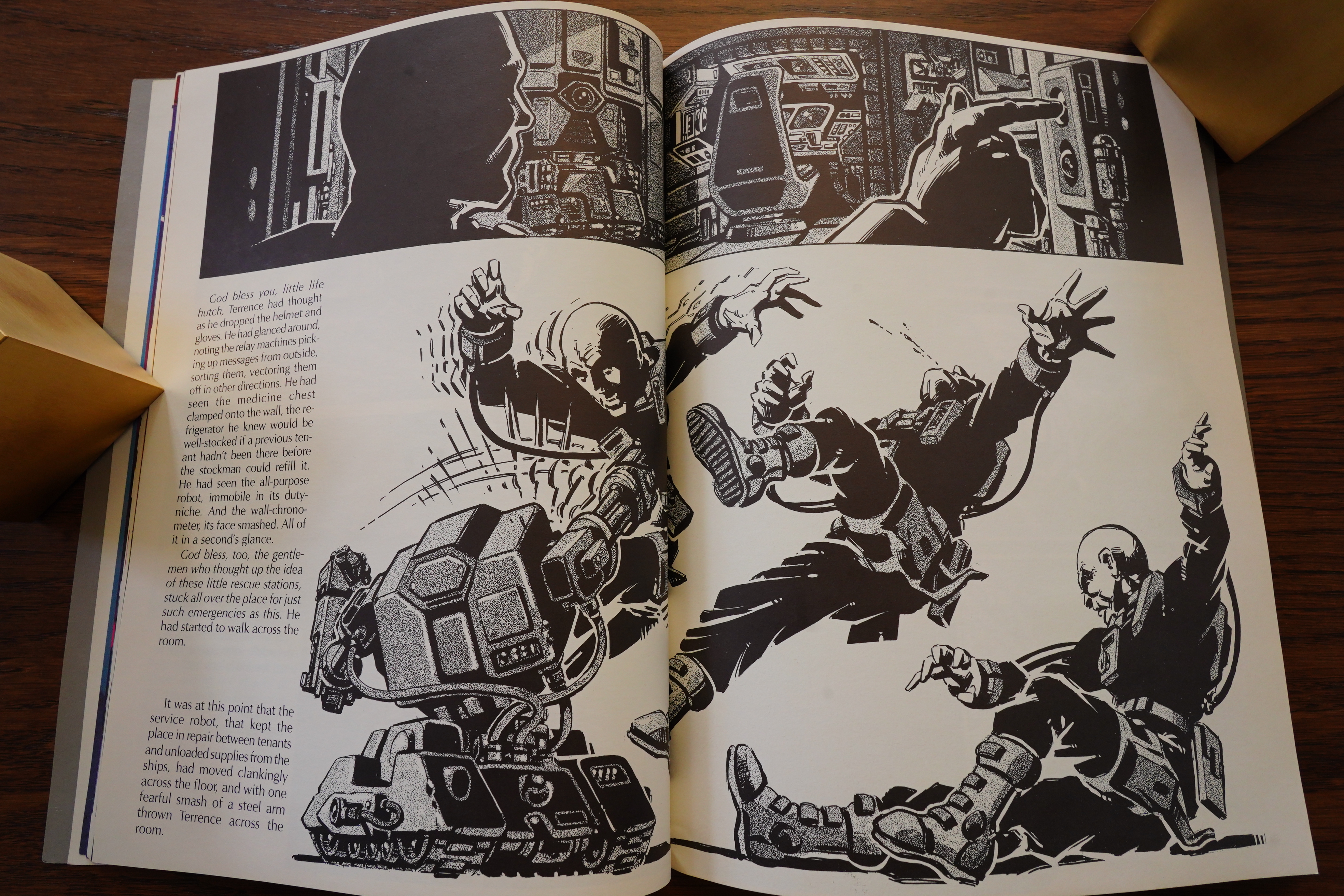
Suddenly we get a couple of pages in black and white, and I thought that was because they originally ran that way in Epic.
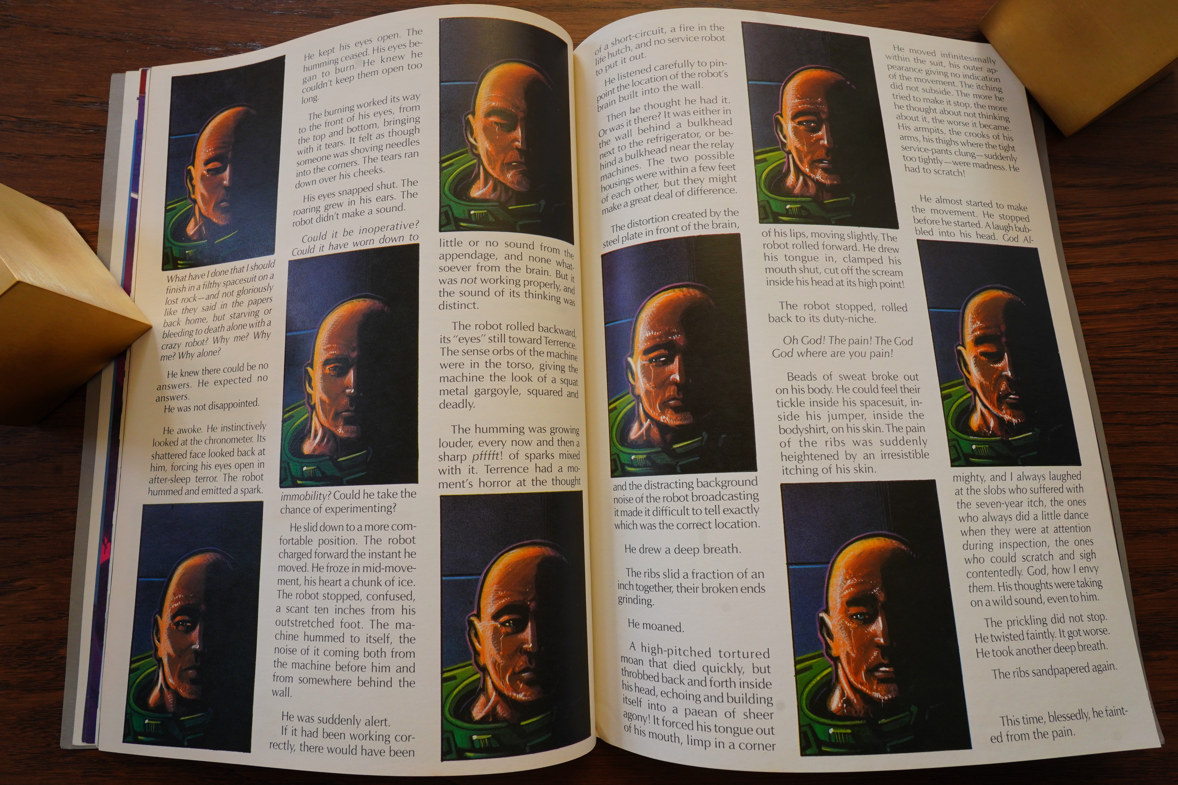
But the entire story was in B&W, but they’ve only left a couple of pages that way. Odd.

This style of adaptation was the kind Byron Preiss used to do… was he involved with this in any way?
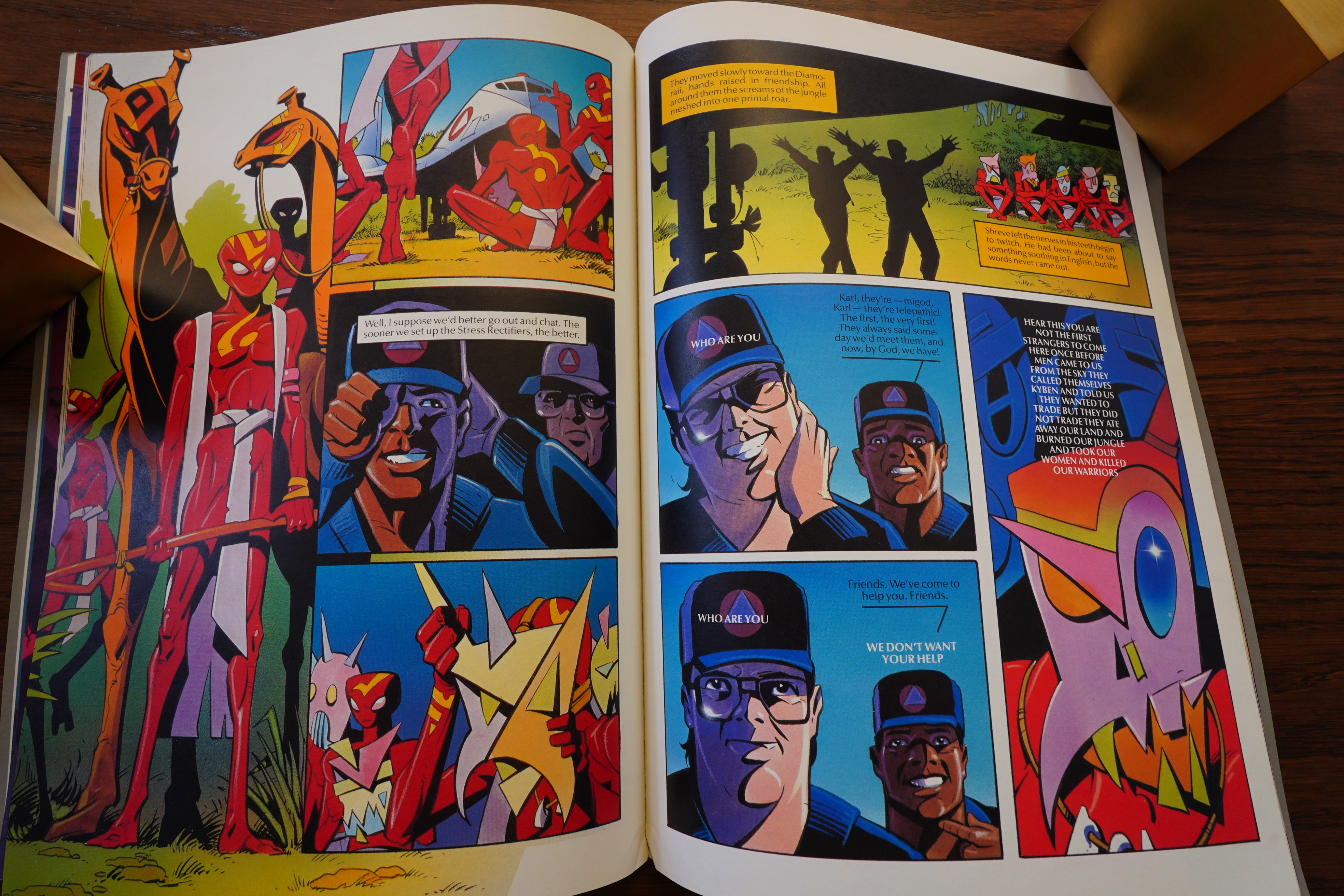
There’s one brand new story (well, OK, new adaptation), and it’s done in a more cartoony style than the rest.
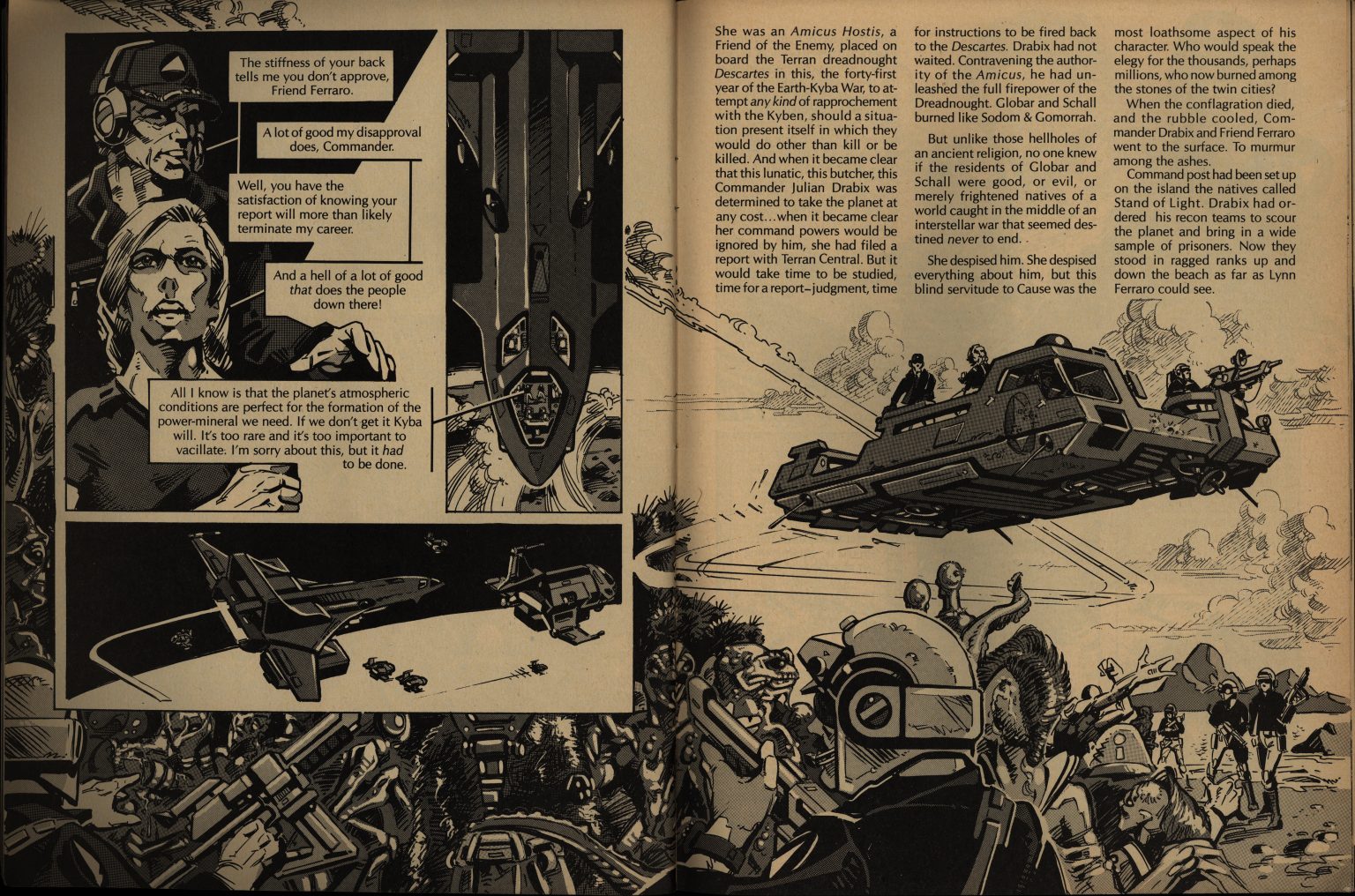
The final story was also B&W originally (Epic version above).
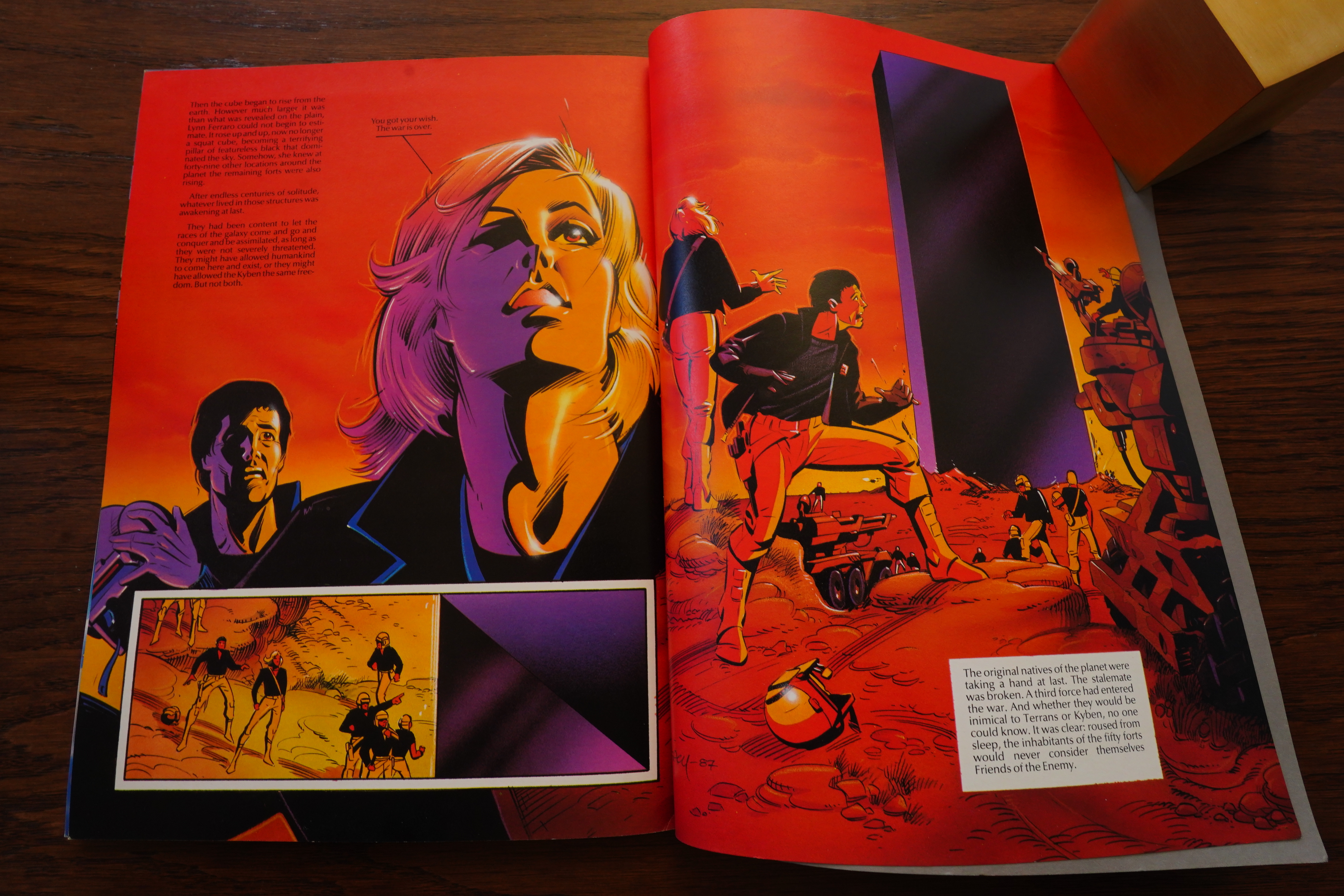
Steacy has really gone to town on doing the colour version, eh?

I think this album works well as a unit — the stories are only marginally tied together, but it reads pretty well. And has a sort of final ending.
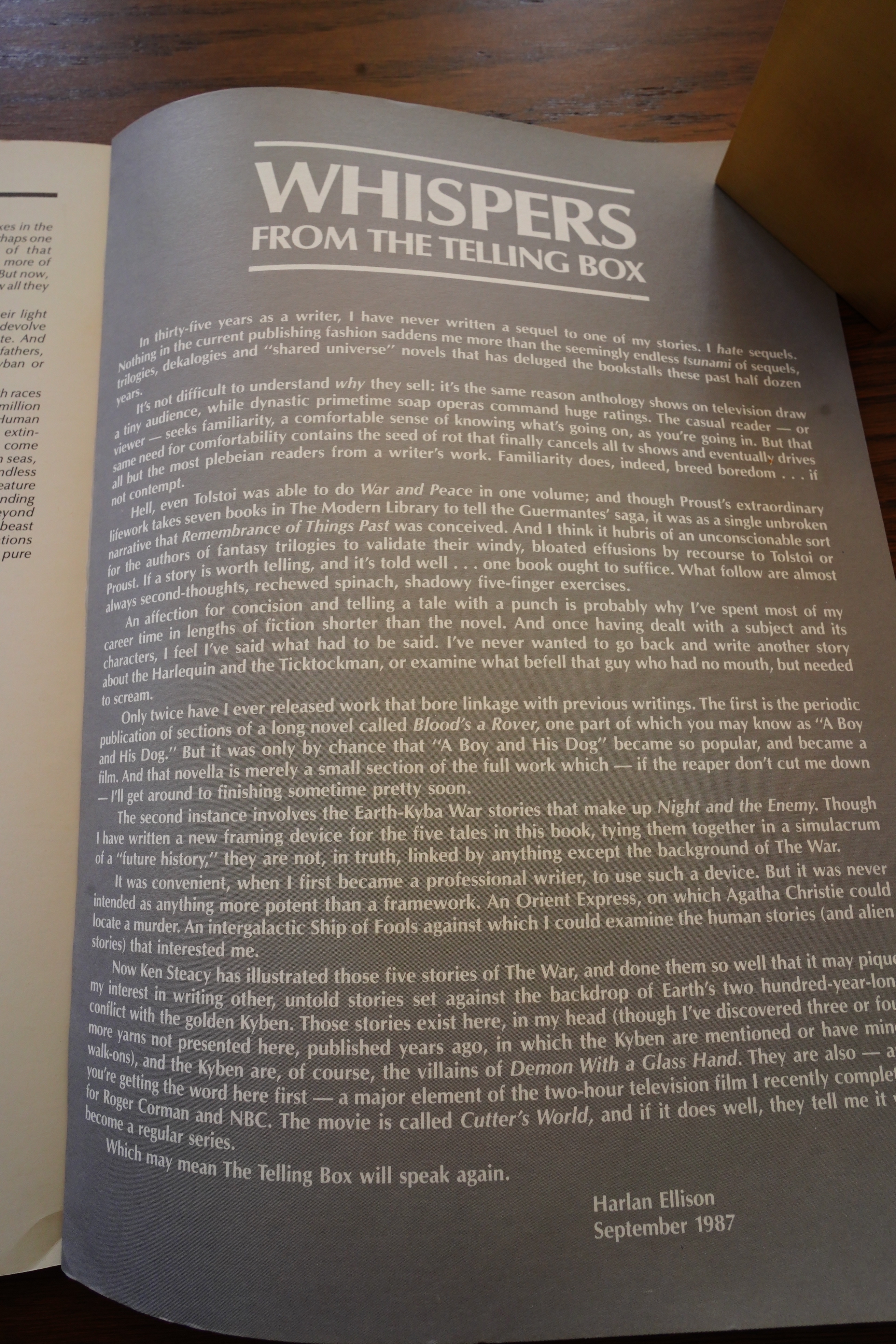
Ellison explains that he hates doing sequels, so these slightly interconnected stories are an anomaly for him.

He says that NBC is possibly doing a related movie — Cutter’s World. It didn’t happen:

When he found out I had dared to try improving his writing, Harlan went livid. His temper, of course, was legendary, and I bore the full brunt of it that day. When I told him I had no choice but to obey the man who signed my paychecks, he sneered that I reminded him of the people of Hitler’s Germany, “just obeying orders.” That’s how, for the one and only time in my life, I was accused of being a Nazi. (No surprise: the series was derailed by NBC soon thereafter.)

Speakeasy #80, page #15:

I was
asked to contribute, and I
thought this was a great oppor-
tunity to to adapt Harlan’s
stuff.’
Steacy contacted
Ellison just as
Byron Preiss was
putting together
THE ILLUSTRATED HAR-
LAN ELLISON, a com-
pendium of comic strip versions
of the writer’s more popular
work. Consequently the rights to
certain tales had been taken up
by Preiss, ironically simplify-
ing Steacy’s choice and making
available one of his favourite
tales – “Life Hutch”. Steacy ex-
plains why: ‘I love this story
because, in essence, nothing hap-
pens. A character is trapped in
what seems like an inextricably
perilous situation, and has to
think his way out of it. There’s
absolutely nothing physical he
can do and in fact any sudden
movements brings his demise clo-
ser. I had 26 or so pages in
which to do the story, and decid-
ed to paint the illustrations in
acrylic using a technique that
Paul Rivoche had been develop-
ing. The artwork was first rend-
ered in ink, and tonal values
were sprayed on with an air-
brush, again in ink, and the
highlighted areas were picked
out with thin washes of acrylic.
So the final impression you get
is that of an acrylic painting,
except that it’s an awful lot
faster. So I finished the story
and turned it in just in time
for ANDROMEDA to be cancelled.’
Fortunately for Steacy, Marvel
comics had just commenced pub-
lishing EPIC ILUSTRATED in dir-
ect competition with HEAVY METAL
magazine, with a more access-
ible, if partisan, approach. Und-
er editor Archie Goodwin the mag-
azine quickly established itself
as a venue for more ‘adult’ work
from comic creators, who were re-
warded with royalties on the mag-
azine’s sales and rights to
their characters. When Steacy ap-
proached Epic with “Life Hutch”,
Goodwin, unsurprisingly, snapped
it up, but not quite in the
manner Steacy expected. ‘I sent
Archie some copies of “Life
Hutch”‘, he recalls, ‘and he res-
ponded very favourably. Archie
knew that this was part of a lar-
ger series, and because of “Life
Hutch”‘s length they couldn’t
schedule it for a while, so he
commissioned another story by El-
lison to be illustrated by me
which had to be done right away.
That was “Sleeping Dogs”, and
due to the constraints of time,
I did the story using a differ-
ent technique, in line with mech-
anical tone, and in two page
spreads. At the time Harlan was
not crazy about it, and looking
back I don’t particularly like
it either. Despite our reser-
vations we had to go with it,
and a few issues later “Life
Hutch” finally ran, and then
Archie asked for a third story
in colour, which was “Run for
the Stars”.
Steacy continued to polish his
photo-realistic rendering on
“Run for the Stars”, which prov-
ed a painstaking effort as he re-
lates. ‘Run for the stars took
me forever to do. It was complet-
ely painted in ink and acrylic,
similar to “Life Hutch”, but in
full colour. So every single pan-
el is a rotten little painting.
It’s a ridiculous way of doing
comics and I’ll never do any-
thing like it again. I was exper-
imenting with a new technique
and a comic book affords you the
opportunity to do that, because
the format allows you to work
out a lot of problems. However,
once I started using this tech-
nique I was stuck with having to
follow it through for the whole
story.
‘Also for all three stories I
did extensive background photo-
graphic research. I chose models
for each of the main characters
and shot extensive reference.
which I hope is not too obvious.
I wanted the kind of refernece
that only on hand reference
could provide. So I had to thumb-
nail the story in and figure out
all the shots and hire the mod-
els. I shot them all in differ-
ent lighting situations, and for
the aliens, my wife, who is a
caricaturist and sculptor, pro-
duced little plasticine models
of the two main characters,
which I then photographed.
‘One of the biggest problems
with comics these days is that
they are underdrawn and over-ren-
dered, and this is precisely
what “Run for the Stars” was. I
was so anxious to get to the ren-
dering stage that I didn’t spend
nearly enough time on the draw-
ing and storytelling. I still
think it works well enough, but
it could have been much better.’

Speakeasy #80, page #15:

Both creators are more than
pleased with the Comico deal,
particularly in view of the free-
dom they have been given on the
project. ‘Ken and I could have
gone anywhere with NIGHT AND THE
ENEMY’, offers Ellison. ‘There
were feelers and offers and prom-
ises and all kinds of the usual
bull cookies. Blue sky and big
bucks, arias of hot air from ind-
ustry giants and industry pyg-
mies. We went with Comico be-
cause no one, absolutely no one,
puts together a prettier pack-
age, without censorship, and
with the sense of true
partnership.’
The result is a package ass-
embled and designed by its creat-
ors, as Steacy explains: ‘They
basically threw it back at us
and said okay, it’s your pro-
ject, so you know best how to
handle this. Most of it was
thrown into my lap because I was
very insistent that I would des-
ign the book as well. So we had
the three stories and we wanted
to do the entire book in colour,
so the black and white ones had
to be re-coloured. On “Run for
the Stars” the colour separa-
tions that Marvel did were less
than satisfactory and unfortunat-
ely EPIC ran strips on coated
stock and uncoated stock, so the
stories that appeared there were
a little inconsistent. I’ve made
a few alterations to the artwork
and redone the separations.
With the black and white mat-
erial I had to respray the art-
work in colour and go back and
pick out the highlights again to
remain as consistent to the orig-
inal style as possible. I’ve re-
drawn “Sleeping Dogs” from
scratch, because nobody really
took to the work, including my-
self. That particular piece is
my favourite coloured strip I’ve
done to date.’

Amazing Heroes #131, page #26:

Night and the Enemy-a graphic
novel due in November, written by
Harlan Ellison with art by Ken Steacy.
It will be an 8½” x 11″ book in full
color. Included will be all five of the
celebrated Earth-Kyba stories-a two-
century long interstellar conflict,
which will be tied together by an all-
new framing sequence written by
Ellison especially for this edition. Two
of these stories, according to editor
Diana Schutz, have not been seen
since the mid-1950’s, two of the three
appeared only in black-and-white in
Epic Magazine.
All of the stories will appear in
color for the first time, a good major-
ity of the material has been completely
re-done by Steacy, including creating
the first time.
some completely new interior art-
work, as well as what has been
described as a “sensational new color
cover.” It has been said before, but
Comico basks in the revelation that
Night and the Enemy will be “the
graphic novel hit of the year.”

Speakeasy #81, page #28:

NIGHT AND THE ENEMY by Harlan
Ellison and Ken Steacy (Comico)
Few writers have had as much att-
ention within the comic industry
paid to their words as Harlan
Ellison, and his fans are in for
double trouble this fall with
the release of two comic adapta-
tions of some of his vintage
tales.

[…]

An altogether more lush and
well packaged book (80+ pages in
a graphic novel format, complete
with a new framing sequence pro-
vided by Ellison) NIGHT AND THE
Steacy’s best artwork, progress-
ing from the overly fussy impas-
toed acrylics in ‘Run for the
Stars’ to the clean and crisp
linework in ‘The Untouchable Ado-
lescents’. And if the work seems
a little stiff occasionally, the
composition, design and colour
more than compensate. Through-
out, the colouring is stunning,
Steacy being able to teach a num-
ber of more prominent artists a
thing or two about how to weild
an airbrush, without the reader
needing to wear shades to look
at the story.
Unfortunately that’s where
the book is disappointing, as
the loosely connected ‘Earth-Ky-
ben War’ stories are not Elli-
son’s best by a long way, with
the possible exception of the
claustrophobic and compelling
‘Life Hutch’. Written early in
his career, they tend to get
bogged down with some heavy hand-
ed moralising and cardboard char-
acterisation, and Steacy’s app-
roach is not so much to adapt
them but visualise certain mo-
ments from them. The result is
neither a collection of illustra-
ted stories nor comic strip adap-
tations, but ungainly falls bet-
ween the two stools.
As such the words and pic-
tures fail to connect as a joint
narrative a lot of the time, des-
pite the best intentions for
them to do so, as in ‘Run for
the Stars’ and ‘Sleeping Dogs’,
with ‘The Untouchable Adoles-
cents’ emerging as the closest
thing in the book to a fully
dramatised comic strip adapta-
tion. This is not helped by hav-
ing typset chunks of Ellison’s
dialogue
prose and
around the panels, giving the
strips an almost clinical feel
and taking the emotional edge
off the stories.
Still, if you’re an Ellison
fan you’d be daft to miss out on
these books, which eclipse much
of what has been perpretated in
previous comics adaptations of
his work.

– Cefn Ridout

Speakeasy #80, page #15:

Steacy explains that the new
framework provided by Ellison
‘leaves the door open for a sec-
ond volume as there are about
eight or ten stories in all. The
events in NIGHT AND THE ENEMY
are actually seen from the vant-
age point of a civilisation
which discovers these stories in
the ruins of Earth, millions of
years after the fact. And they
are viewed almost like fragments
of an inflight video. They are
found in devices called “telling
boxes”, so that each provides a
subjective look at an event
which occured against the back-
drop of this centuries-spanning
war. This intelligence from the
future is trying to piece togeth-
er what happened, and there are
still a number of questions left
unresolved for the audience to
fill in. We didn’t want to pro-
vide all the answers, as we want-
ed the audience to do some think-
ing on its own. We were very
careful with how the stories
were placed so that there is a
comfortable flow between them
and their relationship to each
other makes sense.
‘I don’t think Harlan ever in-
tended this to be a series. He
had some interesting ideas for
characters in situ, and he just
plugged them into this war. Each
story concerns an individual or
a couple of individuals and
their struggles, which were nev-
er overshadowed by this huge
war. The war is not the most imp-
ortant thing in these stories,
it is a given and places the
stories within a specific time
frame.’
Considering Steacy’s Canadian
base and Ellison’s Californian
one, they worked as closely to-
gether as could be reasonably ex-
pected. And, as with the best of
team efforts, they were respon-
sive but not reverential to each
other’s input. ‘Harlan and I
have quite a good rapport and an
excellent working relationship,’
claims Steacy. ‘We respect each
other’s abilities and when push
comes to shove we will defer to
each other’s expertise in their
area. We had a synergistic rela-
tionship on the strips, spending
a lot of time on the ‘phone yell-
ing at each other. And I would
send him pencil roughs before
taking it any further. For the
most part it was fine tuning, af-
ter all it was Harlan’s words
that excited me in the first
place, and I wasn’t about to dim-
inish that in any way. Having
said that, nothing is so sacred
that it cannot be improved. I ap-
proach an adaptation so that I
can take the original and make
it something more than what it
already is in the written form.
If the whole is not greater than
the sum of its parts, there’s no
point in doing it. I don’t know
if Harlan will shoot me for this
but I think I’ve made more of
those stories by adapting and
illustrating them, with his coll-
aboration, of course. NIGHT AND
THE ENEMY, as a body of work,
stands as the finest I’ve done
to date.’
Harlan Ellison is known to be
critical of adaptations of his
work in the past, most notably
Gerry Conway’s muddled handling
of ‘Delusions of a Dragon Slay-
er’, Alex Nino inventively des-
igned though confusing ‘Repent
Harlequin said the Tick-Tock
Man’ and Alfredo Alcala’s overly
literal ‘Croatan’. However, he
is full of praise for Steacy’s
work on NIGHT AND THE ENEMY.
‘Ken has managed miraculously to
even his breathtaking level of
best efforts, and I am as happy
as an Odor-Eater in a bedroom
slipper with the result. This
book’s gonna be one snappy item,
without the faintest scintilla
of self-serving greed or venal-
ity on anyone’s part.’

Comics Interview #51, page #39:

PETER: Well, that was a hint to talk about
Ellison. Would you like to go on the record
about how Mr. Ellison is so gracious and
Mr. Steacy is a nice person?
DIANA: Ken Steacy is a nice guy and a
real crazy-man! Harlan Ellison has been
my hero for quite a long time. I think that
he is the consummate essayist, and I love
his rabble-rousing, “up against the wall,
dirtbag” attitude. When he called up and
wanted to do this graphic novel NIGHT
AND THE ENEMY, I was thrilled right
down to my tippie toes! I subsequently met
the man, found him to be honest –
sometimes brutally so – extremely funny,
extremely gracious, and essentially
somebody who would give you just as much
as you gave him, and no less. So, yeah,
damn right; Comico is – how did you put
it – the little something that could…?
BOB: The little engine that could.
DIANA: In the last two years, Comico has
gone from a company that retailers were
laughing at, to a company that is selling its
books very well, and on time. We now have
a reputation that’s strong enough that so-
meone of Harlan Ellison’s stature has come
to us to publish his material. That’s a nice
pat on the back for all of the work that
we’ve done.
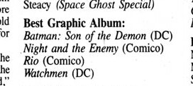
It was nominated for Best Graphic Album at the Ruebens Awards.

The book was reprinted by Dover in 2015:

The story was hard to follow, and the book felt more like an illustrated novel rather than a graphic novel. I know that sounds confusing, but this wasn’t what I would classify as a “comic book” in the strictest sense.

Reception didn’t seem very positive:

This is perhaps one of my least favorite Harlan Ellison collections, but I’d still read some weaker Ellison over many other writers.

Right:

I’m not much of a fan of Ellison….His hijinks as a person have colored my ability to enjoy his work as a writer, and this is really the first work of his that I’ve ever made it all of the way through. It’s not a perfect book, at least not in my opinion….I’m generally not a fan of prose in the middle of my comic-books, and the long text sections were kind of a chore to get through, but they were all rewarding in the end.
1987: Fish Police

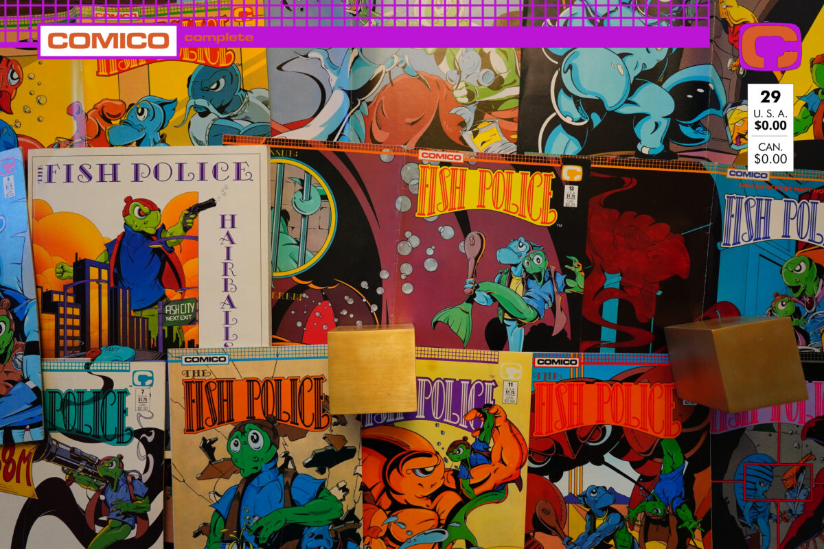
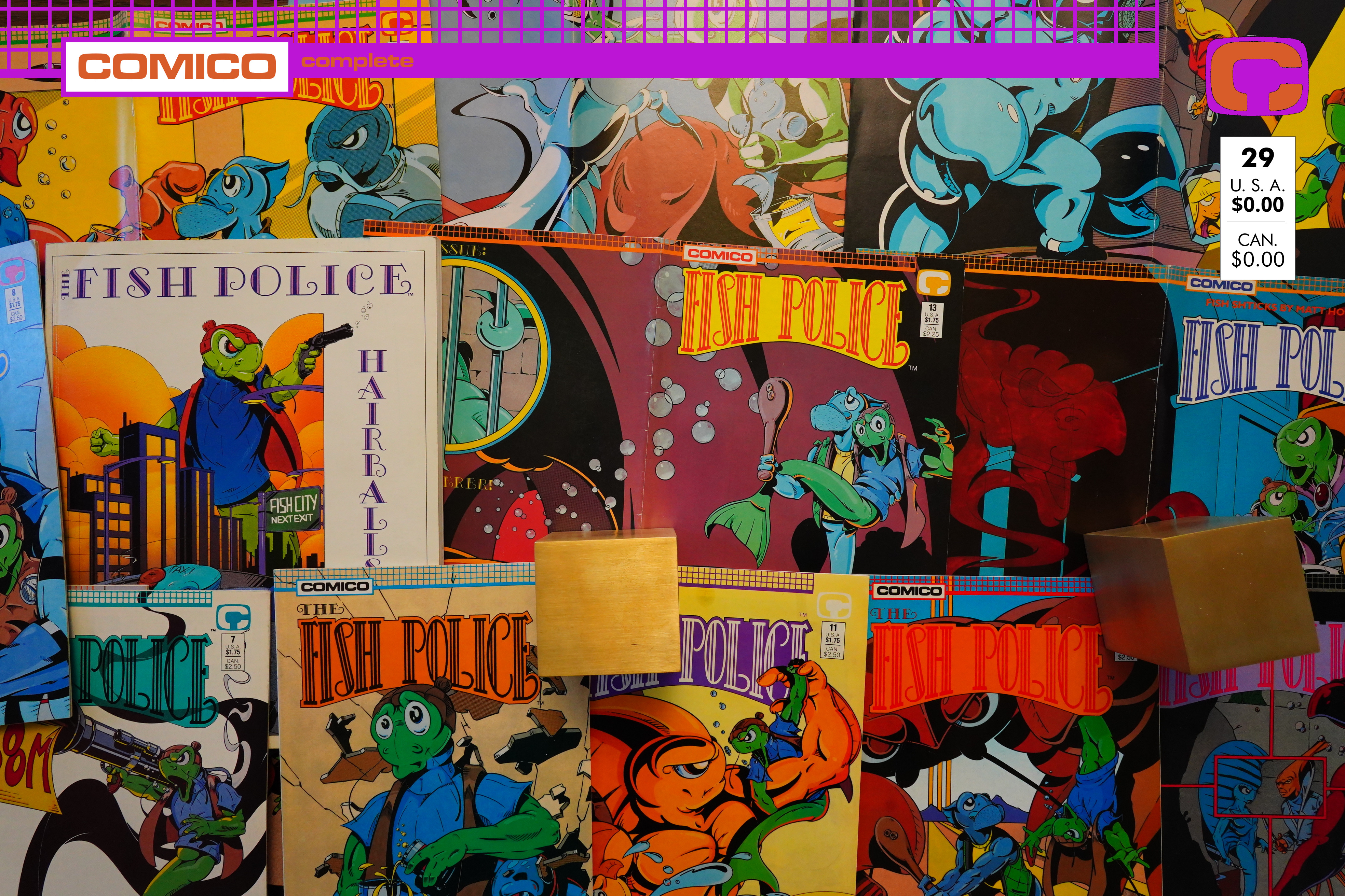
The Fish Police: Hairballs (1987) #1,
Fish Police (1988) #5-17 by Steve Moncuse et. al.

Oops! It’s been a while since the last post in this blog series… I’ve just been distracted by other things.

Let’s get to it.

Oh, remember Harlan Ellison? No? I feel like Ellison has been forgotten more than his contemporaries, but I guess that’s what happens when you mostly do short stories and TV scripts.

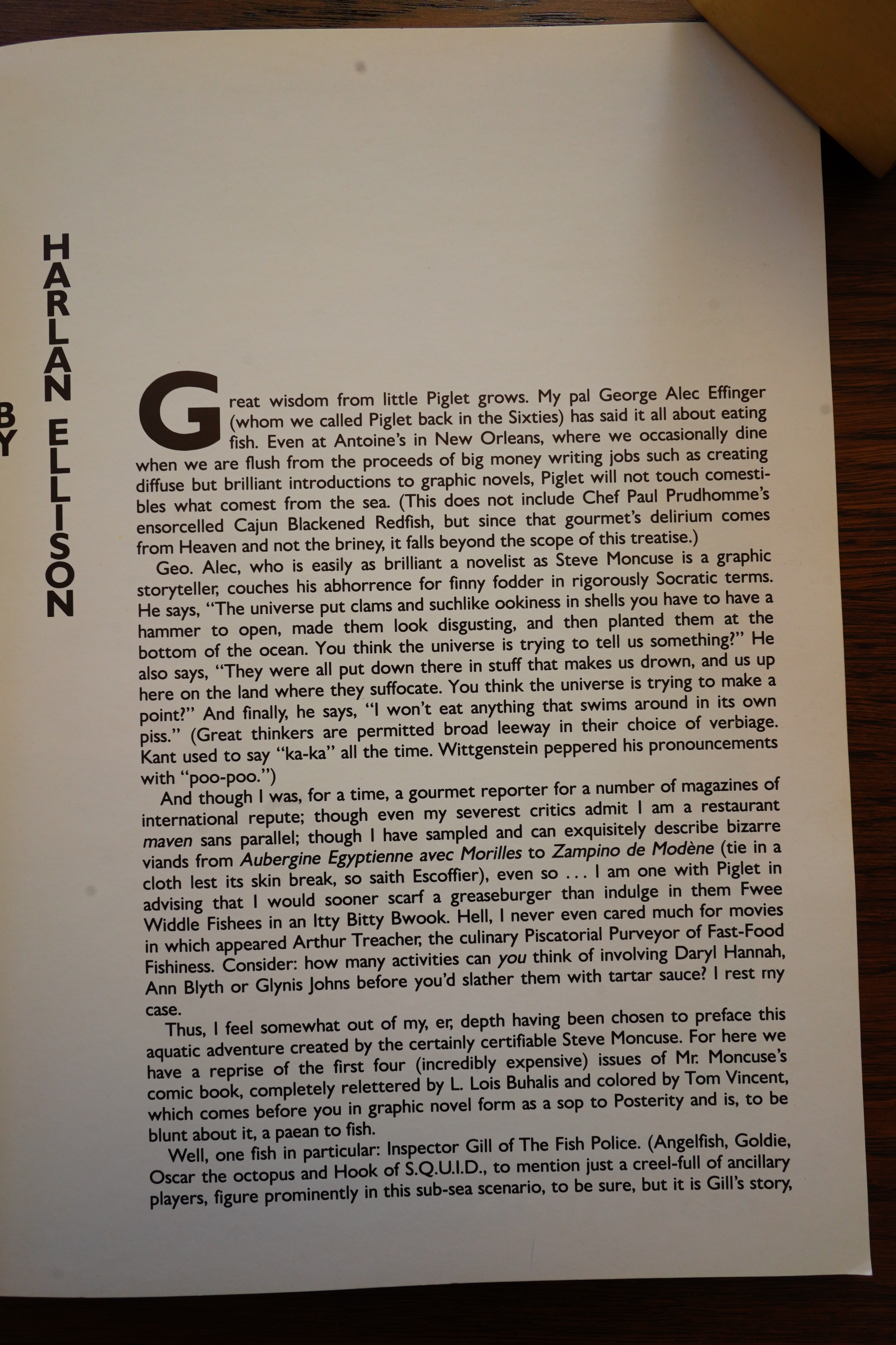
He spends most of the introduction talking about how he and George Alec Effinger don’t like to eat fish — they don’t “touch comestibles what comest from the sea”. But apparently Ellison is a Fish Police fan, and that’s why he’s writing the introduction?

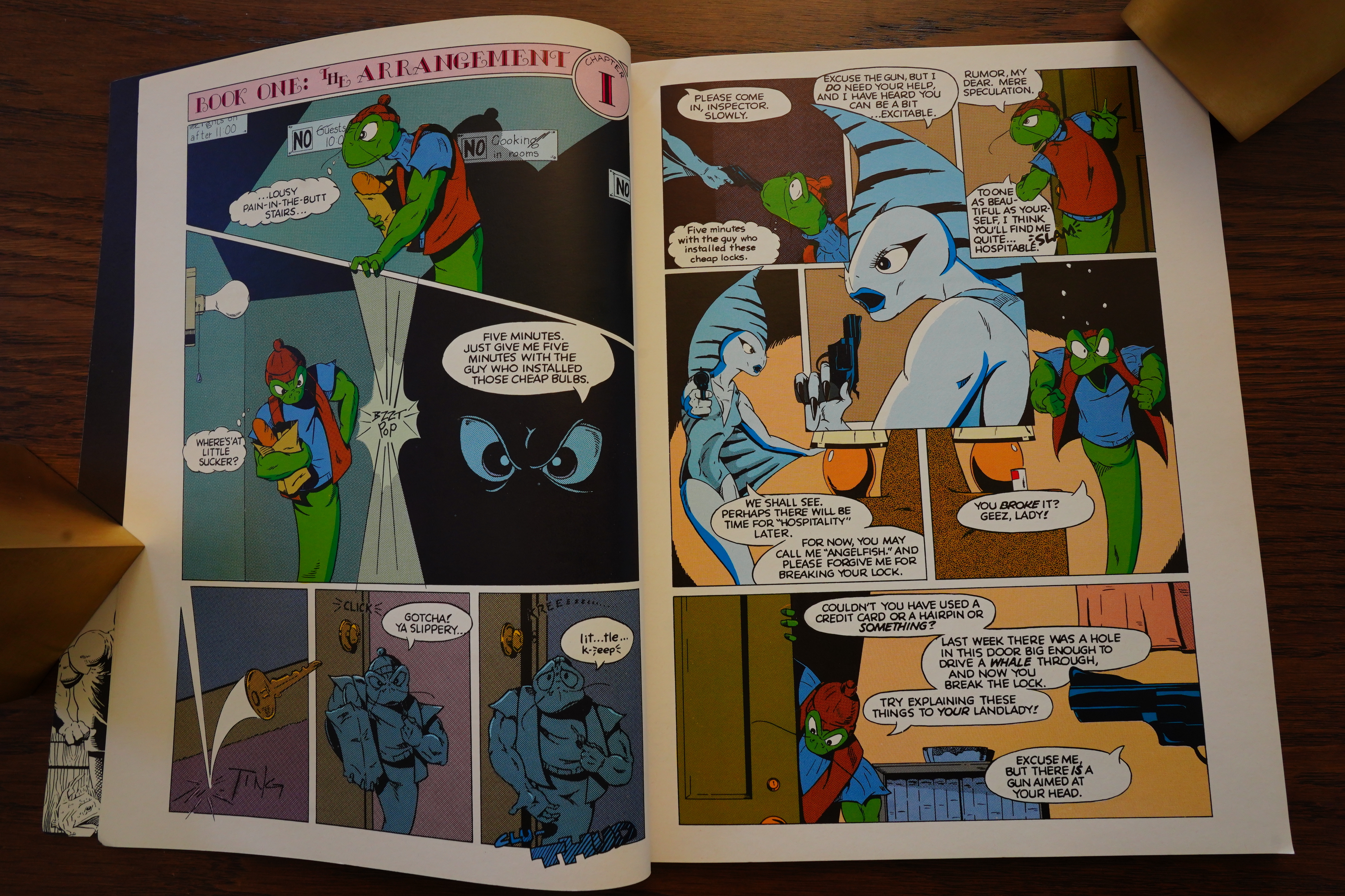
Because this is a reprint of the first four issues of the Fish Police series from Fishwrap Productions. I guess doing it in a European-format album makes some kind of sense — that was the standard “fancy” option at the time — but I guess it didn’t really sell well, because Comico continued the reprint using normal US-sized floppies starting with issue #5.

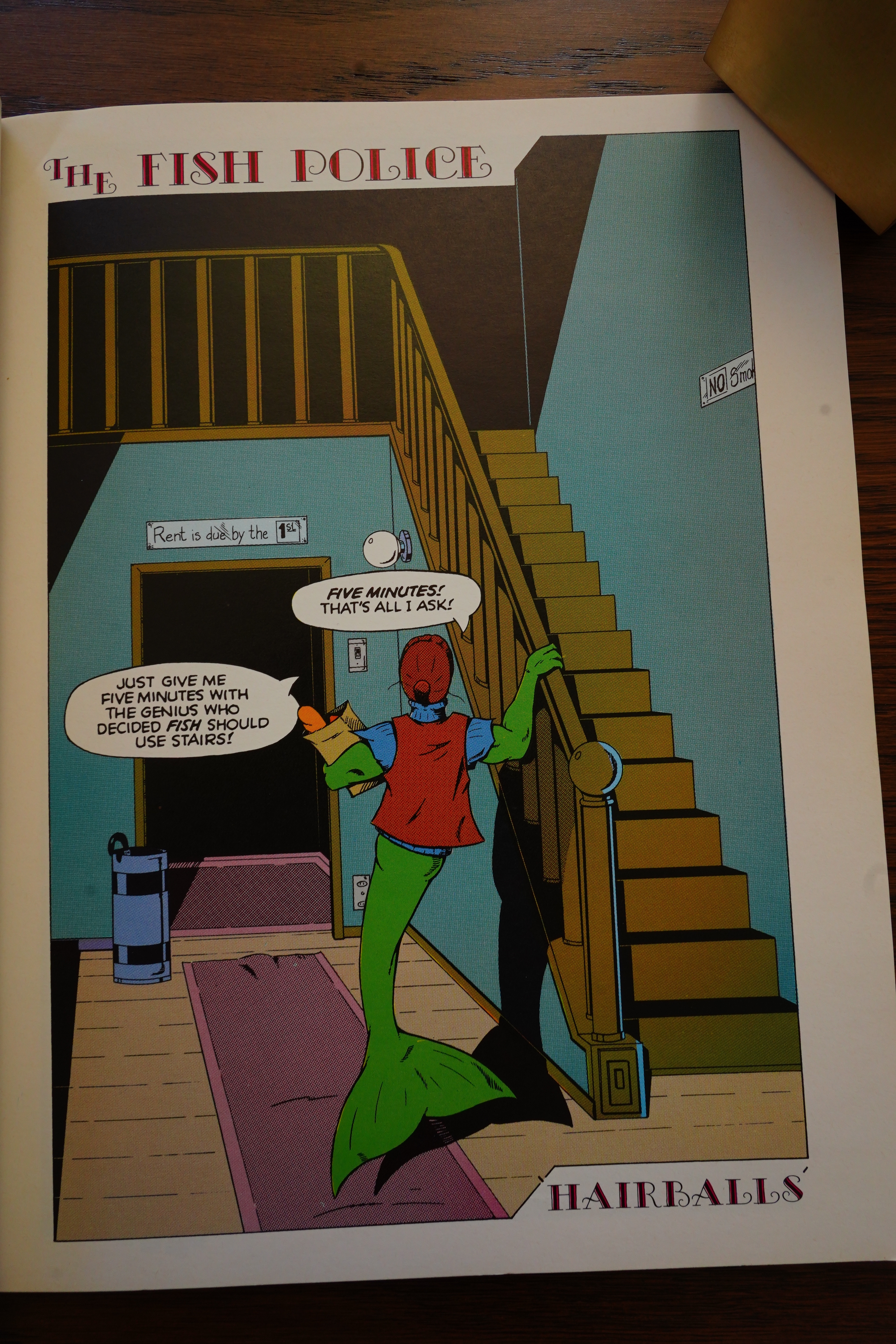
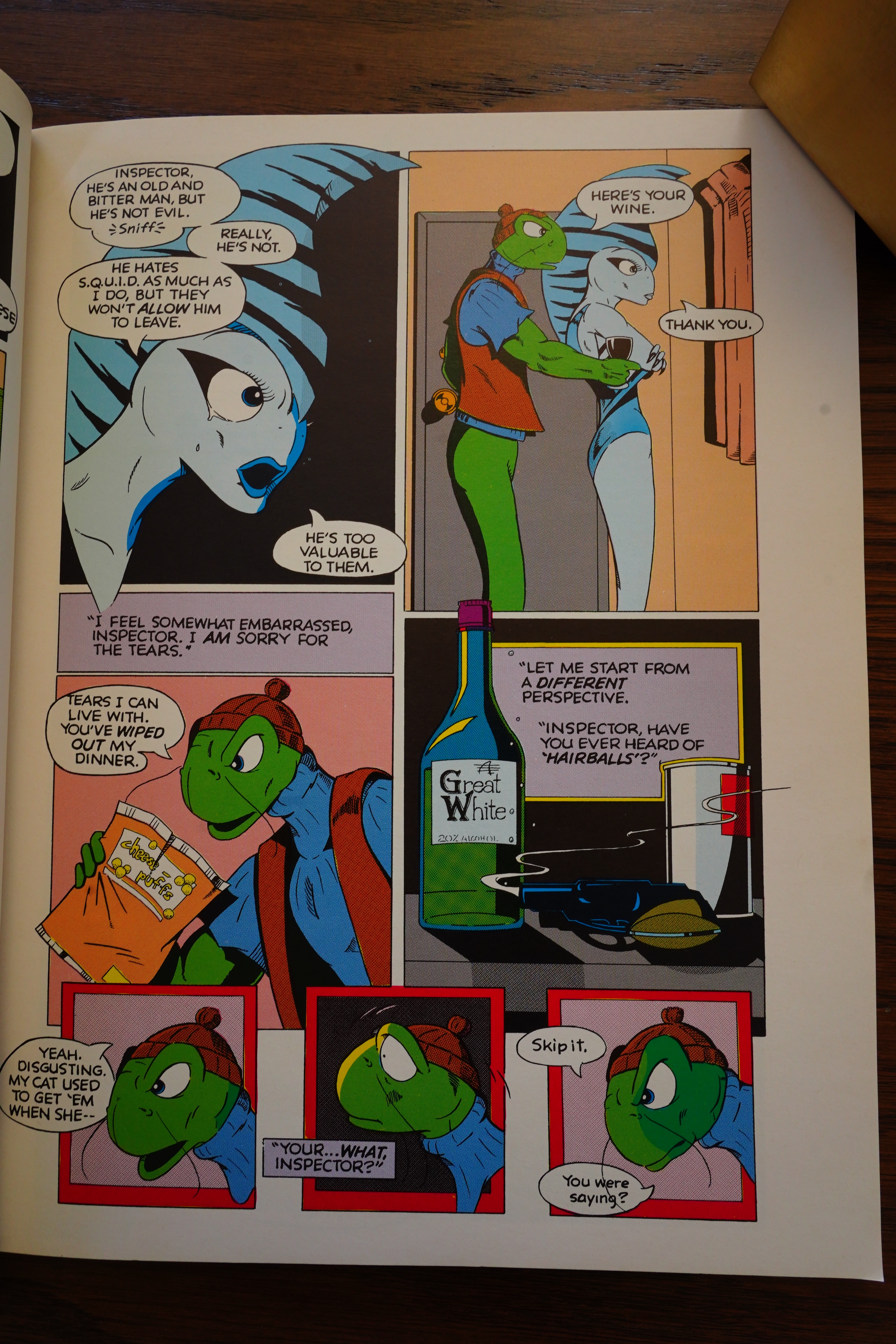
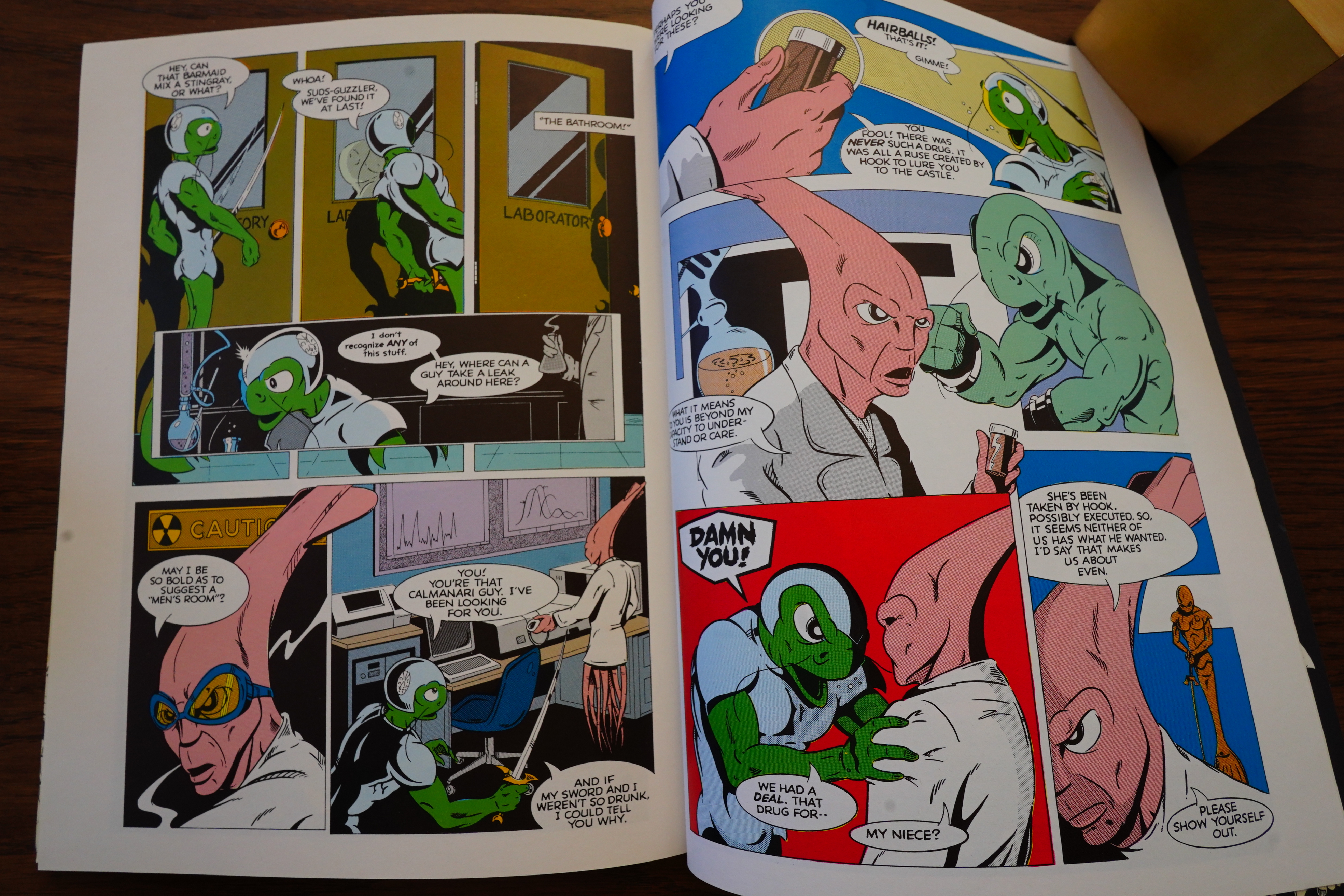
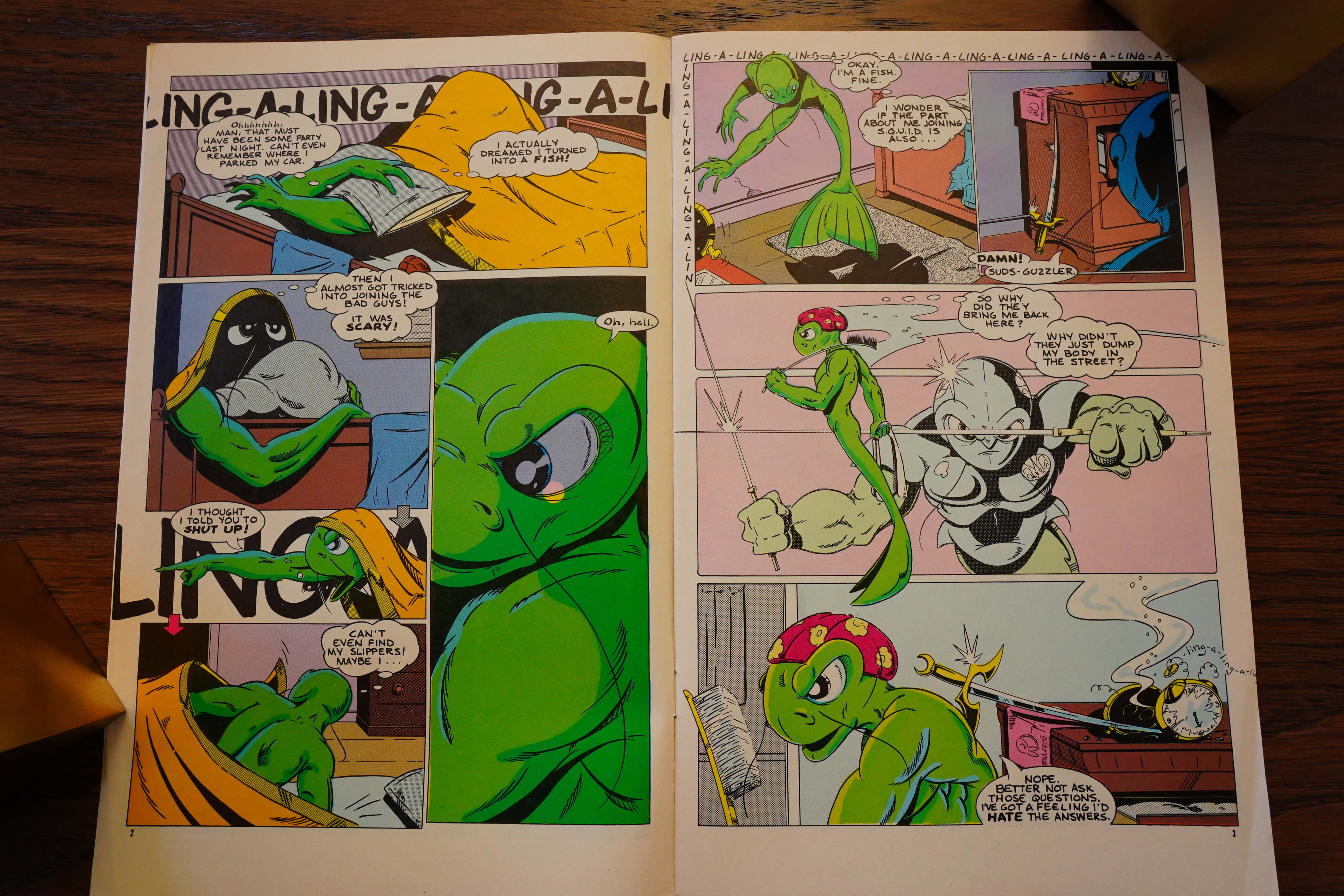
I’ve read the colour special that Comico published earlier, and that was a prequel, and kinda-sorta explains the premise of the series — but it was pretty much unreadable to someone who didn’t know the series before. So I had assumed that Moncuse eased the readers more in with the original #1, but no, not really — he’s hinting at what the gag setup is throughout these issues, but it’s never stated out loud: An human cop’s mind has been transferred to one of these fish police guys, and… then… there’s all these other guys.

See? Hint — they don’t have cats here under the sea.

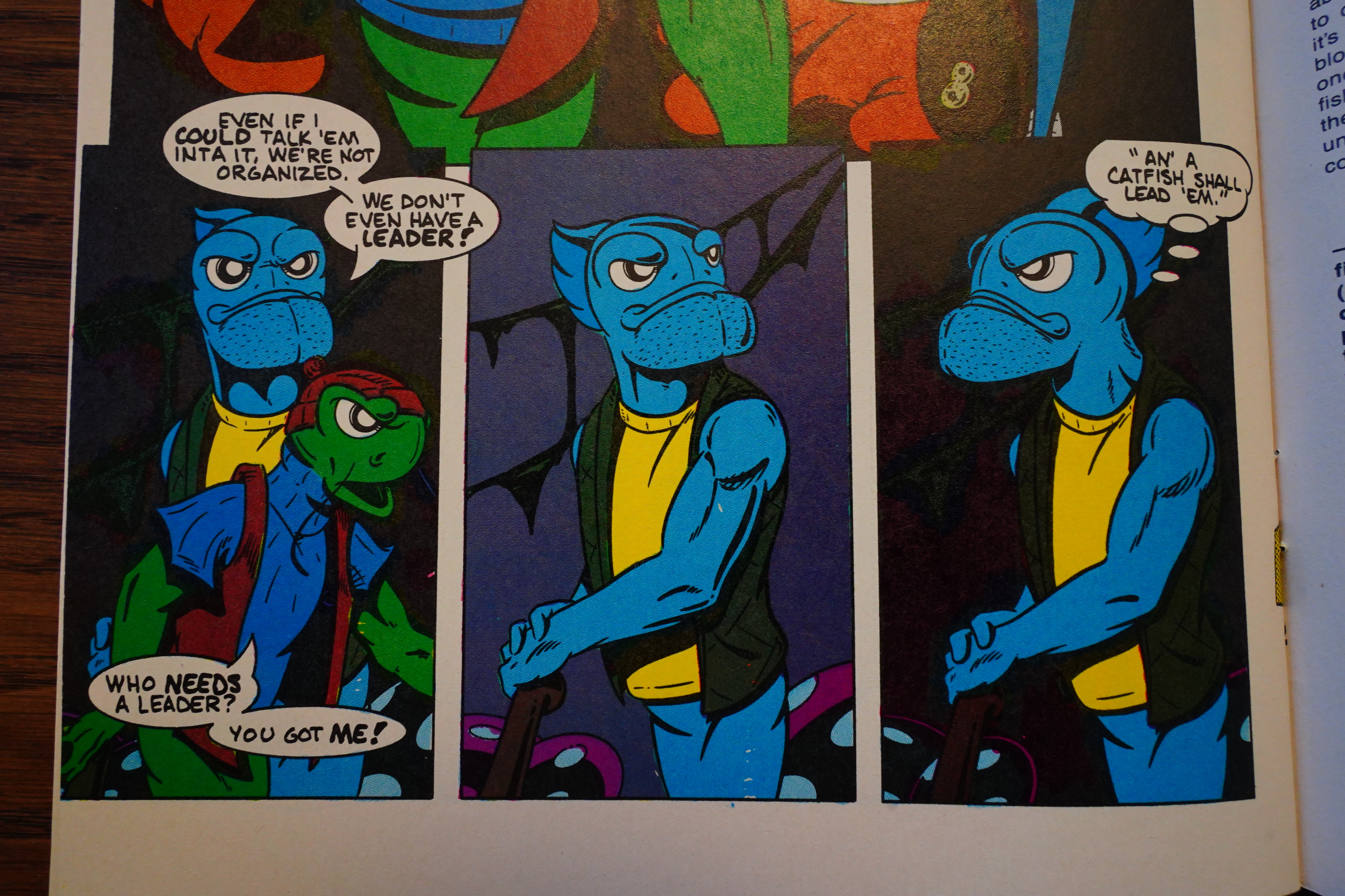
So it’s all mysterious and stuff. Moreso because there’s about two dozen characters that aren’t introduced well, either, and they all seem to have some sort of agenda going on. And they plot a lot. Which all sounds like it should be really intriguing, but it really reads like Moncuse had been doing these characters for years in a different venue, and didn’t bother to recap anything here.

Is that the case? Did he do these as a strip for, say, a student newspaper? Because these issues also read like Moncuse is 22 years old.
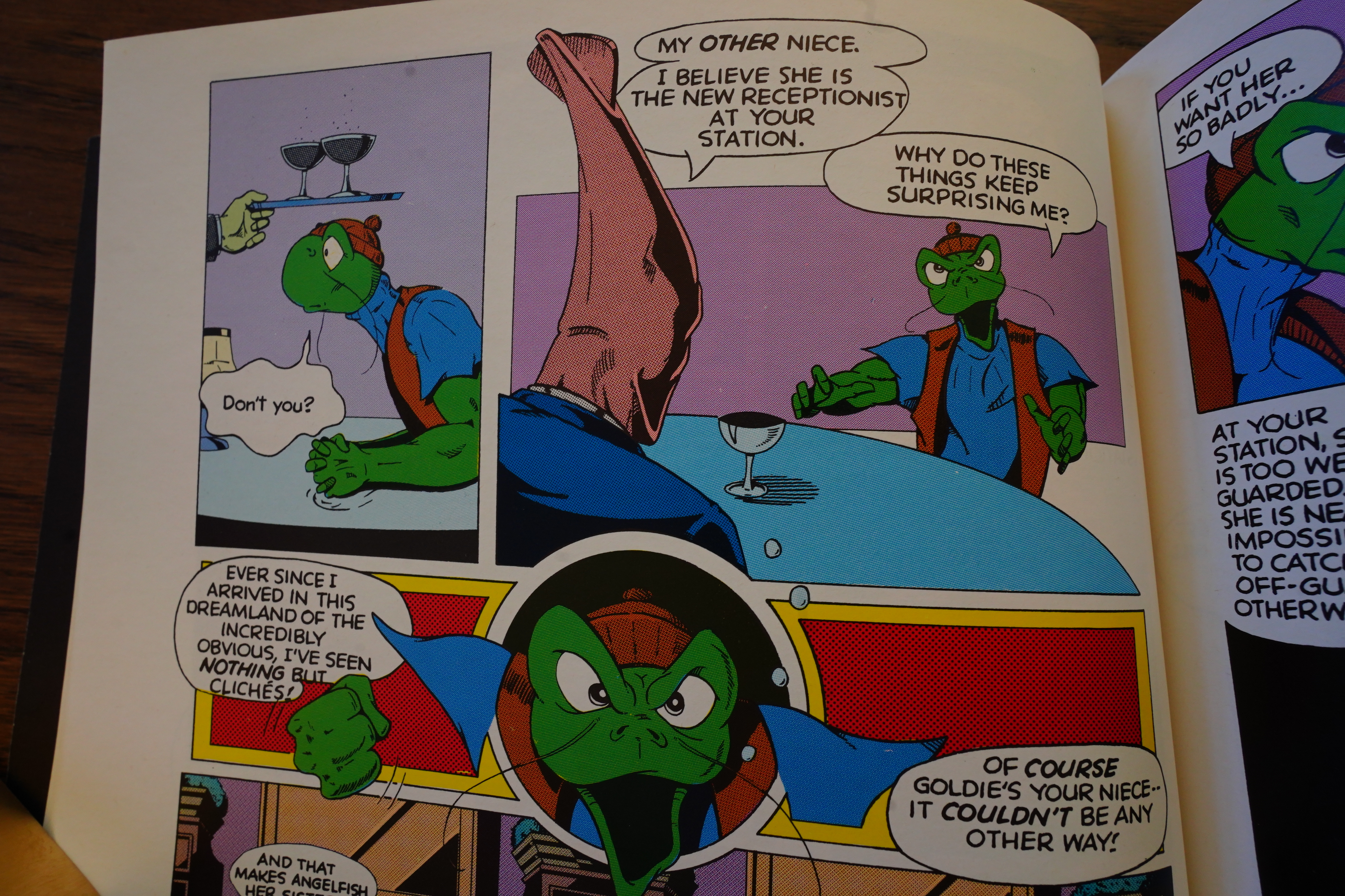
Yes, indeed, this is a comedy. You get a lot of standard skits, but Moncuse’s timing skills are so off that even the simplest gags somehow feel like you’re missing something.
And the plot is so convoluted and incoherent that Moncuse does the traditional having-the-protagonist-comment-on-it-so-that-you-can’t-criticise-it move.

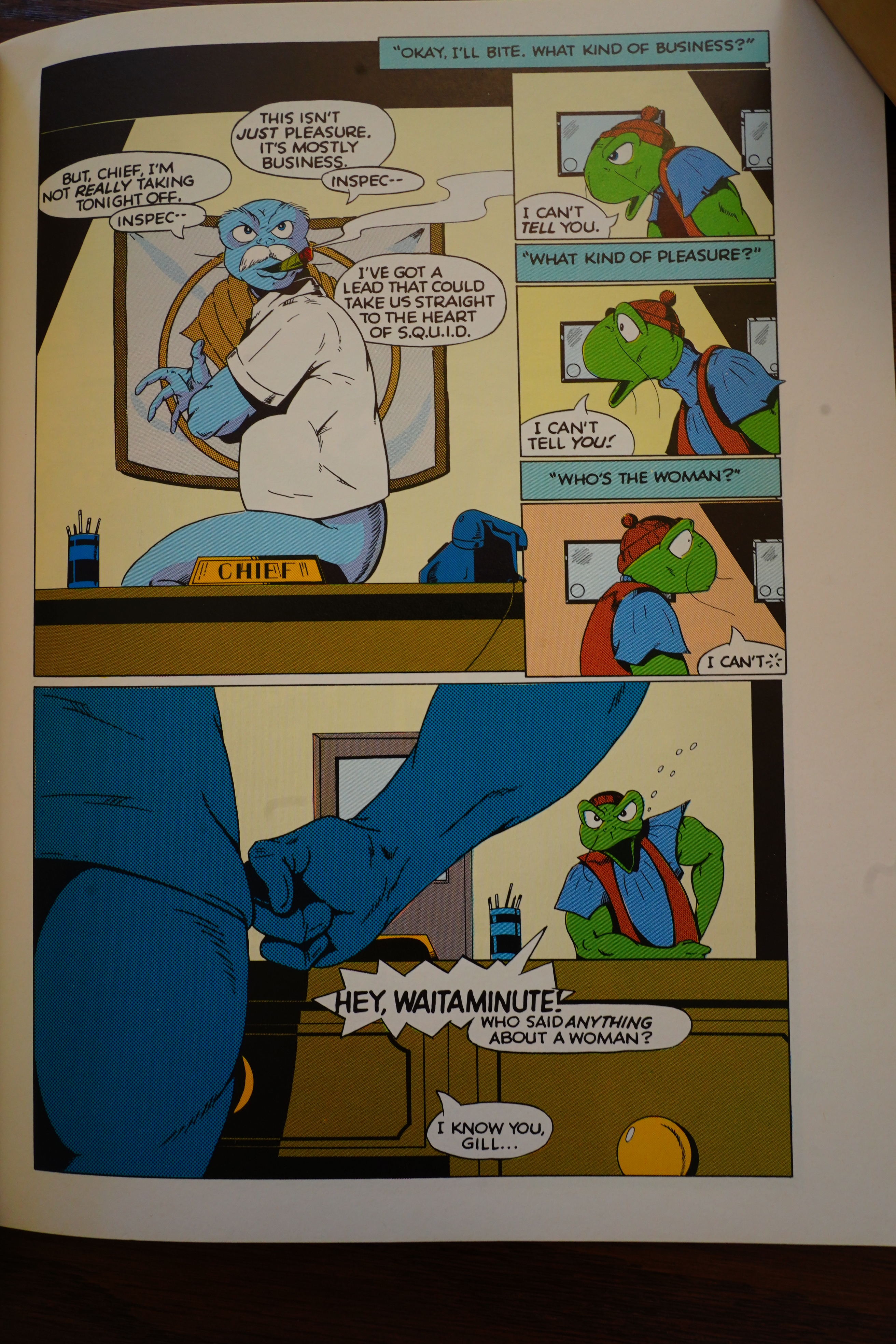
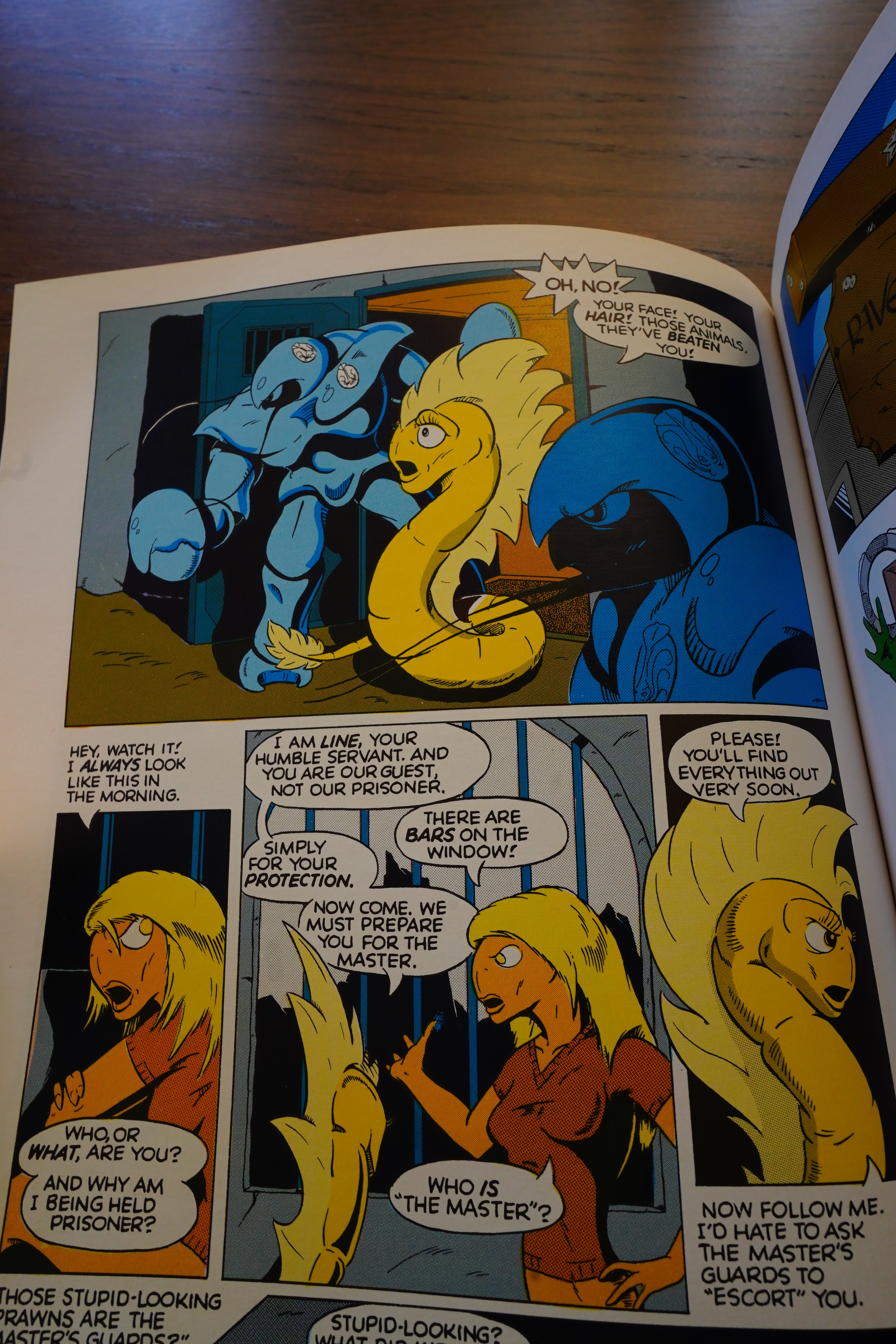
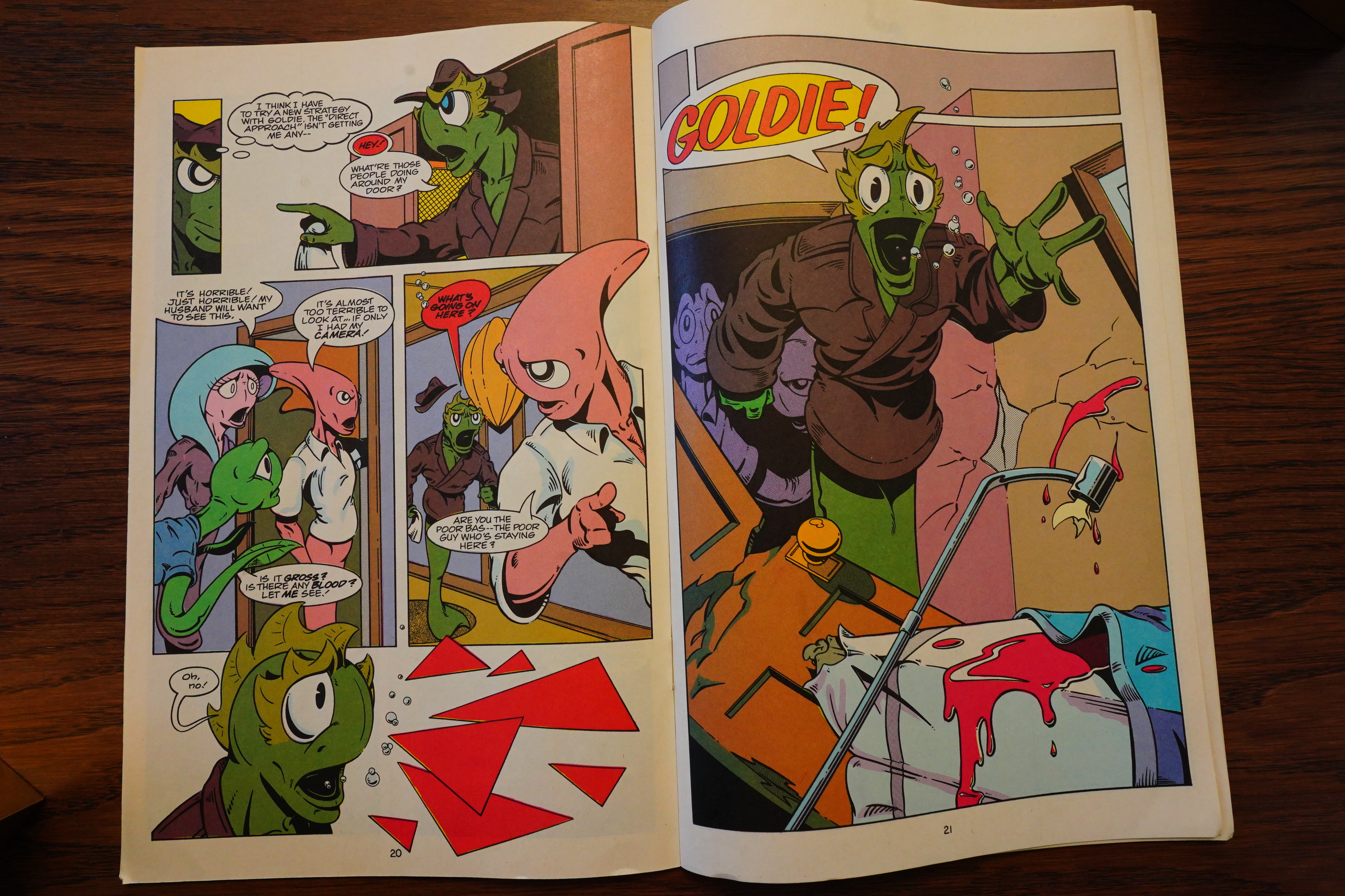
“They’ve beaten you” “I always look like this in the morning” See? That’s a joke. But the way these panels are arranged, and the directions the characters are facing and where they’re moving makes little sense, so it doesn’t really work.

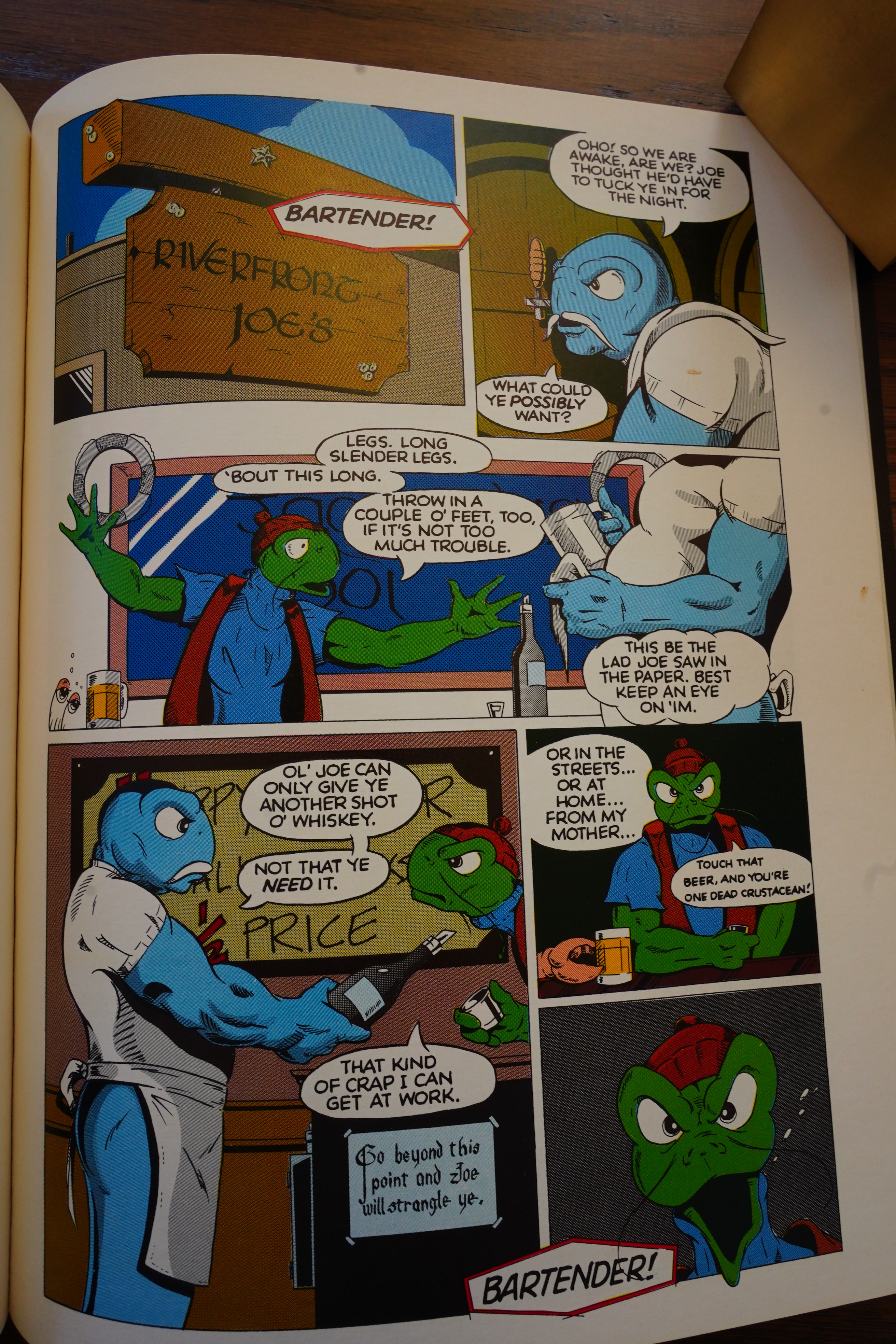
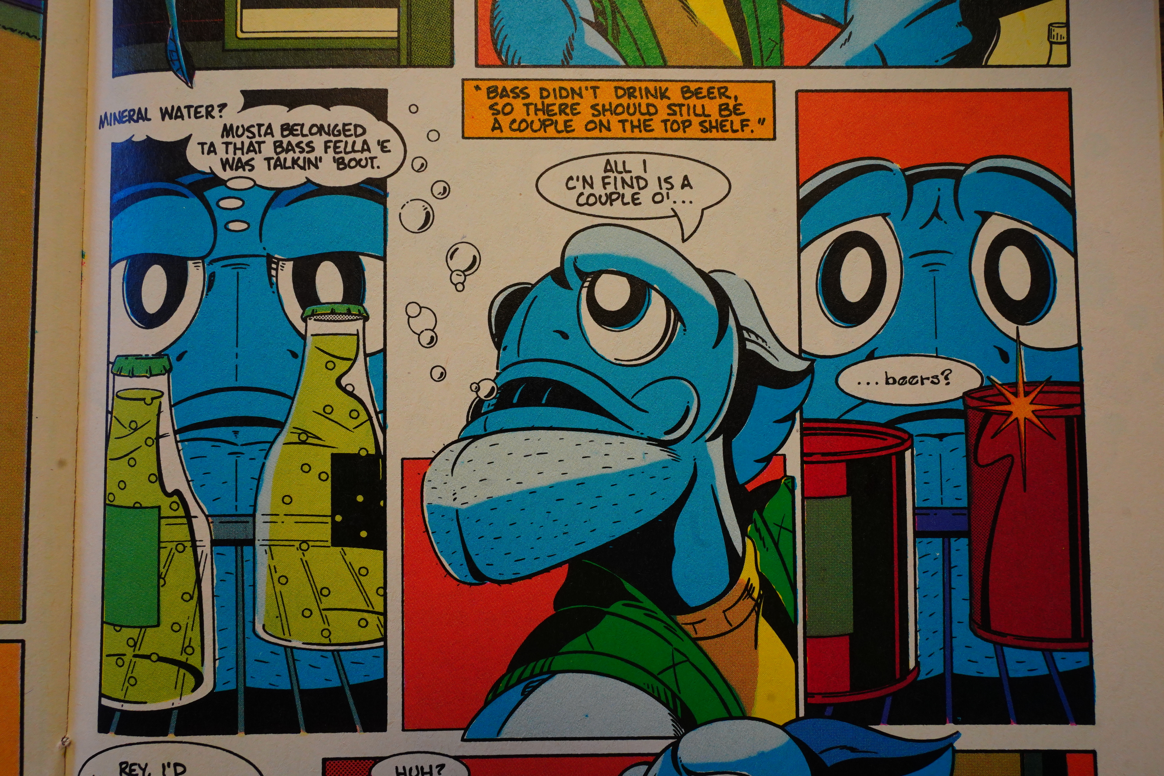
And all the scenes are like this — Moncuse is going for witty, snappy repartee with lots of chaos going on, but you have to be better than this to make it scan — you need to establish that that’s the green guy’s beer before you can have the crab guy try to steal it. And who’s shouting “bartender” at the end with that curiously-shaped speech balloon anyway?

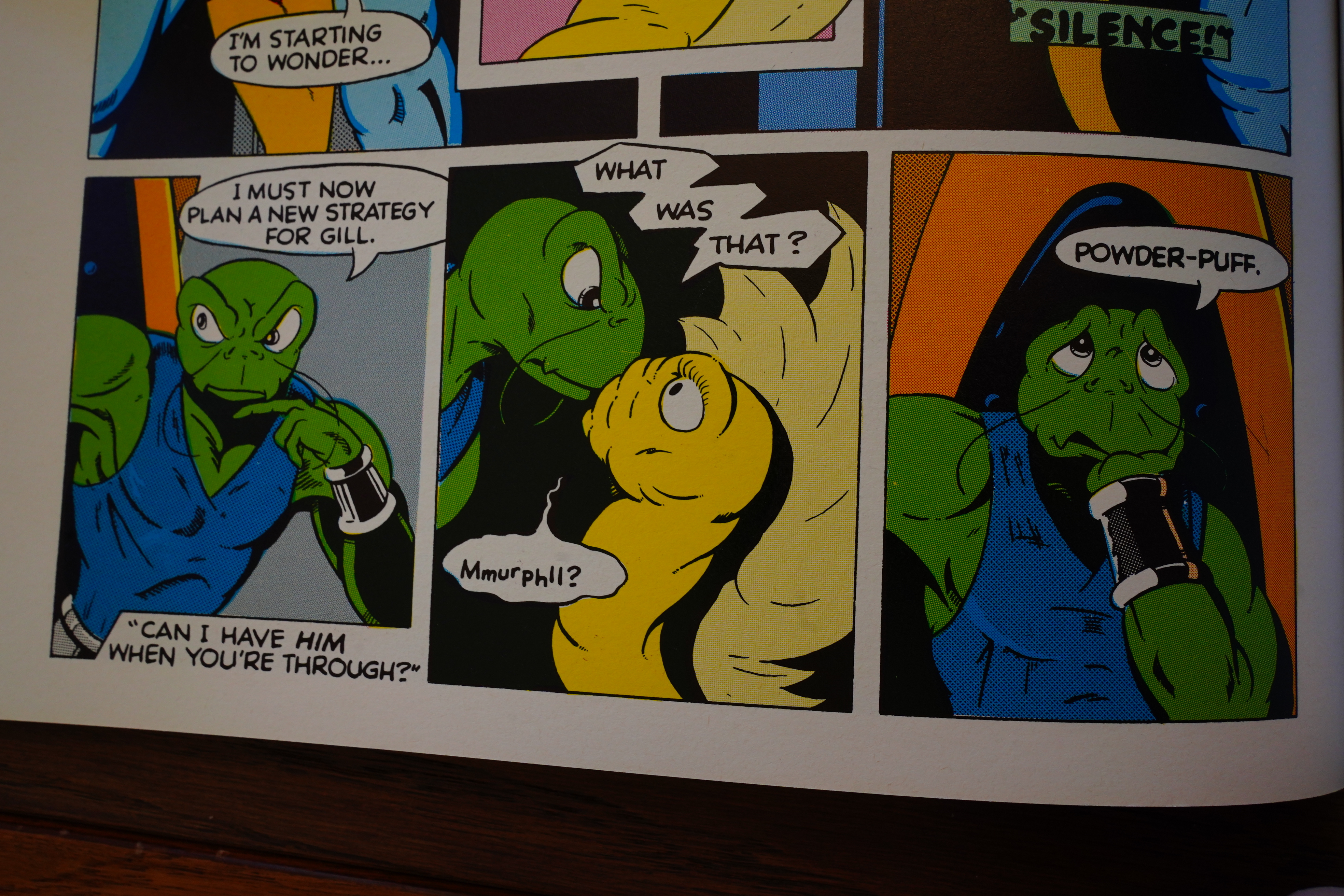
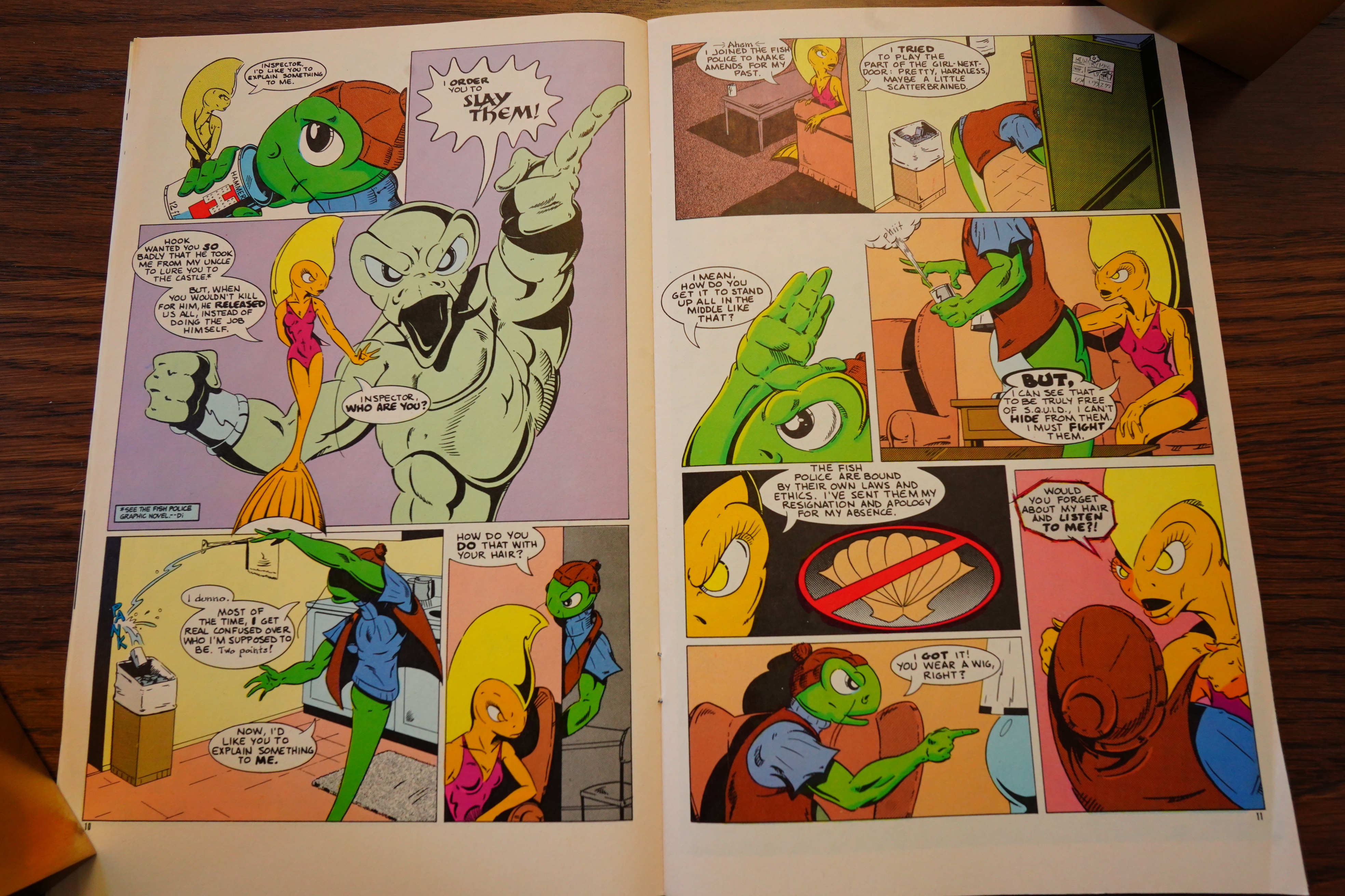
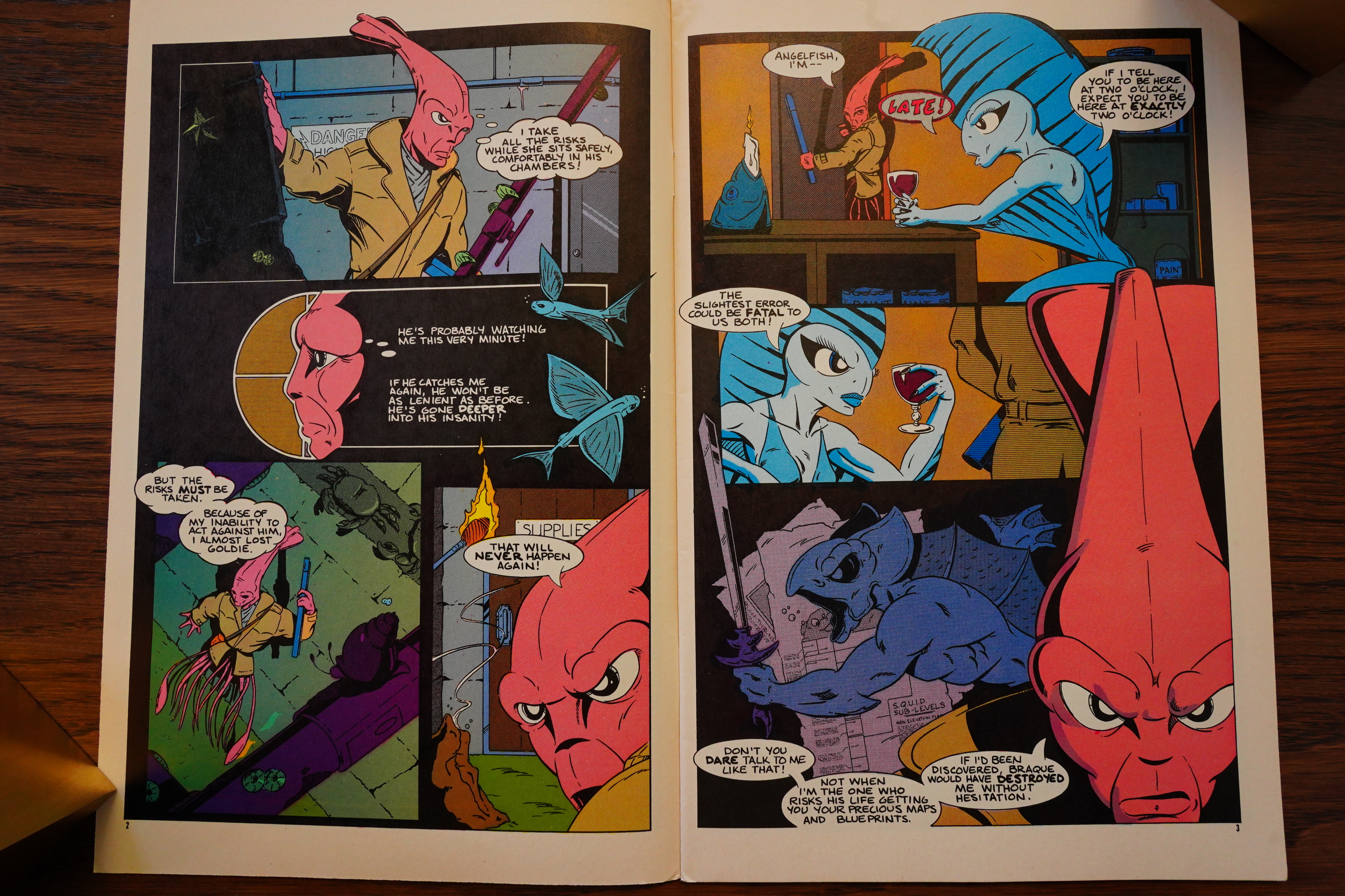
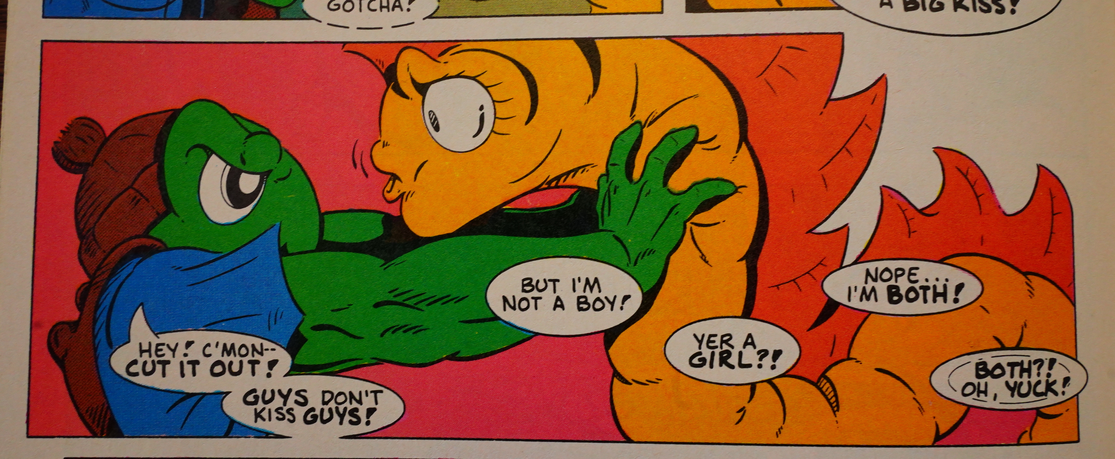
It’s like Moncuse has this private comics language — the boxes that look like caption boxes aren’t really — they’re dialogue from off-panel characters, which is why there’s “” characters around the text. But it’s often not clear who’s saying what — which doesn’t help when the dialogue seems to rely on… well, I don’t know exactly. Is that yellow guy male? I assumed the yellow guy was female, on account of the eyelashes? What does “powder-puff” then mean when the yellow guy wants the fish guy?

What?

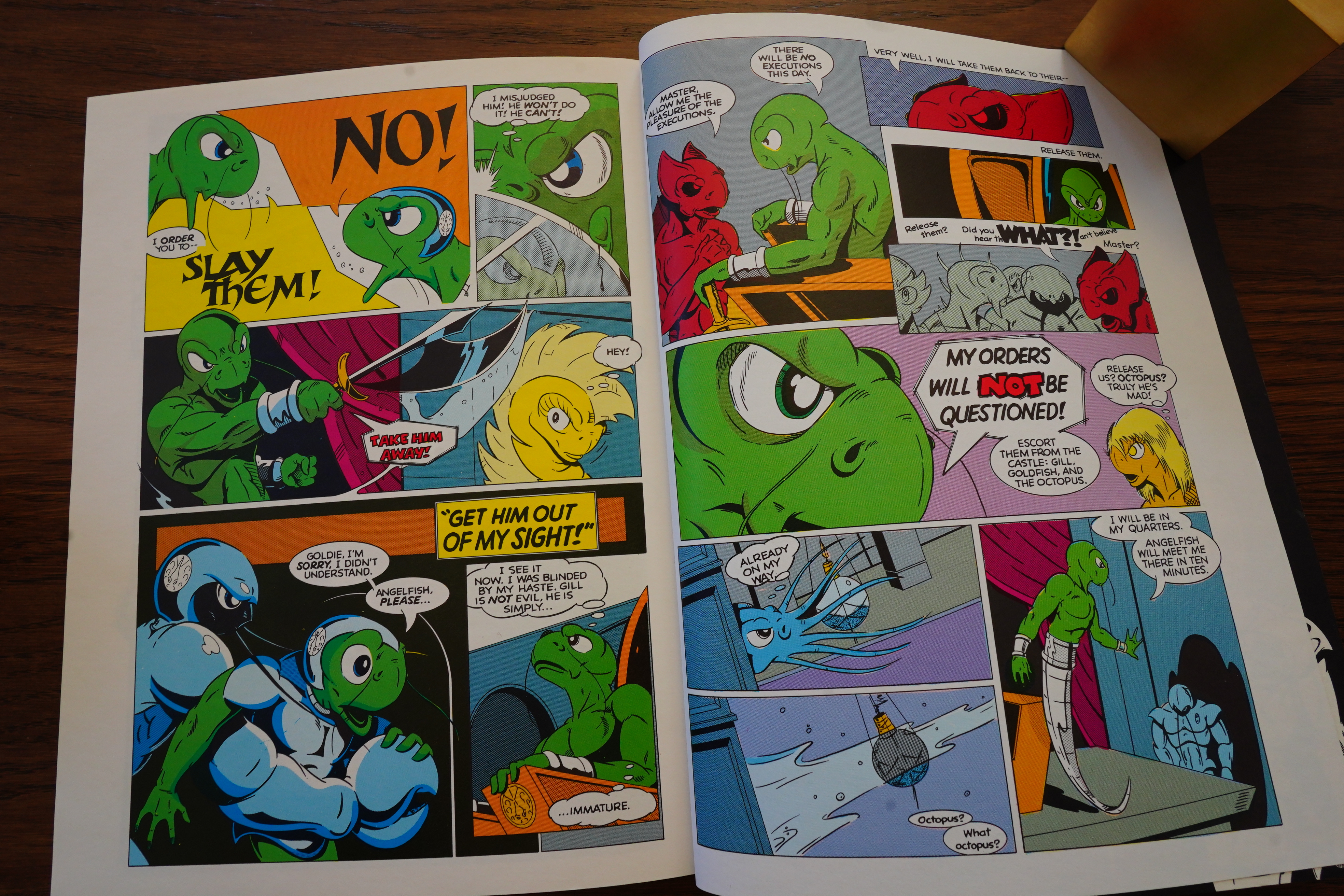
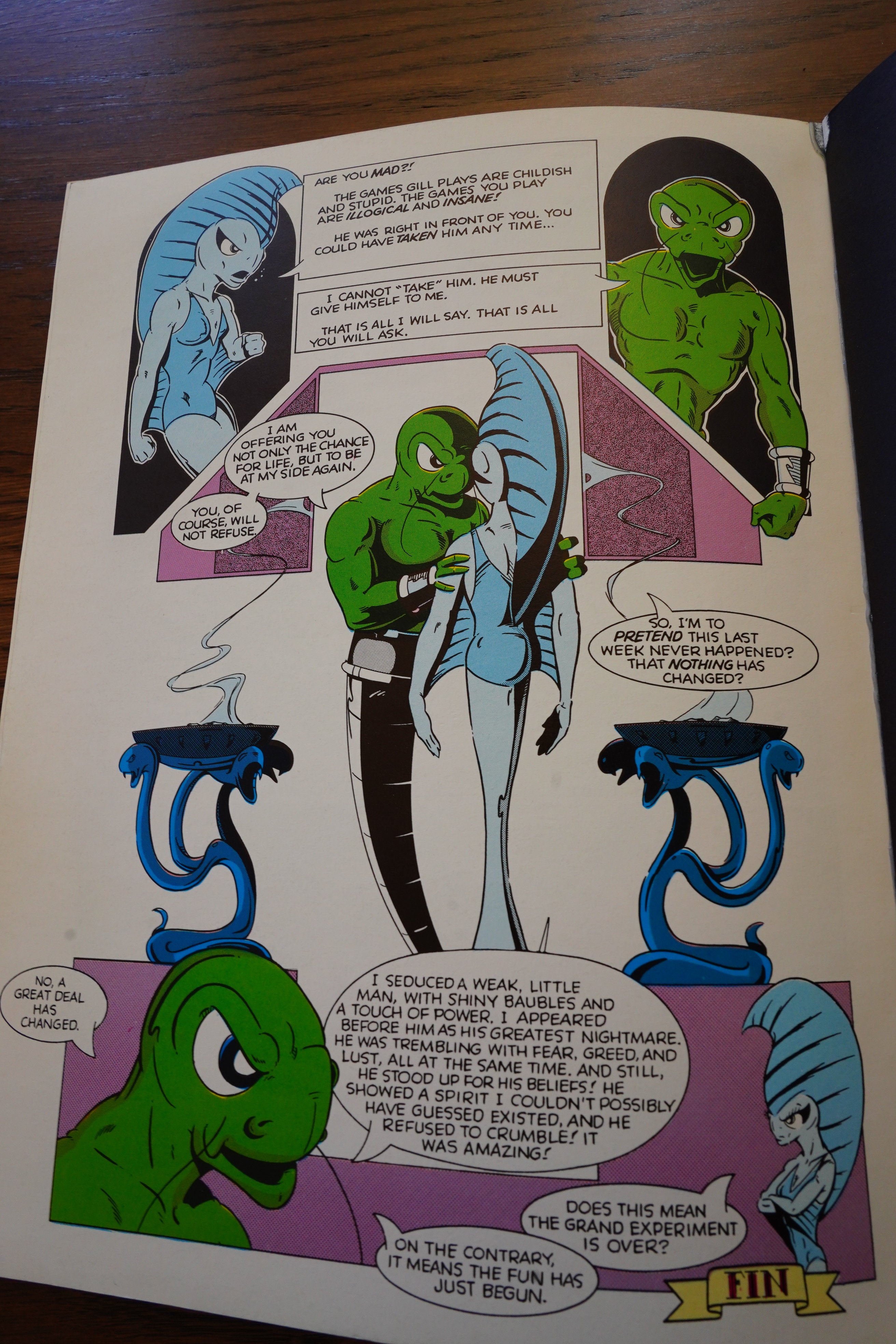
So the album ends:

And I can’t say this strongly enough: “Wat”.

Reading this book is headache-inducing.

OK, onto Fish Police #5:

So Comico is publishing this colourised reprint every other week. Moncuse talks about bringing Fish Police over to Comico, but he doesn’t actually explain what this series is, does he? That is: Comico reprinted the first four issues as an album, and then they’re reprinting the rest as single issues, and when they’re caught up with the Fishwrap issues, Comico is going to start publishing new issues. I think Fishwrap was up to 12 issues, so I guess there would be a four-five month wait for the fans to get new issues.

So this continues straight off of the storyline in the album, of course.

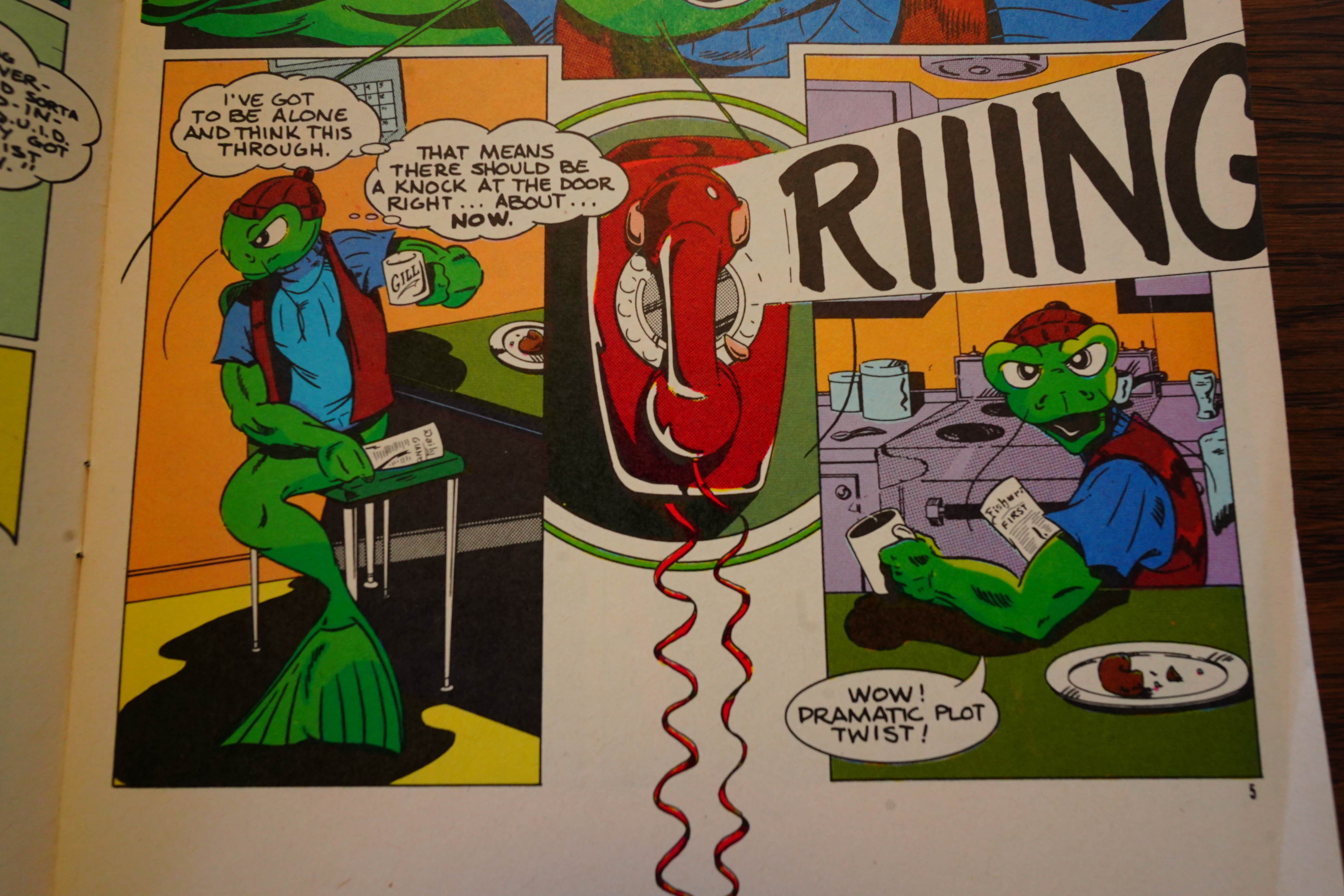
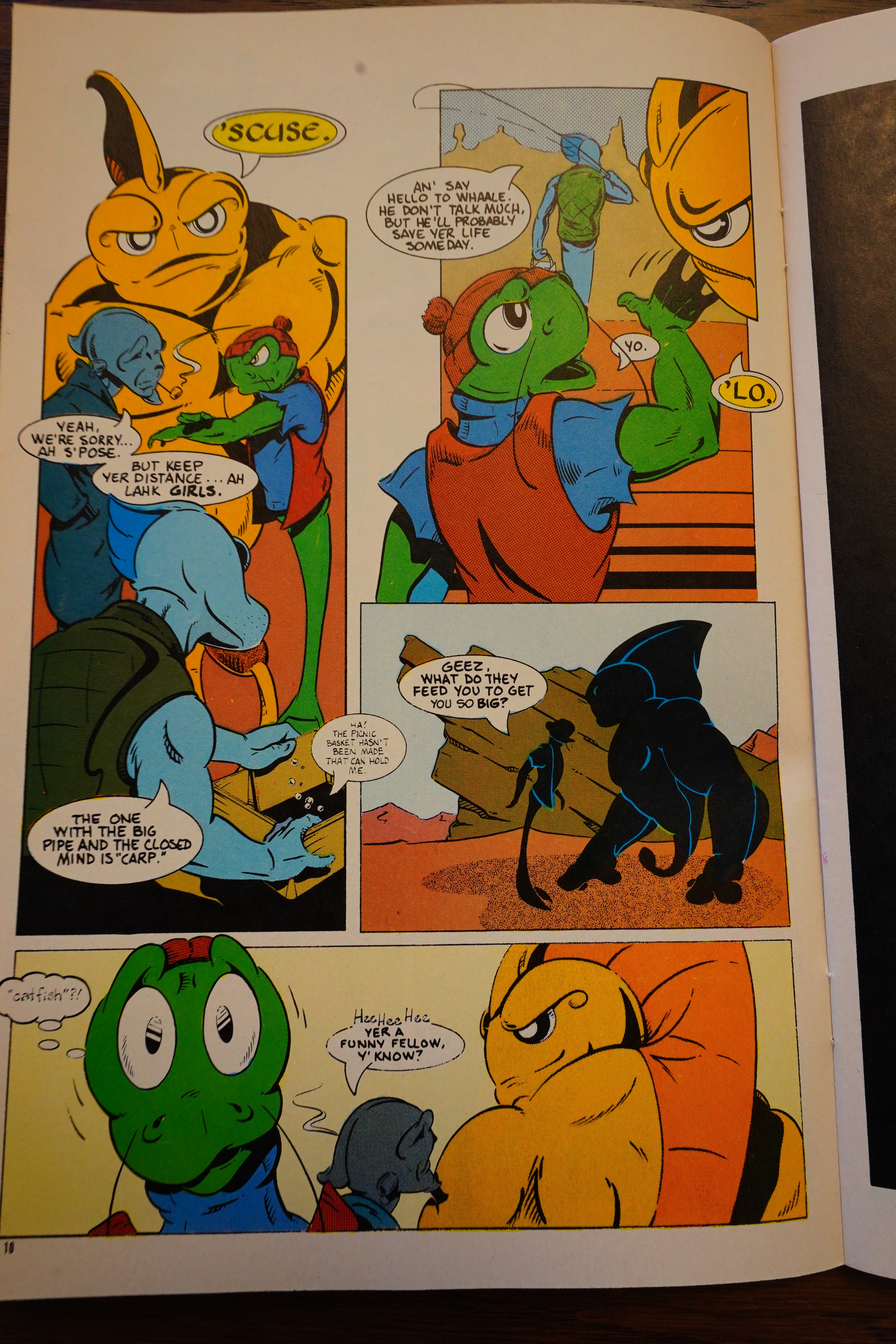
I don’t know… the humour seems to be growing on me? I mean, it’s very standard, but…

They’re still going on about various nefarious plots, but I’m still not sure whether Moncuse himself knows where all of this is going. But the colour special is referred to, even though it was (I think) done later?

To pad out the issue, we get a bunch of pin-ups by other people.

When things are actually happening, it’s not too bad, but there’s a lot of back and forth, seemingly explaining things that we either already know, or should already know, somehow…

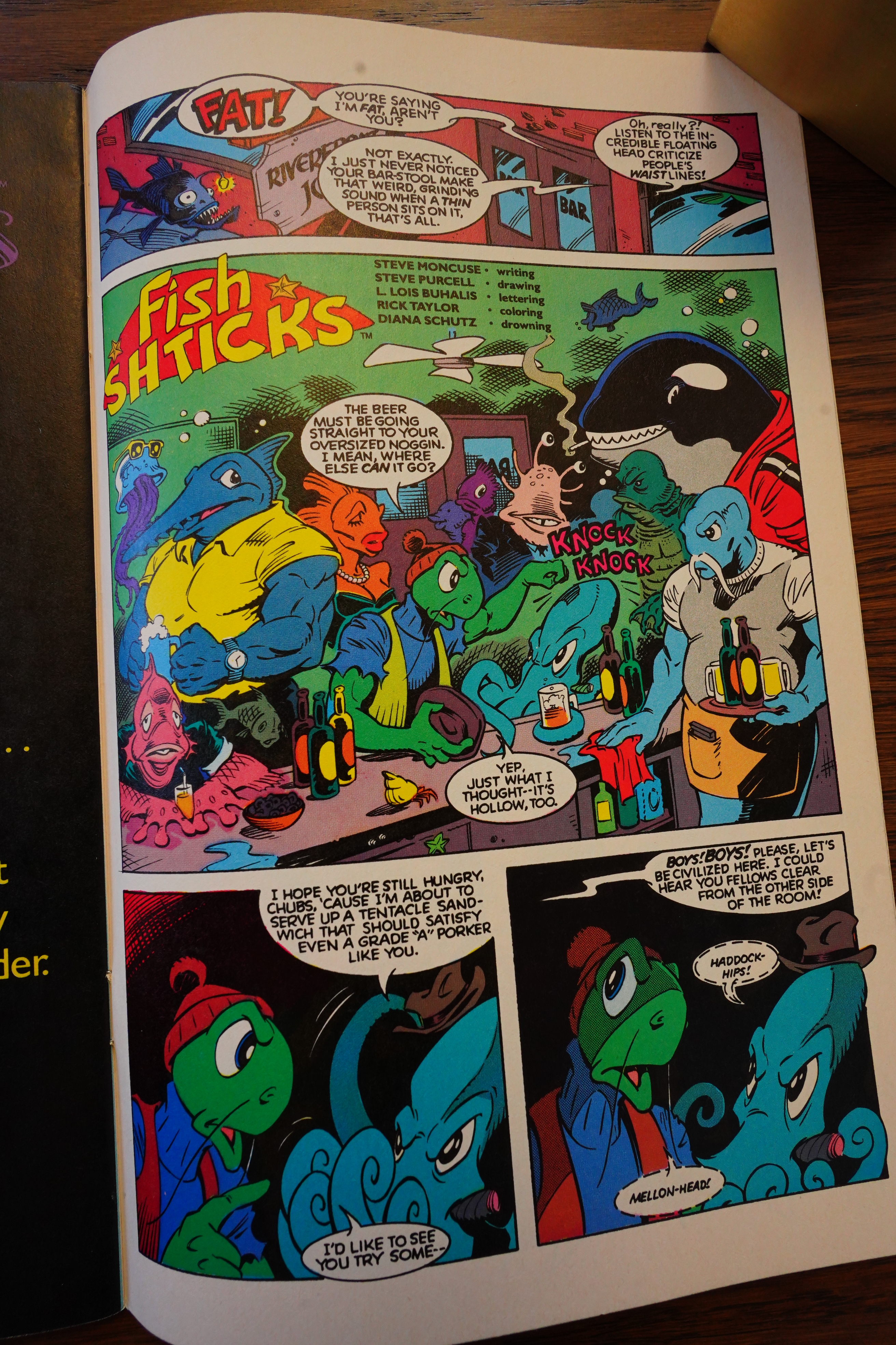
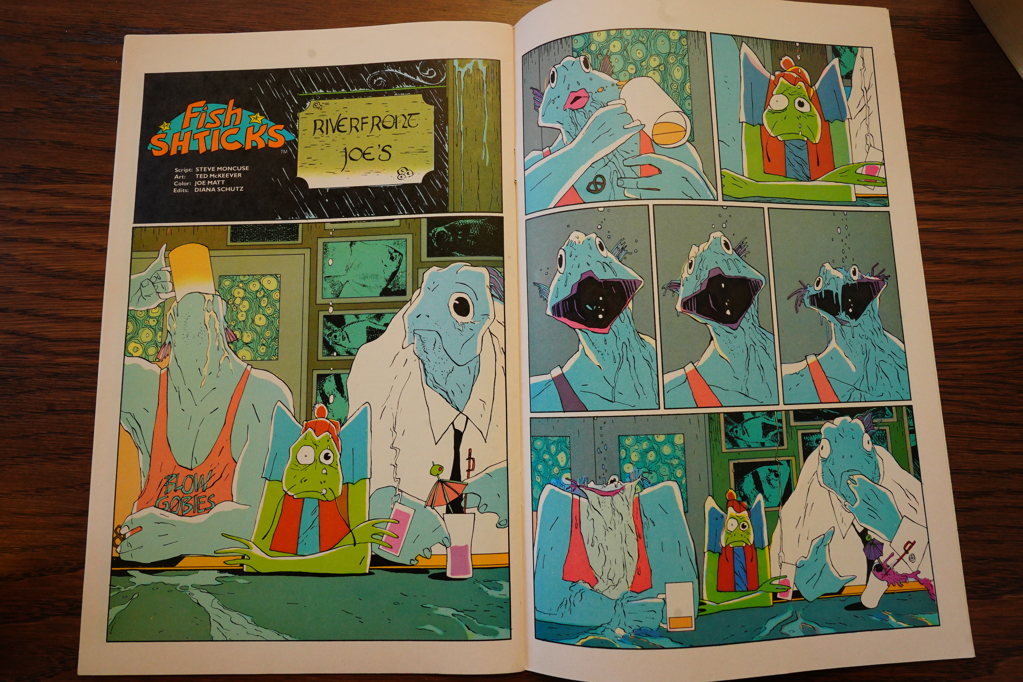
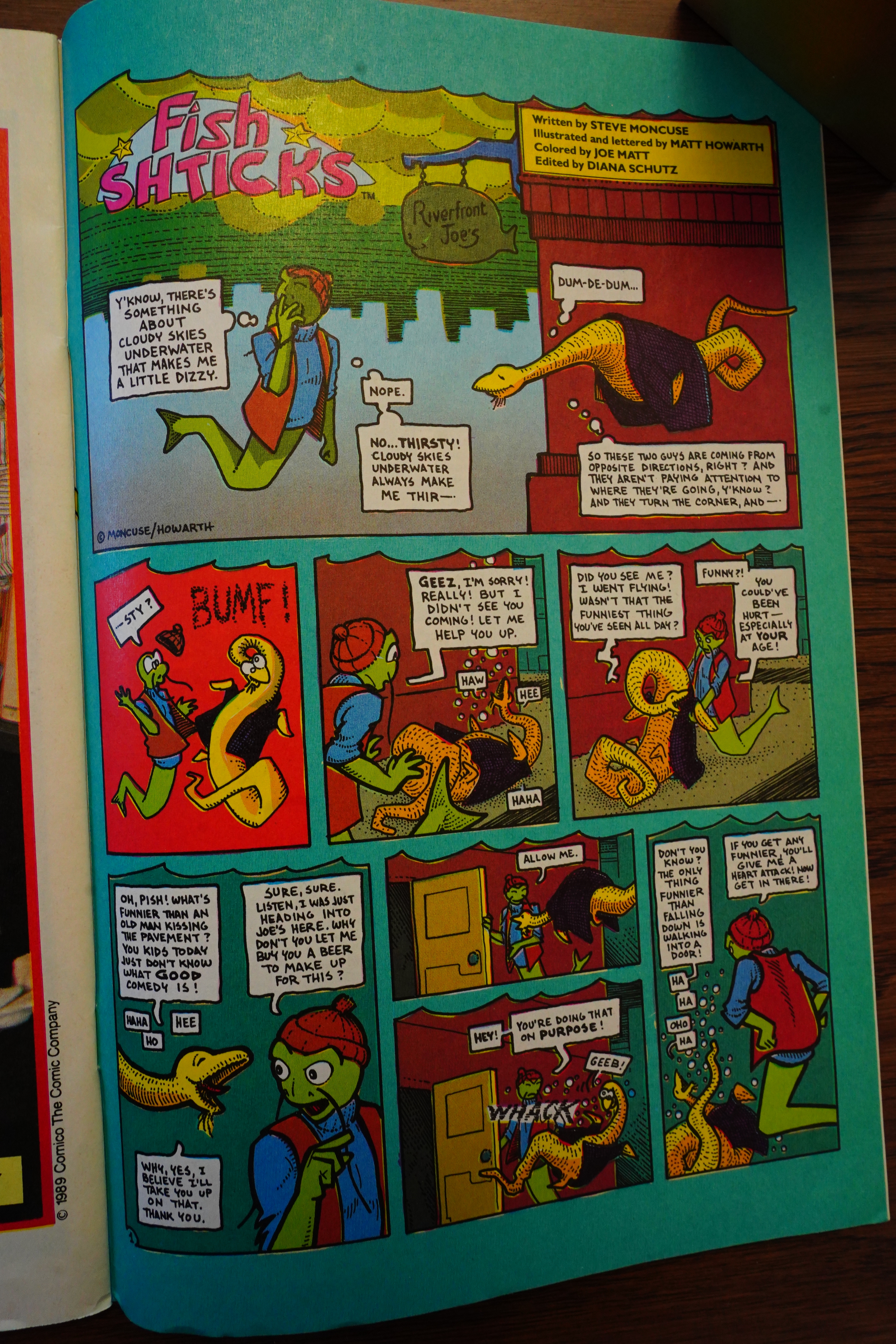
The rest of the series has a backup strip called Fish Shticks, which is written my Moncuse but drawn by other people. Most of them are pretty context less, but the ones that aren’t seem to be happening much further ahead in the storyline.

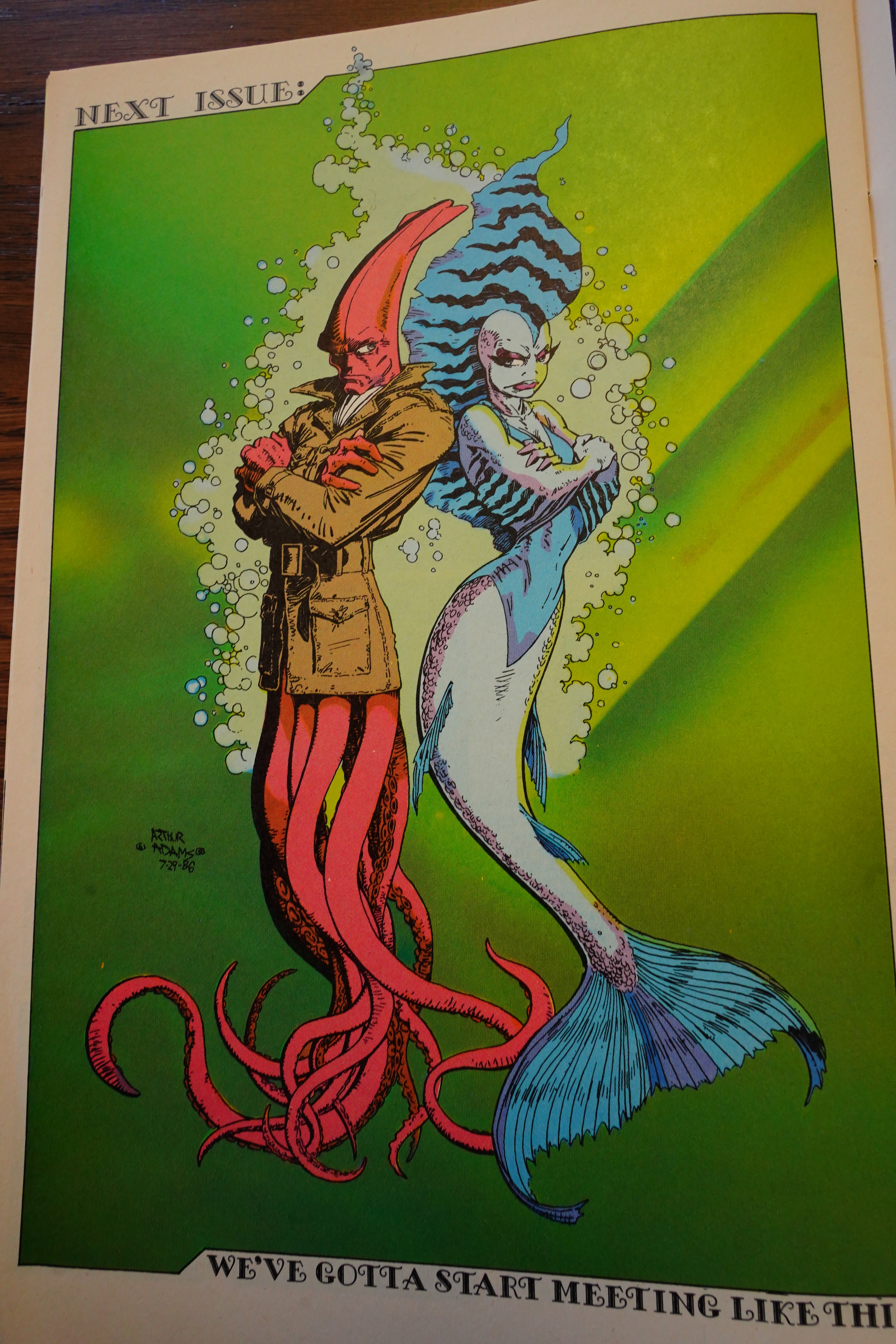
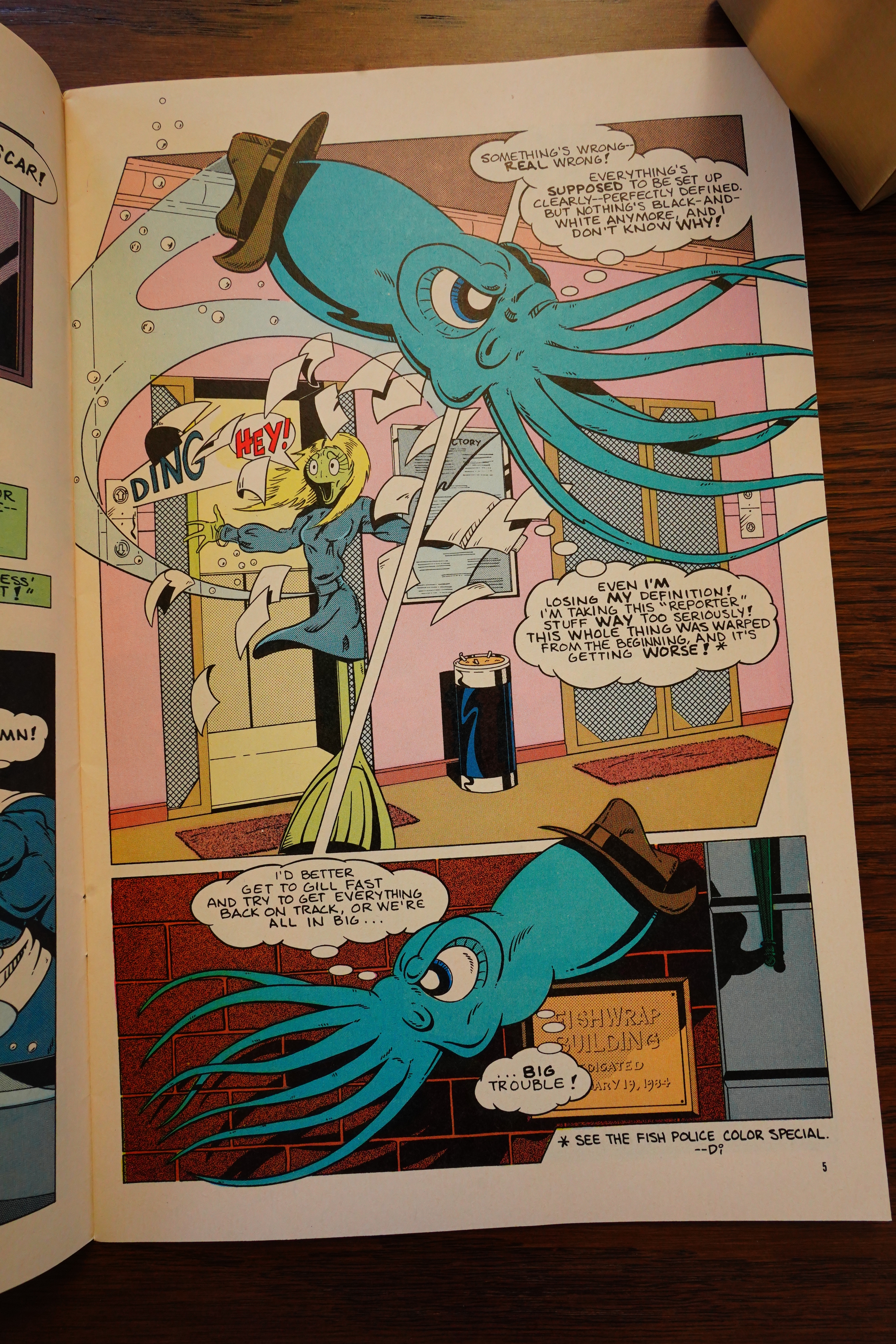
Uhm… oh! The squid guy is swimming feet first? I don’t think they do that in reality, so it makes things a bit confusing…

Wow, Ted McKeever!

Heh.

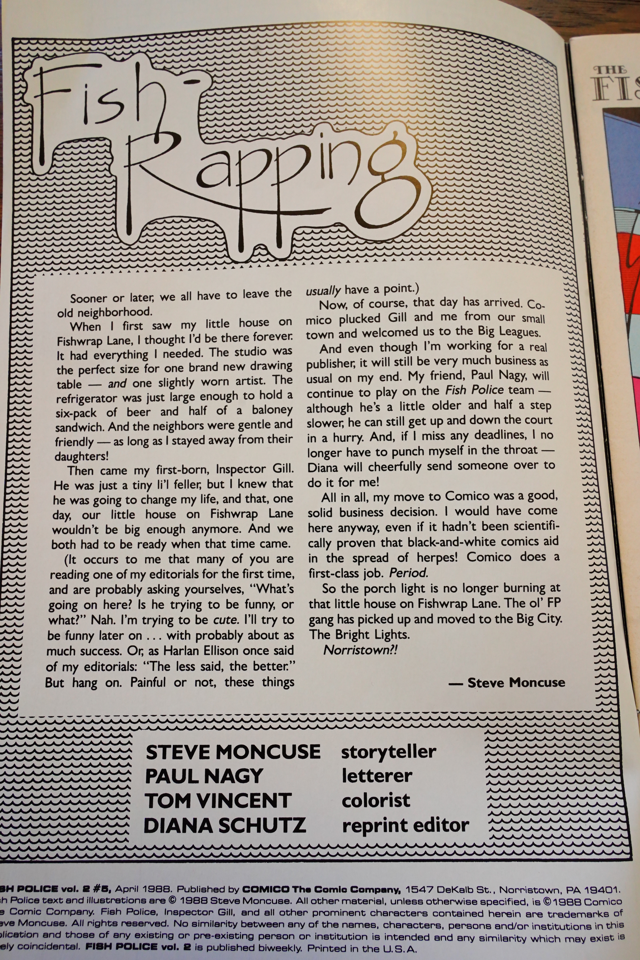
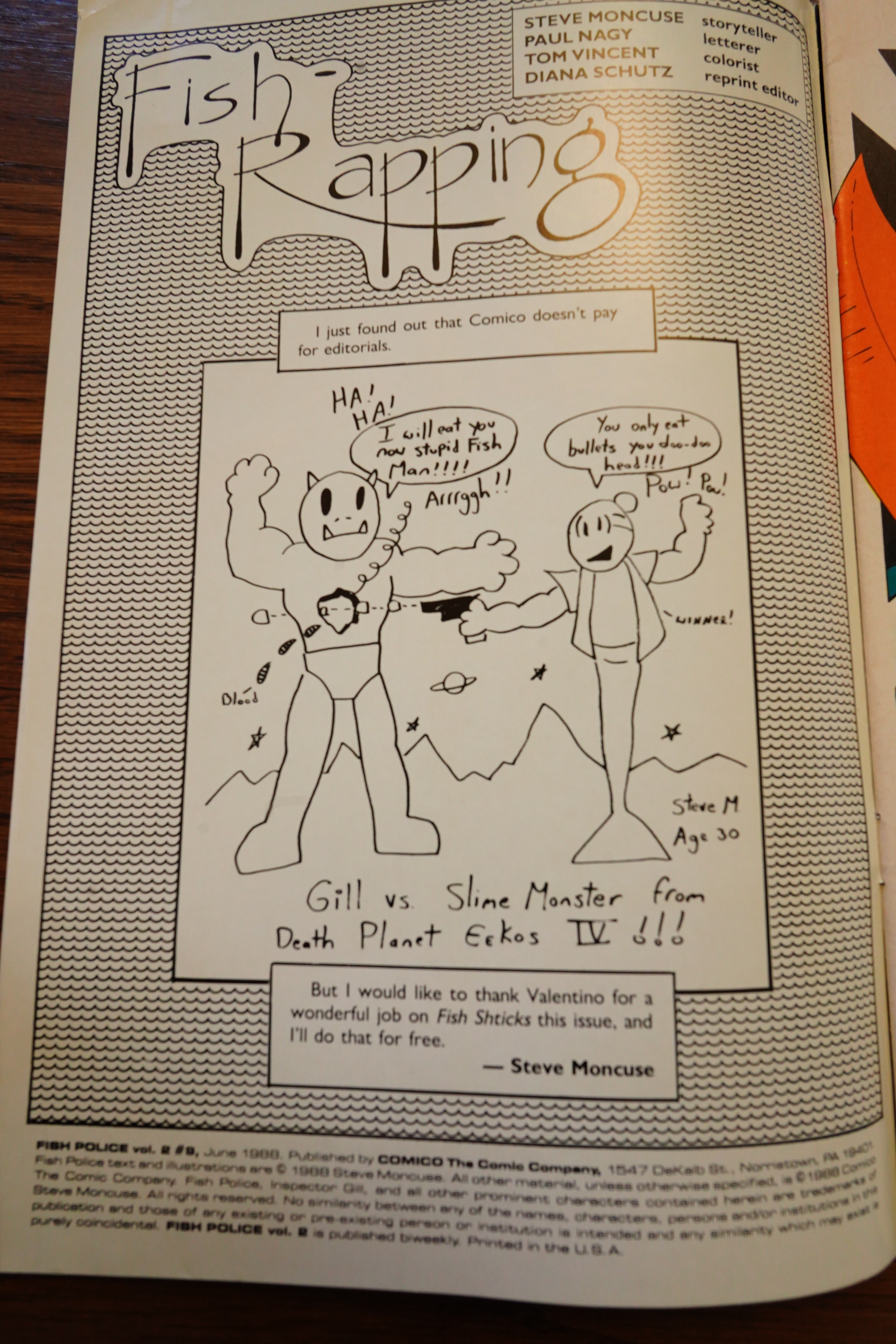
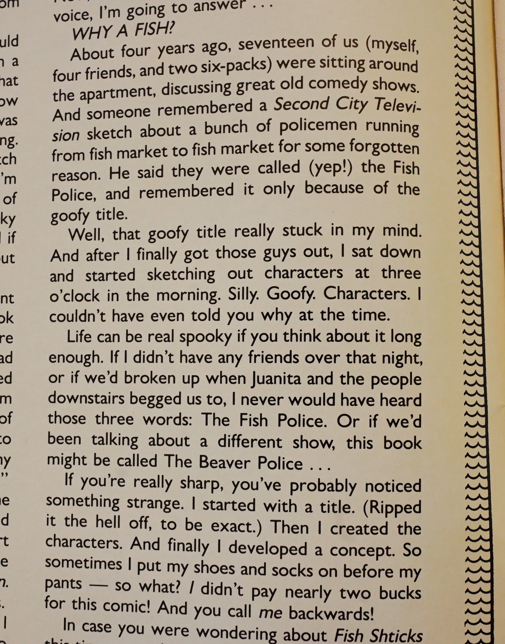
Moncuse explains how he created Fish Police: He took the name from a Second City sketch, and then just created some characters around the name, and then came up with a storyline. Which is pretty much like what the book reads like, I guess.

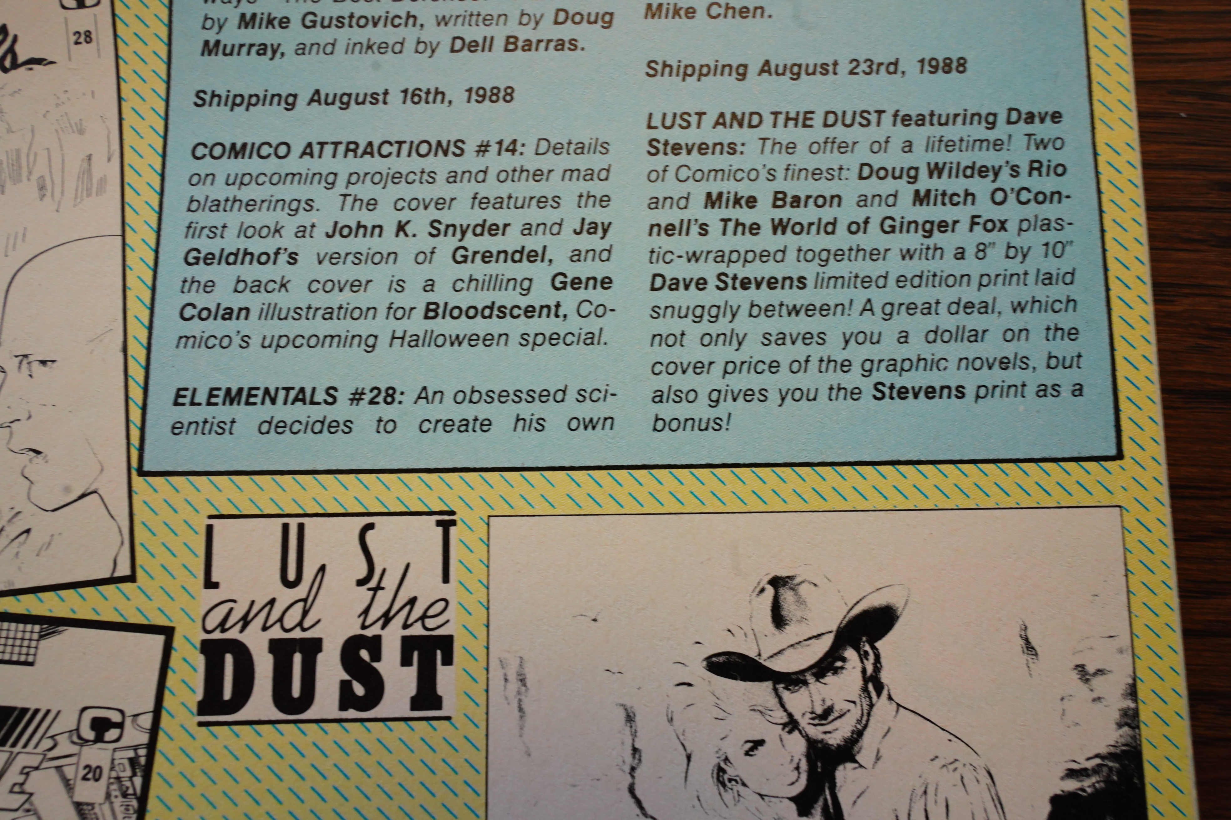
Heh. “Lust and the Dust” — Comico packaged Rio and World of Ginger Fox into one packaged? Well, why not.

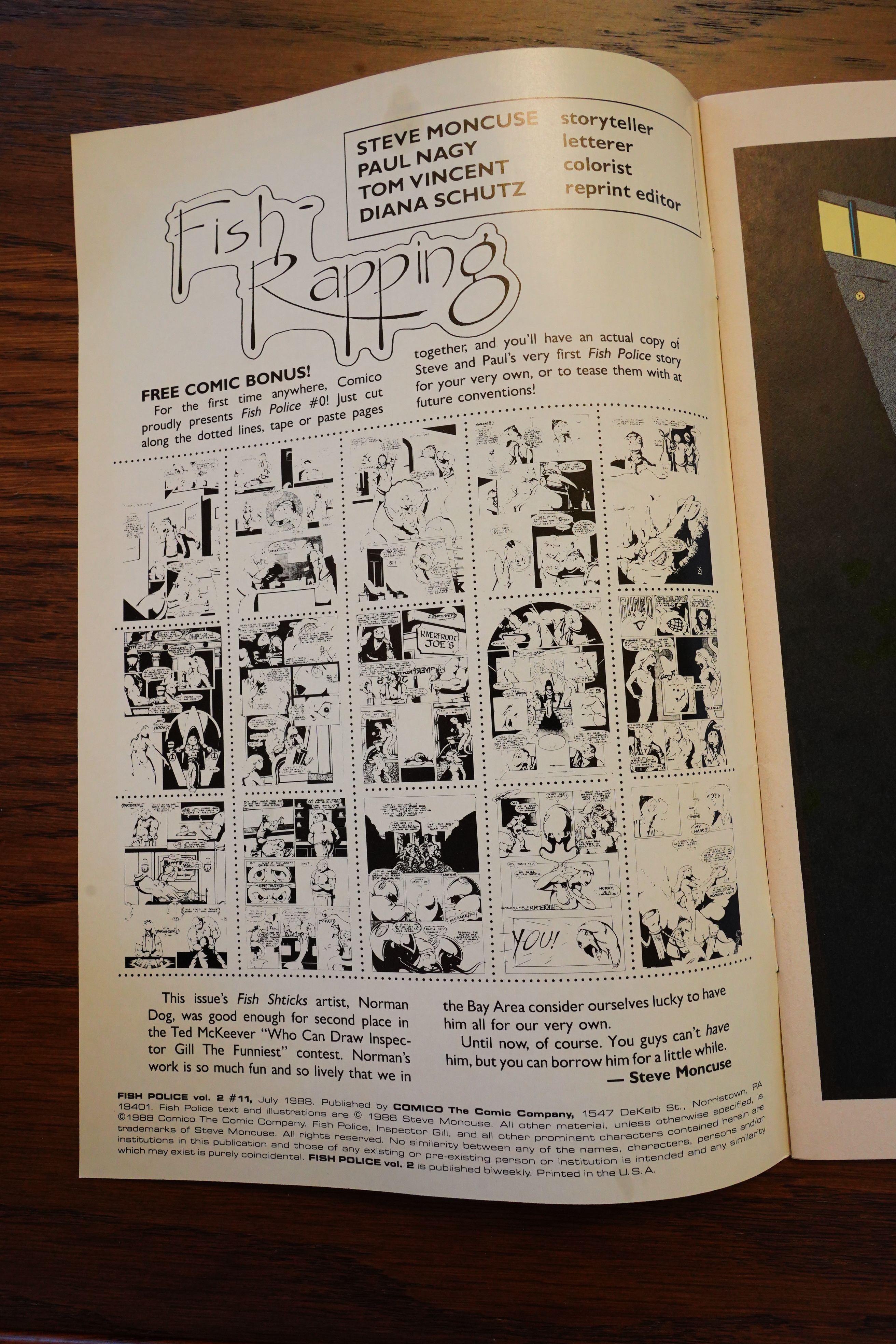
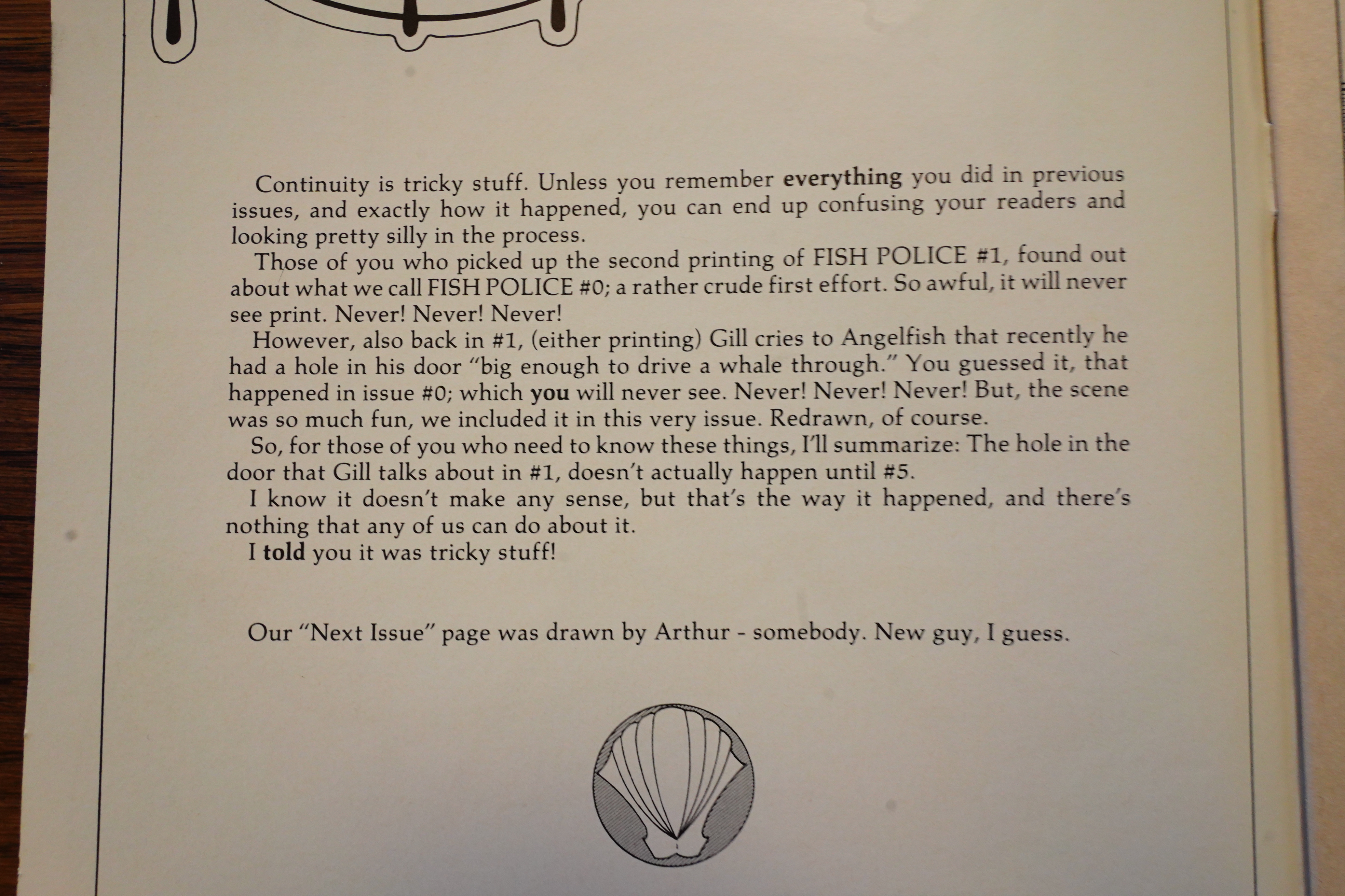
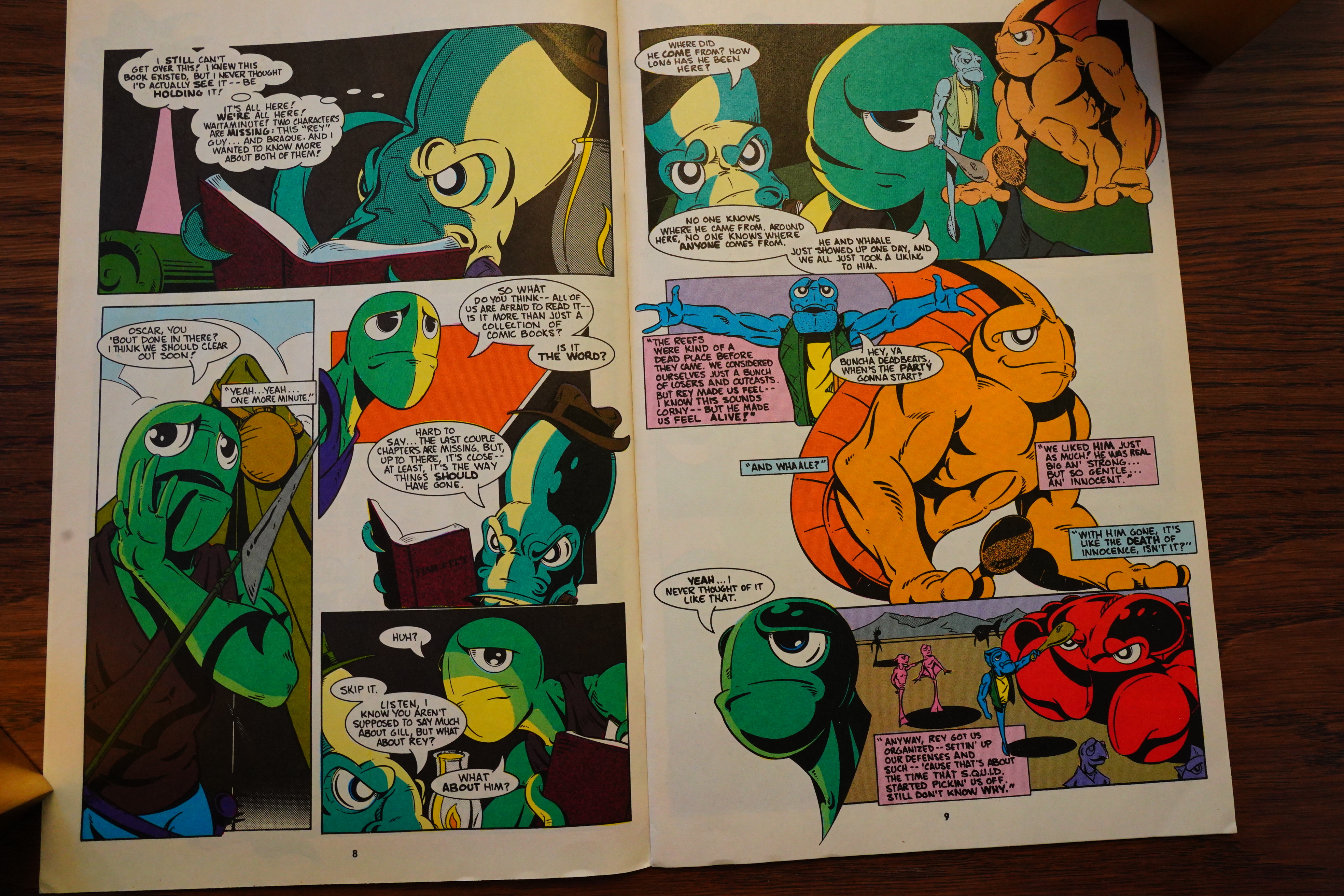
Oh, so there was a Fish Police #0? Well, that explains why #1 feels like we were dropping in on a storyline already in progress.

Moncuse does this story of thing repeatedly — you have a character apparently reacting to something somebody said (like Gill reacting to the orange guy here) — but you’re not shown the orange guy saying something, so it comes off as a non sequitur. The first few times I thought Moncuse just forgot to put it in, or that some of the characters were mind readers, but I guess it’s… just something Moncuse does?

But I have to say that the series is growing on me. Instead of being annoyed by the general chaos of the storyline, it’s becoming clearer that we’re actually going somewhere — even though the storyline moves at a snail’s pace.

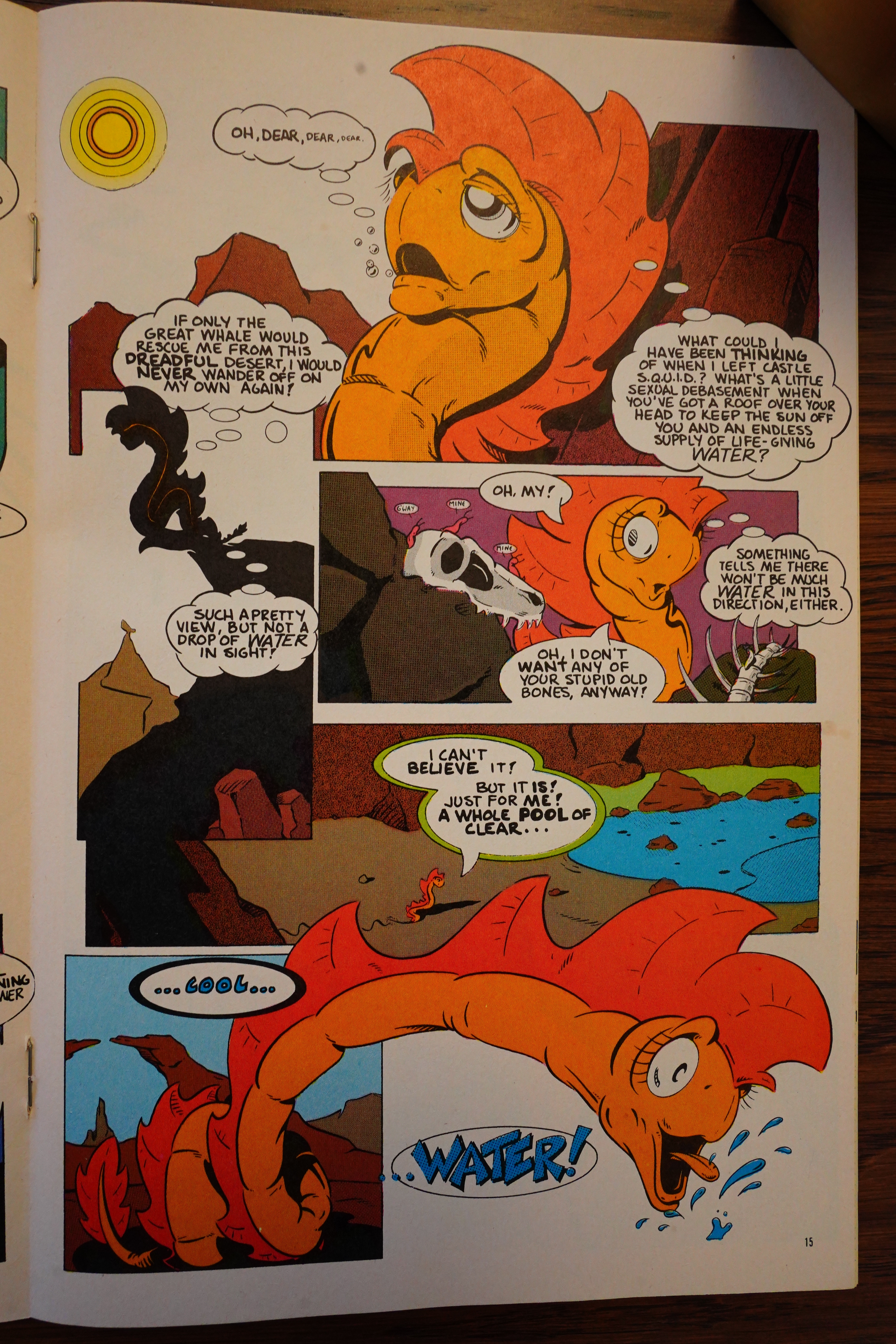
And Moncuse’s insistence on the bizarre nature of his world gets funnier the more absurd it is — like having a pool of water (under the sea).

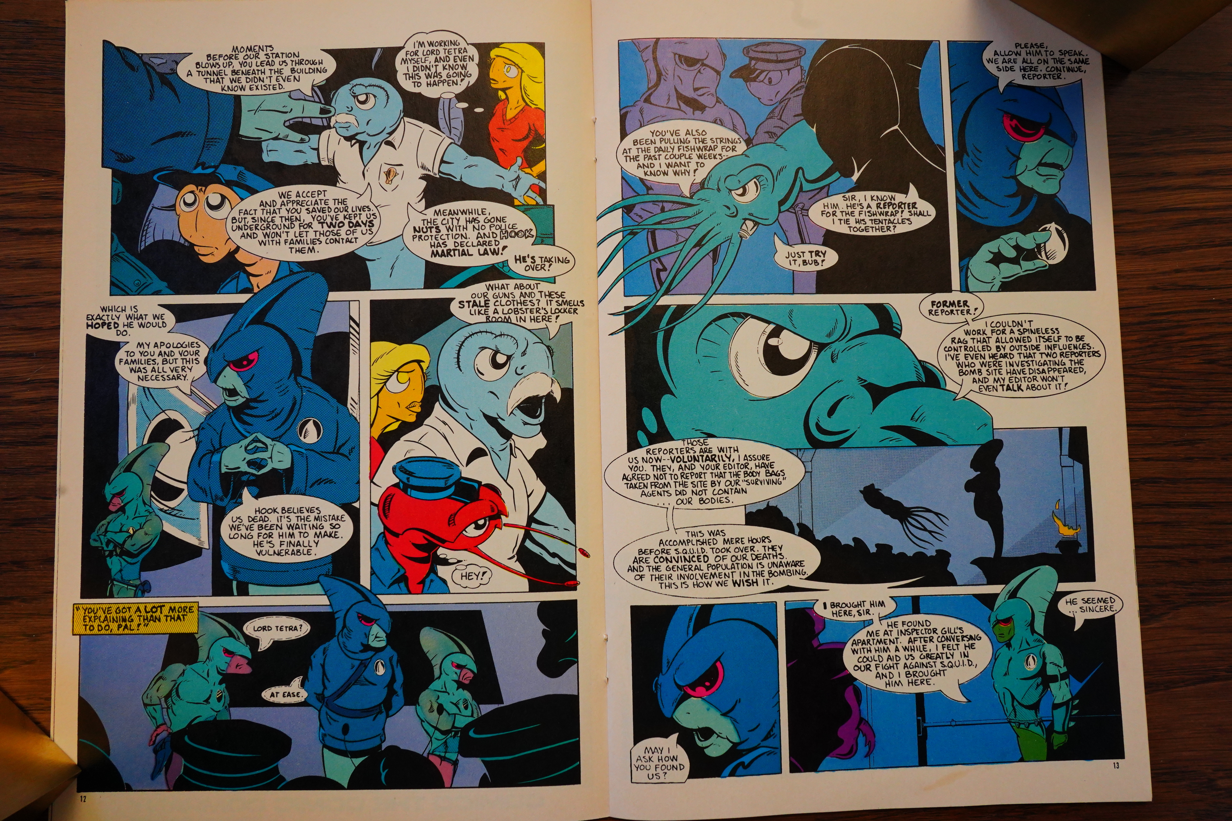
Oh, and now Hook’s joke (way up there in this post) makes more sense, I guess?

Oh — Gill is sort of a messianic character they’ve been waiting for? Hey… this is starting to give me some Cerebus vibes — hinting at intricate mysteries while doing a comedy book.

And Cerebus’ readership shows up in the letters pages, too.

We’re now at the 13th issue, which is the first non-reprint issue, and it’s now a bimonthly series.

Not much changes art wise, I’d say, but the storyline seems to pick up speed. Perhaps the editor had given some hints about it’s being time that some things about this world were explained. Apparently the fridge is magic!?

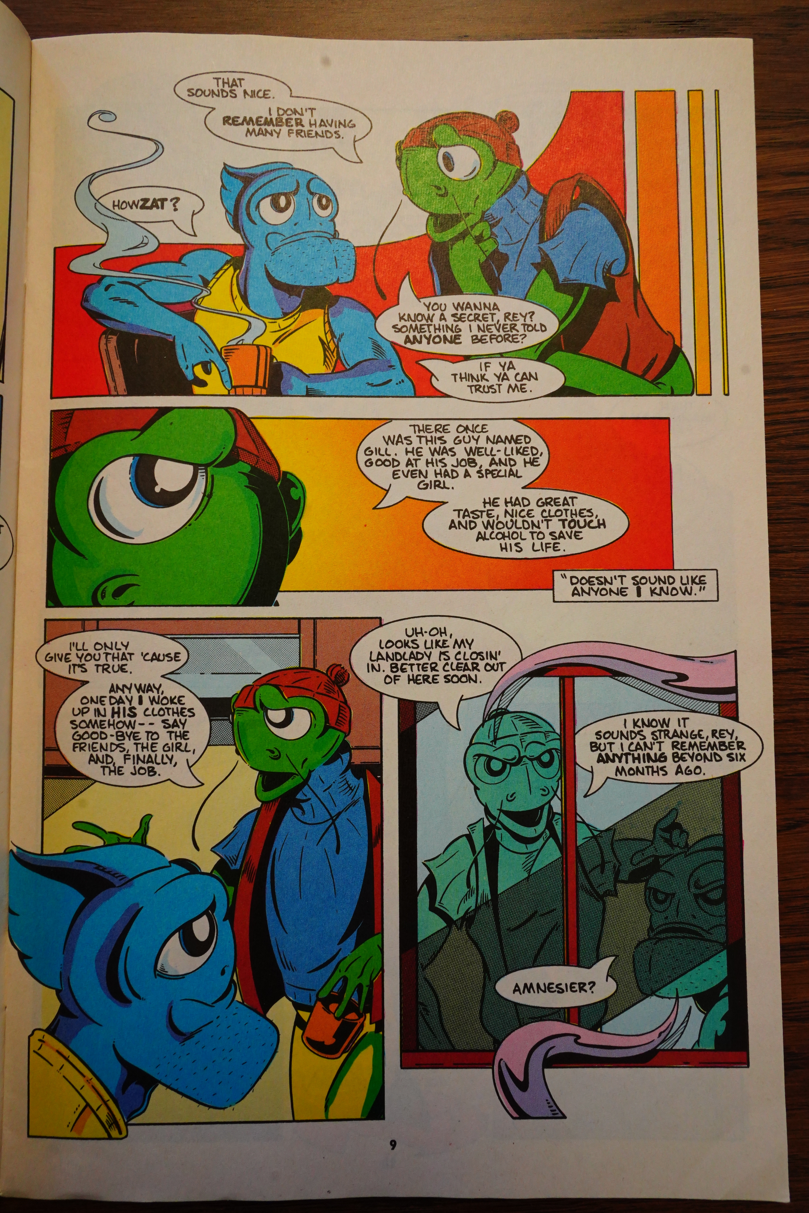
And Gill actually starts explaining to other characters what he can remember and whatnot.

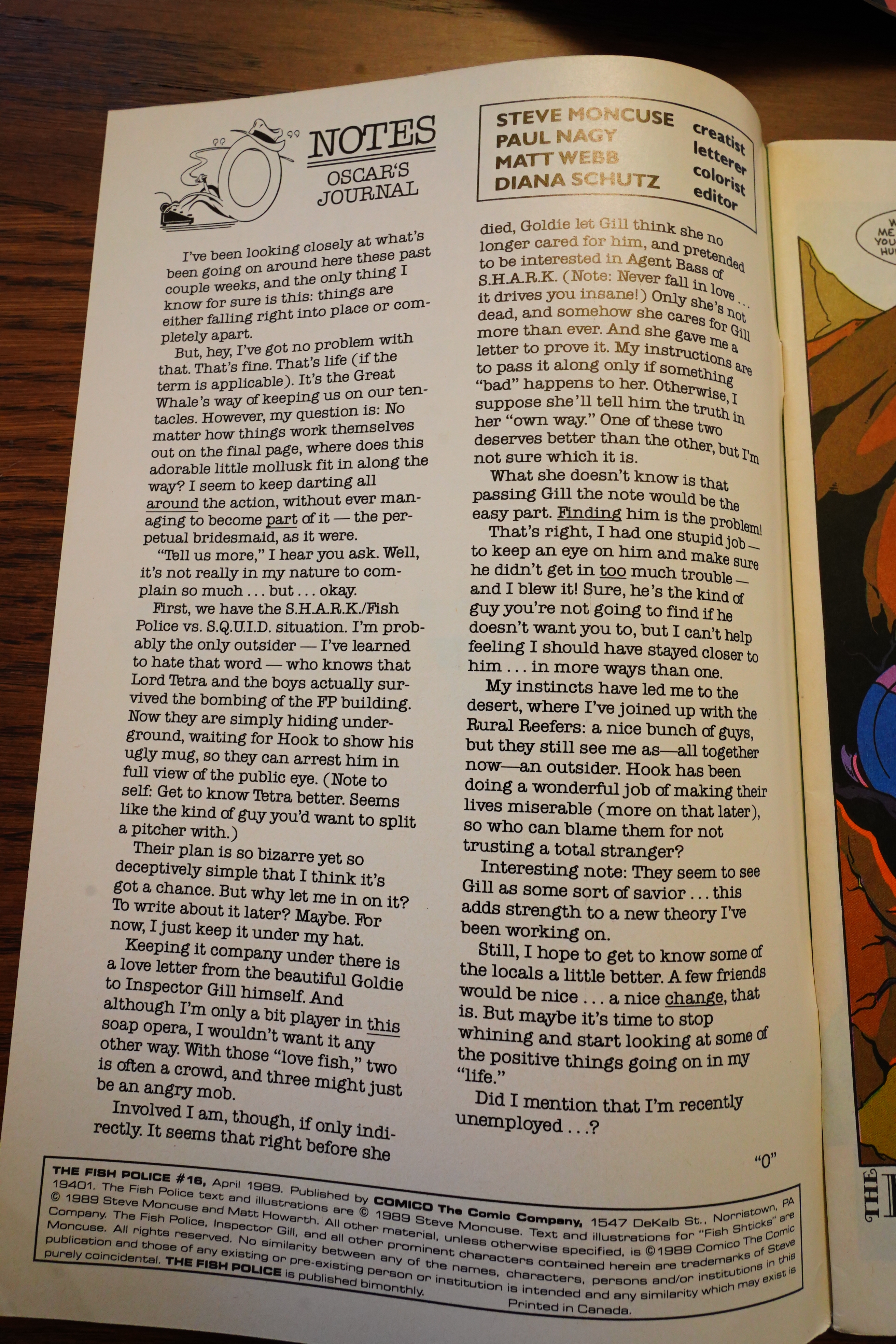
And! Instead of editorials, Moncuse starts recapping the story… but in character as the journalist character.

Who is finding an apparently holy book (which is a comic book?) that talks about Gill. Is this going all circular!?

The Fish Shticks backups continue. Here’s Matt Howarth, for instance.

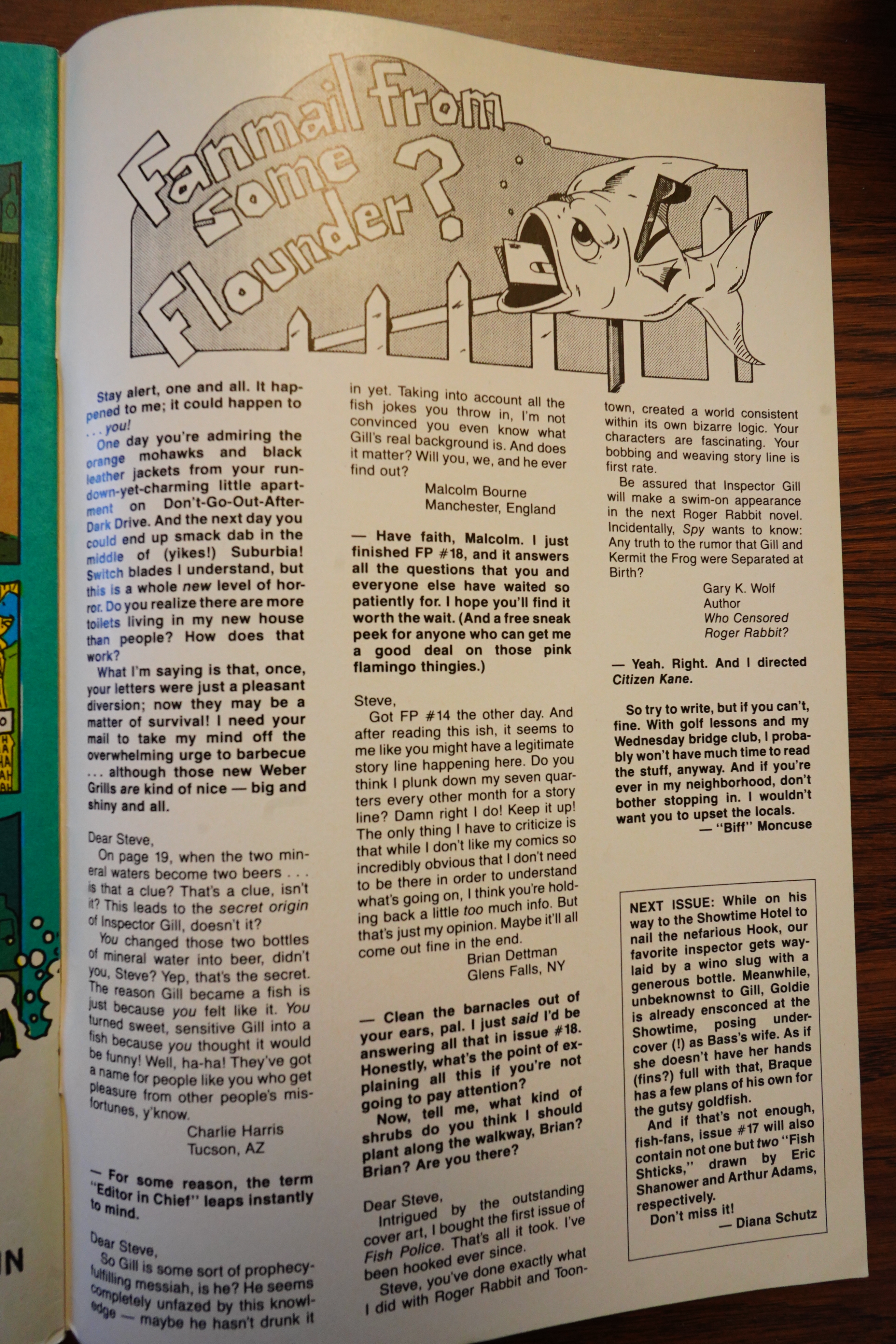
Looks like the letters writers are also relieved to finally see the storyline moving, and Moncuse promises that there’ll be big revelations in #18.

So, of course, issue #17 is the final issue, and it ends like this.

*sigh*

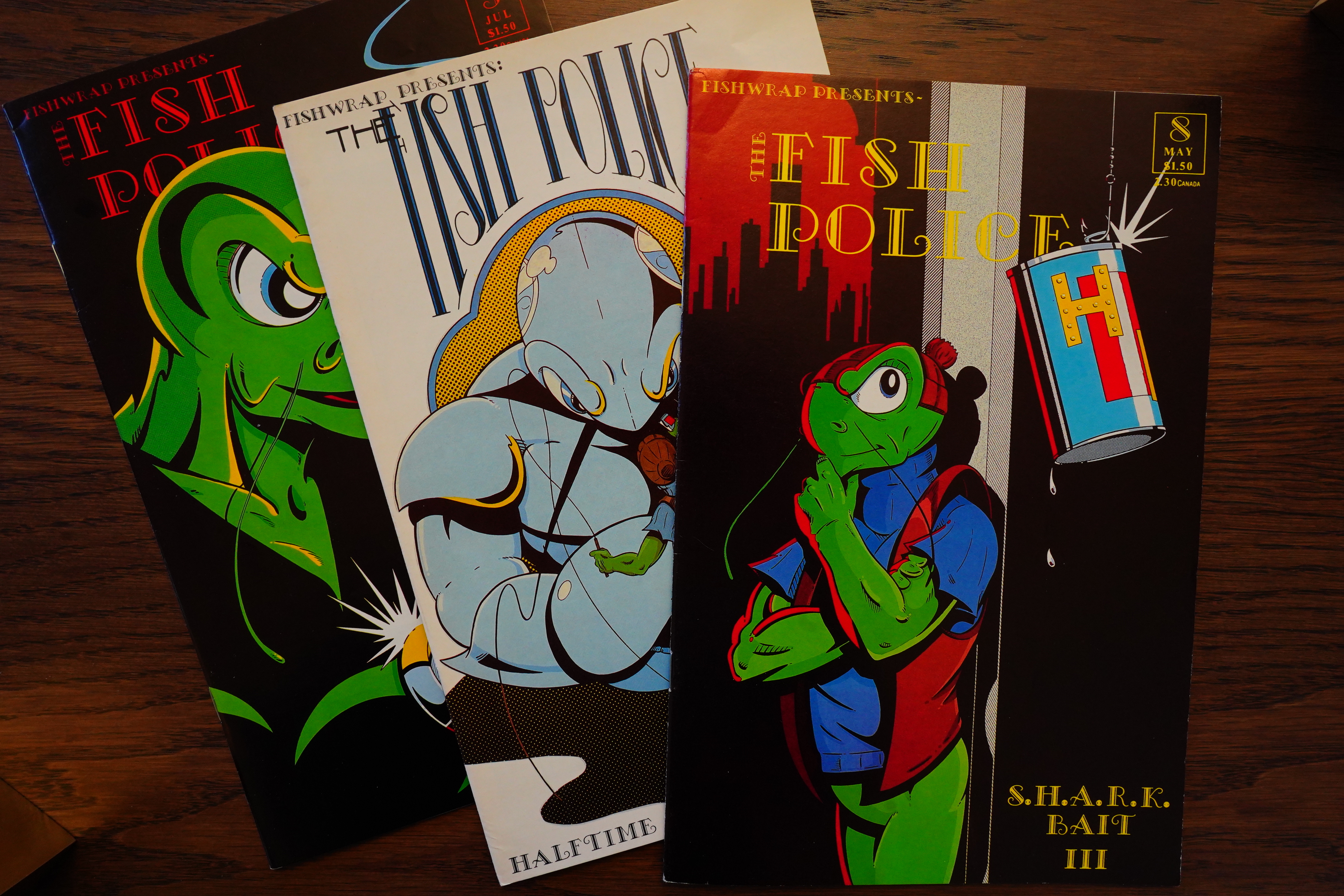
But! I also have these Fishwrap issues — because when buying the Comico issues, sellers kept sending me the wrong editions.

Moncuse swears to never reprint Fish Police #0. I’m a bit curious as to what that looked like. I mean, story wise.

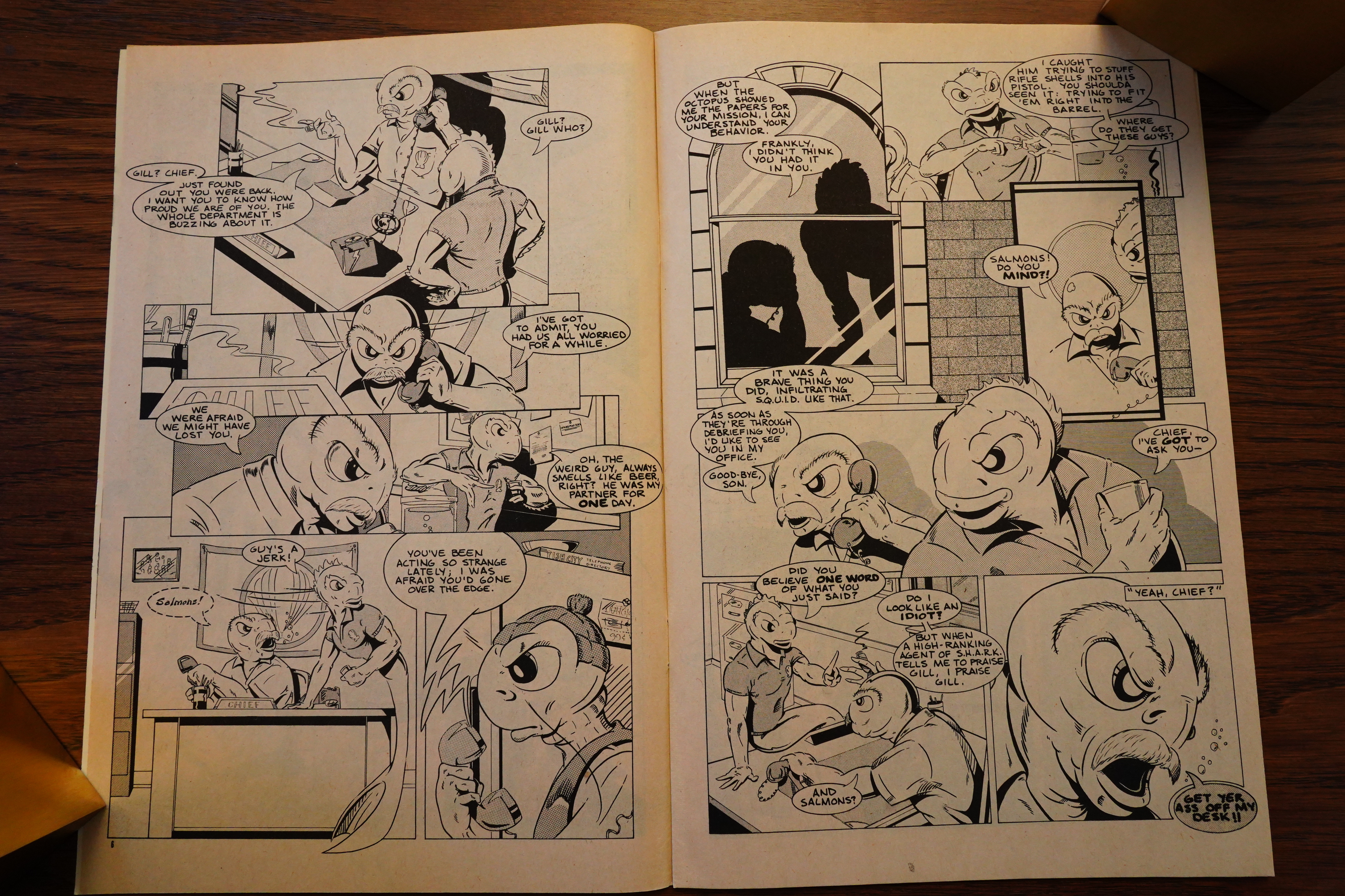
Looked pretty snazzy in black and white, I guess?

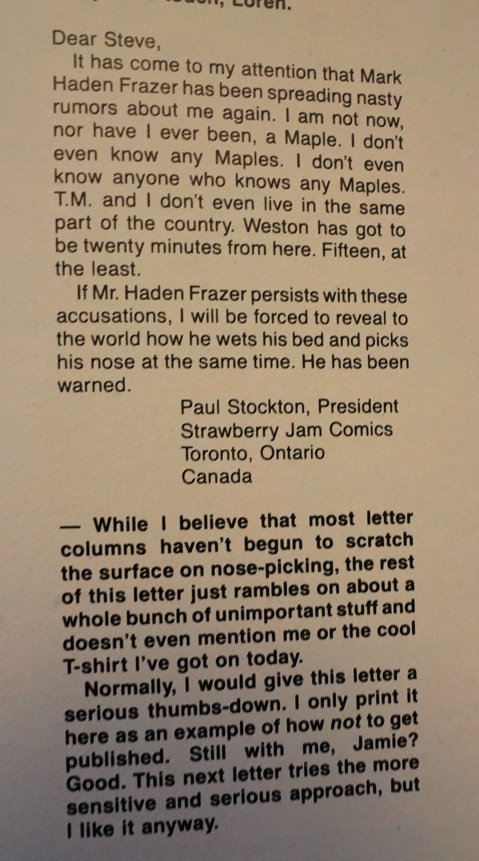
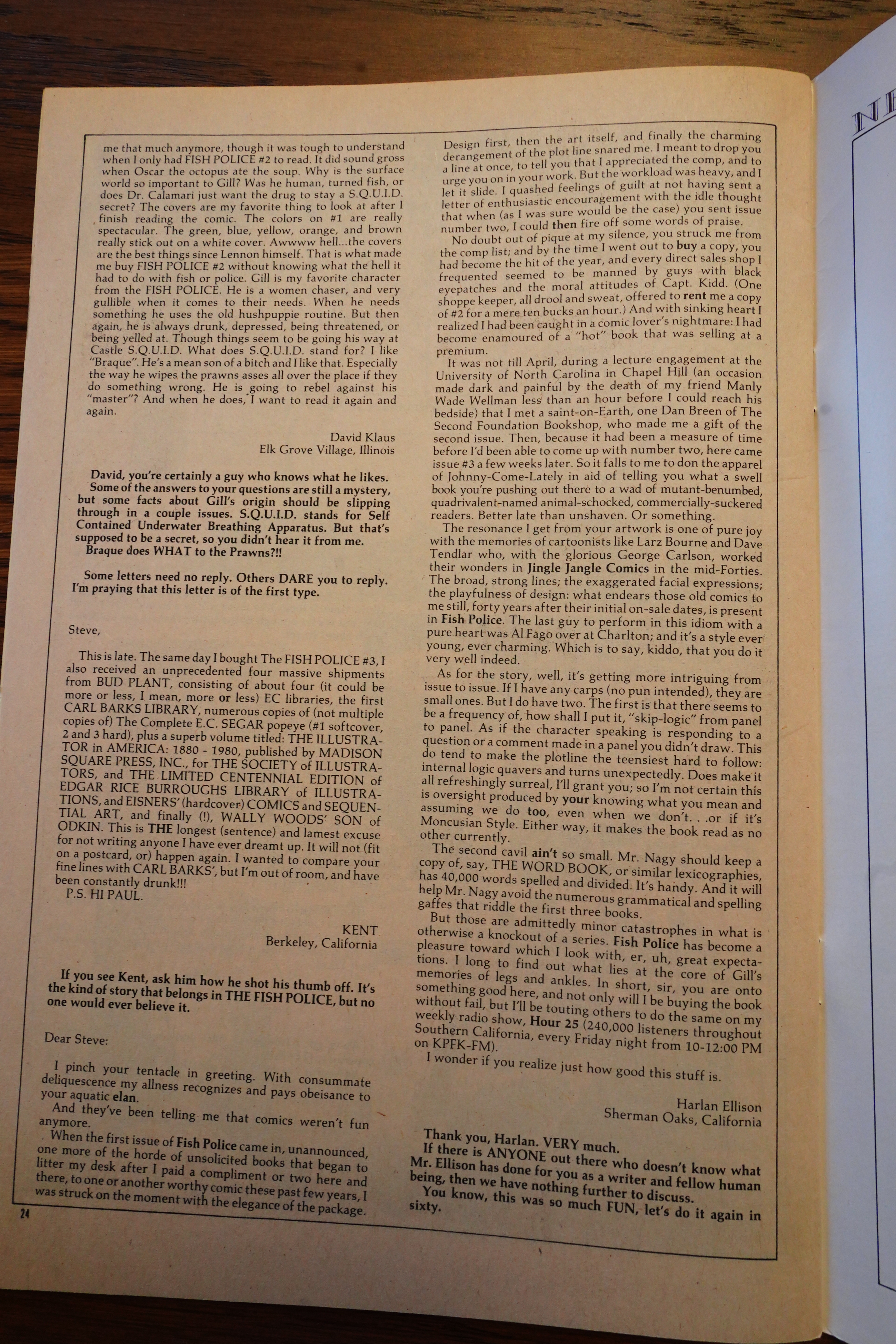
Wow, that’s a long letter from Harlan Ellison.

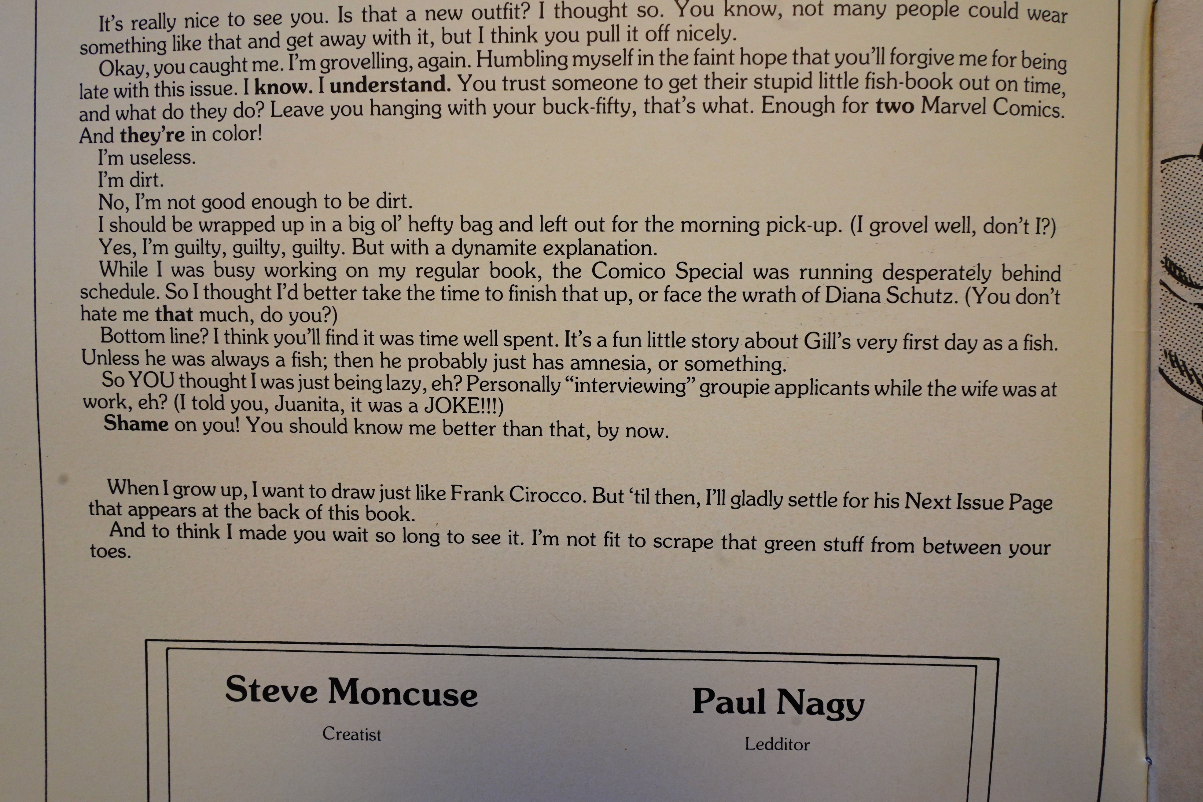
Moncuse describes the colour special — “about Gill’s very first day as a fish. Unless he was always a fish; then he probably just has amnesia, or something”. Which sounds like a joke, but I guess it could mean that Moncuse hadn’t quite decided on what’s up himself, either.

I think… that colour special was the worst introduction possible, at least for me. It emphasised the feeling that there were bits you had missed, and that you weren’t in on the joke.

I think if I’d read the series starting at #1, I would have enjoyed it a lot more — it would have been clearer that Moncuse was writing a long story where things about this world were going to be revealed slowly, and it would have been more of a Cerebus-like reading experience, where all the readers are reading for hints (among the jokes) instead of wondering whether the writer just doesn’t know what he’s doing.

Fish Police wasn’t cancelled at Comico for horrible sales, really, but because Comico were in dire economic straits:

The Comics Journal #128, page #7:

Comico Cancels Half Its Line

Less than three months after announ-
cing a printing and distribution agree-
ment with DC Comics Inc., Comico
The Comic Company has suspended
half of its regular publications. The six-
year-old Pennsylvania-based company
has consistently ranked for the last sev-
eral years among Capital City Distri-
butions’s top five comic book pub-
lishers.
The four titles placed “on hiatus” are
The Fish Police, The Maze Agency,
Trollords, and The Trouble with Girls
– all relatively new releases. While
Comico Publisher Phil LaSorda said
he hopes to reintroduce the titles after
“a minimum of six months,” creators
of the titles have told the Journal they
are actively seeking new publishers.
LaSorda announced the cancella-
tions, effective for books shipping in
July, with a March 1 press release.
“Due to recent market conditions,
Comico has reassessed its projected
monthly schedule,” LaSorda wrote.
“In order to maintain its high stan-
dards, Comico has put the production
of some of its titles on a hiatus for a
minimum of six months. It is our in-
tent to introduce these titles at a time
when more favorable market condi-
tions prevail.’
The move leaves Comico with only
two continuing titles – Grendel and
Elementals – and several limited series,
including the five-part Star
Blazers, the four-part Ribit!, and the
three-part The Amazon (the latter two
end their runs in April and May, re-
spectively). Dave Stevens’ Rocketeer
Adventure Magazine, which ships with
no regularity, remains on Comico’s
schedule.
LaSorda said DC had played no role
in Comico’s decision to cut back.
“DC played no role at all, nor does
this reflect on our agreement with DC,
he told the Journal. “The sales just
weren’t there and we have to follow the
market’s dictates. If titles don’t sell you
have to make changes and that’s what
we’ve done.
“These are our decisions to make,”
LaSorda emphasized; “there was no
input from DC whatsoever.’

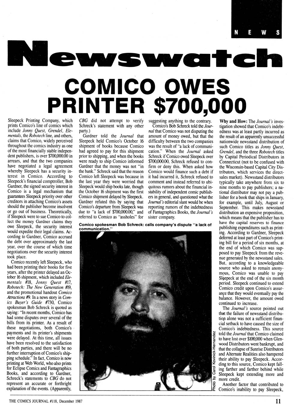
Yeah, “market conditions”. Bet it had nothing to do with this:

I think it’s time to look at what was going on at Comico at the time, but not in this post — it’s long enough already.

The Comics Journal #129, page #15:

Fish Police moves to Apple Comics.

Fish Police. Steve Moncuse’s Fish
Police will continue its bi-monthly
status with #18, due in August from
Apple Comics. The last Comico issue
– #17 – ships in June.
Four issues of Fish Police were pub-
lished by Fishwrap Productions before
Comico issued a one-shot “special”
and subsequently took on the title with
#5.
Moncuse said Apple approached
him for the title “only about a week
or so after I knew I’d been cancelled,”
and an agreement was reached in ear-
ly April.
Moncuse said that, despite “one or
two other pretty good offers, Apple
seemed to be the most enthusiastic.
They made me feel more wanted than
the other publishers.
“I was ready to quit the series at #20,
just to get it done,” he said, “but Ap-
ple made me feel like I really wanted
to do the book again.”

It continued for nine issues at Apple, and they reprinted #0, too.

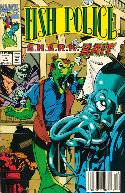
Then it moved to Marvel!? For six issues. Ah… that’s another reprint.

Fish Police has not been reprinted or collected in its entirety. But there was a three episode Hanna-Barbera animated show — it was axed quickly.

Critics’ opinions were mixed to negative. Ken Tucker of Entertainment Weekly gave the show a “C”, saying that the “comics are a lot more varied and better constructed — their plots worked as mysteries, whereas here the stories are just excuses for more fish humor”.

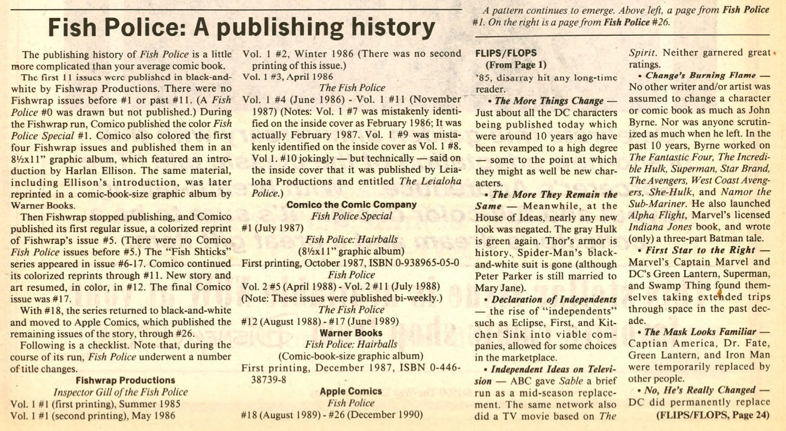
The Comics Buyer’s Guide #894, page #2:

‘Fish Police’ ends 5-year saga in #26

After five years, three publish-
ers, and 26 issues, Steve Mon-
cuse’s Fish Police ends its run
this month.
The last two issues – #25 and
#26, which are being released by
Apple Comics just two weeks
apart — write a finny fini to the
saga of Inspector Gill’s search
for his true identity in a world
that defies common sense.
When placed together, the
covers of the last two issues
combine to create one double-
size scene that symbolically
sums up the changes that Inspec-
tor Gill has gone through. “It’s
quite clever – and an artistic
bonus for those who appreciate
unusual cover designs. Retailers
can show it off to their custom-
ers by displaying both issues
side-by-side on the rack,” said
Apple Comics Publisher
Michael Catron.

These two final issues, Catron
said, are the fulfillment of dual
commitments – to the story
and its readers – which Fish
Police creator Steve Moncuse
made long ago. The whole thing,
Moncuse confesses in the final
issue, is autobiographical.
“The Fish Police wasn’t just
my story,” Moncuse tells his
readers in a farewell column, “it
was a story about me – my per-
sonal growth from a shy, slightly
backward boy from Pennsylva-
nia to the more confident and
culturally rounded 33-year-old I
am today.”
On hand to say goodbye in the
final issue is author and critic
Harlan Ellison, who has been a
vocal supporter of the series
since its first issue. In his wistful
and emotional “Outroduction,”
Ellison explains what the series
and its characters meant to him
and compliments Moncuse on
“the satisfactory Ouroboros-like”
plot that [he] must have con-
ceived in totality when he
started, the kicker of which he
kept cleverly concealed for
years, even to detective-story
buffs like me, looking for the
solution.”
Fish Police began in 1985
when Moncuse self-published
the first issue of his sarcastic,
surrealistic comic book under
the Fishwrap Productions
imprint. It depicted a seriously
skewed world in which anthro-
pomorphic fish had difficulties
with stairs, smoked cigars, and
drank wine from goblets.
The offbeat, independent
comic book sold out and was
reprinted. Today, the original
$1.25 comic-book issues are dif-
ficult to find and sell for up to
$25.
Fishwrap published 11 issues;
then Moncuse turned the pub-
lishing over to Comico the
Comic Company. After Comico
published #17, Moncuse moved
the series to Apple Comics.
Apple has published all issues
since, seeing it through to this
month’s double-issue conclu-
sion.
“One of the great things about”
the conclusion is that it’s exactly
that – a conclusion,” said
The people behind
‘Fish Police’

The Telegraph Wire #23, page #26:

THE FISH POLICE
Maybe it’s not kosher for an employee of Comics &
Comix to review another employee’s first attempt at
publishing a comic…but I gotta have SOME fun. Be-
sides, to this date, I still haven’t met Steve Mon-
cuse–he works in our Berkeley store and I’m down
here in Palo Alto.
THE FISH POLICE is the most professional-looking
package I’ve ever seen from a budding professional to
ever hit the stands. The art is clean, bold lines
and Steve Moncuse keeps the story moving with innova-
tive layouts that complement Paul Nagy’s story.
The plot and characters are kind of a combination
of the Fish Mutants meet Hill Street Blues. The main
character, Inspector Gill, is Belker in fish guise
and the plot concerns a bad guy, Hook, who has a drug
and a dream to take over more than one world.
While I understand the need to keep the plot
from being given away in the first issue, I’m more
than a little anxious to find out what all the mystery
is about these fish-people. More than one character
has made allusions to being “only half the man I once
was.” So please, guys, explain that one to me in the
next issue, huh?
While it’s not a slam-bang issue, it has a dis-
tinction all its own and I recommend it for anyone
who enjoys a good story and great art…and the nice
thing is that this comic can only get better!

Amazing Heroes #201, page #3:

Unbelievably, Fish Police is worse.
Where Capitol Critters imitates Don
Bluth imitating Disney, Fish Police,
which only remotely resembles the
Steve Moncuse comic, uses some of
the oldest tricks in Hanna-Barbera’s
hat. Just as The Flintstones crossed
The Honeymooners with cavemen to
give the appearance of a fresh idea,
so does Fish Police cross detective
cliches with marine life to make a
“new” concept. But the detective for-
mula is even more tired than the
super-hero formula, and there’s real-
ly nothing inherently funny about fish.
I would have watched the whole first
episode, but I had a movie to go see,
and after I saw the wacky sidekick
who constantly tries out new
disguises, I felt I’d seen enough.
The combination of these two shows
is likely to destroy any chance anima-
tion had of making it on network TV,
and it’s all because Hollywood refuses
to believe that there really is such a
thing as a show that’s too stupid to
succeed.

Amazing Heroes #115, page #75:

MY TEN FAVORITE
COMICS OF 1986
By R.A. Jones

10. Fish Police
Serendipity and I met as a result
of Fish Police. It just so happened
that my rave review of the first issue
saw print just about the time the
book really took off in popularity.
Creator Steve Moncuse chooses to
believe there was a direct link be-
tween the two events. Being the
honest and forthright individual that
I am, I have always chosen to let him
cling to this misconception (after all,
I may need a favor some day).
In one sense, I hope I didn’t have
something to do with its success; I
don’t want to bear responsibility for
the buying frenzy which resulted in
the first edition of the book being
so grossly overpriced (I can say that,
because it is a point on which Steve
and I agree).
Still, while Fish Police is not
worth $50, it is worth a place on my
list. 1986 was a good year for the
series, although-like many of the
independents-an erratic release
schedule worked against it.
The year saw the conclusion of the
fishy Inspector Gill’s first adventure,
“Hairballs.” Gill, whose less-than-
stunning intellect, weak will, and
penchant for drink mark him as
being far from the ideal heroic
model, had settled comfortably in-
to life as second-in-command of the
villainous organization known as
S.Q.U.I.D. When the group’s equally
evil leader, Hook, demanded that
Gill execute two female prisoners,
however, Gill discovered that he still
had a few scruples remaining.
Strangely enough, upon discovering
this, Hook set both Gill and the
women free—thus leaving us with
many intriguing questions that will
doubtless only be answered in Mon-
cuse’s sweet time.
Wisely, following this four-part
opening gambit, Moncuse devoted
issue #5 to a story that was more-
or-less complete unto itself: one that
also served the twin purpose of
familiarizing new readers with what
had gone before while setting the
stage for the next storyline.
In the process, he delivered a
clever interlude. Gill’s apartment is
invaded by one of Hook’s massive
soldiers, and Gill tricks the fellow
into a debilitating drinking match.
Issue #6 skillfully launched the
next ongoing tale. With jackhammer
pacing, it (re-)introduces all the
major characters, poses still more
puzzling questions, and leaves you
gasping for more.
If forced to use but a single word
to describe the talents that make
Steve Moncuse’s Fish Police work
so well, that word would be “decep-
tive.” I say that because his work is
so deceptively simple in appearance.
The scripting, the leanness and
sparseness of which make the stories
seem to pass with unnatural quick-
ness, actually functions on many
levels. To be sure, there are chuckles
a’plenty to be found in it, but one
also finds pathos, drama and sensi-
tivity to varying degrees.
Similarly, Moncuse makes such
efficient and effective use of line and
shading in his artwork that a cursory
perusal might lead to the erroneous
assumption that it is sparse—when
in truth it is rich with details.
Moncuse also does an excellent
job of tantalizing the reader, just shy
of the point of frustration. He piques
your curiosity with hints that Gill
may have at one time been human,
and defies you to place this bizarre
underwater world in which charac-
ters not only smoke but drink. As
much as anything else, it is the mad-
dening desire for answers that brings.
the reader back issue after issue.
The craft evident in this series has
consistently brought me back for
each issue—and helped make it one
of my favorites.

R. A Jones in Amazing Heroes #81, page #69:

THE FISH POLICE #1

Somewhere, there exists a world that
is not too terribly different from our-
own. People work and play. They
love and hate, dream and despair.
They live and die. There is one slight
difference: These people are all fish.
The hero of this tale is a gentlefish
named Inspector Gill, a police detec-
tive who is slightly inept, slightly
gullible, and slightly corrupt-but no
less loveable for it. The intrigue
begins when he enters his apartment
only to be confronted by a gun-
wielding femme fatale named Angel-
fish.

[…]

Characterization is one of the keys
to the story’s success. On the surface,
it may seem that Inspector Gill exhi-
bits some of the same faults that
made me antipathetic toward Booster
Gold. But Gill seems to be trying his
best, and at his core seems to recog-
nize his weaknesses for what they
are, whereas Booster Gold seems
oblivious to anything but himself. In
other words, even thought Inspector
Gill is a fish, he displays a great deal
more humanity. His defects are much
like our own, and like us he is try-
ing to compensate for them as best
he can. You can empathize with the
guy, and therefore you care what
happens to him. The other characters
presented here also show promise,
expecially the exotic Angelfish and
her sister Goldie.
This issue actually delivers a
double-barrelled pleasant surprise.
Many, indeed most, self-published
comic books suffer from both story
and art that are sub-par, often to the
point of rank amateurism. As you
have seen, I found the scripting on
Fish Police to be on a level that
exceeds many of the more “main-
stream” comics.
Creator Steve Moncuse goes
beyond that by also delivering an art
job that would compare favorably to
that of established big name pencil-
lers. His style is clean and sharp,
attractive to the eye while observing
all the mechanics required in good
storytelling.

Borderline #11, page #61:

THIS was an ambitious project that
1980s. When Fish Police started in
December 1985, I don’t think Steve
Moncuse had a Babylon 5-type five-
year plan for it. He might have had
an inkling that he was onto
something special very early on but I
can’t be sure; unless I track
Moncuse down (which I might
try) there’s no real way of knowing.
I first discovered Inspector Gill,
Doctor Calamari, Angelfish, Oscar,
Braque, Goldie, Hook, Line and
Sinker back in 1988, quite ignorant
of the burgeoning alternative scene
after having been out of comics for 8
years. By the time I found the
Comico colour reprints (#s 5-11), the
Fish Police was two years old and
had built up a dedicated following.
The owner of my local comic shop
made a healthy profit from me
buying up his back stock of
Fishwrap black and white originals
and the repackaged graphic novel;
he probably wished the franchise
was as big as the X-Men because at
the time my appetite for Fish was
shark-like!
It’s difficult to explain this series
without giving away the story. Not
counting #0, which doesn’t really sit
in the scheme of things – it was a
26-part maxi-series. If Moncuse
hadn’t originally planned this to be a
finite series (and I don’t think he did),
he adapted well under the pressures
of dwindling sales and having to
constantly move publishers.

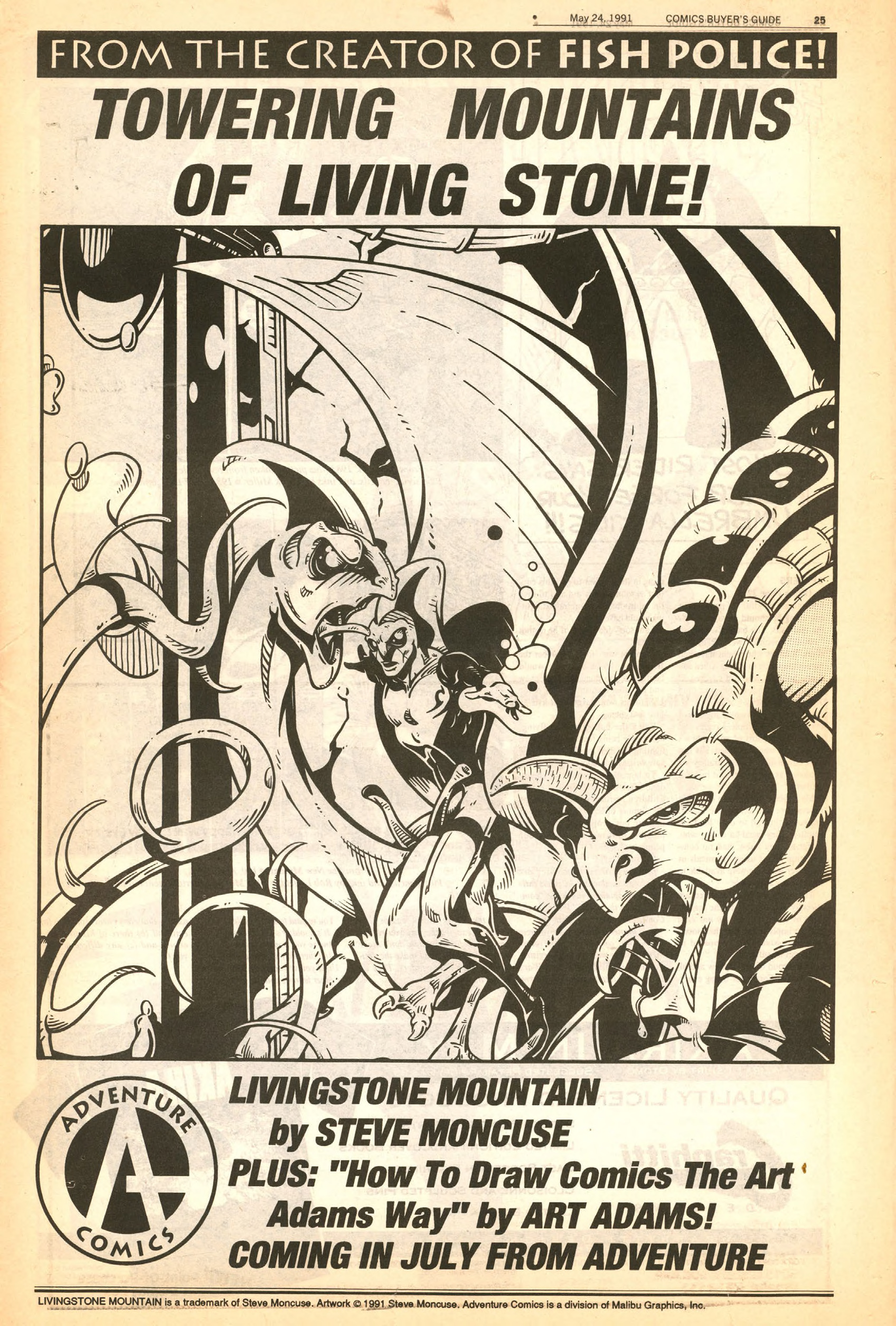
Moncuse’s next project, Livingstone Mountain only lasted four issues.

Comics Scene Volume 2 #28, page #6:

… About eight years ago, I cre-
ated a small, self-published
comic book called Fish Police.
This past February, CBS pre-
miered a prime time animated
show based on my book, cre-
ated by Hanna-Barbera. The ul-
timate success story, right?
Hardly.
I’m sure that hundreds, per-
haps thousands, of writers
have had their work changed.
heavily revised, or just plain
demolished for television or
the movies. But I’m willing to
bet those writers have at least
had the satisfaction of knowing
their material was actually
read before the studios made
their changes. I, however, can
make no such claim.
My relationship with
Hanna-Barbera was odd from
the beginning. In fact, there
was no relationship. David
Kirschner, the studio president,
told a reporter from my area
that there wasn’t one single el-
ement in my book that he
could use in his show, and
therefore found it unnecessary
to have anyone from the com-
pany consult with me or to
even say hello. And they never
did. I was not even mentioned
by name in the press kit. My
book was simply described as
“the British comic book.” I am
not British.

Here’s a review from the internet:

Fish Police has a certain charm, but the first issue doesn’t bowl me over. There’s a potentially interesting mystery setting itself up, but I didn’t really connect with it here. Or with any of the players, who’re just stock characters from every detective show you’ve ever watched.

Oh, IDW reprinted the first four issues:

The biggest problem with this book is that I have no idea why it exists in the form it does. There is no introduction explaining the history of Fish Police to the curious, nor the story of how IDW came to be reprinting it now (the closest information to be found is what’s printed on the back cover).

Very odd — it really makes no sense to read those four issues on their own.

Did this happen?

Get ready to have your minds blown… US publisher IT’S ALIVE! has just beyond thrilled to announced the return of the the brilliant independent comic, Fish Police, created by Steve Moncuse.

And so on:

This was a bizarre black and white comic that came out in the 80’s. The art is pretty good. The storytelling is very simple, with a crime noir feel. The author made a lot of fish jokes – Gill is after Dr. Calamari in the first episode.

Well, that’s it. I would rather like to know how it all ends up — is my guess about the holy book the squid finds being the Fish Police comics themselves correct? But not enough to chase down those Apple Comics issues.

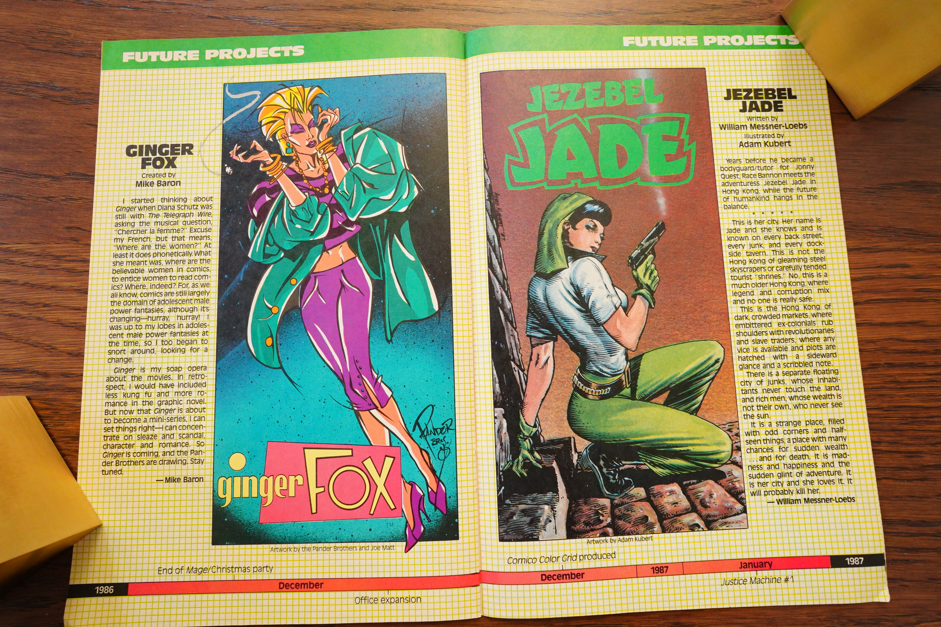
1987: Black Book

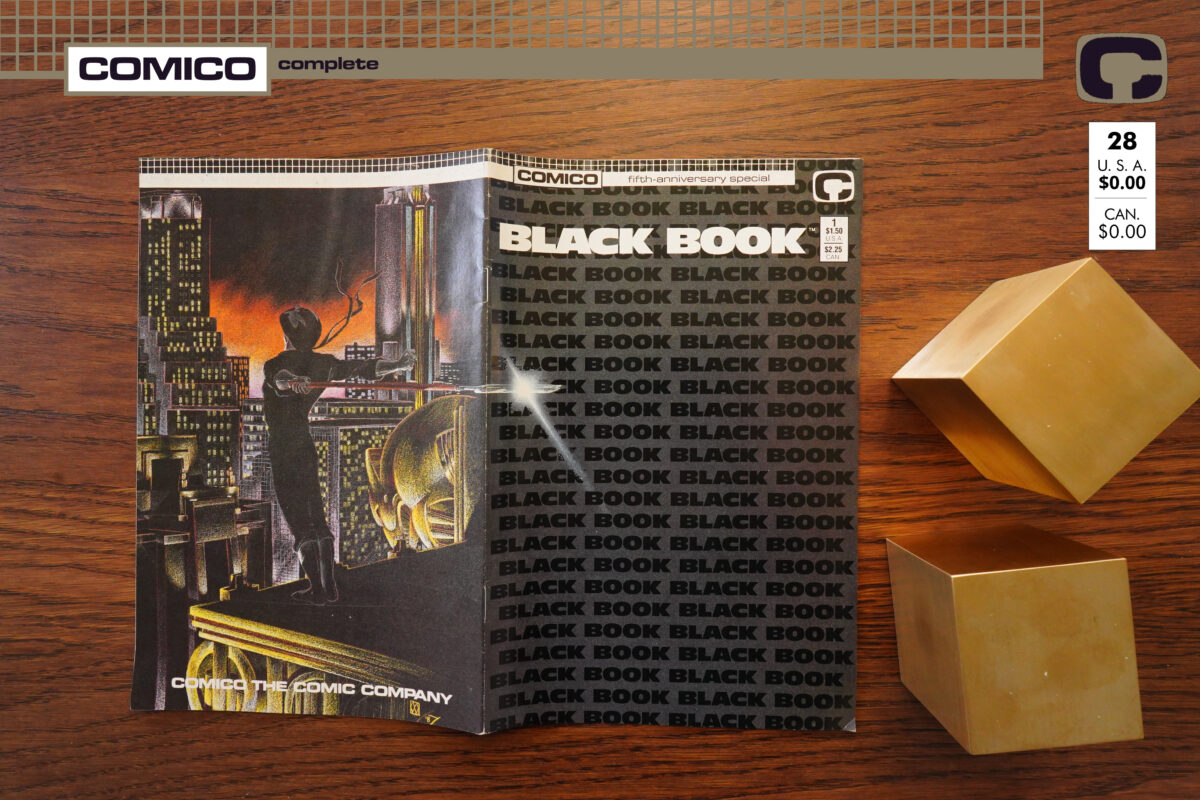
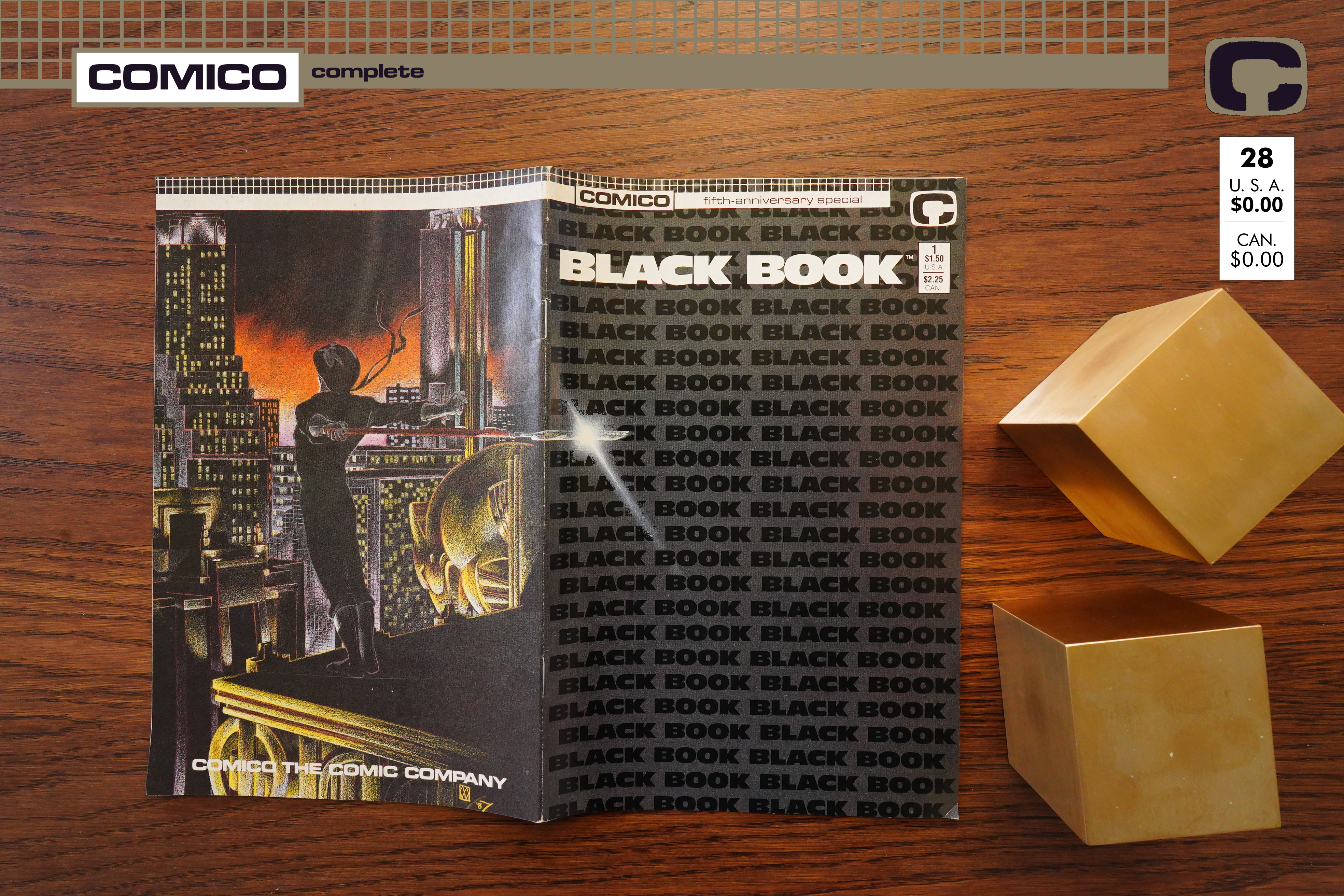
Black Book (1987)

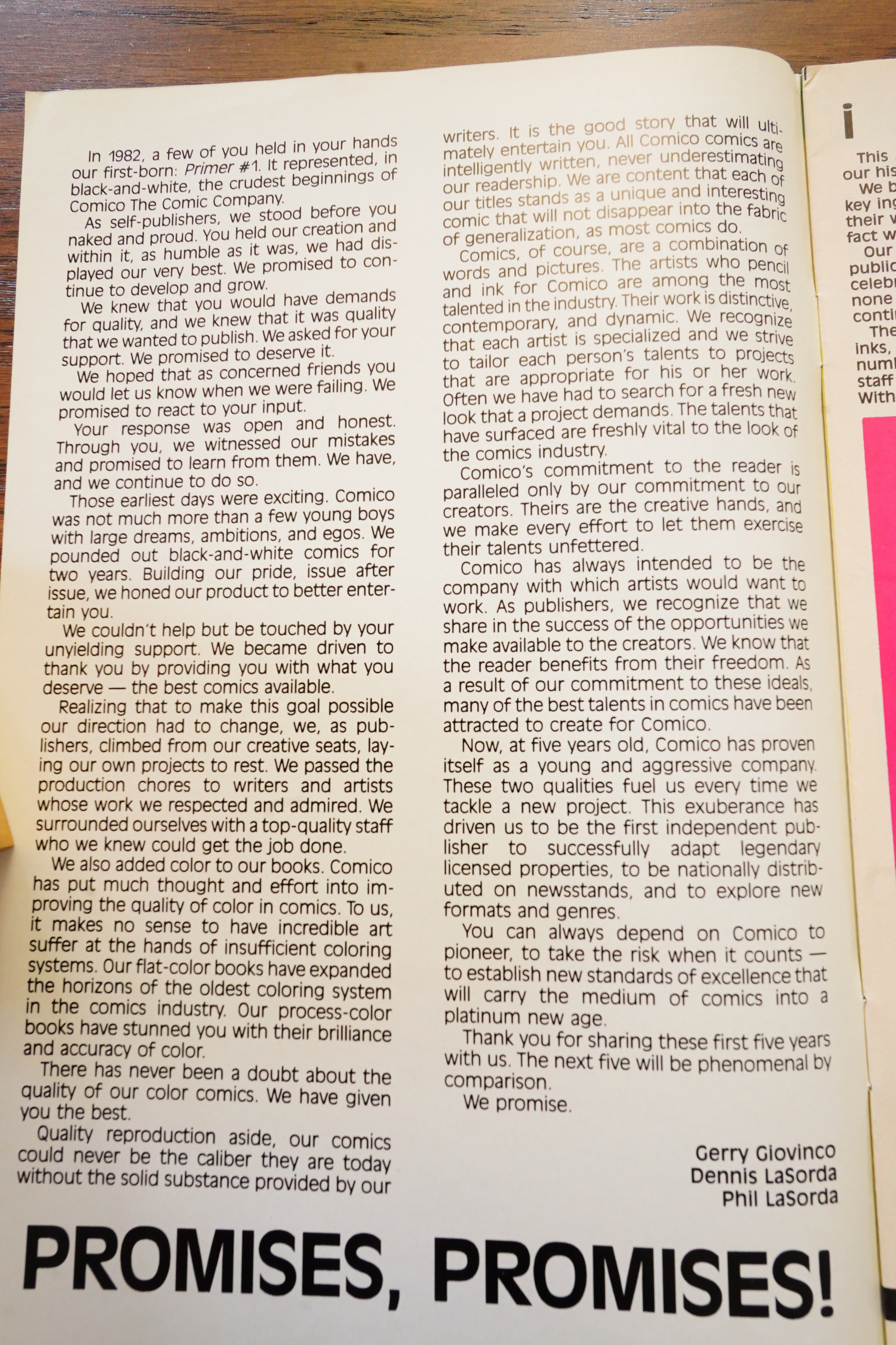
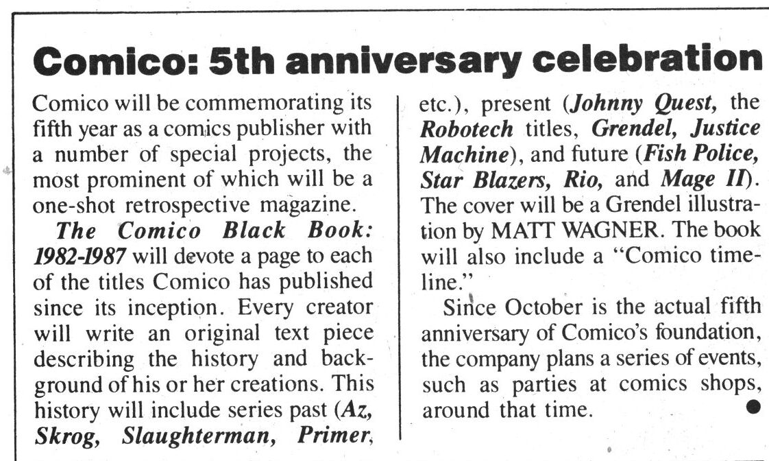
To celebrate Comico’s fifth year anniversary, we have this book.

The publishers explain why, in their usual style — it’s a bit on the hectoring side, in my opinion.

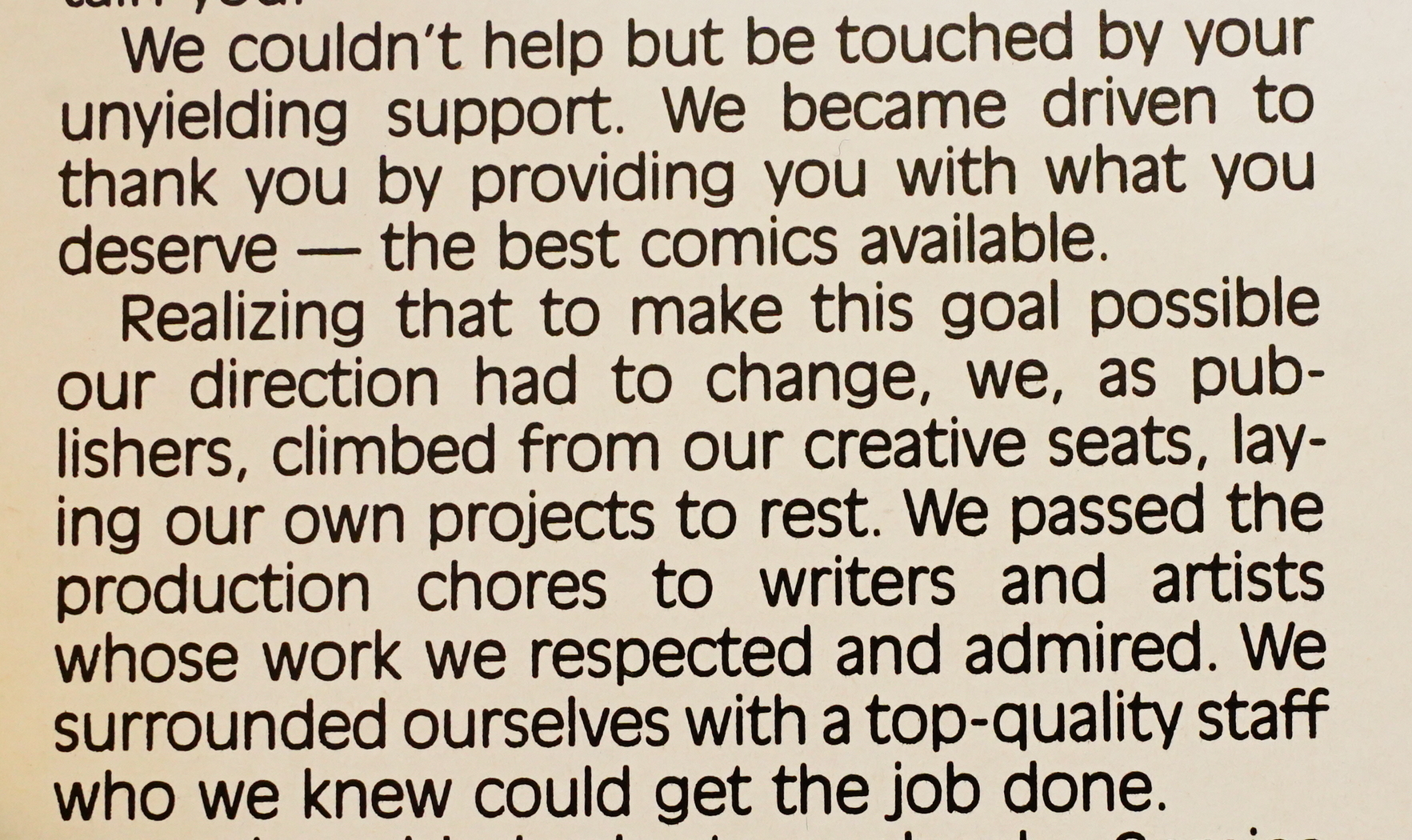
And bowdlerises the story somewhat — the initial batch of books were created by the publishers themselves, and the reaction from the retailers was (and I quote from memory) “what they hell are we going to do with these?” They were pretty bad comics, so they started publishing other people instead.

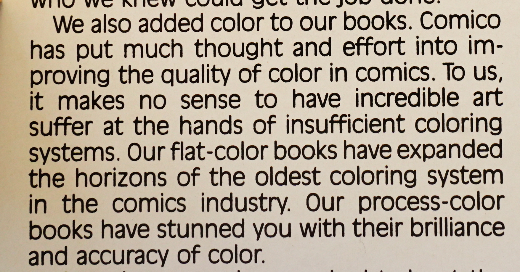
This is actually true — the colour on Comico books was much better than the rest of the field at the time. The books still looks really spiffy for the most part. You can read more about it here.

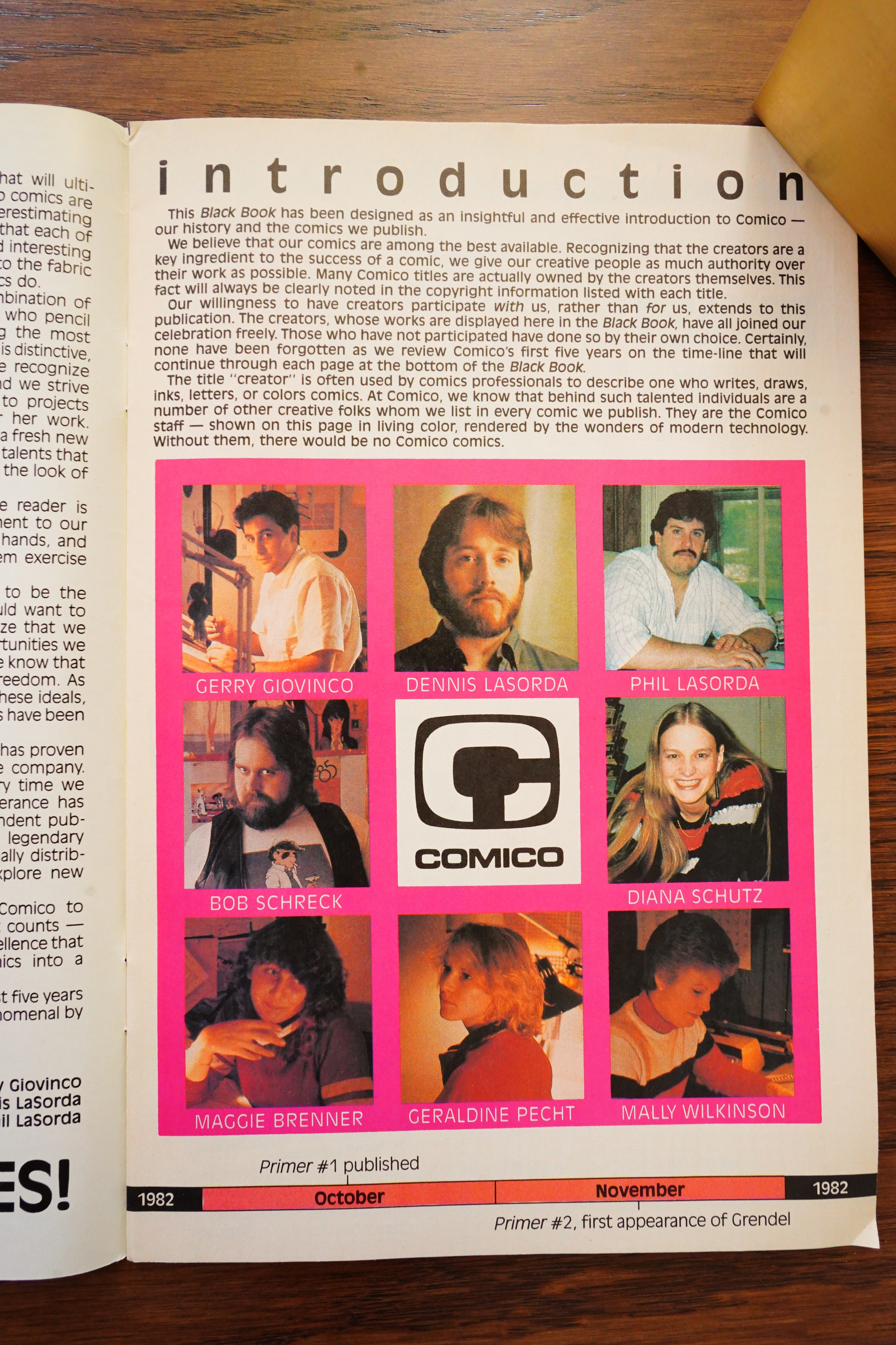
Then we get some snaps of all the people who work for Comico (the three publishers at the top).

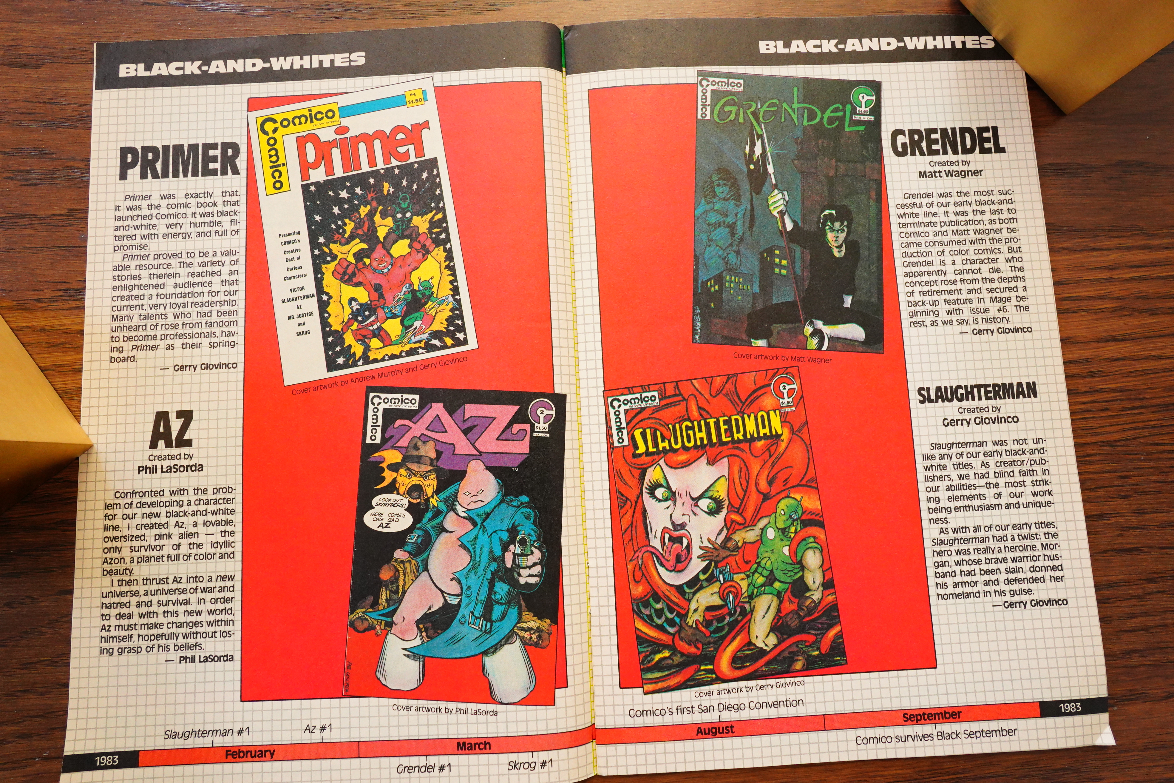
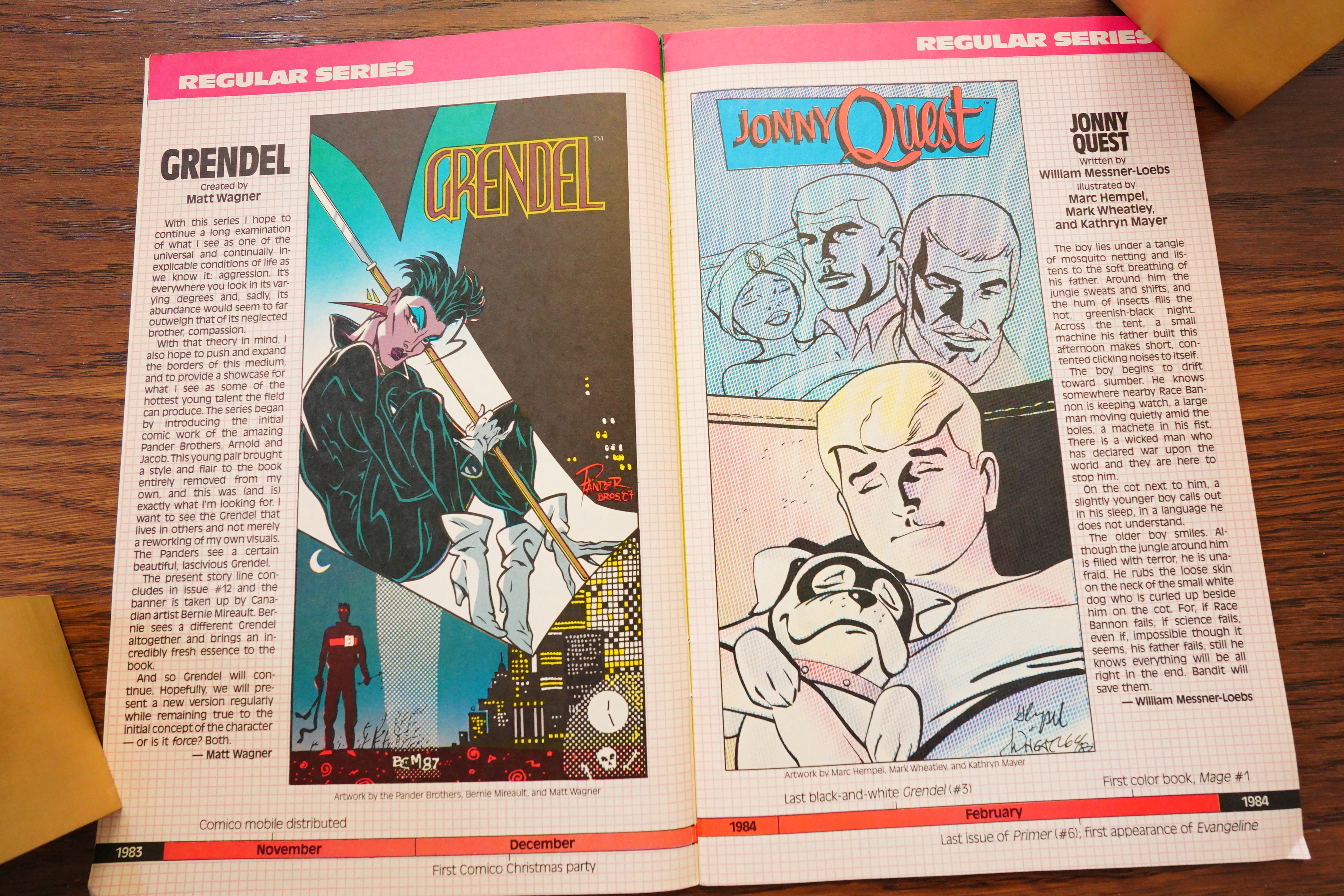
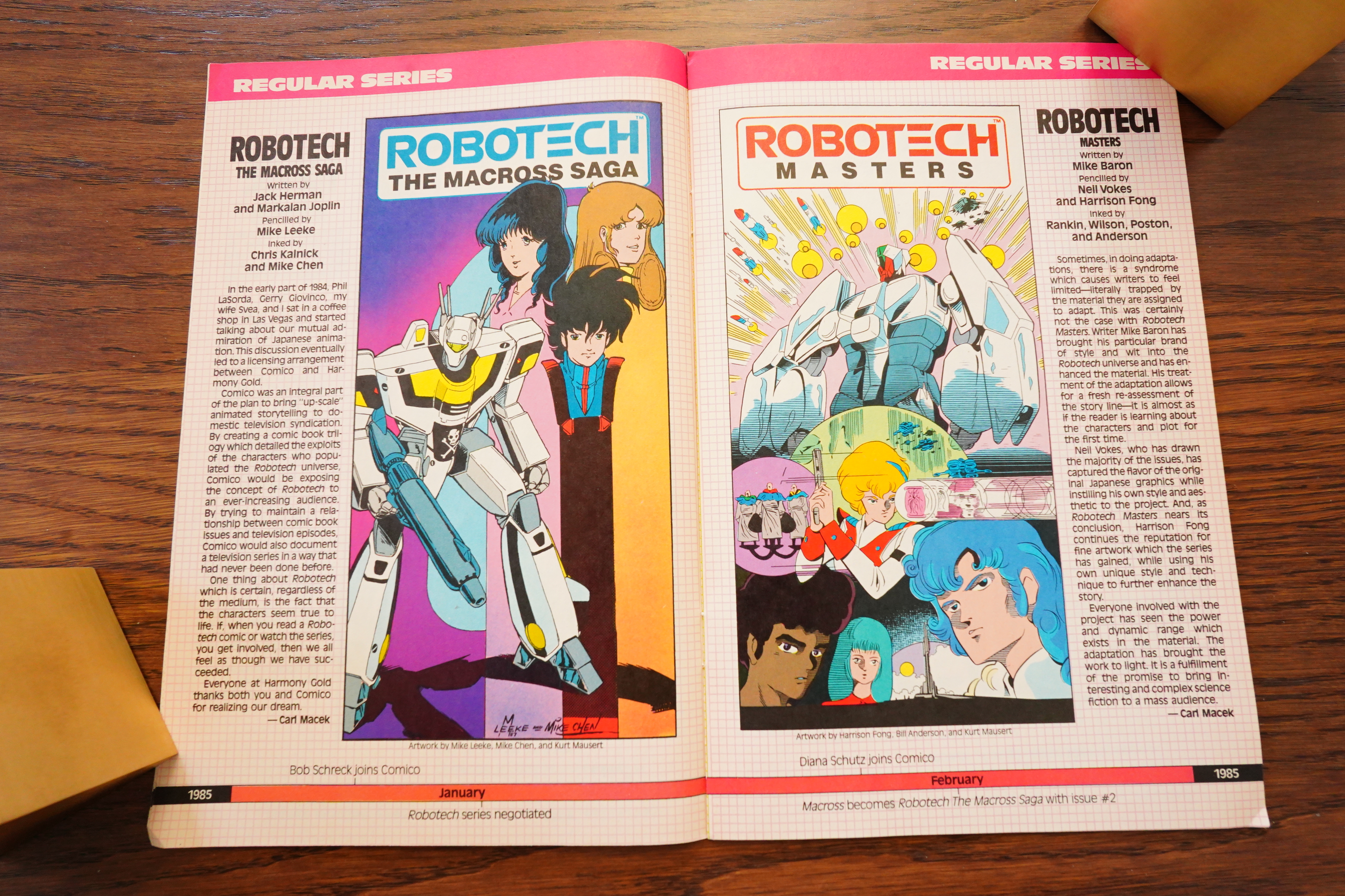
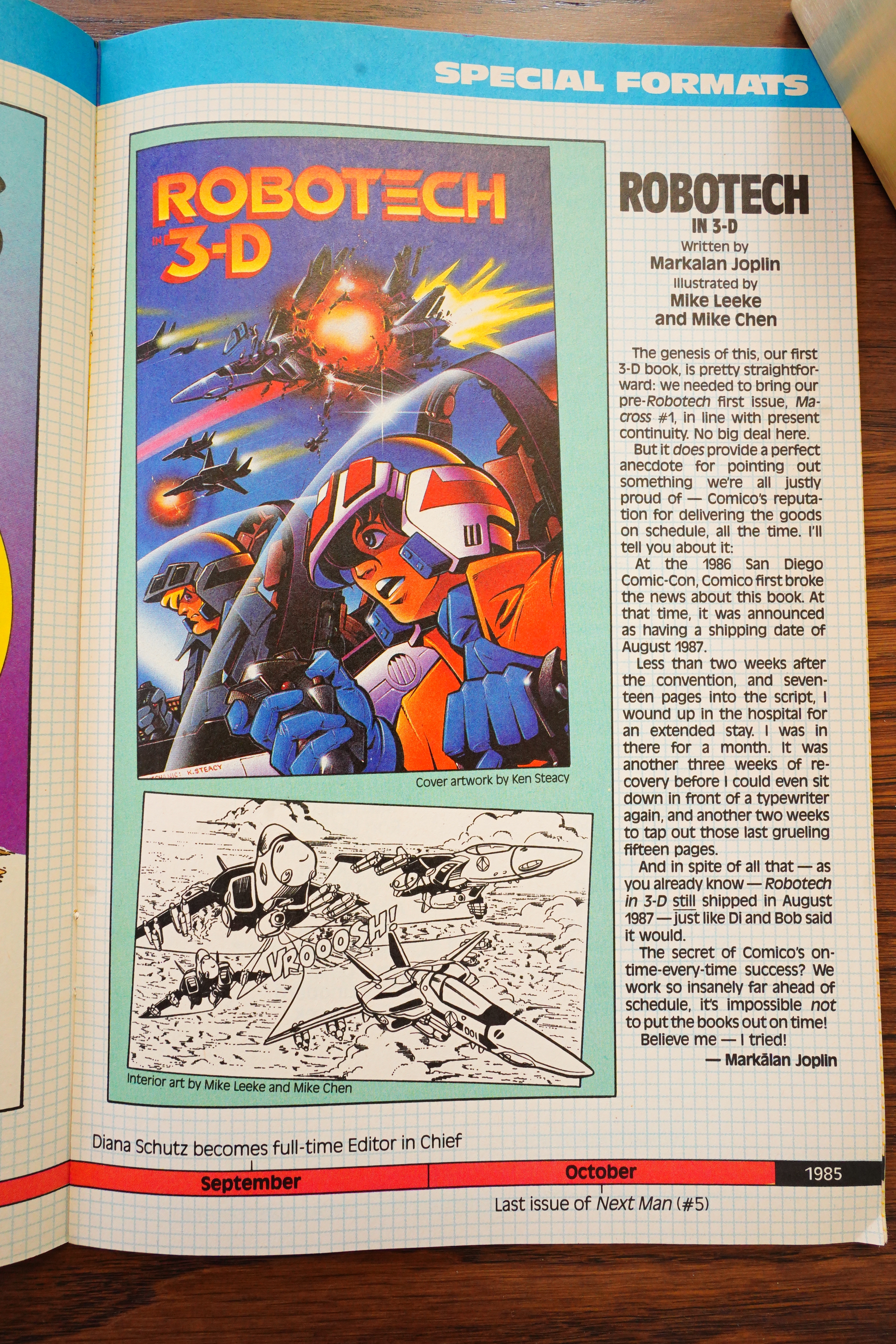
And then the rest of the book is like this — a presentation of the books Comico had published or are publishing.

But it’s not complete — for instance, Skrog is mentioned in the timeline, but is not given a blurb here.

Neither are other early books like Evangeline and Next Man.

I think the artwork here is mostly done for this book? I can’t remember seeing those as covers on the actual books, at least.

And they’ve also gotten these text from the creators involved, which is nice.

So this is more than just an ad, really.

Being “on time” is apparently something that one can just choose to do.

There was a Comico costume award!?

Markalan Joplin goes into more details about that “on time” thing. Making the books so far out from the schedule must either mean that Comico had deep coffers to handle the slow money flow, or they didn’t pay people until books were published, I guess.

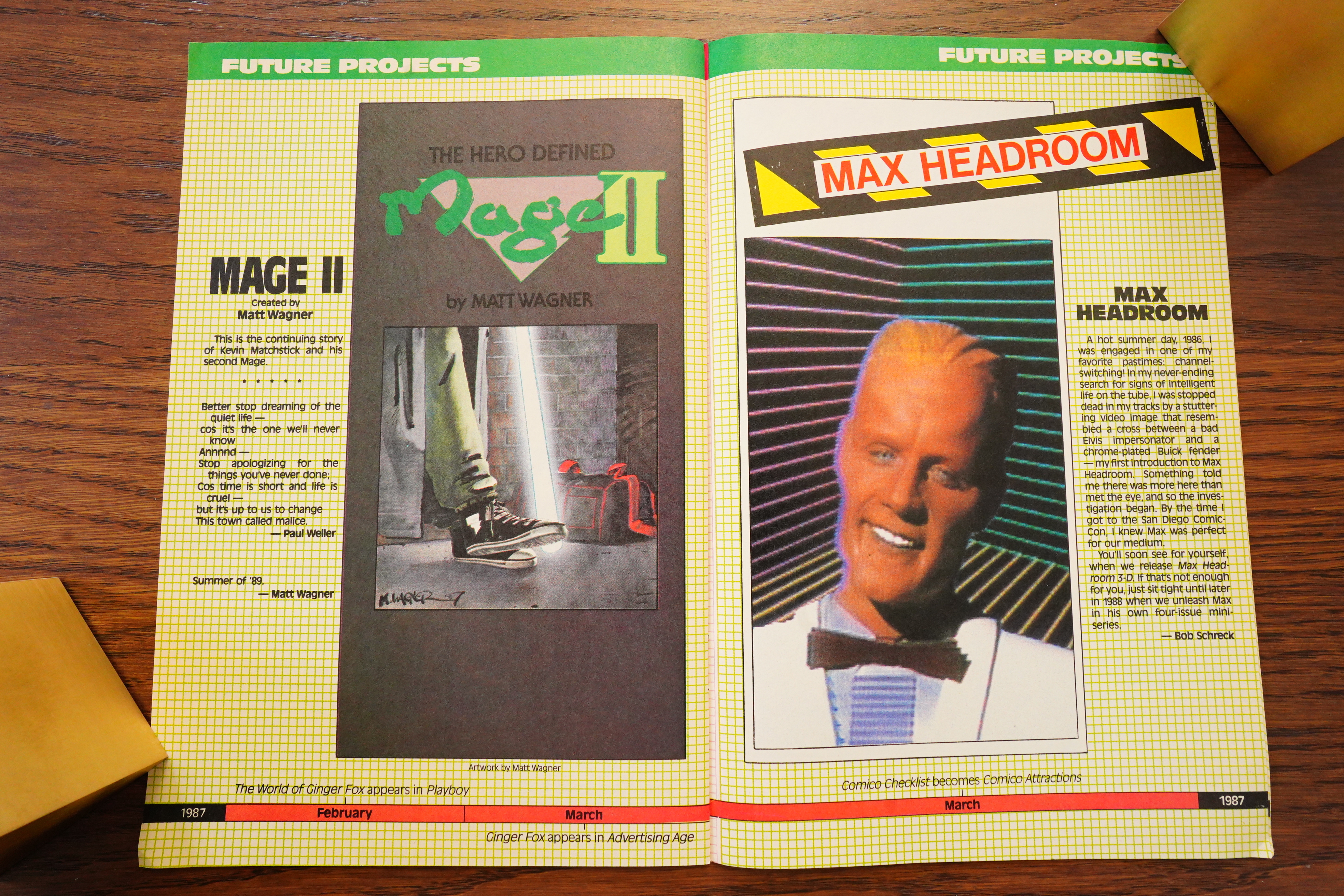
We also get a look at future books…

… some of which never happened.

Black Book isn’t exactly a vital item to have, but it’s better than these things usually are.

Giovinco explains:

The Comico BLACK BOOK became the chronicle of my own history at Comico. Shortly after its publication it became impossible for me to continue working at Comico for personal and professional reasons. My name remained in the publishing credits but it was clearly time for me to move on.

The book also signaled a turning point. Comico began its downward spiral. It was a company that had risen from nothing to an independent powerhouse, challenging Marvel and DC all the way into the mass market only to become a bankrupt shell of itself that would be sold into obscurity.

Sounds like plans changed before publication.

Comics Interview #51, page #46:

GERRY: Another thing we’re doing is
THE BLACK BOOK, which is sort of like
a five-year historical presentation of the
things that we’ve done over the years,
what we currently have in publication, and
some of our future projects. There are a
lot of people who are still strictly Marvel
and DC fans, and it’s a chance for them
to say, “Well, I’ll look in here and see”
what these guys are up to, maybe I’ll find
something that I like.” It’s got a little time-
line on the bottom with key events in our
history. Also we’re doing Comico an-
niversary parties throughout the country;
Bob Schreck is coordinating them with
the retailers. Artists will be available to
go to stores for signings, things like that.
It might not look like a big event, five
years in the comic-book industry, after
Marvel celebrated 25, DC celebrated
50 —
DARREL: Well, when you consider that
Pacific went under after –
GERRY: Pacific went down, Capital
went down, Texas – a lot of different
publishers went down.
GERALDINE: But I think we’ve had so
much growth in five years, though, that
it’s worth celebrating. I don’t think any
company in a five-year span has grown
by the leaps and bounds and produced the
volume and the quality of products that our
company has.
DARREL: Well, one thing about the
quality of the product that you put out now,
from where you started, it doesn’t seem
like you could have gotten from one end
to the other unless you were really con-
centrating on doing that.
GERRY: We’ve never compromised.
GERALDINE: We never scrimp.
GERRY: We’ve always done our best.
Even when we were doing the black-and-
white books, it was the best we could
possibly do. I think if you look back at
them and hold them against anything that’s
being printed in black-and-white these
days, outside of the level of quality of the
art, the package is as good as anything
that’s being produced today. You know,
it was the best that we could do, and we
just never stopped. We said, okay, what’s
the next one, and the books keep getting
better.

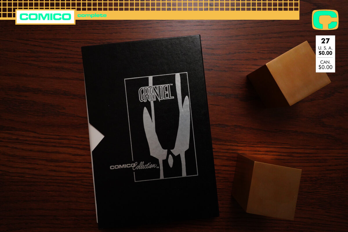
1987: Comico Collection

Comico Collection (1987) by lots of people,
Grendel: Devil’s Vagary (1987) by Matt Wagner and Dean Motter

So what’s this then?

Comico didn’t do many special-format things, but to celebrate the first five years (and possibly to try to get rid of overstock), they did this thing.

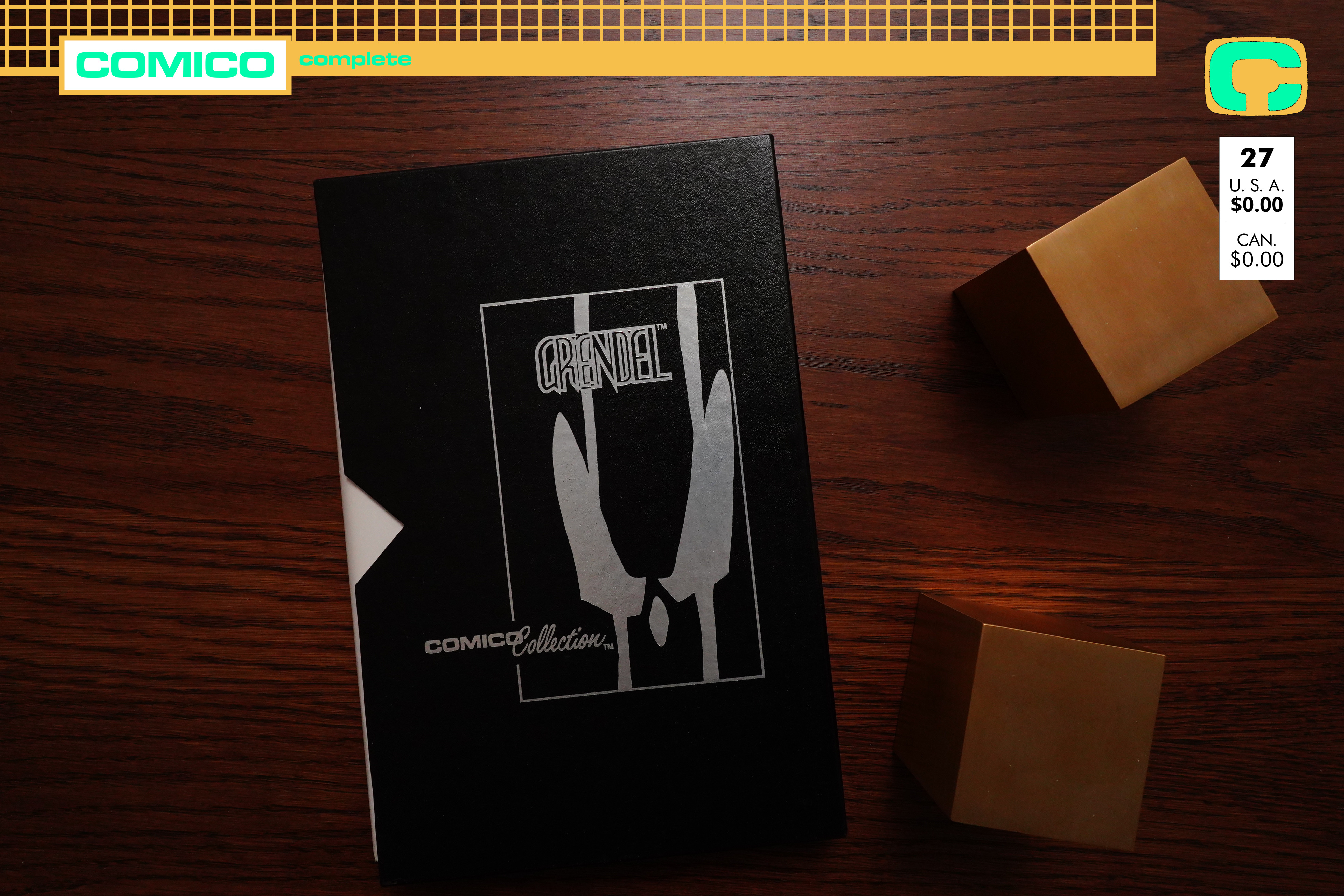
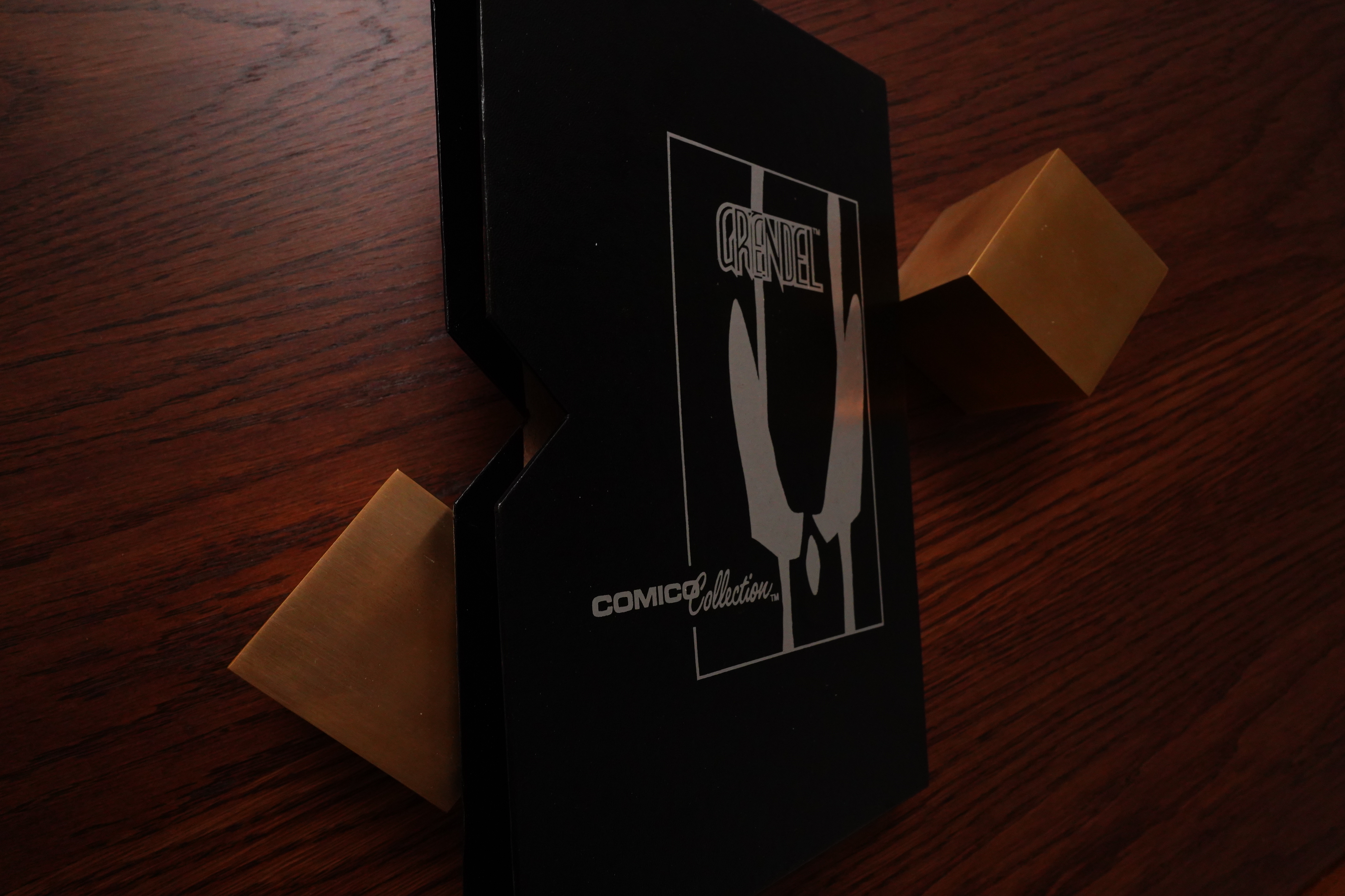
It’s a box made from cardboard, I guess, but it feels kinda luxe. And the design on the … back? is in silver. (The front is blank.)

So here’s what you get.

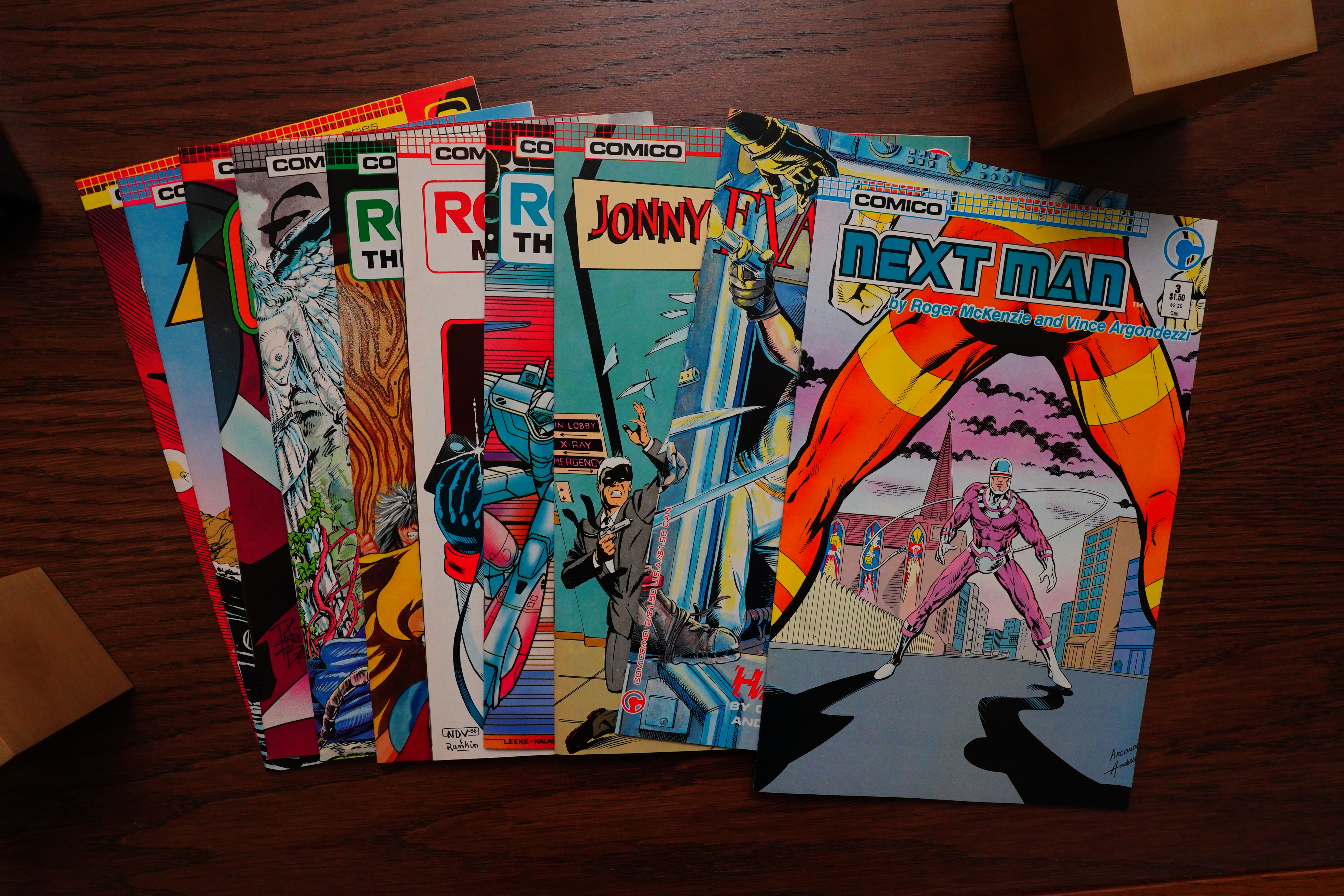
Ten different comics — I guess it’s one each from every majorish series they had? The oldest book is an issue of the short-lived Evangeline series, so there’s nothing here from early the black and white period.

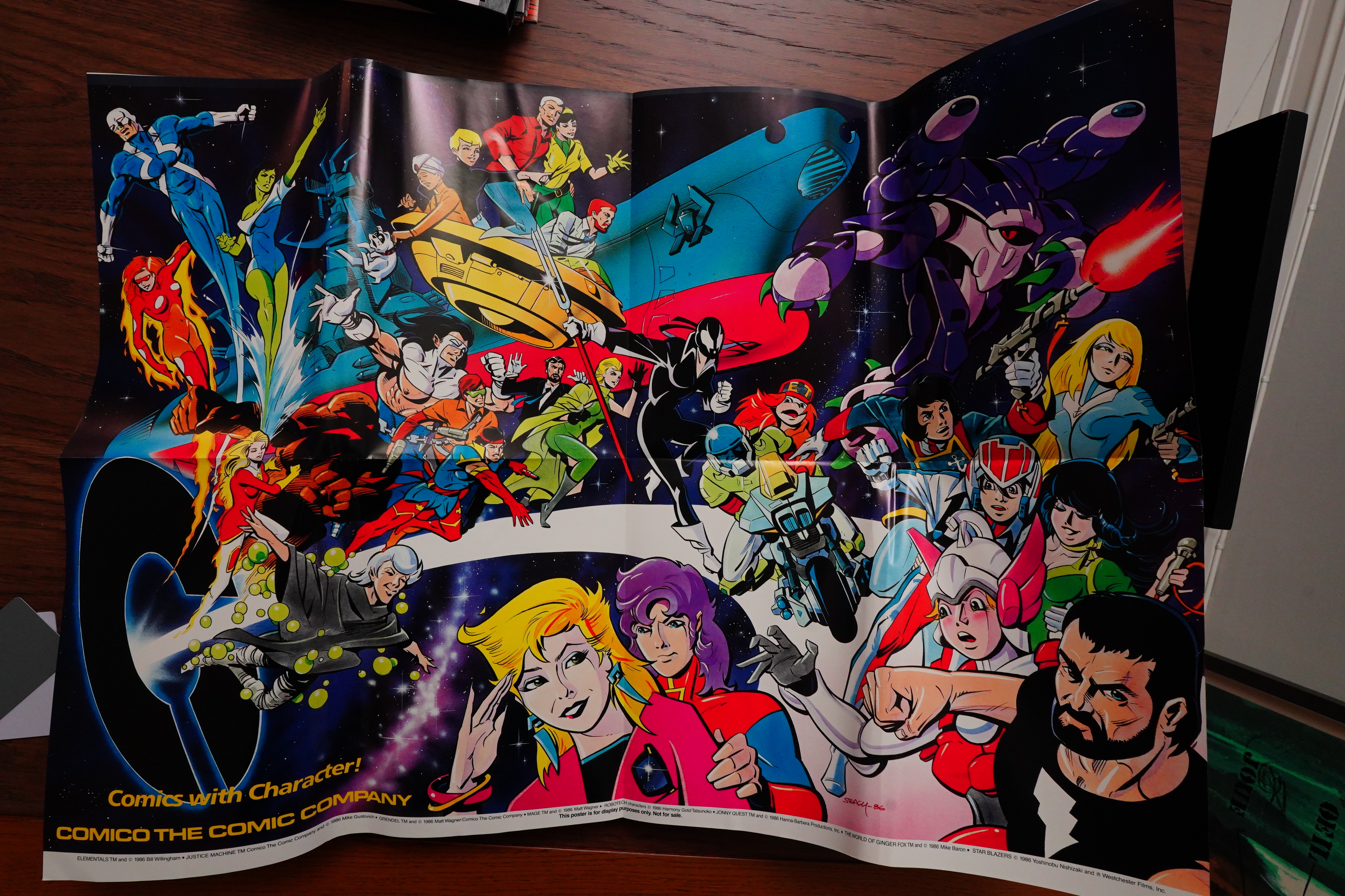
There’s a quite big poster included — it was folded and then wrapped around the comics.

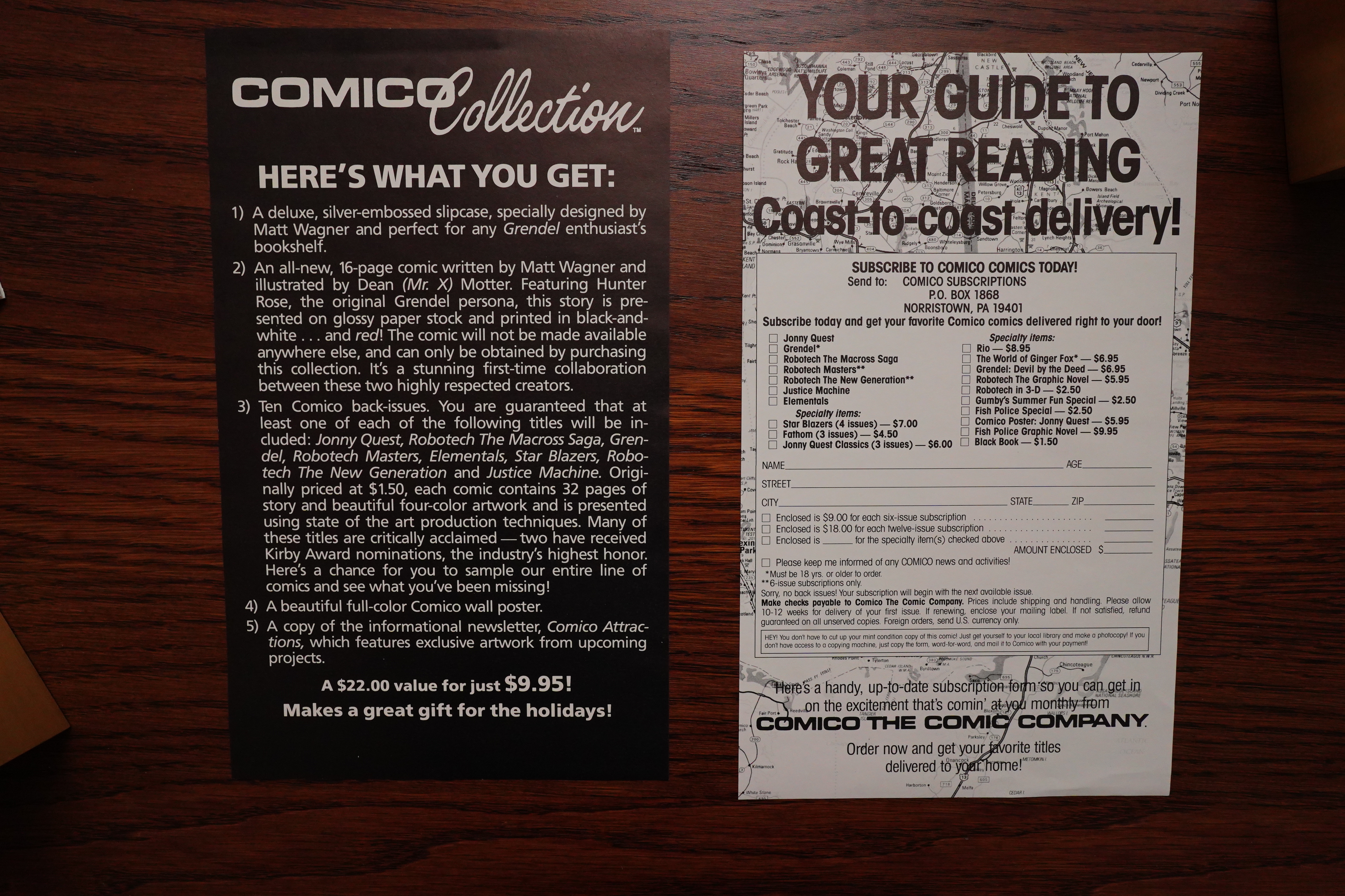
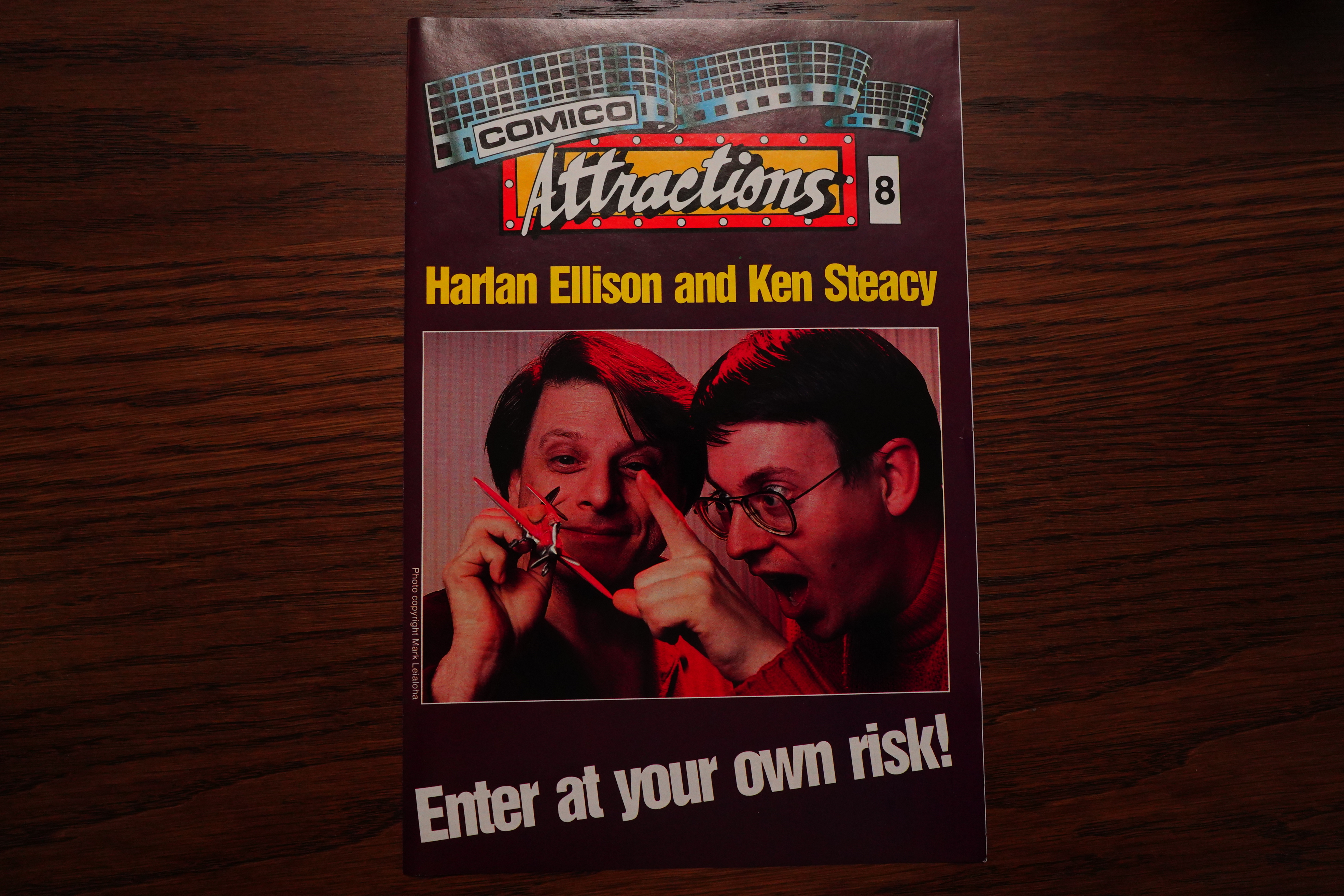
An issue of the Comico flyer.

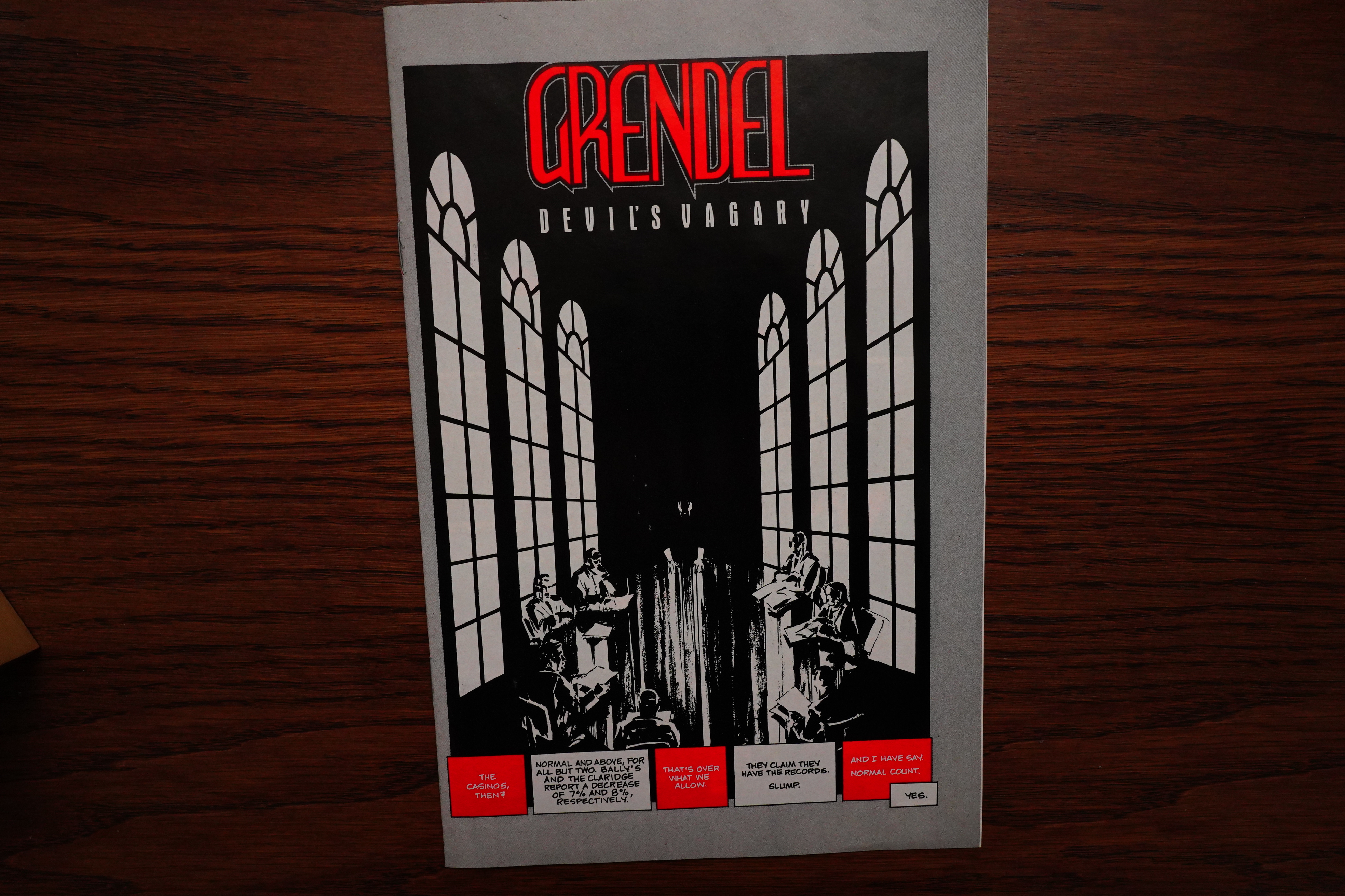
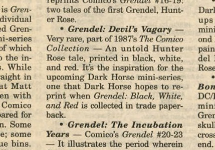
And then the main attraction, a brand-new sixteen page Grendel story: “Devil’s Vagary”.

All that for just $10! But I guess people would buy this for the Grendel story only, so it’s a pretty expensive Grendel story.

Which I’m now going to read.

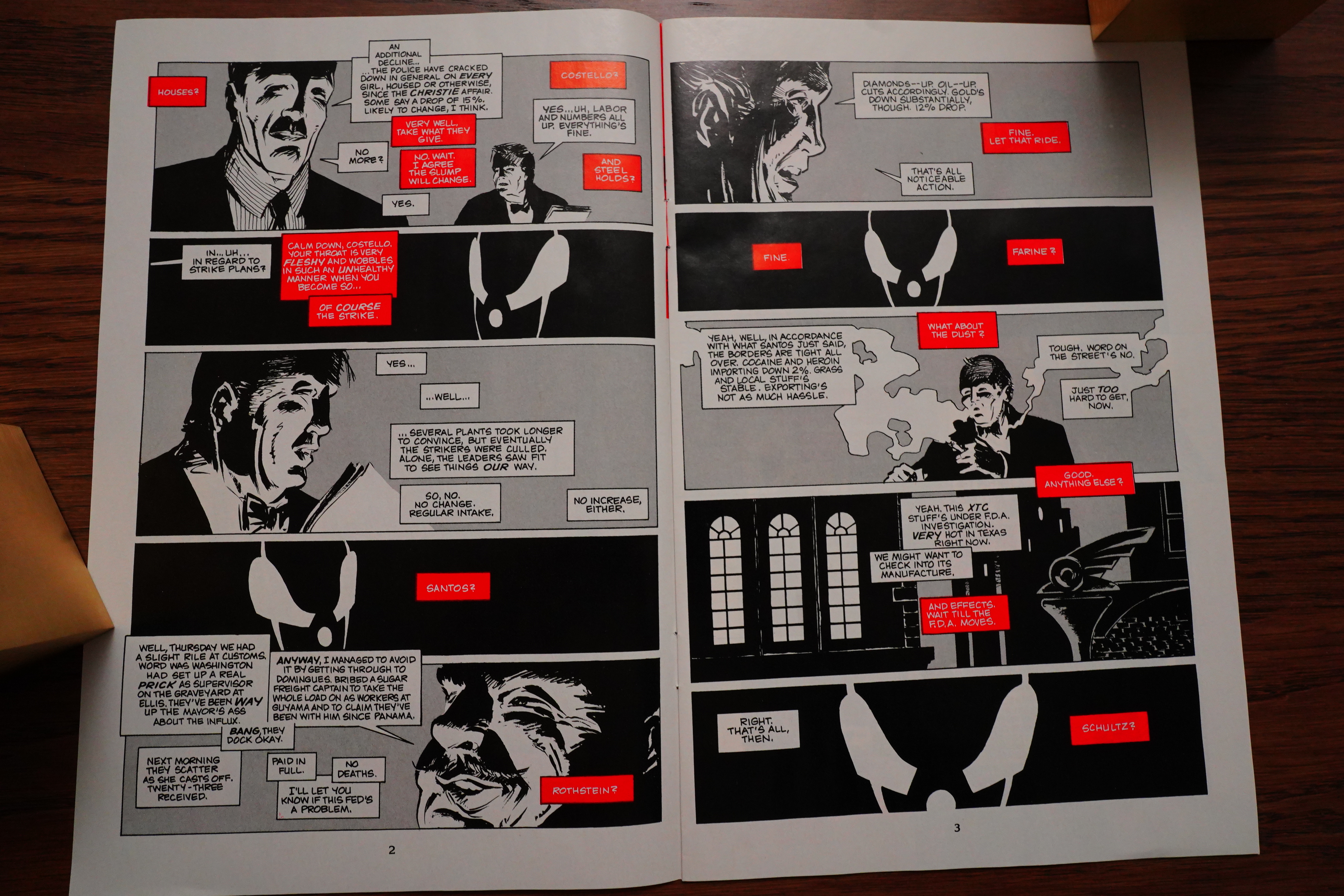
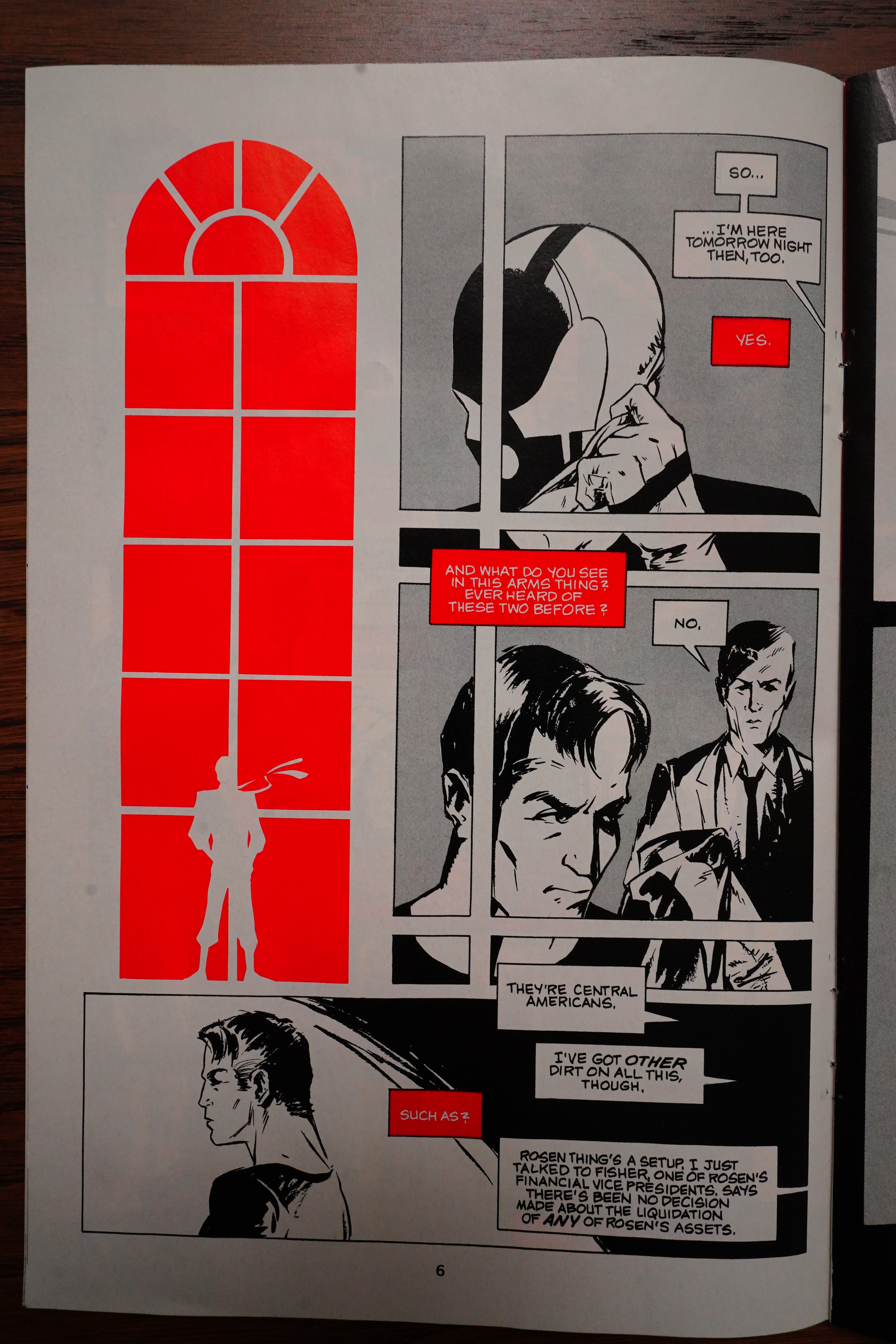
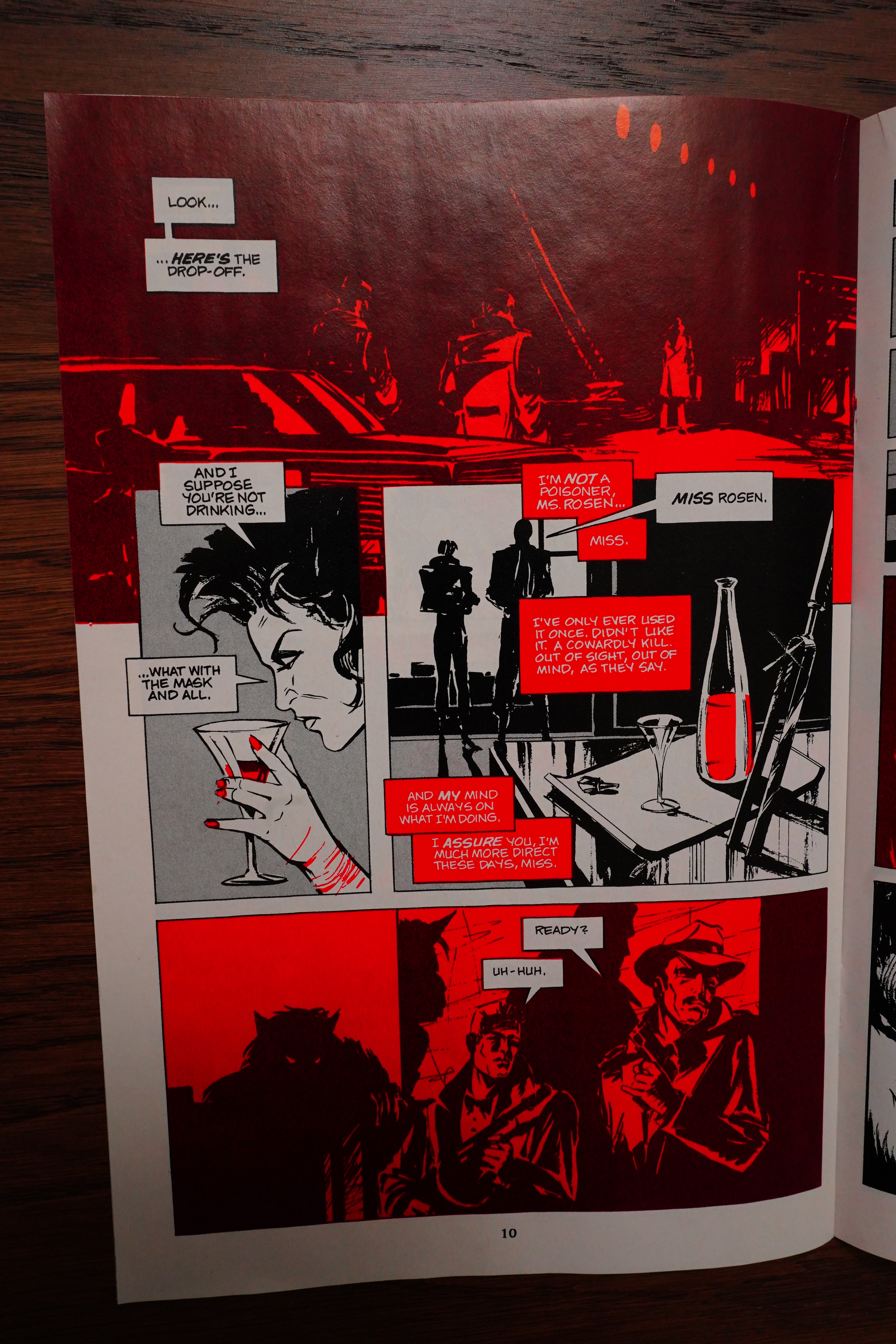
Err… Well, this is very stylish, but it was drawn by Dean Motter, so I didn’t really expect anything else. But it’s rather confusing — is Grendel just watching and thinking things, or is he speaking with these people? Why do some speech bubbles have tails and some don’t?

It looks even sillier on subsequent pages where it’s indeed clear that Grendel’s speech bubbles are tail-less and in red, while the other guy’s bubbles have tails and are in white.

This is kinda interesting — I mean, the red/black on red panels. Has it been done by printing red over black ink? Or does it use two hues of red? Dean Motter had a design studio, so it’s not surprising that he’d come up with something special. The book feels like a Vortex book design-wise: Printed on glossy paper, and “self-covered”; i.e., the cover is the same stock as the interiors, and Motter was the art director for Vortex, so I guess that makes sense.

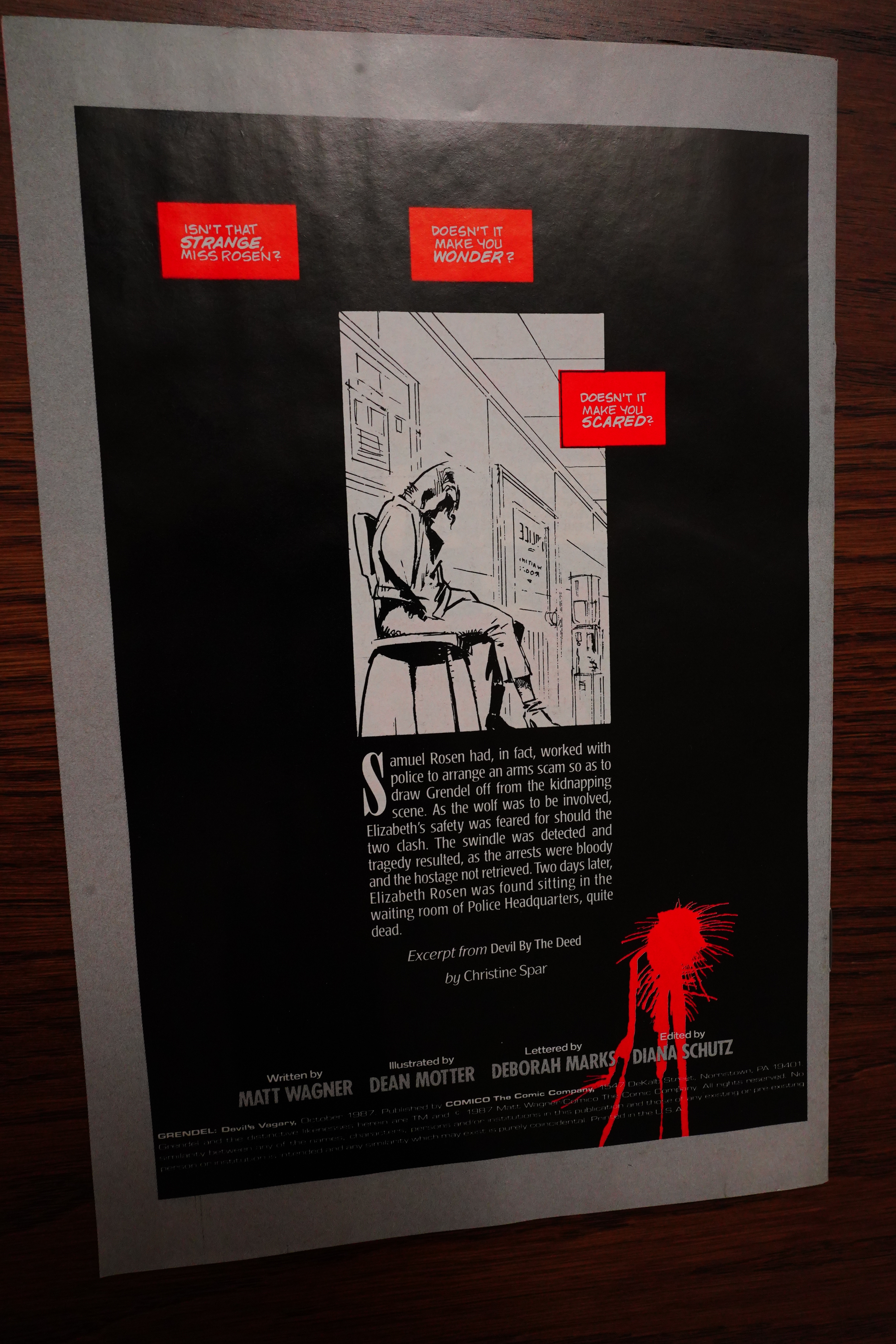
The story, though… The story is about Grendel having kidnapped a woman to, er, do something, and we get their conversation…

And then… er… Argent foiled Grendel’s evil plan, so Grendel just killed his hostage? THE END

That’s not a story — it’s not even a vignette. It looked pretty nice, but, man…

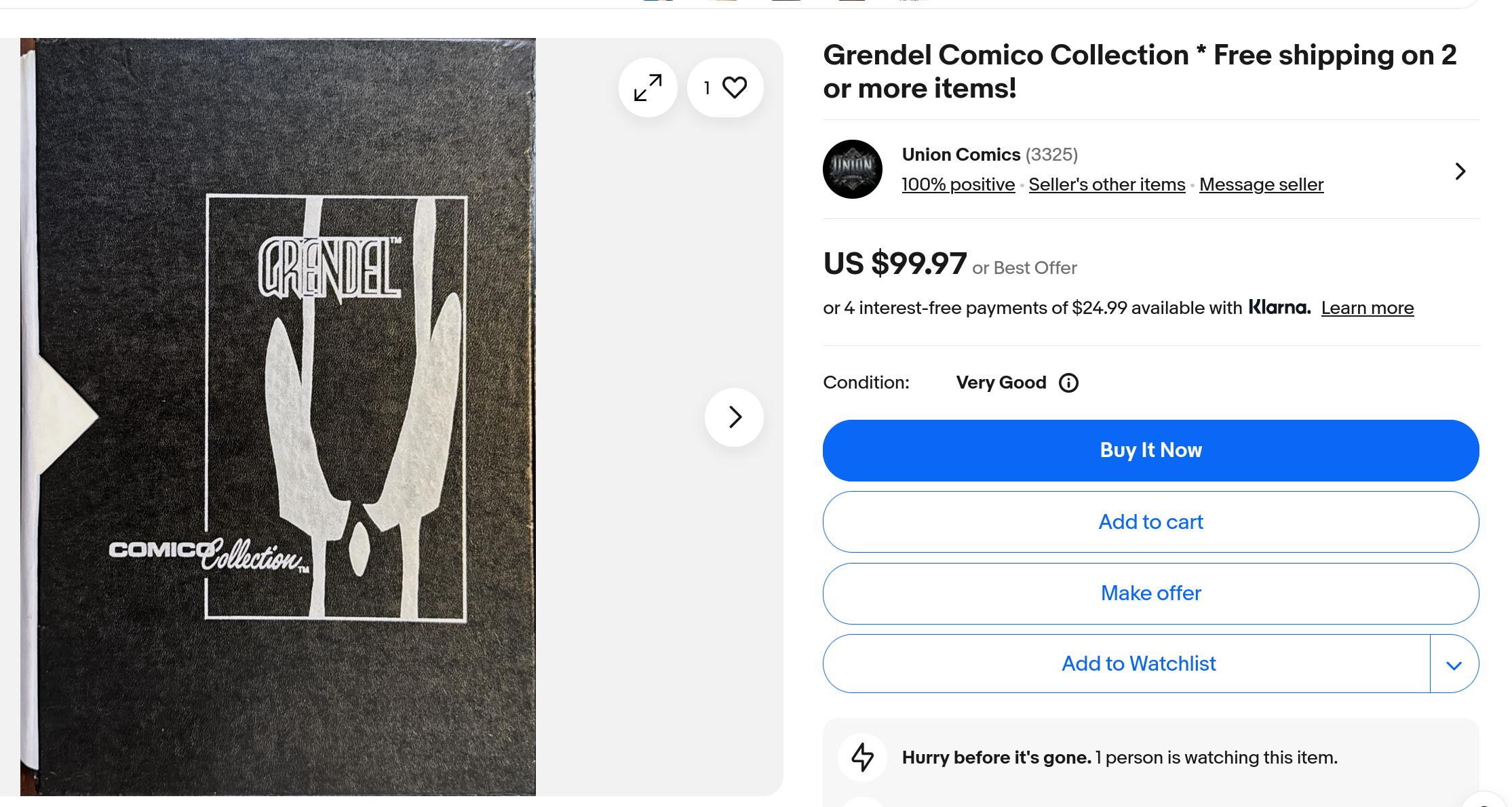
You can still find copies of this easily…

But it’s not $10 any more.

According to this, this book has never been reprinted.

Amazing Heroes Preview Special #11, page #7:

I have another series in the works. It’s
been in the works forever becaused of
Comico’s wildly fluctuating business state.
It’s never been able to solidify. It’s called
Grendel Logs and it’ll be black, white and
red like the thing I did with Dean Motter
[in “Devil’s Vagary”]. All untold tales of
Hunter Rose; all written by me and drawn
by about two dozen different artists,
already selected and pretty much booked.
just waiting for the Comico boat to stop
rocking and find its direction.

Back Issue #125, page #28:

POWERS: Continuing with the subject of you
periodically revisiting the Hunter Rose era, why is
the black-white-and-red palette appropriate for
depicting his stories? I noticed that this minimalist
coloring approach started with the Dean Motter-
illustrated Grendel: “Devil’s Vagary” 16-page
comic for the Comico Collection (1987) and that
Chris Pitzer recolored Devil by the Deed in this
fashion for the story in 2007.
WAGNER: It just seems to fit Hunter’s milieu, even
though I came to that realization later in the game.
It was only after the first B, W, &R series that I decided
to make that palette consistent for all of Hunter’s
solo adventures. The black-and-white evokes the
style and atmosphere of film noir while the red
accents the blood-and-roses motifs that are such a
major element of Hunter’s visualization. It was after I
decided to go this route that we went back to press
with DbtD and had Chris Pitzer give it the same
treatment. That marked the third time that DbtD had
been recolored (the first time, by me, and the second
time, by Bernie Mireault). I like all of those versions but
was happy that the newest version fits so nicely into
the B, W, & R reality.

As you’d expect, there aren’t many reviews of this book. Here’s one:

Going back woth Eddie on this story was a hit Taking another look at the morality (or lack of) that guided Eddie as Grendel is always a delight

Oh, comics.org was wrong about it not being reprinted:

Comments: This issue introduces quite a few firsts. This is the first Grendel piece that was penciled by someone else, with Dean Motter handling the artwork. Matt Wagner wrote the issue. This is also the first time we get a good look at Grendel’s crime syndicate, including where they meet and how they conduct business, which I found very interesting. Motter’s art is decent, not on Wagner’s level but is effective especially in the battle scenes. And lastly, this is the first black, white and red Grendel story ever published. It used to be quite rare, but has since been reprinted in Grendel: Black, White, and Red as well as the Hunter Rose Omnibus.