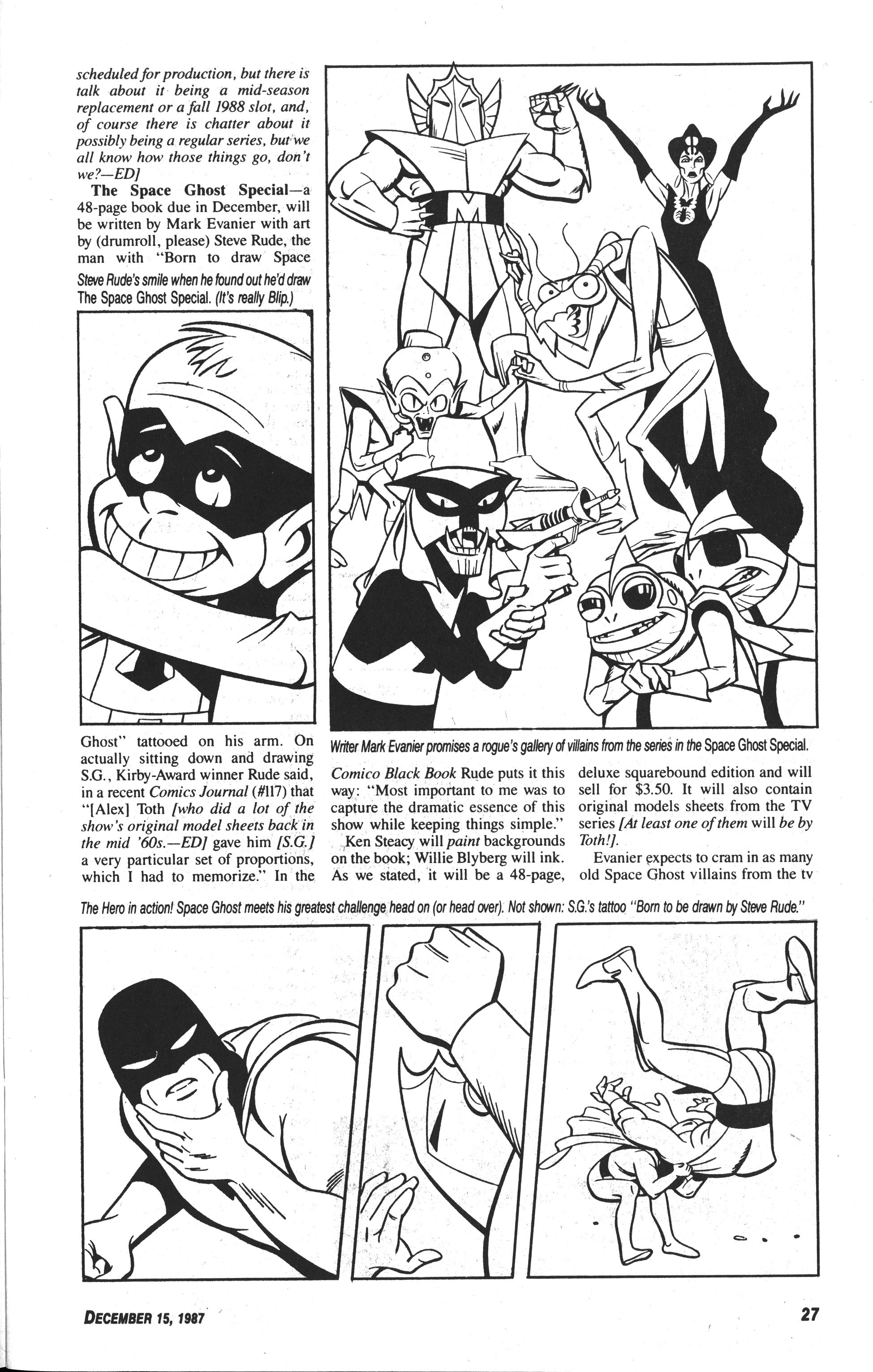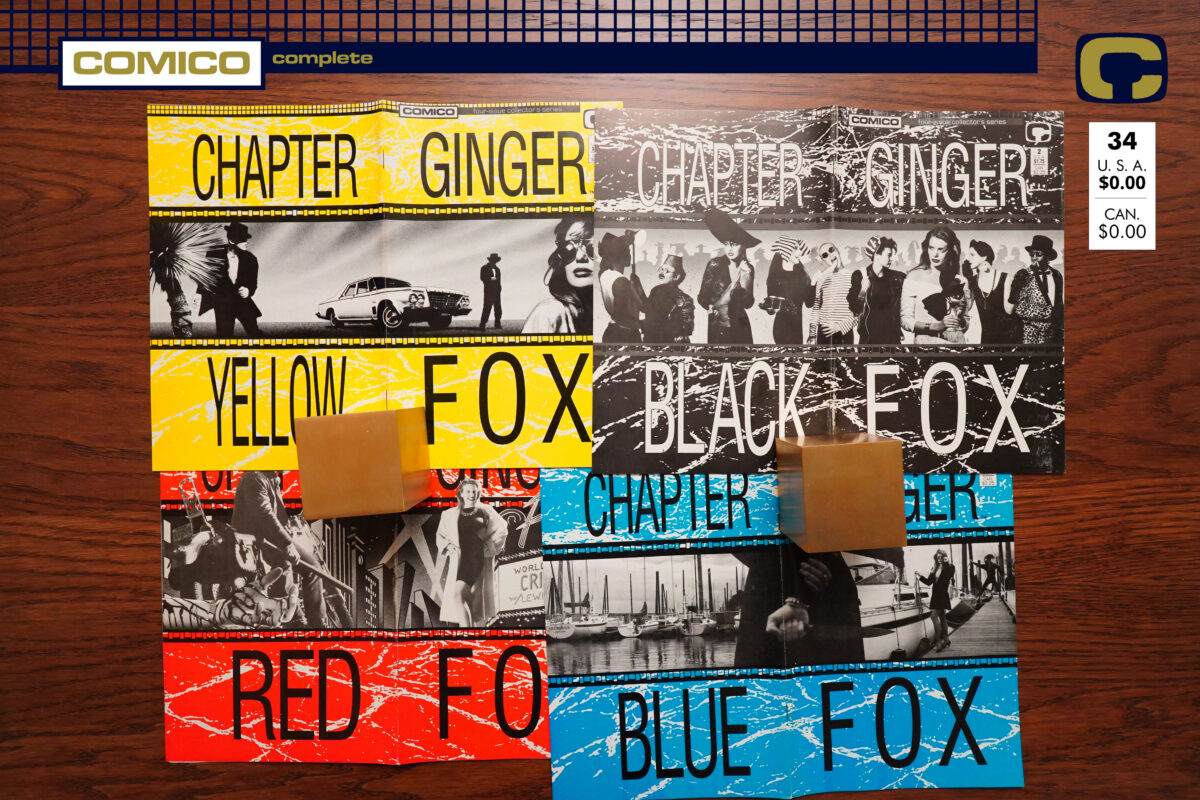
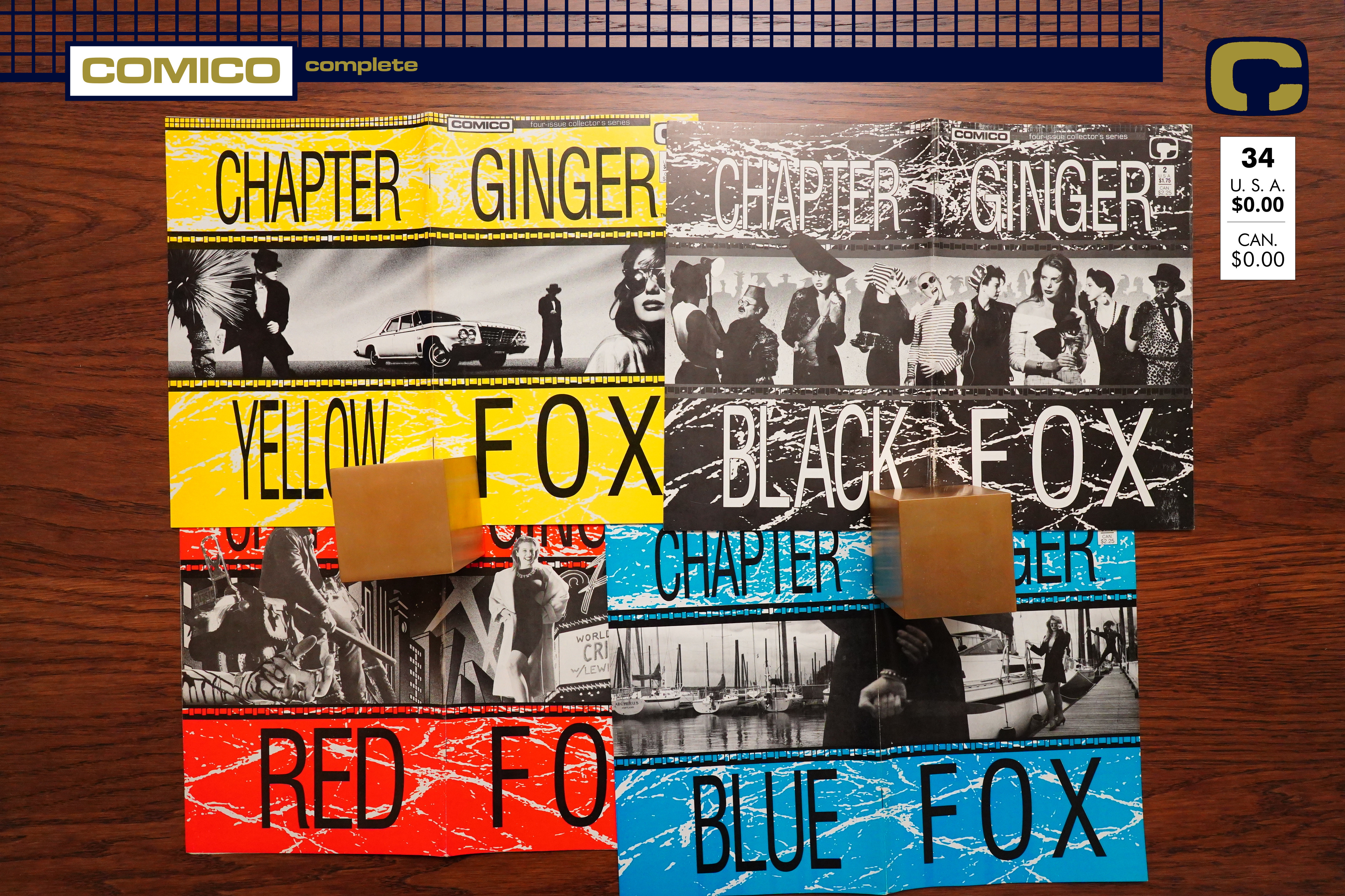
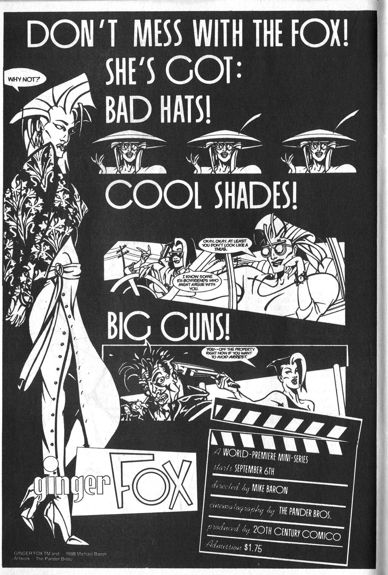
Ginger Fox (1988) #1-4 by Mike Baron & the Pander Bros
The first Ginger Fox book was a bit of a mess, but kinda interesting. And this time around, Mike Baron has the Pander Bros aboard, which might be a good thing for this type of book.
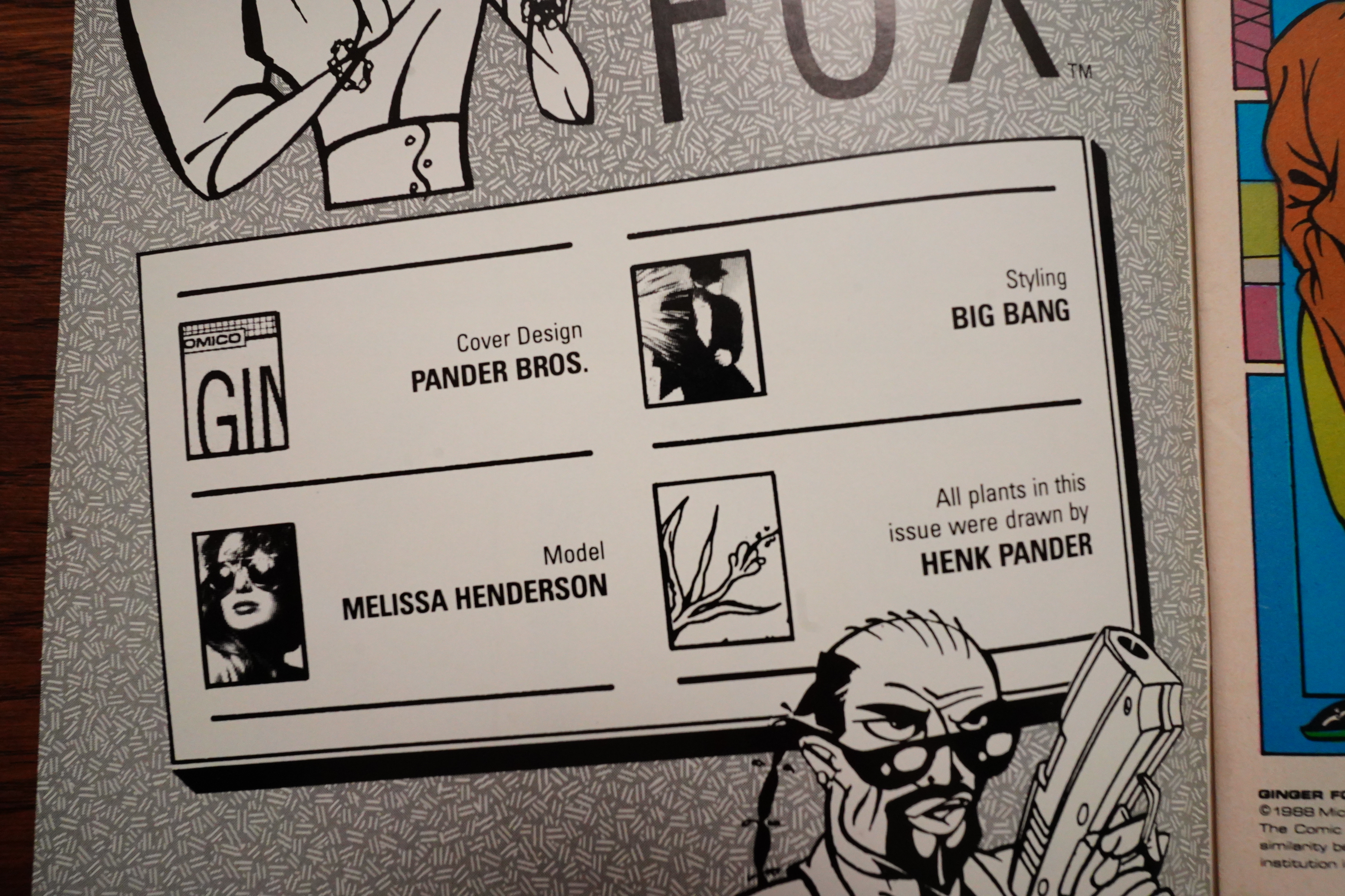
Heh… there’s a third Pander Bros, Henk, who only does plants?
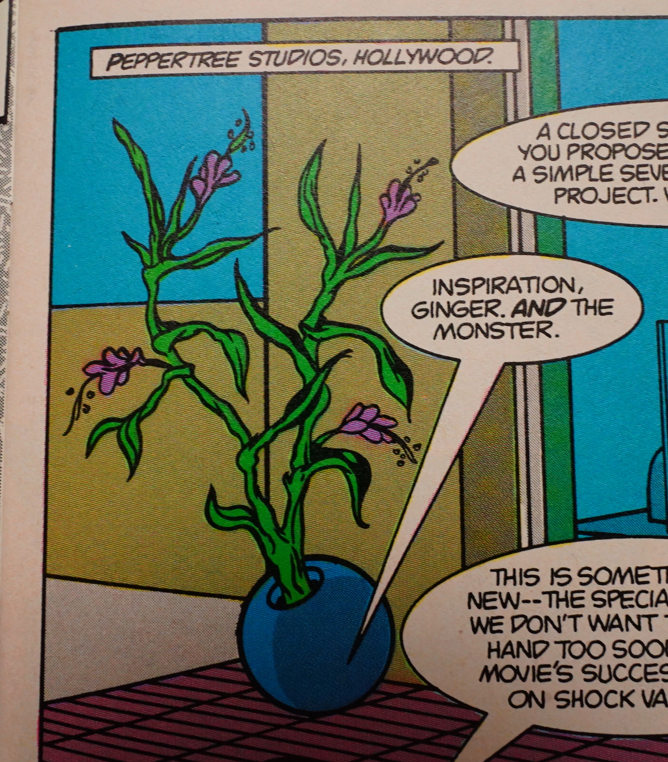
I guess that must be a Henk Pander creation?
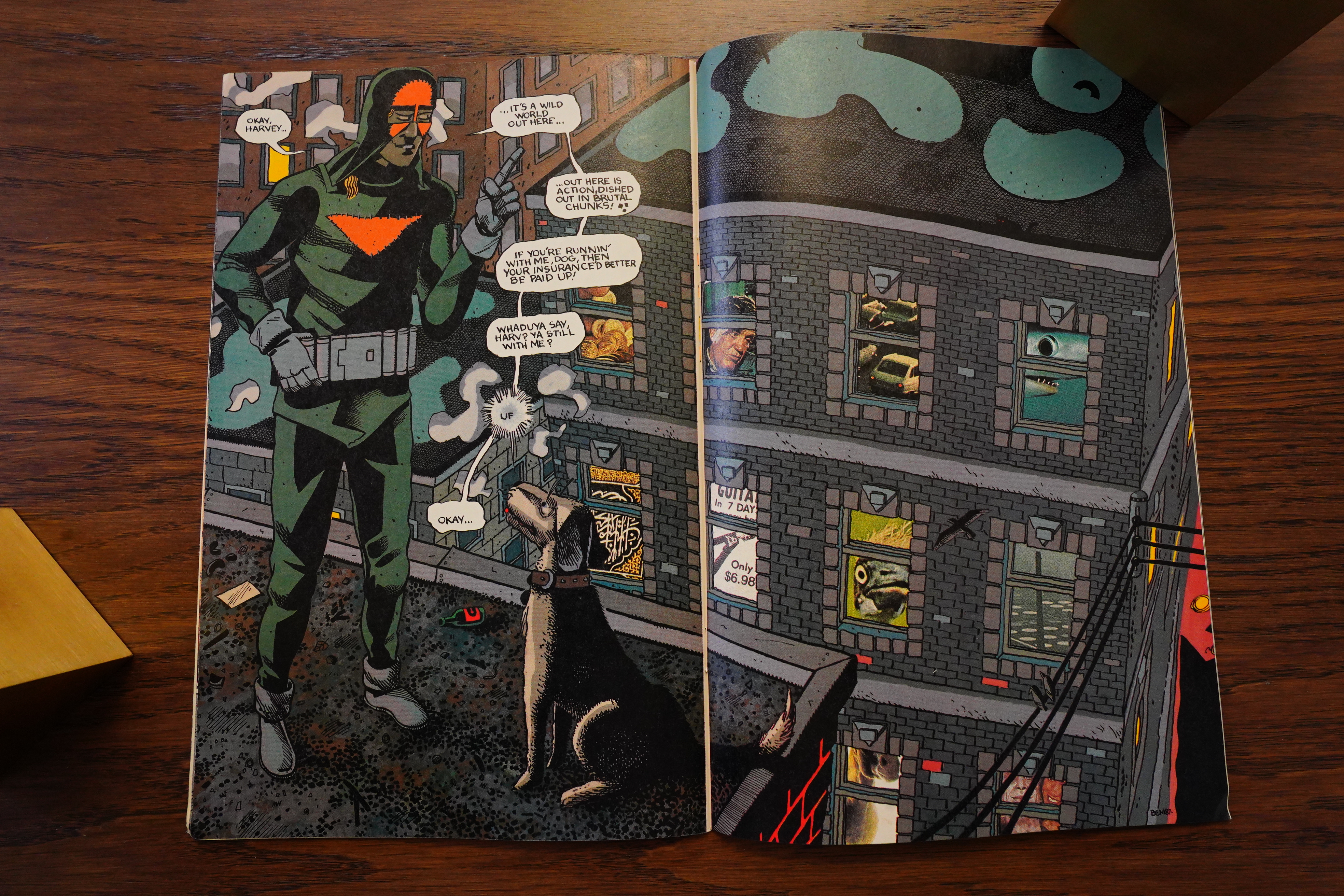
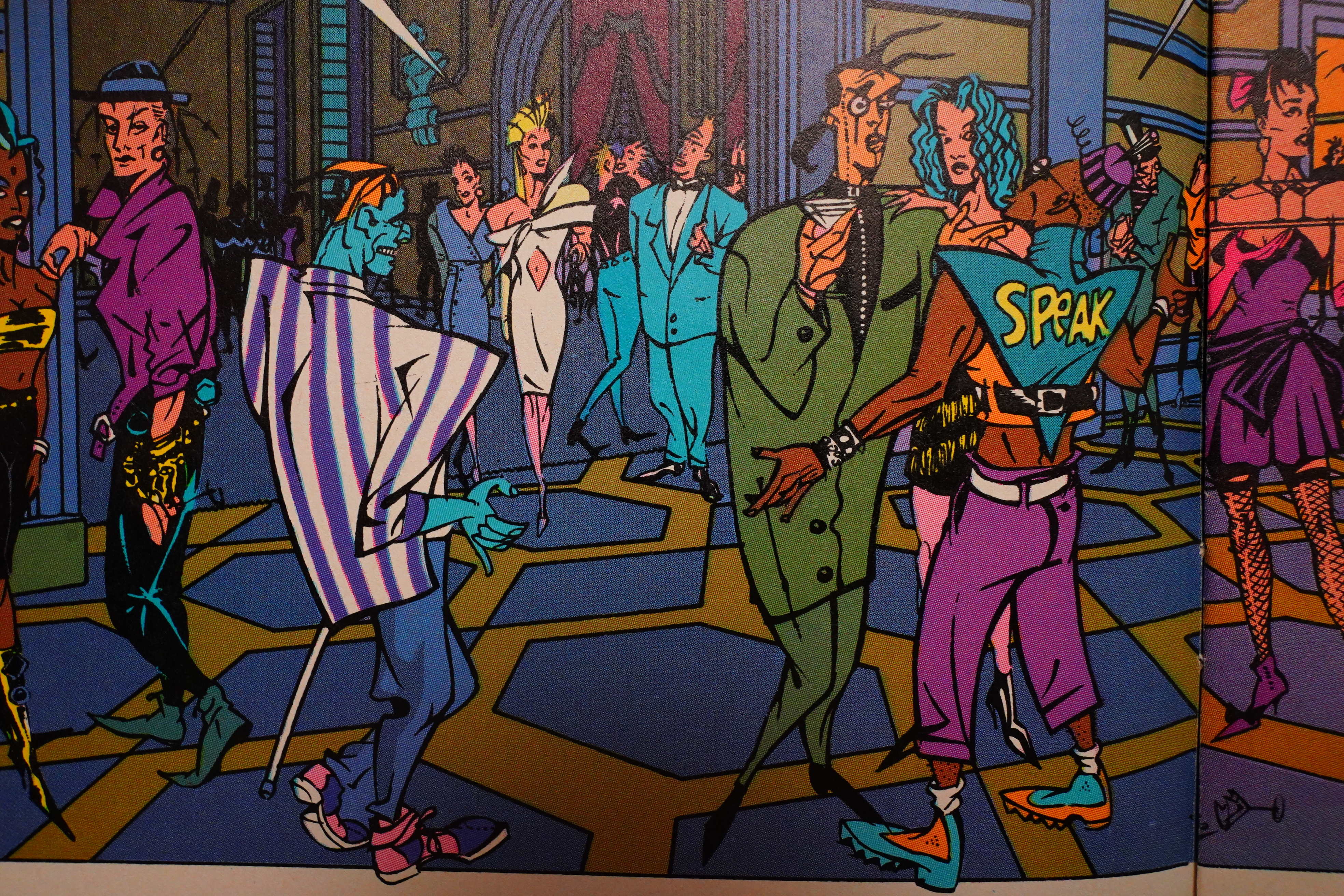
Oh, wow. The Pander Bros have developed further after the Grendel stint they did. The artwork is now more extreme and more cartoony — and… less punk, I guess?
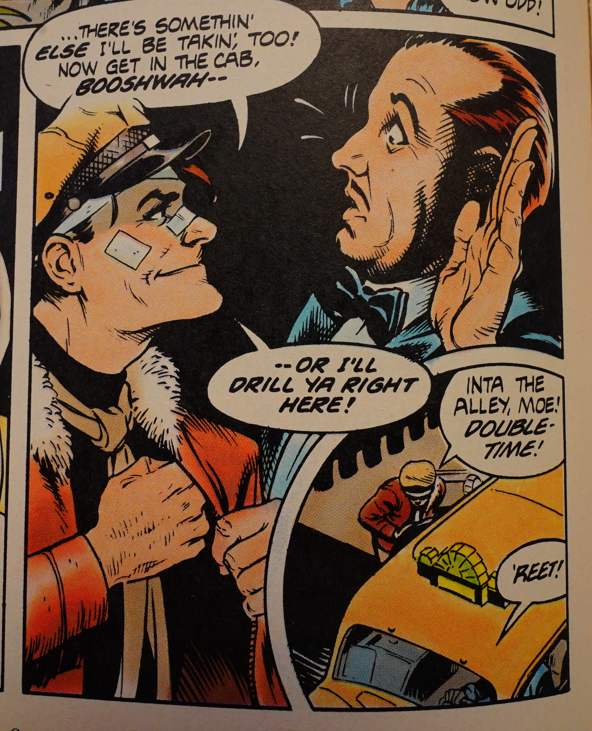
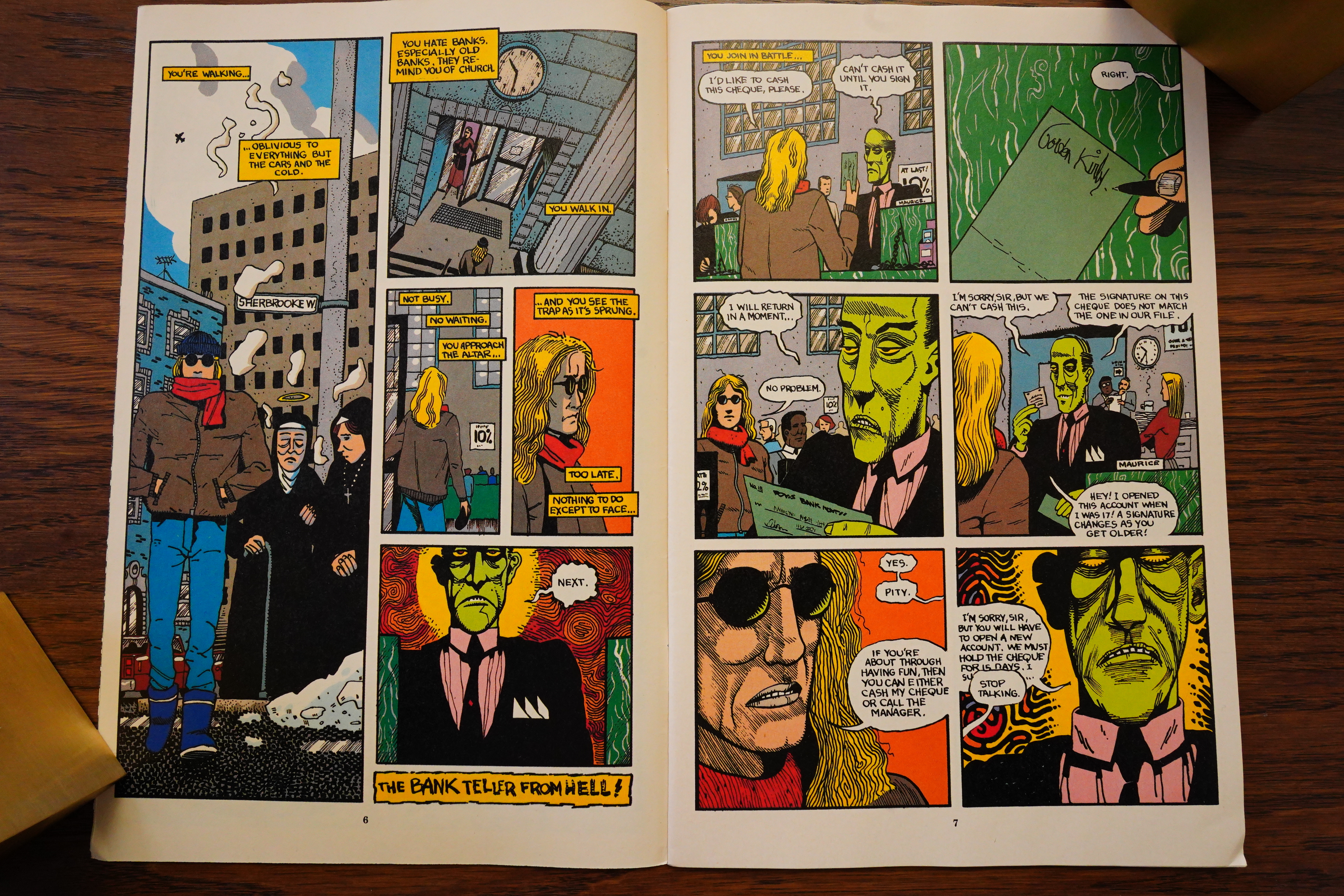
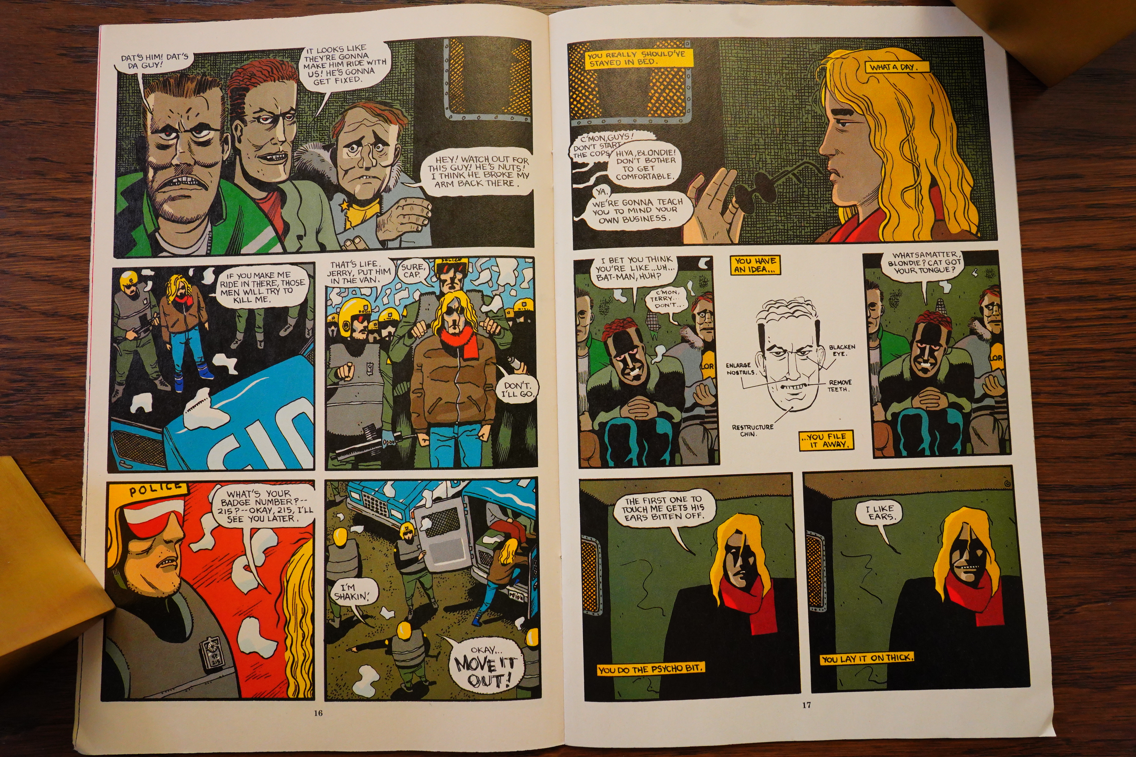
The style leads to some absolutely bewildering body shapes. Yes, all these people have huge elbows, but the Bros sometimes forget how to link up arms to the torso.
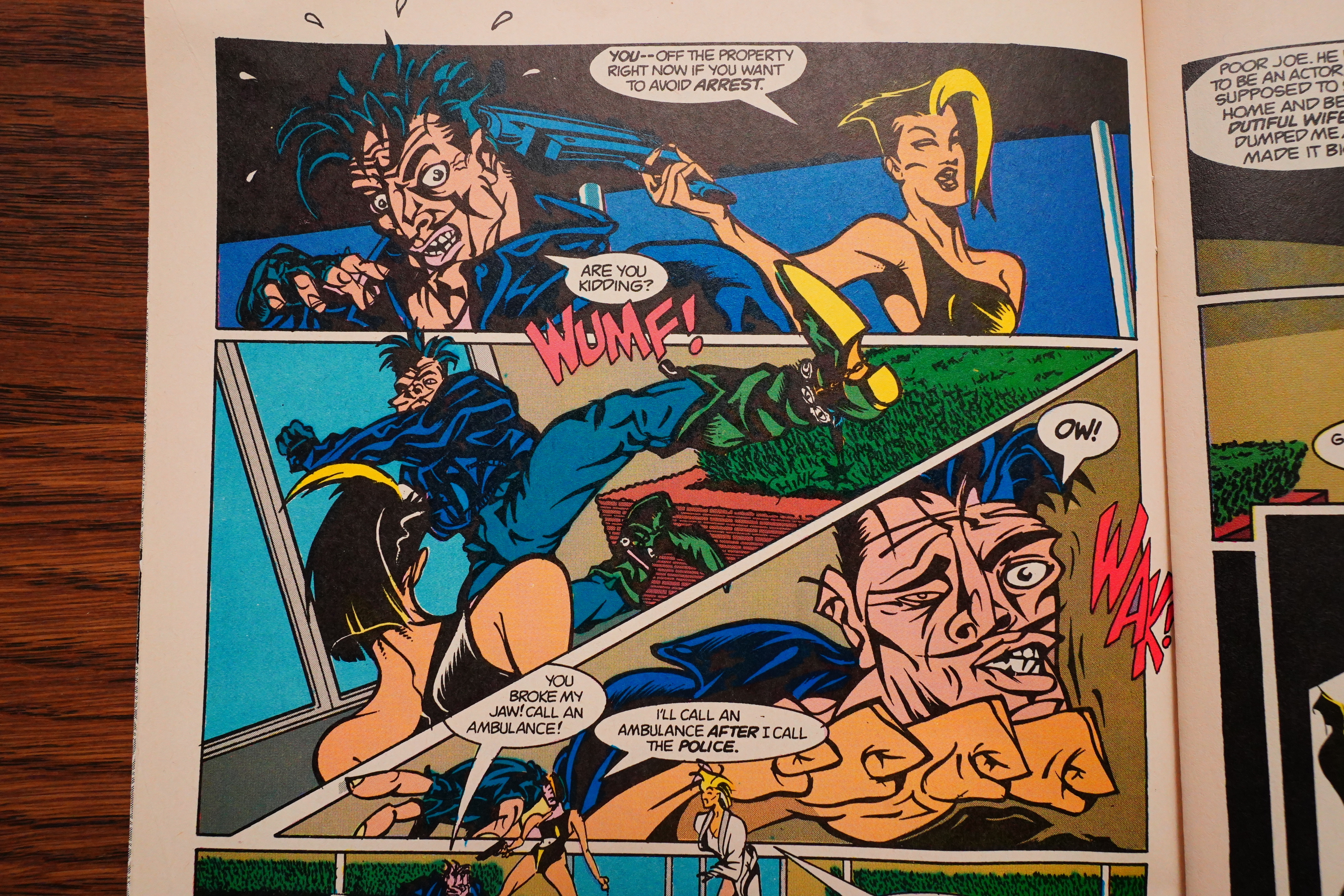
But you gotta love that fight scene — that staggered hand motion…
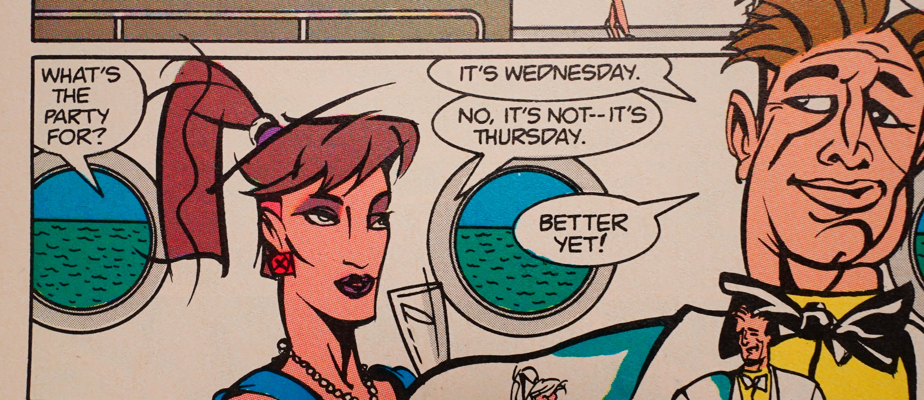
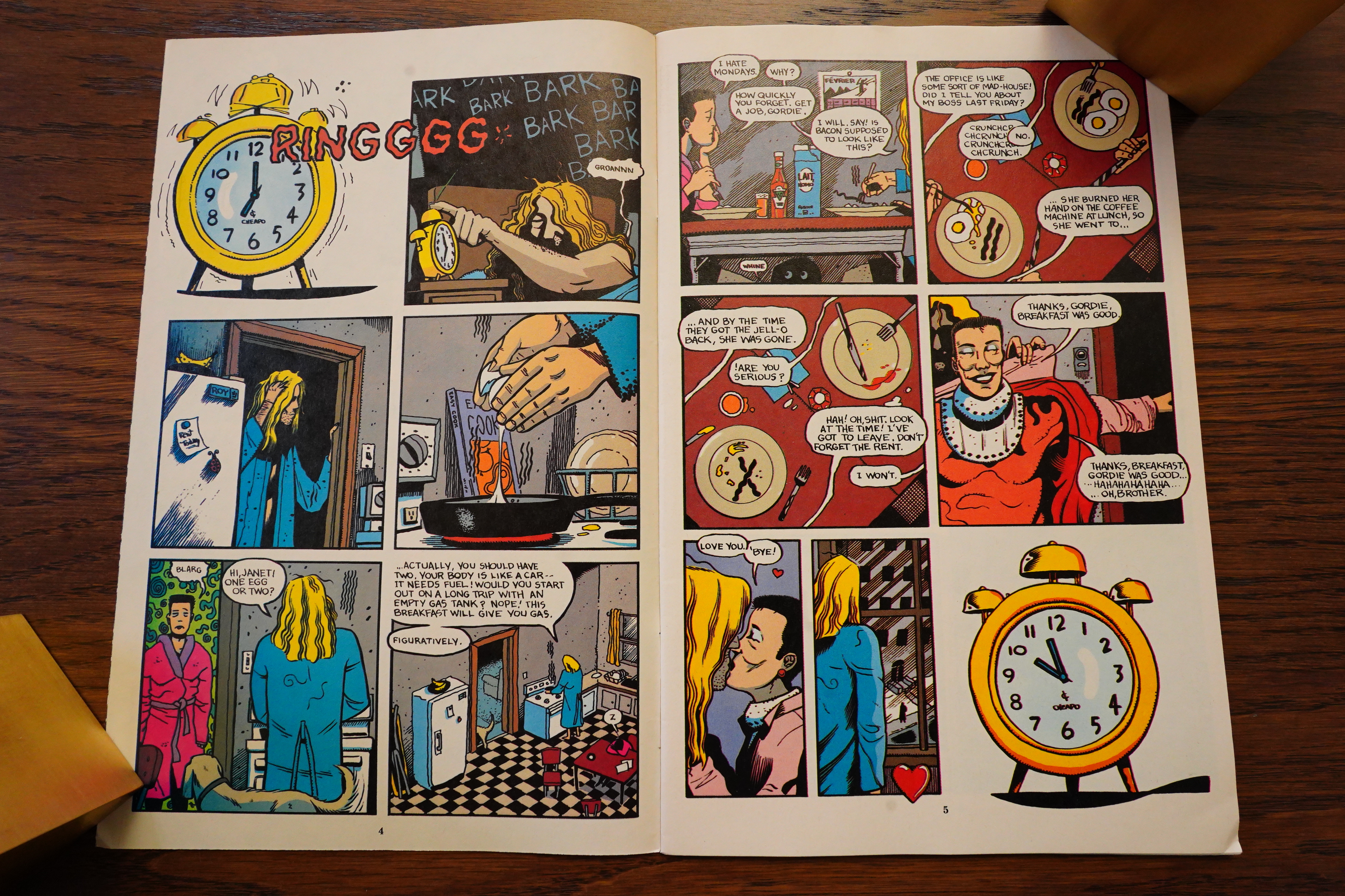
Baron is know for doing quippy comics, and this is the sort of book that certainly could do with repartee, but there’s very little in the way of jokes here, really. And what there is (like the above) is pretty lame.
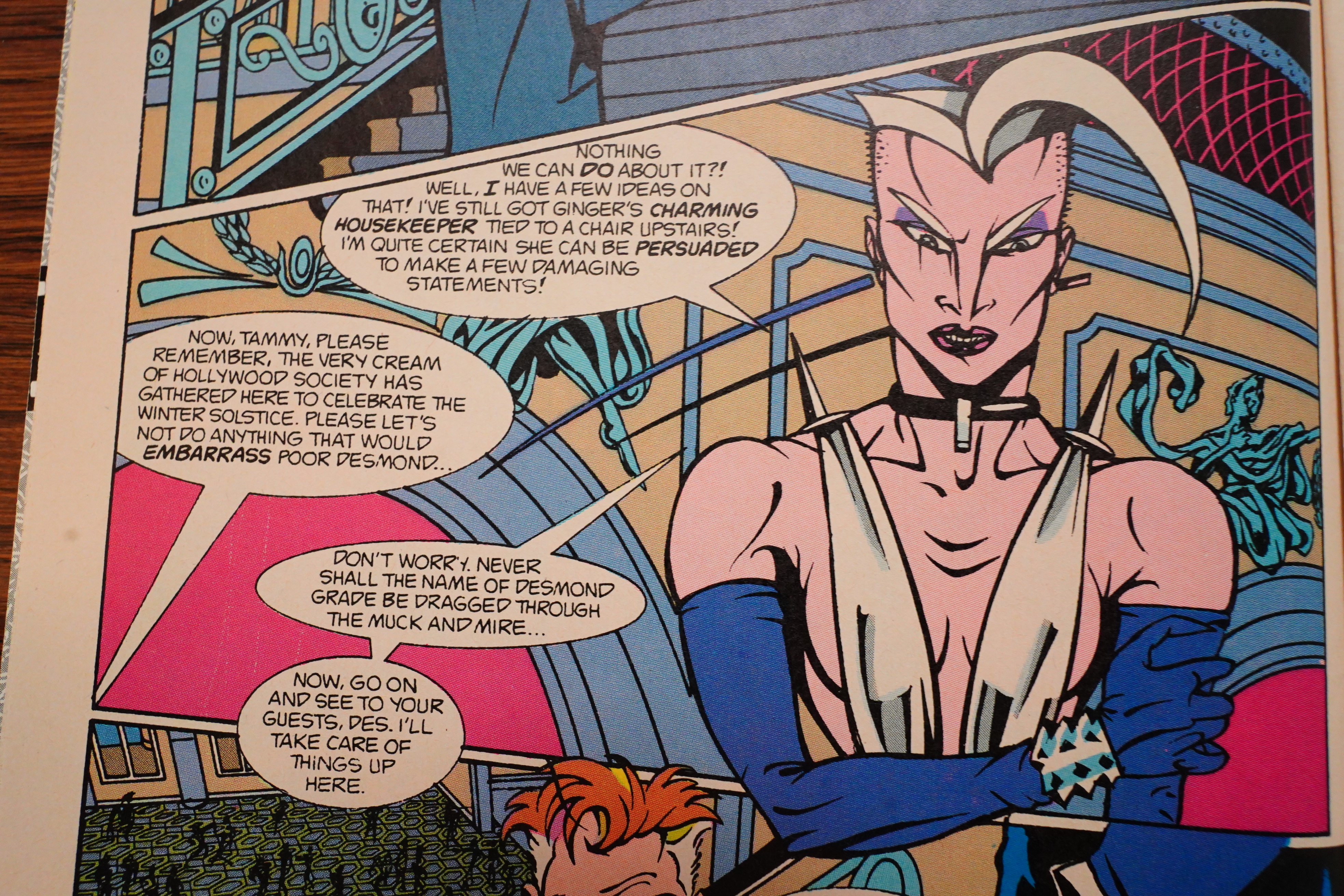
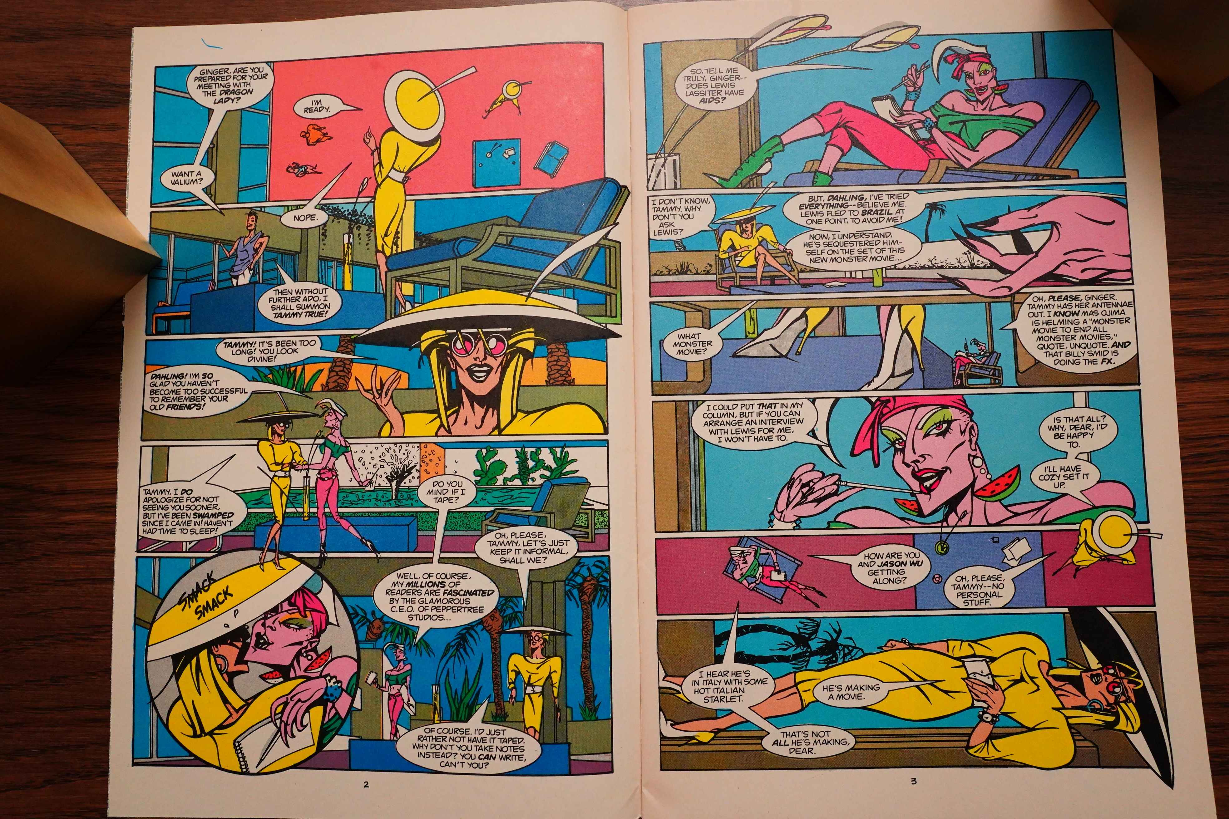
Oh, right, the plot: Ginger Fox runs a movie studio, and for some reason this gossip columnist has it in for her. So she kidnaps (!) her housekeeper (!) so that she can… er… get some gossip? That’s pretty far out, or… just… a very lazy plot. And then her sorta co-conspirator sorta saves the housekeeper, who then goes back to Ginger Fox, and… then that plot is rather forgotten, and they decide to kill Ginger Fox instead, because… because… It had something do to with… running the studio? Was that it?
It’s a pretty convoluted plot, anyway.
The artwork just reminds me of so many other things, like, the above guys somehow made me think of this:
By Willy Smax. But I guess it’s that kinda wild slightly jazzy thing…
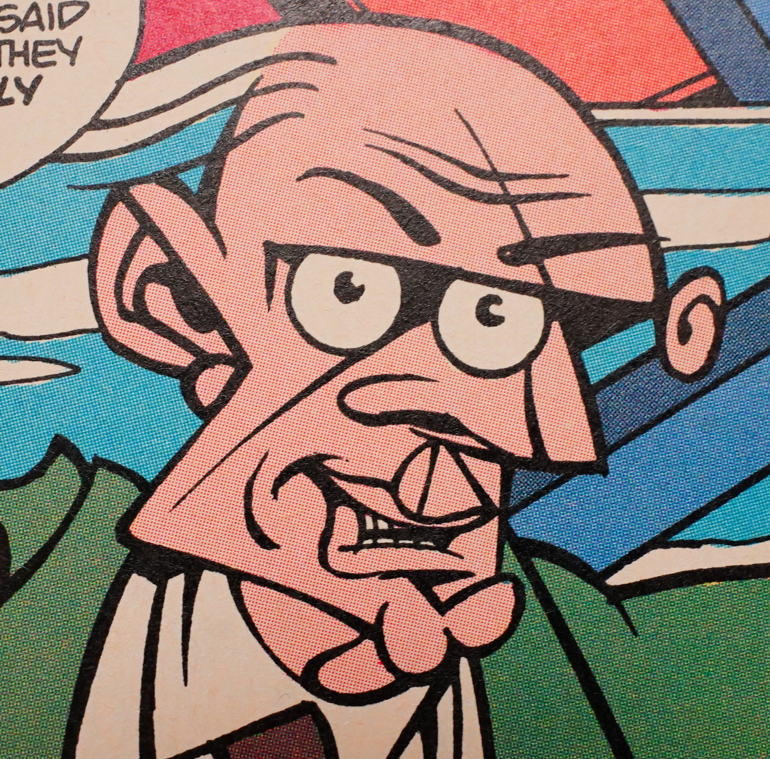
But what’s going on here? Very Picasso I’m sure, but what’s the twirly thing at the eyebrow even supposed to be? His other ear? A… wart?
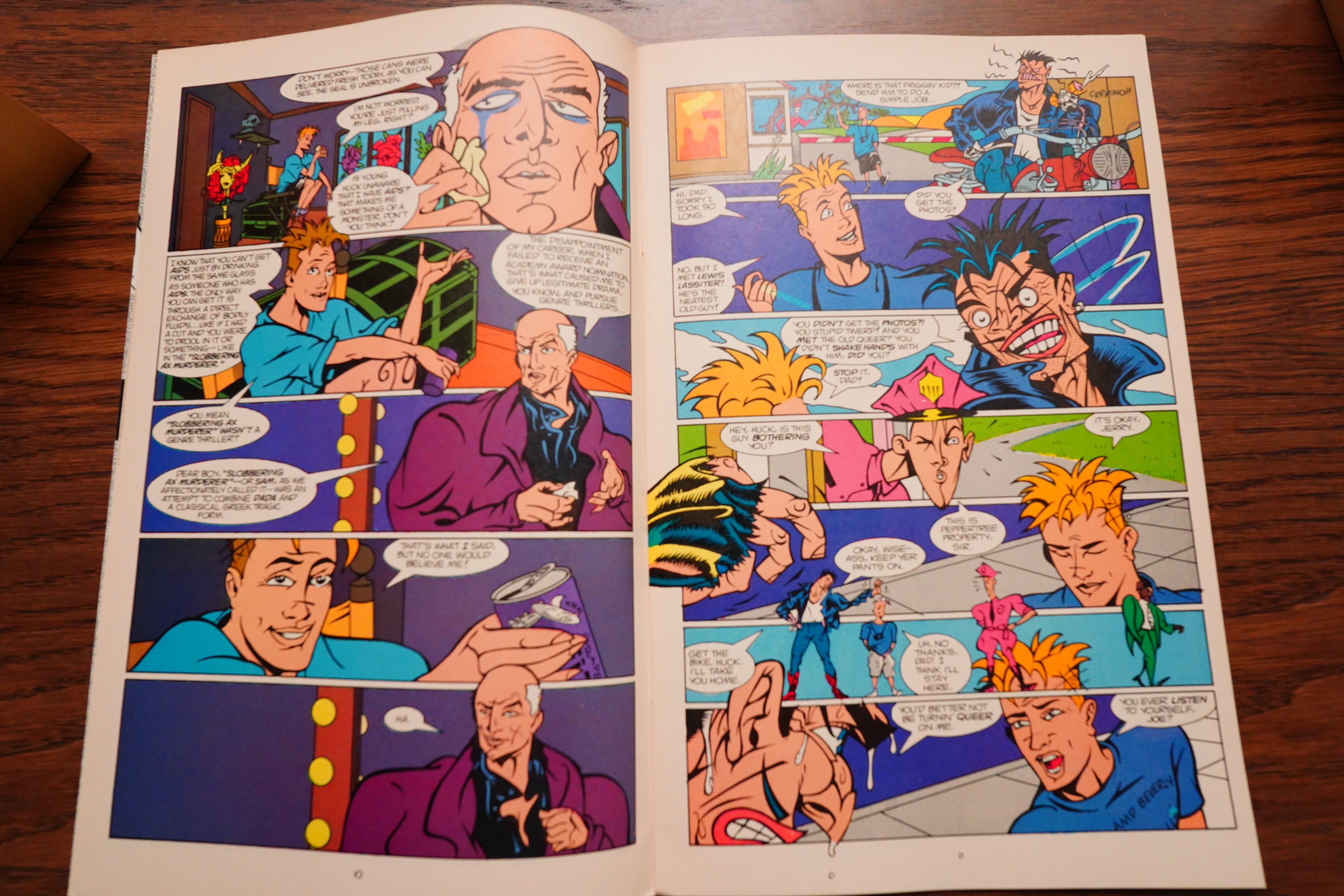
There’s also an AIDS subplot.
It’s really a pretty fun read — it’s quite over the top, but not in an overwhelming way. I guess the main problem is that it feels a bit under cooked — it’s mostly PLOT PLOT PLOT, and then it’s over, and the plot just isn’t all that interesting. So it feels like the book is missing something.
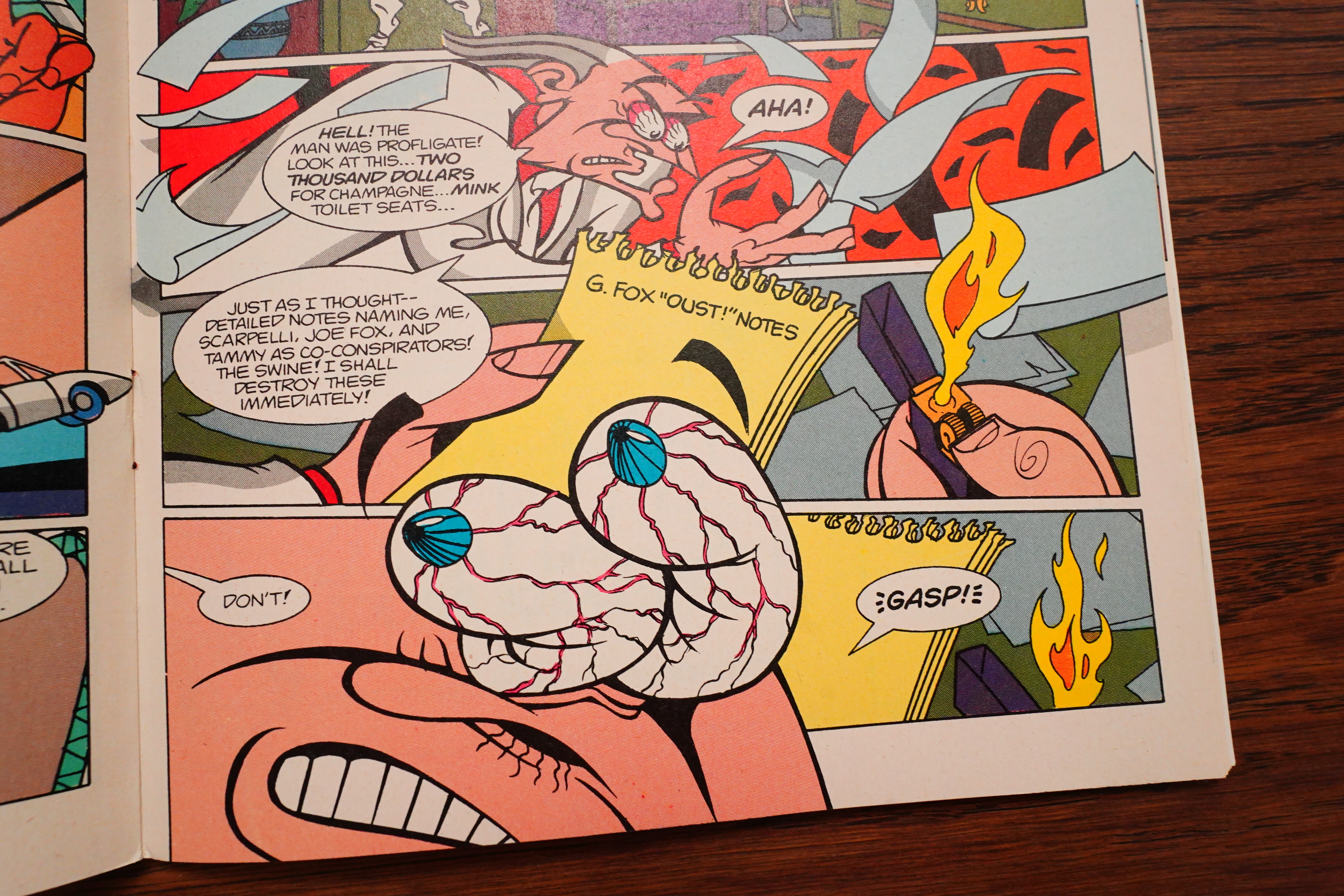
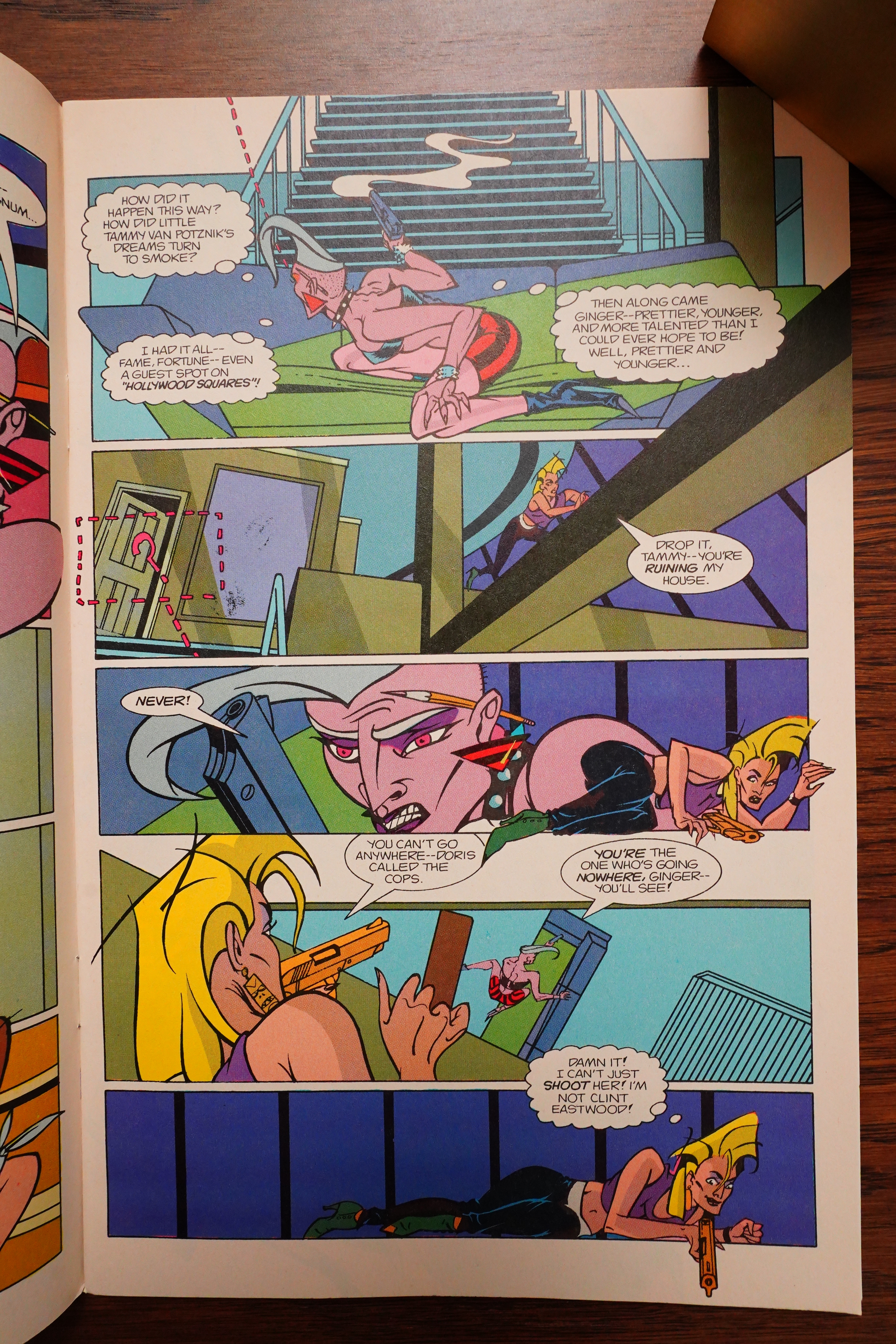
Wow, that’s some eye action.
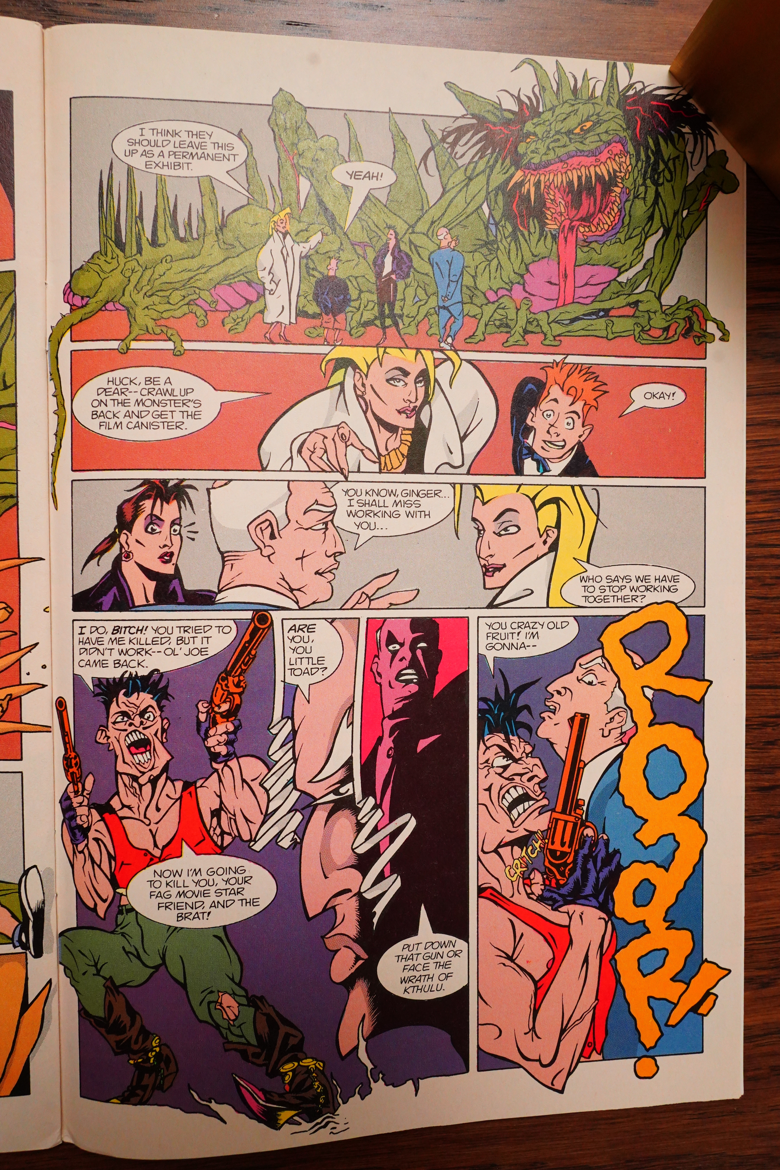
And this is how the mini-series ends (except for an epilogue): “Roar!”? Wat? I think I missed something.
[Edit: Brian Nicholson notes that the pages were printed in the wrong order, and indeed:
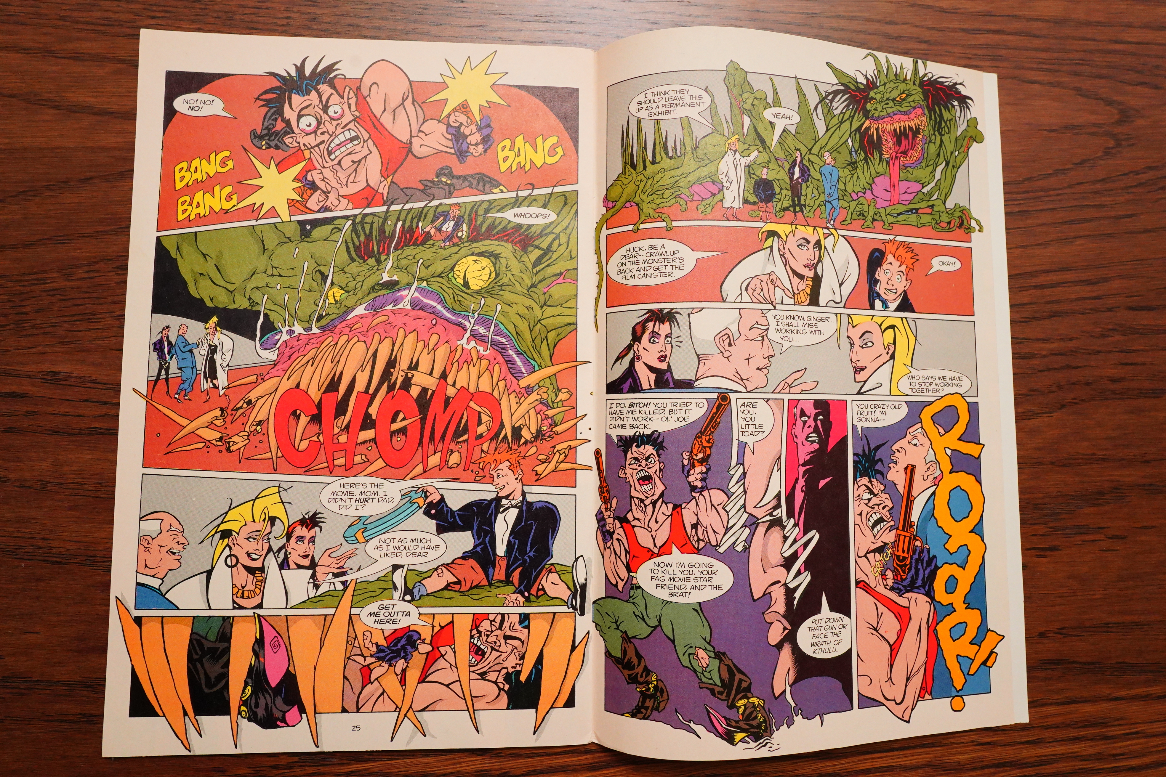
Of course the pages are just swapped. D’oh!]
Amazing Heroes #145, page #101:
Okay, fans of sleaze, sex, and cellu-
loid-Ginger Gox, the star of Comico’s
critically-acclaimed The World of
Ginger Fox graphic novel, is back in her
own four-issue mini-series, courtesy of
Mike Baron and the Pander Bros.
While attempting to film what Baron
describes as “the ultimate horror movie,”
Ginger’s Peppertree Studios is shaken by
an ugly scandal when the calumnious
Tammy True announces that actor Lewis
Lassiter is suffering from AIDS. Lewis
must not only deal with the disease, but
also with the reactions of those he works
with.
And, of course, there’s much more
going on in Ginger Fox. Ginger’s
scummy ex-husband returns, causing
difficulties for her and her son Huck.
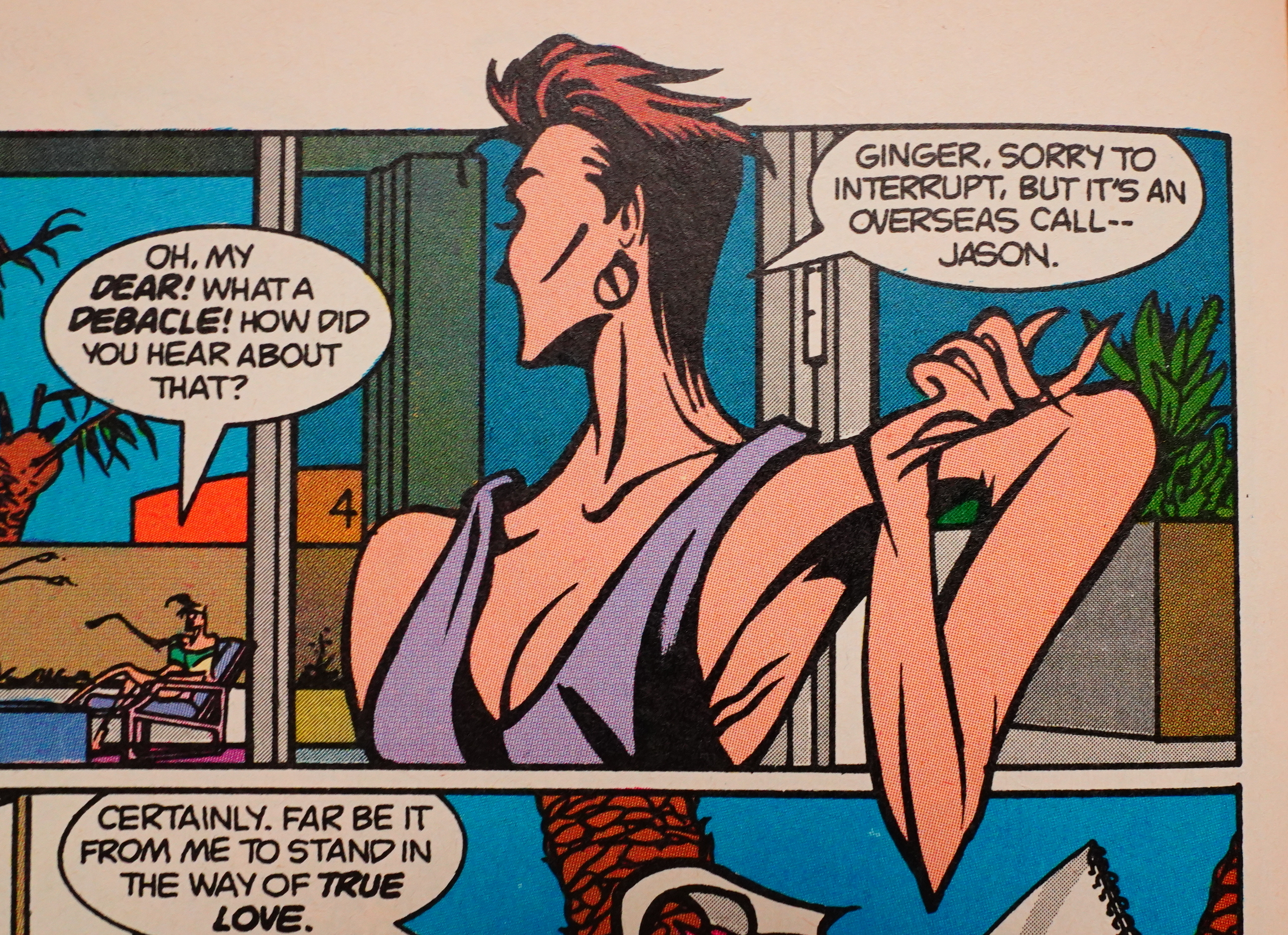
Ginger’s beau, Jason, is philandering.
Ousted and disgruntled, director Creigh-
ton Caw plans to regain control of “his”
movie-at any cost! There are also plenty
of phony Hollywoodians in the mini-
series who kiss each other on the cheek
and address each of their friends as
“dahling.”
Yes, Ginger Fox is pure soap opera-
and you don’t have to worry about being
interrupted by an Ivory Snow commer-
cial while enjoying it. Issue #1 bubbles
onto the stands in September.
Amazing Heroes #131, page #28:
Many Minis
Have no fear, oh lovers of the mini-
series; they have not been neglected—
not by a longshot. There are at least
four in the works from Comico. They
are:
Ginger Fox—taking up from the
recent graphic novel, in four issues by
Mike Baron, who has decided that he
will write the mini-series, and not just
supervise as he said in the recent in-
terview in AH #128, and will have not
only the artistic skills of those Pander
Brothers, but it will also be co-plotted
by said siblings. The plot within has
Ginger in the soap operatic milieu of
Hollywood making, what Mike Baron
has referred to as “the ultimate hor-
ror movie”-ooo, scary- as well as
dealing with an actor who has AIDS,
her ex-husband threatening to take
their child, and Ginger possibly being
replaced. Ah, just another quiet day
in tinsel town.
If successful, this may lead to an
regular, open-ended Fox series.
The latest exploits of Ginger Fox
will be presented this fall in a four-
issue mini-series written by MIKE
BARON and drawn by the PANDER
BROTHERS. Fox fans can expect
many of the same characters from The
World of Ginger Fox, but BOB
SCHRECK says this mini-series “is
much sleazier and action-oriented
than The World of Ginger Fox graphic
novel…The World of Ginger Fox
was about success and how you get it,
whereas this new Ginger Fox mini-
series is about the price of success and
staying on top. There was a lot of
optimism in the graphic novel. The
series is a lot darker… I really feel
that this is one of MIKE [BARON]’s
best stories to date.”
Amazing Heroes #154, page #58:
Okay, soap fans—this is the big one!
Sleaze, sex and celluloid have
returned to your local comics shop.
Yes, the irrespressible Mike Baron has
done it to us again with his lovely new
mini-series, Ginger Fox.
The series deals with Fox’s efforts
to complete the ultimate monster
movie. The problems include a star
who turns out to have AIDS; the
return of Fox’s ex-husband; the kid-
napping of Doris by an unscrupulous
gossip columnist; the ever unsubtle
Babs the bodyguard (eat your heart out
Mr. T!) and much, much more.
It constantly amazes me how much
information Mike Baron can cram into
a single issue of a comic without
making it seem cluttered and disor-
ganized. Here, he has done it again.
The art of the Pander Brothers is
also consistently amazing. For such
an angular style, the Panders show a
lot of curve—a lot of subtlety. Their
strong linework almost makes any
other artistic effects unnecessary, and
yet they do have other strengths, not
the least of which is layouts.
Between Baron’s writing and the
Pander Brothers’ art there is no seam.
This is a team effort in the same sense
that Nexus is a team effort. The art and
script complement each other almost
perfectly, in just the same way.
This is a fast-paced romp through
the sordid and the sleazy. If television
soaps moved like this they might actu-
ally be worth watching for something
other than the gorgeous casts.
Once again Mike Baron has created
a winner. The book is fun and
thought-provoking. It is a world like
no other in comics.
If, like me, you didn’t snap up the
graphic novel, “The World of Ginger
Fox,” don’t make the same mistake
here.
Ginger Fox, a “four-issue collector’s
series”—buy this book!!
GRADE: PRISTINE MINT-Sheldon Wiebe
This book sure got a lot of coverage in Amazing Heroes…
Andy Mangels writes in Amazing Heroes #149, page #48:
For those who missed the Ginger Fox
Graphic Novel, you do not have to
rush out and buy it to understand this
series! Nor do you have to buy any
cross-overs, Ginger Fox Universe
books, or spin-offs. Ginger Fox is a
nice little stand-alone package. At
least, I think it will be by the end of
the mini-series.
Although this first issue of Ginger
Fox does not complete a story per se,
it does succeed in setting up the story
in exactly the ways St. George failed.
What’s the story? “Stories” would
actually be more appropriate.
Ginger Fox is the C.E.O. of Pepper-
tree Studios in Hollywood. She’s also
a single mother, although that fact is
only slightly dealt with. As the story
opens, gossip columnist Tammy True
is threatening to reveal that big-time
movie star Lewis Lassiter is dying of
AIDS while working on the projected
hottest new movie of the decade (for
Peppertree, natch). Ginger’s violent ex-
husband comes to call, and her house-
keeper is kidnapped by Hollywood
moguls scheming to take over Pepper-
tree. A crazed director is willing to
kill Ginger to get back the only print
of his new Western in existence, and
to top things off, Ginger’s supposed
boyfriend is hanging out (really out!)
with a mysterious woman in Rome!
Whew! Does that sound about like
a year’s worth of plots and subplots
for your average comic? And these
will all be resolved in a four-issue
mini-series!
Writer Mike Baron is back in form
again after his disappointing Sonic
Disruptors and silly assembly-line
Jademan work. Here he is terse with
the dialogue, saying reams with a few
lines and innuendos. His dialogue
reads like a well-paced movie sounds:
fast, to-the-point, and meaningful.
Not to say that there aren’t any pro-
blems with Ginger Fox. Baron has
almost too many plots going on in the
series, although I am led to assume
that many of them dovetail into each
other.
His Hollywood is a little unbeliev-
able as well-that is, if Mark Evanier
and many other Hollywood writers are
to be trusted. We all know what a
fantasyland Hollywood is supposed to
be, but this seems a little too much
“fantasy” at times.
The Pander Bros. art is typical of
their work; i.e. style conscious before
anything else. These local (for me)
boys make no attempt at anatomical
correctness, storytelling, or panel
composition. Unlike Mitch O’Connell
(who did the Ginger Fox Graphic
Novel, and who is a fashion designer),
these two go for the grotesque and
unusual. If the rules in comics say to
do this, the Panders don’t.
Especially in Ginger Fox (as oppos-
ed to Grendel), this brash rule-break-
ing fails to work well. Layouts are
confusing, making some pages near-
incomprehensible, and some of the
figures look directly out of Picasso’s
worst nightmares. Seeing the Western
sequence as rendered by the Panders
is somewhat akin to seeing Marilyn
Chambers portraying the Virgin Mary.
Some things just don’t work well
together.
Mike Baron’s scripting saves the
book, and although I’ve kvetched a lot
about it, Comico could have gotten
worse artists than the Pander Bros. on
this project. At least they bring a sense
of style and flair to the book, although
they bring along with that all of their
incomprehensible storytelling faults.
Ginger Fox was an experiment as a
graphic novel, and the mini-series is
a bolder such experiment. Because I
respect (and try to support—if they’re
good) experimental books and Mike
Baron’s fast-moving script is simply
too much fun, I do suggest giving this
one a try.
Grade: Near Mint
See?
Comics Interview #51, page #16:
MARK: What about in the comics field,
do you have any plans?
JACOB: The next step for us is, basical-
ly, to propose our own concept to Comico.
ARNOLD: But right now we’ve pencil-
ed the first issue of GINGER FOX, work-
ing with Mike Baron on this four-issue
mini-series, and if you think that’s going
to look like an L.A. GRENDEL, don’t
worry.
JACOB: It’s beautiful so far.
ARNOLD: It’s a whole approach that
we’re taking based on Oriental fashion il-
lustration, and I’ve been experimenting
with these kind of cubist cartoon images
for the characters that are more of the bad
guys or the villains, those characters that
are not the main figures. So it has a real
stylistic look to it, moreso I think than
GRENDEL – more linear.
Fantasy Advertiser #110, page #13:
Ginger Fox 1-4
by Mike Baron and the Pander Brothers;
Comico.
Yay, this is the biz – now I remember
why I put up with all those sneering
comments from my peers – this is why Mike
Baron’s ‘Next Nexus’ was so weak – Mr B
has been sweating away at this masterpiece
for the last millenium. This comic reeks
of style, atmosphere and sophistication.
This series really is for the mature
reader, not because of the occasional flash
of a naked body, not because of the odd
piece of extreme violence or strong
language but because it manages to treat
these elements, and many others, in a
mature, non-gratuitous manner. As far as
originality goes, even the covers smack
of thought and fresh vitality – cliches
nowhere in sight here folks. The use of
photography on the covers provides an
excellent contrast to the cartoony style
of the Pander Brothers’ sharp internal
artwork, offsetting beautifully the
surrealistic feel of the comic.
The story follows the exploits of Ginger
Fox, film producer extraordinaire and ties
her into an intricate plot involving drug
abuse, the social stigma attached to AIDS,
the decadence of the Hollywood set and
media back-stabbing. Somewhere in the
middle of all this Ginger attempts to hold
together a relationship with her teenage
son and keep an eye on her ex-husband’s
manic, dangerous behaviour.
All the characters in this series really
leap off the page in a sharp montage of
colour and sound conveyed by some
brilliantly creative lettering and stark.
contrasting colouring. The cast of
characters simply ooze malevolent
insincerity and I found myself, in true
pantomime spirit, shouting “Look behind
you!” at every second person as yet another
character assassination took place under
the guiding hand of villainess ‘Tammy the
gossip queen’. The flow of the story is
helped along brilliantly by the electric
Pander Brothers artwork – their best since
their stint on ‘Grendel’. It suits the
zany, offbeat style of this series
perfectly, highlighting the insecurity
of life in the fast lane as the characters
plough on deeper and deeper into the
quagmire of their social scene.
Mike Baron throws in enough confusion
to keep the readers on their toes without
over-complicating and unduly slowing the
pace of the story down, and the result
is breathtaking but not without its
sensitive side seen in the portrayal of
the destruction by the press of a once
respected director, now ridiculed by the
media due to his suffering from AIDS. This
comic is brilliant, complex, sophisticated
but never pretentious – it’s good, clean
(well, more off-white really) fast paced
fun. Buy, buy, buy.
– Simon Ward
The Slings and Arrows Comic Guide #2, page #278:
GINGER FOX
Comico: Graphic Novel 1986, 4 issue miniseries 1988
What should have been a run-of-the-mill tale of Hollywood
folk was, incredibly, one of the most bizarre comics of the
1980s. Actually, the graphic novel by Mike Baron and a
young Mitch O’Connell was a largely uninteresting affair,
enlivened only by its stylish art. For the miniseries, however,
O’Connell was replaced by the Pander brothers, for whom
the description “eccentric” is an understatement of
gargantuan proportions. While the comic is ostensibly about
studio boss Ginger Fox and her tussles with murderous
actresses and unruly directors, the expressionistic, distorted
art transforms it into an insane, nightmare world. However,
whereas the Panders’ art is unrelentingly demented and
staggeringly ugly, Baron leaves no cliché untapped, with
every Hollywood stereotype present and accounted for. It’s
a rare title that manages to be outrageously camp and soul-
destroyingly banal at the same time, but Ginger Fox is that
comic.~DAR
Amazing Heroes #128, page #20:
I’m only super-
vising the course of the Ginger Fox
mini-series, which the Pander
Brothers are writing. Robotech is
over, thank God.
Heh heh.
Amazing Heroes #128, page #26:
AH: You also mentioned earlier that
you’re relinquishing the writing of
Comico’s Ginger Fox mini-series to
Arnold and Jacob Pander of Grendel
fame. What type of control, if any, are
you keeping with that project?
BARON: Well, I imagine I have final
control over the product, if I want to
exercise it. But the thing is, they’re
doing such a good job that it’s going
to come out pretty much the way they
planned it, and that’s the way I want
If you ever come across this book in a back-issue bin, I’d definitely suggest picking it up – well worth the read!
RATING: 10 highly sought-after film canisters out of 10 for an out of the ordinary comic book
with extraordinary art and storytelling talent!
And nobody seems to remember this but me, however, the Pander Brothers had been tapped for a Max Headroom comic that never saw the light of day, but really should have, given the preview art that I’d seen. Scour the dollar bins for these.
Needless to say, while the original TPB showed the sliminess of the Hollywood industry and Pander’s artwork really makes them look evil and slimy. Granted it’s an artistic look, which those who appreciate art, will like his unique style. While those use to a certain style for comic book characters, may not get into Pander’s artwork.
For the first issue, it’s an interesting storyline but the first issue was for the most part, OK.
OK, that’s it. The book certainly has a something jennesequa, but I don’t know what. So it’s a shame it’s never been reprinted or collected, really. It’s pretty good.