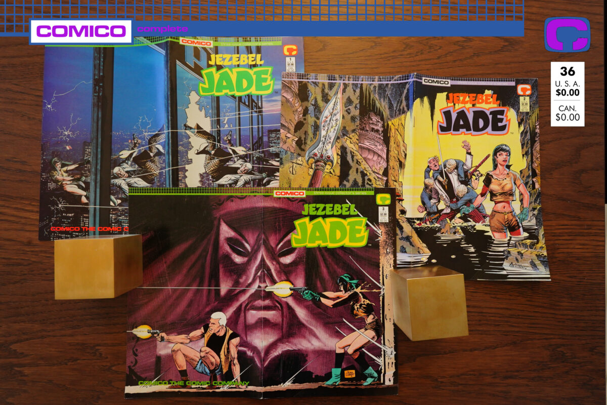
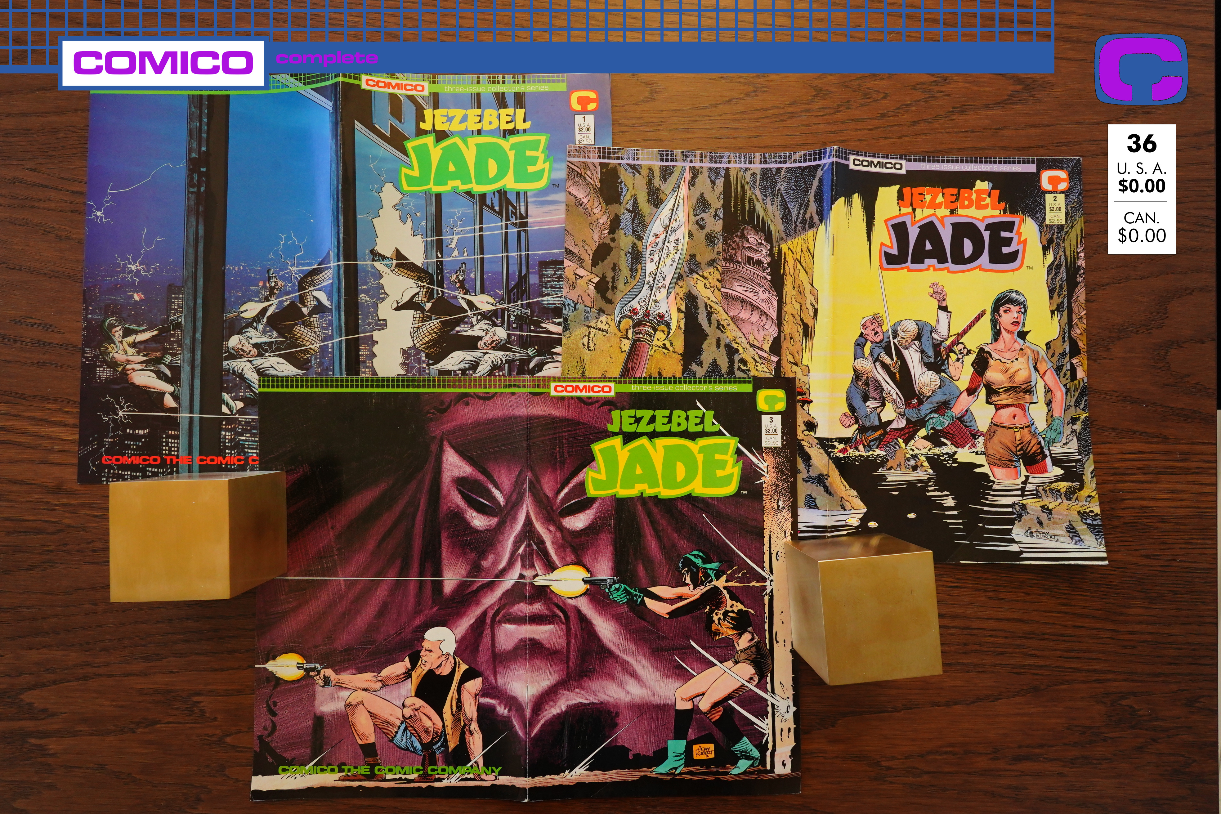
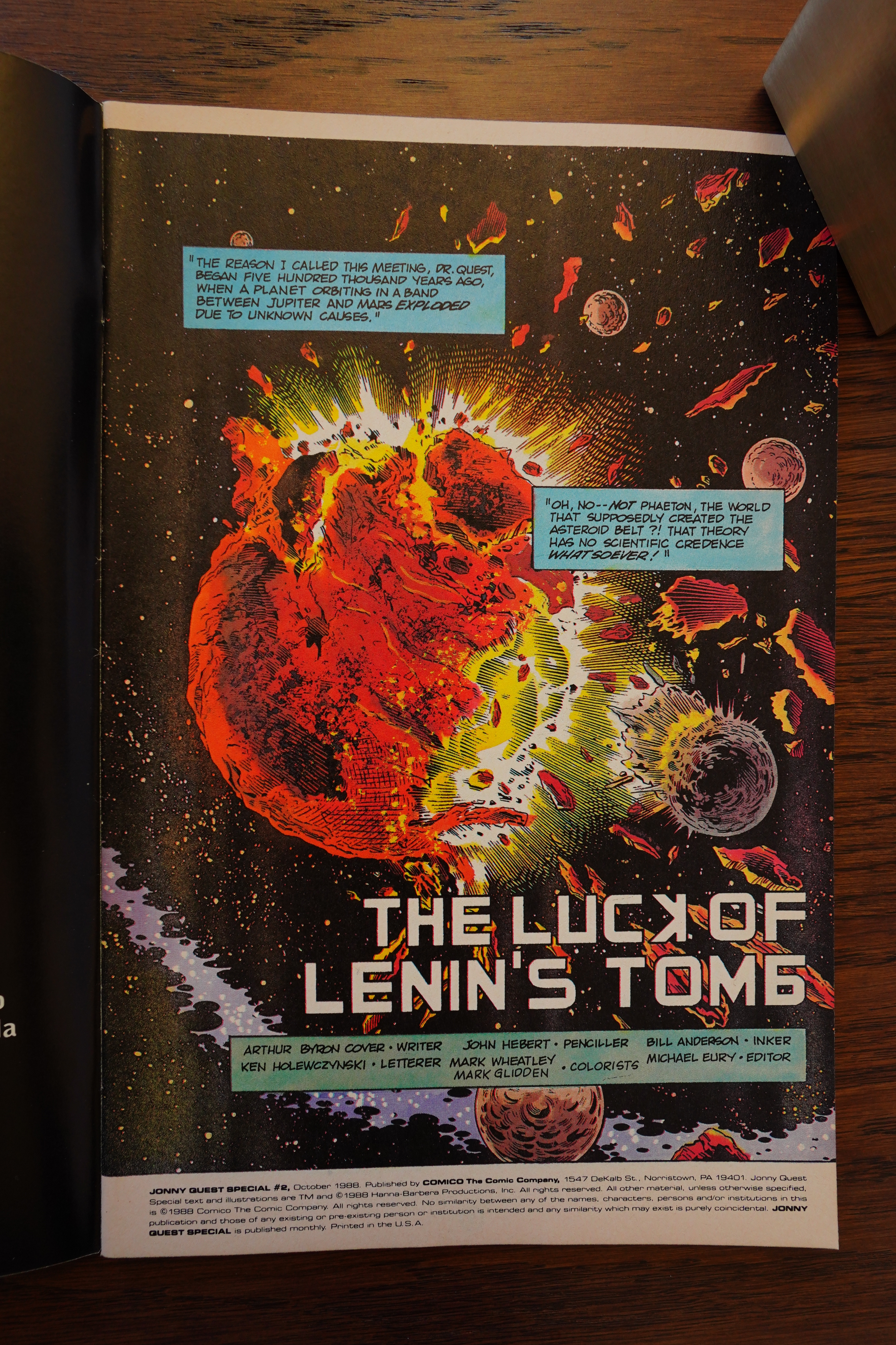
Jezebel Jade (1988) #1-3 by William Messner-Loebs and Adam Kubert
This is the second of two mini-series that Comico published because their Jonny Quest license was running out. While the first one was a mess, this one seems like a more logical series to do — it’s about the background of two Jonny Quest characters (Race and Jezebel Jade)…
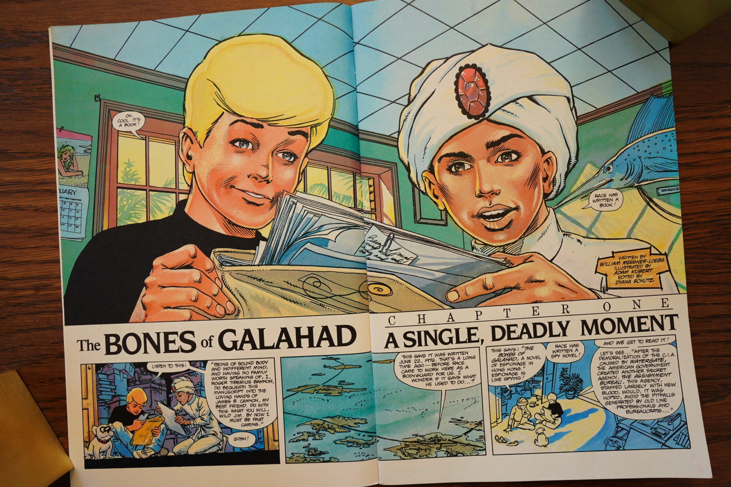
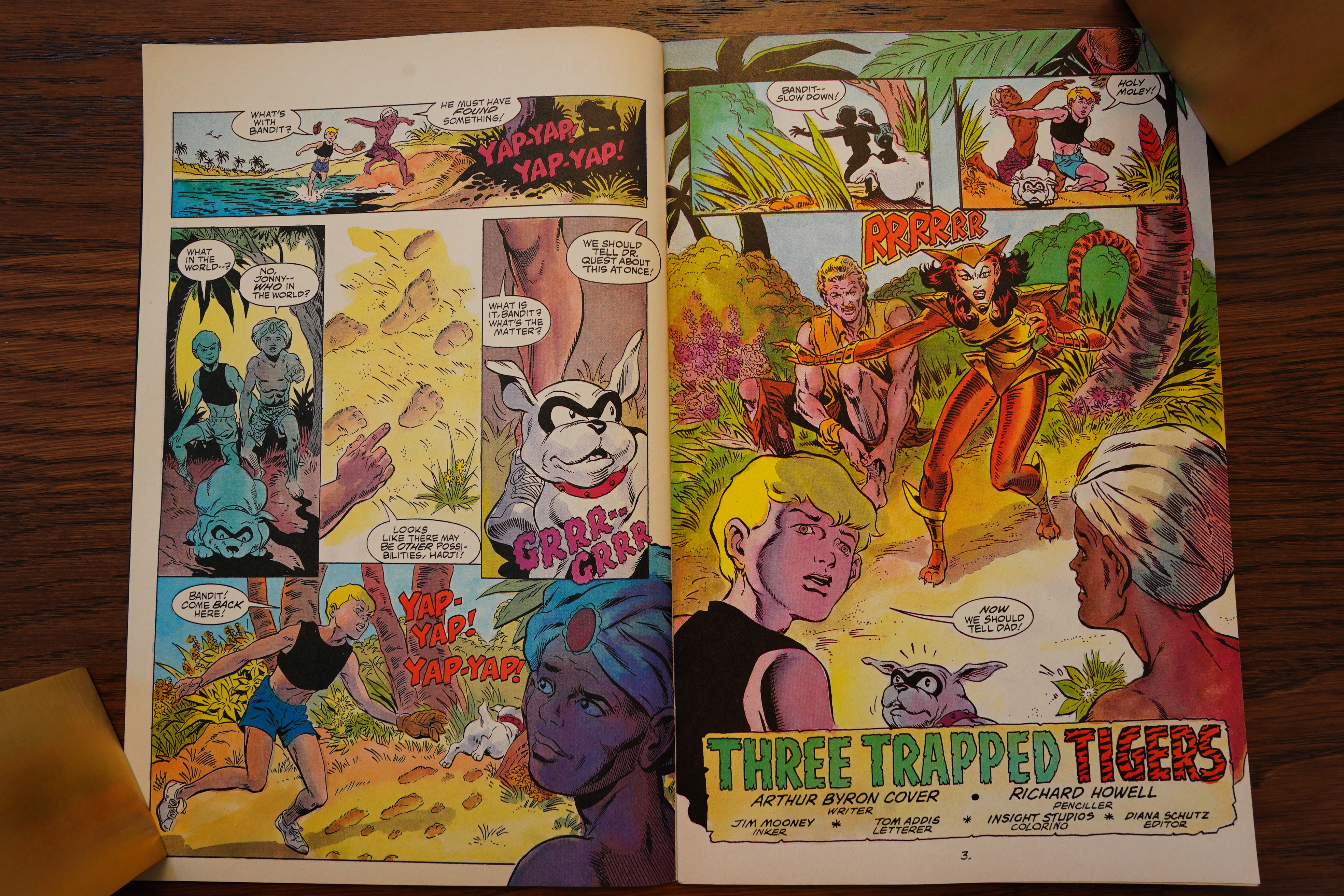
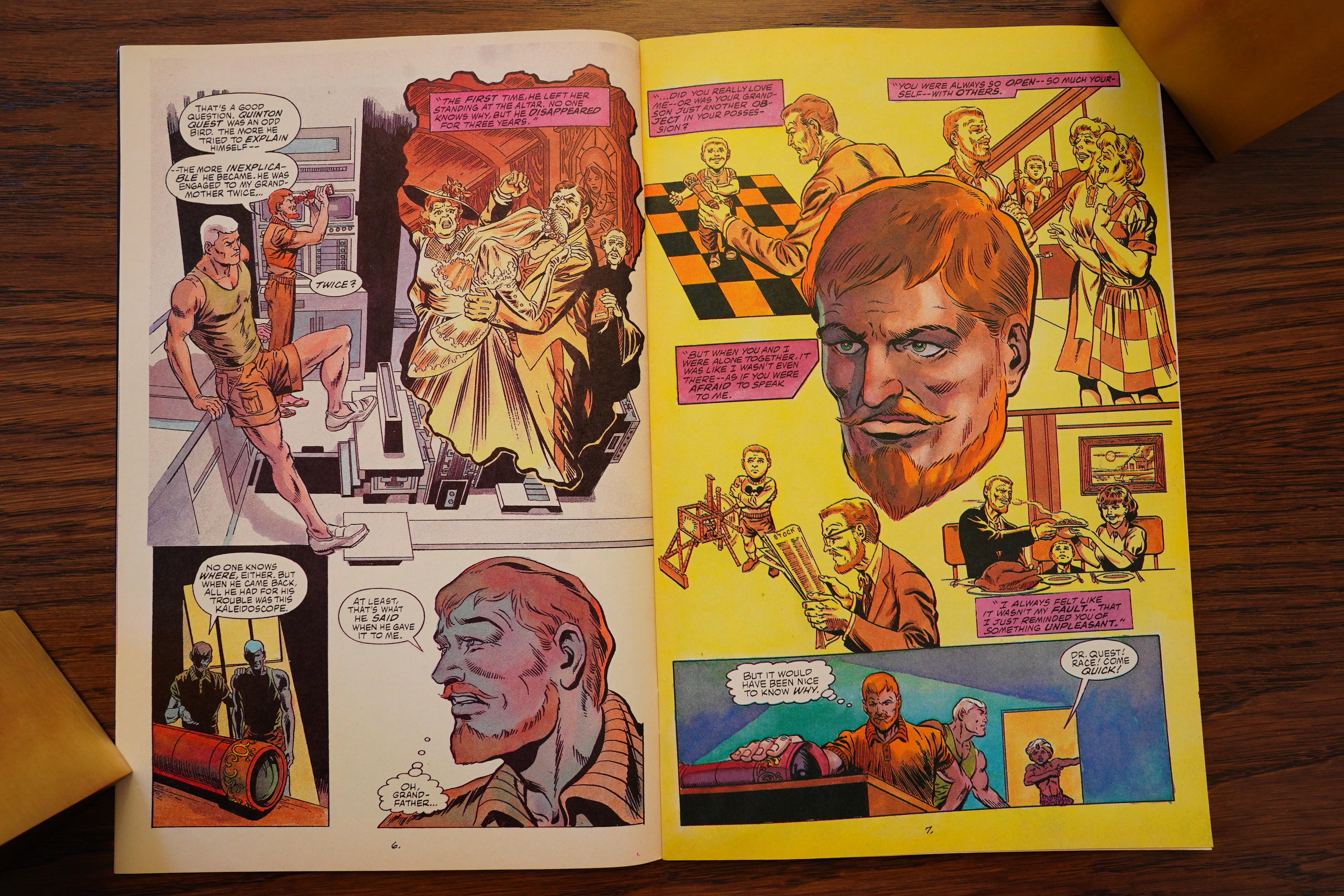
… and don’t feature the kids except in this framing sequence. (They’re reading a book Race has written about his adventures, you see.)
So that’s a classic setup for a spin-off mini-series, and it’s written by regular Jonny Quest writer William Messner-Loebs to boot.
So Race is a secret agent or something, and was much more fun back in the days, apparently.
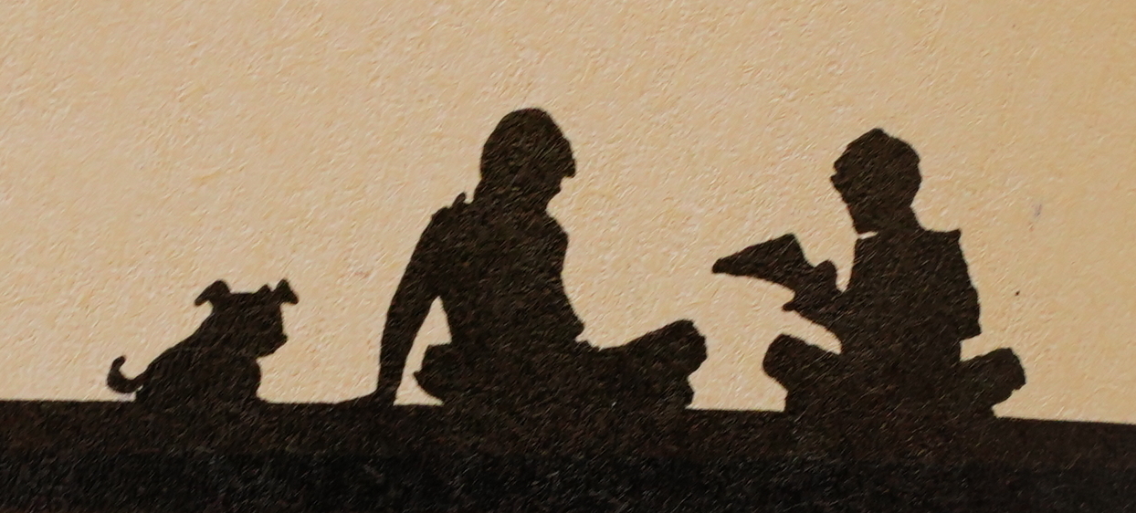
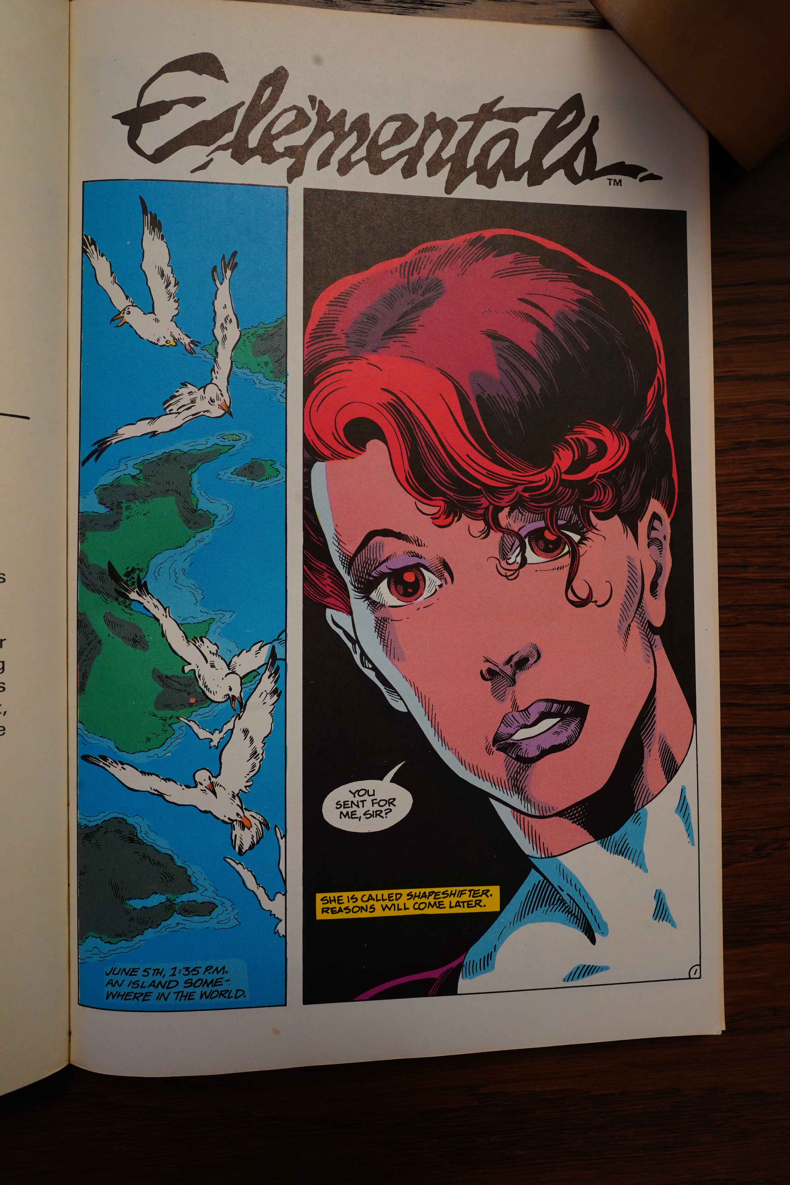
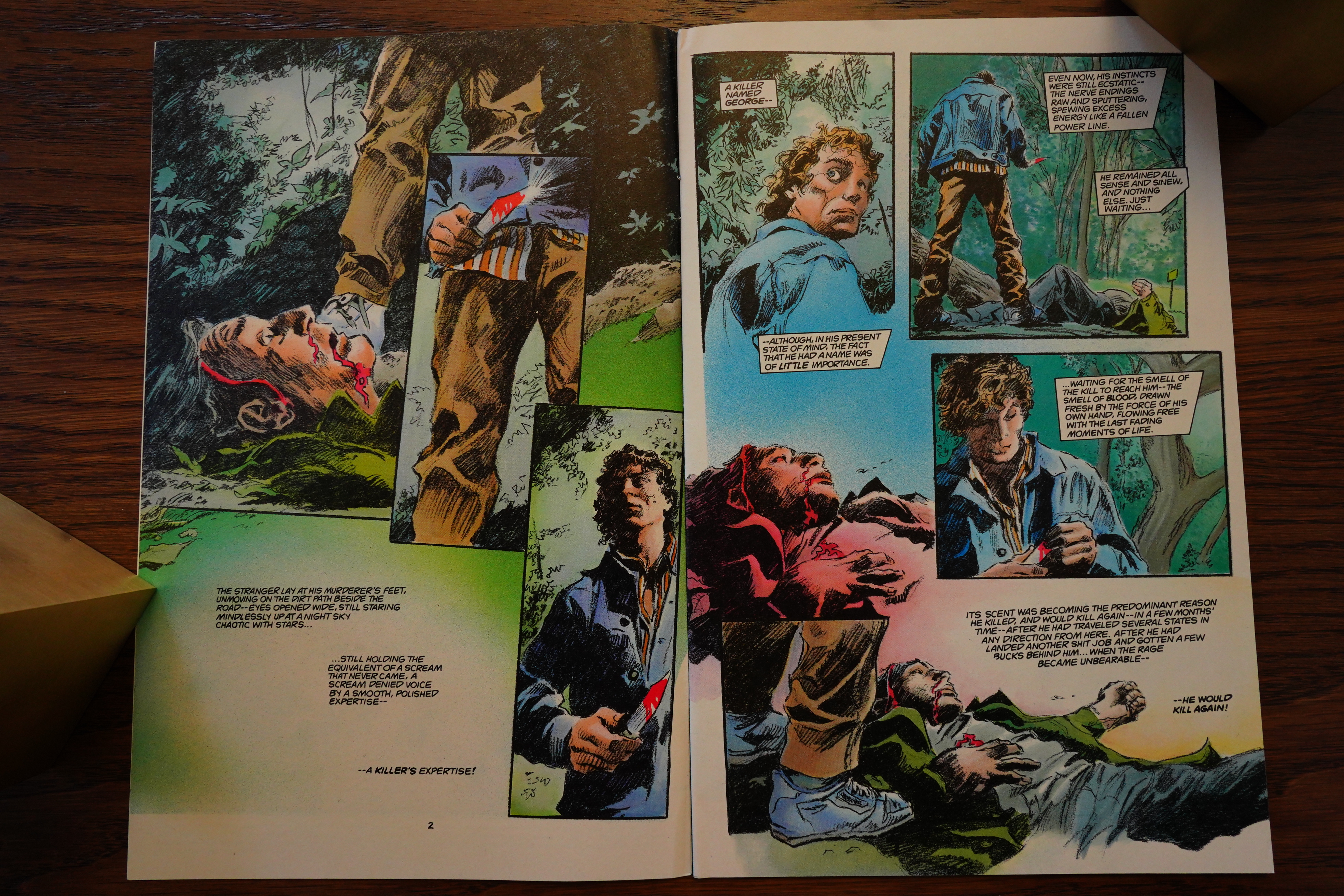
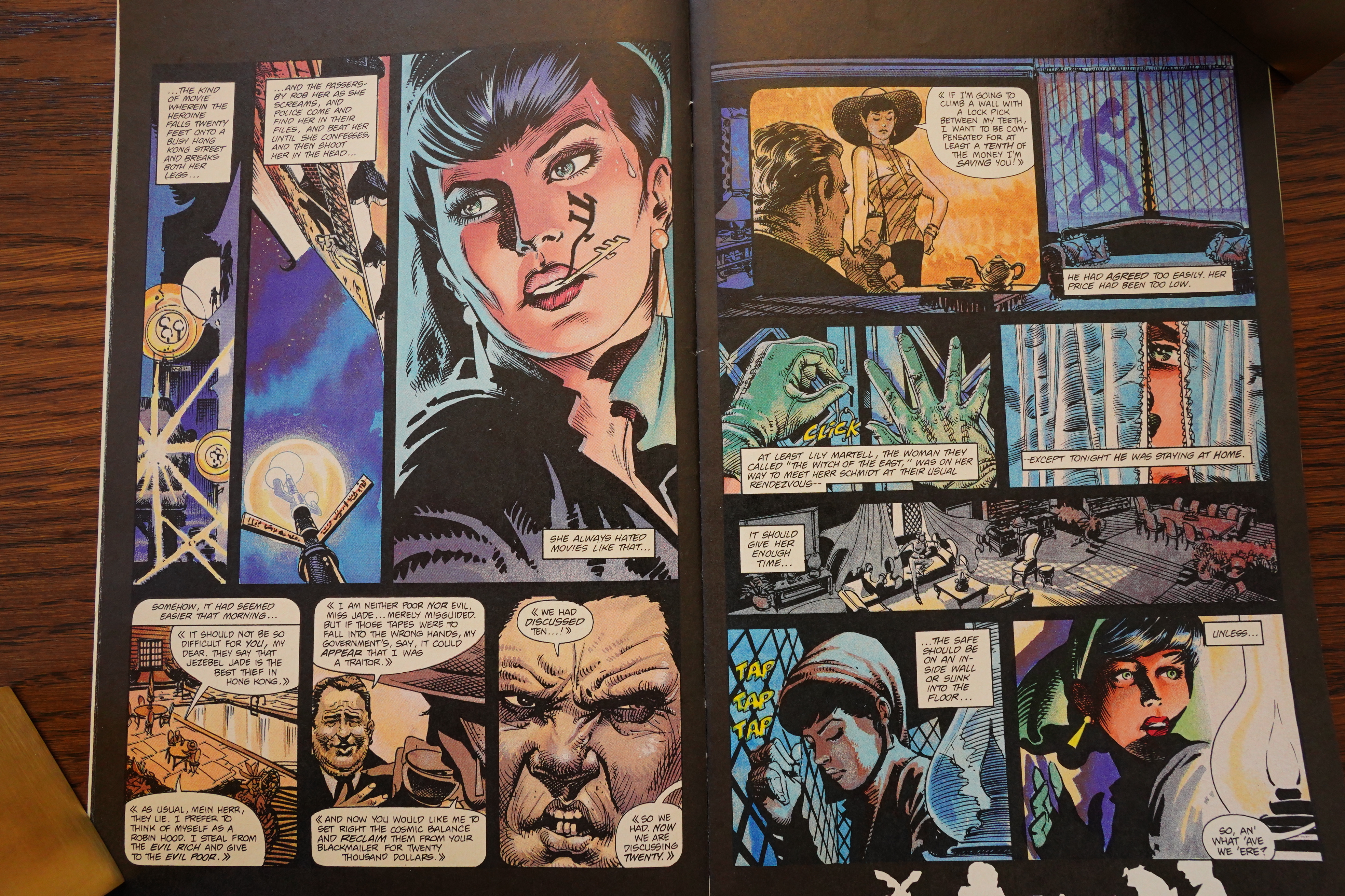
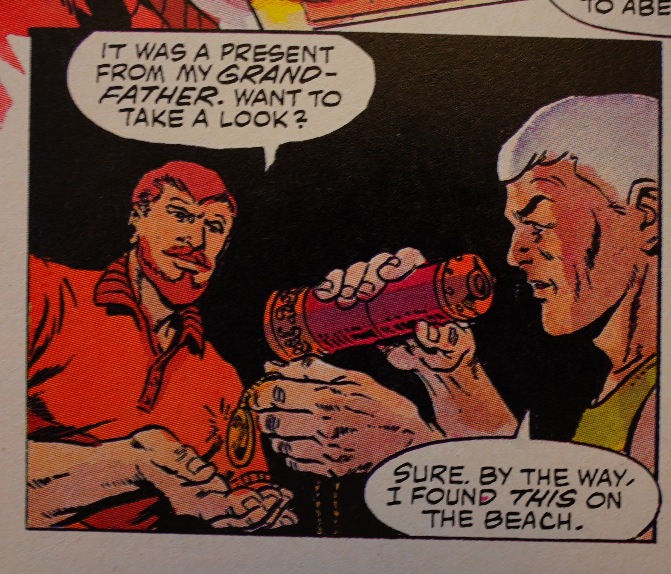
Oh, when I said the kids don’t appear — that’s not quite right. We frequently get silhouettes of them reading the book, which is a fun touch.
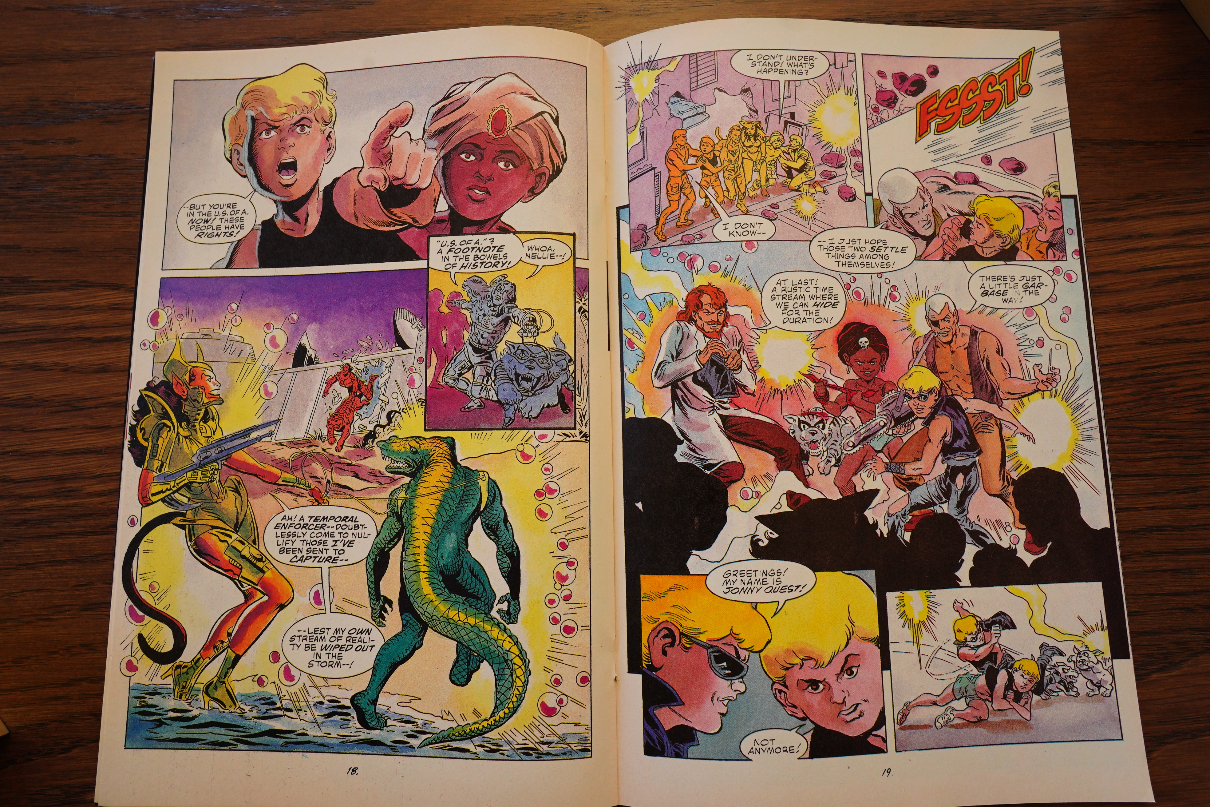
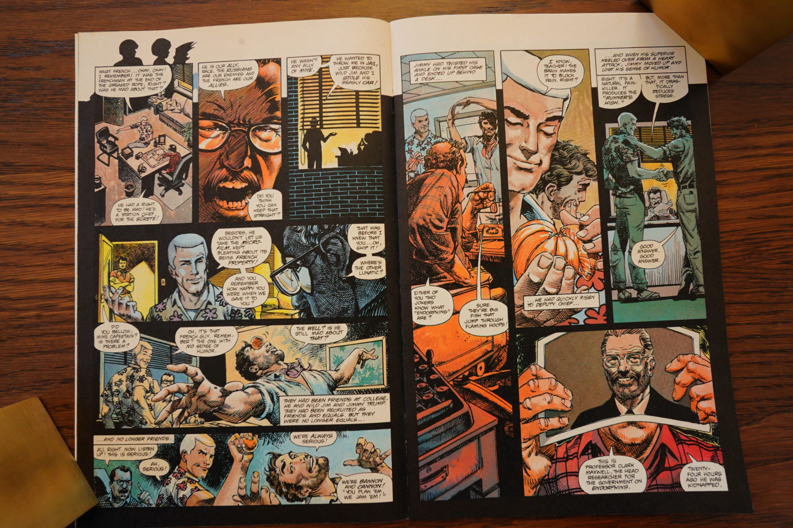
The three issues tell one single story, but it does take some detours.
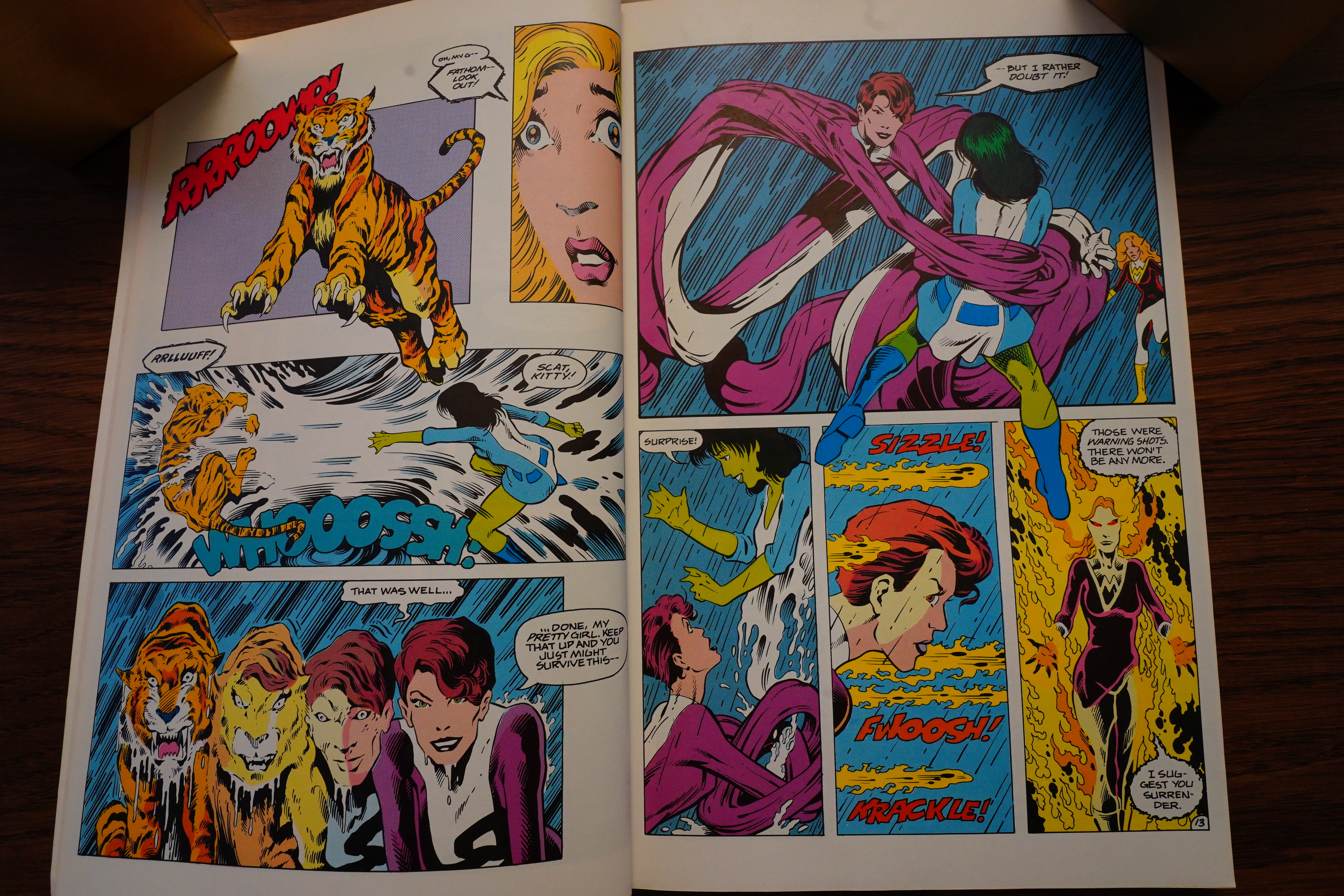
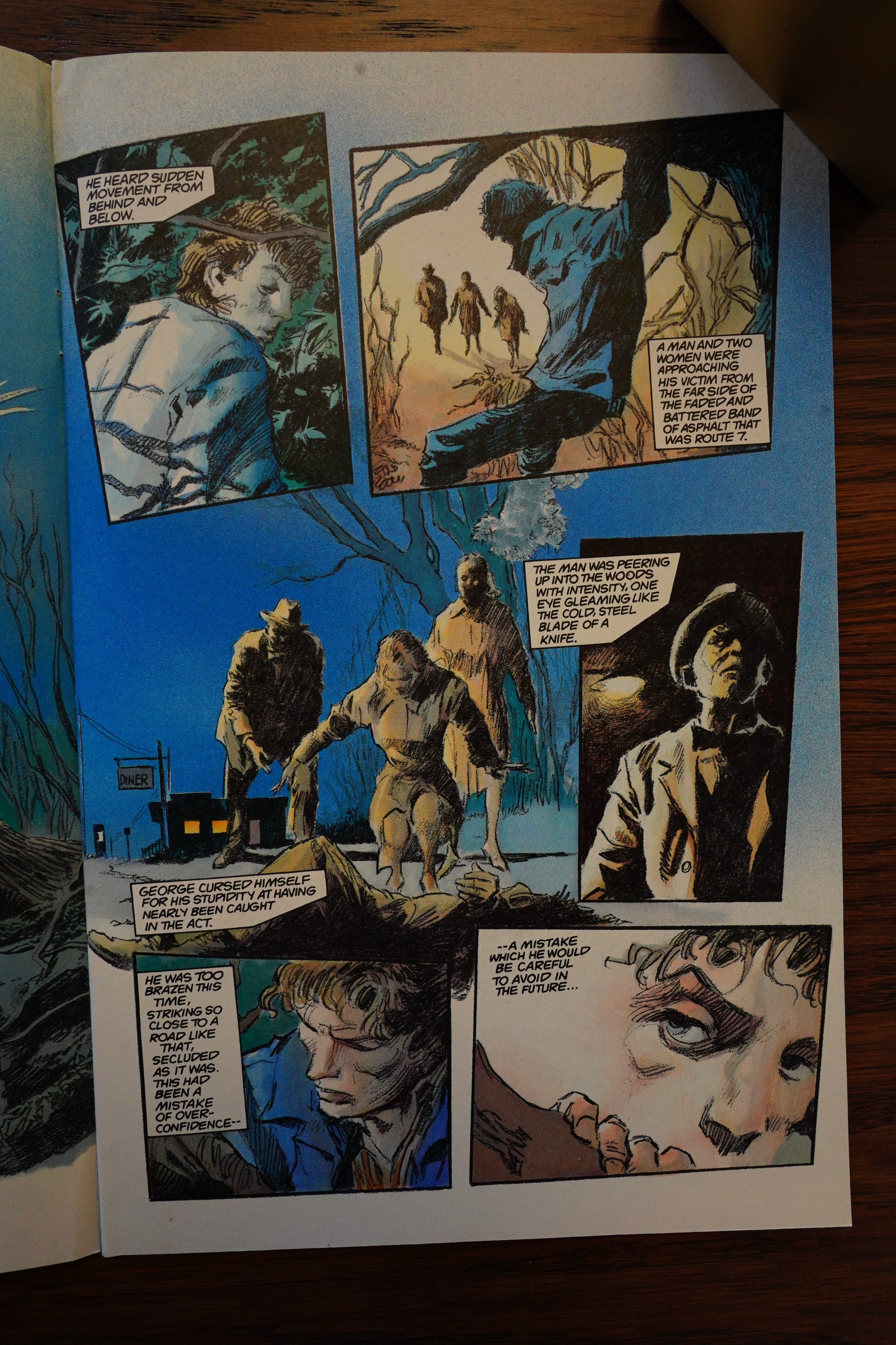
Kubert’s artwork is solid — it’s got that moody, slightly noir feel going on, and he’s got an attractive line.
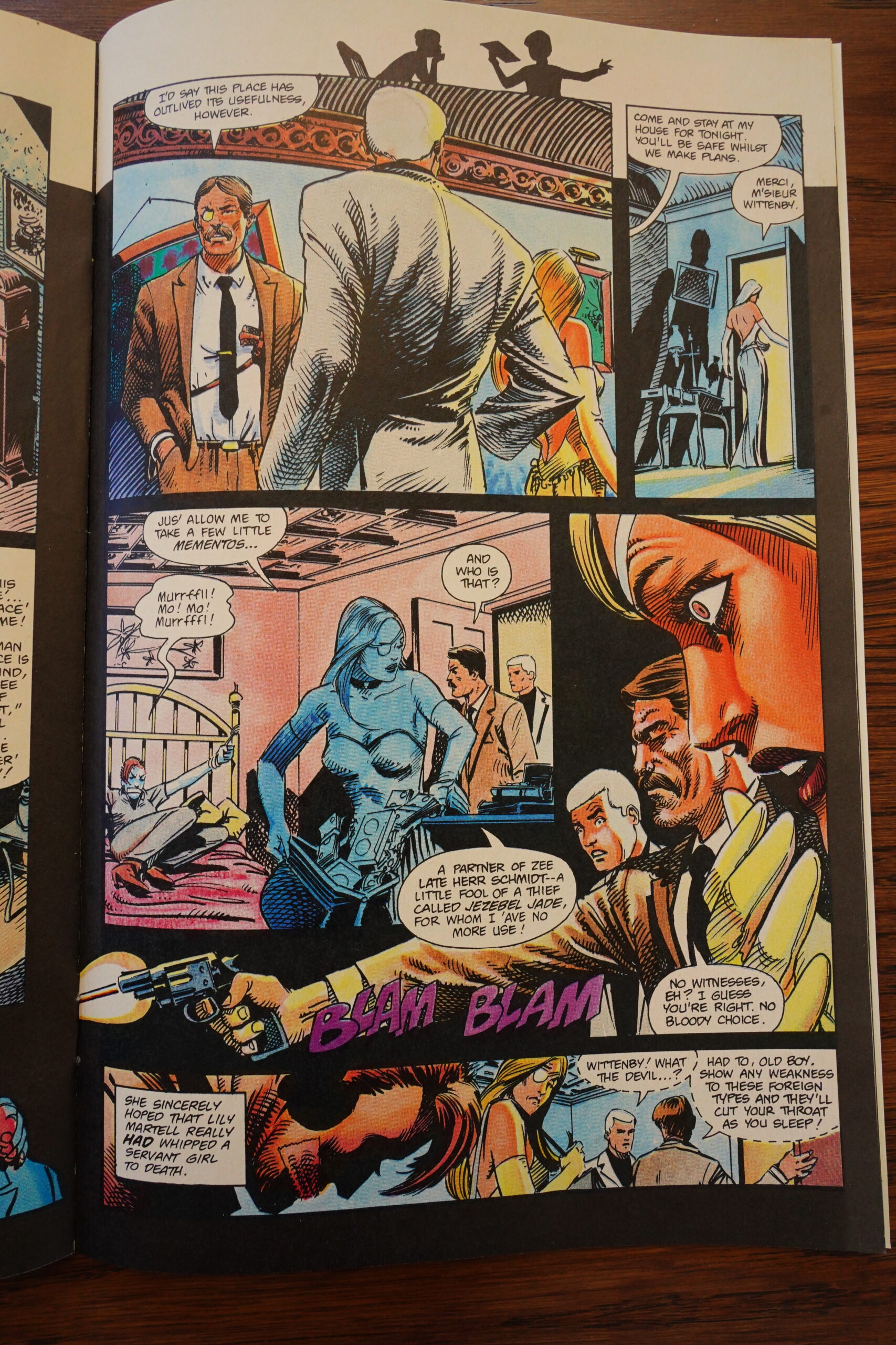
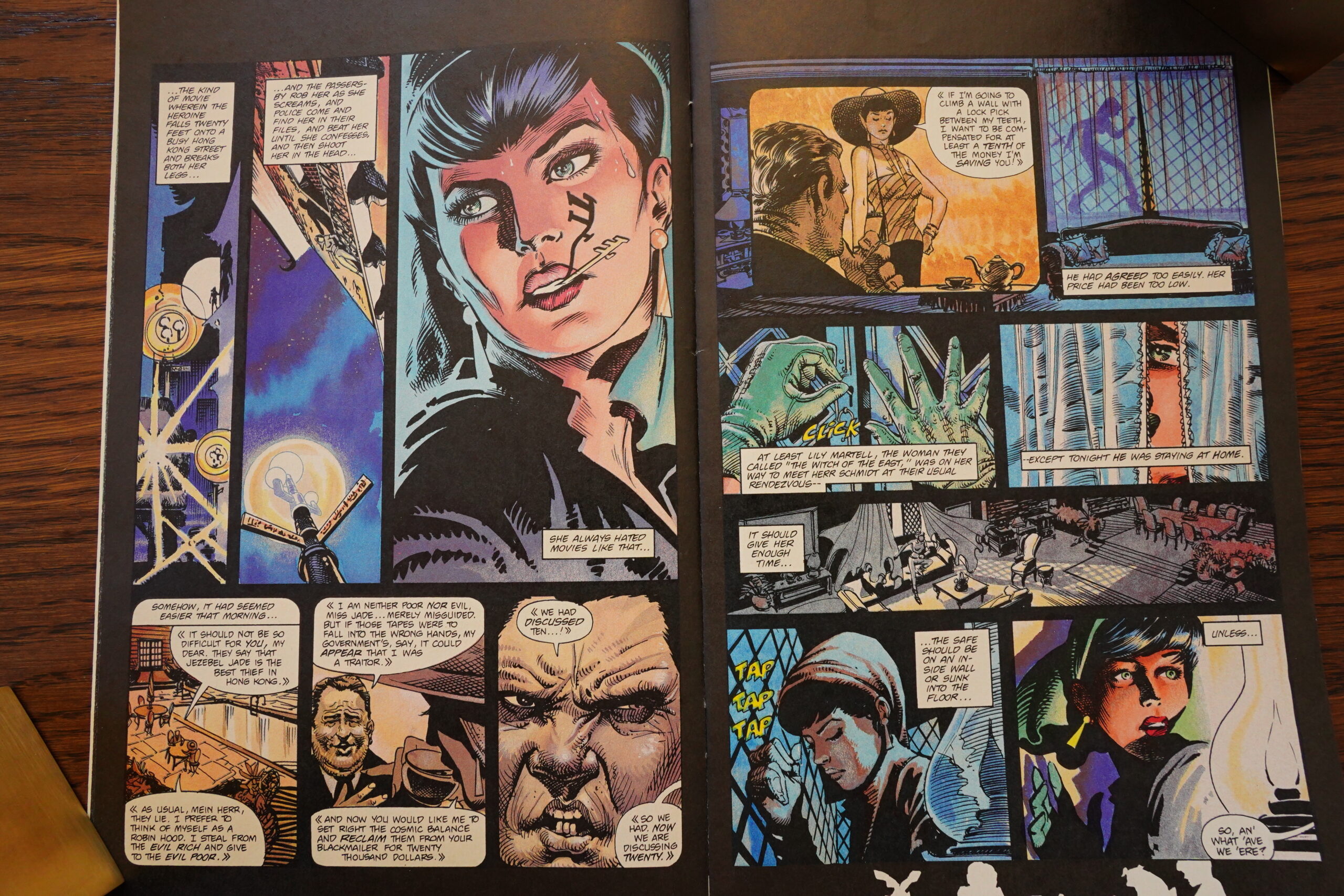
I’m not sure the story actually makes much sense — Race’s boss appears and randomly kills a woman (that he thinks is Jezebel Jade). Just to impress this other woman?

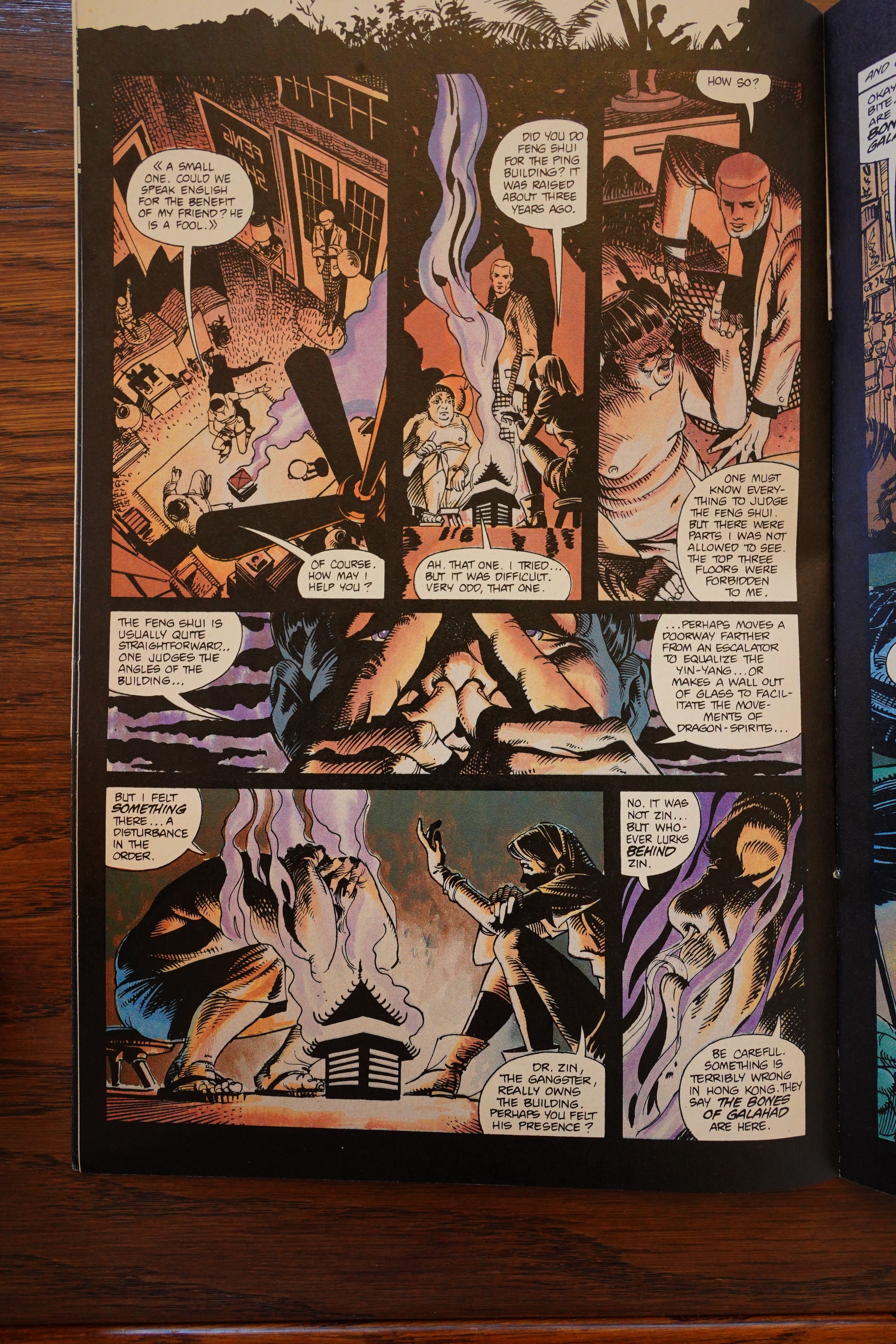
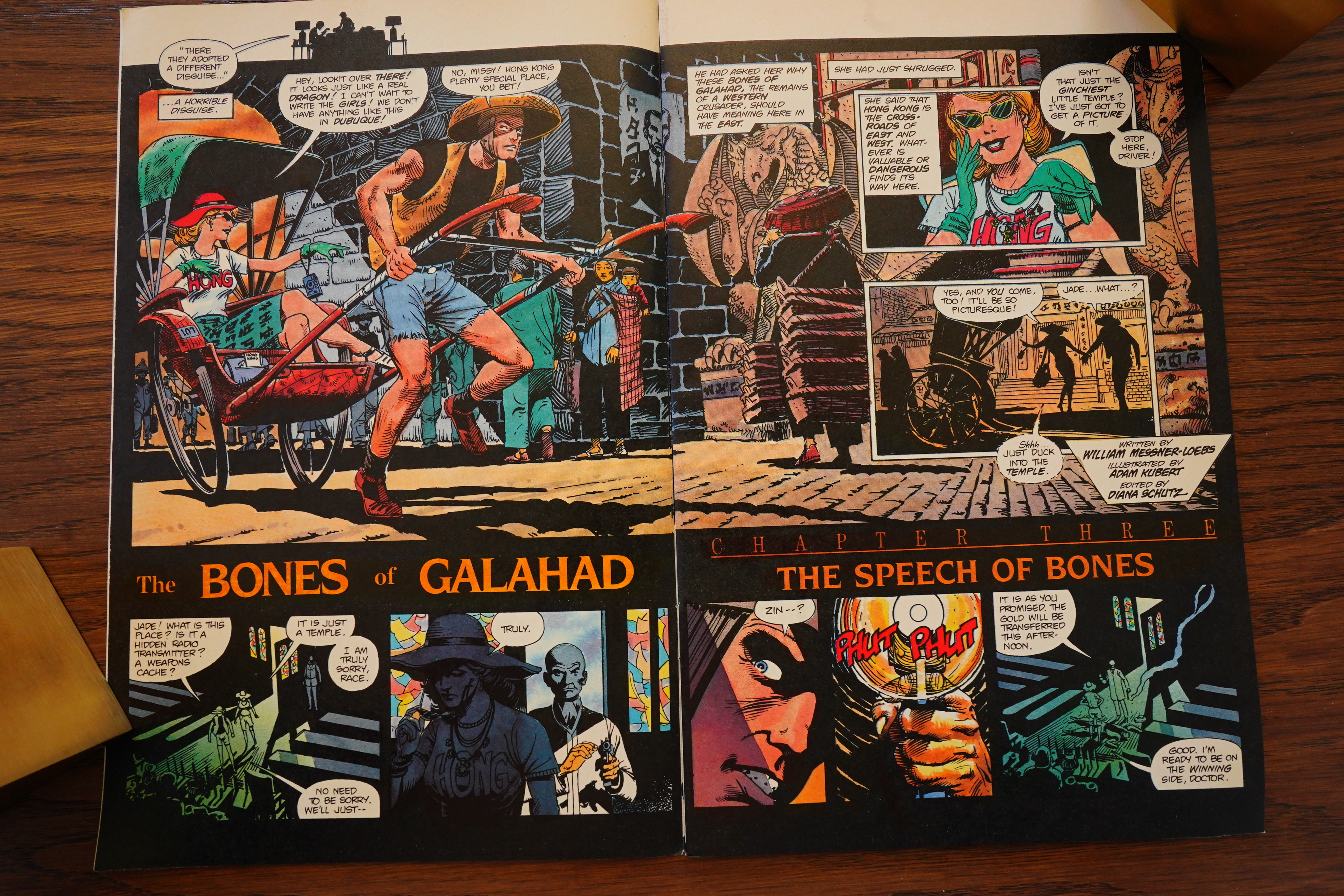
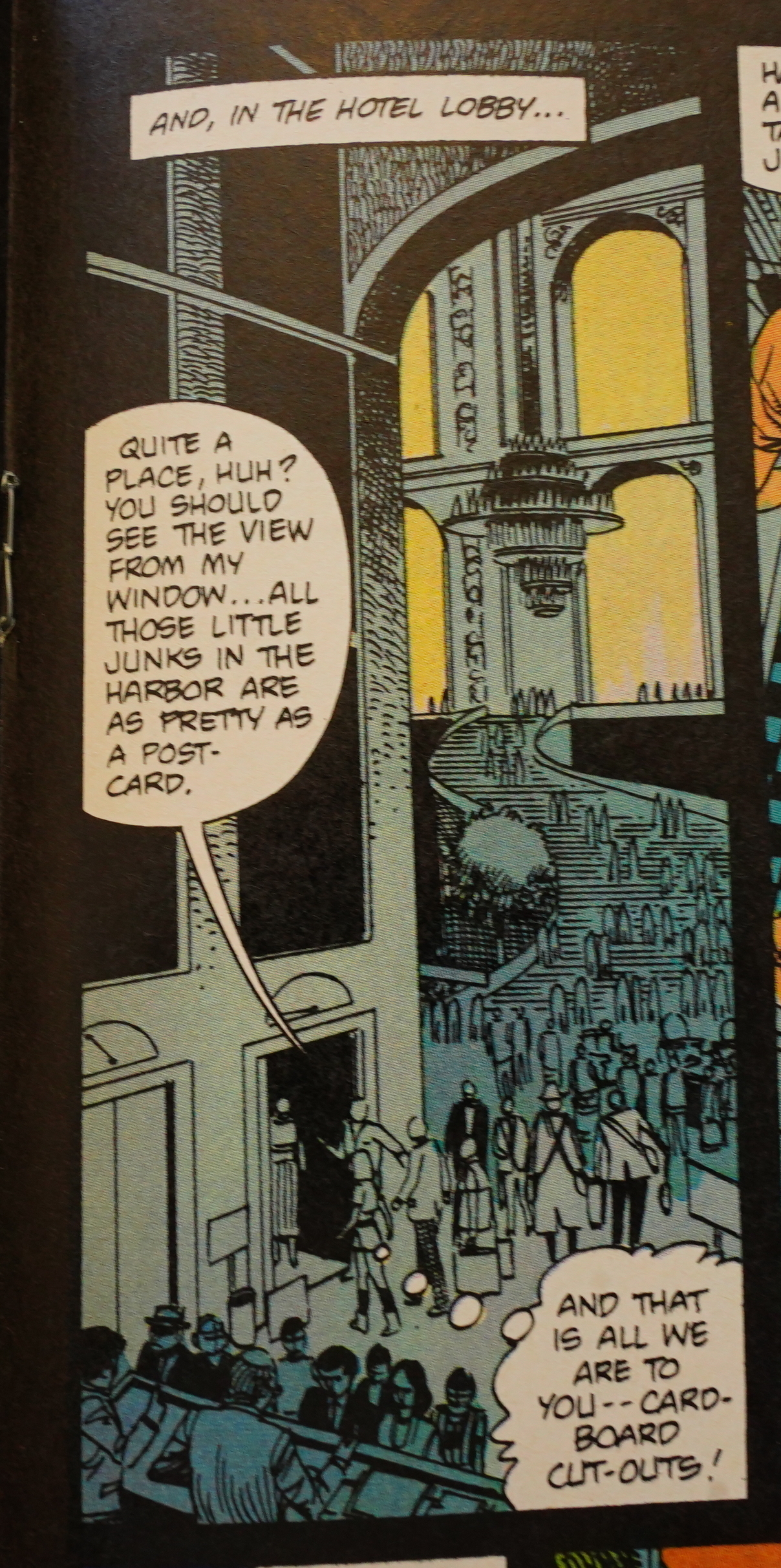
And… they consult a feng shui guy to get the beef about the building where the Evil Main Guy lives? It rather feels like Messner-Loebs is just dropping in stuff he feels is Hong Kong appropriate to pad the pages…
All of a sudden, Jezebel Jade starts giving the agent the side eye because they’re not respectful enough of Hong Kong traditions!?

Er… what?
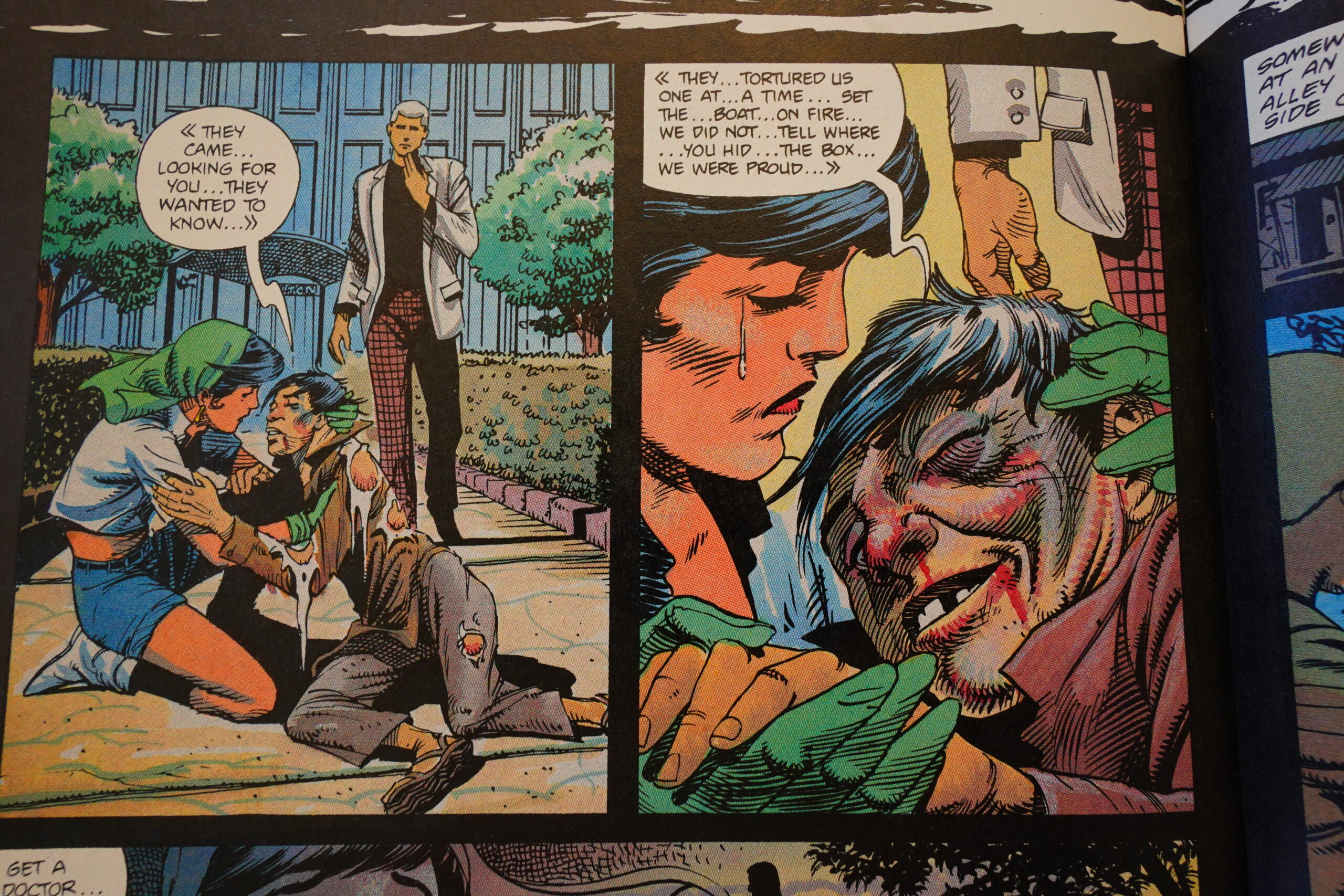
And then Messner-Loebs fridges dozens of people (off page) who were protecting what they thought was Jade’s box of treasures. It was really just a box of make-up that Jade had made those poor people hide for her, and…
I cannot state this strongly enough: “Wat”.

See, she used the make-up to disguise Race as a rickshaw guy from Hong Kong. Amazing, huh?
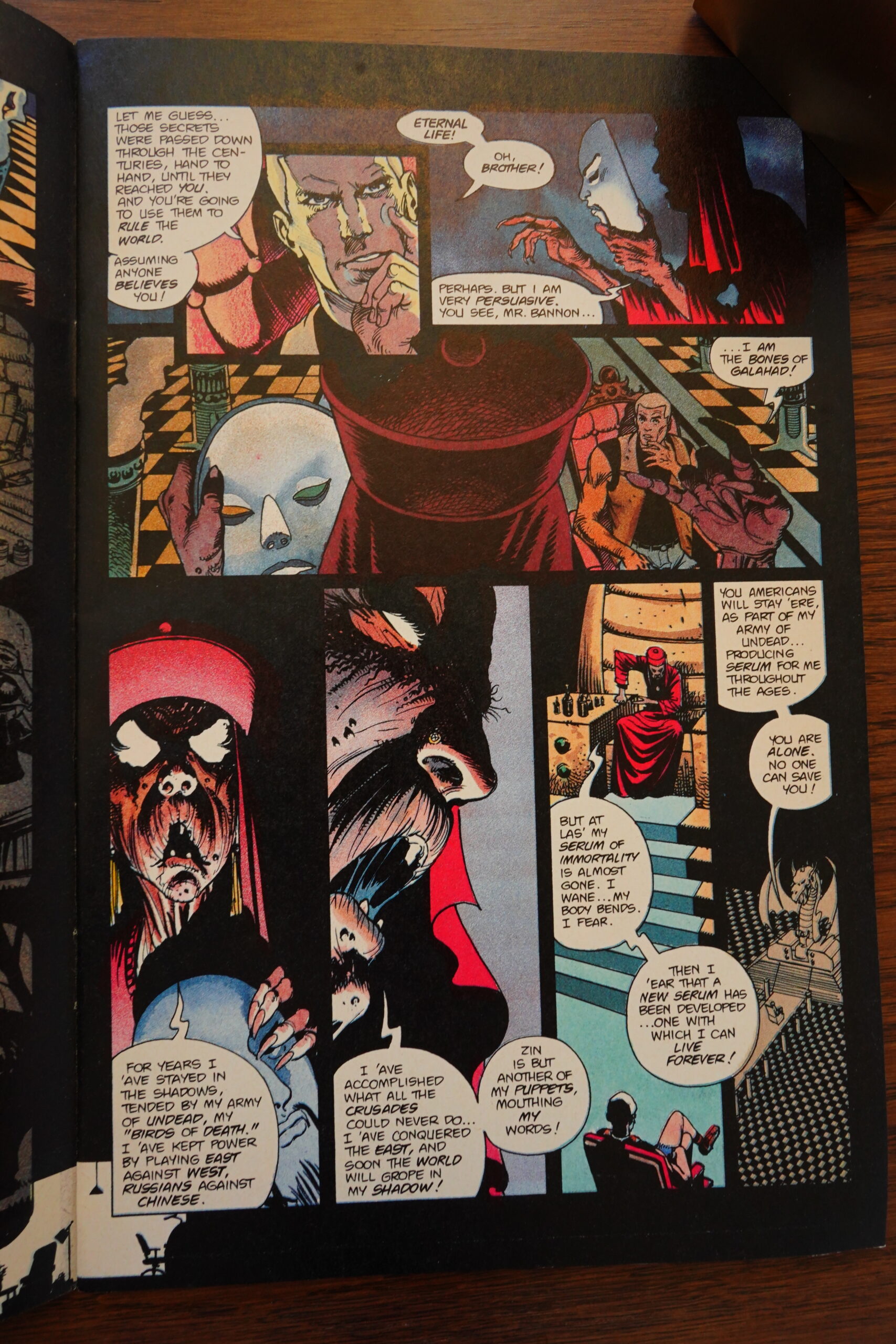
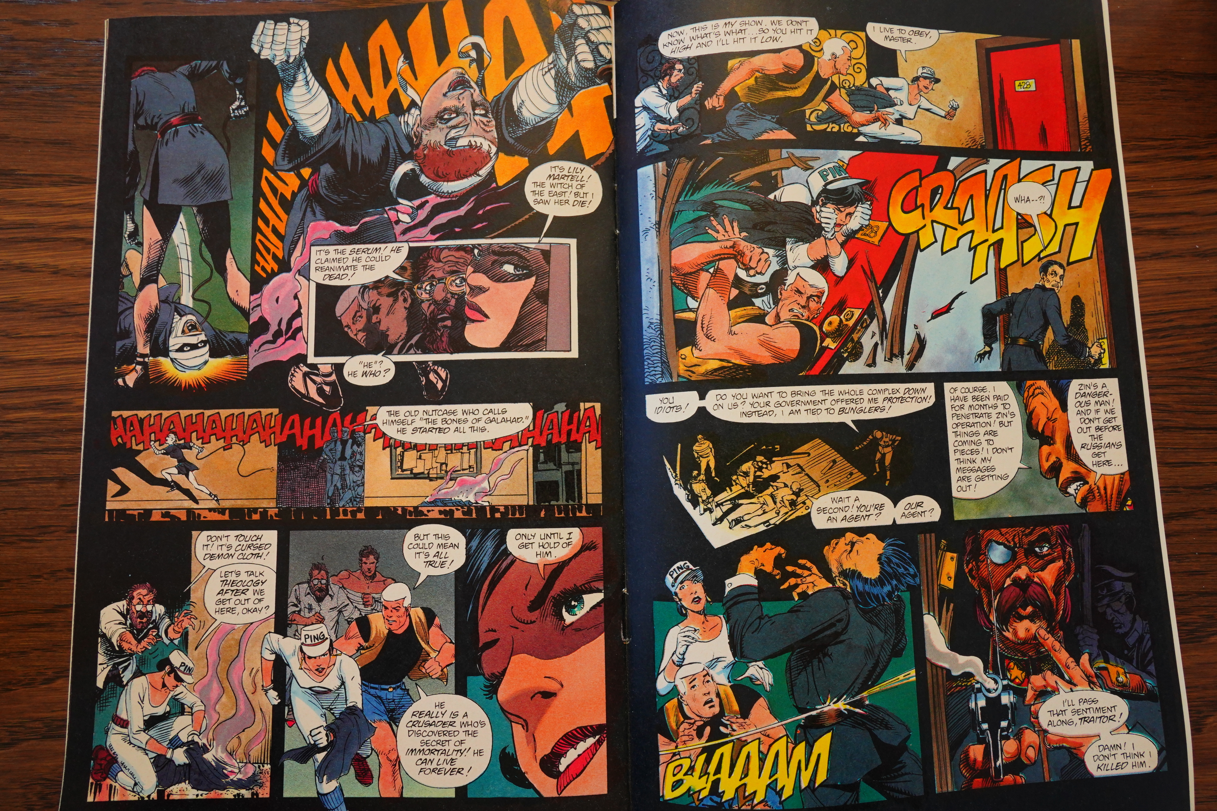
And the major bad guy is an ancient soldier from the Crusades, who has arranged to have Race kidnapped because he wants to have his immortality serum recreated, and he thinks that Race can help because… because…
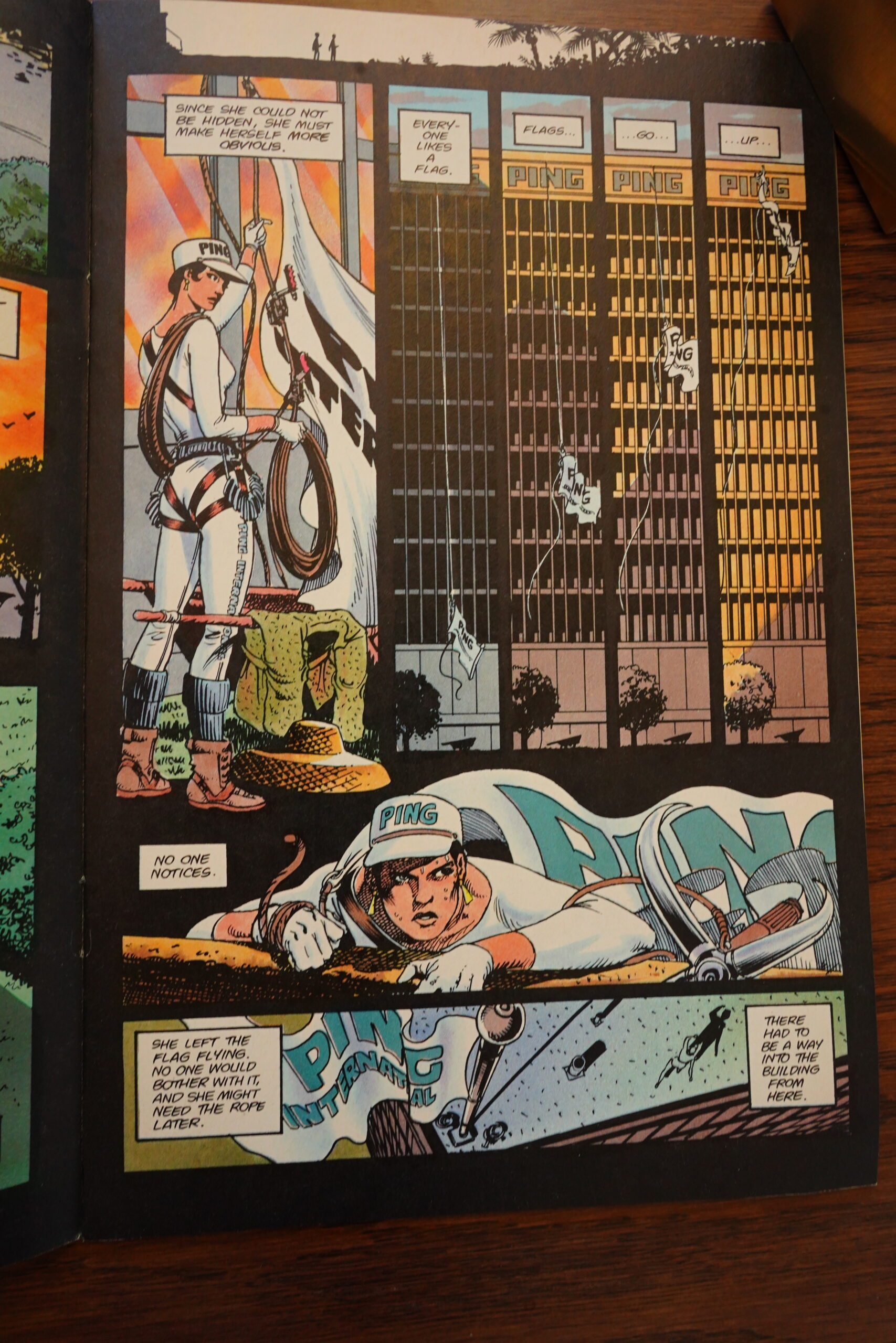
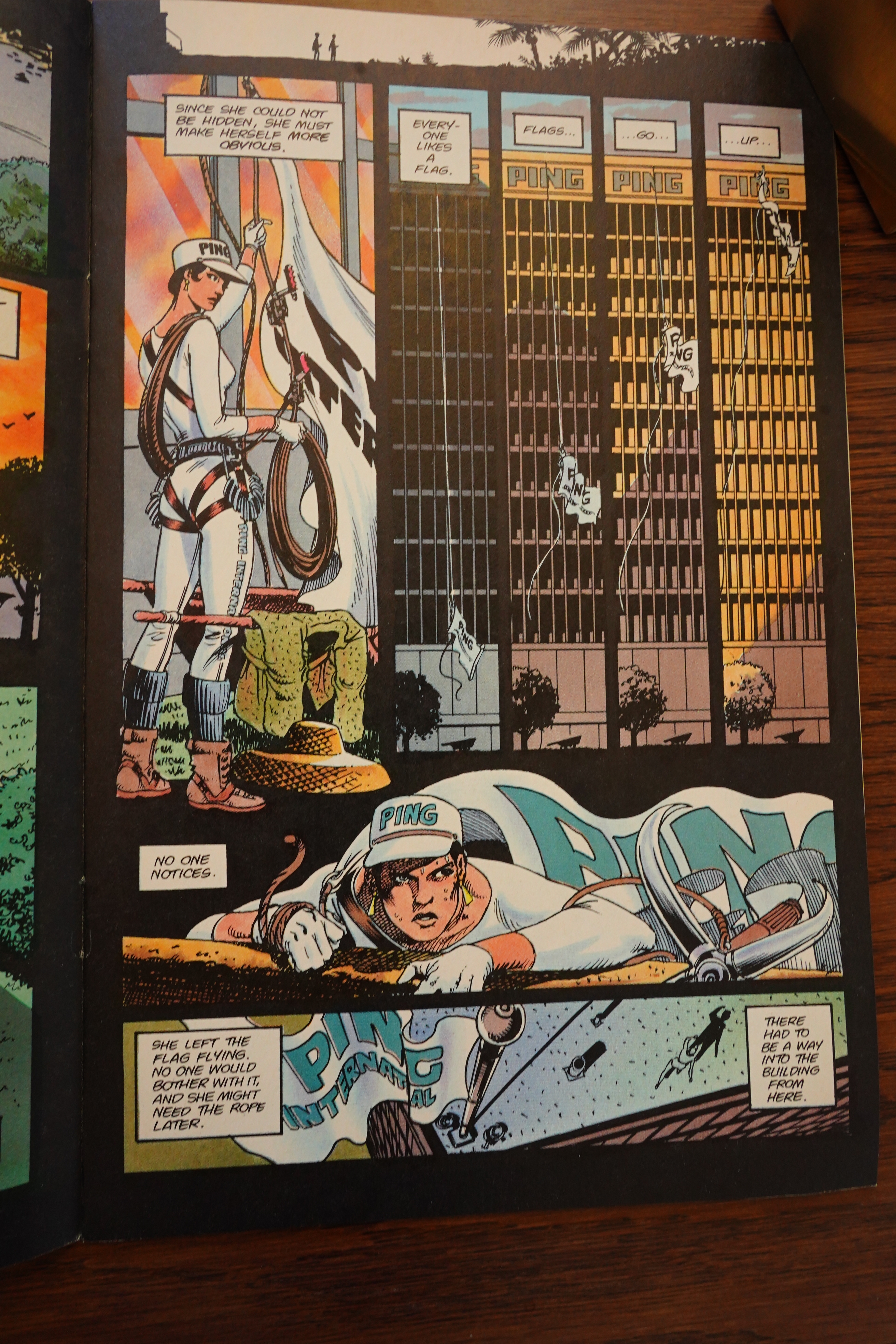
Yes, nobody notices when you hoist a flag up the walls of a sky scraper — everybody does that every day. That’s totally how you transport a flag to the top of a building. They don’t have elevators. Very few people know this.

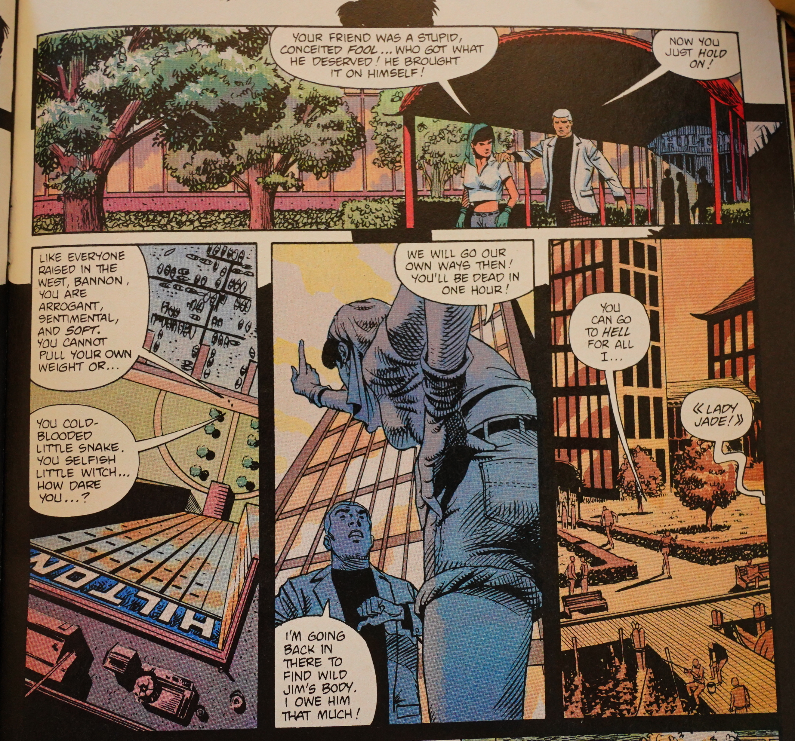
The denouement involves about two dozen characters, and I’m not sure whether Messner-Loebs wanted this to be as funny as it is.
So apart from Kubert’s artwork, this is a bit of a mess. I wonder whether Messner-Loebs had to come up with the story in a hurry because the Jonny Quest license was ending, and they absolutely had to get the series out before the end of the year?
Amazing Heroes #152, page #79:
Joe Kubert is one of the undisputed
masters of comic art and storytelling.
His school of cartooning has trained
and brought us many talented artists,
not the least of which are his own
sons. Adam Kubert is the artist on
Jezebel Jade, the new three-issue
mini-series from Comico, and here he
shows that he’s learned an incredible
amount about comics from his father.
Jezebel Jade is a spin-off from
Jonny Quest, and Jonny is the one
who introduces the story. He and
Hadji are cleaning up Race Bannon’s
room when they chance upon a
manuscript he’s written. Not realizing
it is autobiographical, they launch into
reading the story of Race’s first
encounter with Jade. On a spy mission
to Hong Kong to rescue a scientist
who may have the secret to eternal life,
Race meets the best thief in Japan,
Jade, who is disguised as a French
double agent.
The book is full of espionage and
skullduggery, with more than a few
hints of old-time movie serials thrown
in for good measure. Scripter William
Messner-Loebs manages to work
humor and warmth in amongst the
triple-crosses and crossfires, no mean
feat for any comic scripter. His
dialogue is naturalistic, and he
manages to portray accents in an
easily readable, non-stereotypical
manner.
However, two moments seem
incongruous in the story. First, Jezebel
Jade uses colored contact lenses to
disguise herself. The story is set
sometime before 1976, and it is my
understanding that colored lenses
were not able to be worn longer than
a very brief period of time prior to a
few years ago. This is, for instance,
why the actors on the V TV show
could not keep their cat-eye lenses in
for more than a few minutes.
Secondly, one of the characters does
a double-cross at the end of the story,
but absolutely no attention was called
to it. I had to reread the pages four
times to find out where a certain
character had gone before I realized
what had happened. This was sloppy,
and could have been played much
better.
Adam Kubert’s art rates nothing but
praise. His storytelling is immaculate,
his figures are strong and sure, and
his inking style no longer looks
completely like his dad’s. Adam seems
to have picked up some inking tips
from Gil Kane and Moebius of all
people, because the newer style is
much stronger than some of his past
work. Adam is going to do his father
(and comics) proud, as his near
beginning work is so strong that it
leaps ahead of what most old pros can
do. Watch this guy!
Jezebel Jade is an entirely enjoyable
espionage comic that works on every
level except the two points noted
above. While it is nothing revol-
utionary in comics, it is such solid
“good comics” that it should not be
ignored.
GRADE: MINT
-Andy Mangels
Back Issue #90, page #72:
STROUD: I may not be the best versed in the Jonny
Quest storylines, but it seems to me that Race Bannon
was portrayed kind of differently in this series. He seemed
much more flippant and in your face. Was that deliberate
or a departure?
MESSNER-LOEBS: Part of it was that it was always a
complicated thing to have Race and Jonny Quest and
Jezebel Jade or Dr. Quest and Race and Jezebel Jade where
they’re essentially having a storyline that we don’t need
to see in its entirety, because they’re involved in some
things that a kid would not find important.
My favorite item in the whole series, especially in terms
of Race and Jezebel Jade, is when they were having
some sort of conflict about something. Probably about
Dr. Zin, because Dr. Zin was always on the table
when Jezebel Jade was around, and so Dr. Quest said,
“Oh, we should really get Race in on this. Do you know
where he is?” And the response from Jonny was, “Yeah,
he’s in the library, and he’s been in there for about half
an hour with Jezebel Jade. I’ll go and get him.” Then Dr.
Quest said, “Okay, fine. Oh. Half an hour. Um, Jonny?
Knock first.” [mutual laughter]
KUBERT: That’s great.
MESSNER-LOEBS: So there was always this sort of
subtext of stuff that was going on. The other thing I
found that I had to sort of force myself to forget
when I was writing Jezebel Jade was that Doug Wildey
had given her Mae West’s voice. Back in the ’30s, in the
pre-Code days, [Mae West] was just this red-hot babe.
But for me and my generation that was just such a
cartoony parody of a voice that it has no sexual feeling
to it at all.
So ultimately, what I was getting at was that I was
trying to get Race to come across differently to Jezebel
Jade than in the way he was always coming across to Jonny.
I figured he would be more like a James Bond character.
I was trying to get a little more of that into the story.
STROUD: How did you decide on Hong Kong for a setting?
MESSNER-LOEBS: I think I was looking through National
Geographic and came upon Hong Kong. I think what
I was really thinking was that Jezebel Jade was always in
Jonny’s world and I wanted to see what her world would
be like in the sense that it would be somewhere in
China. We are never explicitly told if she’s Japanese or
Chinese or a mixture or what exactly her heritage might
be. The assumption is that she is part of that general
part of the world.
By the way, you can’t help but be pleased when you
put something into the story and it actually survives not
only being edited, but being drawn and inked. I had
a little note up on the wall that it was supposed to be
a sort of Simon Templar, someone who by that time
would be about 70 years old, and the impression was
that he was a mentor. And, of course, I couldn’t go any
further than just Simon, but to have it survive and
getting it in for all my friends who were big fans of The
Saint, well, Adam once again came through with that.
STROUD: Adam, how big a challenge was it to draw
all the details for that background? Was a lot of
research involved?
KUBERT: Yeah. We’re talking the days of having to
crack a book and going to the library, which was fine.
It was just part of the job. I definitely had to use lots
of reference for it.
MESSNER-LOEBS: I think one of the other things I
had in mind as far as using Hong Kong was the idea
that it would be reasonably accessible for you. I know I’ve got a friend who was
also an artist who laid into me with, “I don’t know why you writers are not forced
to Xerox off all the references you found for we artists to have something to work
from. Or you just make the stuff up.”
I could certainly see his point, but I could also point to artists like Adam who
think that actually doing research is part of the job.
KUBERT: It definitely is part of the job, but I tell you, these days I don’t even have
to open a book any more. Just type it in and out comes a gazillion pictures.
MESSNER-LOEBS: I know. It is so wonderful. I do my own art every now and
then, and to be able to just bring up authentic Indian moccasins without having
to go into Old Fort Wayne and taking pictures, it’s just such a relief.
KUBERT: And that also goes not just for setting, but for characters. I drew this
book for Marvel called Axis, with all these characters in there, and, of course,
I don’t know what the costumes look like or what their powers are or even who
their alter egos are. I just Google it and instantly it’s there for you to find out for
yourself. It’s really, really awesome.
STROUD: Did you two conference much during the series, and was it full script?
MESSNER-LOEBS: It would have been full script. I almost always worked in full
script unless I changed for a particular reason, but I’m sure this would have been
a full script.
It seems to me it would have been a good idea if we’d been doing a lot of
conferencing, but the reality of it is that through most of my career, where I was
doing three or four books a month, it wasn’t really very helpful. It just slows you down.
KUBERT: I was scared to call him. [mutual laughter] I mean, I was really pretty green.
I hadn’t been in the field for that long. As long as I understood what was going on,
there was no reason to talk other than to schmooze, and I wasn’t comfortable
schmoozing, to be honest. I don’t think we spoke at all on the project.
MESSNER-LOEBS: I’m pretty sure that we didn’t. I would have been terrified of
your last name. [mutual laughter]
KUBERT: Just to circle back, Diana was just the glue that kept the whole thing
together. With her involvement, I didn’t have a reason to conference. There were no
questions with the script and she was the go-to person, so it all worked perfectly.
MESSNER-LOEBS: Of course, what no one realizes is that the rational voice in the
inner storm was provided by Diana. She just set her feet and would not tolerate
any startup work, at least on Jonny Quest, until we had an entire year in the can.
The publisher, no matter what they say, as soon as you’d have two or
three months’ of stories, they’d want to publish. No matter what was agreed to,
no matter how reasonable it is to get a backlog, but all the things that happen
in comics happened, but Diana would not hear of it. She held out for an entire
year of finished scripts in my case, and that included artwork. As a result, Jonny
Ouest was never late.
Back Issue #59, page #65:
“The Jezebel Jade series was a result of Comico trying to accomplish
two things,” says Schreck. “One: put out a female lead character
that might attract a female readership, and Two: give us the chance
to work more with Adam Kubert, who is a great person and an
amazing artist.”
In the series, Jonny and Hadji discover a manuscript in Race’s
room. They start reading and discover that it’s a story of Race’s
time in the Agency with Wild Jim. Race is assigned to bring back a
kidnapped professor and heads to Hong Kong, where he finds
treachery, betrayal, Jezebel Jade, and Dr. Zin.
Since the story is being read by Jonny and Hadji, Kubert came up
with a unique way to show that. “The whole story was reading this
manuscript,” he says, “and I thought rather than just do something
with the borders, maybe rounded corners or whatever, I decided to
do something a little bit different and have a small silhouette of the
characters over each two pages of the narrative. It made it fun for
me, and a little bit more interesting.”
And when the professor appears in the story, the fact that he
resembles Adam’s father, Joe Kubert, is not accidental. “I put him in
wherever I can use him. It’s a fun thing for me.”
The Slings and Arrows Comic Guide #2, page #349:
JEZEBEL JADE
Comico: 3 issue miniseries 1988
Spinning off from Jonny Quest, this miniseries spotlights
Race Bannon and Hong Kong’s best thief, Jezebel Jade, in a
fast-moving thriller. The Quests’ old foe Dr Zin has
kidnapped an American scientist who’s working on a
formula to prolong life, and it’s up to Jade and Bannon to
rescue him. Strongly plotted by William Messner-Loebs,
with plenty of action and surprises, the illustration by
Adam Kubert is excellent. Don’t be put off if you haven’t
read Comico’s Journy Quest (although you should): this is
superior adventure material.~FP
Recommended: 1-3
Here’s an interesting article:
Then, I met Adam Kubert with my wife, Kris, at a convention. I loved his work and even my father-in-law Neal Adams used one of his Wolverine covers as inspiration and a color guide. Burning red and full of vengeance. Neal absolutely loved that cover. I told Adam that I totally loved his Jezebel Jade series. He sat back in his chair, laughed out loud and threw his hands into the air.
“I hated that series,” he screamed with humor. “It was a nightmare.” Then he paused and collected himself. “I made a terrible decision to create that border of the kids reading Race Bannon’s diary. Every single page had to have the kids in a different position on the top of the page. I used to wrack my brain to come up with new positions for them to be in. On the bed. On the floor. Jonny reading. Hadji reading. Hanging off the bed. I simply ran out of positions for them.” Then he laughed. “But it was a great series.”
The series has never been collected or reprinted.