1992: Fathom

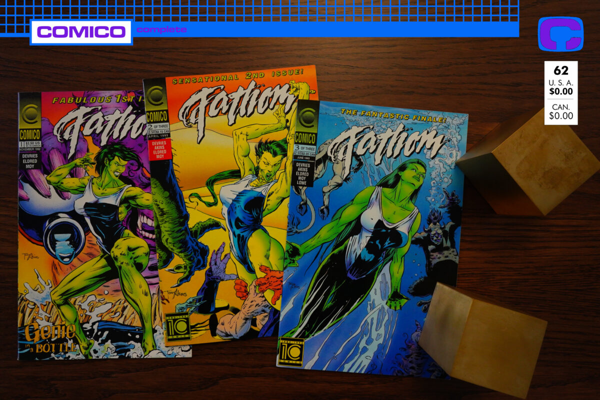
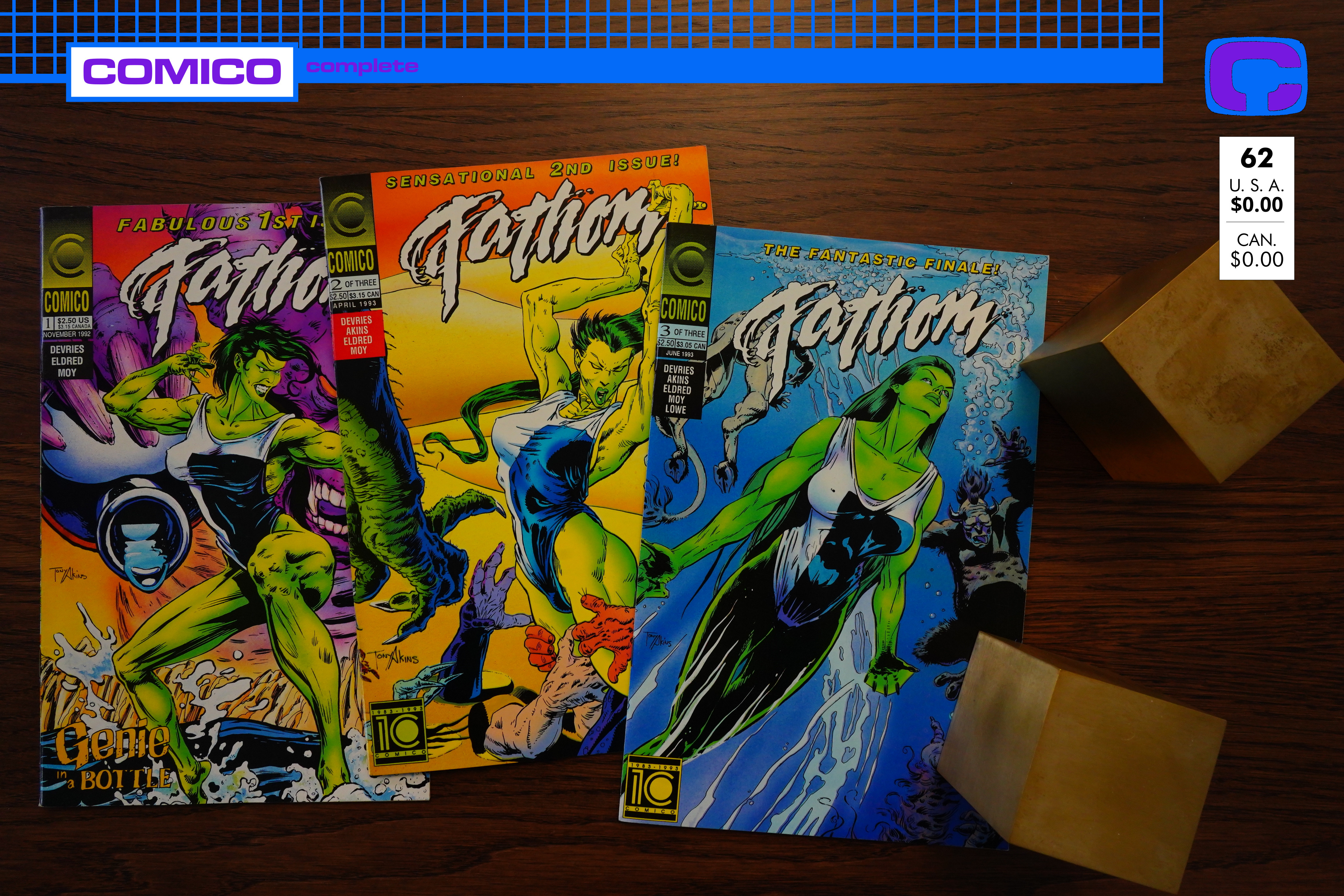
Fathom (1992) #1-3 by David DeVries, Tim Eldred and Phil Moy
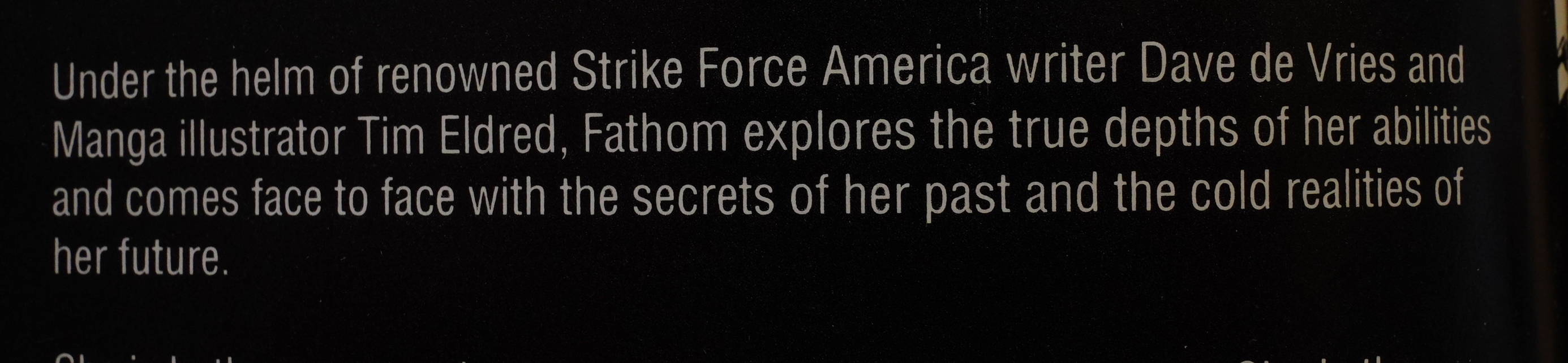
Is “renowned” the correct word to use for somebody responsible for probably the worst comic book I’ve read in years?

Anyway, my expectations for this book couldn’t be lower.
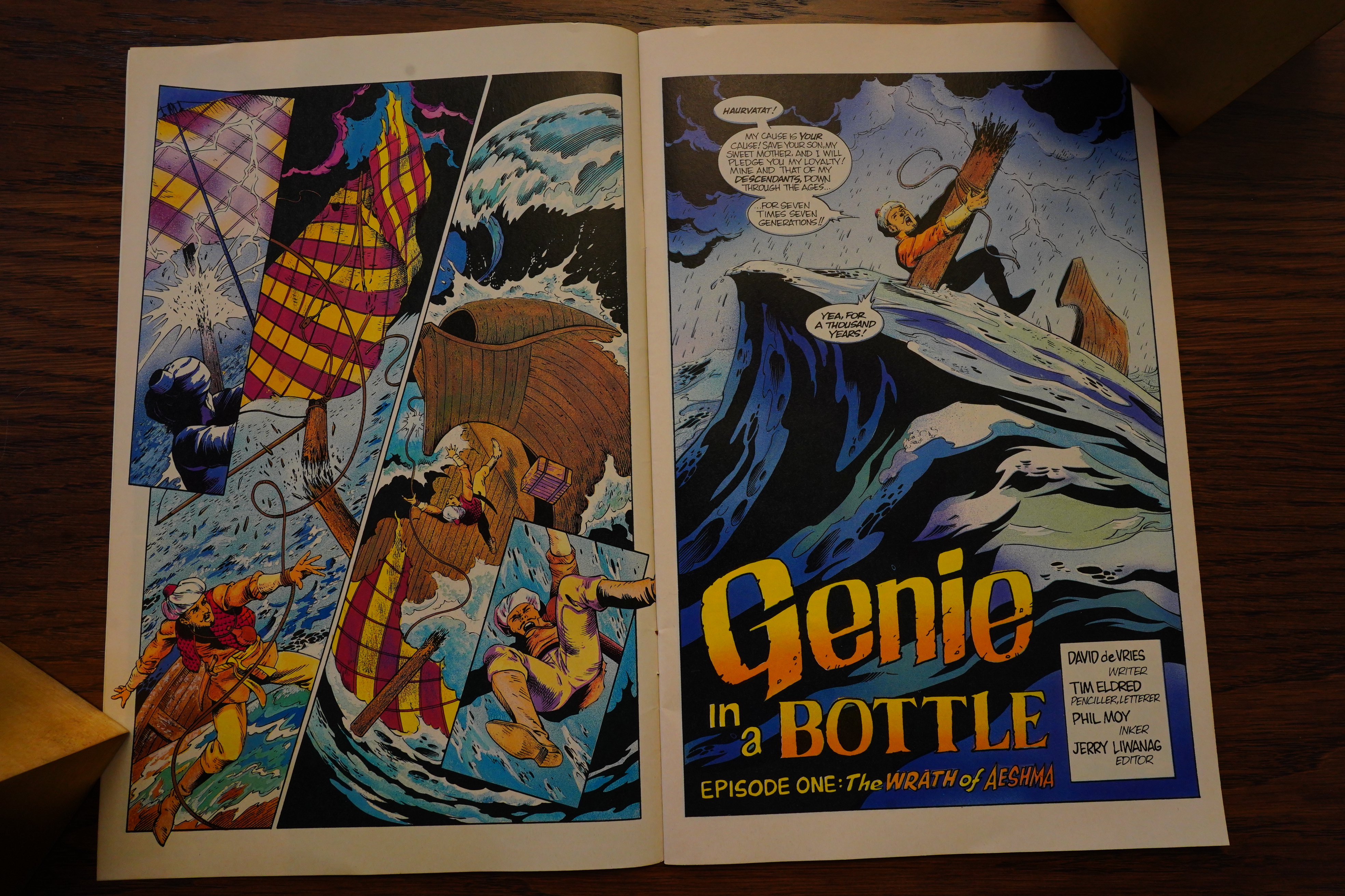
Well, OK, that doesn’t look bad, really.
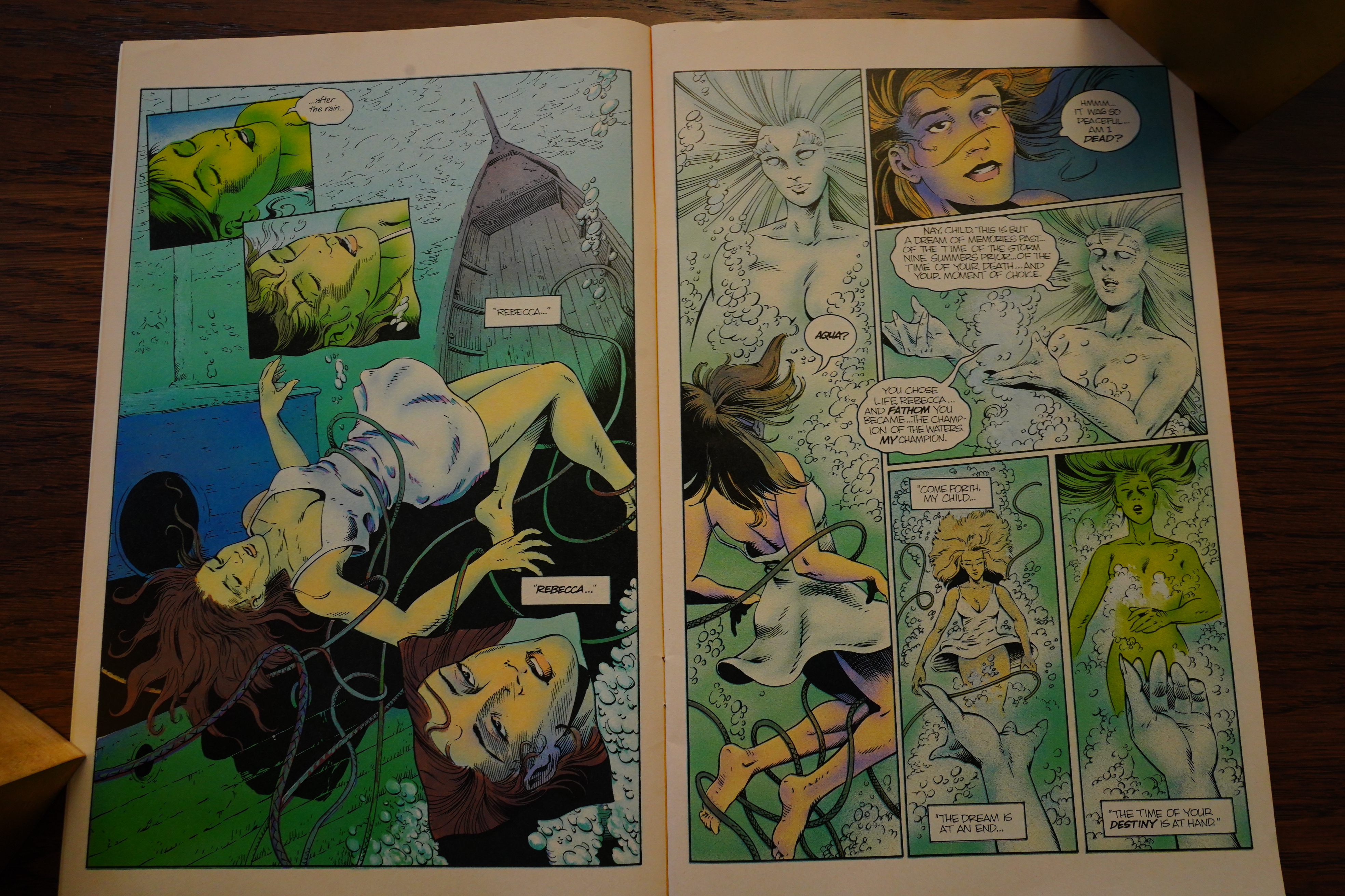
The plot is, basically, that Fathom is being sent back in time to help some guy… by a water godess I don’t think we’ve seen before? (Oh, if you’re new to this blog series — this series is a spinoff from the long-running Elementals series.)

But OK, fine.
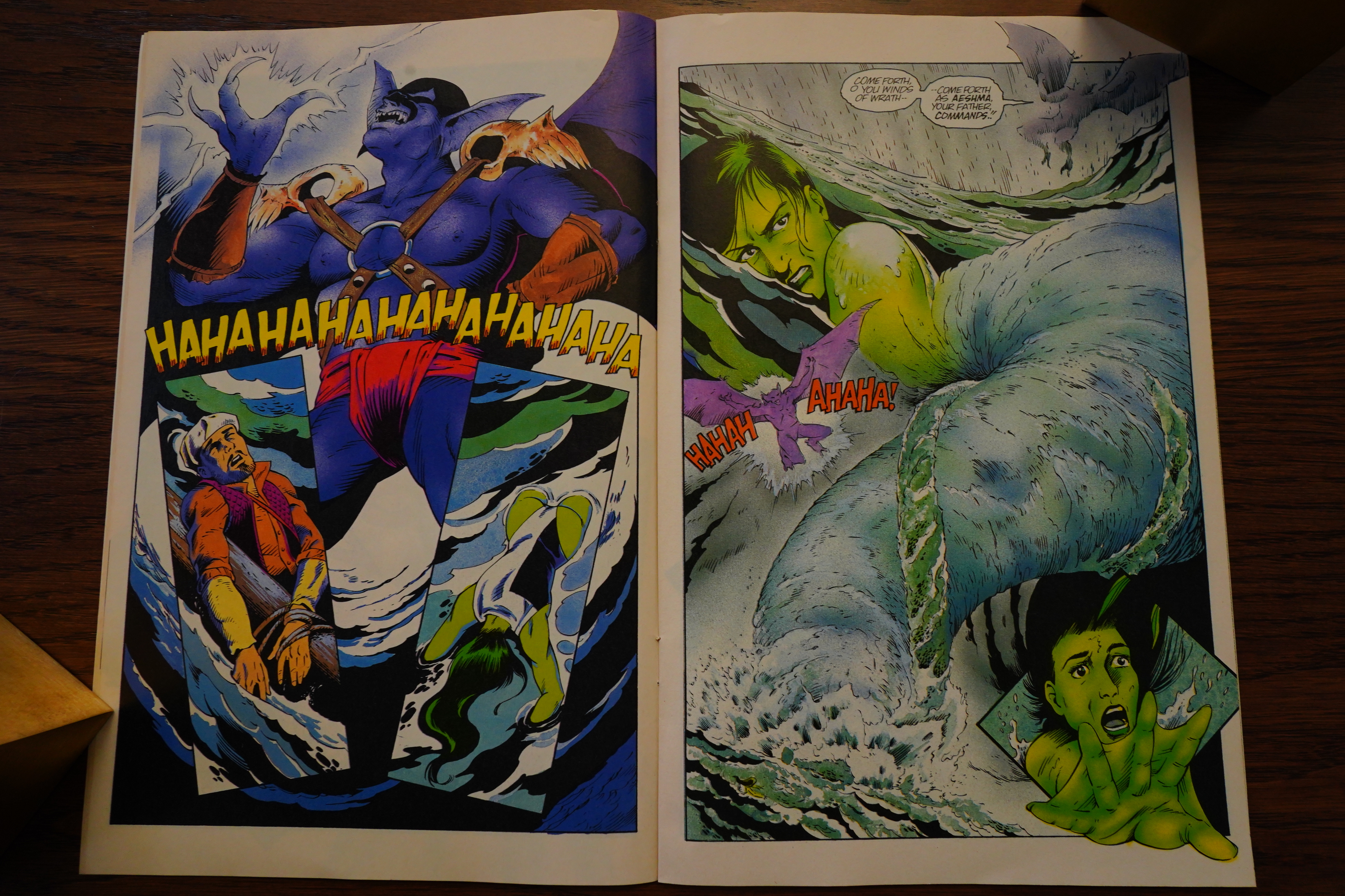
Err… OK, so an evil demon wants to kill the guy and Fathom helps him. Check! So far, so normal.
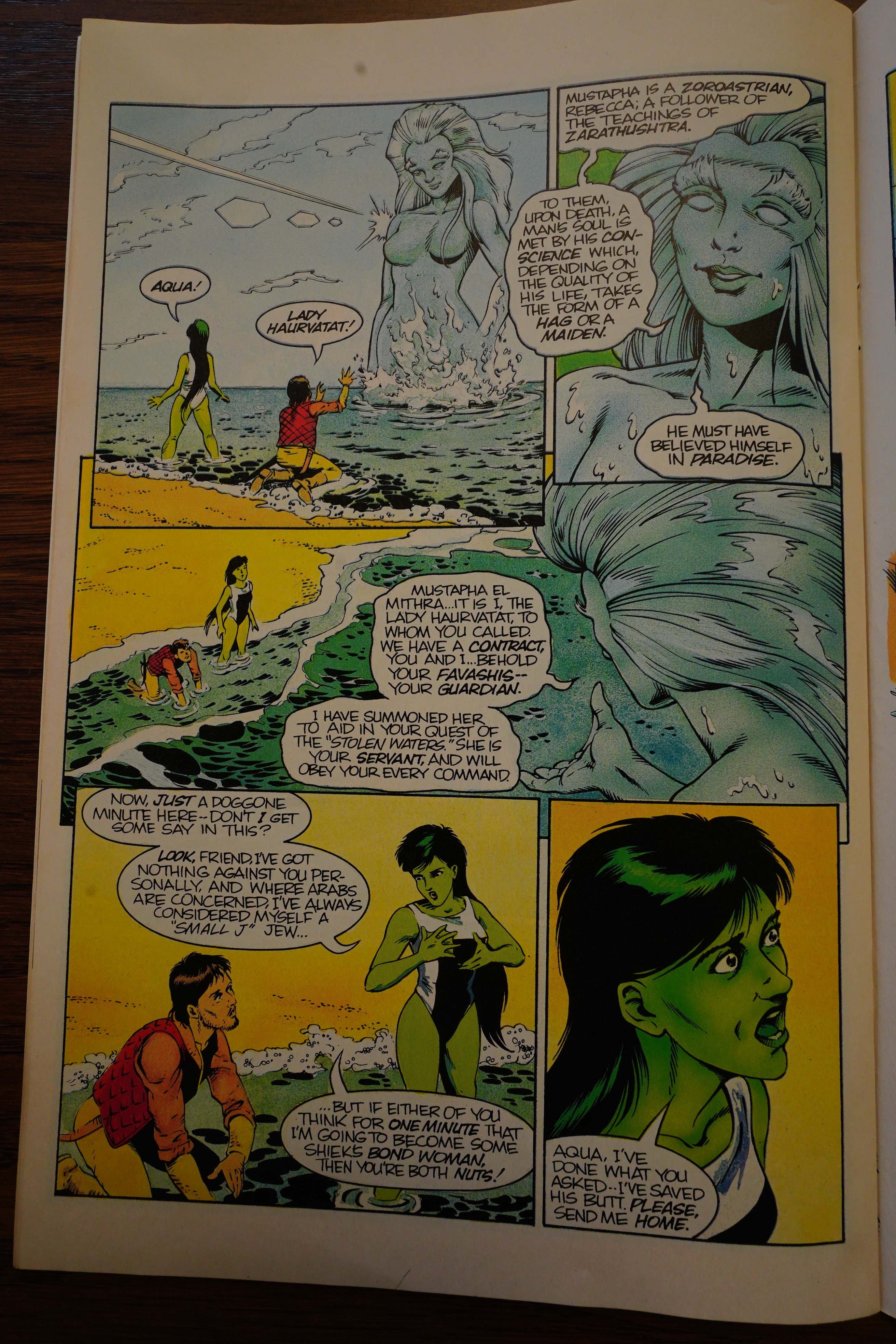
But now she’s going to be enslaved to the guy? And she objects, because… she’s Jewish!? I know, I know, gotta get those things that the author knows about the character into the book somehow, but I’d rather think that anybody would object.

Perhaps that’s just me.
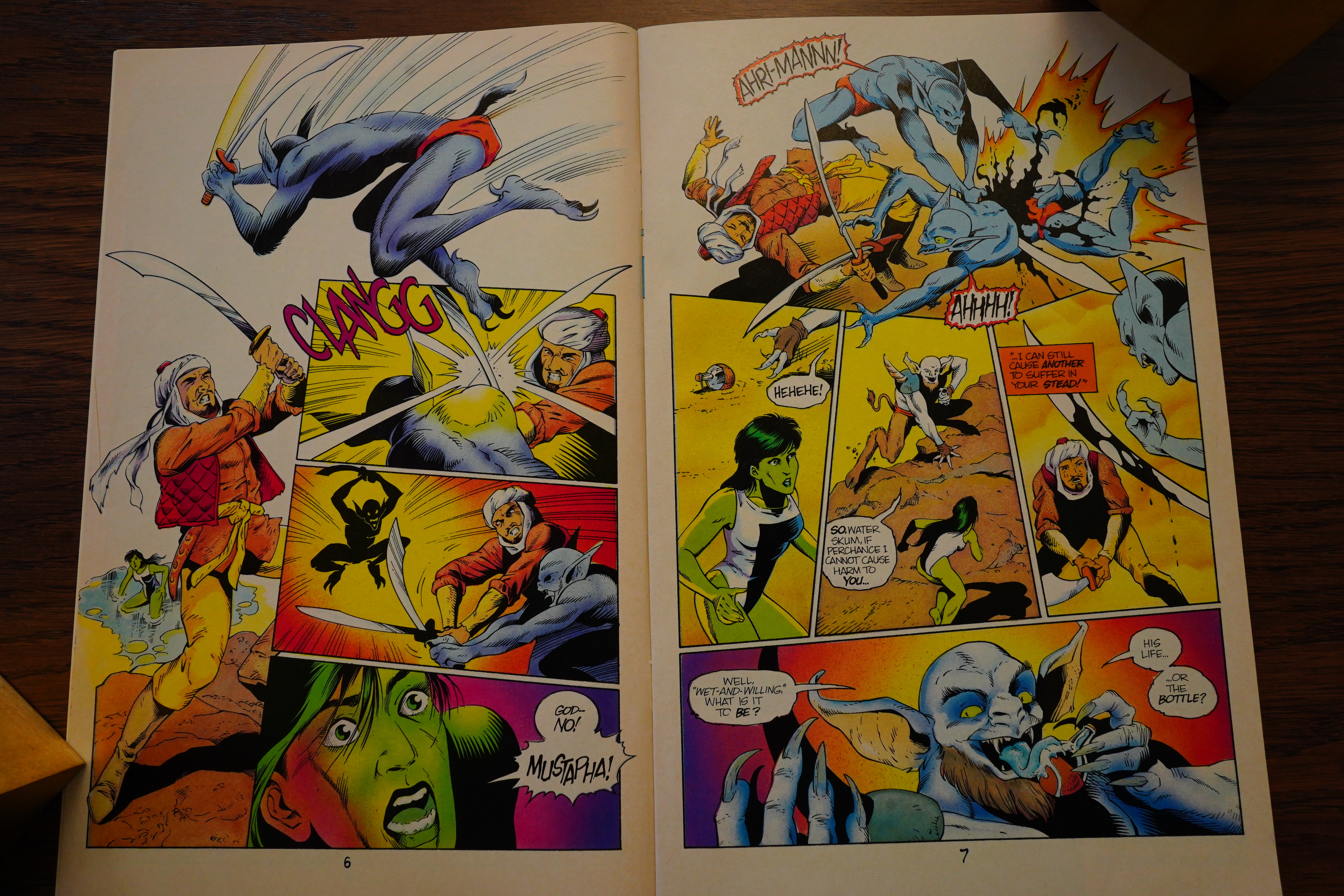
After a pretty normal first issue (which was not marked as being the start of a three issue mini series), the final two (which are) go totally off the rails. It’s like the writer just said “fuck it” and the artist said “I have no idea what I’m drawing”, because nothing makes sense. “His life… or the bottle!” and then he licks the bottle? Is he threatening to eat the bottle? She doesn’t care about the guy, anyway — he’s enslaved her, and we’ve seen no redeeming qualities so far. So why does she care?
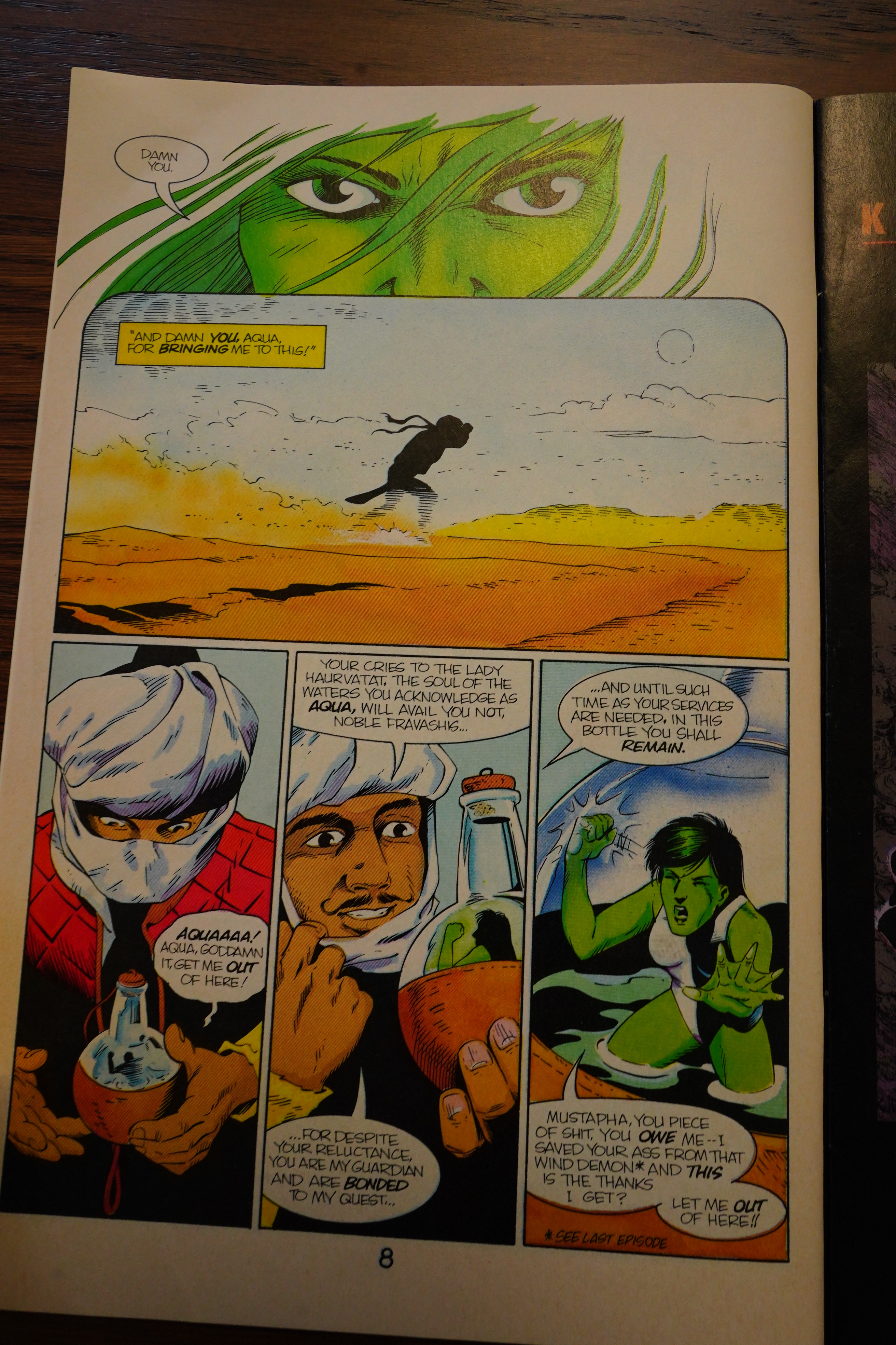
So… she went back into the bottle, and then the demon didn’t kill they guy!? What, and I cannot emphasise this enough: What.
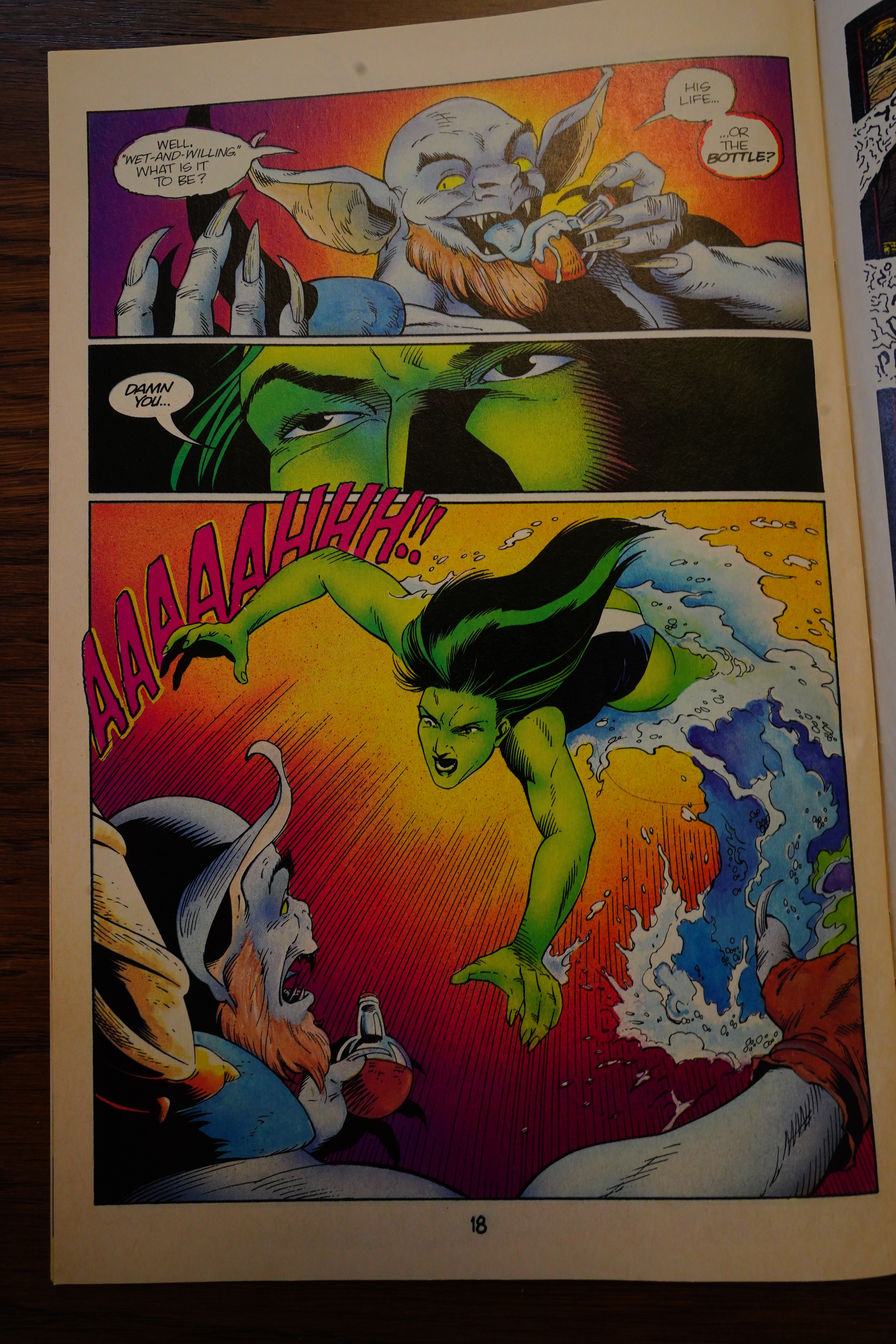
And then he does it again?! Are these pages printed out of order? Did everybody involve have a brain aneurysm?!
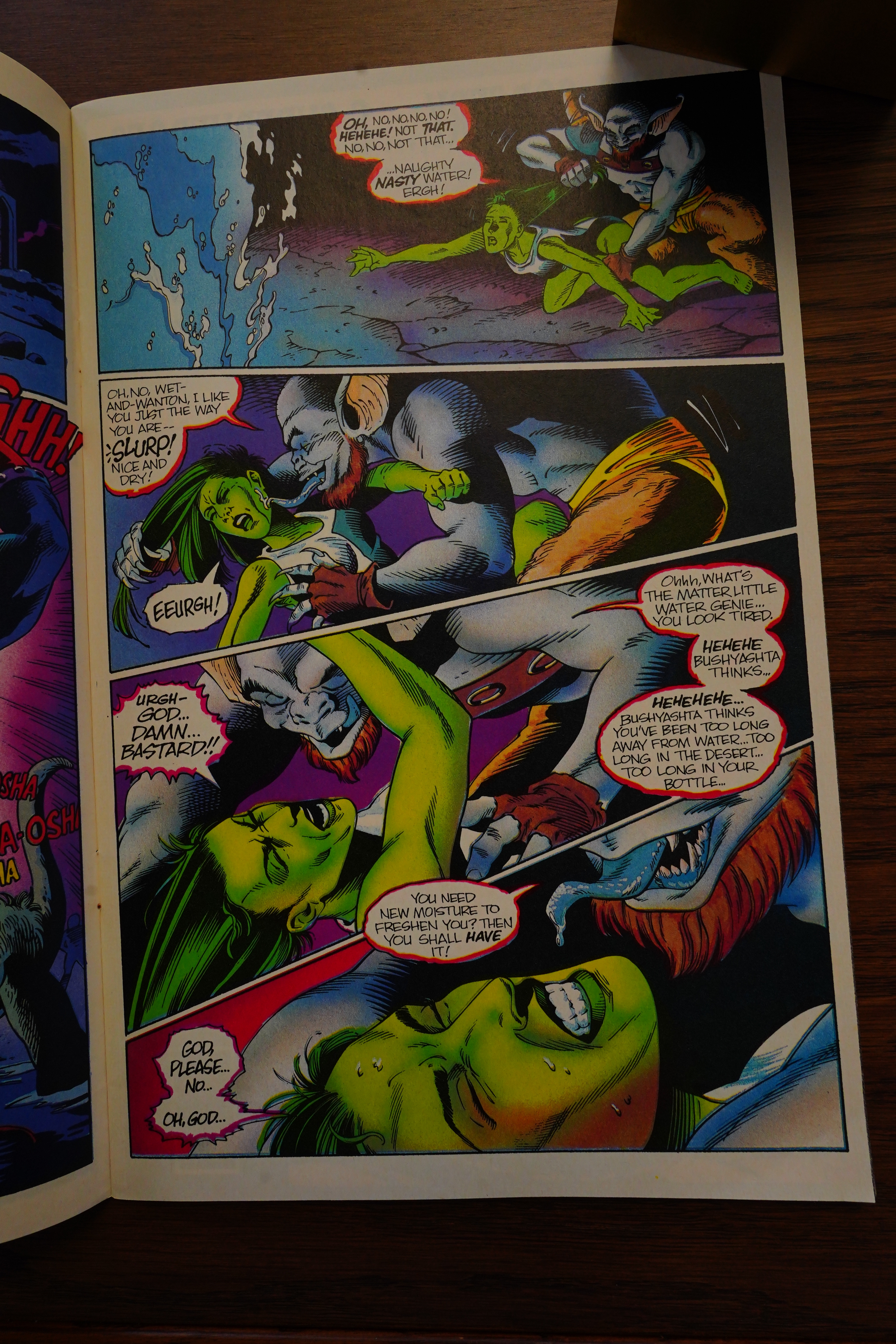
Well, that’s nice.
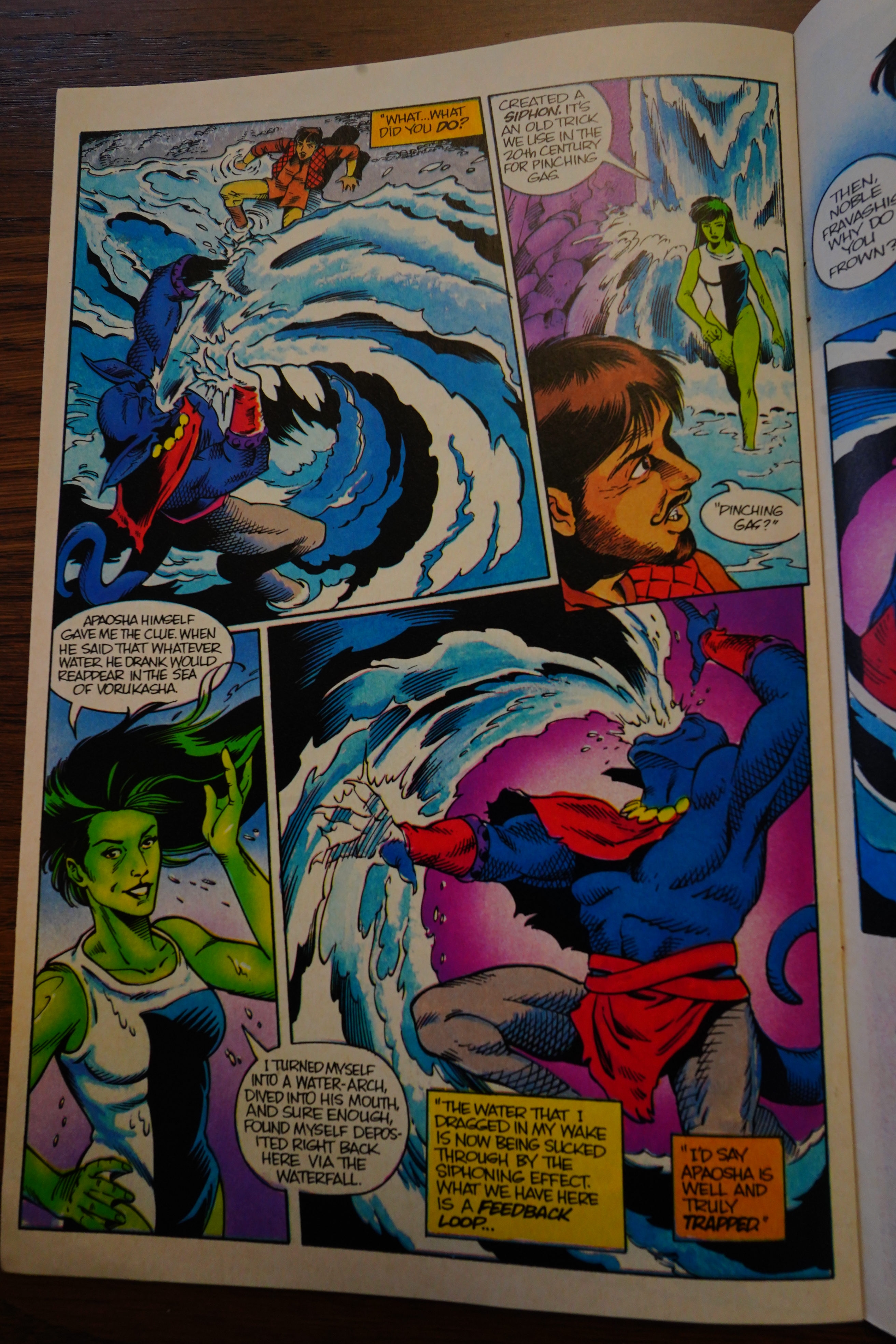
So the solution to the series: Fathom creates a mystical infinity machine out of a guy spewing water, and it works because of things.

You can’t say that’s not original.

As deranged super-hero comics go, this is the most deranged one I’ve read, and I’ve read DeVries’ previous book, too.

The Slings and Arrows Comic Guide #2, page #244:

FATHOM
Comico: 3 issue miniseries 1987, 3 issue miniseries 1992-1993
Two dull miniseries spun-off from the briefly popular
Elementals. In the first, slightly superior, instalment, writer
Lawrence Shick ponderously recaps our aquatic
superheroine’s origin – sailing accident leads to Rebecca
Golden’s reincarnation as ‘Wet! Wild! Webbed!’ Fathom,
acolyte of watery deity Aqua – before sending her to a strange
underwater city where she’s literally treated like a Princess.
Artist Jill Thompson here blandly mimics the work of series
creator Bill Willingham. In the 1990s story Fathom is
summoned by Aqua to battle the dreaded Dera Aeshma,
“despoiler of the world’s pure waters”, a turgid eco-thriller
from David DeVries and Tim Eldred.~AL

I can barely find a mention of this series in 90s comics magazines, so it pretty much sank without a trace.

Eldred has written about the experience:

It sounds effortless when I state it that way, but it was a bit more harrowing than this, entirely because of who I had to work with: the new owner who took over the company in 1990.

“Notorious” is the most polite descriptor I can come up with. Others have been offered in print. Deceitful. Hustler. Nightmare. Enigma. Bewildering. Crook. And, based on my own experience, fast talker. The guy could talk your ear off.

This is the only review I can find of this series:

There are also a lot of unanswered questions that I assume will be followed up on in the story arc, like why these demons are after Mustapha and why Aqua is subjecting Fathom to this? Then there’s the fanservice of Fathom in the bath and Aqua’s design that’s not really needed but at least Aqua puts her in a swimsuit of some kind when she transports her back to 992 AD.

The series has never been collected or reprinted.
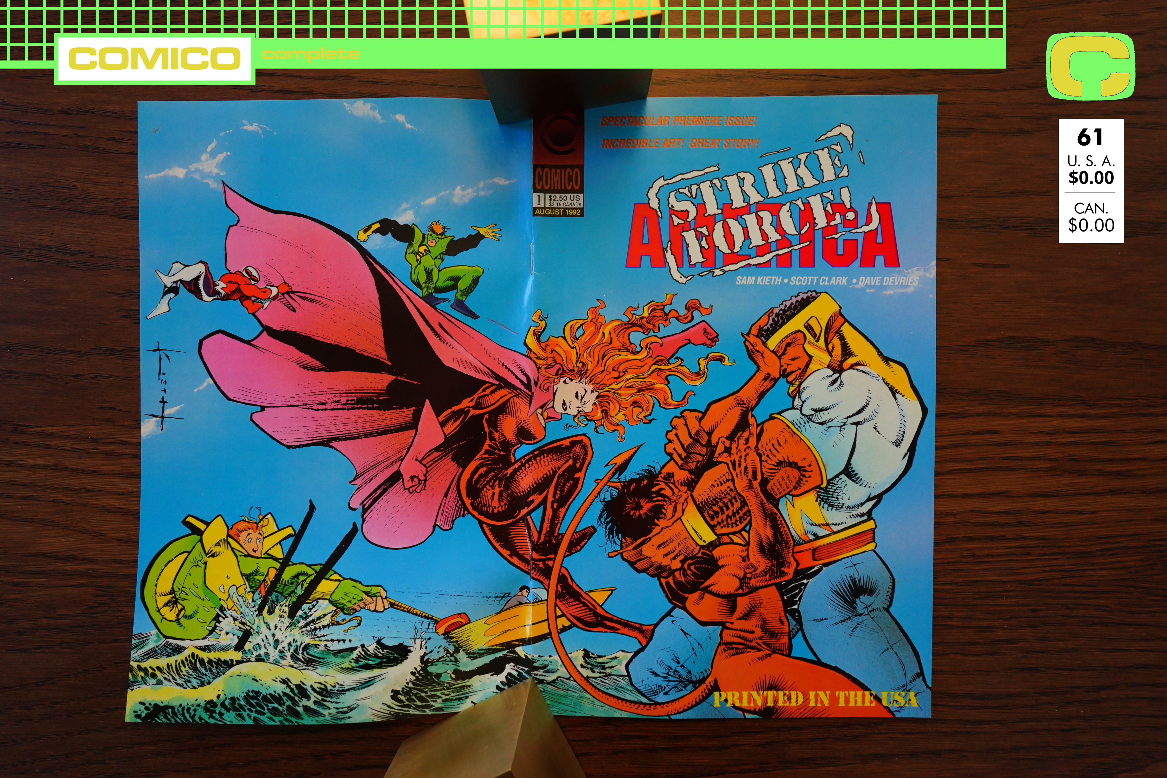
1992: Strike Force America

Strike Force America (1992) #1 by Daniel de Vries, Scott Clark and David Mowry

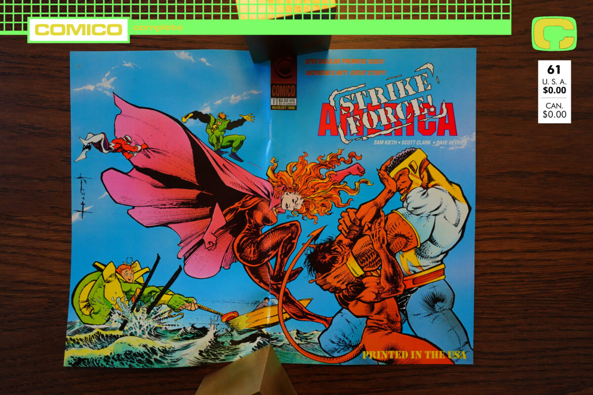
Heh, Sam Kieth gets top billing on the cover — which is understandable, but he only did the cover… and seems to have phoned that in, doesn’t it?

And… “Printed in the USA”? Is that a selling point?

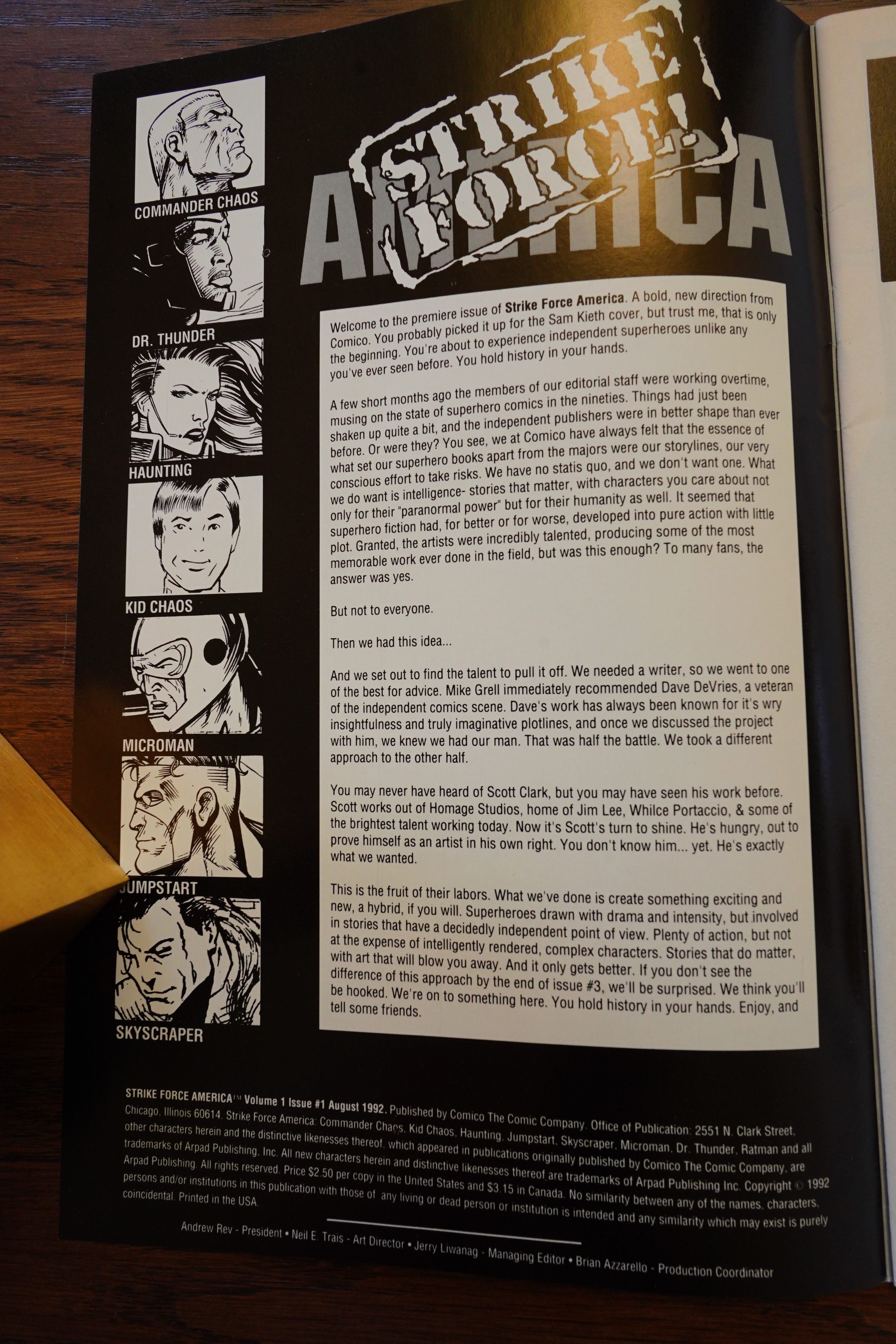
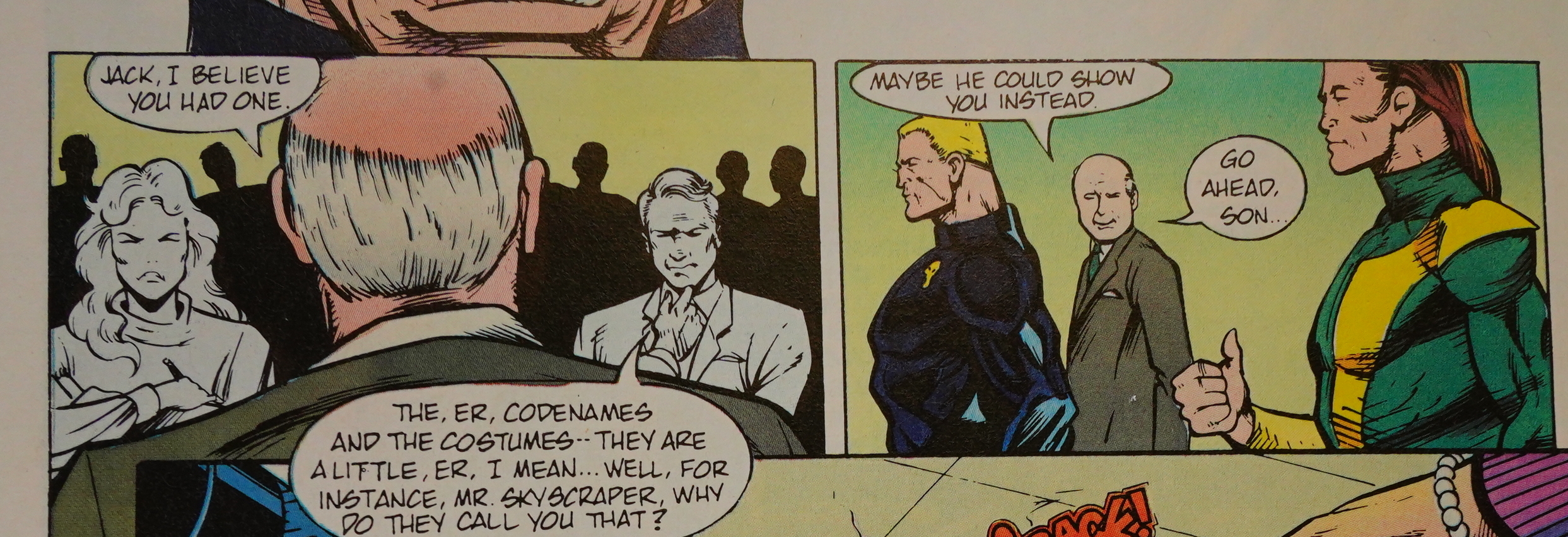
Anyway, the editor (or somebody) explains what this (presumably long-running) series is going to be: Intelligent super-heroes that’s not just action (because that’s the “statis quo” (sic)), so to do that, they get a gofer from Jim Lee’s studio. I mean, somebody who “works out of” that studio. Perhaps an art assistant?

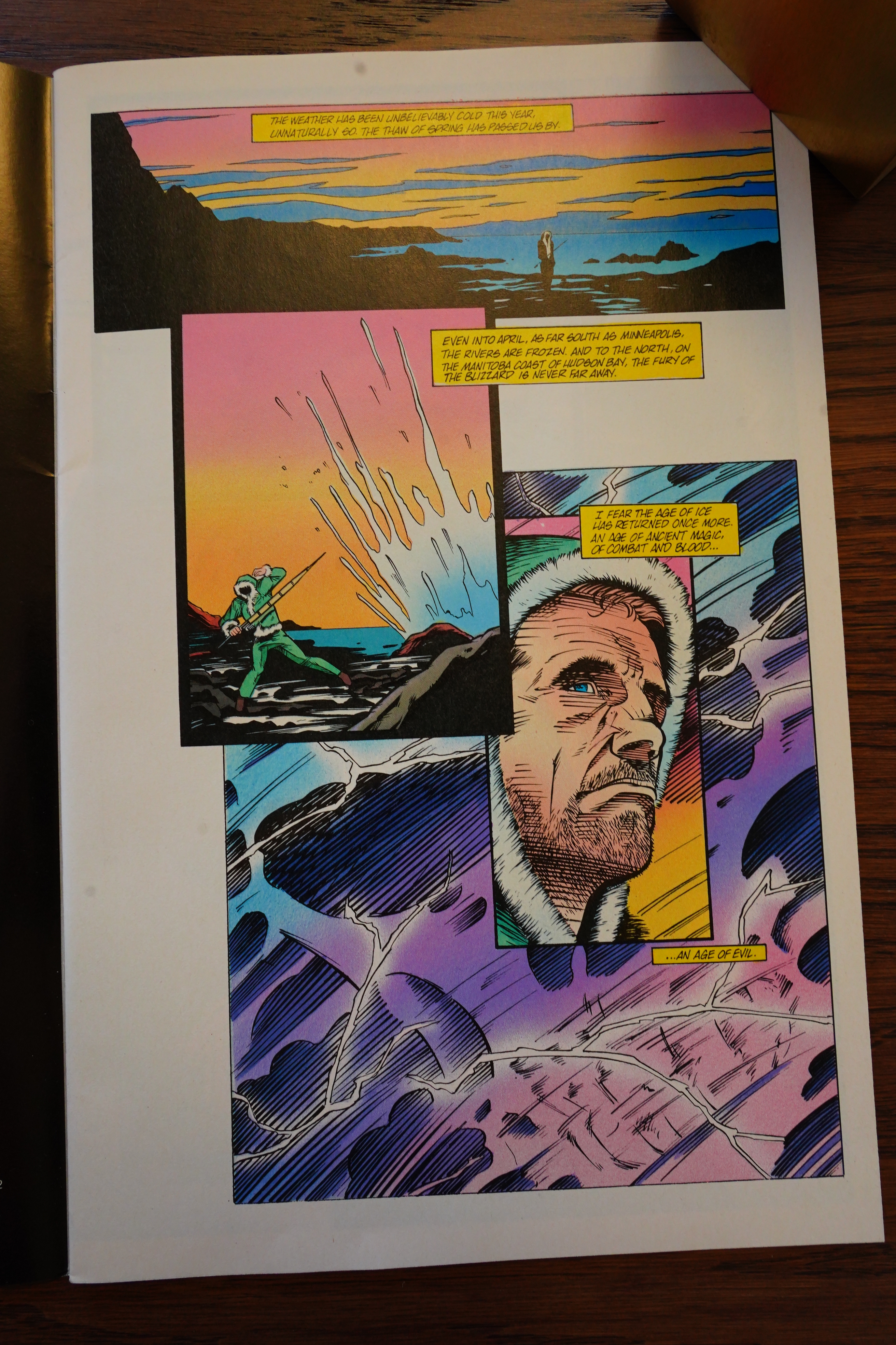
Well, OK, that’s not bad artwork…

OK, I spoke too soon — that’s kinda bad artwork. But the inker’s pretty good.

And… this is yet another Elementals spin-off! I didn’t know that.

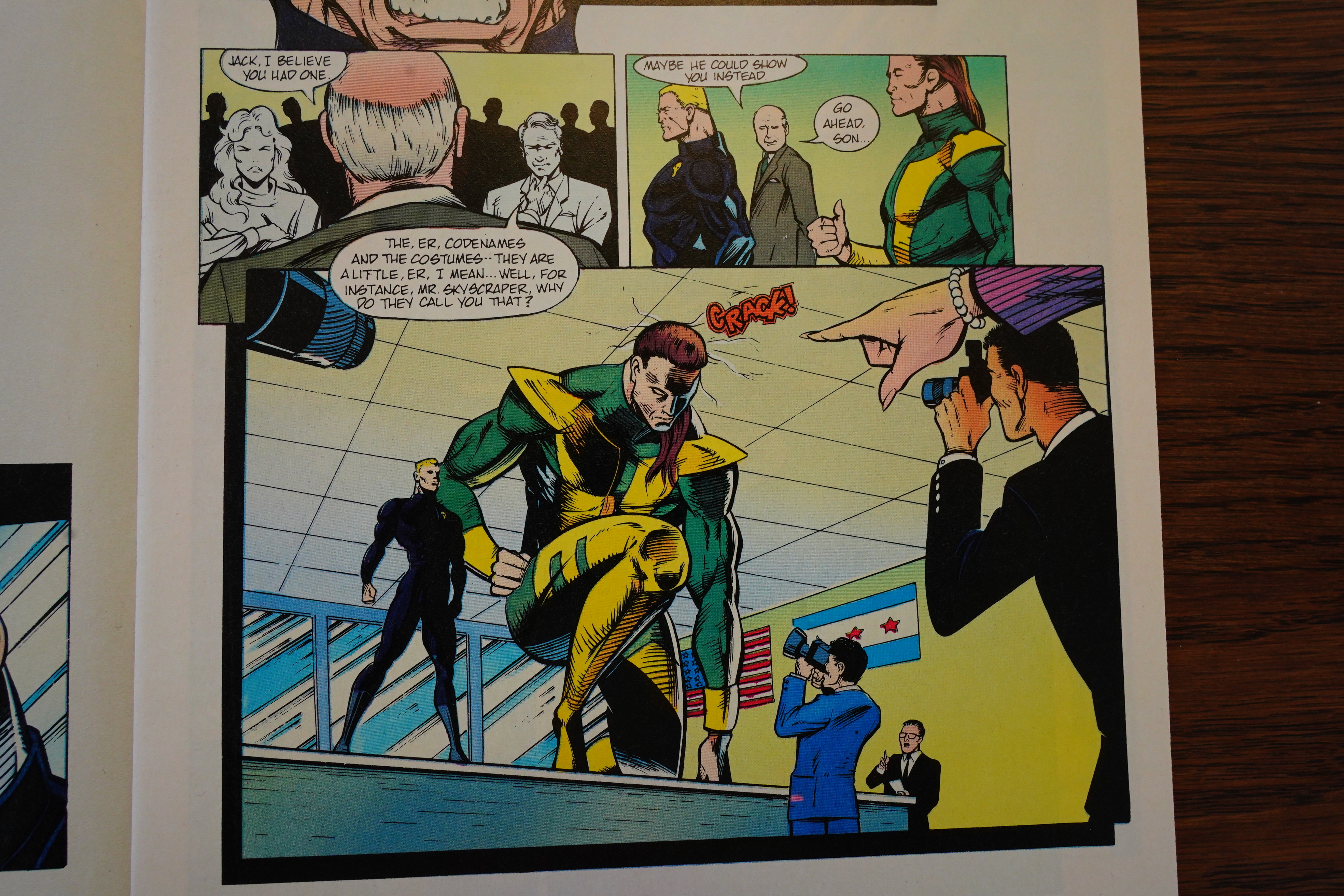
OK, now we’re getting an awesome introduction to an awe-inspiring super-hero that’s going to awe us!!!

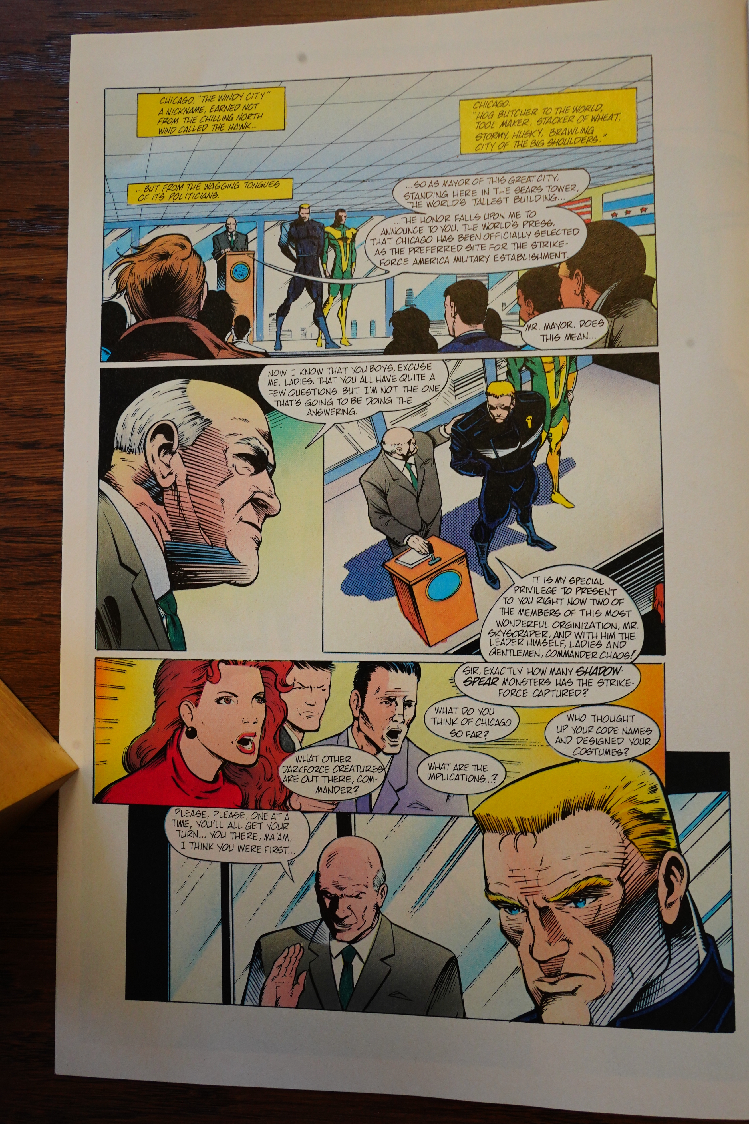
OK, this is pretty bad. I guess much of the problem is that Scott Clark isn’t very good at, you know, putting a page together.

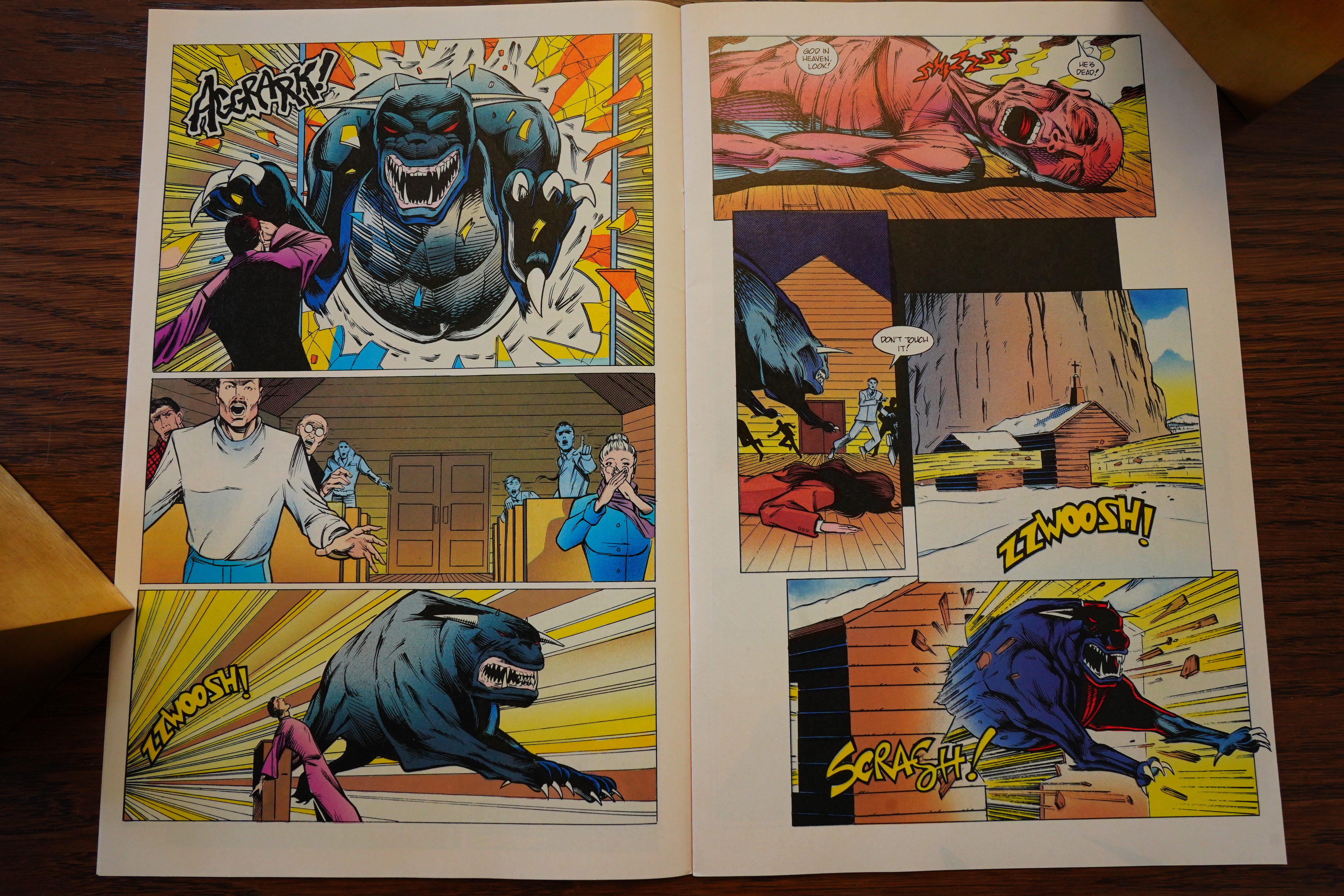
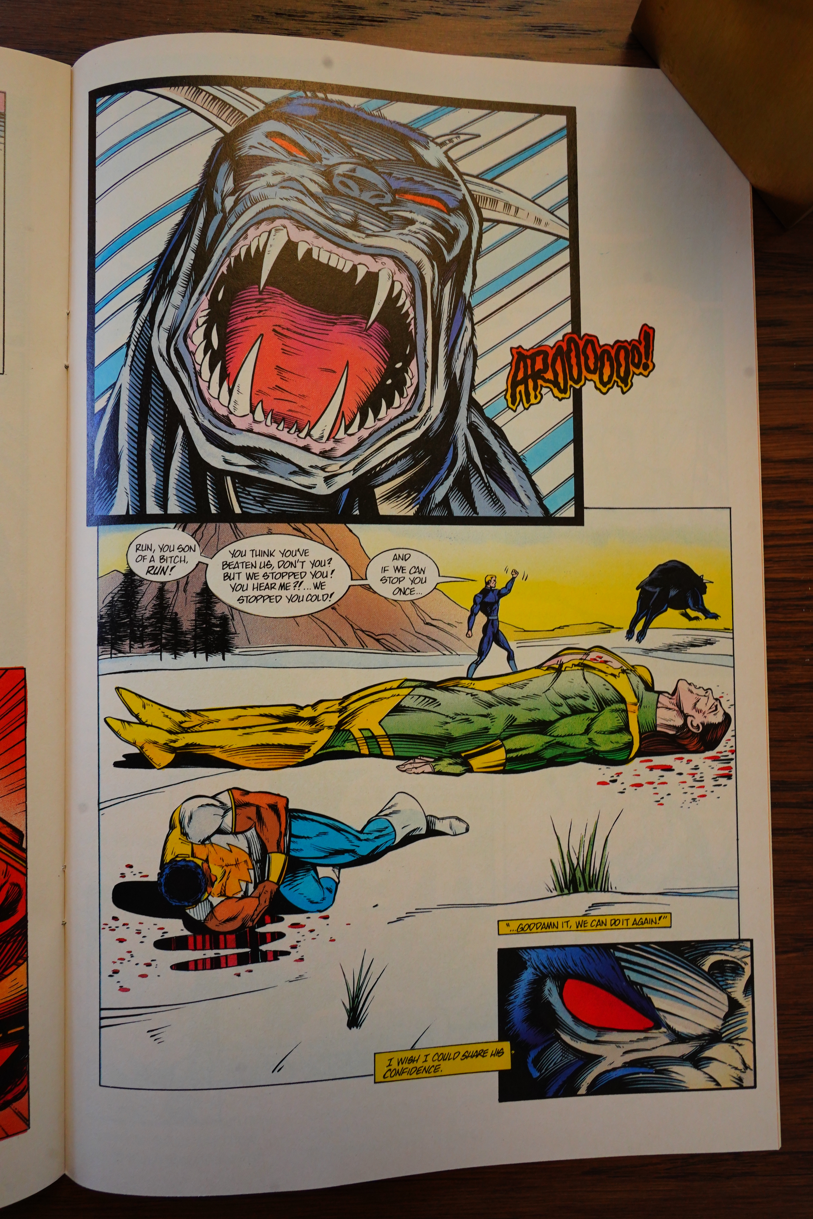
These pages are just bewildering. I mean, you can go through them panel by panel and then guess, perhaps, that… the priest? somehow was torched by being in the presence of that demon dog? A demon dog that is zzwoosh!-ing out of the building before scrash!-ing out of the building, too?

And… the dog head-butted the giant man to death? What?

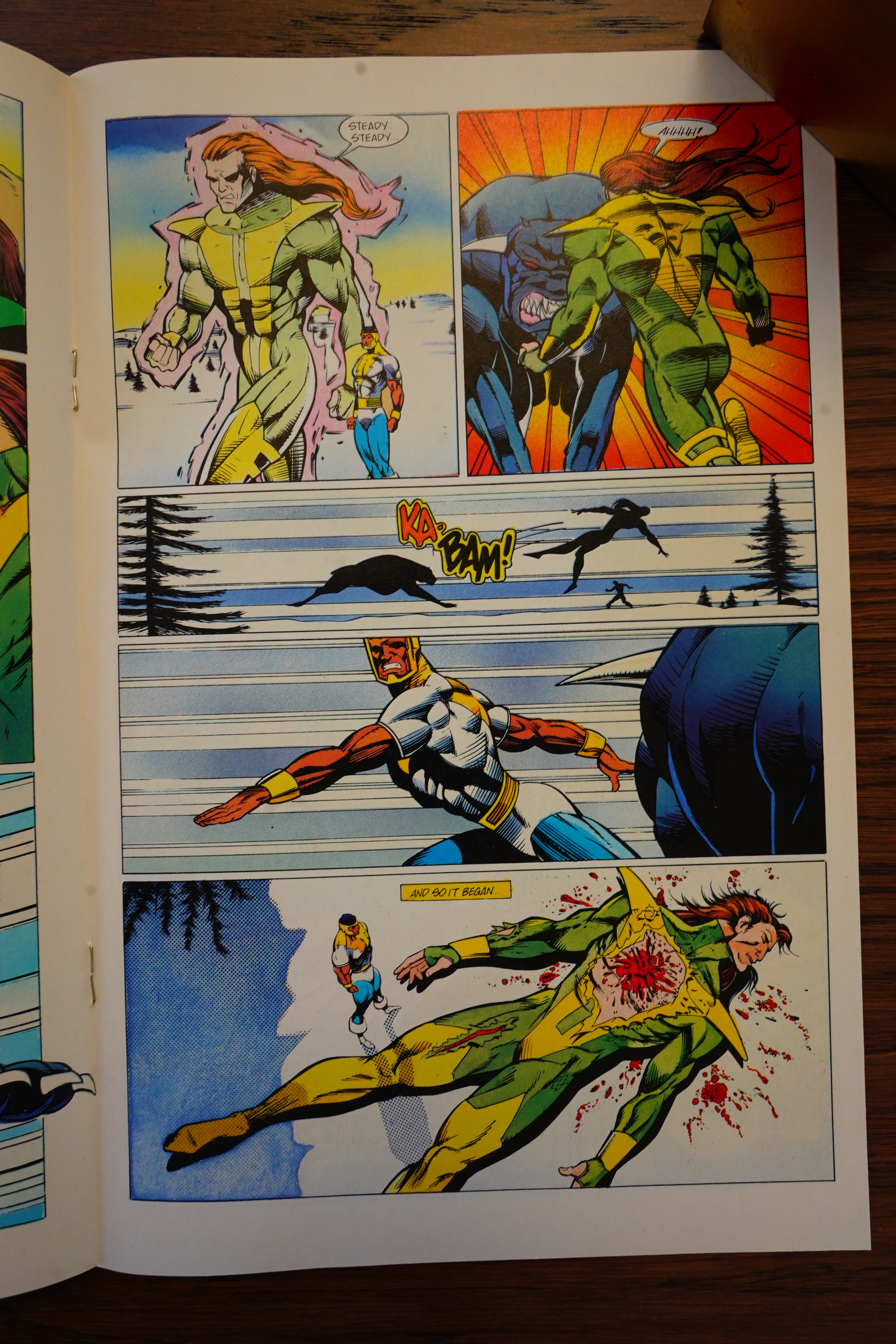
“We stopped you!” How… what… is the point here is that that shouty guy is deranged? Because they didn’t stop the dog — the dog killed a couple of then and then went on its way? What did they stop? Is he deranged?

This book reads like something a bunch of teenagers would put together. It’s incoherent.

But the inking’s quite good.

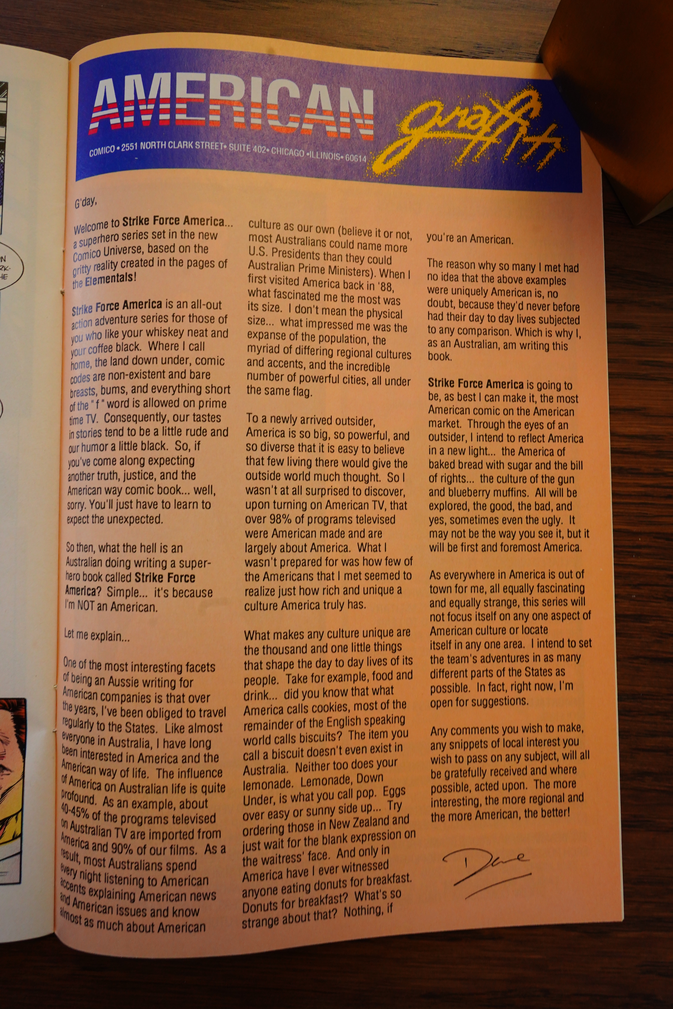
The writer, an Australian, explains what makes US culture so rich: They call biscuits cookies.

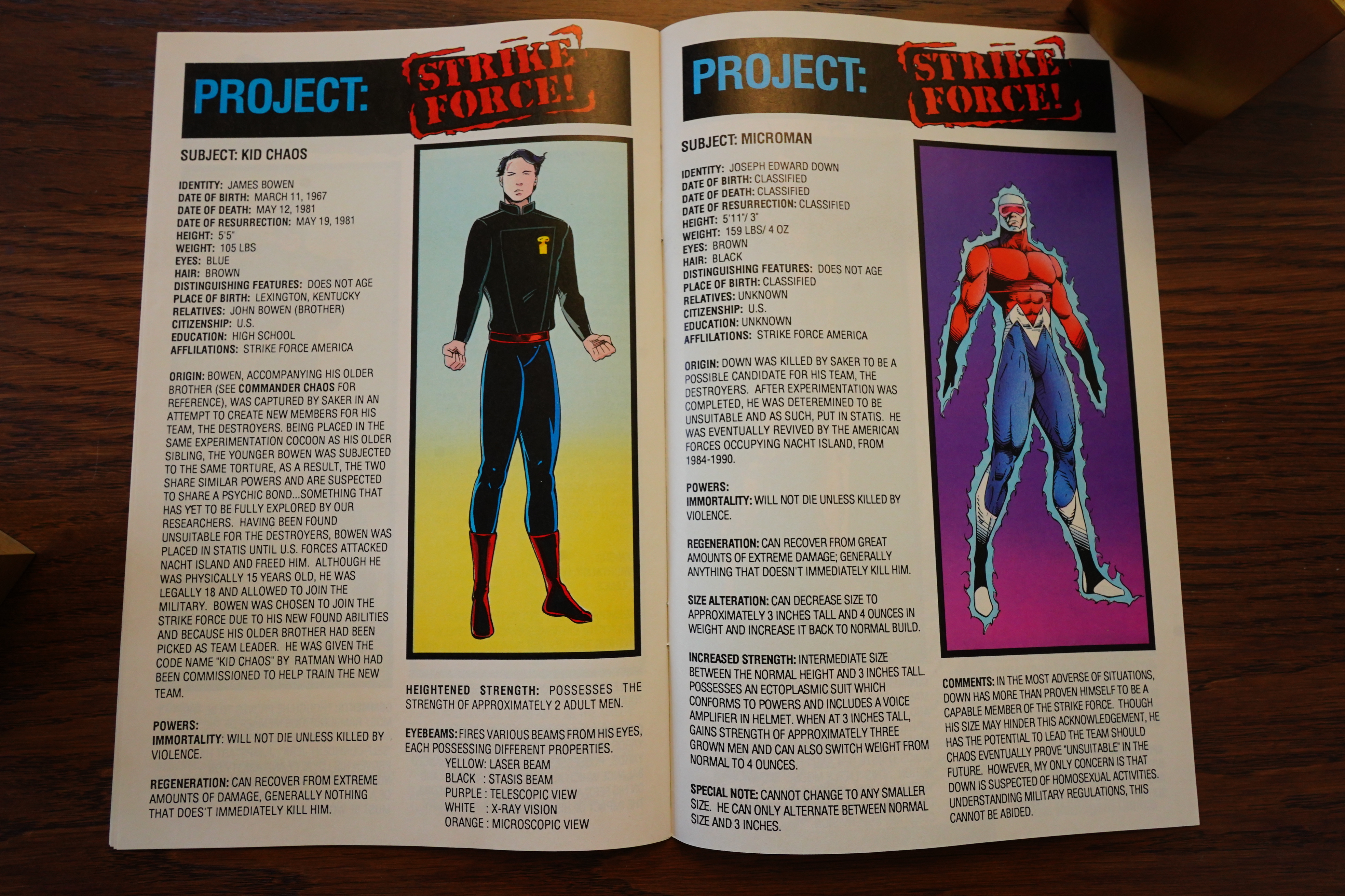
To round out the issue, we get some stats. All of them have “Distinguishing features: Does not age”. How does that distinguish them, then?

This is the kind of book I was expecting to read from the post-bankruptcy Comico, really — just pure stupid and amateurish dreck, but as you’ve seen over the past few blog posts, they managed to publish some books that were kinda good? So it’s nice to get my prejudices confirmed by this book, at least.

The series only lasted one issue, because c’mon — who’d buy more of this. Unfortunately, we have two more Strike Force books to cover: Strike Force Legacy and then the one where they just remix the name from “Strike Force America” to “Strikeforce: America”. I bet that colon is going to make all the difference! People love colon comics!

Hero Illustrated #22, page #88:

“Hope lying in the proles” wasn’t the
only thing to come out of 1984. Bill
Willingham’s Elementals debuted as a
back-up feature inTexas Comics’
Justice Machine Annual #1-four ordi-
nary people who lost their lives and
returned from the grave with powers
given to them by elemental spirits.
Years later, the number of super-
powered characters in the Elementals
Universe exploded, leading to the gov-
ernment forming their own team, Strike
Force America. This June, Comico
gives the team their own ongoing
series. Dave DeVries, who’s worked on
Marvel’s Phantom series, will be writing
the title and Scott Clark (StormWatch
and Warblade: Endangered Species) is
the penciler.
“Major Chaos is the
leader of Strike Force.”
Azzarello comments. “He
is a military man who’s
leading a group of people
who have no respect for
authority-including his
own. So that differs from
a lot of other team books
because it’s a team book
without a sense of team-
work. There’s a certain
amount of interplay that is
just based on tension. It’s
kind of a lot like having a
job.”

OK, Scott Clark wasn’t an assistant? He’d done actual books for Image? Huh.

Overstreet’s FAN #1, page #75:

Inton the heels of Elementals is Strike Force
rica, another ongoing monthly title, that is
linduled for this summer. You want action? You got
Written by veteran scribe Dave DeVries (most
Willy of The Phantom mini series for Marvel
(8), Strike Force America is Comico’s take
the traditional super hero team books and, since
la being published by Comico, you can bet that it’s
whing but traditional. With art by Scott Clark (
ImmWatch and Warblade: Endangered
wries), along with R.R. Phipps, this looks suspi-
undy like an Image comic, but…
Truh, it sort of does have an Image feel, doesn’t
I wonder how that happened…” muses editor
wello. ‘In overall scope, this book is a lot like
Wengers comics of the 70’s. Remember those?
thus, those issues were the heyday of that particular
On closer inspection though, readers may be
with the way things are handled. This is not
in ordinary team book.”

Comics International #58, page #4:

Williams at Comico
AWARD-winning Image inker Scott
Williams and fellow Wildstorm
penciller Scott (Stormwatch) Clark
are the artists for the new Comico
monthly, Strike Force America.
The series is written by Australian
creator David DeVries and centres
on a group of paranormal Strike
Force members commandeered for
America’s last-stand fighting unit.
Their first assignment is to prevent
a super-powered psycho destroying
Rhode Island.
This is Scott Williams’ first work
outside Image’s Wildstorm titles
since his reportedly acrimonious
split with Marvel, in 1992.
The first issue will ship with three
different covers and retail for $2.50.
It features bound-in trading cards to
accompany a set scheduled for later
this year.

Hah! I knew that inker was good.

I’m unable to find any reviews of this book.

1992: Falls the Gotham Rain

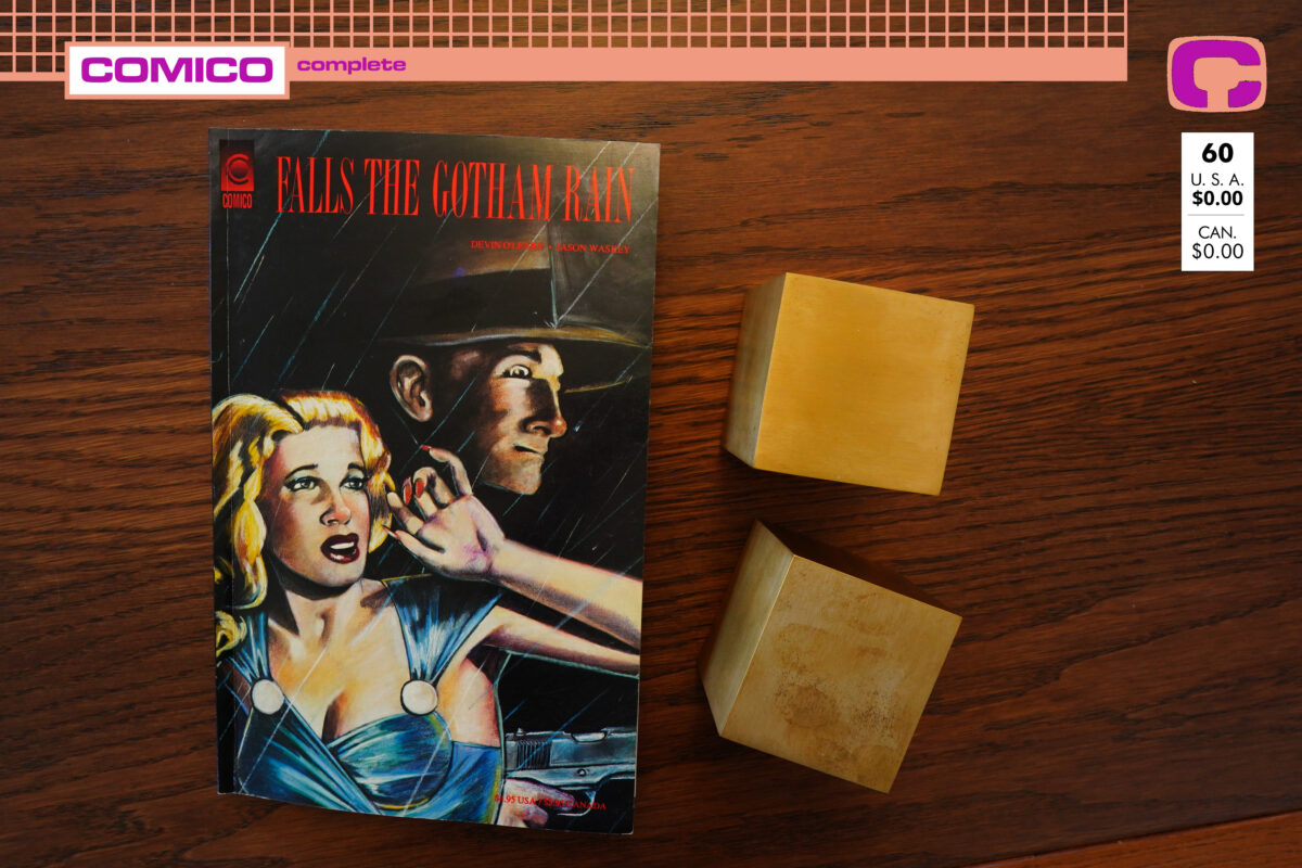
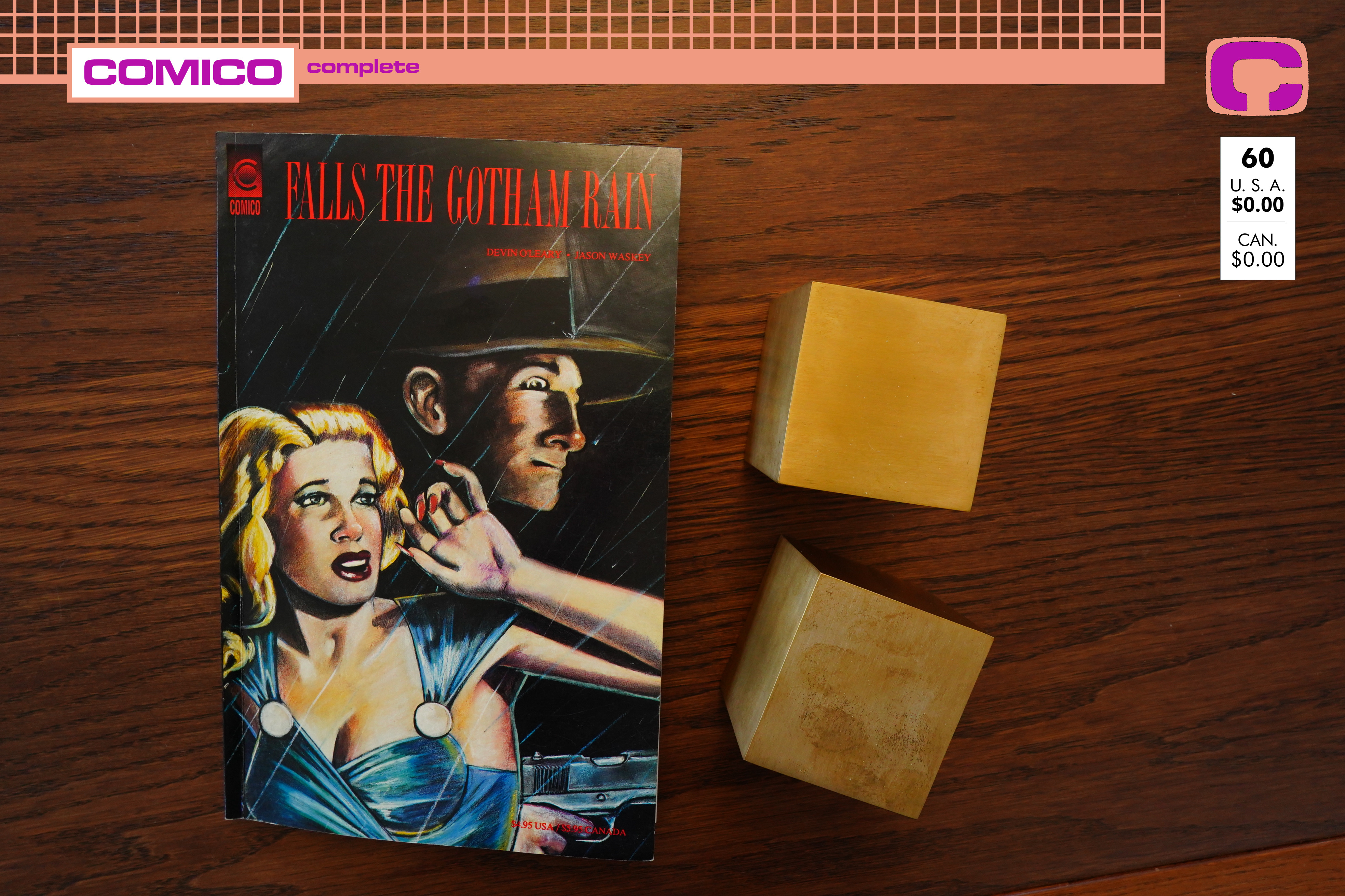
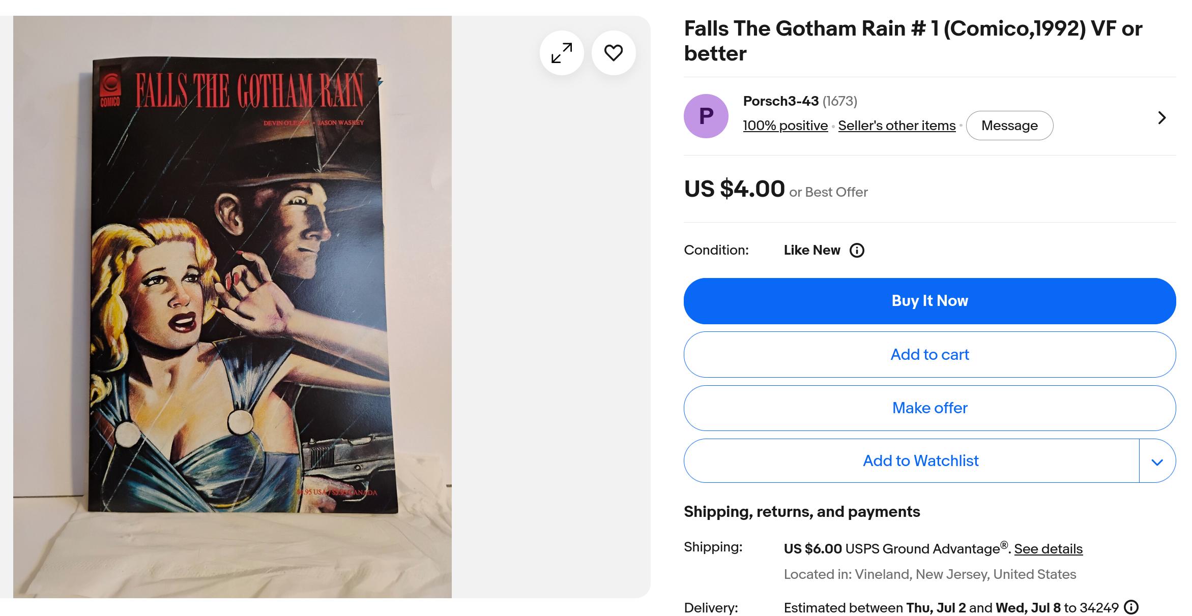
Falls the Gotham Rain (1992) by Devin O’Leary & Jason Waskey

This is a “prestige format” book — it looks like Comico tried to class things up quite a bit. I.e., not just Elementals swimsuit specials, but also some that would appeal to an adult audience.

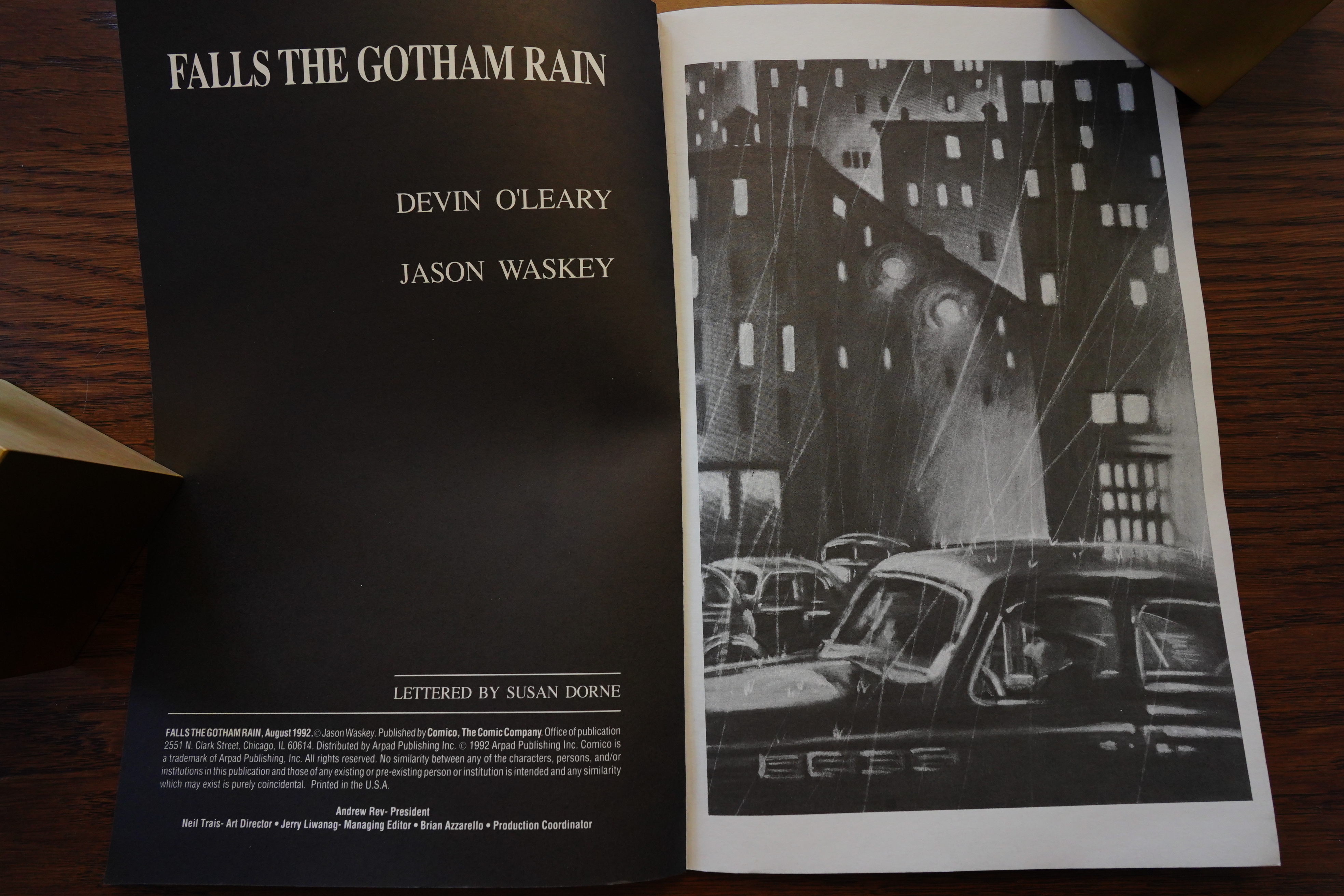
Huh… the “managing editor” here is Brian Azzarello, who is presumably the same guy who would go on to fame and fortune writing noirish crime comics.

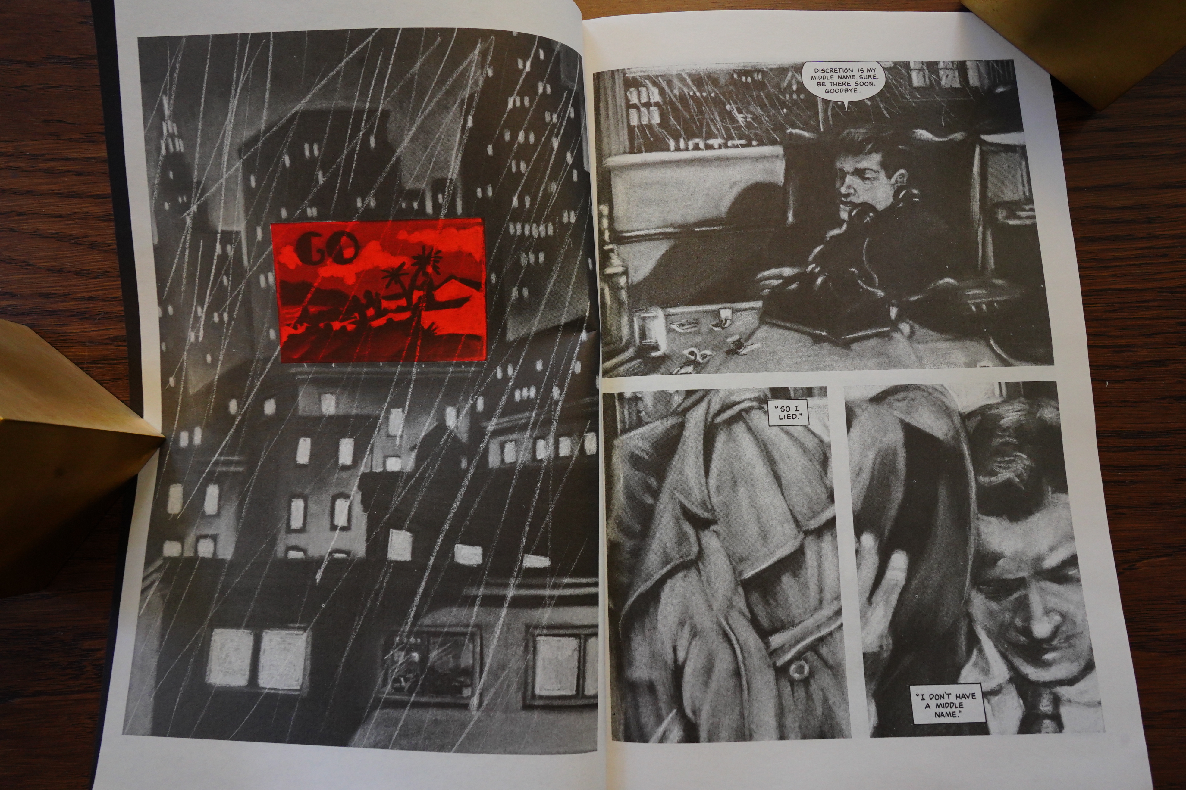
And this looks really intriguing. I love that spot of red in an otherwise black and white book. And I wonder how this artwork was done? Most people who do books vaguely in this style usually use pencils or washes, but I don’t think that’s what’s being used here? It almost looks like it’s painted acrylics that then have been shot in black and white? And perhaps painted in almost the same size as it’s been printed?

It’s a really interesting and (I think) appealing look.

Wow, that’s a fantastic page. The way it flows, and then trips you up a bit with that silent panel that has a different section of the guy in the final panel. That’s one great-looking page — it’s almost like something out of Raw Magazine in 1984.

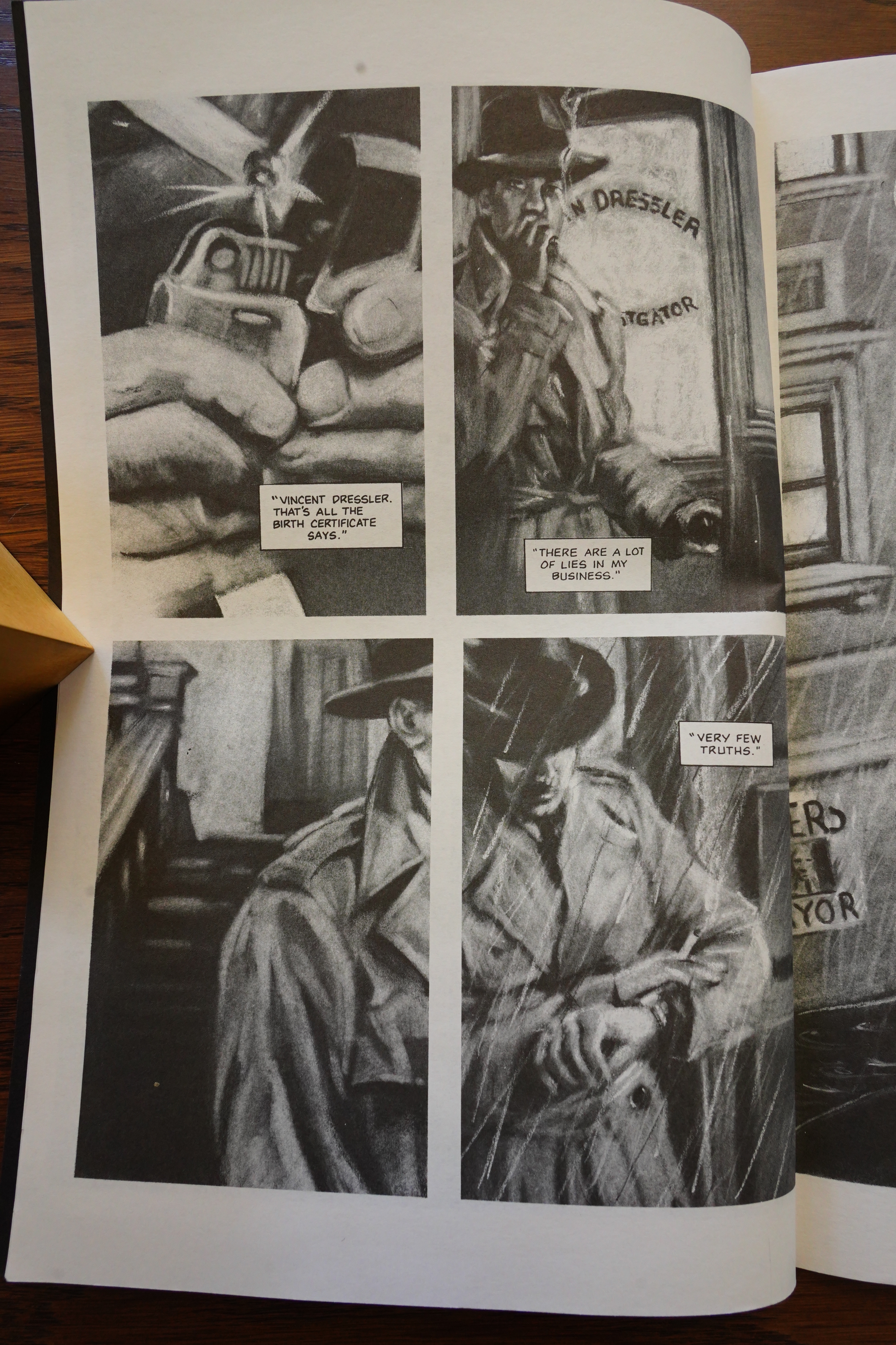
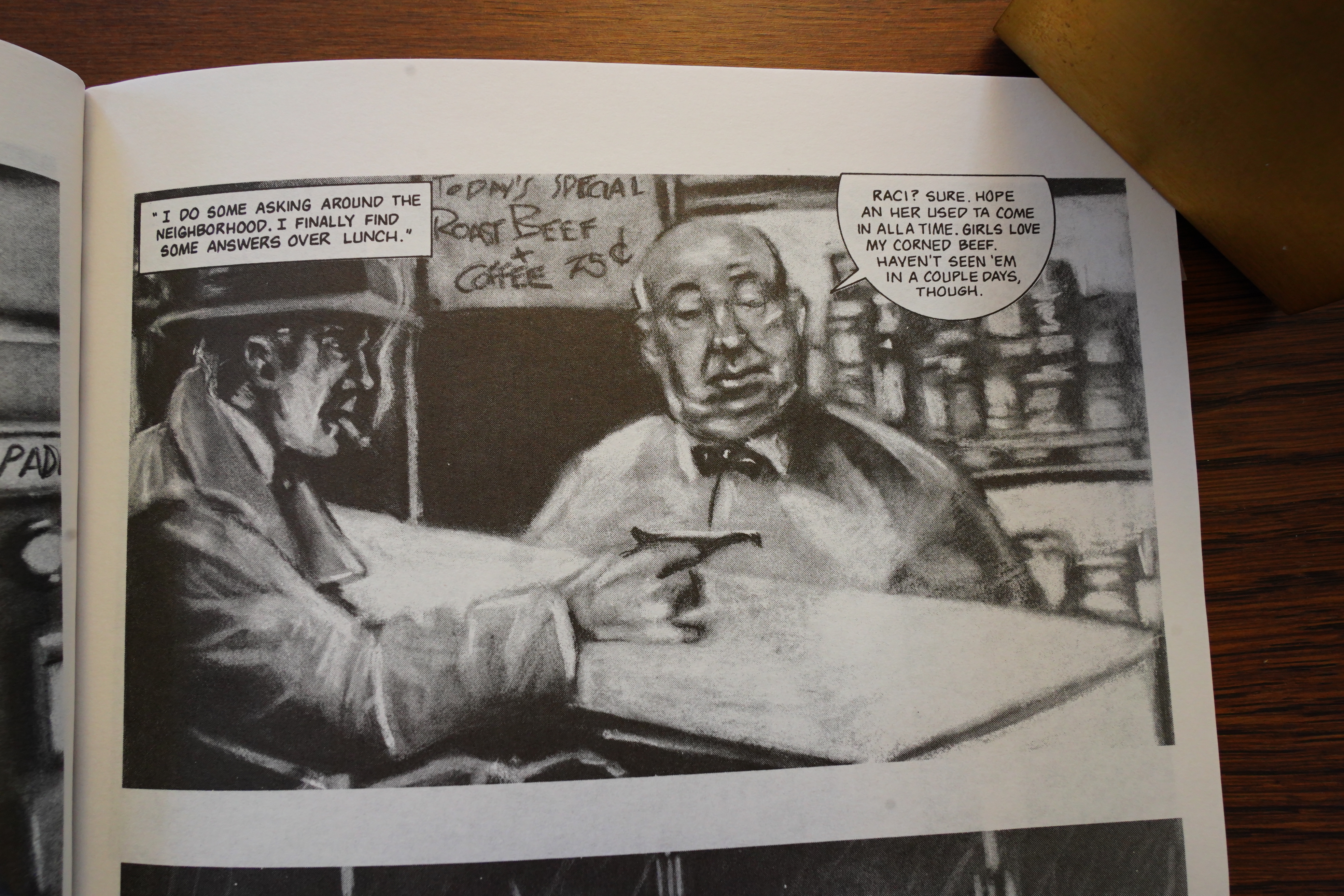
There’s quite a lot of characters here that are obviously referencing famous people from various thrillers, including Hitchcock — but we see the limitations of the artist’s approach here, because the characters end up more hinting at the people they’re supposed to depict, presumably. And that’s a very, very strange angle — the deli guy is presumably supposed to be standing behind a high counter, but it doesn’t really read like that. Perhaps the artist didn’t have a reference photo that had a better angle to use.

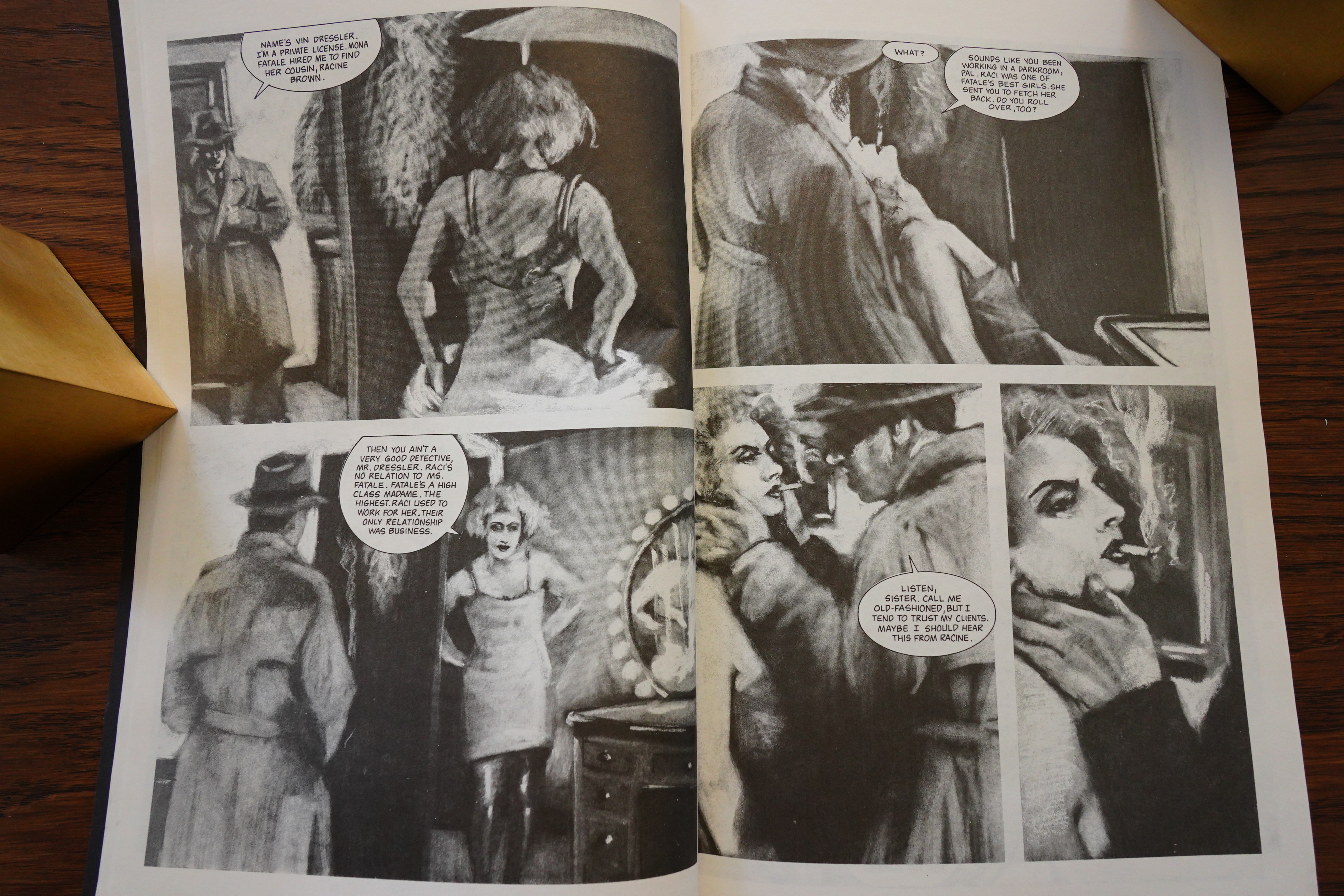
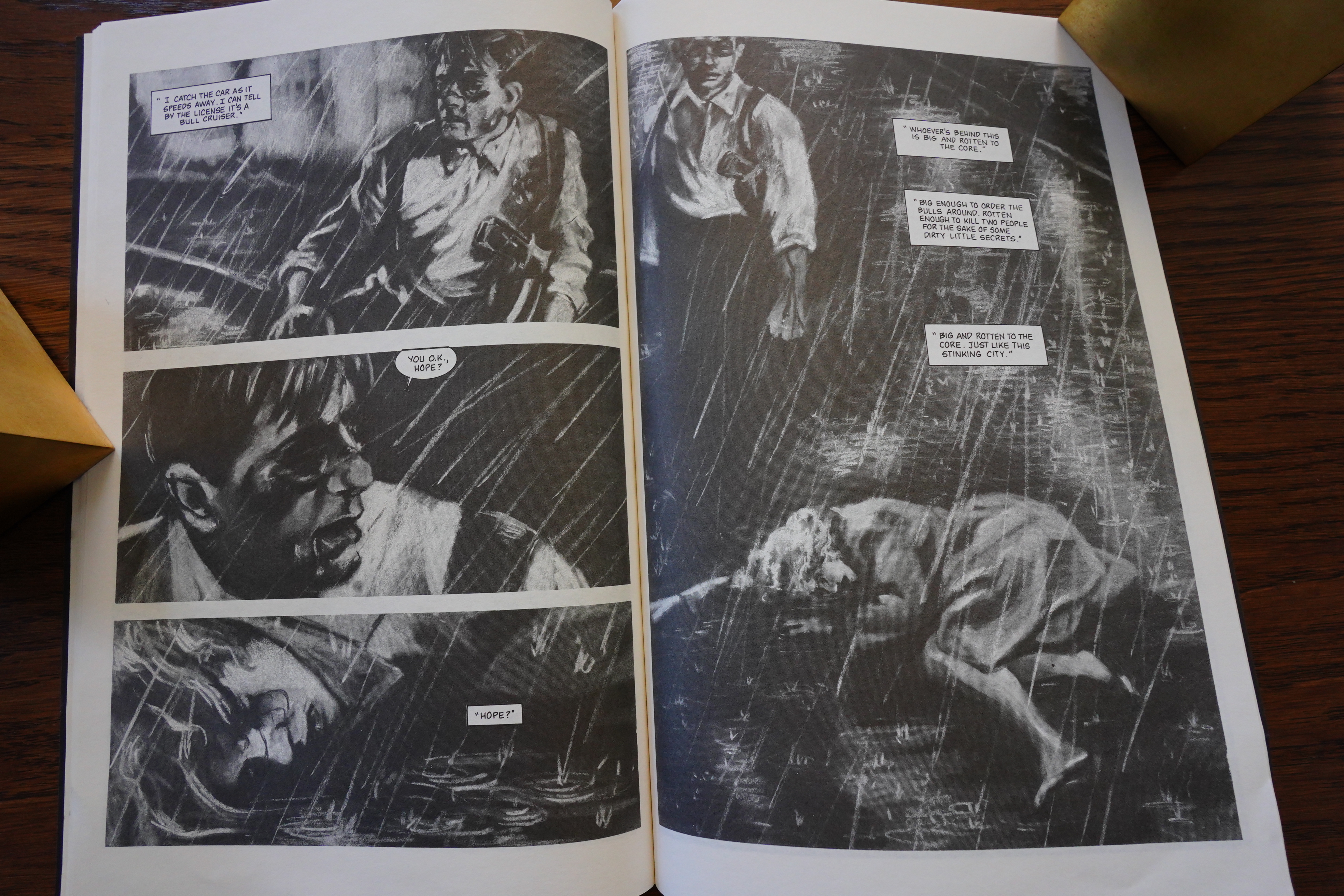
It’s a really enjoyable book to read… but it’s also like reading a feverish synopsis of All Noir Films Ever: You get all the highlights, but very little of the stuff in between (due to length constraints, presumably), so the book careens madly from cliché to cliché.

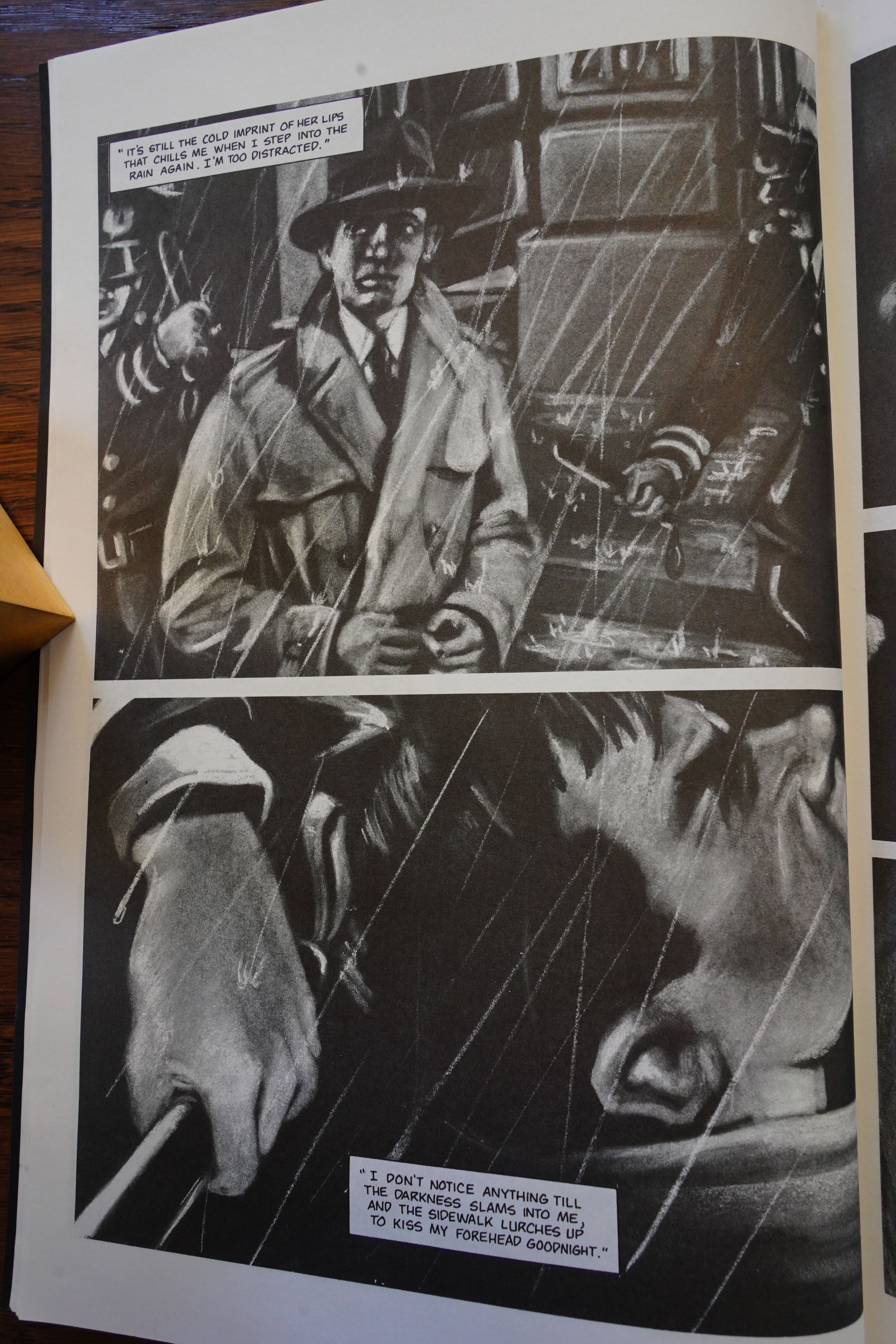
All of them are covered. But again, it’s well done — just look how compressed you can make this standard scene of the private dick getting knocked out by a cop? I mean, it works partly because we already know what’s going to happen, but it’s still beautifully done.

It just really manages to capture the feel of a noir movie. Not by overloading the pages with leaden noir narration (which is the go-to move by most comics writers trying to do this), but by trusting the artwork and trusting in the reader.

This might perhaps be the best thing Comico ever published!? Whodathunk!

Both creators are unknown to me. Apparently it was the only thing O’Leary did, and he’s probably the writer? Jason Waskey has two credits, and is perhaps the artist? It’s not specified, but Waskey did the artwork on at least one other comic book, so…

As usual with the post-bankruptcy Comico, I could find no contemporary reviews. Either Andrew Rev was bad at sending out reviewer copies, or everybody shunned him?

Here’s a review from the interwebs:

For fans of classic film noir, Falls The Gotham Rain is a decent homage, but offers very little in the way of anything new.

Another:

that kid is going to be seriously messed up when he grows up

I guess!

The book has never been reprinted, but you can pick it up below cover price:

1992: Anne Rice’s The Witching Hour

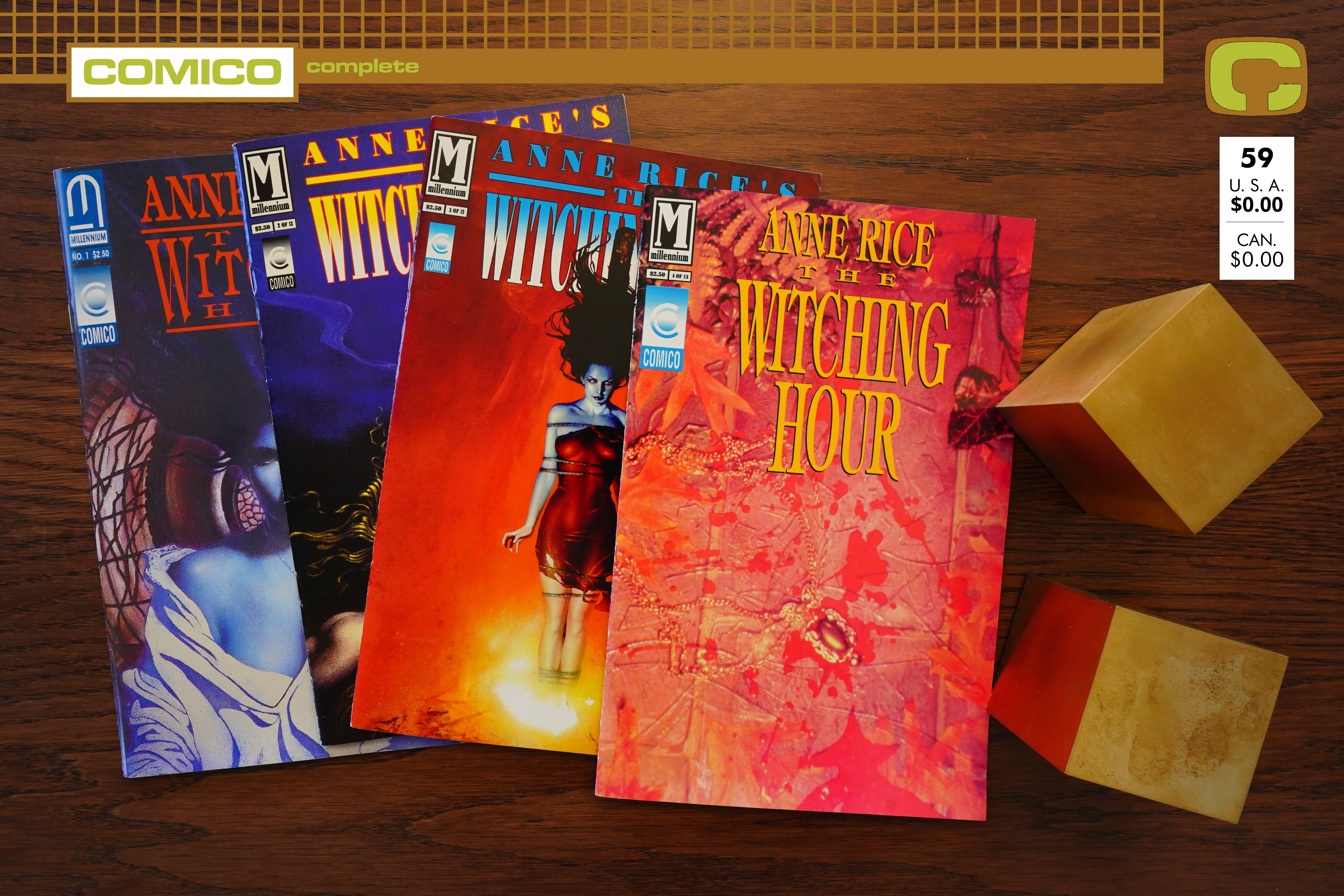
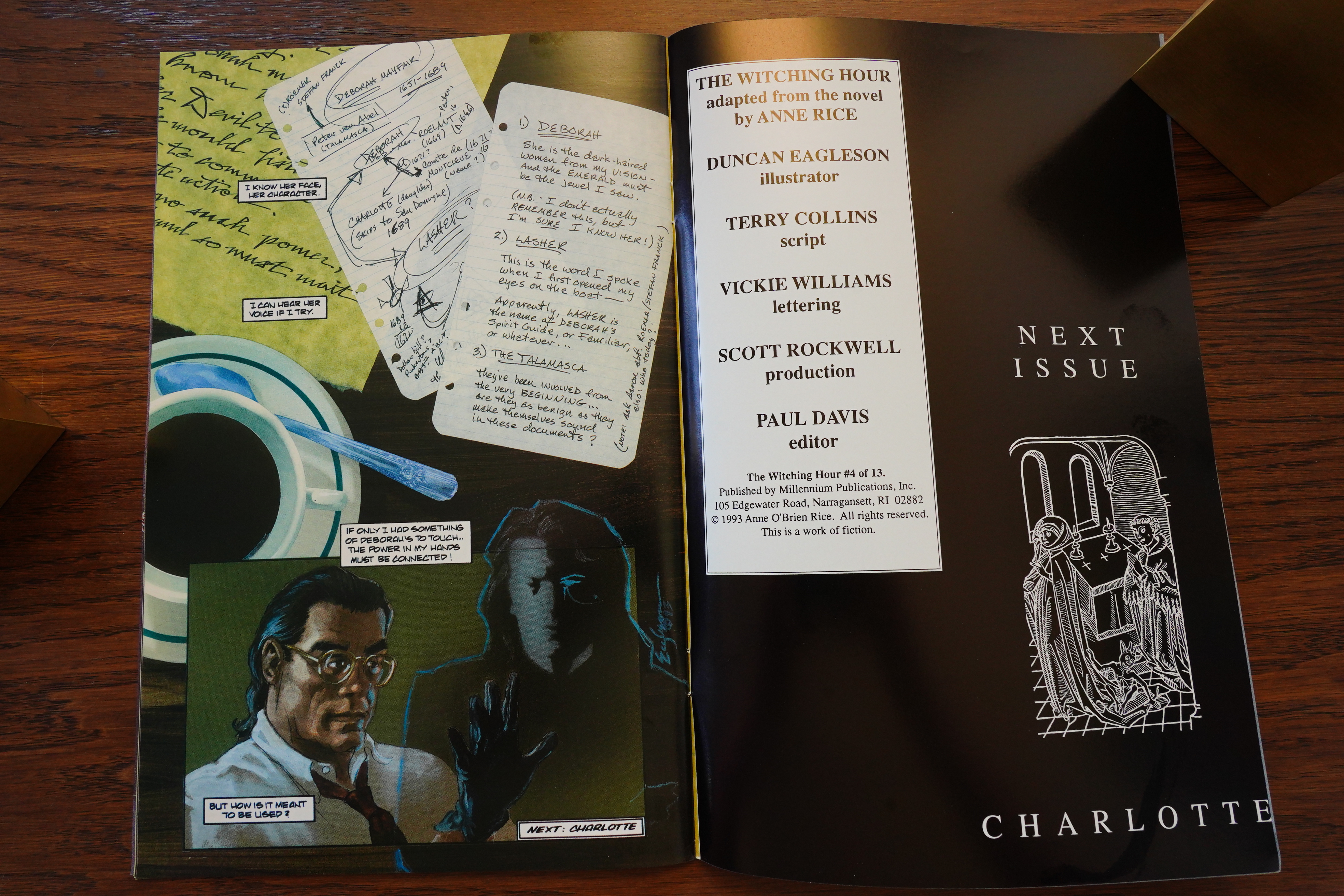
Anne Rice’s The Witching Hour (1992) #1-4 by Duncan Eagleson and Terry Collins

What’s this then? “Millennium”? Both the Millennium and Comico logos are on the cover of this book, but Comico isn’t mentioned in the indicia at all. So was Comico acting as the distributor? Was Millennium yet another comics company owned by Andrew Rev (he had so many). In any case, this was the only book published by this combo, but Millennium published a bunch of other things.

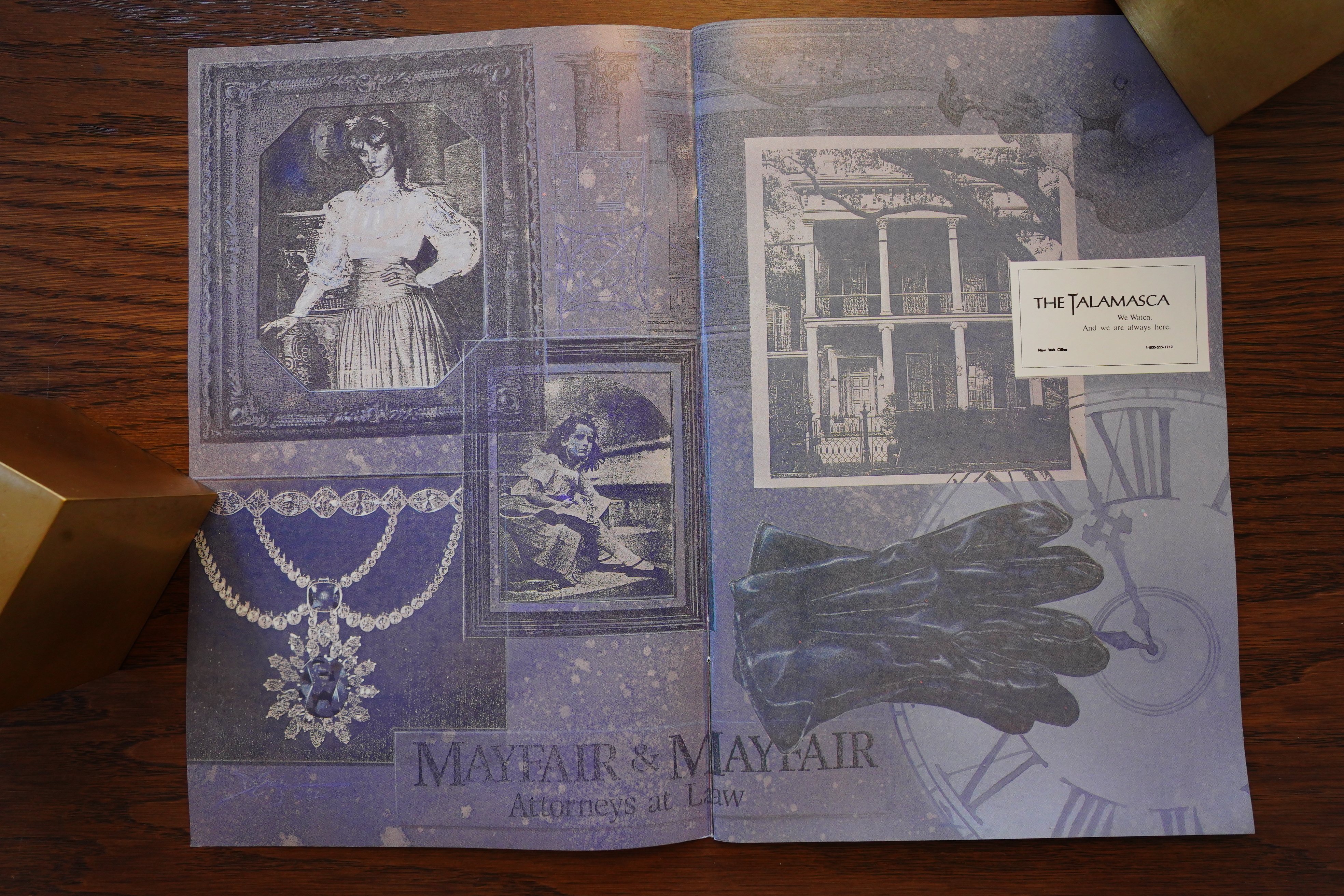
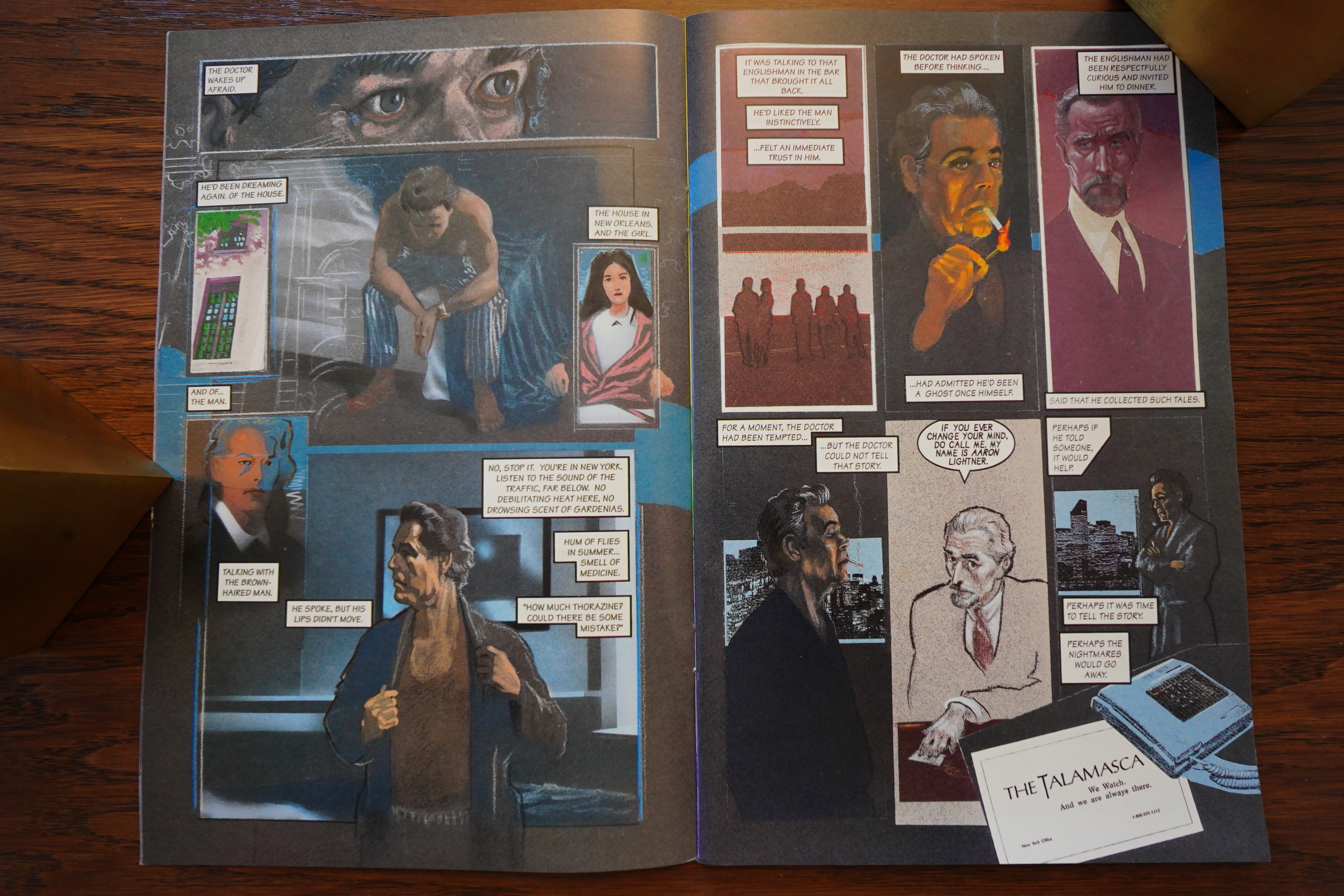
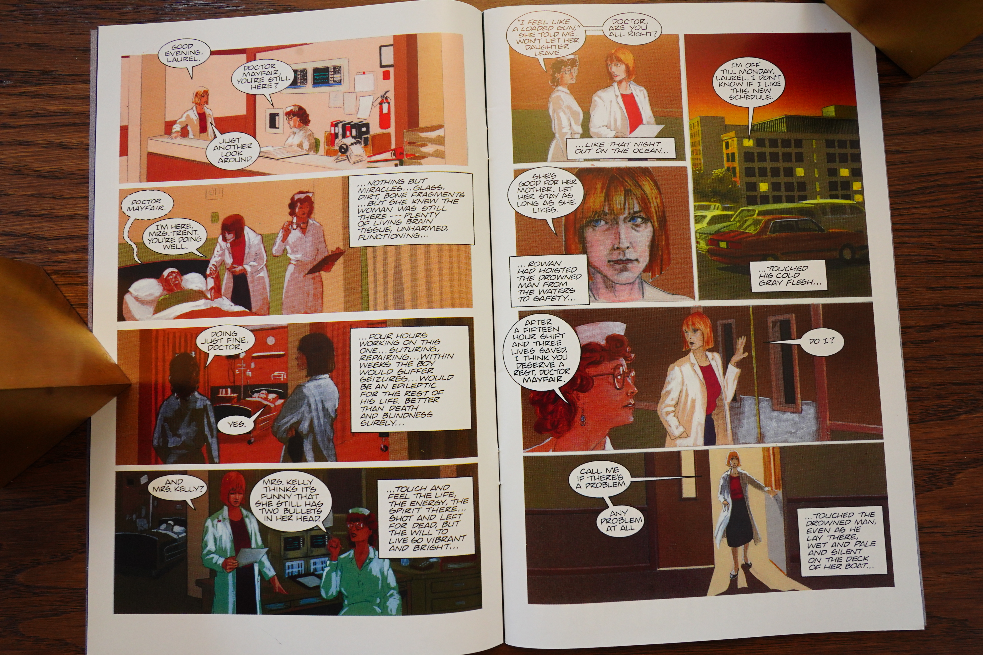
Anyway, this is a lot classier than usual NewComico matter — it’s on shiny paper, has a thick cover, and endpapers.

And is painted. This adapts an Anne Rice novel which I haven’t read — I’ve only read a couple of her books, and I’m not really a fan.
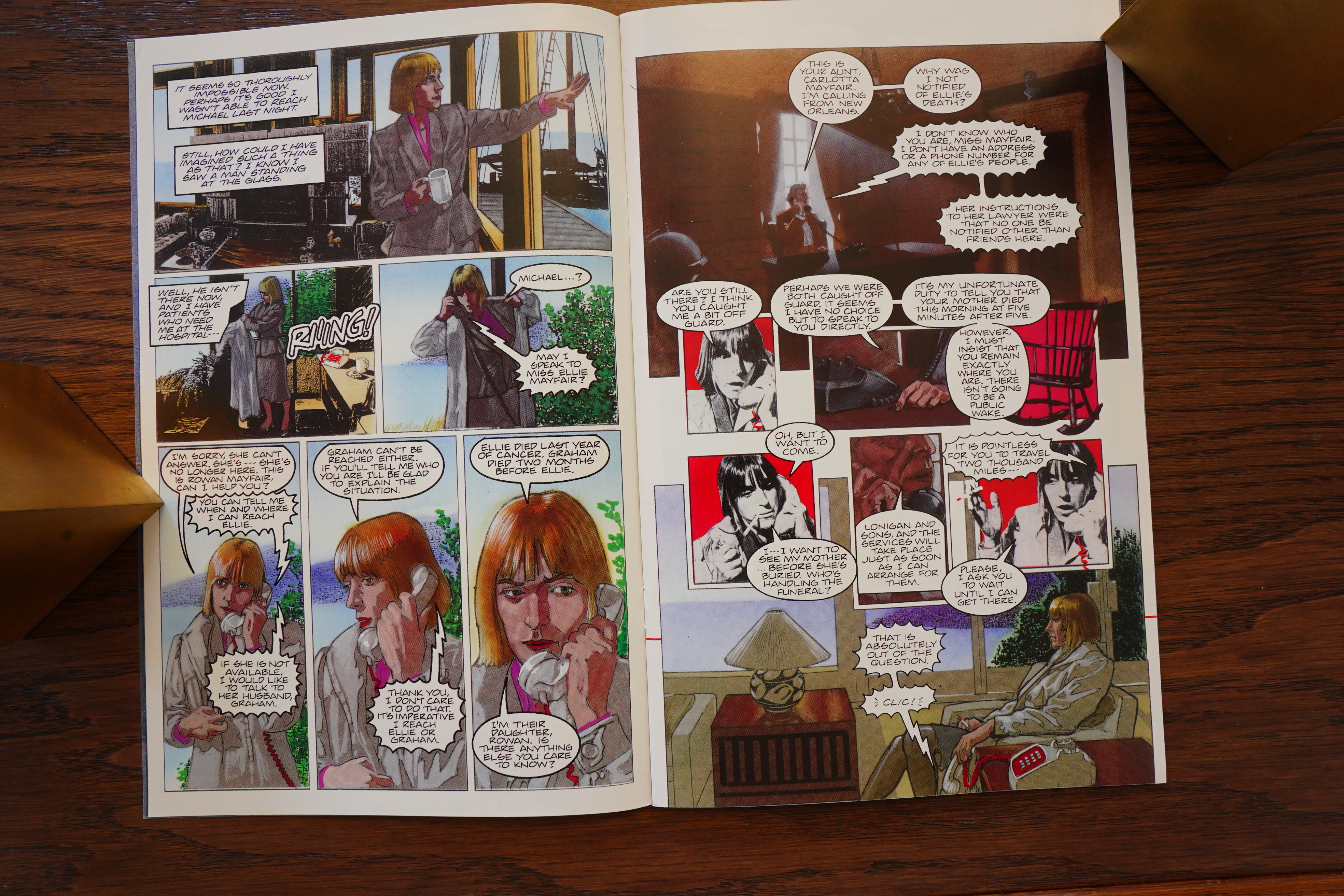
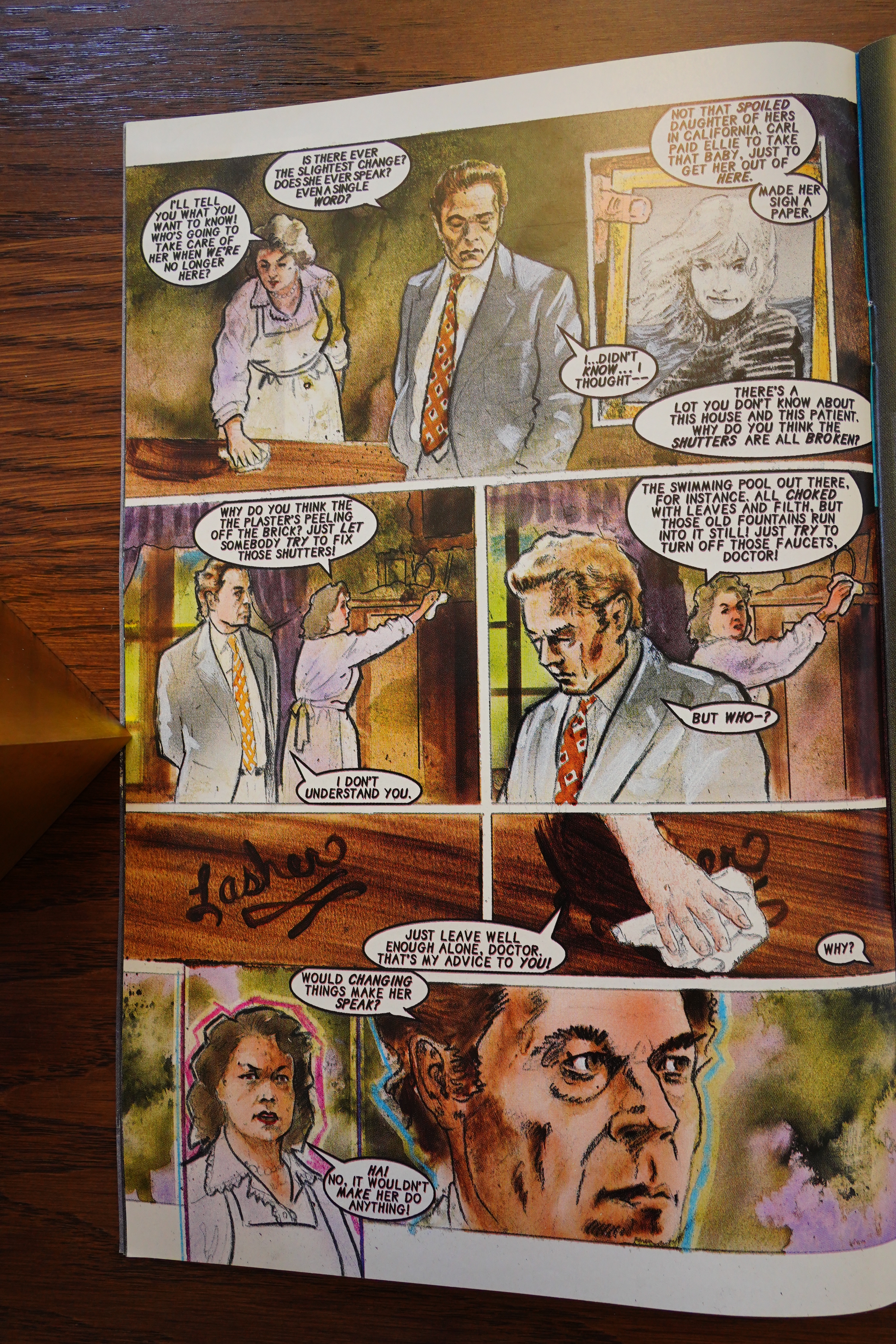
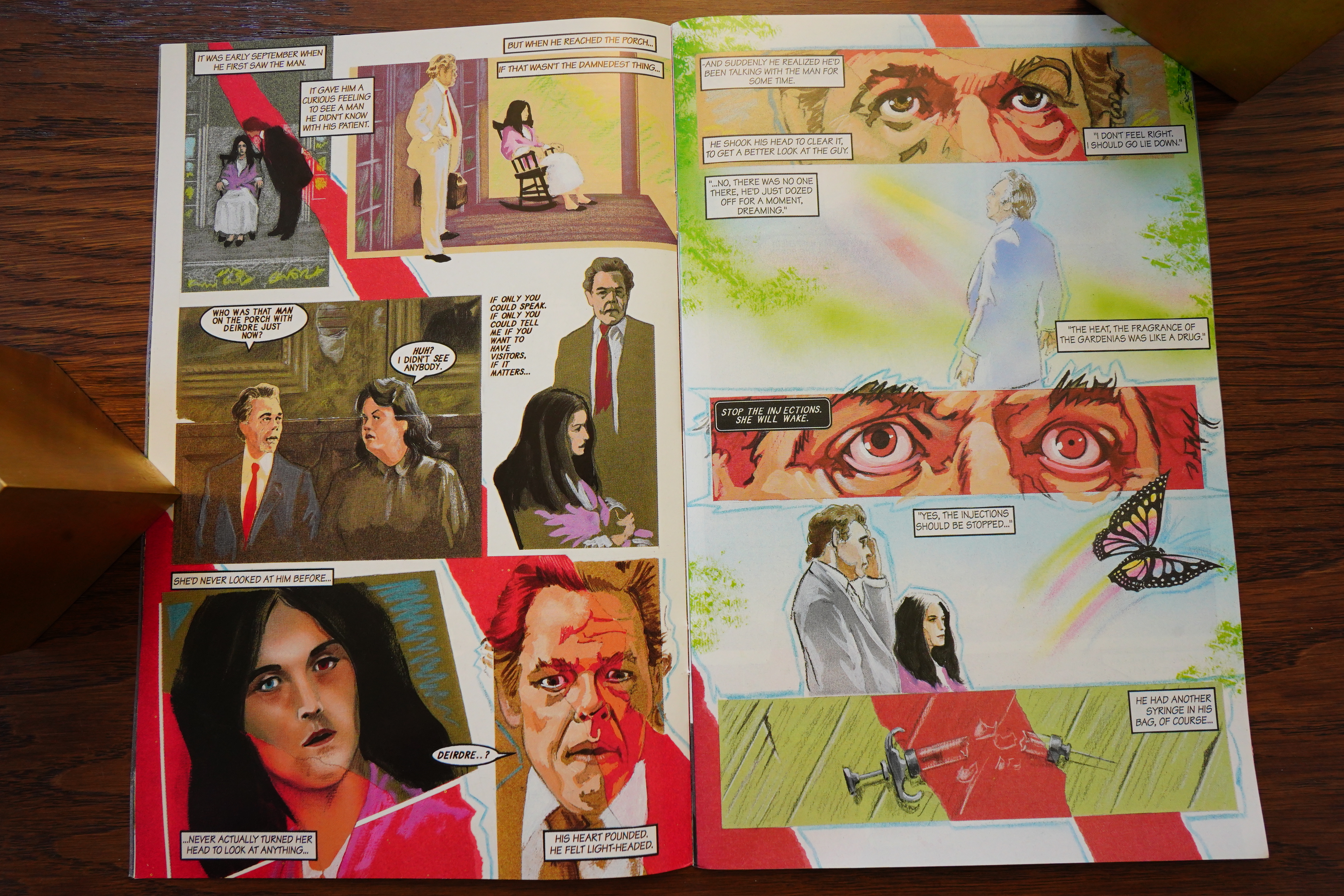
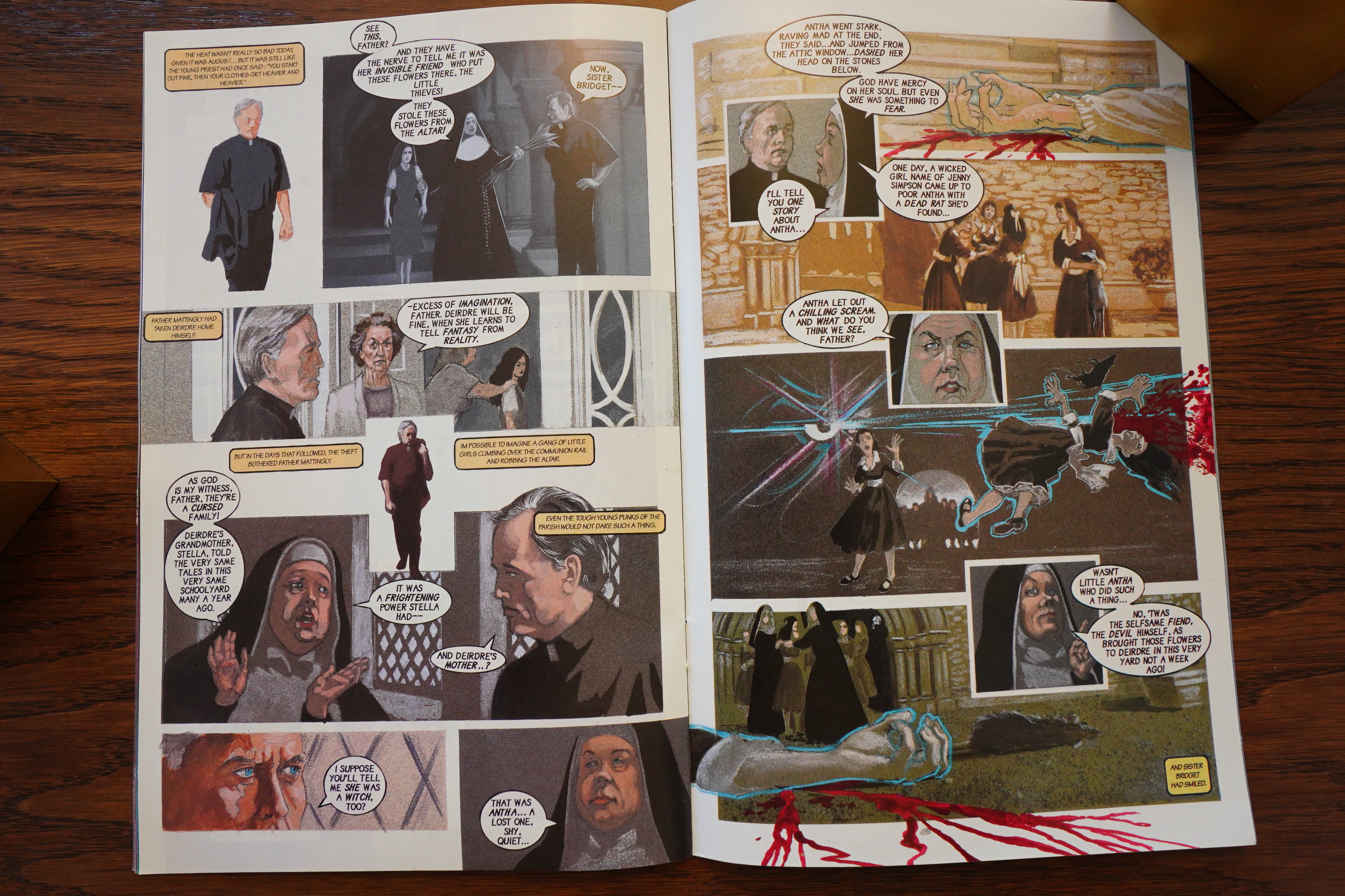
The artist, Duncan Eagleson, seems to be having a lot of fun doing the adaptation, at least. Many different approaches.

But it does feel a bit clumsy. What happens is often pretty vague — but that might be a conscious decision: The book is about mysterious things happening mysteriously, with confused people being confused. So that this is reflected in how the book reads would be logical.

On the other hand, perhaps Eagleson is just new to the comics business?

With the second issue, the cover announces that this is a thirteen part series.

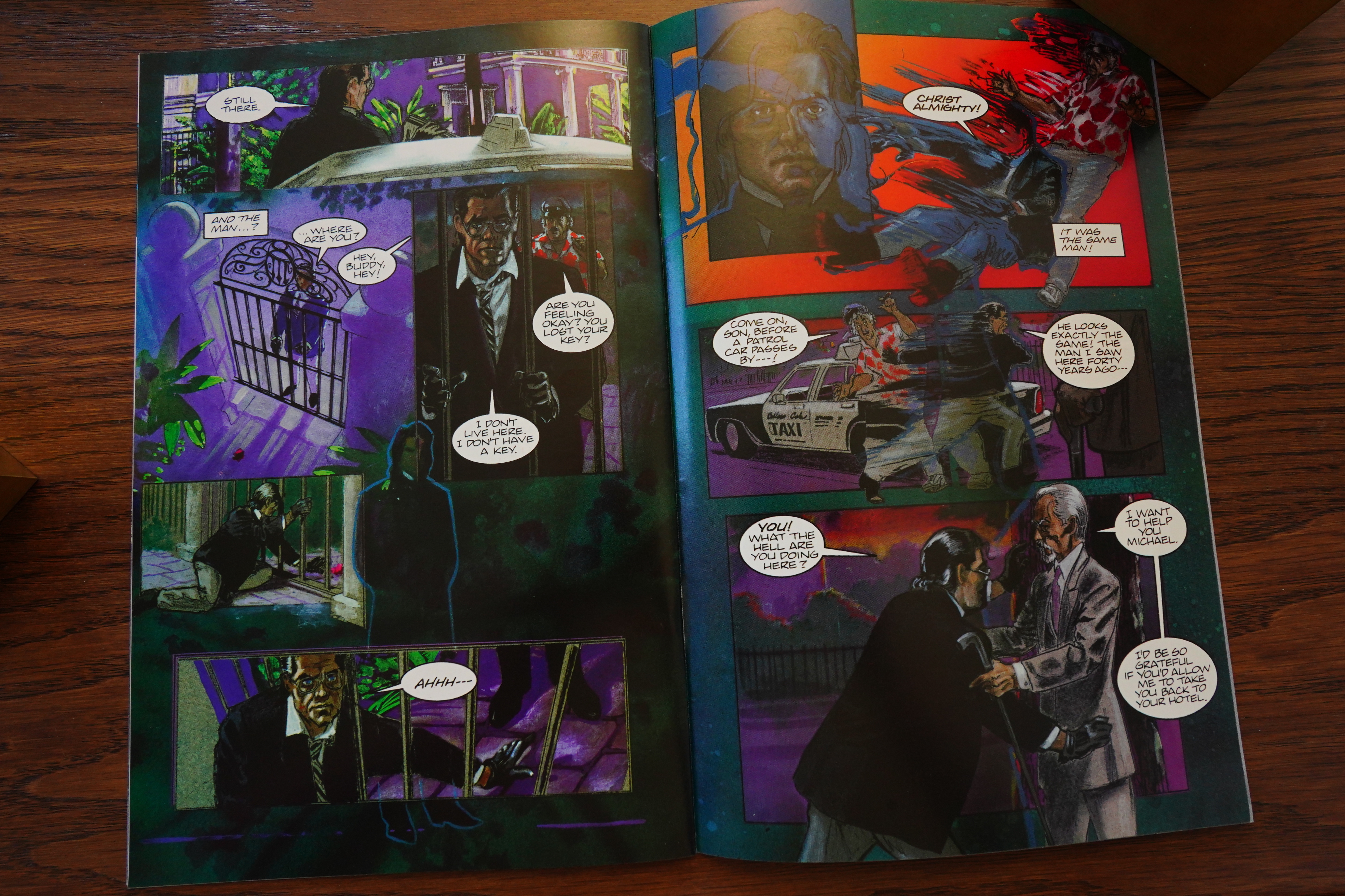
And I wonder whether a lot of time passed between making the first issue and the second, because it reads quite differently. Terry Collins is now credited with “script”, so I guess he’s writing the words, and may perhaps be clarifying things more?

In any case, it feels much more assured now, and I have to say that I was quite getting into it while reading this now: It works very well, as sneaking horror books go.

Hey! Spoilers!

I was going to say that the artwork looks extremely photo referenced, sometimes tending towards being fumetti-like… and then Eagleson drops in some panels that are just straight up photos. Well played!

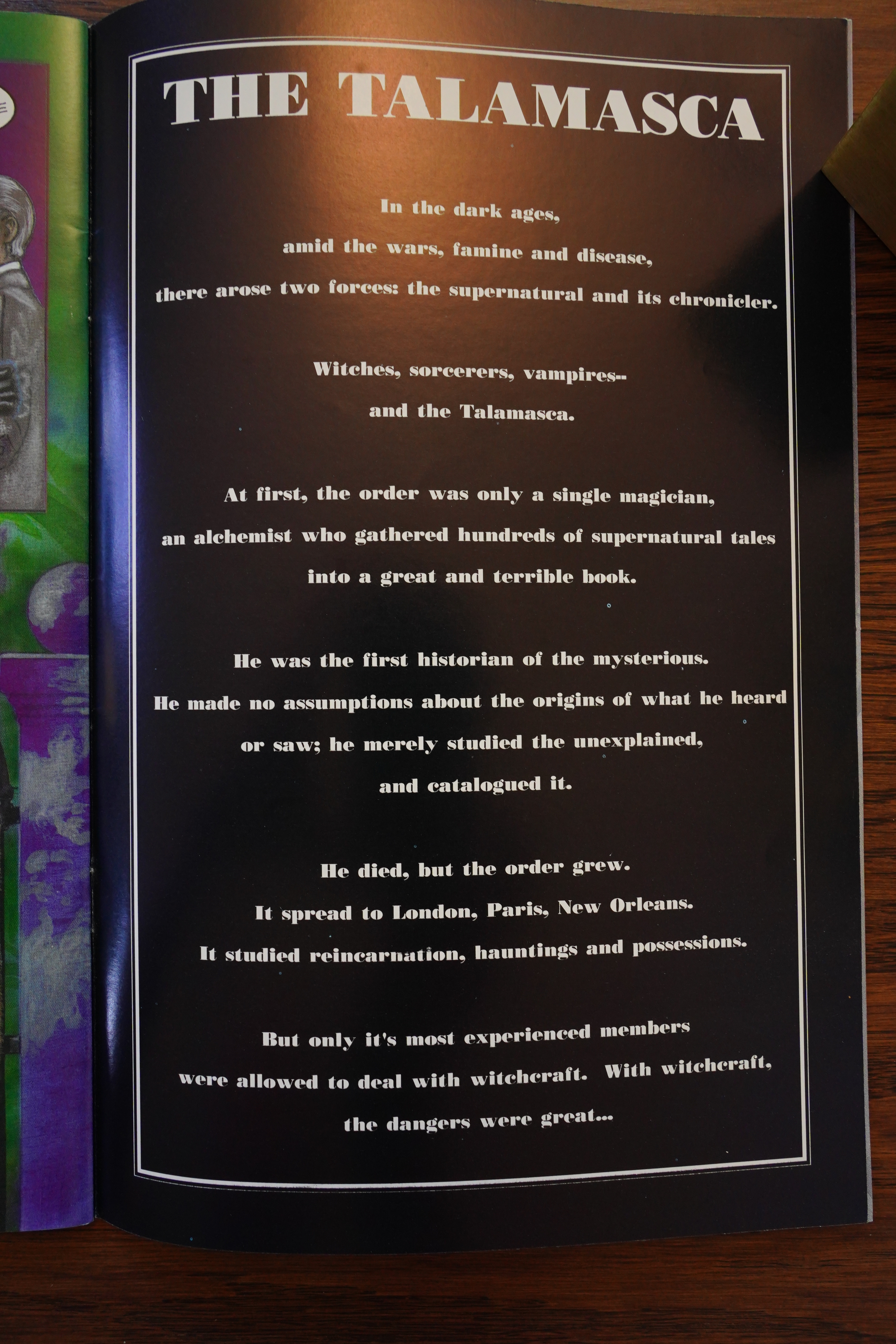
The fourth (and final issue from Comico) gives us a lot of backstory, but even that works well.

Millennium published one more issue on their own, and then they apparently shut down. Unfortunately, it was never completed:

Originally scheduled as a 13-issue series, by the solicitation of the 7th issue it had been reduced to a 10-issue series, and only 5 issues were actually released.

That’s a real shame — this is a really good adaptation. It flows well, and (after the first issue), it doesn’t read like somebody’s tried to cram a long novel into comics format.

Eagleson is a painter and illustrator, and he hasn’t done all that many comics, apparently.

I could find no contemporary reviews of this series. Or any reviews on the internet, either, but here’s an interview:

2) Around the same time you did Sandman you also worked wrote and did art for several issues of Anne Rice’s The Witching Hour comic book series. What was this experience like?

(DUNCAN:) That was a bit of a mixed bag, especially toward the end. It started out looking great − they came to me at first for the art, and they didn’t have a writer. I had just recently read The Witching Hour, and I was wanting to start building a name as a writer, so I convinced them to let me script as well.

Between scripting and illustrating, I had no time to get involved in the marketing, but I probably should have tried. They were marketing the book to comics venues, treating it as if it were a superhero book, which wasn’t the best choice. The Anne Rice audience was huge − but they’re not your typical superhero comics audience. As it was, I think we got some respect from folks in the industry − the one time I met Kelly Jones, he was kind enough to say he thought The Witching Hour was the best full painted book on the market at the time − but the sales of the first couple of issues were disappointing.

To be fair to Millennium, novel adaptations are always a hard sell in comics, and traditionally don’t do very well. And although I think The Witching Hour might eventually have found its audience, they just didn’t have the kind of funding to hold the line until that happened, they needed to make money off the book right now. And that wasn’t happening. So the book got cancelled, and shortly thereafter, the company went belly-up.

As an artist & storyteller, however, I had a great time doing it. I unleashed everything I had learned about drawing and painting and visual storytelling on that series.

[…]

This was in the days before the use of Photoshop had become common, and I was doing a lot with Xeroxing drawings and photos onto colored paper, and painting over them with gouache, acrylics, airbrush, and pastel pencils. At one point, my editor, Jordan Bojar, called me up and said “I don’t know how you created this, what kind of techniques you’re using, but whatever they are, don’t ever reveal them to anyone.” Of course, I said “Why not?” I’m always happy to share whatever I’ve learned with someone who wants to know. “Because this is unique, these techniques are a gold mine,” he said. I thought he was nuts. Far as I’m concerned, anyone who wants to try out these techniques, knock yourself out. If you’re a mediocre artist looking for a gimmick, you’ll produce a cheap knockoff. If you’ve got imagination, and are good at what you do already, you’ll do something else with it, use it to develop your own unique creation. Why would I feel threatened by either possibility? A cheap knockoff will almost always be seen for what it is, and an imaginative, unique creation deserves to succeed, and be cheered on.