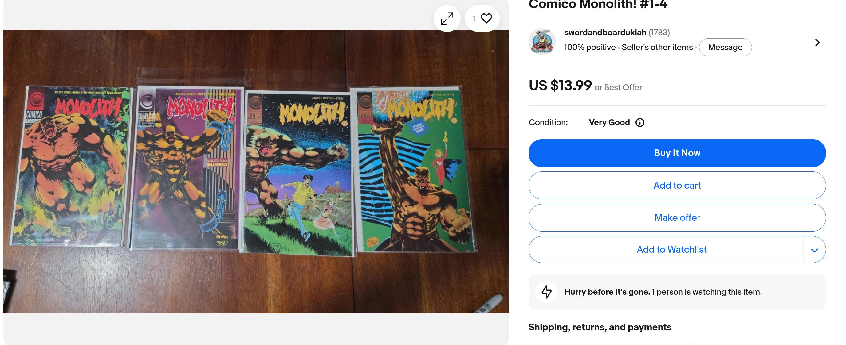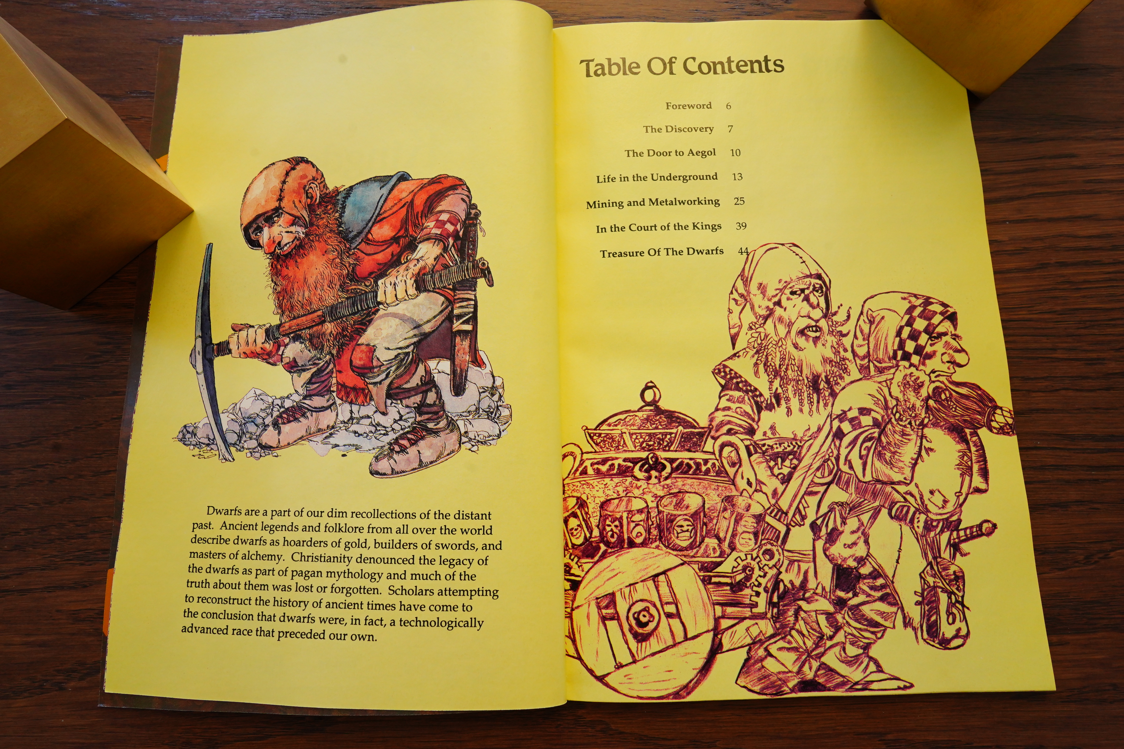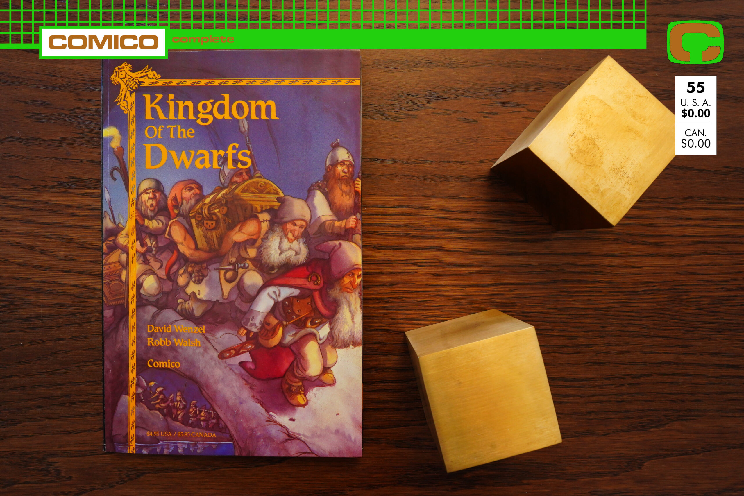
Kingdom of the Dwarfs (1991) #1 by David Wenzel and Robb Walsh
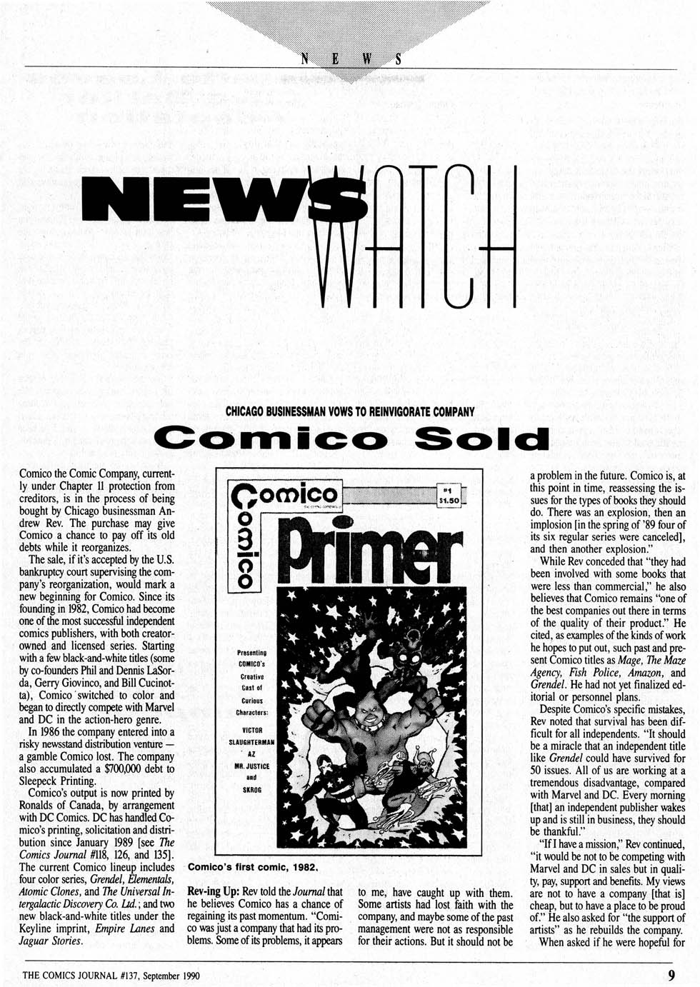
What’s this then!? In the last blog post, Comico was bankrupt… but now a year has passed, and Comico has risen from the ashes.
Sort of.
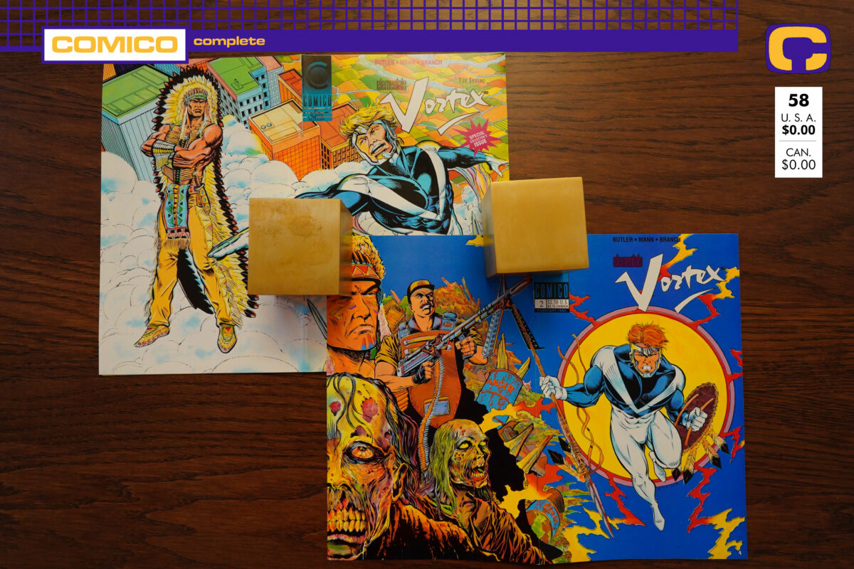
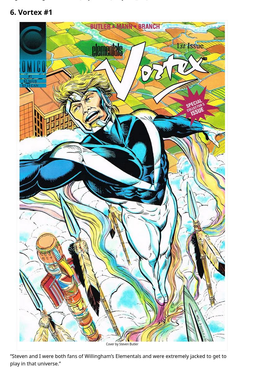
This wasn’t the first thing that the revived Comico published — I think that was an issue of Elementals? — but it the first new series.
And we can see here, none of the editorial staff stayed on. The new owner (and president) is Andrew Rev.
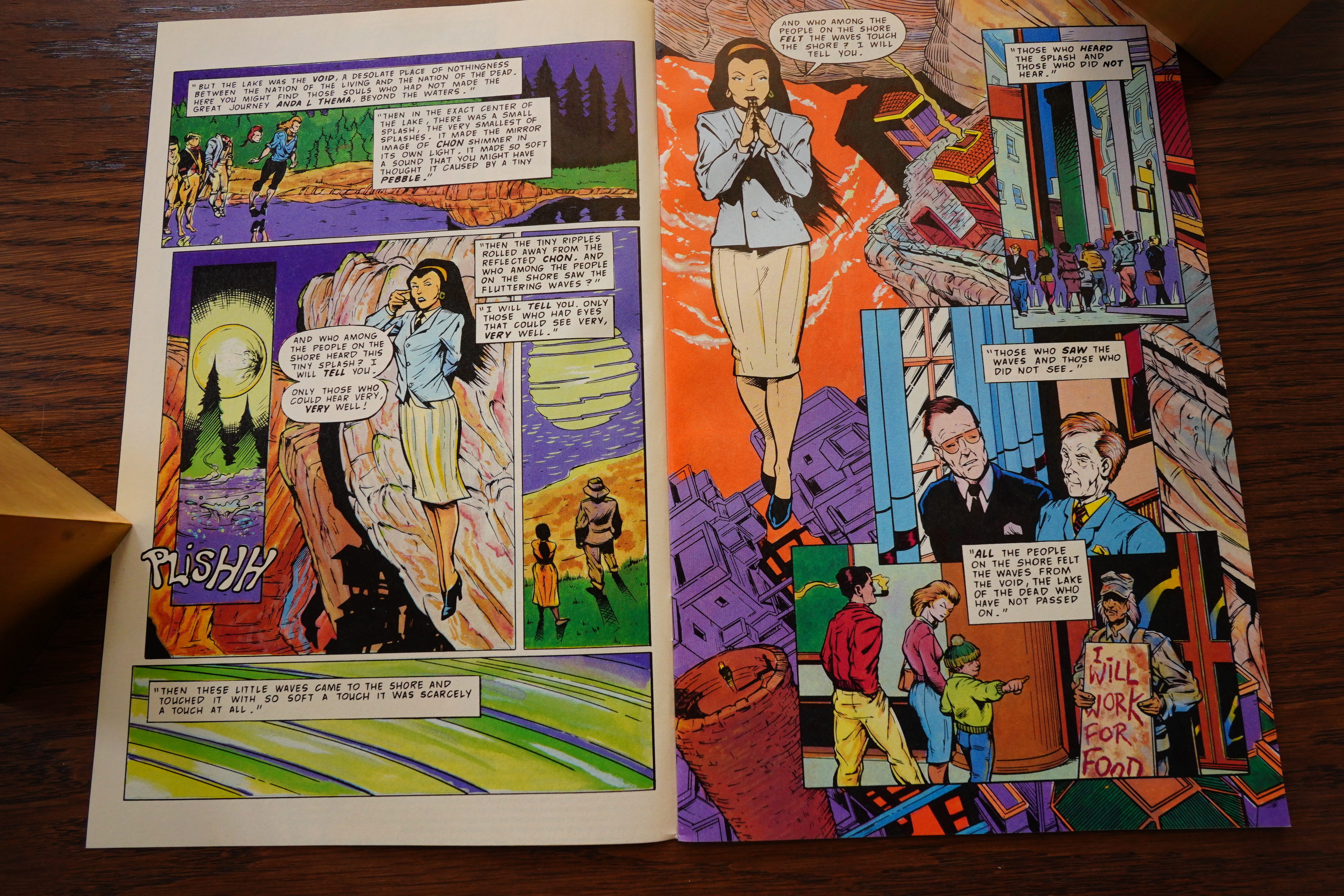
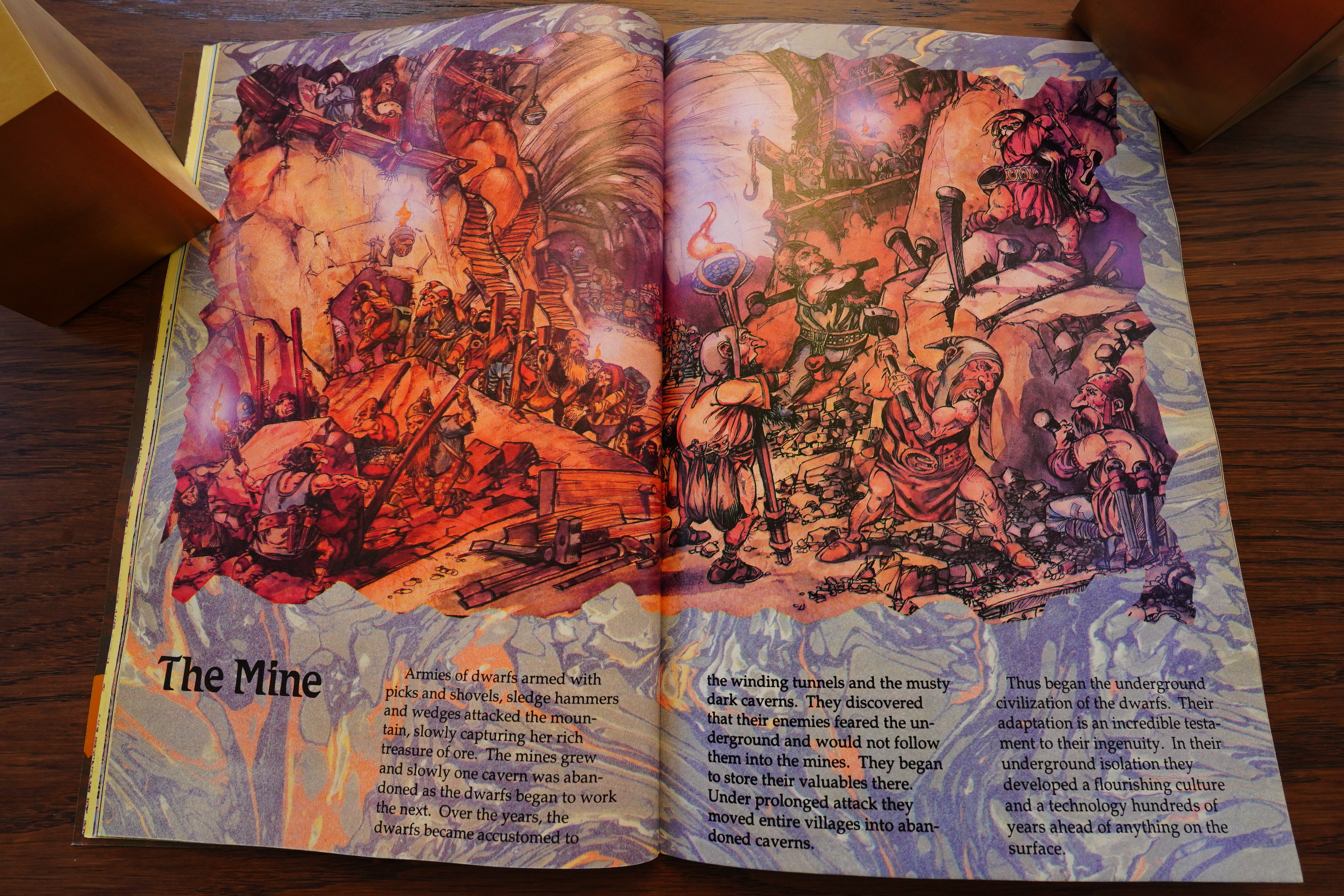
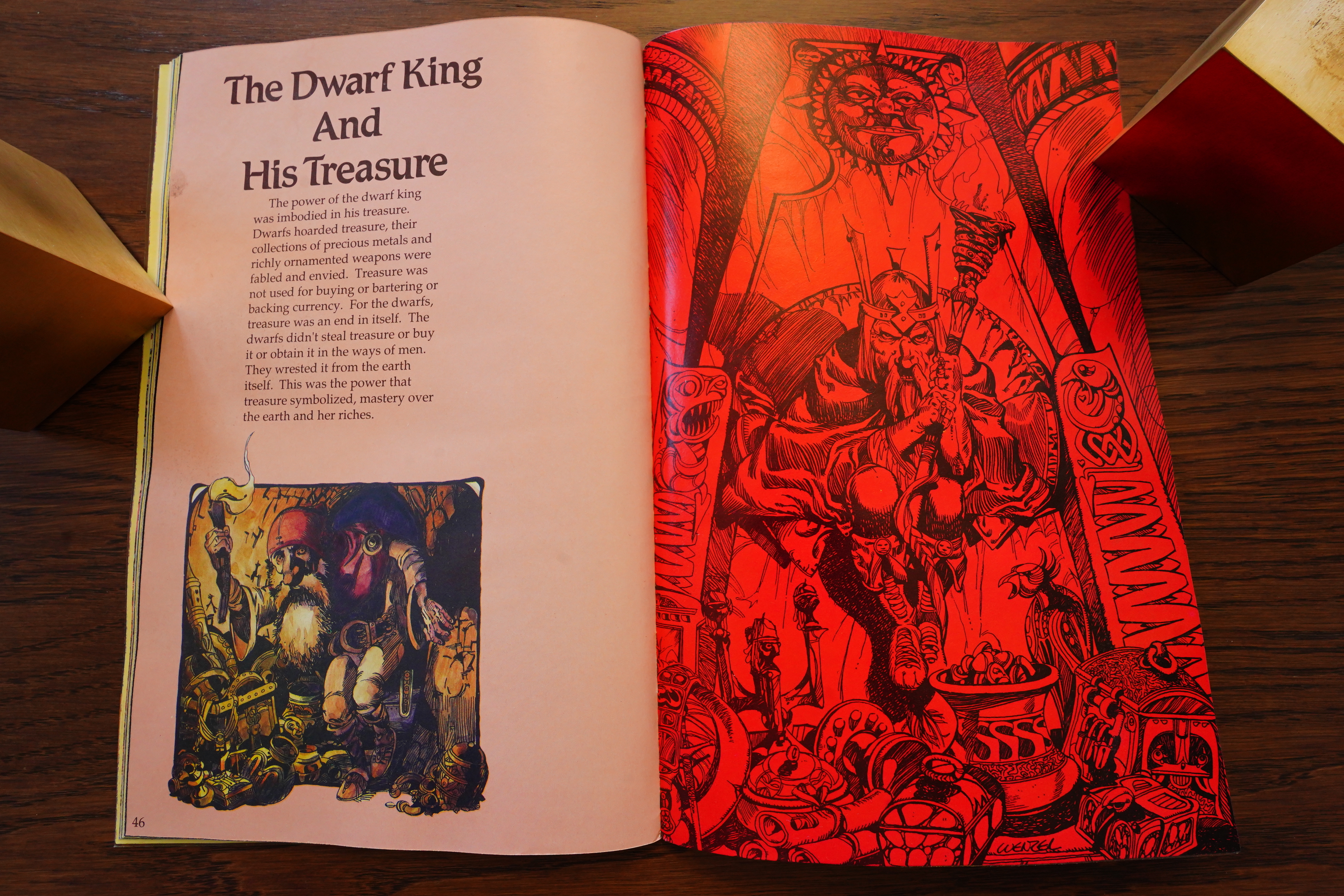
But what is this book, then? Well, the artist here had a minor hit with his Hobbit adaptation over at Eclipse Comics, and this book is about… dwarfs… so I guess it may appeal to the same audience.
(Kudos on the writer for using “in fact” correctly — it’s only used if you don’t know, or if you’re telling an outright lie. Also allowed in fiction, I guess.)
Anyway, the concept here is that Wenzel is part of an expedition to excavate a site of an earlier dwarven population, which sounds like a fun concept.
But… while they find the site (there’s no doubt about that at all, in fact), they don’t really do much with the concept.

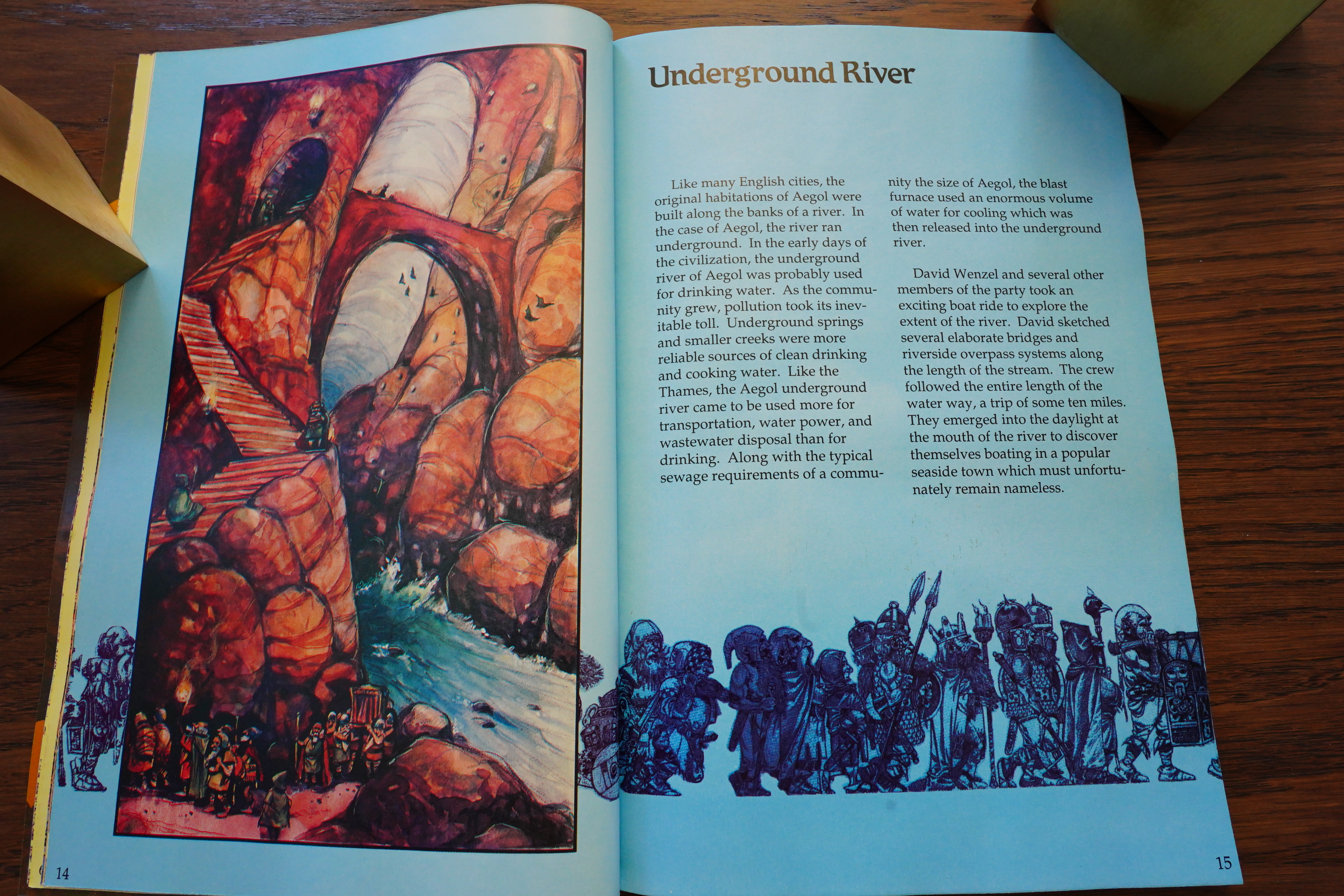
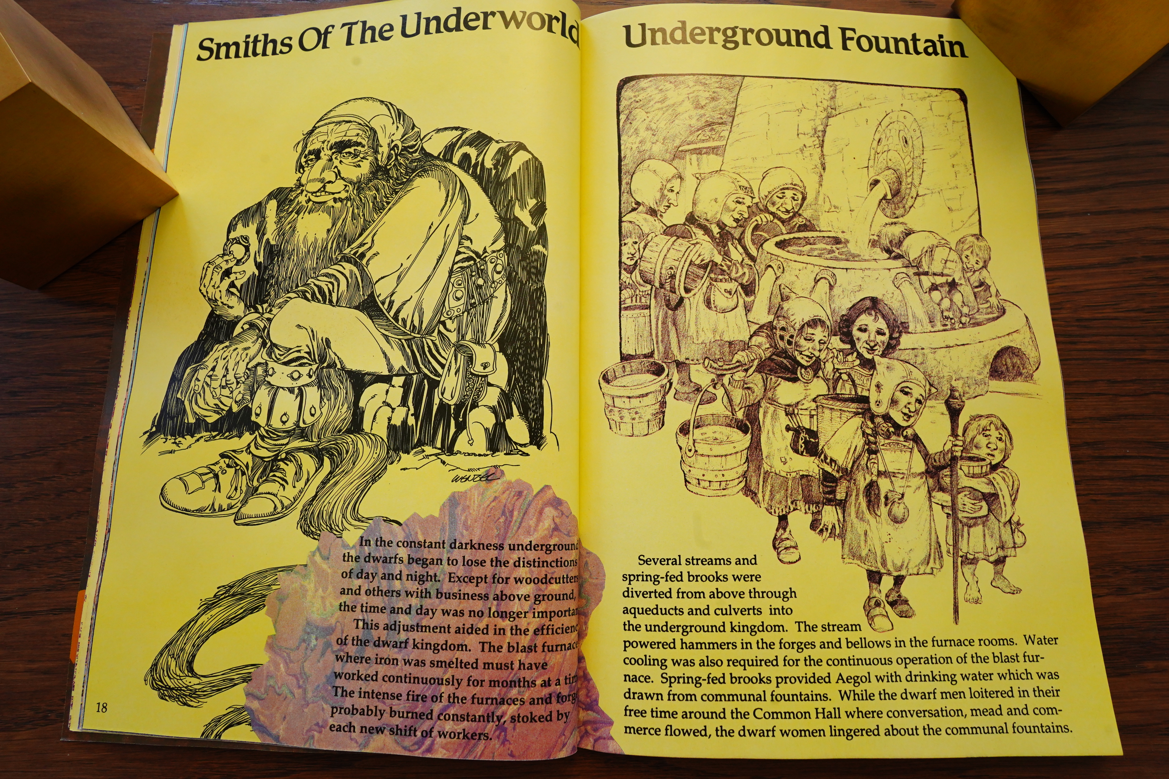
And after a third of the book, they just abandon it completely, and instead just illustrate what these people looked like, and how they lived.

Imaginary anthropologies can be fun — Always Coming Home by Ursula K. Le Guin to take an example — but this isn’t. It’s just kind of a “what do you vaguely remember from reading Lord of the Rings, then?” with some (admittedly) nice illustrations.

And this is how it ends. The indicia says that it’s #1 of Volume 1, so perhaps they had planned on making this into a series? And then it either bombed, or they didn’t want to work with Rev’s Comico?
The Comics Buyer’s Guide #891, page #4:
Asked for details of other
projects in the works, Schanes
spoke highly of the upcoming
Kingdom of the Dwarfs written
by Rob Walsh and illustrated by
David Wenzel. The project con-
sists of three issues, each 48
pages, “in color and black-and
white,” which will retail for
$4.95 per issue. “It’s text with
illustrations, and David did the
interpretation of The Hobbit
which Eclipse recently pub-
lished,” Schanes said. “It’s sche-
duled to ship in January, March,
and May, and all the art is done.
“We expect Kingdom of the
Dwarfs to sell as well as The
Hobbit did for Eclipse — and
Comico has worldwide rights to
Kingdom, so we expect it to be a
hot property for us.”
He added, “Some time in ’91,
we don’t know when, we expect
a third issue of Rocketeer Adven-
ture Magazine from Dave Ste-
vens. We hope it will be at a time
to coordinate with the Rocketeer
movie.”
He concluded, “Comico
hasn’t been very visible recently,
but there has been a lot of activ-
ity from our company.”
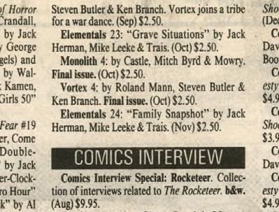
I can find no other contemporary mention of the book (except in listings).
Here’s a person who’s read it:
Therein lies my problem. As a storyteller I can fully appreciate the hard work that went into crafting this book. I don’t know how much research Walsh did into dwarf folklore but the attention to detail is really quite good. And yet I couldn’t bring myself to finish the book because as I stated at the beginning of this review I’m just not a high-end fantasy person, and barely dip into low-end fantasy, although there have been occasions when I’ve peeked into both.
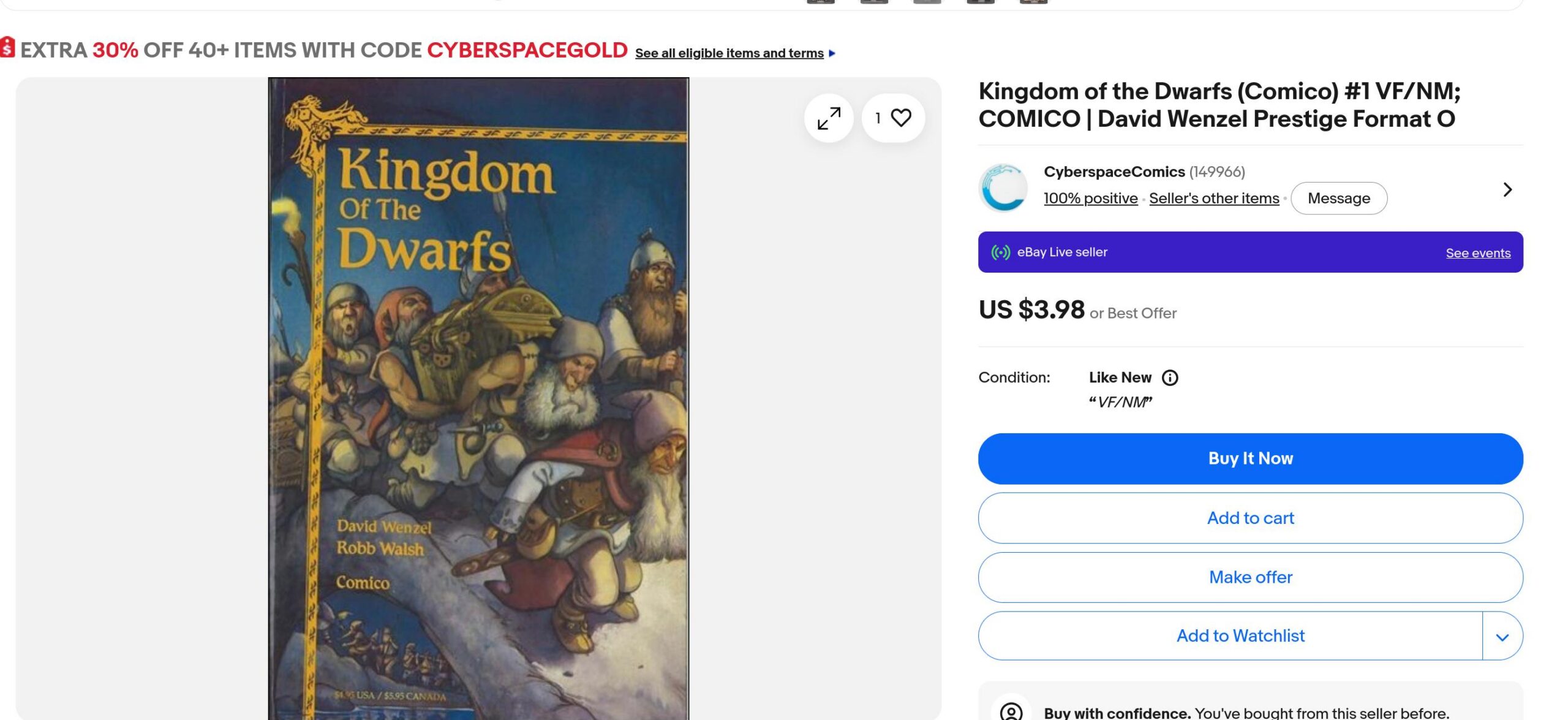
You can get copies of this at NM for below cover price, so I guess they did sell a lot of copies… but it’s not a popular item now.
Heh heh:
I miss books like this being made, doesn’t seem to be much like it anymore. It almost feels you could have gotten this from a scholastic book fair in grade school. Or even ordered off a late night Time-Life commercial!
Uhm… what’s this then?
I read this book when I was in 8th grade, and I checked it out from the library probably 8 times. I would read it over and over before going to sleep, just absorbing the art and the stories.
This is one of my all-time favorite books. The idea is brilliant, and the artwork is phenominal.
This was originally published in 1980?! As a 144 page book? So Rev just reprinted the first third of the book without actually mentioning this to anybody?
Well, I guess that seems par for the course.
Man.
OK, this is the first new RevComico book, so perhaps we should look a bit more on what happened?
The Comics Journal #278, page #81:
DEPPEY: One final question: I’m assuming that
you still own Elementals…
WILLINGHAM: No.
DEPPEY: No?
WILLINGHAM: No. The final act of Comico, when
Andrew Rev came in, he was gonna bail out
Comico. All I knew about him was he was a
money guy from Chicago, a comics fan, and
he was going to refinance Comico, come to
the rescue, all that kind of stuff. By this time,
I had decided that I didn’t want to just hang
on to another company that’s fighting for its
life, that I actually want to attempt to work
with publishers that kind of have a better
idea of what they’re doing. So I wanted out
of Comico. Elementals was still contracted
and if Andrew Rev bought out the company,
he was going to buy the existing contracts as
well. There were two ways to get out of it. One
was the way Matt Wagner took with Grendel,
which was just to fight tooth and nail for years
at a time to finally wrest his property away
from Andrew Rev. I went the other route. I
thought, “Well, I’m probably done with El-
ementals, anyway. I’m a little tired of it. I’m
not gonna continue.” By this time, I’d gotten
some bad vibes from this fellow that I did not
want to work with him as the new publisher.
I thought, “Well, I bet he won’t try to hold
me to a contract if he can keep the rights.” So
I sold him the rights to The Elementals. The
original Comico people were being pretty
cagey about what the buyout deal was.
Overstreet’s FAN #1, page #72:
As the
new Comico struggled to maintain it’s position
as a publisher, the market continued to change.
Rather than fight against forces it was ill-
equipped at the time to battle, the company
made a bold decision. In April 1993, Comico
ceased publishing. To its fans, Comico was out
of business. This, however, was not true.
“It was my feeling two years ago that the mar-
ket had reached a saturation point,” states
Comico publisher Andrew Rev. “After talking to
readers, I realized that almost overnight, the fun-
had disappeared from comics. There was a lot-
of dissatisfaction. Our market research indicat-
ed that foil and other cover enhancements,
though financially successful, didn’t hide the
fact that the basic comic product was dull. I
found this disturbing, both as a publisher and,
more importantly, as a fan.”
Recognizing that a new direction was neces-
sary to make great comics, Comico ceased pub-
lishing, in spite of sales of over 40,000 for titles
like Elementals. Comico then got down deep.
in the trenches and embarked on developing a
to comics that would show the minute you
see their books and deliver the same kind of
reader satisfaction Rev found when he first di
covered Marvel Comics in 1963 after being a
loval DC fan.
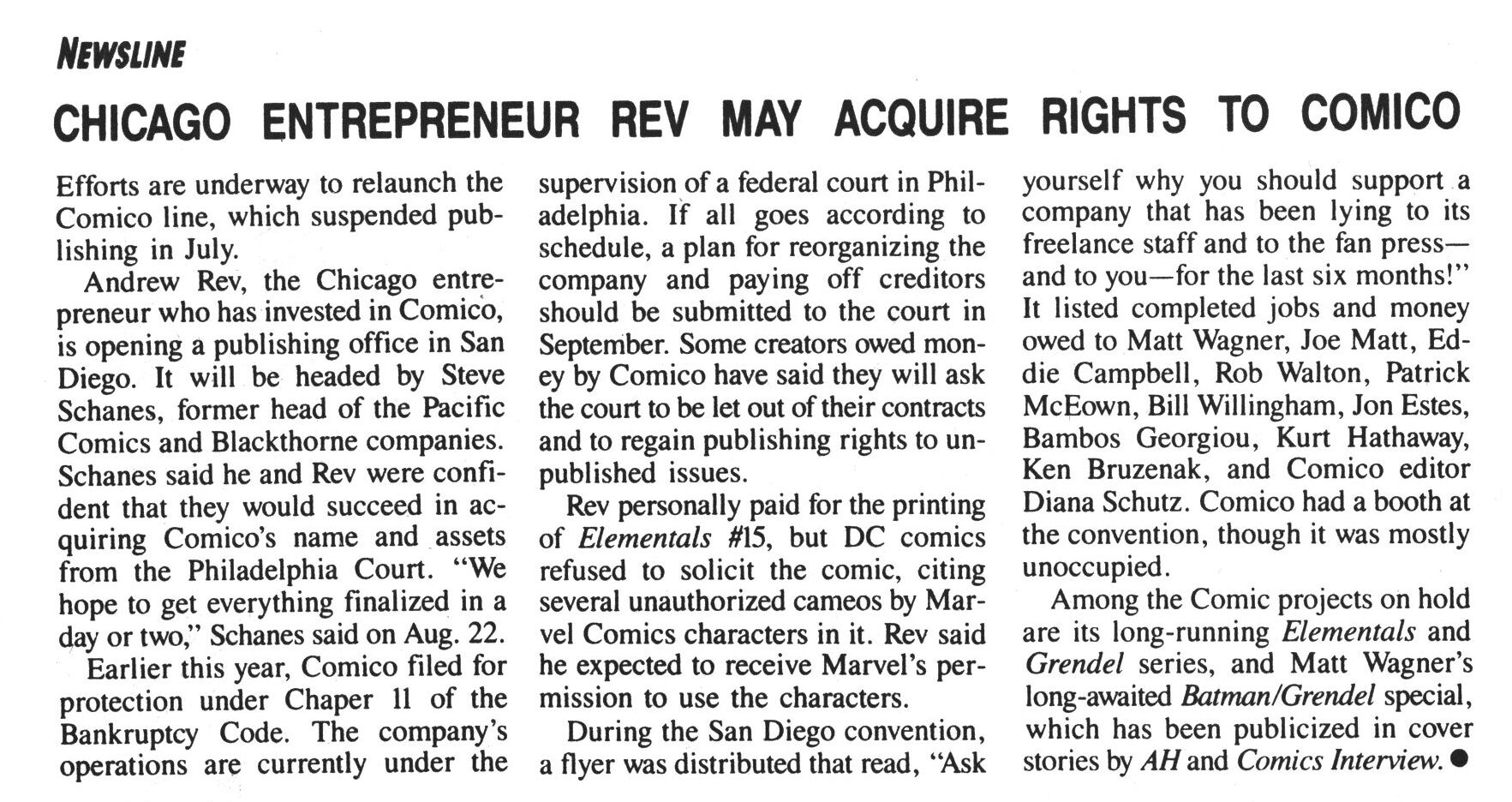
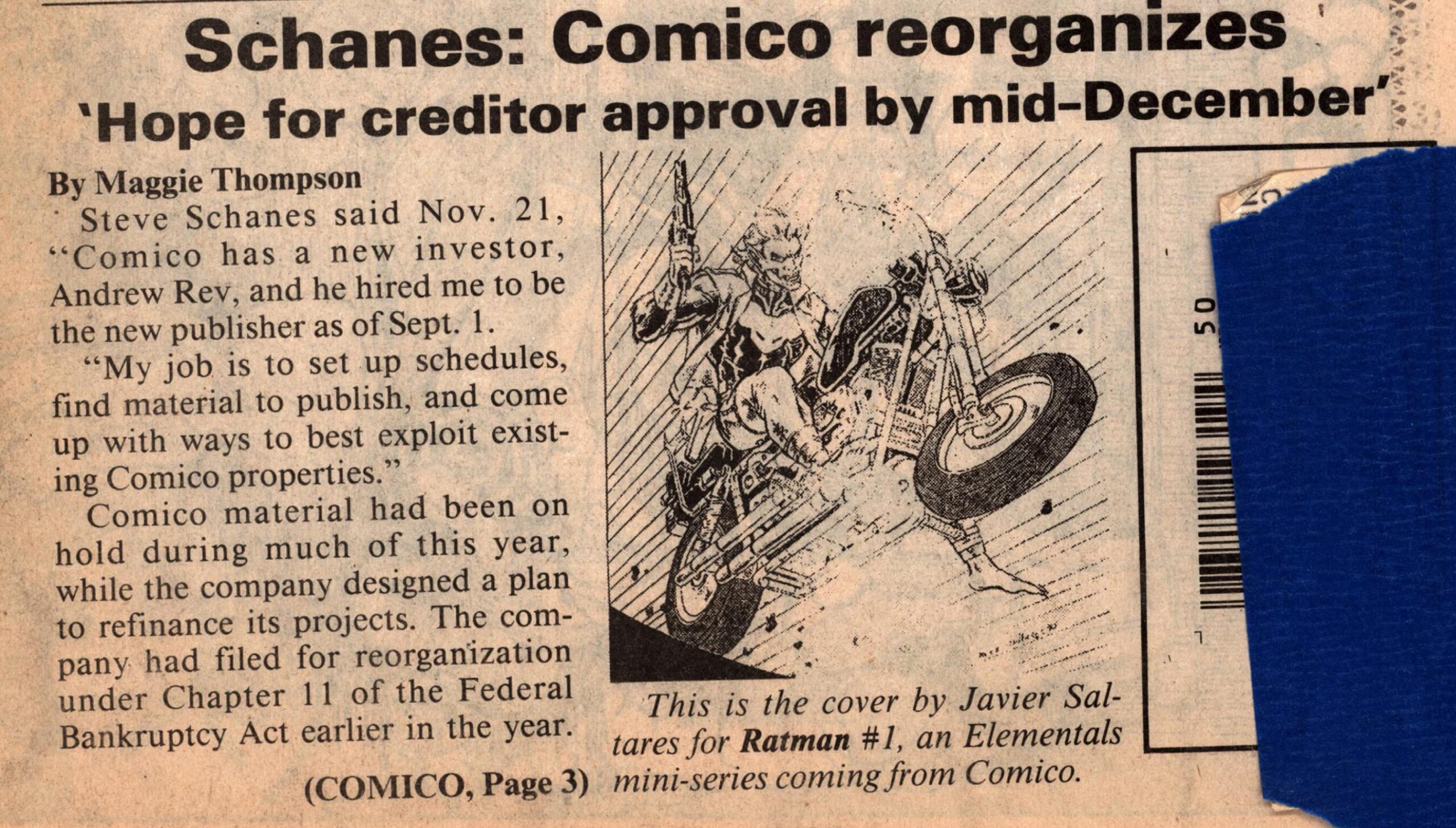
Oh — Steve Schanes (or Pacific Comics fame) was going to be a partner in the new Comico? I guess he was ejected tout de suite after the deal was done.
The Comics Journal #138, page #10:
Rev is opening a publishing office in San
Diego. It will be headed by Steve Schanes,
former head of the late Pacific Comics and
Blackthorne companies. Schanes said he and
Rev were confident that they would succeed in
acquiring Comico’s name and assets from the
Philadelphia court. “We hope to get everything
finalized in a day or two,” Schanes told the Jour-
nal on Aug. 23.
“I’ve been in the comics business for 19 and
a half years,” Schanes added. “I’ve had my trials
and tribulations, my ups and downs. But that’s
a fact of life in independent publishing. It’s a
little easier to keep going year in and year out
when you’re a big corporation.”
Among the Comico projects on hold is Matt
Wagner’s Batman/Grendel crossover, a co-
publication with DC. The crossover book is
receiving major fan-press coverage, with cover
stories in Comics Interview and Amazing
Heroes; should its publication be delayed too
long, its sales may suffer.
An anonymous flyer was distributed at the
San Diego Comic Book Convention, stating,
“Ask yourself why you should support a com-
pany that has been lying to its freelance staff
and to the fan press — and to you — for the last
six months!” It listed completed jobs and money
owed to former editor-in-chief Diana Schutz and
to creators Matt Wagner, Joe Matt, Eddie Camp-
bell, Rob Walton, Patrick McEown, Bill Will-
ingham, John Estes, Bambos Georgiou, Kurt
Hathaway, and Ken Bruzenak. Comico had a
booth at the convention, which was unoccupied
much of the time.
Heh. Flyers and stuff.
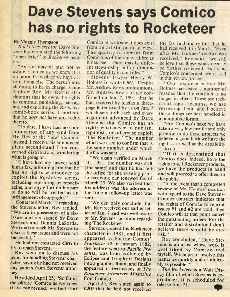
When Rev took over, DC Comics dropped the distribution agreement, I guess.
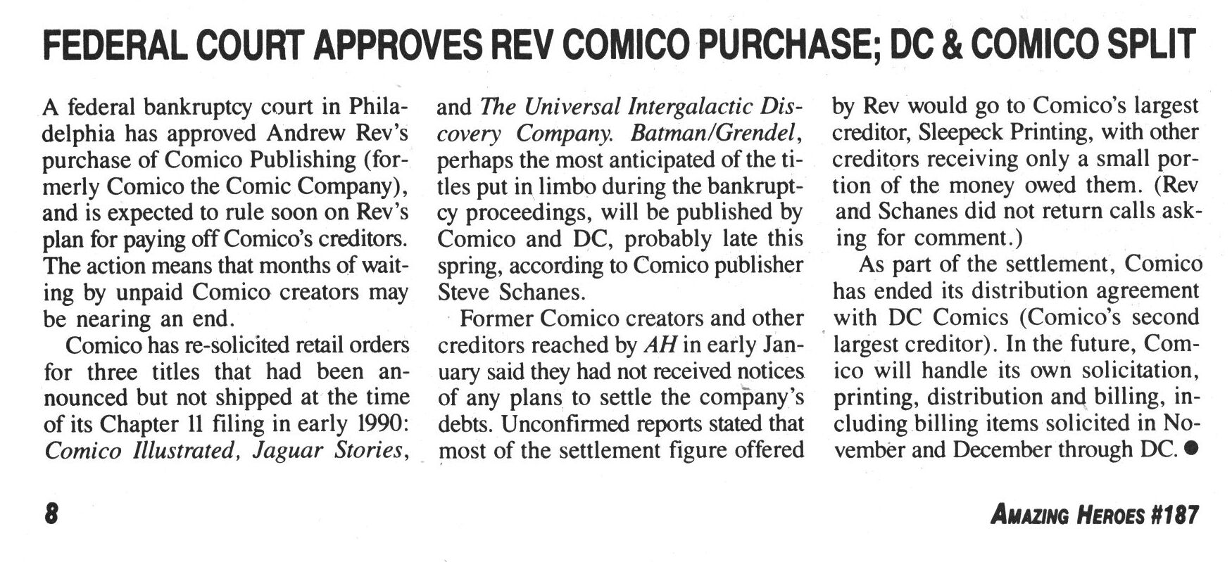
The Comics Journal #140, page #14:
Andrew Rev’s acquisition and bailout of Com-
ico Publishing has been threatened. A prelimin-
ary approval of Comico’s reorganization plan by
a federal bankruptcy court in Philadelphia was
appealed by a rival bidder for the company. A
second company filed, and then withdrew, a for-
mal objection to the plan. And Steve Schanes
reportedly resigned as Comico’s publisher and
editor-in-chief on Jan. 10.
The Comico saga was still being played out
as the Journal went to press, and many of its
details have yet to be settled. Based on reports
from a variety of sources surrounding the af-
fair, the Journal has learned the following:
Rev’s reorganization plan involves a $7,000
payout to Comico’s creditors, a payment of less
than 2 cents per every dollar owed. In return,
Rev will get Comico’s name, inventory, and do-
mestic publication rights to certain contracted
but yet-unpublished works.
A 2% payout! Wow, no wonder people were pissed off.
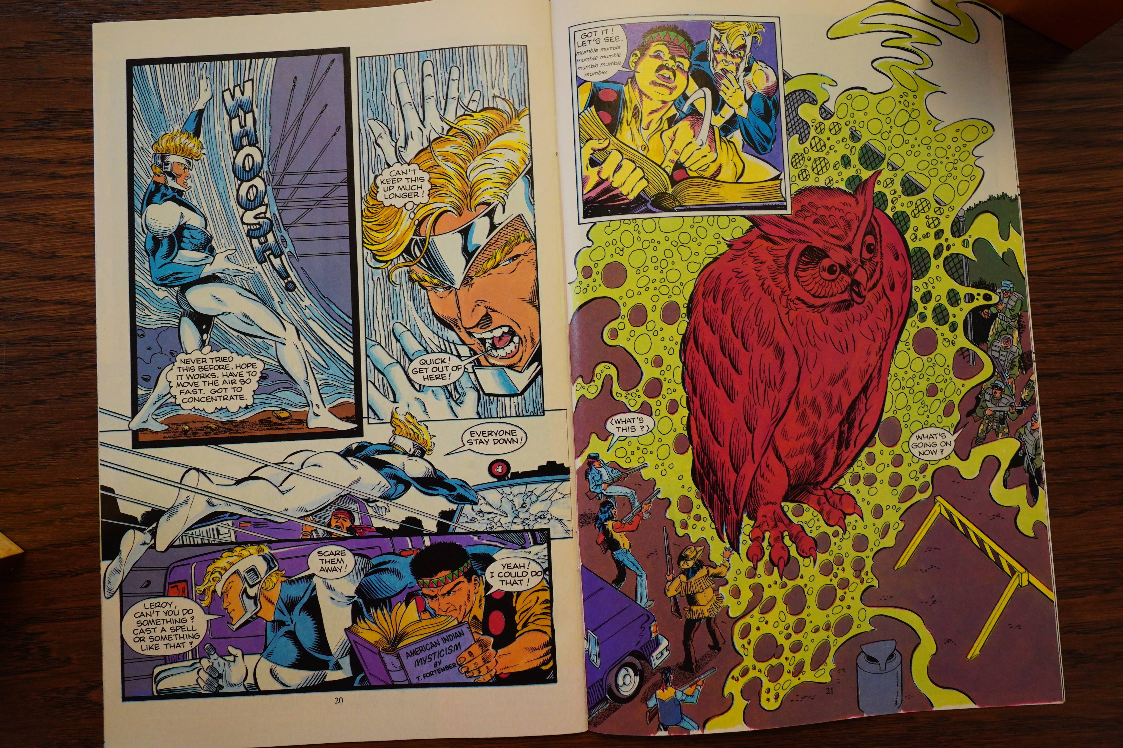
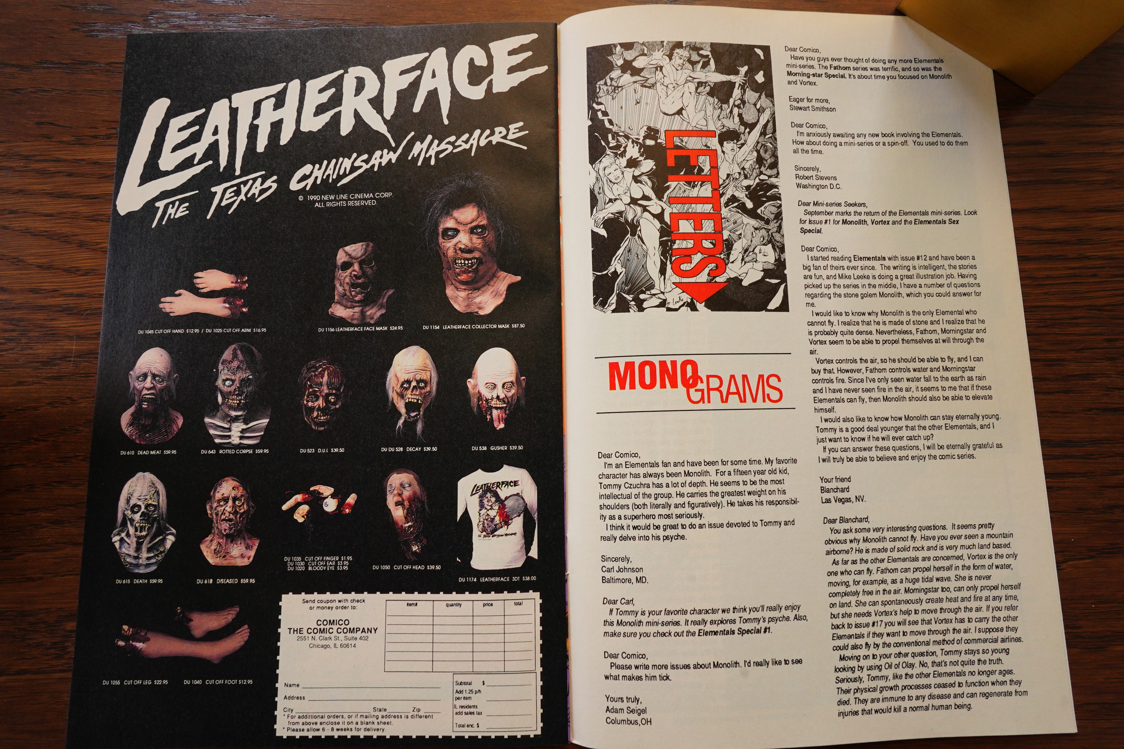
Rev made a separate deal in his own name
for the title and characters of Bill Willingham’s
Elementals, and commissioned new issues. The
team working on the new episodes, Mike Leeke
and Jack Herman, have yet to be fully paid for
their work to date. Leeke said of Rev, “He has
not been paying freelancers for new work. I
don’t see how he has any future in the industry.”
Willingham, who didn’t work on the new issues,
claims not to have been paid in full for the rights,
and is considering legal action.
Malibu Graphics (parent of Eternity, Aircel
and Adventure Comics) submitted a counter-bid
of $10,000, which was rejected by the court. Ma-
libu then appealed the approval of the Rev plan.
(When asked to comment, Malibu president
Scott Rosenberg reiterated the company’s poli-
cy of not responding to the Journal.)
Dark Horse Comics filed, then withdrew, an
objection to the Rev plan. According to presi-
dent Mike Richardson, “Dark Horse was in-
terested in the plan submitted by Rev as it related
to two creators with whom Dark Horse has rela-
tionships…to assist the creators in the protec-
tion of their copyrighted creations. At no time
did the creators involved promise Dark Horse
anything for Dark Horse’s efforts on their parts.
The situations surrounding these artists were
resolved without Dark Horse taking any action.”
The artists Richardson mentioned are Matt
Wagner and Dave Stevens, whose creator-owned
Grendel and The Rocketeer were published by
the original Comico. Richardson also stated that
Dark Horse had not bid for Comico.
Comico has re-solicited for titles that had
been announced but not shipped at the time of
its Chapter 11 filing in early 1990: Comico Il-
lustrated, Jaguar Stories, and The Universal In-
tergalactic Discovery Company.
Yeah, many Comico artists fled to Dark Horse (as did the editorial staff), so I guess things were strained between Rev and the refugees…
The Comics Journal #142, page #11:
Comico Opens: Over a year after Comico the
Comic Company filed for Chapter 11 bankruptcy
reorganization, Andrew Rev’s new Comico has
launched a regular publishing office at 2551 N.
Clark St. in Chicago (the original Comico had
been based in Pennsylvania). Releases as of ear-
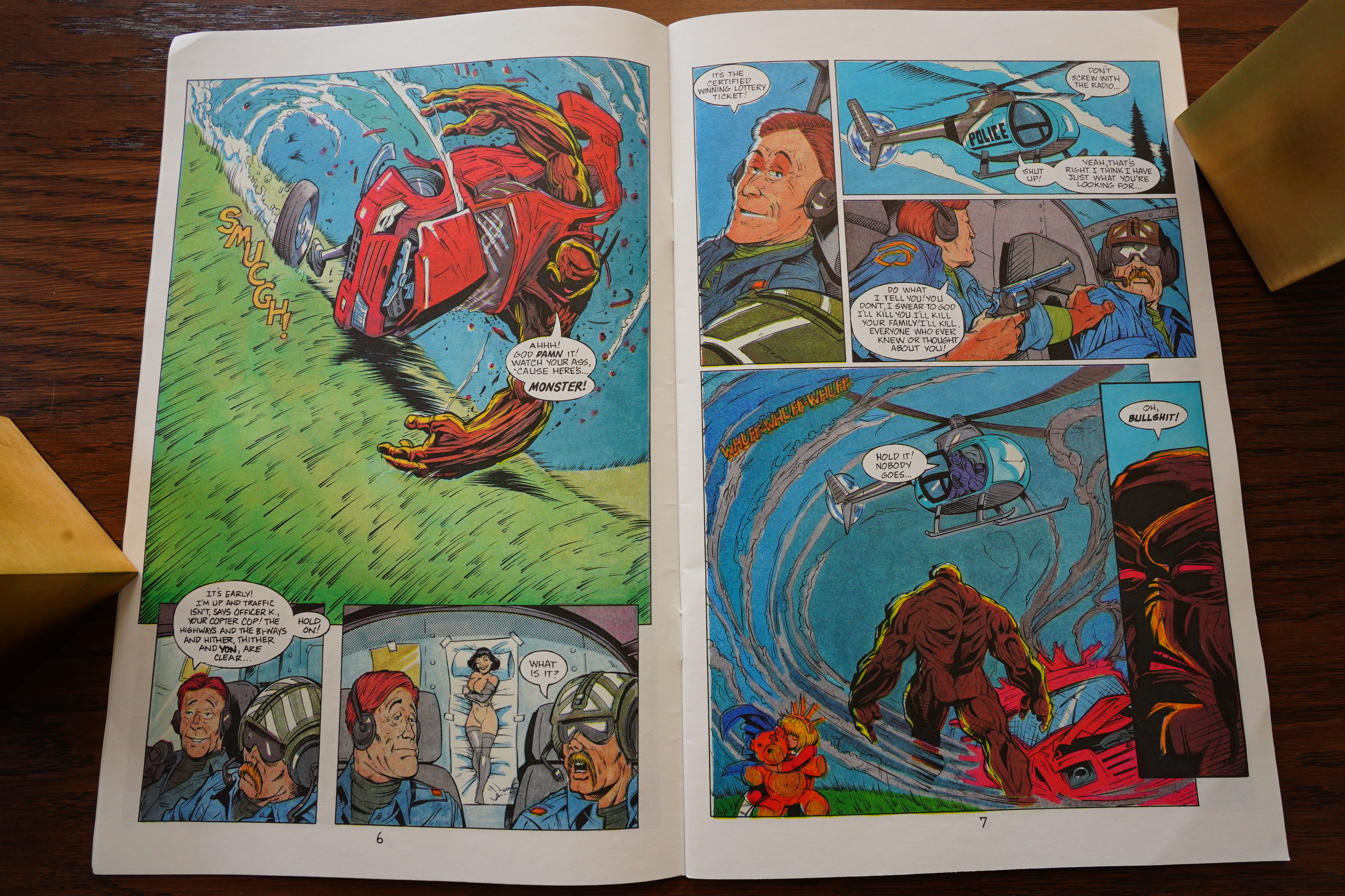
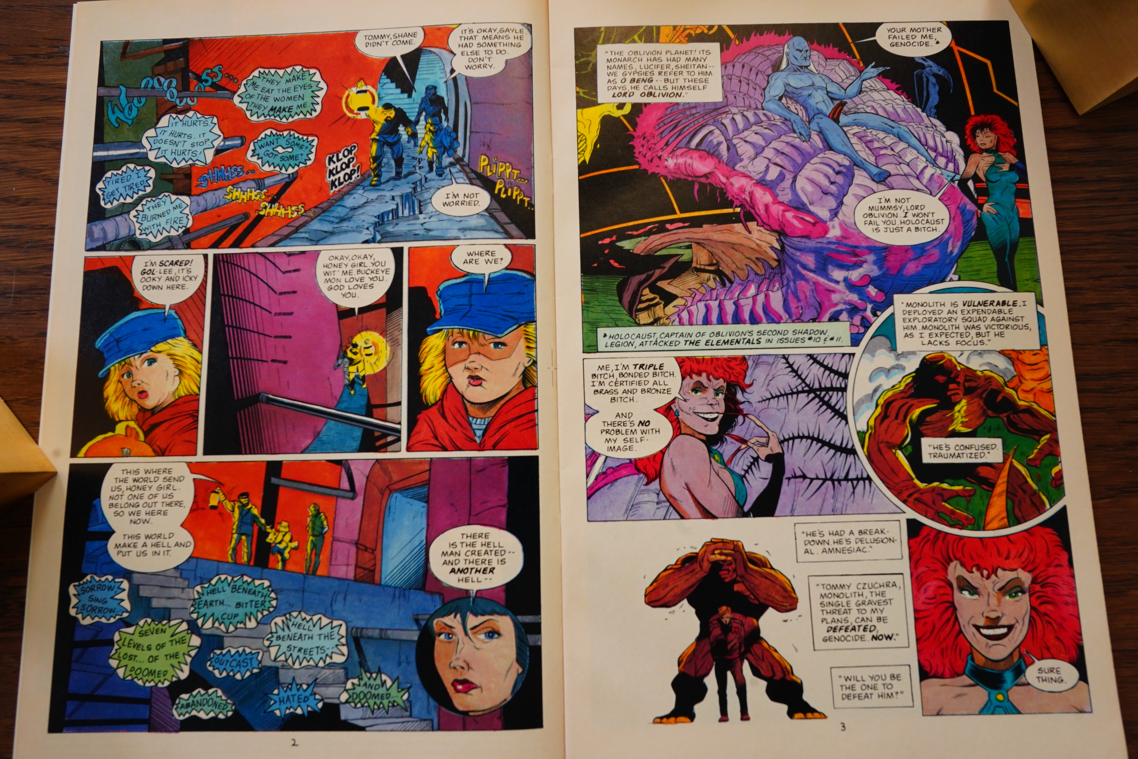
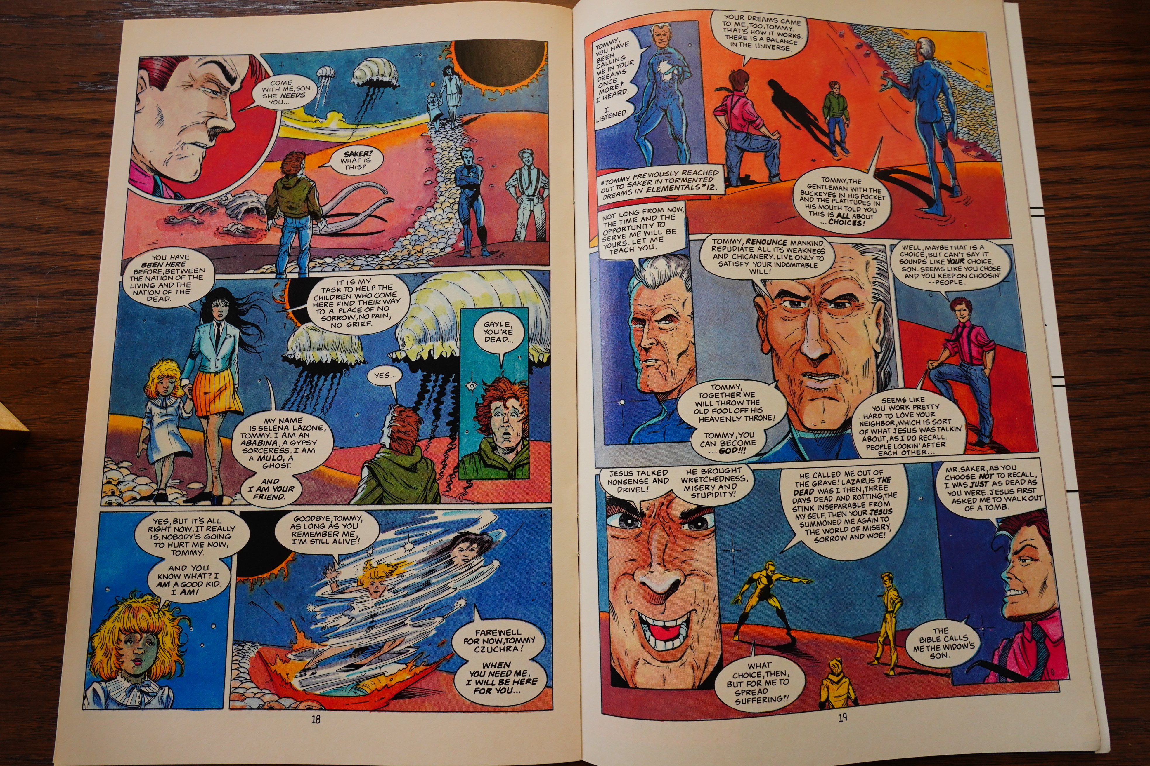
ly May include two issues of Elementals and one
issue of the horror anthology Splatter. The lat-
ter was issued under the Northstar imprint, with
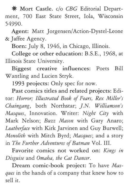
which Rev is also now involved. Northstar foun-
der Dan Madsen and editor Mort Castle are part
of the new Comico-Northstar editorial team;
Steven Sullivan (no relation to Time Wankers
creator Stephen Sullivan) is story editor.
The first comic released from the new of-
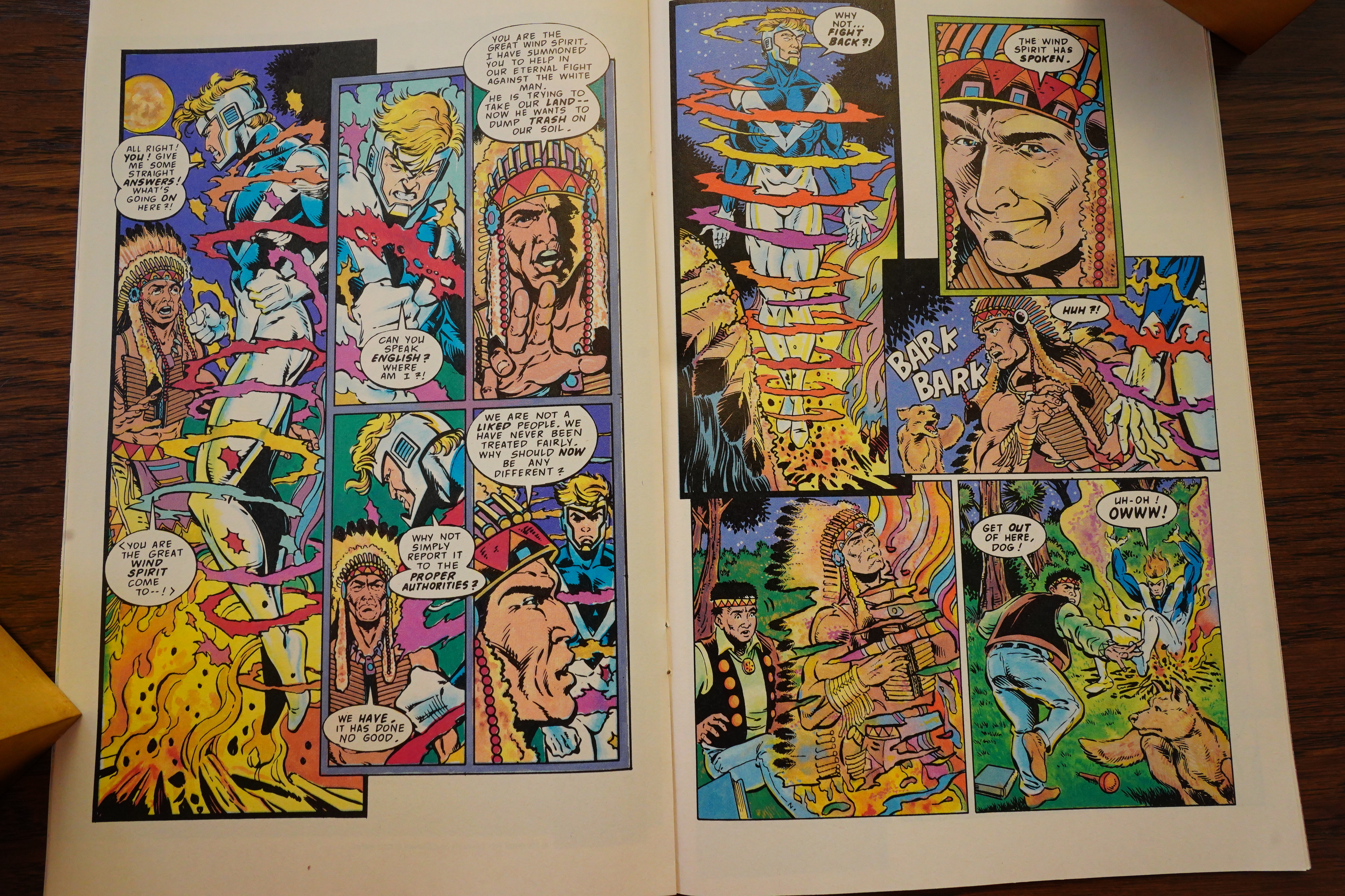
fice, Elementals #16 (commissioned by original
Comico publisher Dennis LaSorda), bore the
names of the office staff but not of creator-writer
Bill Willingham or the issue’s artists, Mike
Leeke and Mike Chen (Willingham’s signature
does appear on the back cover and as “Bill W.”
in a narration box on the last page, a box which
Willingham didn’t write but was instead added
by Rev’s staff). Creator credits did appear on
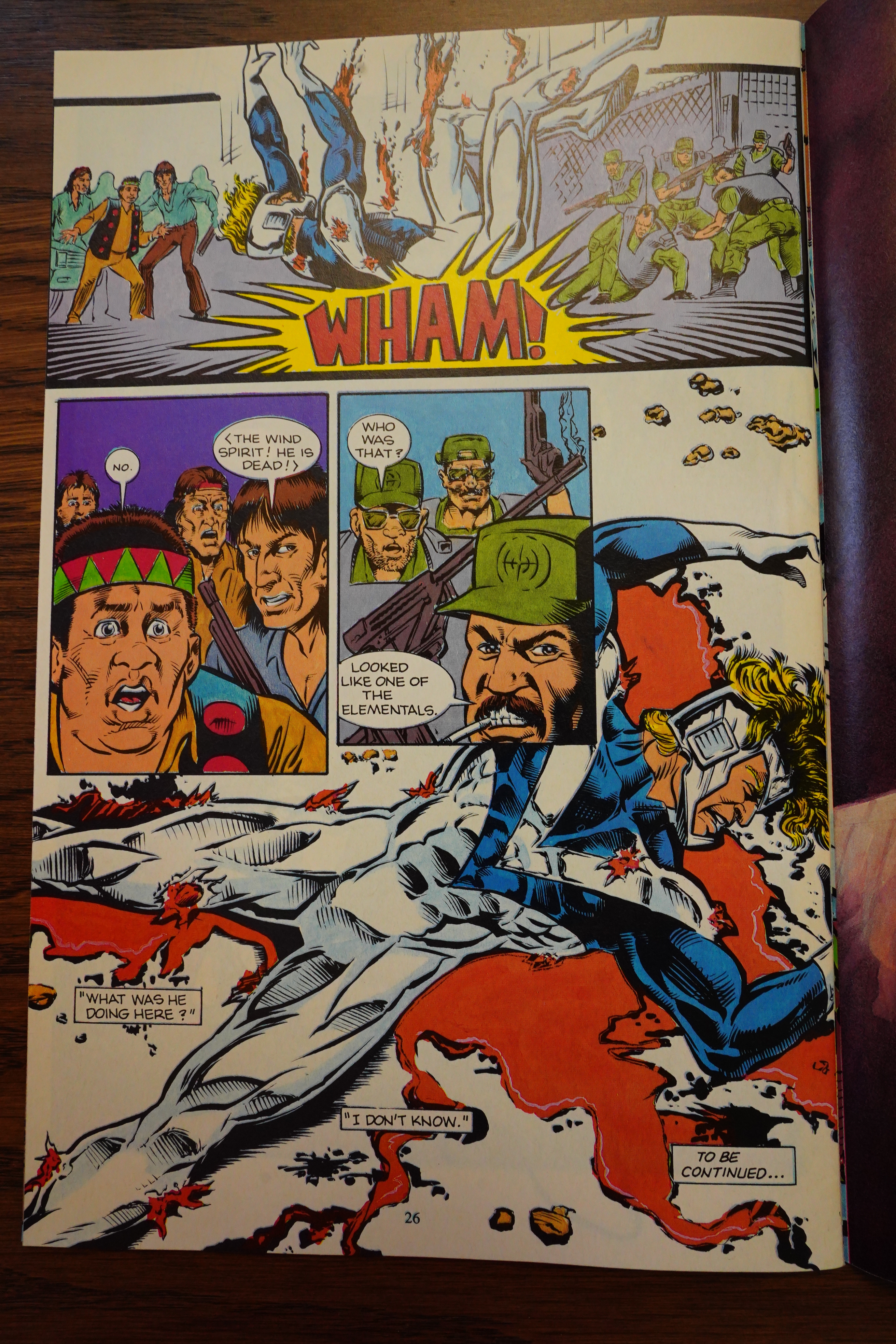
the Rev-commissioned Elementals #17, an issue
created prior to the Gulf War in which the su-
perheroes help American hostages escape from
Iraq. (Elementals #15 was published last win-
ter by Rev and interim editor Steve Schanes.)
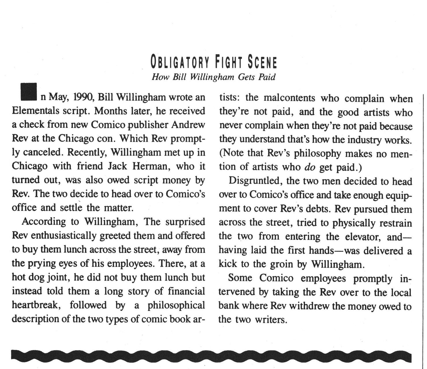
A minor scuffle broke out at the Comico-
Northstar office in early May, when Willingham
and Elementals artist Jack Herman showed up
to demand payment for their last work on the
series. “I got in a real argument with Rev,” Will-
ingham admitted. “I was telling him to pay us
up for the issues we finished a year ago. I said
that if he didn’t pay me, I was going to take a
fax machine. He tried to forcibly block me from
going into his office. I tried to knee him in the
groin, but I missed. He yelled for somebody to
call the cops. I yelled for the cops louder.” After
staff members and representatives of the office
building’s management helped get the com-
batants separated and calmed down, Rev went
with Willingham and Herman to his bank and
paid them in cash.
Fun!
And note how Schanes seems to be out now — he said the Comico offices would be in San Diego, but Rev opened the office in Chicago.
The Comics Journal #165, page #66:
PINKHAM: So he was trying to get you back on the book,
under his management?
WAGNER: Oh yeah, for a long time. Very persistent.
PINKHAM: He was holding out on things you wanted back,
like reprint film?
WAGNER: Yeah, he held the films. Several paintings were
never returned—I don’t know if that was his doing. At one
point, Steve Schanes was involved – as editor-in-chief of
the company — so. I think he did a lot of the clearing out
of the Comico office building, which was just a rat’s nest
of backstock material, financial information, artwork, etc.
So somewhere along the long lines of Comico changing
hands, lots of stuff got lost. And I don’t even know where
the reprint film is; we’ll find out someday.
PINKHAM: These are the reprint films to what books?
SCHUTZ: 40 issues of Grendel, 15 issues of Mage. Legally,
the reprint rights belong to Matt to take anywhere he wants
to — but without the film it’s impossible to reprint any of
that stuff.
WAGNER: We don’t know where it is, and Andrew would
never meet in various conversations with my lawyers.
Andrew has indicated that he has all the film, but I know
that when Comico went down, stuff was scattered all over,
amongst printers, warehouses…
PINKHAM: You’ve sold the original art?
WAGNER: Yeah. I never anticipated this sort of problem as
a young, stupid artist. We were able to reprint Devil by the
Deed because I just so happen to have all the originals to
that still. I hadn’t sold any of that off, so we just had it re-
colored and printed off the originals again.
PINKHAM: How much was DC involved with getting the
Batman/Grendel work out of the mire?
WAGNER: That’s what was the most frustrating about it.
Eventually, Andrew made a few technical errors which
enabled me to break my contract with him for Grendel and
bring it to Dark Horse. I probably just should have done it
earlier anyway, just been a little ballsier about it, because
I don’t think he ever would have chased me. So I had
broken my Grendel contract with him legally, but the only
existing contract for Batman/Grendel was between DC
and Comico, and for the longest time DC tried to work
things out with him. He was very antagonistic, apparently,
and they didn’t want to be aggressive about it because it
was during a particularly sensitive, political time with a lot
of companies folding. DC didn’t care to appear as the big,
bad corporation, so Batman/Grendel just lay in limbo for
a long time. Comico didn’t seem to have much of a
successful publishing history after Rev took over, so I
think eventually the deal worked itself out – because
everybody needed to make money. So it finally came
through, and everybody got paid.
Legally, I have the right to buy back the film we spoke
of earlier. Rev can’t do anything with it, so really it’s worth
next to nothing to him.
SCHUTZ: It’s not clear that he has it, though, because when
Comico filed for Chapter 11, they owed a number of
printers a fair amount of money – and if that film was at
those printers, they would have held onto it as collateral.
So, basically, everybody tried to extract themselves from the claws of Rev as fast as they could, and a bunch of lawsuits were threatened, and some were filed, and they were all successful. The only one who failed was Bill Willingham, who had a contract with Comico to write Elementals… and he thought he could get out of that by just giving the rights to Elementals to Rev. Which may have sounded like a good plan, but when you see what all the rest did — just told him to fuck off — that, perhaps, wasn’t such a good 5D Chess move anyway.
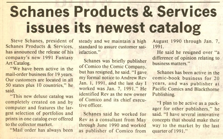
Ah, here’s the news story on Schanes leaving Comico — he was the publisher for half a year, but then had a “difference of opinion” with Rev…
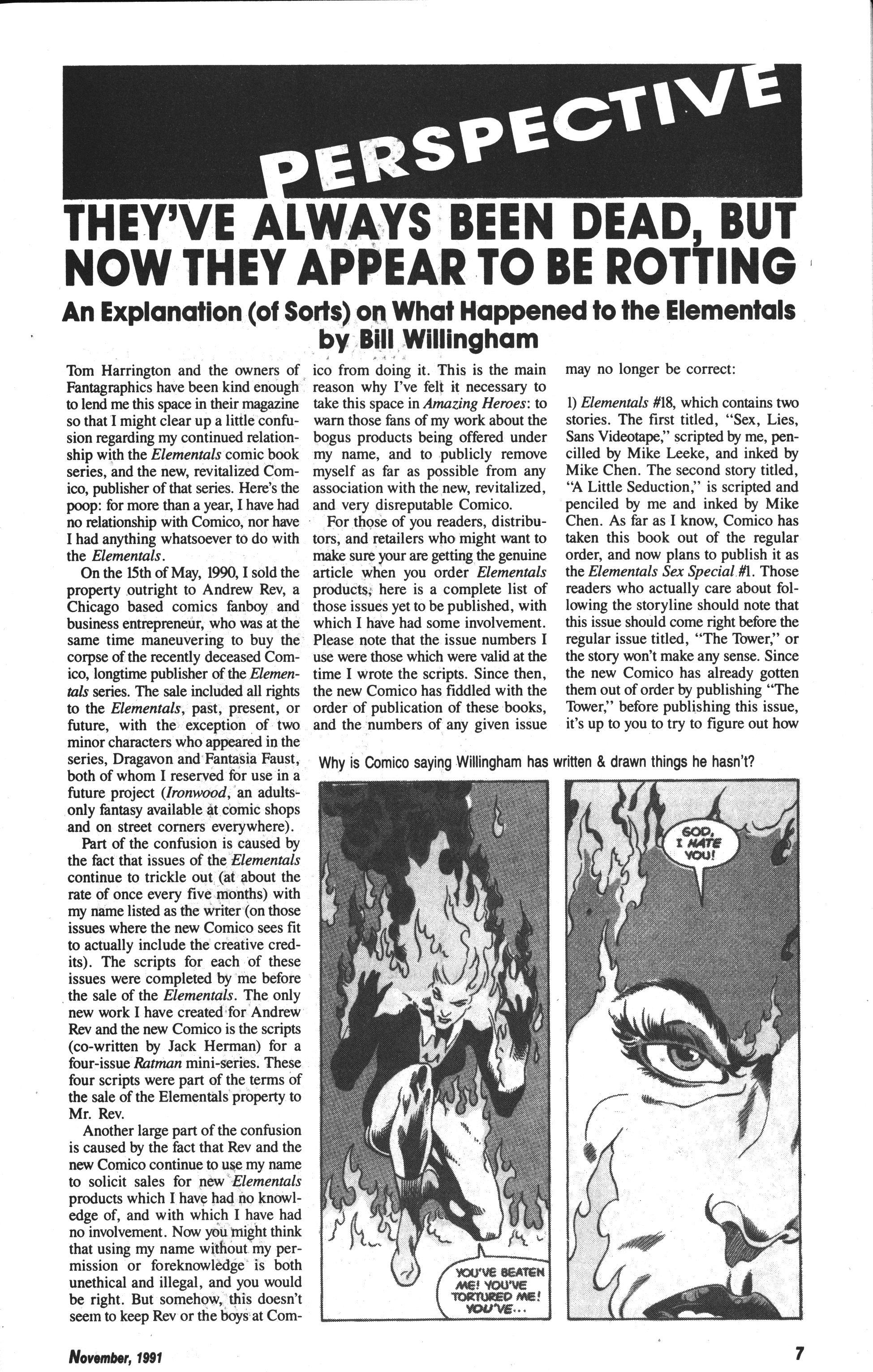
Amazing Heroes #196, page #7:
THEY’VE ALWAYS BEEN DEAD, BUT
NOW THEY APPEAR TO BE ROTTING
An Explanation (of Sorts) on What Happened to the Elementals
Tom Harrington and the owners of
Fantagraphics have been kind enough
to lend me this space in their magazine
so that I might clear up a little confu-
sion regarding my continued relation-
ship with the Elementals comic book
series, and the new, revitalized Com-
ico, publisher of that series. Here’s the
poop: for more than a year, I have had
no relationship with Comico, nor have
I had anything whatsoever to do with tors,
and retailers who might want to
the Elementals.
On the 15th of May, 1990, I sold the
property outright to Andrew Rev, a
Chicago based comics fanboy and
business entrepreneur, who was at the
same time maneuvering to buy the
corpse of the recently deceased Com-
ico, longtime publisher of the Elemen-
tals series. The sale included all rights
to the Elementals, past, present, or
future, with the exception of two
minor characters who appeared in the
series, Dragavon and Fantasia Faust,
both of whom I reserved for use in a
future project (Ironwood, an adults-
only fantasy available at comic shops
and on street corners everywhere).
Part of the confusion is caused by
the fact that issues of the Elementals
continue to trickle out (at about the
rate of once every five months) with
my name listed as the writer (on those
issues where the new Comico sees fit
to actually include the creative cred-
its). The scripts for each of these
issues were completed by me before
the sale of the Elementals. The only
new work I have created for Andrew
Rev and the new Comico is the scripts
(co-written by Jack Herman) for a
four-issue Ratman mini-series. These
four scripts were part of the terms of
the sale of the Elementals property to
Mr. Rev.
Another large part of the confusion
is caused by the fact that Rev and the
new Comico continue to use my name
to solicit sales for new Elementals
products which I have had no knowl-
edge of, and with which I have had
no involvement. Now you might think
that using my name without my per-
mission or foreknowledge is both
unethical and illegal, and you would
be right. But somehow, this doesn’t
seem to keep Rev or the boys at Com-
ico from doing it. This is the main
reason why I’ve felt it necessary to
take this space in Amazing Heroes: to
warn those fans of my work about the
bogus products being offered under
my name, and to publicly remove
myself as far as possible from any
association with the new, revitalized,
and very disreputable Comico.
For those of you readers, distribu-
make sure your are getting the genuine
article when you order Elementals
products, here is a complete list of
those issues yet to be published, with
which I have had some involvement.
Please note that the issue numbers I
use were those which were valid at the
time I wrote the scripts. Since then,
the new Comico has fiddled with the
order of publication of these books,
and the numbers of any given issue
may no longer be correct:
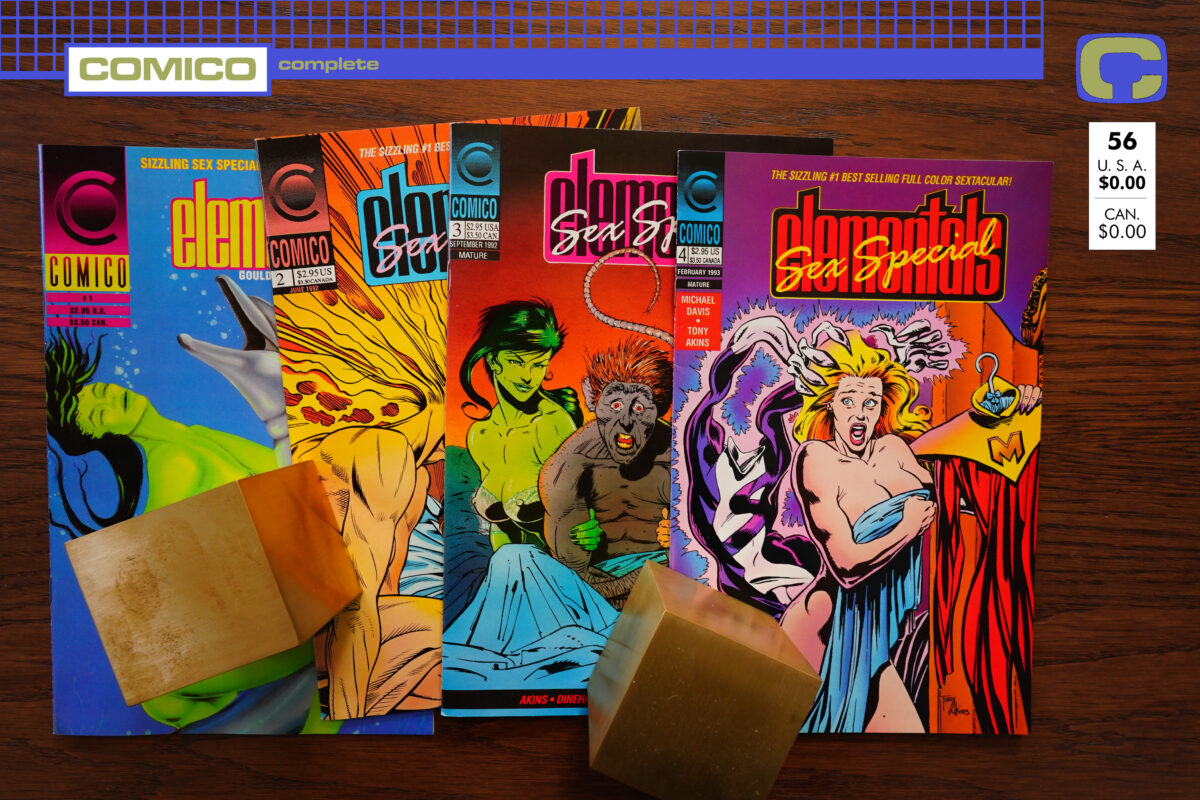
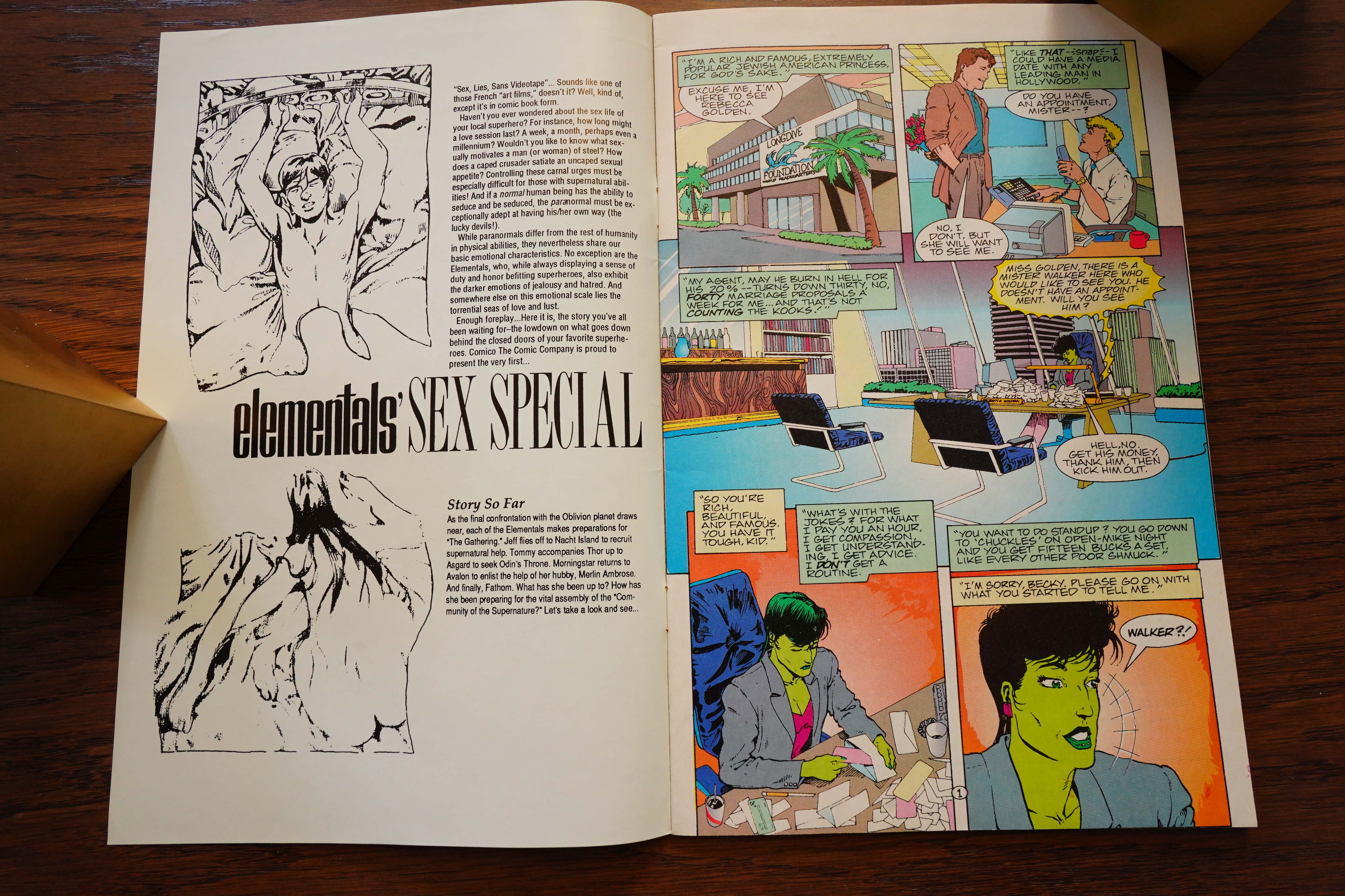
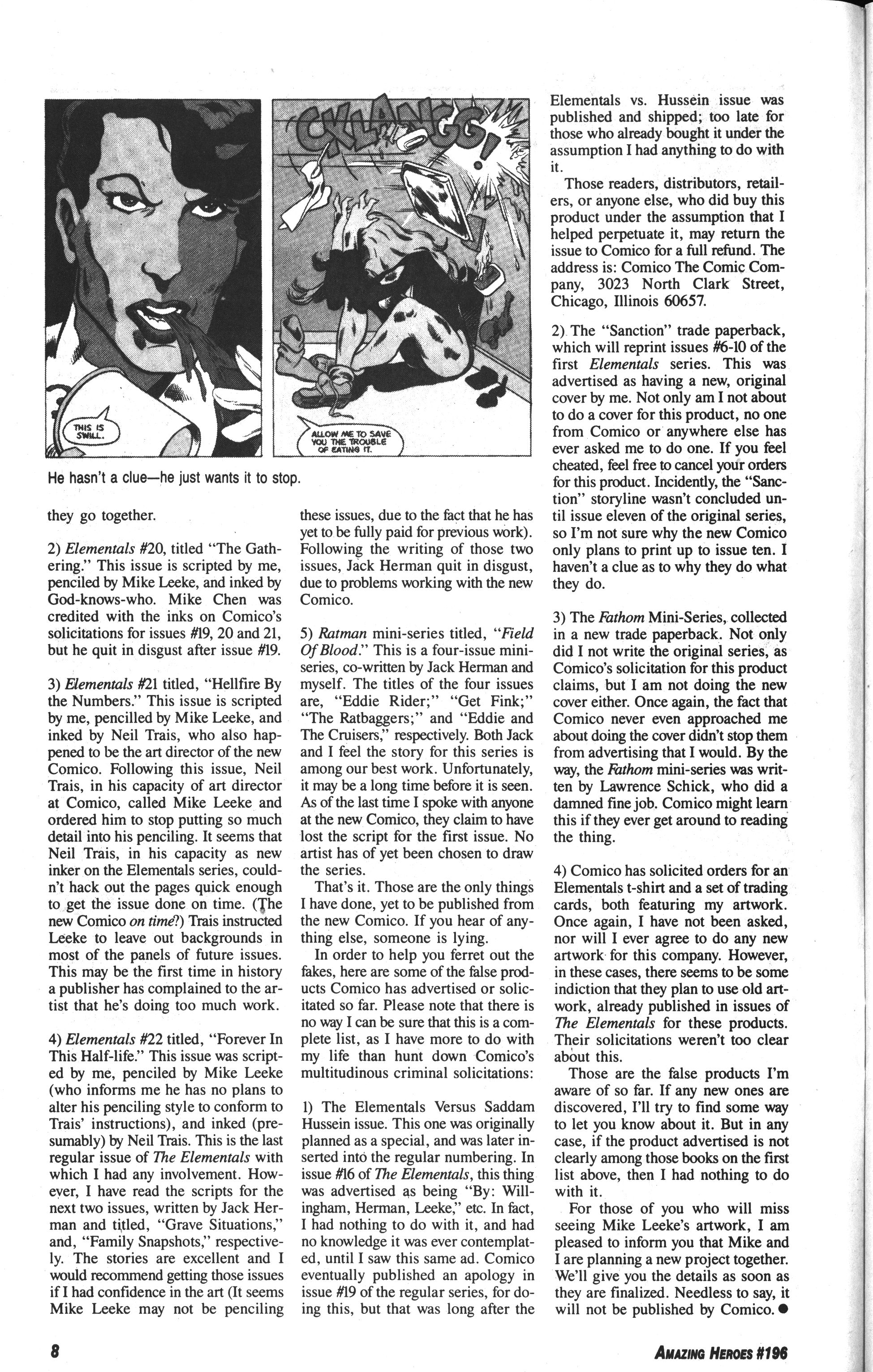
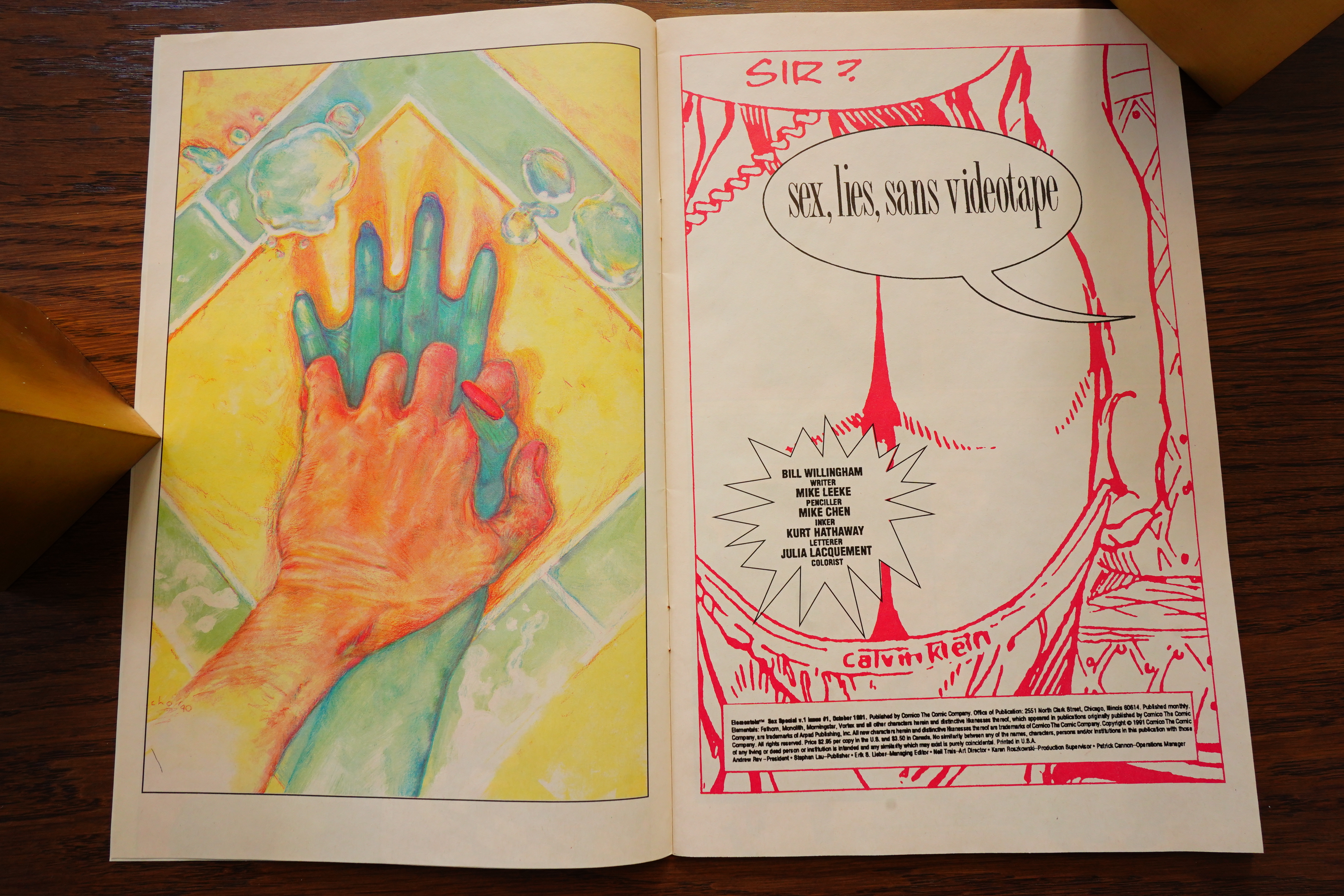
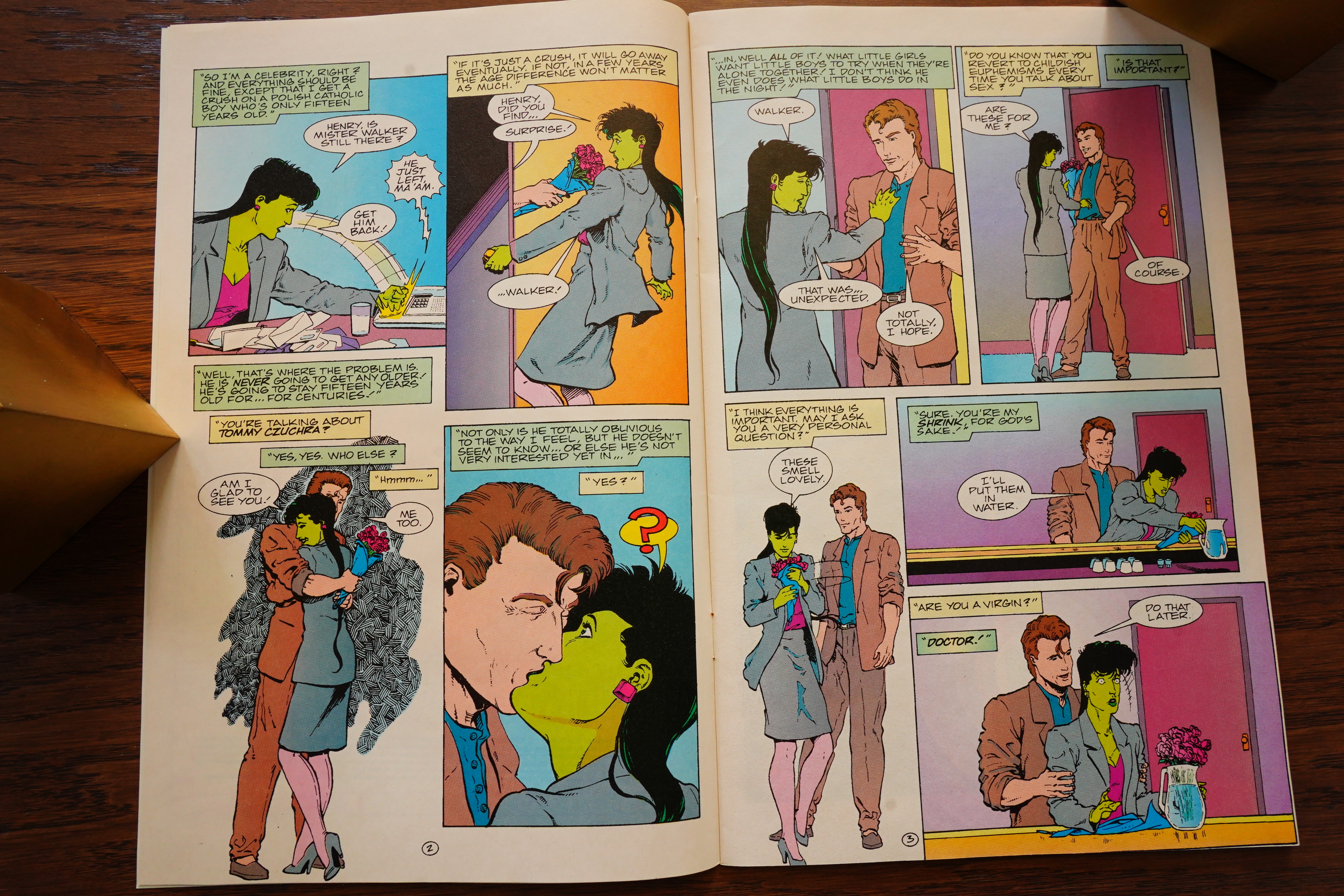
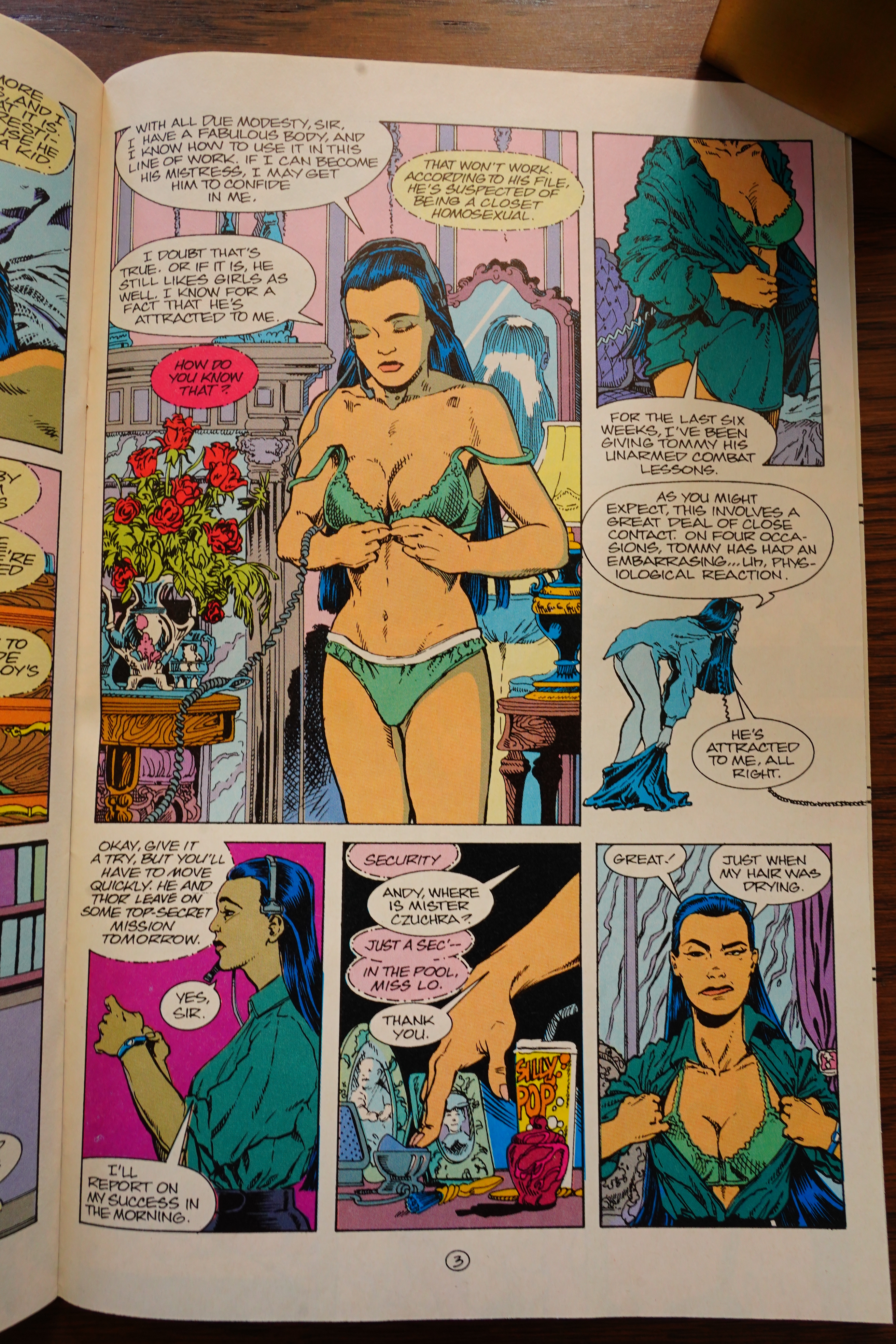
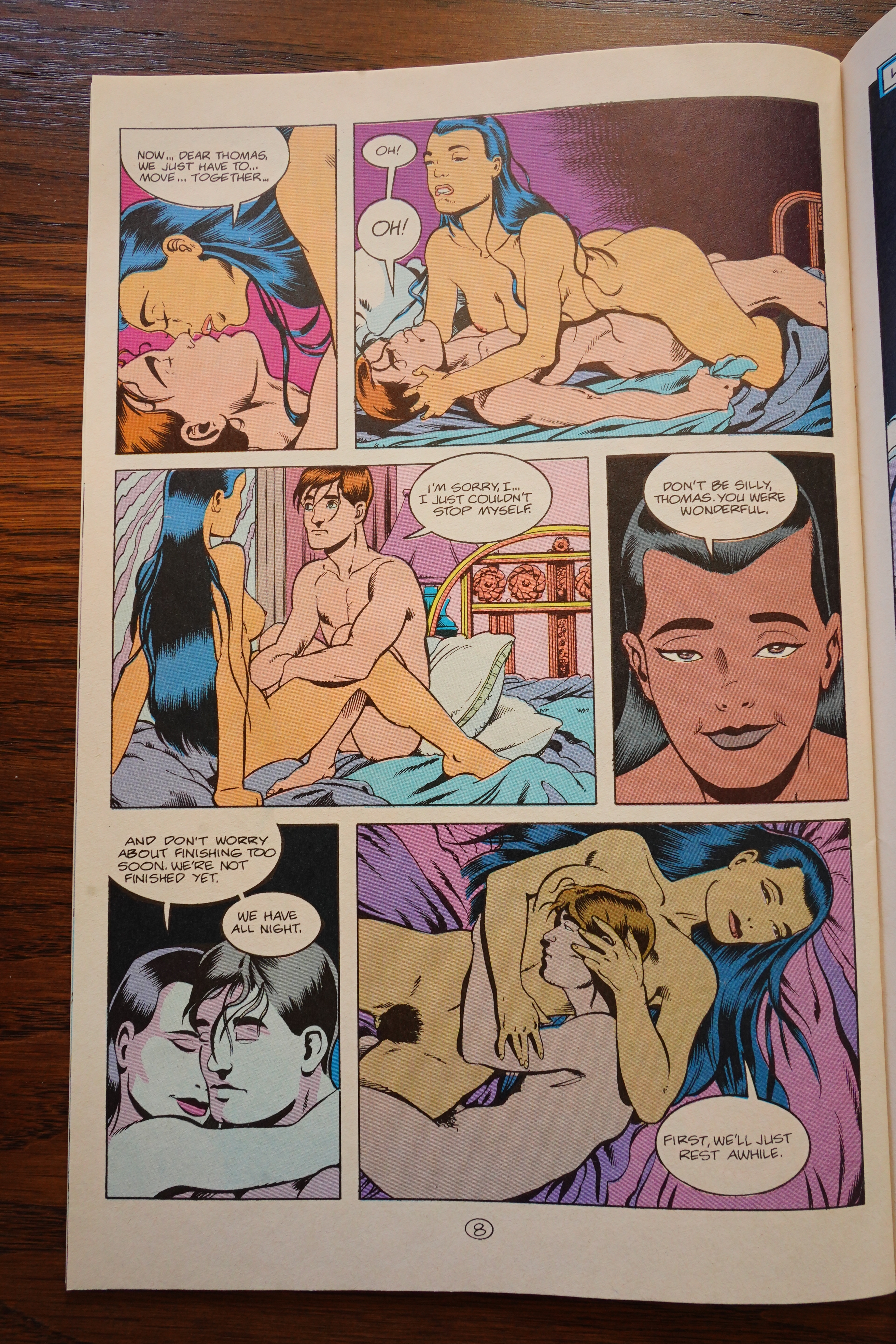
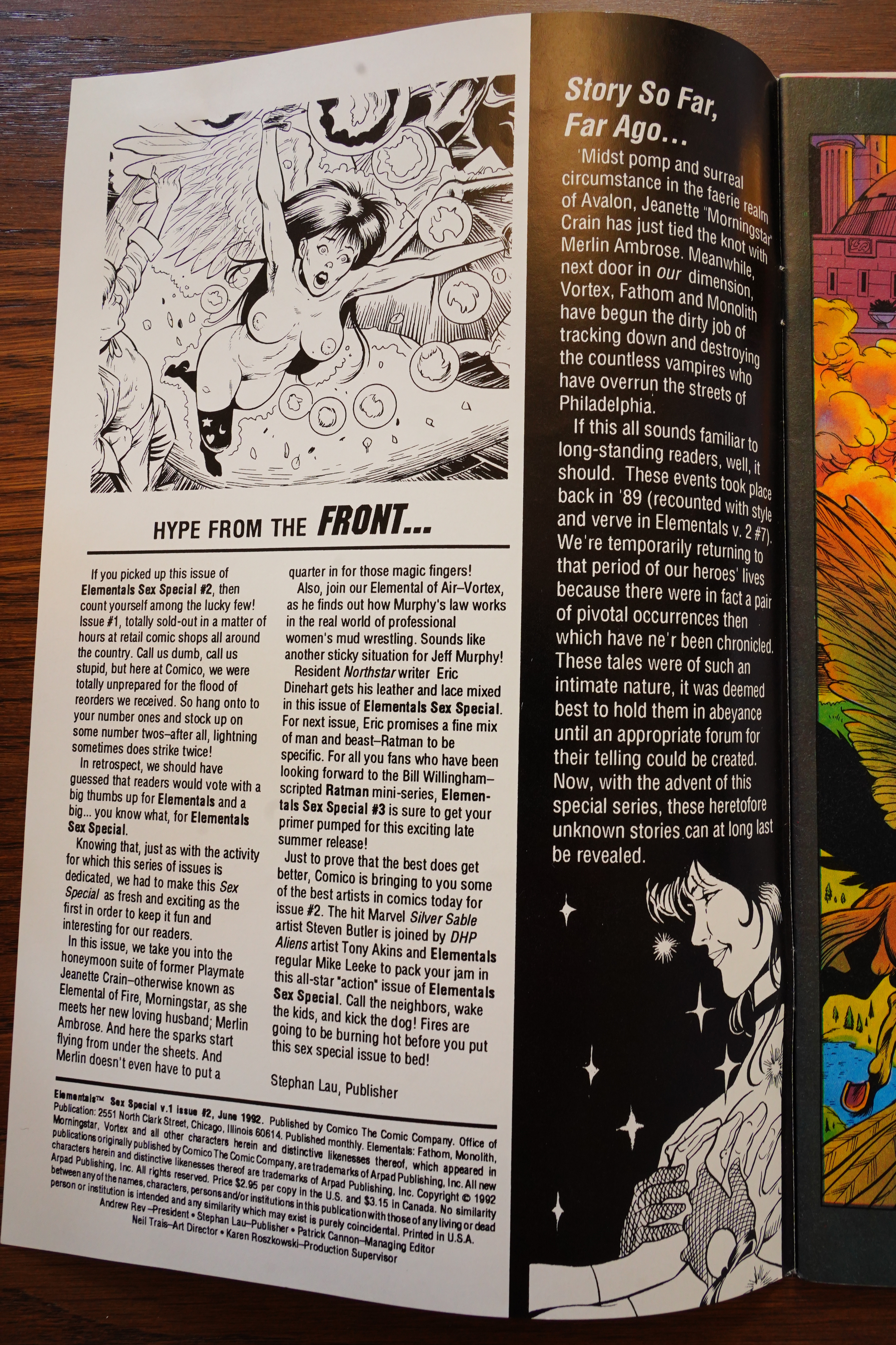
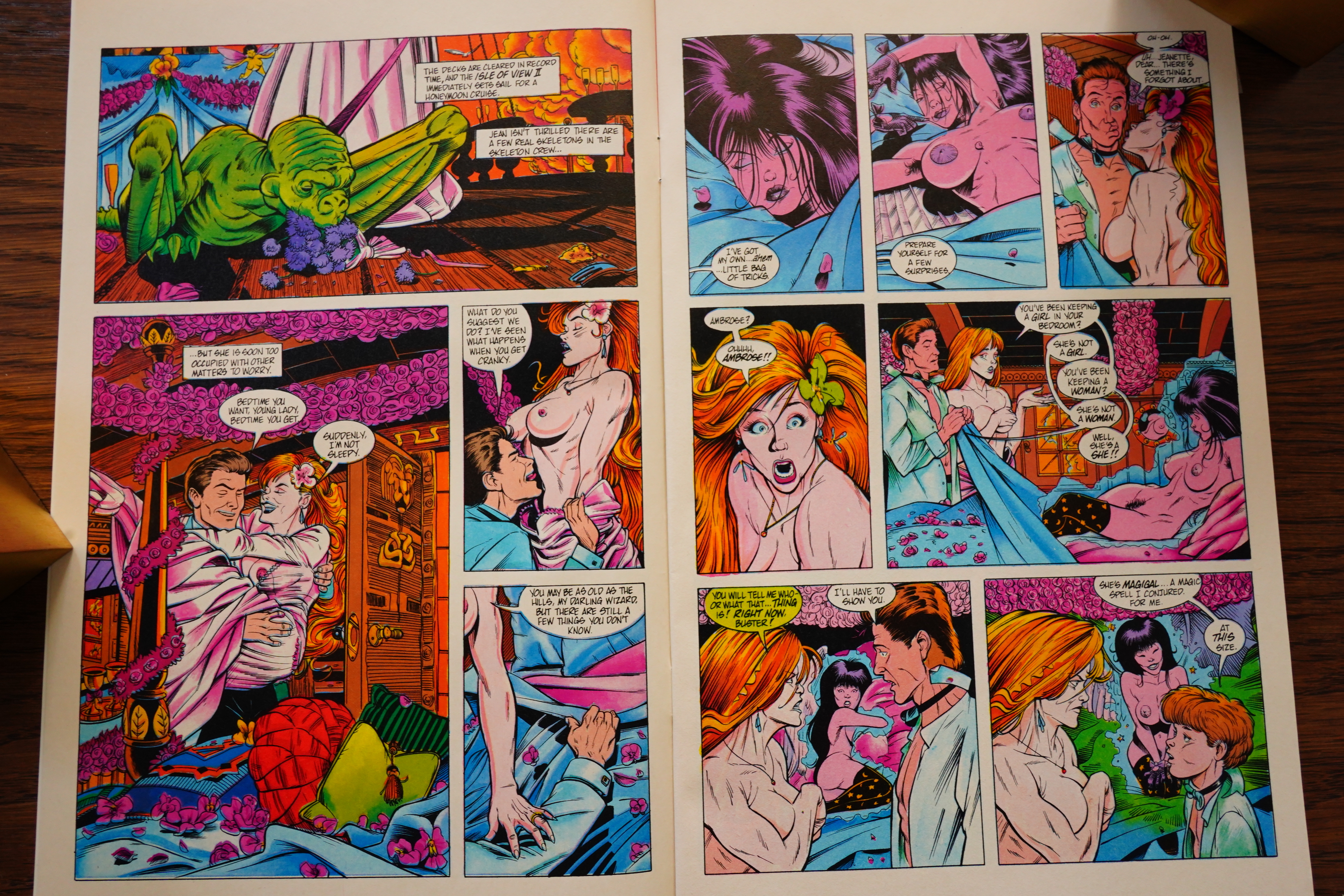
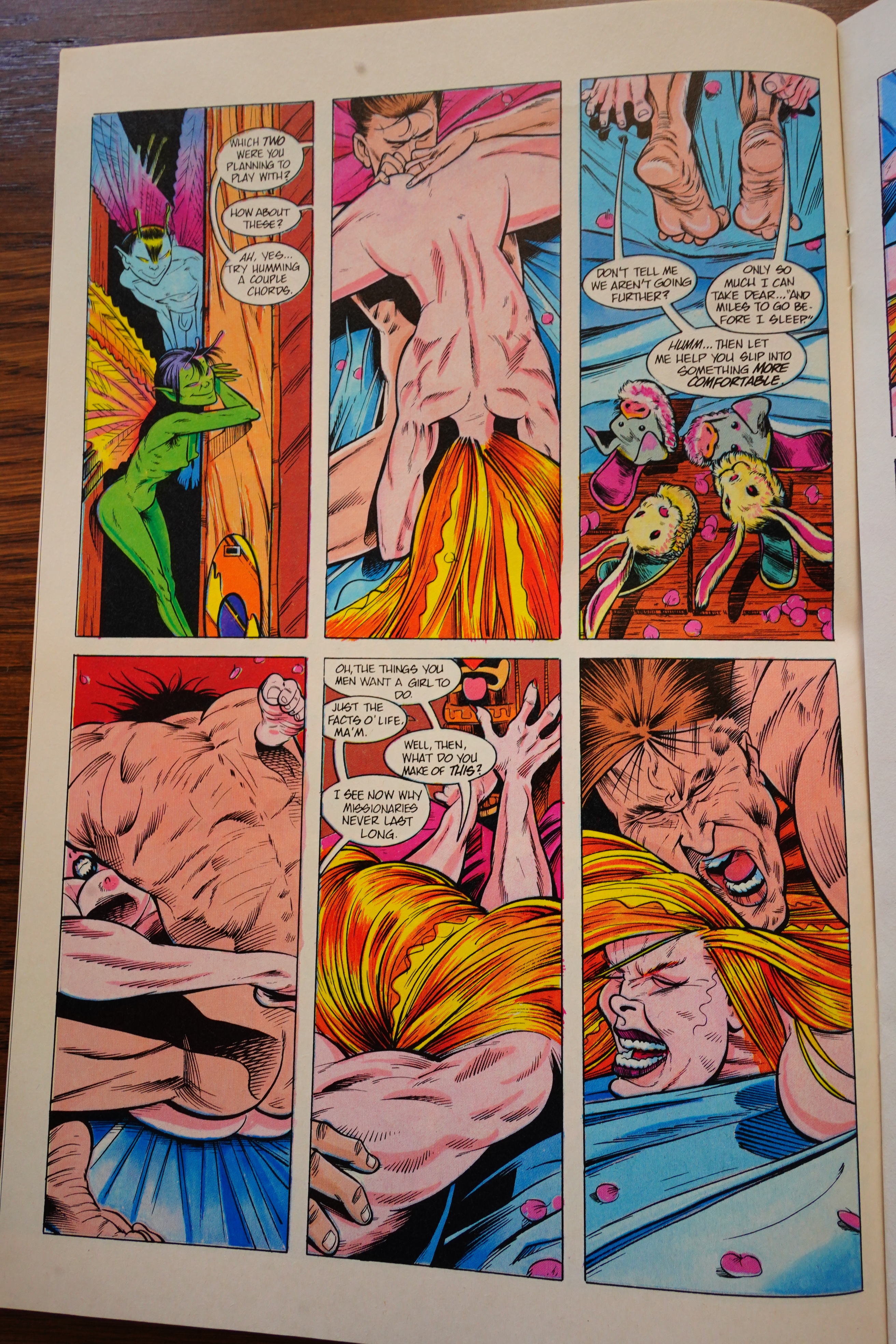
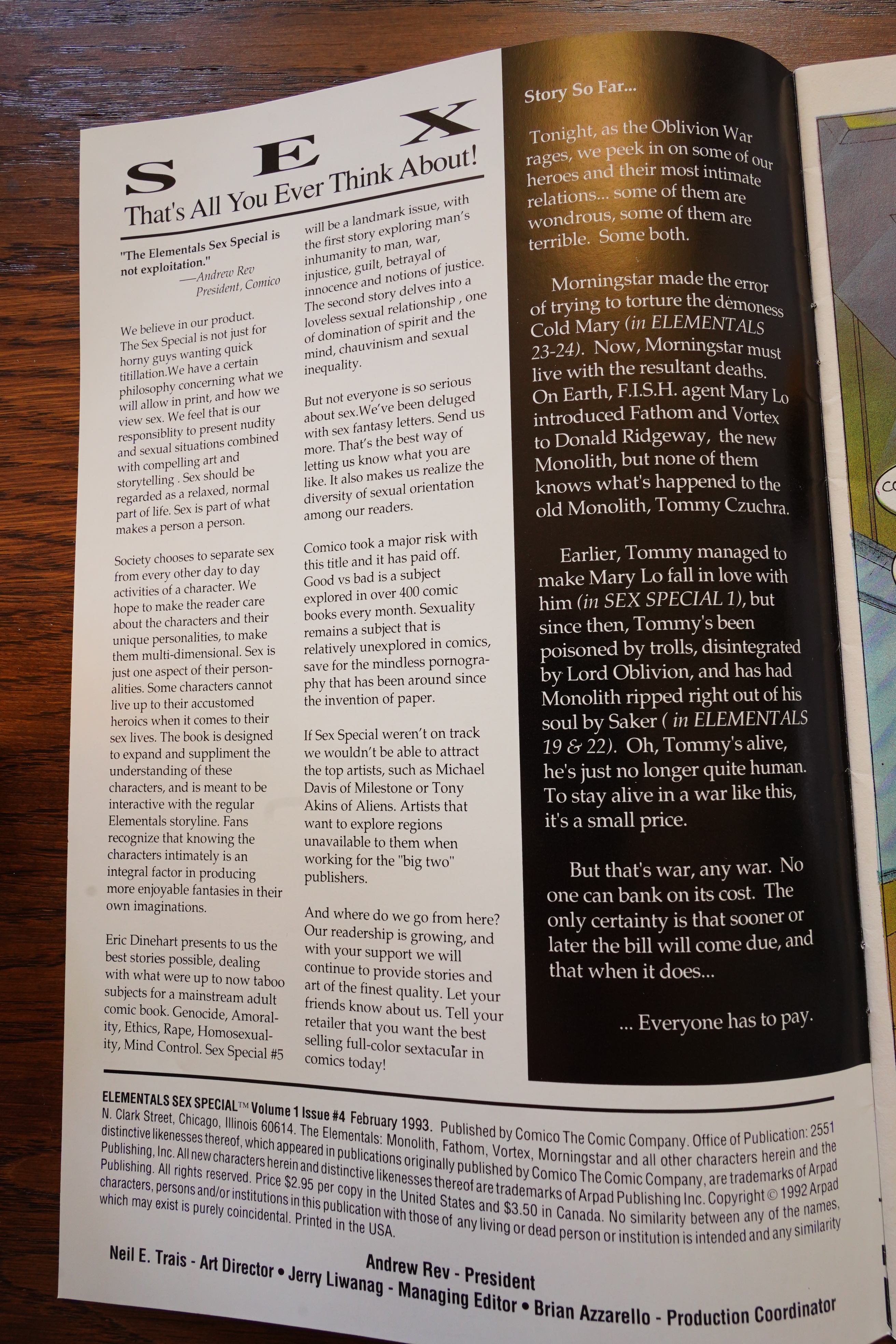
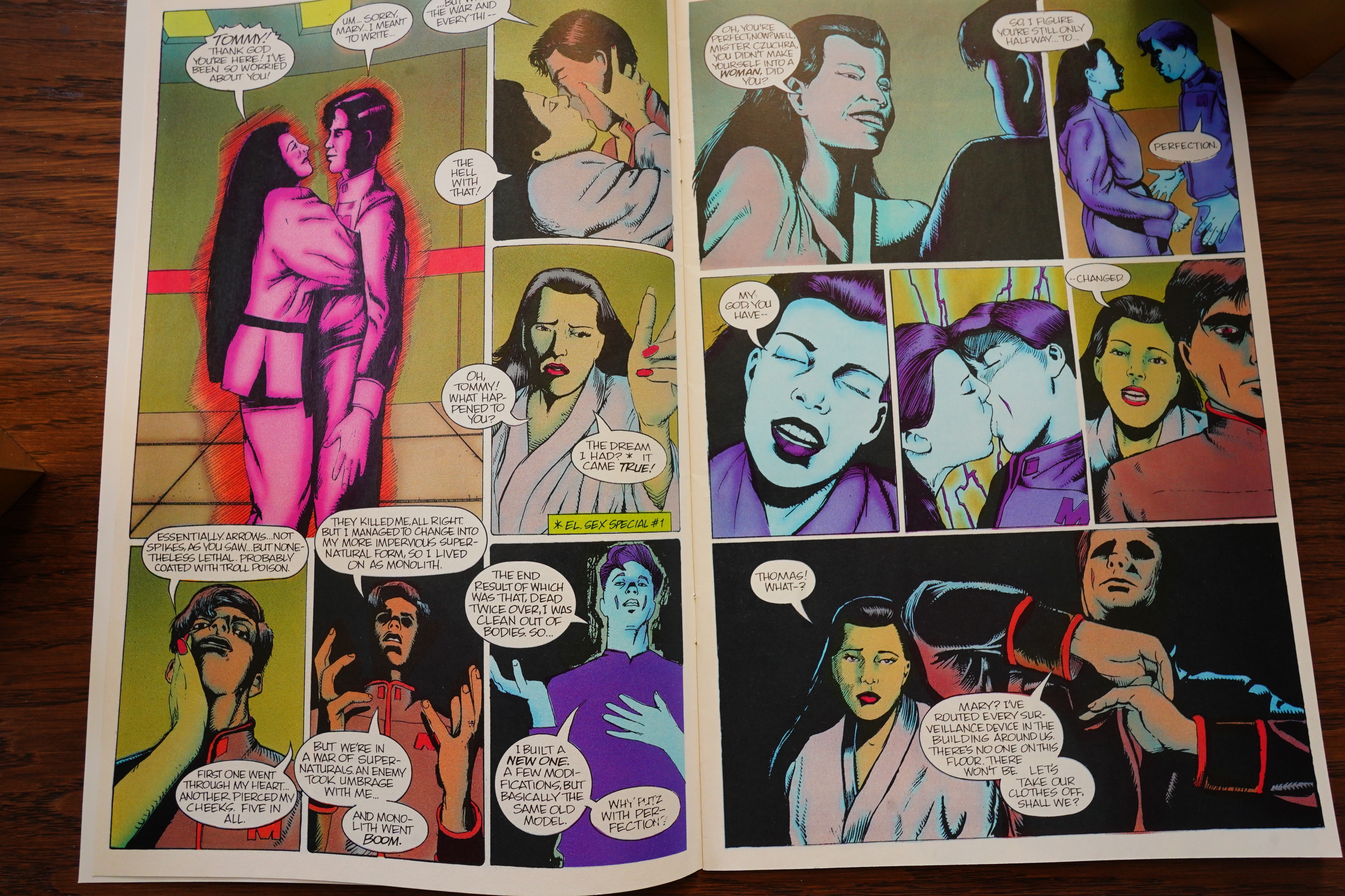
1) Elementals #18, which contains two
stories. The first titled, “Sex, Lies,
Sans Videotape,” scripted by me, pen-
cilled by Mike Leeke, and inked by
Mike Chen. The second story titled,
“A Little Seduction,” is scripted and
penciled by me and inked by Mike
Chen. As far as I know, Comico has
taken this book out of the regular
order, and now plans to publish it as
the Elementals Sex Special #1. Those
readers who actually care about fol-
lowing the storyline should note that
this issue should come right before the
regular issue titled, “The Tower,” or
the story won’t make any sense.
Heh.
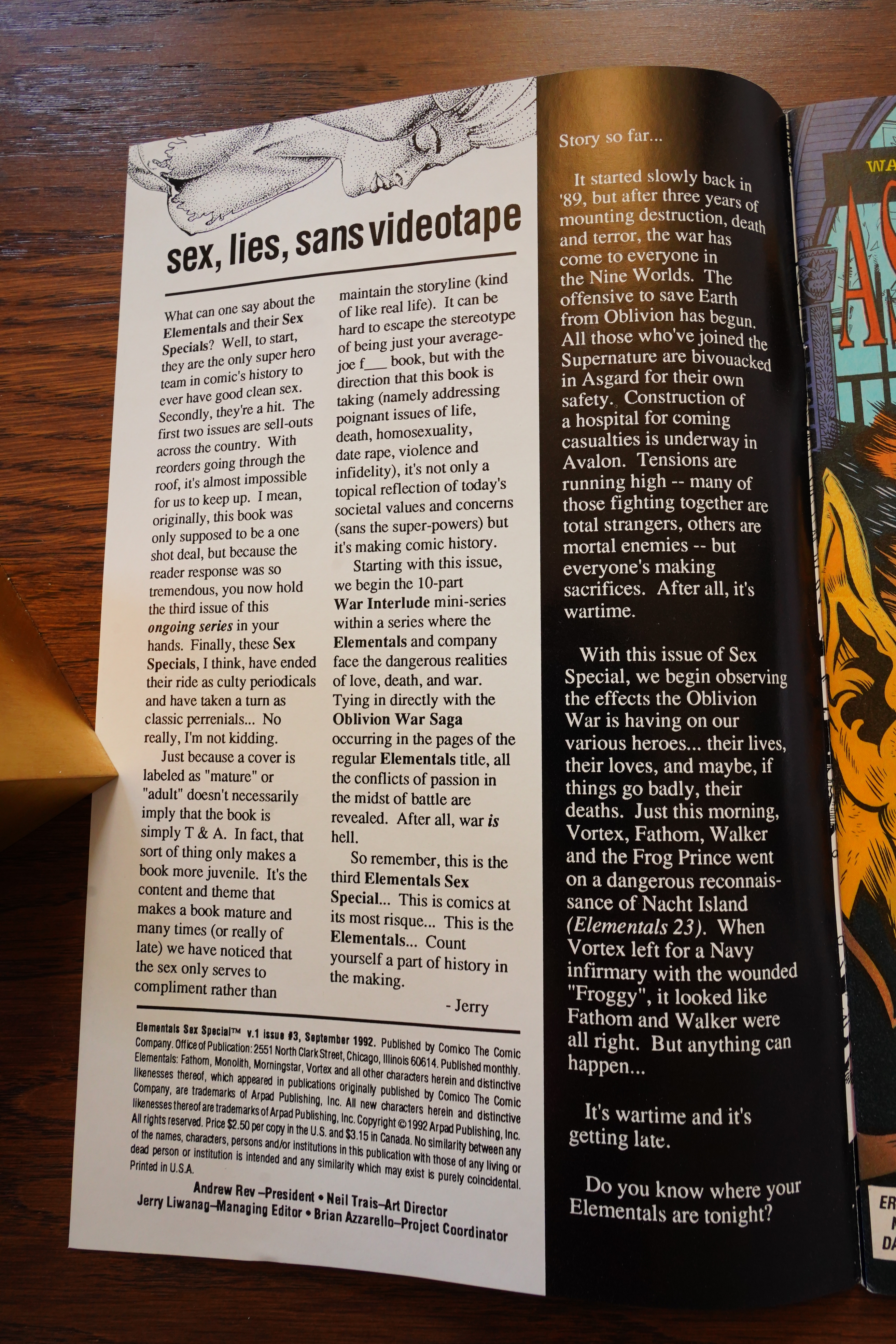
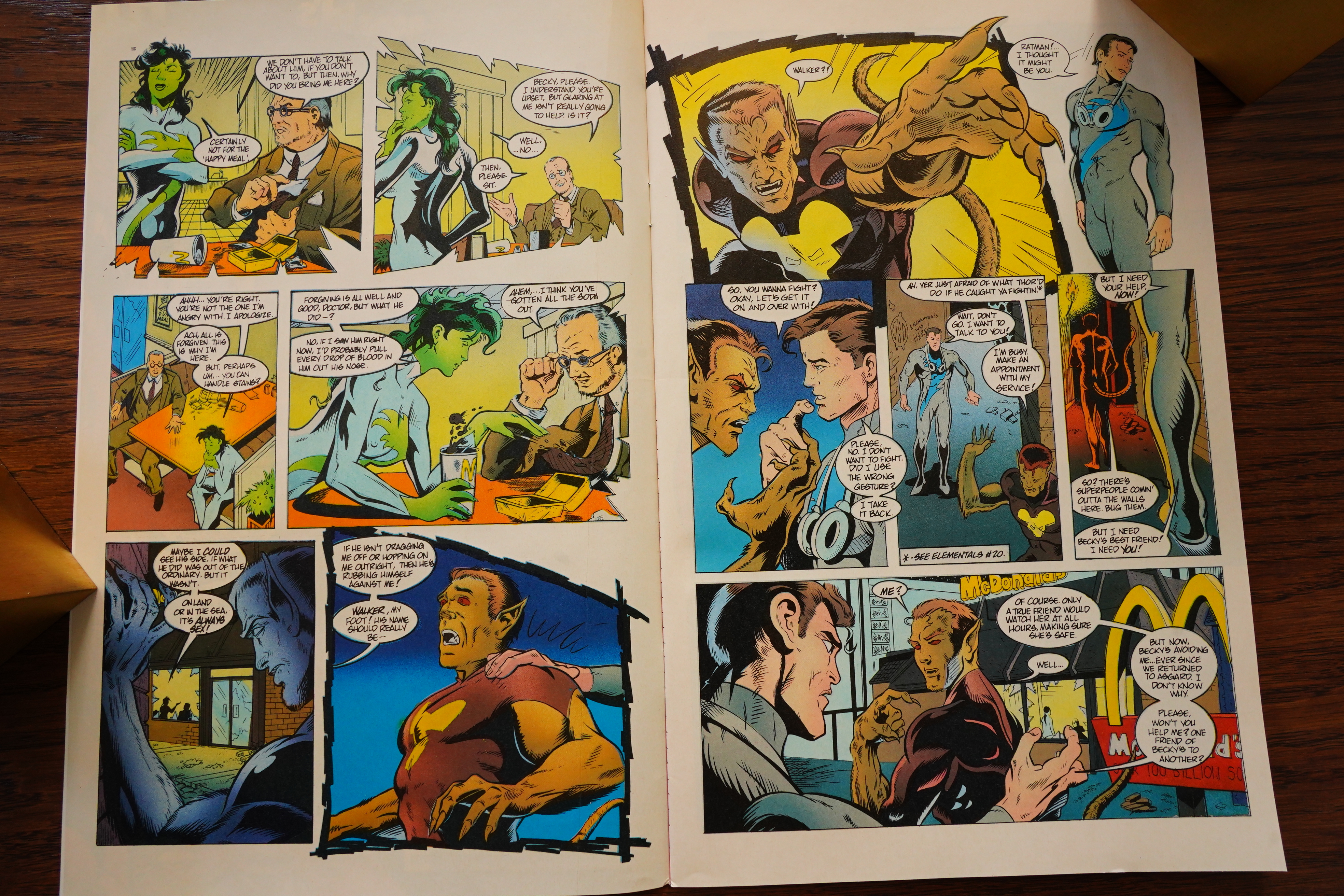
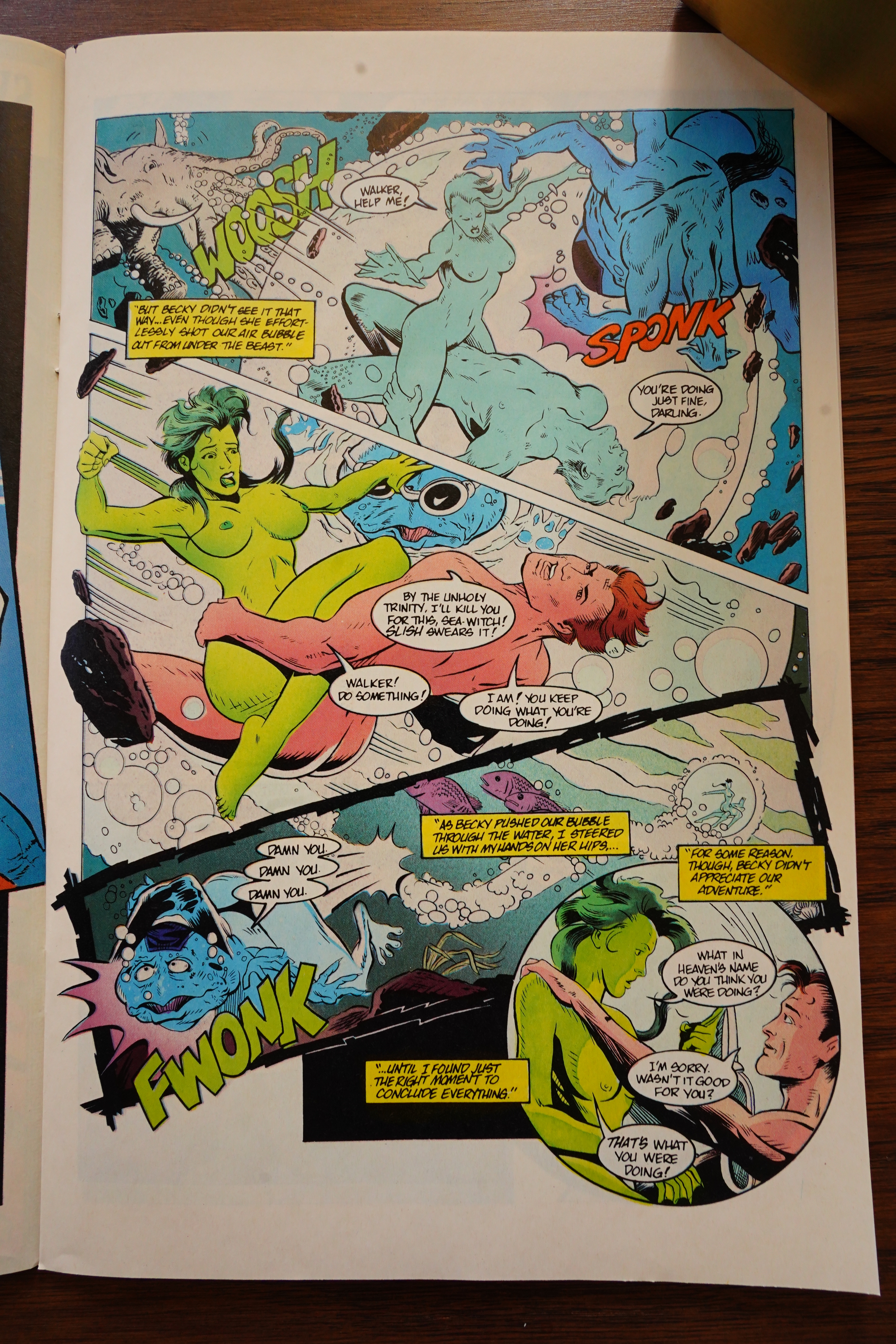
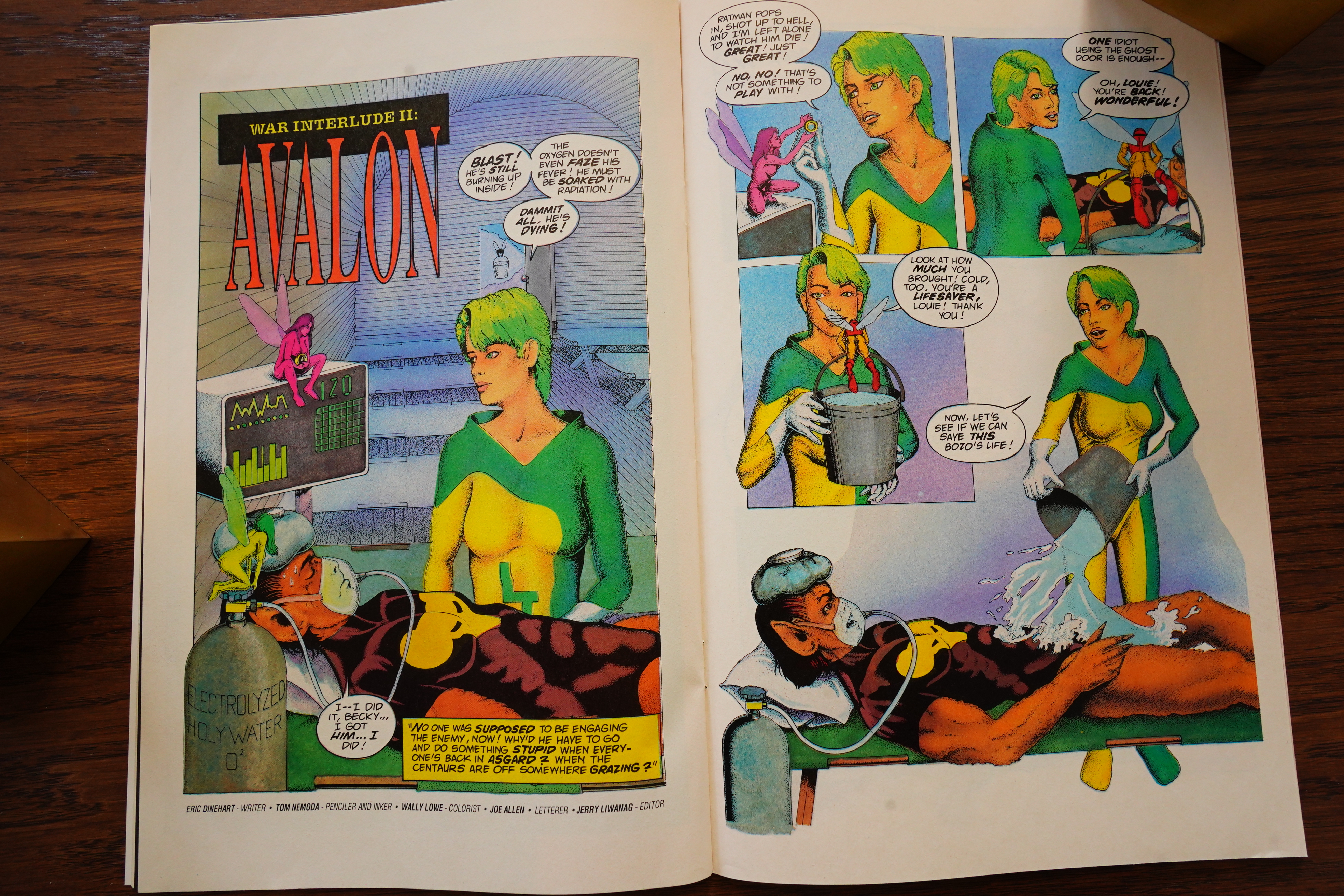
OK, I think that’s enough — everybody hated Rev, but he owns rights to Elementals, so we’re going to get a whole bunch of Elementals stuff.