1986: The World of Ginger Fox

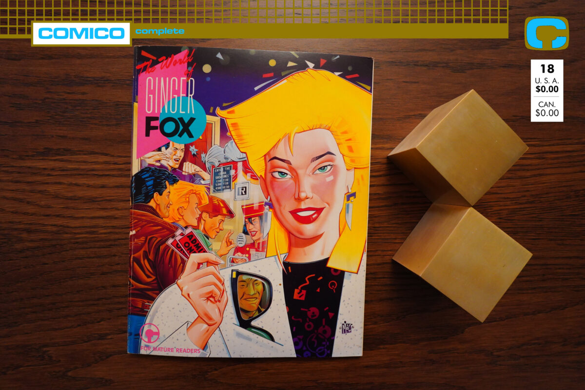
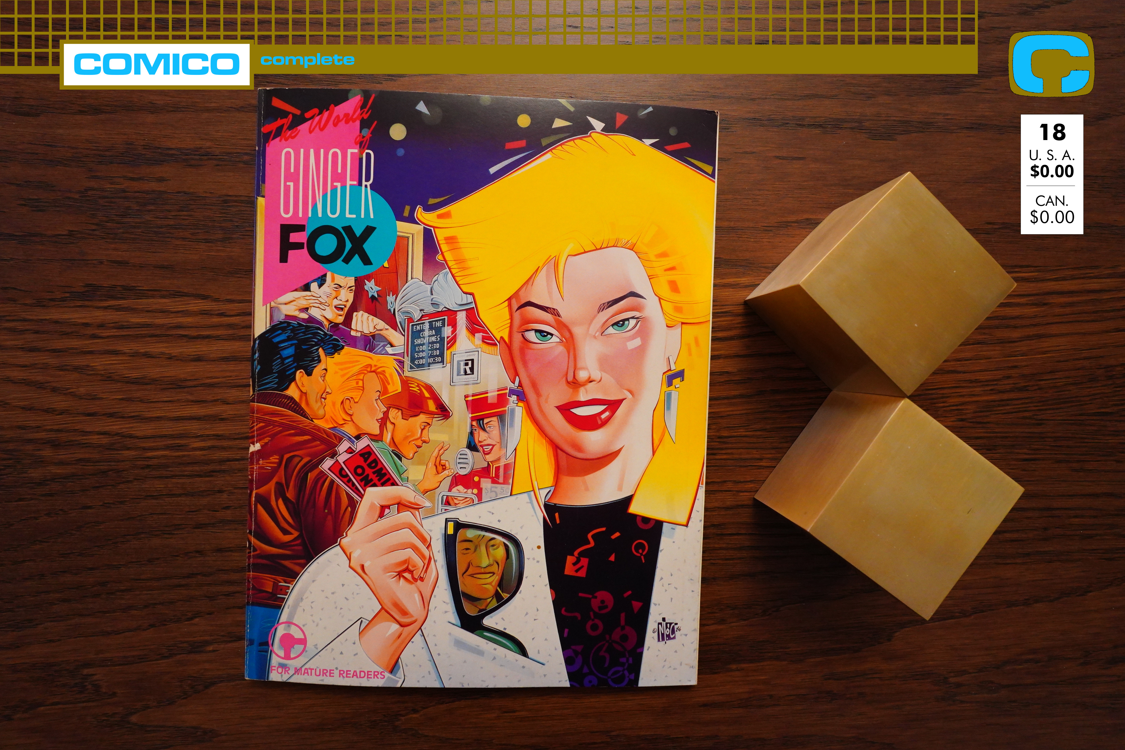
The World of Ginger Fox (1986) by Mike Baron and Mitch O’Connell
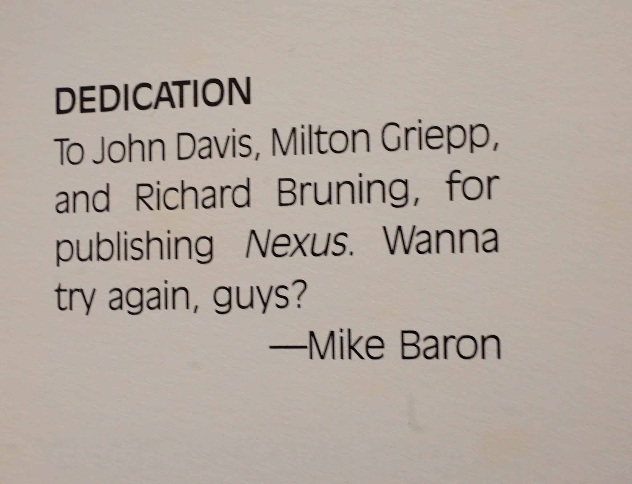
Err… That’s a weird thing to put in your graphic novel. Is Baron asking his previous publishers to save him from his current publishers or something?

Oh, hi! This is a blog post about The World of Ginger Fox, the first original “graphic novel” published by Comico. I mean, I guess you could make the case for the Robotech graphic novel being the first, but that’s a spinoff from the series, so…

Mike Baron is mostly known for his Nexus series with Steve Rude, but I most recently read the Robotech Masters series he wrote, and it was horrible. So I’m approaching this with pretty low expectations. Let’s read the first three pages:
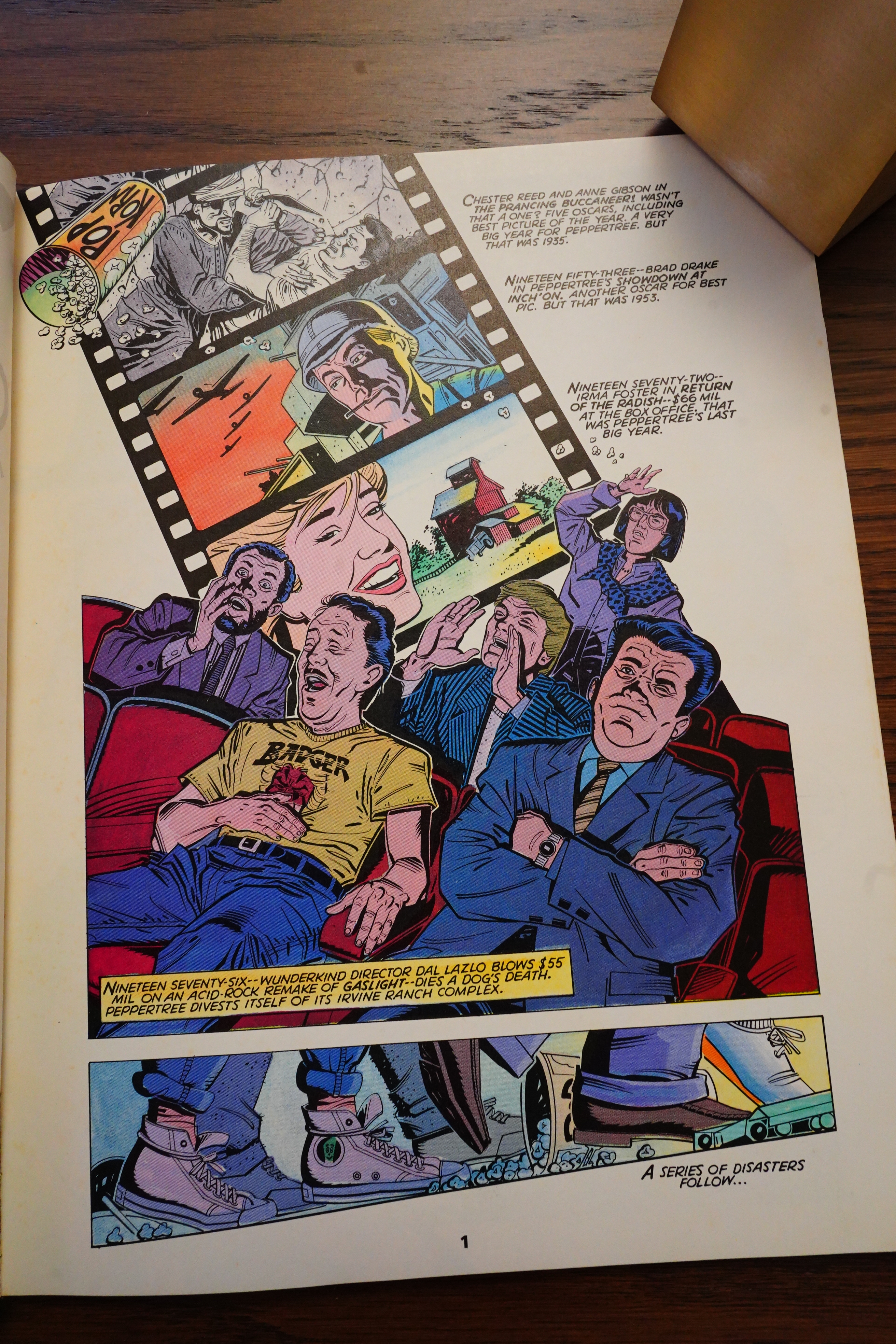
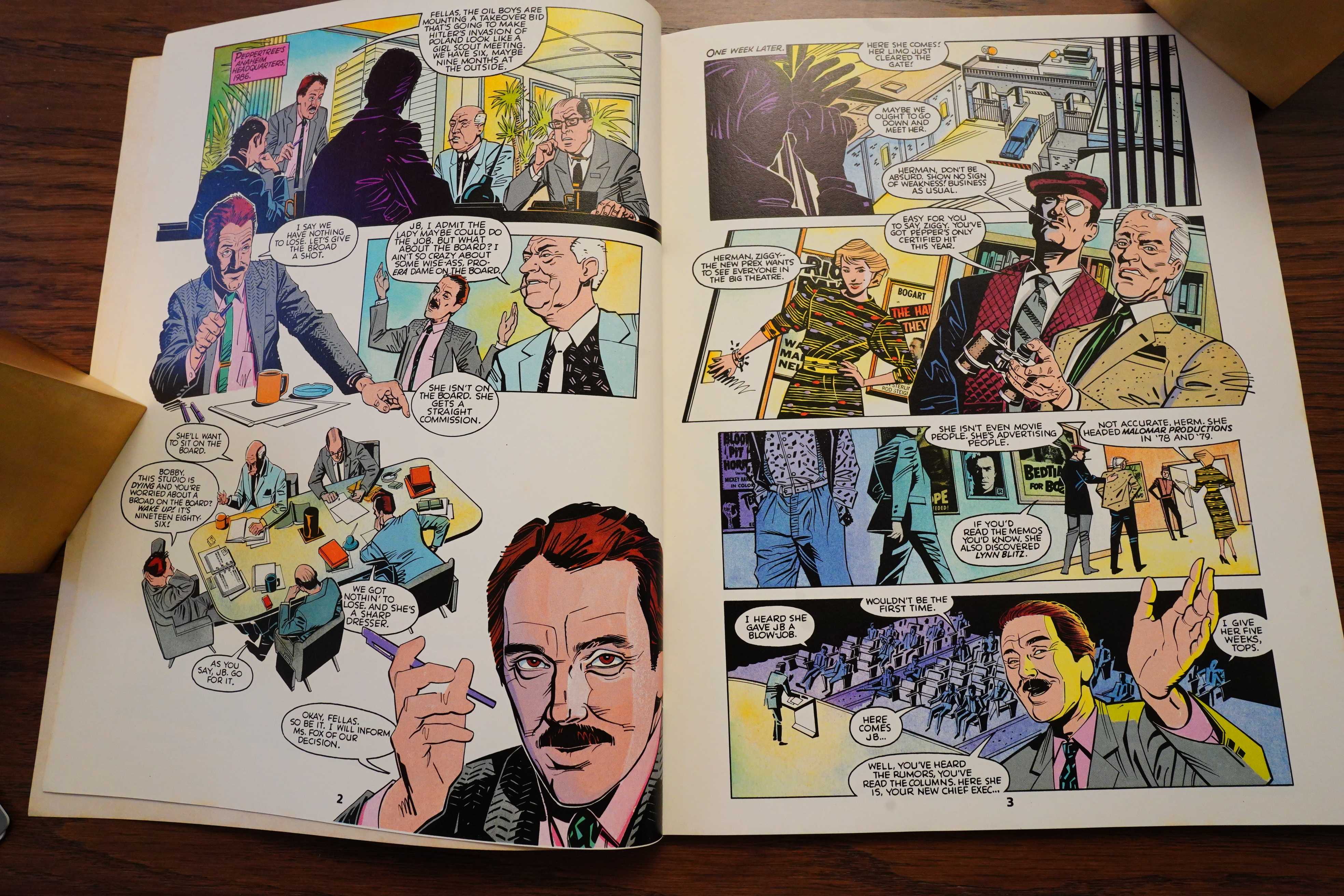
OK, I like the artwork. The name Mitch O’Connell seems really, really familiar to me, but I can’t quite place it. And I’ve got this “method reading” thing going here — I never do any research before reading or writing my take on these comics, so I have to postpone any googling until the end of this blog post.

But I think this artwork looks really British somehow? And, of course, intensely mid-80s.

It’s like John Prentice is drawing figures based on layouts by Patrick Nagel, right? Or perhaps that’s just me. There’s also something very American about it… It’s quite attractive, though, even if it looks kinda wonky in places — like, those two faces on the women up there don’t quite belong on the same page.
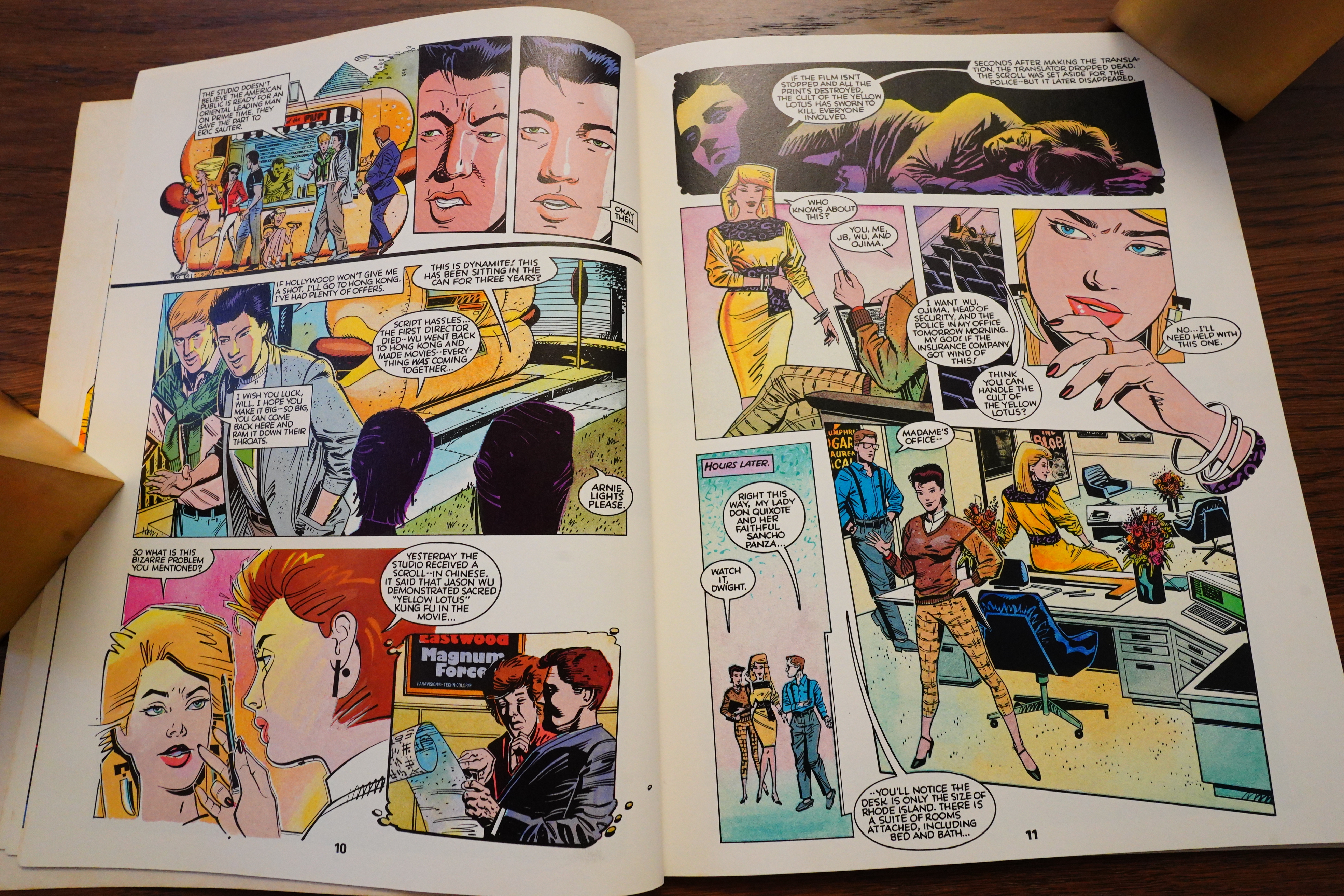
The story is also very mid-80s: It’s about a new executive (Ginger Fox) arriving at a declining movie studio, and will she be able to turn the ship around? Or is it bankruptcy time? It’s not very original, but it’s a solid, well-used premise.
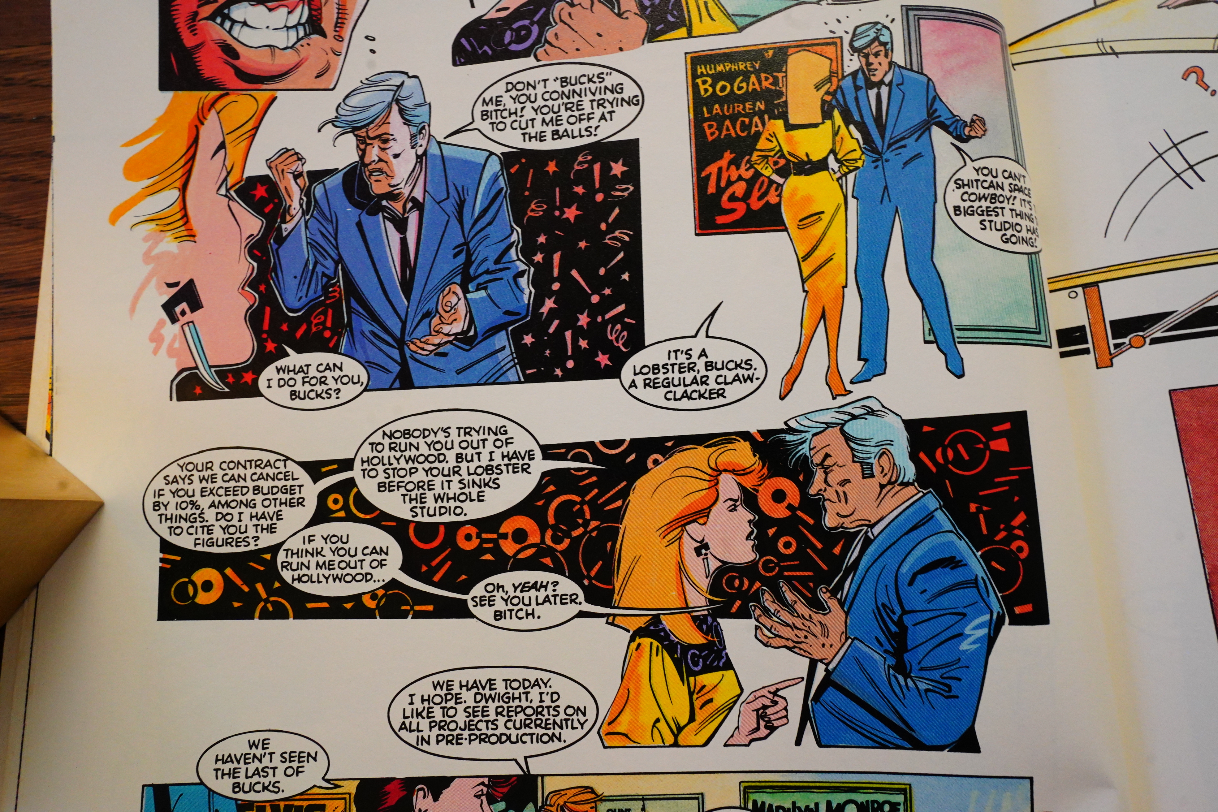
The most disturbing thing about the book is the word balloon placement. O’Connell has these rather loose panel arrangements, sometimes with borders and sometimes not, and the word balloons seem to float rather freely.
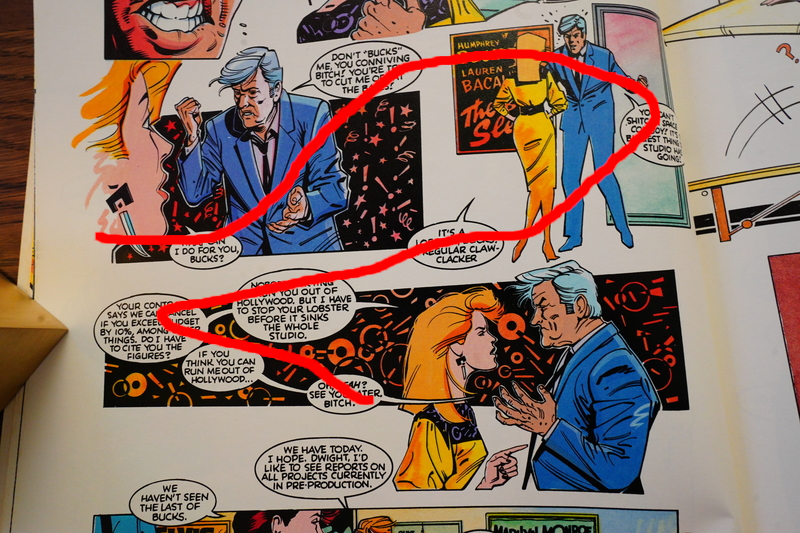
It seems like they’re hinting at a snakey reading order like this — but that’s wrong, you read these two rows strictly left to right. But then on other pages, snakey is indeed the reading direction meant — and this means that you have to reparse these pages a lot, which is tedious. I wonder whether the letterer came up with the balloon placement, and was just new at it — these things seem pretty amateurish.
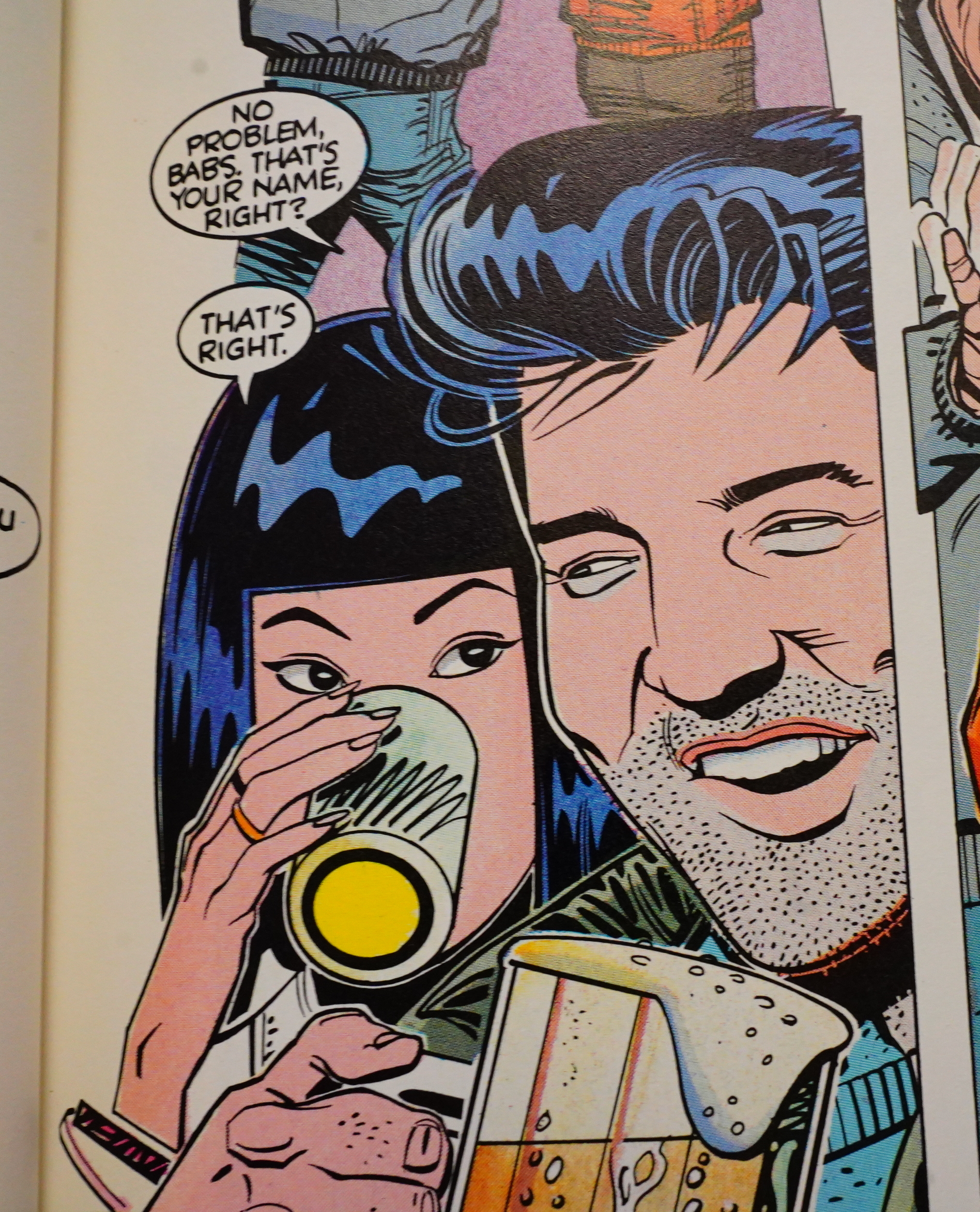
Man, O’Connell’s artwork seems so familiar… I feel I’ve seen it a lot, and in conjunction with… Raw-adjacent comics? Perhaps it’s just the Elvis thing.
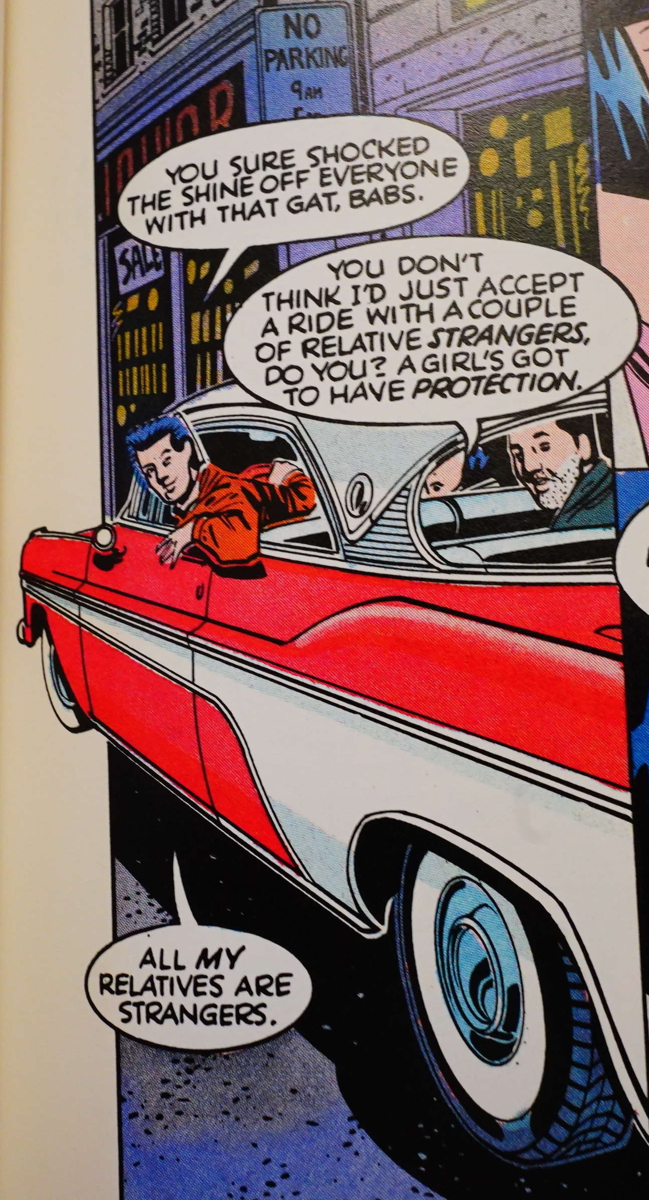
Baron tries to add humour, as usual, and as usual, it’s not exactly hilarious.
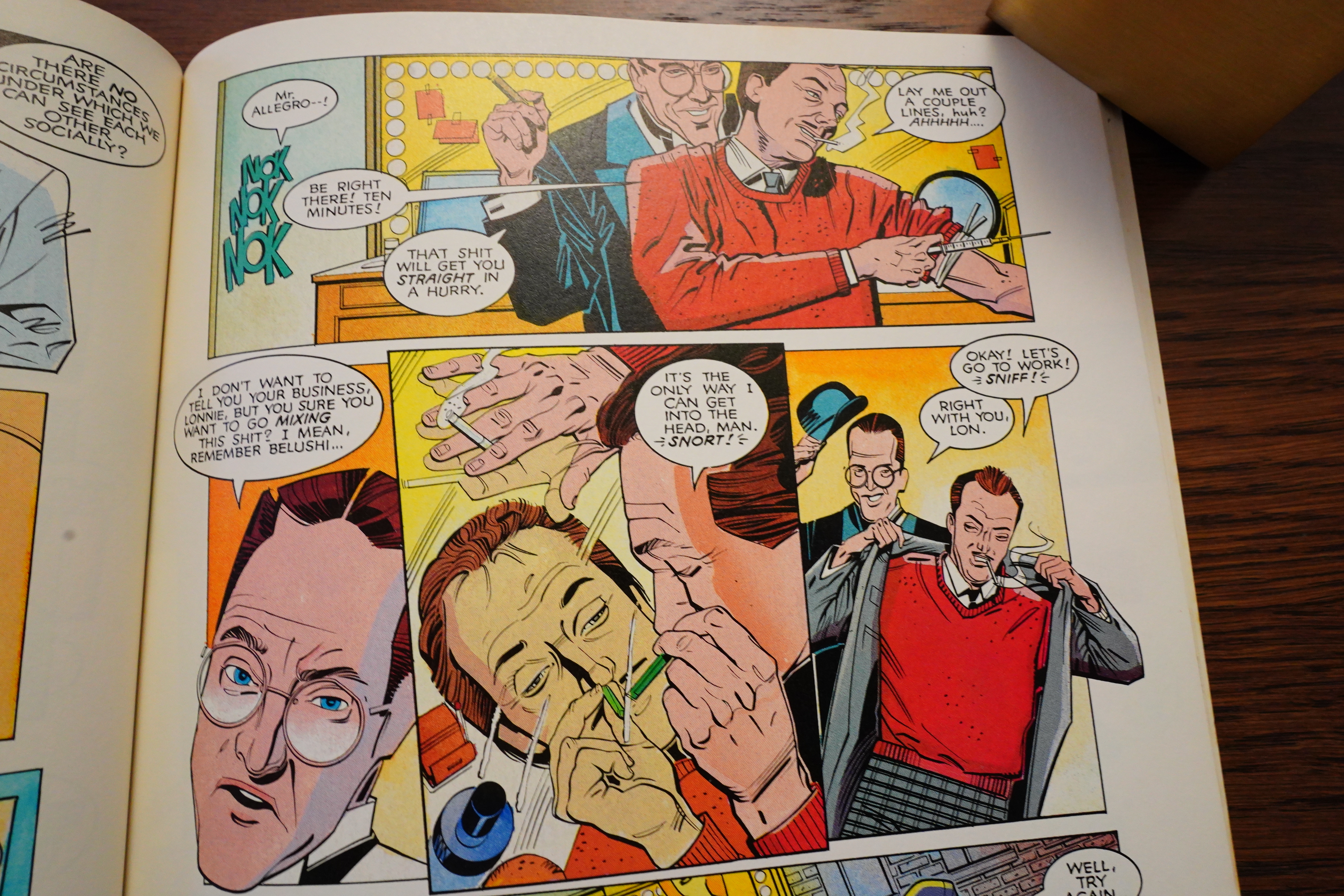
Oooh! Drugs! Oh no!!! At least he’s an efficient multi-tasking multi-user.
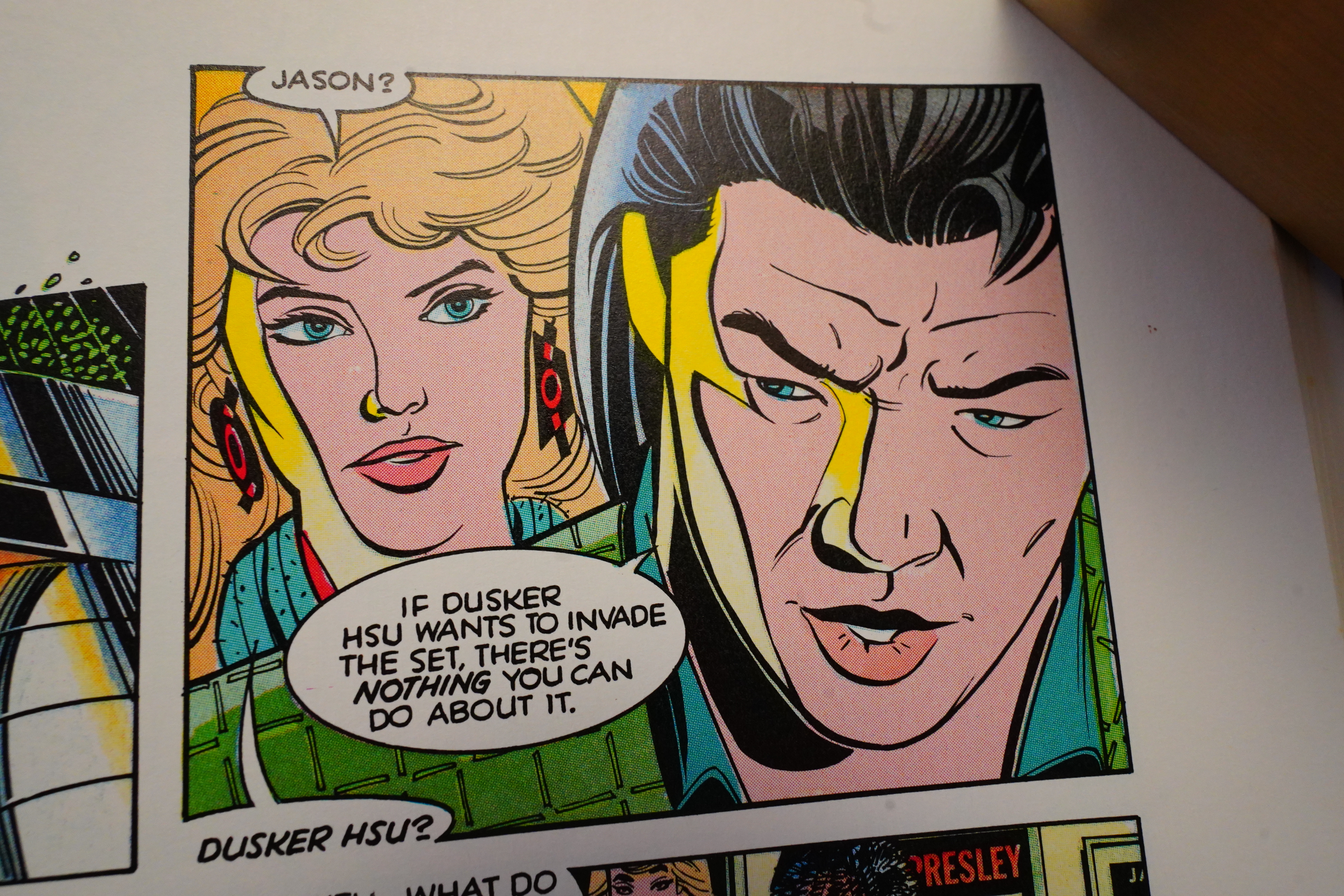
Oh yeah, I forgot to mention the plot — it’s about a secret society of Kung Fu guys who want to shut down a Kung Fu movie. The main guy is called Dusker Hsu. Get it? Get it? (That’s a Hüsker Dü reference.)
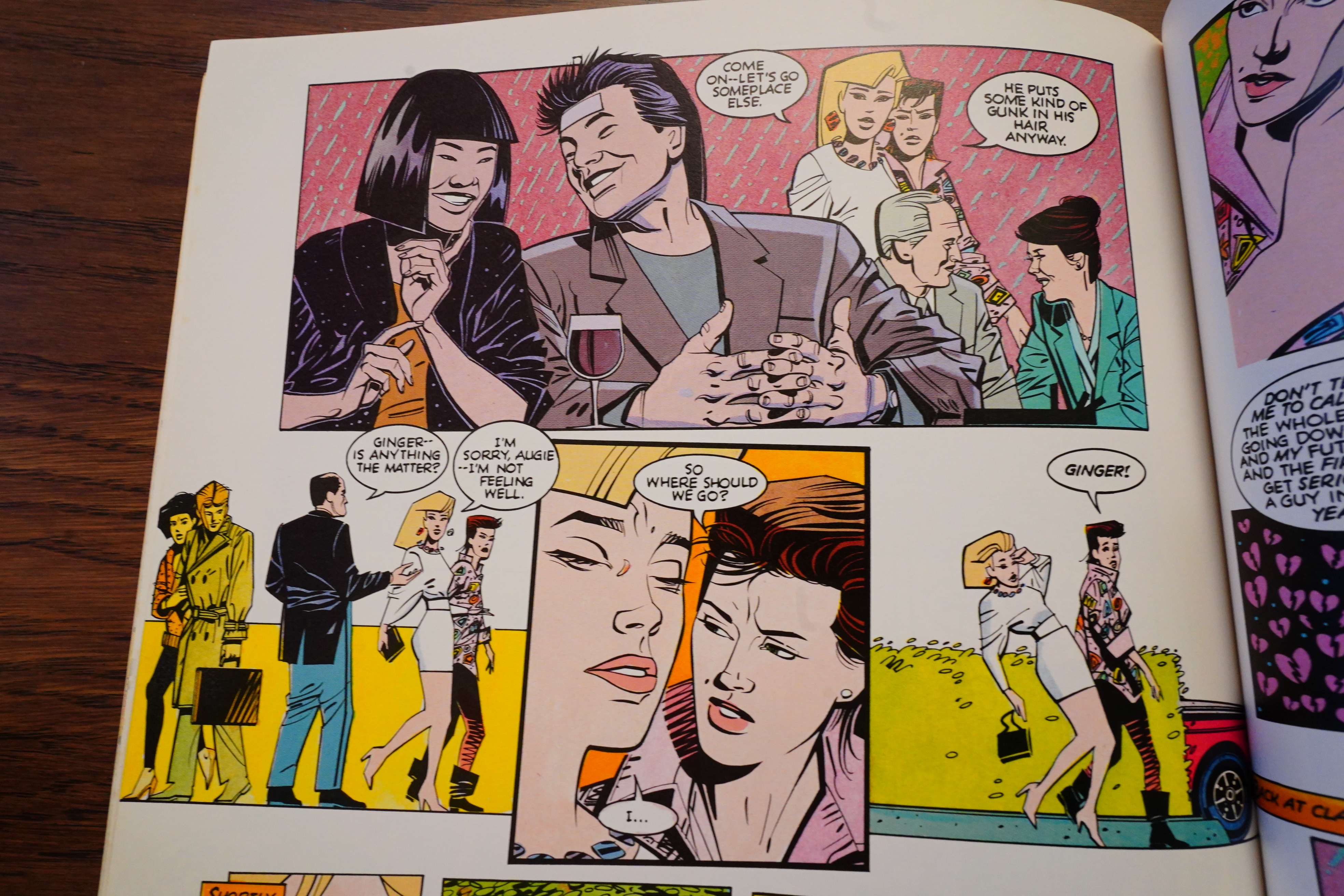
There’s also a romantic plot which has such stunning scenes like Ginger Fox fainting when she sees the guy she’s kinda dating at a bar with another woman.

The book is a bit of a mess. There’s plenty of plot going around, but none of it amounts to much. And it ends like you’d expect, with a triply happy ending.

I liked it? It’s got a breezy thing going on that’s really appealing. But it doesn’t quite work.

According to comics.org, it’s never been reprinted, which is… not that unexpected, really, because:
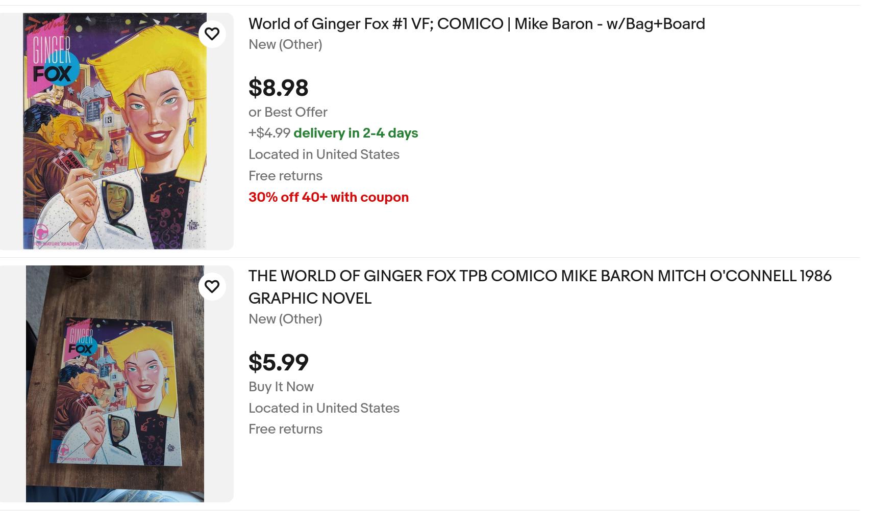
You can pick it up from ebay cheaply.
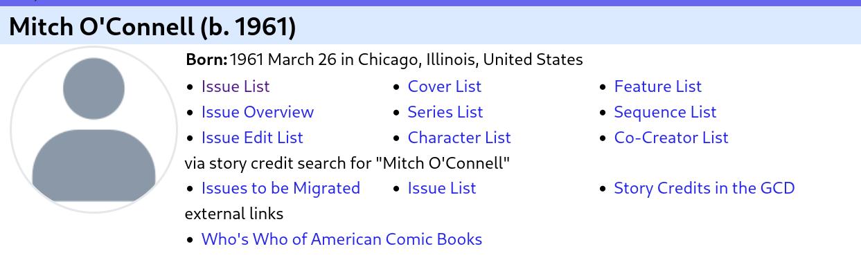
I was totally wrong about O’Connell. Too bad I can’t go up there and edit what I’ve already written because my “up” key stopped working the other day. I’ll have to live with the shame! And looking over the books he’s done, I don’t think I’ve read many of them at all.

Rob Rodi writes in The Comics Journal #115, page #35:

Comico (“The Comic Company,” as it
rather redundantly subtitles itself) recently
accelerated its slow, careful climb to market
respectability by issuing a highly-touted,
slick-looking graphic album by the popular
and almost ubiquitous Mike Baron. The
World of Ginger Fox is designed to
compete with the Marvel, DC, and First
graphic novels, and it should do the job;
it’s as attractive a package, it’s priced
competitively, and it’s about as effective.
It tells the story of the beautiful new presi-
dent of a failing motion picture company
who comes in swinging and puts everything
to rights. It’s about as dreadful as it sounds,
but it has its moments. From the synopsis
you might think it has as much to do with
movies as Dynasty has with oil or Falcon
Crest with wine, and you’d be right, but
what saves it from that depth of embarrass-
ment is that Baron gives us just enough
accessible “insider” talk to flatter us into
thinking we know a lot. (I don’t know much
about the film industry myself, only what
I read in Final Cut, but then again, that was
enough to convince me I don’t want to
know any more.)
As a fantasy about power and its uses and
abuses, as a high-style flit throught the fast
lane, and as a journal of the ins-and-outs
of corporate entertainment, Ginger Fox is
pretty lame stuff. Baron has demonstrated
before-most notably in Nexus and The
Badger, also his own creations-his unwill-
ingness to be better than his medium. For
him, comic books have an inherently loopy
surreality that tends to throw all serious
intentions into sort of garish, Mack-truck
relief. He glories in the kind of goofball, seat-
of-your-pants sensitivity that, paradoxically,
makes his work seem almost enlightened,
as if he’s beyond all this “comics-as-art” lip-
flapping and just wants to have sort of a
high-profile gas. He’s going to be an awfully
good arbiter of our present culture, I think,
for future sociologists. Ginger Fox is so com-
pletely a product of the 1980s that in 20
years it’s going to seem hilariously quaint.
I doubt this would displease Baron, either.
But you do ache to see more from him.
I’ve complained about his blithe acceptance
of character archetypes before, and Ginger
Fox couldn’t be more archetypal. You know
what you’re in for as soon as you open the
book and find the movie studio’s board of
directors debating whether or not they’re
desperate enough to let “the broad” have
a crack at saving their hides. (The studio
is ripe for a takeover by “the oil boys.”) Of
course, with a set-up like that, “the broad”
has to turn out to be perfect. And Ginger
Fox is perfect. She comes in looking like
Christie Brinkley on one of her best days,
and announces a new plan for saving Pep-
and announces a new plan for saving rep
public! That’s a loser’s game. No more
follow the leader. Peppertree will develop
new concepts, new ideas.” This is some of
the most trite writing Baron has ever done.
You can just hear Heather Locklear reciting
it. (Wouldn’t a real CEO, given only two
months to save a studio’s hash, be talking
about shorter-term, more immediate
solutions-marketing strategies, advertising
gambits, distribution deals with indepen-
dents?)
Ginger goes on to review the list of
“orphaned” projects still in production; she
kills one outright, a cheesy space-opera,
incurring the wrath of its director, and
“adopts” two others. All are over-budget
and late, but she uses her instincts to tell
her which to dump. And of course, her
instincts are perfect. The director of the
space-opera turns out to be a vengeful,
unforgiving type who tries to sabotage the
studio and all of Ginger’s hard work.
Wouldn’t it have been more fun if Ginger
had been more of a self-centered, don’t-fuck-
with-me-I’m-always-right sort-if some of
her rough-riding over her auteurs were
shown to be as fascistic as their work was
masturbatory? If she had a few freakin’ flaws,
for Pete’s sake? But no, she has to be an
ideal-with youth, beauty, guts, savvy, great
clothes-and, hey, she’s sexually active and
a great mom. Saint Ginger of the Corporate
Ladder. (In the midst of her troubles, she
even arranges an audition for her actress
housekeeper; Mary Poppins ain’t got nothin’
on this gal.)
She’s pretty much a cipher as a result. She
falls for one of her actors, a Bruce Lee-type
who’s starring in an action film called Enter
the Cobra (which, from the confusing selec-
tions we’re shown from it, seems to be
autobiographical), and you think it might
render her human; instead, this actor turns
out to be perfect too. But then, he has to
be. Ginger loves him. (However, being a
perfect CEO, she won’t date an employee.
Integrity can be a harsh mistress.)
There are subplots about a drug-addicted
actor who is the key to one of the films
Ginger has inherited, and about a secret
kung fu sect that is out to ruin Enter the
Cobra, so that both films, upon which the
studio’s fate hangs, are in danger; and don’t
forget that pissed-off space-opera director
who’s trying to ruin her, too. So Ginger has
a lot on her mind. I could have lived
without the scene of her fainting from her
exertions and her moral unequivocacy; it
smacks of cheap theatrics. It’s only there to
put the seal on her sainthood. And it’s
sexist, too. (Would a male CEO pass out in
a tough spot? Did Lee Iacocca swoon while
waiting for approval of his federal loan?)
Ginger’s perfect kung fu boyfriend takes
care of everything, which includes kicking
the shit out of an old kung fu master and
helping the addicted actor kick the habit,
and then the story ends with the whole cast
taking in the premiere of Enter the Cobra,
which is a smash hit. Well, of course it is.
Ginger believed in it, didn’t she?
Wouldn’t it have been wittier-and more
modern-if the film had been a failure, but
with the last-minute news that its sound-
track album had sold enough advance units
to save the studio? But Baron insists on
trendy “retro” melodrama. It’s not exactly
a cynical work-Baron is never cynical-
but so much of it is regurgitated from old
Joan Crawford and Ginger Rogers movies,
where the woman at the top is better than
all the men, but so lonely, so misunder-
stood. (Comic book fans will probably be
most reminded of the old Millie the Model
comic-except that it’s 1986 and Millie’s on
the other side of the camera.) It presents the
acceptable, ’80s face of sexism. (You get the
impression that Ginger wouldn’t be as good
an executive if she didn’t dress cool.)
There are also some celebrity “cameos”
that are simply beneath mention, so let’s
not mention them.
The artwork, by Chicago commercial
artist Mitch O’Connell, is pretty, if a trifle
busy; he has a couple of neat tricks-such
as giving us panels with all the characters
shown at midsection, so that we’re aware
of their body language (an untapped source,
given the instant accessibility of facial
expressions). He has a pleasing, confident
rendering style, something like a cross
between Steve Rude and Alex Toth, if you
can even imagine it. Ginger Fox is at least
a treat to look at.
And, to borrow another movie “insider”
term, it may indeed have legs. I think it’ll
work best in about 20 years-the way we
look back at, say, Green Acres today, and
wax nostalgic for the kind of culture that
could have created such a curious thing,
even though we couldn’t stand it at the
time. Until then, file this one next to
Metalzoic and The Sensational She-Hulk.
That seems to be the height to which it
aspires. Congratulations, Comico.

That’s a very fair review — I agree with what Rodi says here, especially the “Ginger Fox is so completely a product of the 1980s that in 20 years it’s going to seem hilariously quaint”.
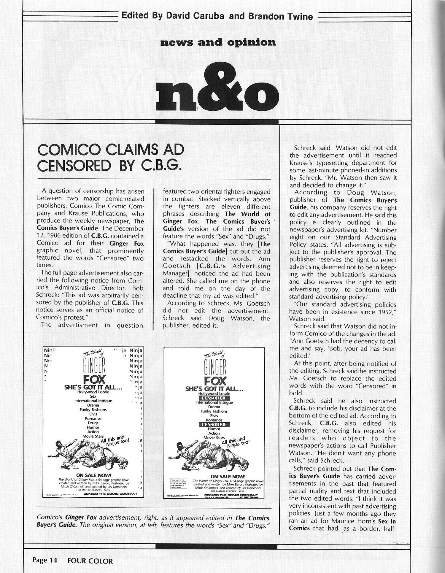
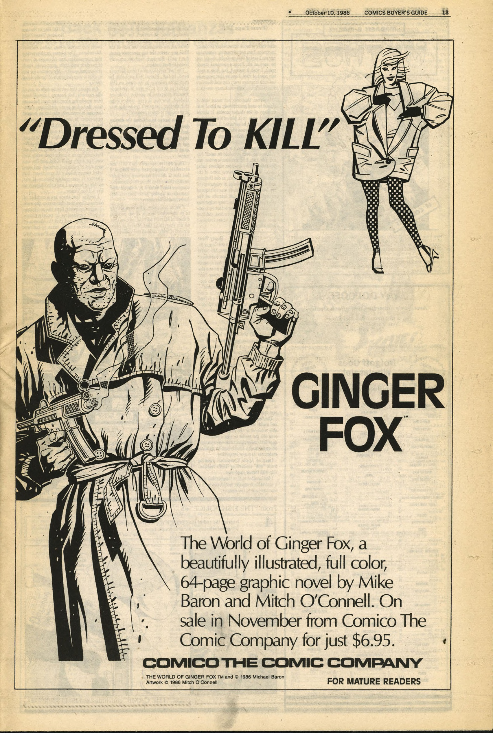
How bizarre.

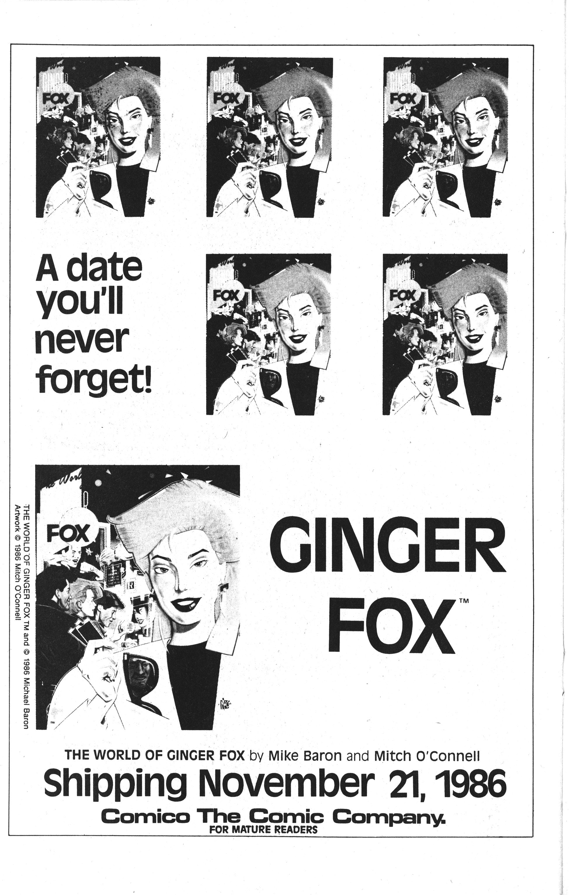
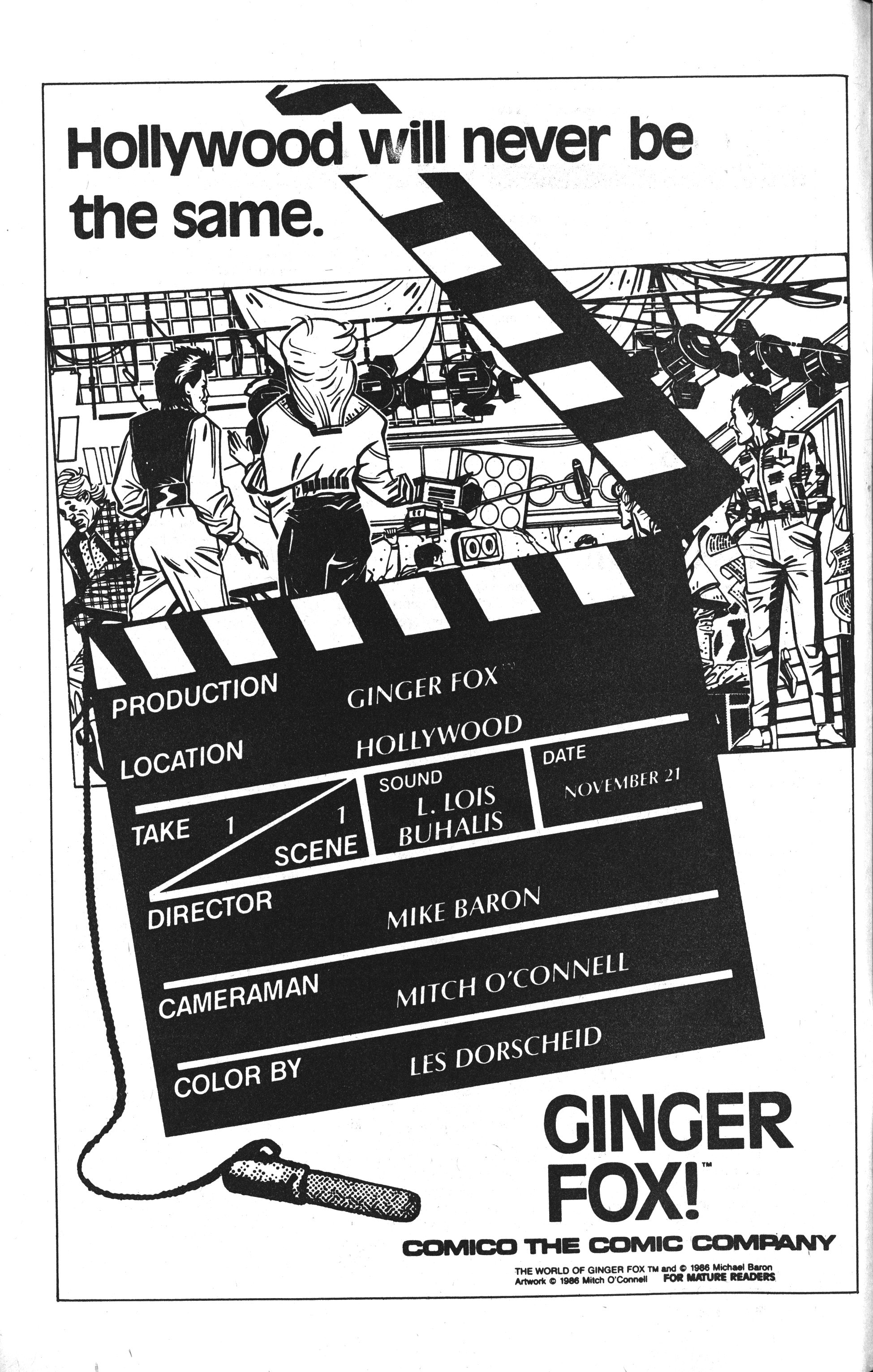
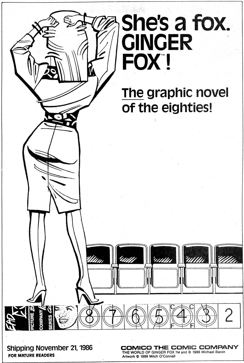
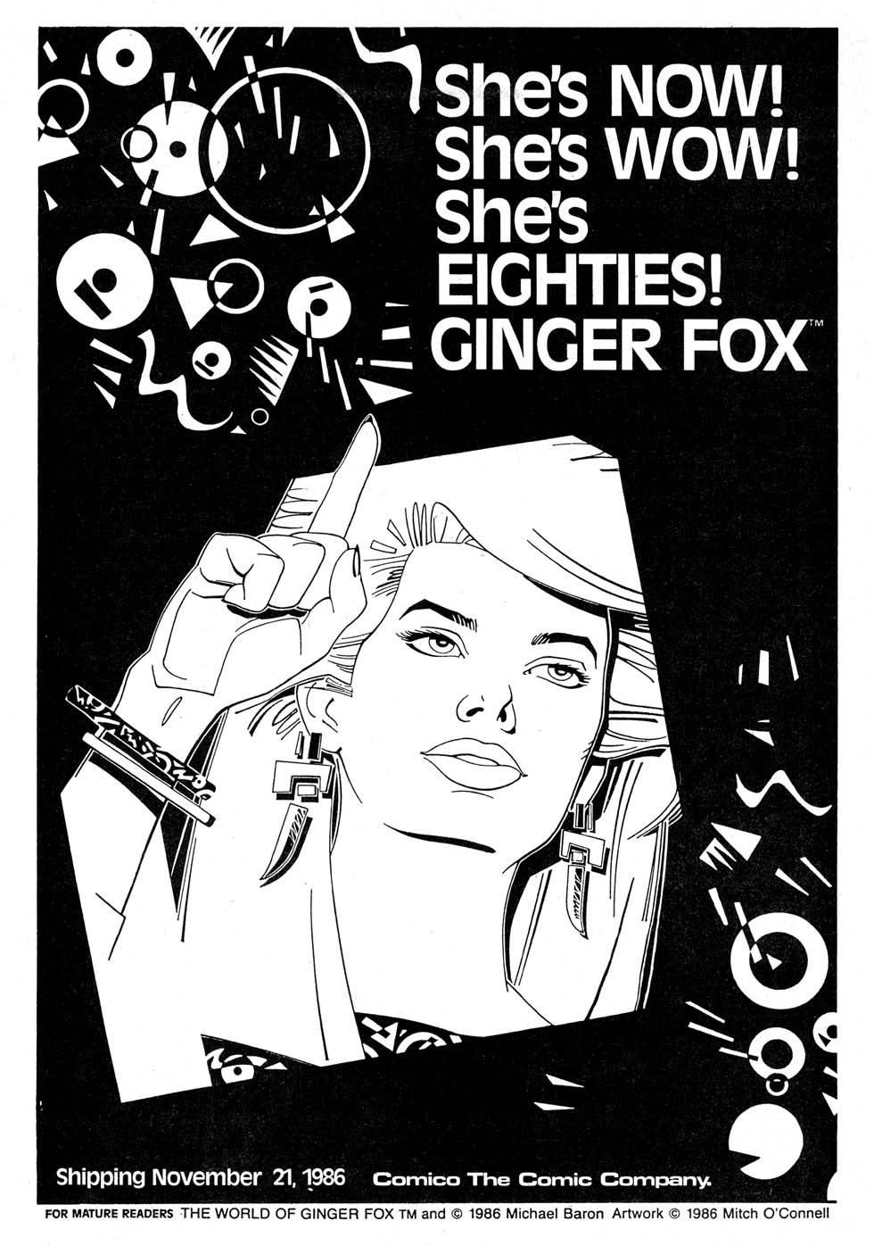
Well, Comico certainly got behind the album — lots of ads. And this is just a sample. Are they good ads? Eh…

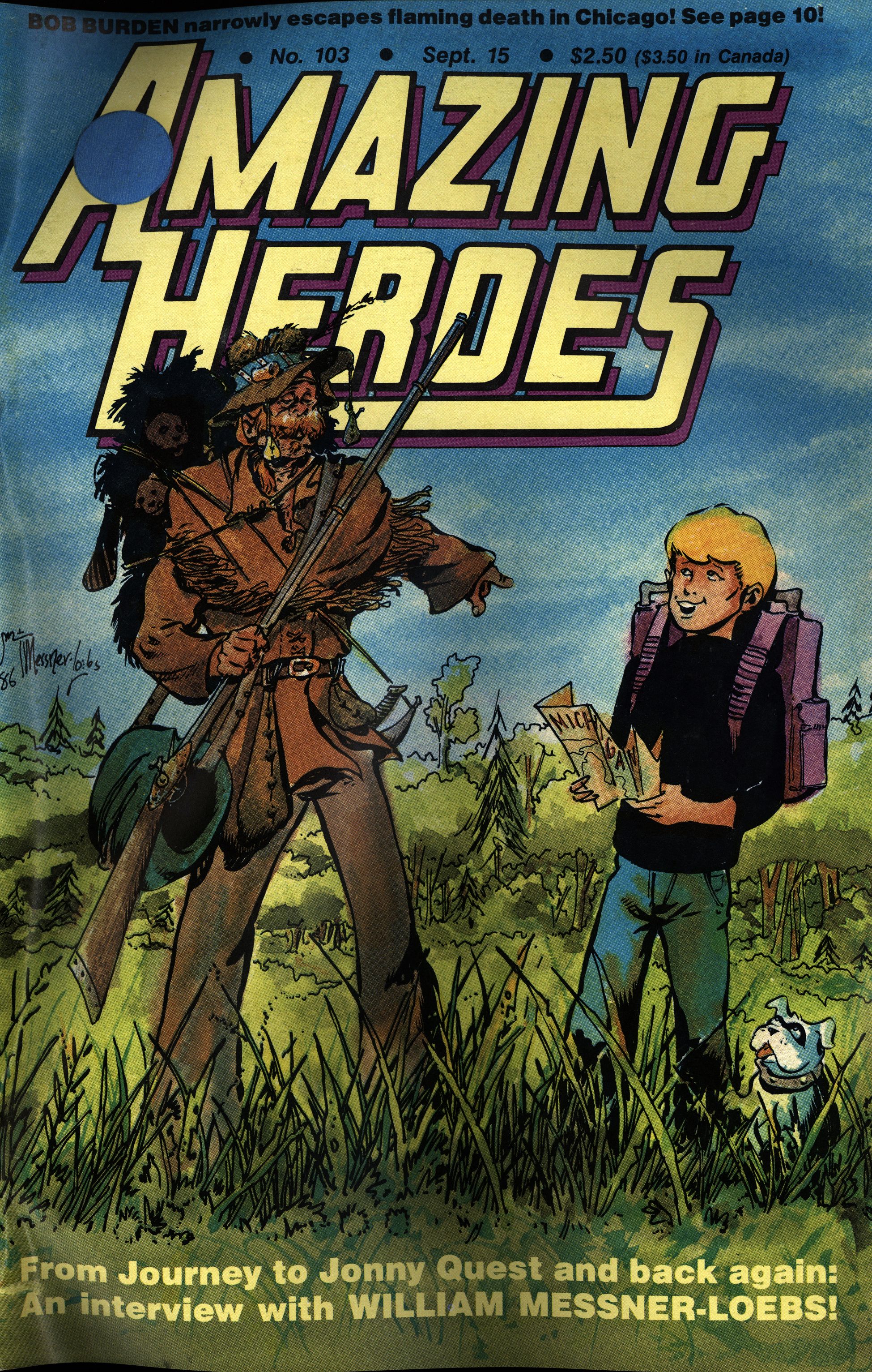
Gerry Jones writes in Amazing Heroes #112, page #65:

This isn’t real reality. It’s
Hollywood. A glamorized wish-
fulfillment Hollywood at that.
Hyped-up, packaging-oriented, fast,
fluffy, superficial, sexy, fun. It’s also
kung fu, which isn’t real reality
either. Ritualized, baroque, violent,
colorful, predictable but suspense-
ful. It’s a weird combination. It
makes something that isn’t reality
but isn’t fantasy. It isn’t mainstram
but it isn’t genre. I don’t know what
it is. But it’s a blast.
Mike Baron-thanks to the suc-
cess of the funny, startling, chilling,
pseudo-philosophical niftiness of
Nexus-is in the enviable position of
being able to call his own shots. He
can dream up a goofy story aobut
a hot young female Hollywood
studio executive turning a kung fu
movie into a major hit and falling
love with its Chinese star despite the
interference of the deadly Yellow
Lotus secret society, and he can get
it published as a full-color graphic
novel. It’s a silly story, based on a
whole mountain of sillinesses (a
kung fu movie, especially with an
Asian star, becoming a studio-saving
hit in 1986? Who you tryin’ to kid,
Baron?). The characters are pretty
two-dimensional, the emotional de-
velopments pretty quick and conve-
nient. But what the hell. It’s
Hollywood. And it’s fun.
It’s refreshing just to see a slickly-
produced, smoothly-written, all-
color comic book about the big
world outside the concerns of funny-
book folks. Who cares if it’s as pat
and insubstantial as any Hollywood
action-comedy? That makes it a
better reflection of the world it’s por-
traying. Granted, I’d liked to have
seen more romance, more studio
shenanigans, more character stuff,
and not so many fight scenes. But
I don’t think Baron put the fight
scenes in as a concession to the
expectations of comic fans. I think
he put them in there because he’s a
genuine kung fu freak. And maybe
the best thing about reading this
story of his is sharing his own obvi-
ous fun and sense of creative
liberation.
(But Baron does pull one blunder
that should be posted as a warning
to writers everywhere: He tries to
give us a scene full of Good Writing.
The scene is a screening of Pepper-
tree Studio’s movies-in-progress for
new president Fox and her Exec Sec
Maureen. They see part of a lame-
brained space opera and laugh it into
extinction. Then they see a scene
from a “serious” movie in which a
Puerto Rican junkie launches into a
sobbing entreaty to the virgin Mary
to help him turn his life around. It’s
the most mawkish piece of senti-
mental schlock I’ve ever seen. “It
ain’t, it ain’t for me I’m askin’… it’s
for my little girl…It’s for Mary.”
I figured, if Ginger and Maureen
laughed at that other thing, how
they’re going to howl at this one. But
I turned the page to find Ginger say-
ing, “I like it.” Is this a prolonga-
tion of the joke, I wondered? But
then, with horror, I realized that
Baron had meant this slop to be
Serious Writing. It took me about
five pages to get back in synch with
the comic. Challenges like that, no
writer should ever put on himself.)

I thought the same thing! This Gerry Jones must be some kind of genius… let me do a quick google on the name and OH MY GOD

NO CARRIER

Baron does a good, deft, facile job
with a charming story. But the real
star of this comic is Mitch O’ Con-
nell. I don’t know where this guy
came from, but I hope he never goes
back. He’s a minor miracle, an ap-
parent newcomer to the field who
strides in with a dazzling, sophisti-
cated, versatile style of his very
own.
O’Connell’s not just another Mar-
vel/DC-style Hot New Sensation,
finding different ways to combine
George Perez, Jim Starlin, and Neal
Adams. He brings in an enormous
vocabulary of designs, motifs, illus-
trator’s tricks, fascinating faces, and
ingenious compositions. He dedi-
cates the comic to, among others,
Alex Toth, and a better influence for
this kind of work couldn’t have been
found. Toth did some romance com-
ics in the early 1950s that have never
been touched for visual inventive-
ness and sophisticated design (check
out Eclipse’s True Love if you don’t
believe me). O’Connell obviously
learned from those, transformed
what he saw into an Eighties con-
text, and assimilated it into his own
forceful graphic style. Clothes,
backgrounds, page designs, even
figures, are broken down and flat-
tened out into sharply evocative
designs. He uses clever bits of
shorthand—a background of broken
hearts unfurled like wallpaper
behind an unhappy Ginger, the final
scene in film-frame style to blur the
distinction between movie and
reality—with remarkable unobtru-
siveness.
Very design-conscious, very snaz-
zy, very slick, this is cartooning for
the age of music videos and Keith
Haring watches. But because it’s
always evocative and never loses its
narrative flow, it’s also completly
legitimate comic book art. O’Con-
nell and Ginger Fox were made for
each other. I look forward eagerly
to seeing what he can do with some
other—any other—material.

The Comics Journal #115, page #27:

The World of Ginger Fox, a
Comico graphic novel by Mike
Baron and Mitch O’Connell, was
featured in the February 1987
issue of Playboy in the “After
Hours” section. According to
Comico Administrative Director
Bob Schreck, “The article profil-
ing Ginger Fox emphasized how
most of the ‘hot’ new graphic
novels produced for adults were
of a serious nature and indicated
that Ginger was a much-
welcomed departure from that
type of book.’
Schreck added that Playboy’s
national cable TV channel was
interested in the graphic novel as
well. “There is a strong possi-
bility that Ginger will be featured
in an upcoming edition of the
monthly Playboy Video
Magazine,” said Schreck.

Four Color Magazine #1, page #12:

Returning to the topic of Comico
media attention, the new graphic
novel The World of Ginger Fox has
appeared in a graphics magazine and
Philadelphia Magazine.
Schreck added, “So far the few
direct-market retailers and warehouse
managers who’ve seen Ginger have
been very enthusiastic about the pro-
ject. I am certain that once the retailer
puts Ginger on display, it will fly out
of the shops. It is one of the best writ-
ten, most incredibly illustrated graphic
novels you’ll ever read.”

The Comics Journal #110, page #91:

When are you going to do
a non-super-hero strip?
BARON: November of 1986, The World of
Ginger Fox will be out. It’s published by
Comico. Mitch O’Connell will be the art-
ist. It’s my third totally new creation. It’s
pure soap opera set in Hollywood. The en-
tire thing is written. It’s half drawn. I have
the pages here, I’m going to show you in
a little while when we get off this machine.
But I’m tremendously excited about this.
This is my effort to get the romance crowd.
Of course, all I can do is write the story. To
get those ladies who would never dream of
looking at a comic book is going to take
another effort, but I think we have a battle
plan for that too. But the answer is, it’s in
the works.
SMAY: Is it going to be full color?
BARON: Yeah, it’s going to be full color.
It’s going to be a graphic novel, 64 pages
long. It’s gonna blow your mind. Mitch
O’Connell is an artist who lives in Chicago.
He works with my good friend Bill Reinhold
quite a bit. Bill is the artist for the Badger.
Mitch has been inking a lot of Bill’s covers
for the Badger. He does clip art. He does the
most amazing clip art. I see it popping up
everywhere. It’s in our local newspaper. It’s
in a lot of journals I get in the mail-because
his art is so startling and inventive. It’s very
designer oriented. It’s got a lot of deco influ-
ence but it’s very modern.
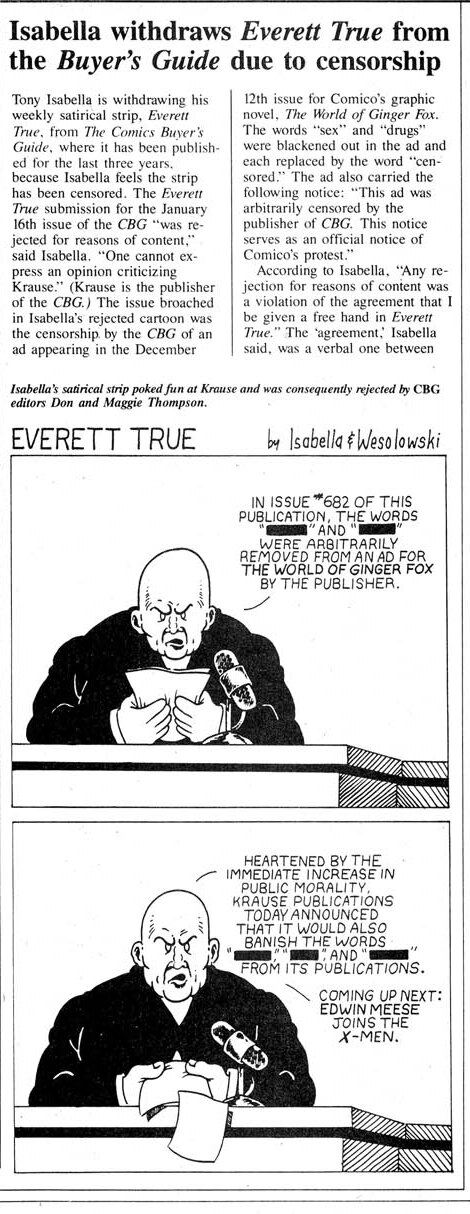
Ginger Fox returns a year later in a four issue series drawn by the Pander Bros, and I’ll cover that later.

There’s a few reviews on the intertubes:

This might be the most 80s comic I ever read.

Hm:

Sexy, cinematically violent and wickedly tongue-in-cheek, this adult comics caper is markedly different from almost anything you’ve ever seen and thoroughly deserves another bite of the graphic novel cherry.

Hm:

This one is definitely worth tracking down. Fans of Mike Baron’s work on The Badger won’t be surprised at all by the martial arts portion of the story, but both it, the romance, and the film industry portions are handled in very clever fashion.

Right:

The review itself was a bit of a takedown, but this general description of Baron’s work caught my attention at that time…

“For him (Baron), comic books have an inherently loopy surreality [sic] that tends to throw all serious intentions into sort of garish, Mack-truck relief. He glories in the kind of goofball, seat-of-your-pants sensitivity that, paradoxically, makes his work seem almost enlightened, as if he’s beyond all this ‘comics-as-art’ lip-flapping and just wants to have sort of a high-profile gas. He’s going to be an awfully good arbiter of our present culture, I think, for future sociologists.”

Heh:

An 80’s throwback. Mike Barron tries to write Get Shorty, but fails. The Art from Mitch O’Connell is great and really gives those 80’s vibes in the best way.

OK, that’s it. The next blog post in this series may take a few extra days to arrive, because it’s a longer series again: Justice Machine.
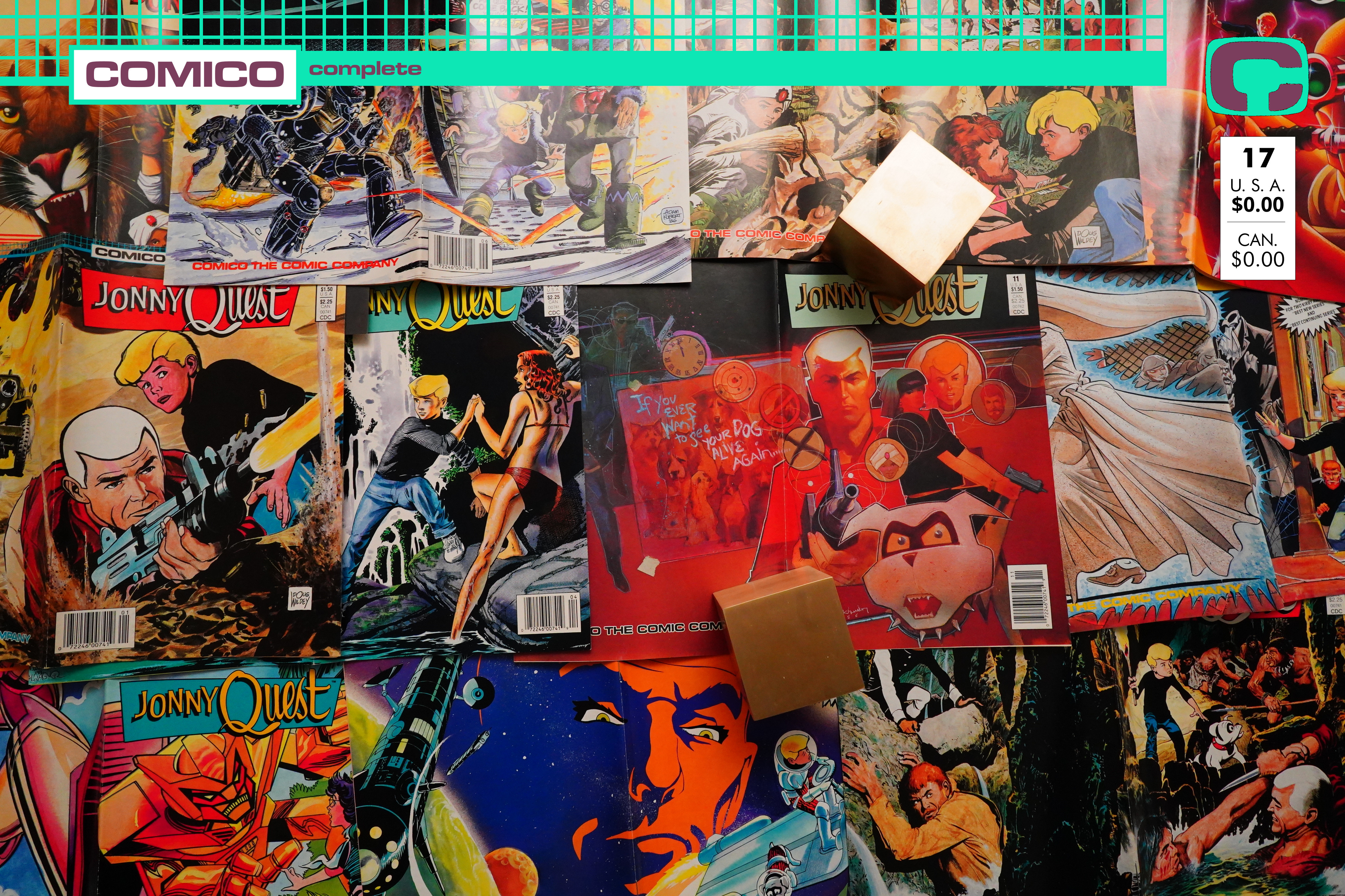
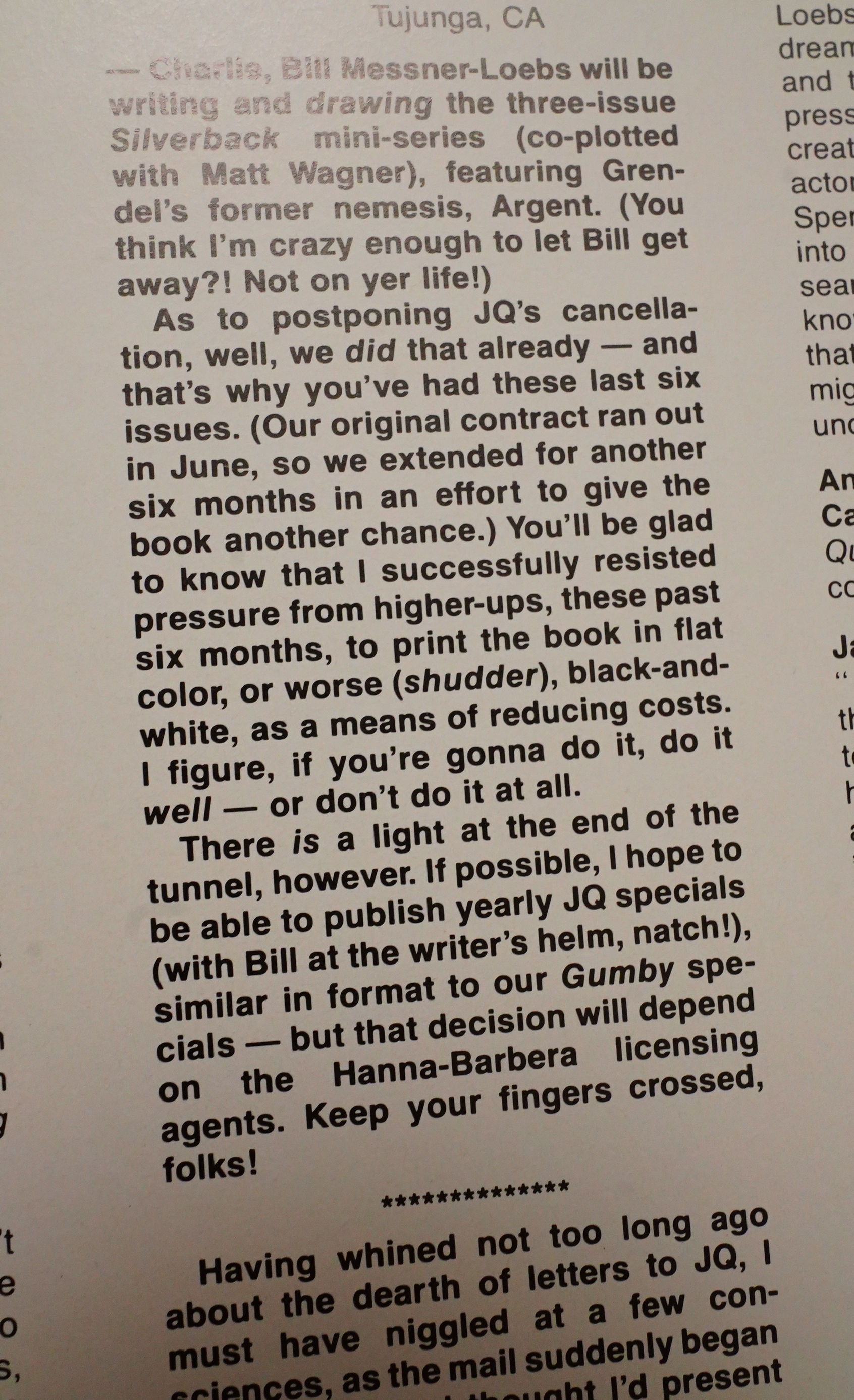
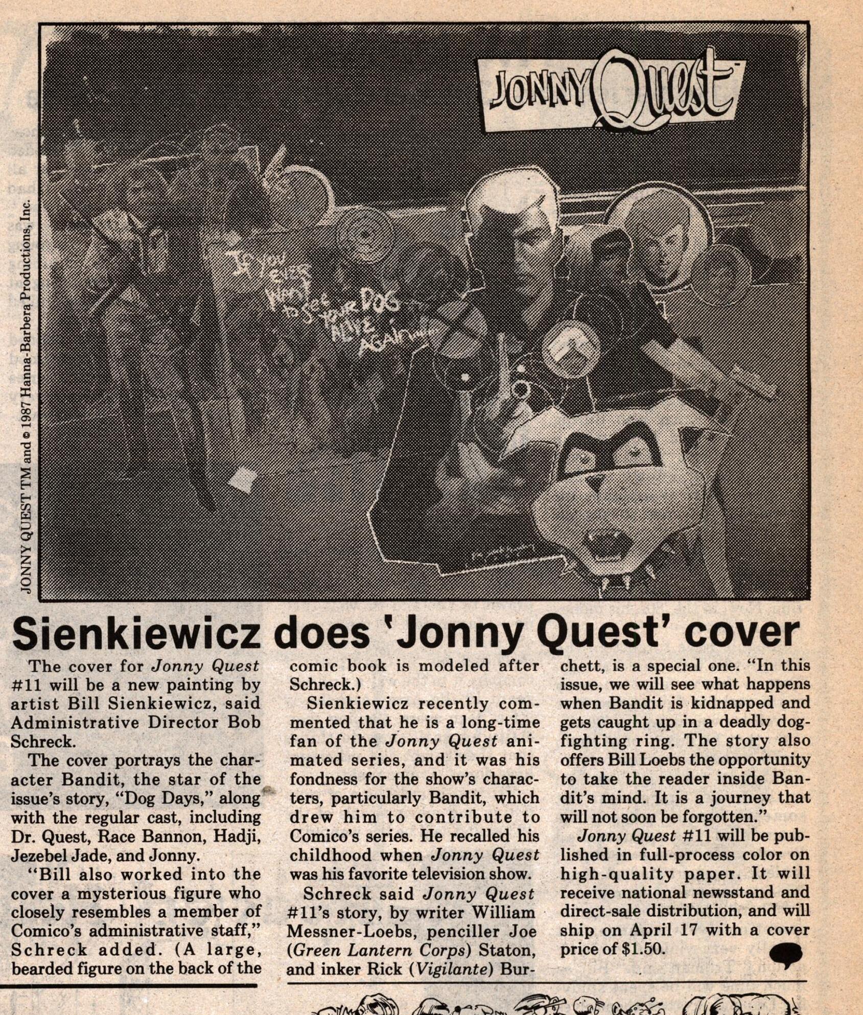
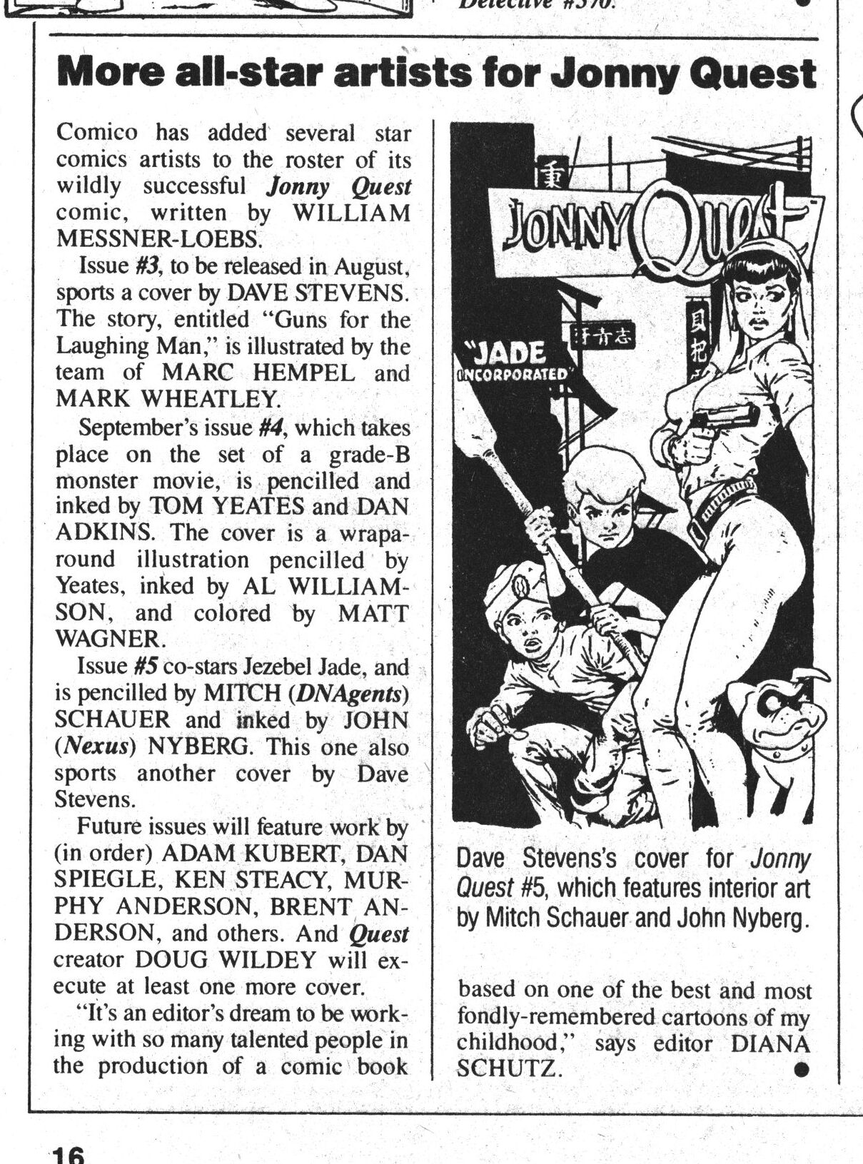
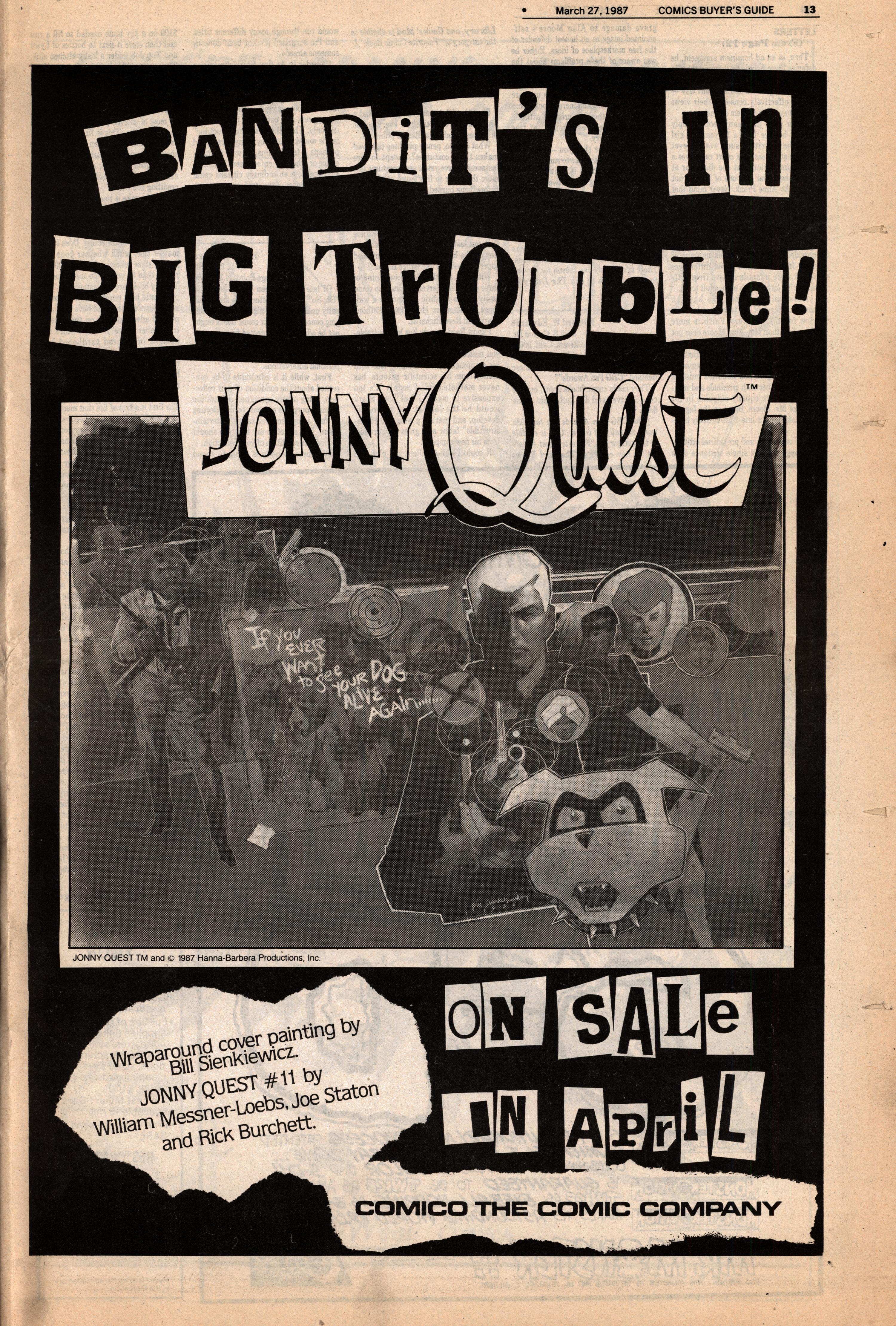
1986: Jonny Quest

Jonny Quest (1986) #1-31 by William Messner-Loebs and a cast of thousands

This blog post has taken a lot of time — not because reading these books has been boring, but because I got busy doing other things, so I’ve just not had the time to read them. So this blog post is probably even more scattered than usual — I may have forgotten what I’ve written at the start when I get to the end…

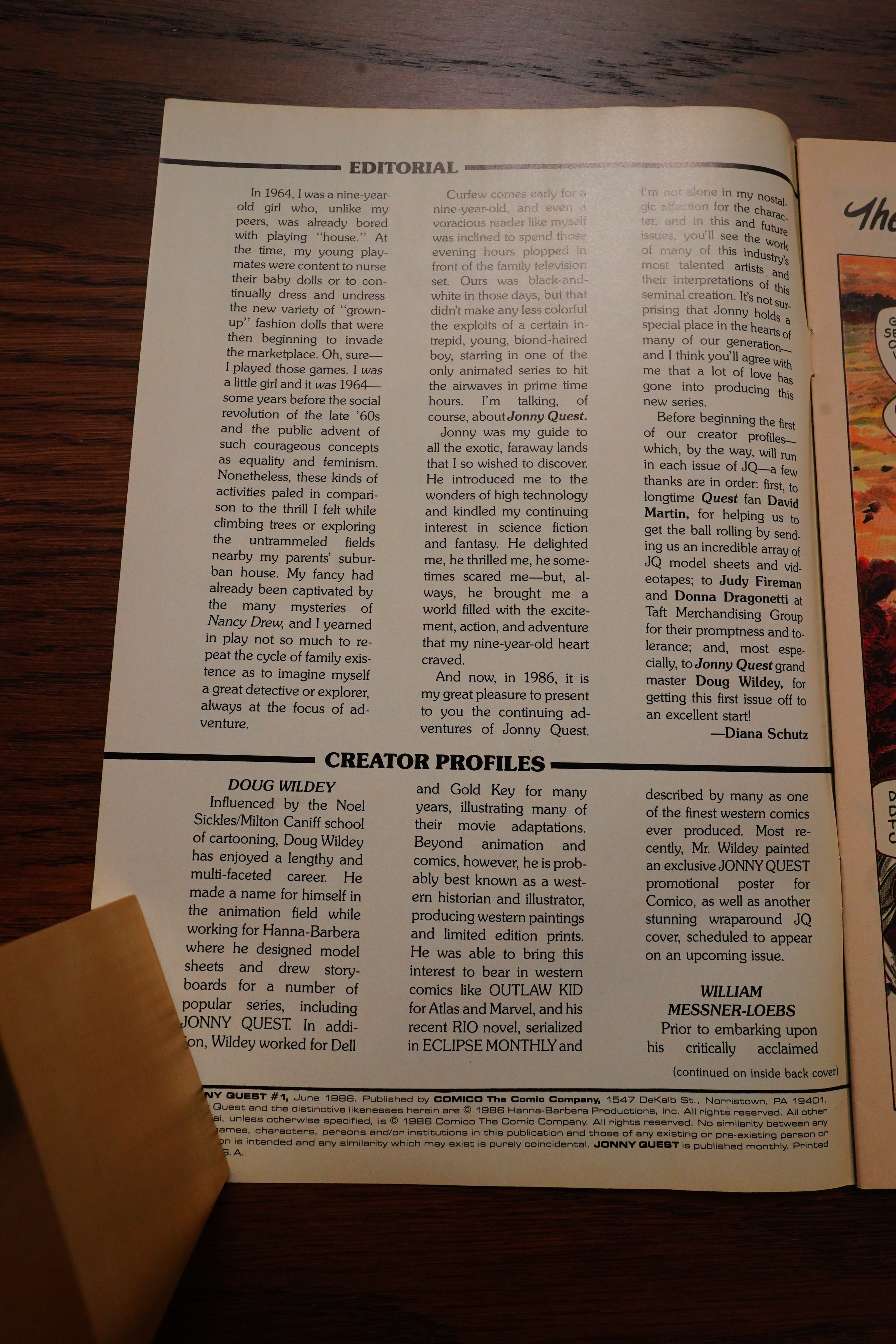
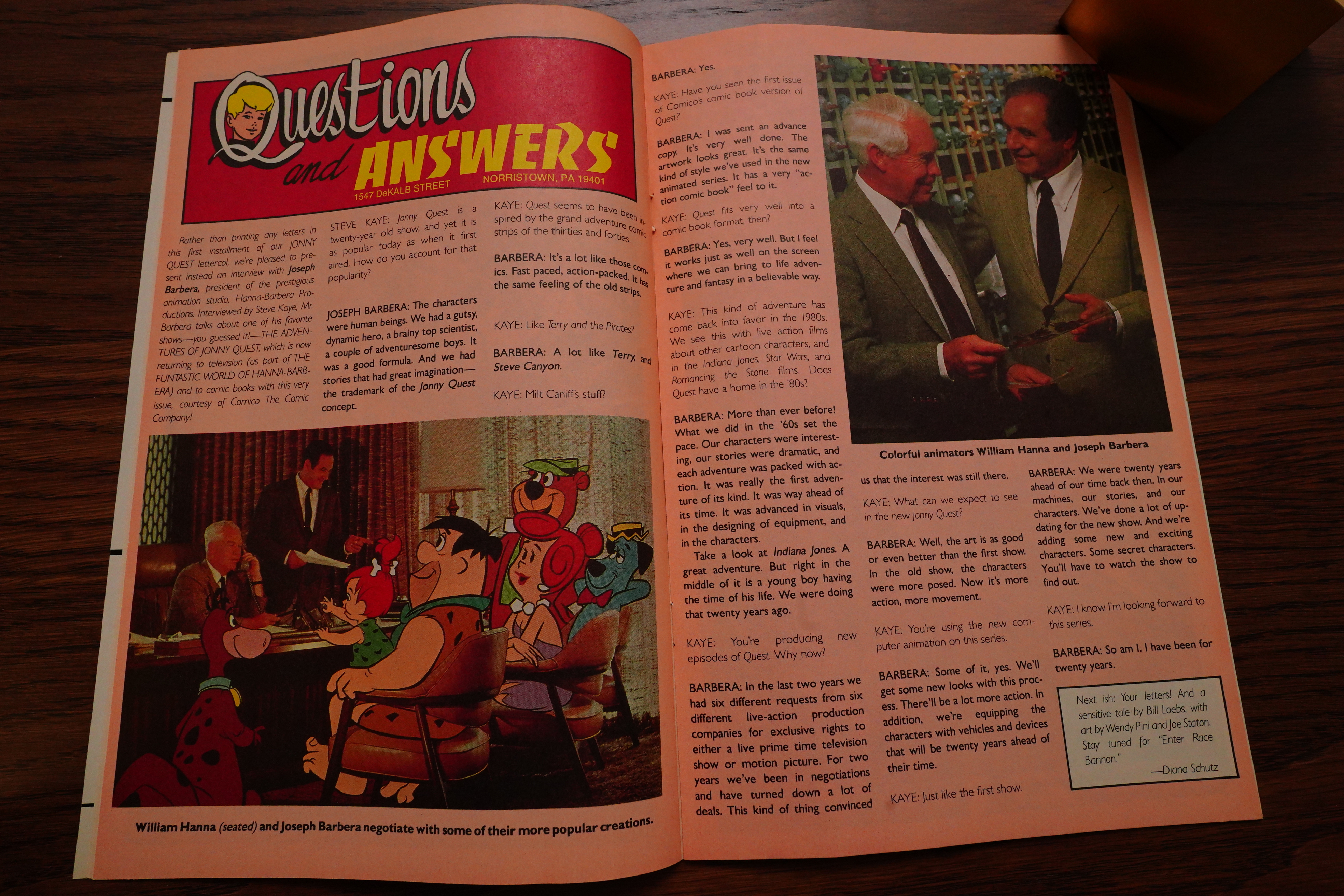
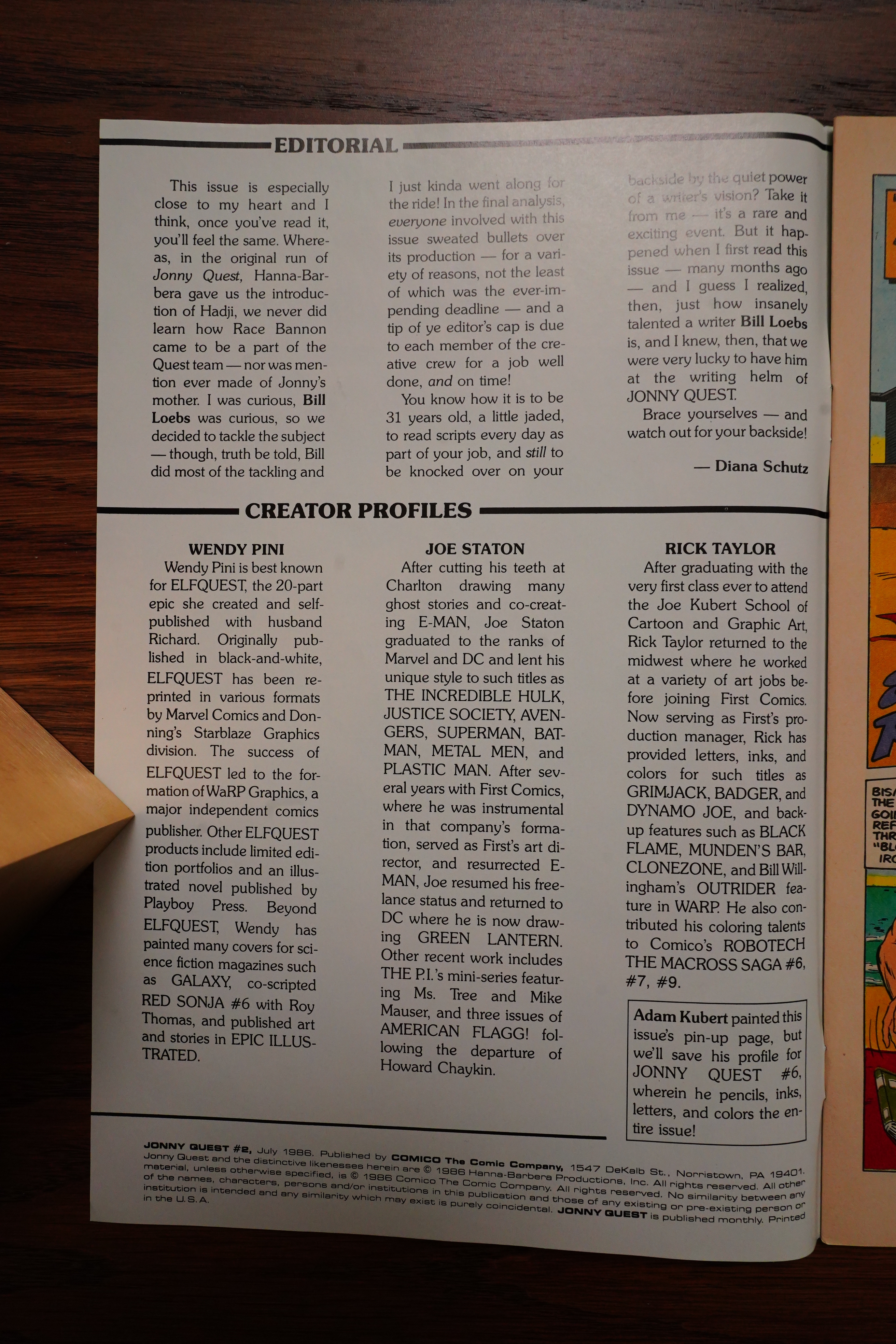
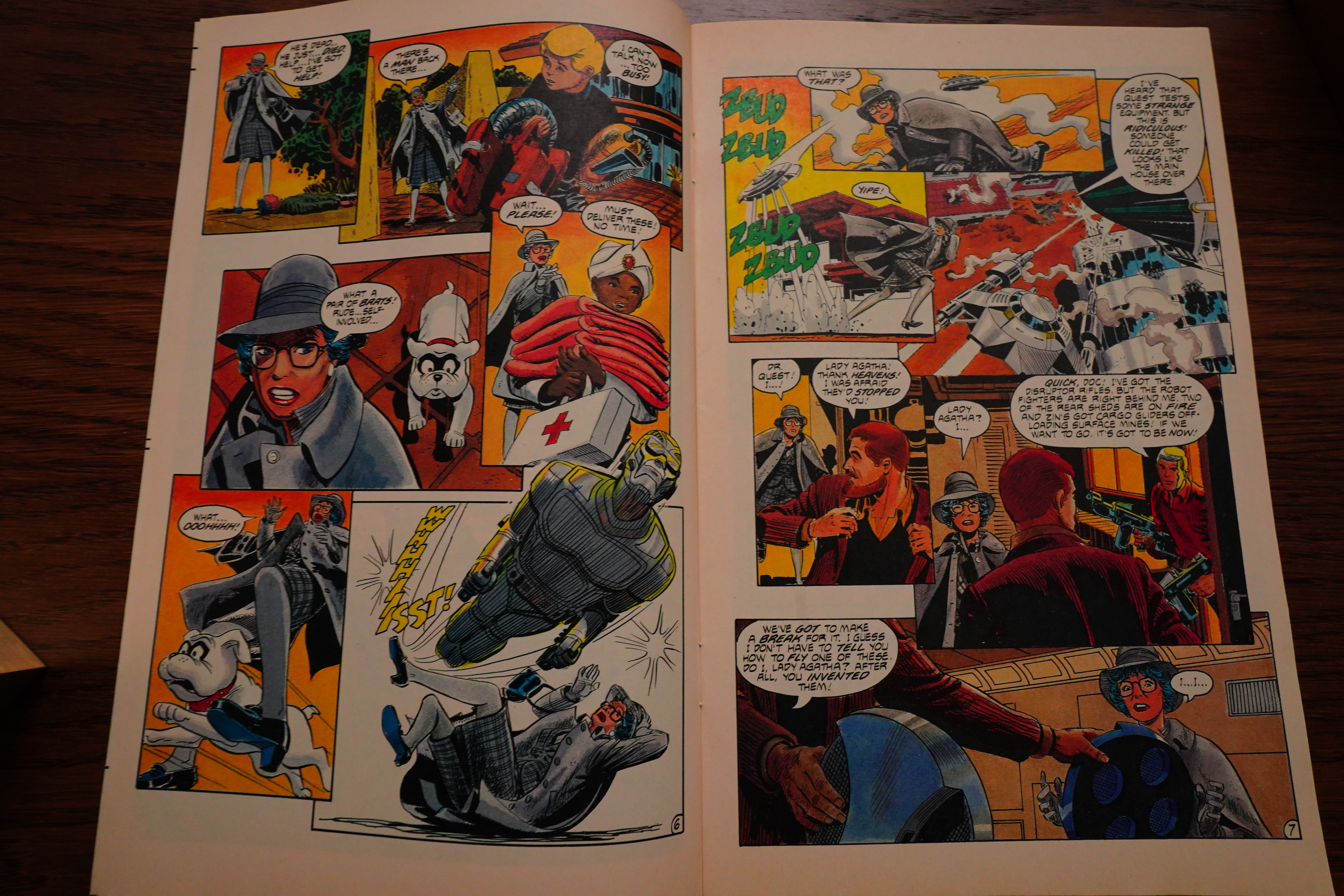
I know nothing about Jonny Quest. The only time I can remember seeing him mentioned is in connection with this series, really. But it turns out that it was a cartoon that ran for 26 in the 60s — i.e., it was cancelled after one season. So I’m not sure whether Diana Schutz’s introduction here is supposed to be taken at face value — was this really a beloved series that they were finally doing an adaptation of, and everybody’s excited? Or is this more like the Robotech situation, where (apparently) nobody involved had any real passion for the project (until perhaps later in the series when they got some fans aboard) and it’s just a way to make some money?

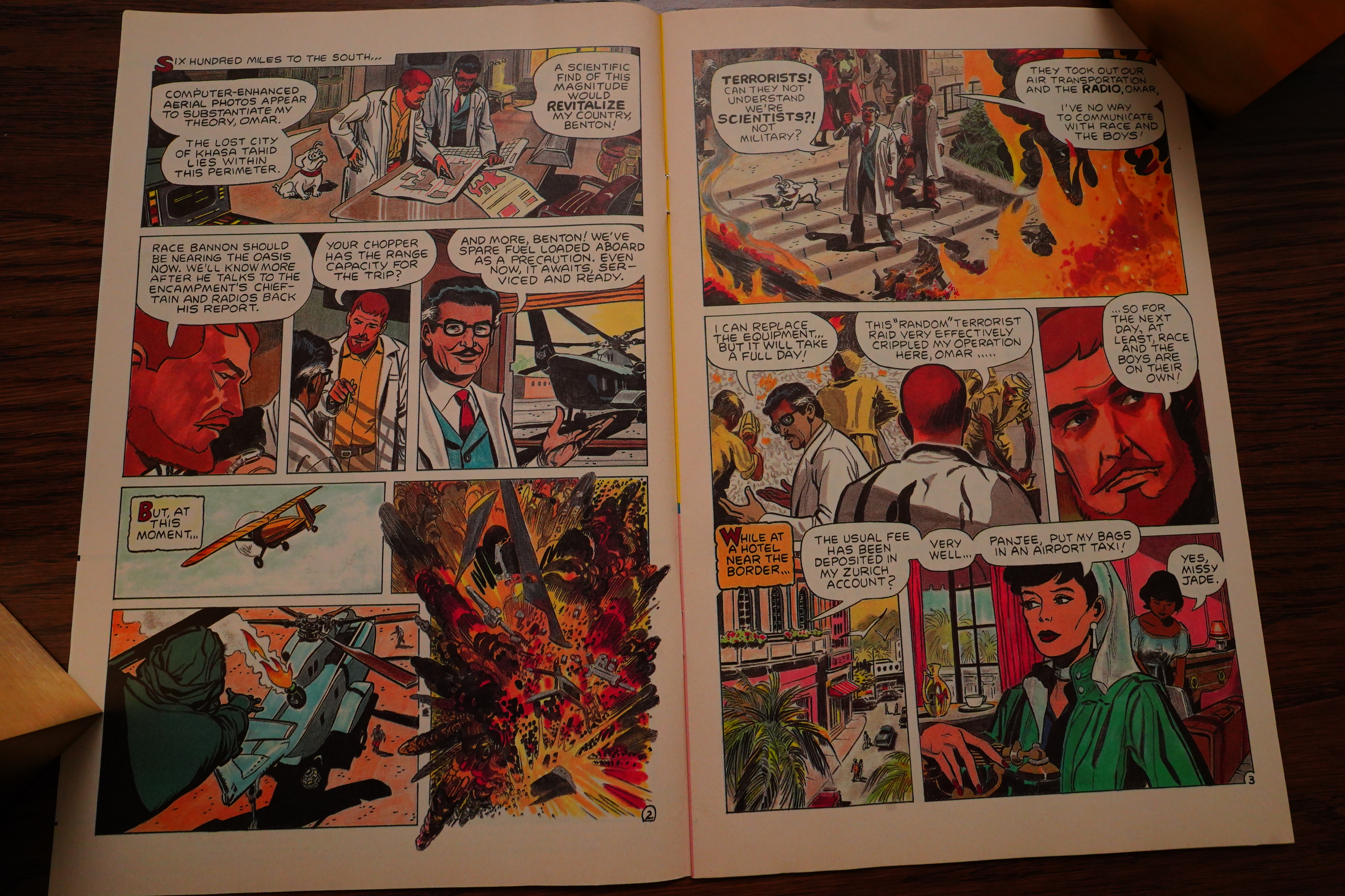
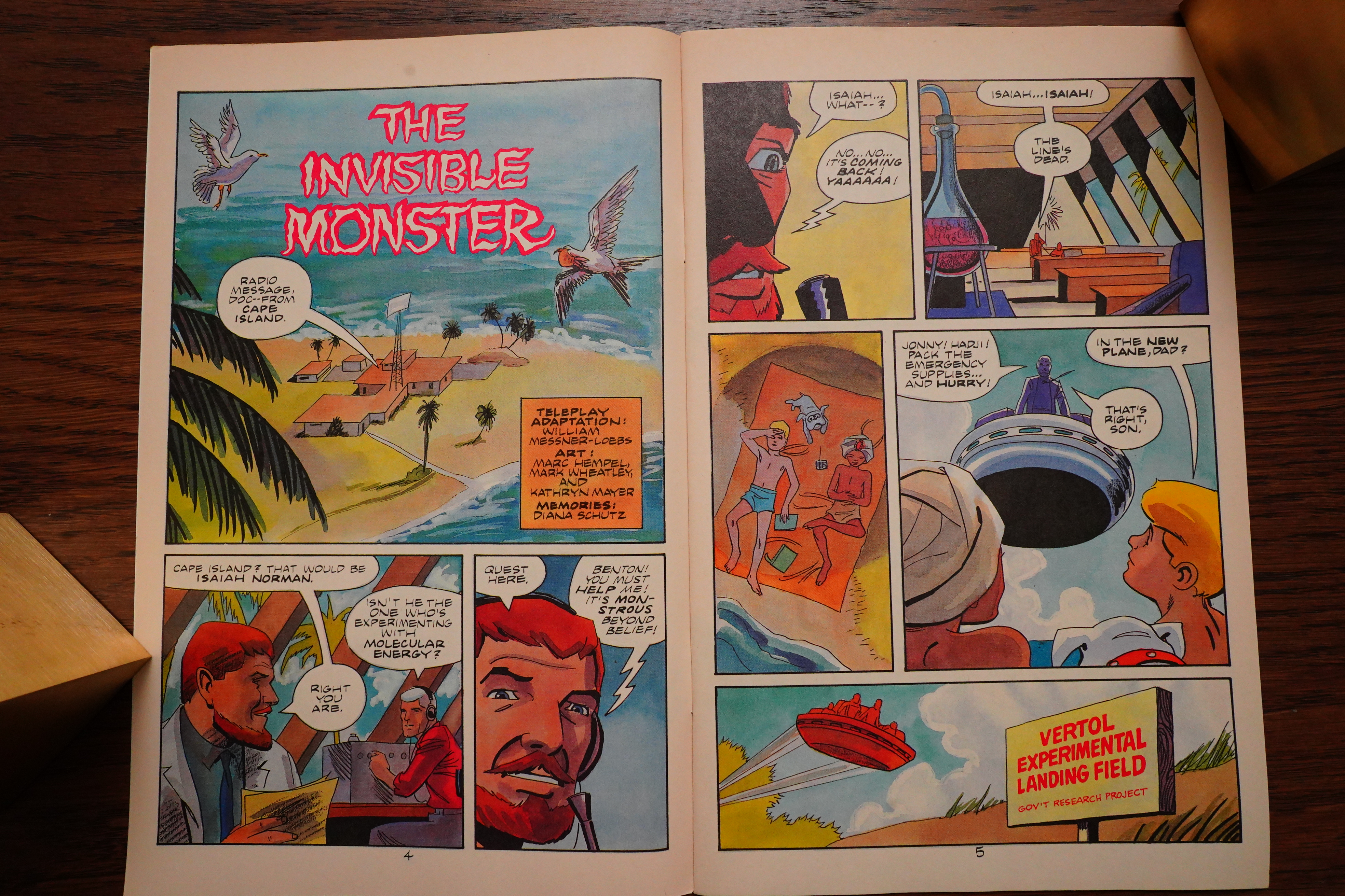
The first issue isn’t typical — it’s two short stories instead of one longer story. Doug Wildey does the first one — perhaps on his own? It’s not clear.

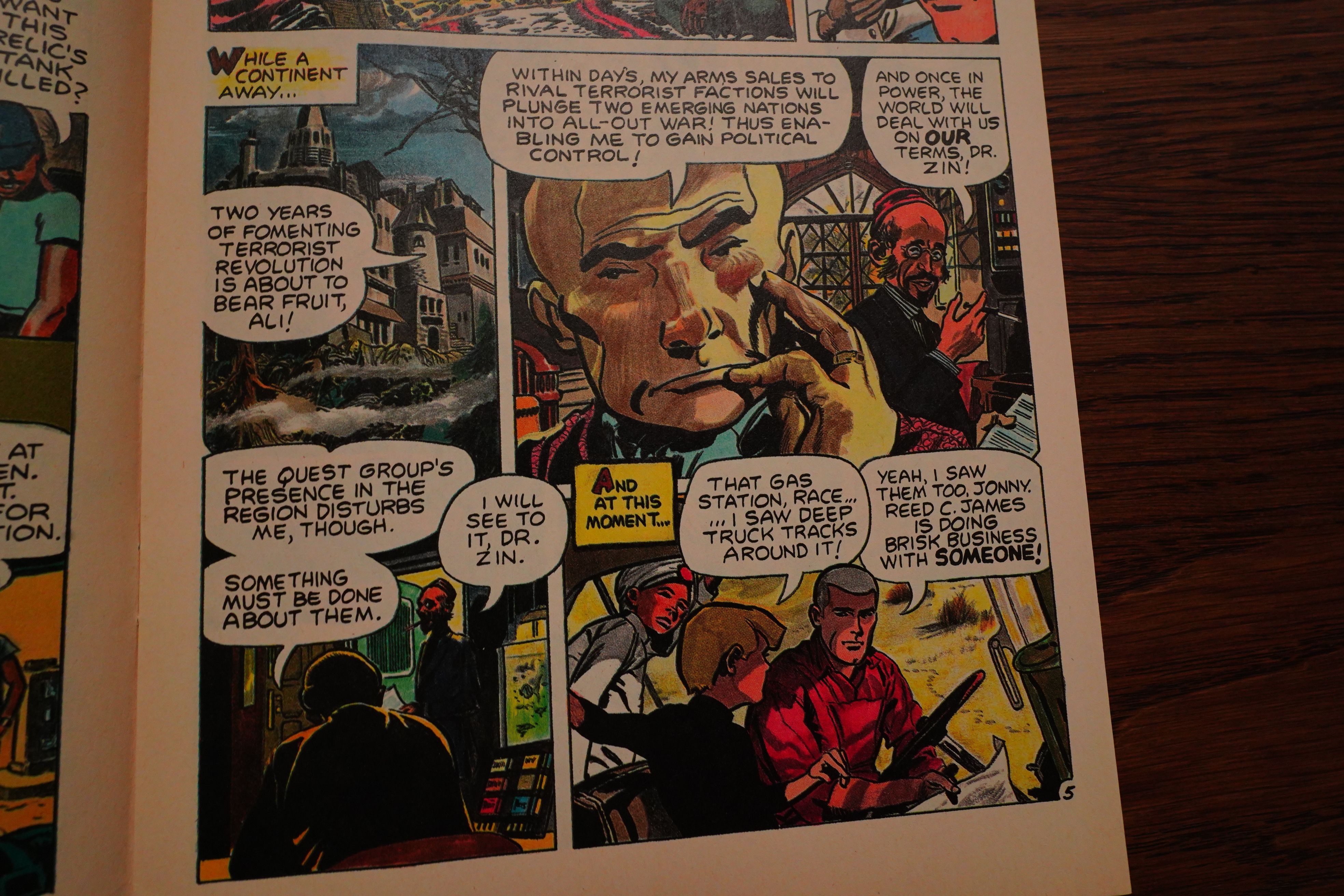
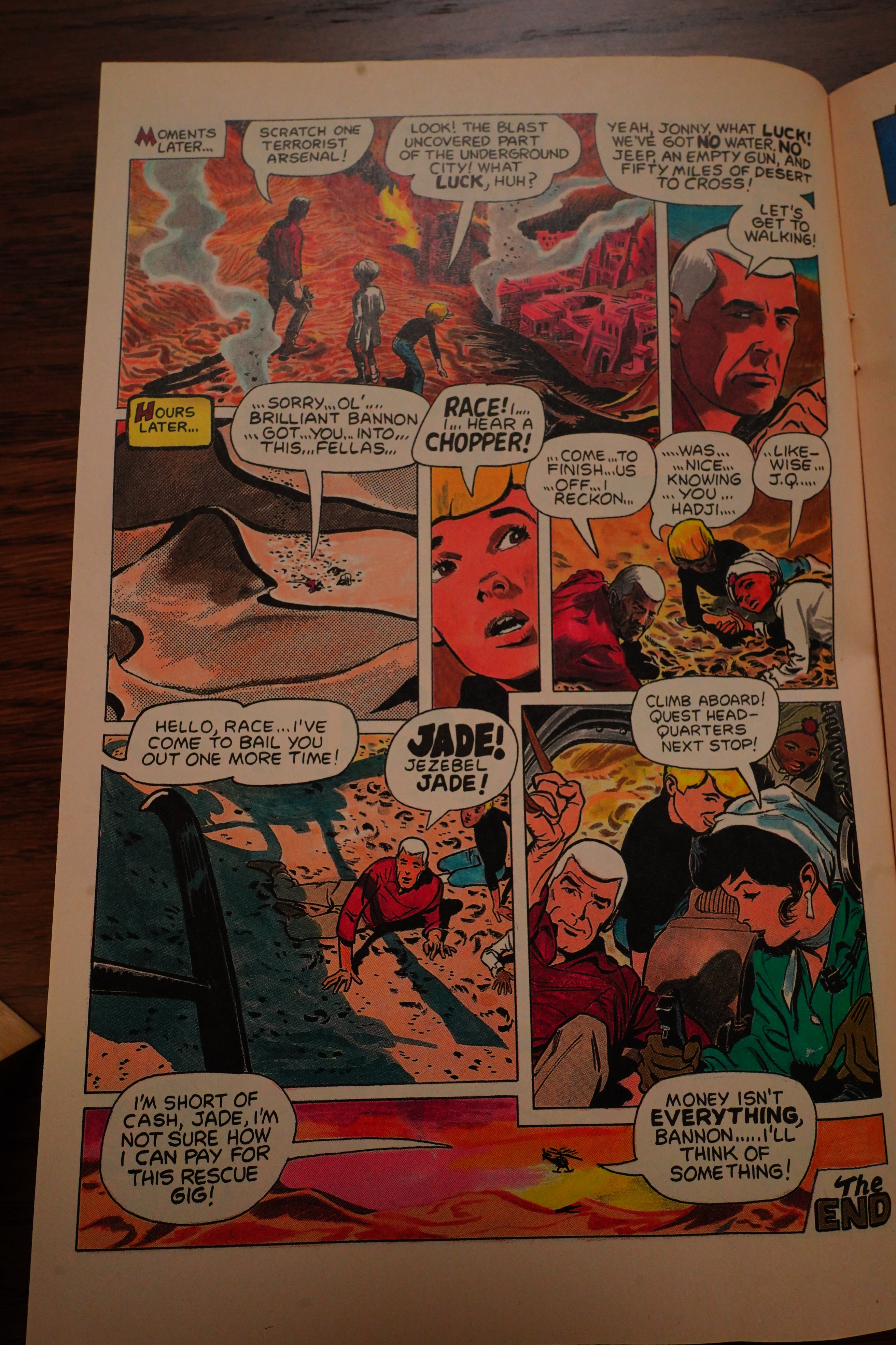
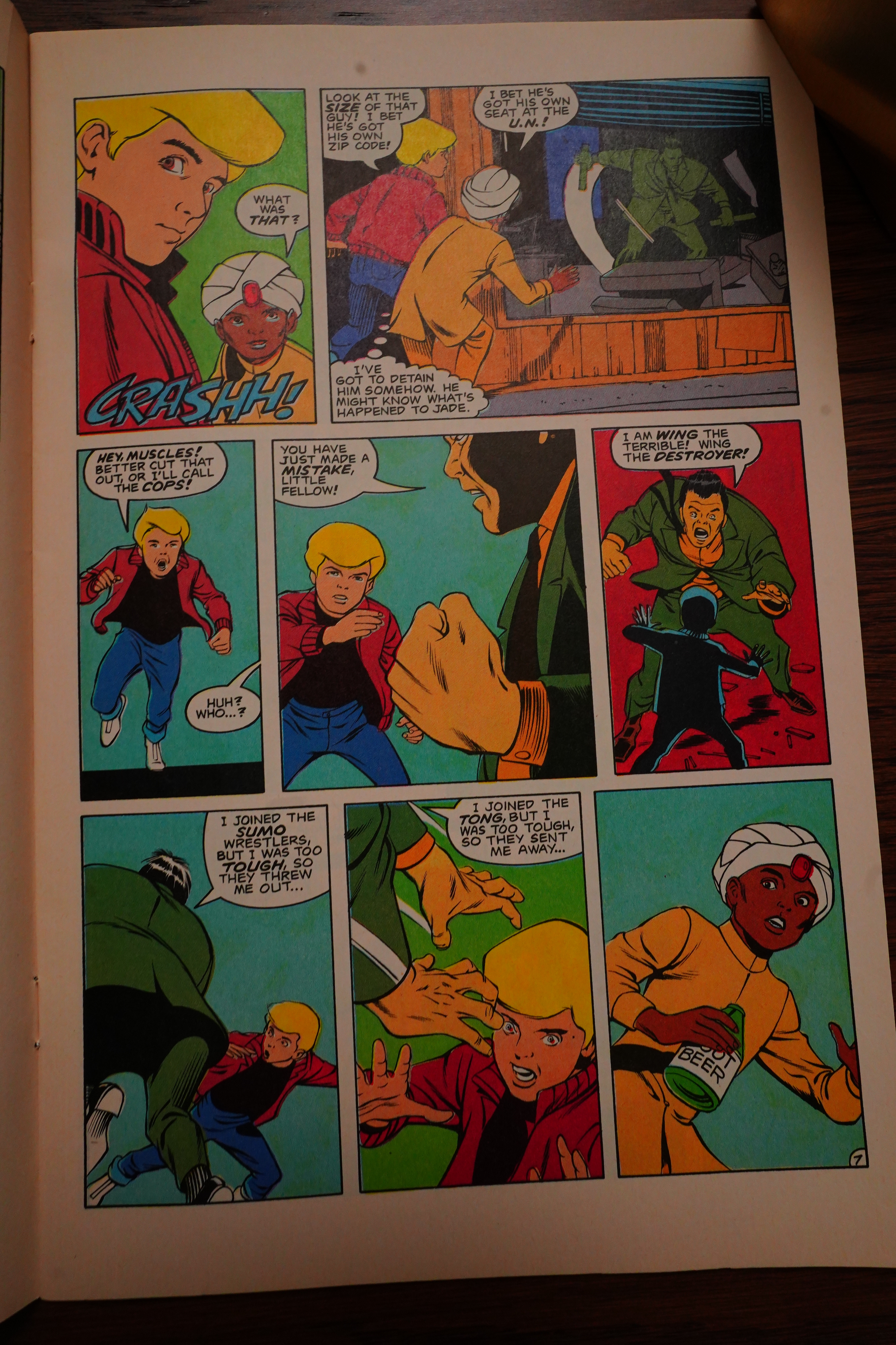
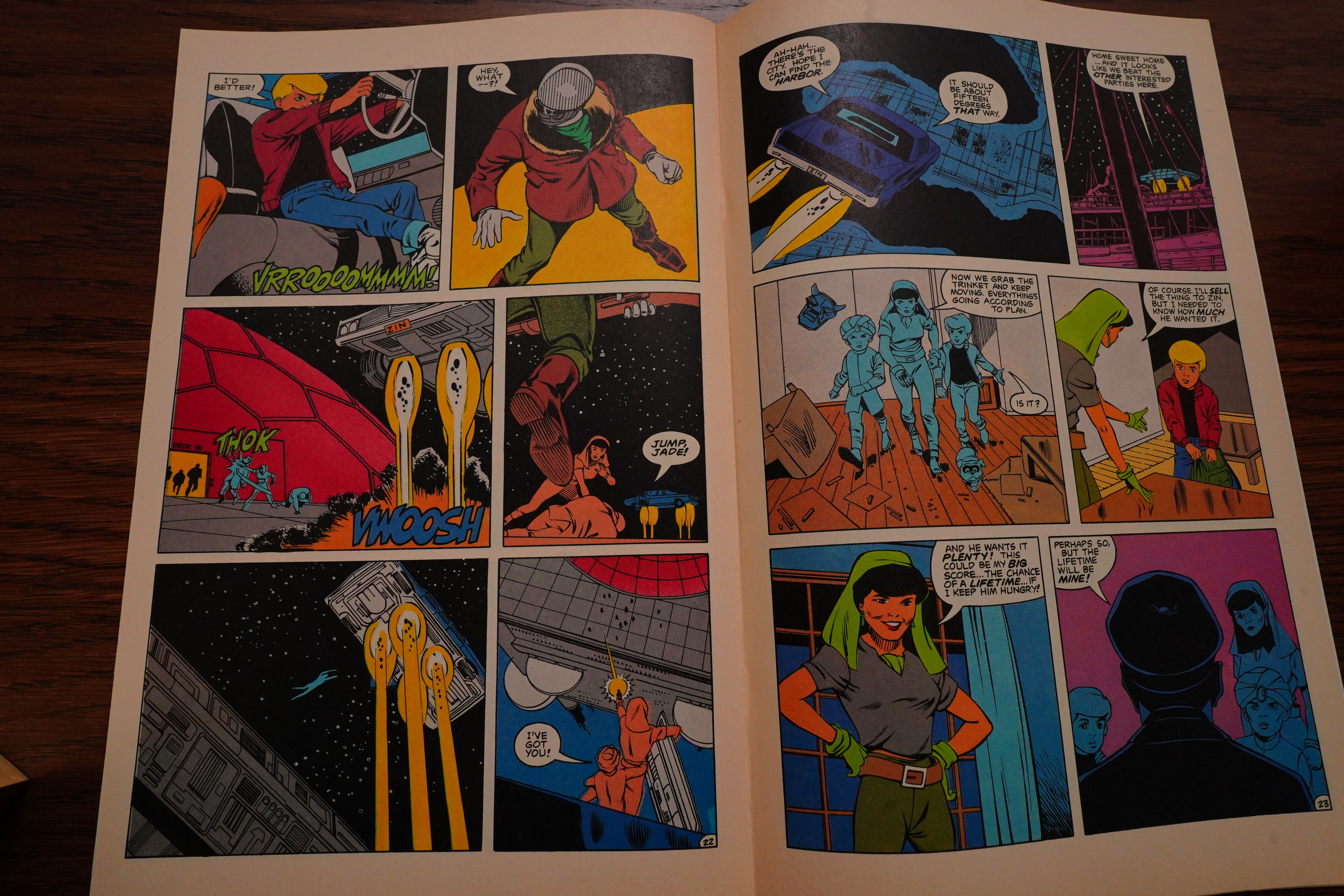
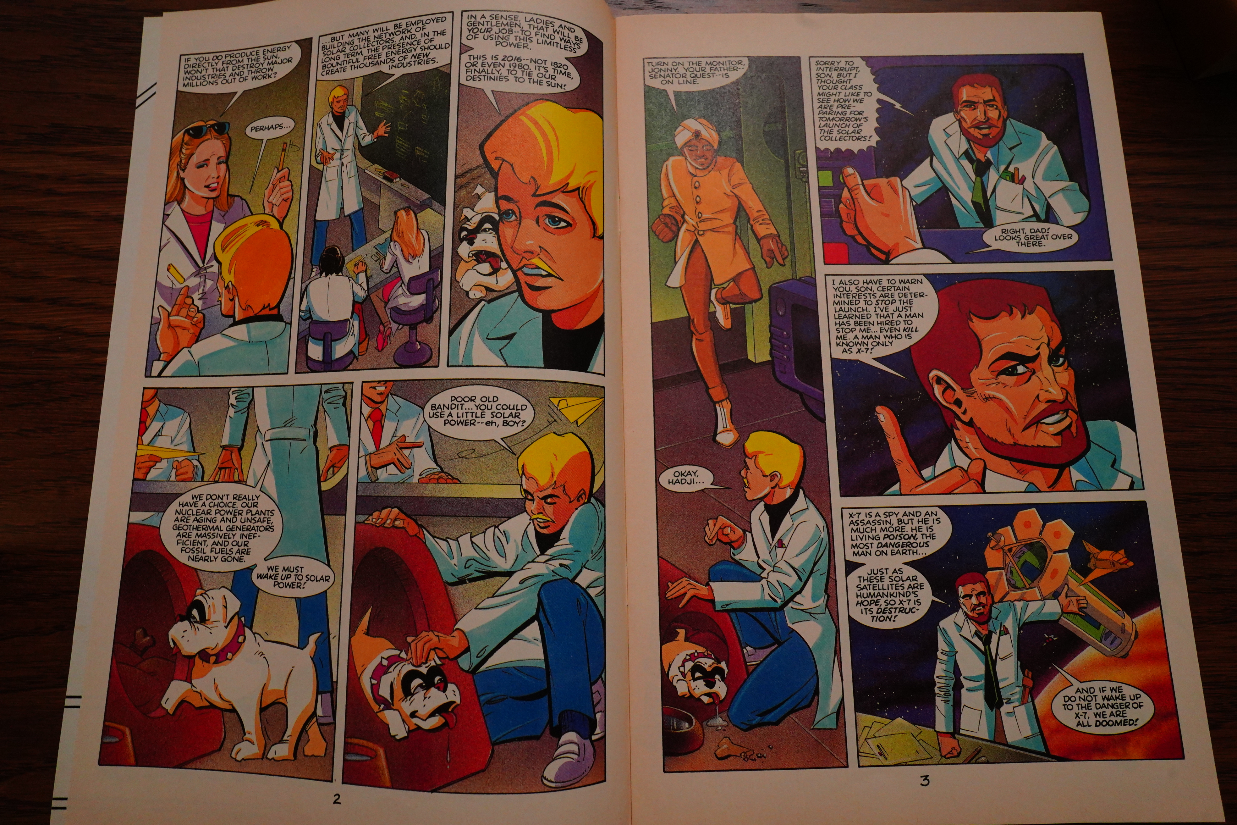
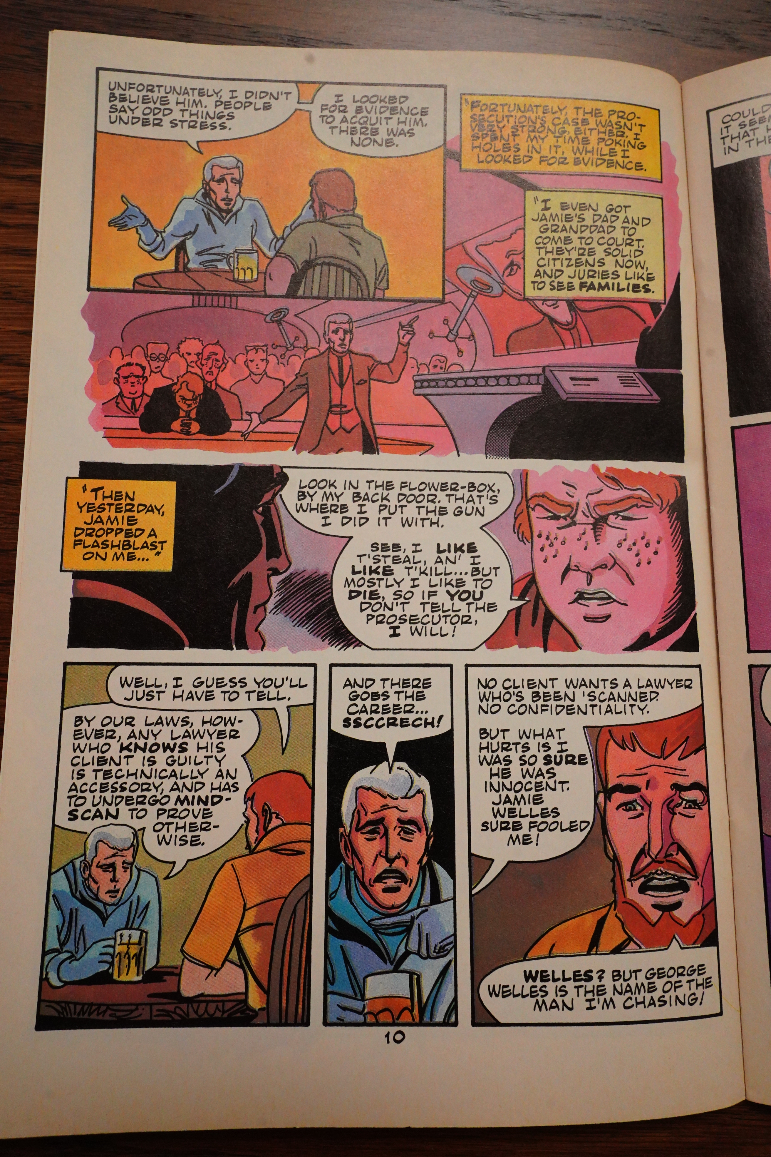
So… the bad guy is called Dr. Zin, which is nice, and then there’s… two kids? One blond, one in a turban. And there’s a white-haired tough guy? So the series is about these three guys having adventures?

I do like that they don’t infodump at us, but it really feels more like they assume that everybody knows who these guys are.

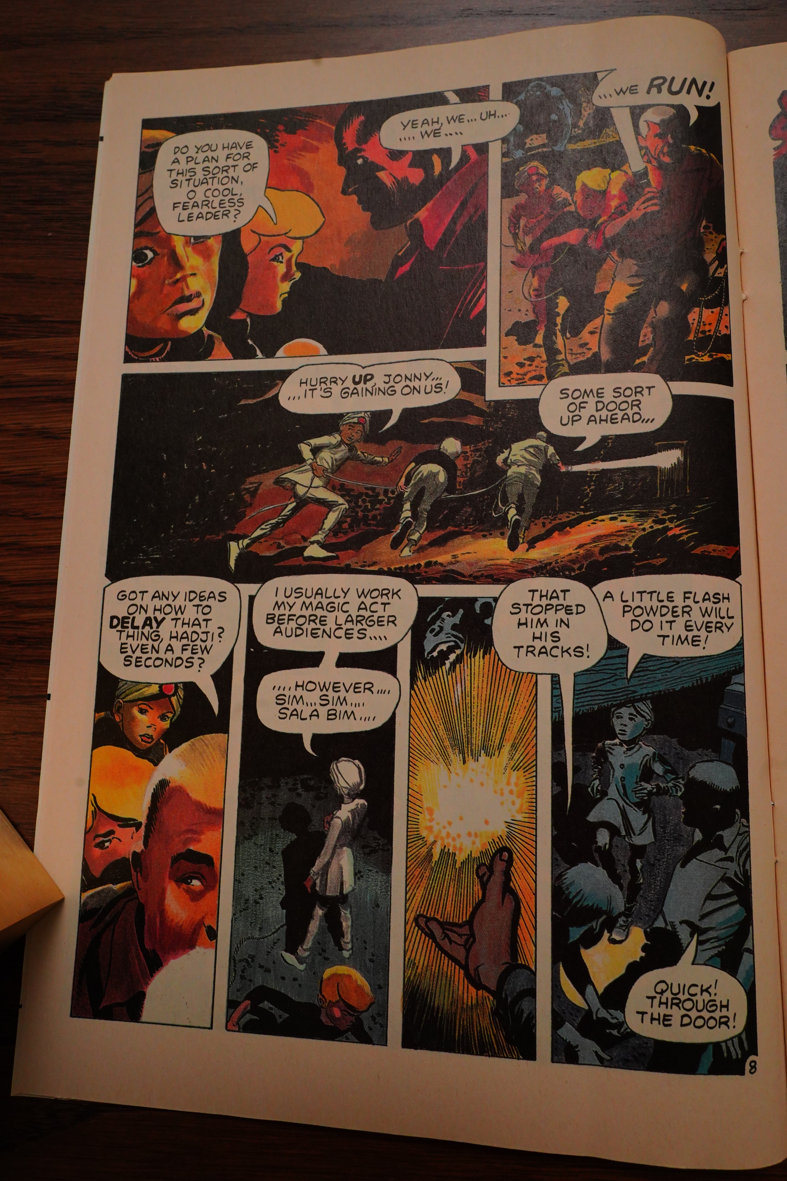
And… the kid in the turban can do magic!? Or perhaps just magic tricks?

Well, OK, if this is a money grab, it’s done well — that was a solid short story, if you like this kind of thing.

We get two pages of background, and that’s it.

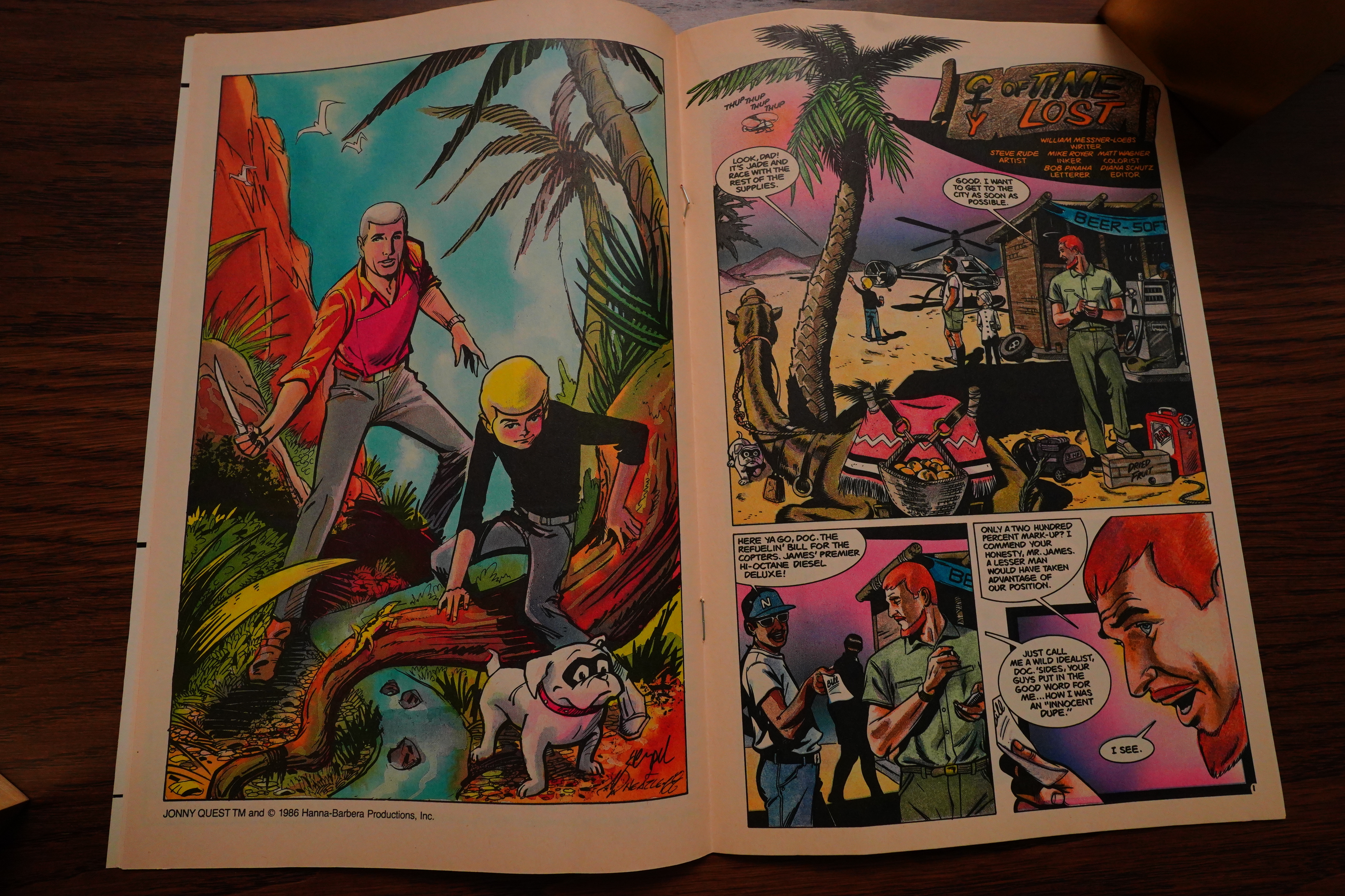
Every issue has a pinup or two.

And… another short story ends.

Well, I think I have the answer to my question at the start there: This doesn’t feel like a money grab. You can feel the enthusiasm everybody has for this project, just oozing from the pages. It’s palpable.

This series doesn’t have a set art team. Messner-Loebs is going to write them all, but having somebody new coming in every issue sounds like it’s going to be a jarring read, perhaps? On the other hand, they seem to be going for a top notch roster of artists… is the deal here that all comic book artists just love Jonny Quest so much that they all want to do an issue?

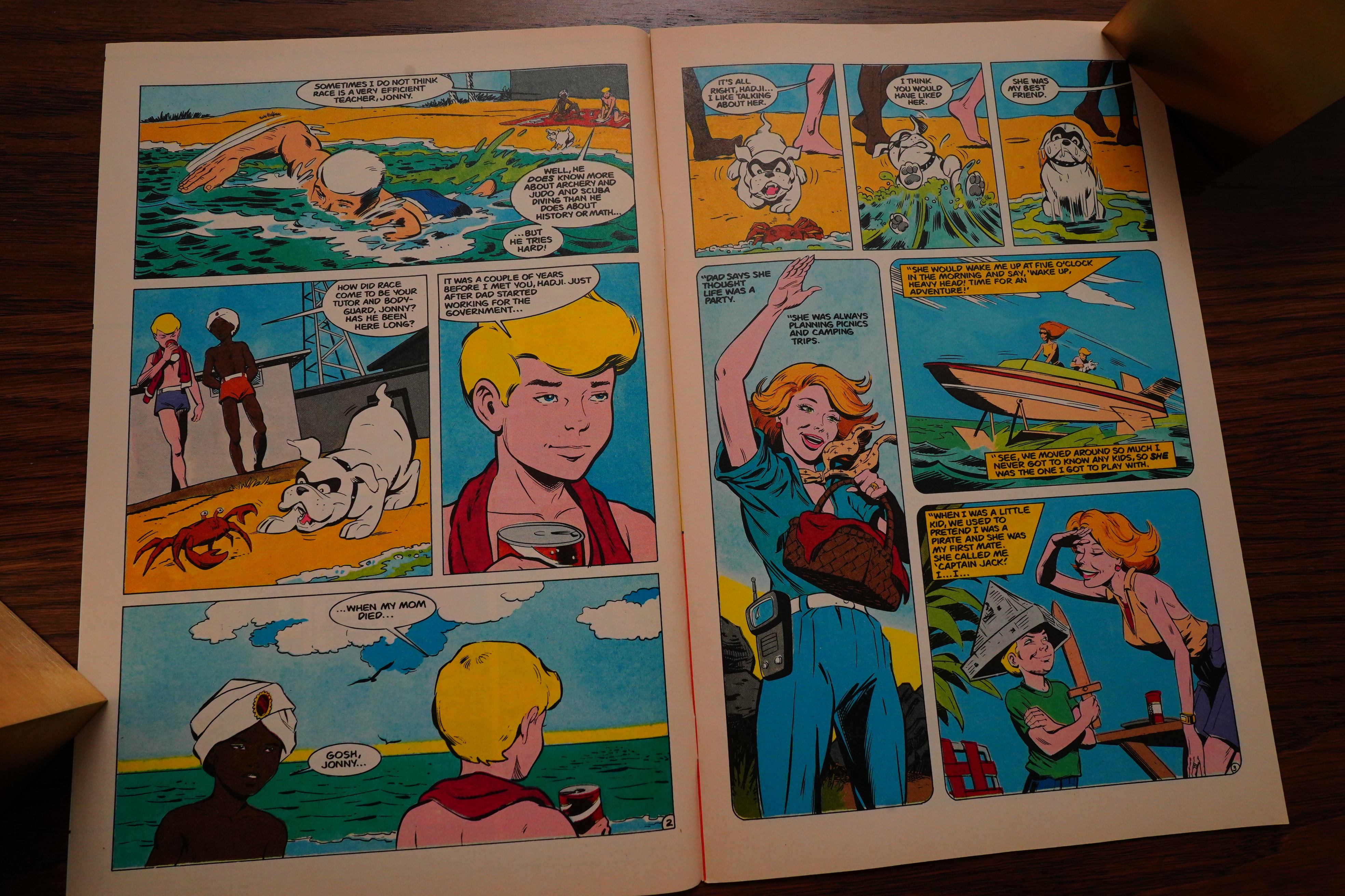
In the second issue, we do get some background — but it’s not really clear why the adults are willing to put these kids (and their dog) into lethal danger all the time.

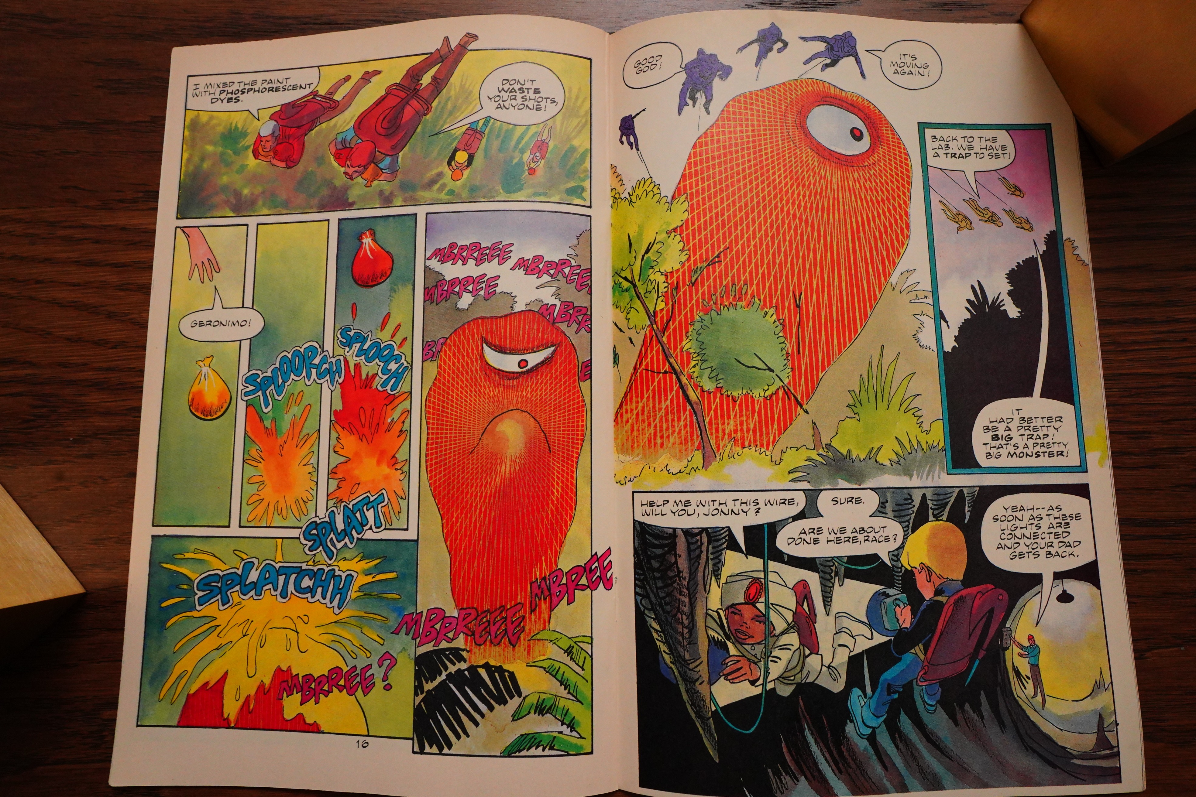
Hempel & Wheatley do some interesting things with the colouring.

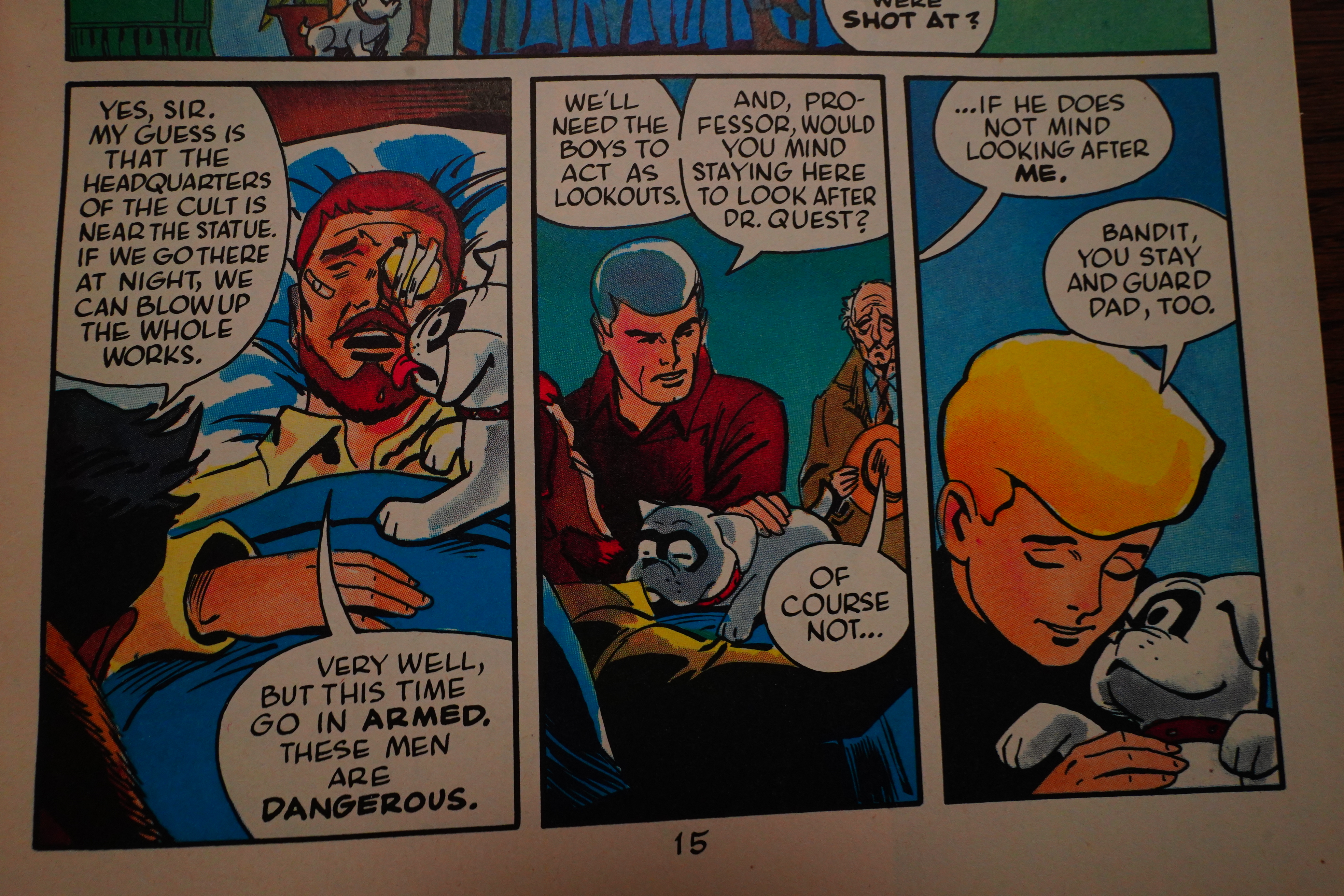
“We’ll need the boys to act as lookouts.” Well, if they need them, I guess…

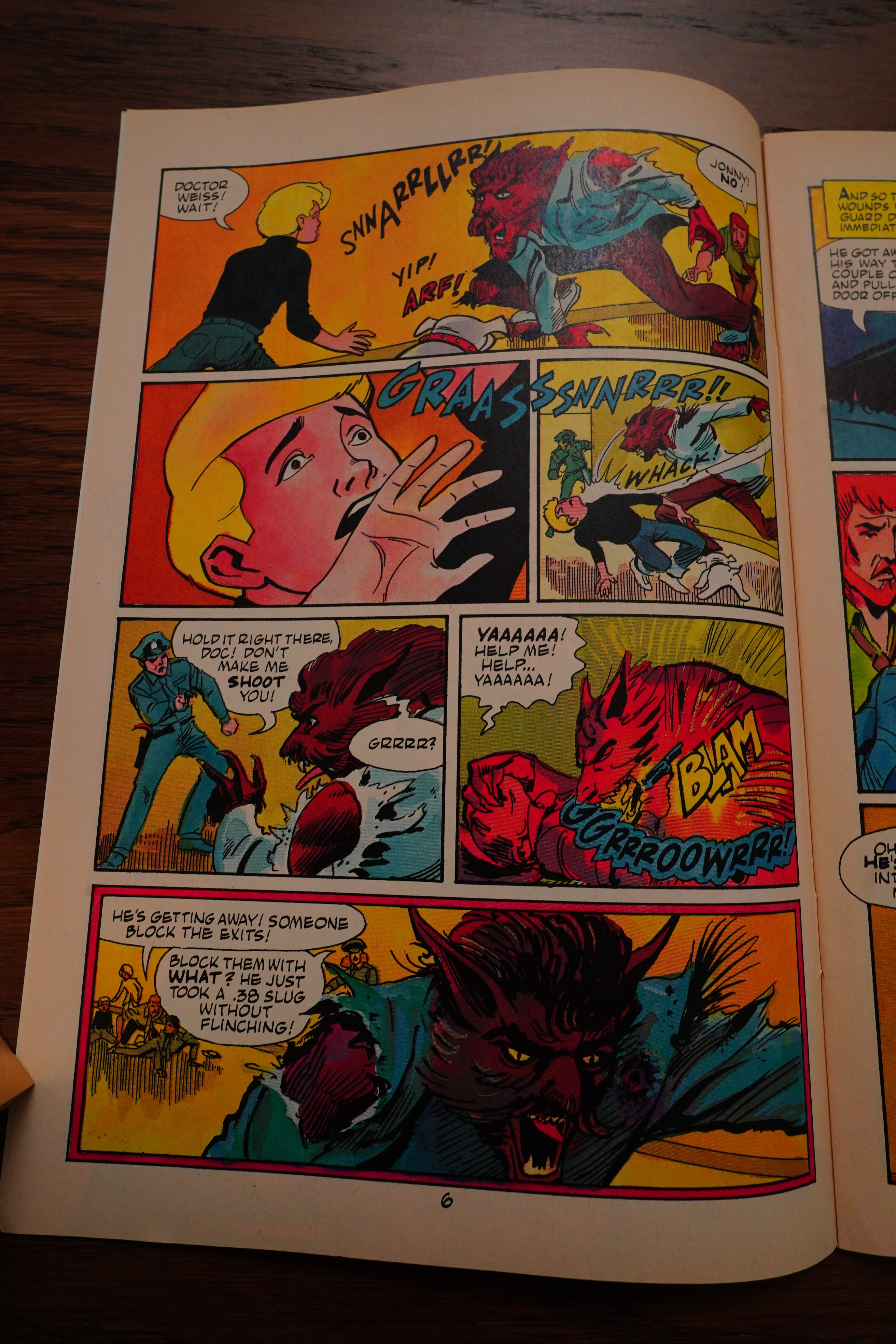
Scarred for life!

I know, I know, the concept is “kids go on adventures”, and that’s fun — but when doing this kind of thing, they usually try to formulate some kind of answer as to why it’s fine, and they haven’t been shipped off to live with an aunt or something instead…

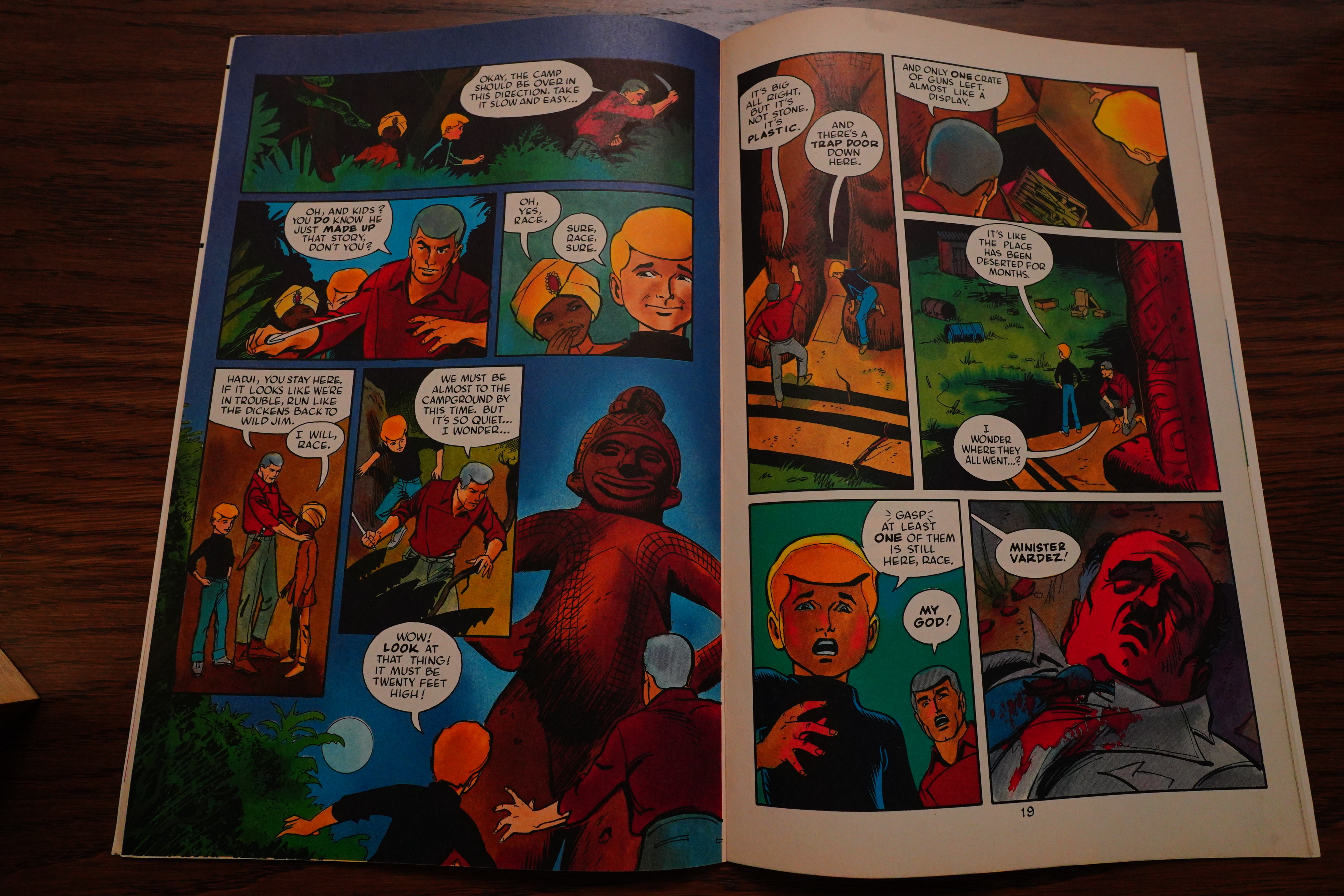
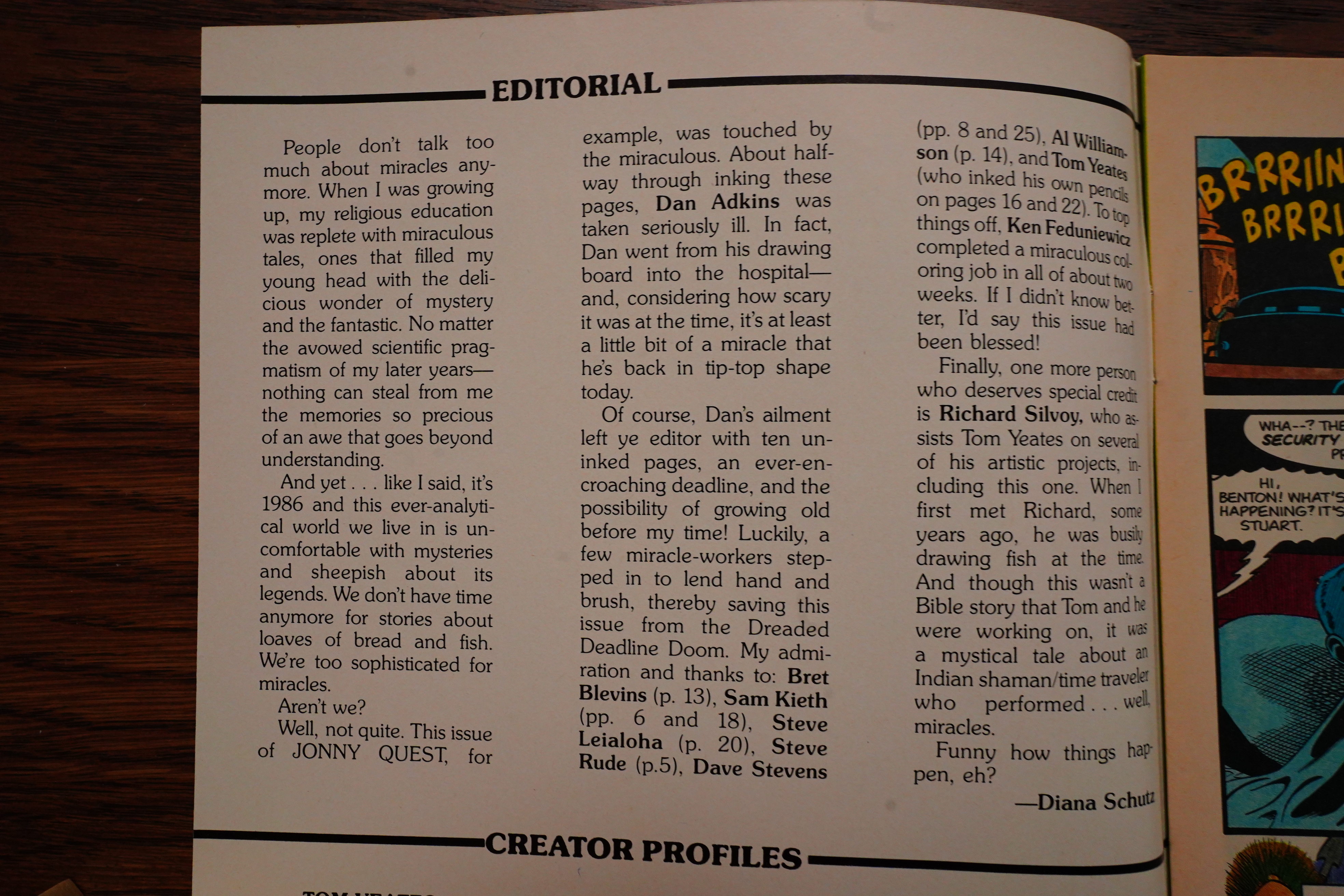
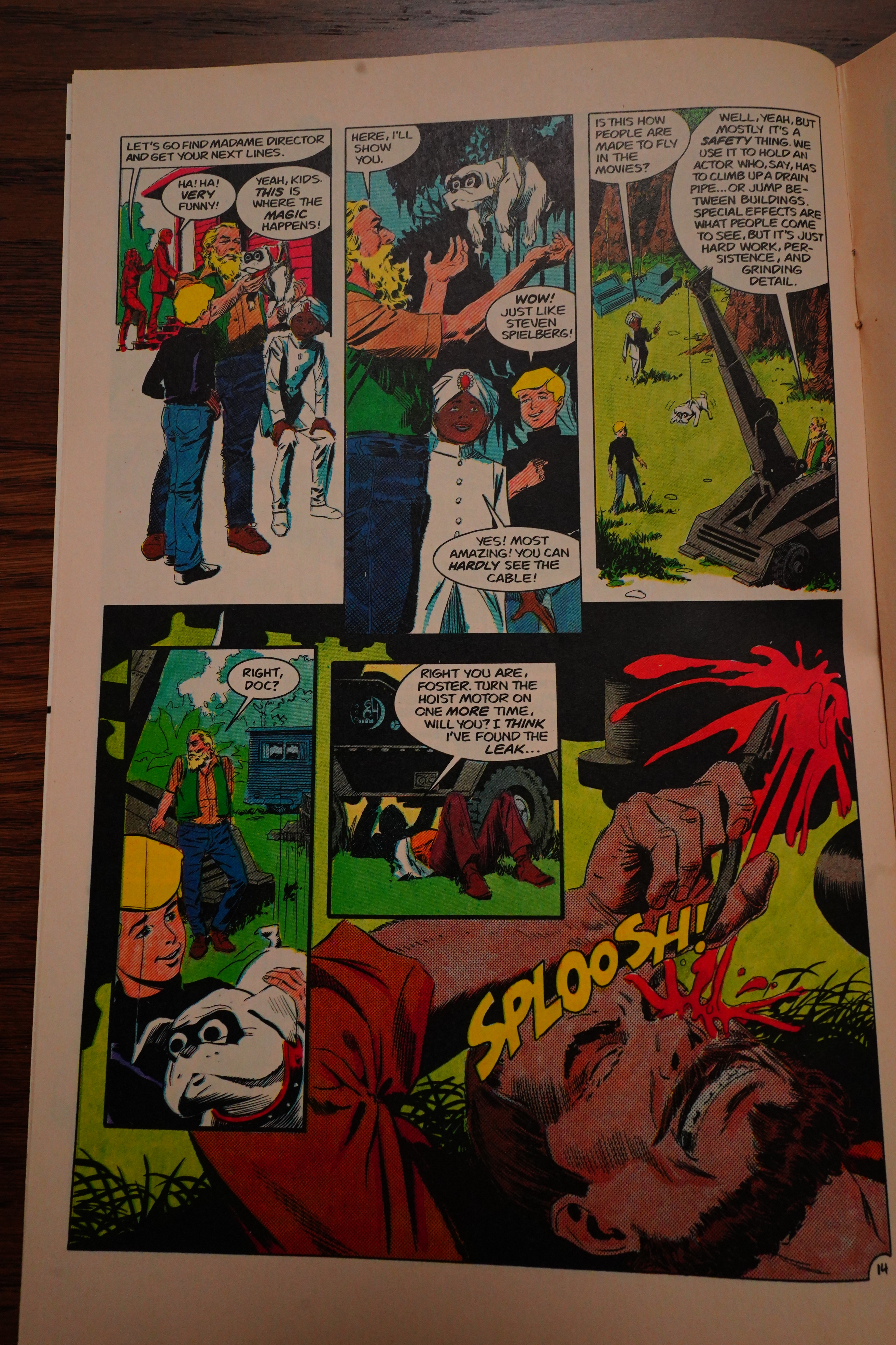
A miracle strikes! And it involves Dan Adkins taking ill, but others stepping in to do inking instead.

This sort of thing always makes me wonder why they don’t just delay the issue instead, or swap in another. Especially on a series like this, where they have to have several going at the same time, from different artists.

Here’s Al Williamson (!) inking a random page. The issue looks amazingly consistent, really.

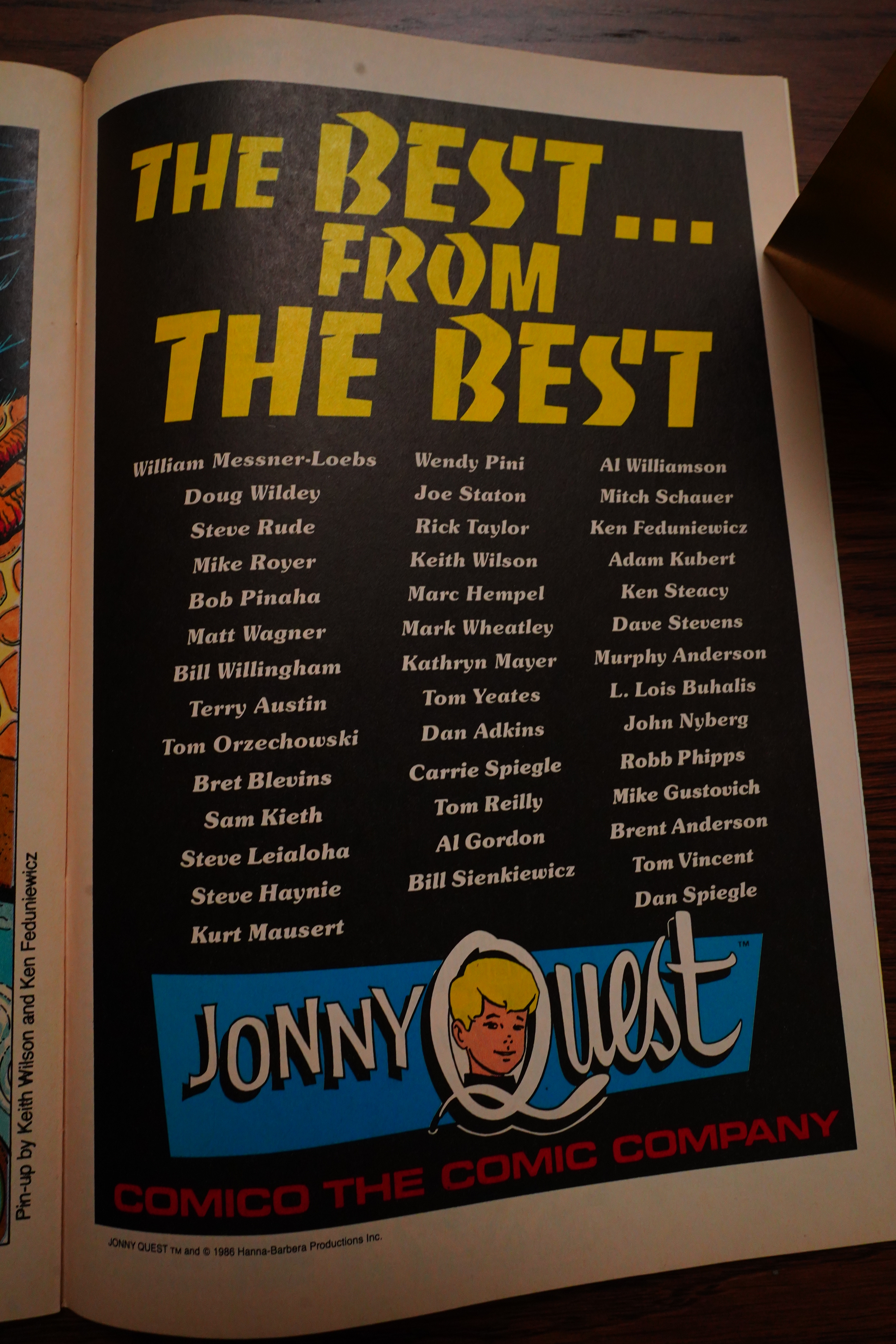
That is some list of artists.

Mitch Shauer’s issue is pretty weak — most of the artists involved are really having fun, but this one’s lazy.

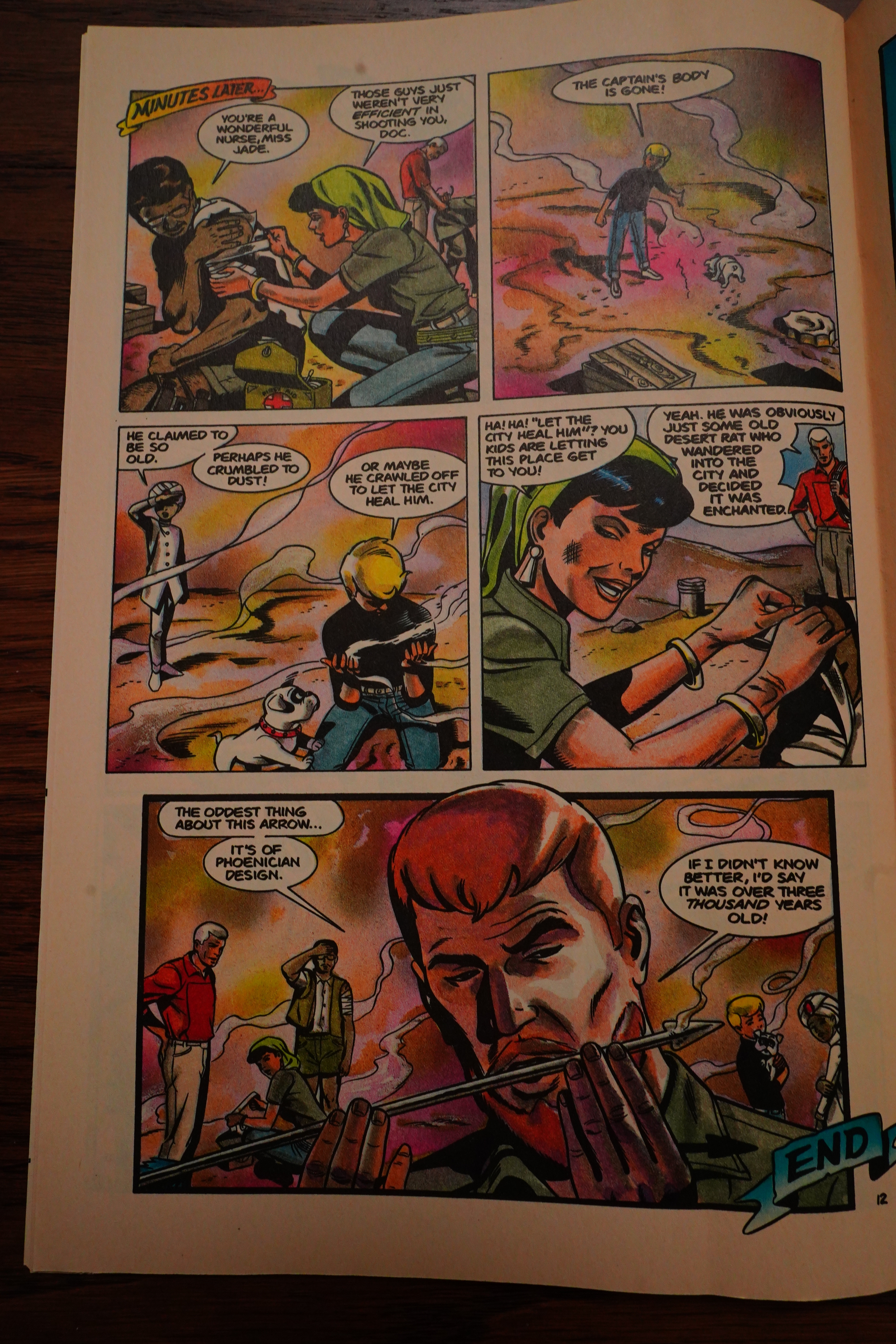
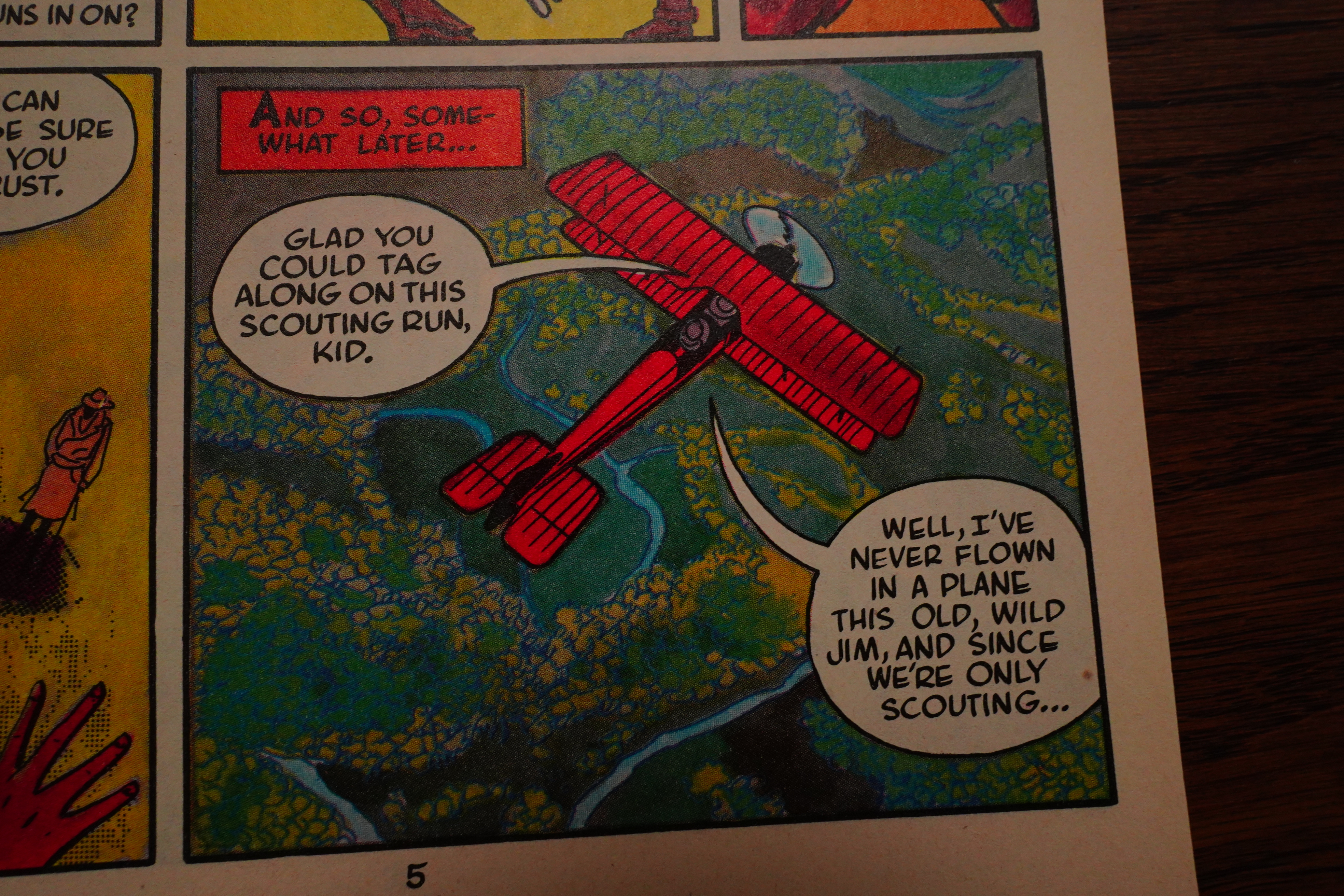
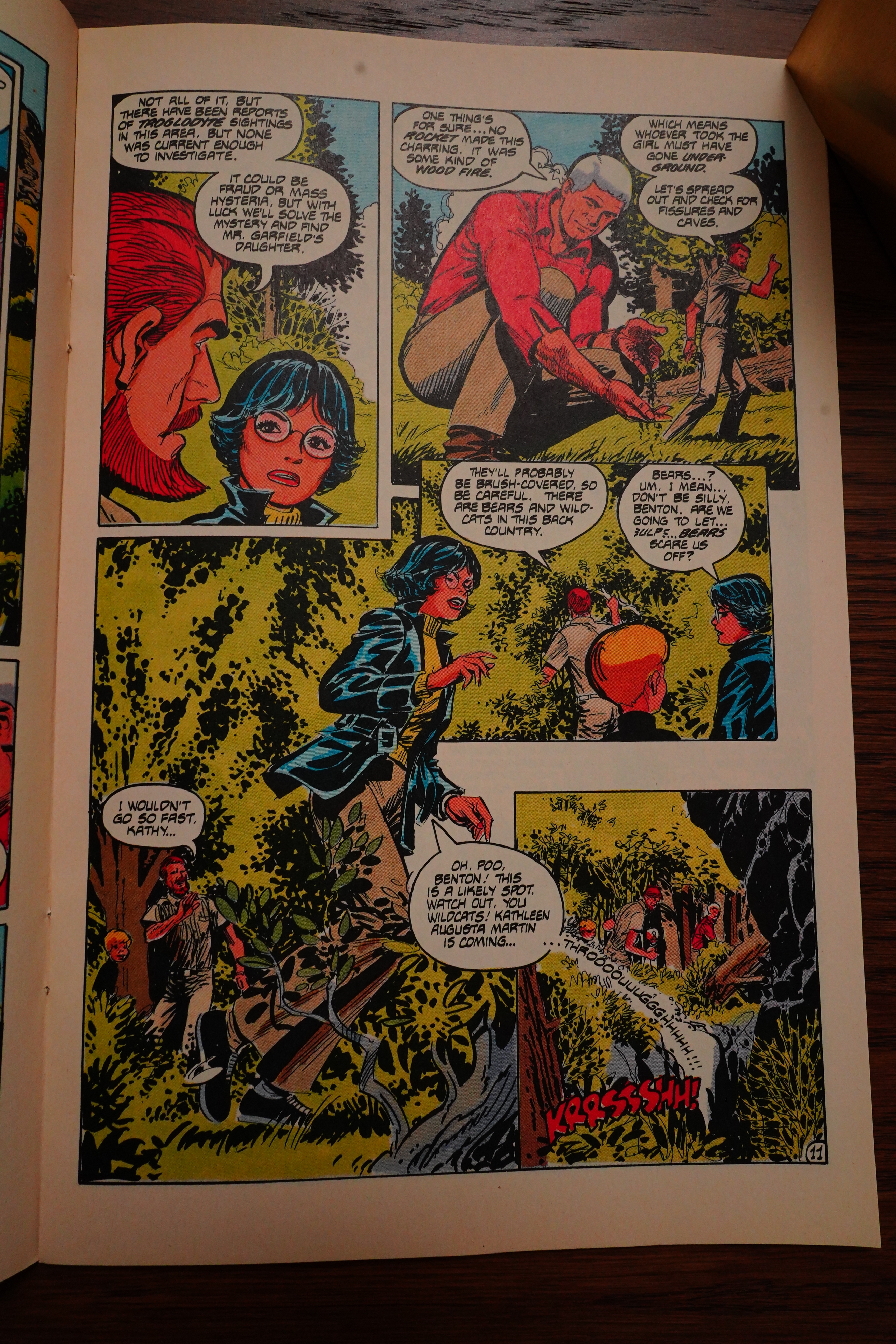
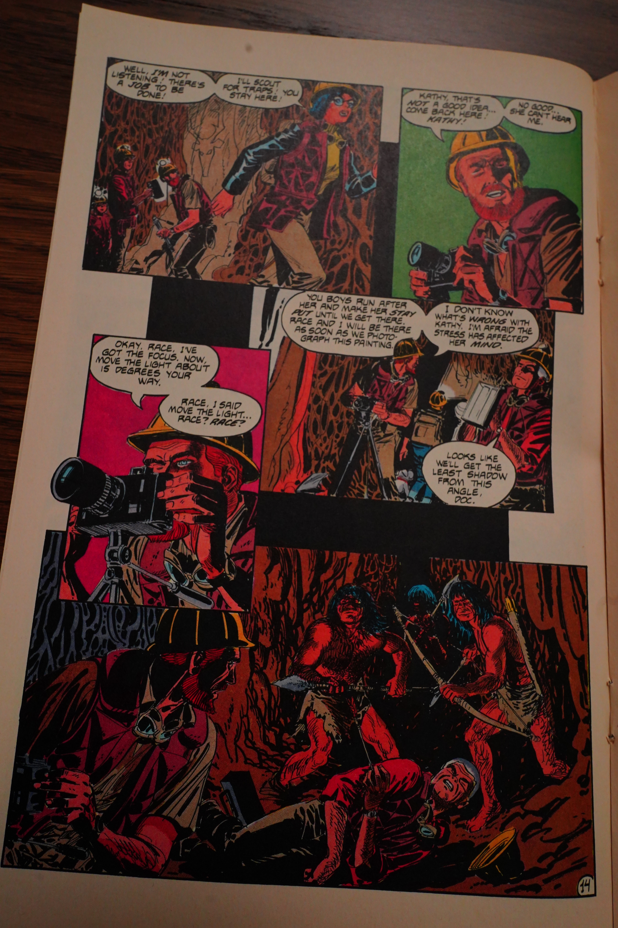
Jonny Quest seems like an everything-and-the-kitchen-sink sort of series. We have archaeology action/adventure as the main entry point, apparently, but then there’s space ships, magic, time travel, dinosaurs, whatever they can come up with that’s fun and cool, I guess? It doesn’t make for much of a consistent world, but eh, what’s the difference. And:

See?

Adam Kubert does everything but the writing — art, colours and lettering. Looks pretty cool.

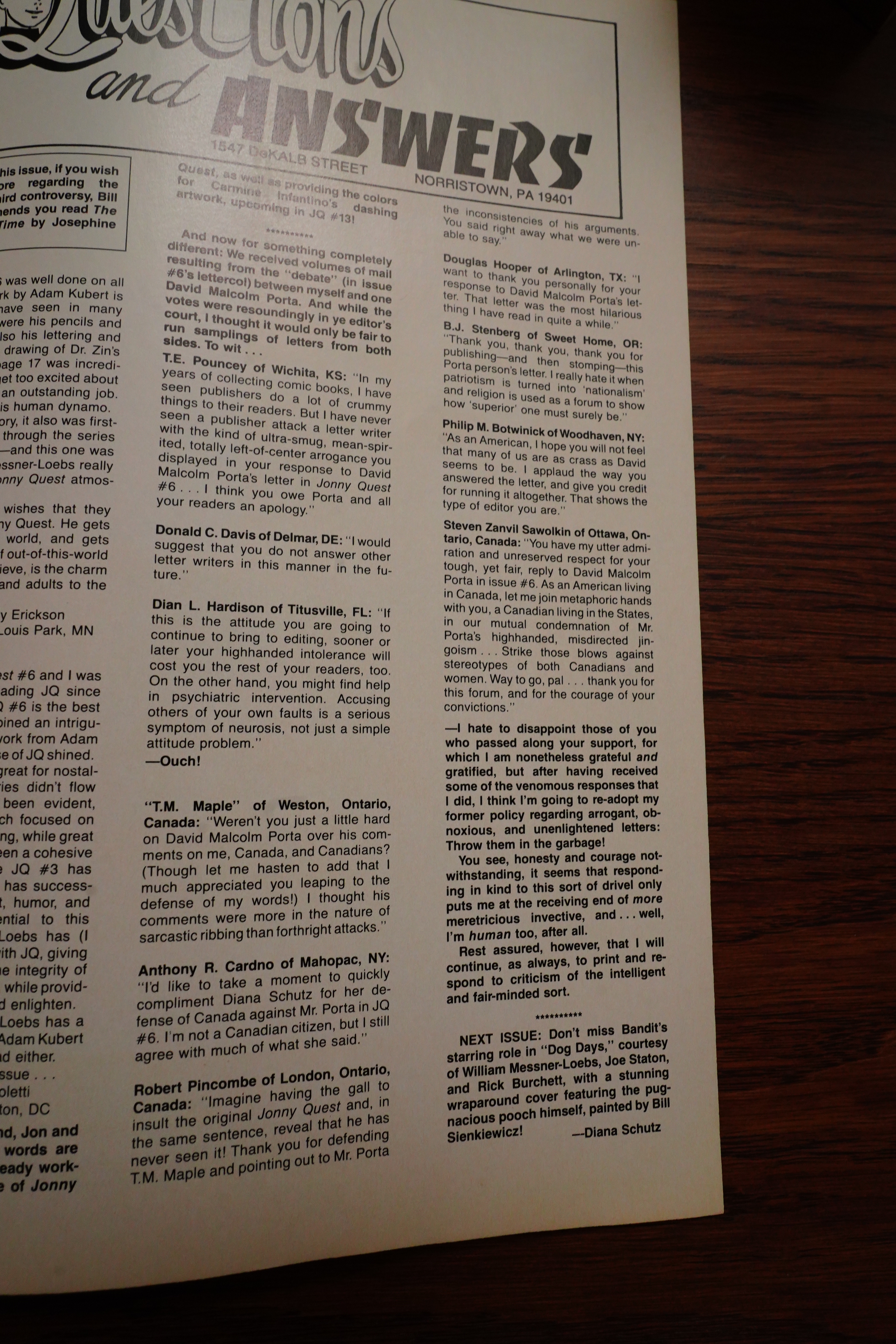
A reader writes in to… well, pooh-pooh a different reader’s thoughts about putting these kids in school, and Schutz gets really annoyed.

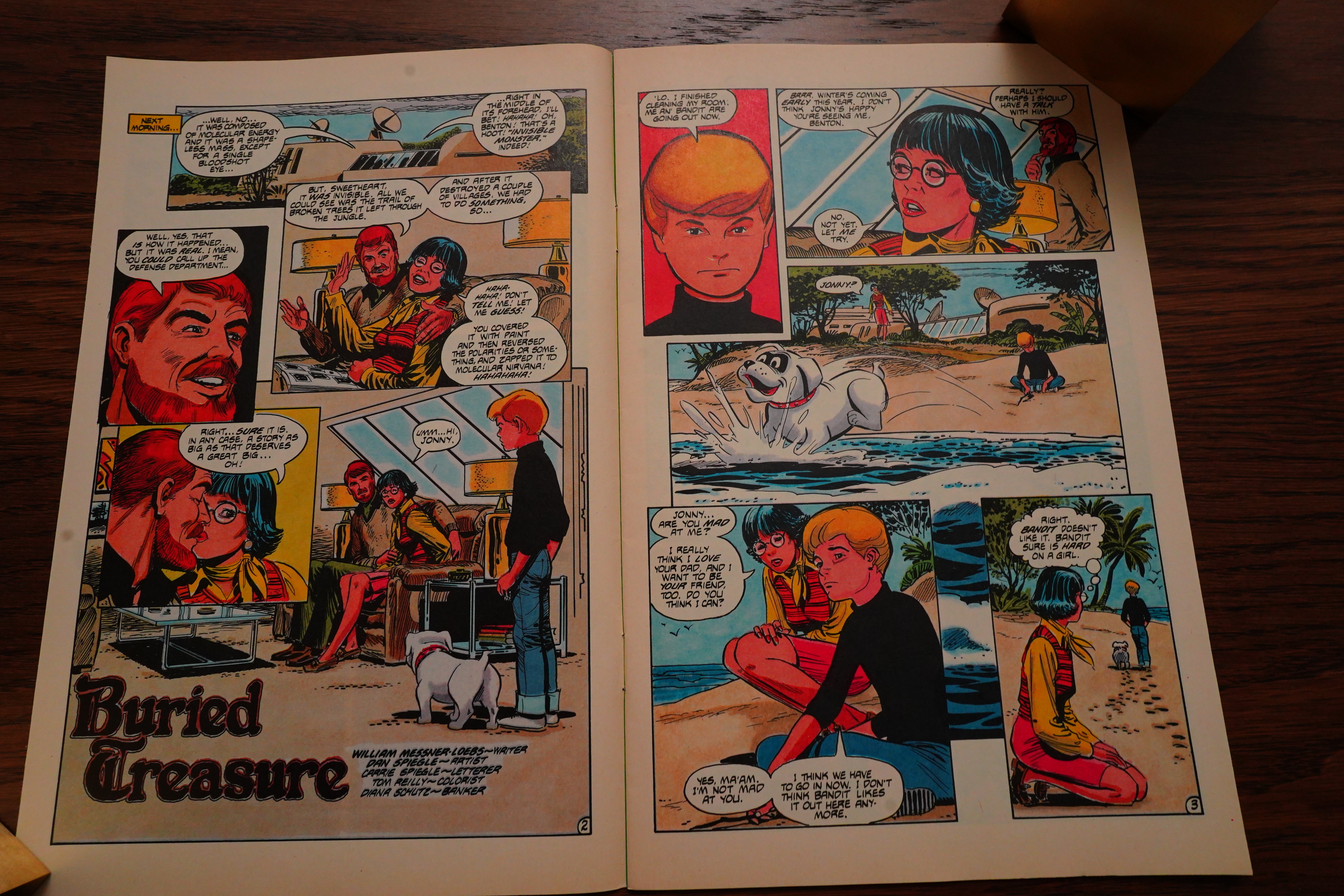
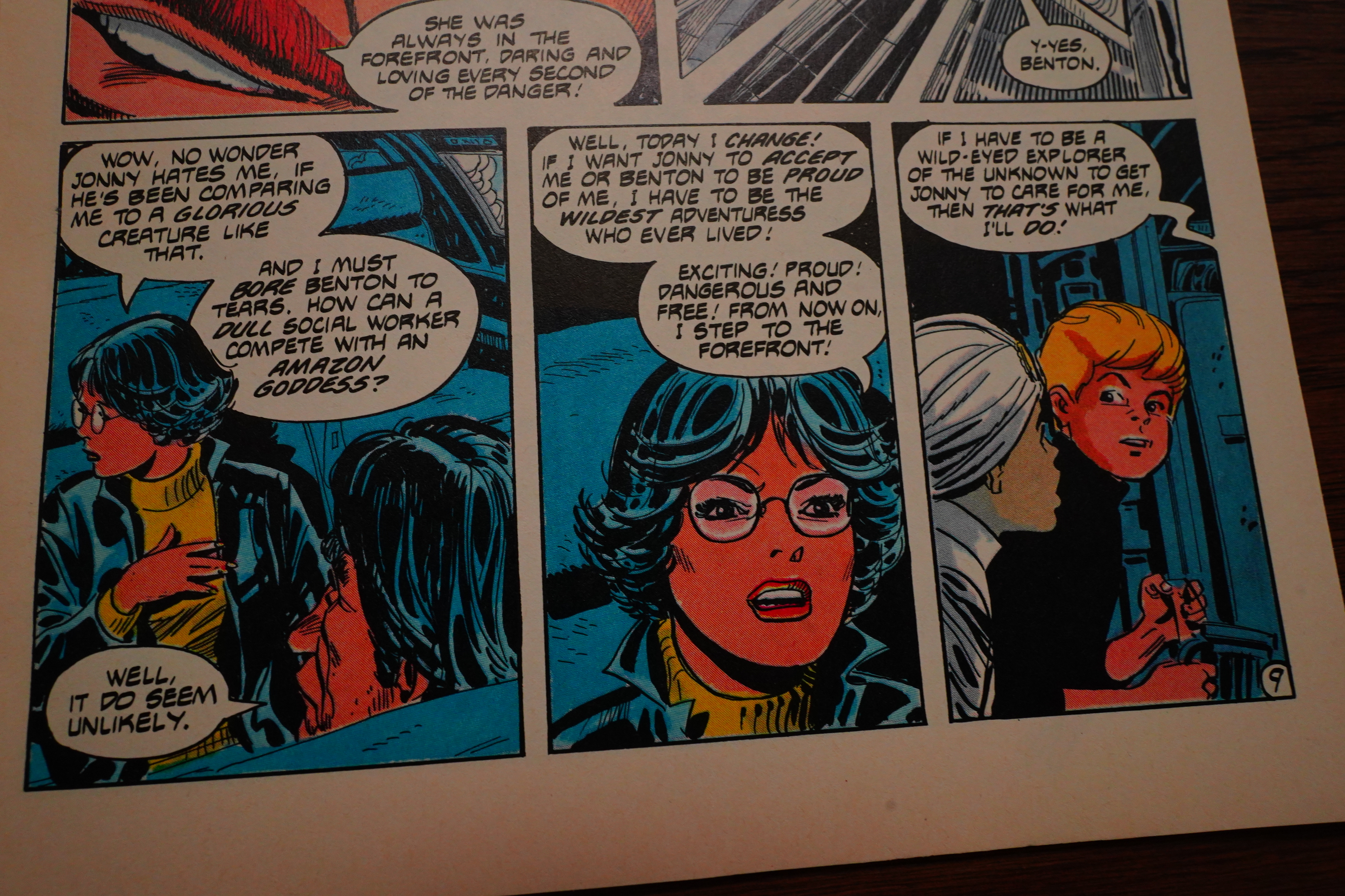
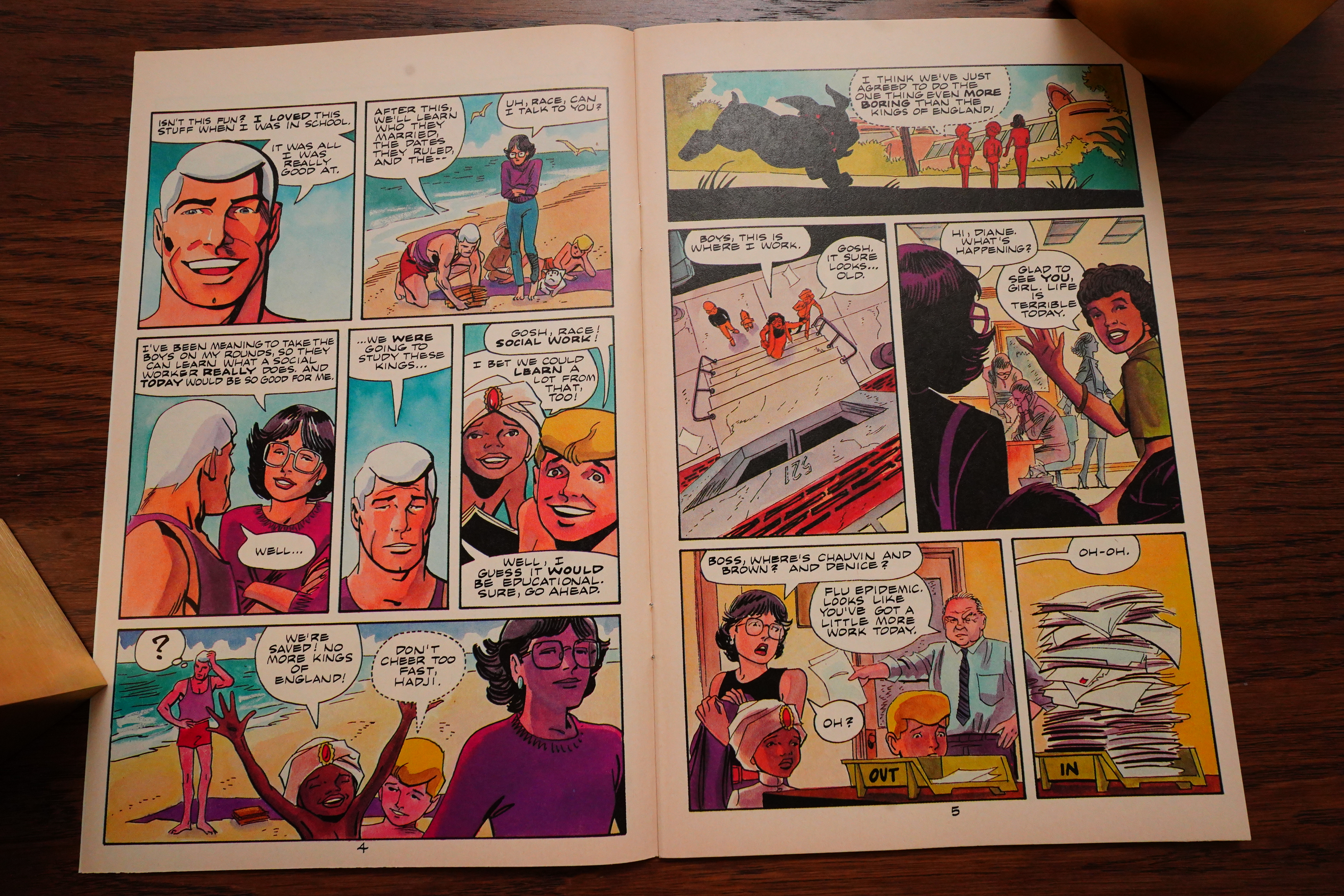
And in the next issue, a social worker drops by to check on the kids!!! Hilarity ensues.

Ken Steacy stops by to paint an issue — which turns out to be a dream issue, looking at a possible future. It’s surprisingly good.

OK, I think I’m now one third in, so here’s what I think so far: This is much, much better than I thought it would be. Every single issue has a solid adventure, and most of the artists are really on form. There’s some slight continuity between the issues, but really, you could read them in random order and not notice.

I’m pretty entertained — I’ve always been a fan of Messner-Loebs, ever since Journey — and this series is solid fun. Let’s hope it continues that way.

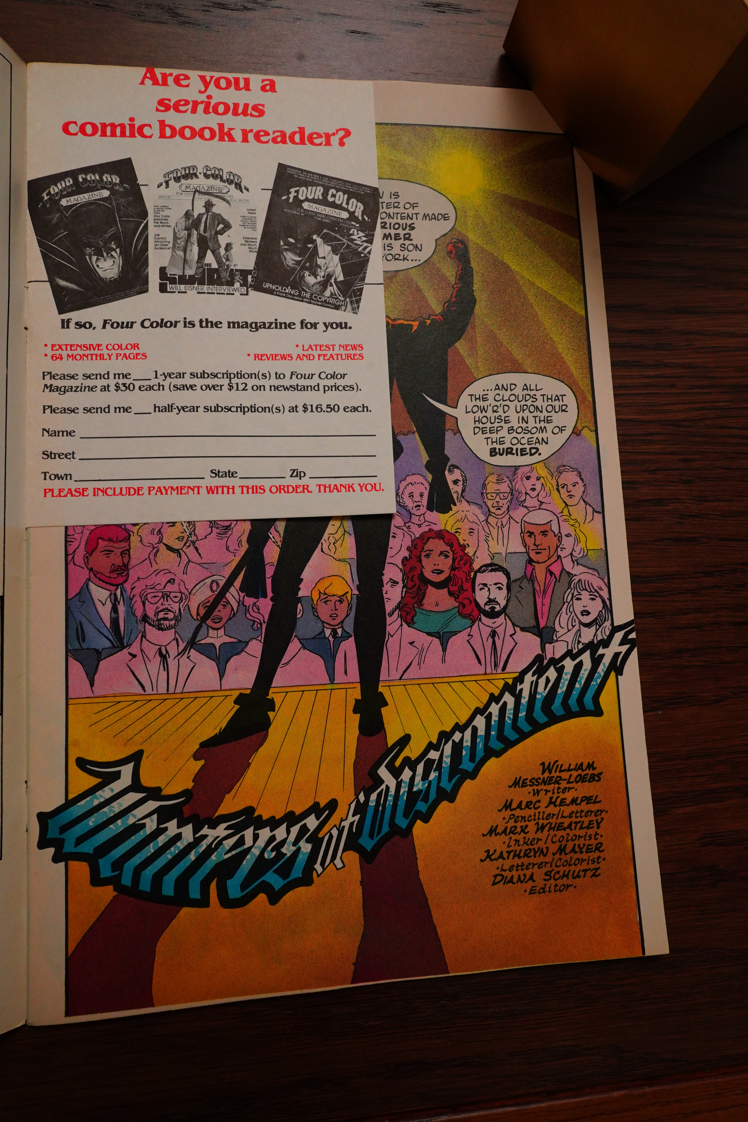
Wow — a card insert ad for Four Color Magazine? Weird.

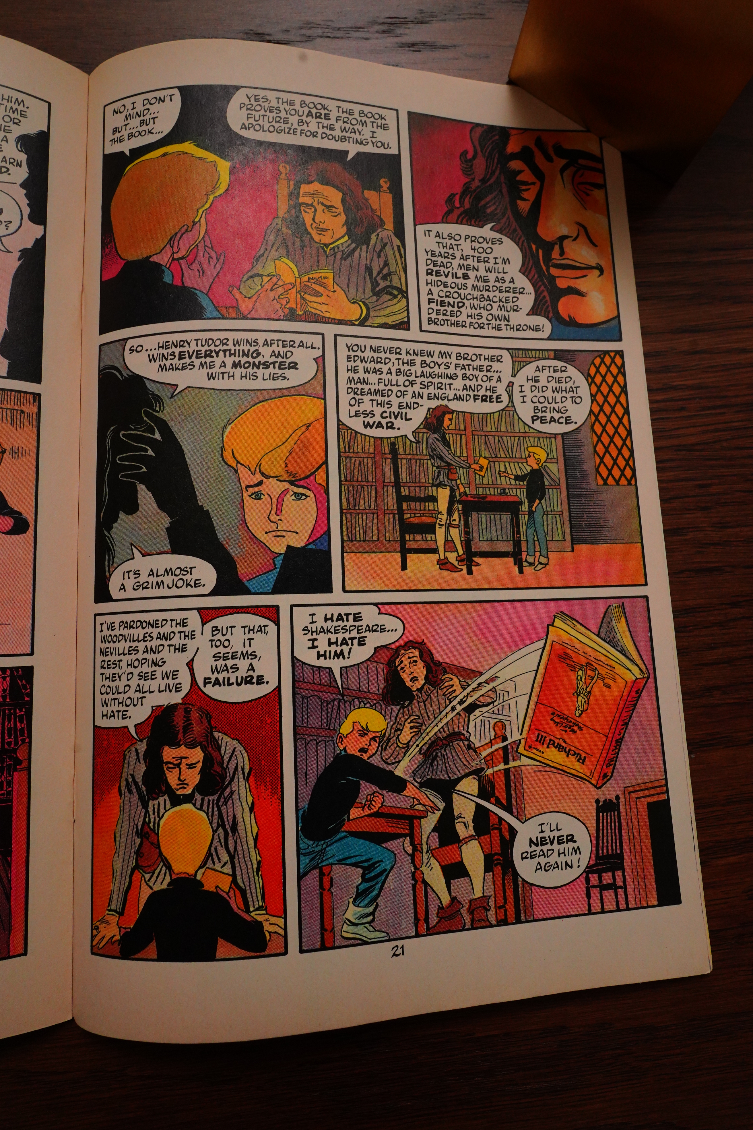
Messner-Loebs casts around widely for plots, so he takes the plot from that Josephine Tey book in an issue. Why not? It’s a time travel/dream issue, of course. I do think if you do too many of these, it’s going to become rather silly after a while.

Readers react to that showdown between that Real American Reader and Diana Schutz.

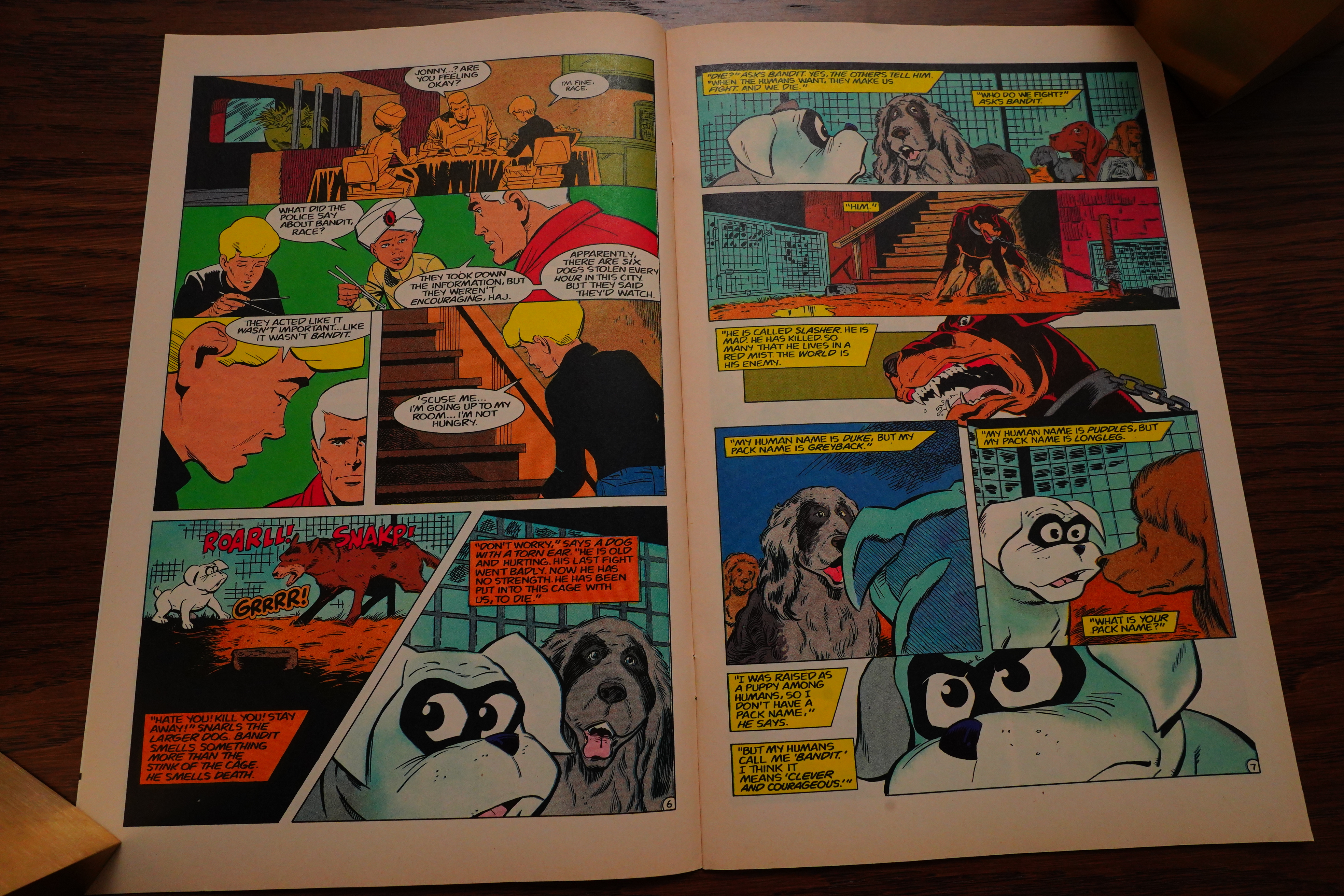
The dog has to have his solo adventure issue, of course. Well, it’s not totally solo… but it’s a really good issue. Quite moving and exciting. The letters pages some issues later agreed, calling it the best issue of the series.

The obvious way to go with a series like this is to do “character building” instead of just going on one adventure after another. And if you have actual characters instead of blank slates, they may generate stories on their own.

And I think Messner-Loebs manages to do this in an amusing way, while not losing track of having action going on.

Dan Spiegle returns on this issue, and I see that he’s still trying to introduce a new reading pattern. Look at the above…

… and then this: Yes, it’s meant to be read in a “Z” way, and Spiegle does this for about half of the pages. I think it works quite well?

Apparently the book is both a commercial and a critical success.

I may have mentioned this before, but man, the design on these pages… OK, they don’t want to pay to have the colour separations done on these small covers — fine. But then it’s like “well, this is a colour book, right? So wee need colours!” And then you end up with the above, which has to be some of the ugliest design on a thing like this possible…

As the series progresses, you can see the enthusiasm drain from the project. The book settles down to having Hempel/Wheatley as the art team, and now that the book has a monthly schedule, the art grows pretty basic. I mean, it makes sense to try to settle on a smaller roster of artists, and Hempel/Wheatley can do good stuff, but it’s starting to feel phoned in.

The stories are a bit of a random walk — sure, why not do a film noir issue?

It just works better when Messner-Loebs grounds the exploits in the characters, like when the other kid goes looking for a swami. (Art by Ernie Colon.) It’s just funnier and more interesting.

The worst of the issues are the time travel ones — there aren’t that many, really, but they’re not really very inspired.

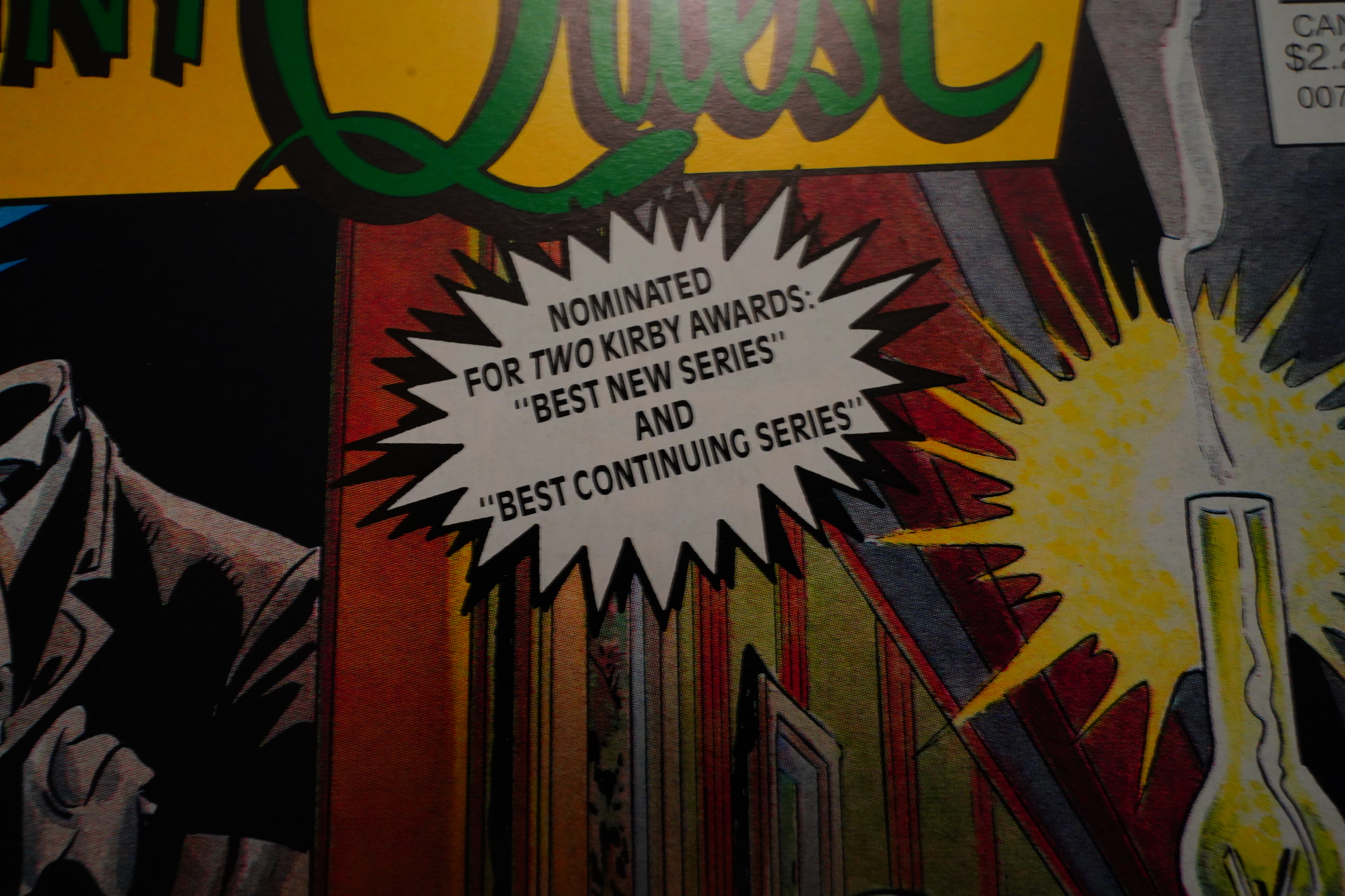
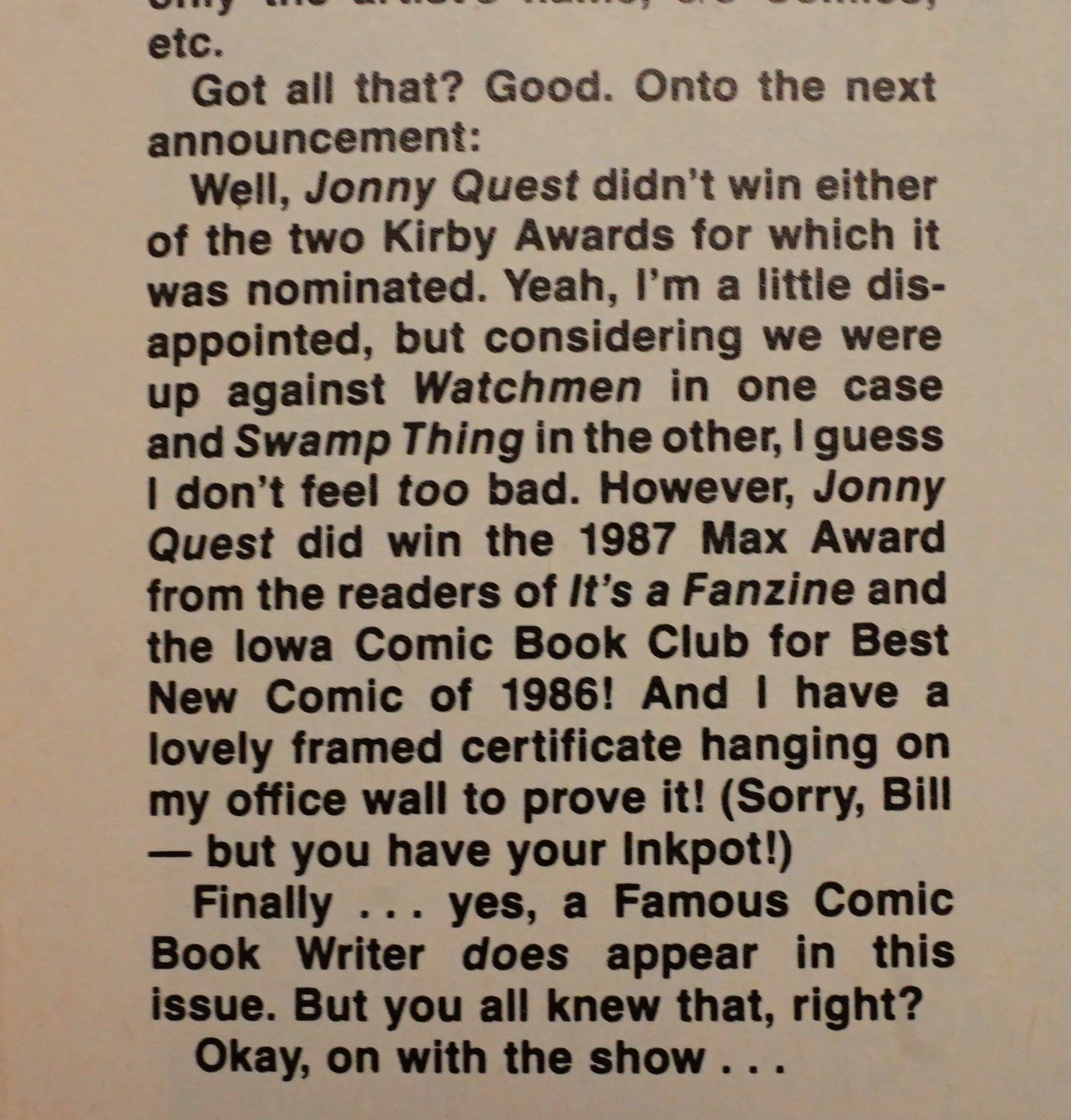
Jonny Quest didn’t win any of the Kirbys it was nominated for, but it won the It’s a Fanzine Max Award.

It’s fun looking at the different approaches to colouring and separations — they’d mostly figured out how to do this by this time, but you still see a lot of variation from issue to issue. And something like this isn’t something you’d ever see today. (Colours by Joe Matt.)

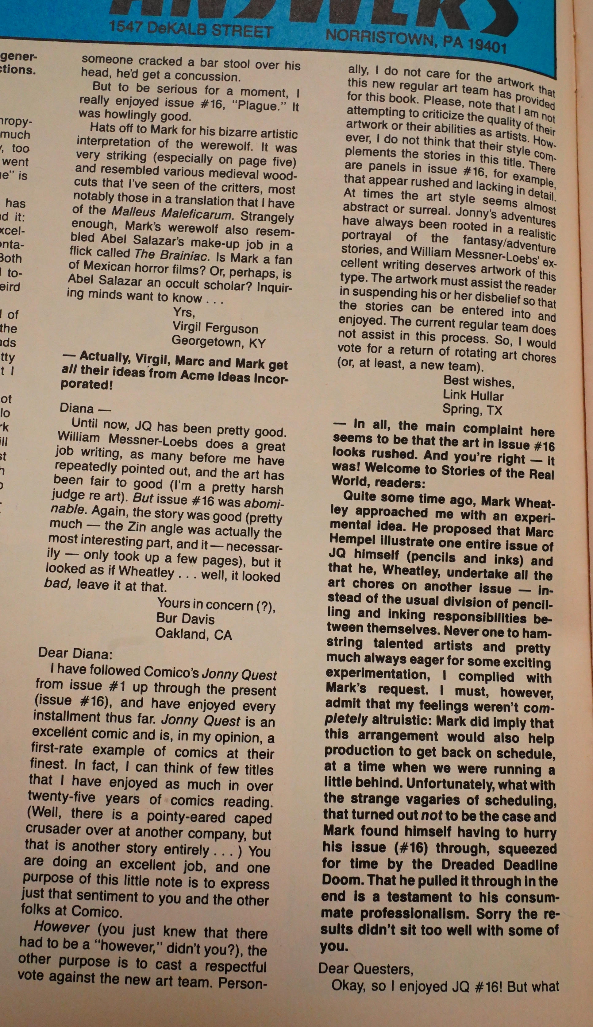
OK, I wasn’t the only one that reacted to that particularly naff Hempel/Wheatley issue — it was indeed done in a hurry.

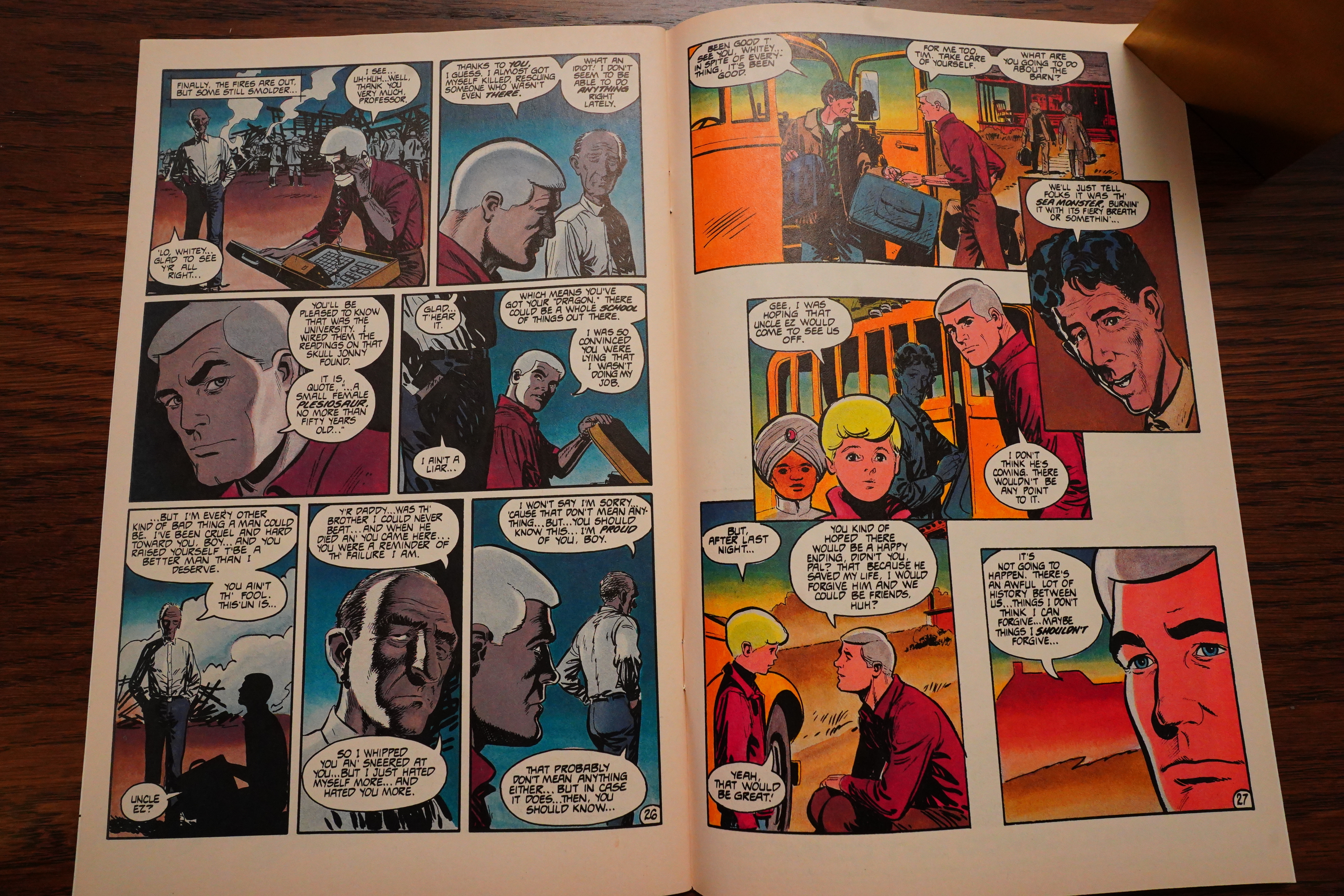
Messner-Loebs and Dan Spiegle does an issue about going home — it turns out that whatsisname with the white hair was brought up by an abusive uncle, and when he goes home, he finds out that things were less clear than he remembered them being. But his uncle was still an asshole. Which makes this a pretty nuanced issue.

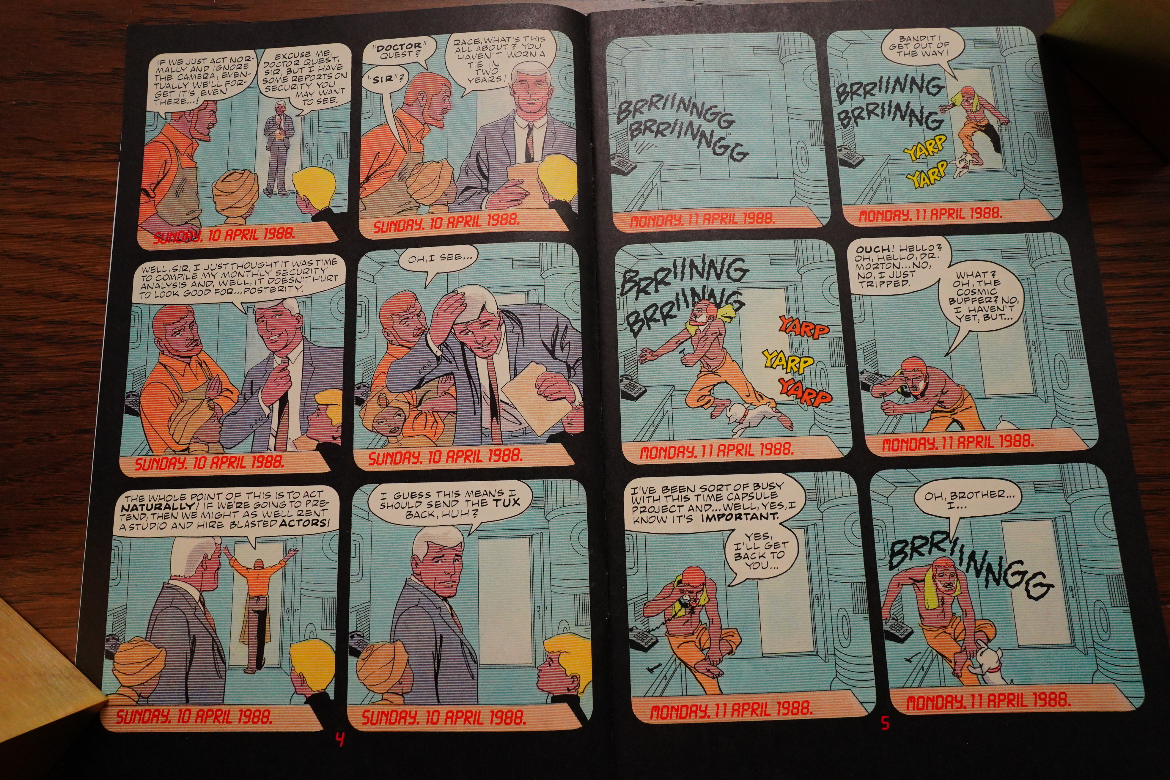
And then we get an issue with a fixed camera! That can’t have been very entertaining for the Marc/ks to draw, but it’s a very amusing issue.

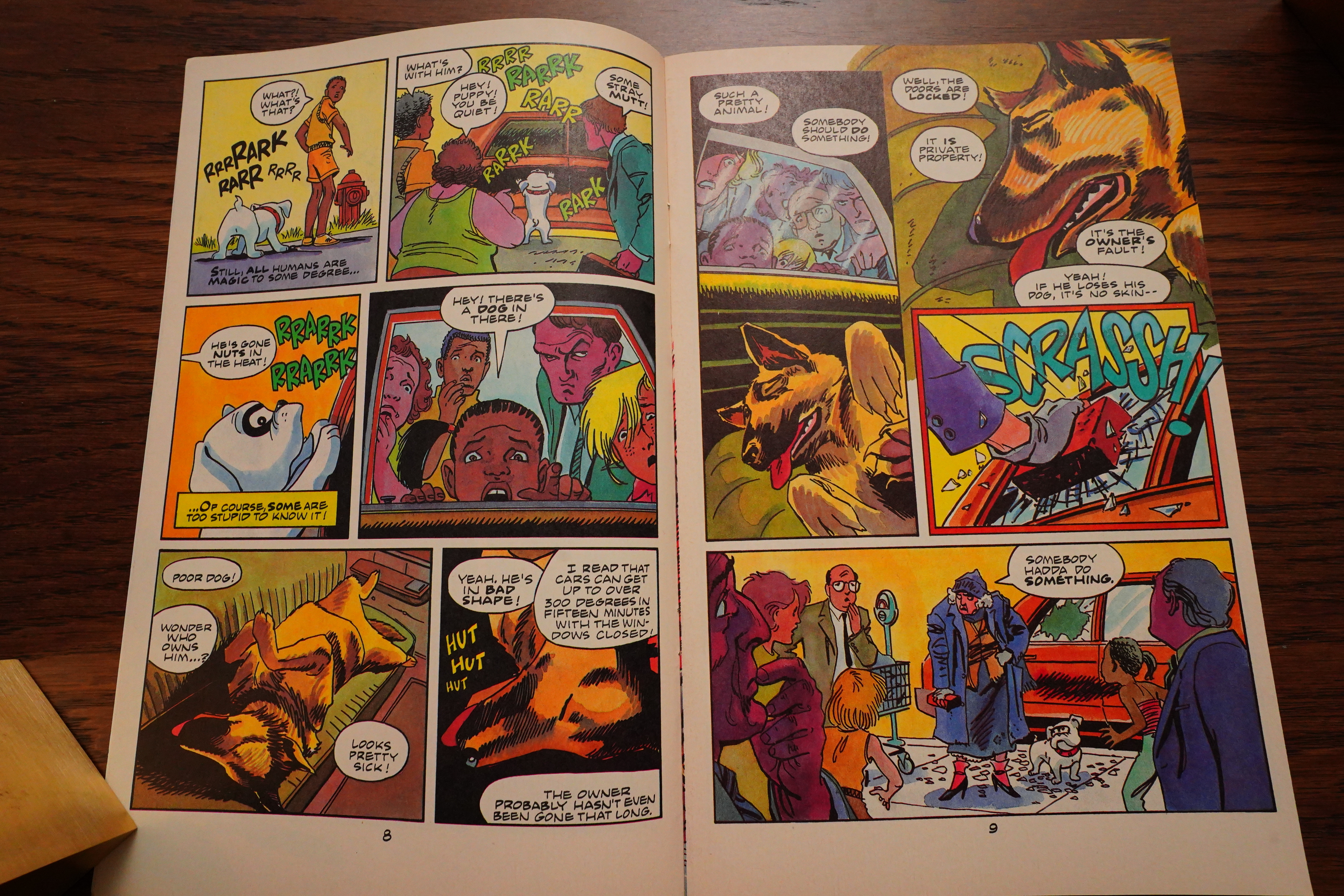
And another dog solo issue! And again, very touching!

I felt like Messner-Loebs kinda lost his way there for a few issues in the mid-teens, but now he’s on a roll again — every issue having a strong story, and with great variety. The only problem is that we’ve moved pretty far from the Two Kids, A Scientist, James Bond and Their Dog Go On Adventures, which was the setup here…

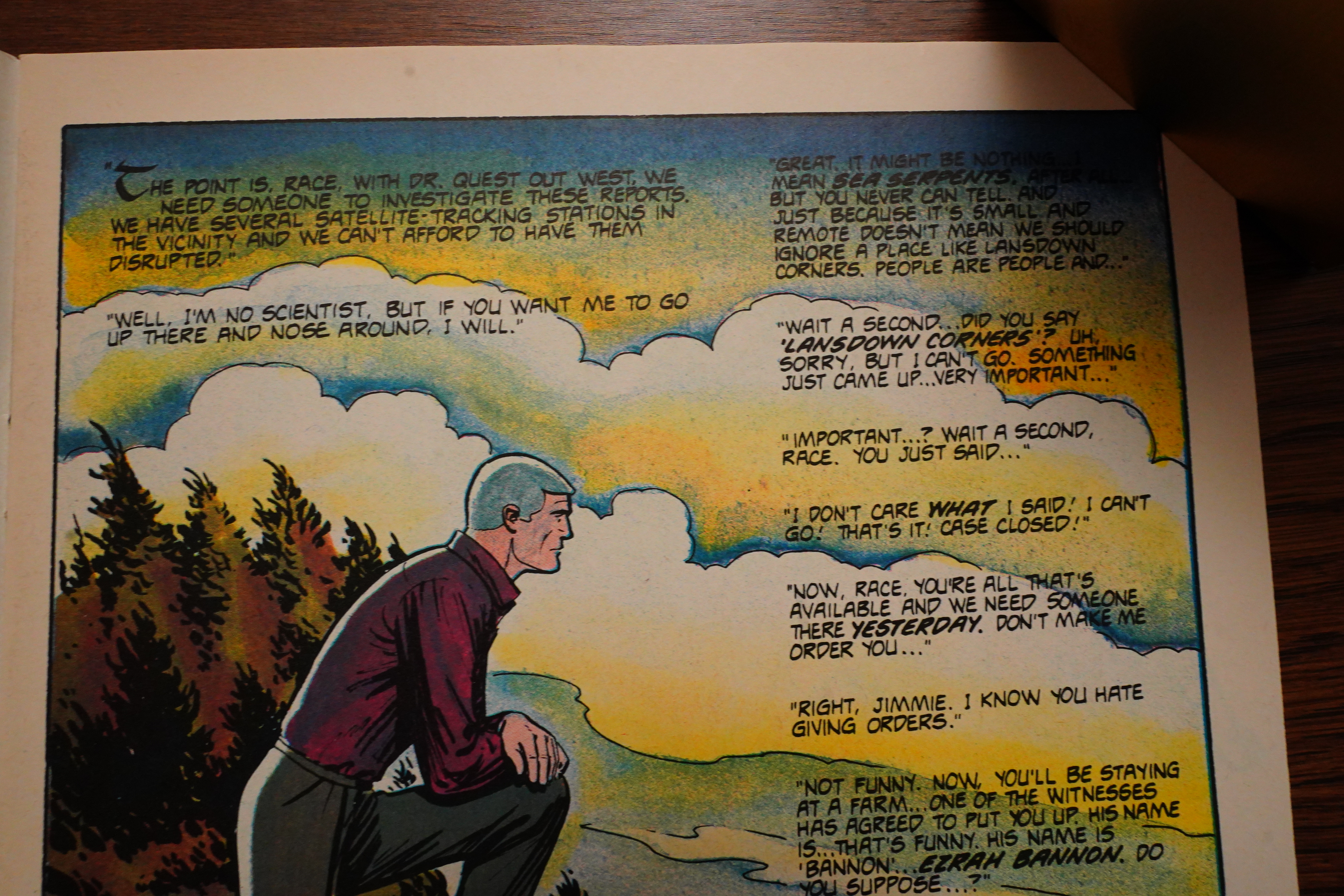
But then Messner-Loeb’s stories get more and more disconnected from… well, anything — a two-parter where they solve a half-assed mystery out west? Sure, but… It’s such a bad mystery!

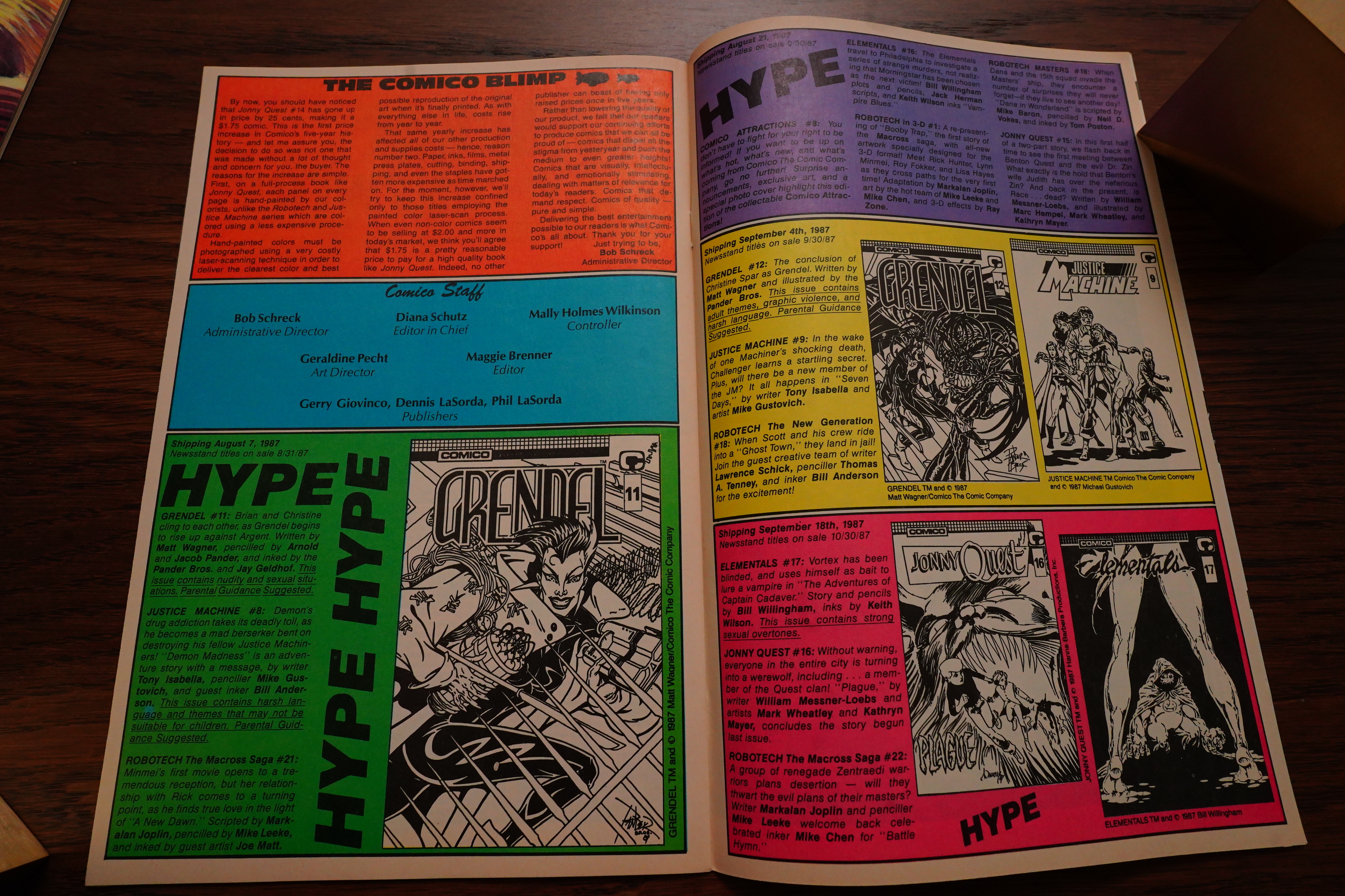
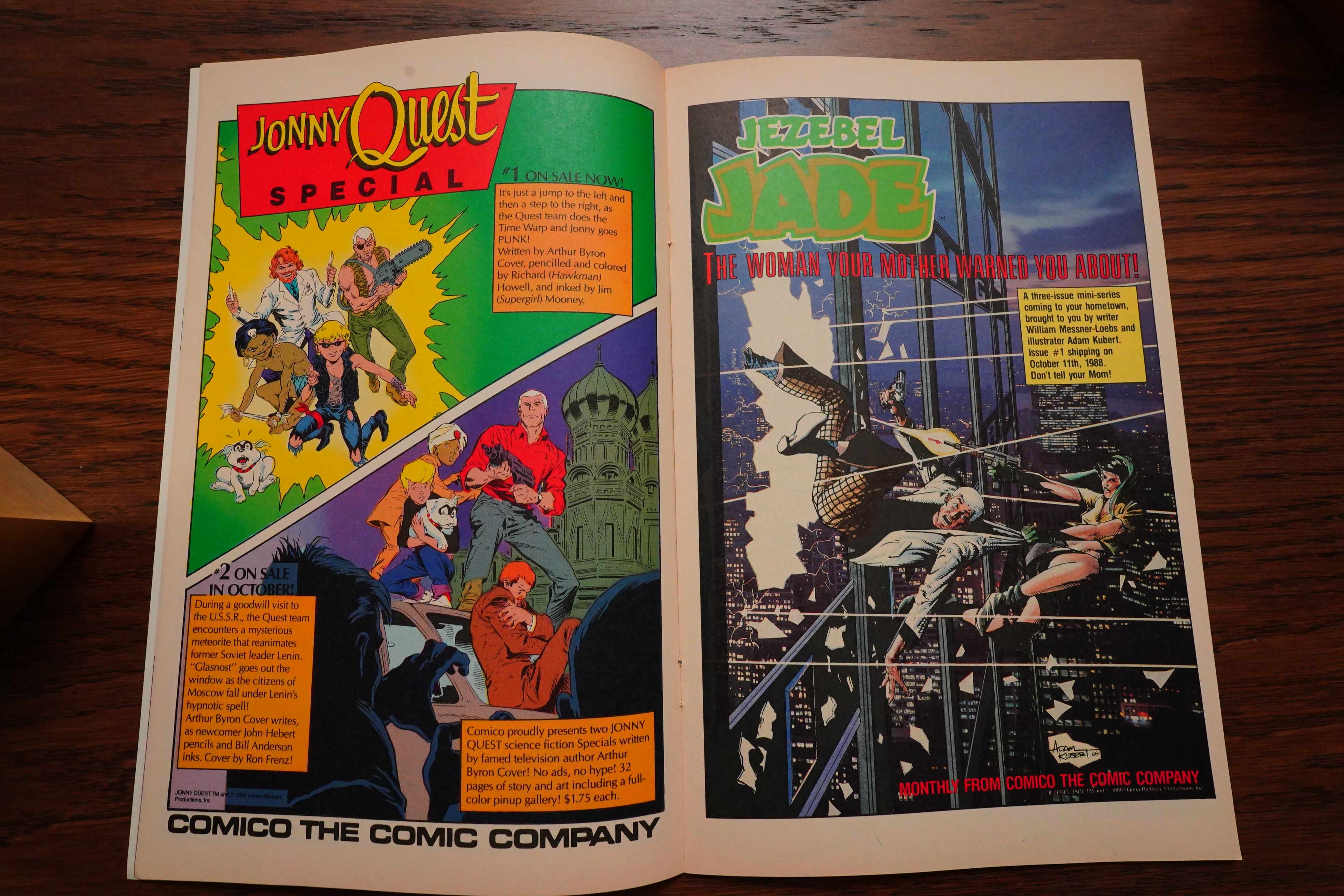
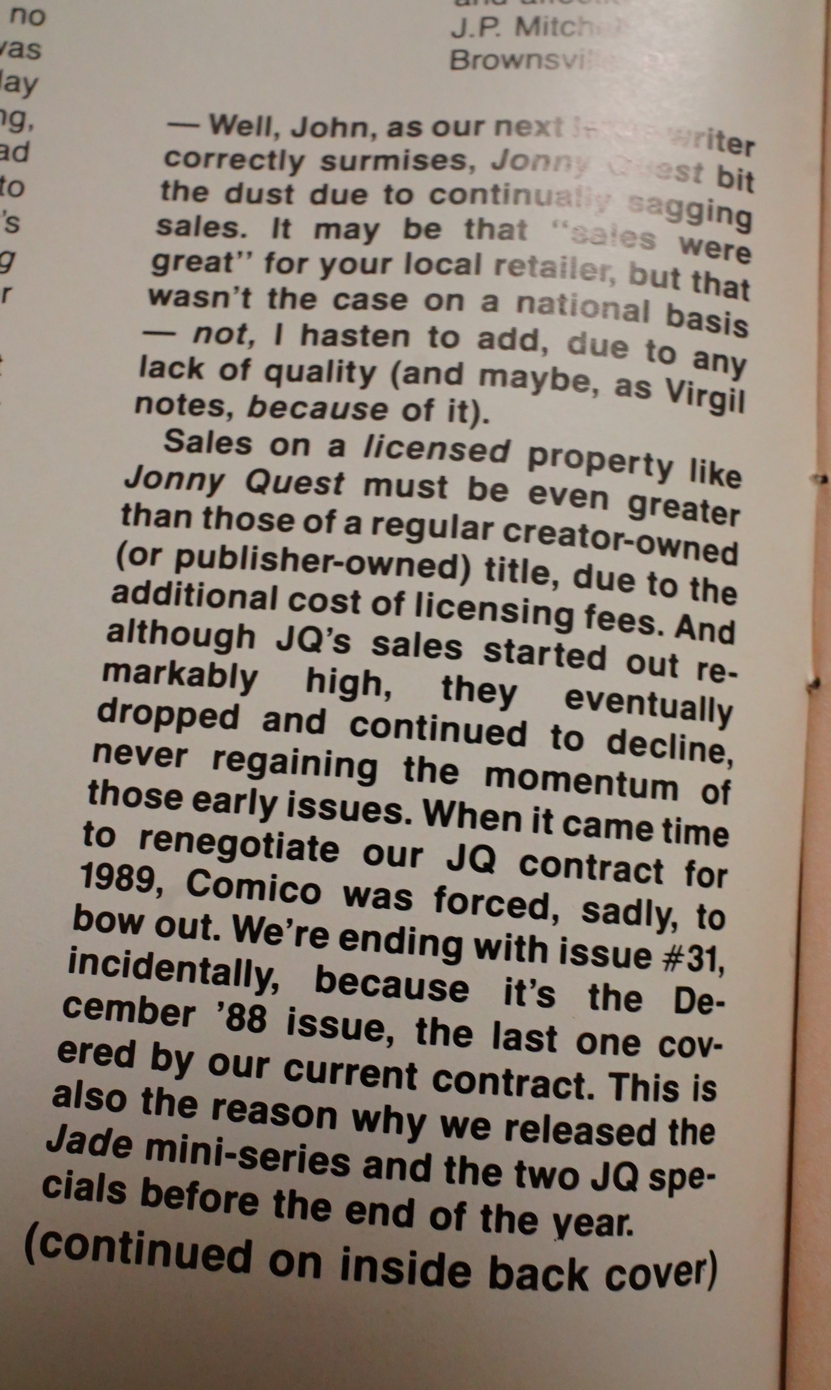
We’re coming towards the end of the series, and it was cancelled due to low sales. Why are they then bringing out two Jonny Quest mini-series at this time, then? Hm… Oh, perhaps the licensing agreement with Hanna-Barbera is lapsing, so they’re squeezing some last minute dollars out of it? But that only makes sense if they weren’t losing money on the property in the first place… Or perhaps they don’t pay more, so this gambit makes it possible to avoid losing money the last three months?

The next-to-last issue adapts one of the original stories — the first issue to do this. I think the Jonny Quest Classics series did this, too, but it’s weird dropping in an issue like this at random… Perhaps Messner-Loebs just had run out of stories?

If this is a typical episode of Jonny Quest, I don’t understand why it’s fondly remembered, because it’s easily — easily — the worst issue in the series. The plot makes no sense, and there’s very little excitement: Just random stuff happening until they run out of pages.

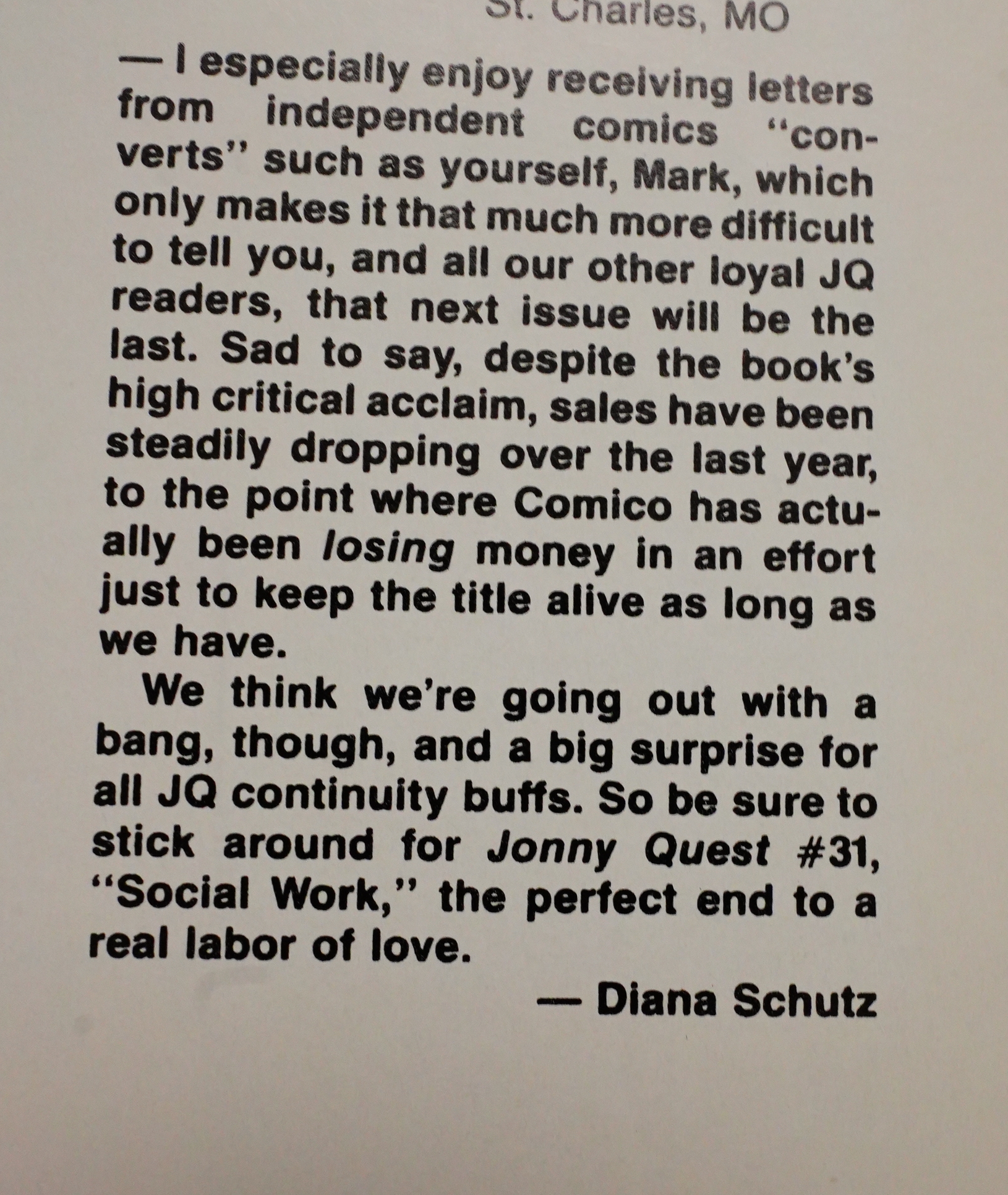
Diana Schutz announces the cancellation, and states that they’d been losing money on the title.

Wow. In the final issue, Schutz confirms my speculation about why they chose to release those two mini-series all of a sudden. Right again! I’m so smart S. M. R. T.

In the final issue, the kids go on their most exciting adventure yet — they follow the social worker to work, and get to see old people getting kicked out of their homes and stuff.

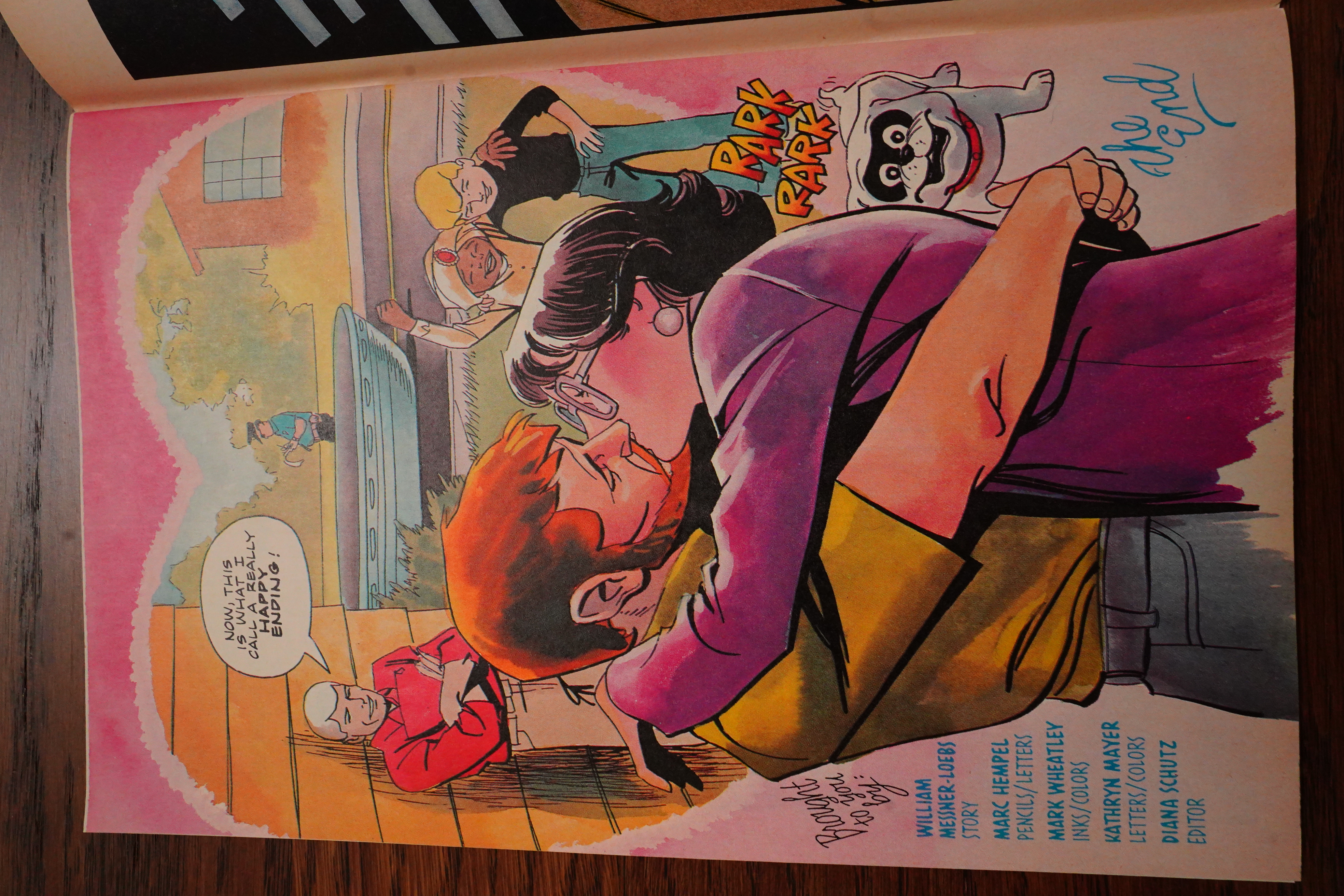
And then… Their dad marries the social worker finally! The end!

Schutz fought for the series until the end, it sounds like.

So… Wow, I finally got to the end. I think it took me ten days? But I had other things to do; it’s not like it took me all this time to read these 31 issues. But… it’s also to do with how these issues are structured: After reading a handful, I didn’t really want to read any more.

Reading this series has been like like reading a short story collection. Almost every issue is a one-and-done story, and while there’s some progression plot-wise, it’s very, very slight. But more than that, the stories didn’t really feel grounded in the characters: For many of them, you could have slotted in any characters and it would have been the same story.

Individually, I liked almost all of the issues. Collectively, it was a slog to get through, especially after Hempel and Wheatley took over the artwork. It’s not that they’re bad artists — they’re fine — but it’s hard to get excited about their work here.

And who was this series for? Obviously, at the start they set off with great (and contagious) enthusiasm, but then that dissipated, and we were left with a series that wasn’t really about a family going off on James Bond-like adventures, but just… random stuff. But the people who’d enjoy reading a story about the vicissitudes of social worker like aren’t likely to pick up an issue of something called “Jonny Quest”, are they?

But what did the critics say?

Amazing Heroes #95, page #28:

Diana’s gameplan for Jonny was
twofold. First of all, she received a
lot of response and interest from art-
ists interested in drawing Jonny. This
fit in fine with her plans because the
amount of lead time required for Taft
approval of each book, would have
created a nightmare for any single
artist. With visions of scheduling
dancing in her head, Diana decided
to use a different artist each issue. As
firmly convicted as she was about
multiple artists, she had just as strong
a conviction that there should only
be one writer, to keep a sense of
balance. This prompted a difficult
search for her. “I knew there are
many great artists who could do this,
but there are few great writers,” she
explains.
On the phone with Sam Kieth,
inker of Mage, Diana related her
dilemma to him. As luck would have
it, Kieth had been talking to his good
friend Bill Loebs. William Messner-
Loebs, as many are aware, is the
creative force behind Fantagraphics
Books’ Journey. Loebs had told Keith
that it would be nice to have another
project besides Journey to be work-
ing on. When Sam talked to Diana
the next day, and she told him she
was looking for a writer who would
stay with the book, Sam Kieth sug-
gested that Bill Loebs was available.
Diana thought this was a marvelous
idea because she was a long-time fan
of Journey, and felt that Loebs had a
real strength in character develop-
ment. She called Bill up, and he
thought it sounded like an interesting
project.
By his own admission, originally
Bill would never have considered
such a project, because he was used
to working with his own characters,
and felt it would be difficult to work
with someone else’s. Diana con-
vinced him that the company would
be open to trying new things with
the cast of Quest. As he delved a
little into their pasts and their motiva-
tions, Bill began to notice the
parallels between Jonny Quest and
Terry and the Pirates, in terms of
locales and characters. Another
motivation for him was that he cur-
rently was getting more into Carl
Barks, and the way he had been able
to go in, take an animated cartoon
character, and adapt it for the dif-
ferent needs of a comic book. This
feat fascinated him, and Jonny Quest
presented Loebs with the opportuni-
ty to try something similar. To Diana’s
delight, Bill phoned her and ac-
cepted the assignment.
As they began looking into the pro-
ject, Loebs and Schutz put together
some basic ideals. The continuity
aspect will be minimal. Every issue
has a beginning, middle, and end
which is partly a function of wanting
to have as many artistic interpreta-
tions of Quest as possible, and being
a mirror of the TV show. Diana did
want some elements to carry over. It
will be the kind of continuity in that
the events of a previous issue will
have some kind of effect on a later
issue. “These are concessions to
reality,” says Diana, and as an ex-
ample she cites, “If Jonny breaks his
arm one issue, which I am not say-
ing is going to happen, he will not
suddenly be out of a cast by the
following issue.”

Comics Scene Volume 2 #1, page #60:

Big changes are in store for
Comico’s Jonny Quest, according to
writer William Messner-Loebs. Begin-
ning with issue #14 (on sale now), the
series, which has been illustrated by
rotating artists since its inception, will
settle down to the regular team of Marc
Hempel and Mark Wheatley, formerly
of First Comics’ Mars series, who had
drawn Jonny Quest #3.
Though not a fan of the original
show, Messner-Loebs has decided to
play up two minor characters from the
original series-the mysterious Jezebel
Jade from Race Bannon’s espionage past
and the Eurasian arch-villain, Dr. Zin.
“In talking to my friends who were
big Quest fans,” Messner-Loebs ex-
plains, “they all say, ‘Oh boy, Jade was
in all those episodes and Dr. Zin was
behind all those plots.’ Actually, each
one is only in two episodes. But because
people are so sure there were more, it
seemed logical to carry that through. So,
I’ve built up those two characters.”
Reader reaction to Jade and Dr. Zin
has been overwhelmingly positive and
there are plans to feature them even
more prominently. A three-issue Jade
mini-series is in the planning stages.

Amazing Heroes #103, page #27:

Amazing Heroes: Bill, I understand
the first few issues of Jonny Quest
have sold phenomenally well.
William Messner-Loebs: So I hear.
But in this business, you can never
tell. I remember Dave Sim telling
me once that because everything is
[pre-purchased] all along the line,
there’s no way of finding out exact-
ly what anyone does with those pur-
chases. Theoretically, 19,900 of the
20,000 Cerebus that were selling
could be in plastic bags in some
[retailer’s] boxes, accumulating dust.
I always think about that whenever
we talk about sales figures, because
you really don’t know what’s hap-
pening. But, so far, it looks real
good for Jonny. Certainly I’ve sold
almost as many Jonny Quest # 1 in
one four-day period as I sold of the
first ten issues of Journey. I wonder
what that means.
AH: I assume you’re happy with the
success of the book?
Messner-Loebs: Yeah. It was a
totally different thing to be working
with somebody else’s characters and
trying to bring them to life and bring
something of my own experience to
them, to walk that fine line between
paying homage to an old television
series and just mummifying it.
AH: Did you like the old Jonny
Quest show?
Messner-Loebs: Not much.
[Laughter] I came along at the
wrong time. Almost anybody who
is considered to be nostalgia bait for
it was about 11 when they saw it,
which is about the same age as
Jonny was supposed to be. I was 17
-a very critical and very animation-
conscious 17-so I was never able
to get past the limited nature of the
animation. Also, I was never able to
get past the disappointment left over
from the almost unspeakably heavy
Hanna-Barbara hype that accompa-
nied the show. I took that very
seriously when I was 17, also.

Heidi MacDonald writes in Amazing Heroes #119, page #69:

Bill Loebs is pretty incredible
when you think about it. Look how
bleak the picture is: a spin-off of a
20-year-old cult kid’s cartoon show,
yet another licensed property, and
one that doesn’t even have a steady
artist…you’d expect this to be tol-
erably dopey, at the very best. But
picking Bill Loebs to write this book
has to be one of the smartest moves
that Comico has ever made. We all
know Journey was a fascinating,
magnificent bastion of naturalism
and human drama in the sea of slug-
fests, and we knew that Loebs was
a good writer, but who could have
guessed that he’d turn this spin-off
into a completely entertaining com-
ic, full of allusions to all manner of
High and Low culture, and recall-
ing nothing so much as the Golden
Years of children’s comics?
Loebs’s Quest stories all have one
silly element each, (viz. the mystery
object which everyone was after in
issues #5-7) but he knows exactly
how silly they are, and exactly how
to push each element just far enough
to be entertaining without being
ludicrous. (It’s very much like what
Carl Barks used to do in his long
Uncle Scrooge epics.)
Likewise, despite the somewhat,
um, meandering pacing to which
Journey was often prone, Jonny
Quest proves that Loebs is one of the
few comics writers who can tell
satisfying stories, complete in each
issue, stories which have beginnings,
middles, ends, characters, and even
a theme or two. In literary circles
this is known as writing. In comics
it’s known as a miracle.
For instance, take the Loebs-Ken
Steacy story in #8, “The Curse of
X-7.” Observe first Steacy’s brilli-
antly lurid cover. Hadji, Dr. Quest,
Race, even…(gasp!!) Bandit…
hanged by their necks. Shocking
stuff. Now admittedly, if I saw this
on the cover of, oh, say, The X-Men
I’d have to stifle a yawn. But here,
it’s a wee bit startling.
Inside Loebs plays havoc with one
of the oldest tricks in the book-is
it a dream or not? First we see Jonny
a man of 30 or so, teaching his
science class. Within a few pages,
Bandit has died of an old age, and
Race and Dr. Quest have been mur-
dered by X-7, a robot villain of
dreadful aspect. Then we learn that
his flash-forward is really a dream
flashback, of Jon ten years later, now
seeking a bitter vengeance against
X-7. Suddenly we find out this too
is a flashback from an even older
Jonny, and this turns out to be a final
flashback of a very aged Jonny, es-
tranged from Hadji, even more lost
in his vengeance trip, and still
searching for X-7.
It’s all played out in a perfectly
eerie fashion. Steacy’s angular and
idiosyncratic art sets a surreal tone,
keeping the reader off-balance as to
just what the heck is real here. Of
course, on page 22 we find out that
the real (present day, young) Jonny
was dreaming all these dreams
within dreams, brought on by a tank
full of poisonous insecticide—an
insecticide known as X-7.
On the surface, this could be any
stupid super-hero book—we have a
killer robot, a disastrous vendetta,
a furturistic society, a “Hey it was
all a dream!” ending. But Loebs
uses these overfamiliar elements
masterfully. He gives his stories
contexts and motivations. Notice
such details the older Hadji’s asce-
ticism, or “The Race Bannon Socie-
ty,” a combination of the John Birch
Society and the KGB which snoops
into people’s lives under the pretext
of searching for X-7. It’s a rich con-
cept, and yet one just thrown out in
passing.
The next issue, “A Fire In Green”
Meadows” is just as heady, recall-
ing, in a playful way, both William
Inge and Hayley Mills in its small
town setting. Jezebel Jade’s arrival
in the peaceful town of Green Mea-
dows could spell trouble a la Picnic
or even The Music Man, but when
the gang gets involved with a mys-
terious panther haunting the out-
skirts of town, it reminds me of a
Mills Disney vehicle from the early
60’s. (Damn, these are weird com-
parisons, and they’ve all got the
genders wrong, ‘cuz Jezebel is Wil-
liam Holden and Jonny is Hayley.
Oh well.) Of course, there’s a
pseudo-scientific McGuffin-an
enzyme that turns garbage to
energy—a lost treasure, childhood
friendship, dark secrets from
people’s pasts coming back to haunt
them, and all stirred together into a
hokey but tasty brew.
On the artistic end of things,
Quest is first-rate all the way.
Steacy’s was a standout for flashi-
ness, but the dependable craftsman-
ship of Murphy Anderson in #9 and
Dan Spiegle in #7, is a real pleasure
too. Even artists whose work I usu-
ally have problems with-Mitch
Schauer and Tom Yeates-turn in
sterling jobs. Of course Doug
Wildey’s appearances are the su-
preme treats. All of the artists in the
book take on a deliberately flat, very
objective style—anyone who tries to
give Race’s shock of white hair any
kind of ruffling or volume is mak-
ing a serious mistake—which works
beautifully with Loebs’s straightfor-
ward storytelling. Marc Hempel and
Mark Wheatley are an excellent
choice for regular artists, as their
work in #3 has a blend of objectiv-
ity and stylization.
Jonny, Dr. Quest, race, and Hadji
are far from being rounded charac-
ters in any sense of the word, but
they fill their stereotypical roles to
the utmost. Loebs has also made the
most of the supporting cast from the
animated series—Dr. Zin makes a
dandy villain, and in a few issues
Loebs has turned Jezebel Jade into
one of comics’ premier femmes fa-
tales—and the only one who looks
ravishing in a snood. (Even I must
tip my cap to Dave Stevens’s cover
of #5.) And what can you say about
Bandit, aside from the fact that he’s
corny, and he’s adorable.
On paper, there’s no way Jonny
Quest should be as good as it is. A
great deal of it can only be described
as being hokey, and yet Loebs and
friends make it work. It’s good clean
fun, totally American to the core, as
the Flaming Carrot might say. Like
Mister X, this is a class act, with
first rate coloring and covers. Com-
ico’s put together a damn fine
package. You really get your
money’s worth with this one.

Heidi MacDonald is right as usual.

It looks like Jonny Quest got plenty of attention at the time — which surprises me a bit, because Comico wasn’t able to get any press for their Robotech series. But of course, Japanese animation hadn’t really taken off in comics circles at the time (I mean, compared to what it would be ten years later).

Andy Mangels writes in Amazing Heroes #137, page #87:

Jonny Quest #22, ‘Vantage Point’;

I was not excited to get this book . . . at
first. I kind of flip through Jonny
Quest when it comes into my store,
to see if there’s anything interesting
that catches my eye. So far nothing
has, because I haven’t read a single
issue yet.
I remember (vaguely) the Jonny
Quest cartoon show from my younger
days, and I did kind of like it then,
although it did seem a little weird at
times. My favorite was Race Bannon.
I absolutely despised Hadji. Didn’t
think too much of Bandit the dog
either. So, I settled down on the
carpeted floor of my office and began
to read Jonny Quest, fairly certain I
would not be entertained.
The story begins as Dr. Quest is
installing a camera in his lab, which
will record everything in its sight for
one full week and etch it onto a disk.
This disk and viewer will then be
launched into space for a thousand
years, in the most ambitious time
capsule project yet. Although every-
one at first acts up in front of the
camera, Dr. Quest advises them that
they will soon forget it’s there. In time,
they do.
What follows is an entire story told.
from one single point of view: that of
a stationary camera. A camera only
records exactly what is shown, leaving
nothing to the imagination, nor pro-
viding any other points of view. The
issue is what the camera records over
the course of the week. Dr. Quest
finds himself much too busy and
unorganized, and decides to hire a
secretary. Unfortunately, all of his
prospectives employees are frightened
off at the idea of working with dino-
saurs werewolves, cult attacks, small
arms, and hovercraft! When a secre-
tary is found, Quest finds himself
embroiled in a search for a missing
father, battles with an adopted cat,
mixed-up appointments, and a mad
scientist who thinks Quest has turned
the world against him.
I found myself chuckling many
times during my reading of the issue,
which is something I rarely do when
reading a comic. it was the classic no
win situation for Quest; every time
something seemed solved along came
five other things to complicate mat-
ters. The ending is not quite up to the
rest of the book, but seems predictable
given what has been done before in the
story. My only disappointment with
the story was that it seemed astonish-
ing that such a historical recording
would be so casually treated, but this
is comics, and the motivations do
completely fit into the Jonny Quest
structure as I recall it. I can forgive
that one nitpick, given the highly
enjoyable quality of the book. This is
great family fare, fun for adults and
children alike.
Bill Loeb’s writing is funny, and the
characters are fully fleshed out (even
the incidental ones). His dialogue fits
the way the characters look, and tells
us exactly what we need to know
about that character. The art is com-
petently cartoony, although I’m not
ultra-wild about Hempel and Wheat-
ley’s art style. It suits Jonny Quest
well, interestingly enough looking
better in black and white than in color.
This is not to say that the coloring is
bad (it’s usually well done), but to say
that the art does not seem to be drawn
for color. By the way, there is a great
appearance by a TinTinesque mad
scientist in here, that no TinTin fan
should be without.
I was pleasantly surprised with Jon-
ny Quest, although I can’t really say
I’m going to follow it in the future. I
will do more than flip through future
issues though. Give it a try.
Grade: Mint

Comics Interview #73, page #26:

SCOTT McCLOUD: JONNY QUEST
seems to be quite a special book to a lot of
people. It attracted some big names.
What do you think its special appeal was?
BILL LOEBS: Well, that’s a good ques-
tion. I think largely its appeal was
chronological. You tend to find it more
appealing the younger you were when it
first came on. I was, I guess, in my late
teens when it came on, so I tended to
notice more of its problems. I looked at
it a little more so I tended to notice more
of its problems. I looked at it a little more
technically, in terms of animation and that
sort of thing, than a lot of people seem to
have. And I also think that a lot of the ap-
peal is, even though the kids are treated
like kids and the dog is treated like a dog
– in that no one is particularly precocious
– they are treated as adult members of
the expedition. There’s none of this,
“Gosh, these are ten-year-old kids. We
should leave them at home and go have
the adventure, Race.”
SCOTT: It’s not as condescending as
some other things.
BILL: Yeah. I think there’s a lot of that.
That was something that struck me when
I read the original TOM SWIFT books
also, where even though his father was an
inventor – theoretically pretty clever –
his father was invariably wrong. Tom was
always coming up with things and his
father was invariably wrong. Tom was
always coming up with things and his
father would end up, “Oh, you were right,
Tom. This was just the perfect time to in-
vent an atomic tank.”
SCOTT: . That’s a very ’80s attitude isn’t
it? We’ve seen that a lot in the cinema
recently.
BILL: Yeah, usually with authority
figures that are somehow abstracted once
or twice from being actual parents.
SCOTT: Right. A guardian or an uncle.
BILL: Yeah. As a matter of fact I was
reading a book which was analyzing old
fairy tales in terms of Freudian symbols,
and it said that the reason that you had all
of these evil step-mothers was not that
there were more step-mothers back then
than now, but that it’s a way of hating your
own mother without having to actually
deal with hating your own mother. That’s
also the reason that the witches traditional-
ly have a hood thrown over their features.
They’re really hiding features that you
don’t want to see because it would be too
traumatic to have to realize that that’s who
you’re hating.
SCOTT: So you think on a milder level
that that kind of surrogate character was
showing up in JONNY QUEST?
BILL: Well, yeah.
SCOTT: Obviously not with his…
BILL: We’re actually talking about the
sort of youth exploitation films where the
young people trash the university
presidents or the girlfriend’s father or
something like that — real obvious
avoiding of trashing your own parents.
One of the really neat things about RISKY
BUSINESS, one of the things that makes
it something more than just exploitation,
was that it’s actually dealing with saying
this out loud. The more direct you are the
more it approaches art, even if it’s about
things that may seem exploitative.
SCOTT: Well, getting back to JONNY
QUEST before he gets away…
(Laughter) How was your working relation-
ship with TaftEntertainment? Did you sub-
mit works in progress to them for
approval?
BILL: Yes. Every step along the way is
submitted, not by me but by Diana
Schutz, who acts sort of like a clearing
house for all of this massive amount of in-
formation that goes through.
SCOTT: How deeply involved are they
with the actual production of the stories
and whatnot?
BILL: Well, they haven’t been at all in-
volved up to now except in being real in-
terested. What I essentially did was work
up twelve story ideas and submitted them
and they liked them all, and I submitted
my first script and they liked that one, and
so forth and so on.

Comics Scene Volume 2 #1, page #57:

One of the most welcome revivals of
the 1980s has to be Jonny Quest. A
prime-time animated adventure
show which aired for only one season in
1964, Jonny Quest was a boy’s adventure
book come to life. It featured intelligent
characterizations, fantastic plots, a stir-
ring jazz theme and, although a ratings
disappointment, it has attained cult status
among aficionados of TV animation.
Twenty years later, the children who
thrilled to Jonny Quest are now adults,
and the great JQ revival is in full swing.
Last year, Comico launched its Jonny
Quest comic book, written by William
Messner-Loebs and drawn, so far, by a
battery of talents including Steve Rude,
Wendy Pini, Al Williamson, Dan Spiegle
and many others. Last fall, Hanna-
Barbera aired new Quest episodes as part
of their Funtastic World of Hanna-Barbera
syndicated show.
The man who created the series, il-
lustrator Doug Wildey, greets this revival
with a certain detached amusement.
“I hate to blow anybody’s personal illu-
sions out of the water,” he says today,
“but I didn’t think that Jonny Quest was a
very good show.”

Heh heh.

Amazing Heroes #159, page #79:

Jonny, We Hardly Knew Ye Lad
What’s this I hear that as of issue 31
Jonny Quest by Loebs, Hampel and
Wheatley will be discontinued. What
was it’s drawback, poor sales? Had it
ever occurred to them that maybe their
story renditions to the character
weren’t quite up to the level as that of
the founding cartoon. I mean that the
originators went all out to base actual
scientific research around each epi-
sode, stories drawn from evidence of
existing information that made the
stories somewhat believable! Super-
sonic jets, lazers, hydrofoils, moni-
tored walkie-talkies, flying back-
packs, etc…etc!
The best that Comico put out were
the issues based on the “classic”
Jonny Quest television cartoon epi-
sodes, the one’s illustrated by the
genius behind the character, Doug
Wildey. Now if Comico had continued
to bring those episodes to comics form
sales may have generated positive. I
for one would like to see Alex Toth
illustrate three of his favorite episodes
to the series, or maybe if they would
put out a bio-formated 200 page book
about the conception of the original
Jonny Quest series by Hanna-Barbera
with drawings and photos and vital
information, now that would be some
book for all us Quest enthusiasts to
have in our library. How about it?

Arena Magazine #4, page #27:

Top 10 Comics No Longer Being Published
by Jerry Smith

[…]

10. Jonny Quest — I loved the
cartoon as a kid, I loved the
comic book as an adult. This is
where I first discovered the work
of William Messner-Loebs, one
of the finest writers of current
comics. Messner-Loebs took the
concept of the cartoon and to-
tally fleshed out the characters.
He made Professor Quest, Race,
Jonny, Hadji, and even Bandit
three-dimensional, enjoyable
characters. So many of his sto-
ries on JQ will stick with me for
the rest of my life: the ghost story
with references to all kinds of
writers and classic stories hid-
den in the dialogue, the origin of
Hadji, the Bandit solostory where
we see how much the dog loves
his friend Jonny, I could go on
and on about Messner-Loebs’
touching scripts. This is a much
missed book.

OK, that’s enough.

This series has apparently never been reprinted? That’s kinda surprising, isn’t it? But here’s some reviews from the internet:

Overall, Jonny Quest #13 by Messner-Loebs, Infantino, Kubert, and Pinaha is an enjoyable ghost story utilizing key elements of the cartoon’s characters and story elements. It was a favorite when I was a kid and I find it largely holds up even now. The artwork from Infantino and Kubert alone is worth a look.

Here’s another:

Let me admit right here and now that I thoroughly enjoyed Jonny Quest. Messner-Loebs’ story was engaging, with thoughtful character development and just the right amount of humor and action.

Ditto:

Messner-Loebs shows us again what a solid writer he is and how much he understands this world and these characters. Everyone is pitch perfect and feels like they’ve come right out of the show.

OK, I’m out. What’s up next? I hope it’s something shorter… OK, Ginger Fox.. but then there’s Justice Machine! Man, Comico published a lot of long-running series in their early years. But that’s changing drastically in 1987.

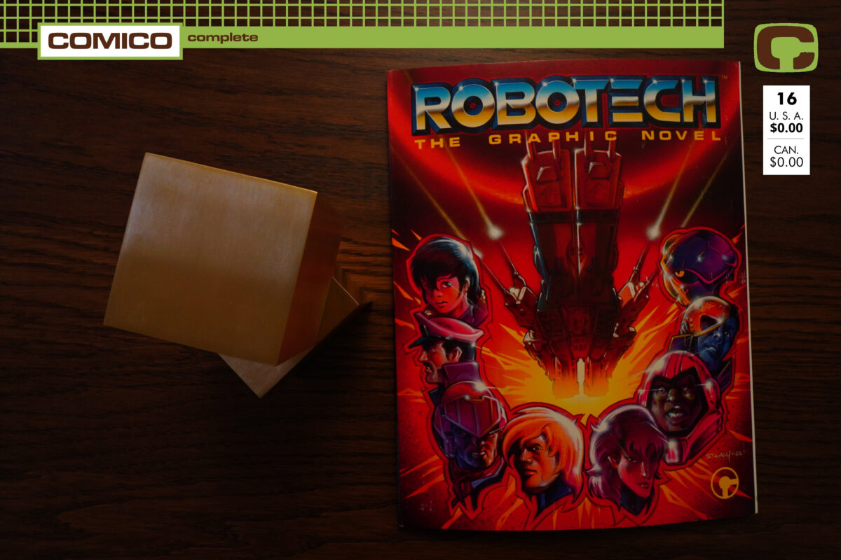
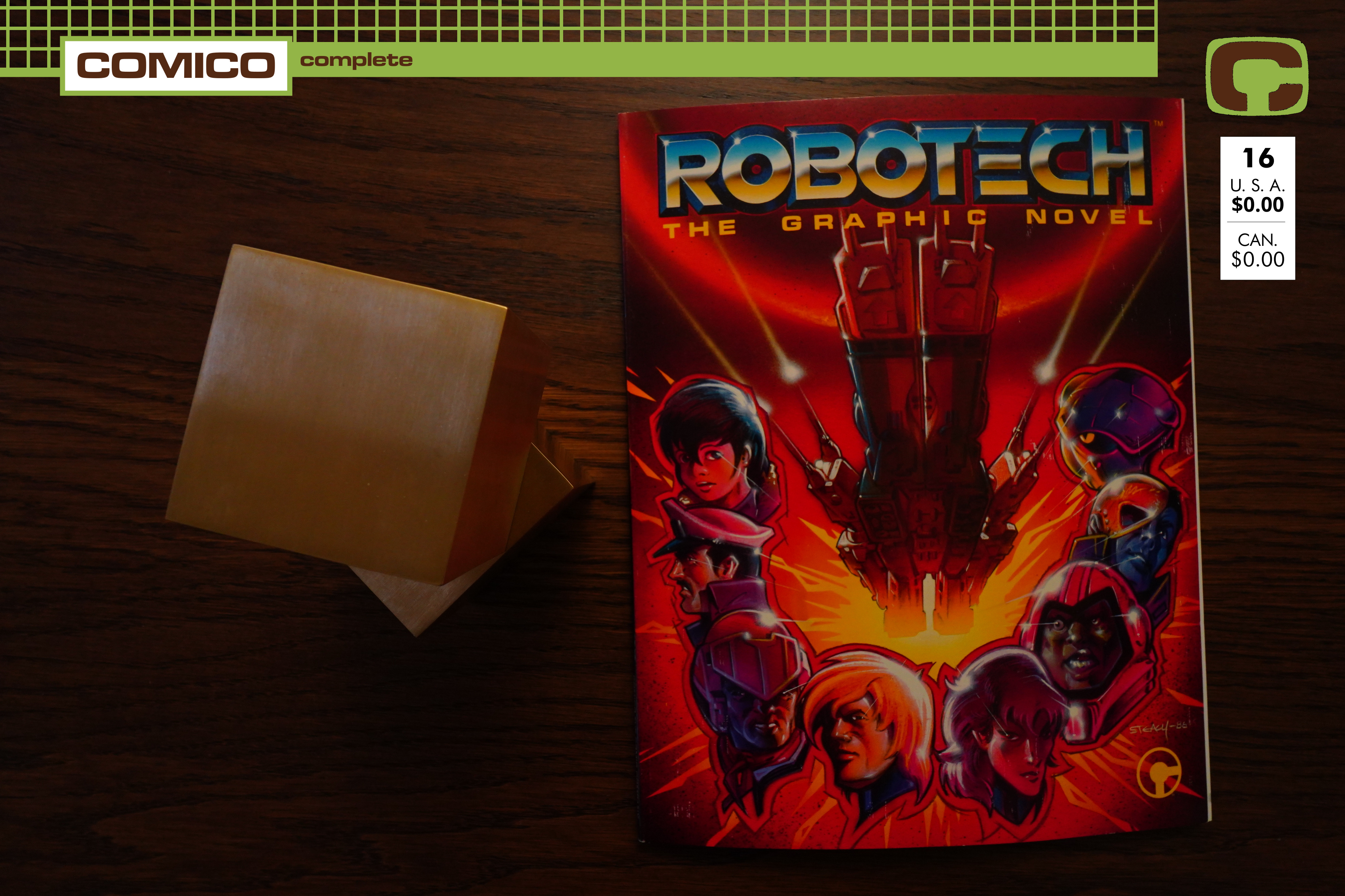
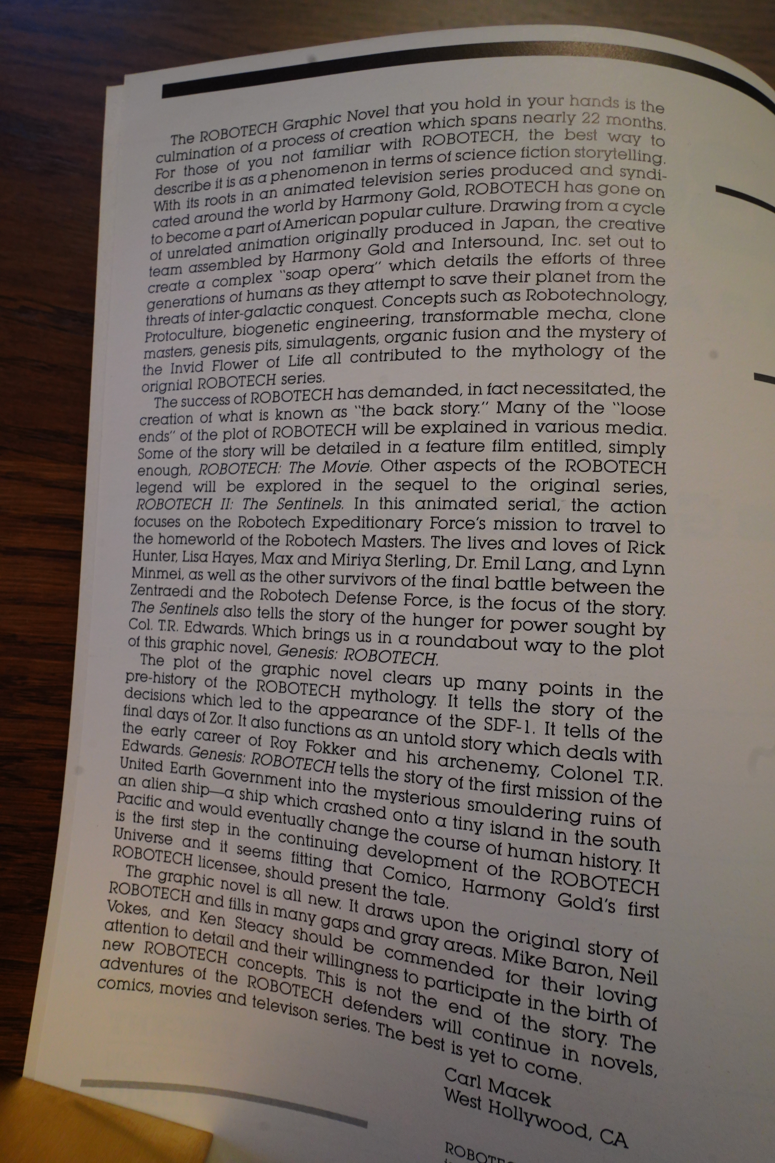
1986: Robotech the Graphic Novel

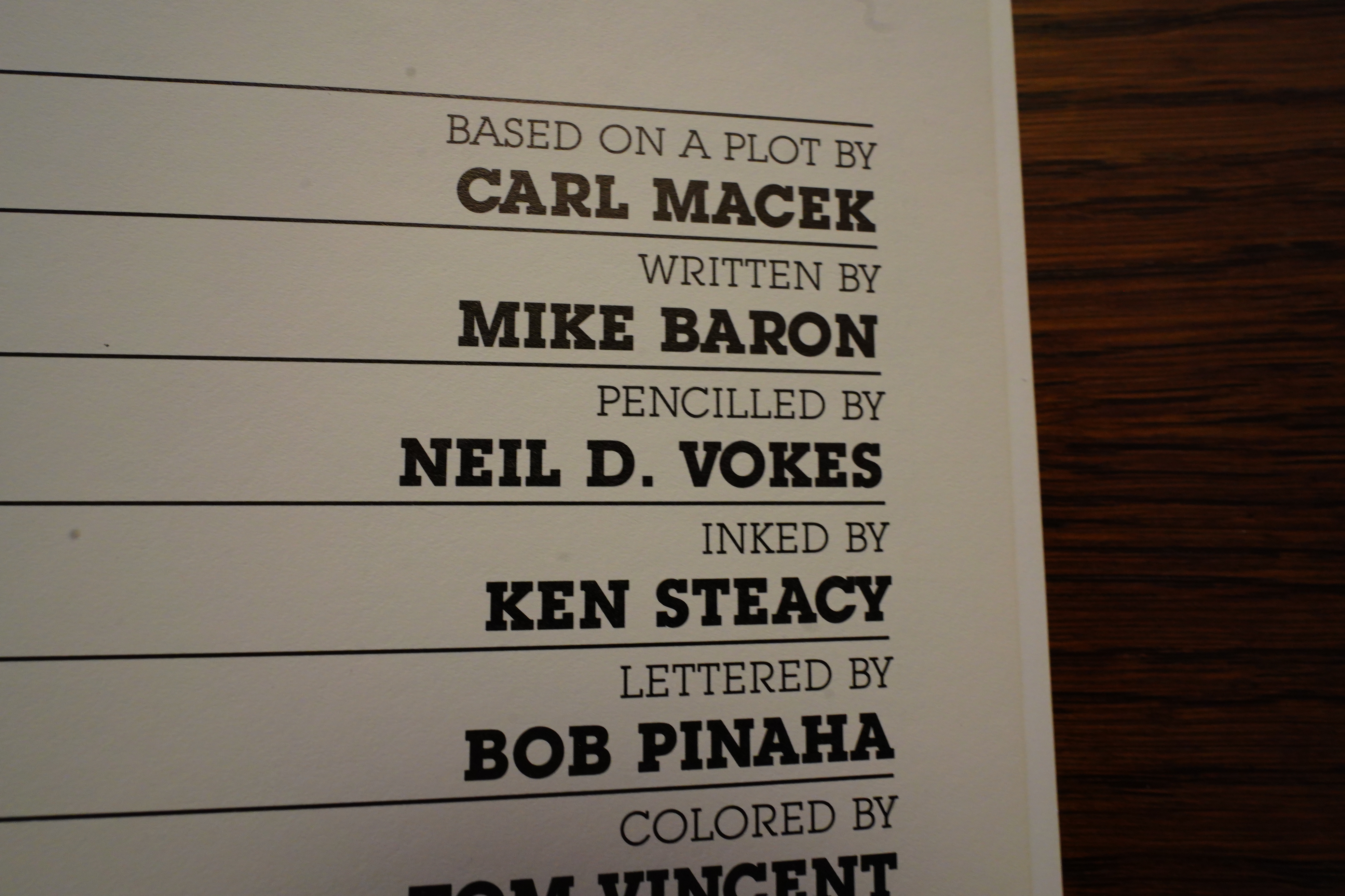
Robotech the Graphic Novel (1986) #1 by Carl Macek, Mike Baron, Neil D. Vokes, Ken Steacy et al

I planned on doing one single blog post for all the Robotech specials, but apparently I changed my mind. Because I didn’t feel like doing more than this graphic novel today.

Oh no! Mike Baron wrote the decidedly worst of the three regular Robotech series, so why is he doing this? OK, he was the only “name” of the writers, but he totally phoned in his series — it was boring and it made little sense.

The plot is by the showrunner of the Robotech animated TV series, so perhaps it’ll be OK.

Macek explains that this graphic novel is where he’s going to infodump on the readers all the bullshit he’s made up to tie the three unrelated Japanese animated series into one “coherent” Robotech series. (I’m paraphrasing.)

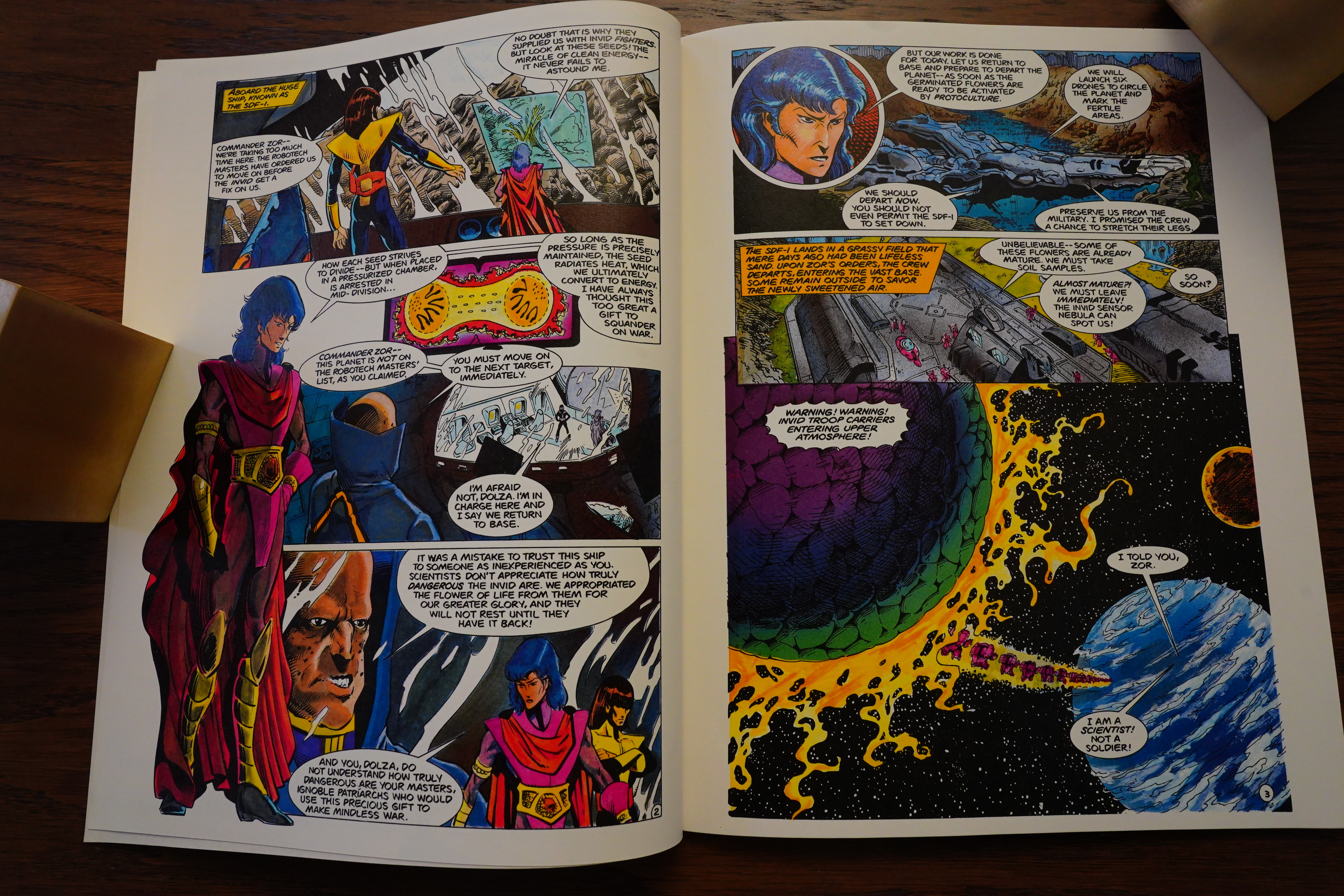
And indeed, we open with the mysterious guy from the Macross series talking about the flowers from the Mospaeda series with some guys from the Southern Cross series, so… mash-up achieved.

I can’t really say that it works — we don’t really learn more about Zor’s backstory than earlier, and things don’t really make more sense than before. So I guess Macek hadn’t really put all that much thought into the backstory, which was what I had assumed all the time.

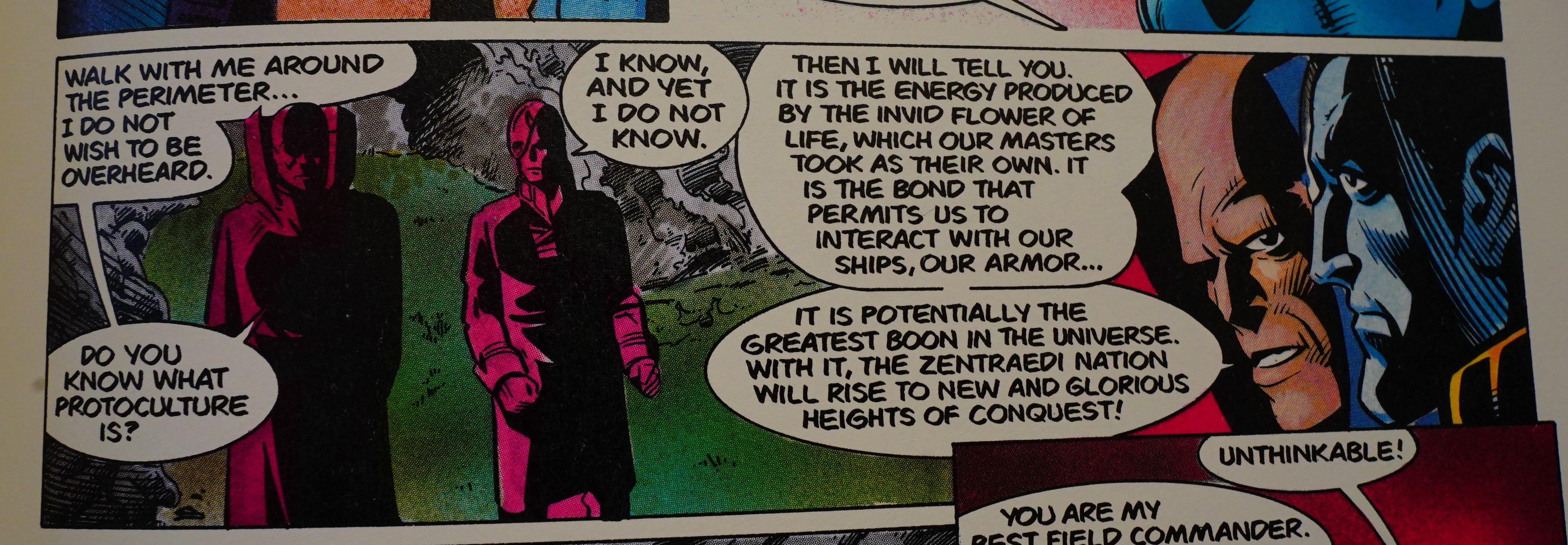
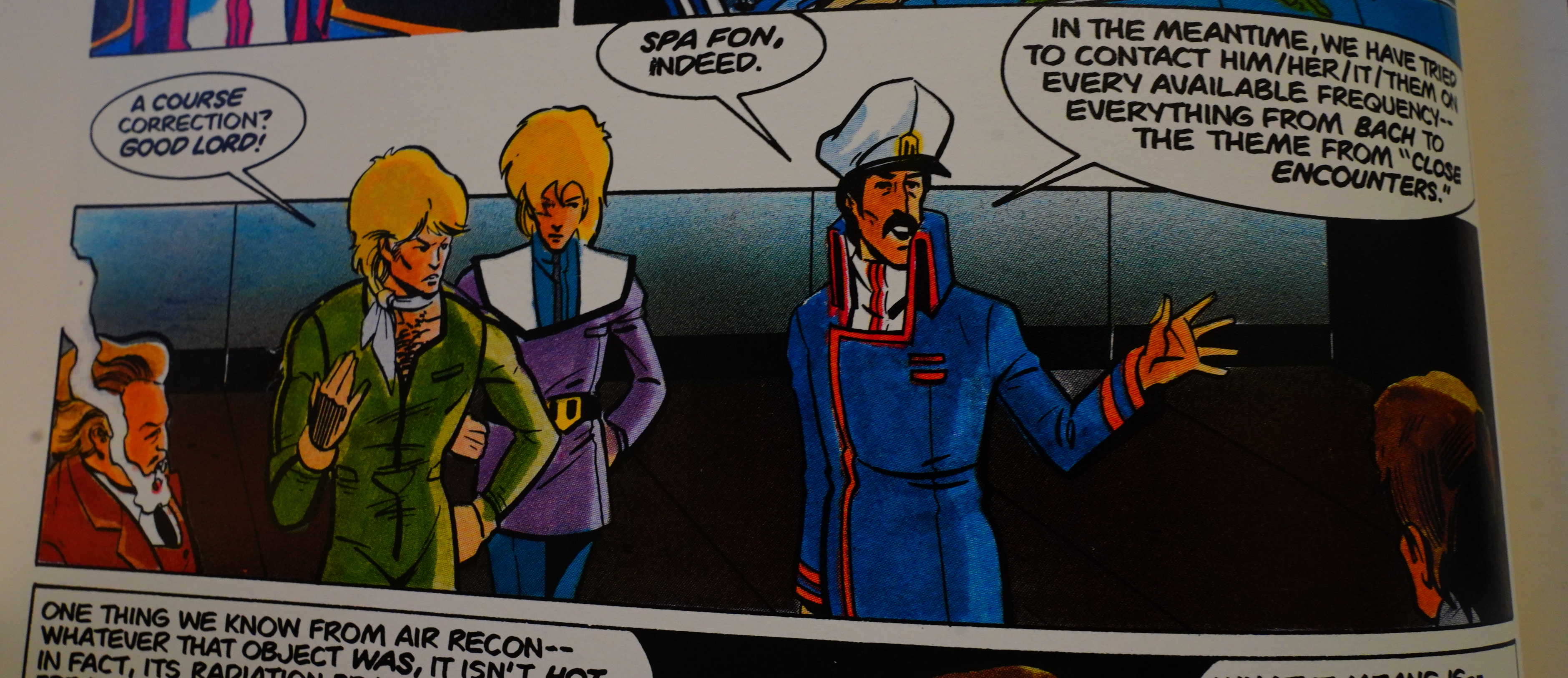
I suspect that Baron is making fun of Macek a bit here. “Do you know what protoculture is?” “I know, and yet I do not know.” — which is what viewers of the Robotech series would answer if you asked them, because protoculture didn’t really make all that much sense in the end.

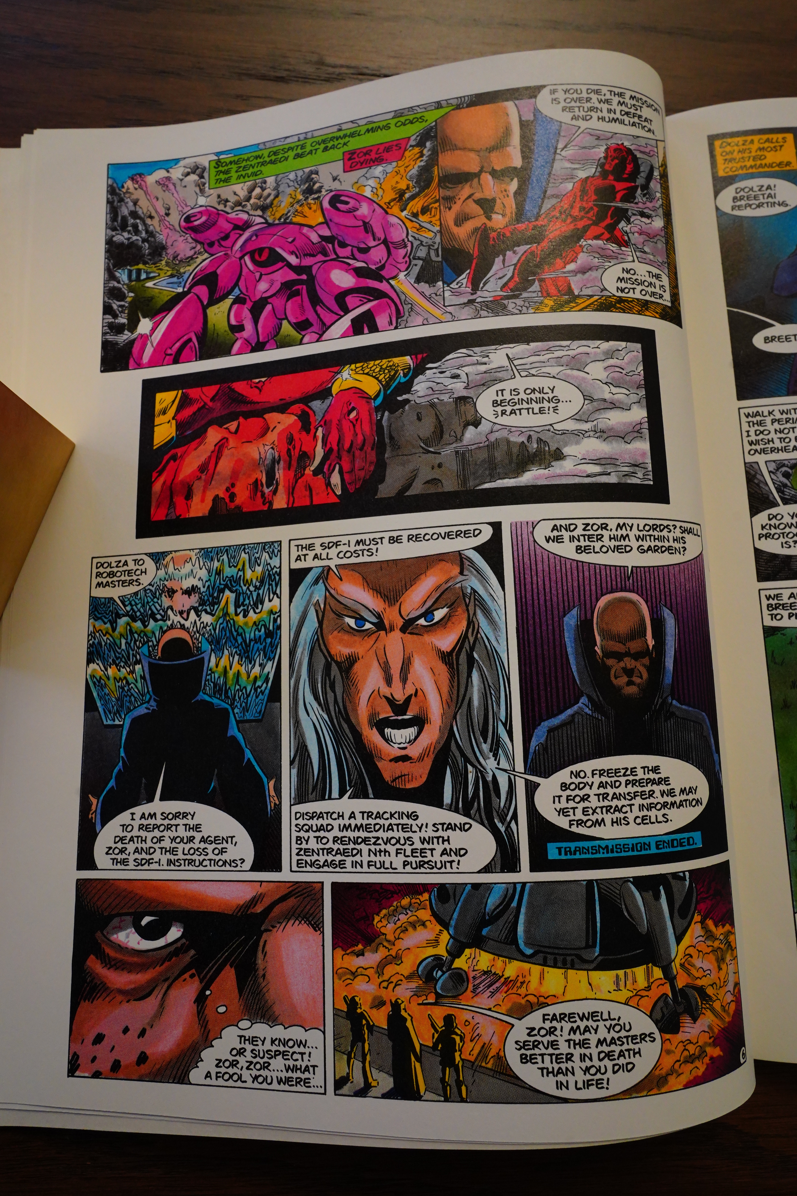
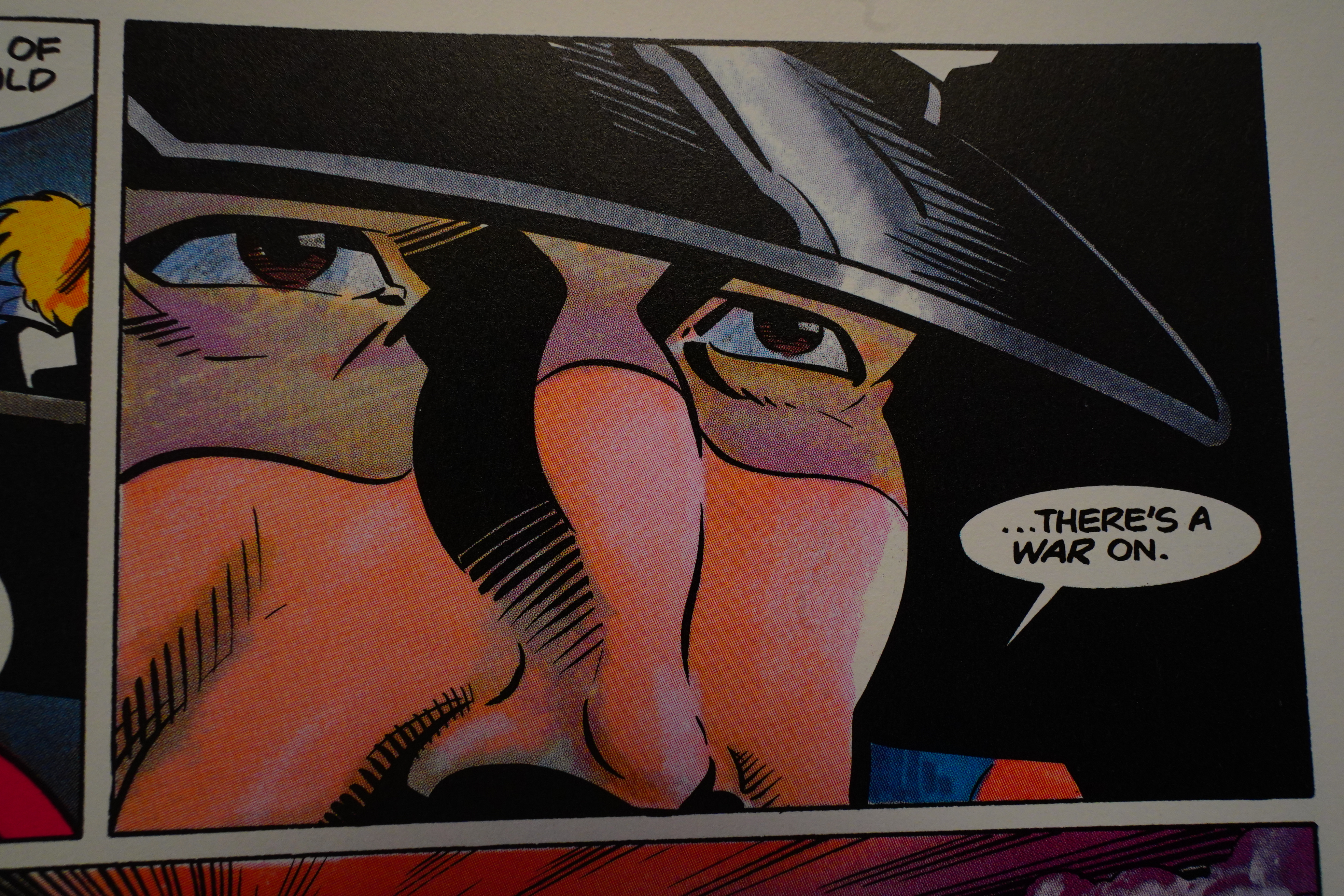
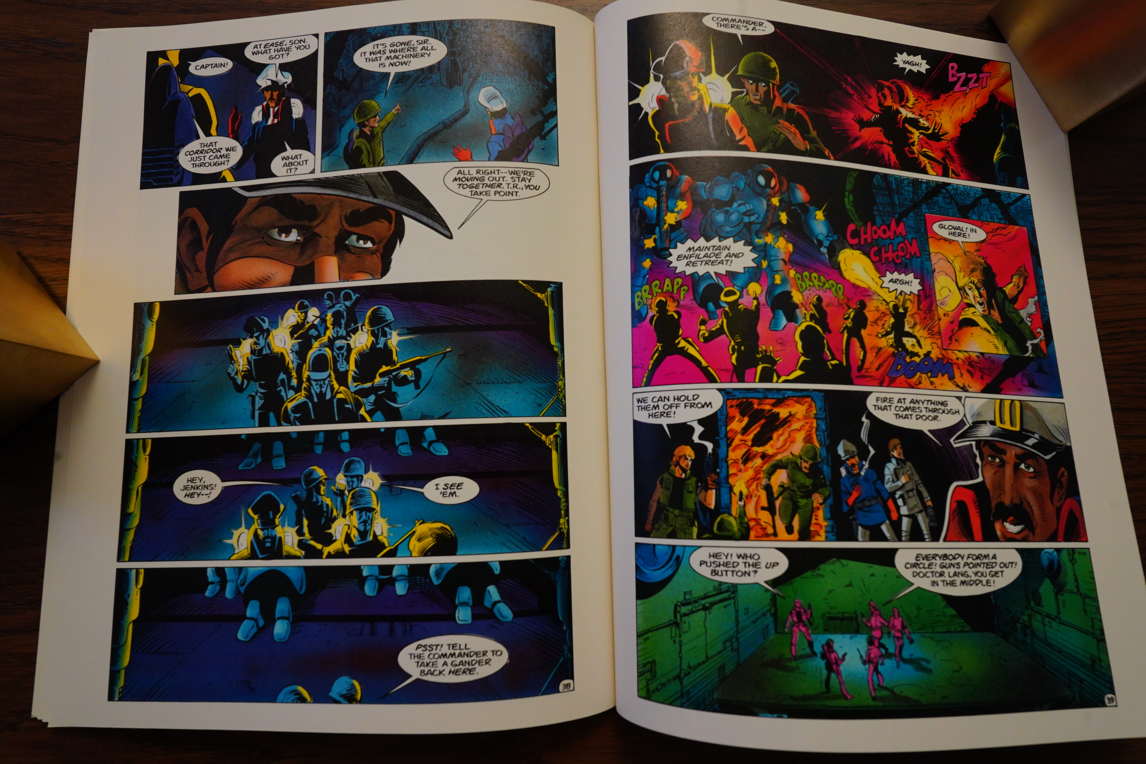
The artwork is a lot better here than what it was in the three Robotech comics, but it doesn’t look like the TV series at all. I suspect the positives are mostly down to Ken Steacy, who is a really talented artist.

His rendering here gives a nod to Rand Holmes at points, perhaps? Really sharp.

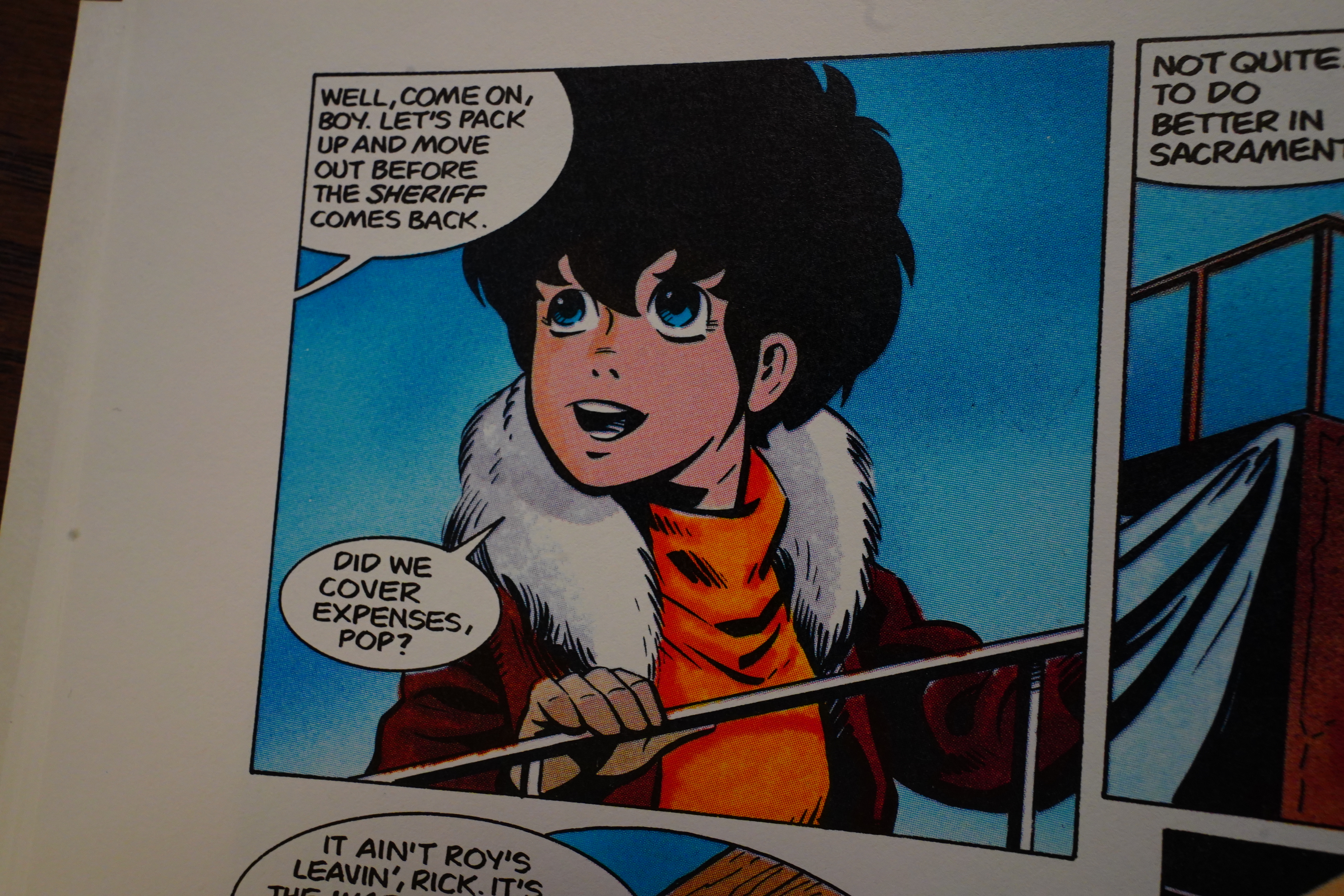
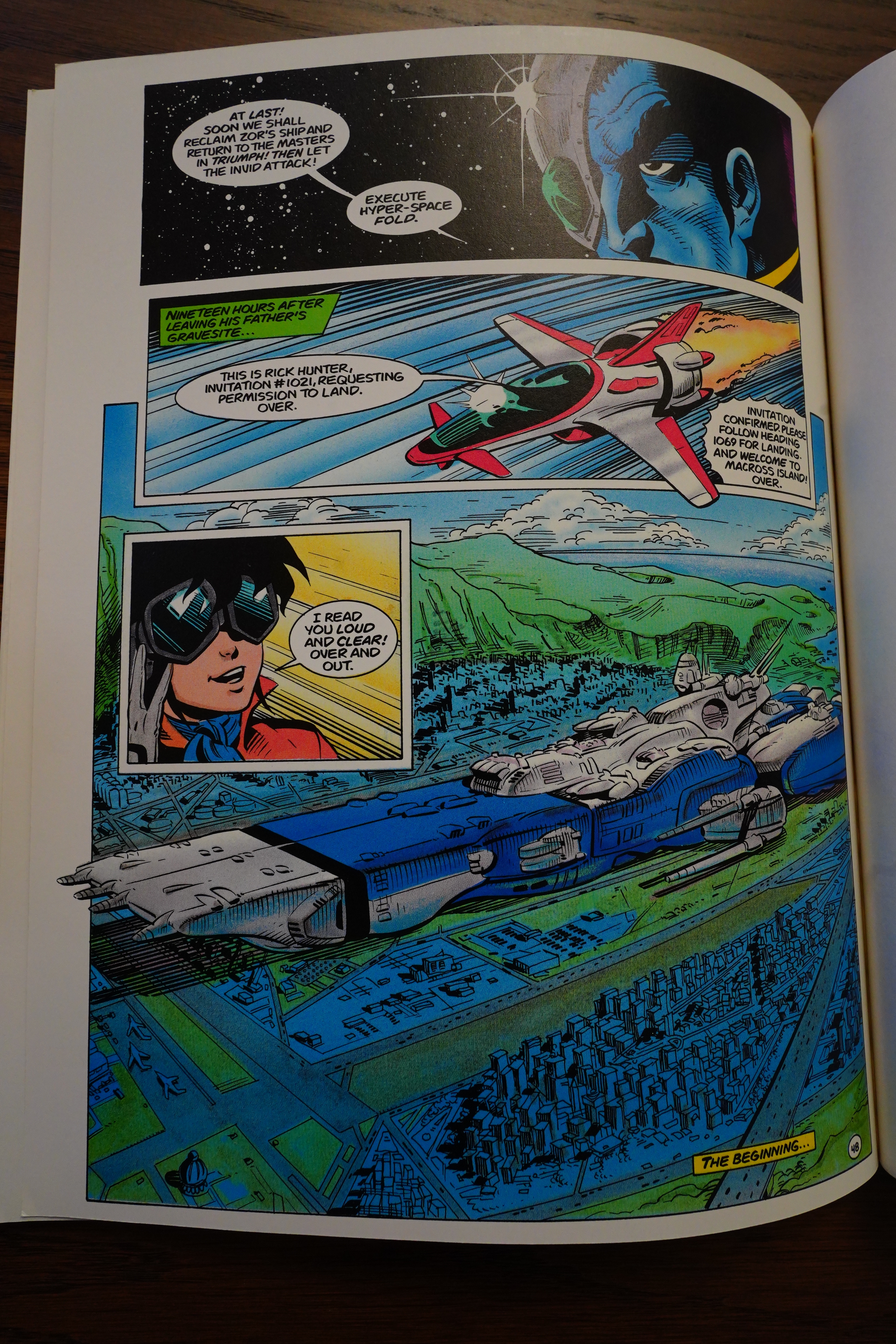
Rick! Where’s Minmei? That’s a pretty spiffy version, really.

Heh — Baron drops some EC Comics references…

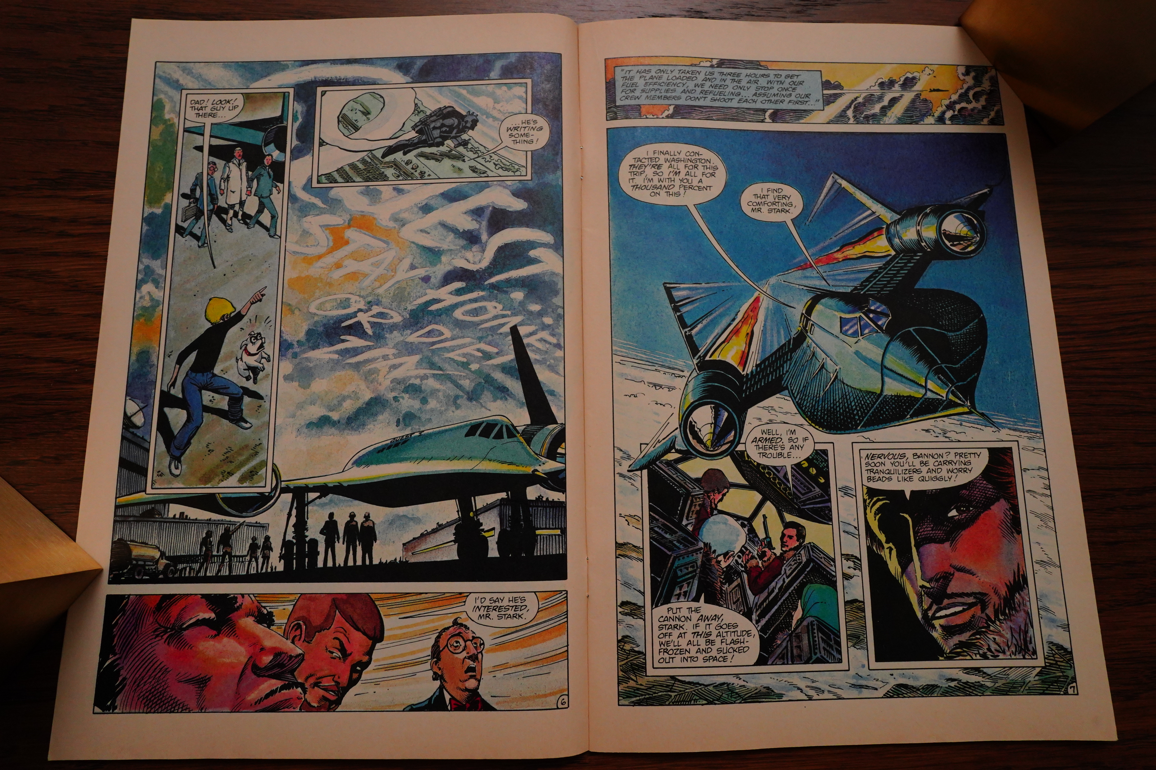
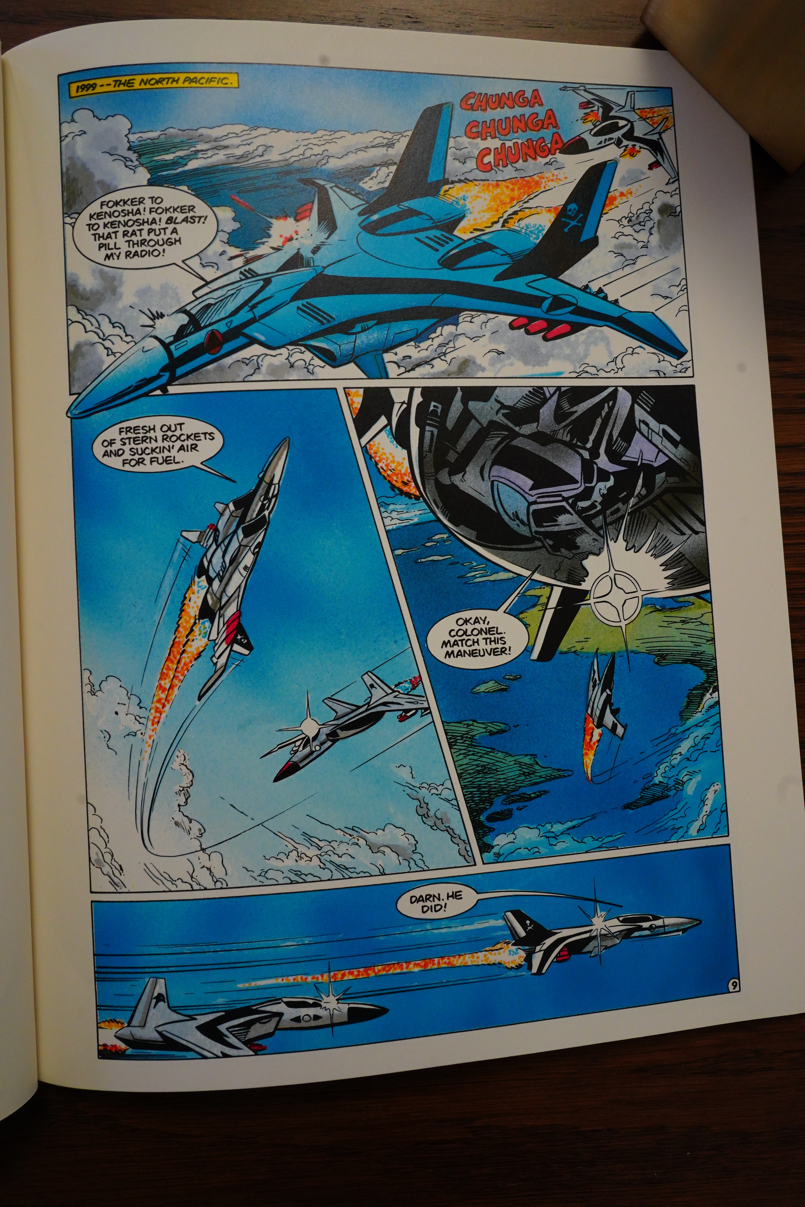
Oh, the plot — it doesn’t really make much sense. As we previously knew, the SDF-1 ship landed on Earth, and half the graphic novel is about humans exploring the ship. But the ship is like nothing we’re familiar with — it seems more like they’re exploring an Aliens ship or something, with slithering tentacles and self-organising mechanical creatures.

And it end, of course, where Macross starts.

The artwork on this is surprisingly good, even if it’s mostly off model. The story isn’t very good, but Baron adds some jokes, so I guess it’s not all bad.

Protoculture Addicts #1, page #28:

Robotech: The Graphic Novel,
released in December 1986 by Comico,
is the answer to all the questions you
had about Robotech but were afraid to
ask… It is the UNTOLD STORY; the
WHAT, WHEN and WHY of Carl
Macek’s Robotech Saga.
The story begins on a planet of
the fourth quadrant of the known
universe. There, we meet Zor and the
original SDF-1. Then we learn why the
SDF-1 was sent to Earth and how Zor
dies. We also have a glance at Roy
Fokker as a fighter pilot in the Global
War. We also have a chance to actually
see what Rick Hunter looked like at the
age of 10… Many new characters are
introduced (some of them are back in
the Sentinels) and you will also learn
what the SDF-1 was like before the
“micronians” adapted it.
I appreciated a lot the artwork of
Neil D. Vokes which is a little different
from the japanese style but still very
good. The script is from Mike Baron
(based on the plot by Carl Macek) and,
as I said before, it answers almost all
the questions we had on Robotech.
There is a little problem, though: after
reading it, some new interrogations rise
up. But most of those new questions
are answered in The Sentinels.
I think that all true Robotech
fans should have one because it is not
only a comic book, it can also be used
as a reference manual. The retail price
is $5.95 ($7.95 CAN), and believe me,
it is worth the price. If you are a true
Robotech lover, Robotech the graphic
novel is a must!

Four Color Magazine #1, page #12:

Schreck also said that Robotech: The
Graphic Novel that was released in
September has sold out. Comico is
rushing the graphic novel back to
press to reach retailers in time for the
Christmas rush. Written by Mike
Baron from a Carl Macek plot, pencill-
ed by Neil Vokes and inked by Ken
Steacy, the 48 page full color novel
tells the story of the Robotech saga.

So it sold well… It’s been reprinted twice — once by DC in 2003, and then by Titan in 2018.

The Slings and Arrows Comic Guide #2, page #546:

The graphic novel is subtitled ‘Genesis: Robotech’, and
relates the events leading up to and immediately following
the crash of the Super Defence Fortress 1. Carl Macek, Mike
Baron, Neil Vokes and Ken Steacy create a readable tale that
can be enjoyed without a degree in Robotech History.

R. A. Jones in Amazing Heroes #105, page #73:

An island full of people is launched
into space aboard a giant folding
robot spaceship, chased across space
by inscrutable aliens, defending
themselves and escaping by using an
unfamiliar alien technology, some-
times badly. Of Comico’s three
Robotech titles, I’ve always con-
sidered Macross Saga to be the best
in several ways. The characters of
Masters and especially New Genera-
tion leave me cold, and the plots of
the latter two are less well-defined.
Perhaps it’s just that Macross has
presented such an intriguing concept
of humans adapting and building a
seemingly-normal city inside a
spaceship, much to the consternation
and confusion of the highly-
disciplined miltaristic aliens. The
other two series confine their bat-
tles to defending Earth.
I have never seen the Robotech
animateds on which all this is based,
although I hope to make their ac-
quaintance some day. Yet I checked
out the comics because of the good
things I’d heard about the shows. I
was attracted by the clean, car-
toonish artwork and the unusually
complex cast. Then, well, I’ve
always been too easy to sucker on
a soap opera, and that’s what
Robotech is, with the wide, unusual
crew of characters and their evolving
relationships. While retaining a
sense of humor and lightness (some-
times misplaced, it seems to me, but
I’ve never been in a war with aliens),
the characters act and react with
unexpected individuality and depth.
This is light entertainment, but not
cheap. The transforming robots
technology interests me least about
the series. No, that’s not true. The
songs interest me least about the
series. (Of all the aspects of the
animateds to be translated to comics,
singing seems to have fared the
worst.)
I also admit, as a comics fan, I
was attracted to the Robotech comics
just to see what this new company
Comico felt was so important.
Comico has all three comics on an
every-six-weeks publication sched-
ule, staggered so a new issue is out
every two weeks. Quite a publishing
commitment, I thought, no matter
how successful the cartoon series is.
The three comic titles are sequen-
tial rather than contemporary. That
is, Robotech is the earliest story,
with Masters and New Generation
beginning after the Robotech story
is finished. So one other aspect of
Macross which I appreciated was the
freshness of the story. In Macross
#1, the giant floating space fortress
SDF-1 crashes to Earth, interrupting
World War II and leading eventually
to war against the aliens. This is not
a simple story. Obvious care has
been taken to set up the background,
the direction, the look and feel of
the alien Zentraedi, and the Earth
cast. Not all is immediately revealed
in the first issue, either. There are
still questions lingering on the later
series.
As plotter Carl Macek writes in
the introduction, Genesis: Robotech
“clears up many points in the pre-
history of the Robotech mythology.”
Revealed in this book are the reasons
why the space fortress crashed,
background on the aliens, and some
early history of several Macross
characters. The seminal crash-
landing of the SDF-1, seen in.
Macross #1, is shown in expanded
detail. And more is learned about
the aliens, their minds and motiva-
tions, and their mysterious “proto-
culture”-based technology. The
capable script is by Mike Baron,
who has been writing the Robotech
Masters series. Baron’s dialogue is
lean but natural, for aliens or Earth-
men, always carrying the work
forward.
The highlight of this book is the
initial exploration into the SDF-1.
The human soldiers are trapped in
a violent and utterly alien world
within the still-active robot ship,
where walls move, robots evolve,
and time flows differently from out-
side the ship. This close encounter
is well-developed, and not for the
squeamish. Some of the tricks the
SDF-1 pulls in this issue have not
been seen in the Macross series,
indicating just how little of the
technology of their commandeered
ship the humans have grasped, and,
I hope, some of what we can look
forward to in the series.
The lowlight of this book is the
ending. It’s understandable that there
would be no solid ending, as this is
the “prequel” to the entire series.
But the last several pages dissolving
into the panorama of the months and
years that followed, leading up to
Macross #1, made for a kind of scat-
tered and disappointing epilogue.
There is little rounding-out to the
ending of this “novel.”
Neil Vokes was the penciller on
the first Macross issues I read, and
his pencils on this graphic novel are
still attractive. Ken Steacy inked the
interior and painted the cover. The
art is much the same as the Macross
series, although Tom Vincent’s
coloring is superior, giving a needed
complex quality to the simple
cartooning.
This is hardly the work I would
recommend to introduce a non-
comics reader to the world of
comics. And the casual reader may
have little interest in this pre-history.
But for those who are familiar with
the Robotech saga, the graphic novel
is one of the better contributions
from Comico. And, of course, a
must for the completist, as they say.

Dwight R. Decker in Amazing Heroes #118, page #64:

Then there’s Robotech: the
Graphic Novel, which Comico
published as a squarebound 48-page
volume in 1986. Its $5.95 price tag
is even reasonable as these things go.
Scripted by Mike Baron and drawn
by Neil D. Vokes and Ken Steacy in
a more traditional “Western” com-
ics style, the book presents what
amounts to the origin of the
Robotech universe. In the last years
of the 20th century, Earth is in the
throes of a several-cornered global
war, but the arrival of an enormous,
unmanned alien ship brings a quick
end to the conflict by alerting the
various factions to the fact that far
worse enemies are out in space and
presumably on their way. Earth
unites, begins building up its
defenses, and learns to exploit the
technology of the alien artifact.
There isn’t a whole lot of plot in this
book: it serves mainly as an intro-
duction to the series and some of the
characters, and it isn’t even close to
being a complete story in itself. For
readers curious about Robotech but
daunted by the sheer mass of mate-
rial available, this might be the best
place to start.

Right:

Robotech was a minor comics phenomenon of the 1980s based on some rather deft marketing of assorted Japanese fantasy exports. Whilst American TV company Harmony Gold was cobbling together and re-editing three separate weekly science fiction anime series (Super Dimension Fortress Macross, Super Dimension Cavalry Southern Cross and Genesis Climber MOSPEADA) US model-kit company Revell was selling Japanese mecha kits based on the aforementioned Fortress Macross, Super Dimension Century Orgus and Fang of the Sun Dougram as Robotech Defenders, complete with an all-new English language tie-in comic produced by DC Comics.

A copyright clash resulted in the DC title being killed after two issues after which TV produced Carl Macek and Revell went into limited partnership in a Macross co-licensing deal which saw three shows translated into an 85-episode generational saga wherein Earth was rocked by successive alien invasions decades apart and only saved from annihilation by a fortuitous spaceship crash which had allowed humans to master extraterrestrial Robotechnology.

[…]

Fun and adventure in the grand old space opera manner and superbly easy on the eye, it’s about time these 1980s epics were revisited by a more comics friendly readership.

OK, next up in this blog series is Johnny Quest, which is 31 issues long, so we may have another unscheduled pause here, but I guess we’ll see?

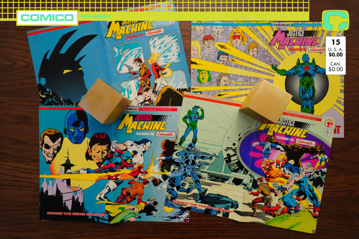
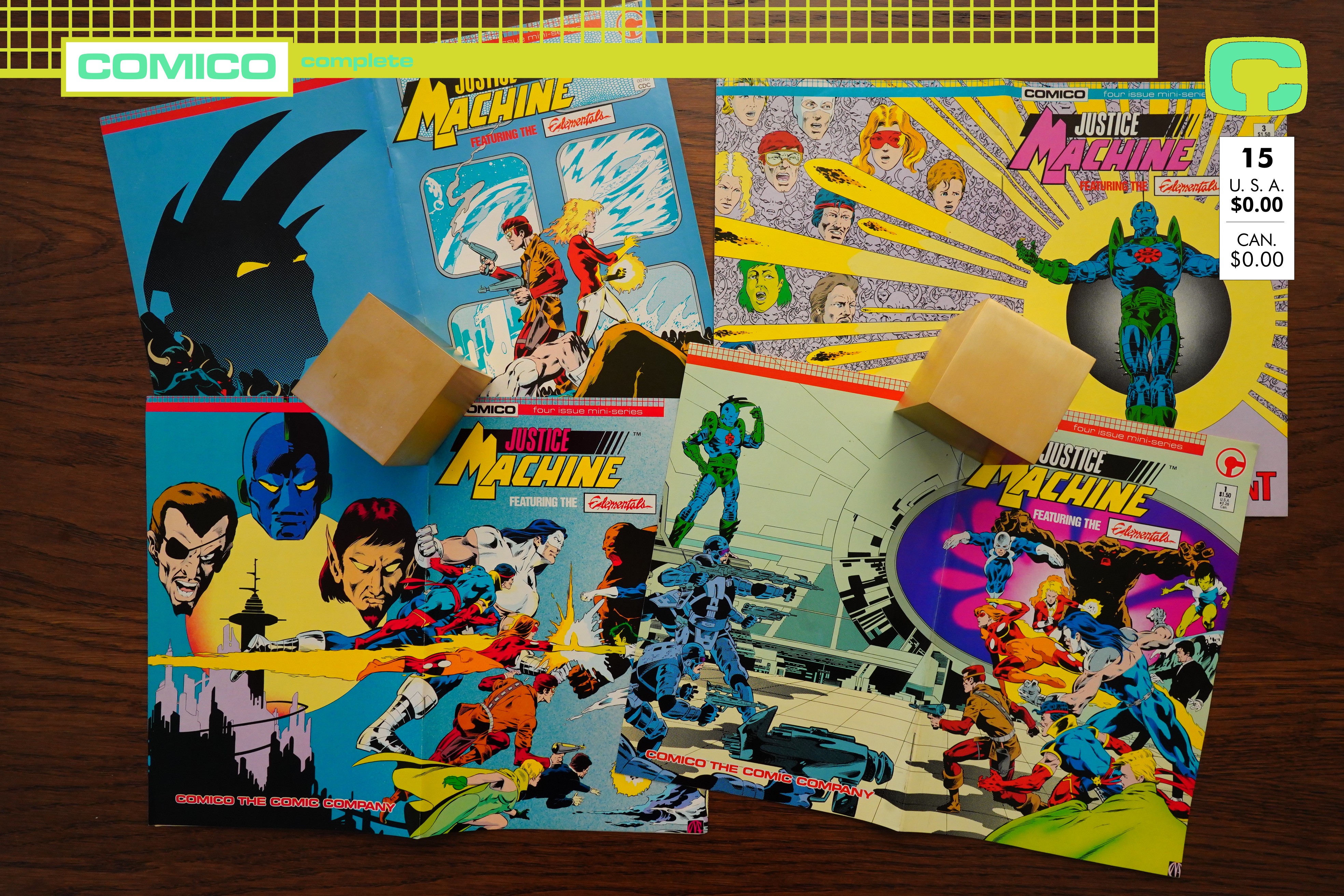
1986: Justice Machine Featuring the Elementals

Justice Machine Featuring the Elementals (1986) #1-4 by Mike Gustovich, Bill Willingham et al

Justice Machine had previously had a very short run at a different publisher, but (as would become a theme with Comico), it then moved to Comico and stayed there for quite a while.

Bill Willingham is credited as the writer, but it’s not clear whether that means that he wrote the plot or not — based on some other Comico comics, it could mean that he wrote the words after Gustovich plotted and drew the issues…

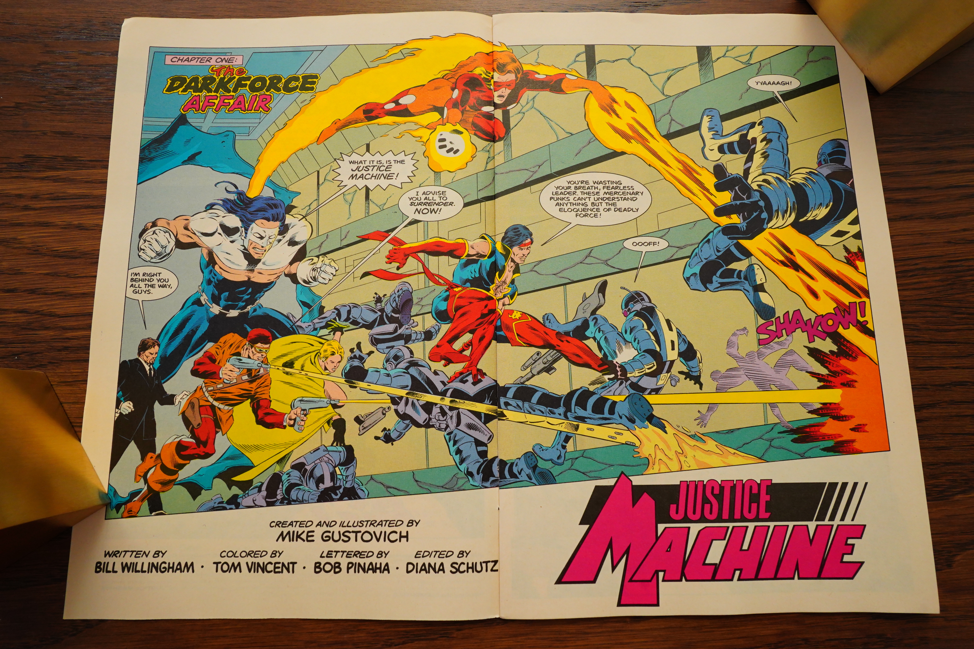
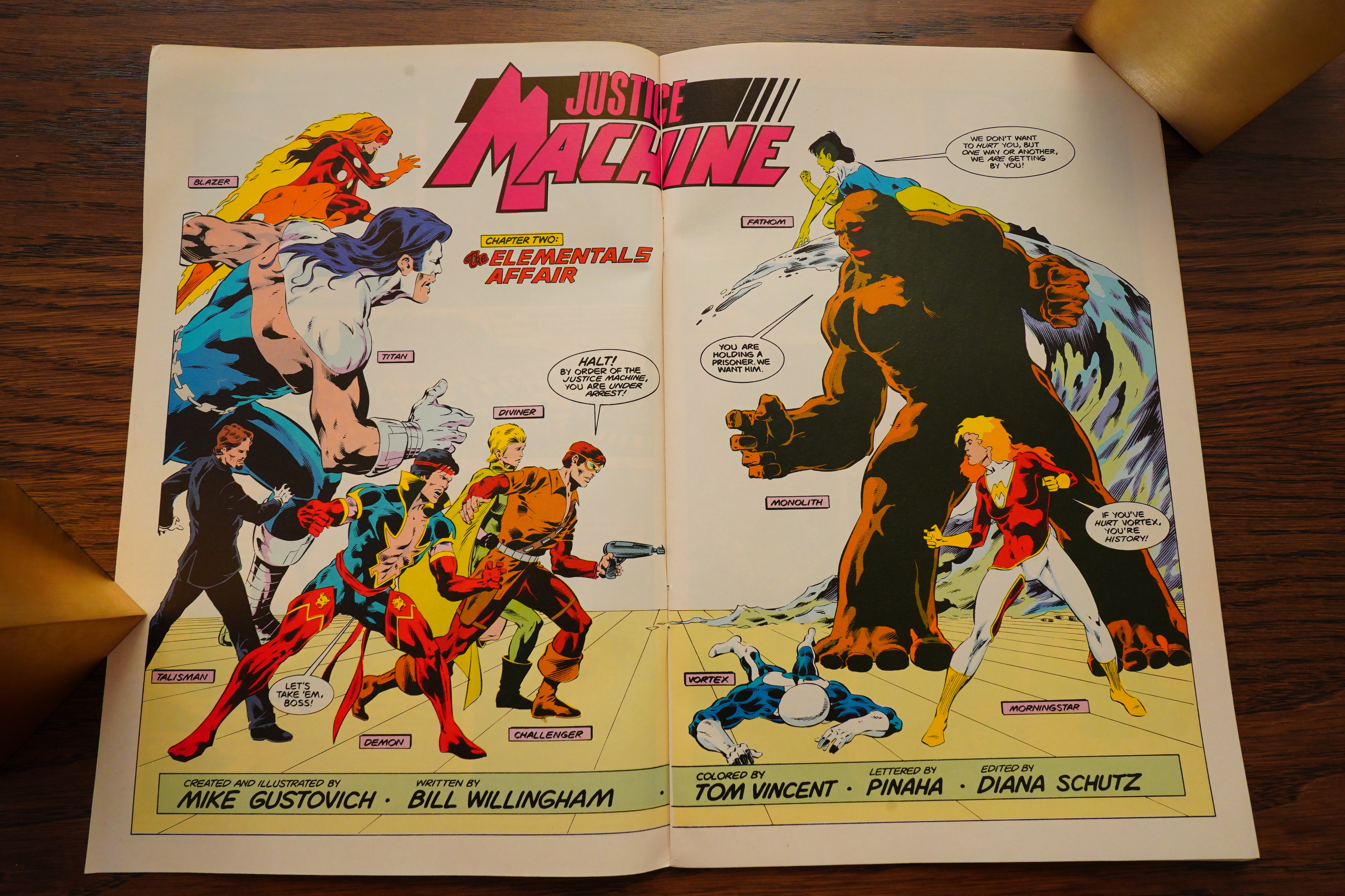
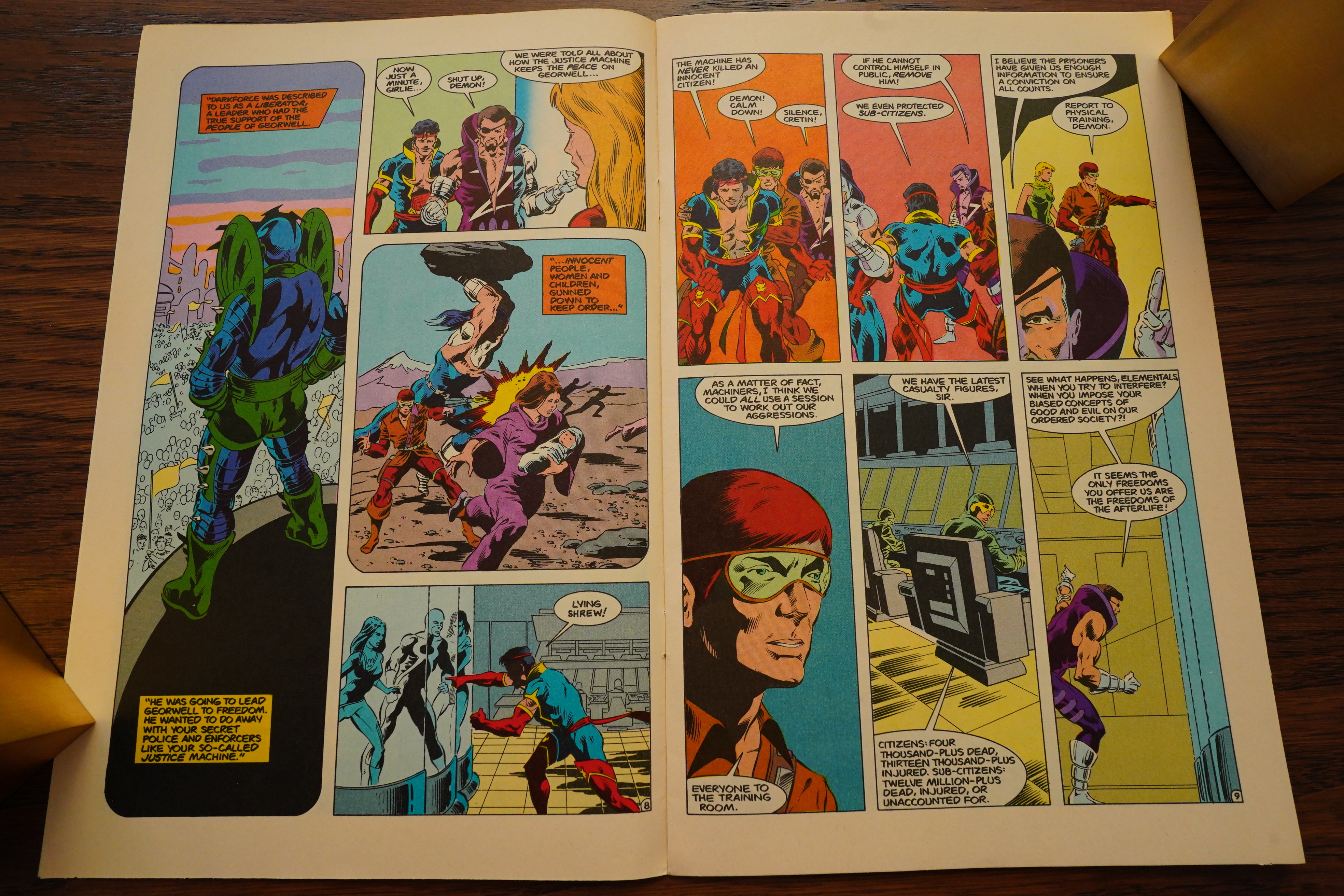
Anway, this mini-series starts off in a (literally) punchy way…

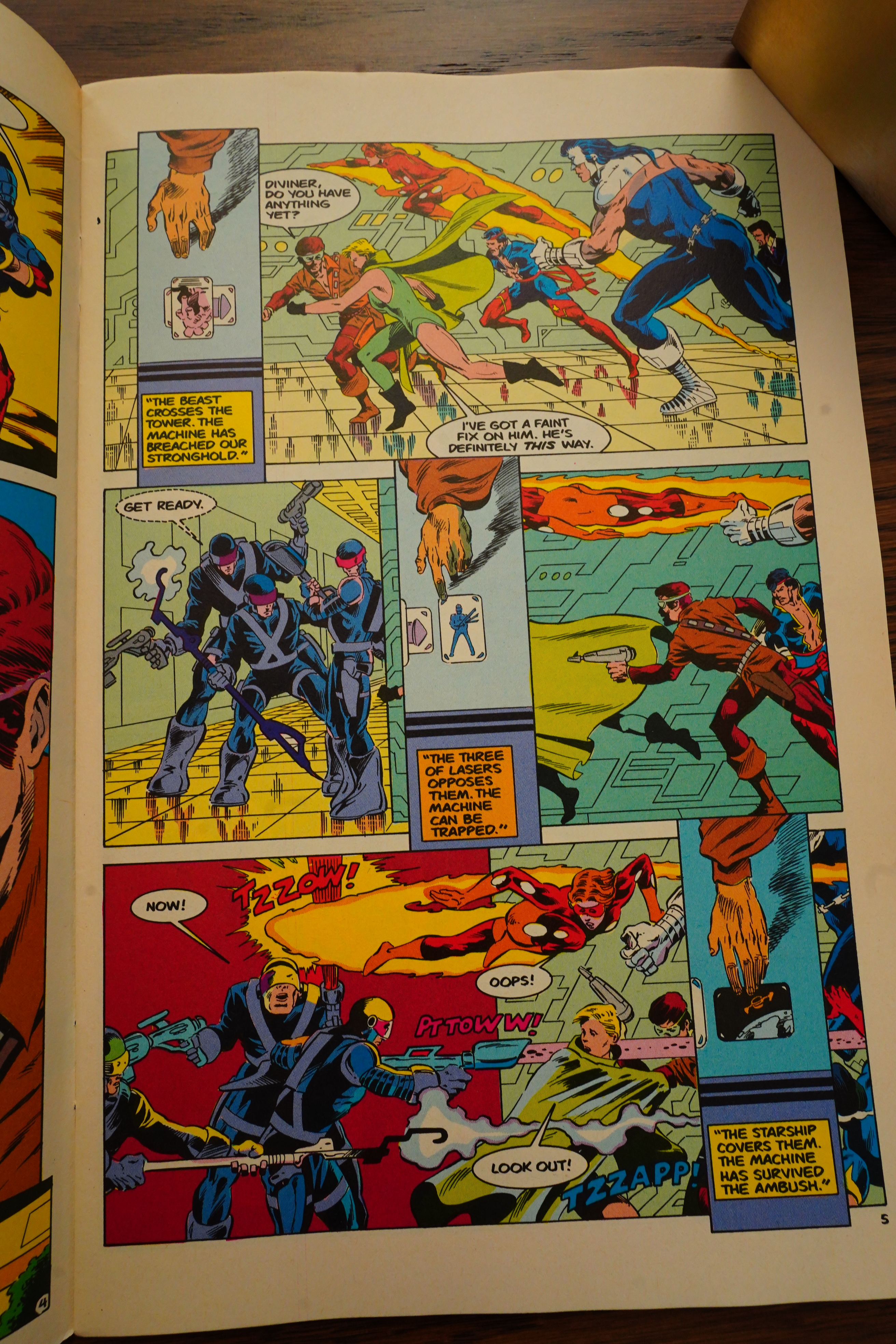
… but then we get Foreshadowing. Unfortunately, there’s not a lot of this stuff, so these pages rather stick out, making them more “eh?” than “ah”.

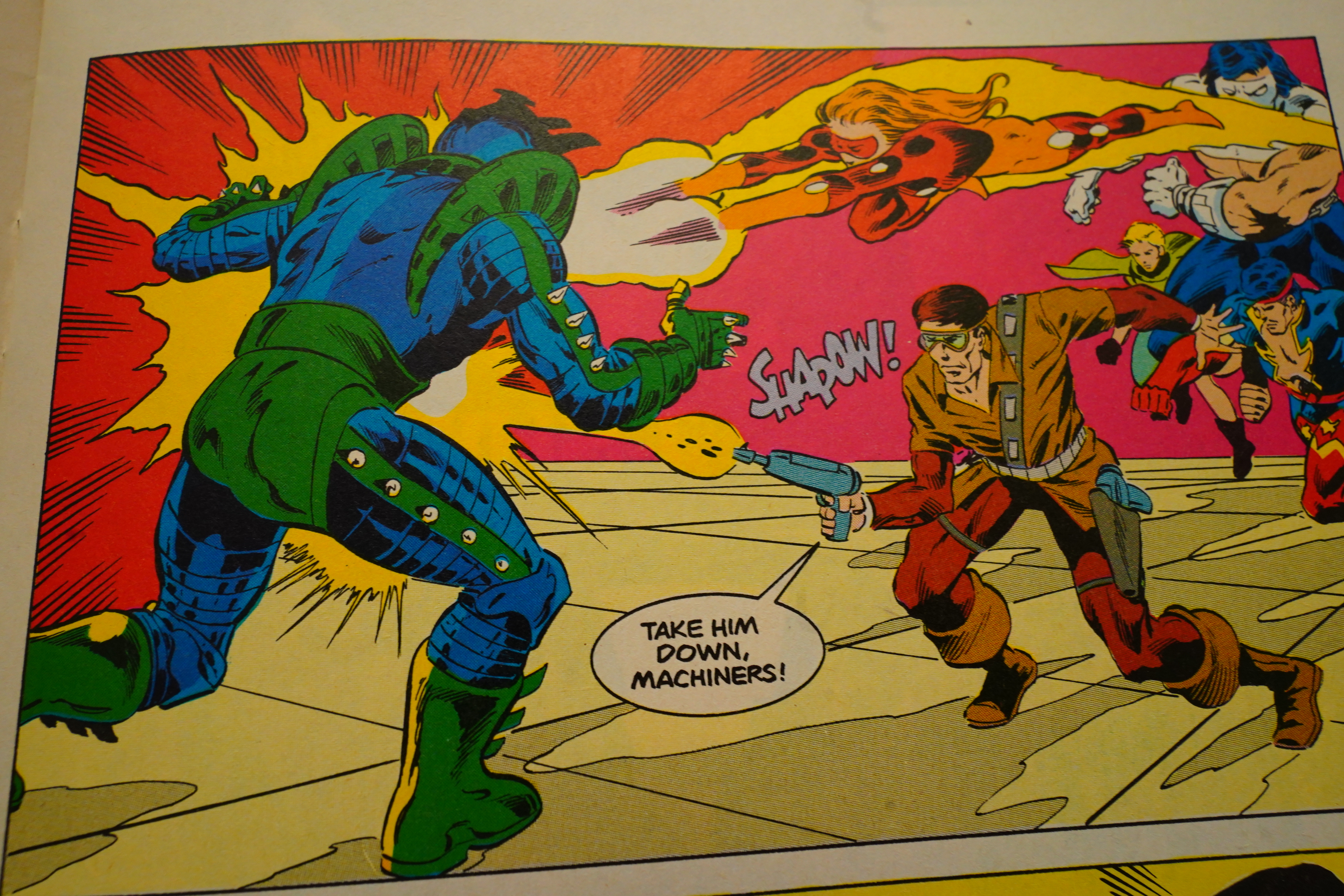
“Machiners”? I guess they were thinking “Avengers”, from a plural of the noun form of “avenge”, but… er… that’s not how… OK, is this book one of those funny comical books?

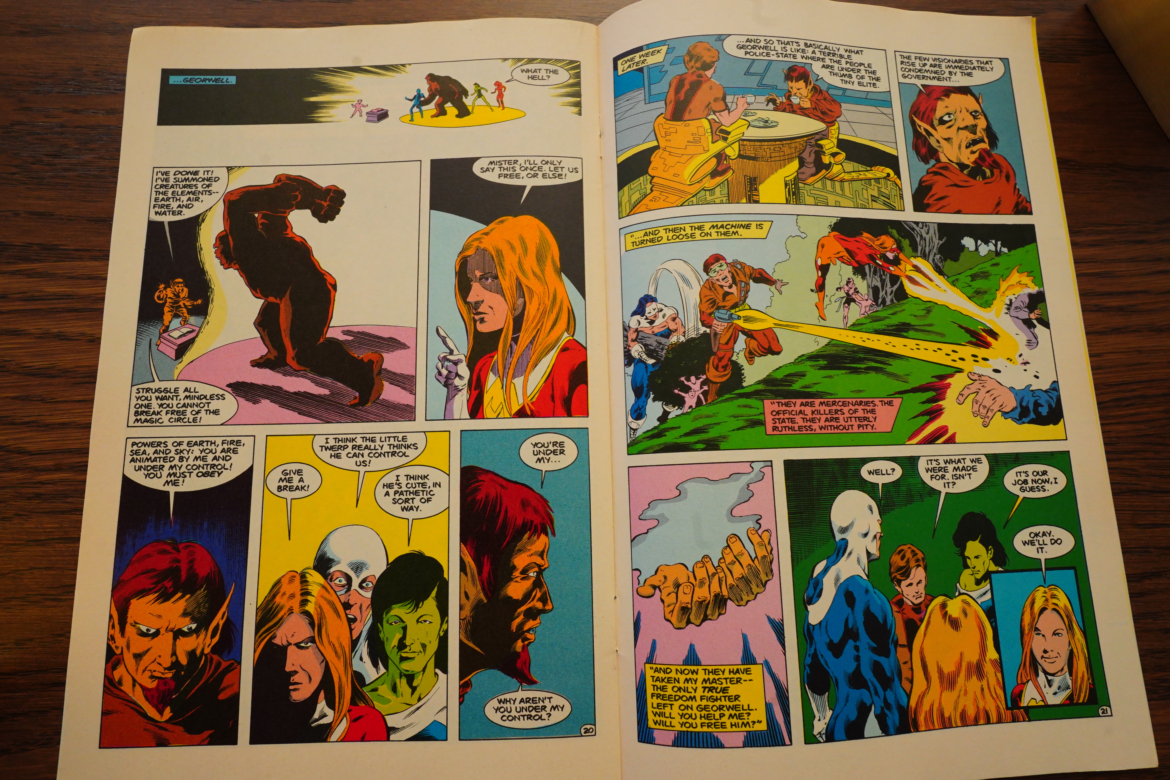
Well, it’s not very serious, anyway — but we get an Elementals crossover, because the Machiners’ enemies need somebody to fight for them, and then… lies to them about this world? Or is it a lie? Complexity!

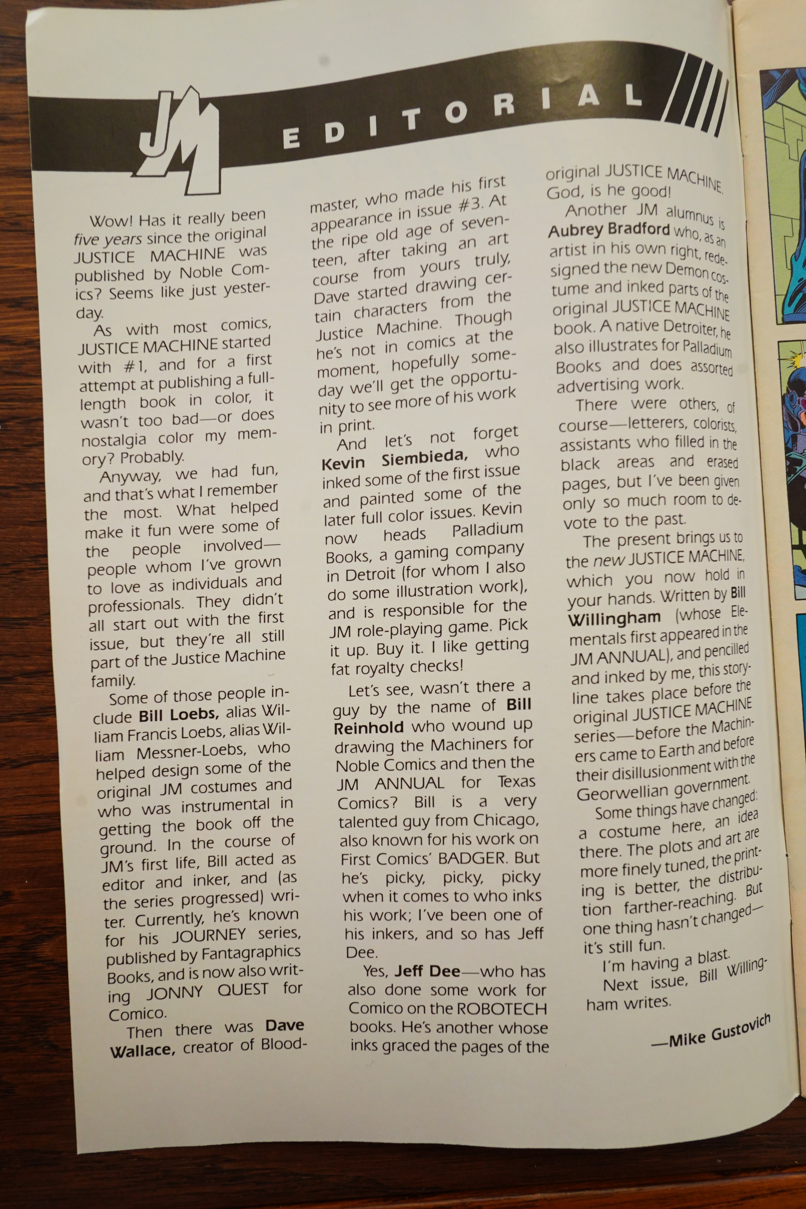
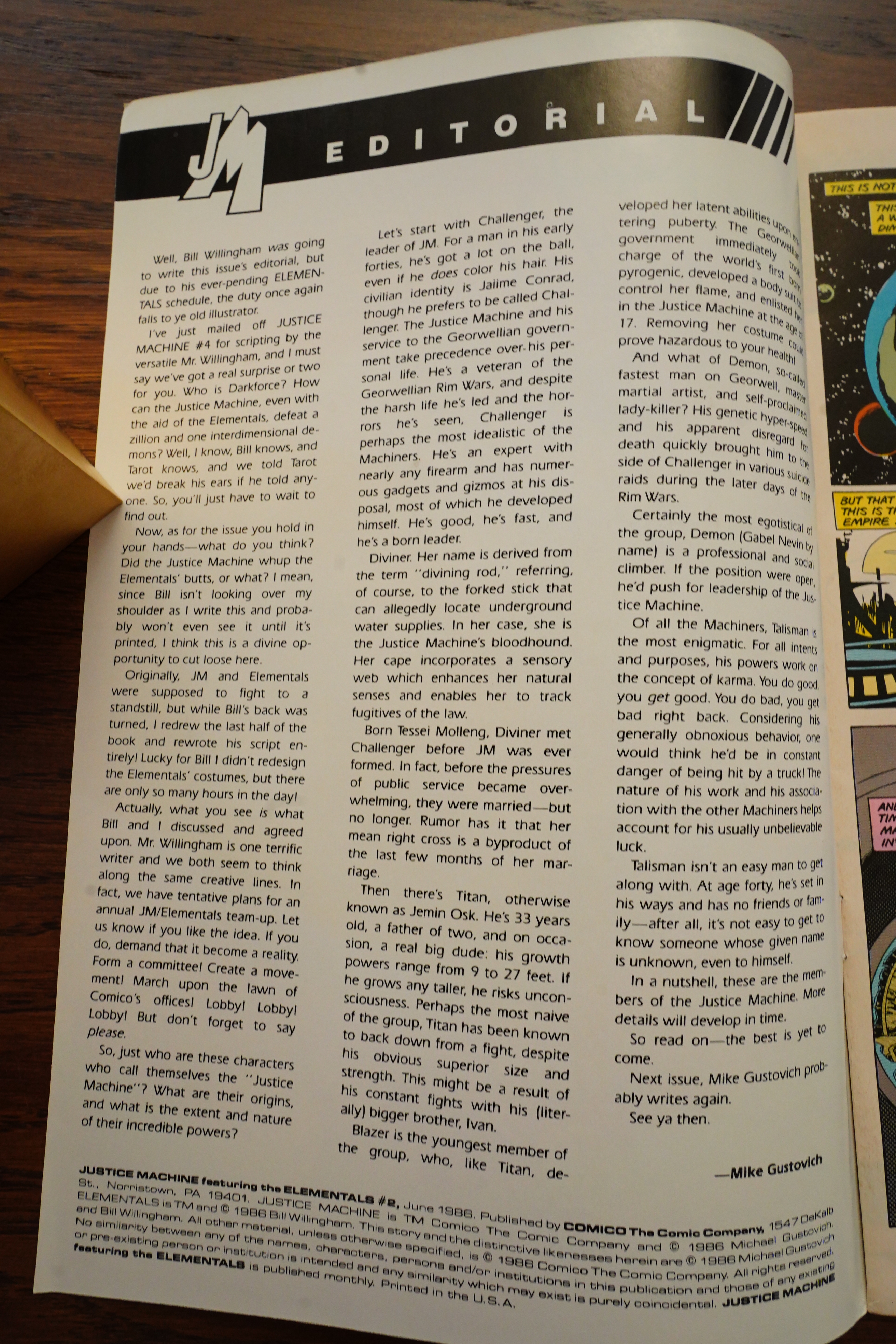
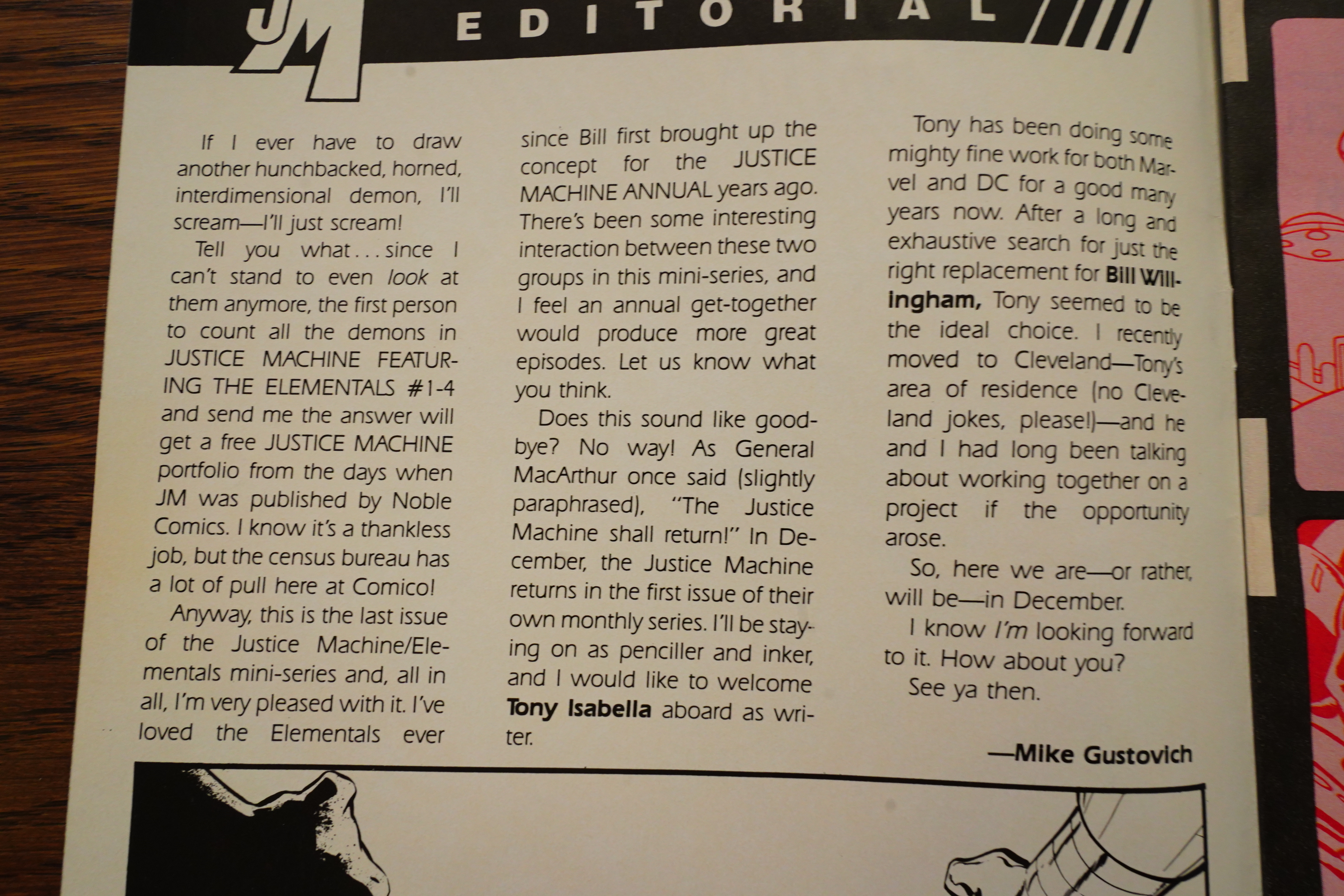
The second issue’s editorial has the background on the super-hero characters, and it makes me wonder: Did Gustovich come up with these characters while he was in high school? Hm… Oh, he was born in 1953, so he was 33 when he did this? I guess not!?

It’s a classic team up/battle book, though, and Gustovich’s artwork looks very appropriate. I like the sheen his inking has. Very dramatic.

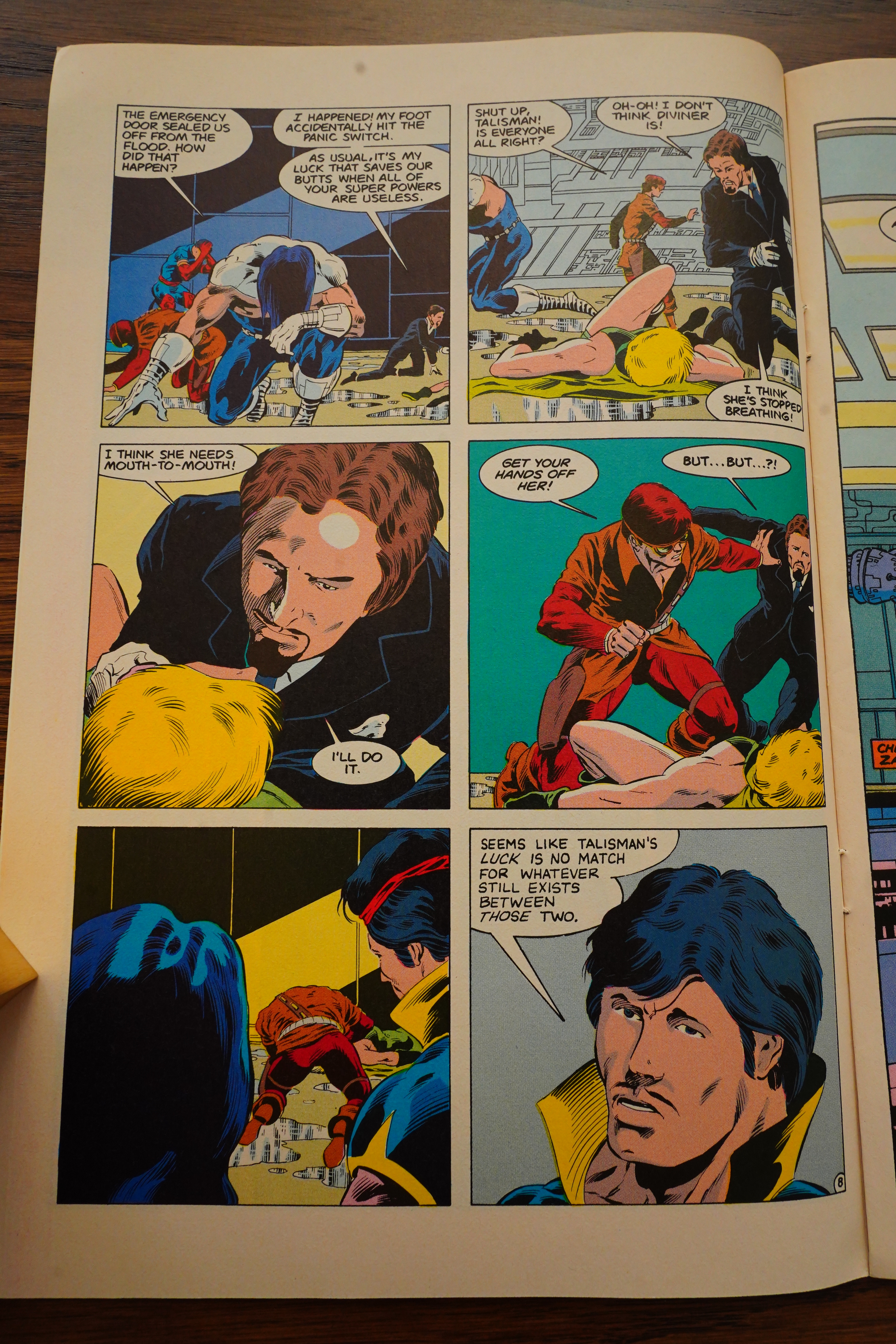
I’m leaning towards Bill Willingham being a co-plotter on this, because this scene is just the kind of icky thing he’d think about putting in. (Speaking only as one who has the experience of reading his Elementals comics, of course.)

Heh, the planet here is called “Georwell”. Georwell… George Orwell… GET IT!??! So clever, because the society here (there can only be one society per planet, as per the SciFi Accords Of 1973) is very authoritarian and controlled and stuff, apparently.

Gustovich announces that there’ll be a monthly, regular Justice Machine series, but Willingham is out.

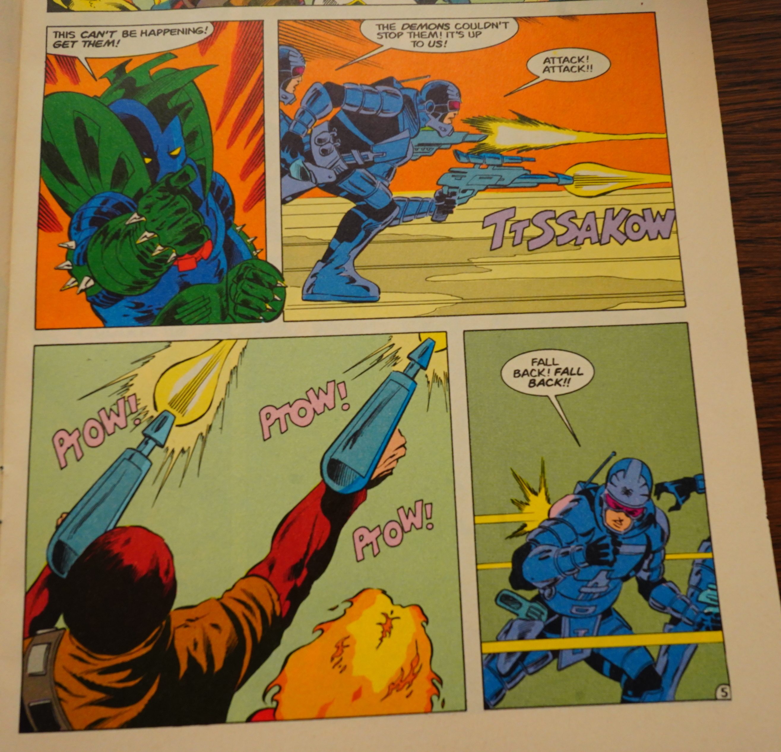
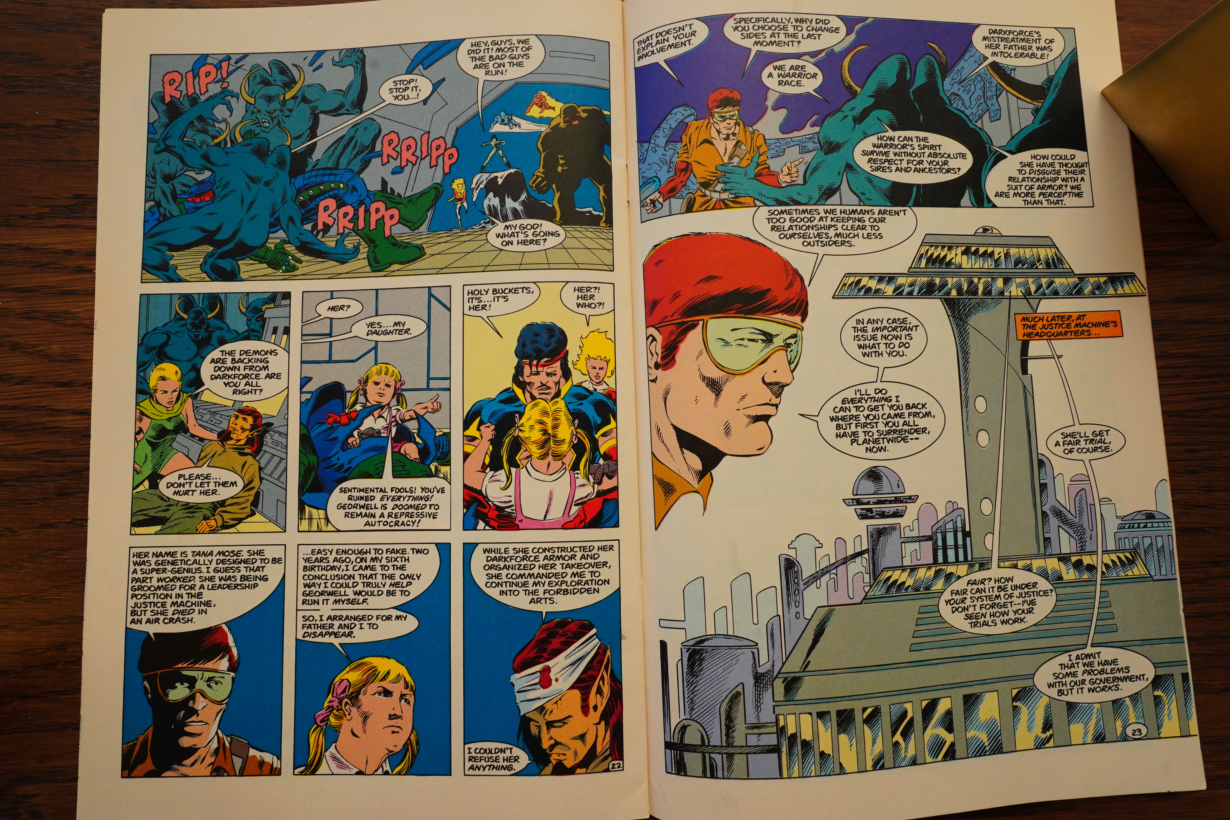
I think this is an iteration of the popular “attack/run away” gag, but it’s not very well done, is it?

I like Gustovich’s line and his storytelling, but his faces sometimes leave something to be desired — especially when he does women and children. Perhaps because he has fewer lines to add to the faces, so they end up looking like features floating in a sea of nothing?

Now that’s a twist ending — it turns out that the big bad guy was really the quite young daughter of the elf!? What?! Does that make sense? Is this supposed to be a very funny punchline? It just reads very confused to me.

I quite enjoyed reading this series — it’s short and snappy. It was muddled in parts, but eh, whatever.

Back Issue #94, page #24:

The Justice Machine arrived at Comico in 1986. By
then, their protégés, the Elementals, were on their eighth
issue at Comico. [Editor’s note: See BACK ISSUE #24 for
our look at Comico’s Elementals series.] Fans remembering
where that group had received their start were responsible
for convincing Comico to restart the Machine, as they
constantly asked Comico co-publisher Phil Lasorda when
the company was going to begin publishing the title
where the Elementals debuted. The latter team’s success
probably had a lot to do with The Justice Machine returning
to print in a four-issue miniseries that was subtitled
“featuring The Elementals.” The four-issue series also
featured the writer of Elementals, Bill Willingham. He was
the first to suggest having the group guest-star in the
series, wanting to pay back Gustovich for the favor he
had done of giving Willingham his first break.
Comico’s Justice Machine featuring the Elementals #1’s
(May 1986) editorial states that its tale takes place
before the Noble issues, so at this point the Machine are
still installed in the position of government enforcers.
This would allow those who had read the Noble series
to enjoy it as well as the hoped-for newcomers.
The story, both penciled and inked by Mike Gustovich,
details the Machine’s battle with an armored villain named
the Dark Force. Like Maxinor before (or chronologically
after, as the case may be), this adversary is intent on freeing
Georwell from its totalitarian government. The Elementals
are initially recruited by the Dark Force to aid him but
switch sides when they discover his methodology.

Amazing Heroes #113, page #27:

In July of 1985 Justice Machine was
a book looking for a publisher. At
the same time Comico was a pub-
lisher looking for a book. While
some of its earlier efforts were less
than successful, Comico was pre-
sently on a roll. Mage by Matt
Wagner was a popular title. Com-
ico was also publishing Bill Will-
ingham’s Elementals with great suc-
cess. In addition, the Robotech
trilogy, a series for which Comico
had high hopes, was about to debut.
Comico wanted to take advantage of
its successes and add another fan
favorite to its roster.
That the two should get together
was inevitable. In the first place,
Phil Lasorda, the publisher of Com-
ico, knew Mike from the old Texas
Comics days. He remembered the
Justice Machine and believed they
were well conceived, strong charac-
ters who could still carry their own
title. He thought it would be a fun
project with which to be involved,
and that was exactly the type of pro-
ject that Comico wanted.
In the second place, the fans all
seemed to believe that Comico was
going to publish Justice Machine.
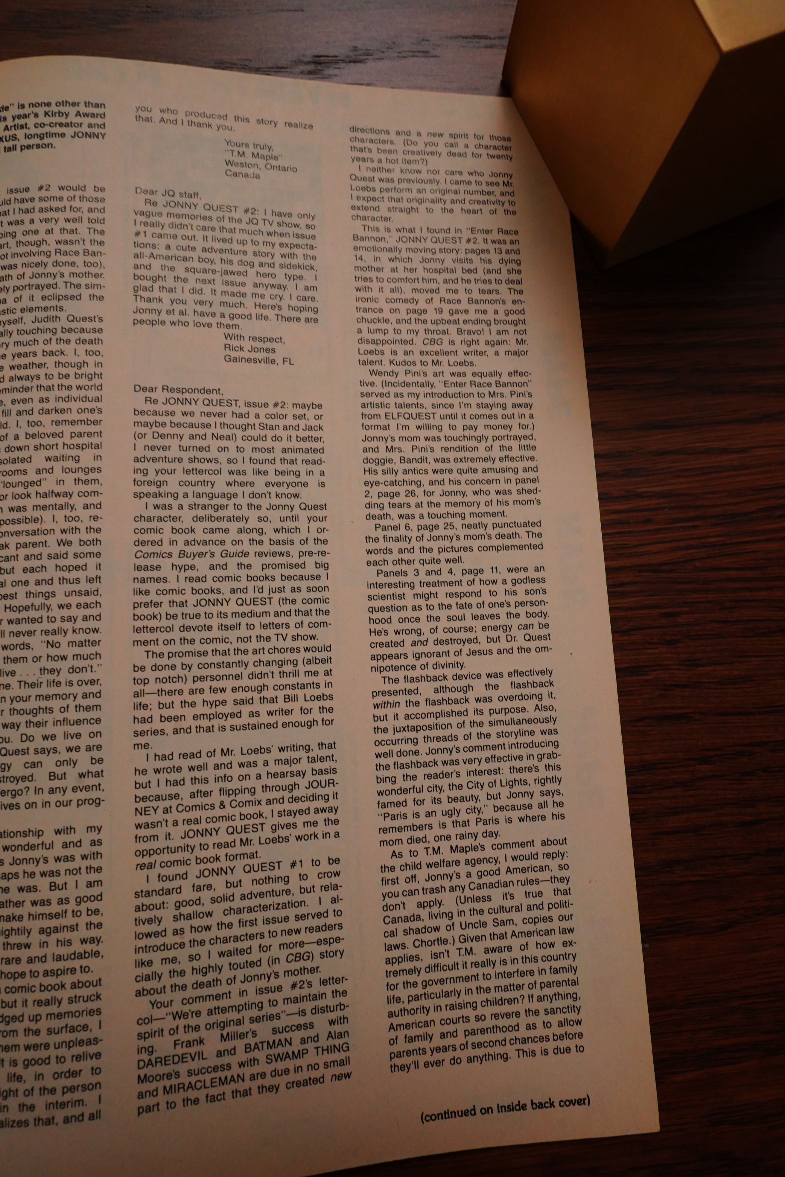
“They’d come up to us at conven-
tions,” said Lasorda, “and ask, ‘You
got The Elementals [which debuted]
in the old Justice Machine comic];
when are you going to publish Jus-
tice Machine?”
Justice Machine was a book with
both a large fan following and a
strong, well executed story line. It
was exactly the type of book Com-
ico wanted. Thus, during a Comico
panel at the 1985 ChicagoCon,
when Comico was asked, when are
you going to publish Justice
Machine, they answered that they
were looking for Mike Gustovich to
discuss that very subject.
The fans applauded. One fan,
however, did better than applaud.
Dave Gifford, a former student of
Mike’s continuing education art
class, was in the audience. He knew
that Mike was at the convention. He
told Mike to talk to the people from
Comico, because they were inter-
ested in doing Justice Machine.
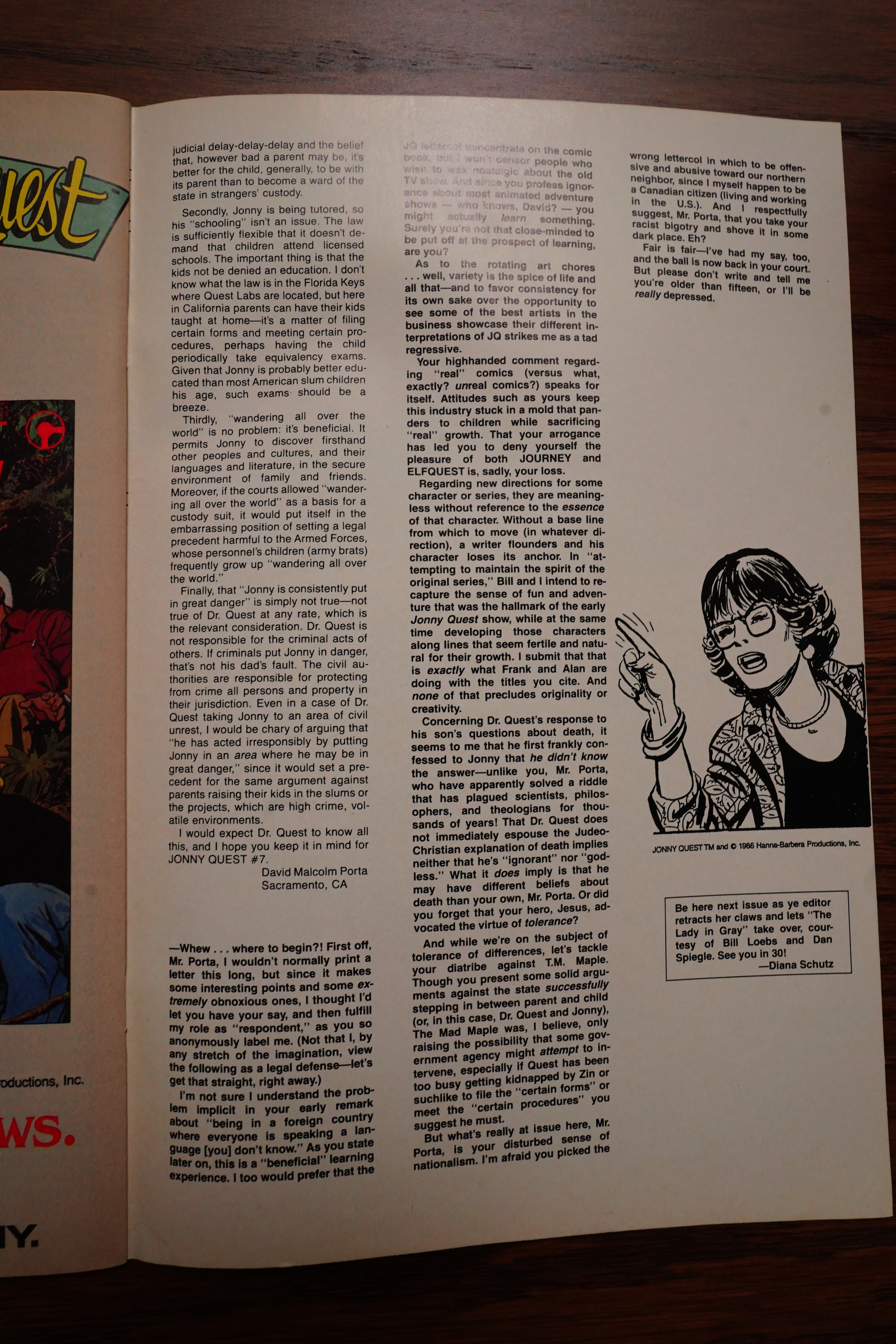
Mike did, and they reached an
agreement to do a Justice Machine
mini-series.
Bill Willingham suggested that the
mini-series guest star the Elemen-
tals. Mike and Noble Comics had-
given Bill a break when they origin-
ally published The Elementals. Now
that Elementals was a hit, Bill
wanted to return the favor. In order
to get the Justice Machine off to a
strong start, Comico would do a
four-issue series featuring the
Elementals written by Bill and illus-
trated by Mike.
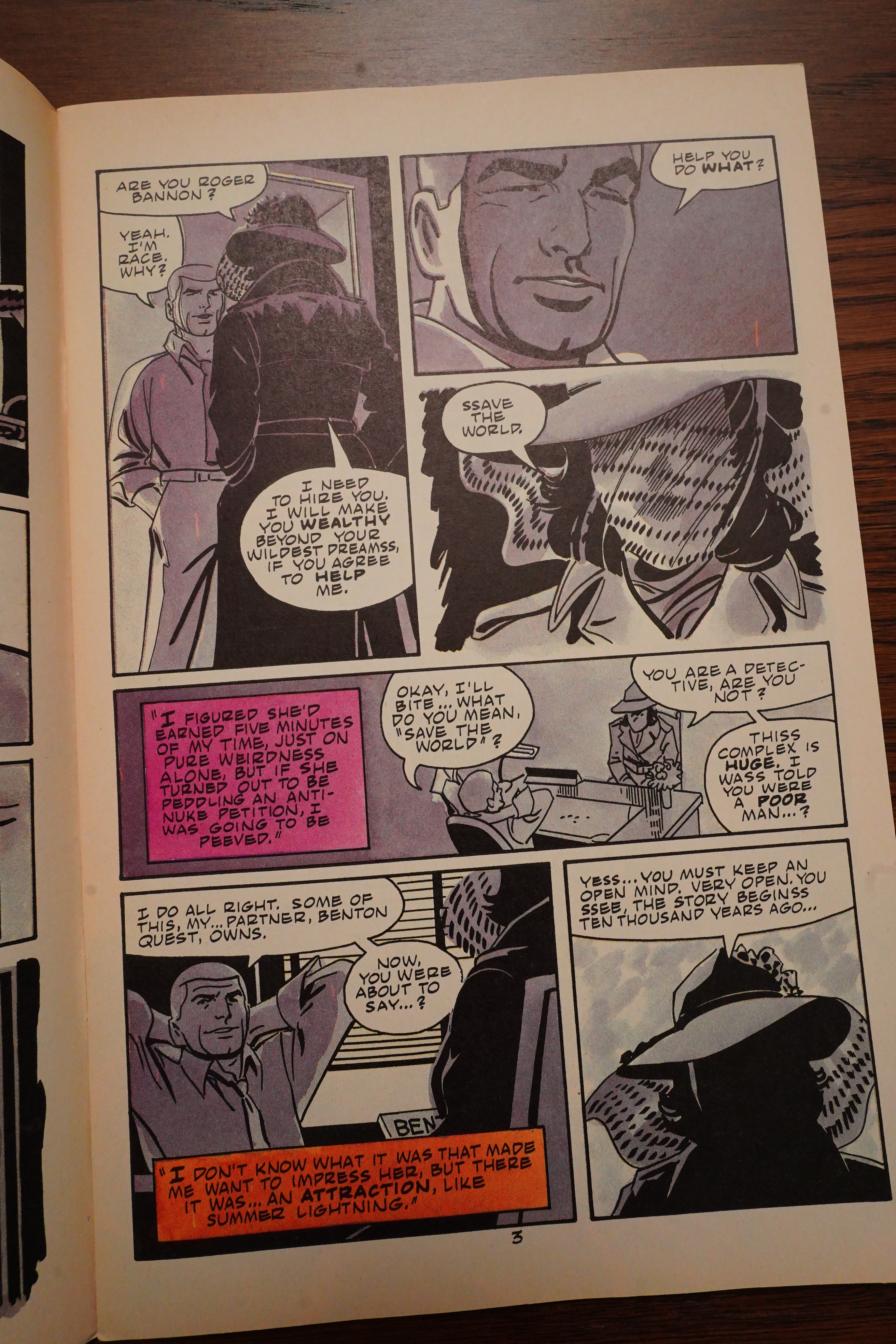
The book sold.
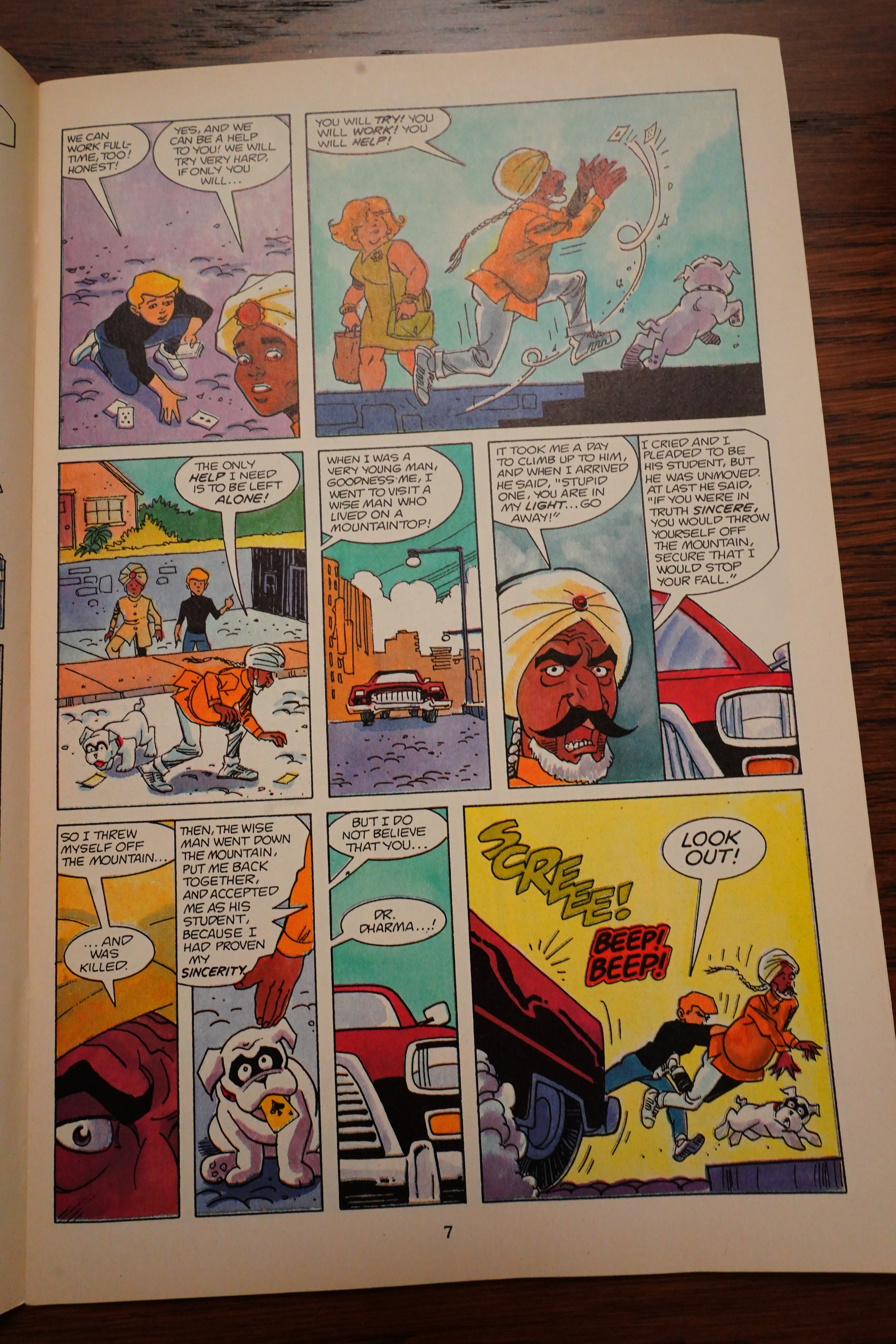
While Jonny Quest #1 was the best
selling single issue Comico put out
in 1986, the Justice Machine mini-
series was the best selling title. Its
four issues sold better than any four
issues of any other book Comico
published, including Jonny Quest #’s
1-4. Comico had a solid hit on its
hands.
But Comico didn’t wait until the
sales reports came in to sign up for
a Justice Machine continuing series.
Comico had commissioned Mike to
do a Justice Machine cover for the
Comico Checklist, Comico’s
publicity newsletter. Mike ex-
plained, “When they saw the Check-
list cover, they knew [Justice
Machine] would be hot, so they ap-
proached me about doing it as a
regular series even before I started
drawing the first issue of the mini-
series.”

I’m unable to find any contemporary reviews of this book, which is kinda surprising since it sold so well… And this is the only review I could find on the intertubes:

A fairly generic start to an indie superhero crossover from 1986. I mainly picked this up to finally own a comic by the well-respected but short lived publisher Comico, which originally published the debut of The Maxx.

These issues have apparently never been reprinted.