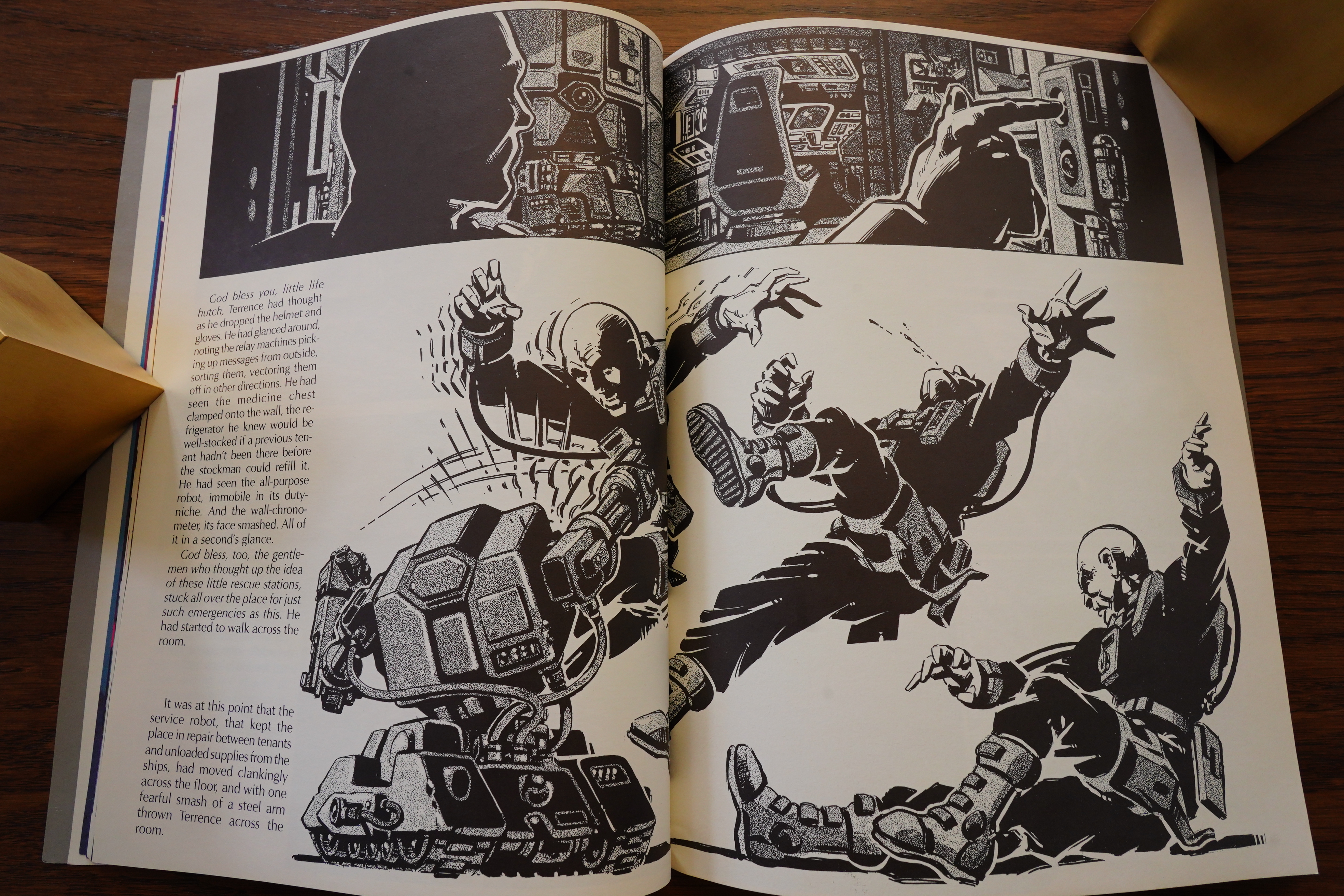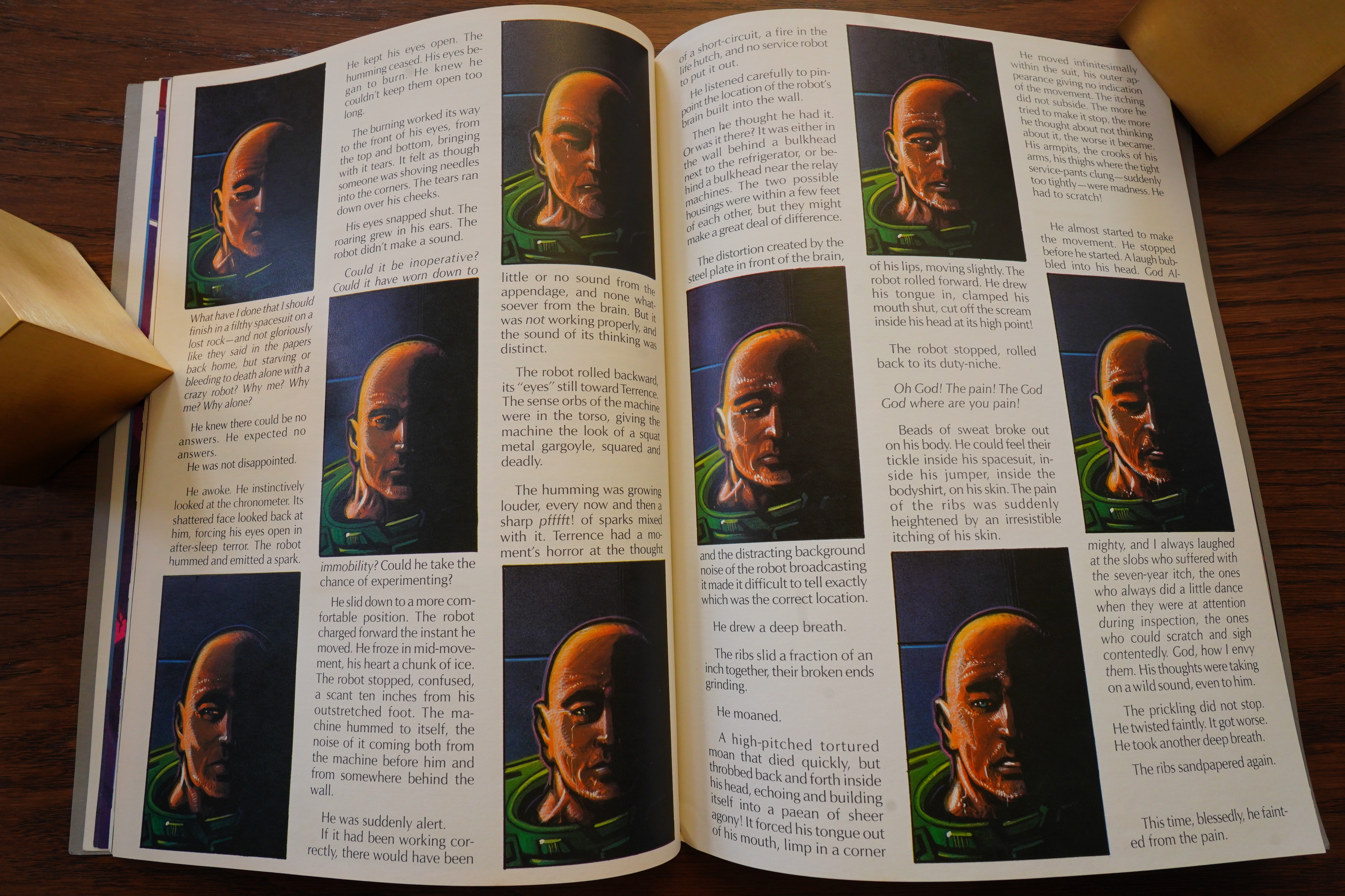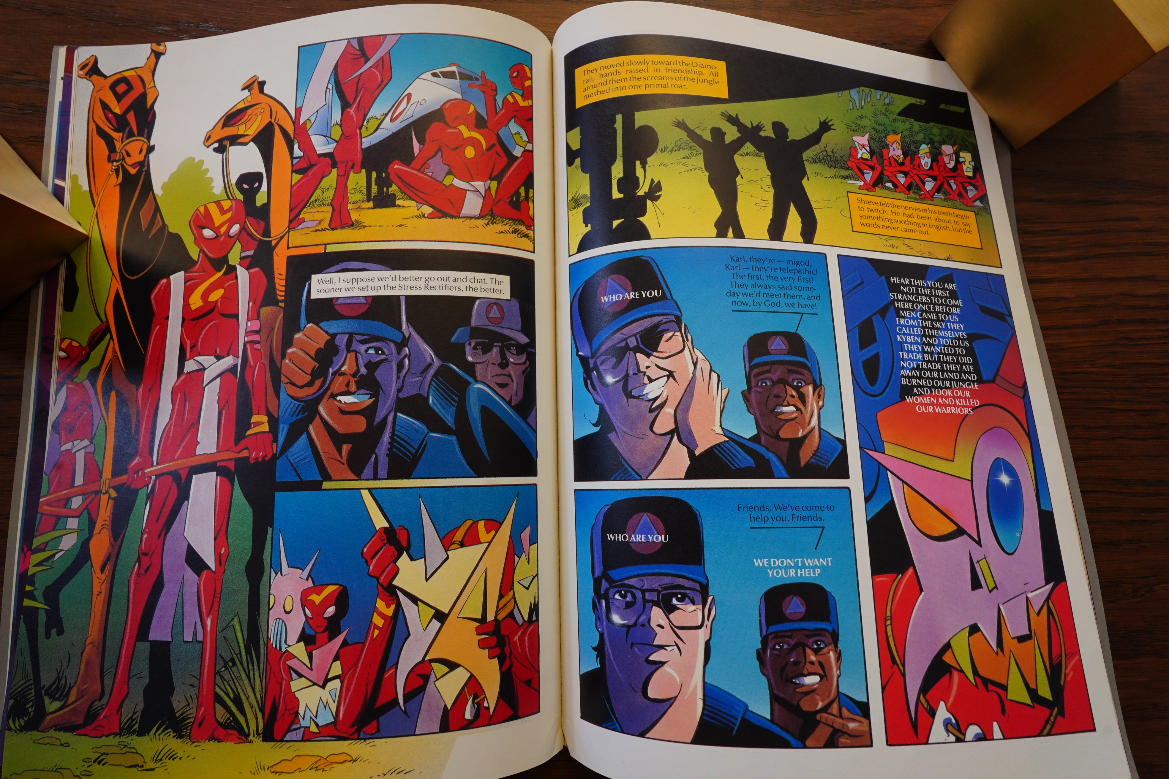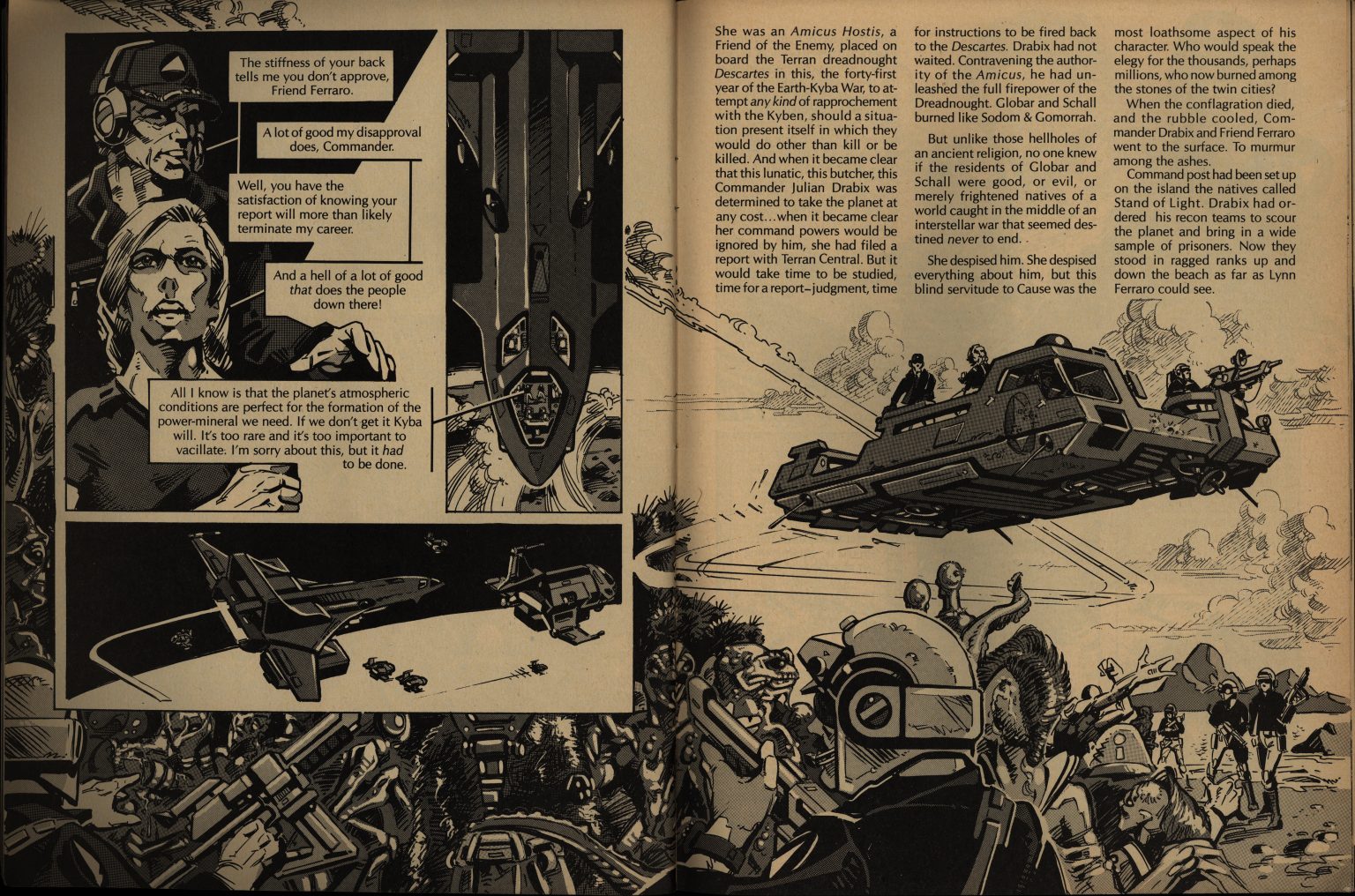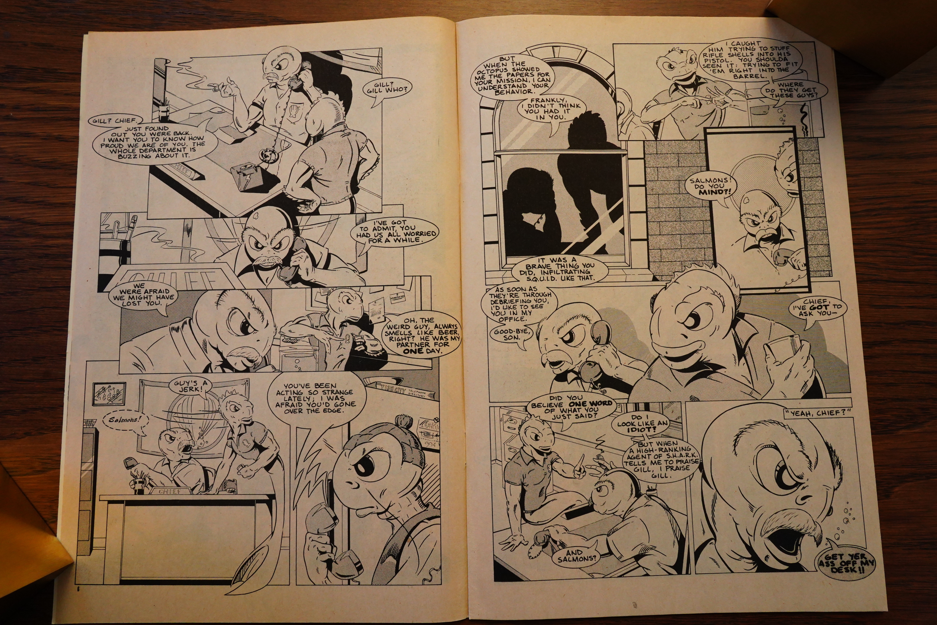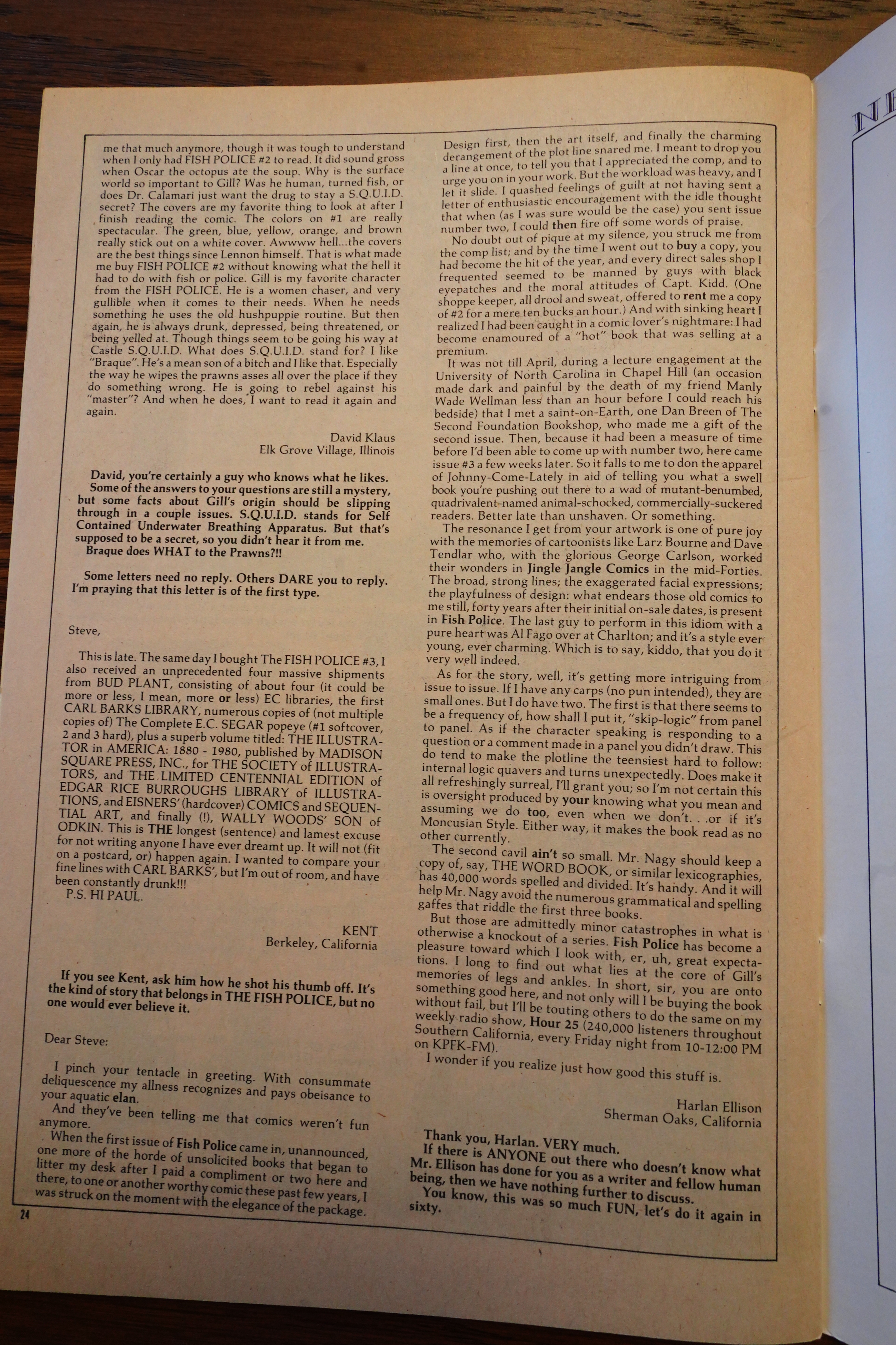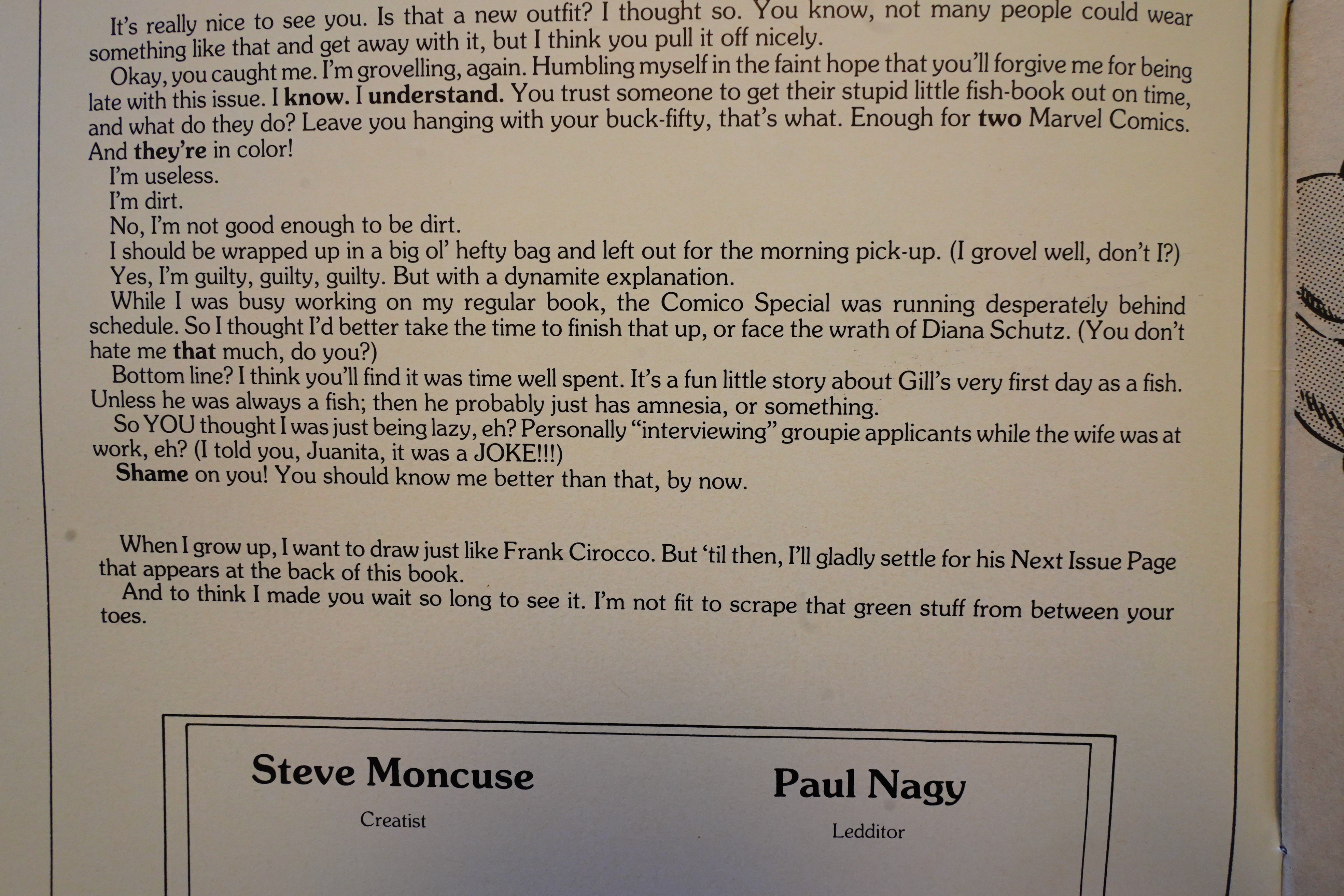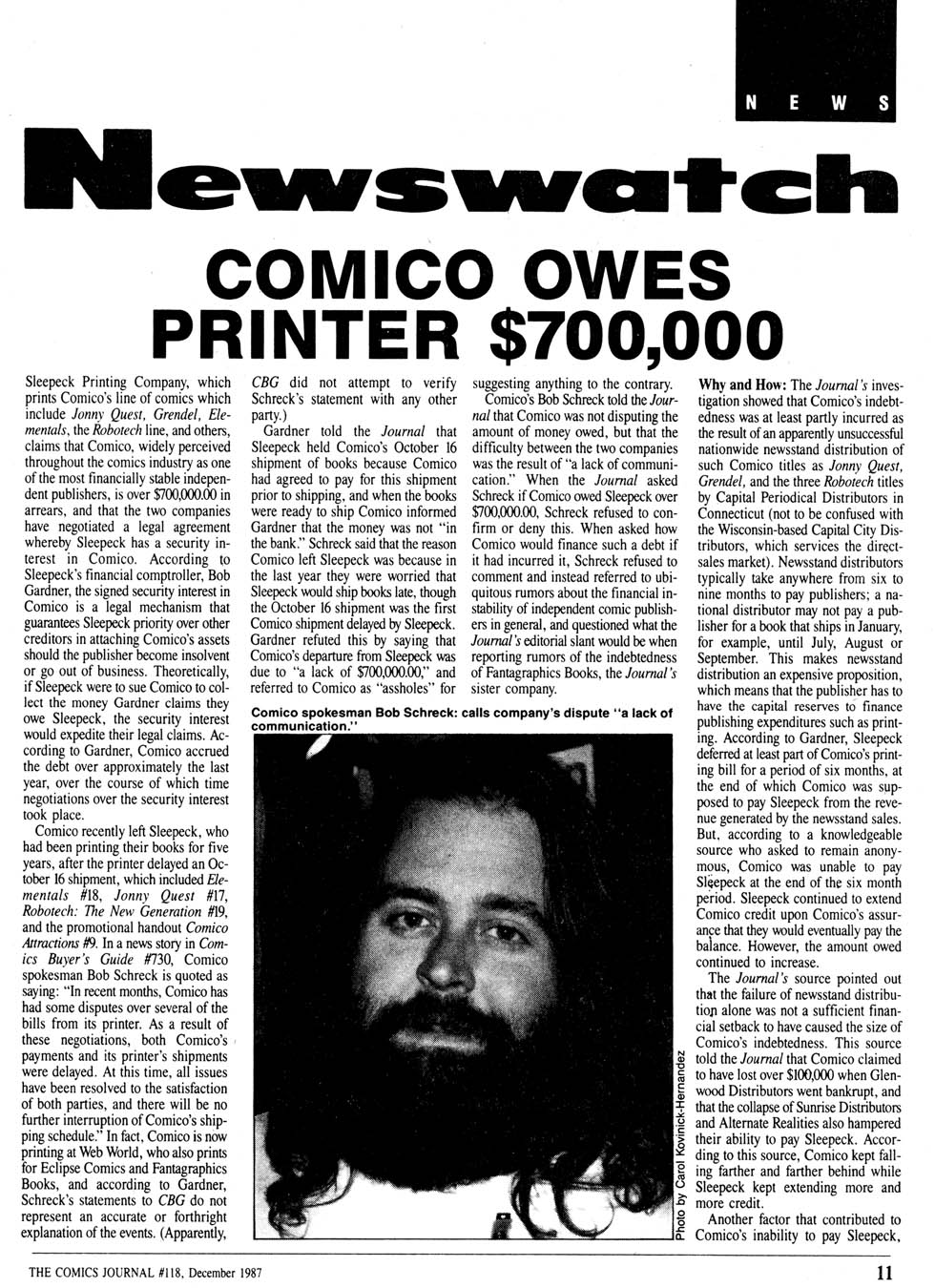
1983: Grendel

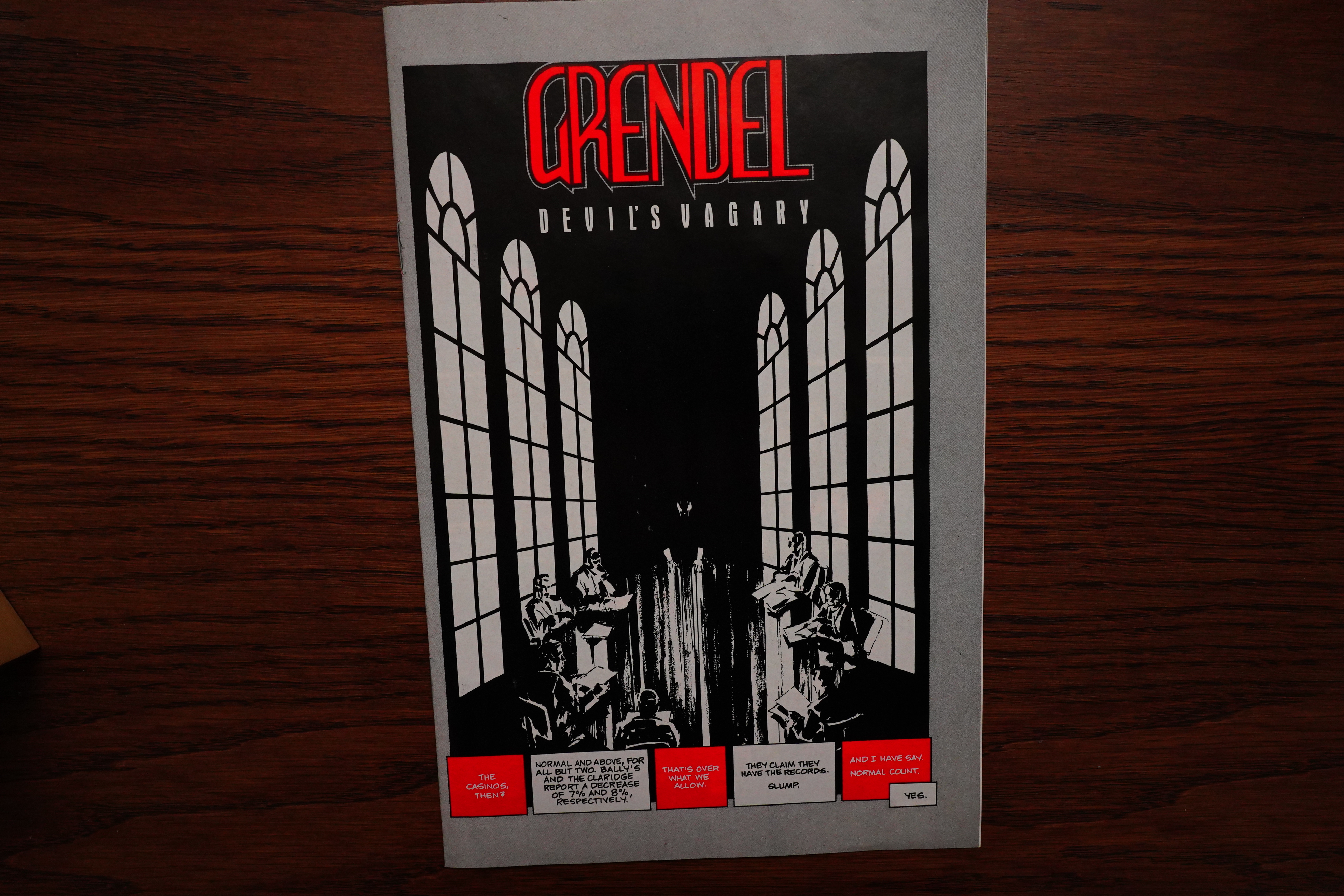
Grendel (1983) #1-3 by Matt Wagner

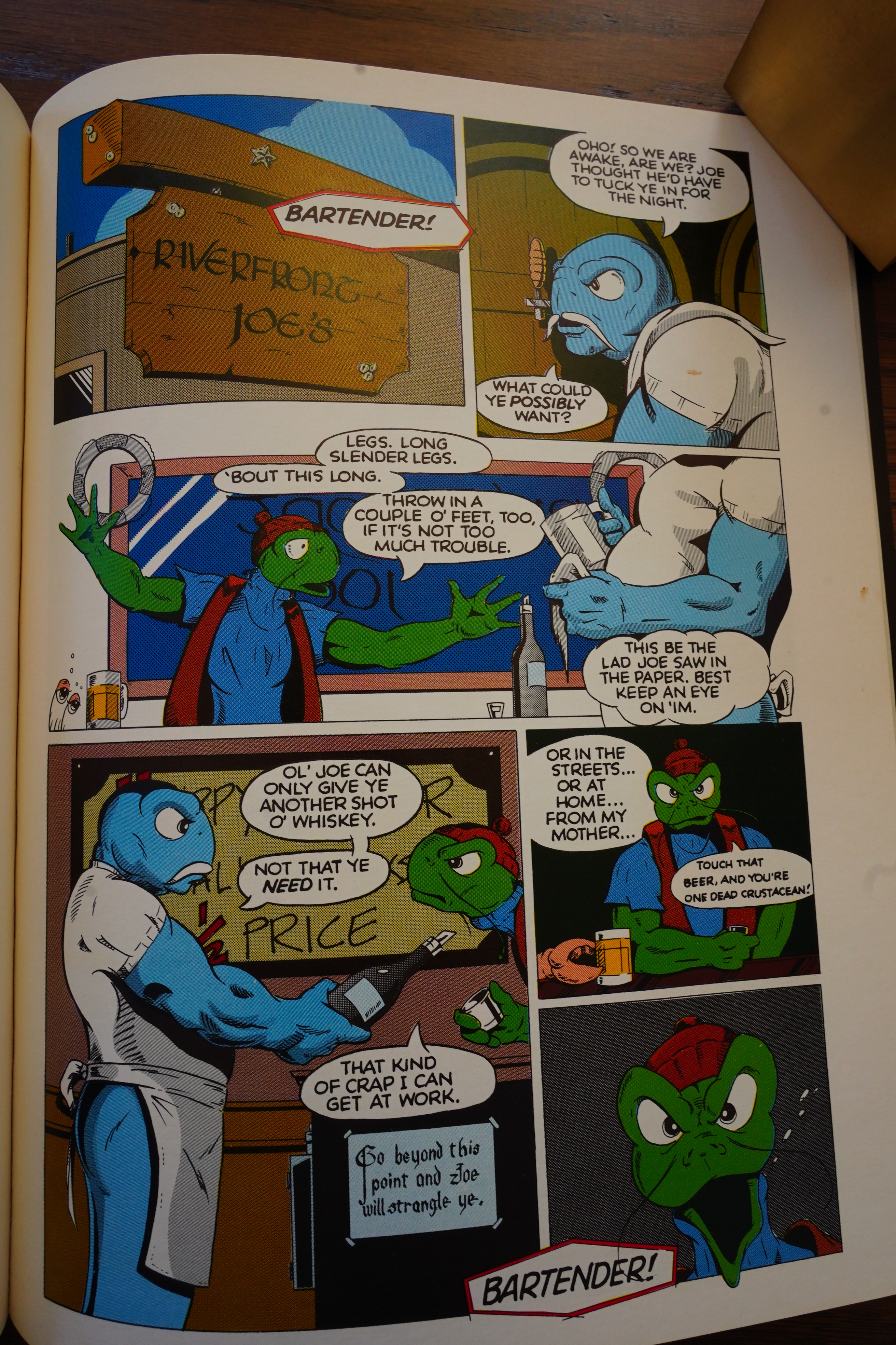
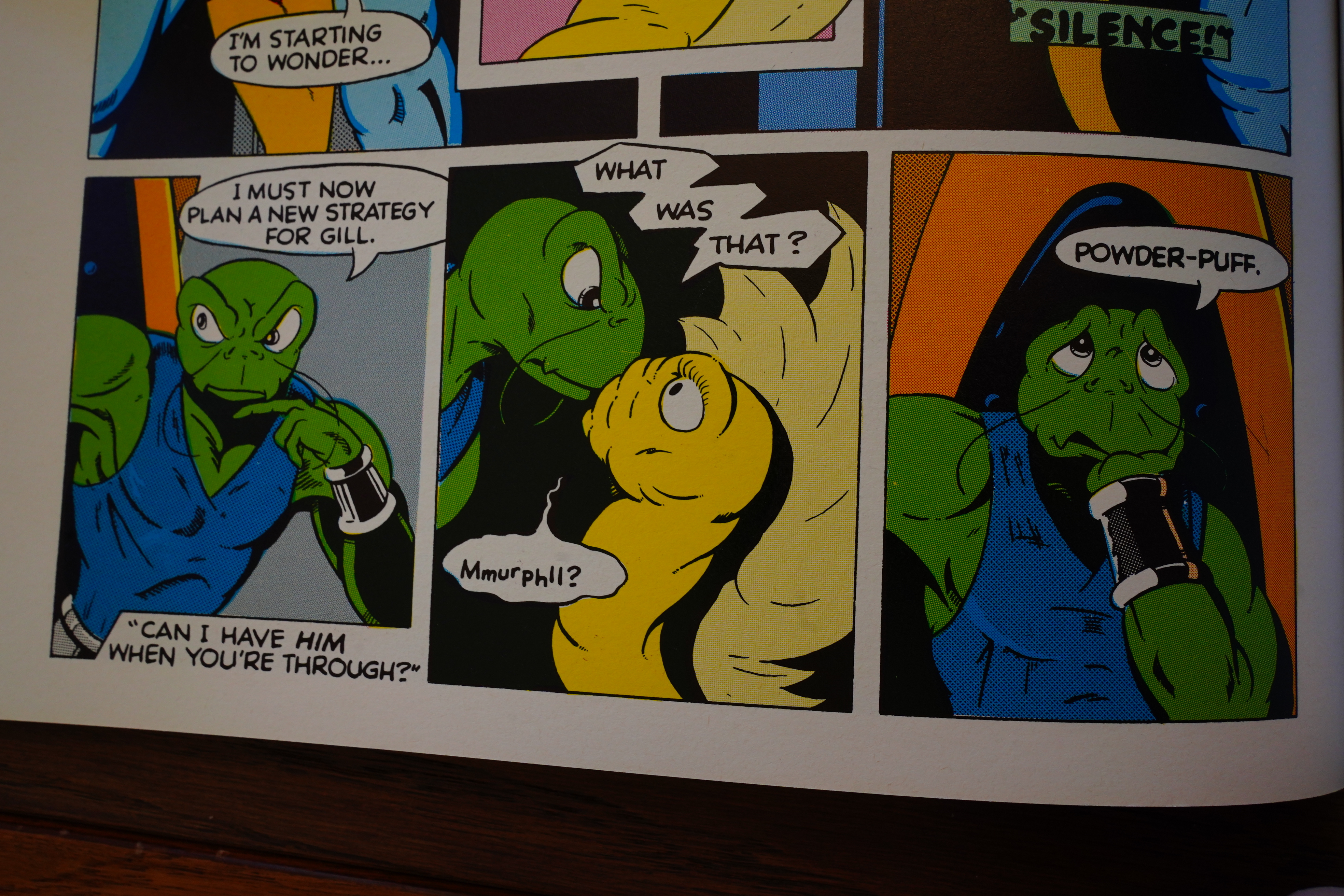
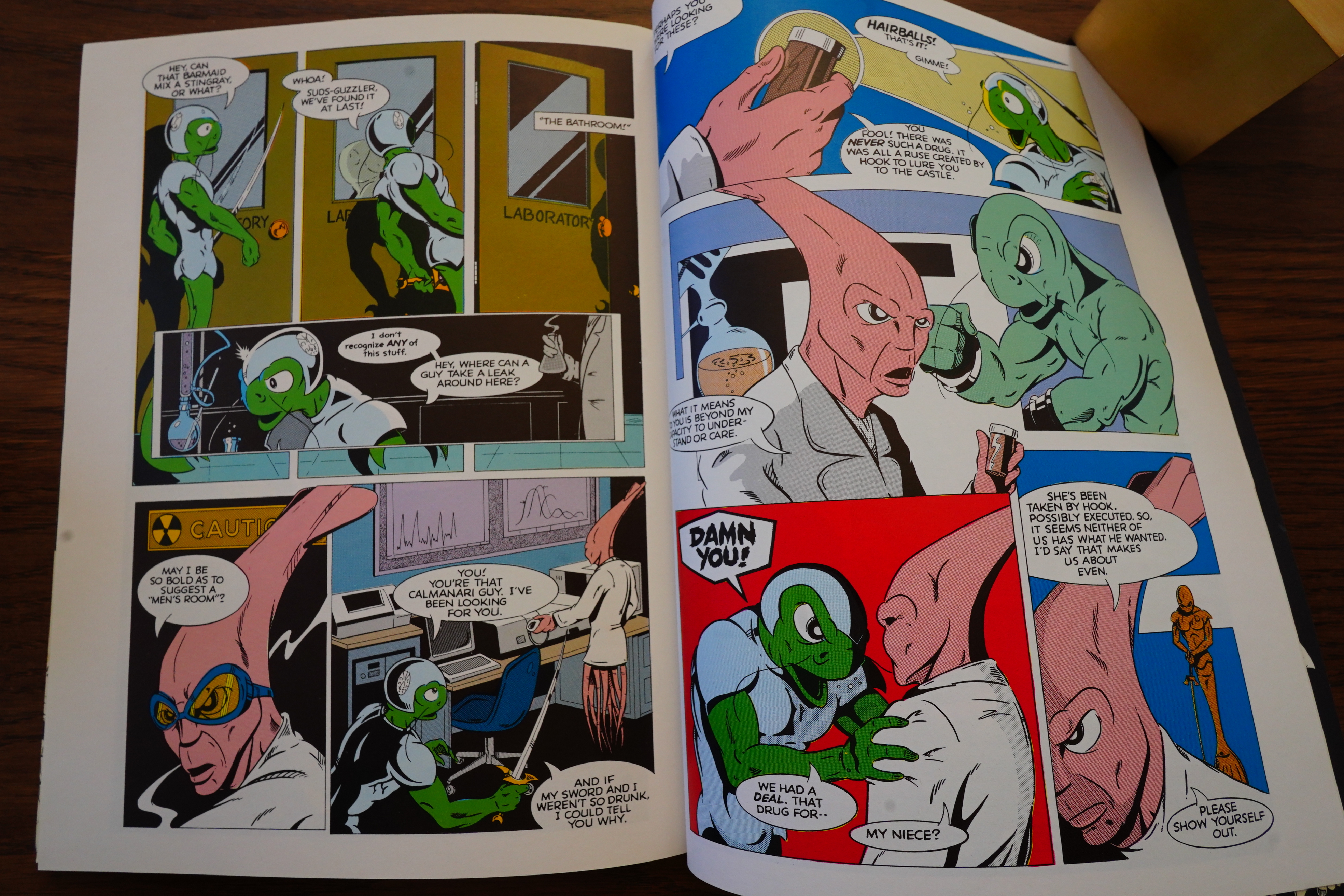
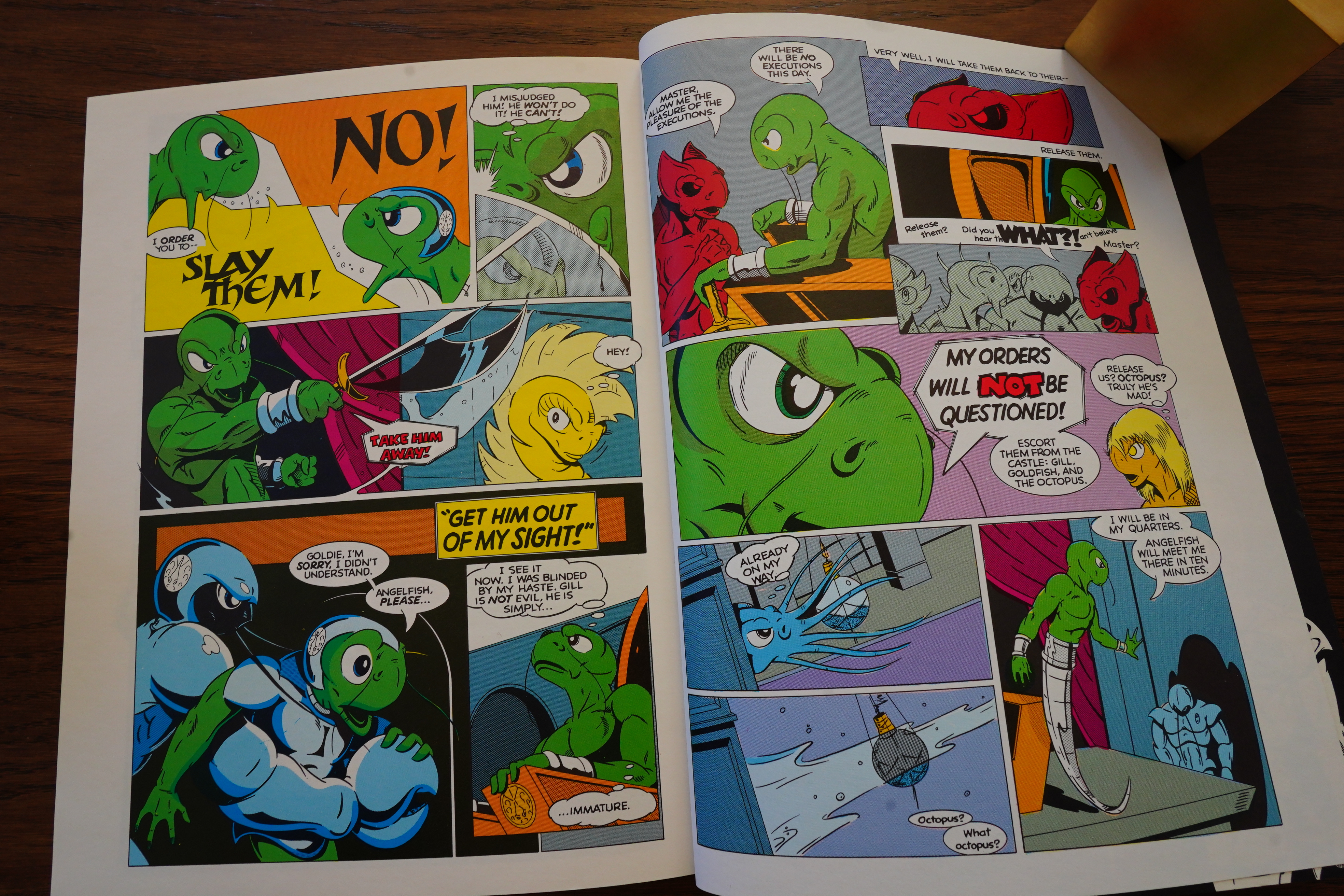
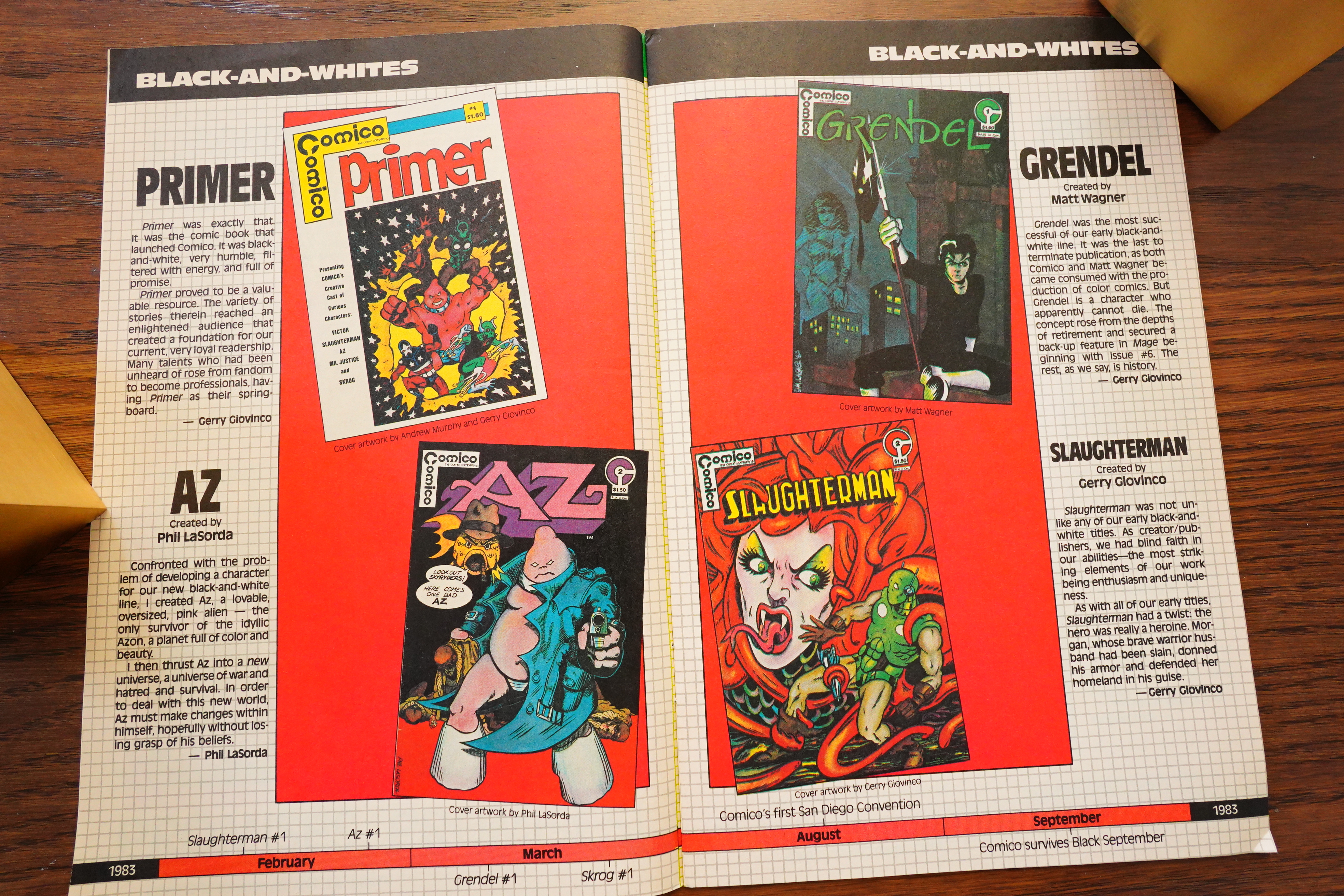
After publishing Slaughterman, Az and Skrog (all created by the Comico founders), here we get the first book by somebody else (and also the last of the black-and-white books), so I guess Grendel is both the start and end of something.

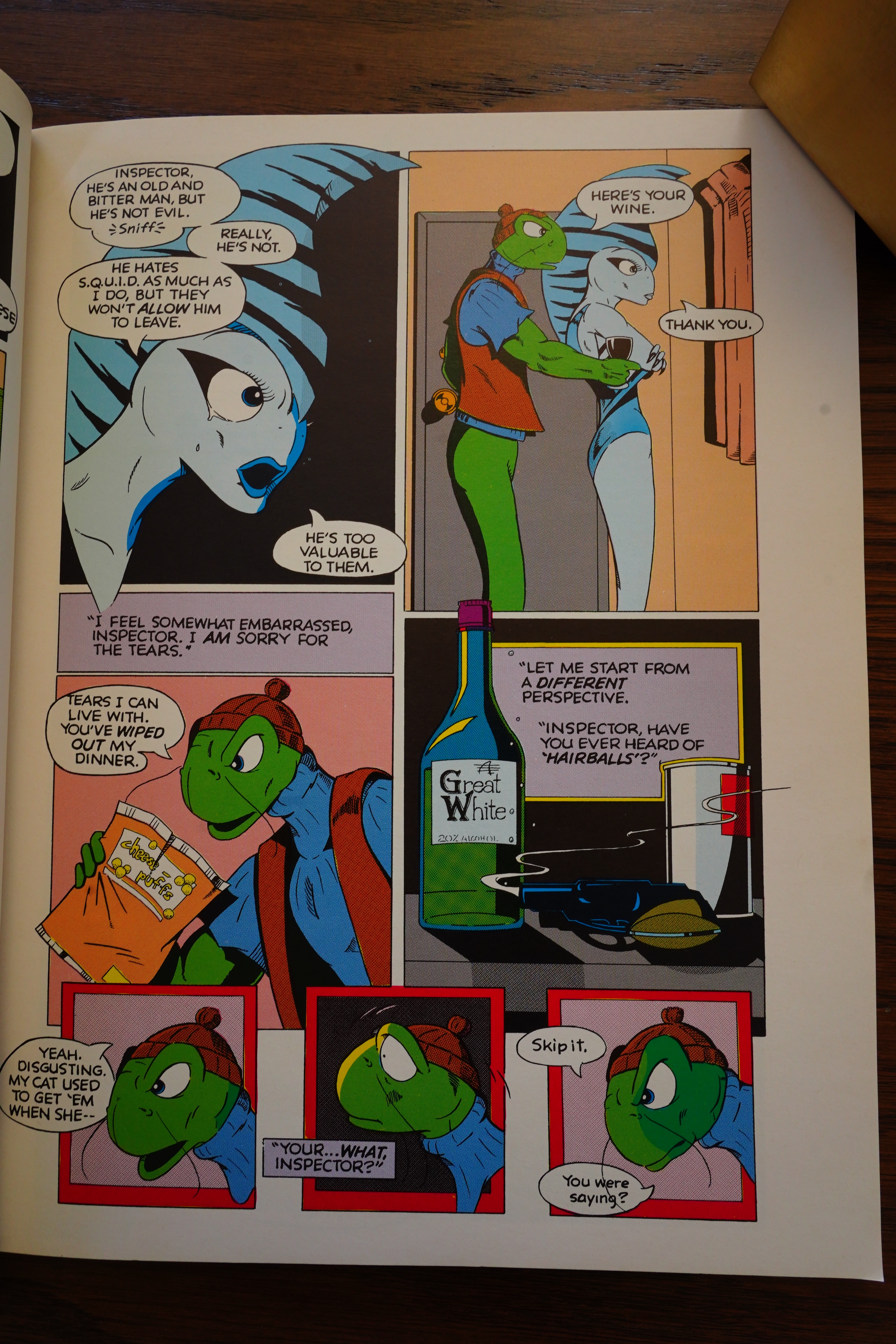
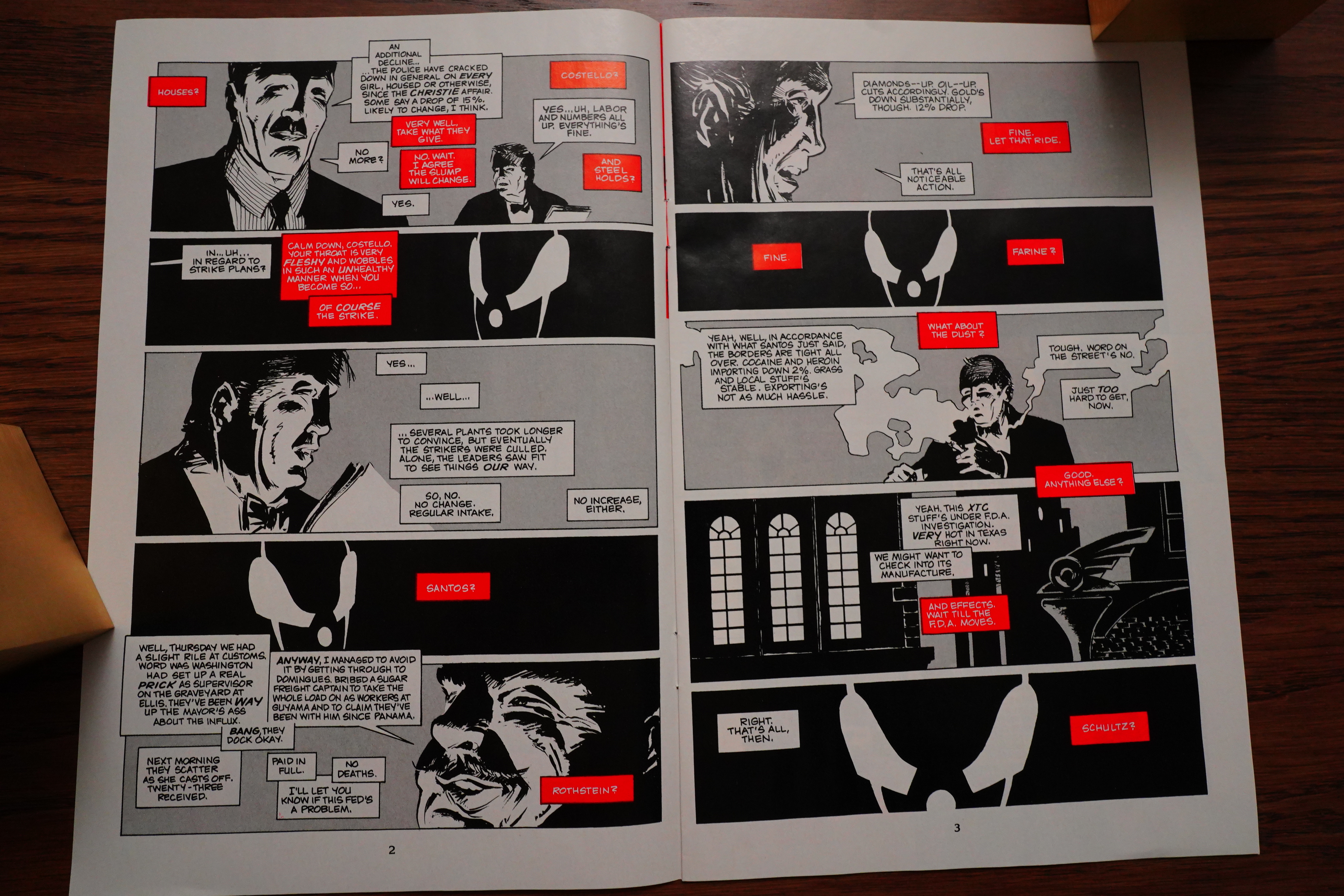
Oops! They ran the same (insufferable) editorial in all the four #1s, but they forgot to swap out the Skrog indicia. Anyway, here’s the first three pages:

Pretty stylish!

There’s a really stark graphical quality to these pages.

But it’s a pretty weird way to start a series. Grendel and Argent had been introduced in Primer #2, but it’s not like we have a long history of these characters. And here they are, sitting on a rooftop, reminiscing about old times.

The entirety of the first issue is spent recounting Grendel’s backstory — which is economical, I guess, but it’s also like… does the reader really need to know all of this? I mean, origin stories are popular, but…

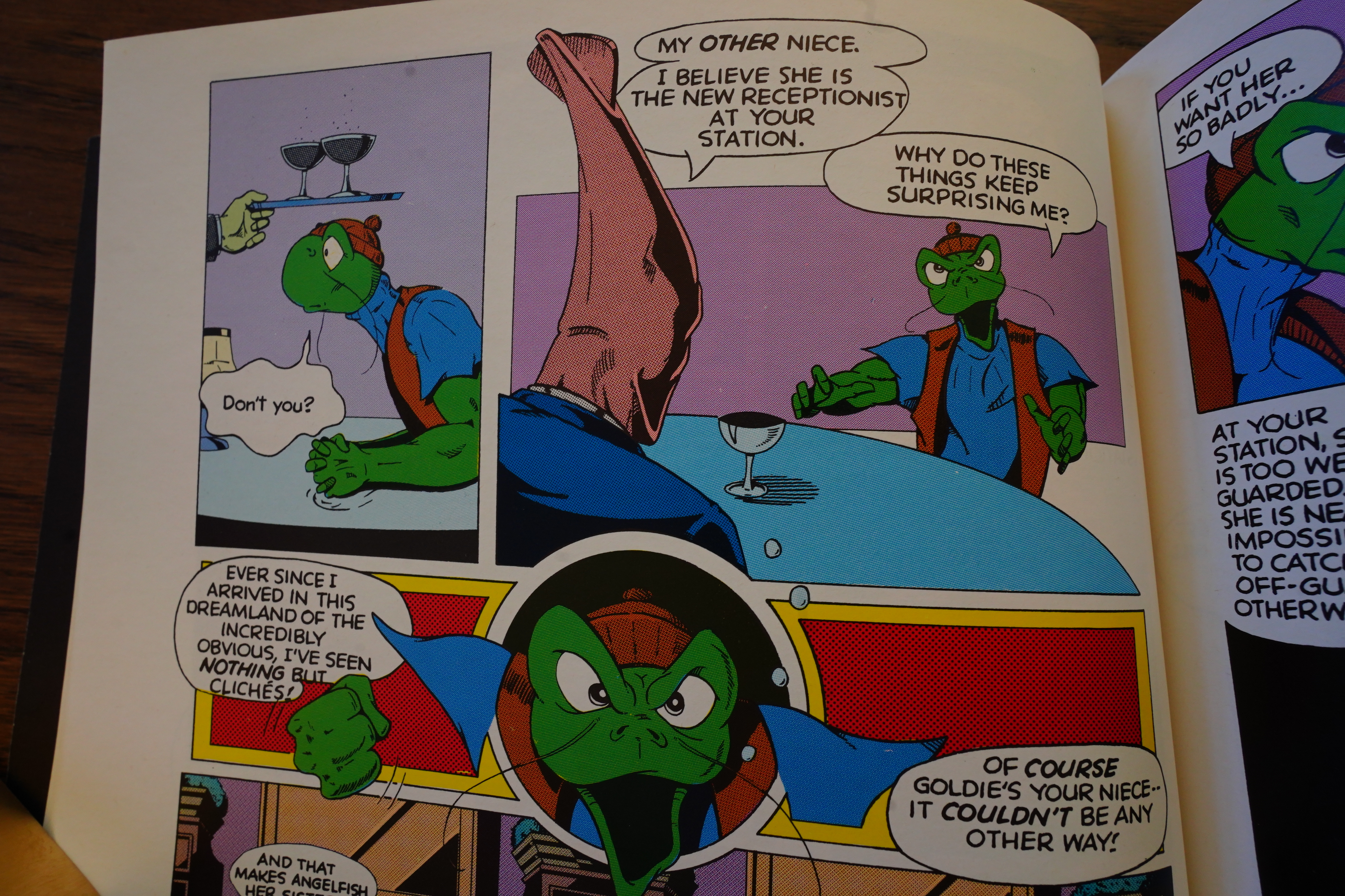
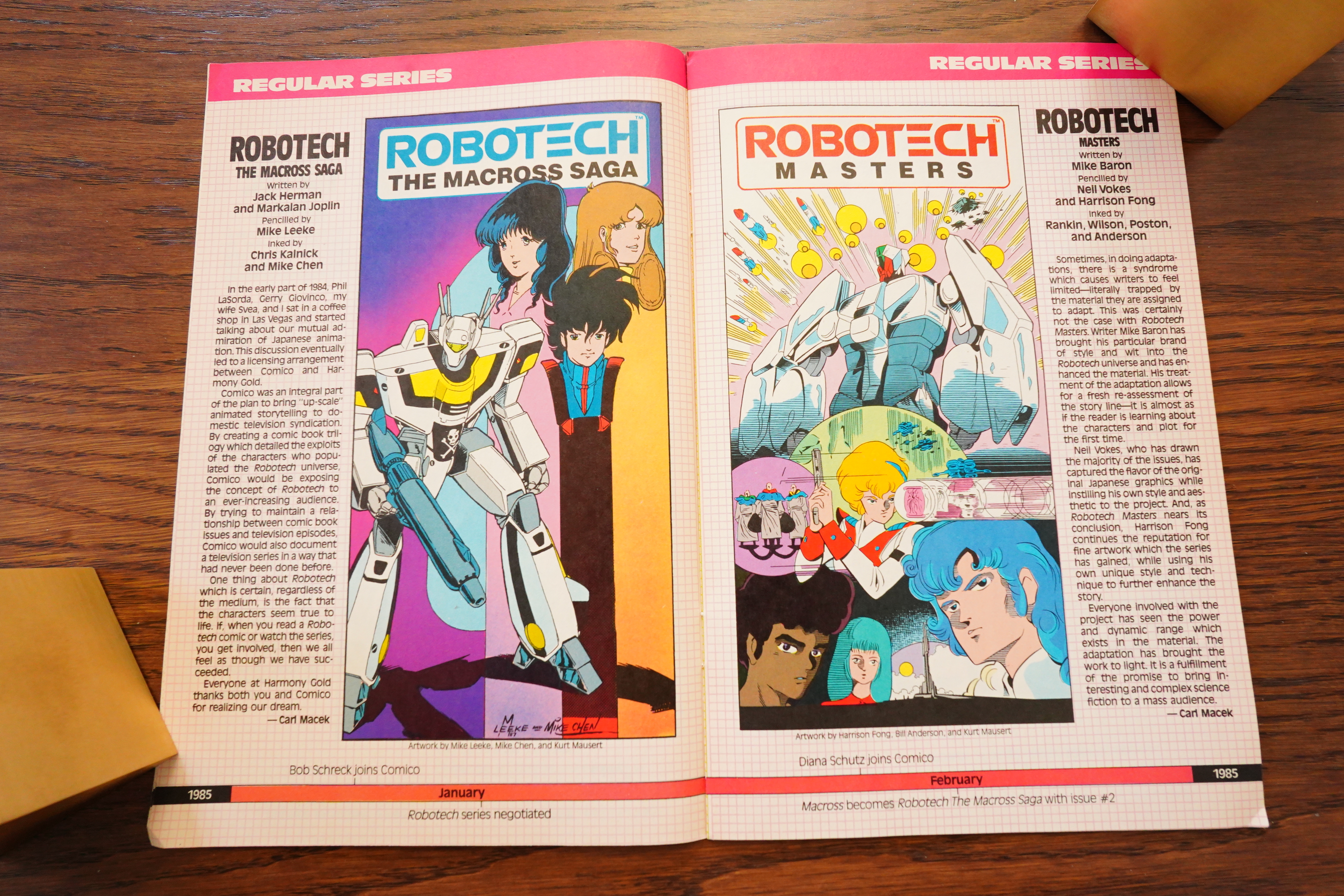
Did Wagner read Japanese comics at the time? Some of the artwork looks somewhat Japanese influenced, especially when he draws children. Perhaps he’d seen the Robotech animated series or something?

Right:

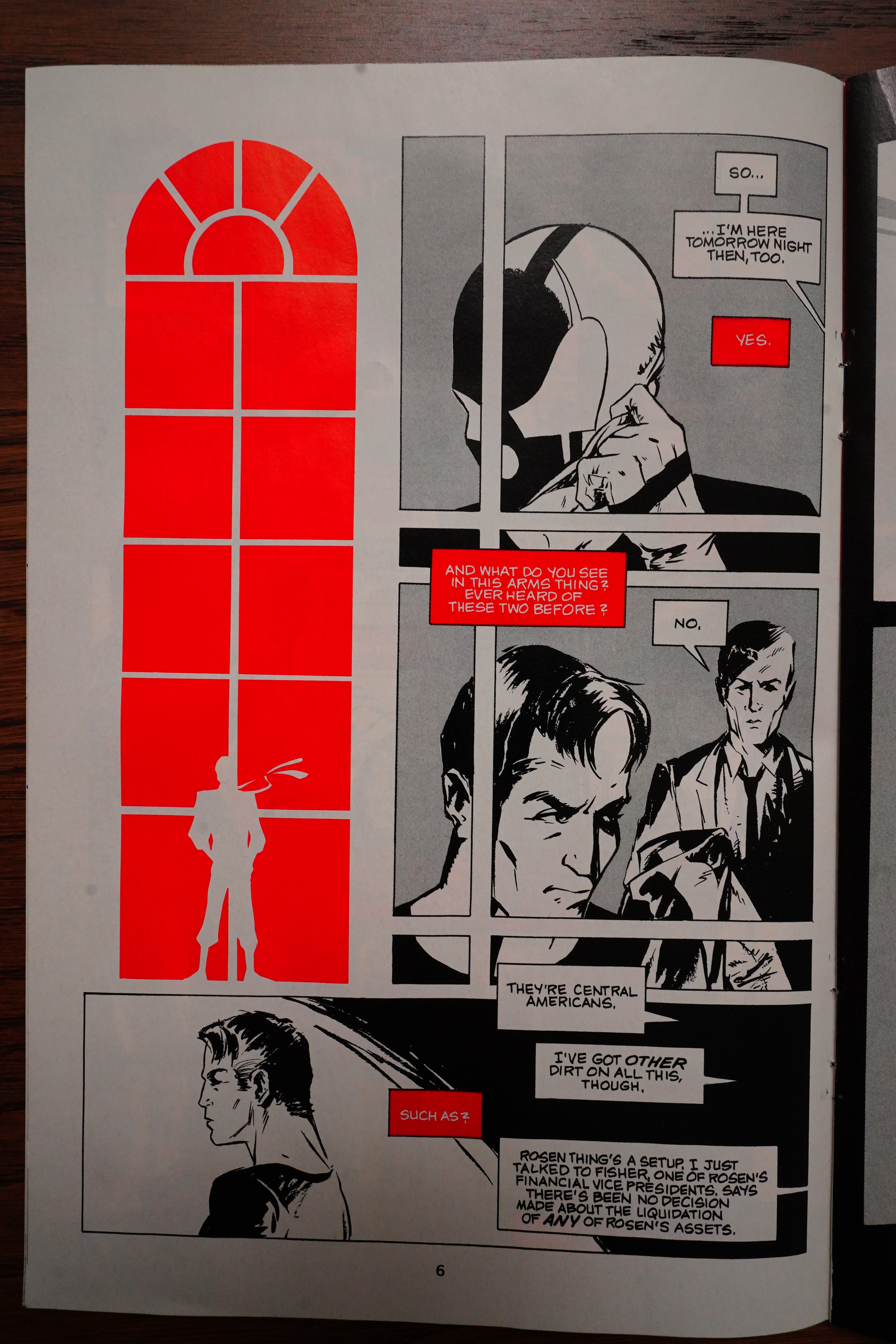
It’s a really interesting shift from the initial three issues you had done, not only in storytelling style, but in art. Those first three issues have an interesting combination of rounded, almost cartoonish forms, and noir-influenced very heavy blacks and shadows. How much of that was deliberate, and how much was just your early style?

It was deliberate in that I had just discovered anime, and anime was kind of a rarity at that point. Right. There weren’t many examples of it available here in the States. So it seemed intriguing to me, this style of big feet, and big eyes, and the little mouth, and I was kind of taking my cues from that. But at the same time, yeah, I was also influenced by noir comics. Frank Miller was in the thick of his upward trajectory at that point, and his style was really prevalent all over Marvel comics. So there was a huge, huge switch from those [issues] to what ended up becoming Devil by the Deed in the back of Mage. And part of that was, again, as I said, the limitations of space I had to work with. But also I was just growing up creatively. There’s an old adage in comics that everybody has a hundred pages of comic art that they have to poop out first before they get to anything that looks pretty good. And I was reaching that hundred page mark, finally.
So his backstory is that when he was 14, he was seduced by this woman…

… and then he became a sociopath. Or something. So he took over as a crime boss in the big city, and killed dozens of people. But! He stopped child prostitution all over the city, so he’s not all bad.

By the way. But he’s now a psycho, so he doesn’t care.

So what’s going to happen in issue two?

ANOTHER ORIGIN STORY! We get the origin story of the wolf guy, Argent.

So I thought that was going to last the entire issue, but instead they start reminiscing about something that happened years ago — and this seems to be the real story that Wagner’s going to tell.

When I read this the first time, I was pretty confused — I thought the girl entered the room, finding Grendel and that guy, er, doing something… But nope; she discovers a dead body, and…

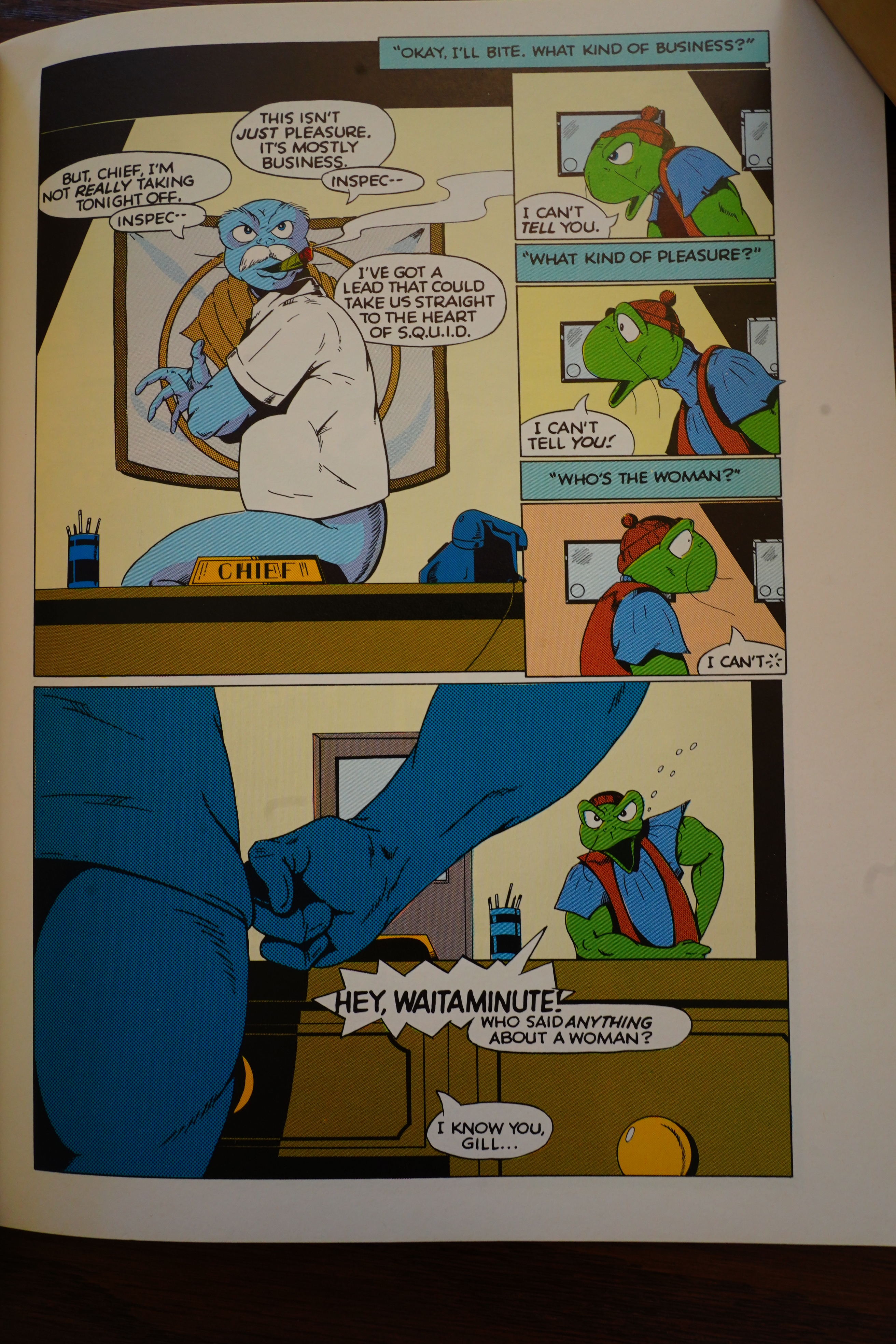
… then the rest of the issue is told in a kind of interesting way: We get a Grendel/Argent fight scene on half the pages…

… and then a Poirot scene where a cop solves the crime. It’s not altogether successful, but it’s fun.

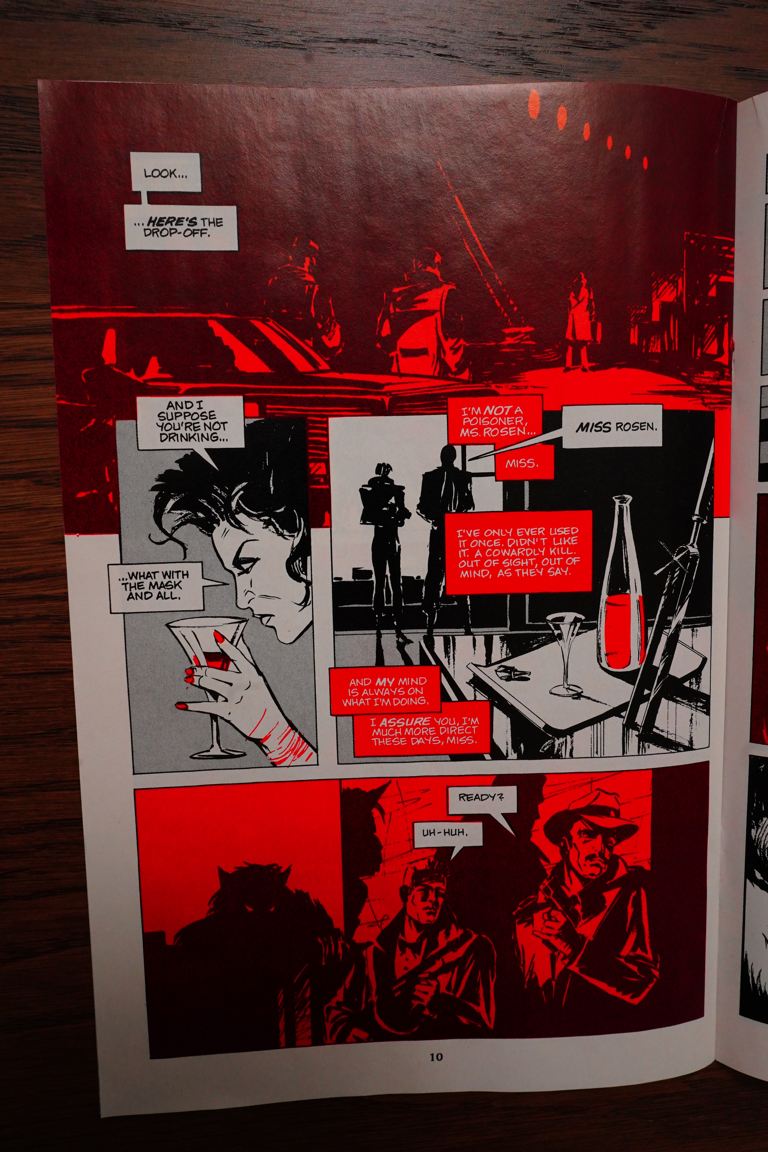
Reggie Byers does the inks in the third issue, and he has a line that’s more blunt. Not bad, but rather different…

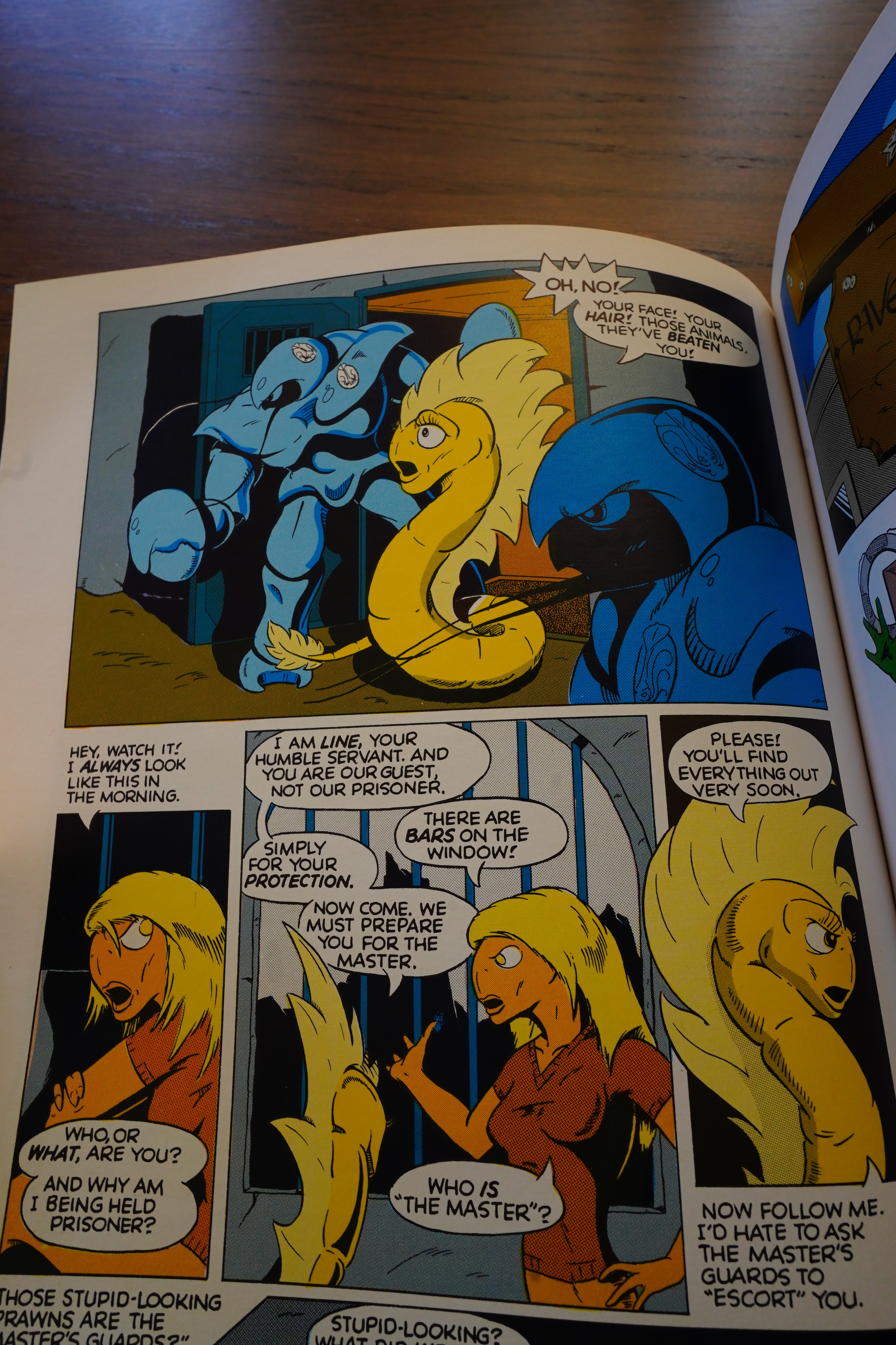
Oh, remember the girl? She totally fainted, and Grendel left her on the sidewalk for some reason, and a passing PDF kidnapped her. I’m guessing the rest of the series was supposed to have been a search for her?

And then they announce the cancellation of the series in the time-honoured fashion of saying “To be continued”.

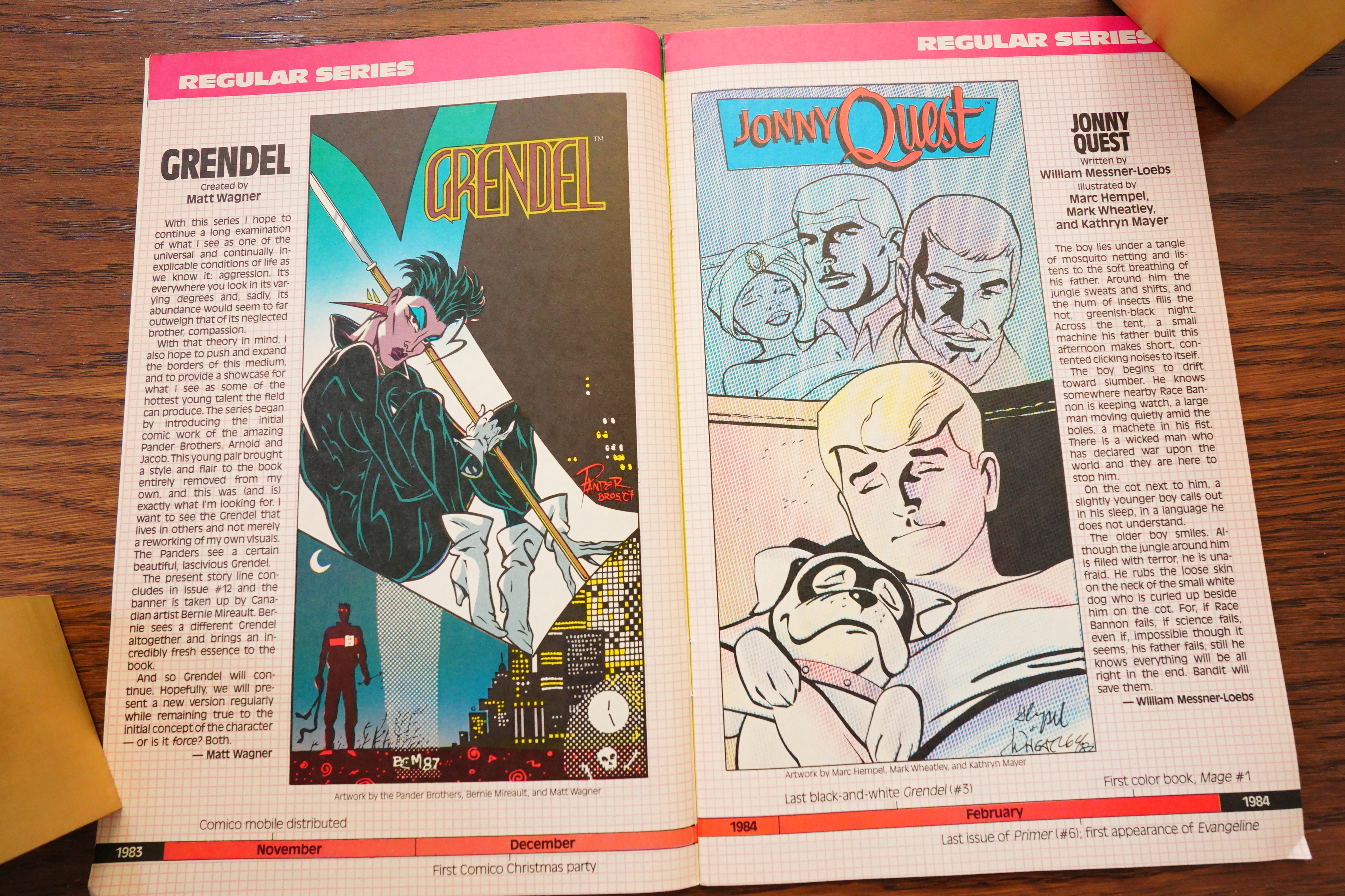
Wagner said in some interviews that he wasn’t keen on reprinting these issues, but it finally happened in 2007.

I’m not sure, but I think Wagner retooled this story in the Mage backups? I only vaguely recall — I guess I’ll find out when I get to Mage in a few days.

Oh, yeah, I read the blog about this:

Looks pretty good:

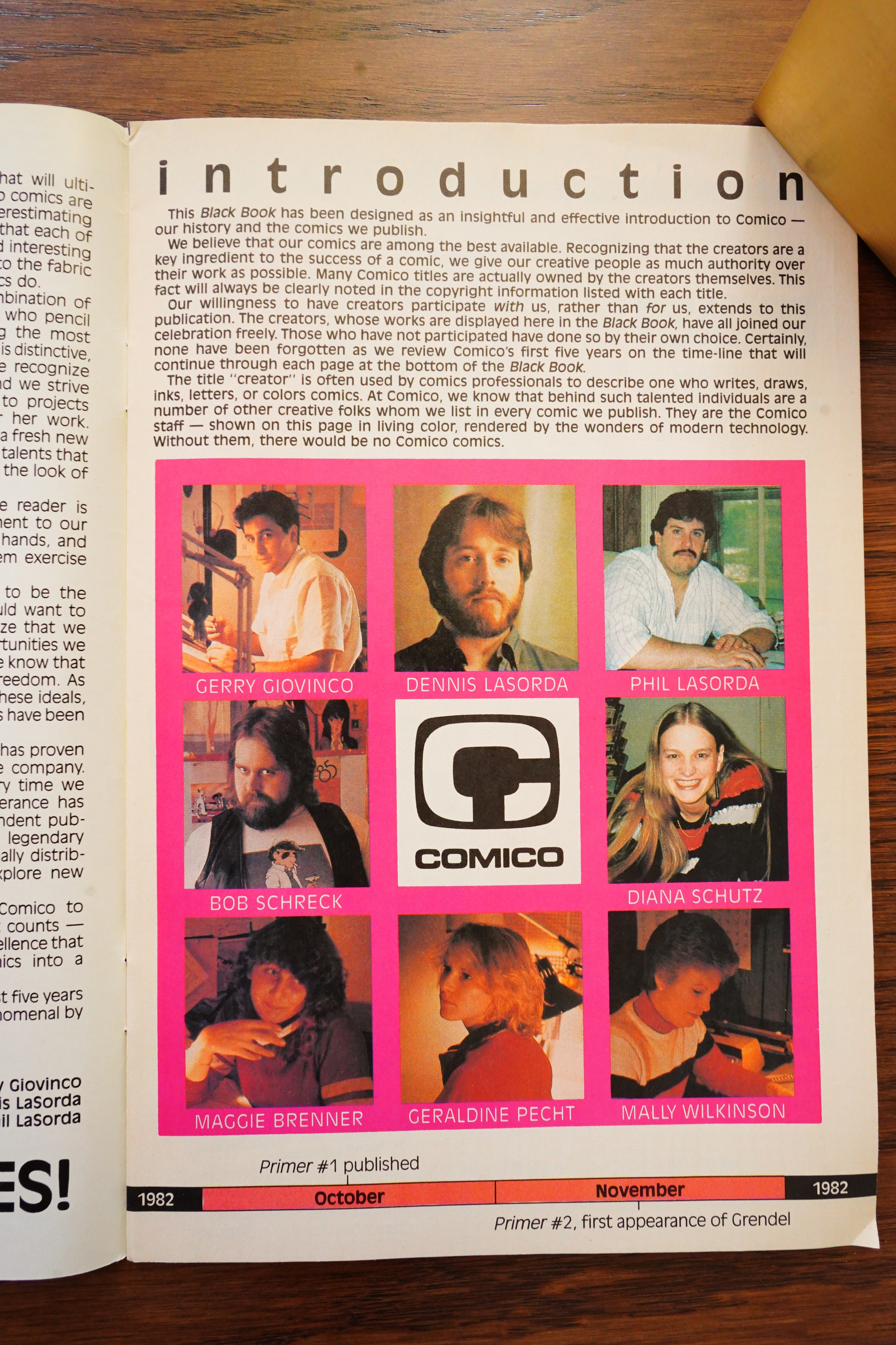
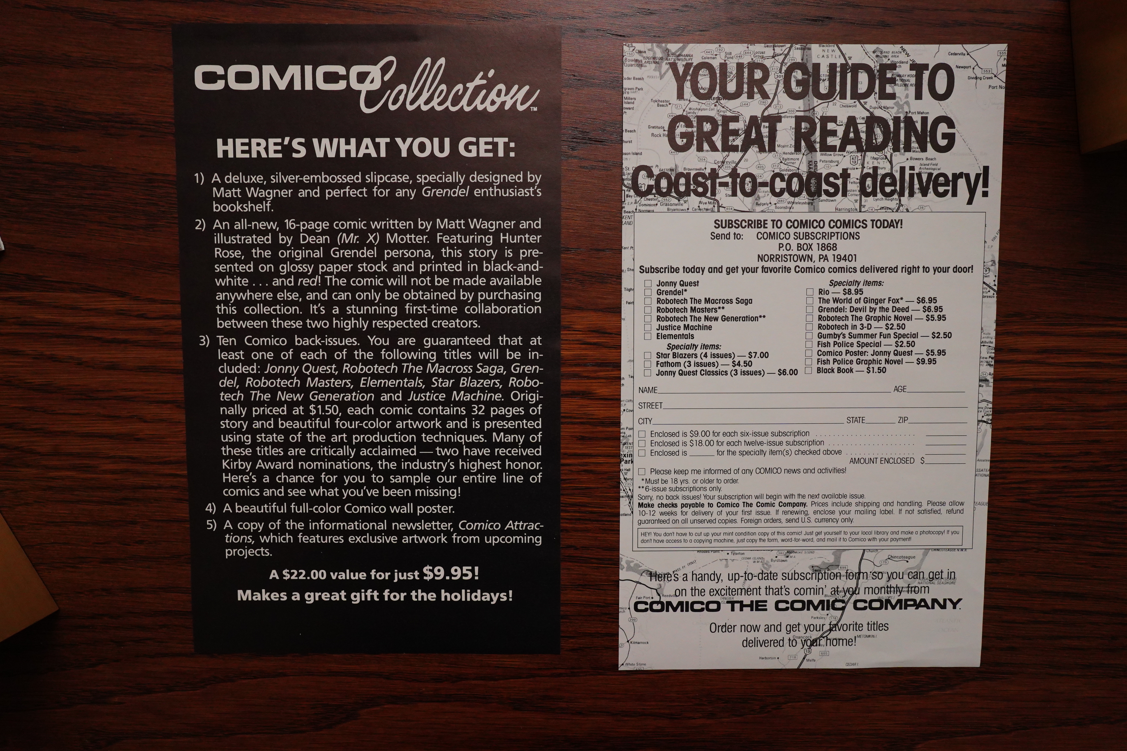
The Comico people were really into doing promos and stuff.

Anyway, Grendel is indeed what you’d call a promising series — even though it’s a bit clumsy here and there, the storytelling is on point, the artwork is interesting, and you want to know more about these characters.

Let’s see if we can find some reviews of/articles about the original series… It’s not that easy, because there’s been so many Grendel series, but…

Wizard Magazine #117, page #116:

The first three issues of the old Comico
1983 Grendel series by Matt Wagner have all
slipped a bit in price this month. That may be due to
Dark Horse’s recent reprinting of the series-recolored
and looking much better than the original, no less.

Back Issue #125, page #7:

POWERS: How did Grendel end up being published by Comico?
WAGNER: I always have people asking me how to get into comics, and I always
answer that I’m the wrong guy to ask since a large factor in how I got started was sheer
luck and happenstance.
In the early ’80s, I was attending an art school in Philadelphia, and I got on the
elevator one day and noticed a guy wearing a comic-book-themed T-shirt. We struck
up a conversation and that guy turned out to be Bill Cucinotta, one of the founders
of Comico. The core members of the earliest version of Comico were just a bunch of
college pals who had this dream of publishing independent comics—in a day when
there really weren’t so many of those yet. These guys were all “city-lads” and knew a
whole lot more about the business and production of comics than I ever had exposure
to, having grown up pretty rurally. At one point, we all dropped out of school to follow
that crazy dream, and Comico’s initial launch featured four black-and-white books, all
done by the three original guys in the group and me, Grendel being one of those titles.
Admittedly, our first efforts were crude, and the company was fairly disorganized,
but that eventually all turned around when Bob Schreck and Diana Schutz signed on
to the ranks. But that’s a whole different story in its own right.
POWERS: What are your thoughts on the early Grendel appearance in Comico Primer
#2 (1982) and the original three-issue run of Grendel (Mar. 1983–Feb. 1984)? In other
words, what did you learn from these energetic first efforts with the character?
WAGNER: Well, as I said, my initial efforts were admittedly crude but also, as you said,
energetic. Of the four premier Comico titles, only Grendel garnered much positive
response, and that’s what eventually led to me getting the chance to develop a color
title for them, which turned out to be Mage (again… a whole ‘nother story). And there’s
an old professional adage in the field that everyone has 100 pages of bad comic art that
they need to poop out first before they get to something credible and at least marginally
professional-looking.
Obviously, there were ideas in those initial Grendel issues that just wouldn’t die and
eventually led to a massive and lengthy publishing history for the character. As with
that 100-page maxim, I was definitely working through a lot of what I liked about other
people’s comics and honing in closer to what I eventually wanted my comics to be.
In effect, during those 100 pages, a comics creator learns what not to do, leaving the
excess baggage behind… most obviously in this case, the pseudo-anime style.
Still, when I look at those early issues, I can still see the elements that have defined
my art and my career ever since… the bold but clear approach to storytelling and layout,
the classic pulp-influenced scenarios, and, again, the simplicity of style. People often
assume I’m ashamed of these early efforts, and nothing could be further from the truth.
I recognize that these were the fledgling efforts of what has since proven to be a long and
continuing artistic journey.
POWERS: When you later brought back Grendel as a backup feature (Devil by the Deed)
that ran for nine parts in Mage #6-14 (Mar. 1985-Aug. 1986), you told the story in a
prose style. What inspired this radical storytelling approach to Hunter Rose’s tale?
WAGNER: After the launch of Comico’s initial black-and-white titles failed to gain much
success, either financially or critically, the company decided they needed to make the
move into producing color comics. This was just before the B&W boom of the mid-’80s,
and color seemed to be the only way to make it at that point.
As I said, of the four titles, only Grendel had gotten much positive response, and so the
company offered me the chance to develop a color title… which, again, turned out to be
Mage.

Back Issue #2, page #34:

DS: All right, and so for
everyone who continues to ask this question twenty-
one years later, are you ever going to reprint those
early black-and-white Grendels? Please say no!
MW: Yeah, I really see no reason to. It’s an unfinished
story. I later revamped that story and finished it in
Devil by the Deed. I’m too dedicated an artist to just
republish my unfinished work just for the sake of a quick
buck. Maybe when I’m 60 and there’s a necessity to
catalogue all my work in such a manner. But I get this bad
rep that I’m ashamed of that stuff and that’s why I don’t
republish it, and that couldn’t be further from the truth.
I know if that was the case, I’d never republish the early
Mages, and sure, I’ve done that over and over again.
But again, the first Mages came to fruition. That was
a complete story. Not so with those early Grendels. So I
just don’t feel a need to. Again, maybe later. In the
meantime, let them remain the collector’s items they are.
You know, if you’re such a Grendel completist that you
must have my early, unfinished work, well, that’s the path
that you chose for yourself. (laughs)

Comics Interview #14, page #45:

BILL: What led you to do comics?
MATT: One day I got on the elevator at the
Philadelphia College of Art, and there was
a guy standing there who had a Creation
Convention T-shirt on, and we struck up a
conversation. The guy was Bill Cucinotta,
now with Comico. I learned that with a cou-
ple of his friends he published an
underground newspaper at the college call-
ed DUCK WORK, which was all duck-
oriented cartoons – MY THREE DUCKS,
SPACE DUCK, PUNK DUCK, stuff like
that . So I went up and talked to them, and
then I started submitting things to them, do-
ing full-page movie take-offs, such as
RAIDERS OF THE LOST DUCK and
ROLLER DUCK. Eventually these guys
dropped out of school and formed Comico.
After they dropped out, I kind of lost con-
tact with them for about half a year, and they
called me and said, “We liked your work
and we want you to work on something for
us for the COMICO PRIMER.” That’s
when I had started developing a story bas-
ed on the Arthurian legends – and then DC
put out CAMELOT 3000. That shot my
balloon down. So then I came up with the
story of GRENDEL, and they gave Grendel
his own book. When they broke into the col-
or field, they said, “Do you have any idea
you want us to consider? We’re trying to
decide what to do for our first color book.”
And I had had this idea for MAGE kicking
around for a while, so I presented it to them,
and they liked it.

Borderline #14, page #28:

MATT WAGNER’S series Grendel
first appeared in 1982 in Comico
Primer #2, an anthology allowing
talented amateurs to gain exposure
within the comics industry. The
character of Grendel was a crime
lord with a line in snappy patter and
a moral sense that belied his
underworld position. In the story
Grendel kills a city councilman who
is using underage girls in his
prostitution ring. After this he
honours a prearranged meeting with
his nemesis, the man-wolf Argent
and, following a brief battle, makes
his escape.
This story led to Grendel being
granted its own series in a black and
white title less than a year later, at
the start of 1983. However, within
a further year and after only three
issues the title ended, its story
unfinished.

The Slings and Arrows Comic Guide #2, page #291:

After first appearing in Comico Primer 2, Matt Wagner’s
Grendel enjoyed cult success in black and white. Wagner’s
early artwork showed promise but lacked finish, and these
early strips remain more of a curiosity than an essential part
of what would become a significant tale. Wagner’s
commercial potential was fulfilled with Mage, which, from
6, contained a Grendel back-up. Christine Spar’s novel,
‘Devil by the Deed’ (reprinted by Dark Horse), is beautifully
designed and rendered by Wagner, falling somewhere
between comic strip and illustrated story.

Comics Interview #5, page #8:

DAK: You haven’t said anything about
GRENDEL.
GERRY: That is because Matt Wagner
is not here. Matt is sort of an interesting
story, himself. We call Matt, “Mr. Dif-
ferent.” His whole thing is trying to do
something different. GRENDEL is not
going to last forever. GRENDEL is really
weird. Matt has a real nice surprise ending
for it. He doesn’t want to get locked into
doing an endless series. GRENDEL is
drawn in a Japanese style and he doesn’t
want people to think he can only draw
that way, so he is going to do something
else that is on the other side of the
spectrum.
When Matt first started working for us,
he was developing a story – I don’t know
exactly what the title was, it might have
been ARTHUR PENDRAGON – all
about King Arthur. And out came
CAMELOT 3000.
PHIL: He was crushed by that.
GERRY: He knows the Arthurian legend
inside and out. So when CAMELOT
3000 appeared, he said, “No way. I am
not going to do it. I am just going to have
to come out with something different.”I
was really pleased with the Arthurian
story he was working on, and I said, “He
is really going to have a hard time topping
that.” And out he comes with this guy in a
black suit and a clown mask. I said,
“Well, he is kind of neat. What is he?”
“Oh,” he said, “he is the villain. Here is
the hero. His name is Argent.” He’d gone
back to BEOWULF, took the wolf, Argent,
and made him the hero. Grendel is the
villain. He’s real handsome, and has an
Oedipus complex that is a very weird
thing. It is masterfully written. Matt is
twenty-one years old, and I think he is
going to be the next Frank Miller.
PHIL: Matt is that type of person. He
can really catch you with a story. When I
first read GRENDEL I really got emo-
tionally into it; I just couldn’t wait for the
second one.
Matt is very dramatic at staging his
characters. He loves drawing capes, as an
example. He makes a cape take a form
with the character. A lot of people draw
capes and just let them fall wherever.
Matt’s capes take a shape, and each one is
sculpted to fit the character. He did a
picture of Batman on a roof, looking
down, and a little part of the cape goes
over the ledge. Just a little tip, hanging
there.
GERRY: But it is so dynamic.
PHIL: It is the best part of the whole
picture. Batman looks so menacing . . . so
evil. When I look at Matt’s stuff I get
emotional and upset. I say, “God, why
can’t I ever think of something like that.”
We are speaking very highly of Matt,
because Matt is going to be very big.
There is no way that he can’t.

Well, they were right about that.

Amazing Heroes #108, page #61:

In Grendel’s original incarnation (in
Comico’s Primer #2 and three issues
of his own title), Wagner told a fairly
straightforward comics story. His art
was amateurish, but pleasing-a
combination of Japanese animation
and Frank Miller’s Daredevil.
The initial ten-page Primer story
did little more than introduce the
two main protagonists, a nobly-
motivated assassin, Grendel, and a
champion of good, the “wondrous
wolf” Argent. Once the series grad-
uated into its own book, Wagner
threw in a few twists.

[…]

Unfortunately, the story ended
there, at least temporarily, as Com-
ico cancelled their black-and-white
line and Grendel #4 never appeared.
It’s sad to note that in the past
year, the original Grendel series has
become one of those hot, small
print-run independent phenomena,
with copies going for ridiculously
inflated prices. As result, many
comics readers will never see Wag-
ner’s original version of Grendel.

No, I’m just unable to find any reviews in contemporary magazines of the original Grendel series — there may be some, but there’s so much written about Grendel that it’s just hard to narrow down the searches. And the same is the case for the intertubes. *sigh*

1983: Az

Az (1983) #1-2 by Phil Lasorda

This is the third and final of the original series by the Comico founders, so I guess it’s a good opportunity to blather on a bit about Comico (so far) in general. But first, let’s look at some Az.

Well, that doesn’t look so bad…

And Lasorda has gone to town with his toothbrush, spraying ink all over this filthy cityscape. And ultraviolence!

It’s not the worst way to start a series? And this seems to have nothing to do with the Az piece in Primer #1? Which is good news.

OH MY GOD

FOR THE LOVE OF

OK, this is pretty bad. It’s so bad that it’s hard not to wonder whether the artwork is bad on purpose — I mean, it’s funny? But the storyline doesn’t really seem to go for humour much otherwise?

What would Captain Ockham say?

Well, Lasorda has his priorities when rendering things…

This really looks like something a teenager would have cooked up, but I think all the Comico people were, like, 23 when this was published? Of course, this could have been drawn years earlier, but…

The shifts from “gritty” ultraviolence…

… to oddball comedy seems very much like what an easily distracted teenager would do, I think.

And then the series ends, never to return, with the traditional indie comics “to be continued” sign off.

The artwork’s inept, and so is the storytelling, and the plot (if you can call it that) seems to be going nowhere. So, like the two other “ongoing” series from Comico, this is a pretty bad comic book.

But bad comics are nothing new — there’s a lot of them out there, and publications like this usually get a response of “well, it’s rough around the edges, but it shows potential!” and so on. But reading contemporary reviews of these books, there’s a palpable sense of hostility towards them that you rarely see in the comics press.

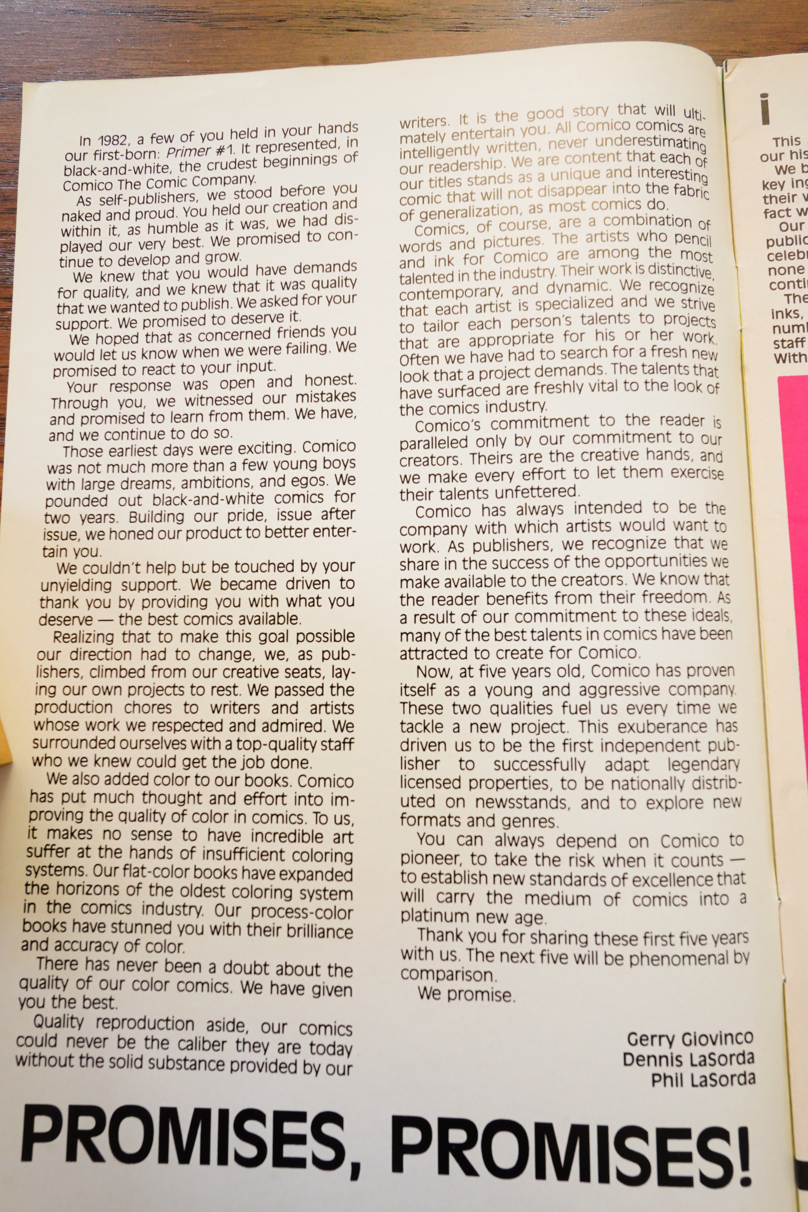
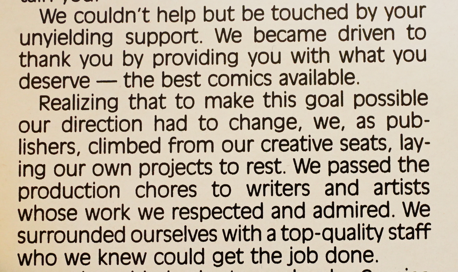
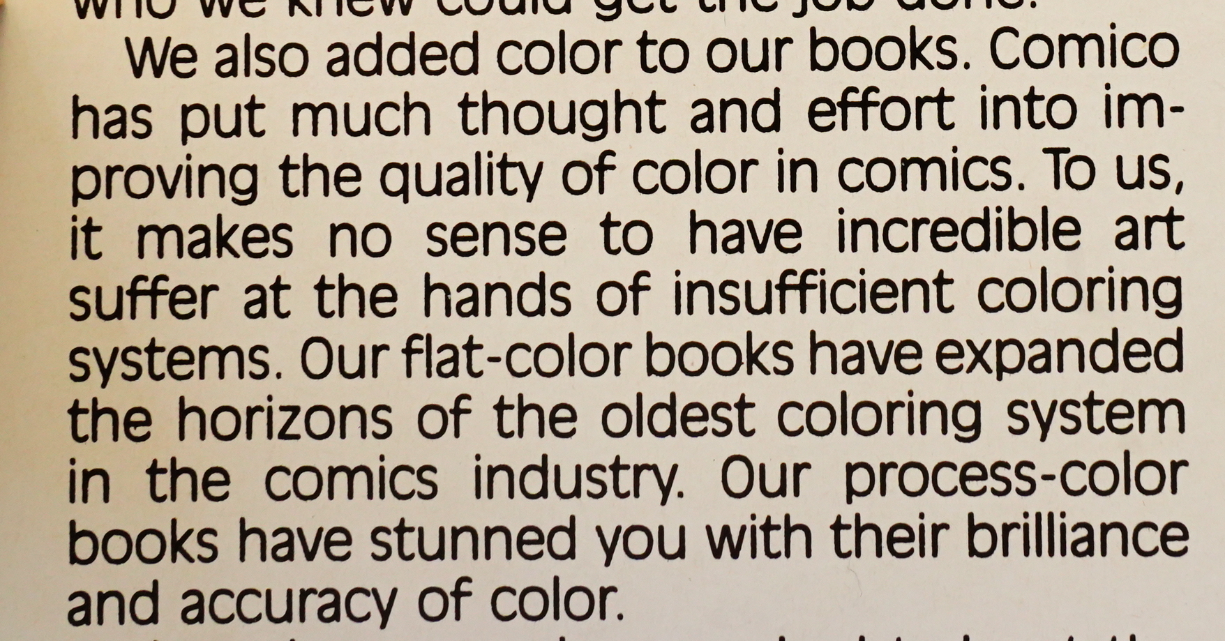
And I think some of the reason is the apparent delusions on display here. All three of these series had the same editorial, so they had to have been proud of the ridiculous verbiage here (with dubious grammar). And it’s obvious that this would rub reviewers at the time the wrong way: Instead of judging these books as fannish amateur books by some hapless almost-teenagers, this editorial line professes that these are part of “dynamic professional” line of comics.

Comico blanketed the comics press with ads for these books, which means that Comico had money to spend, which perhaps further alienated people — as in “they had money to spend? ON THIS?!?” Somebody described these comics as “ugly comics with ugly names”, which is accurate — comic shops ordered a lot of copies of these books based on the ads and the solicitations (that were done without much in the way of artwork samples), and the reactions when they received the books were probably along the lines of “and what are we supposed to do with this shit, then?” People didn’t see them as another charmingly amateurish book, but as somebody trying to swindle them.

It’s not surprising that Comico then pivoted to publishing other people’s comics, because nobody were going to order further issues of this stuff.

The Telegraph Wire #10, page #6:

COMICO
Beginning with the fourth issues of
SLAUGHTERMAN, AZ, SKROG, and GRENDEL.
Comico will be publishing its entire line
with the exception of PRIMER in full colour.
According to these new publishers, the pur-
pose of the change is to “put Comico in the
comics limelight.”

This didn’t happen.

Full page ad in The Buyer’s Guide.

The Slings and Arrows Comic Guide #2, page #55:

AZ.
Comico: 2 issues 1983
Dear, oh dear, oh dear. Az is large pink alien (an Azonian),
who is captured by the evil monocled Baron Stroker. There
are a few nice ideas, like a cigar-smoking fish, but you
can’t sympathise with our pink friend as he’s a violent
bugger. The abysmal art only made matters worse. This is
sub-standard fanzine level at best, so who would
have thought Comico would grow into a respected
publisher.~HY

Oh, Lasorda had planned on outsourcing the artwork.

Comics Interview #5, page #7:

DAK: What’s interesting about Comico
is that you don’t give the impression of
having analyzed the market and said,
“Well, superhero groups are selling well,
so let’s do superhero groups.” You really
have taken a chance, with characters like
Az — a fat pinhead wearing a raincoat…
PHIL LASORDA: I designed him after
my father.
BILL (COOCH) CUCINOTTA: Wait
’til he reads that!
PHIL: I had a psychology teacher in
college analyze AZ for me, and he said
for women it is a penis gratification, and
more women are going to like the char-
acter than men. He felt Az would have a
certain tendency to sexually excite women.
GERRY GIOVINCO: Personally, Phil,
AZ changed my life.
PHIL: I just have penis envy. Only
kidding! Az is really weird. When I first
created him, he was really primitive. I
was into the “love” thing. And when I
first came up with AZ, I pictured it as a
child’s book, with pastel colors. On his
planet, there is no such thing as killings,
or hatred — there is a lot of love and
butterflies and that sort of stuff. But his
planet was destroyed, so he curses every-
body for that. Yet every now and then, he
has that love inside him, that desire to
help other people. His whole mission now
is, “to make more Azonians.” Rumor is
that there’s another one out there, and he
just has to find it.
DAK: I thought that was a unique
motivation, too. Not the old, “My parents
were killed, so now I’ve got to stop
crime!”
PHIL: Well, see, he is only here for a
little bit of time. He goes from planet to
planet. He is going to be on an old-age
planet, in the fifth issue. The cover is him
in a wheelchair.
My brother is a physical therapist, and
when I was in college, in order to earn
extra money, I worked with him in an old-
age home, a nursing home. I talked to
people and saw how they felt about lone-
liness. I decided to bring that into the
book and incorporate Az to show how he
deals with older people.
Az goes through these different ex-
periences and different emotions. A reason
I left his eyes blank was that I wanted to
get other people’s feelings into Az. I want
them to picture themselves in Az. Every-
one picks on you, everything happens to
you, you feel like an Az . . . A-Z, not the
other one.

Is that how Az from Vokes/Rankin would have looked?

Comics Interview #83, page #16:

PAT: I’m going to tell you a secret: I was
the managing editor of COMICS
SCENE when the first Comico titles
came out and we were running a column
called “Pick Hits,’ in which I chose what I
thought were the best titles coming out.
When I saw the first set of Comico titles
– with the possible exception of yours; I
don’t remember if it was in there – I
turned to the editor, Bob Greenberger,
and said, “Gee, I wish we had a ‘Bottom
of the Barrel’ column.”
What’s the one I remember – Adge,
or something like that?
MATT: AZ – that was done by Phil
Lasorda, the owner.
PAT: So, it was surprising, four or five
years later, to see Comico doing material
that anyone actually wanted to buy.

There’s even less written about Az than Slaughterman and Skrog…

Well, this guy liked it:

I genuinely loved this!Comic absurdity at its finest.

I think this had better art and story than the first Vol (2 issues) of Grendel, like hands down! (I love Grendel btw).Phil Lasorda could have taken the adventures of the AZONIAN “AZ” and the floating fish “Detective Doggman”, to similar levels of success, at least judging by these stories.

Hey, there’s an entire Progressive Ruin post about Az:

So basically I’ve had an interest in amateur work like what you see here in Az, a sort of unfettered approach to putting your imagination on paper and getting it out there for people to read, without the constraints that could be put upon the project by larger publishers. It’s rough around the edges, I’m not sure about the setting for the story (more on that in a sec), there’s a full page drawing with a waitress in the foreground whose nipples are very carefully delineated beneath her shirt which is — a choice…like I said, unfettered.

Aside from that last bit about the nipples, which, honestly, that was out of nowhere, this isn’t a terrible comic. It sets up the premise, introduces our hero, tells its story…not polished in the slightest, but retains a measure of charm anyway.

Well, I have certainly read worse than Az — I mean, a lot worse — but this seems overly generous.

Anyway — the next post will hopefully be about an actually good book.

1983: Skrog

Skrog (1983) #1 by Bill Cucinotta and Bill Anderson

This is the second of the three original Comico series. And look:

I bought a lamp! Perhaps that’ll fix my problems with uneven lighting that I had on the previous blog posts…

Hm… do I see a Cerebus influence?

OK, this is one of those punny comics, which I approve of, but…

With extremely zany humour. But, er, it doesn’t really work, does it? I mean, it does seem kinda like high school humour, which is almost appropriate, because I think Cucinotta was in his early 20s here, but it’s really basic.

The artwork’s not altogether bad, but he attempts more than he really has the skills for.

Oh the puns.

That looks really, really Dave Sim-ish, doesn’t it?

It’s sometimes not altogether trivial to say what’s going on, and even if you do understand it, it’s still a bit eh? Like here, Skrog has bitten off the tentacles of the henchmen monsters and then spits them into the wizard’s face, and … and… But why?

And this is how the issue (and the series) ends. Is that Batman’s hand? Did I miss something? Is this a total non sequitur? Oh, yeah, his shadow is on the cover… I forgot.

In 1987, Cucinotta released a sequel, and that’s apparently it for the character. Oh, and a story here?

Amazing Heroes #30, page #62:

Comico, the publisher of Az,
Grendel, Primer, Skrog, and
Slaughterman has been kind
enough to send me copies of
their titles for review purposes. I
in turn have decided to scruti-
nize the first issue of Skrog,
since it is in my mind the best of
the lot.
Make no mistake, Skrog is
very much a fan effort, but that
should not deter you as a
reader. It should in fact stimulate
your curiosity—all too often, the
mainstream comics seem to fos-
ter cookie cutter writing and art
styles, but the creator of Skrog
spurns the typical Marvel/DC
treatment for an individual,
iconoclastic approach.
Skrog is a freewheeling
conglomeration of ham-bony
humor, irony, and sheer extra-
vagance that avoids superhero
cliches by lampooning them.
And fine satire it is, consisting of
telling visual puns and succinct
witticisms (which is a welcome
contrast to something like
E-Man, which is starting to
resemble the walls of a bath-
room stall where the punsters
get paid by the word).
I feel quite assured in stating
that there has never been a
character/series comparable to
Skrog. It’s all mad, vivacious
fun, and sheer, goofy appeal.
And to me, that’s entertain-
ment.

Satire?

Comics Interview #5, page #8:

GERRY: That is an interesting thing
about our characters. None of them have
eyes except Skrog, and Skrog’s eyes
never focus. Too bad we didn’t bring any
early versions of Skrog. He used to have a
knife sticking out the top of his head!
PHIL: Like you said about us being
different . . . Dave Scroggy of Pacific said,
“You guys are so different, there is no
way you could say no to a book as
different as that.” People like the chances
we are taking with the books.
COOCH: The reason that we are different
is that everything is totally personal.
GERRY: Every one of us has something
to do with the character we are drawing.
Every time I look at SKROG I die –
because it is Cooch all over, every ex-
pression the character makes.
COOCH: Well, I do hibernate in trash
cans.

A second issue was put on the schedule, but cancelled.

Heh, they had Primer planned up to #10, which ws supposed to be an all-Skrog issue?

Comics Interview #10, page #50:

SKROG has been skragged.
(Laughter.) Bill Cucinotta, the creator
of SKROG, is going to be working on a
much more refined character, a macabre
individual: PAIN.

That didn’t happen, either…

The Slings and Arrows Comic Guide #2, page #593:

SKROG
Comico: 1 issue 1984
Crystal: 1 Special (‘Yip Yip Yay’) 1987
Skrog is very much a prototype Mask, with the same mixture
of madcap whimsy and parody, which makes the title sound
far more interesting than it is. Unfortunately the wacky action
and stream of consciousness dialogue is hung on a two page
plot stretched to twenty. By the special the art has improved,
but it’s still a waste of paper.~WJ

Ouch!

From the infamous Alternative Comics Cadaver Derby in The Comics Journal #98, page #51:

If ever a comic book company got started on the wrong foot, this is the one. Com-
ico’s opening line, with titles like Az and Skrog, featured art that was as ugly as the
characters’ names. Dealers waved copies of Comico comics at me and cried
piteously, “I’m supposed to sell this?”
Beginning, then, with one of the worst reputations in the industry, Comico set
Evangeline. After a particularly homely first issue, Mage began to shape up. And
Elementals, the first issue of which did amazingly well for an alternative book,
about it.
The bloom may be off the lily, though. The creators of Evangelinehave cancelled
a comic book adaptation of a Japanese adventure cartoon.
This one could swing either way. Even odds.

Amazing Heroes #55, page #17:

CUCINOTTA LEAVES: BILL CUCINOTTA, who
had been a partner in Comico since May 1982,
has left to devote more of his time to pursue
his career as a freelance designed and
illustrator. Cucinotta was co-publisher in the
firm, handled the promotional efforts there, and
created Comico’s Skrog book.

I guess that explains why there’s no Skrog/Pain from Comico.

Comic Book Artist #15, page #69:

Chris: I seem to remember the Primer was in early ’82? Is that
about right?
Matt: Yes. Again, I think First Comics were around at that point, as
well, Eclipse and not much else in the way of… well, there was
WaRP and Aardvark, but they were self-publishing one book apiece,
so there were not that many publishing houses outside of Marvel
and DC, and the direct sales market had just crept up into existence,
and they were willing to take on independent publishers where the
newsstands weren’t. So we had this opportunity and we slipped in
to it. I will say the initial batch of books weren’t very well received
when they were actually shipped.
Chris: They were quite famously ill-received.
Matt: Yeah. Quite.
Chris: There was a point, I think, where retailers were just
ordering every independent book that came out.
Matt: You’ve got to remember, too, that this was in the days when
the ordering catalogs were nothing like these large, ornate, full-color
affairs you see now. You often had to order books off little more than
a tiny little paragraph of text, you usually saw no graphics. [laughs] I
think another reason they got ordered, too, was that Giovinco had
quite a nice little graphics sense, and so our ads always looked pretty
damn good! [laughs] But when the books came in, they didn’t look
so damn good. Oh man, it was kind of a desperate time! We’d all
quit school, and were really trying to do this, and realizing that
we probably weren’t ready for it, weren’t the professionals we’d
conceived ourselves to be. [laughs] Of the four books, Grendel was
the only one that was modestly received. I won’t even say it was
greatly, or even positively received, but it generally got more positive
feedback than the other three.

And how!

This is the only review I can find on the interwebs:

This is one messed-up comic – and a tricky one to grade, as well. From an objective perspective, Skrog is clearly more fanzine than professional comic. But the introductory editorial insists it’s a “fantastic, new, professional comic book,” one “ranking right up there with the best.” Comico would go on to publish some of the best indie books of the 1980s; this is not one of those. This series’ odd mix of fantasy, horror and humor might just work if the creative team had had time to grow. But Skrog would prove to be a one and done at Comico.

1983: Slaughterman

Slaughterman (1983) #1-2 by Gerry Giovinco

I think this is one of the few Comico comics I had as a teenager. I had a “policy” — I’d try one comic from all new independent publishers just to see whether they had good taste or not. (This stopped when the Black & White Explosion got underway, because it just became impossible then.) And I don’t remember anything about this book, but I can’t have been very impressed, because I didn’t buy anything from Comico for a while after that. I think the next book I bought was Mage #7 or something? And even after that, I mostly just skipped the Comico solicitations — I picked up things like the Jam Color Special, but…

So now I’m kinda excited to read this again to see whether I agree with my… 14 year old? self.

Oh wow. “Segment them into a progression of dichotomous choices”. Perhaps I just fell off my reading chair laughing back then?

And then it gets worse — we get a hard sell with “our first dynamic professional line of four great books […] in the midst of a creative explosion”. Yeah, I can feel the breeze from my eyes rolling, reaching me from four and a half decades ago.

But hey! This doesn’t look bad! It’s much, much better than the artwork in Primer #1, which was published just some months earlier. (But I guess the artwork may have been older than that.)

We pick up from where we left off. The piece in Primer #1 ended with Slaughterman apparently being killed — a traditional cliffhanger ending. But then it turns out that he’s really dead after all!

Well, that’s certainly an original way to open a series — with the protagonist dead (and with a feeling that you should have picked up Primer #1).

It’s pretty jarring — the bad guy is appropriately cartoonishly evil, but when you couple that with a gang rape, it’s a bit… what’s the word I’m looking for… disgusting?

OK, the setting is on a primitive-ish planet, but there’s mysterious aliens (perhaps) that are dropping weapons there. To have fun, perhaps? Could be leading up to something meta?

I guess having a villain this cartoonish allows you to skip having to actually write a coherent plot.

Giovinco is pretty ambitious, really — he tries lots of different storytelling approaches, and I have to say that it’s pretty successful on that level.

But it doesn’t really seem to be going anywhere? So we get lots of flashbacks instead.

And of course a whole lot of fighting.

But it seems like the status quo that Giovinco is aiming for is that Slaughterman’s wife is the new Slaughterman, but she has to hide who she is because… er… probably patriarchal reasons.

So you have a medieval setting, with sci fi weapons, and a mad evil villain, concealed identities, and possible humour from gender swapping, and… it’s not a bad setup, really? There’s certainly lots of possibilities for carrying on. Up the Khyber.

But are these two issues good? No, not really. But they’re better than I thought they’d be. Especially the artwork. How old was the artist at this point? 23? Well, OK.

The series ends the traditional way indie comics series end: With an announcement of the next issue, soon to follow.

Comics Interview #5, page #15:

PHIL: You did that in THE COMIC
BUYER’S GUIDE. Gerry sent a press
release to tell them about the upcoming
issues of SLAUGHTERMAN, SKROG,
AZ and GRENDEL. The press release
even revealed the surprise ending of
SLAUGHTERMAN. I said, “Gerry,
you shouldn’t do that.” He said, “Oh,
they won’t print that.” (Laughter.) But
we got a big response from California,
when it came out that Slaughterman was
a transvestite superhero, so that was neat.

[…]

DAK: What struck me as unusual was
killing the title character in the first issue
of SLAUGHTERMAN.
PHIL: People are often put off by the
unusual quality of our books, but just as
often that offbeat quality grabs ’em. A
friend of ours, Reggie Buyers, a fan and
an artist, told us this story: He was in Fat
Jack’s Comic Store in Philidelphia, and a
kid comes in and picks up AZ #1. He
says, “What is this crap? And he starts
cutting it up – verbally, that is. He flips
through it and says, “Who would buy
this?” Then he keeps looking through it,
all the way to the end – and buys it! It’s
funny, but it happens. I think if people
pick up the books, read them, and find we
have something special to say, we’re
going to catch them. I know it!

The Comics Journal #75, page #19:

Az, Morgan Slaughterman, and
Skrog: Another independent
comic book company aiming at
eventual four-color, nationally
distributed publication is
Comico of Norristown, PA. The
partners behind Comico (Gerry
Giovinco, Phil Lasorda, Bill
Cucinotta) have put together a
promotion package featuring
their characters Az, Morgan
Slaughterman, Mr. Justice, and
Skrog, and are trying to line up
support from distributors.
Further information on their
plans can be obtained by writing
Comico, 1547 Dekalb Street,
Morristown PA 19401.

Reading interviews with the Comico guys, one thing they emphasise is how important it is to get the word out. So there’s an unusual amount of ads for early Comico issues to be found in the comics press, like this from Comics Scene.

Comics Interview #5, page #8:

GERRY: My character, Slaughterman,
is the so-called “first transvestite super-
hero.” Personally, I am not a transvestite
-(in a high-pitched voice) really. But I
try to put myself in all the different
characters. With me it is sort of a challenge.
SLAUGHTERMAN is more about social
relationships, religions, religious ideals,
things like that, and I try to incorporate
my ideas about them into the strip, using
the character. SLAUGHTERMAN is a
little straight-jacketed by the comics for-
mat – all our characters really go beyond
that. My character is unusual, because it
is a woman in a man’s suit of armor!

Amazing Heroes previews — this didn’t happen. When Comico switched to publishing colour comics, they planned on transitioning all their comics — Slaughterman, Az, Skrog — to colour. Instead they just cancelled them all.

Comico started as a way for these guys to publish their own comics, and they did that for about a year — and then they stopped, and instead concentrated on publishing other people. I guess it’s kinda what happened with Denis Kitchen and Kitchen Sink?

From a Comics Interview quiz…

Comics Interview #5, page #13:

PHIL: The next two books we had plan-
ned were SLAUGHTERMAN and TALE
FEATHERS — we were into a big duck
thing — which was also going to feature
AZ and SKROG.
GERRY: But then we decided, “What
the heck! If one book can make money for
us, we could sell four books and make
four times the money!” We had Dennis
supporting us, so we could put four books
out and make the money back. Which
was the best thing we ever did, because
PRIMER barely met costs, but when we
put out SLAUGHTERMAN, SKROG,
AZ and GRENDEL, sales of each were
four times the sales of the PRIMER.
PHIL: It shocked us. It really did.
GERRY: The books paid for themeslves,
and then we made that much on top of it,
so we were really very happy with them.
We figure, if we are doing all right in black
and white, we will do even better in color.
Capital Comics’ sales jumped consider-
ably when they went from black-and-
white to color.

Yeah, comics anthologies never sell much in the US.

Well, that’s a slogan!

The Comics Buyer’s Guide #498, page #52:

Comico has released the first
issues of Az and Slaughterman.
I understand Slaughterman is
selling fairly well in at least some
stores. That seems just, since
Slaughterman is the better of
the two. Az is too confusing in its
storyline and too difficult to get
into, Slaughterman is more
direct and coherent. The
artwork in both leaves a great
deal to be desired but there are
indications that there is raw tal-
ent underneath the crudities
waiting to be developed. I can’t
recommend these out of hand,
but I do suggest you look them
over; they are not without possi-
bilities. And there will be color
in future issues, I’m told.

Comics Interview #5, page #9:

DAK: What if one character becomes
ultra-popular, or if a character is very
unpopular?
GERRY: That is a real big question. We
are thinking in terms of flexibility. As
mentioned, GRENDEL is not going to
last forever. I know that Matt already has
another character planned. I don’t want
SLAUGHTERMAN to last forever, either.
My book is pretty well projected, though
– it is going to be out there for a couple of
years, if it is successful. And I think our
characters are loose enough to last as long
as we want and, if they are unsuccessful,
hopefully we are creative enough to come
back with something else.

Amazing Heroes #47, page #18:

GONE: Comico’s Slaughterman has been
cancelled. Additionally, the new Comico titles
Az, Skrog, Armageddon Warriors, and Pain
have all been delayed, although the material
intended for Skrog will be showing up in an
early issue of Comico’s Primer anthology
comic.

Oh, that’s the first I’ve heard of Armageddon Warriors and Pain, and it’s a notice that they’ve been cancelled.

Back Issue #2, page #37:

ME: Matt, in your earlier
work, before Diana, was
there an editor?
MW: Uh-uh. Nope. I guess
Gerry Giovinco ostensibly
gave it a shot. The whole
set-up in the early days of
Comico was that we all did
our own books, the four
books. Skrog, Az, Slaughterman,
and Grendel. And they were all
poorly executed. They were all
the thinly disguised Ids of each
of the creators, and you were
just kind of responsible for your
own gig, you know? There was
no editor, there was nobody
correcting artwork, or anything.
DS: This was before I got there, but you got out three
issues of Grendel. And if I’m not mistaken, none of the
others got out more than one issue of their own. You’re
the only one who-
MW: I was the only one who got any response that was,
like, “I want to see more of this.” (laughs) I mean, they
were all scared and that’s why when they made the
decision to go to color, when they hired Bill Willingham
to do The Elementals for them-and as we know, gang-
printing is cheaper so they needed a second book to
print with The Elementals-I was the only one who had
any sort of positive response from any readers, so de facto,
I won the slot. And that’s how I developed Mage.

Yeah, that didn’t happen, either.

I can’t really find any proper reviews of Slaughterman — I guess there wasn’t a lot of enthusiasm.

But! I found a link to Giovinco’s blog (from 2010-2015), and it’s all on archive.org. However, there’s no index there, so I did some downloading.

Look!

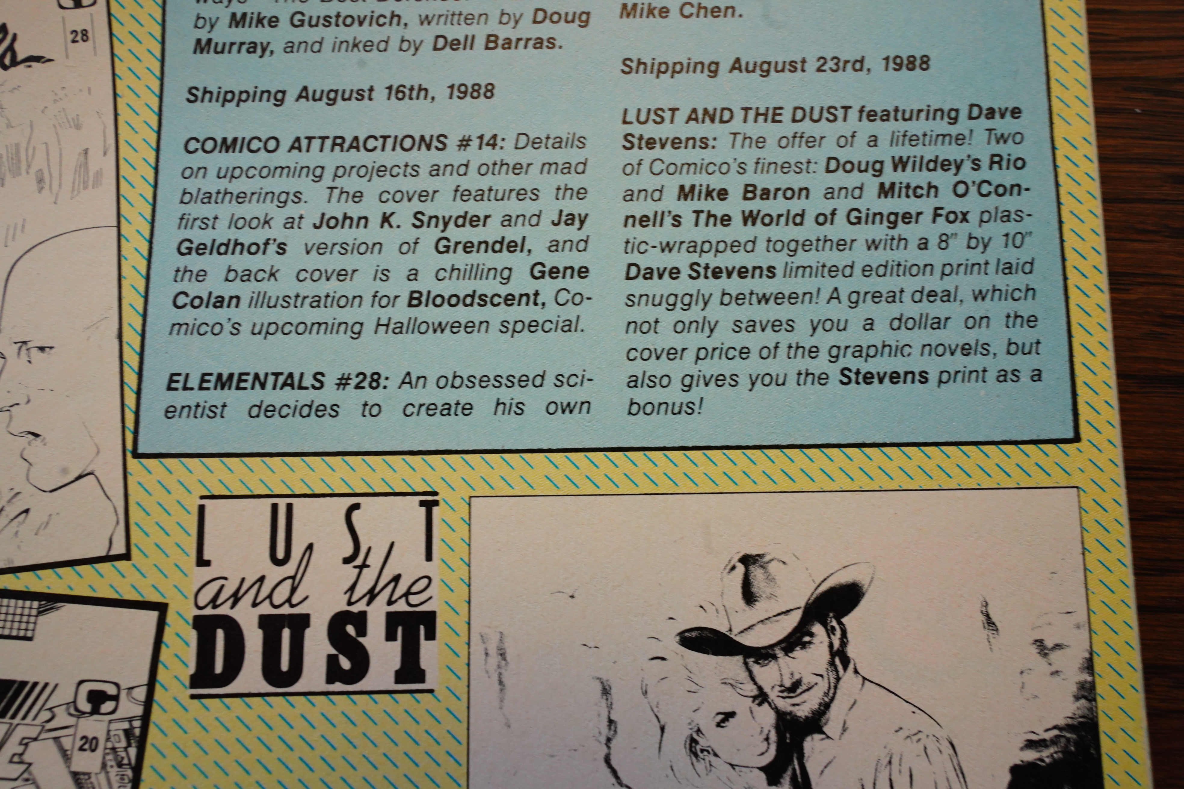
1983 was our first year attending with a booth and we were quick to realize how easy it was to get lost in the vast auditorium of vendors, publishers and artists. Comico was a small black-and-white publisher at the time featuring five titles: Az by Phil LaSorda, Grendel by Matt Wagner, Slaughterman by myself, Skrog by Bill Cucinotta and our new-talent anthology, Comico Primer. We had our sites set on publishing color books and had begun to promote our intentions.

There’s tons of interesting blog posts there. I’ve scraped archive.org for the ones in the “The Comic Company” category, spent some hours massaging the data, and put the pages here. (If that’s not OK, let me know — but it’s just a cache of articles that you can also find on archive.org. It’s just easier to reference from here, because I can search the articles.)

But, as far as I can tell, he hasn’t written a lot about Slaughterman? But I may just not have found the articles: archive.org is so slow and such a chore to sift through.

Let’s see if anybody else on teh interwebs have reviewed Slaughterman…

Here’s one:

Giovinco’s pencils are hit and miss here. Some panels are brilliant, from vultures gnawing on the dead hero, to close-up images of Morgan’s teary eye as she is about to be assaulted by a barrage of brutal henchmen. Yet other panels look rushed, with underdeveloped characters and designs. Still, I see potential here and it’s a shame Giovinco did not continue drawing…but he had many other interests besides art.

Here’s Progressive Ruin:

Even if the contents of the books could be amateurish and a little crude, the cover designs (and slightly larger dimensions) were on-target and definitely stood out as something different. “These Aren’t Your Daddy’s 1980s Comics!” they almost seem to shout.

And… that seems to be it? Okidoke.