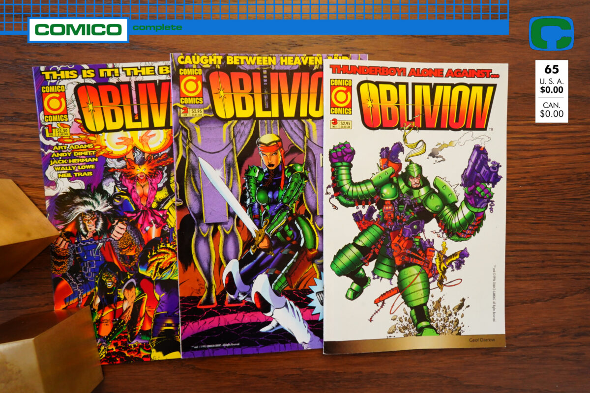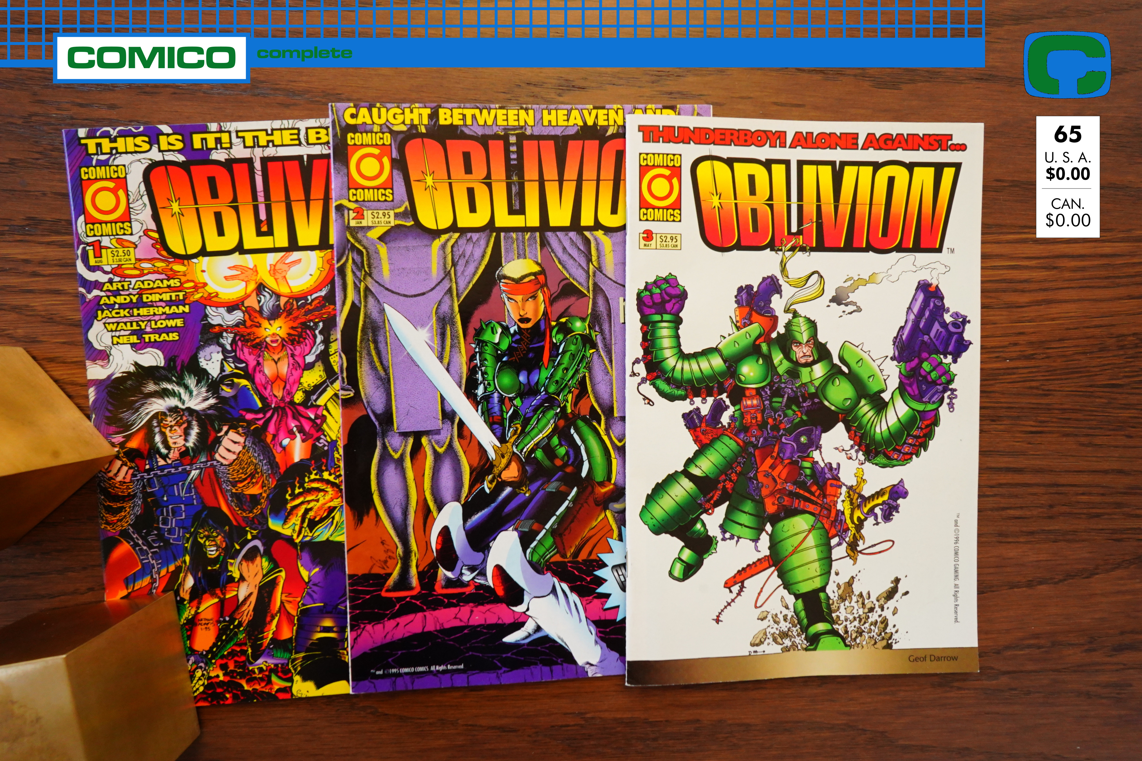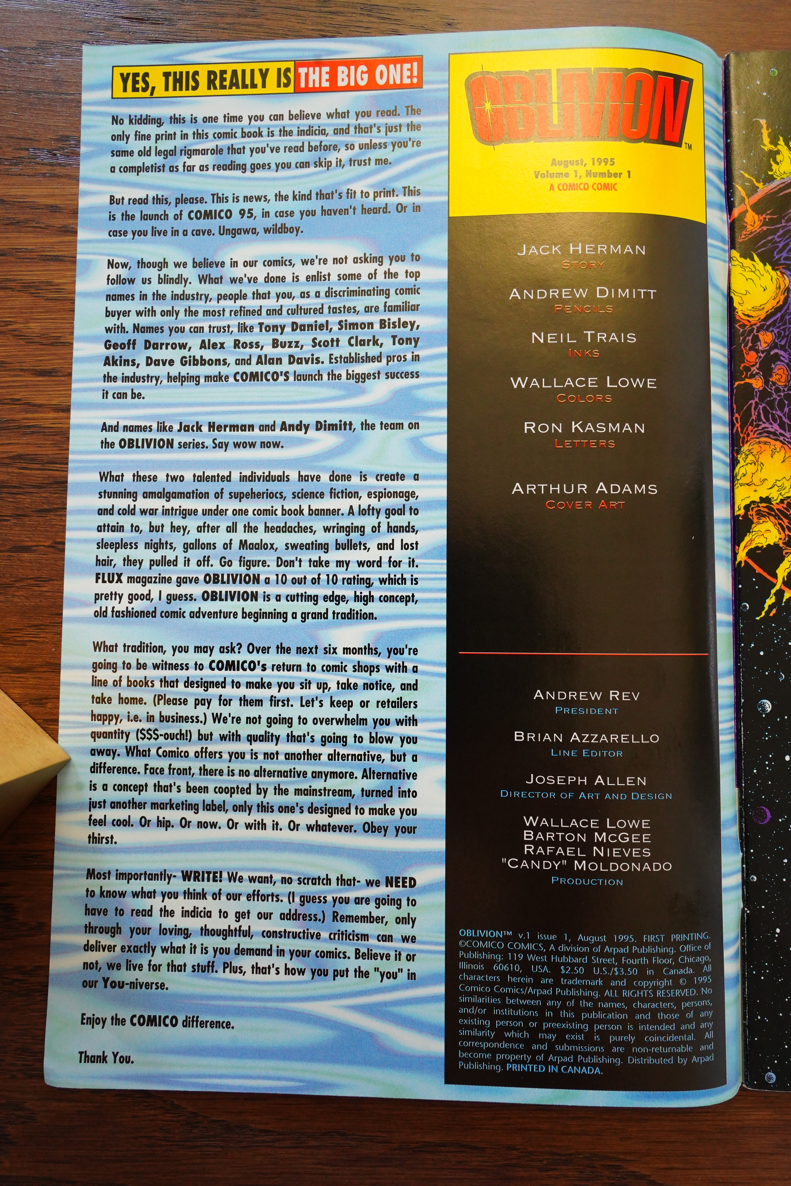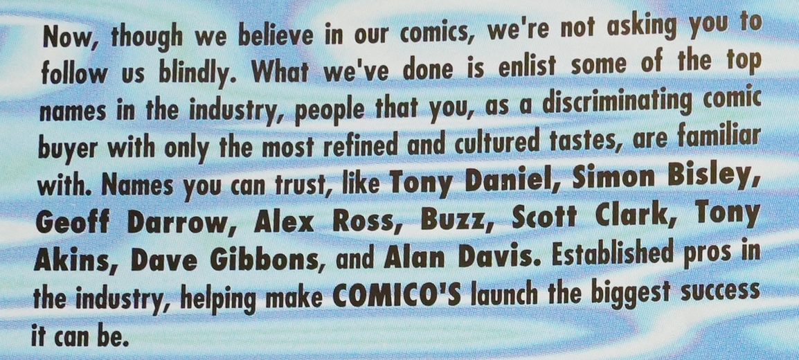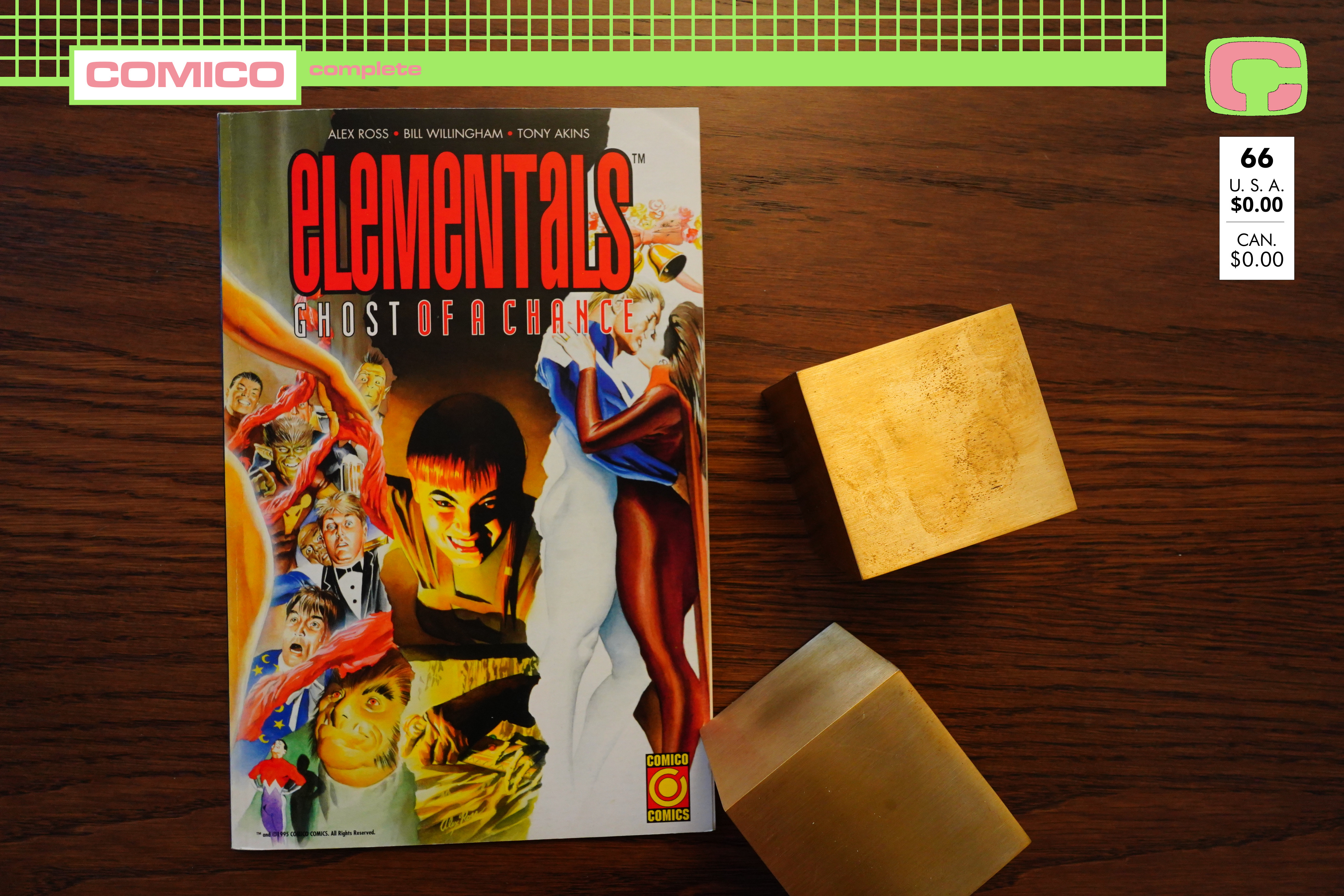
Elementals: Ghost of a Chance (1995) by Bill Willingham, Tony Akins and others
Heh — note Alex Ross getting top billing here. He only did the cover, though.
Bill Willingham’s relationship with Comico had ended on pretty acrimonious terms, with Willingham even writing an article explaining how little he had to do with Comico’s Elementals offerings after the 1990 bankruptcy. But here we are, five years later, and a new Elementals book written by Willingham? The original Comico had a policy of having a deep pipeline of scripts and stuff, so was this a script that’s been in a drawer all that time?
It’s hard to say, because this “prestige format” “graphic novel” (I’m quoting the ads for this thing) seems to take place sort of out of continuity.
But more to the point, the entire thing is a head scratcher.
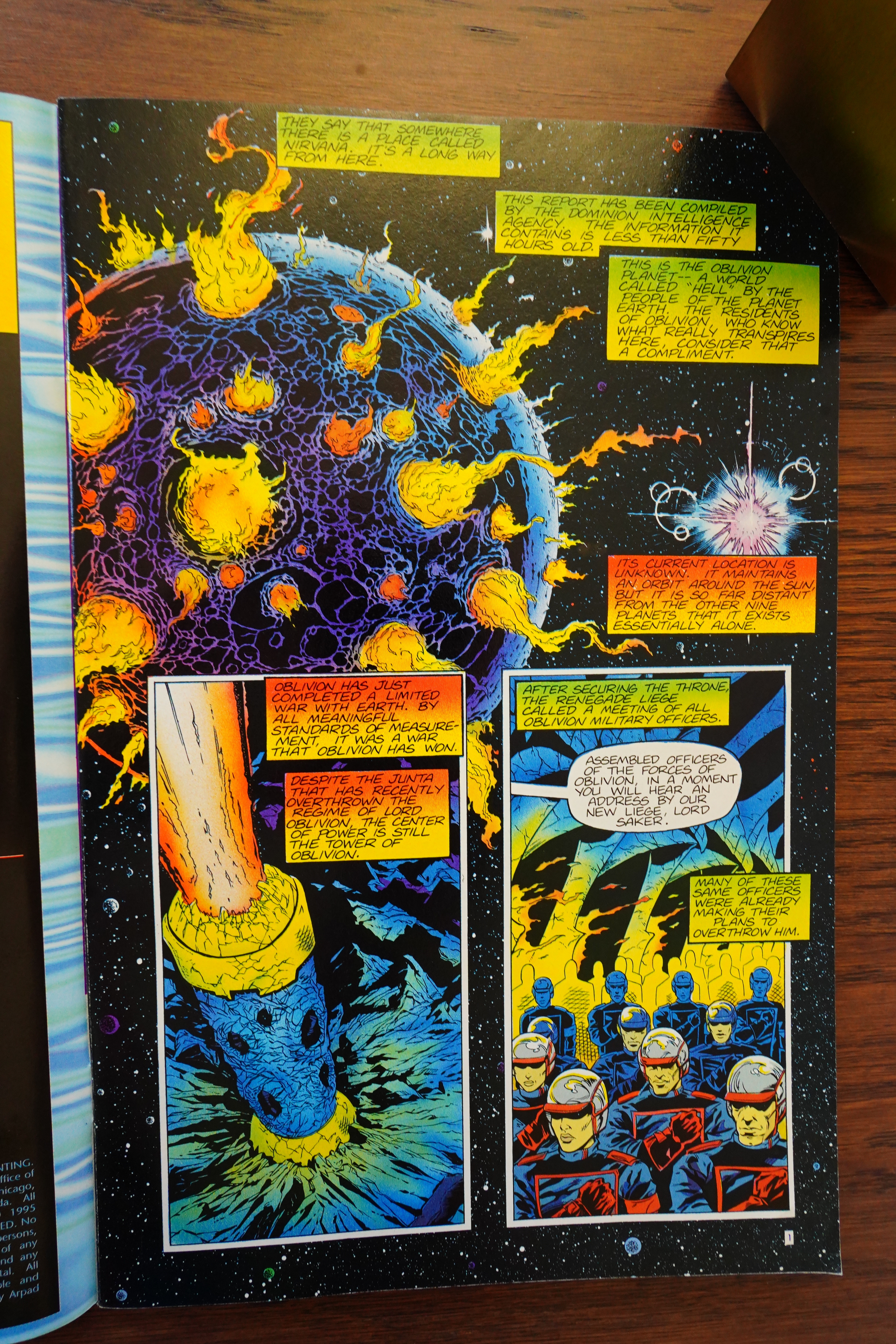
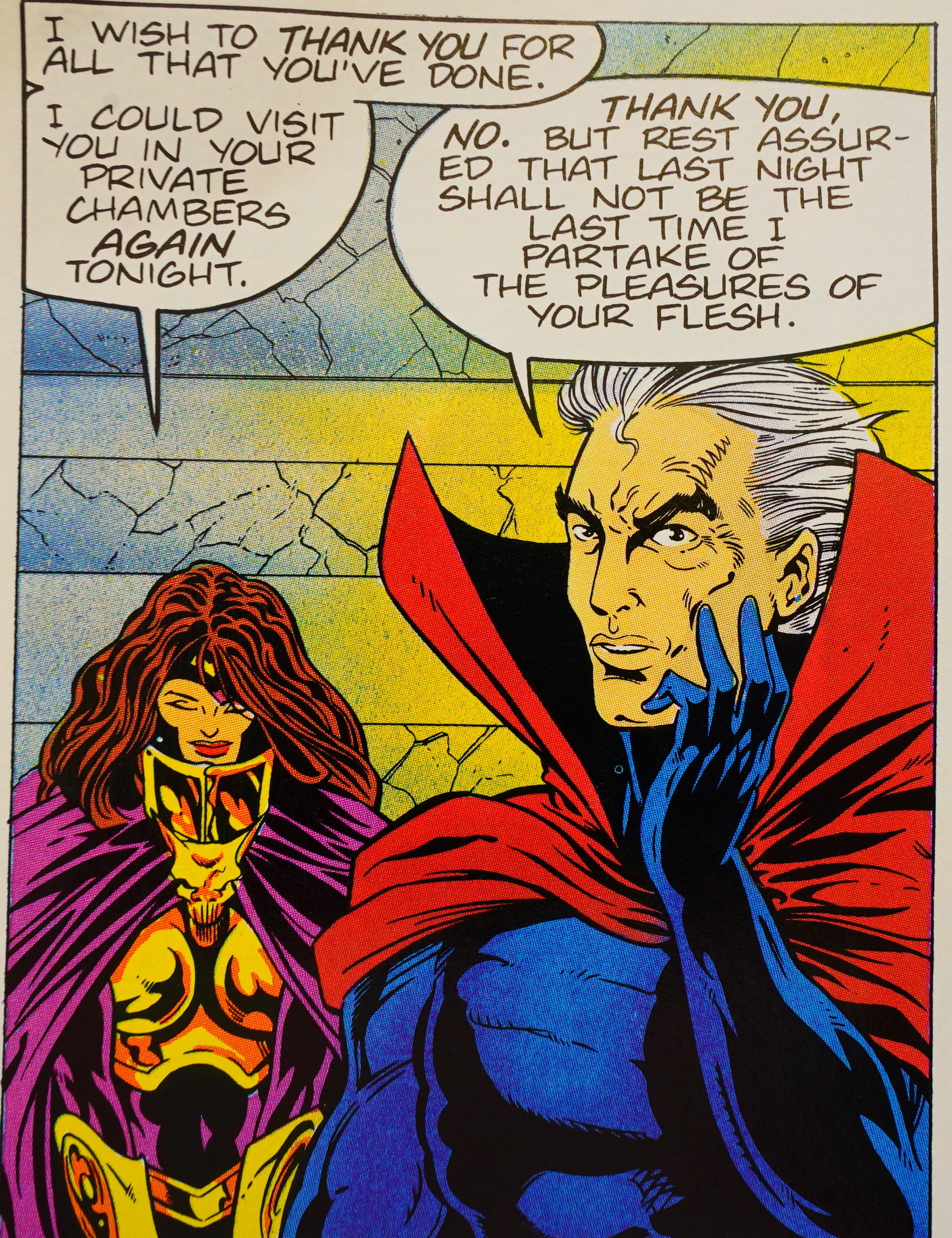
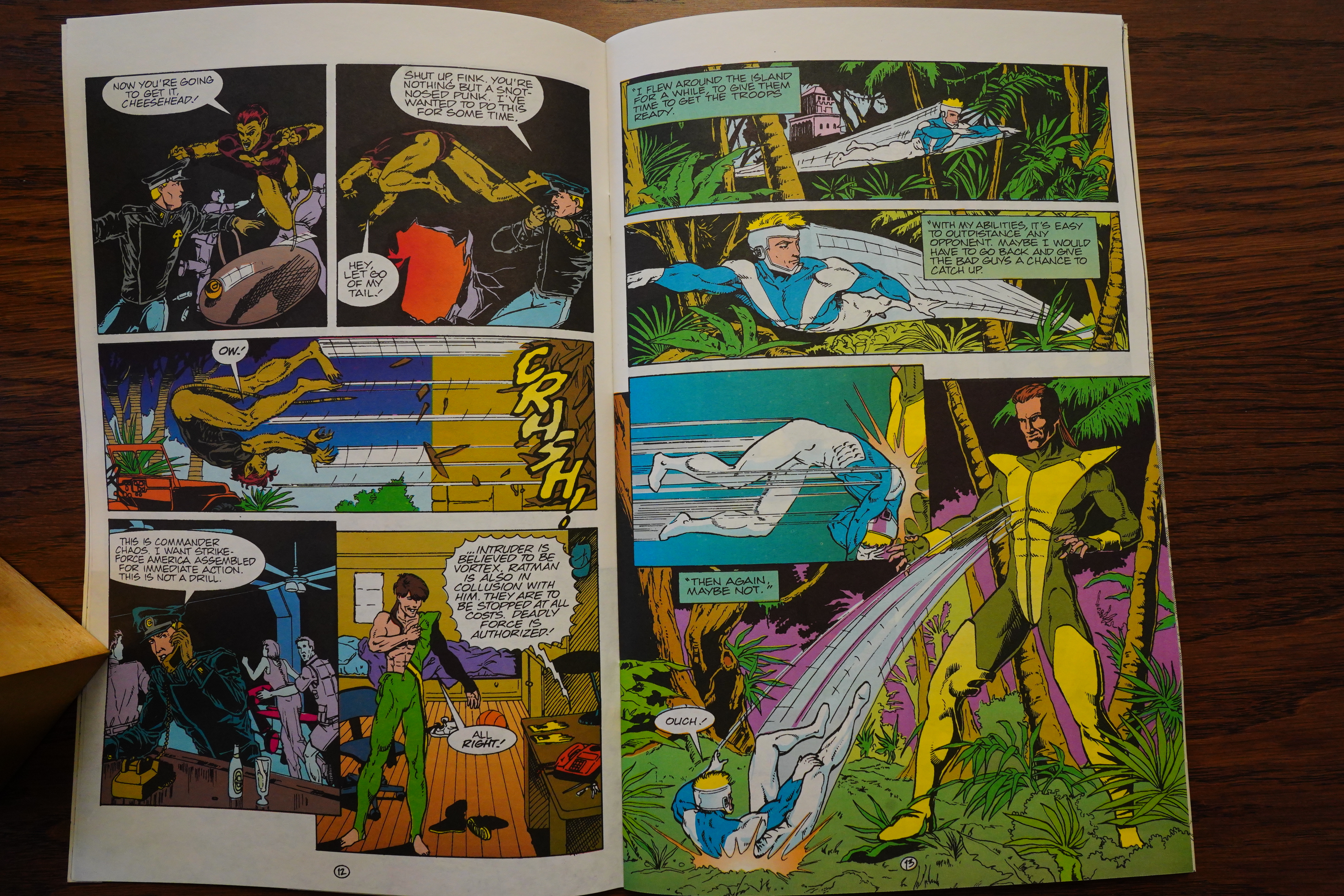
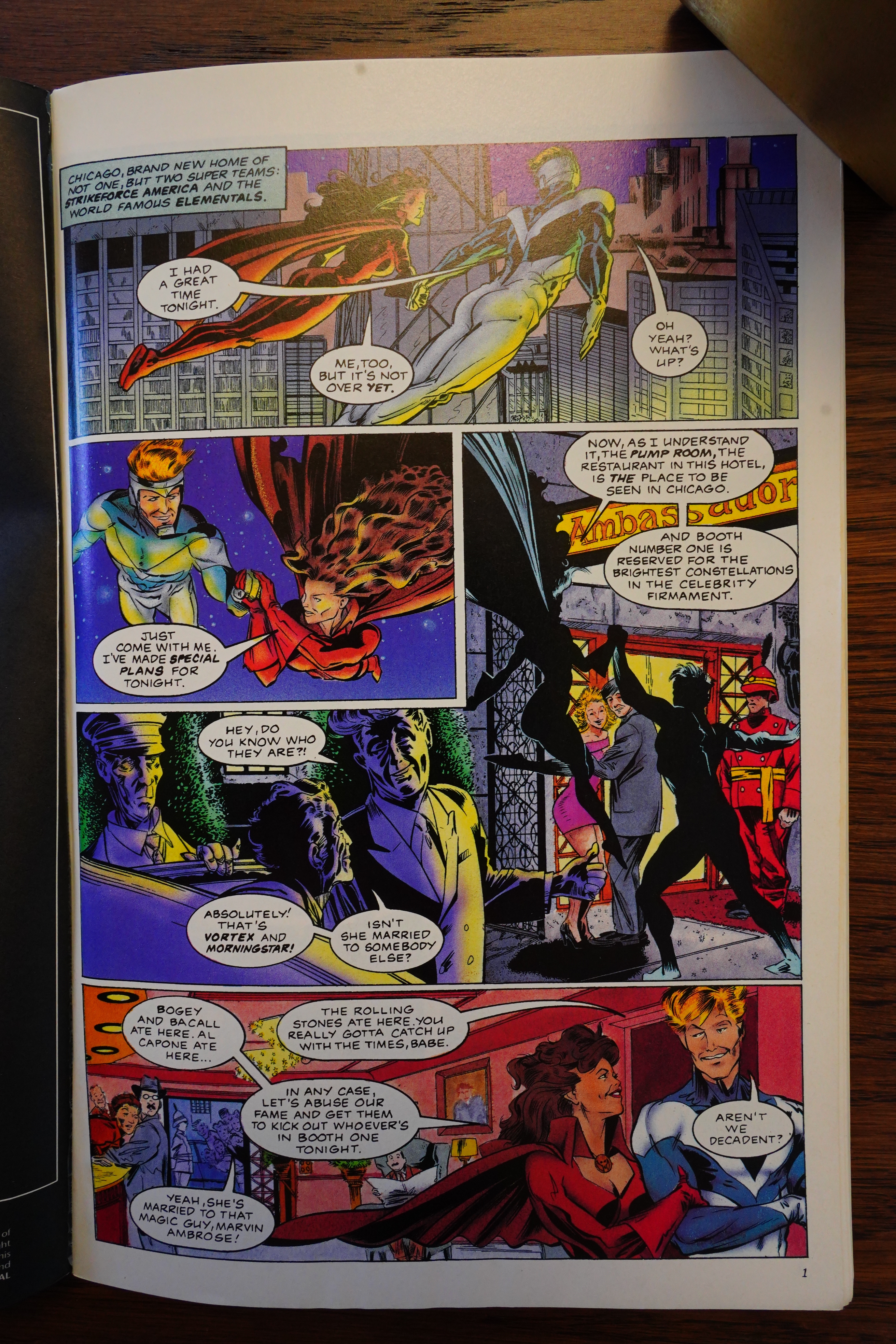
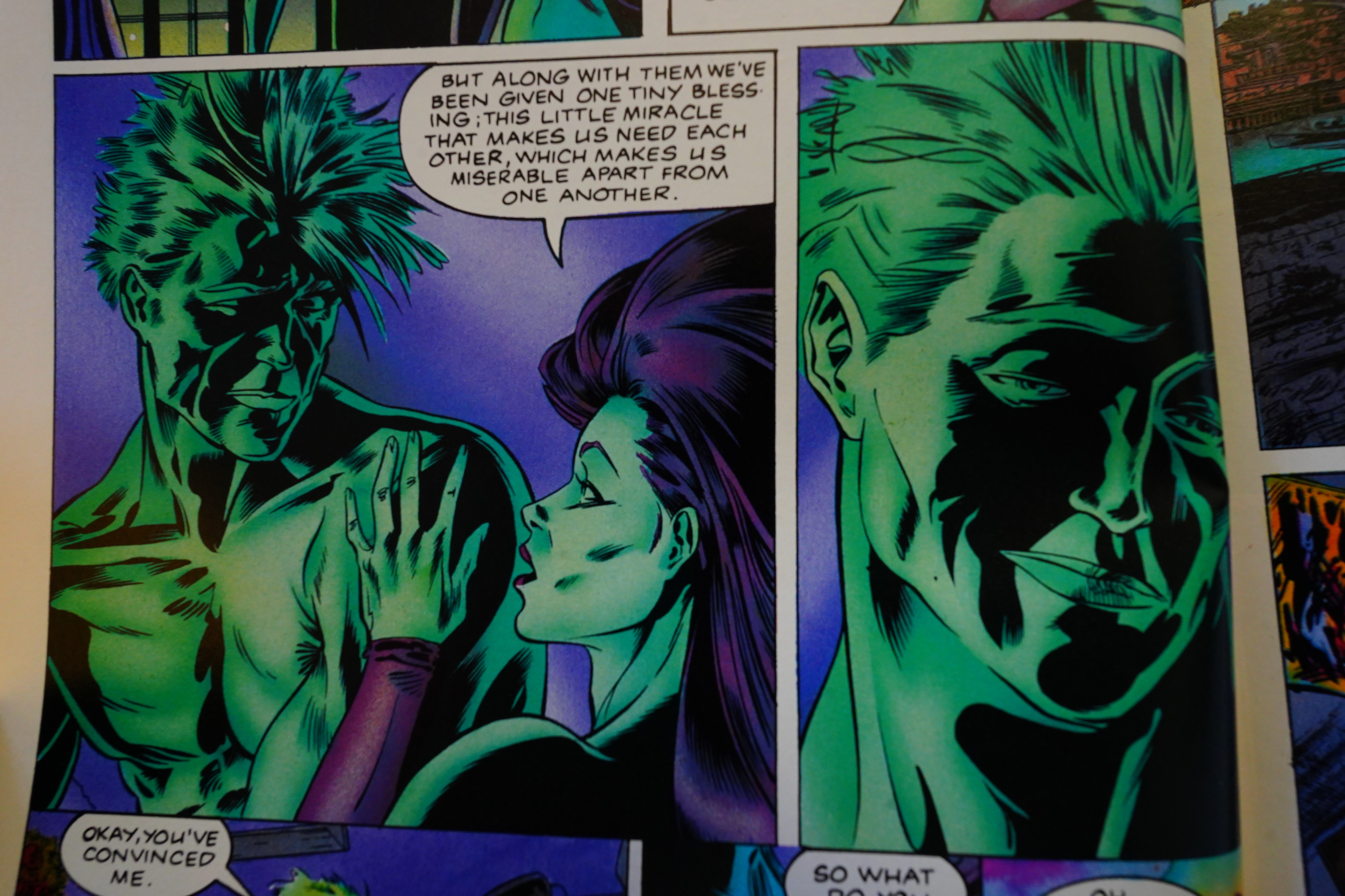
On the first page above, we seem to be getting the introduction of these two characters. One is Vortex; sure — I sorta recognise him, but drawn off spec. The other is apparently Morningstar, but looking nothing like I remember her… but the Elementals have a way of changing costumes all the time, so, er OK? It’s Morningstar?
And she’s going to marry some guy tomorrow? But wants to have sex with Vortex first? Sure, sure, OK, but isn’t Morningstar already married to that Merlin guy?
And… this is how I read half the book. But apparently that introduction (by the passing bystanders) was wrong — she’s somebody else, but her super-hero name isn’t mentioned once in the entire book, I think? She’s consistently called “Janet”, but it’s been several days since I last read an Elementals book, and I don’t remember what Morningstar’s real name was, so this didn’t help at all.
This was published after a two and a half year hiatus, so it had to be even more confusing at the time. And I was plenty confused while reading this.
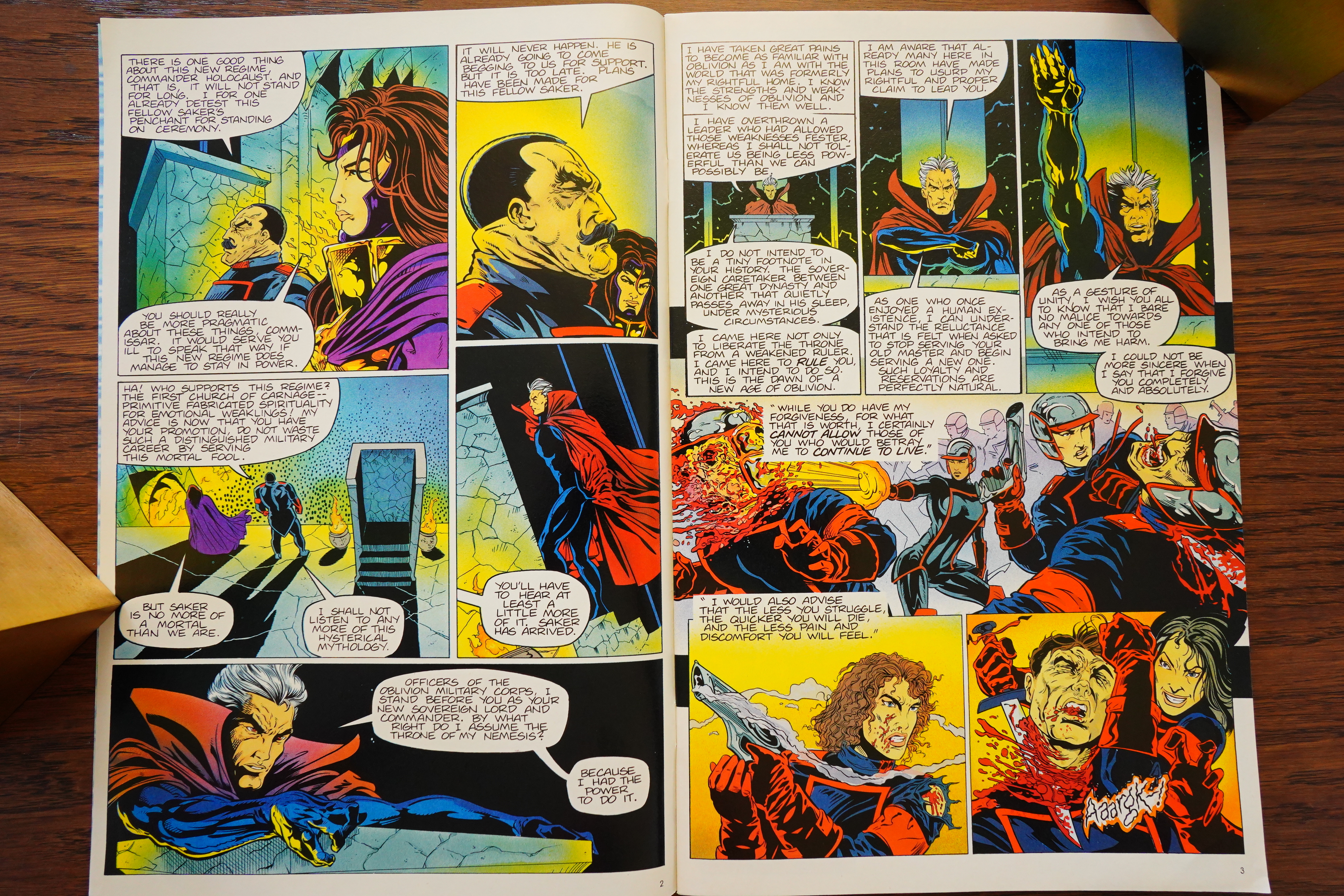
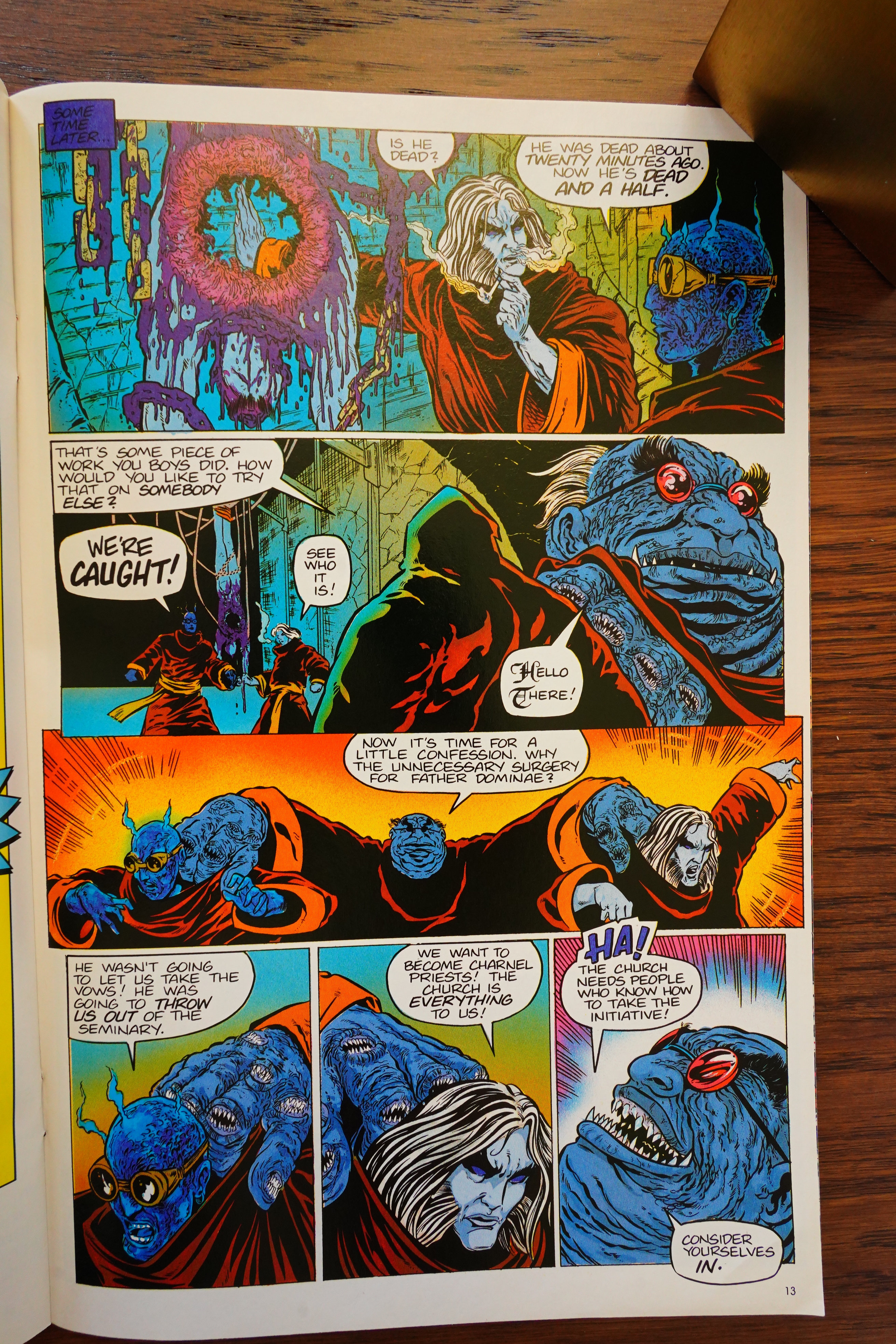
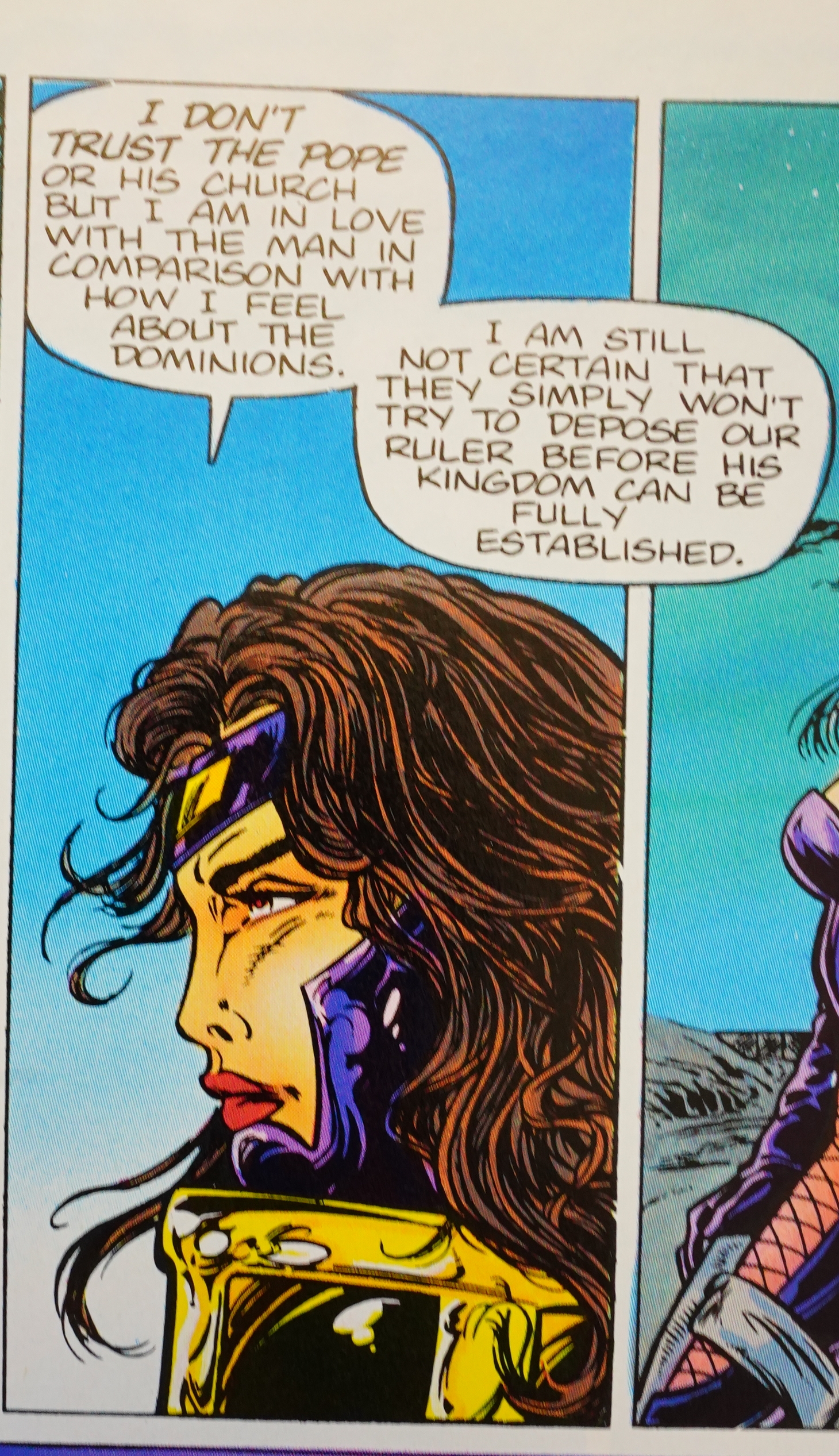
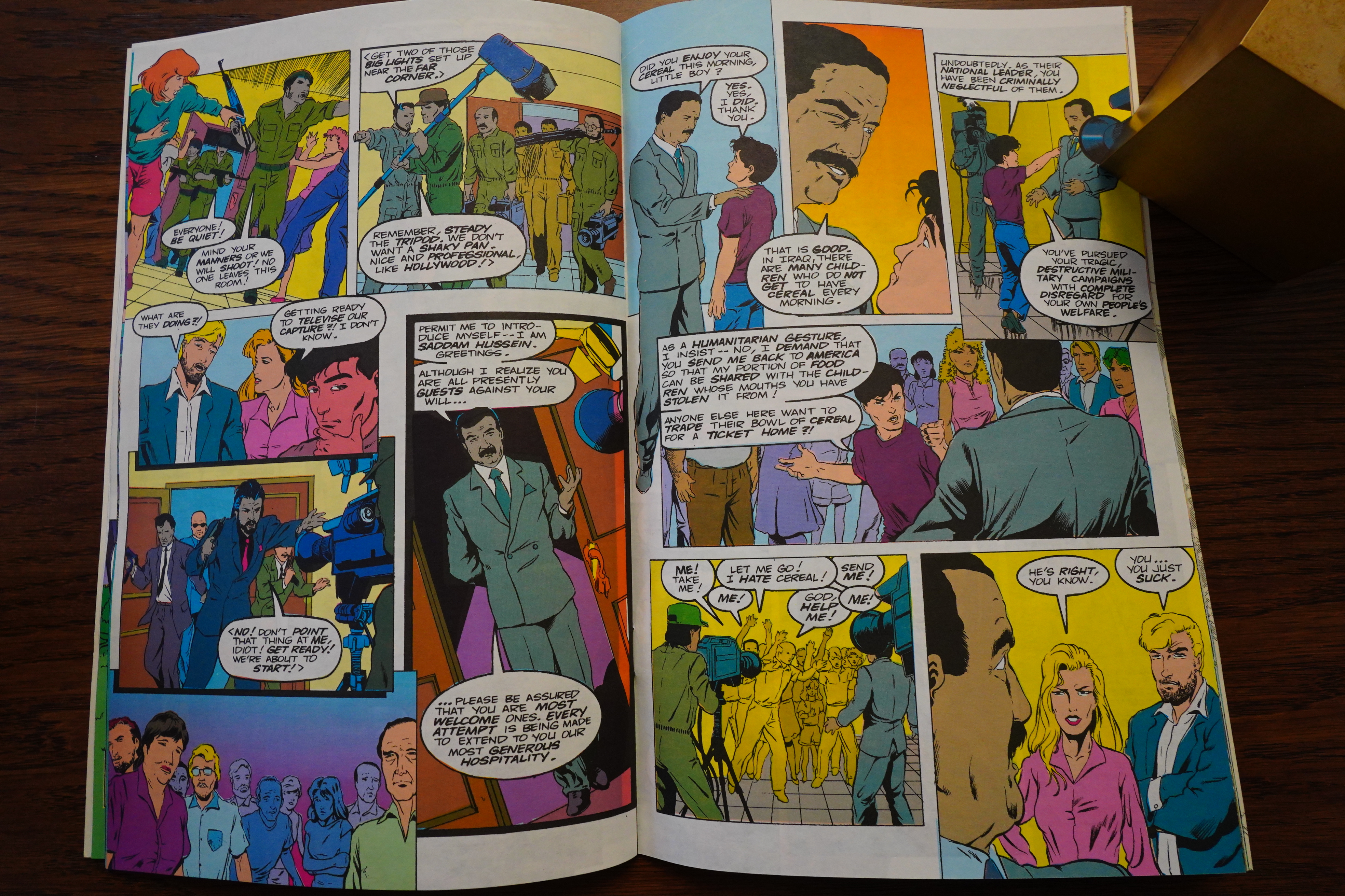
There’s also a plot about this evil villain trying to … do… something… I know, I sound like I’m having an aneurysm, but I can’t tell you have confusing reading this book was. Nothing seems to make sense.
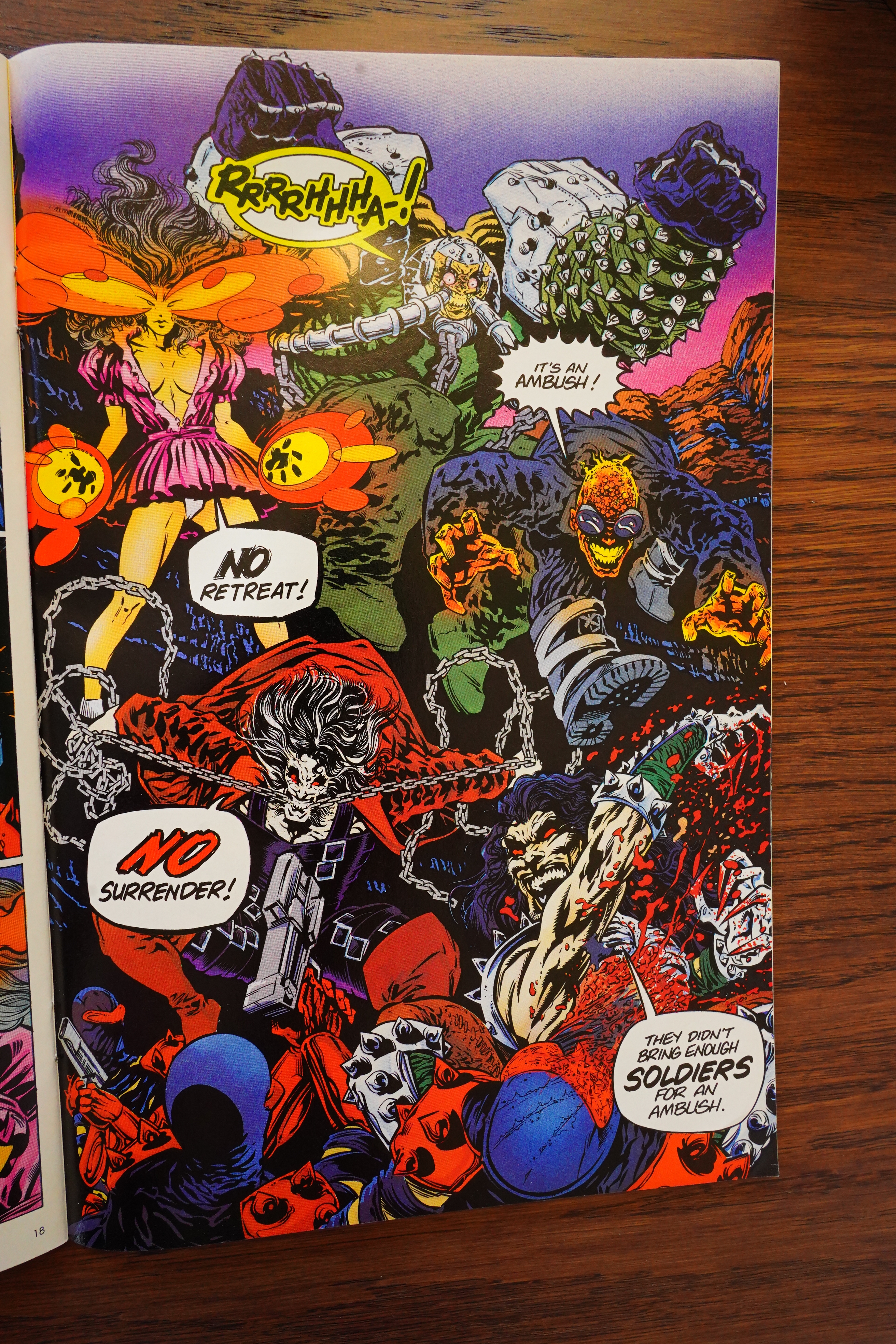
Akin’s artwork is kinda striking sometimes.
And, er… why does that plane crash land in the background there? I think that’s the first and last we see of that pilot?
Willingham adds a joke.
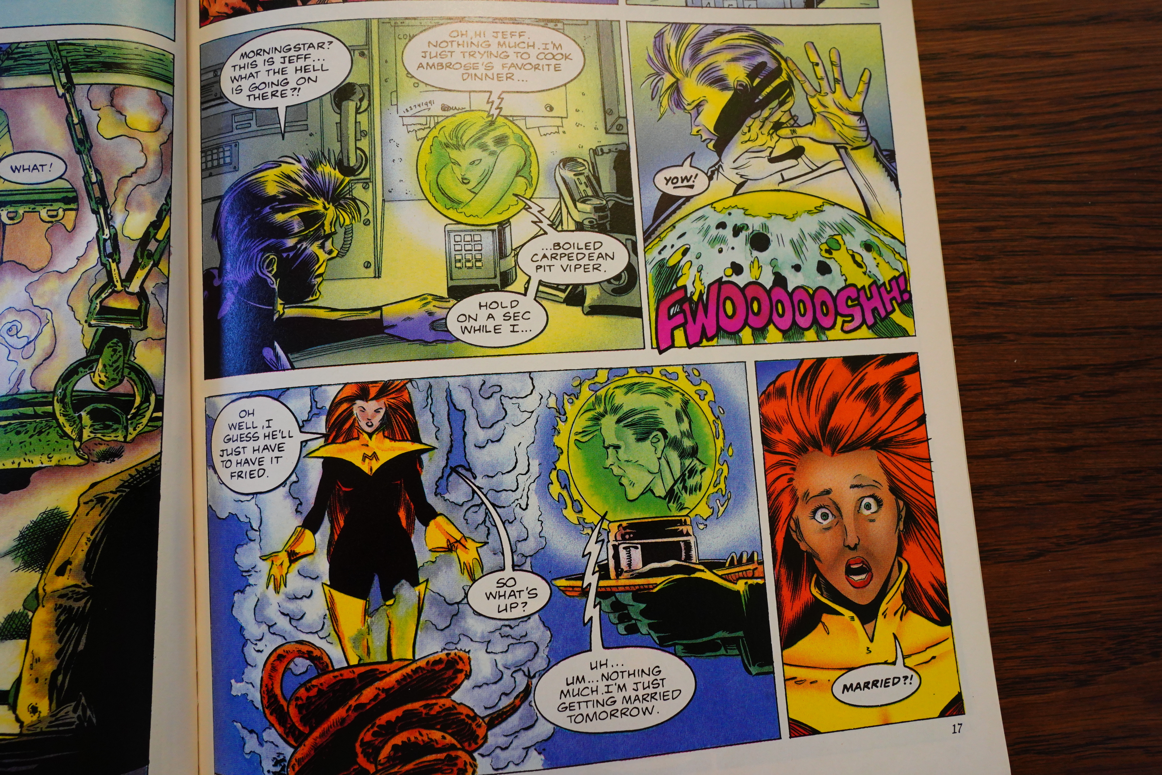
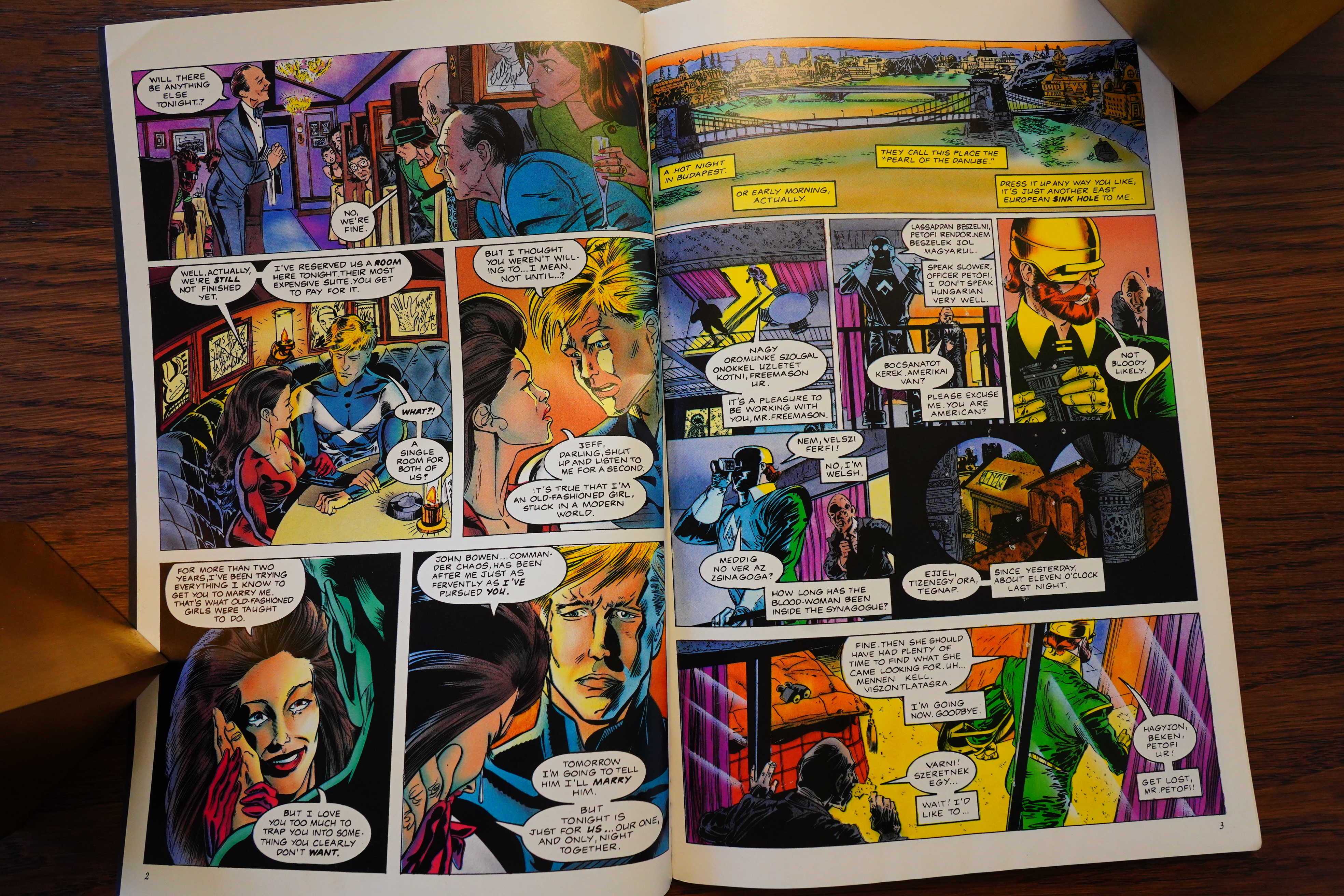
Oh! There’s Morningstar! When I reached this page, I started wondering whether there were two Morningstar characters now, and I’d just forgotten.
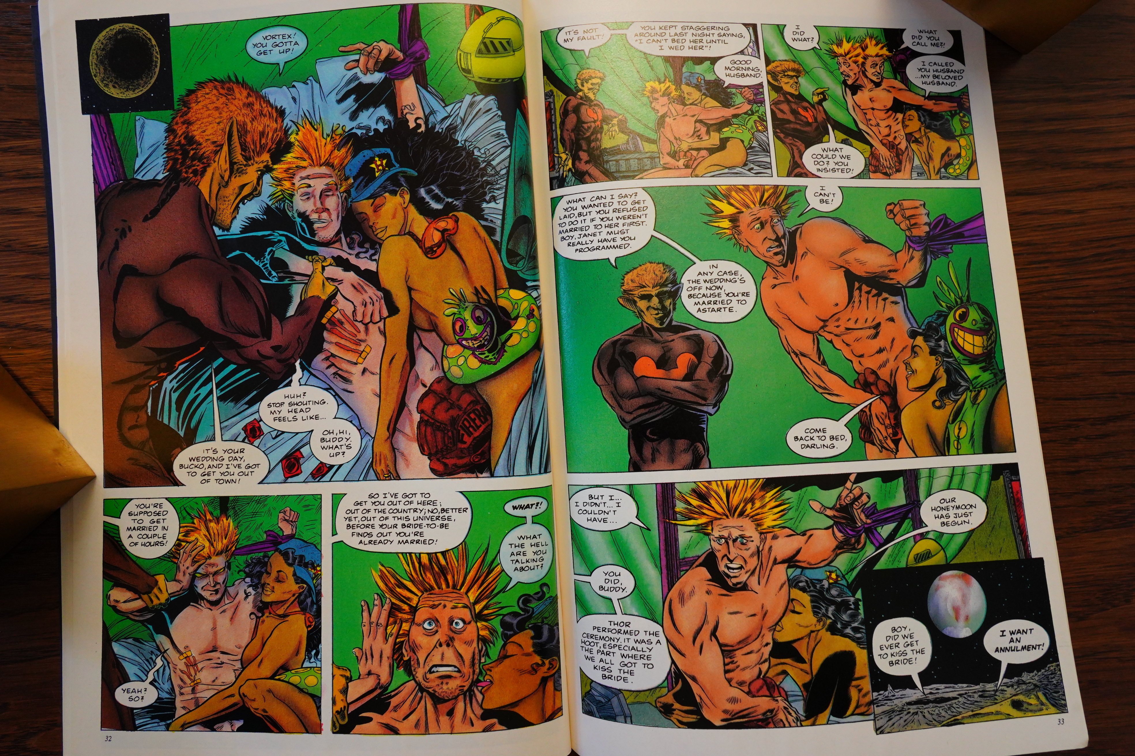
Anyway, there’s a huge bachelor party, and… Vortex gets married to somebody else, has sex (so does the not-Morningstar character (not the marrying part)), has the marriage annulled, and then marries not-Morningstar! Whoho!
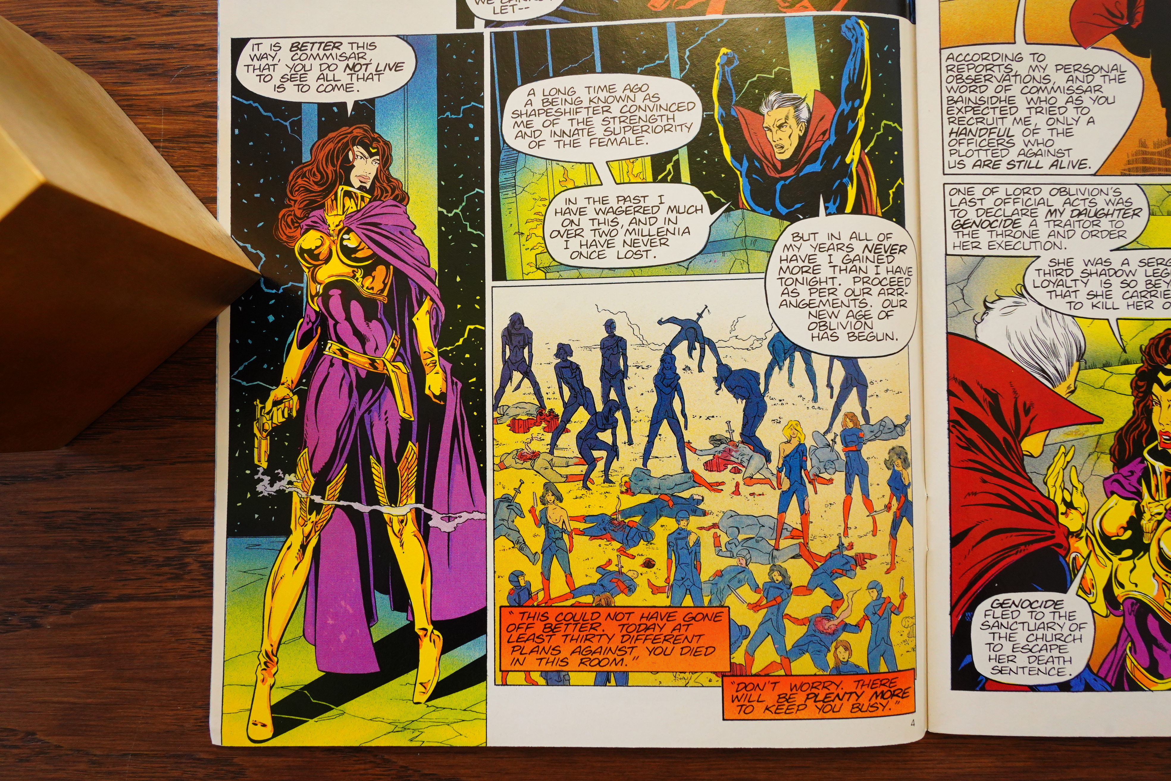
(Not-Morningstar conquered that evil villain through means I don’t think were explained in the B story.)
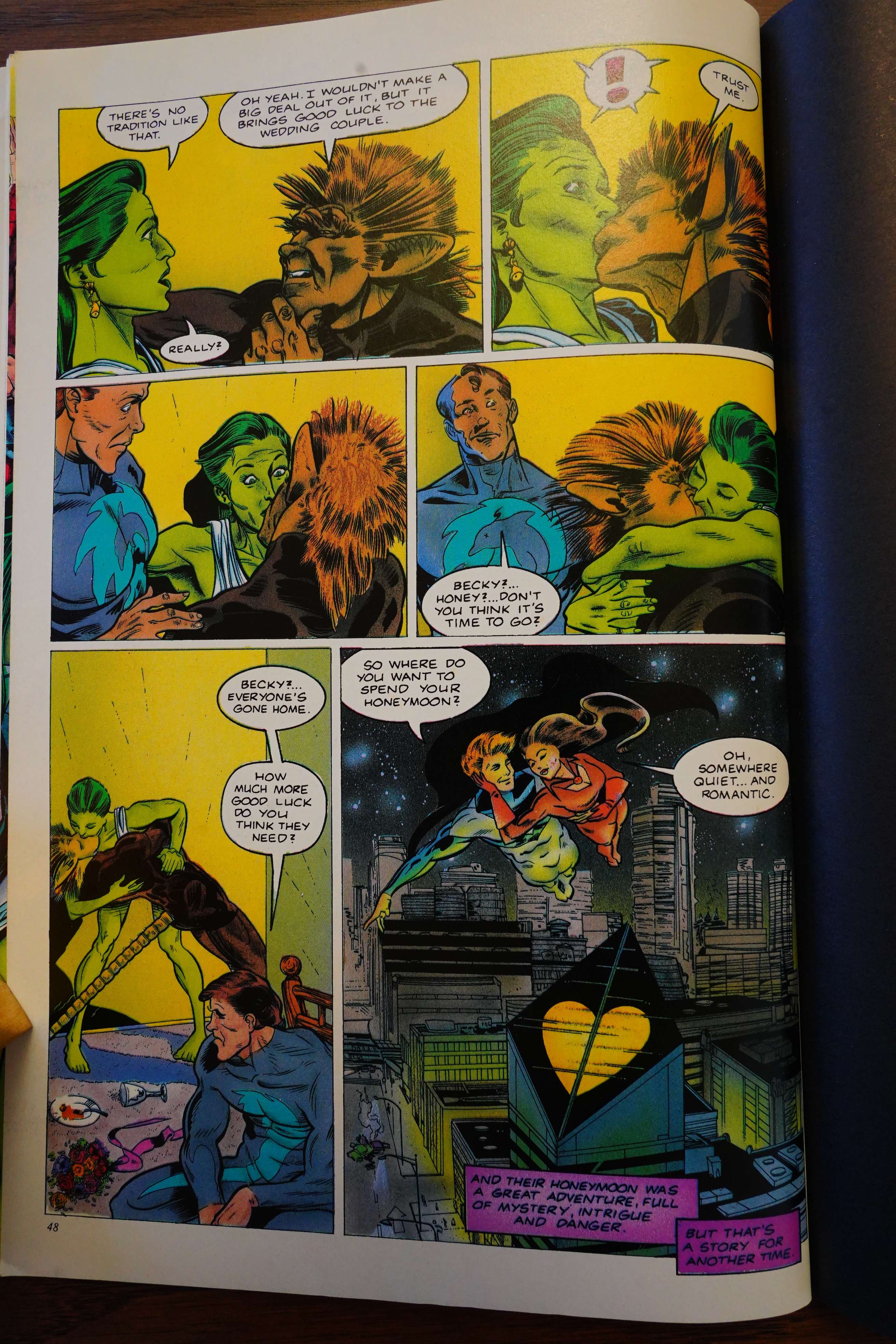
Happy ending! Whoho!
Man, that was a confusing book. But funny, I guess?
Overstreet’s FAN #1, page #74:
Just say Elementals in any comic book shop and
you’re certain to get a wide variety of responses,
ranging from a bemused rolling of the eyes to an
excited yelp followed by a declaration that this was
the best super hero book ever. Regardless of the
response, one thing many fans agree upon is that
without The Elementals, there may not be an inde-
pendent super hero comic market.
Well, they’re back! Not content to merely release
just another comic book that may go unnoticed in a
sea of product, Comico has pulled out all the stops
with Elementals: Ghost of a Chance, a 48 page
graphic novel debuting this July.
“When we decided it was time to bring these
characters back, we knew we had to do something
really fantastic, not just for the long time readers,
but to attract the attention of a whole new genera-
tion that may have not had a chance to read The
Elementals before,” says Allen. “Basically, what we
needed was a fresh beginning for an established
continuity, which, by the way, is as difficult as it
sounds. But not so difficult that we weren’t able to
pull it off.”
With that, Comico returned to ground zero. “We
figured who better to recreate the Elementals than
the man who originally created them, Bill
Willingham? We approached Bill about the project
and, as luck would have it, he was thinking about
contacting us at the time about working on the
Elementals again. The excitement was pretty
volatile at first, but when the smoked cleared, we
had what we believed to be a project that would
bridge the past with the future of the Elementals
and clearly set the team in a bold new direction.
And on top of all that, it was a great story.”
Things started falling into place after that. “I was
speaking to Tony Akins about another project, and I
mentioned that Bill was scripting a graphic novel for
us, and Tony practically begged me to do it. He was
just finishing up his very successful run on Star
Wars: Tales of the Jedi, and was looking for a book
he could really get excited about. He was a big fan
of Bill’s, and, as it turns out, Bill was a big fan of
his. Out of nowhere we had a perfect match.”
The excitement didn’t end there. Once the scope
of this project leaked out among comic book pro-
fessionals, it was only a matter of time before others
would lend their support. “When I first saw what
Alex Ross had planned for the cover, I knew we had
what would be considered among his best work. I
know we were lucky to add his name to our roster,
and that he picks and chooses his projects extreme-
ly carefully, but hey, he said the book was worth it.
Wait till the fans get a load of this!” Ross was signed,
and the creative team was complete. Savs Ross, ‘T
been an admirer of Tony’s work for quite some
time, though there really isn’t a lot of it out there.”
With Elementals: Ghost of a Chance, Comic
has what it believes to be one of the greatest
Elementals stories ever. It’s certain to please the
long time Elementals fans, and get a whole new
legion of readers collecting this groundbreaking
book. Adds Allen, “You think this is something?
Well, you’re right it is, no doubt about it. But, hev.
the Elementals deserve it. It’s the perfect way to
get fans excited for the Elementals ongoing series
which will debut not long after Ghost of a Chanc
ly book!
So Willingham apparently got involved with Comico again? I mean, I wouldn’t take anything the Comico people are saying on faith, because they’re inveterate fabulists, but…
Hero Illustrated #22, page #88:
When
Titans
Marry
While you won’t see the
return of the Elementals
monthly series this June,
the characters will return
for the wedding of Vortex
and Haunting in the
Elementals: Ghost of a
Chance graphic novel.
This special occasion is
brought to fans by creator
Bill Willingham and Star Wars/
Cenotaph artist Tony Akins, with a
painted cover by Marvels artist Alex
Ross.
Akins comments, “I think the old fans
of the Elementals will get a real kick out
of it. I tried to stay faithful to what Bill
Willingham did with his characters,
which is drawing them fairly naturally,
not pumped up. They’re good-looking
folks in costumes. So I tried to stay
faithful to that and I tried to spin things
as dynamically as possible. I hope the
research that was done on the book,
both by myself and Willingham, makes
it exotic because it happens in exotic
places … like a ritzy North Shore hotel
in Istanbul. Plus [there’s] some good
action. The old fans will dig it and the
new fans will pick it up. It’ll be a nice
story to yank their interest, along with
the Tony Daniel stuff coming out.”
Overstreet’s FAN #9, page #127:
It has been quite some time since Comico has appeared in a Lee’s
Comics report, and I’m happy to see them back. Before I comment
on their products, please bear in mind that it is hard to decide
what to order when the solicitation is over six months off. The first
two issues of Elementals sold out, which tells me there is still a lot
of interest in this title. I ordered 30 copies of issue #1 and 20 copies
of issue #2. Also, I ordered 25 copies of Elementals: Ghost of a
Chance and sold 18. This surprised me, as its author, Bill
Willingham, is the original creator of Elementals. Maybe the hefty
cover price of $5.95 and the fact that the consumers are fed up
with six dollar comic books made the difference for this one.
Nevertheless, I am happy to be carrying this title in our stores.
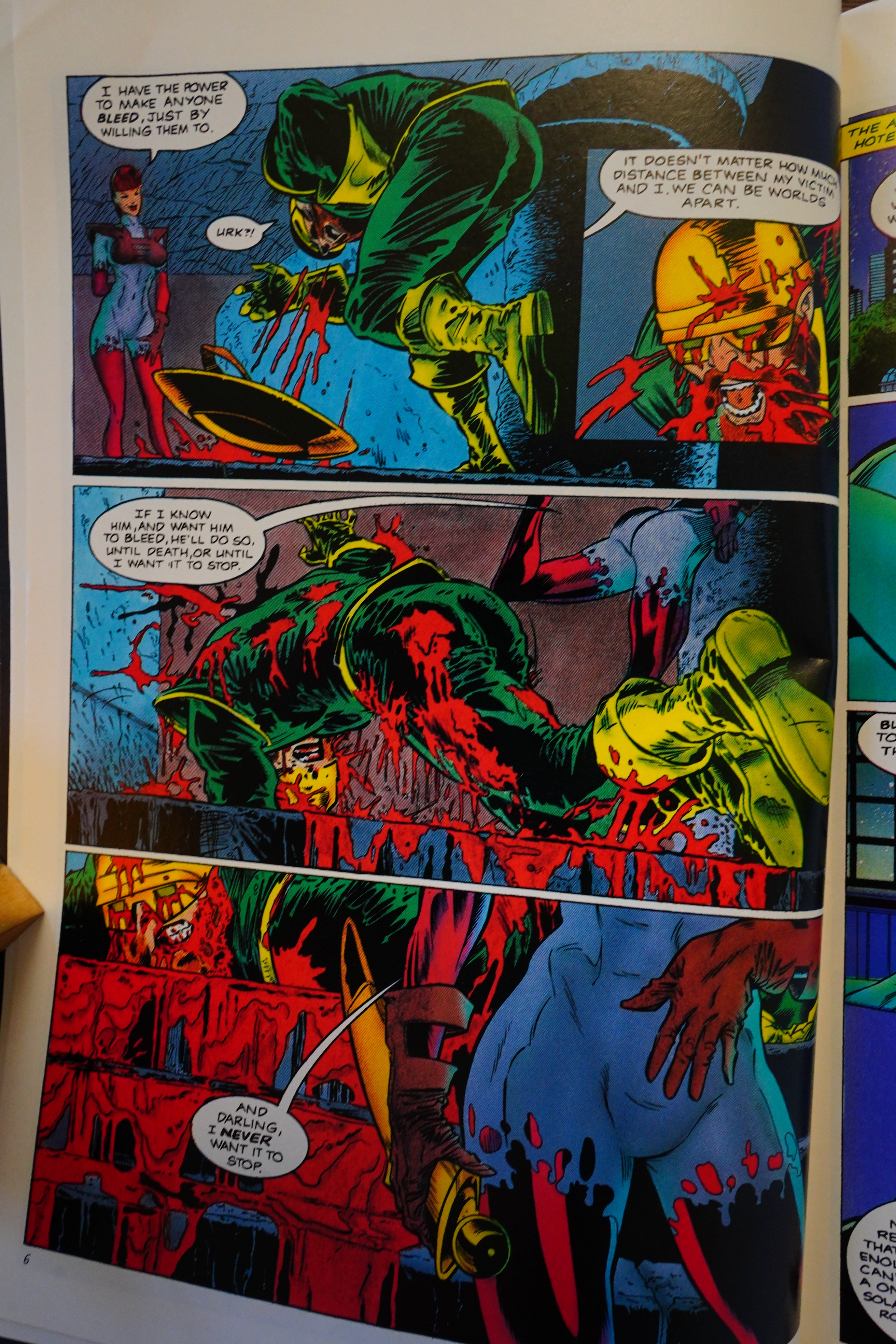
Overstreet’s FAN #9, page #114:
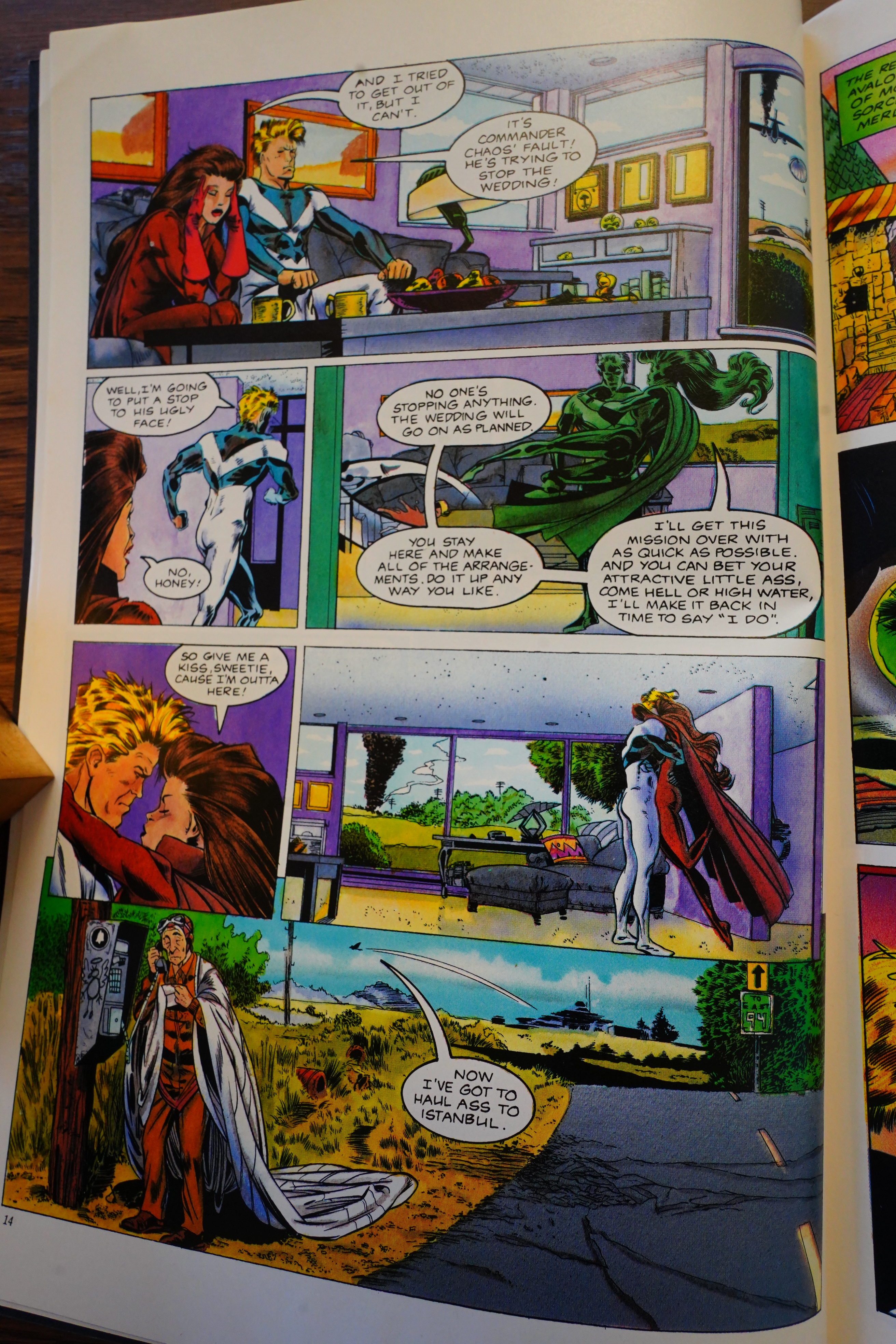
Comico’s classic superhero series
from the 80’s has returned, and this
special 64-page graphic novel is the
perfect way to get to know the main
characters. Vortex and Haunting
finally decide to get married, until
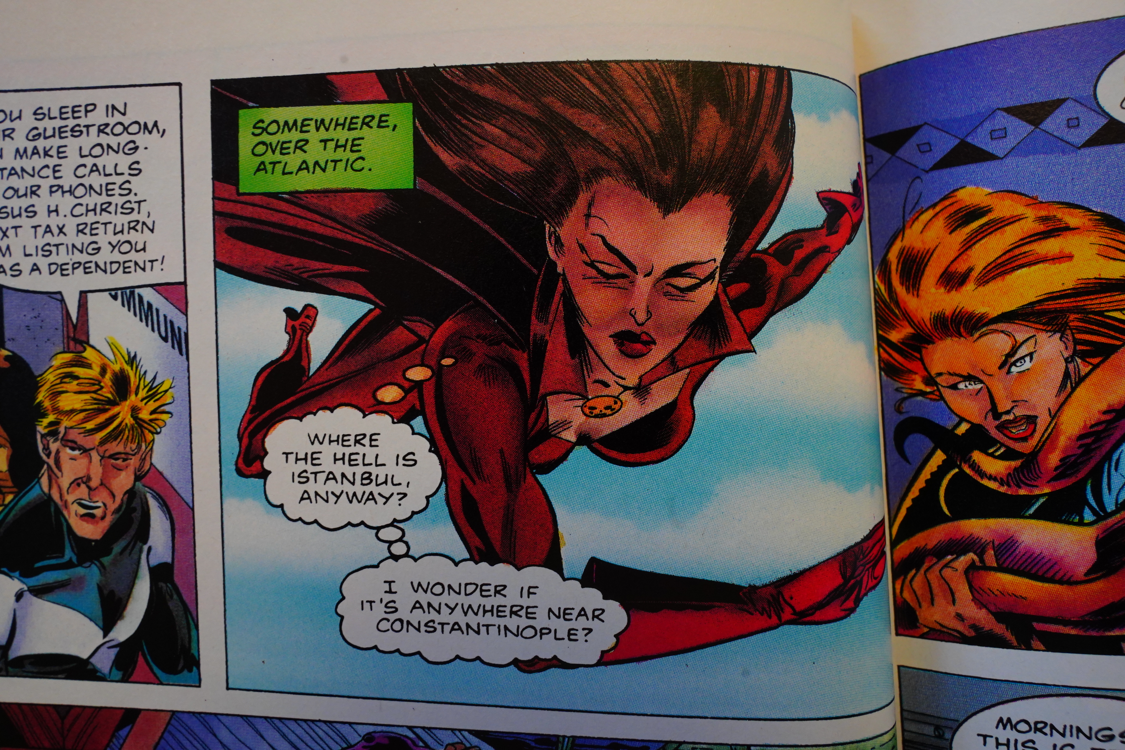
Haunting is called to Istanbul (not
Constantinople) by the commander
of Strikeforce America in order to
take care of Bloody Mary. This non-
babe villain, who has the power to
make people bleed to death just by
willing it, has been stealing ancient
Masonic artifacts, and the
Freemasons, protectors of the arti-
facts, need Morningstar to stop her.
As I’m not a big fan of computer col-
oring, I really enjoyed the fine water-
colors here by Marcus David in this
book, as well as the sight of Haunting
and the stripper at Vortex’s bachelor
party in some pretty skimpy outfits.
will, unfortunately, have to give a “For
adults only” label to this book, as the
scenes with Vortex bedding Astarte
the stripper are definitely not appro-
priate for young fans.
Oh! Her name is Haunting!
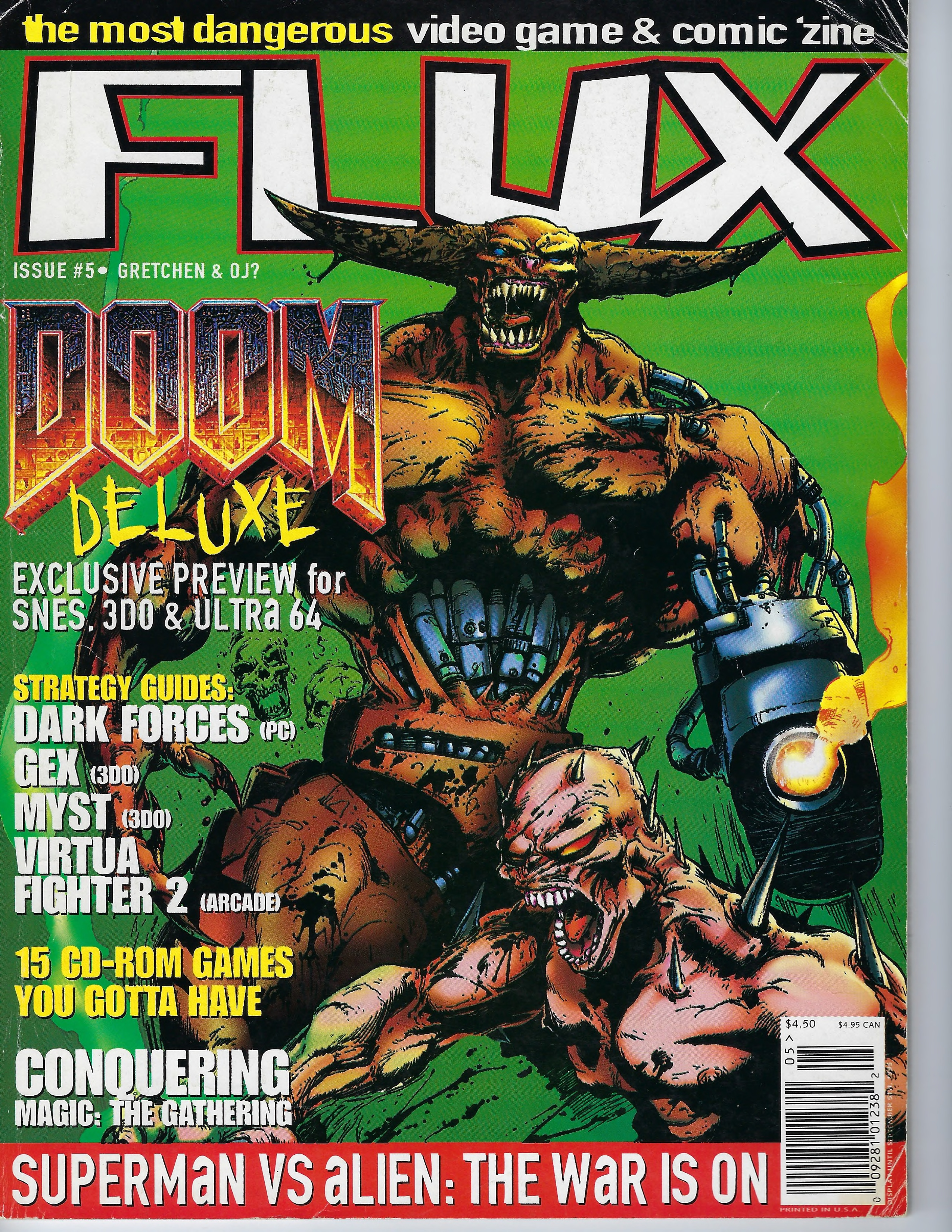
I could find no contemporary reviews of the book (other than the above), but they did manage to get some press in the mid-90s blathering comics press, apparently.
I could find no reviews of the book on the interwebs, either. It looks like it goes for a reasonable price on ebay, and Alex Ross seems to be the draw here. “When I first saw what Alex Ross had planned for the cover, I knew we had what would be considered among his best work”, as that Comico shill was saying. Uh-huh.
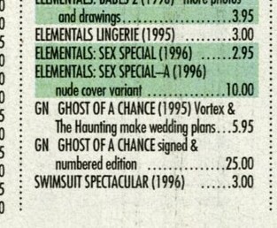
There was a signed and numbered edition which apparently is worth some money.