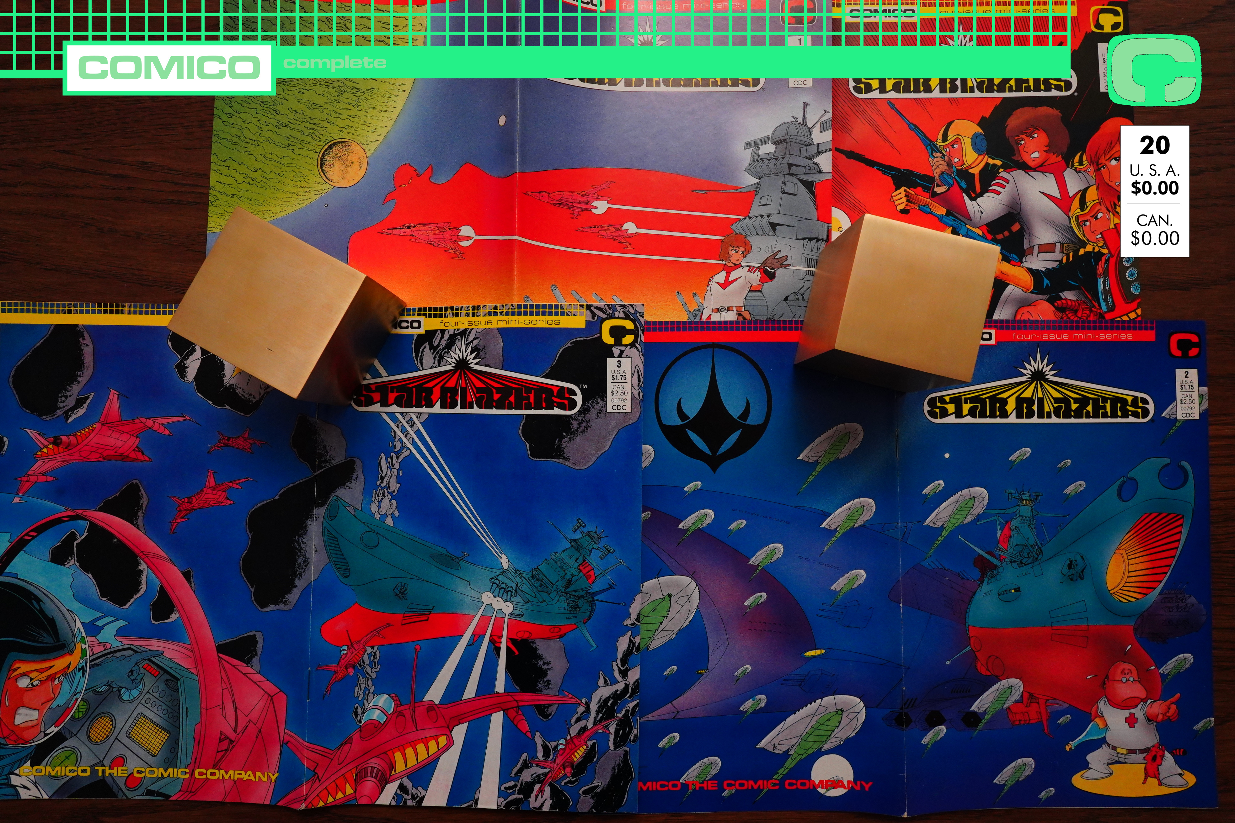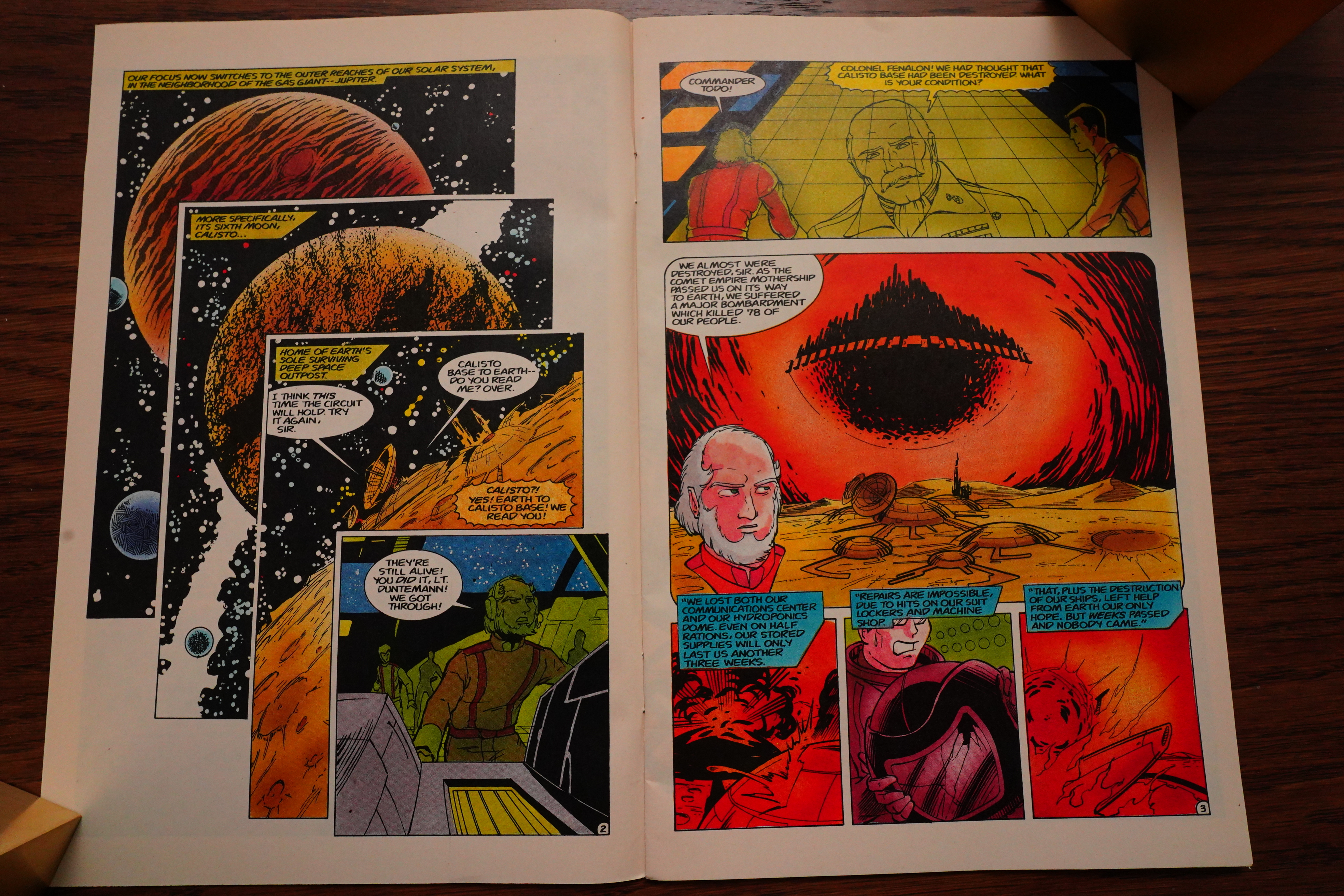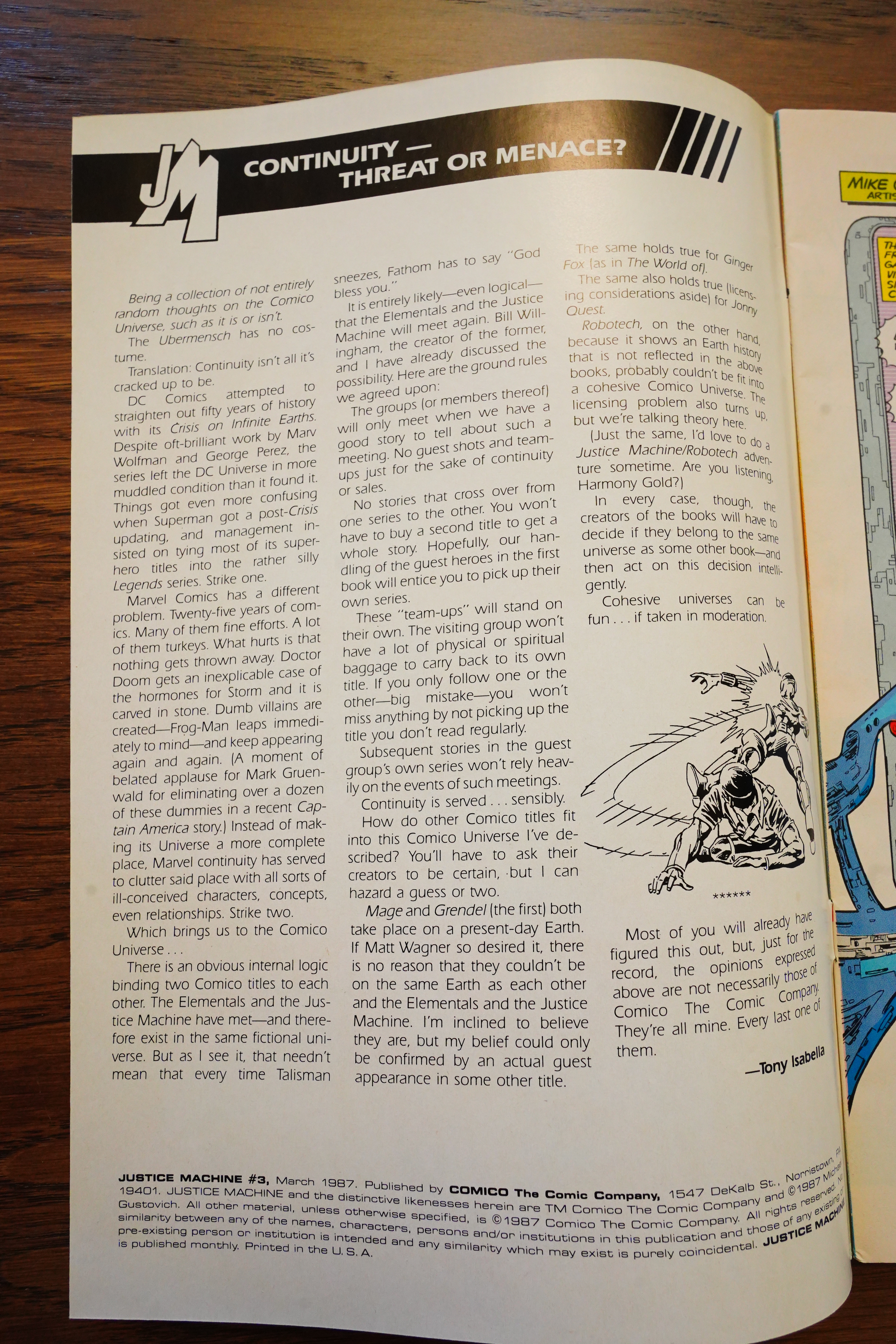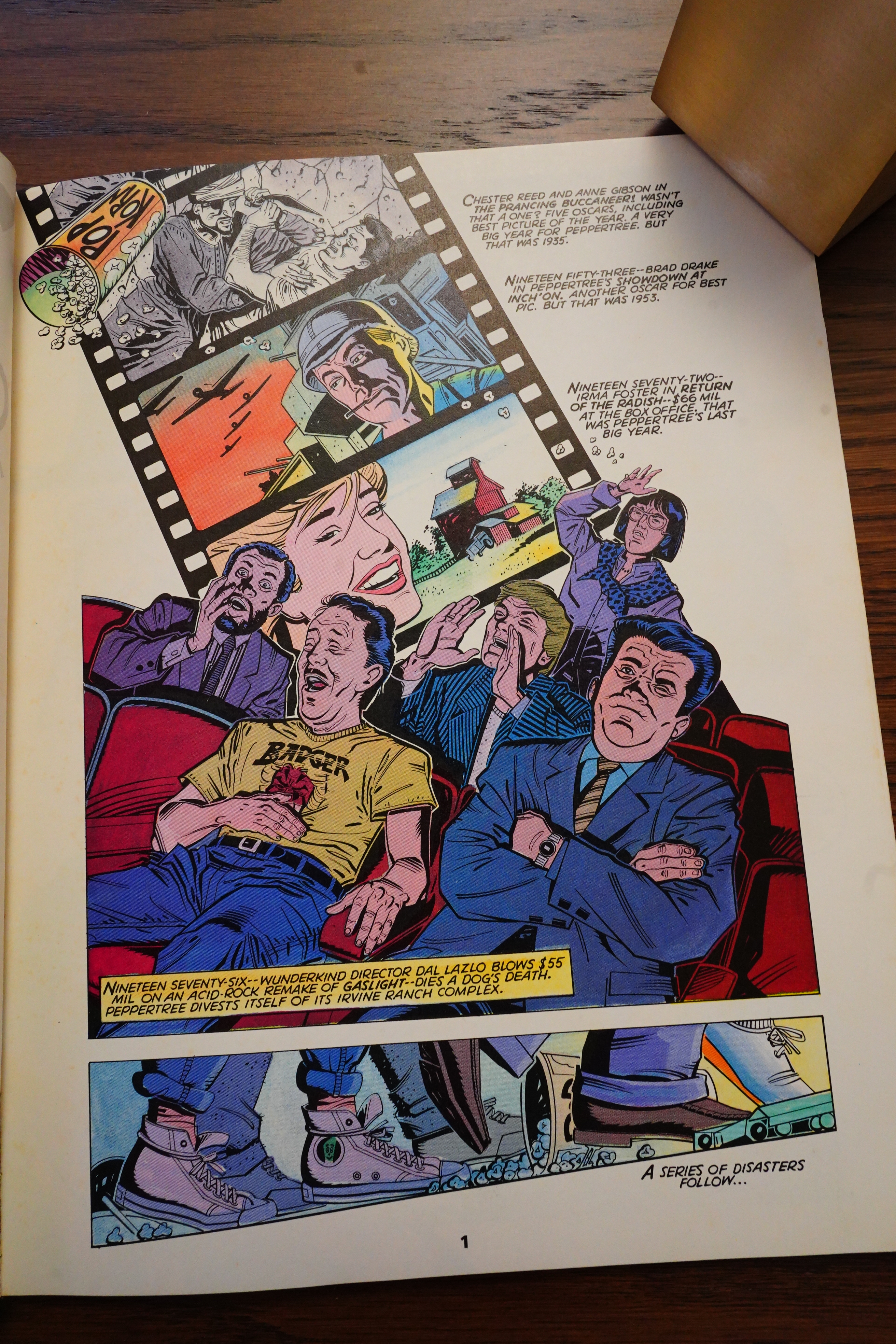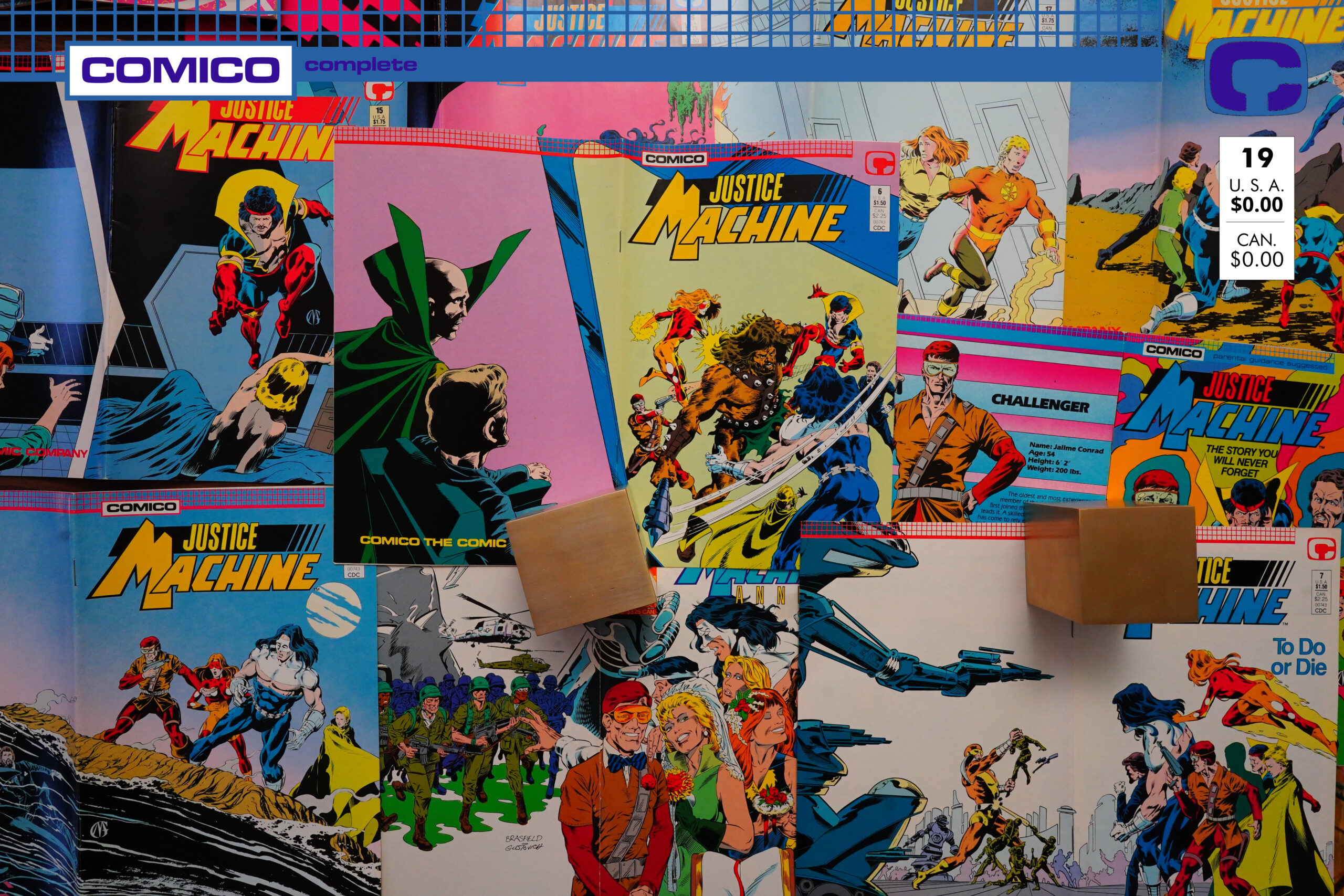
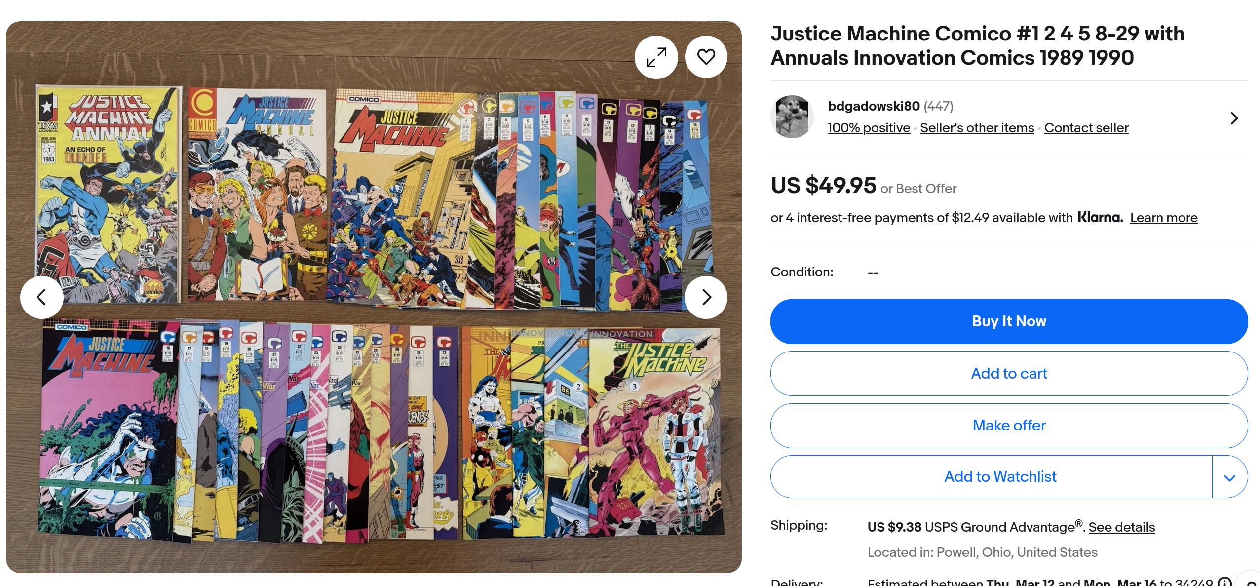
Justice Machine (1987) #1-29, Justice Machine Annual (1989) #1 by Mike Gustovich, Tony Isabella, Doug Murray et al
I guess by the time this blog post is published, it’s going to have been quite a while since the previous post on this blog? I’m typing this after reading the first four issues, and boy… It’s going to take me a while to get through these 29 issues.
Because this post is probably going to turn into one of those “old man shouts at forty year old comics” posts. I’m sorry! I dislike writing those as much as you dislike reading them.
Anyway, I guess we’ll just have to get started.

Previous Justice Machine issues had been written by Gustovich or Bill Willingham, but we now have a new, regular writer: Tony Isabella. So I thought we’d be in safe hands, because while I’m not familiar with Isabella’s work (I think?), Isabella is a professional with a long career. So at least this should be… painless?… to get through.

The book is about a super-hero team from a different planet (well, a planet in a different dimension), Georwell (very clever name)…
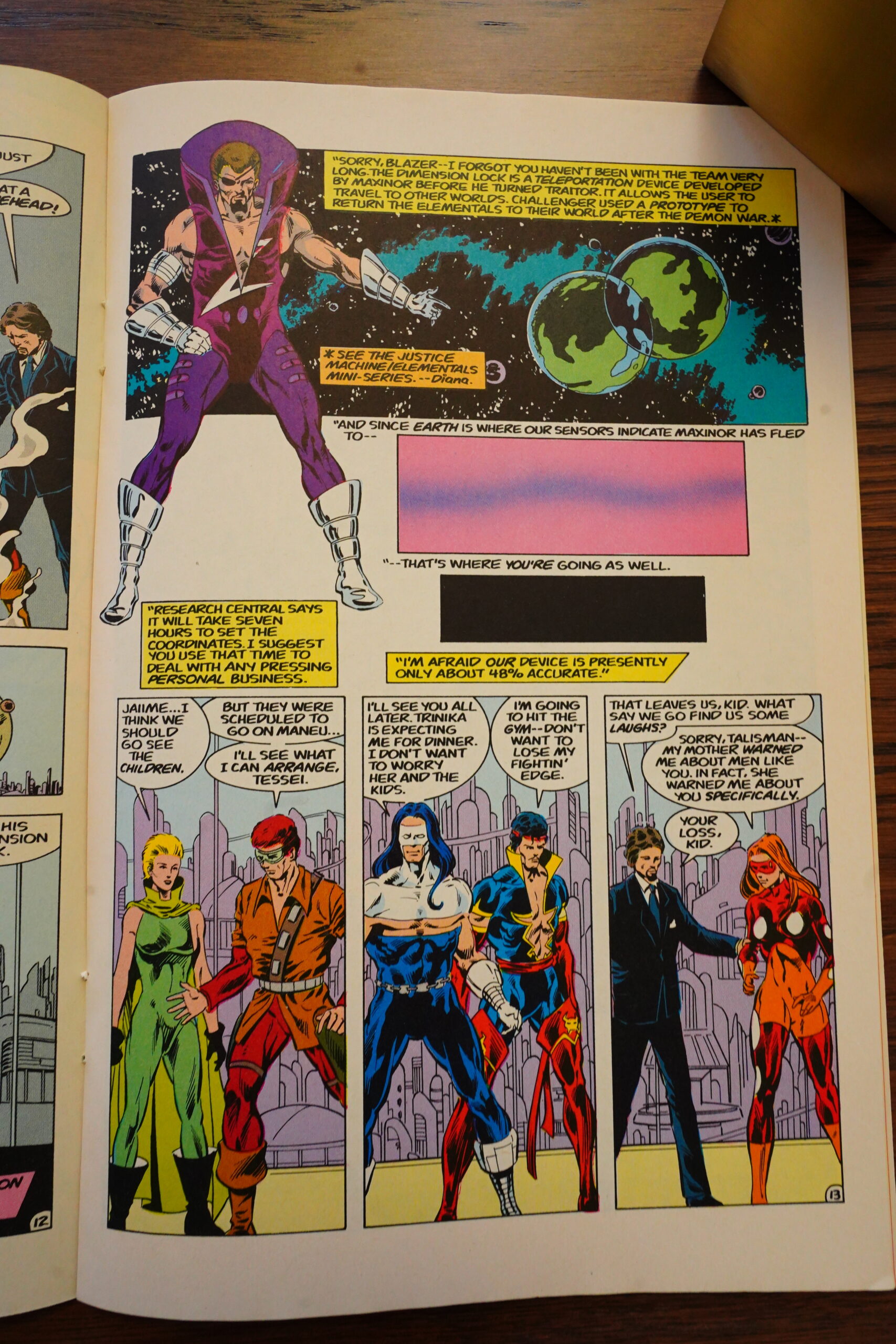
… and we establish the setting in a pretty economical way, without any recapping of previous adventures. Which is good.
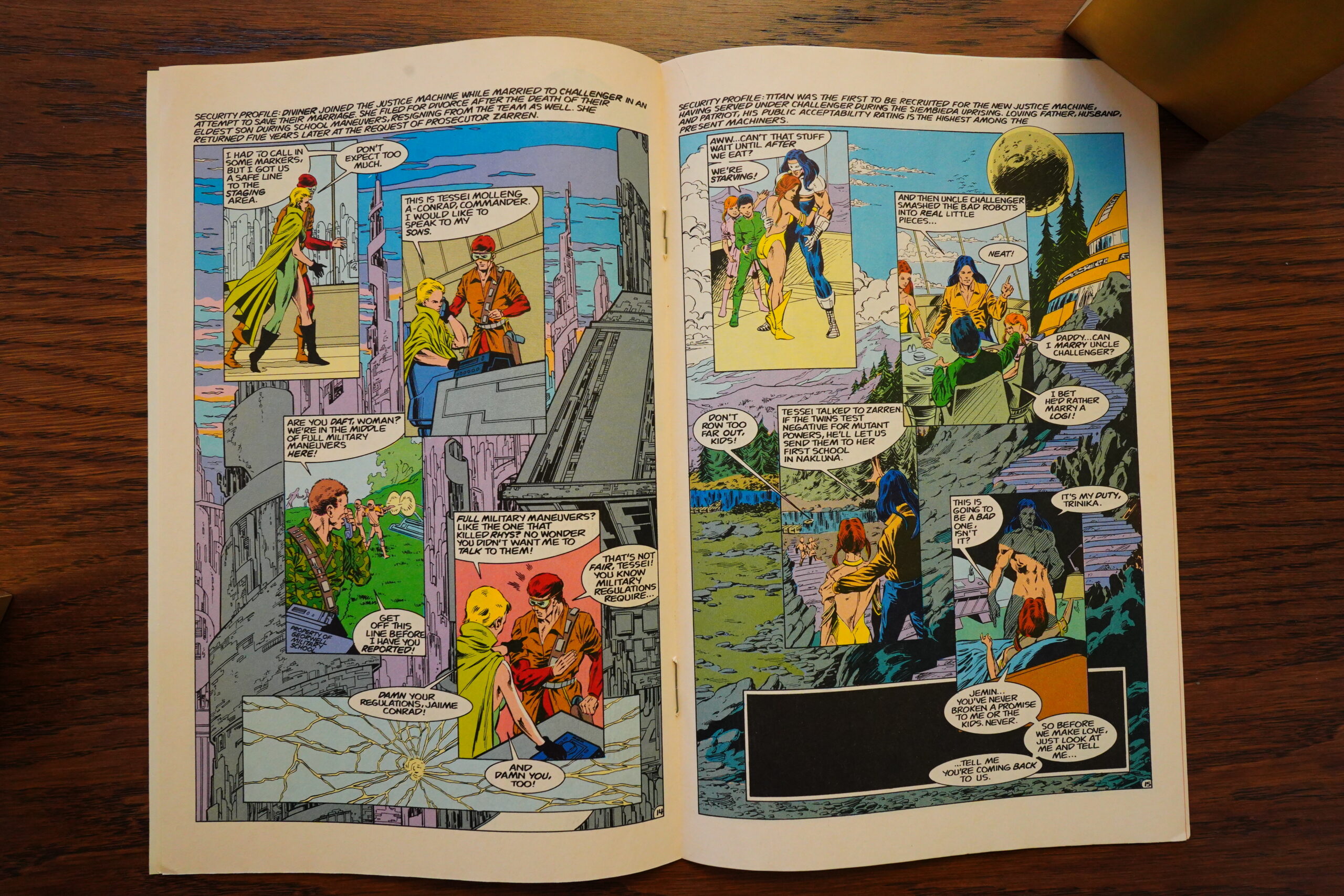
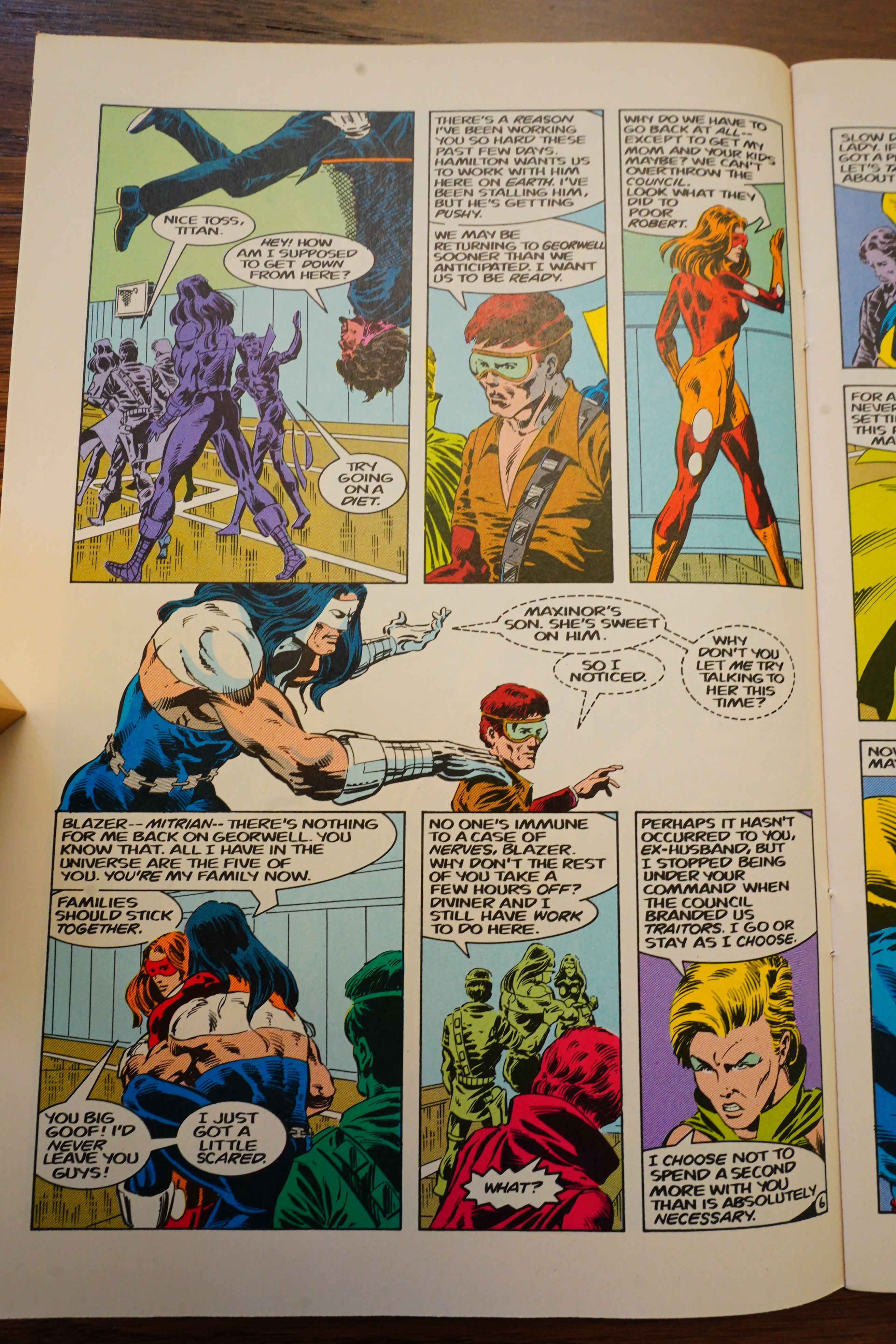
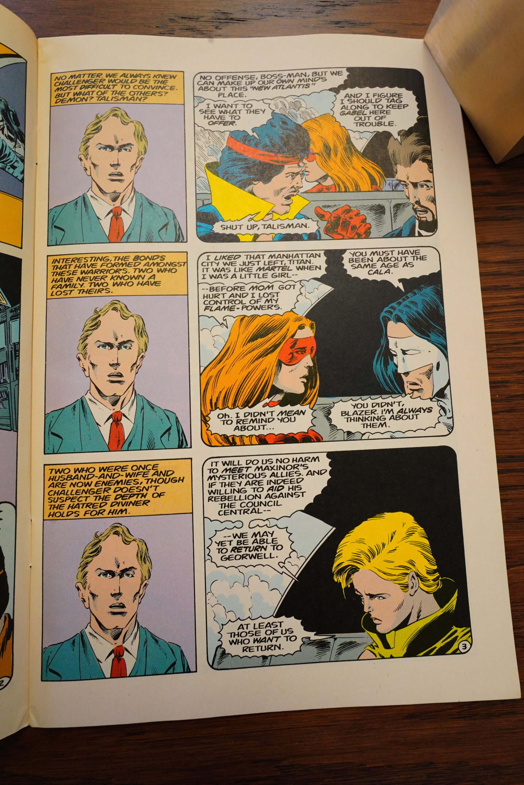
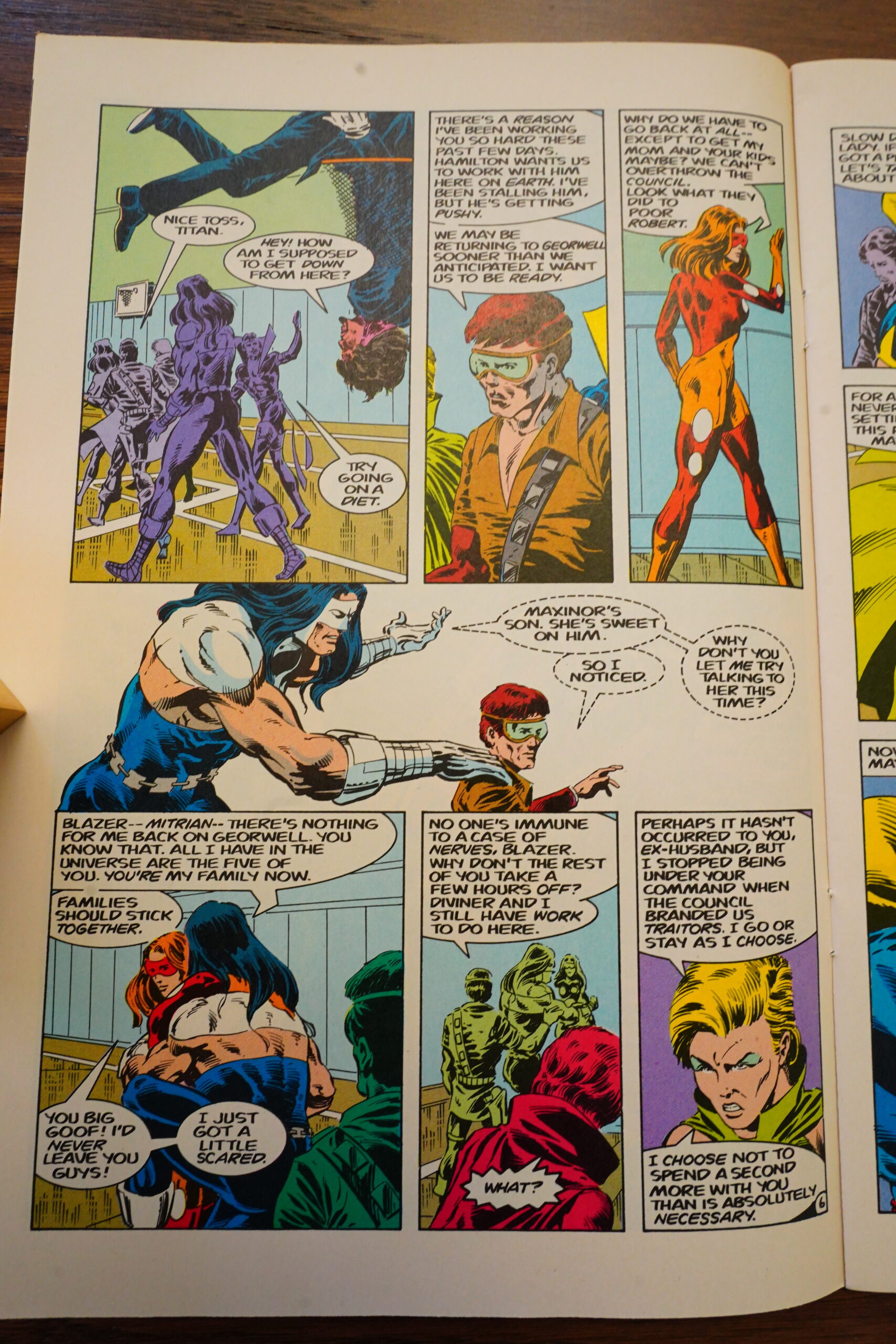
But it does feel clunky. We’ve got these six heroes, and the book insists on giving them all solo scenes, so not a lot of stuff actually has a chance to happen.
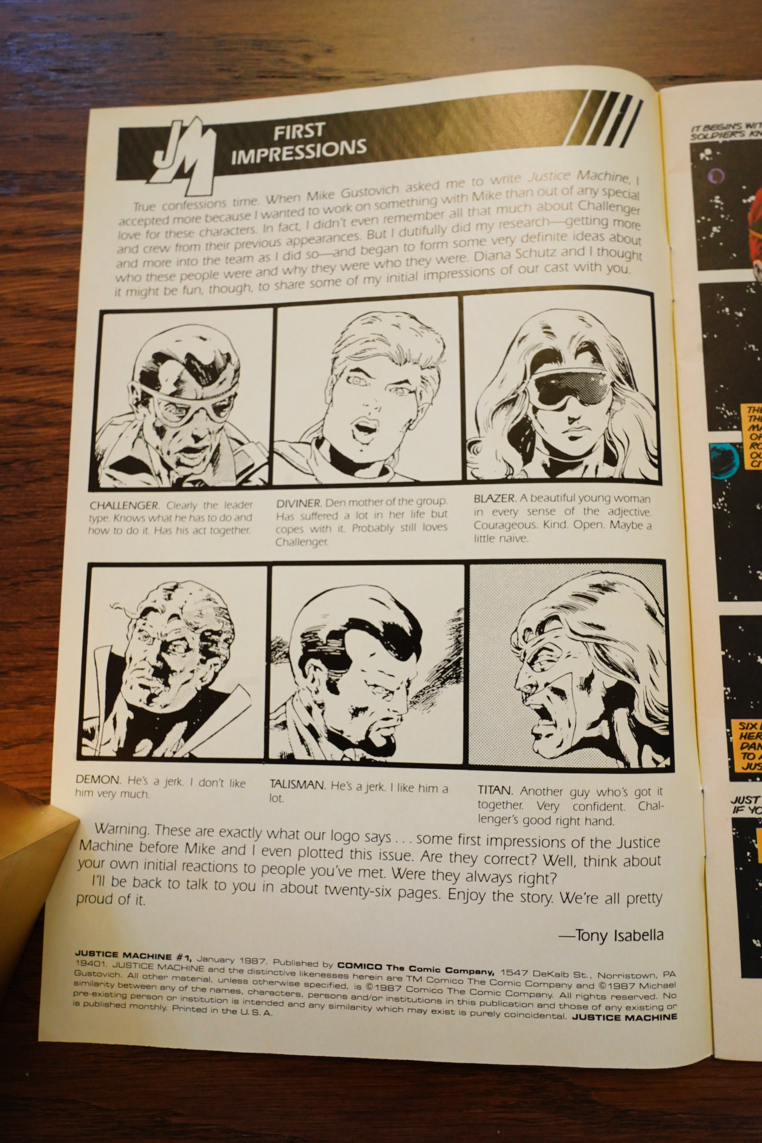
Isabella lays down some rules.
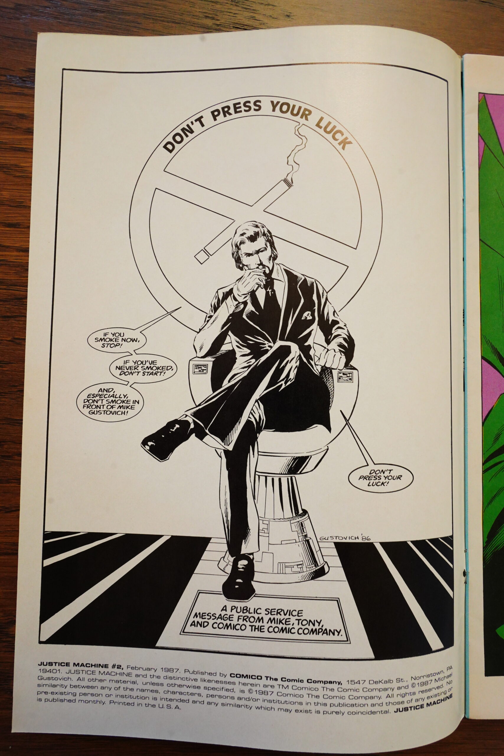
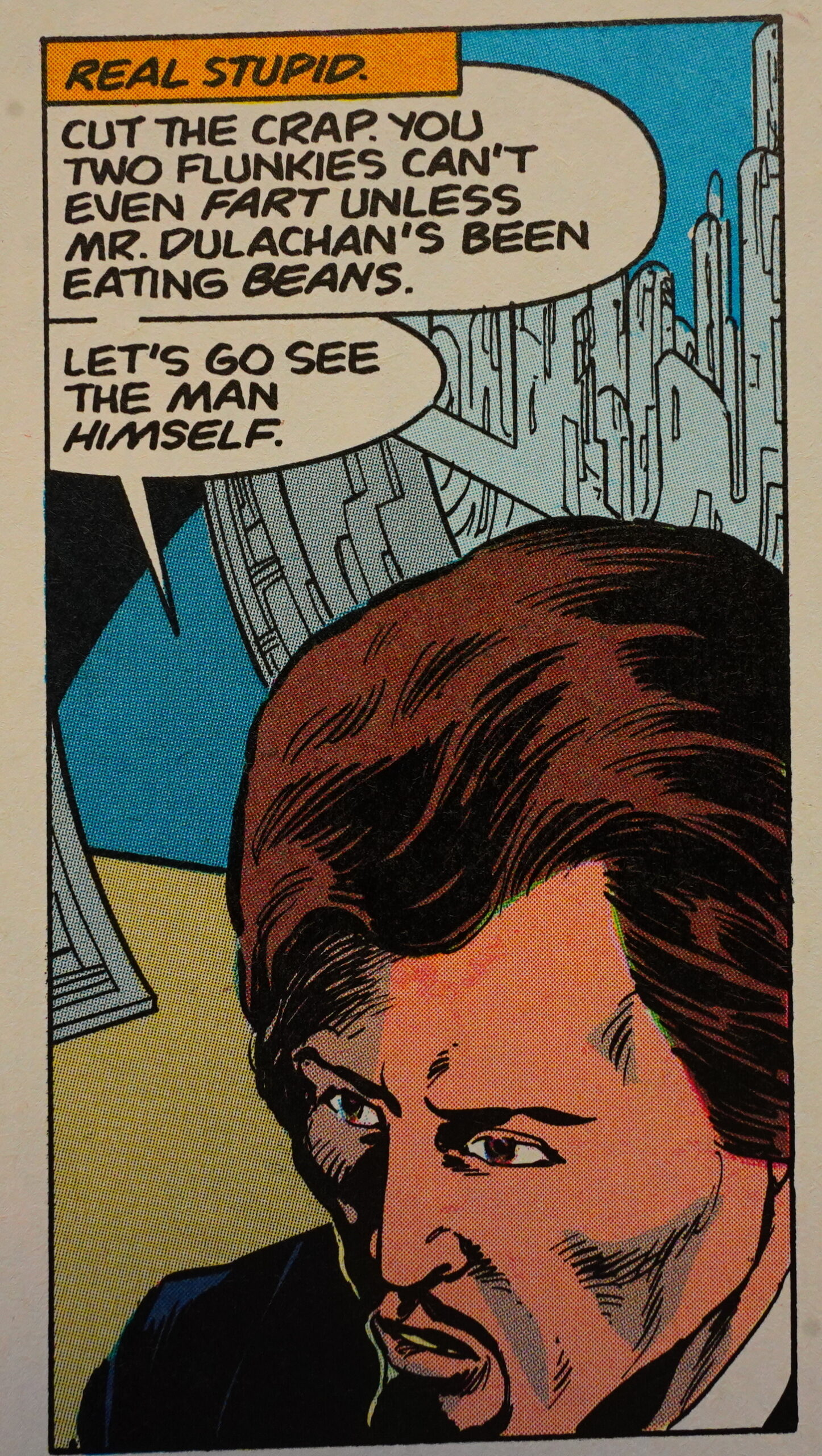
Er… is that a PSA? I guess they just don’t like smoking?
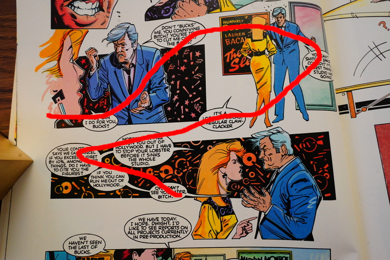
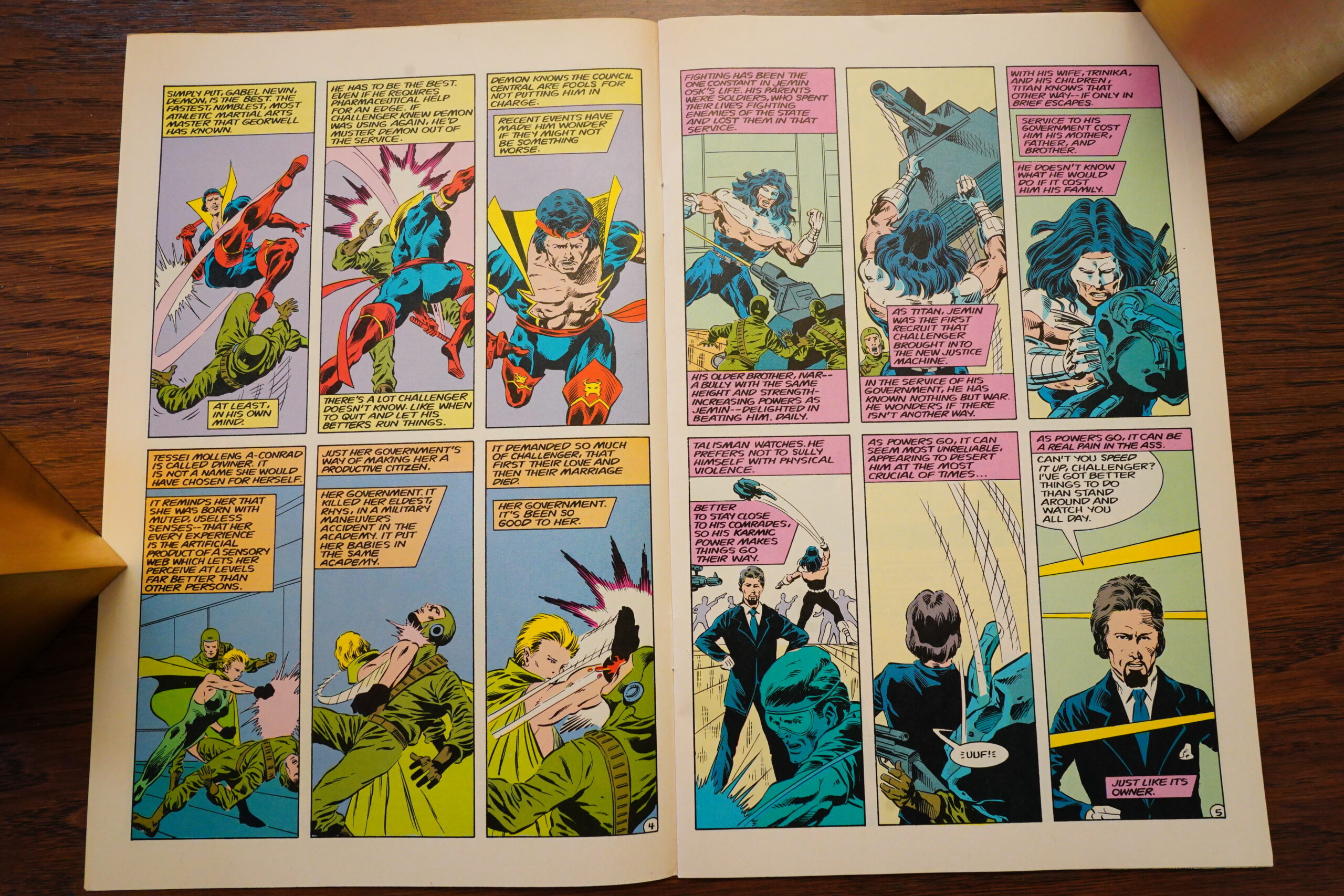
I quite like Gustovich’s line and his rendering, but he certainly has some deficiencies — mostly to do with drawing heads. Particularly from some angles, where everybody turns into some kind of monster.

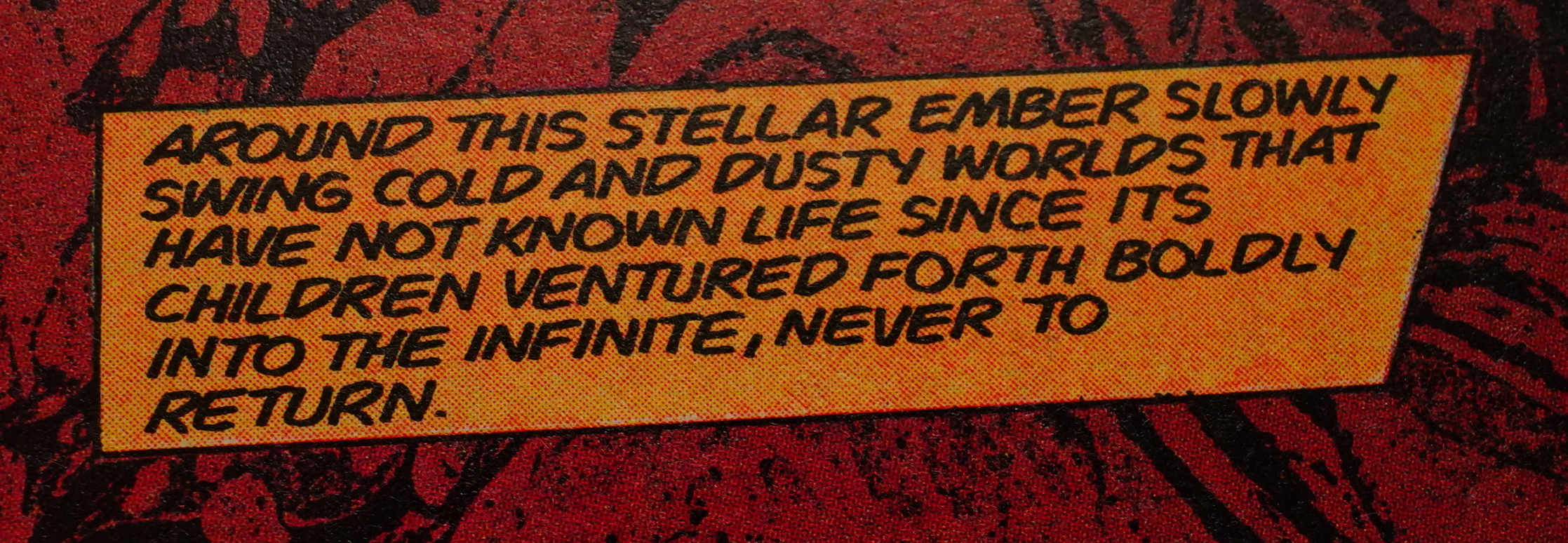
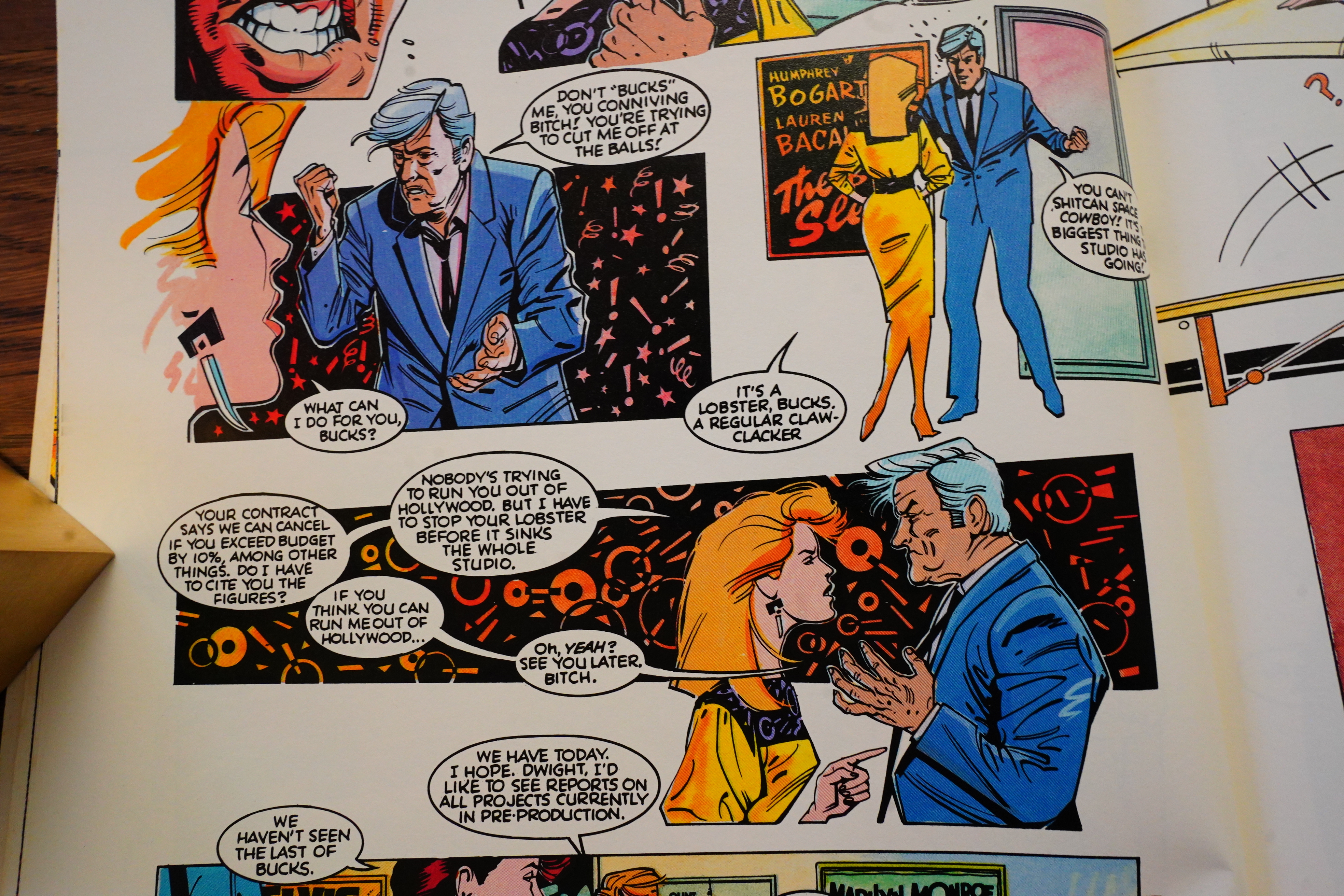
The writing feels very old-fashioned. Remember, this was in 1987, where there were all these new storytelling styles swirling around. Here we get a very verbiage laden style, with an omniscient storyteller dropping thrilling stuff like the above in the captions. It feels very amateurish.
Oh, those heads and angles…
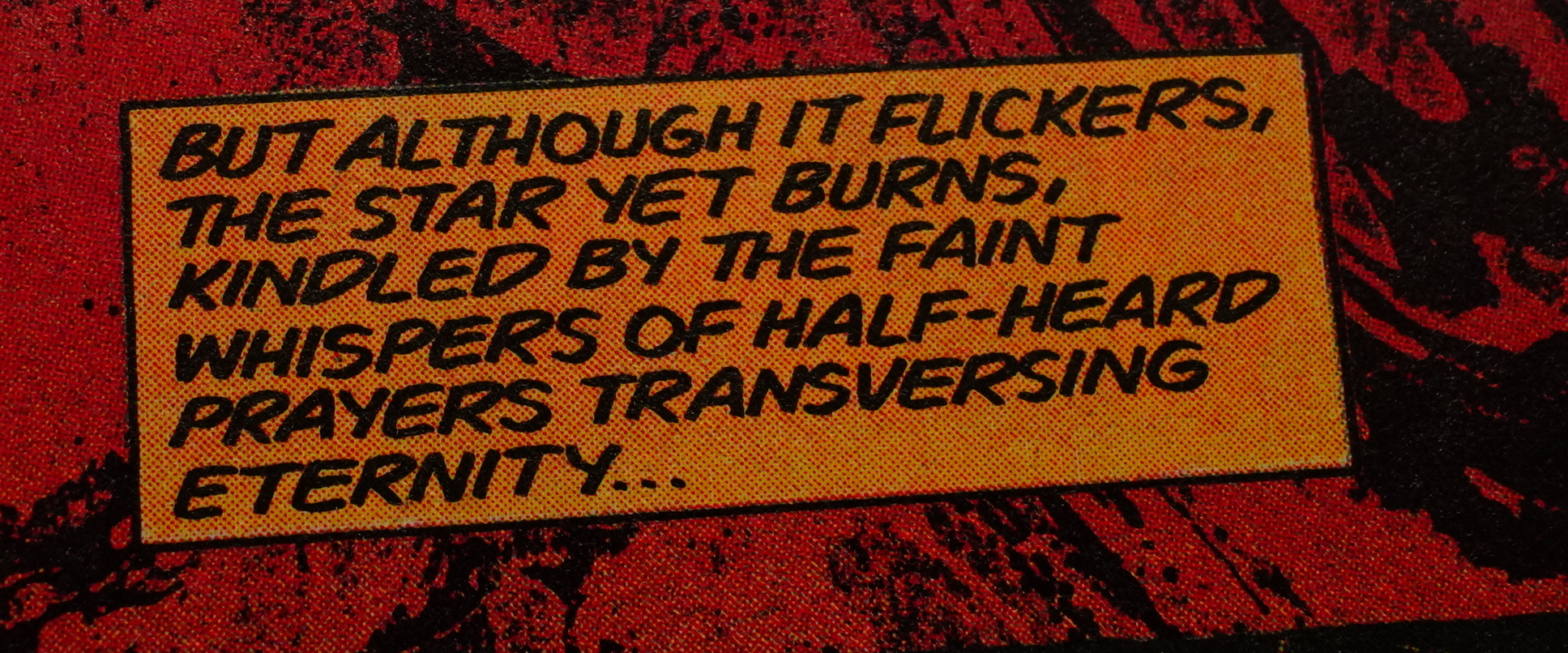
It’s not just that the captions are unnecessary, but they’re so dull — it’s like Isabella is trying to emulate the deadliest of the dead boring old DC comics, right?

Isabella gives us the Superhero Comics Philosophy. Which makes me wonder — just how old is Isabella? My guess, based on this, is 24. Let’s check! Oh deer — born in 1951, so unless my university maths education fails me, Isabella was 36 when this was written. But, ahh — a columnist for The Comics Buyer’s Guide! I guess that explains things…
Oh:
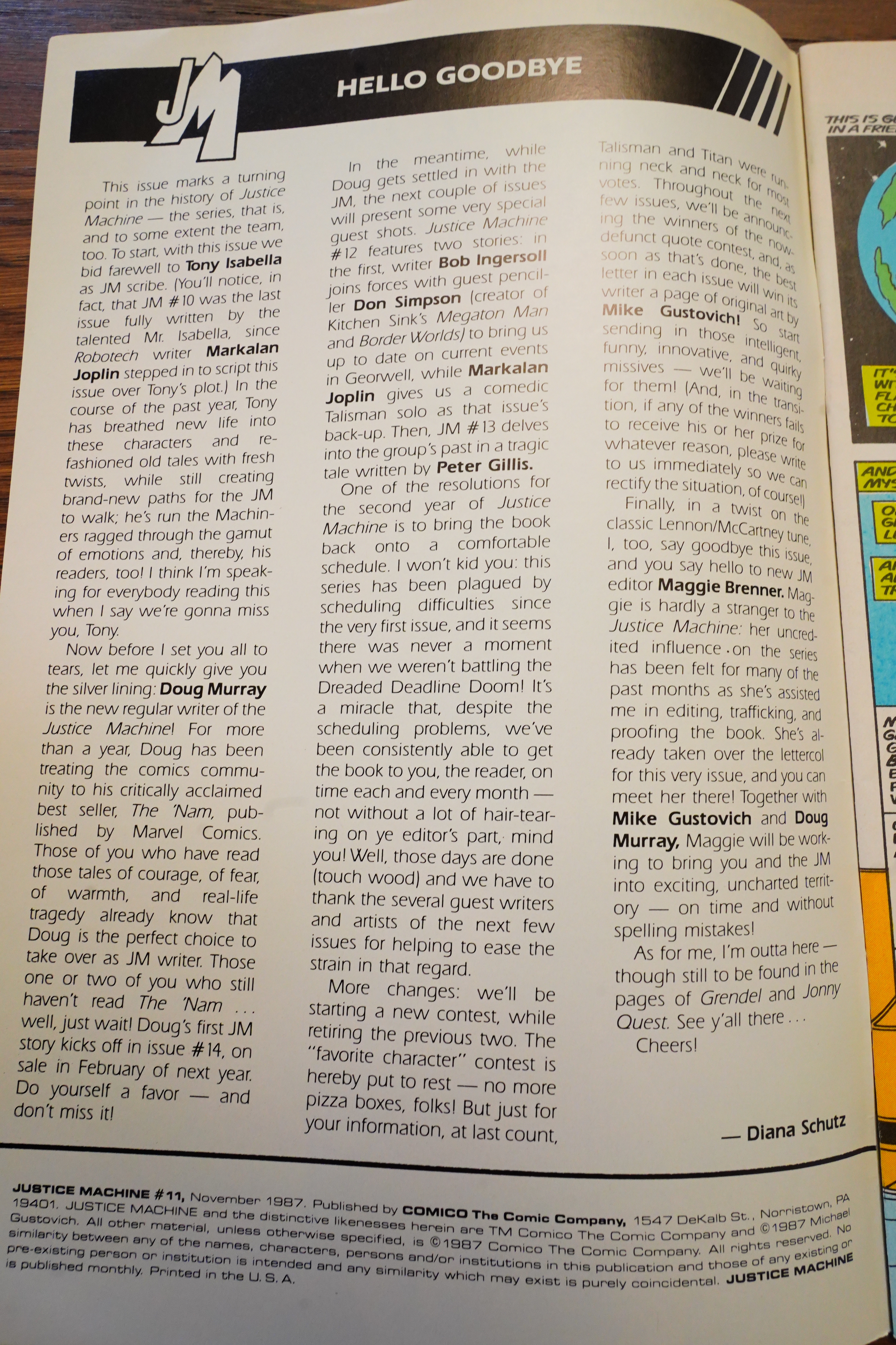
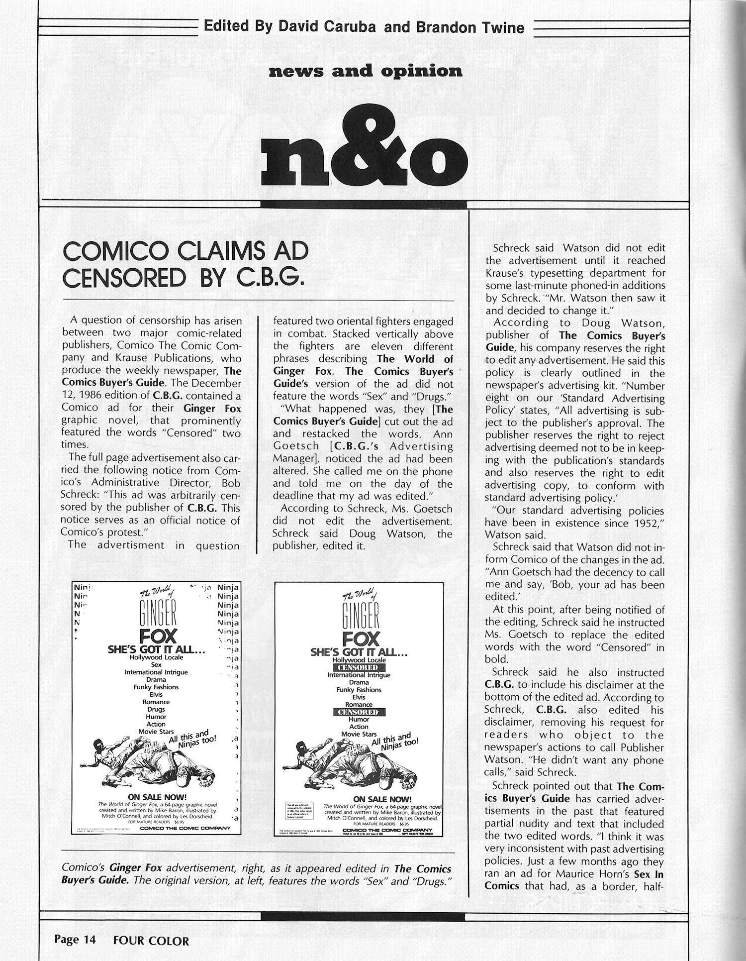
The ongoing book became one of Comico’s best-selling series, selling upwards of 70,000 copies of each issue at its peak. Isabella wrote the first 11 issues of the Comico series before moving on to other projects.[
OK, the book was a smash hit? Huh.

Perhaps everybody just went wild for the profound narration above?
And then, at random, we get a short Danger Room story.

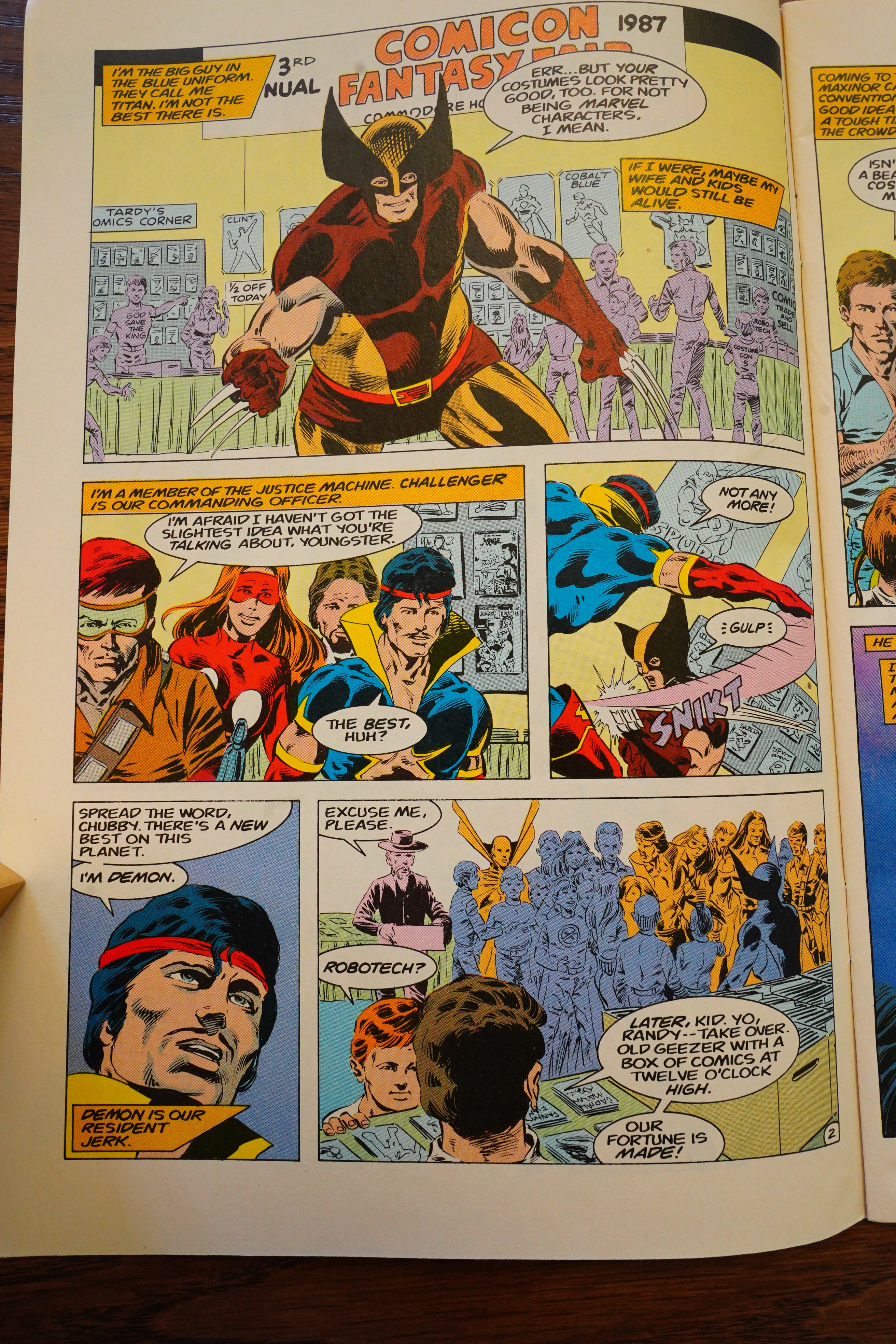
Write what you know, I guess? So the heroes are now on Earth, and are attending a comics convention. Why not.

That’s a gay joke!
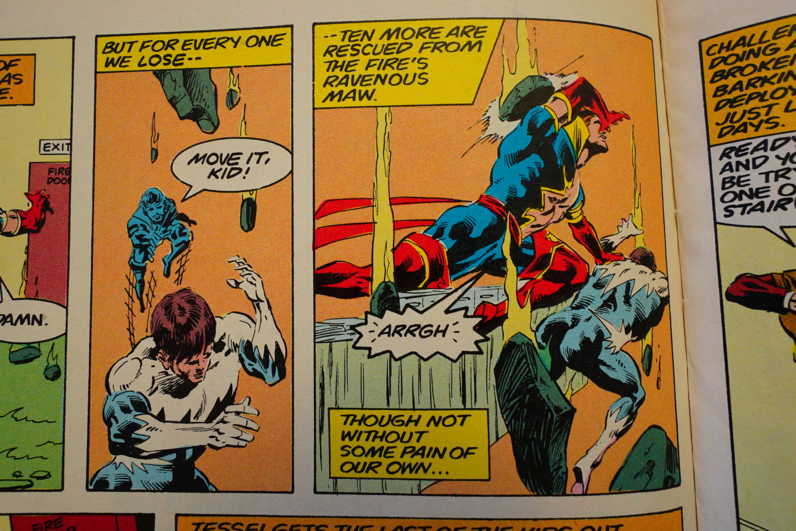
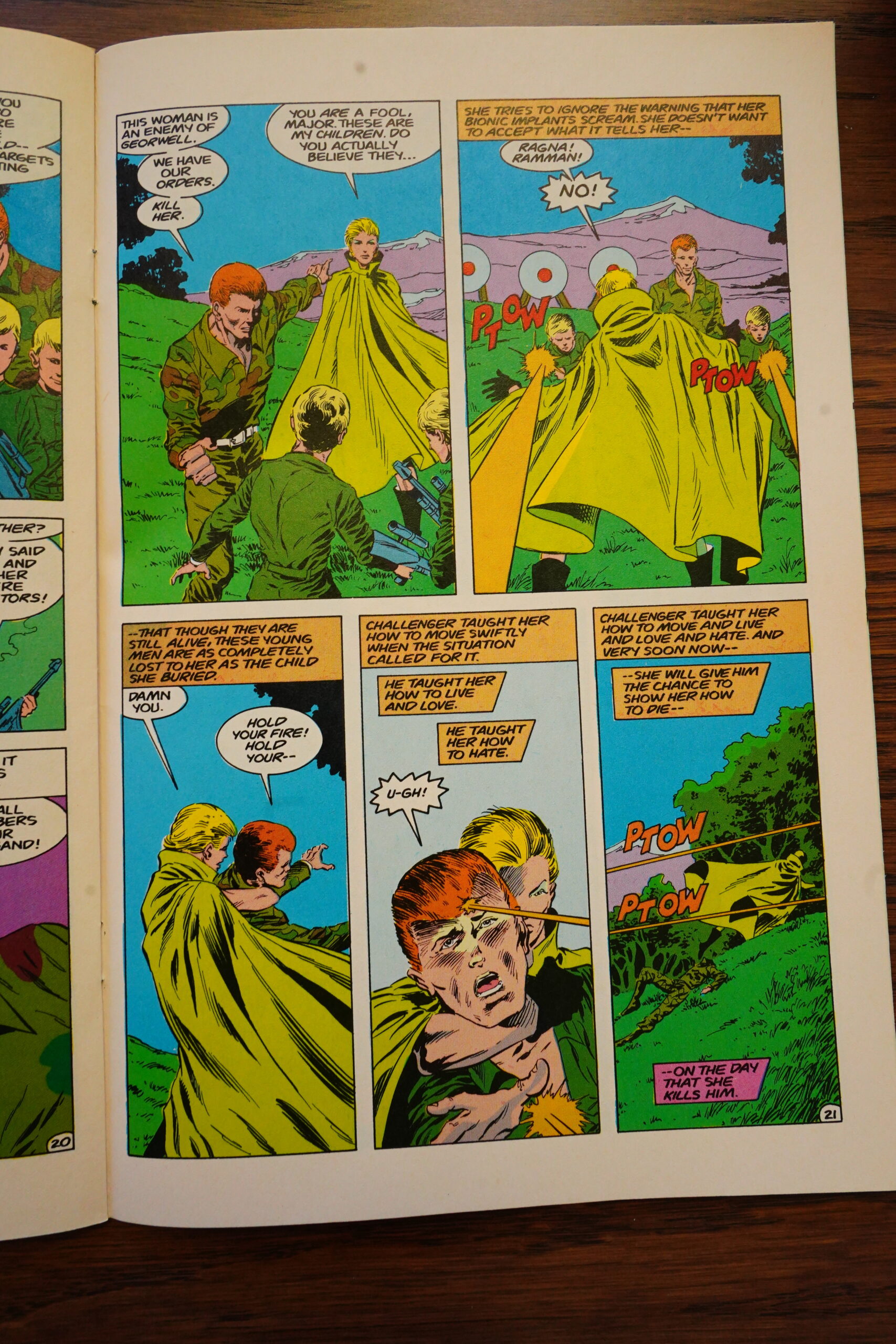
“Rescued from the fire’s ravenous maw”… This isn’t the same narrator as before, but one of the heroes.
OK, this is where I take a break — perhaps to continue tomorrow. Perhaps I could just start reading faster, and then the rest of this blog post won’t be as painful. I’m curious to find out who takes over after Isabella.
Gustovich has found a clever way to do the art faster. For one page.

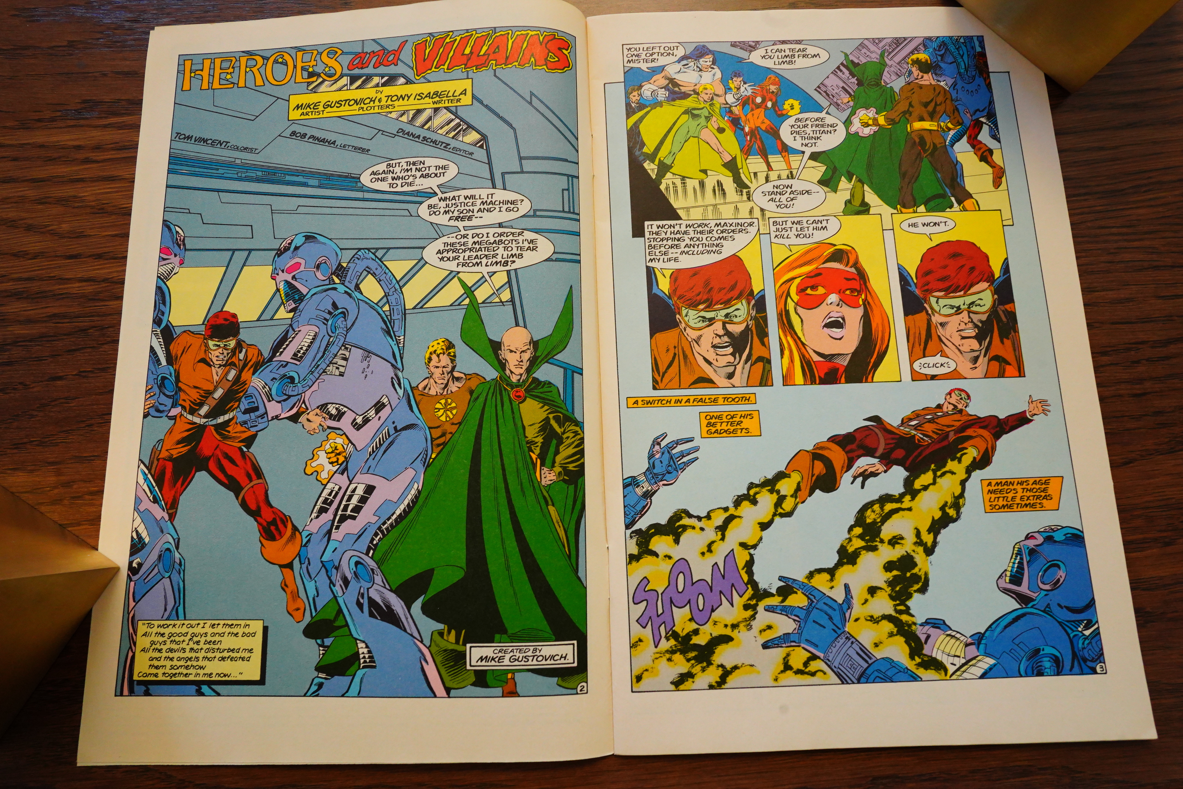
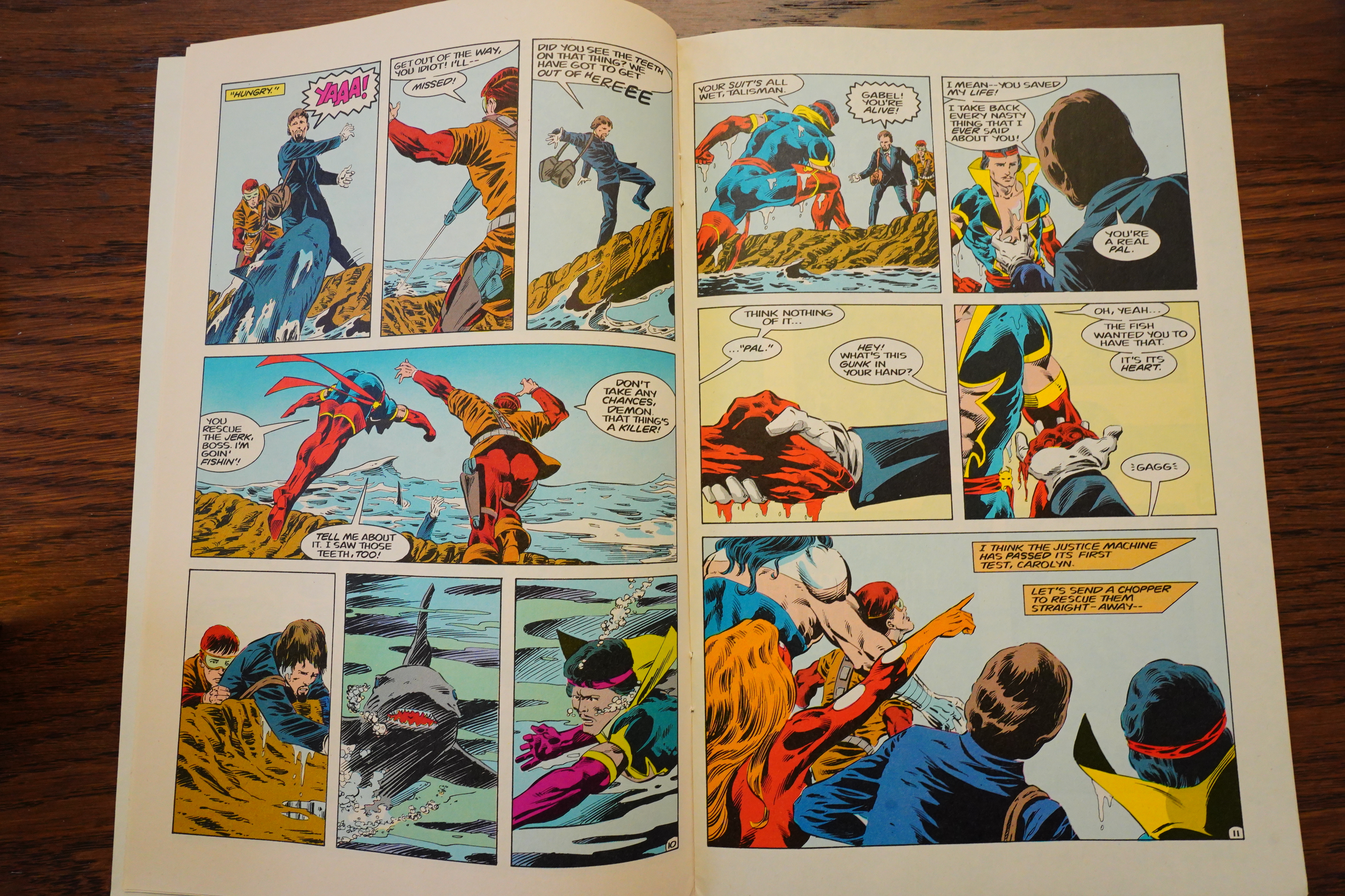
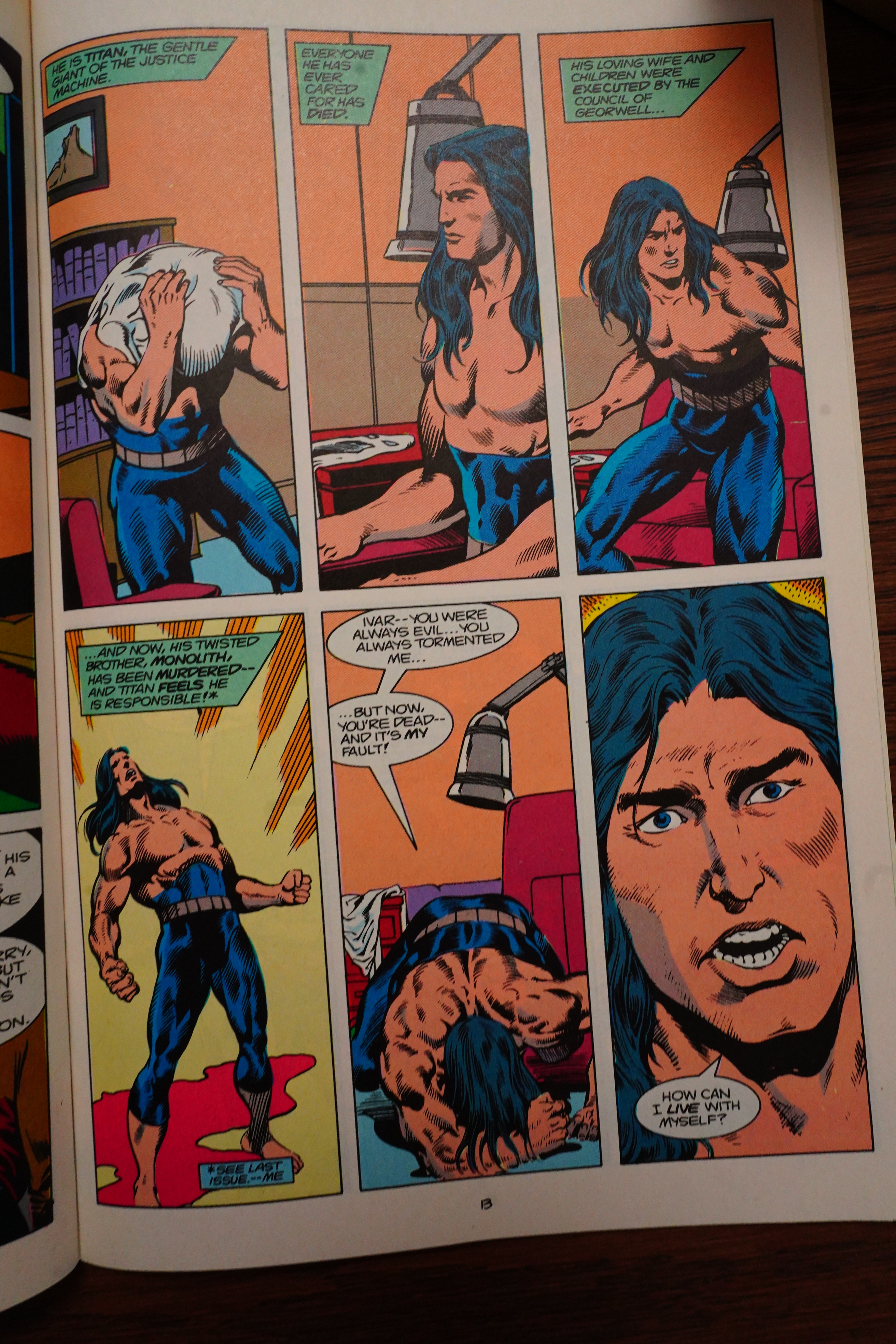
There’s so many scenes that are just … weird. So Demon saved the beardy guy’s life, and then… gave him the heart of that shark that we’re not actually shown being killed? Well, OK?
There’s the classic super-hero bickering stuff, and then there’s Justice Machine. Which seems to tip over into psychosis every other page.
Rob Ingersoll takes over writing for one issue, and it’s a flashback issue, which makes sense. What doesn’t make sense is that we’re sort of re-introduced to all the characters again. Like, why?

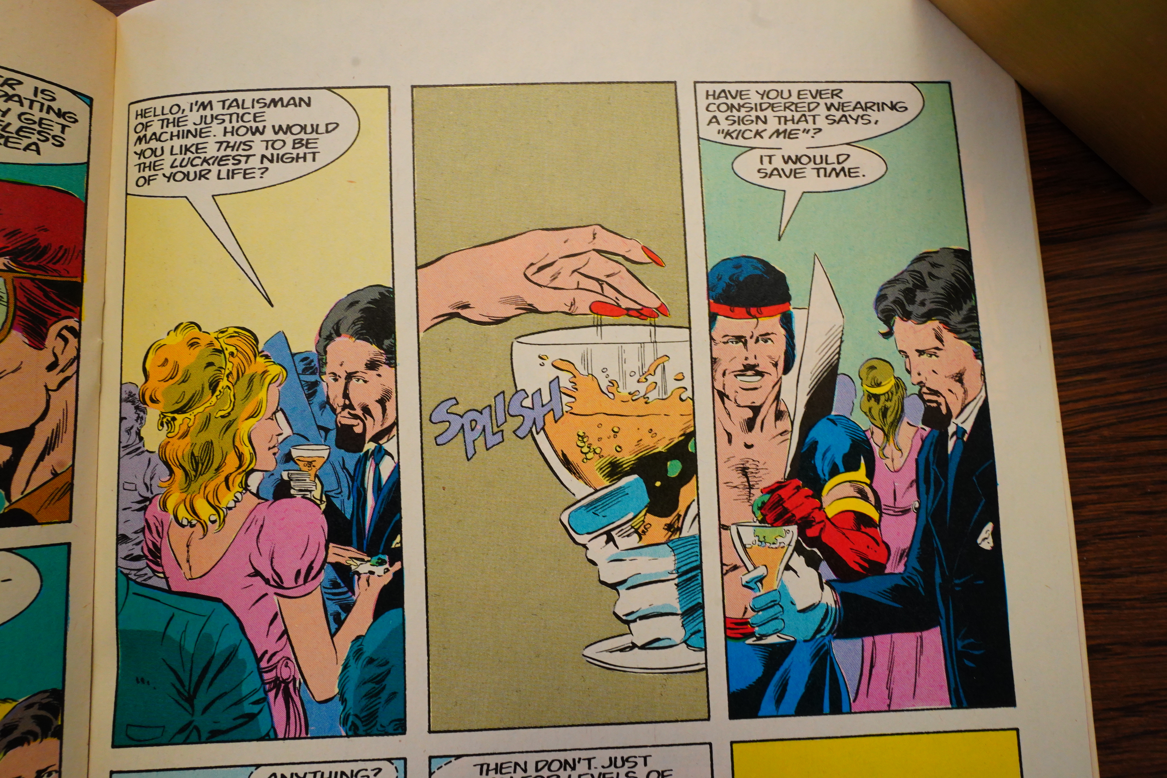
I think perhaps much of the problem the series has is that Gustovich just isn’t very good at drawing anything but super-hero poses. Like in the scene above — just what is it that she’s dropping into beardy guy’s glass? Is it a toy car? A canape? What?
Err… OK…
c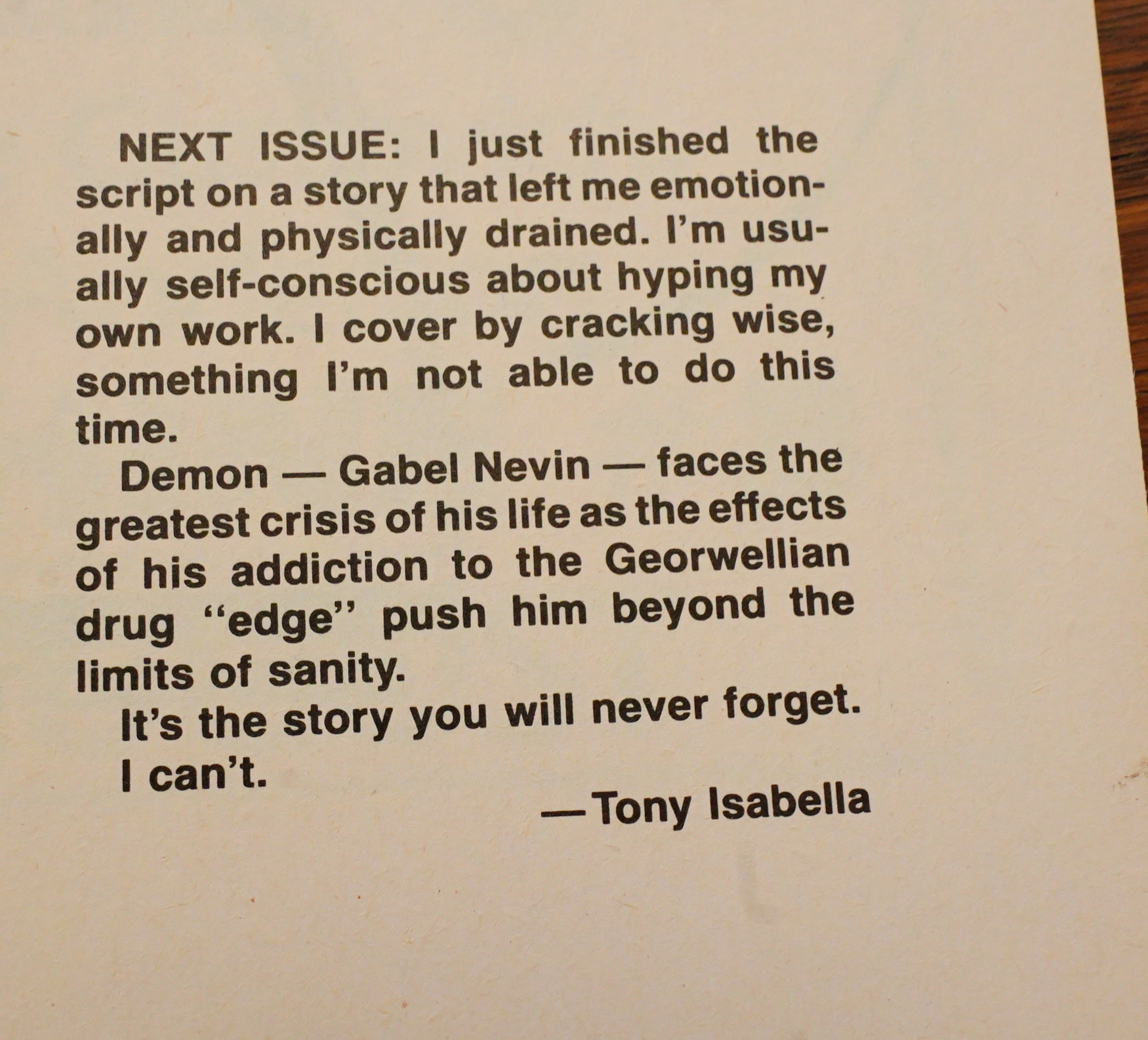
Well, if you’ve just finished the script on the story, I’d hope you haven’t forgotten it already. Probably forgotten it by now, though.
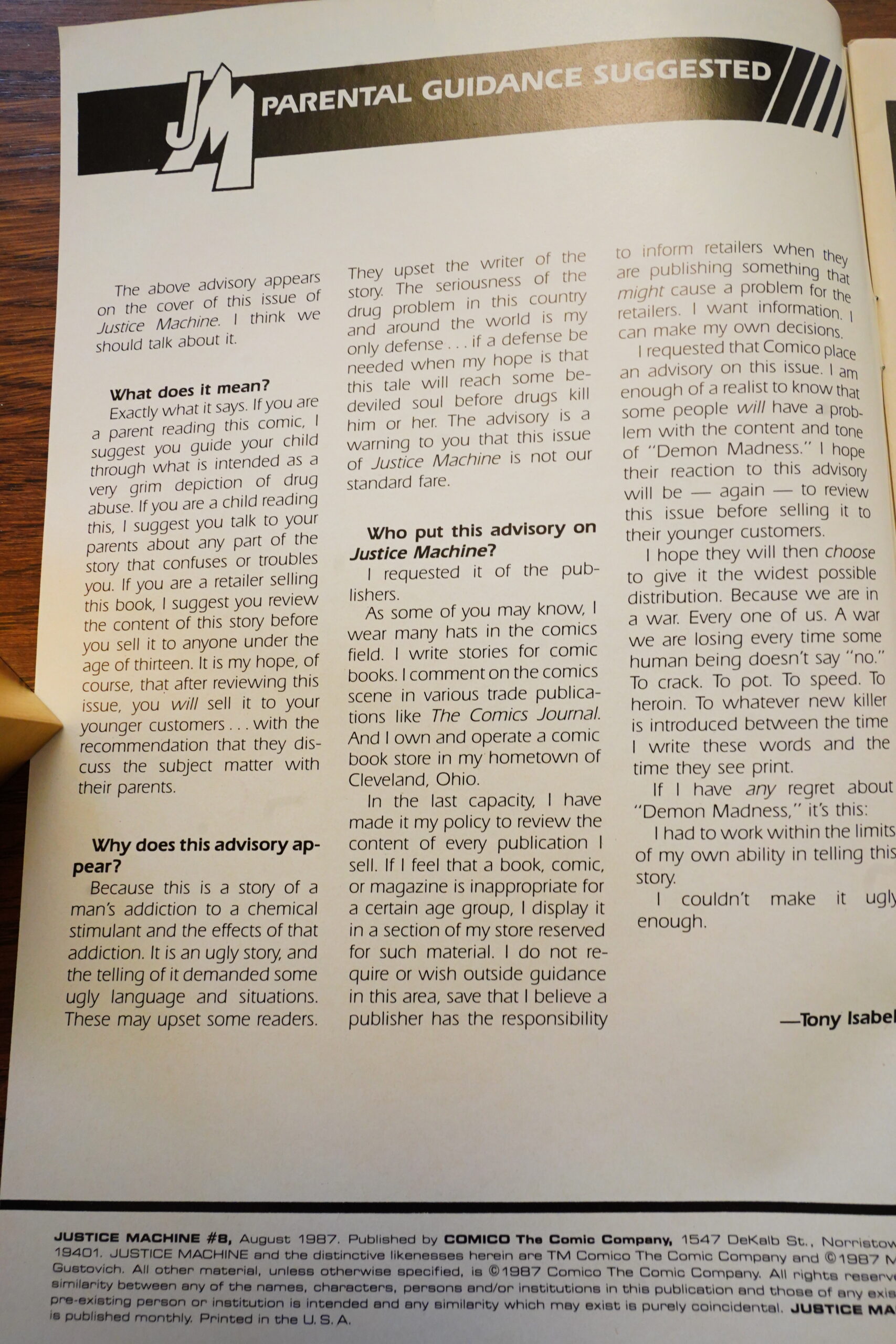
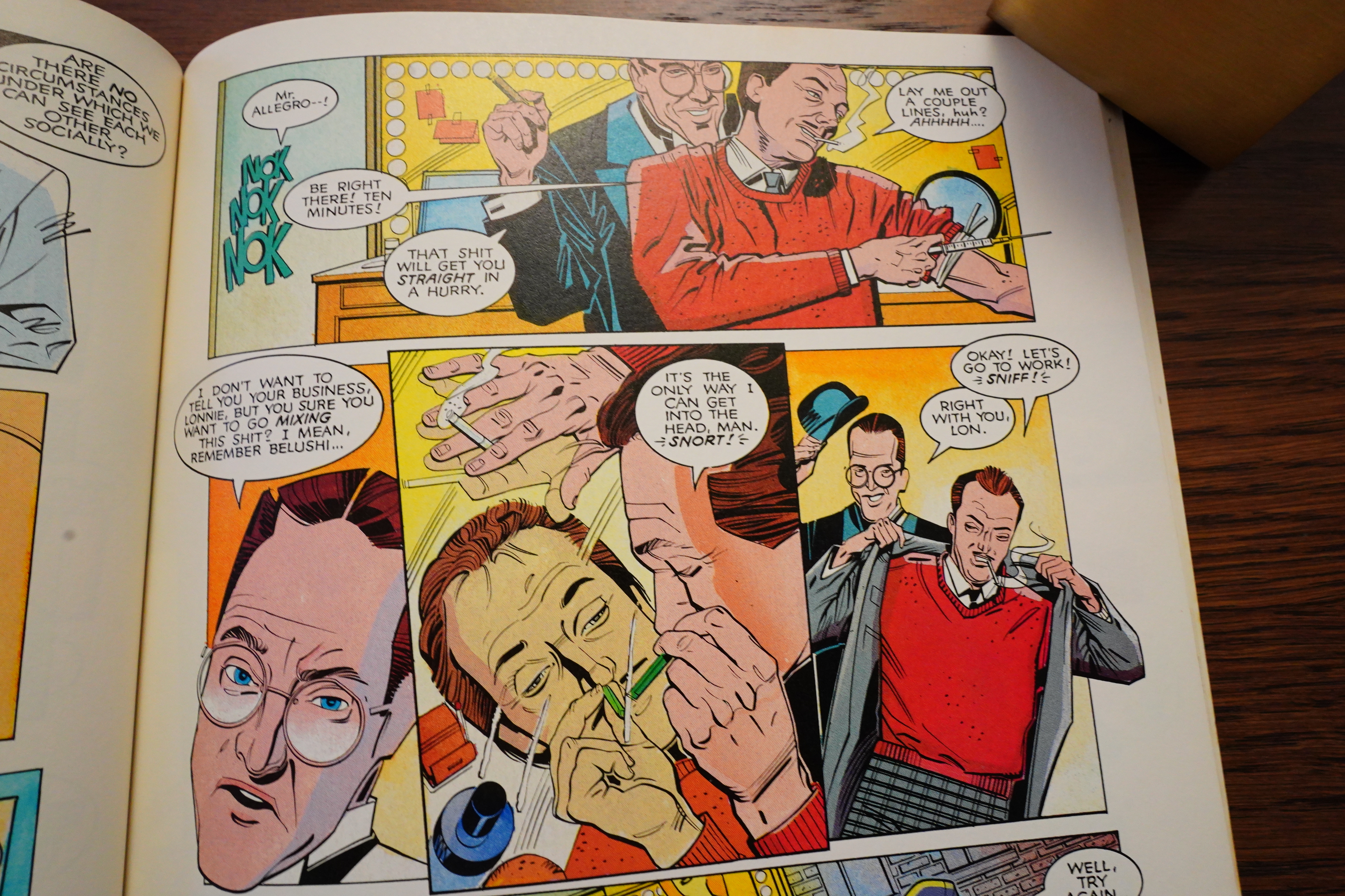
It’s such a hard-hitting story that the issue has a parental guide warning.
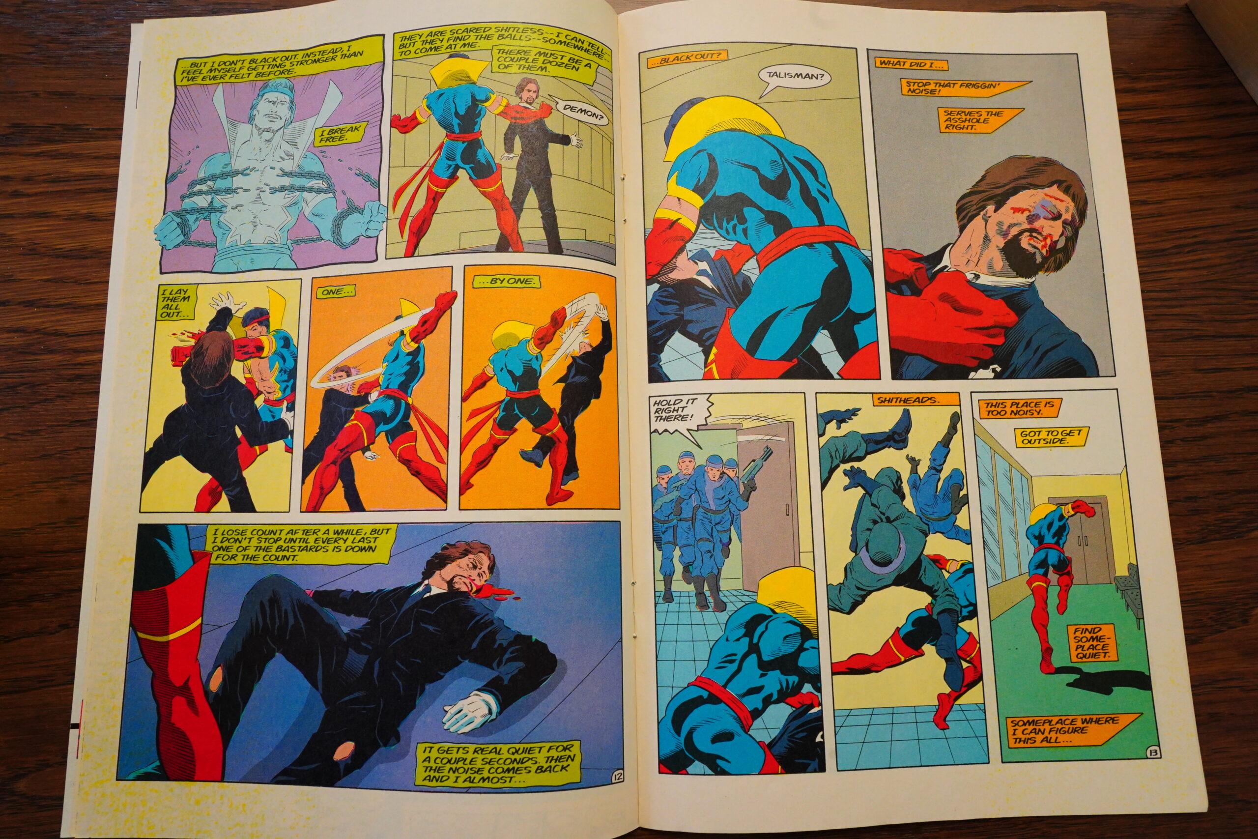
So what’s the hard-hittingness, then? Yes, Demon is going through drug withdrawal, and that makes him hallucinate and beat up beardy guy. KIDS! TALK TO YOUR PARENTS ABOUT BEATING UP BEARDY GUYS WHILE GOING THROUGH WITHDRAWAL!
This feels more like concern baiting than anything else — Comico had tried to get press attention before with a couple “worthy” projects, and failed miserably — because they were totally ridiculous. This fits into that pattern, I guess.

And it turns out that Isabella left in the middle on the 11th issue? Between plotting it and scripting it, so that sounds sudden. I wonder what the story is?
They didn’t even have a new writer lined up, so they’re going to do fill-in issues until the new writer is on board. So… not a planned exit.

Markalan’s scripting is better than Isabella’s, I guess, but it’s still a pretty nonsensical issue. (Inked by Sam Kieth.)
Amazing Heroes Preview Special #3, page #67:
“Our goal for the first six issues is to
define the characters clearly so that
everybody knows what their powers are,
and who they are. We want to get them
established on Earth and set up their
relationship to Georwell; what used to
be called New Haven and is now called
New Atlantis and is under the ocean;
and with Maxinor, who is basically the
Dr. Doom of Georwell. Then we go into
what the book is really going to be all
about-immigrant super-heroes making
their way in the new world. That’s going
to be the basic theme of Justice
Machine. Most of the old super-heroes
and super-villains will be reappearing in
the book, though not necessarily look-
ing or acting the way they did before.”
Amazing Heroes Preview Special #5, page #67:
As you may recall, the last time AH
Preview spoke to Mr. Isabella, he said
(and we quote from issue #4), “Homina,
homina, homina.” We decided to give him
another chance, and this time we got a
couple more facts.
With issue #8 Isabella will take over the
layout of the covers as well. The first thing
he’ll do is get rid of the wraparound
covers, replacing the back cover with pin-
ups of various characters. Bill Anderson
will ink this issue. The issue itself will deal
with Demon’s addiction to the drug Edge.
Demon is being driven to madness by his
dependency on this Georwellian drug,
and the story will deal with the realities
and the horrors of drug addiction. “It will
have some very strong and ugly language
and the story will carry a ‘Mature Readers’
guideline note on the cover.”
Although Isabelal requested that the
warning be placed on the cover, he
insisted that as a retailer, he would have
no trouble selling the book to kids,
because he feels that it is a story that
needs to be told to kids. “The story is as
rough and ugly as it can be,” he said, “But
the language isn’t anything they haven’t
heard in the schoolyard already.” Isabella
thinks this is his best issue of the series
to date.
Issue #9 will be titled “Seven Days”
and will contain seven short connected
stories. Among them will be Youthquake
joining the team, while other members of
the Machine track down the lead on the
Edge pipeline from Georwell to Earth.
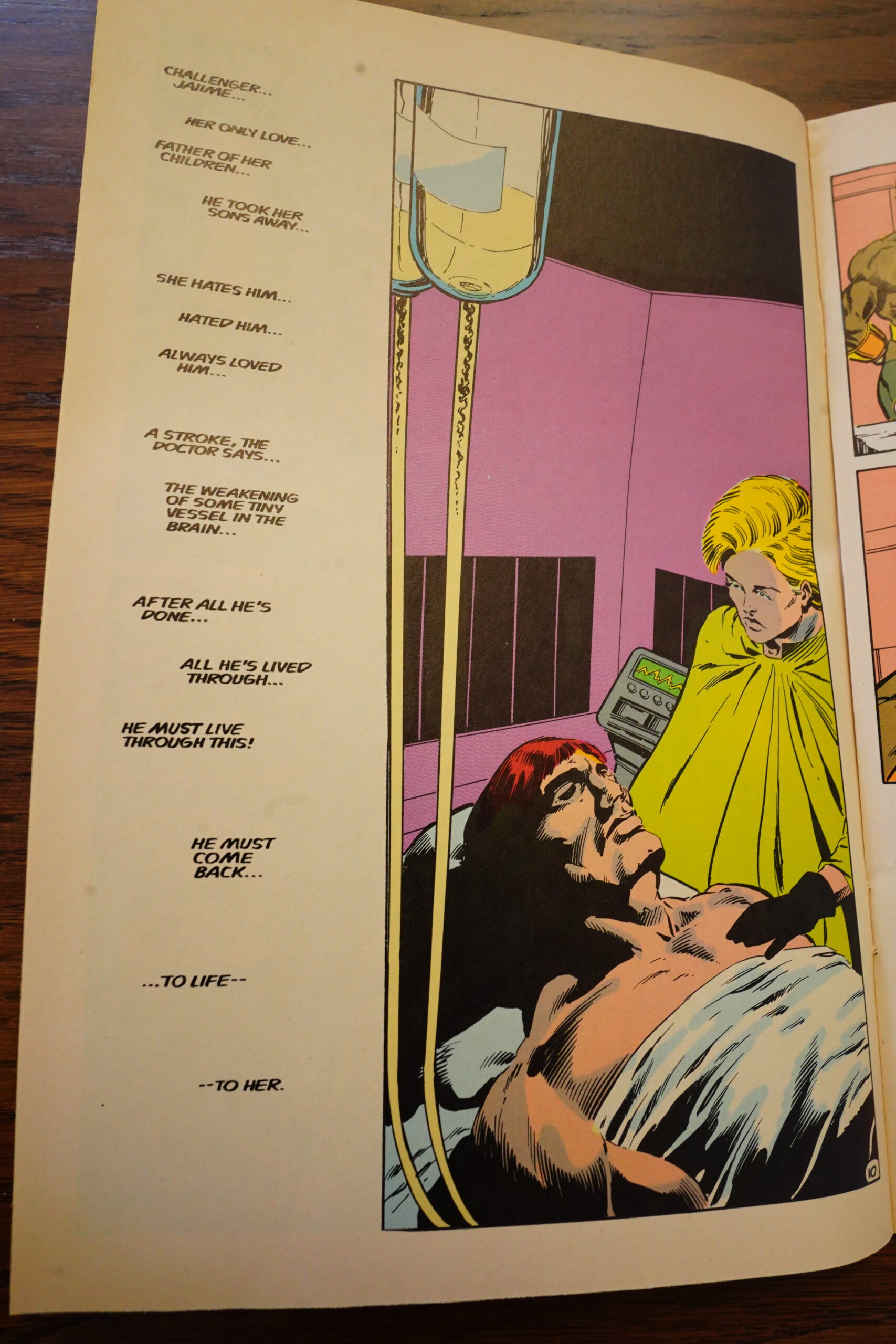
Also in this issue, Challenger finally
discovers that Blazer is his daughter. This
discovery segues directly into #10, entitled
“Father’s Day.” Here, we are treated to a
flashback of the original Justice
Machine’s last case and Challenger’s
relationship with The Flame (Blazer’s
mother). The story deals in part with the
Rim Wars, which was sort of Georwell’s
version of WWII, except that it took place
in outer space. There is also a partial
resolution between Challenger and
Deviner, his ex-wife.
In issue #11, Talisman, Titan, and
Youthquake continue to track down the
source of Edge on Earth. Then in #12,
some of the characters return to Georwell
to rescue Deviner’s kids. Blazer will
receive an operation that will help her
control her powers-at least to the point
where she can take off her uniform.
The Slings and Arrows Comic Guide #2, page #365:
The Justice Machine was and is artist Mike Gustovich’s
baby. The original series in magazine size proved popular
enough to spawn a role-playing game and accompanying
sourcebook, but issues are so difficult to find that when the
series was picked up by Comico in 1987 Gustovich
decided to ignore past continuity and start again from
scratch, with Tony Isabella handling the script.
The Justice Machine are the government enforcers of the
unsubtly named planet Georwell. After meeting up with
Earth’s Elementals (who débuted in the Texas annual) in
issue 4, Justice Machine vs The Elementals (1986), they begin
to question their orders and when they push too far find
themselves framed for treason. After that, it’s time to team
up with their former enemy, Maxinor, for Justice Machine
vs the evil regime, via Earth, where the rebels have allies.
The basic idea might not be the most original, but along
the way the comic addresses issues of where you draw the
line between heroic freedom fighters and evil terrorists. It
also tackles drug addiction (Justice Machiner Demon’s
powers are derived from drugs to which he is addicted),
albeit in a way which makes you feel you’re being
preached at rather than offering much advancement to the
plot. Mostly, though, the Comico issues are a competent
superhero romp, nothing special but a satisfying, easy
read. The Innovation miniseries and subsequent seven
issues, and Millennium’s miniseries, are poorer quality
and best avoided.~JC.
Back Issue #94, page #26:
Then comes Justice Machine #8. The issue carries a
“Parental Guidance Suggested” banner at the request
of author Tony Isabella. He requested it due to the subject
matter of the story, and remembers, “The only feedback
I ever received was from the publishers and they were
upset with me for requesting the advisory, though I never
made it a ‘my way or the highway’ situation. I felt that
the depiction of drug use and sex in the issue, as well
as the multiple occurrences of more extreme than usual
for a superhero profanities, required the advisory.”
The issue focuses on Demon. Since the series started,
he had been using a drug called Edge to enhance his
speed and agility. Unfortunately, the team used the last
of his supply to defeat Killgore in issue #6.
Issue #8 is a frank depiction of Demon’s withdrawal
from the use of the drug and ends with him, unknown
to anyone, setting off to prove to his teammates that
he no longer needs chemical assistance by swimming
the 2,000 miles from New Atlantis to New York City.
He doesn’t get very far before his body fails him and he
sinks beneath the waves. Here the issue ends.
As we will see, the character would take a very
convoluted path from here. But did Tony Isabella mean
this to be the finale for Demon when he wrote the story?
“No,” says Isabella. “I knew Gustovich liked the character,
so it was always my intention to bring him back.”
He also feels that “Demon was cut from the same vicious
cloth as the bullies I have dealt with my entire life. It was
easy to write him and joyful to abuse him. The only
difficulty in writing him was figuring out how to turn him
into a good man and redeem him. I had a long-range plan
for that, though I was never able to follow through on it.”
[…]
The editorial in the following issue tells us that the Machine is in
for a major change. That change being the departure of Tony Isabella.
No reason is given for his leaving, but issue #10 was his last full script,
while he supplied the plot for #11.
In his 11 issues, Isabella introduced a number of ideas that were never
followed through with, Hamilton’s daughter being one example. Rather
than having specific plans for them, though, he reveals, “If I was ever
stuck for a plot, I planned to turn to these plot elements in waiting.”
As it is, issues #11 through 13 deal with the clean-up of some of
the major plot points plus a flashback to an earlier tale of the
team from their security force days on Georwell.
Can’t find anything about why Isabella left…
Gene Phillips writes in The Comics Journal #74, page #45:
Intellectually, I know that Justice
Machine must be an indirect spawn of
Marvel’s X-Men and similar books.
Witness the flashy costumes and powers of
the heroic team, the pure action plot, the
characters’ attendant neuroses, and so on.
But in a perverse way, it’s hard to believe
that Justice Machine could even share kin-
ship with Tony Isabella’s Champions: it’s
too estranged from the very aspects that
made the formula so appealing.
The plot is naturally threadbare: the
Justice Machine, formerly law enforcers on
the planet “Georwell” (the closest the
script evergets to wit, lacklustre though it
is), find themselves hounded by “the cor-
rupt Georwellian government.” They
return to that wittily-named world “to
destroy their government’s only means of
tracing them-the dimensional-lock.”
They encounter another super-group, and
whup ass on them. It seems that it would be
hard to go wrong with such a basic, paint-
by-the-numbers setup, but writer/artist
Gustovich managed to get just about every
facet of the formula wrong, which is sort of
an achievement in itself.
First, the names of the superdudes. Such
names should have a dramatic ring, des-
cribing both the powers and characters of
the heroes, i.e., Storm, the Thing, the Vi-
sion. Only one of Gustovich’s cognomens
is passable; a hero named Talisman (who,
despite the mystical name, wears plain-
clothes). The other names are blandly des-
criptive: Titan, Blazer, Challenger,
Diviner, and Demon (who doesn’t look at
all demonic). The Guardians are even
worse, including a tough female named,
of all things, “Male-Factor,” and two
Marvel ripoffs, the shield-slinging “Crusader” and
the brutish “Hunk”(!).
The powers: Chris Claremont has re-
peatedly stressed the inability of fans to
‘establish” the heroes’ powers, if for no
other reason than to set up dramatic ten-
sion. The Justice Machine’s powers are
strictly rabbit-out-of-the-hat; at one point
Challenger uses a gun that bounces his foe
back and forth like a slingshot!
Characters: I didn’t expect the perso-
nalities to be any better than the worst
Marvels, but Gustovich managed to get
even worse than that. It’s one thing to have
one character go back home and discover
the truth of Thomas Wolfe, but to have all
the characters learn the same truth with
minor variations is not characterization,
just scene-shifting. There’s the usual
gratuitous dislike between two members as
well, tossed off with a simple, “O.K., I don’t
like you.” Such complexity makes my head
spin.
Art: costumes are tolerable, which gives
them the highest marks of anything here.
Most of the facial expressions seem borrow-
ed from Byrne or Adams (especially Titan’s
half-lowered, glaring expression on page
33); the fight scenes are static, in which the
heroes spend more time striking dramatic
poses than fighting (pages 10, 32, and 34).
My favorite action-scene is the one in
which Talisman encounters a belligerent
old woman, who assaults him with a left
cross (“WHUMP!”). As for anatomy, well,
page 36 shows that all Georwellians are
made of rubber, so it hardly matters.
Dialogue: “The others are depending on
me.” “Now, give me the gun.” “We’ve got
to rely on surprise.” “Zarren framed us,
made it appear we’d defected!” “Giving up
ish’t in our vocabulary.” What ever hap-
pened to the fans who enjoyed Marvel
because of its grandiose sesquipedalianisms
rather than because of the cliches it recycl-
ed from B-movies?
What more can one say to dissuade
others from investing in this ignoble ven-
ture? Larry Houston! Tim Corrigan!
Where are you when we need you?
That’s a review of the pre-Isabella Justice Machine, though.
So there’s two fill-in issues after Tony Isabella left, and they’re virtually unreadable. I can’t quite put my finger on what makes this series so offputting — the lack of actual characterisation, the tedious bloviation, the way nothing seems to actually happen while there’s chaos everywhere…
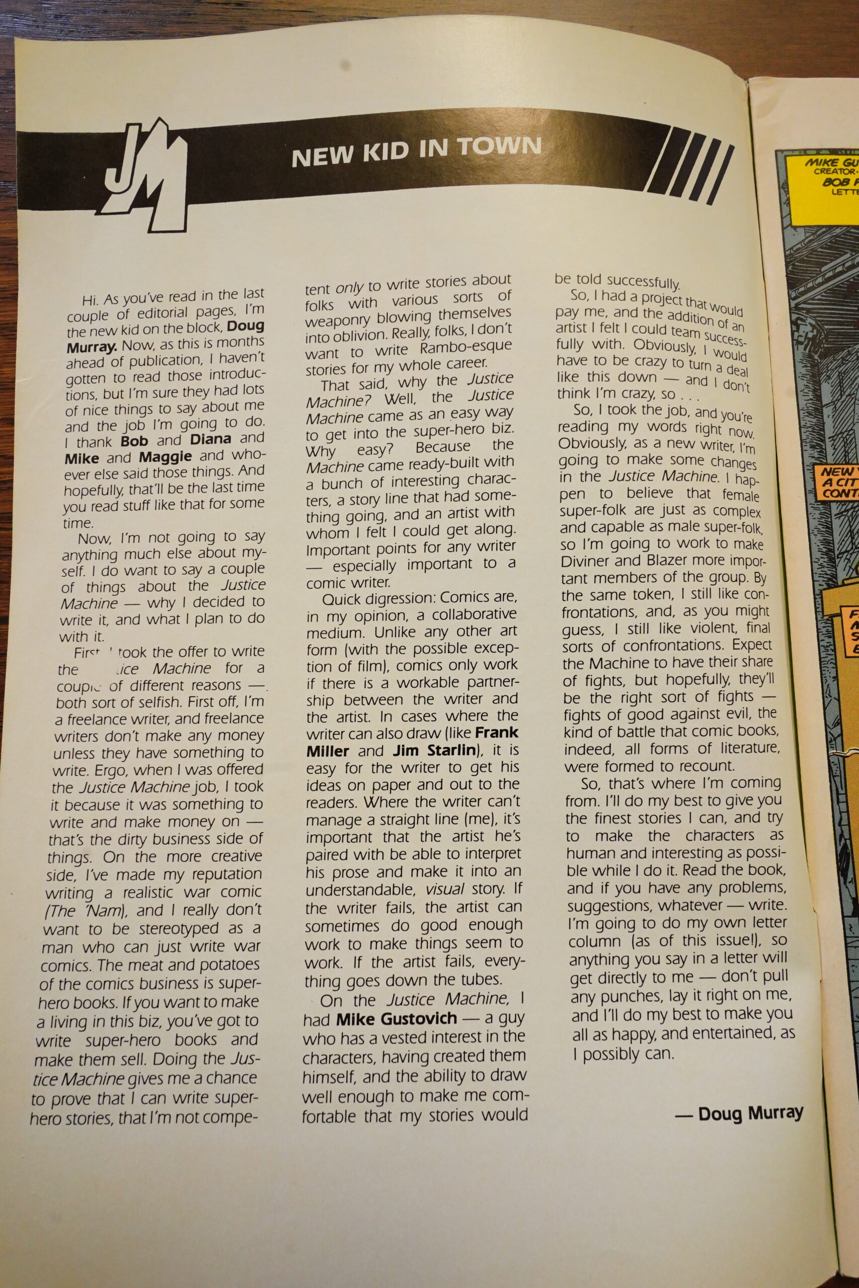
But then Doug Murray arrives, and he explains that he’s only taking this job for mercenary reasons. I paraphrase slightly, but I think he wants to establish that he’s not some kinda fanboy?
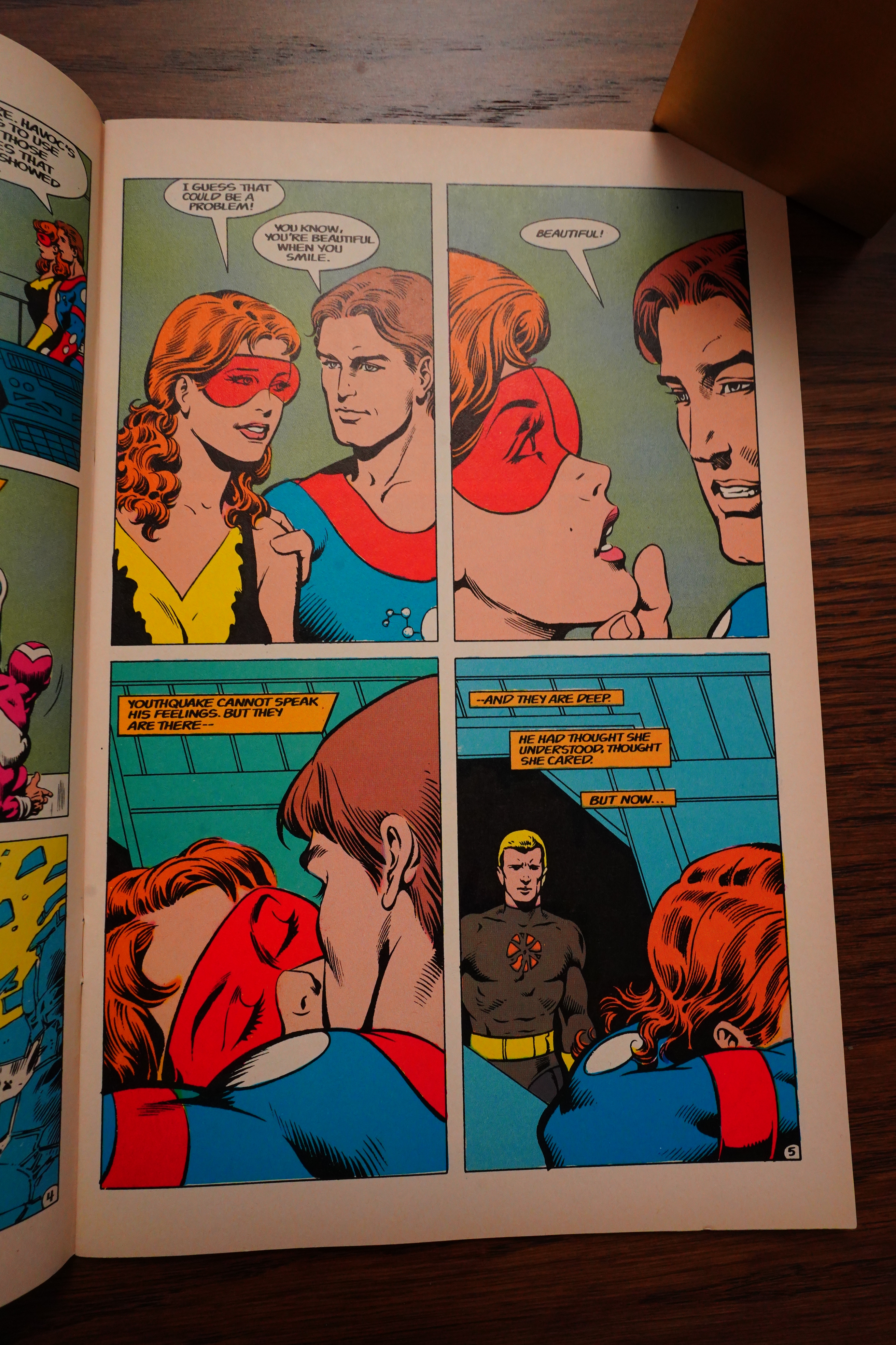
He also belives that “female super-folk are just as complex and capable”. What do you mean Diviner isn’t a complex character! She dislikes Challenger and that’s her entire character, do you need more? And Blazer… her personality is… er… let me see… Oh, her personality is “I’m 18”. OK, OK, I think Murray has a point here, but it’s not like the other characters have much character, either, beyond a few surface ticks.
So let’s read some pages:
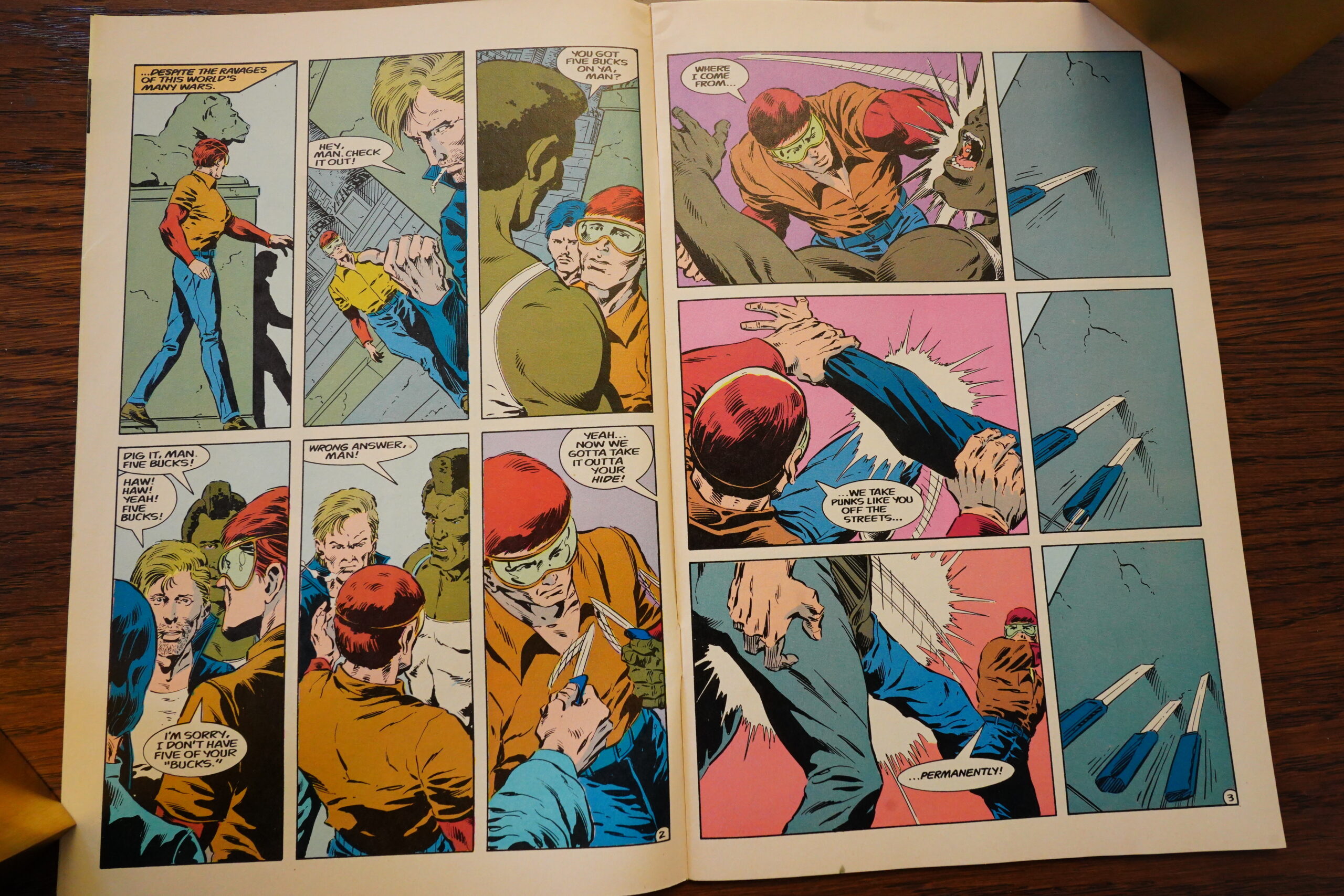
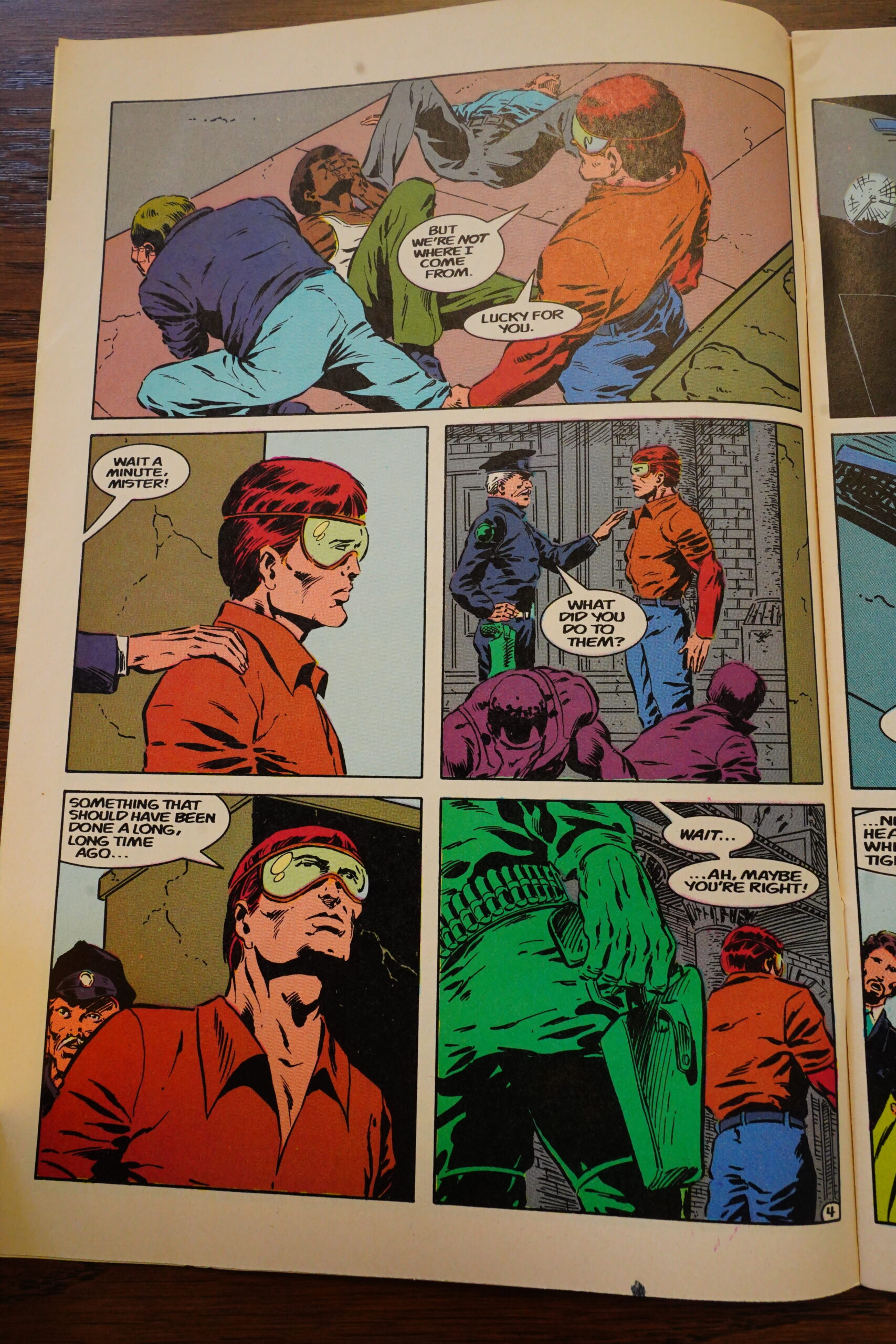
Er… OK, that’s certainly a bit more grounded, I guess? But… Challenger is just beating up some people who tried to stab him? And people stabbing other people is apparently something the cops don’t deal with otherwise?
I see what Murray is going for here, but it’s pretty stupid.
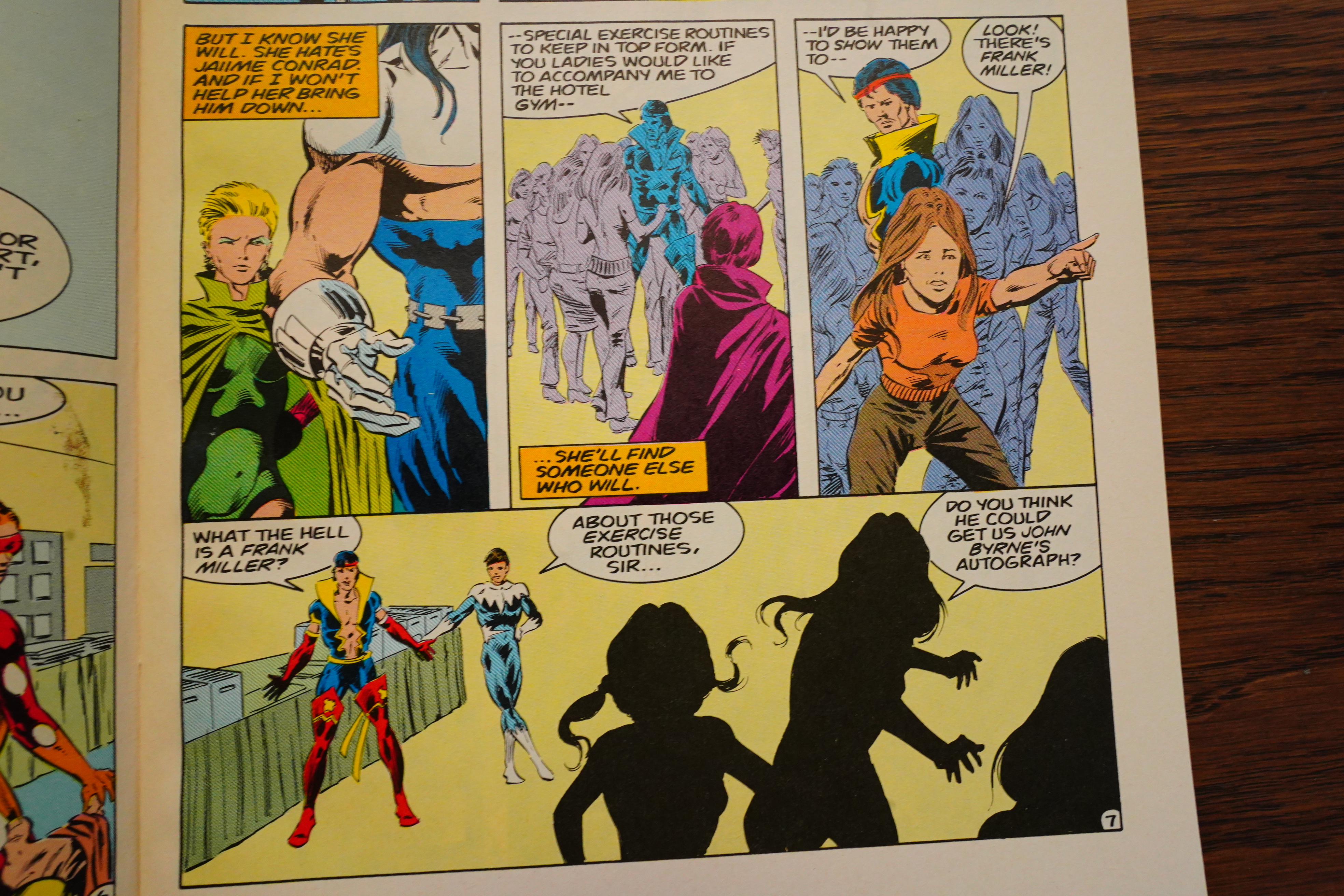
And now Diviner gets character! She’s not only going to be “Oh, I hate Challenger soooo much”, but also “But now I kinda love Challenger, too”? Well, that’s complex characterisation for sure!
Oops spoilers — they bring Demon back. He kinda-sorta was implied to have been dead back in #8, but in super-hero comics, nobody stays dead. And they didn’t even find his body, so it was always meant to be.

Heh heh, you have all these super-heroes, but as soon as somebody pulls out a gun, they all go running. Which makes you wonder why this guy doesn’t just carry a gun regularly. It’s best not to ask these questions.

Murray explains that Gustovich insisted on bringing Demon back from the dead.

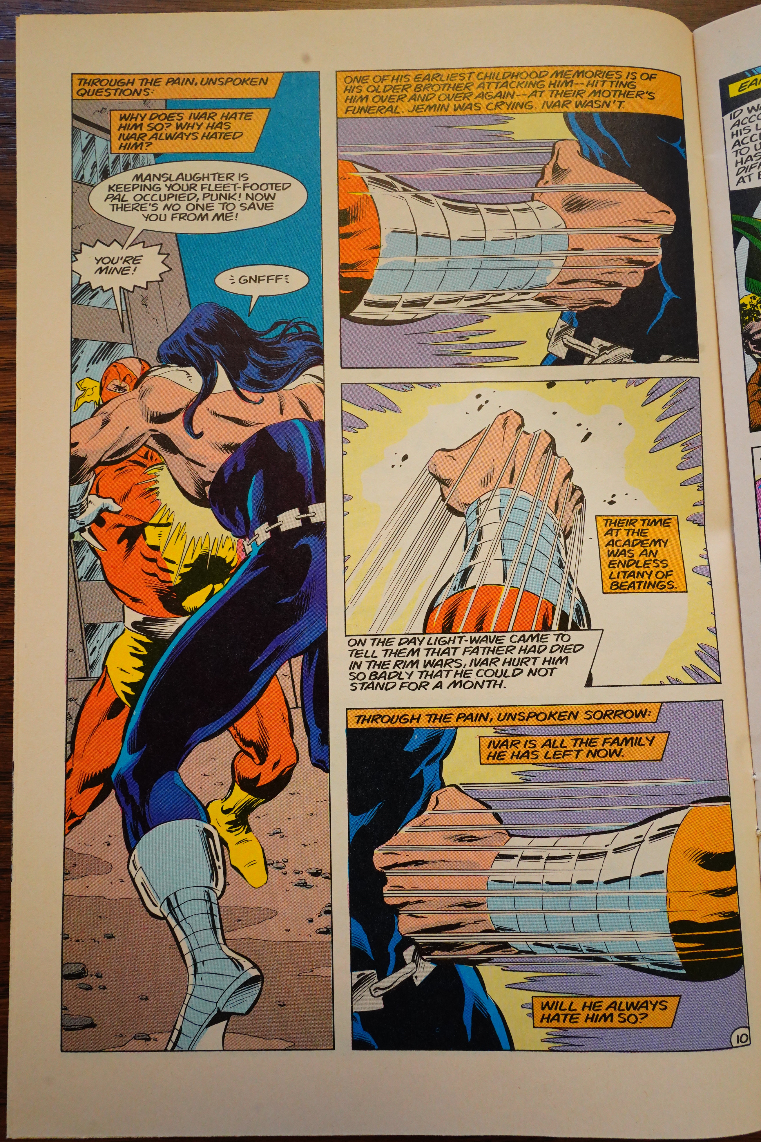
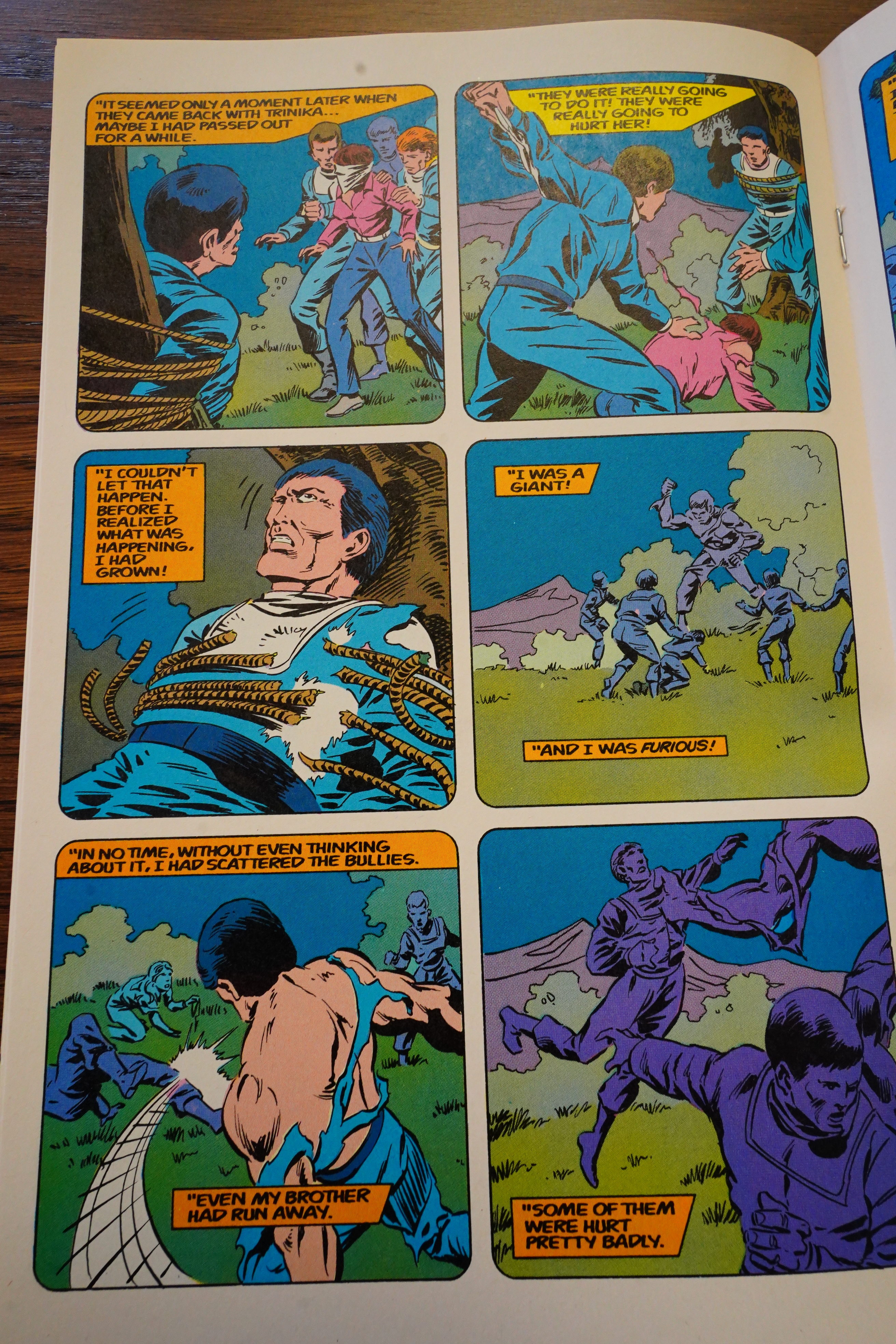
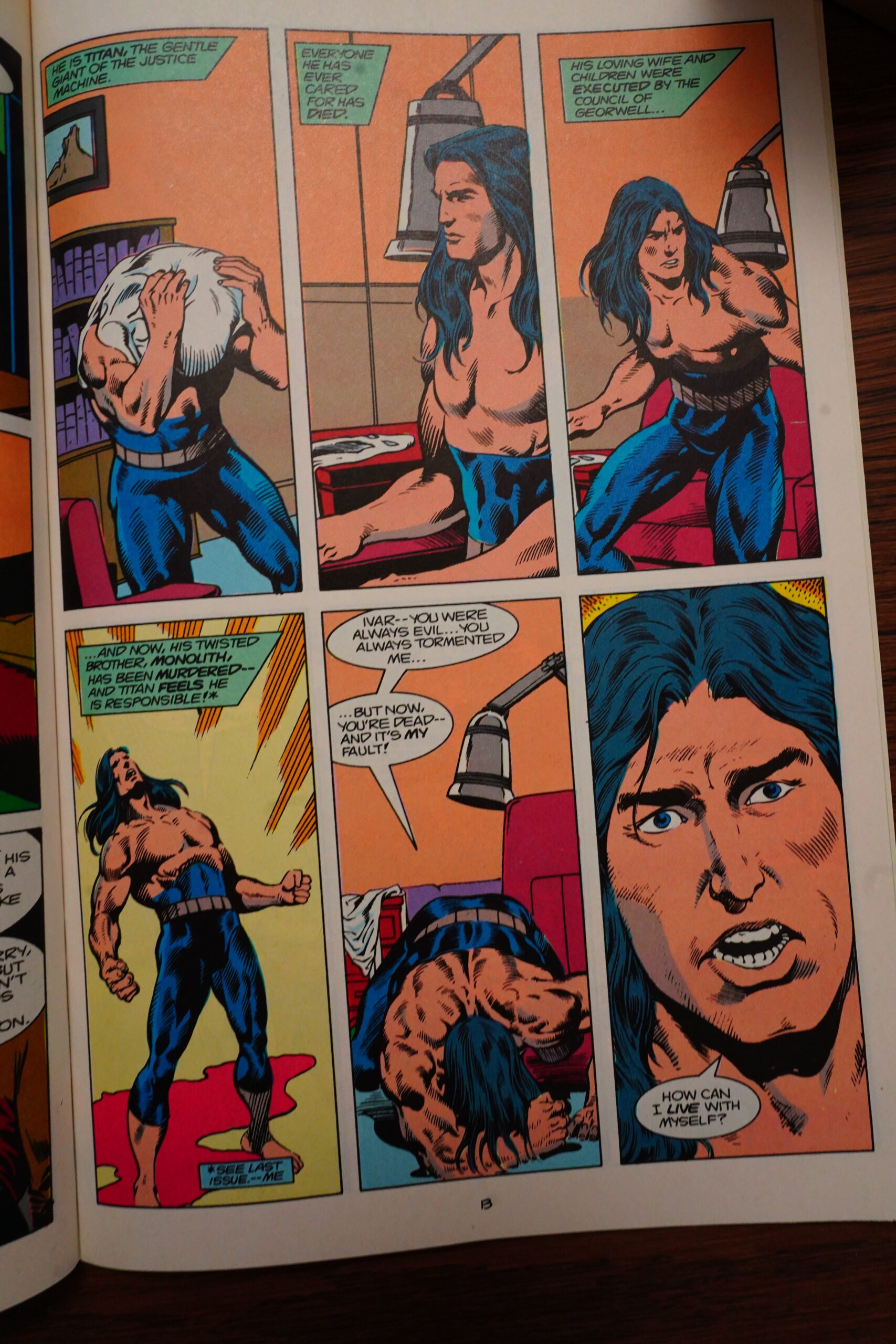
And the complex characterisations continue — Murray (over several issues) give us the backgrounds of all the characters, and it turns out *gasp* that they all have sad, traumatic backgrounds. This one became a super-hero at the attempted rape and fridging of his girlfriend… by his brother!!!! Others turn out to have had abusive fathers and all that stuff. So: Totally standard, but it’s certainly better than nothing, which is what we had before.

And Murray’s first storyline — which spans four issues — is good! It’s an actually intriguing mystery sort of thing, and it’s a solid, well-told super-hero mystery thing, with actual surprises and fun things happening.
The book is no longer a chore to read! I’m amazed! And entertained.
Heh heh.

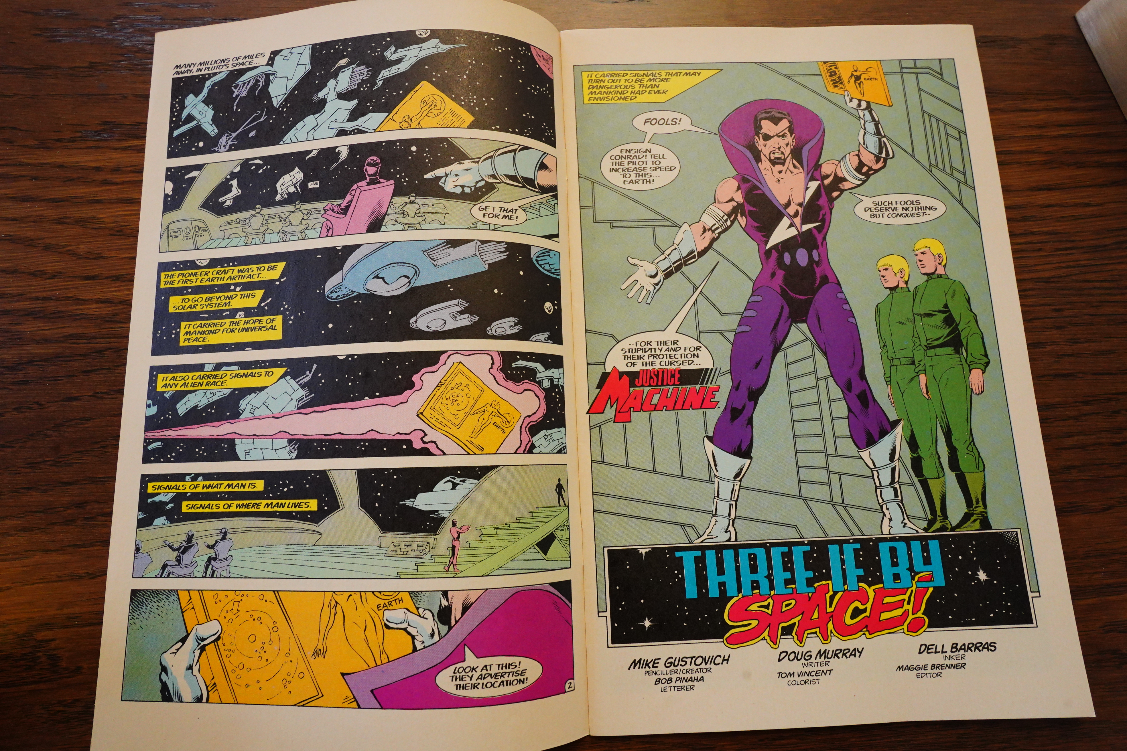
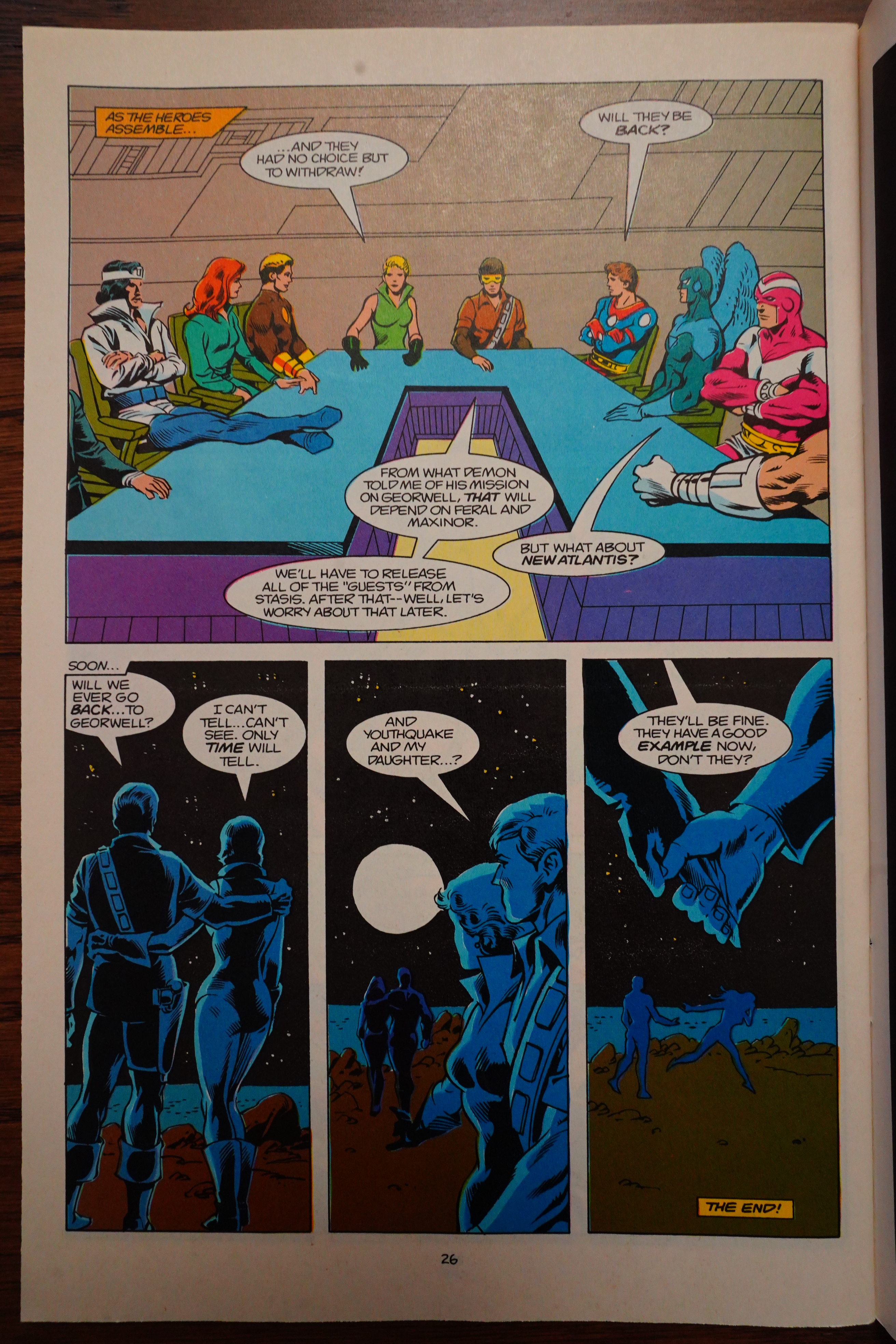
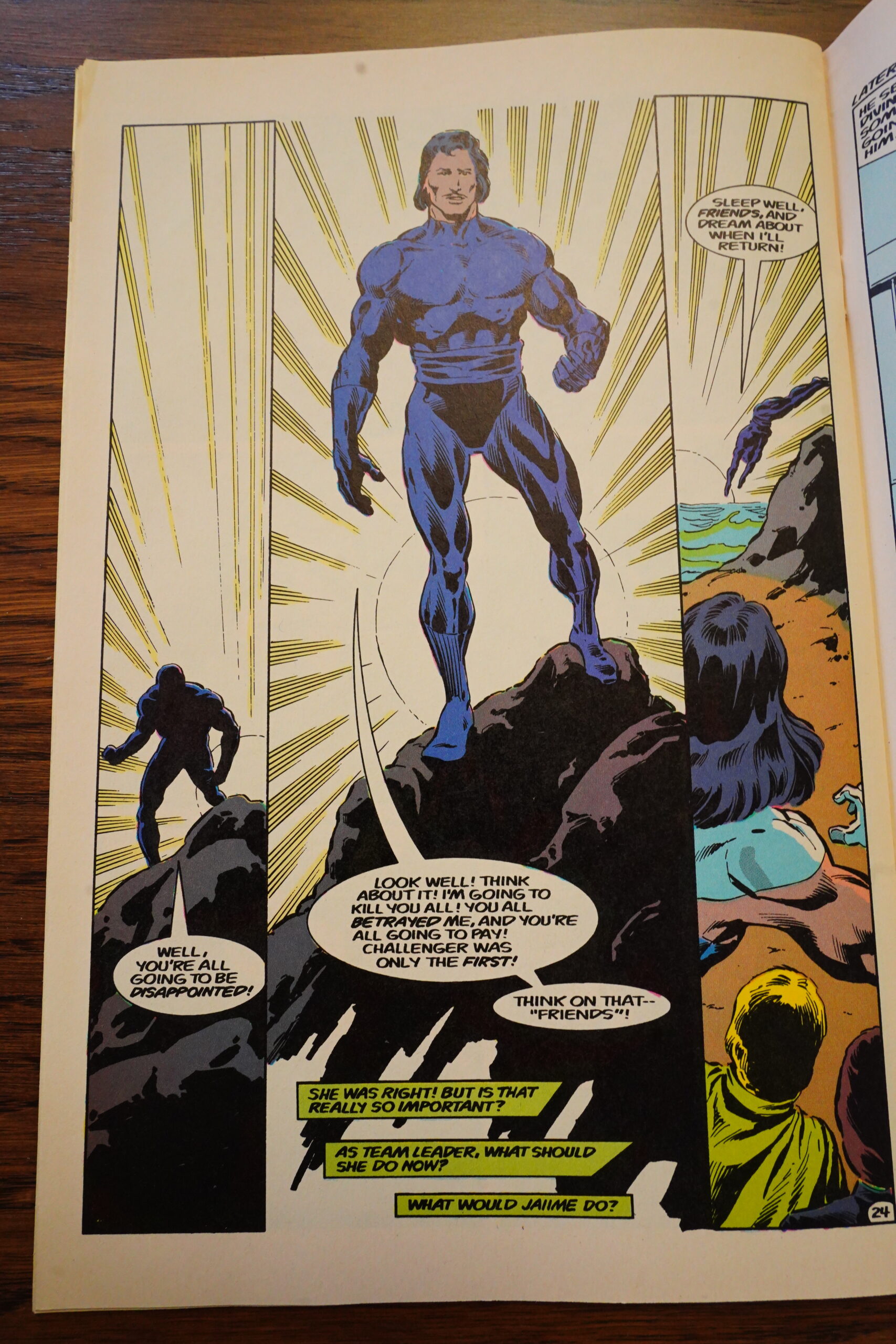
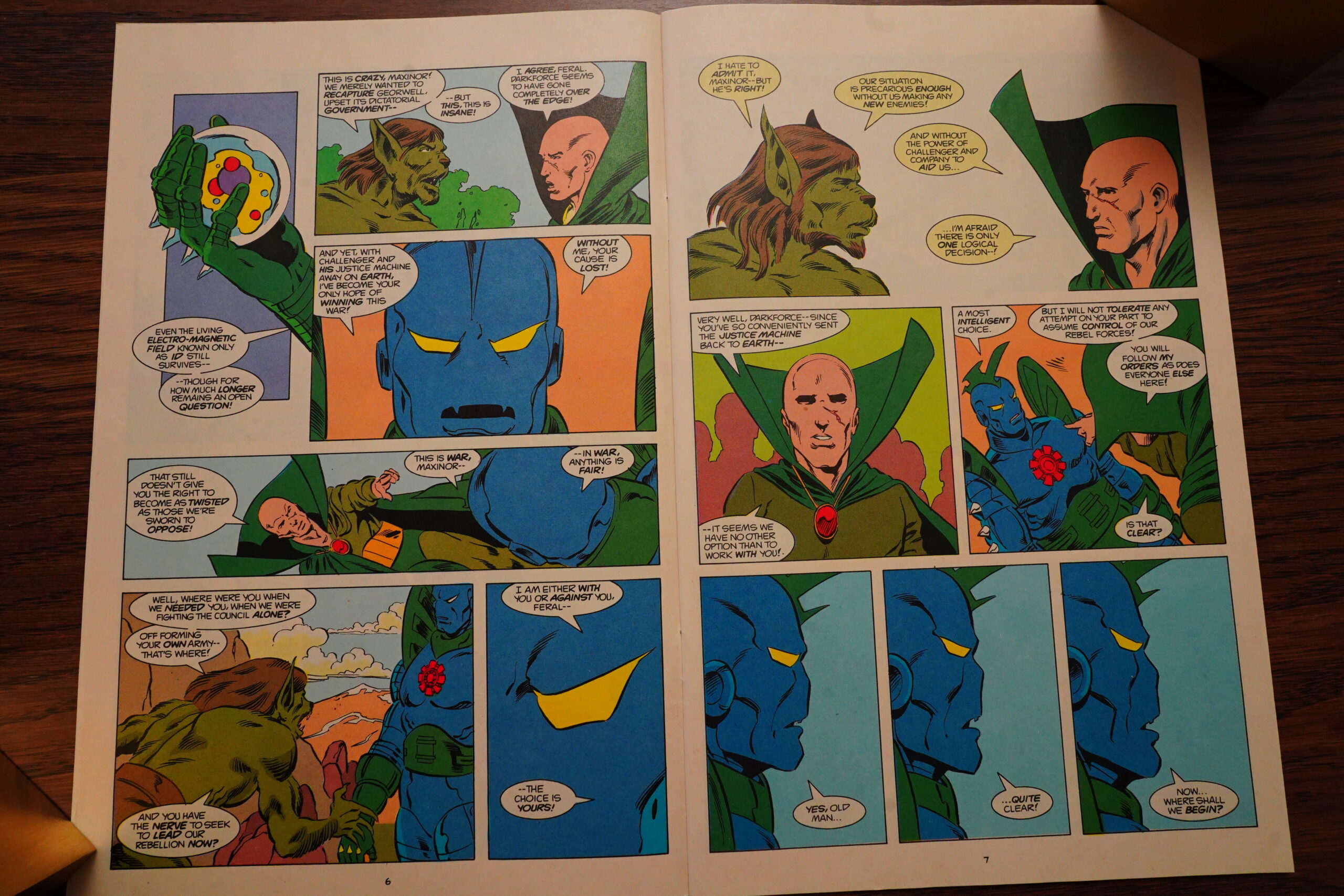
And then we start a seven-part epic Earth/Georwell War series. After that first Murray arc, I’m aboard, even though I don’t quite understand why Georwell is attacking Earth from space when they have that dimensional teleportation device? Space ships are fun anyway.
The series gets a new editor who tells us what a hard, hard job being an editor is. I bet the editor’s the most important person, even!
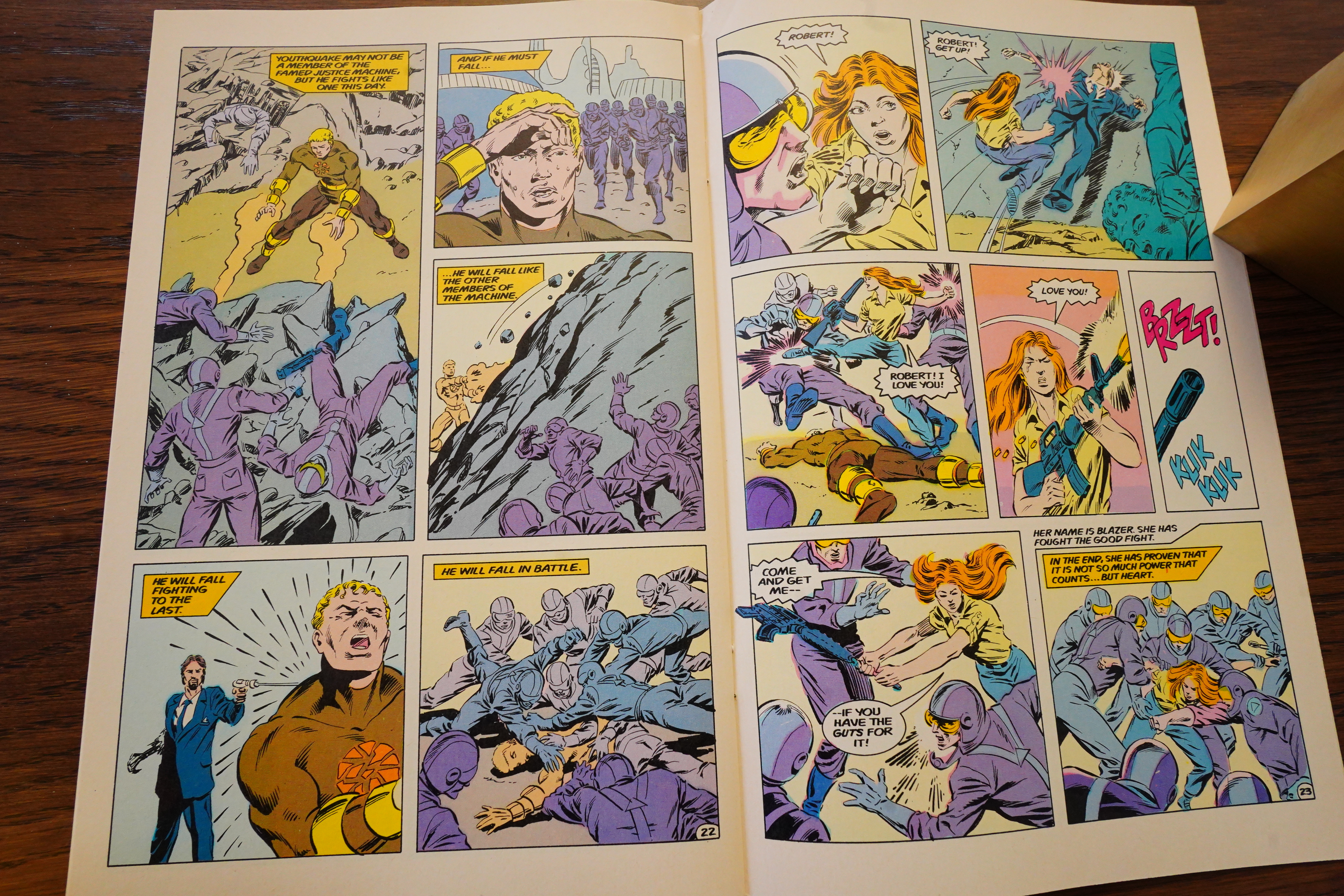
Murray’s second story arc isn’t as successful as the first. I mean, scenes like this:

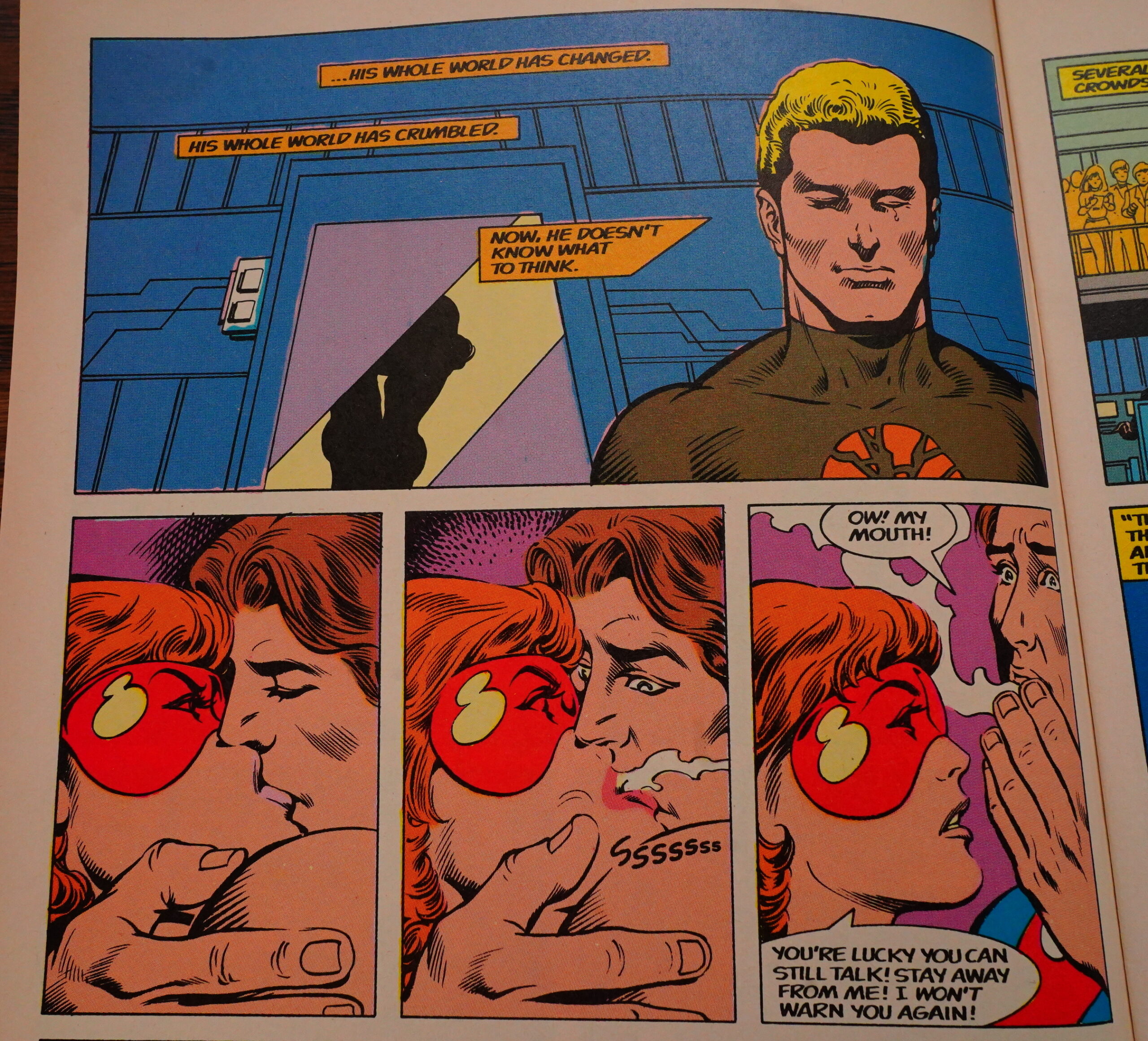
C’mon.
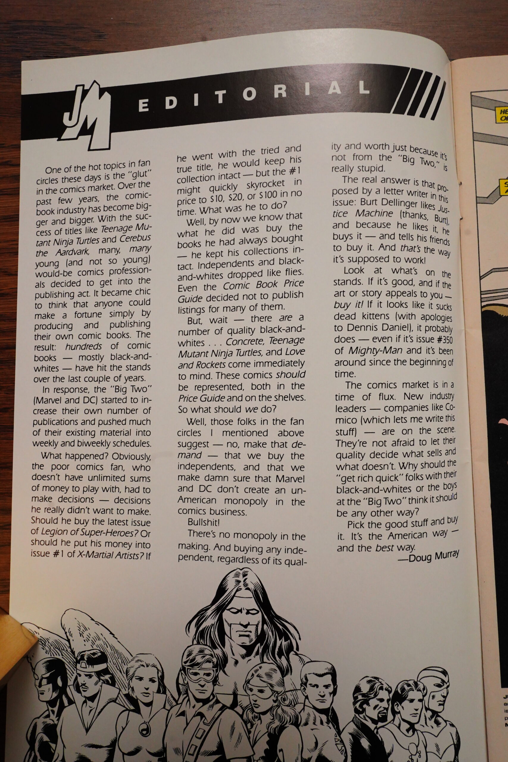
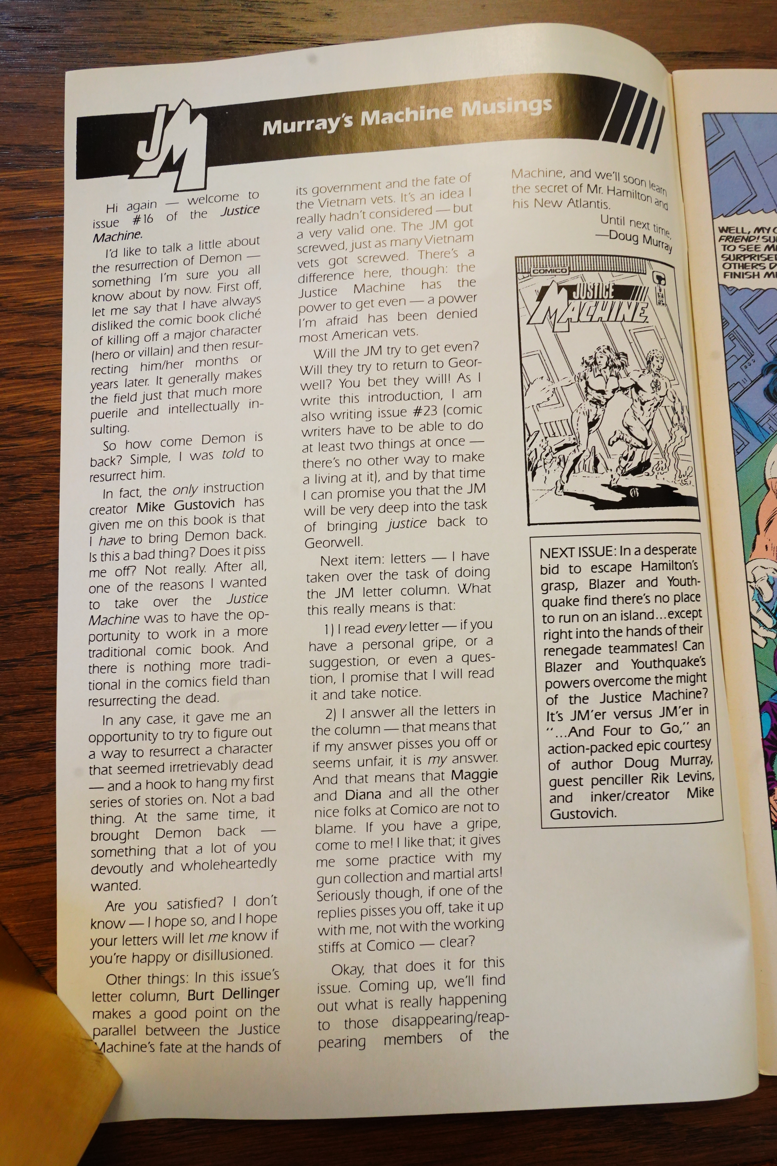
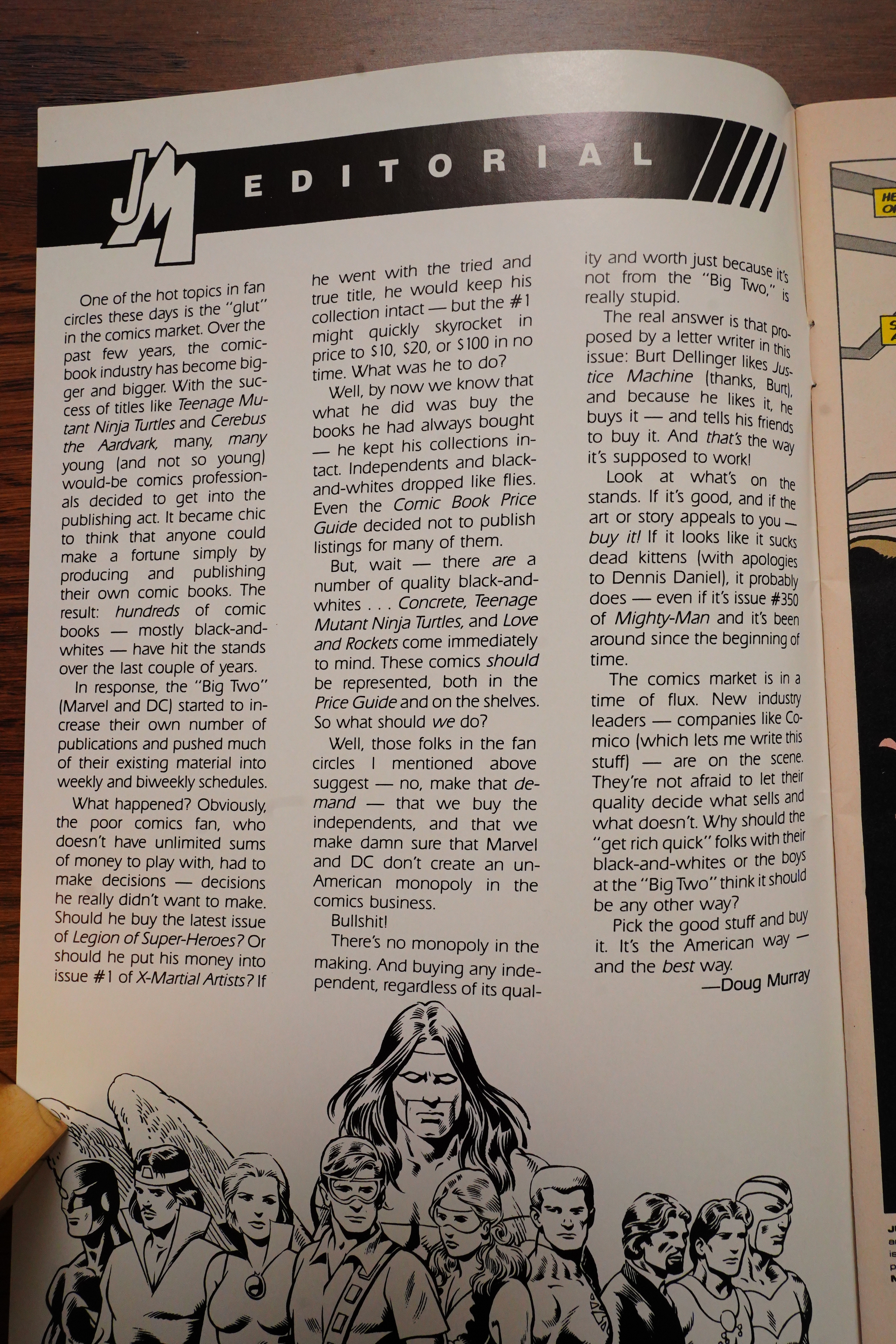
Murray writes an editorial about the current comics glut. Which was definitely a thing at the time — DC and Marvel were pumping out comics, trying to drown out all the indies (like this book) — but I guess the editorial means that the Justice Machine sales were in the toilet? That’s what my Secret Comics Editorial Decoder Ring (S.C.E.D.R.) tells me.
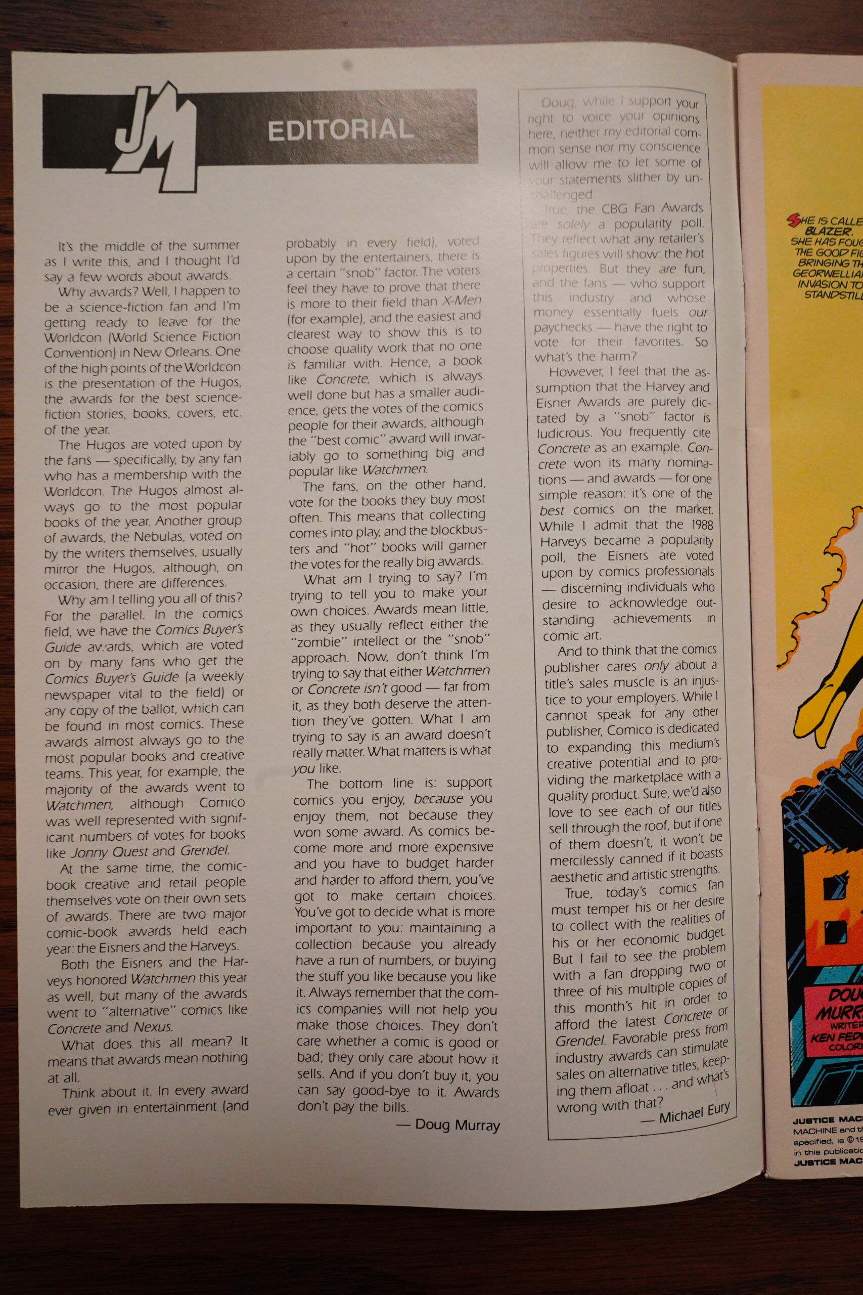
And then next issue we get a pretty odd editorial. Murray complains about two types of comics awards at the same time: There’s the CBG awards, which just go to the most popular books, and then there’s the Eisner’s, which go to “cool” books. Using my S.C.E.D.R., I thing this means that Murray is angry that the Justice Machine isn’t getting any awards? I.e., it’s neither popular nor cool, which is accurate, I guess.
Editor Michael Eury (weirdly enough) drops in a column to rebut his own writer, which is just… I mean, it’s understandable, but kinda tacky.
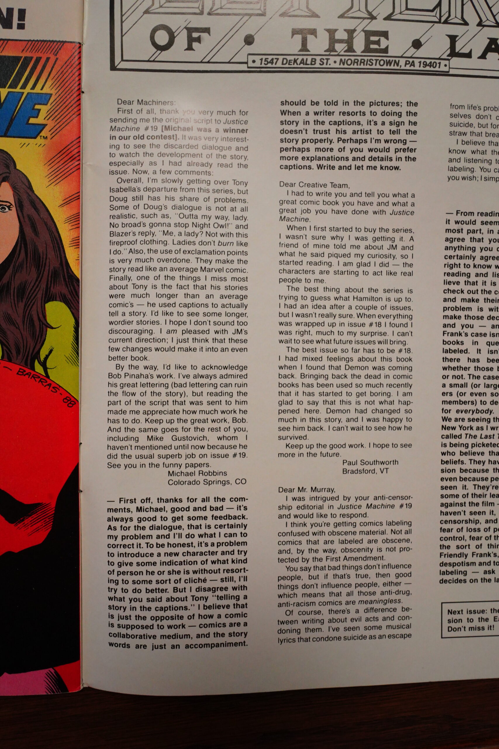
A reader writes in to let us know that he preferred Isabella’s writing, because “he used captions to actually tell a story”, which is the first time I’ve seen somebody clamouring for more leaden verbiage in a super-hero book, I think?

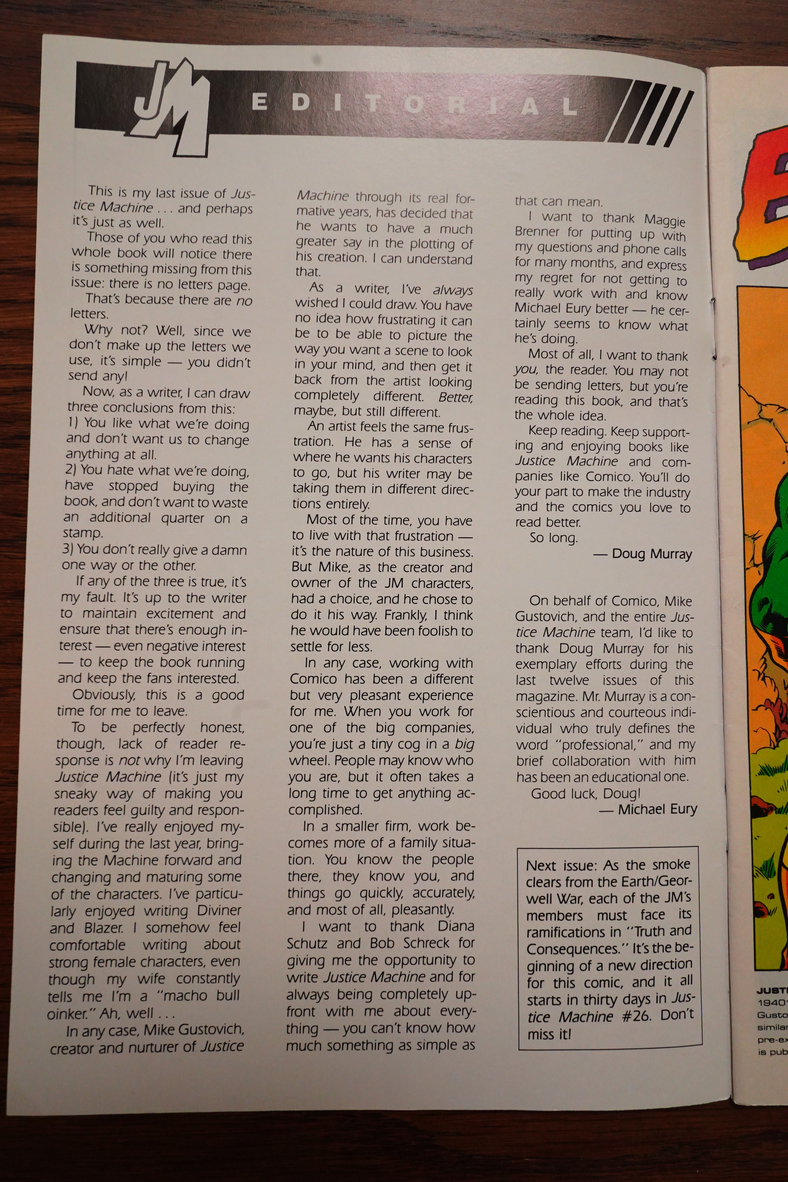
Murray announces that he’s leaving, and mostly says this is mostly down to Gustovich wanting to write the plots himself. Yet again, using my S.C.E.D.R., I think this means that sales are further in the toilet, and they can’t afford to have a writer on board any more — instead Gustovich can just get the entire (now diminished) paycheck. Gustovich also takes does the inking on the final issues, which had also frequently been outsourced previously.
But I wonder whether there’s also tension between Murray and both the editor and the artist — Murray took the book in actually entertaining directions, which was a fundamental break with how the book had been until that point.
Oh, I forgot to say how the Earth/Georwell was went — it was fine, but not as interesting as Murray’s first story arc. But it was OK — it wasn’t annoying or anything.
I haven’t mentioned the colouring on this book, have I? It’s good — Tom Vincent doesn’t shy away from bright colours, but he mostly focuses on darker, but saturated colours. It looks distinctive and appealing.
So now Murray is out, and Gustovich plots on his own, and… the editor takes over the scripting (i.e., writing the actual words) for one issue.
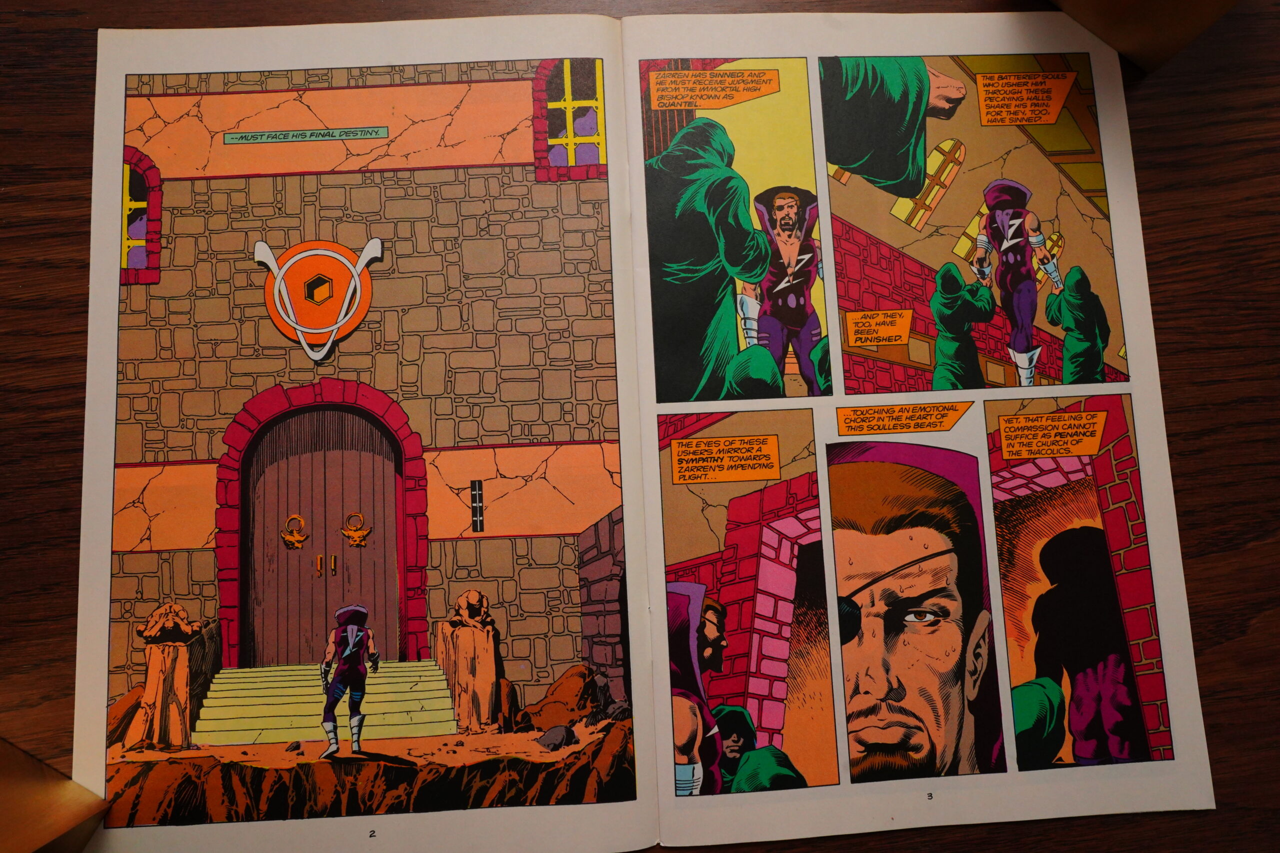
Things rapidly become stupider than before, and leaves the book more exposed to the problems of its razor-thin world building. Georwell is at the same time a super-technocratic world and also a seemingly medieval one, ruled by “Thacolics” (very clever naming again). Oh, and the ruler wears (for no reason) spandex with a collar that’s so high that he can only see straight ahead, I guess.
And Gustovich reverts to old tics — giving each member of the team a page or two emote, thereby killing all momentum while we check in on them, one after another. OH THE DRAMA.
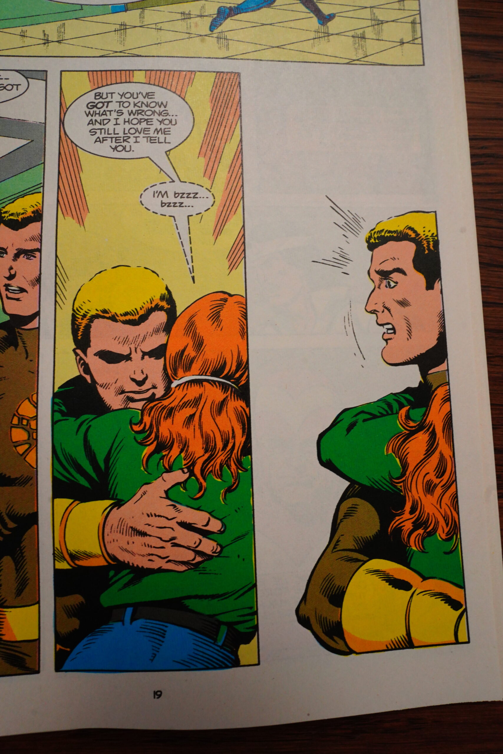
“I’m bzzz… bzzz…” WHAT COULD SHE BE TELLING HER BOYFRIEND
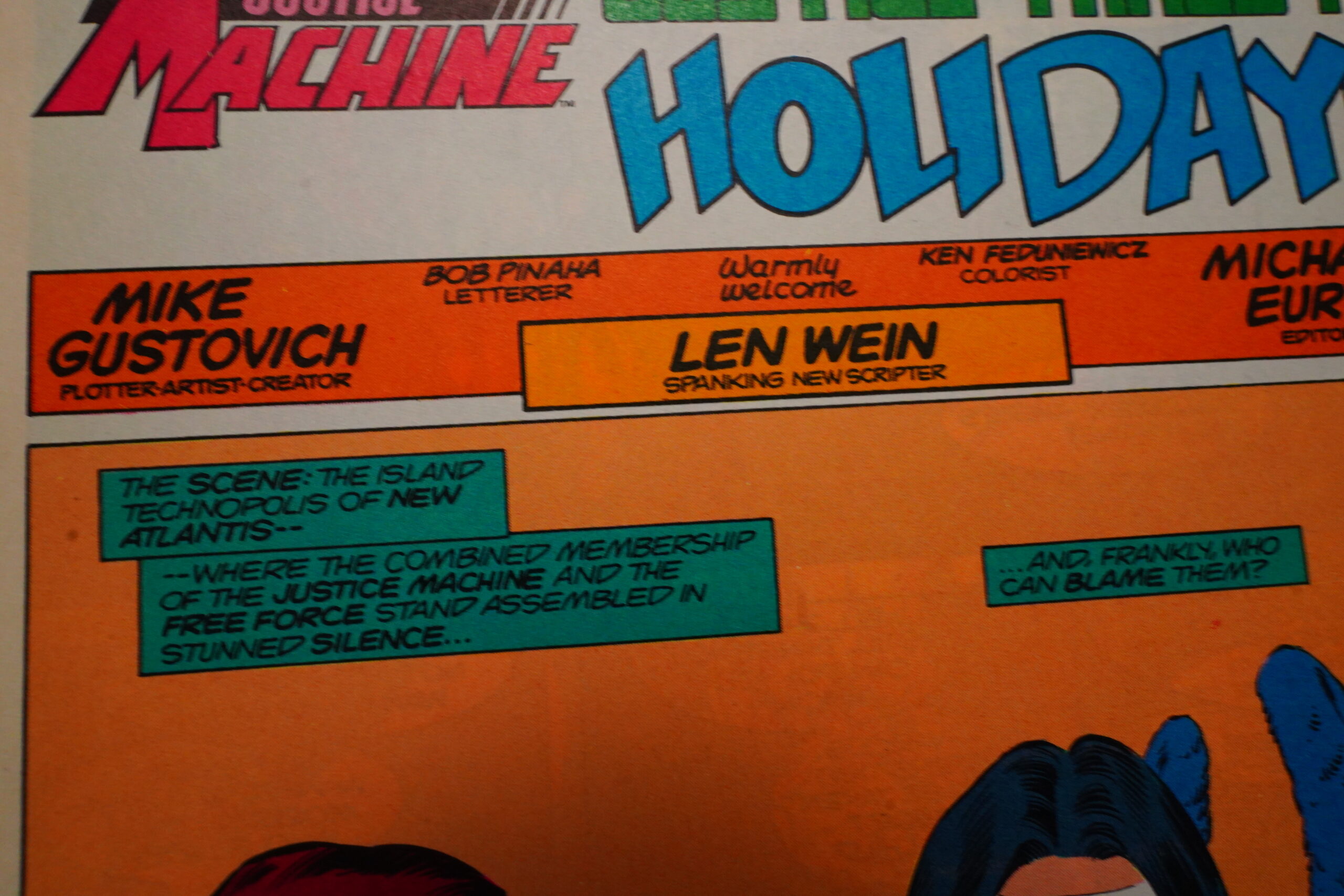
Fortunately, for the rest of the series, veteran writer Len Wein comes in as the scripter. Was he cheap?

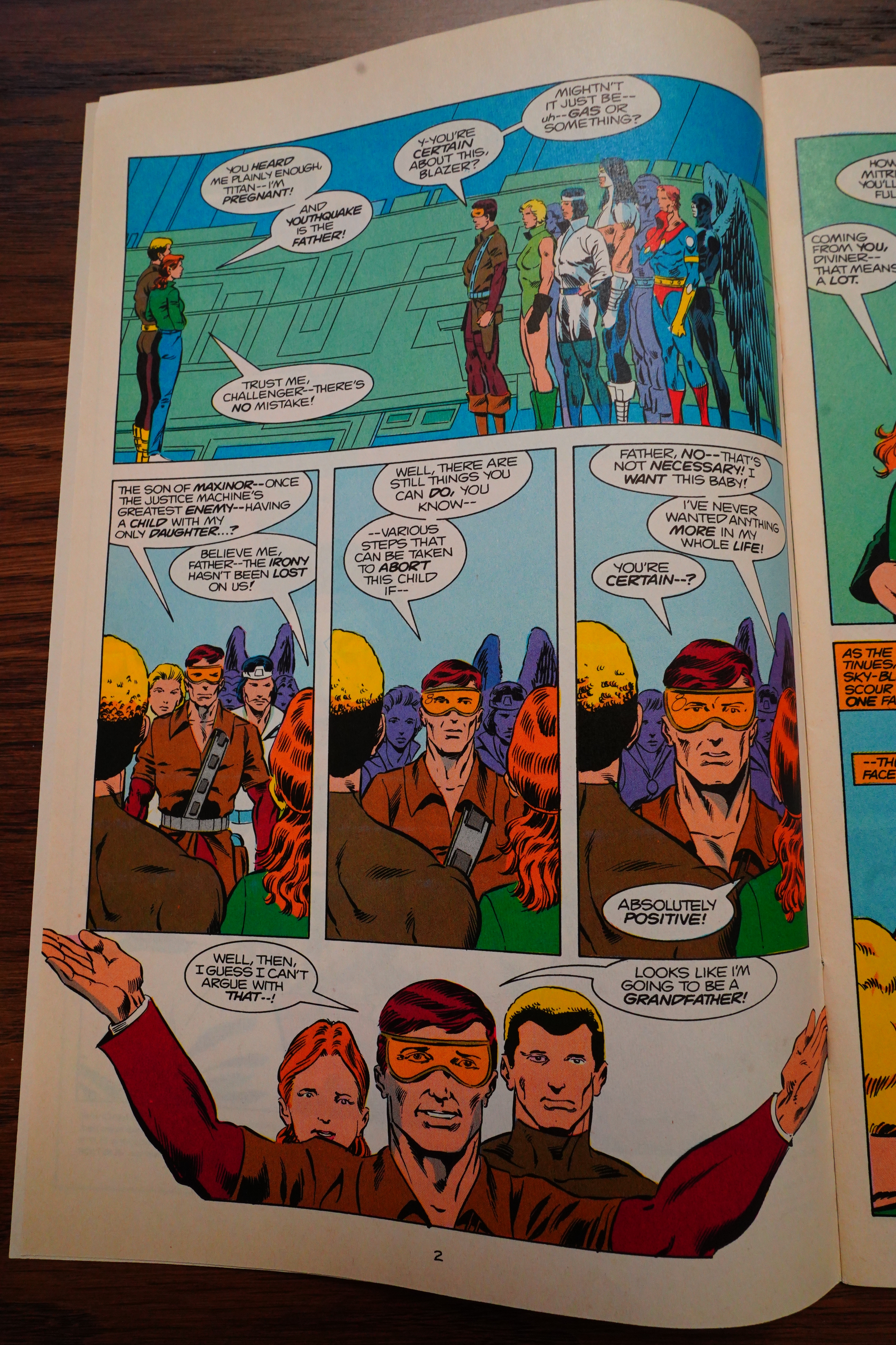
He certainly brings more humour to the dialogue — Challenger’s daughter tells him that she’s pregnant, and he suggest first that it’s just gas, and then that she could have an abortion. Is it meant to be funny? I’m not sure, actually.
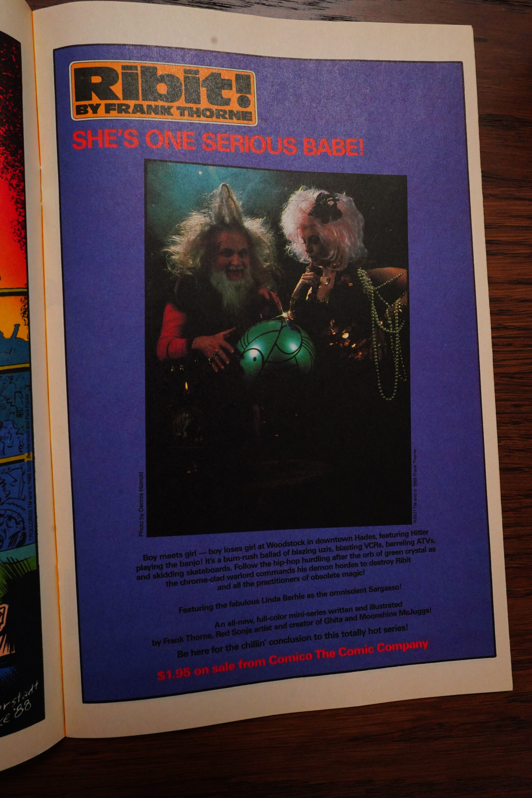
Man… is that a good ad for Ribit!, though?
The remaining issues deal with various enemies on both worlds, and they’re not as awful as I expected. However, most of the pages deal with the various characters painstakingly working out various plot points — which normally a writer would mostly just do off-stage and then just write some action scenes where the plot points are displayed. But it’s fine.
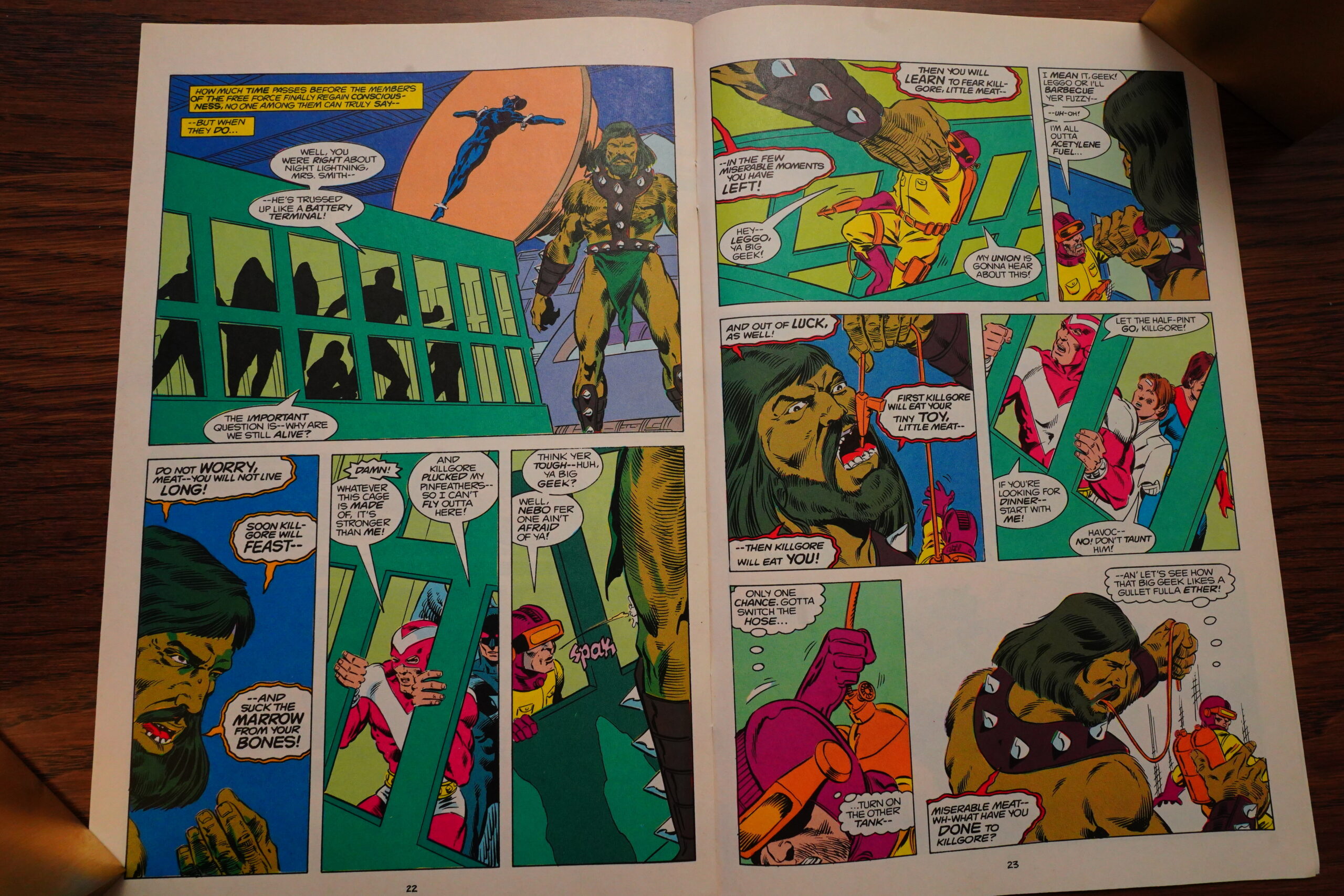
Some things are just inexplicably amateurish and lazy, like this cannibal giant guy putting all of our super-heroes in a jail box… but then it turns out that the box doesn’t have a roof, because he needs to be able to grab them? But if that’s the case, they can just climb out?
A real writer would have come up with something less cringeworthy.
With so many plot points being hashed out, the final issues are pretty static, and the scripter can’t really help with that.
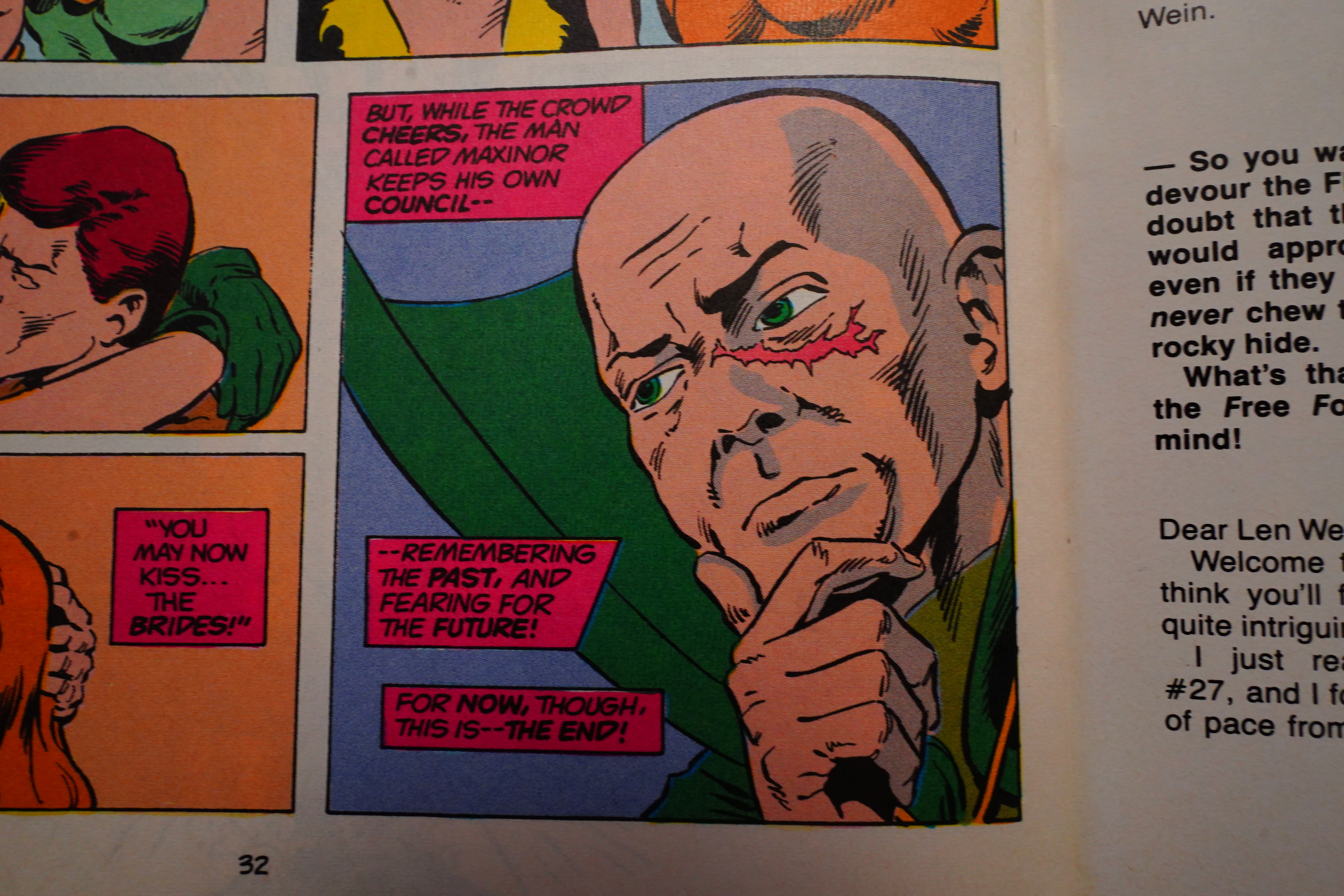
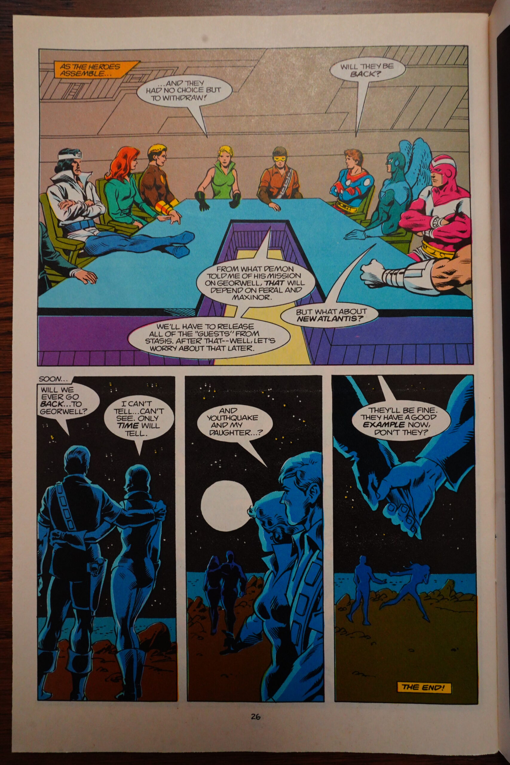
And then we get to the end of the final issue — but it doesn’t really actually say that it’s been cancelled, but instead we’re told that the story continues in the first Annual.
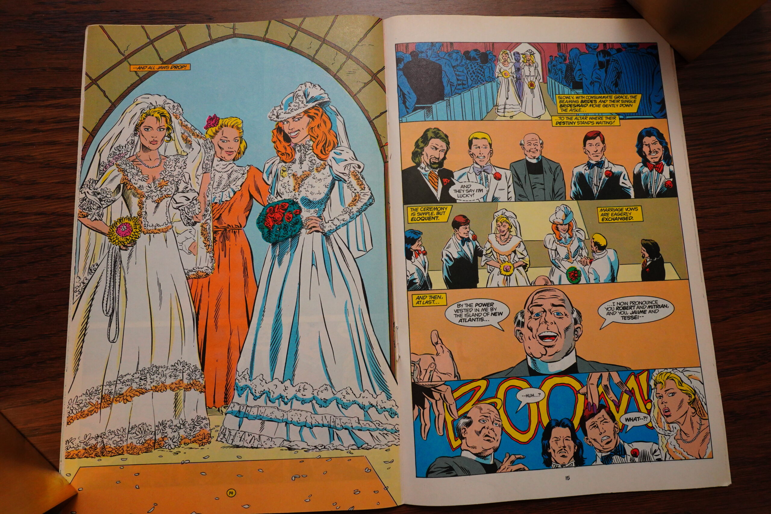
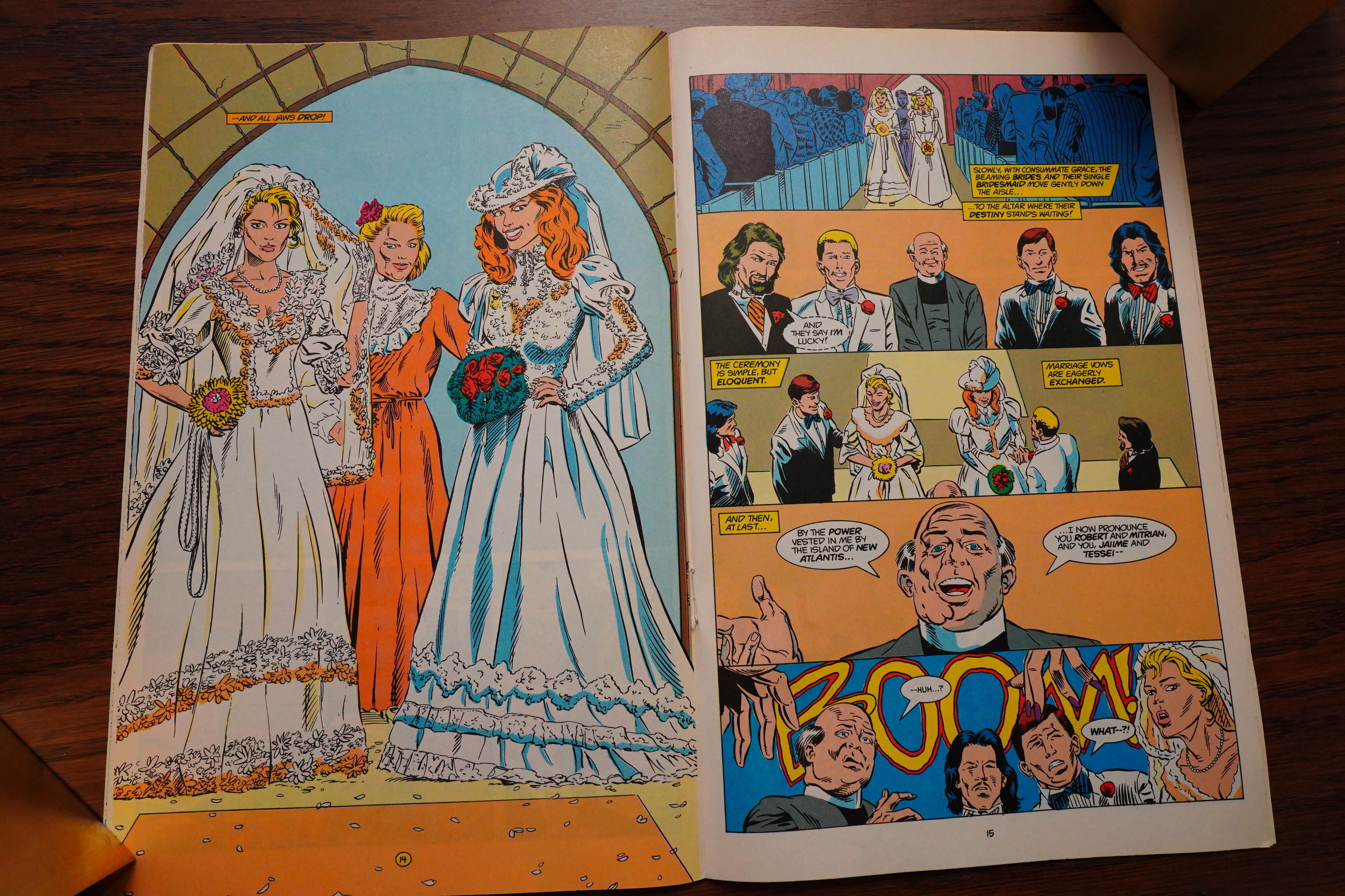
Which, OK, it’s the traditional wedding issue.
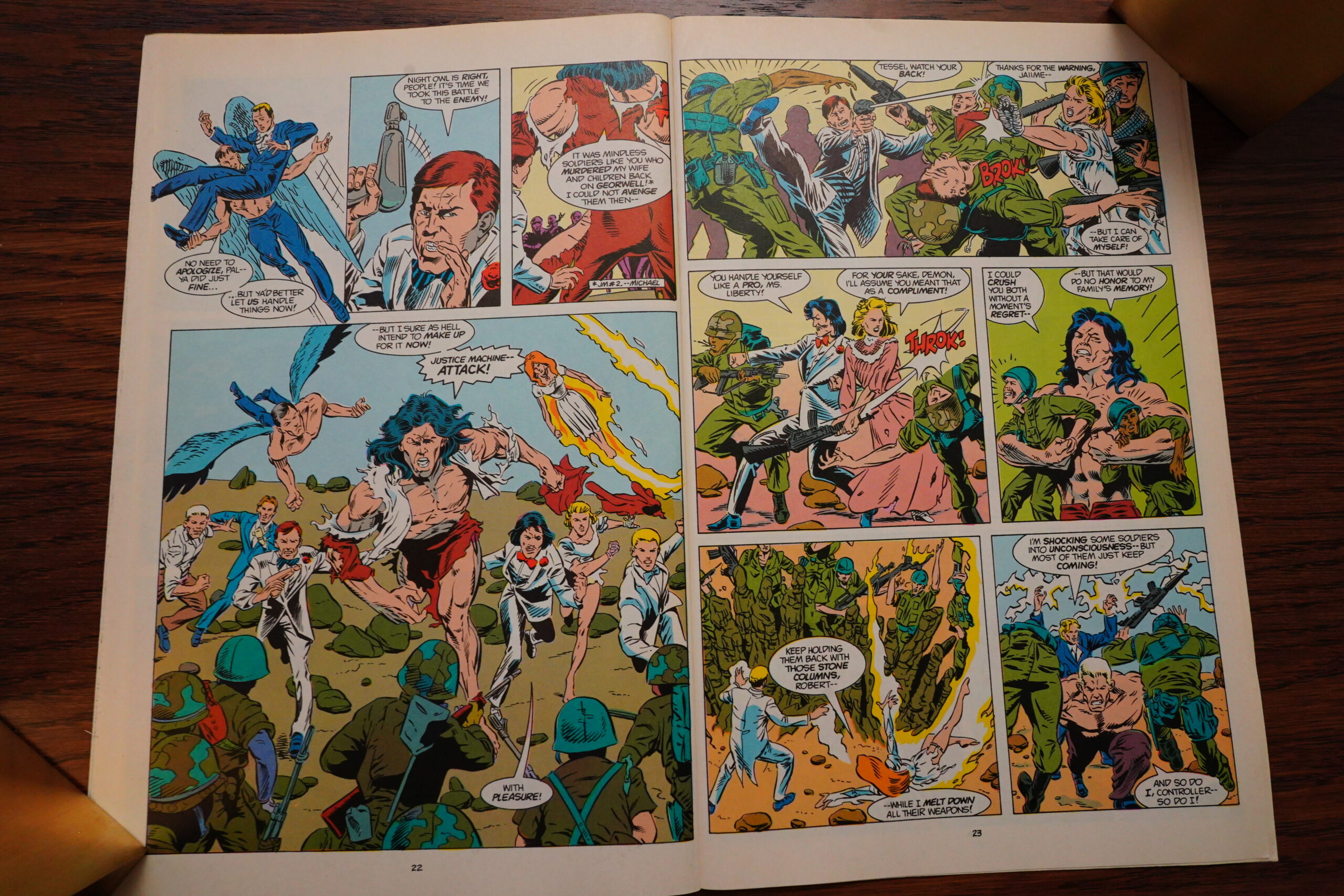
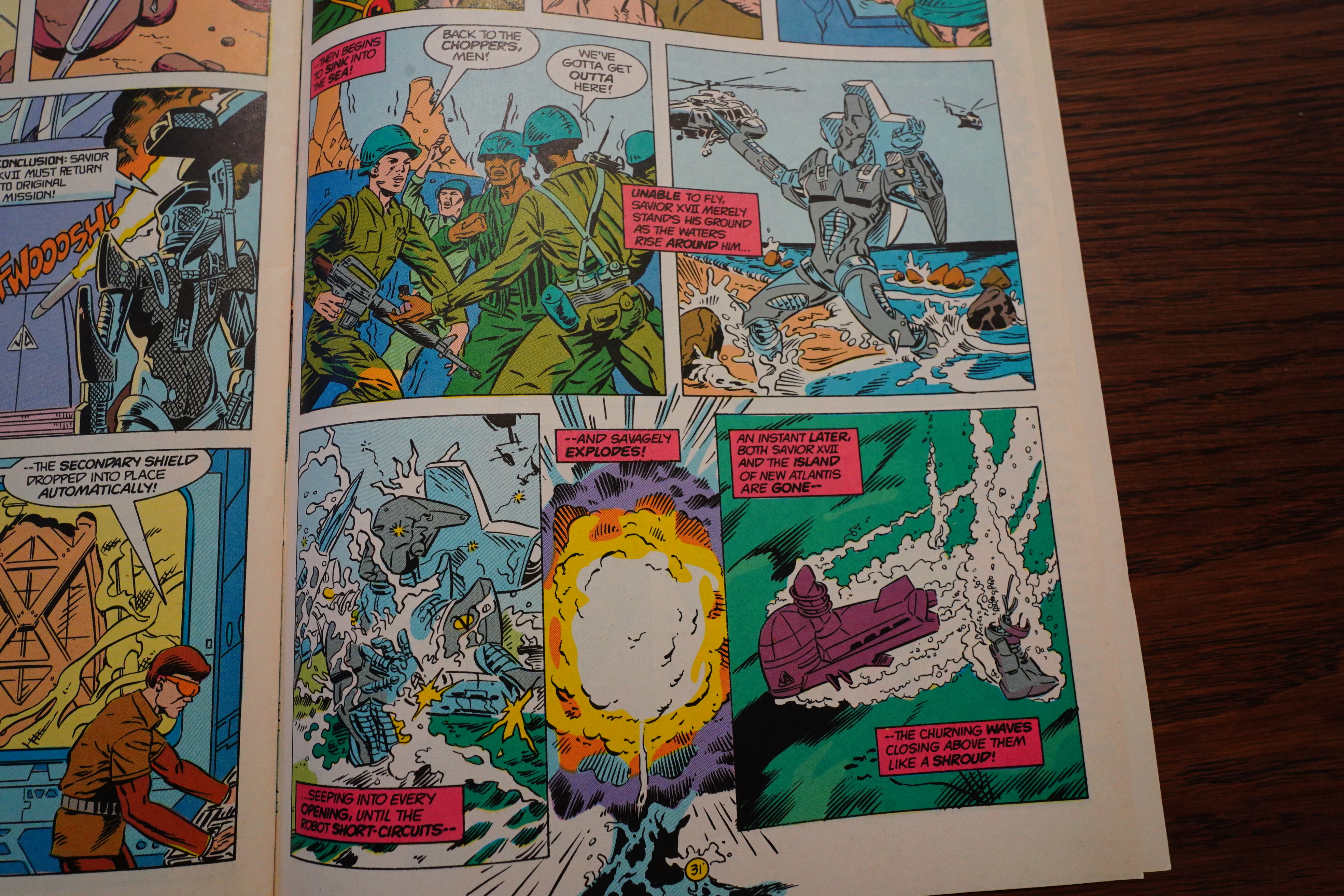
Which is interrupted by the US army attacking their island at random — fortunately they get to kill a lot of soldiers.

Gustovich had been setting up this super duper assassin machine for a few issues. When it attacks it turns out that it’s not water-proof.
*sigh*

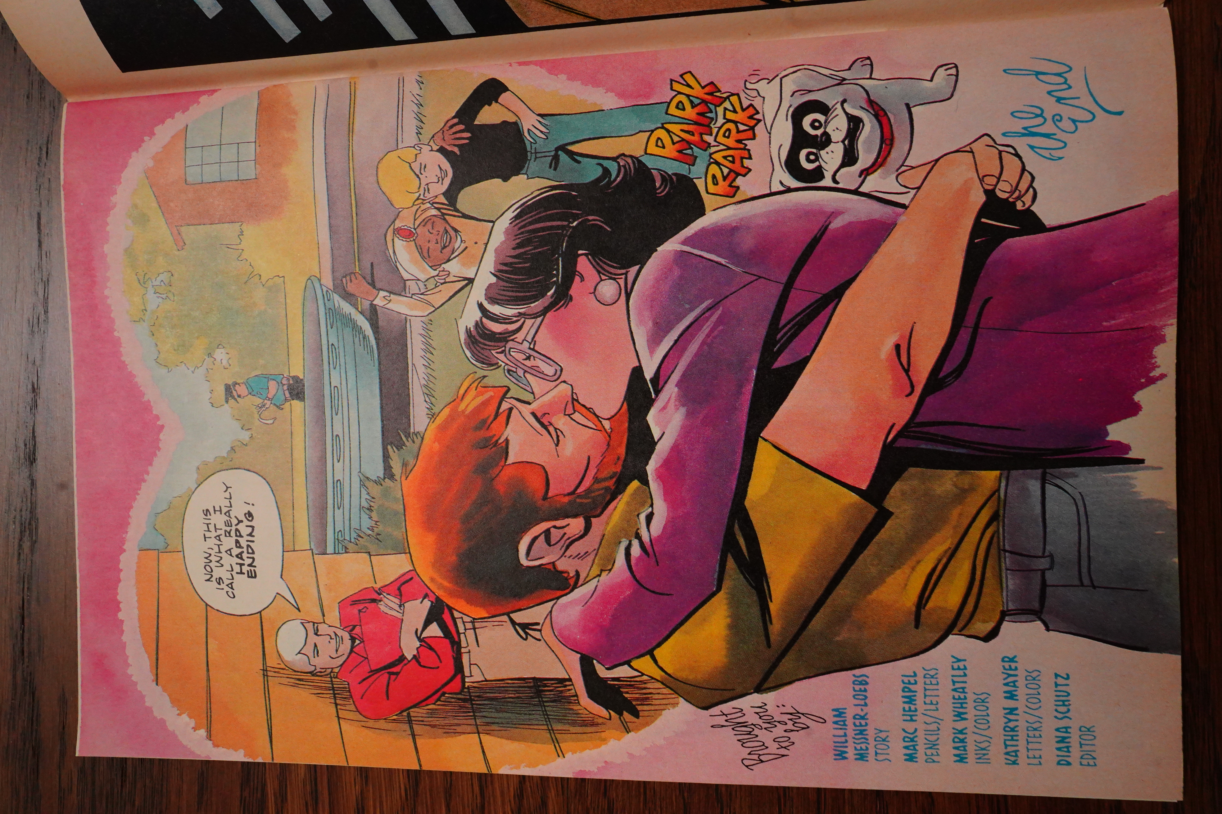
THE END.

But we’re told that the series isn’t over — it’s going to continue from Innovation Comics. It only lasted for seven issues, but there were a handful of further specials and stuff published.
This series has never been reprinted, and you can usually pick them up for less than cover price still:
Andy Mangels writes in Amazing Heroes #139, page #66:
I never did understand the appeal
of the Justice Machine, much less the
continued appeal after its numerous
revampings. Hmm. Maybe that’s it.
I’ll get back to that thought in a mo-
ment, but first, the story of the issue.
As the book opens, Demon (whom
many thought died about six issues
ago—and who should have) is attack-
ing Titan, in what is revealed to be a
video-taped encounted being critiqued
by Diviner. Titan is asleep (standing
up no less!), and dreaming of his past
in a sequence that made no sense at
all to me. The meeting is dismissed
with the revelation that Demon is still
loose somewhere in the Machine’s
headquarters, and that they’ll all sleep
with guards to their rooms.
Later, Titan wakes up the mute
Youthquake and launches into his
origin story. Talisman comes to relieve
Youthquake (and the reader of the rest
of Titan’s origin), only to be revealed
as a “duplicate” pages later. He isn’t
the only “duplicate” as it seems
“someone is trying to duplicate the
Justice Machine!”
It really didn’t strike me what it was
about this book that made it so unap-
pealing, besides some of the obvious
points.
Justice Machine is Doug Murray’s
only non-war comic scripting, and if
this is what his original stuff reads
like, I’d rather he stick to adapting real
events. The plot (that term used very
loosely) is poor, and the characters
move through it sluggishly. No help
is given to the reader to discern what’s
going on in the story. For instance,
one main character is not called by
name until the end of the book! Since
Comico never runs “Our Story So
Far” pieces, the reader is left
floundering in what is supposedly a
five-part story!
Murray’s scripting is poor, with
very stiff dialogue, and almost no
character motivation. Titan finds out
that two other Machine members are
“duplicates,” so what does he do?
Does he check what kind of
duplicates? Are they in rubber masks?
Are they surgically altered? Are they
robots? Aliens? Who knows!? Titan
doesn’t check, nor does his team-
mates.
The shoddy script is not helped by
Gustovich’s completely uninspired art.
Gustovich is one of those professionals
that has always been almost there, but
never quite good enough. His work
greatly resembles the early John
Byrne of his Space: 1999 days,
although even that comparison is giv-
ing it more than its due. Anatomical
grotesqueries abound (such as pages
7 and 17). There is not a single
attractive-looking person in the whole
book either. Gustovich has no know-
ledge of sign language—something he
needs when drawing a mute character.
His mute man communicates with
hopeful puppy-dog-like facial expres-
sions, rather than using any kind of
sign. His hands are doing something;
we just don’t understand what.
I said earlier I didn’t understand
why this book was popular, especially
after numerous revampings. What do
you get if you take any number of stan-
dard Marvel or DC writers, put them
with a roughly professional Byrne
clone, and put them on a super-hero
team book with a rotating cast? You
get the Avengers, that’s what! Or any
number of Marvel/DC team books
over the years.
Over its six years, twenty-some
issue run, Justice Machine has had at
least five (seven, I think) different
writers, and another handful of differ-
ent directions. Each new writer that
came onto this book decided to ignore
what the other writers had done, and
establish a “new direction.” Murray
even brought back a man from the
dead, ruining one of the few good
Justice Machine stories ever done (and
writer Tony Isabella’s best). The con-
cept behind Justice Machine seems to
be that behind most every Marvel and
many DC books being produced over
the last 15 years: “It doesn’t matter
who does it, if the characters are
there, it’ll sell.”
Justice Machine is then, the closest
thing to a mainstream comic published
by an independent company. It has
absolutely no single creative vision
(other than regular artist/creator Mike)
Gustovich’s) and the recent addition
of Murray as writer does not help in
the slightest. Amazing Heroes scribe
(and a good friend) Mike Eury has
just been named editor of Justice
Machine, and I hope he can salvage
what is by far the worst of Comico’s
fairly good line. Here’s hoping for
you, Mike. They haven’t given you
much to work with.
If you liked the Defenders (circa
1977) from Marvel, Justice Machine
is your cup of tea. It’s certainly not
mine.
Grade: Poor
I agree with Mangels in general here, but I think he just didn’t understand what Murray was doing in these issues — the seemingly inexplicable things that the characters were doing was eventually explained, and they were left up in the air to build tension — and that worked well, I think.
Back Issue #94, page #27:
ENTER THE MAN FROM THE ‘NAM
With the 14th issue (Feb. 1988), Justice Machine moves
into a significant new phase. Arriving as writer is Doug
Murray. A logical choice for a still-evolving young company,
Murray was at the time the recipient of critical acclaim
for his work on Marvel’s The ‘Nam. His arrival at Comico
also had some to do with the old adage “It’s not what
you know, it’s who you know.” As Murray reveals, “Bob
Schreck (who was administrative director at Comico) and
I were old and dear friends. He wanted me to do a book
for his company and I was happy to have the extra work.
However, there was another reason for bringing me
aboard. For whatever reason (and I really don’t know
why), the book was way behind schedule. Bob knew (as I said, we’re old
friends) that I was a very fast writer and would make it my business to get
the book back on schedule as quickly as I could-which I proceeded to do.”
Did the co-plotting between writer and artist continue with Murray’s
arrival? “It was planned that I would talk to Mike Gustovich to set up
plots and the like-but these were
the days before cellphones and the
Internet (remember them?) and
Mike was in the process of moving,
thus I spoke to him far less often
than I would have liked, but, as I
needed to turn in a lot of scripts
quickly, I had to move ahead with
or without those talks. It’s a shame,
because I would have preferred
having some kind of relationship
with Mike and would have preferred
even more to be going in a direction
he was pleased with (which I am
still not sure was the case).”
On the letters page of a subse-
quent issue, Doug Murray revealed
that Mike Gustovich’s only instruction
to him when he came on board was
that he had to bring Demon back.
Murray welcomed the challenge
of finding a way to do just that.
(However, the best-laid plans….)
Finally, since Tony Isabella was
not familiar with the group before
beginning to write them, what was
Murray’s situation? “I knew nothing
whatsoever about the Justice Machine
before getting the job. Once I knew
I’d be doing the book, I read every
issue that Comico had, including
the Elementals crossover.” Seems to
be a common theme doesn’t it?
Doug Murray’s tenure on the
title encompasses two long-running
storylines, the first of which begins
with Blazer receiving an operation
to help her control her powers.
After the operation, she begins a
relationship with Maxinor’s son,
Youthquake.
This plotline had begun in issue #10 (Oct. 1987), so Tony Isabella
had some definite ideas on how it would have progressed had he
continued writing the book. Tony comments to BACK ISSUE,
“The operation would have been a success. I would have done my best
to redesign her costume without the big circles where her boobs were.
“As for her relationship with Youthquake, it would have been doomed
to end badly. Perhaps not quite Romeo and Juliet badly, but badly.”
The fact that Isabella had begun this plotline worked well for Doug
Murray, as one of his priorities was to increase the roles of the Machine’s
female members. As well as freeing Blazer from the confines of
her costume, Murray also eliminated Diviner’s dependence
on her sensory web. When asked the reasons for these
changes, Murray tells BACK ISSUE, “I have always been
a believer in the power of women-even before the
feminist revolution. I have felt that way (probably due
to the fact that I had a strong mother and an even
stronger wife). I always wanted to show that strength
in my writing. It was pretty much impossible in The
‘Nam, but worked well with Justice Machine. I especially
wanted to do things with Blazer because I felt that a
regarding the Justice Machine. Feeling they will not be able to help him
with his goal of building a new world order, he decides to replace them
with his own custom-made duplicates. This process begins with the
seeming return of Demon, though he is later revealed as a simulacrum.
woman with real feelings who couldn’t even touch
someone she loved was a very sad thing indeed, and
although I know that making the hero unhappy is a
big part of this sort of writing, I wanted to at least
make her more than a background character.”
Murray’s first story details Douglas Hamilton’s change of thinking
Hamilton is revealed to have a
lot of experience with this sort of
thing as we discover his major
lieutenants are themselves created
beings, injected with aspects of his
own personality!
Quite an interesting concept!
Were there any stories from the
past that sparked this? “I’m pretty
sure that was nearly all me,”
comments Murray. “I’m sure I
was influenced by any number of
science-fiction stories, although I
can’t give you a specific one. I know
there are several where someone
removed part of their personality
to try to make themselves a better
person. I think Gordon Dickson’s
stories came into play-he had
mankind broken into several
groups. I probably used some of
that because he had a new book
out around that time.”
Back Issue #94, page #27:
THE DEMON WITHIN
As mentioned, this storyline runs until
issue #25 (Jan. 1989), and there are actually two major
endings in the issue, the war being the first. It was also
the last issue written by Doug Murray.
“I had no idea I was leaving the book when I wrote
that stuff,” Doug reveals. “I was eventually told that
Comico was not going to publish another issue for some
time and that I wasn’t needed. It’s kind of a shame, but
things like that happen and the fact that I still had no
relationship with Mike Gustovich certainly came into play.”
The major reason Murray was replaced was that Mike
Gustovich had expressed the desire to have much more
say in the evolution of his characters and so had decided
to take over the plotting of the series. With a degree of
self-depreciation that comes with hindsight, Gustovich
believes, “Back then I don’t think I was the easiest person
to work with. You’d have to ask others about that. Some-
times I wanted more control, probably because I wasn’t
thrilled with what other writers were doing. Looking
back I can see that they were doing a very good job,
especially with the input I was giving them. There was,
I believe, a bit of an undeserved ego thing on my part.
I thought I was better than I was and others were not.
Age has given me a better perspective on the matter.”
You will notice that nowhere is there any mention of
the circumstances regarding Demon’s return from the
dead. Doug Murray believes, “If I said Mike wanted him
brought back, then Mike certainly wanted him brought back. In my
experience, it’s not that unusual for a creator to kill a character off and
later have second thoughts and decide to bring him back. I did have
plans to explain Demon’s return-but I never got into that for a number
of reasons, the biggest being that the Earth/Georwell War was mandated
to come next, and afterwards, I was off the series pretty quickly.”
Issue #27’s letters page does finally answer a query regarding the
mystery by stating that Mike Gustovich was working on a miniseries
to provide the details.
Those details are provided by Gustovich himself. “Demon’s return
was going to be totally my own story and art,” Mike tells BI, “a four-
issue miniseries. He would be found by a steamer ship and brought
back to the New York ports. There he would basically be homeless for
a short time, and without his Edge and demoralized he became easy
prey for a street gang, until they were run off by an elderly homeless
woman whom they all seemed terrified of.
“Demon wakes in her abandoned warehouse abode to find out first
hand that she doesn’t put up with disrespect. She was a master of the
martial arts before he was born. From there she teaches him the better
path to martial superiority that is not based on drugs or arrogance but
serenity, study, and practice.
“Together they defeat a ganglord and his hold over the community.
Then he goes back to find his teammates in a huge mess. He saves
them, and so on and so on.
[…]
As it turned out, issue #27 introduces that new scripter, industry veteran
Len Wein. How did someone with no previous connection to Comico
come aboard? “I called and asked him!” reveals Eury. “I remember
meeting with Diana Schutz about a new Justice Machine dialogue writer,
and she asked whose work I liked on superhero books. I always found
Len’s dialogue to be crisp and realistic and I thought he could help
make the JM characters more relatable to readers.
“I recall that working with Len was fun, and my first contacts with
him solidified the fact that I was a ‘pro,’ since I was working with
someone whose comics I had enjoyed as a fan.”
Wein’s first issue introduces the team to Ms. Liberty, a circus
performer. Mike Gustovich recalls, “The Ms. Liberty concept came
much earlier to me and I would have added her to the JM lineup. The
storyline didn’t evolve as well as I’d initially thought.”
The reason it did not might be because, unfortunately, this creative
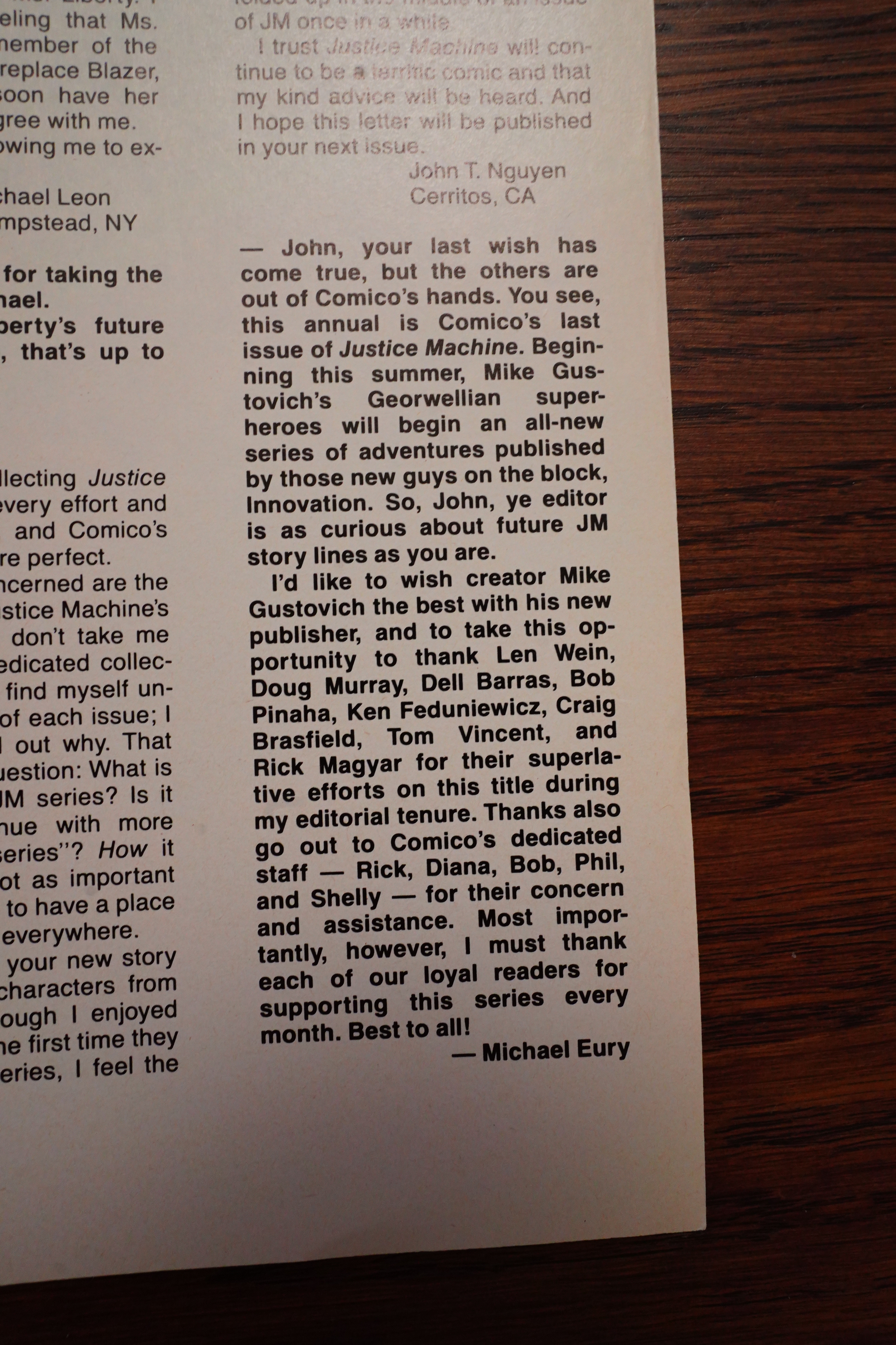
team was only together for a very short time. Issue #29 marks the end
of the regular Comico series, followed by Annual #1, which would be
the last Justice Machine comic the company published.
Amazing Heroes #133, page #98:
Murray felt that things weren’t moving
along fast enough, nor was there enough
internalization to suit him, so he is going
to be working on these aspects of the
book. “This is not to say that I didn’t like
what Tony was doing, I did enjoy the
book under him, but now I’m writing it,
and picking up on different things.” As
stated at the onset, Murray will be
following the major portions of situations
set up by Isabella. “I’m going to be
working on lots of background, charac-
terization, and advancing the storyline.
I also have a couple of stories dealing
with the backgrounds of Titan and
Challenger.” Murray was very excited
about working on the series, and his sole
lament was that since he was working so
far in advance of the actual on-sale date
(about nine months) he was unsure of as
to how the fans were going to react to
the stuff he was currently writing. Still,
he was having a good time with the
characters.
Comics Interview #51, page #37:
PETER: And as for JUSTICE MACHINE?
BOB: JUSTICE MACHINE in its premise
does that, a group of heroes who realized
that the government had sold them the
wrong bill of goods, a Vietnam mentality,
and they were kind of standing there look-
ing like maroons. Tony Isabella, with his
work in the new series, has given them a
lot of depth, a lot of characterization that
they didn’t have before.
DIANA: Tony’s established subplots, inter-
relationships among the characters, motiva-
tions, and he’s given them history and
background, and done it creatively and in
a stimulating fashion. He’s definitely
delivered an above average superhero book.
And I know that when Doug Murray takes
over the book, he’ll do an equally im-
pressive job.
I’m not really against the genre of
superheroes, but to some extent I’ve had
them to the max, you know.
I’m unable to find much in the way of chatter about Justice Machine on the intertubes. Here’s something:
Zack: Which character is your favorite, Steve? Is it the guy in the tan shirt with the bandolier? The guy with a uniform that is just a cowl and Spanx?
Steve: I’m partial to the cringing businessman.
Heh heh.
Here’s a youtube thing…
No doubt:
I have to say, “Justice Machine” is no doubt one of the coolest superhero groups and comics worth reading!
OK, that’s it. This blog post has taken me way too long to write, but after the first dozen issues, it’s not too bad, really.
And after this, there’s only one long series to read. That is, I’ve still got 80% of the posts in this blog series to do, but I’ve read 60% of the issues — the vast majority of the remaining series are pretty short, so I should be able to do them on a more regular schedule. I’ll be aiming for about three posts per week again? Let’s see how that goes.