1987: Fish Police Special

Fish Police Special (1987) by Steve Moncuse et. al.

I’ve never read Fish Police before, but I know that it was a pretty well-regarded comic — published by … Fishwrap Productions? Hey! How come I know that? I don’t think I’ve thought about Fish Police since the 80s, but I still remember the name of the publisher? I must have found it particularly amusing as a teenager? Or perhaps my brain just made the name up right now. Wow, no, that’s right — even the “Productions” part.

My brain ejected the knowledge of what the square theorem is, but it retained that bit of info? Thanks, brain! You’re the best!

Fish Police creator Steve Moncuse explains why Comico is publishing a Fish Police special all of a sudden — Diana Schutz thought it was a good idea. Possibly as a way to test the waters for taking over publishing the regular comic, too? Which Comico started doing a year later, so I guess the experiment was successful.

Moncuse explains that this book is a prequel, which sounds like a good idea for introducing new readers to the concept, right?

What… er… who… what? I don’t even know what order to read these pages in. No matter what order I try, the dialogue doesn’t make much sense.

… what? Why is the magician being so snippy with his boss? Why is the boss so angry? WHAT IS GOING ON

wat

The guy in the helmet didn’t say anything, so why did the magician shrink his head?

Buh ah wha

OK, OK, OK… I think I’ve read what the concept of this series is in a review back in the 80s, and now it’s coming back to me: It’s about a human guy who has his conscience transplanted into that green fish guy above, and the green fish guy is a cop. That’s a good set-up for lots of humour, but this book doesn’t explicitly mention this — after about two thirds, the fish guy starts wondering what’s happening to him, so I think a reader might puzzle this out, but I’m not altogether sure.

The book basically reads like one giant non sequitur.

Hey! I got an extra staple! *kaching*

And this is how the plot ends — that green fish guy is possibly a villain, and he’s fighting the red guy? Who wanted to kill the green cop fish guy? But then there’s an octopus who is a journalist? And they have a conversation about… er… the green cop fish guy?

And then they disappear. The end.

I’m guessing all of this makes perfect sense if you’re already a Fish Police reader, but it makes zero sense to a new reader. It’s the weirdest way possible to introduce your characters to a broader audience.

And the jokes aren’t very good, either.

Now I’m kinda looking forward to reading the regular series (which I’ll be getting to in a couple of weeks), bizarrely enough, so perhaps this total ? of a book was a good strategy, anyway?

The Comics Buyer’s Guide #711, page #4:

Introduction: Fish Police Special
By Steve Moncuse
The Fish Police.
The Fish Police Special.
“Special.” It’s that one little word that gave me so much trouble.
About this time last year, Diana Schutz asked me if I would be
interested in doing a Fish Police story for Comico. Maybe I draw
talking fish for a living, but I’m not nearly as silly as you, or my par-
ents, might believe. I said I’d love to.
My regular book keeps me fairly busy, so I figured I’d just pound
out another clever little FP story. (A little mystery, a little action, a
lot of beer, and — voila! Fish Police!) Take the money. And run. It
would be called The Fish Police One-Shot, or maybe The Color
Fish Police — something along those lines. It would look real nice
sitting next to all those other books in the real comics section. And
everyone would be happy.
But, geez, they went and called it The Fish Police Special!
Maybe I’m just old-fashioned, but it seems to me if they’re gonna
call it special, then I ought to make it special.
So I did.
When talking about their favorite comics, most readers ask,
“What happens next?” Mine ask, “What happened first?” For those
of you reading a Fish Police story for the first time, this is an excel-
lent place to start. The Special actually takes place before Fish
Police #1. What follow are the first pages of a 40-page story, avail-
able from Comico in July.
What happened first?
This did…

A history of Fish Police.

1987: Rio

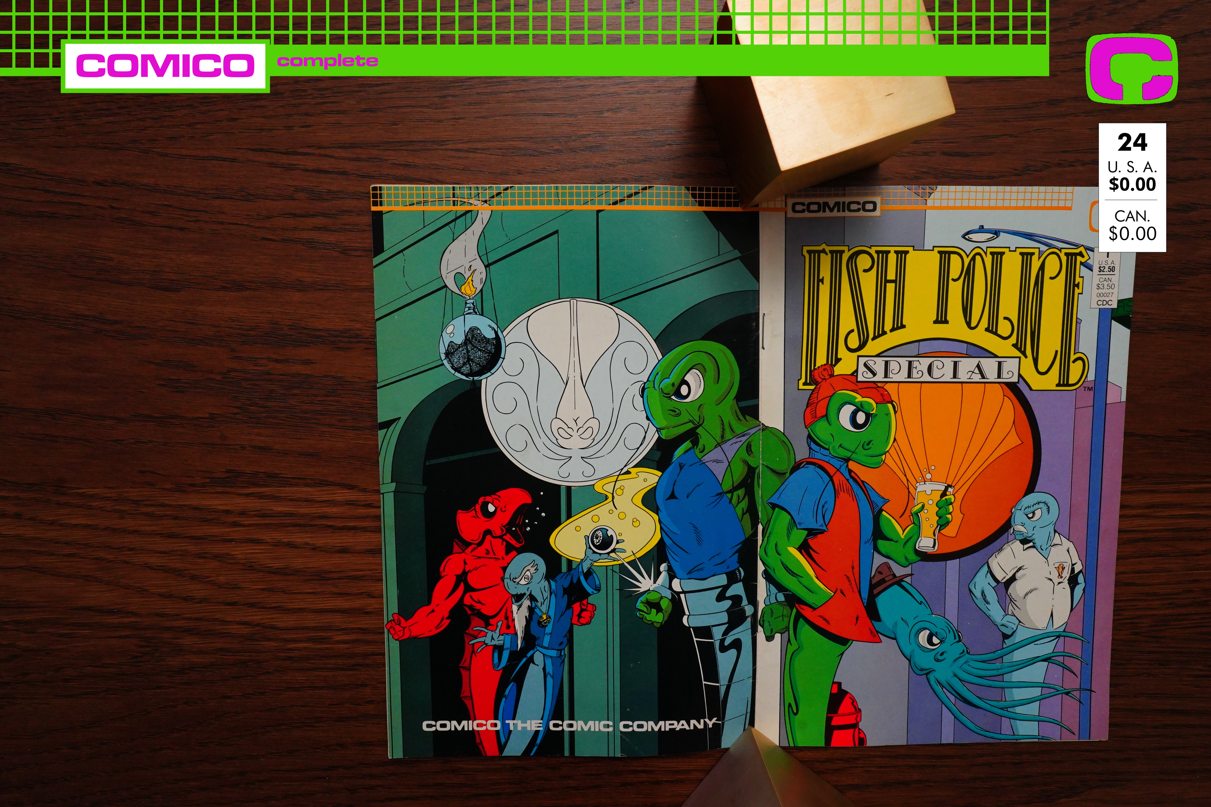
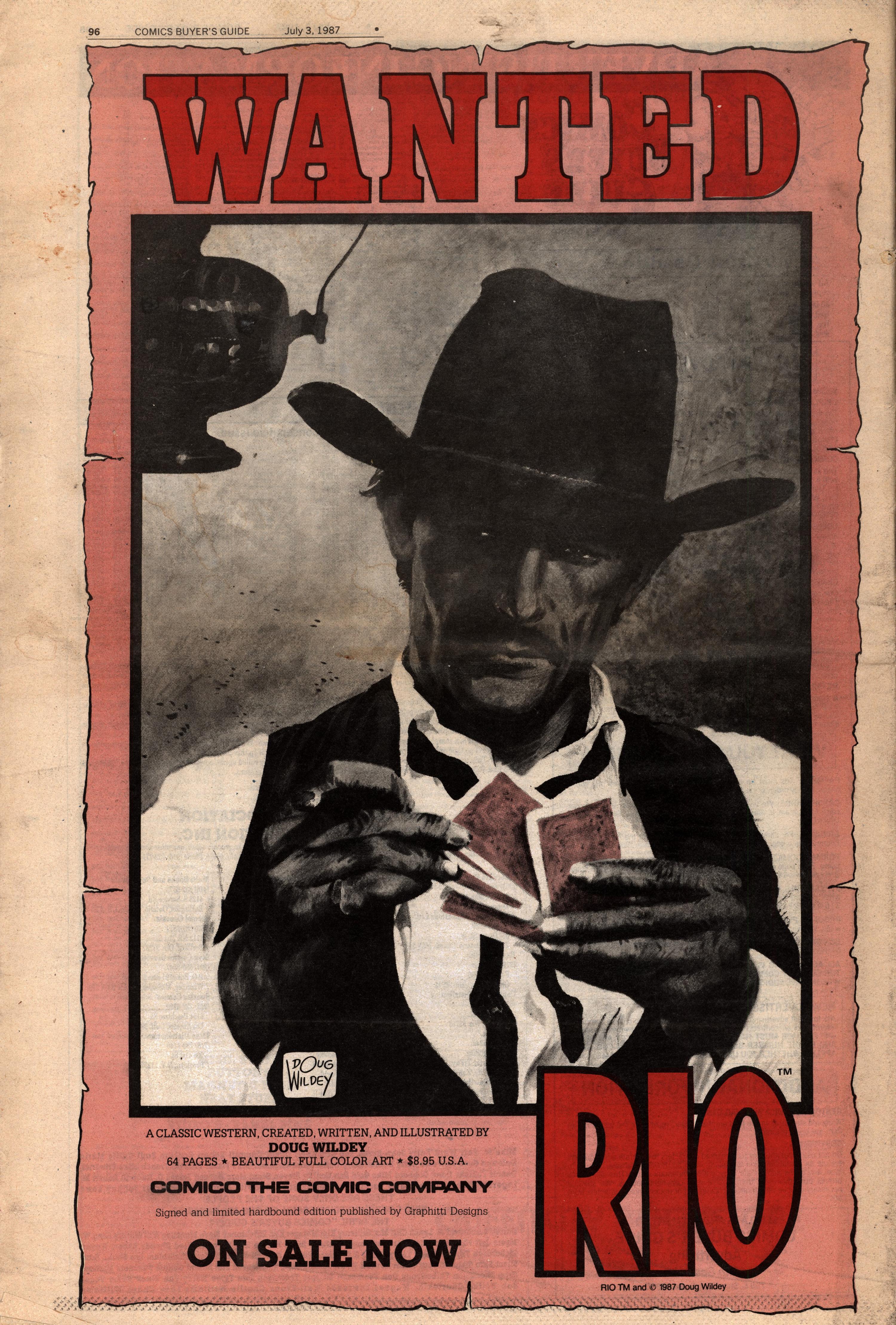
Rio (1987) by Doug Wildey

This book, of course, is based on the then-recent hit by Duran Duran, which had swept the US charts and

What? What’s that you say?

OK, this is a pet peeve of mine — nowhere in this book is it even hinted at that this is a reprint. It originally ran in Eclipse Monthly, and I’m not sure whether it was modified for this edition or not?

Eclipse Monthly was a comic-book-sized publication, so the form factor is off, and you get these overly large left/right margins. But it still looks very good. I’m not sure the beige/pinkish borders work, though…

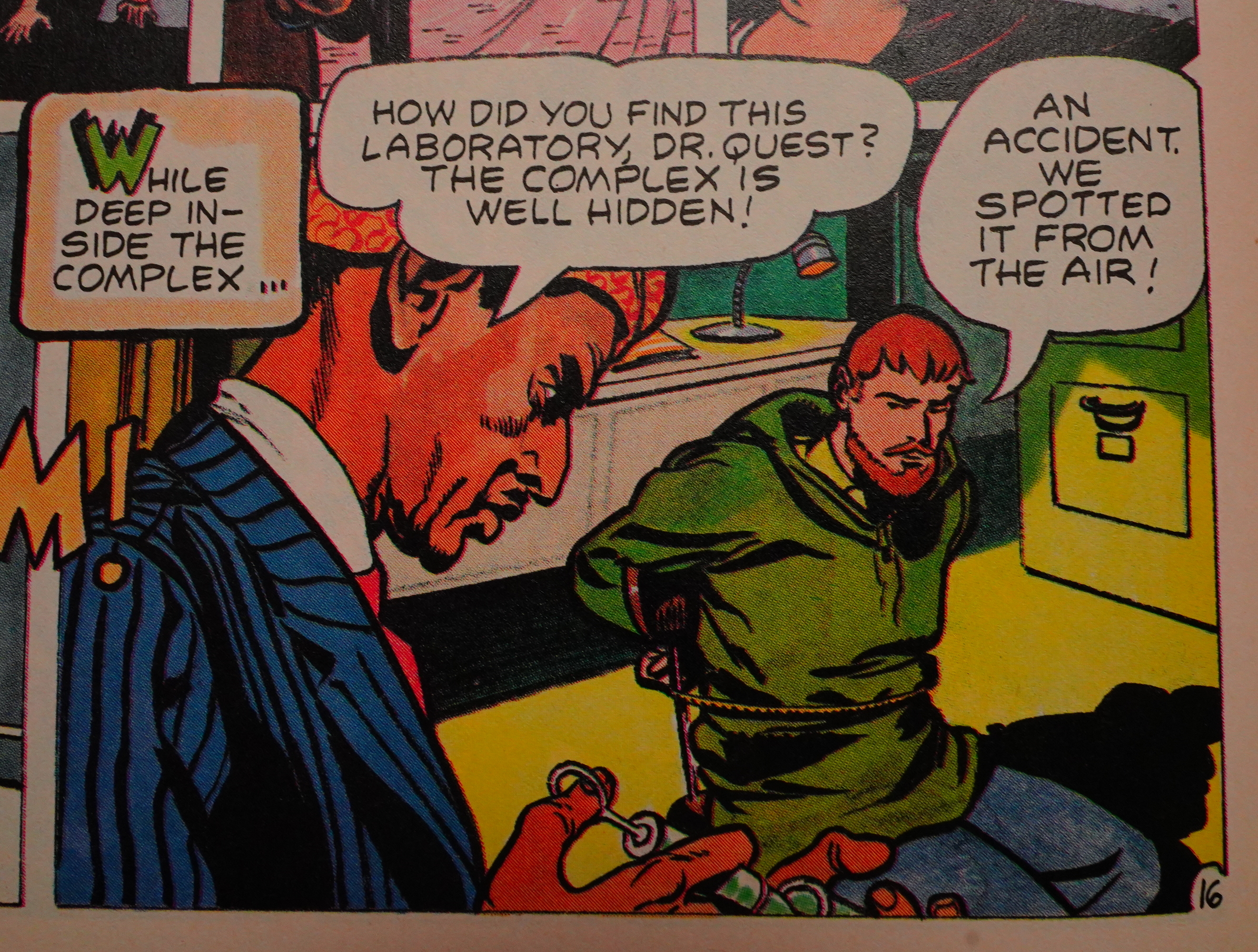
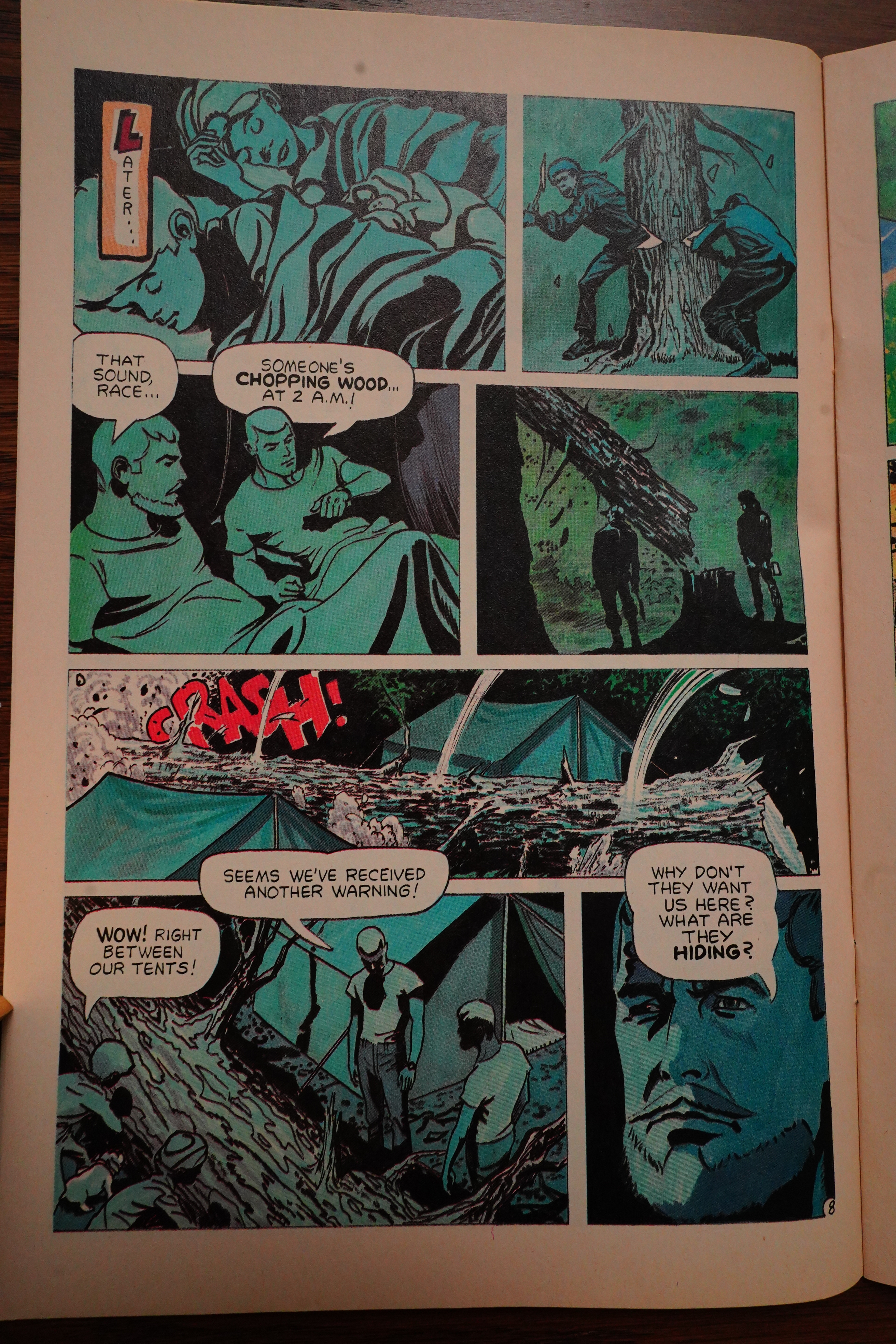
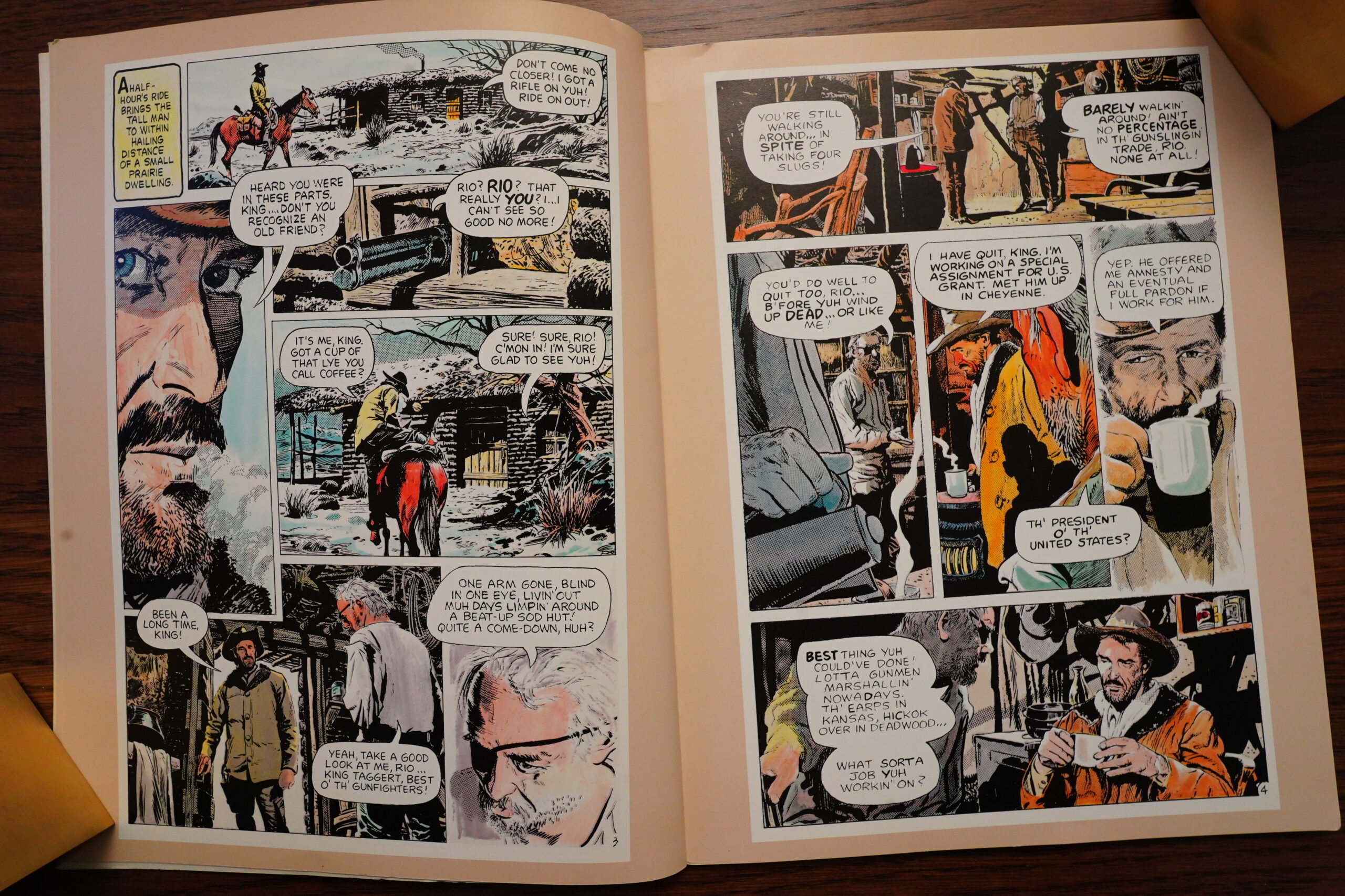
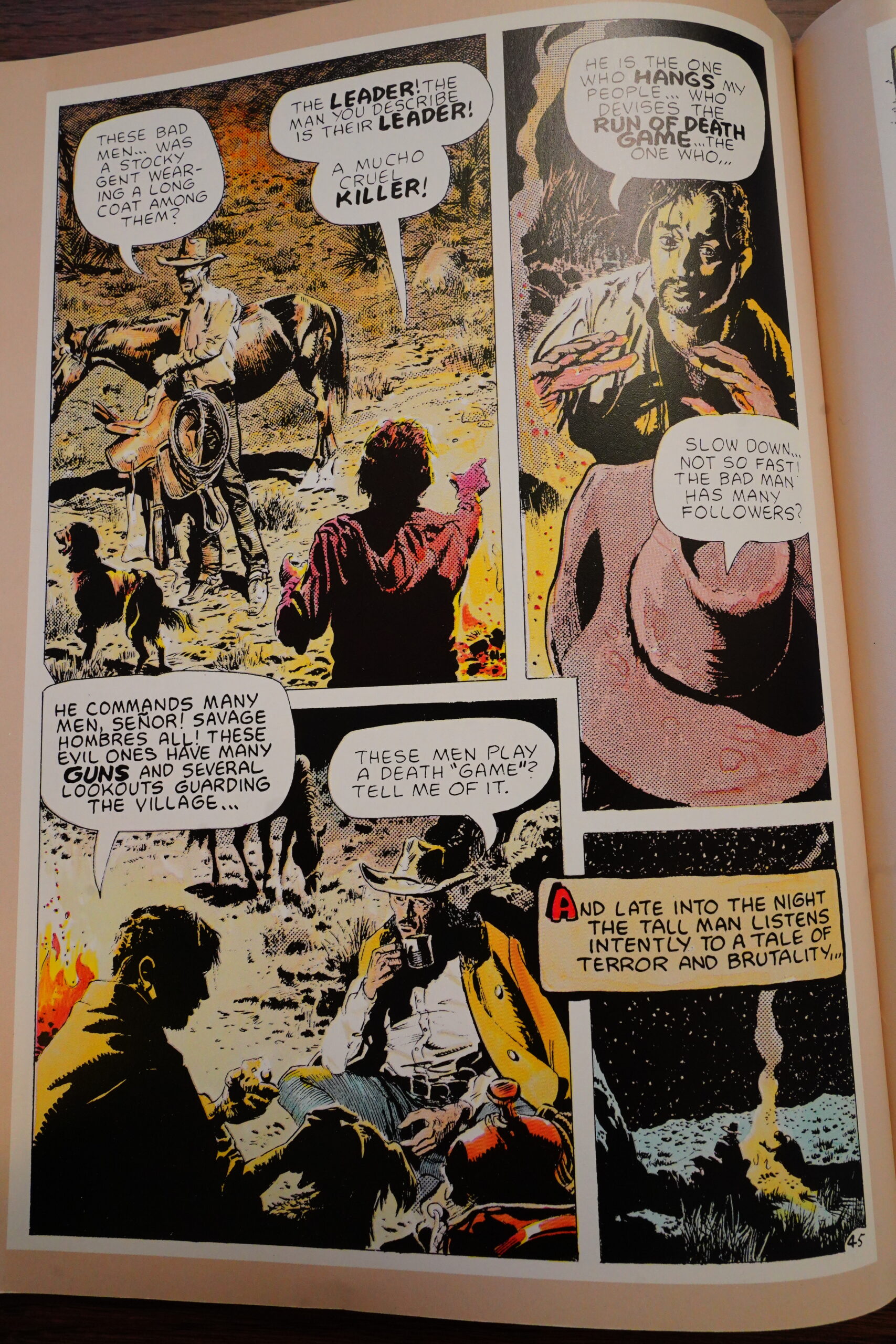
Anyway, it’s a pretty episodic album. There’s three stories — Rio tries to stop buffalo massacres in the first story (but runs afoul of a conspiracy).

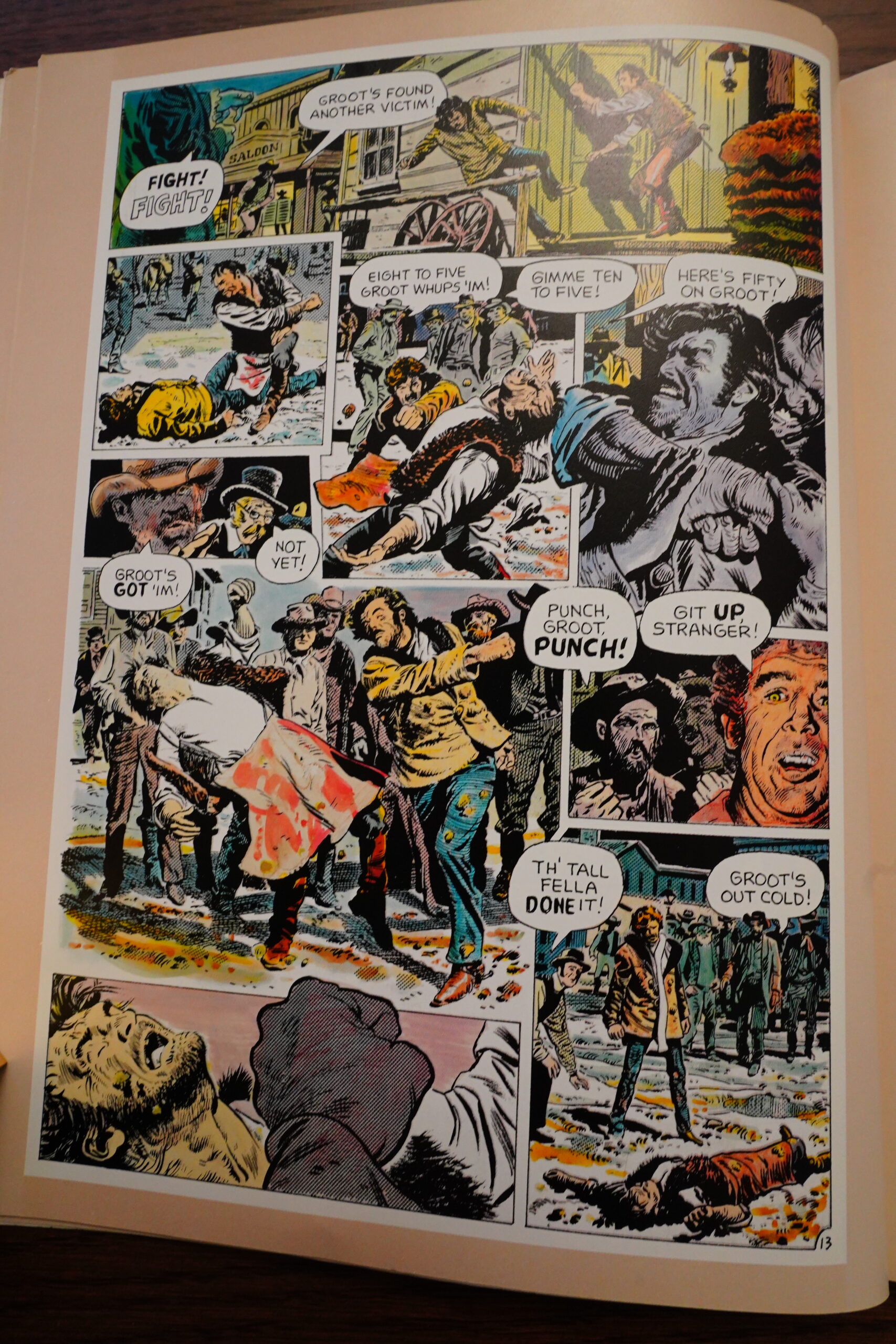
I really like Wildey’s artwork — he does it in a style that extremely appropriate for a western: Gritty and old-fashioned. But also very lively. I mean, it’s not quite Jean Giraud, but it’s very appealing, and the storytelling has nice beats.

The only problem is that his faces sometimes look a bit off model.

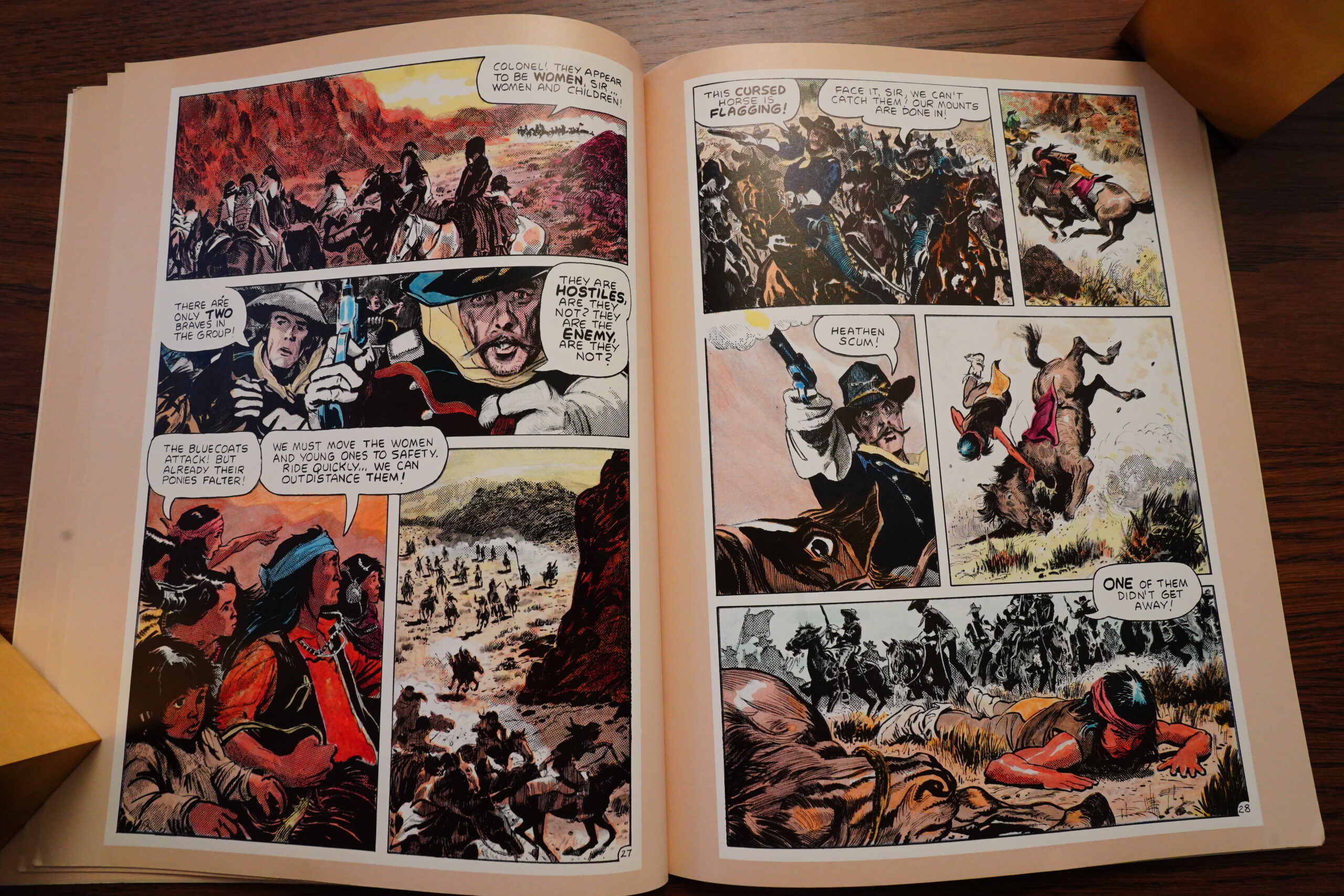
The second story is about Rio encountering a gang of evil US soldiers, but it has a happy ending: They’re all killed by Geronimo.

And finally, the third story returns to the plot of the first one — Rio chases down one of the guys that framed him in the first story.

Heh heh. Yeah, I think you can tell pretty easily from this book that he’s got a real affinity for the material.

I’m not sure the book totally works as a “graphic novel”. It feels extremely episodic, even though it’s got a plot through-line, sort of. There’s no character development to speak of. But it looks great, and each individual story is very entertaining. Good on Comico for reprinting this.

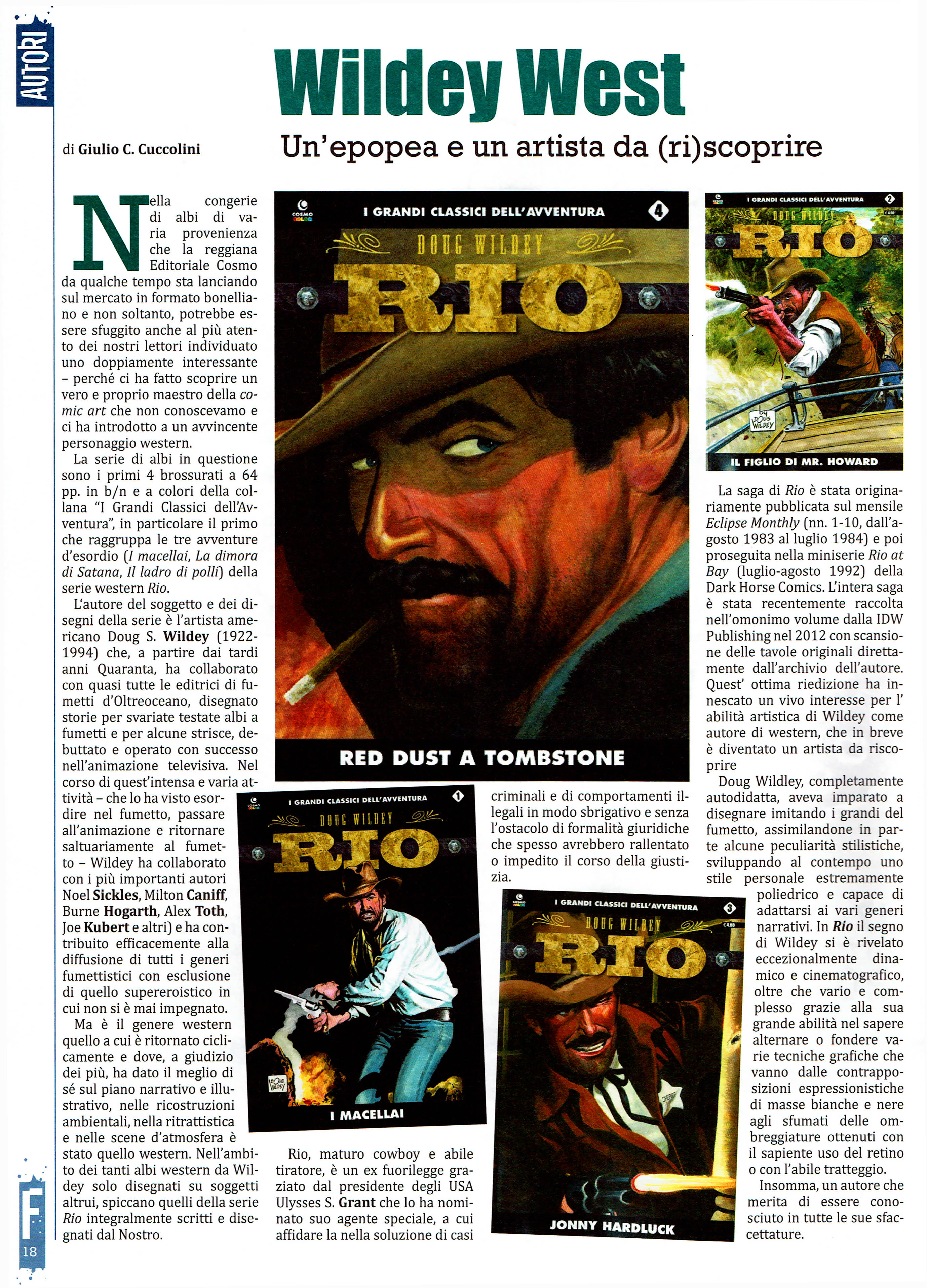
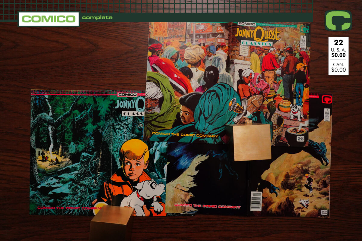
Wildey would go on to do more Rio stories for various publishers, and it was all collected by IDW in 2012, and I’m now going to buy that volume, because I want to read the rest of Rio’s adventures.

Hm… oh darn, it’s out of print, and copies go for $100 and up… Oh, I found a copy in the UK for 47 pounds.

OK, let’s see if we can find any reviews…

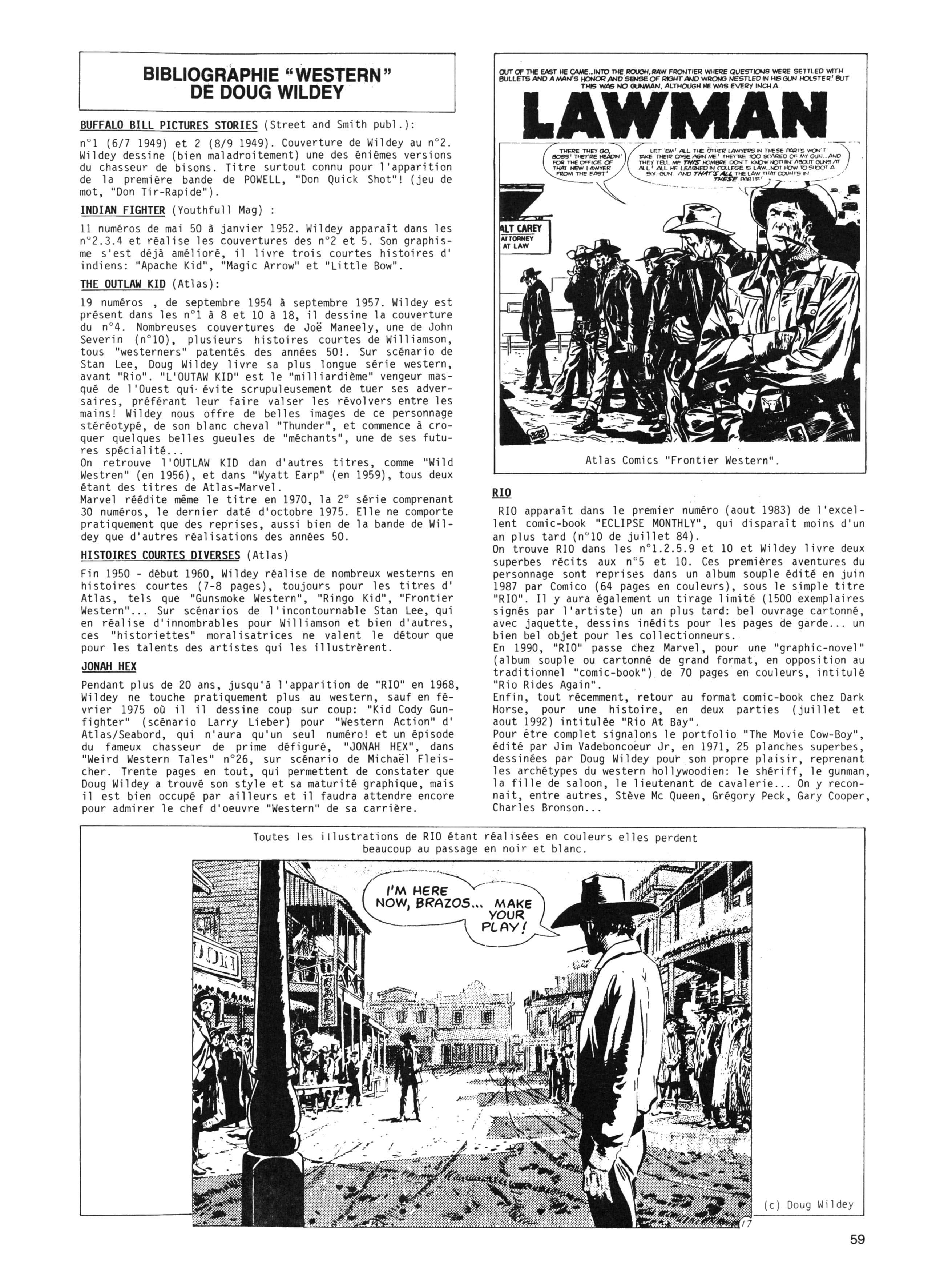
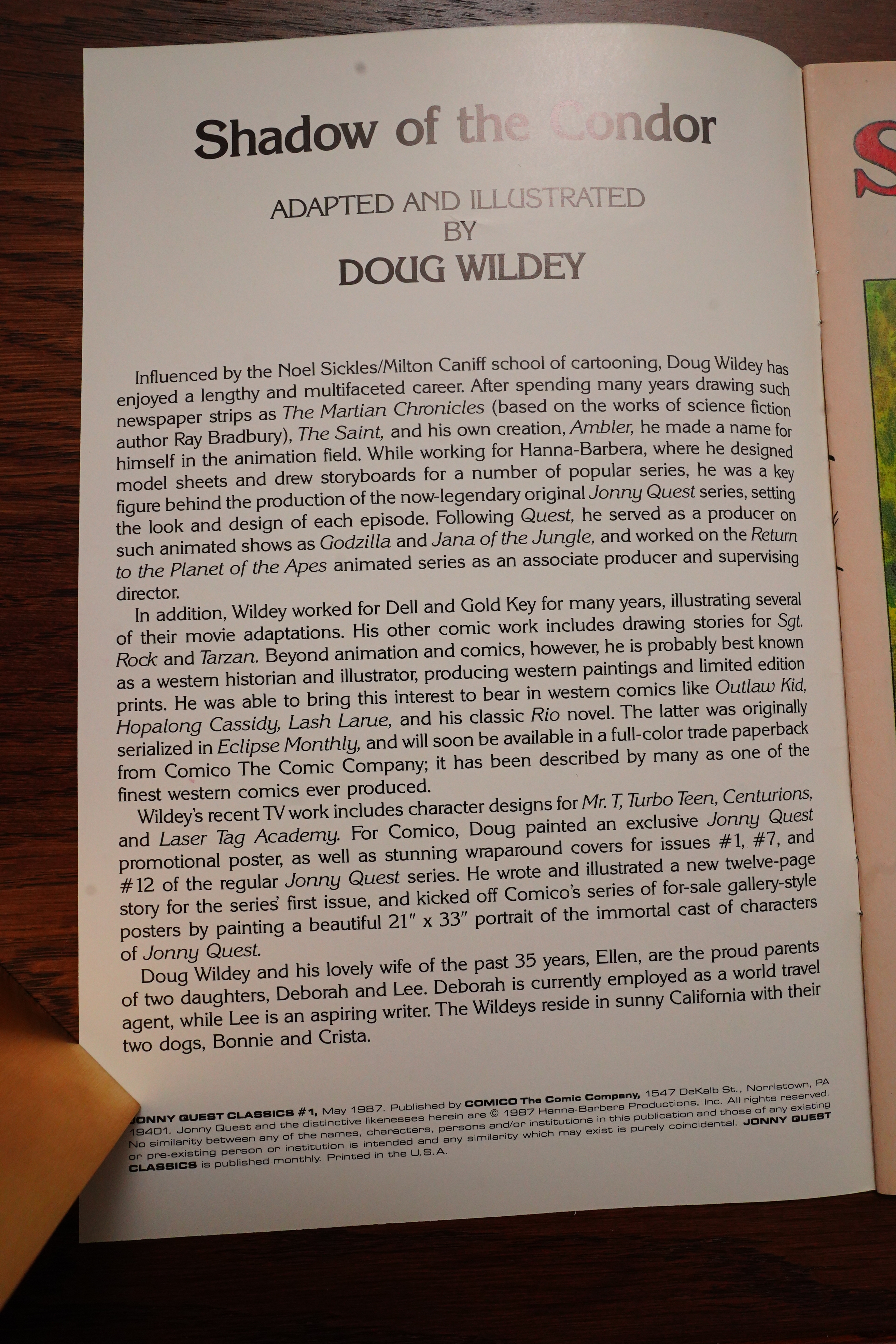
Wildey’s done a lot of westerns.

Comic Book Marketplace #110, page #75:

In a
dramatic departure from his earlier pen and ink comics line
work, Wildey accented the strip with heavy use of zip-a-tone
complimented by moody watercolors. Fans, old and new,
went wild over Wildey all over again.
“What I was trying to do was get some kind of a western
that would have a little authenticity and historical conse-
quence to it, and not make it the usual comic book,” Wildey
explained. “With most of the events in Rio, the dates have
been changed or altered to enhance the story, but the
incidents that occur in Rio are based on historical fact.”
Wildey felt this historical approach is what set Rio apart
from what had gone on in the genre up until that point.
“I think it is effective,” he stated, no doubt harkening back
to his experience on The Outlaw Kid thirty years before,
“Effective enough that if anybody reads the thing, they will
at least not see the usual shooting of guns out of hands and
that type of thing, which has been done eighty zillion times
in comic books. This is a kind of departure in that sense.”

Looks like this has been reprinted in Italian, too. Which isn’t surprising — Italians love westerns.

Hop! #54, page #57:

The first volume of RIO opens with a double-page spread whose somber beauty and icy silence immediately immerse you in the atmosphere. In the foreground, the railway tracks and the carcasses of dead bison. On the right, the title “The Butchers” is written in orange letters against a background of bloodied hide. Beyond, the rider advances at the pace of his mount, whose nostrils flare with an icy breath. He crosses the snow-covered plain, amidst the peacefully grazing herd, dominated by the peaks of a coal-black mountain. An overlaid panel:The horse advances towards us at a slow pace, therider’s face turned to the right, his gaze fixed on theslaughtered animals. On the opposite side of the page, in the upper left corner,his name is emblazoned in blood: “RIO”.This double-page spread foreshadows the entire beginning of the first chapter:RIO’s arrival, his altercation with the railway director about the massacre—perpetrated from the trainby trophy-hungry “sportsmen”

Amazing Heroes #104, page #18:

HIS NAME IS RIO: Speaking of
Doug Wildey, some may remember
“Rio,” the western series he wrote
and drew in early issues of Eclipse
Monthly a couple of years back.
Comico is repackaging the 60-page
saga, adding some new pages and a
new Wildey cover, and will release
it as a 64-page full-color graphic
novel next summer.

Amazing Heroes #64, page #63:

R.A. Jones on Eclipse Monthly #10

The next offering comes
in the form of the latest installment
of “Rio,” a western by veteran art-
ist Doug Wildey. Westerns are one
of the subgenres of comics which
has fallen by the wayside in the
wash of super-hero titles. Kids like
Japanese robots nowadays, not
cowboys. The storyline here is
pretty standard western fare, with
the lone hero facing a horde of
badmen in an effort to clear his
name/with the law.
What places “Rio” a notch
above similar tales is the art.
Wildey is actually more an illus-
trator (like Al Williamson and the
late Reed Crandall) than he is com-
ic book penciller. His art is a balm
to the eyes. A full-page illustration
of Rio, rifle blazing as he faces four
horseman, is almost gorgeous
enough to frame. Though this com-
ic is being cancelled, I hope Mr.
Wildey finds another forum in
which to present his work.

Comics Interview #51, page #47:

GERRY: Right. (Laughter.) You know,
I think that as an industry it’s necessary
for us to explore different formats, to try
everything possible to make the medium
as accessible as it can be to any marketing
plan.
GERALDINE: In a sense, though, it
doesn’t matter. I mean, you could package
this thing in toilet paper. If the story and
the art aren’t good, then it doesn’t mean
a hill of beans! But it’s great to have a
nice-looking package because, if we want
to go into another market, we have to have
something that this outside market can
recognize and appreciate.
DARREL: Something I’ve been hearing
a lot about is the RIO graphic novel.
GERALDINE: Oooh, it’s great.
GERRY: It really is one of the nicer
packages. That might sound like our ego
tooting itself, but we’ve had so many peo-
ple, like Burne Hogarth, for example,
just rant and rave over it. Burne Hogarth
is one person who’s been trying to gather
some respect for the medium for years and
years, and to get a compliment from him
is just one of the biggest kudos that we
could have. And RIO is very much a
tribute to Doug Wildey. How we felt
about Doug and our interest in the RIO
project – we put all of that into produc-
ing this package. We wanted to see the
smile on his face, you know. A lot of real
hard production work went into it. It’s pro-
bably the most difficult book we’ve ever
produced. It had a lot of idiosyncrasies in
it.
DARREL: And you’re dealing here with
a story that has already been presented.
GERRY: That’s right.
DARREL: So what do you do when you
have something that has already been
presented?
GERRY: You produce it the way it should
have been produced in the first place. RIO
was always intended to be a graphic novel.
That was the way Doug designed it in the
beginning, and then the publishing deal he
ended up with was at Eclipse, who printed
it in 10- and 20- page increments. And
each part was produced differently –
when you put them together, none of them
looked the same – and you couldn’t en-
joy it as one visually consistent RIO story.
We took it and redeveloped all of the art-
work so that it was consistent throughout.
packaged it in a way that was concise and
all-inclusive, and just made the definitive
RIO package out of it.

Here’s a review:

This is a real labour of love for Wildey. There was no guarantee of any further Rio stories, so he threw everything into this three chapter gem, covering an inordinate amount of familiar Western scenes and characters. Gunfighters, cavalry, native Americans, a snowstorm, the railroad, buffalo, a bar brawl, a siege, a quest to clear Rio’s name and a trip to Mexico all feature. Many Westerns build to the inevitable town centre gunfight, but Wildey dispenses with that before ending his first chapter, knowing he has plenty of other scenes to draw. Not that Wildey is nothing more than the sum of his homages. There’s a viable plot with plenty of original twists. In among it all Rio is knowledgable and practical enough to know when standing on convention isn’t going to work.

Oh, the IDW edition sucks?

The chances of a full Rio collection seeing the production process through is hardly likely, so the choice is this or the earlier printings and missing out on two good additional stories. The content is stunning, but the production questionable.

Well, I’m glad I have this edition too, then.

1987: Jonny Quest Classics

Jonny Quest Classics (1987) #1-3 by Doug Wildey

This mini-series adapts three episodes of the Jonny Quest animated show — and the adaptation is done by Doug Wildey, who was the guy who created these characters and wrote most of the shows back in the 60s. So that’s nice and unusual.

The issues have a classy look — the covers use a stiff, heavy stock, and the interior pages are cream-coloured.

If the above introduction had been a wikipedia page, I think there’d be a [citation needed] behind the Rio description “it has been described by many as one of the finest western comics ever produced”. Possibly?

It’s an interesting look — we have painted backgrounds, kinda impressionistic-looking, but with very appealing colours. And then we have the characters that don’t altogether look like cartoon characters, but almost? It’s a kinda Alex Toth-looking line… or Milton Caniff? But coarser than both of them. I’m not quite sure that the mix totally works, but it’s interesting.

As usual with Comico books, we get 26 interior pages… and it’s one episode per issue, so the plots seem rather rushed. Like the condor/dog adventure there was apparently quite long originally, but was compressed to one page here.

The plots are… er… well, they’re pretty standard plots? Not bad, really. But these issues do feel quite rushed.

We also get several pages of interviews with Wildey in each issue, and these are really quite interesting.

Hadji’s origin story — he saves Dr. Quest’s life, so they kinda adopt him? Sure, why not.

The plot in the second issue can’t really be called a plot — it’s a series of coincidences strung together until you have a sufficient number of minutes of animation.

The third issue is also nonsensical, but there’s more of an actual plot there.

Wildey explains that Jonny’s hairdo was a failure on Wildey’s part.

So… not a very exciting mini-series, but perfectly pleasant reading. And very, very different from the Bill Messner-Loebs-scripted regular Jonny Quest series.

Amazing Heroes Preview Special #5, page #66:

Jonny Quest debuted as a primte-time
animated television entry in 1964. Jonny
Quest premiered as a regular comic book
series from Comico last year. And now,
both genres of Quest tales meet in Jonny
Quest Classics, a three-issue limited
series which adapts a trio of Jonny’s TV
episodes to comics form.
Comics and animation veteran Doug
Wildey, who created the characters for the
memorable Hanna-Barbera series, is
producing both the script adaptations and
the painted illustrations for Jonny Quest
Classics.
After issue #1’s “Shadow of the
Condor” and #2’s “Calcutta Adventure,”
the third and concluding issue (out in
July) features “The Werewolf of the
Timberland.” It pits Jonny and crew
against a hairy, snarling beat (no, it’s not
Magilla Gorilla). The story takes place in
the wilds of Canada, where a gold smug-
gling operation spells adventure for our
heroes.

Comic Book Marketplace #110, page #76:

More than twenty years had passed since the original run
of Jonny Quest, but Wildey was both surprised and pleased
to discover that he didn’t have to refit the character designs
for the 1980s.
“They managed somehow to still look contemporary,” he
noted. “I kept the characters and updated the story.”
For the kickoff, Wildey wrote and drew a new adventure,
“The Sands of Khasda Tahid.” It was received so well Comico
asked him to adapt three of his favorite episodes for their
Jonny Quest Classics.
“They’re not particularly favorites,” he admitted. “I
selected the three stories-‘Shadow of the Condor,’
‘Calcutta Adventure’ and ‘Werewolf of the Timberland’-
only because of the palettes used on three different locales.”
The same painterly approach that had worked so well on
Rio made Jonny Quest crackle with excitement. And for the
first time, Wildey had complete creative control over the
final Quest product.
At that time, interest in Jonny Quest was high. The new
animated series was so hot, Hollywood was talking about a
Jonny Quest live-action movie. But Wildey was left out of all of it.
Previously, Wildey had attempted to re-launch the
character on TV. He explained the premise this way:
“Jonny Quest grows up, Hadji grows up, Race gets older,
etc., but basically we continue about young Dr. Quest who’s
twenty-two years old and who has graduated from M.I.T. or
whatever, and we’d carry on from there.”
After Young Dr. Quest failed to get off the ground, Wildey
lost interest in the character’s animated possibilities, and saw
Jonny Quest Classics as his farewell to the beloved boy hero.
“Other than a movie,” he confessed, “if I’m lucky enough
to get consulted, this will probably be the end of my
participation in Jonny Quest.”

Comics Scene Volume 2 #1, page #64:

“They’re not particularly favorites,” he
notes. “I selected the three
stories-‘Shadow of the Condor,’ ‘Calcut-
ta Adventure’ and ‘Werewolf of the
Timberland’-only because of the palettes
used on three different locales.”
Color choice is critical to these books
because Wildey colors directly onto his
original art, which is then laser-scanned.
Even though Jonny Quest is Doug
Wildey’s brainchild, he doesn’t involve
himself in the regular comic book series,
which is being written by Journey’s
William Messner-Loebs.
“I’ve left him strictly alone,” Wildey
says. “I talked with Loebs once, but I
never make any criticisms or contribu-
tions to the writing. Loebs’ approach is
heavily into plotting the series along the
lines of science fiction. That’s the only
way you could go when you get down to
it. The stories I’m doing are more direct
in the sense of adventure and trying to
keep the original show’s flavor.”
Similarly, Wildey keeps his distance
from the new animated episodes. “I’ve
seen one half of one of the new shows,”
he comments. “It wasn’t a world-beater,
by any means. It was just another product
to be licensed out of a huge studio.”
Wildey was approached to work on the
new episodes, but never reached an
agreement with Hanna-Barbera.

Four Color Magazine #2, page #15:

Comico has announced a new Jonny
Quest three issue mini-series coming
in 1987. Entitled Jonny Quest Classics,
the series will be illustrated by veteran
artist Doug Wildey, the man responsi-
ble for setting the design and look of
the original television series.
“The reaction we got from Doug’s
story in the first issue was ridiculous,”
said Administrative Director Bob
Schreck. “People just kind of scream-
ed at how good it was and how much
fun they had reading it.”
The series will be full-color adapta-
tions of three of Wildey’s favorite
episodes from the original series. Each
issue will feature 26 pages entirely
produced by Wildey.
The first issue, slated for next sum-
mer, features a story entitled,
“Shadow of the Condor.” According
to Schreck, the story evolves the
Quest team having to ditch their plain
over the Andes. They land on a moun-
taintop “where a retired Nazi war
criminal is hanging out.” The story
culminates with Race Bannon in a
dogfight with the aforementioned war
criminal.
The other two stories include
“Calcutta Adventure” and “The
Werewolf of the Timberland.” The
first deals with the introduction of Haji
to the Quest team, while “Werewolf”
has the team going to Canada to crack
a gold smuggling scam.
Schreck added that a possible back-
up feature to the mini-series would be
an interview with Wildey himself. “It
would recount what was going on in
Doug’s mind while he was doing the
series,” said Schreck. In particular,
Schreck said the interview would
focus in part on Hanna-Barbera’s addi-
tion of Bandit to the cast for comic
relief and how Wildey responded to
the addition.
“We are very happy to be able to
present such a package and are thrill-
ed to be working with Mr. Wildey on
this project,” said Diana Schutz, editor
in chief. “I’d say we’re in for a real
treat with this one!”

The Slings and Arrows Comic Guide #2, page #355:

Doug Wildey adapts three episodes from the original Jonny
Quest cartoon series ‘Shadow of the Condor’, ‘Calcutta’
Adventure’ and ‘Werewolf of the Timberland’ (‘The
Invisible Monster’ can be found in Jonny Quest 30). Wildey’s
art is, as always, top notch, but the material he’s adapting
doesn’t have the depth or resonance of the stories written by
William Messner-Loebs for the ongoing Jonny Quest
title.~WJ

It was nominated for a Ruben Award.

This series has never been reprinted or collected.

I’m unable to find any reviews of the series, but there’s this:

It’s a shame Wildey didn’t adapt ALL of the JQ television episodes into comic book form…in this final “classics” installment, we travel to the Canadian wilderness in another fine offering. And in part three of the interview with Doug Wildey, we learn about JQ’s television character voice actors, a bit about Wildey’s fascination with the wild west, and even about how Jonny got his hair!

1987: Fathom

Fathom (1987) #1-3 by Lawrence Schick, Jill Thompson, Keith Wilson et al

Honestly, when I started this blog series, I thought I’d find a publisher that was more or less like Eclipse Comics — some really good comics, some kooky comics, and some comics that were churned out for purely commercial reasons — but even those done professionally and competently, resulting in surprising discoveries of series that are much better than they have any reason to be (to take just one random example).

If you’ve been following this blog series (if so — I’m sorry), this has not turned out to be the case. Perhaps I was mislead by the good and distinct cover designs, and the attention put to the colouring and stuff — Comico books look, if you just cast a glance at them, pretty good.

The problem is the comics themselves.

So many of them are just amateurish drek: Writers that don’t quite know how to tell a story, and artists that don’t know the basics. That goes doubly for the “commercial” comics (like Star Blazers, Justice Machine and Elementals) which have been both amateurish and surprisingly boring.

But I haven’t lost hope yet! Most of the books I’ve read so far have been inaugurated before editor Diana Schutz came aboard, I’m holding out hope that it’ll turn out that she has a taste level approaching cat yronwode’s.

So this is an Elementals mini-series, but Bill Willingham isn’t involved. This series is about the water spirit hero Fathom (she’s the one in green).

Well, that’s a very efficient way to set up the series, I guess?

What’s the reading order of the speech balloons in the second row here supposed to be, anyway? It seems like the “insect repellent” thing is supposed to go before the “was that a joke?”, but… er… Oh, is the “was that a joke?” supposed to be a comeback to “now the real party can start”?

It turns out that her old friends find her water spirit super-hero thing to be kinda disgusting. Nicely depicted, but… kinda weird.

The second issue starts with a recap of the first issue — and is that necessary when doing a three issue mini-series?

Love interest!

The second issue is rather a chore to read, because the black ink is all smudged.

But there are lots of fights to go around.

Jill Thompson’s artwork is better than in those issues of Elementals that she did. It’s kinda pretty?

The series has a dream-like quality to it. Fathom discovers a kingdom far below the waves, and gets a boyfriend, and … it’s all very strange. I was expecting it all to be revealed to be a dream, because it’s just very odd.

Instead the people under the sea are revealed to be cannibals (who eat their own children)…

… and this is how the series ends. What’s that final silent panel trying to tell us?

Very, very odd series. But not bad! I’m pleasantly surprised. Most of the attraction is from Thompson’s artwork, I guess.

Comic Book Collector #4, page #26:

The only reason I remember these is
because people brought them up to me,
and I looked through them and said,
“My God, I’d completely forgotten-
about this!” Then I did … the Fathom
mini-series, I think.
Comic Book Collector: Right, for
Comico.
Jill Thompson: That was for the
first Comico, the real Comico, not the
evil, slimy Comico. It was the one that
wasn’t “Fathom has sex with a dolphin
and everything else.”

Amazing Heroes Preview Special #4, page #42:

FATHOM
Written by LAWRENCE SCHICK from a
suggestion by BILL WILLINGHAM; pencilled by
JILL THOMPSON; inked by KEITH WILSON;
edited by BILL WILLINGHAM and DIANA
SCHUTZ
3-issue limited series; 32 four-color pages; $1.50;
monthly from COMICO
This mini-series has been in the
planning stages for some time and
marks the first solo appearance of a
character from the pages of The
Elementals. It stars Fathom, the water
Elemental of the group, and evolves
from Elementals creator Bill Willing-
ham’s desire to explore an actual under-
water civilization. “It is not a city from
the surface transported underwater,” he
says, “but a lot of scientific extrapolation
to see what one would be like.” This is
not “Comico’s Atlantis,” he points out.
The story is being done by two new-
comers to comics. Lawrence Schick is
doing the scripting, and Jill Thompson
is handling the pencilling. Both have
been hand-picked by Willingham to
work with regular Elementals inker
Keith Wilson. The story finds Fathom,
Tommy, and Lawrence out sailing when
they are capsized by a Japanese fishing
boat. Monolith falls overboard, causing
Fathom to have to save him. This is the
plot device which leads Fathom to
discover the underwater city and ano-
ther water elemental, a truly bizarre
character. Fathom proceeds to get into
all sorts of weird situations with these
people.
Look for this series in May. -ES-

Four Color Magazine #1, page #14:

Fathom, one of the characters from
the Elementals series, will be featured
in a three issue mini-series. Cleverly
titled Fathom, the series will be writ-
ten by Lawrence Schick and pencilled
by Jill Thompson under he supervision of
Elementals creator Bill Will-
ingham. The series begins with
Fathom, Rebecca Golden, attending
her high school class reunion. The
series next takes Fathom to sea,
where she experiences adventure. Ac-
cording to Willingham, the story also
involves her Elementals teammate
Monolith as well as the team’s butler.
Lawrence. Schick has written articles
for Dragon and Twilight Zone
magazines as well as having done ex-
tensive work as an editor of role-
playing and computer games. Ms.
Thompson, the penciller, has
previously contributed artwork to
Villains and Vigilantes gaming
modules and a “Munden’s Bar” back-
up in First Comics’ Grimjack…

The Slings and Arrows Comic Guide #2, page #244:

FATHOM
Comico: 3 issue miniseries 1987, 3 issue miniseries 1992-1993
Two dull miniseries spun-off from the briefly popular
Elementals. In the first, slightly superior, instalment, writer
Lawrence Shick ponderously recaps our aquatic
superheroine’s origin – sailing accident leads to Rebecca
Golden’s reincarnation as ‘Wet! Wild! Webbed!’ Fathom,
acolyte of watery deity Aqua – before sending her to a strange
underwater city where she’s literally treated like a Princess.
Artist Jill Thompson here blandly mimics the work of series
creator Bill Willingham. In the 1990s story Fathom is
summoned by Aqua to battle the dreaded Dera Aeshma,
“despoiler of the world’s pure waters”, a turgid eco-thriller
from David DeVries and Tim Eldred.~AL

This mini-series has never been reprinted or collected.

This is the only review of the book I can find:

Going in blind…it’s not bad and you can get a grasp on both Fathom and her backstory easily. The writing is decent and the art is classic mid 80s indie fare. Very much a product of its era with the fashion and pacing and all in all not a bad change of pace from the nonsense I normally read.