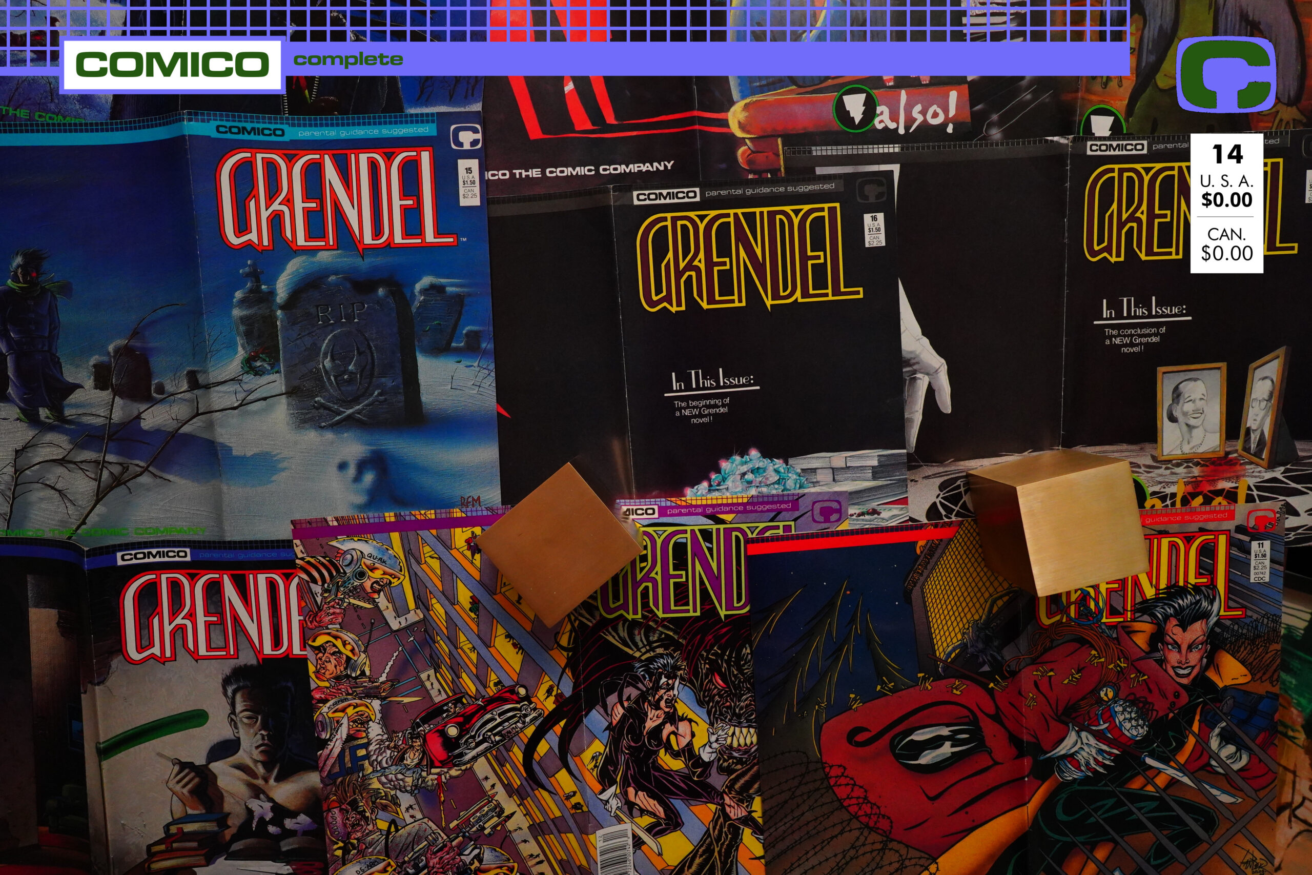
Grendel (1986) #1-40 by Matt Wagner, The Pander Bros, Jay Geldhof et at
Oops! I’m doing 1986 slightly out of order — sorry.

I had the buffer sorted wrong, so I thought Grendel came before Justice Machine Featuring the Elementals — but now I’ve read the first eight issues of Grendel, so I might as well write this blog post anyway.
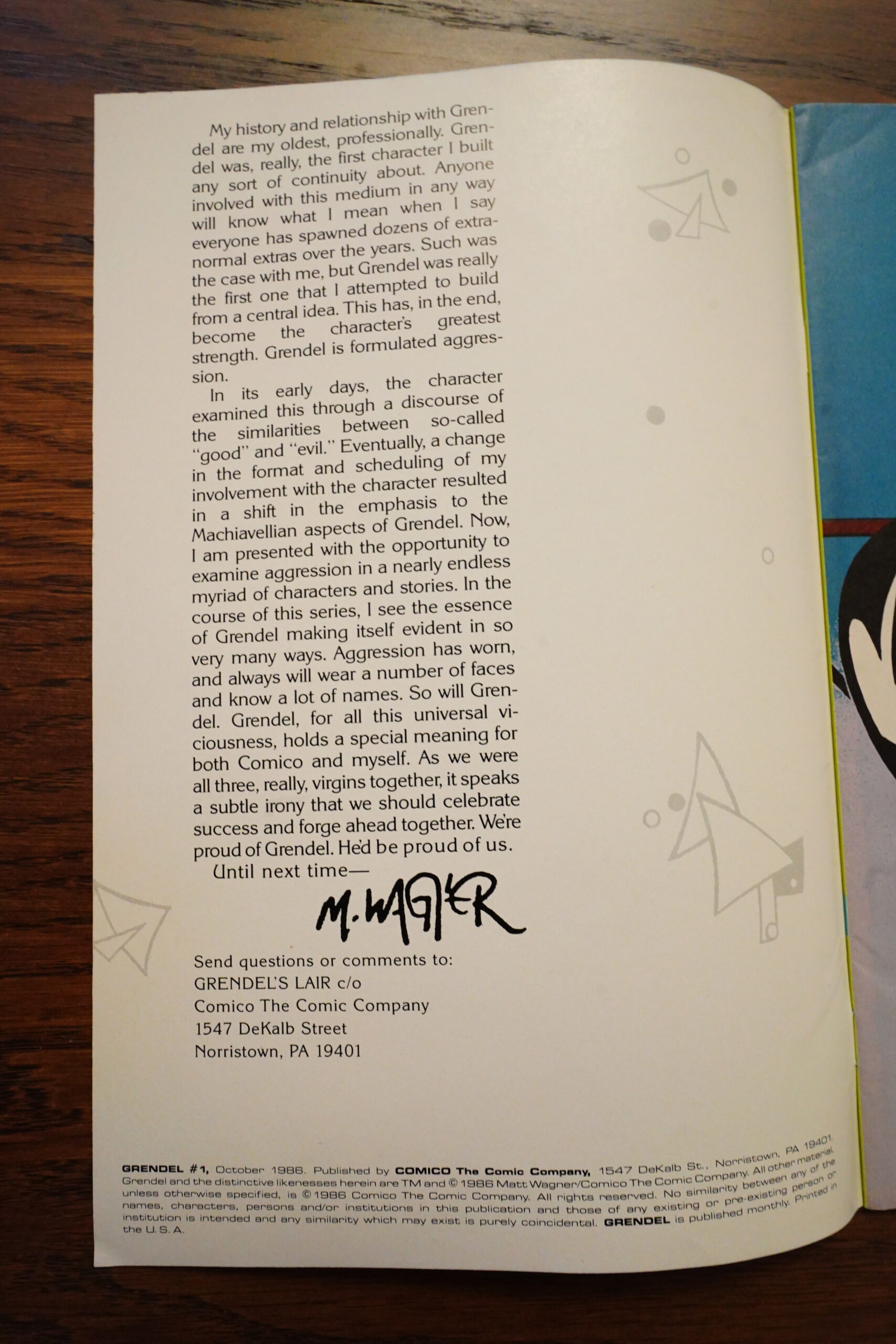
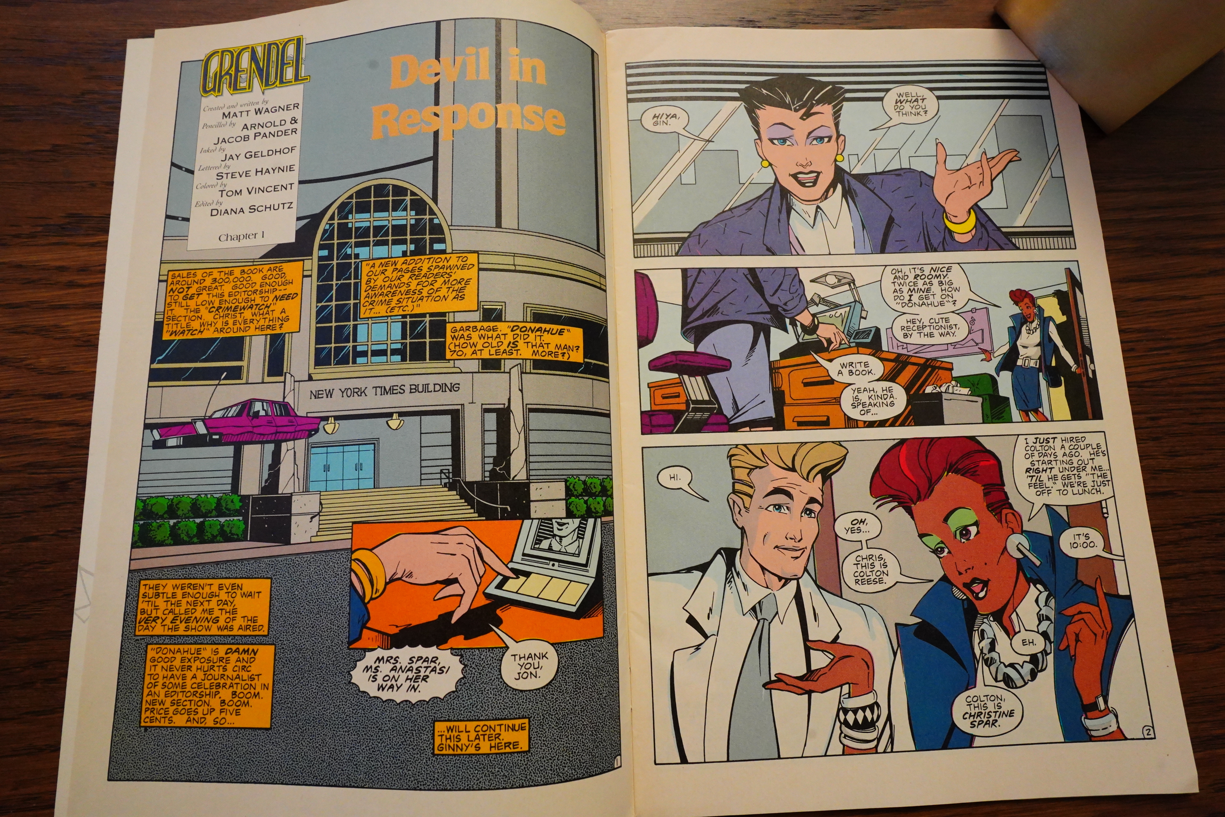
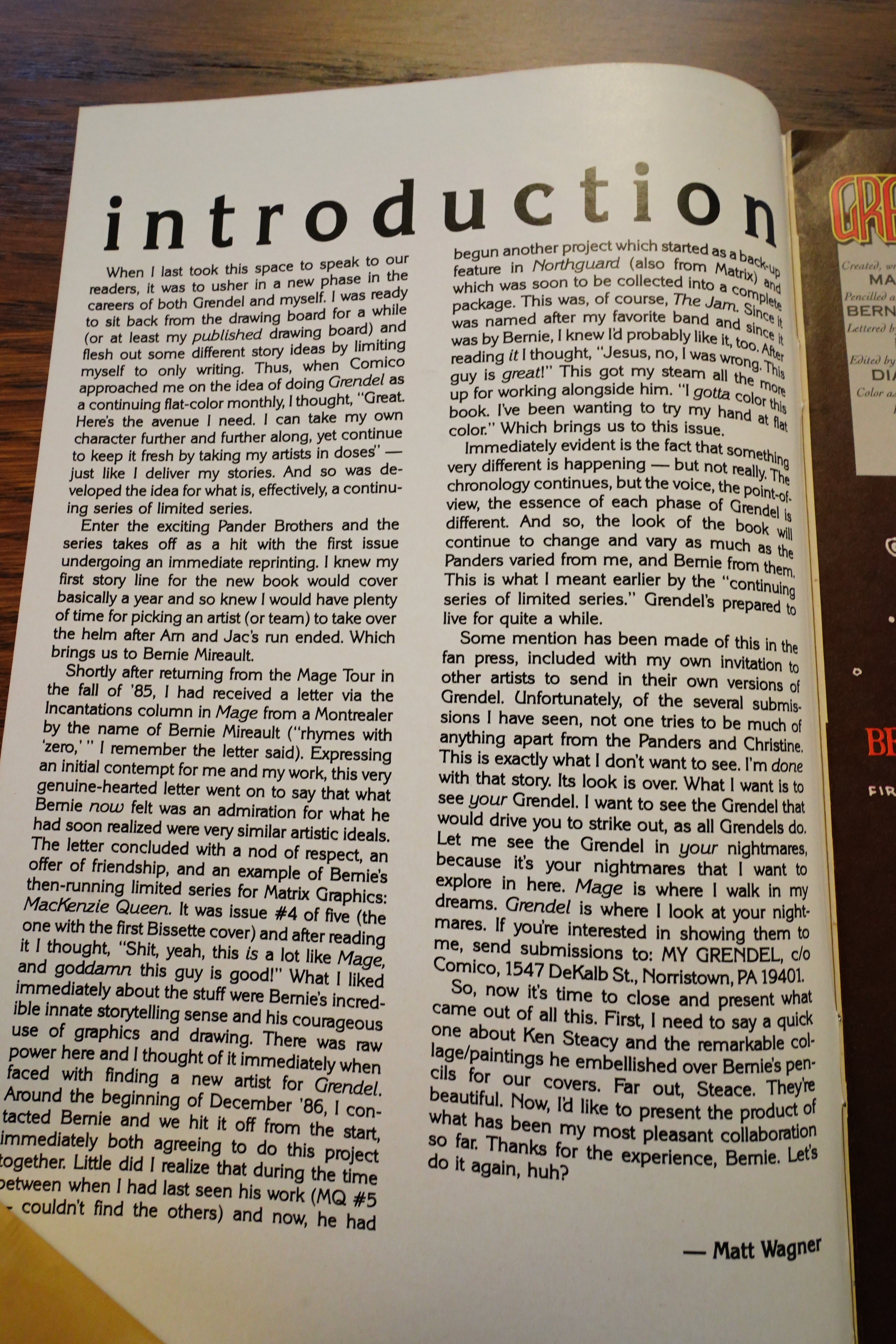
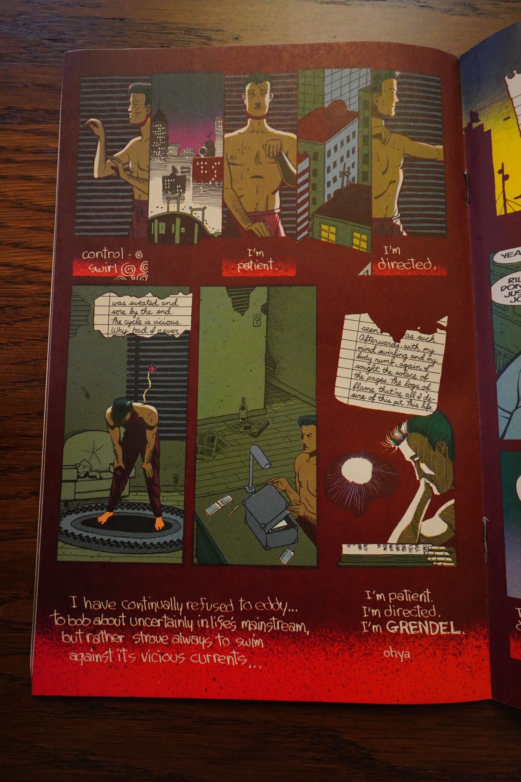
As usual with Matt Wagner, he opens the series with a rather portentous editorial.
And instead of recapping all of the Grendel lore, this is almost all the reader gets. I wonder whether this discouraged some readers or not?

This is the first major series that Diana Schutz was aboard as the editor from the first issue on. (Except if that’s the case with Jonny Quest, which came out some months earlier, I guess we’ll see when I come to that in a few days… Doing these post non-chronologically isn’t ideal.) It’s also distributed on the newsstands from the first issue. And Bob Schreck is now running Comico on a day-to-day-basis, So in some ways, this feels like a fresh start for Comico — or the start of their “imperial phase”, where they published a whole bunch of comics that were both commercially successful and critically successful.
(Yes, OK, Mage had been both, but felt like it stood out in the company it shared. Elementals moved copies, but was a mess otherwise. And Robotech certainly shifted units, but was largely ignored critically.)

But it’s almost as if these pages have a brand new whiff about them: The sweet smell of success; of unbridled enthusiasm for doing something new and fresh.
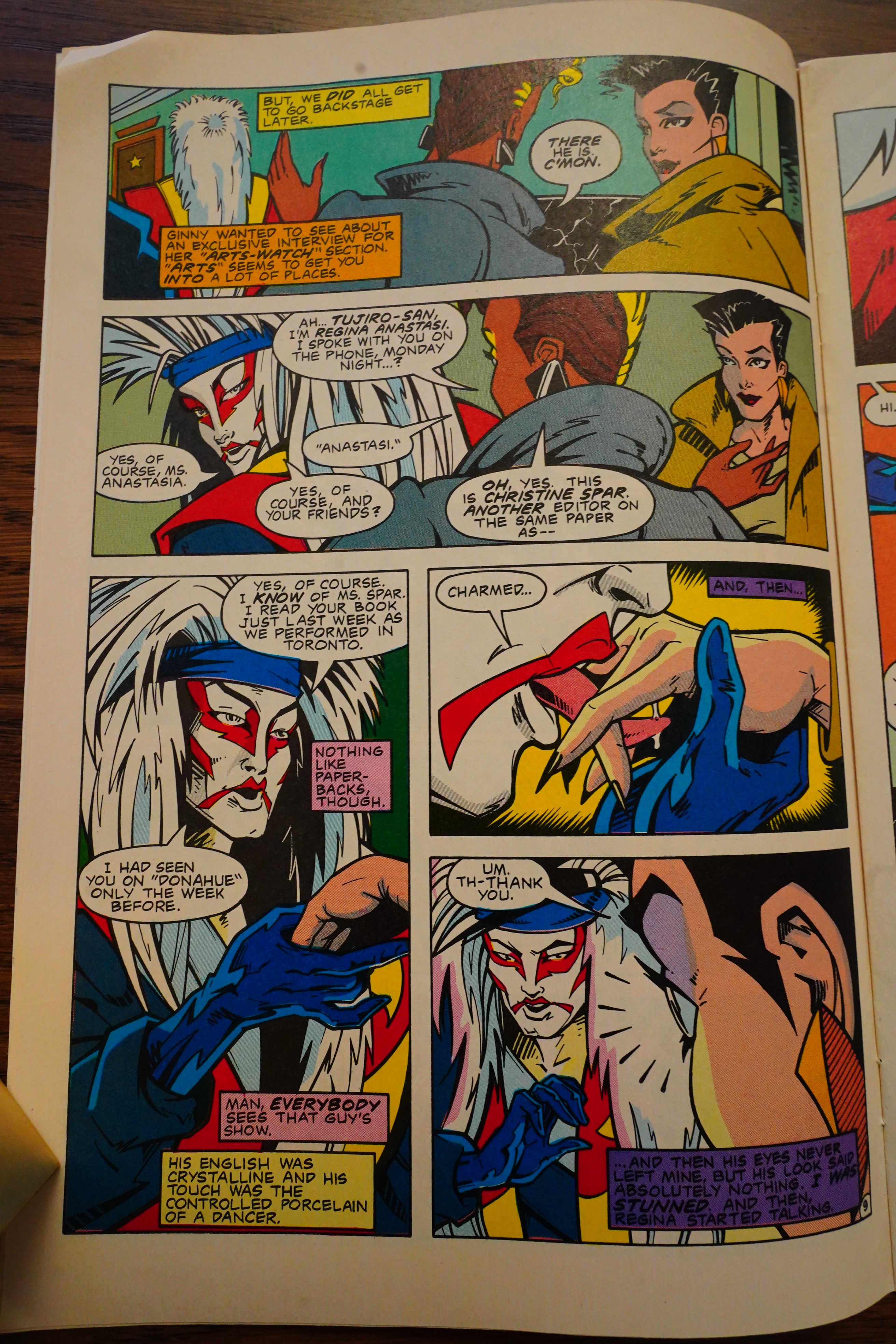
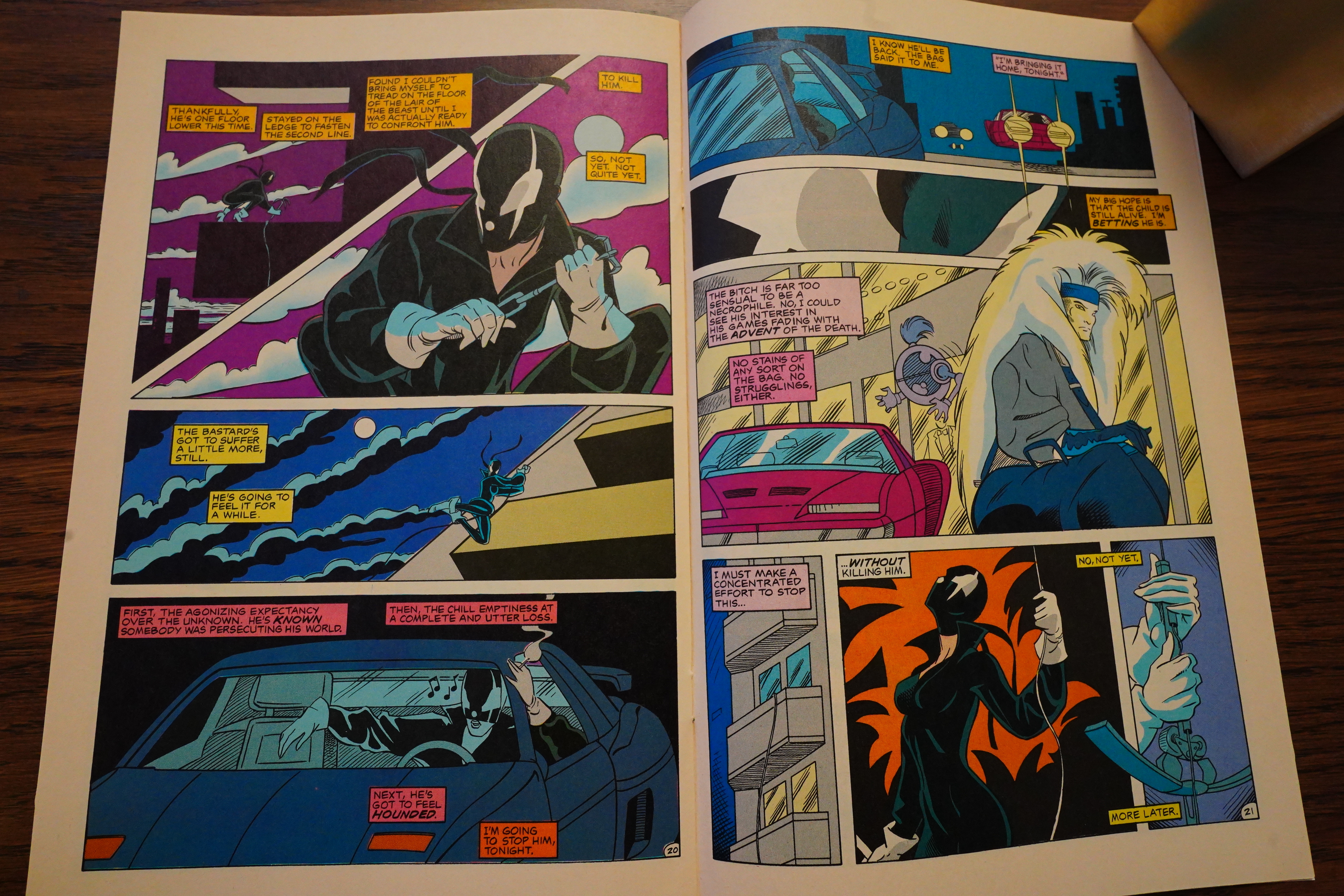
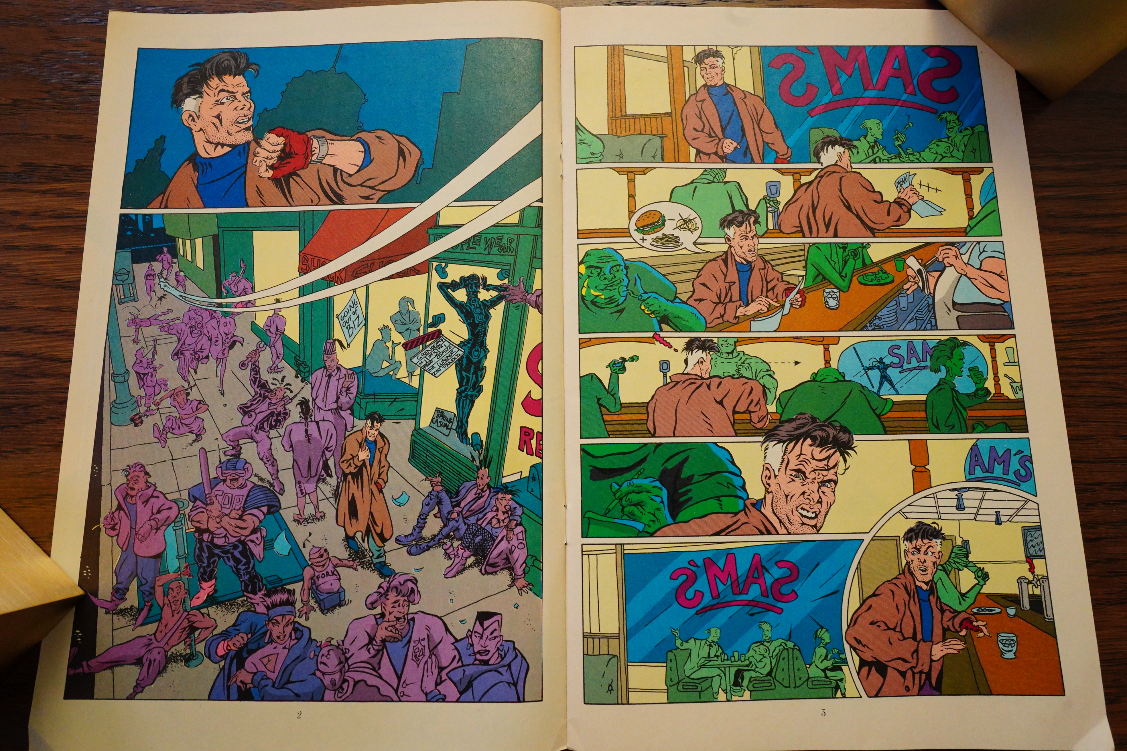
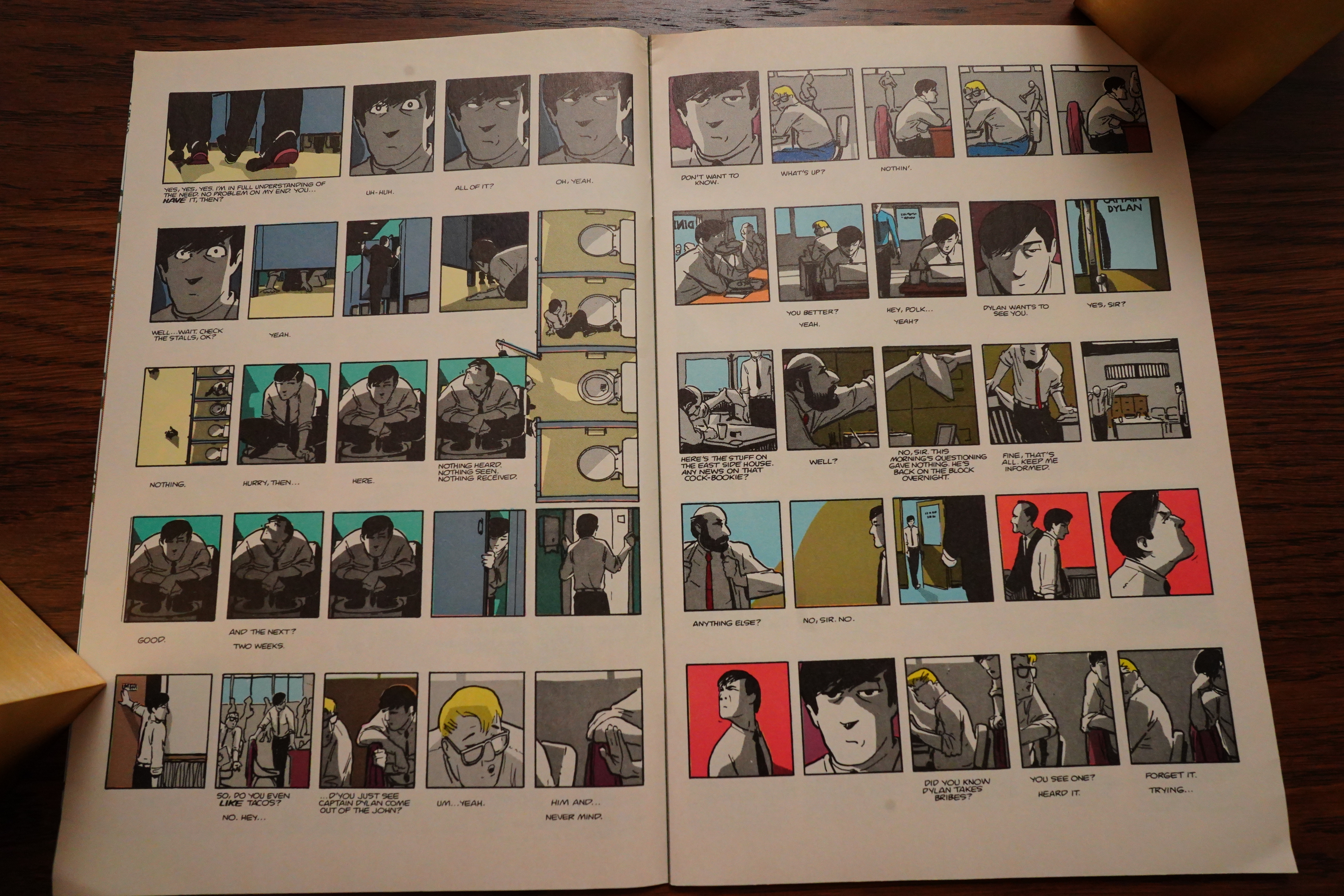
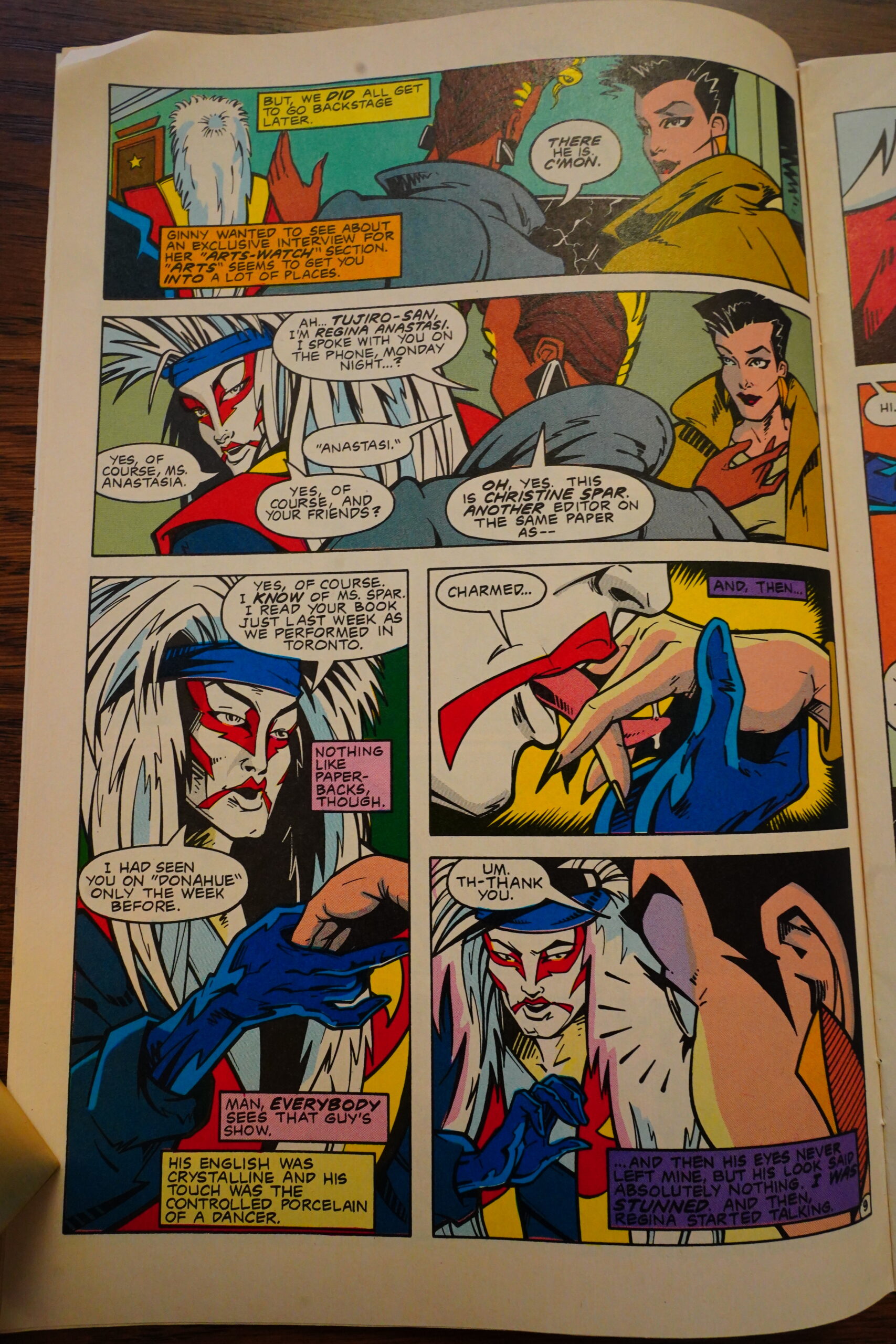
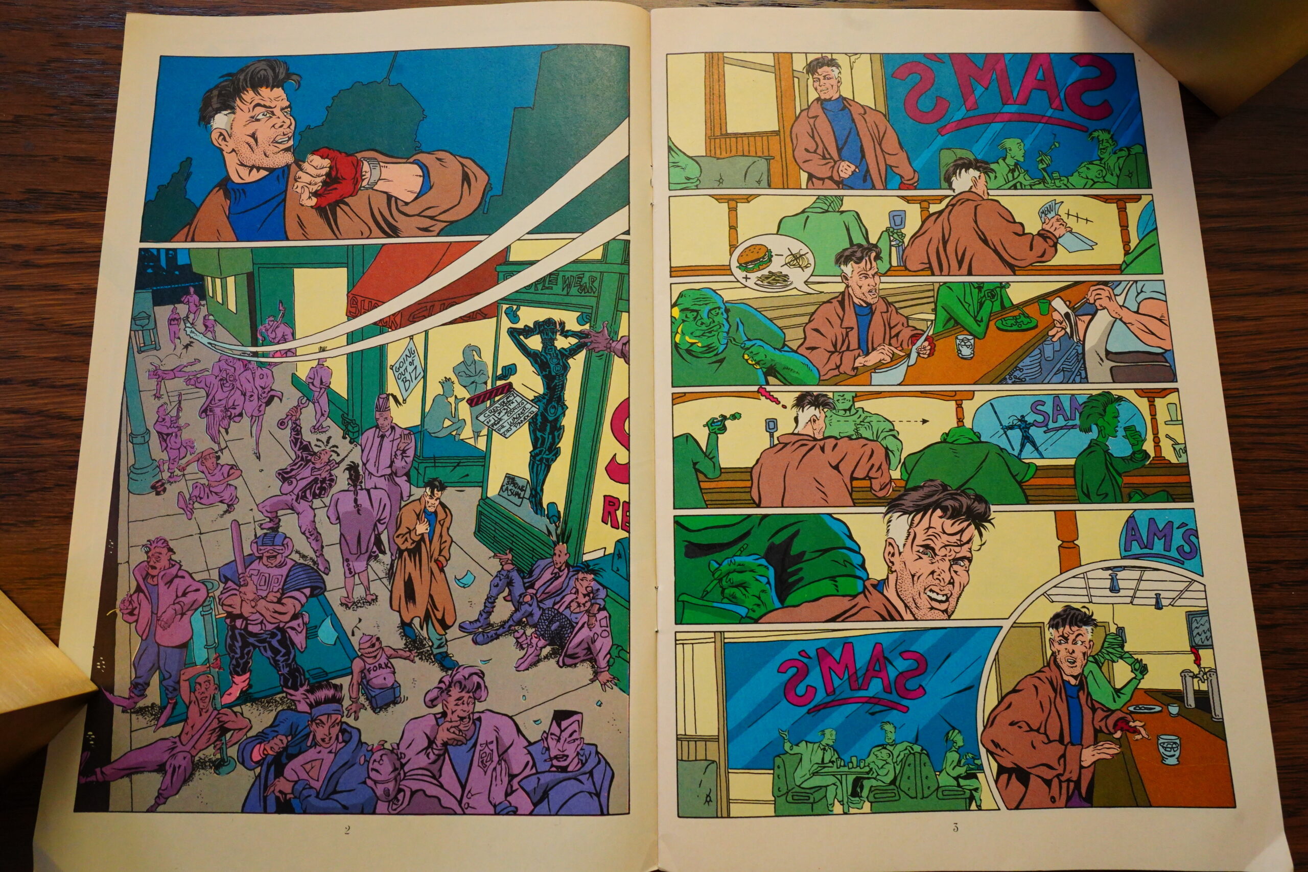
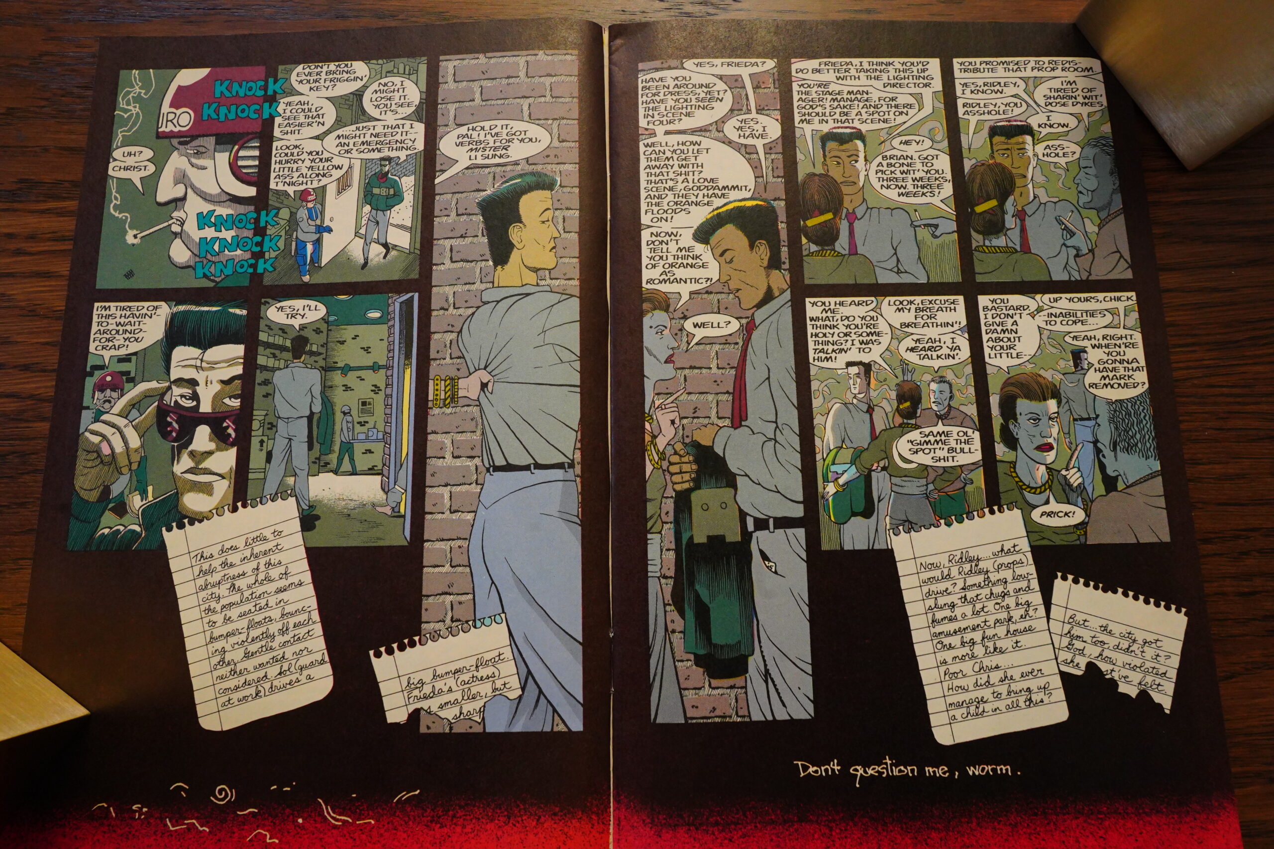
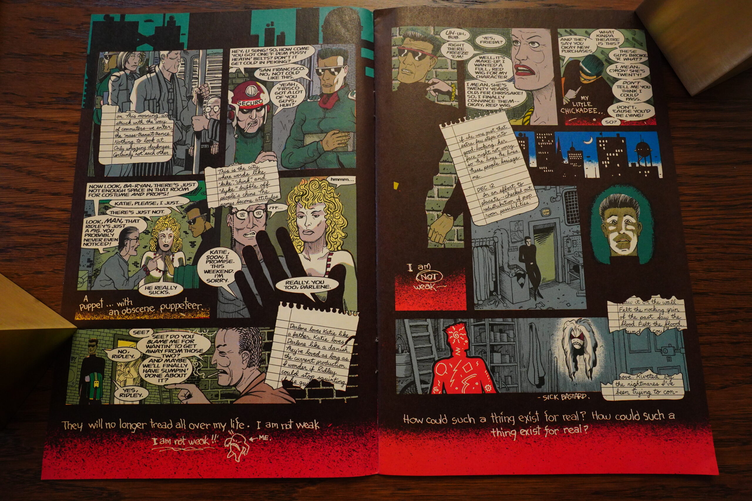
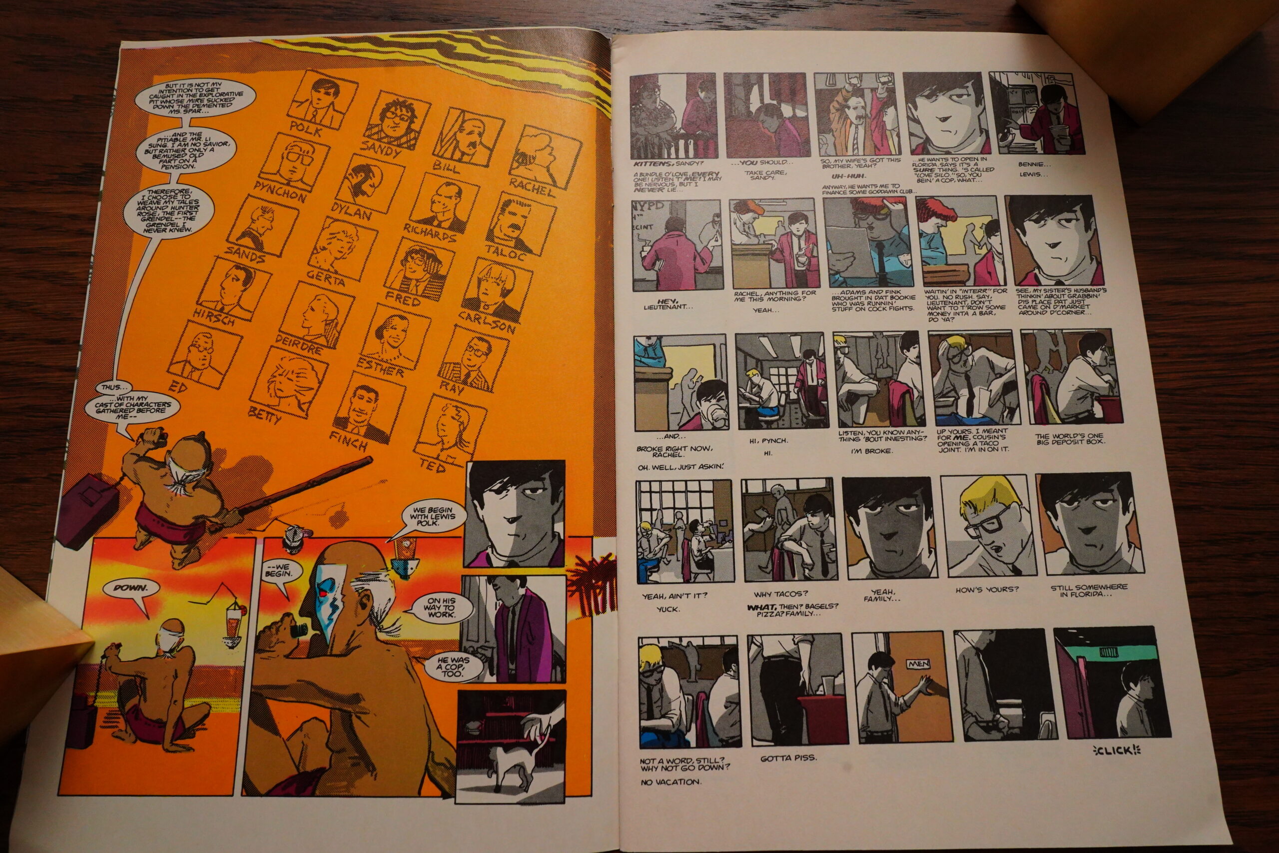
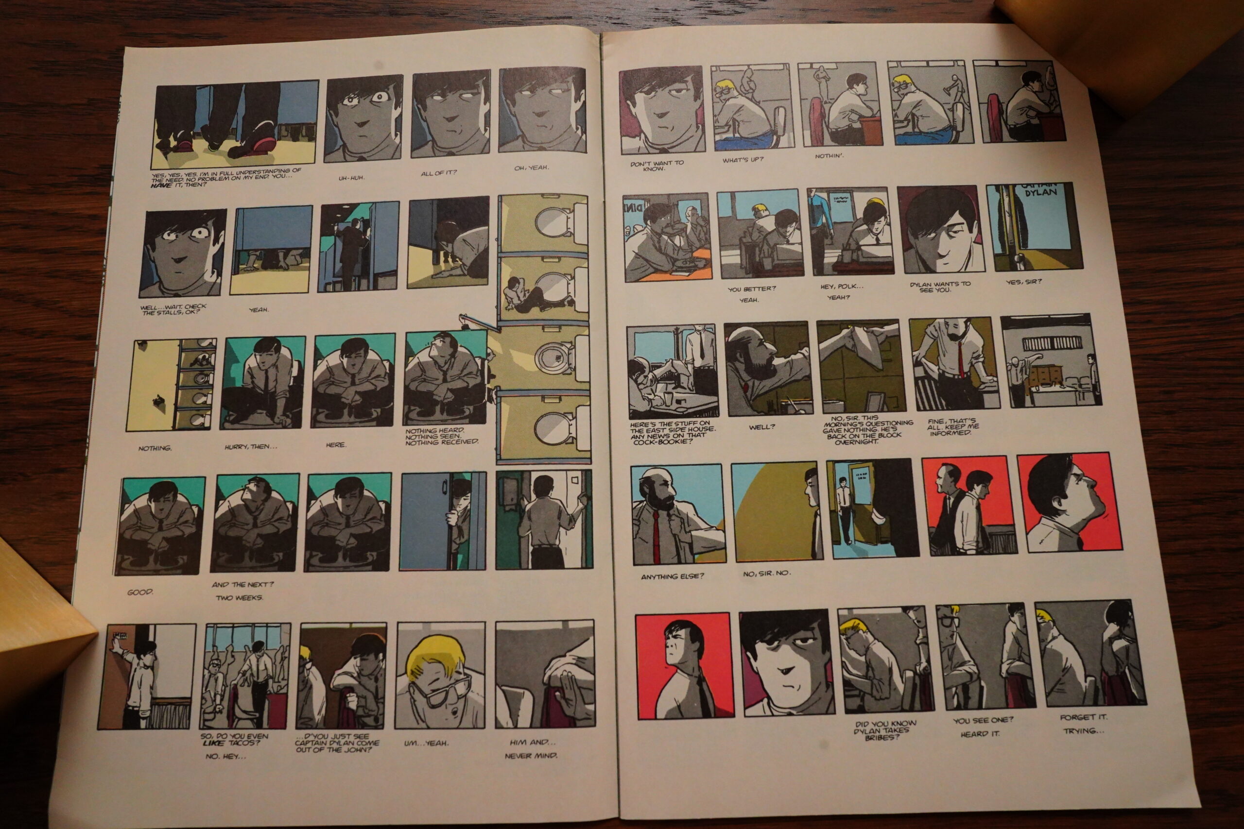
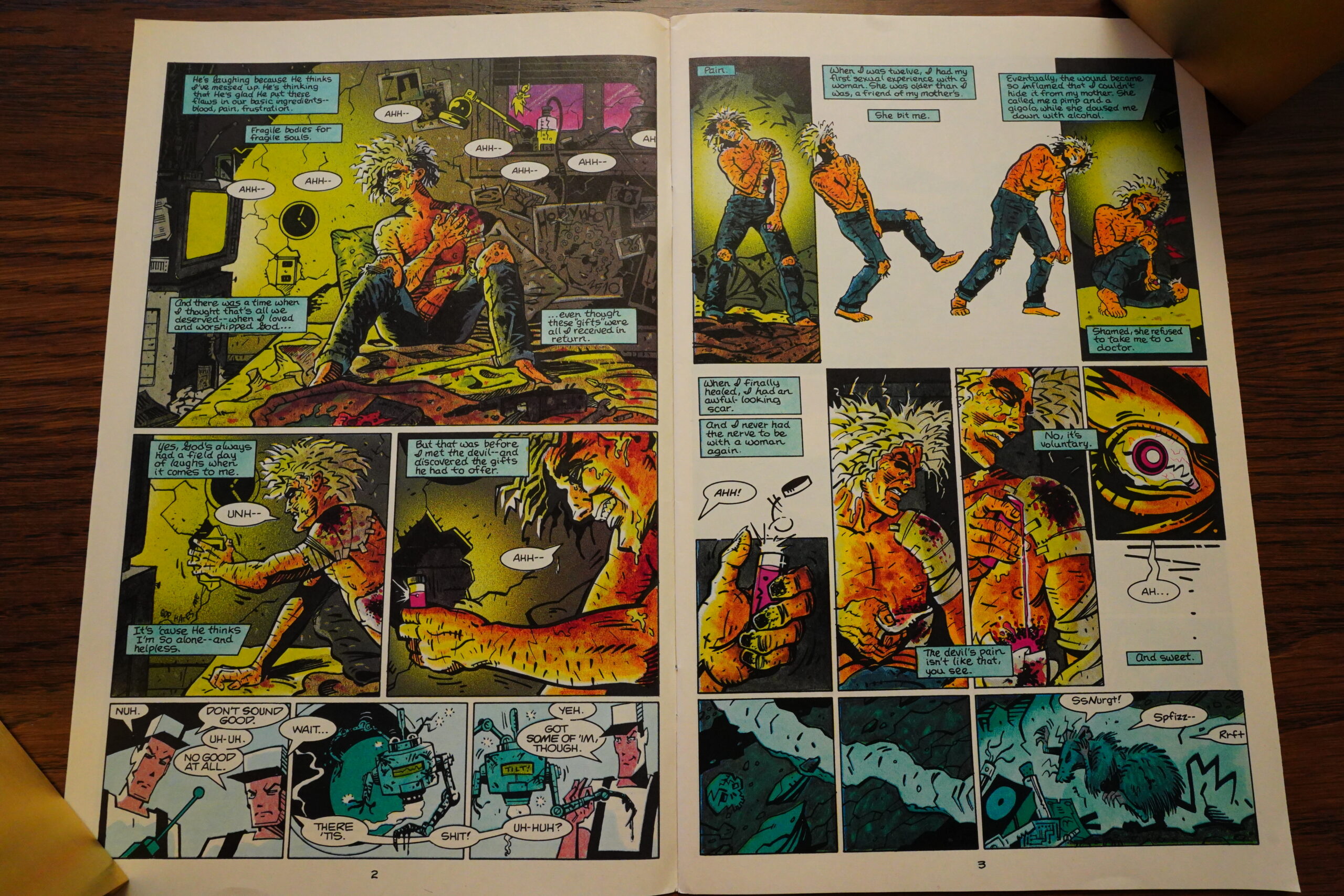
The artwork’s wild and dynamic, and the writing has that mid-80s modern dense feel: Over the first four pages, we’re introduced to two main characters, and we’re given all the backstory we’re gonna get. The woman with the black hair is Christine Spar, the daughter of the original Grendel’s adoptive daughter. Is the grendelness (that’s a word) gonna resurface in her?
The artwork is so mid-80s in some ways — everybody looks like they’ve been designed by Thomas Nagel, but the line isn’t Nagel’s line at all. It’s a very plastic, elastic line… influenced by Warner Bros cartoons or something? I dunno. It’s interesting to look at, anyway.
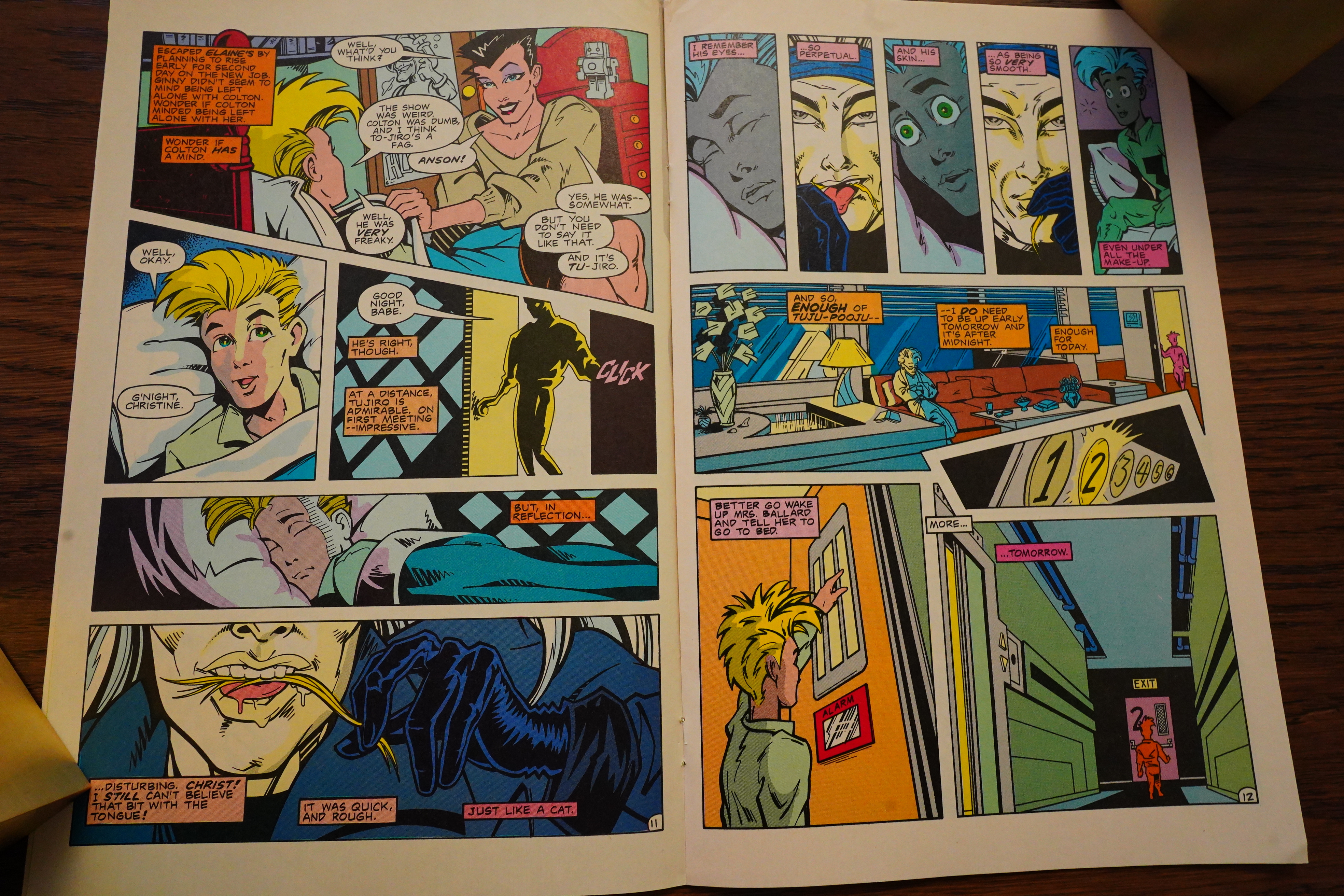
Many comics from around this period had a certain density — Starstruck, of course (which I think is the first modern US comic book), and then American Flagg, and of course Dark Knight Returns and Watchmen — but they also played a lot around with a multitude of voices and a narrative complexity. This basically has none of that: Reading this page, I was trying to determine if the captions with different colours were from different people (which was a thing at the time), but nope: What we’re reading is apparently Christine Spar’s diary. The colouring has no semantics.
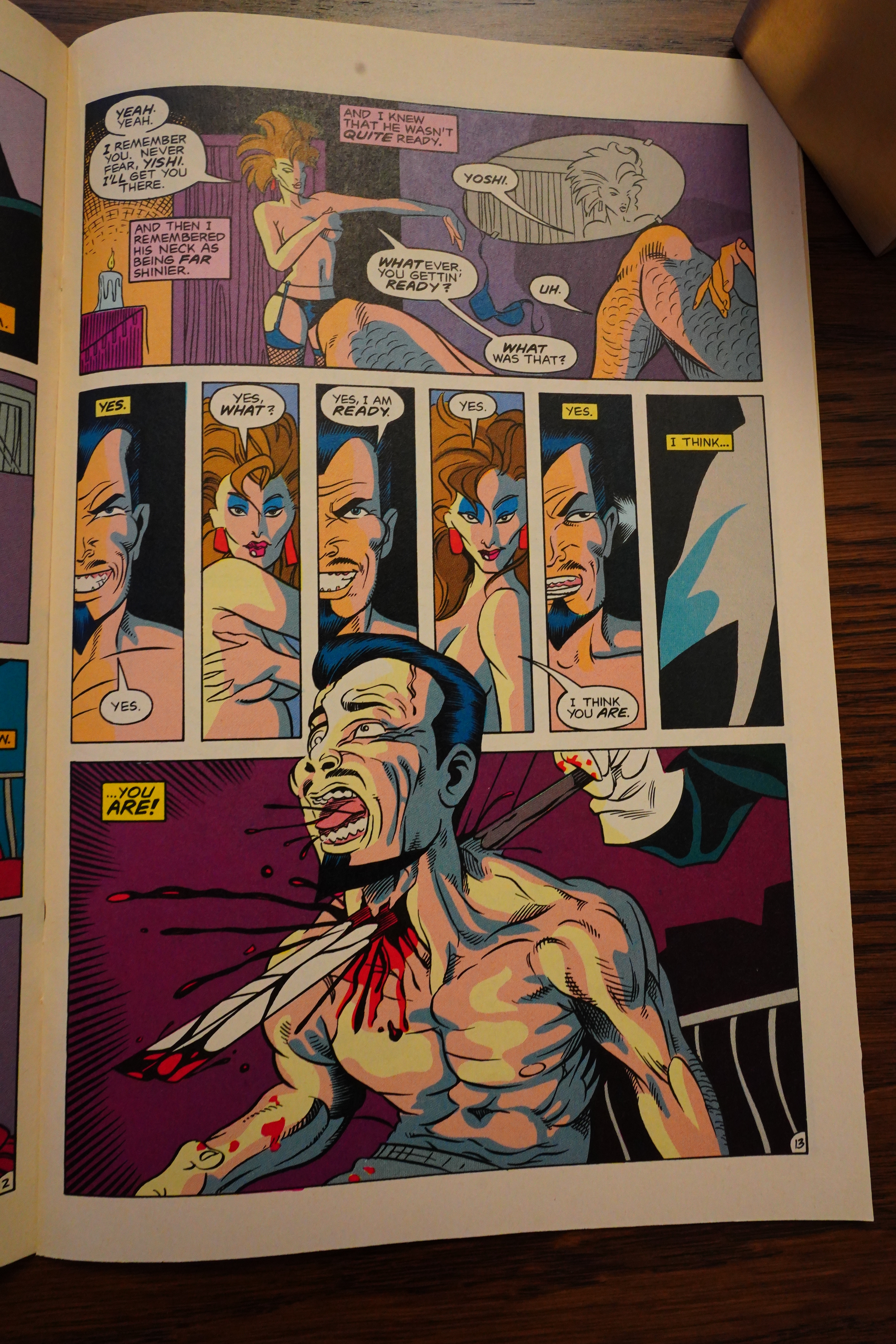
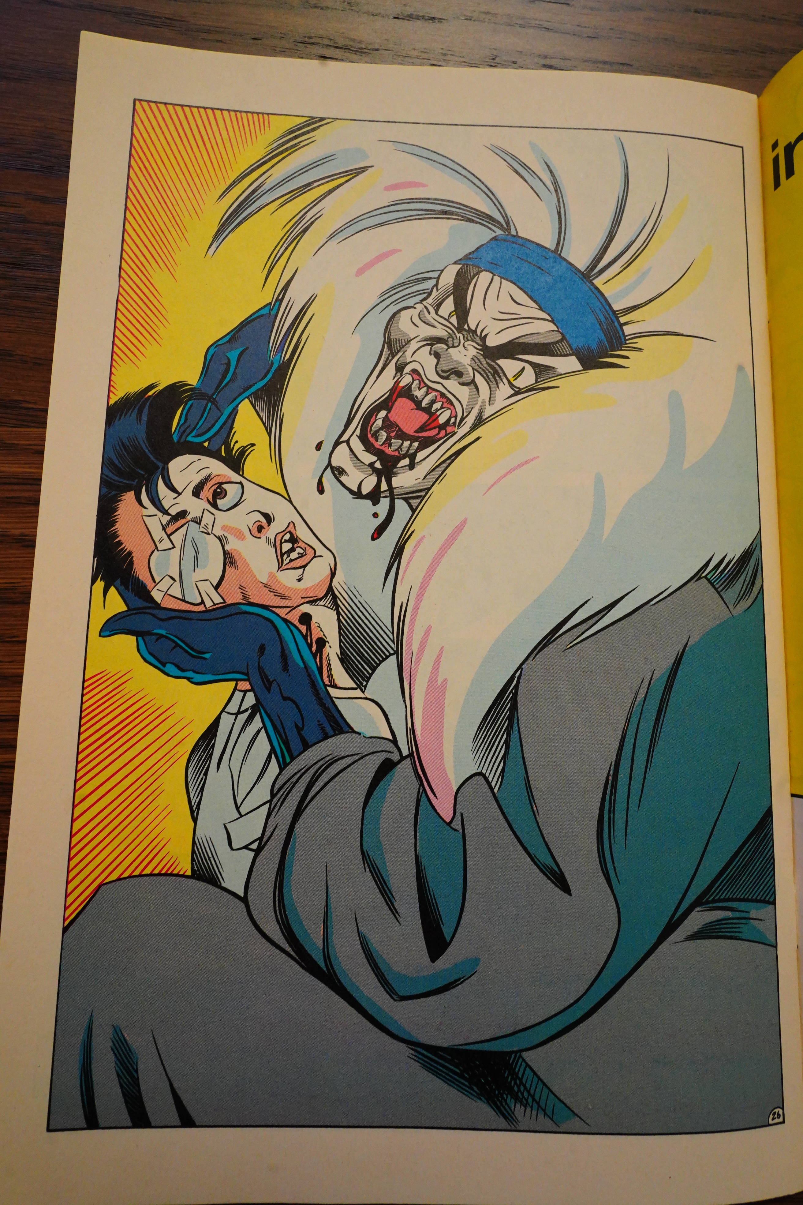
And a creepy kabuki guy who goes around licking people? MIGHT BE BE A BAD ONE?!
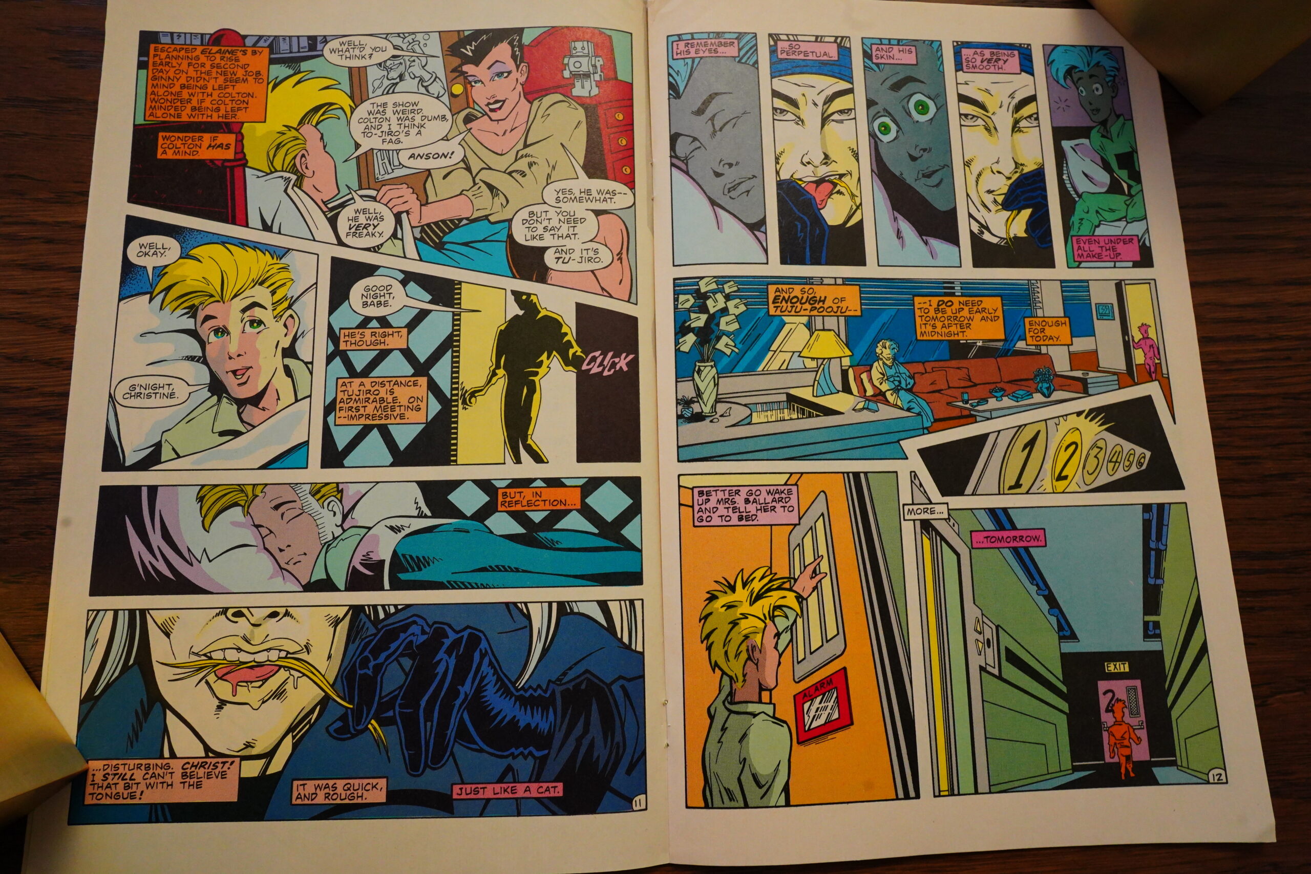
The other thing that sets this book apart from those comics I mentioned is that it’s pretty stupid and extremely obvious. As with the lack of narrative complexity, it’s obvious from page eleven that that creepy kabuki guy is a vampire. I mean, his name is “Tujiro XIV”, so he’s obviously fourteen generations old but has changed his name etc etc etc.
The “modern” twist Wagner gives him is that he’s 1) Japanese, 2) gay, and 3) a paedophile. That’s pretty modern!

So in classic Death Wish fashion, the bad guy kidnaps (and possibly kills) the protagonist’s child, and then…

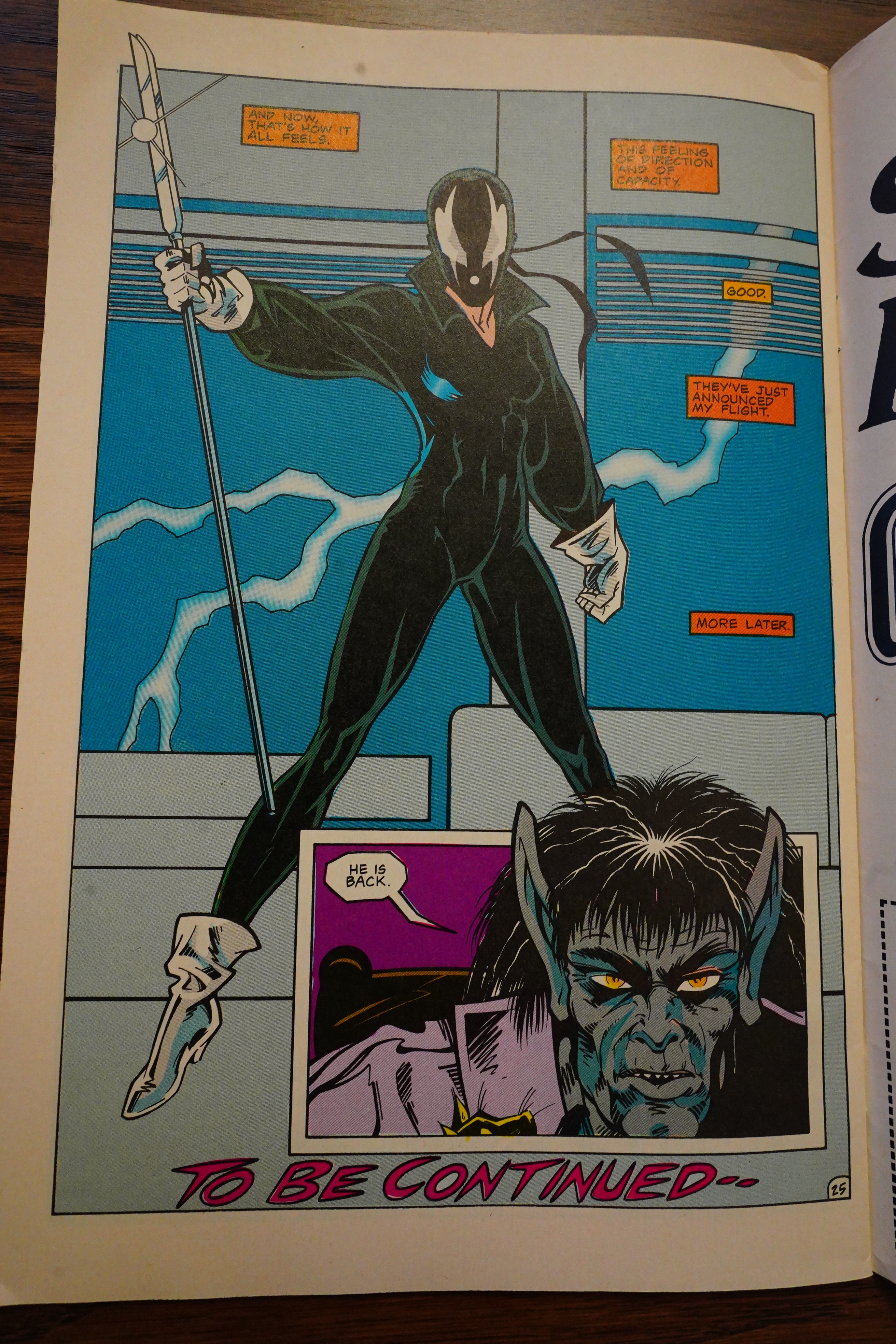
Tada! She becomes Grendel and goes after him! Whodathunk!

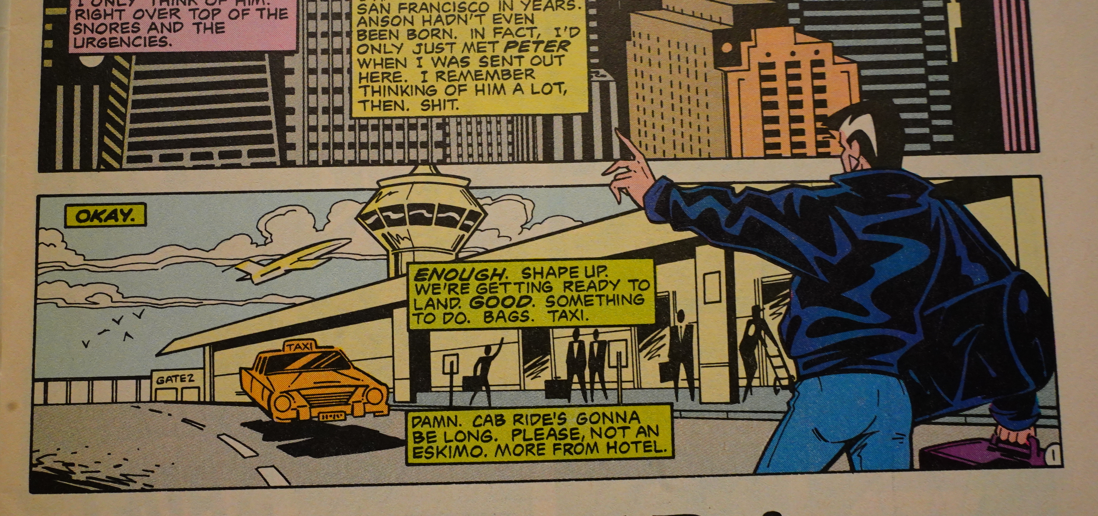
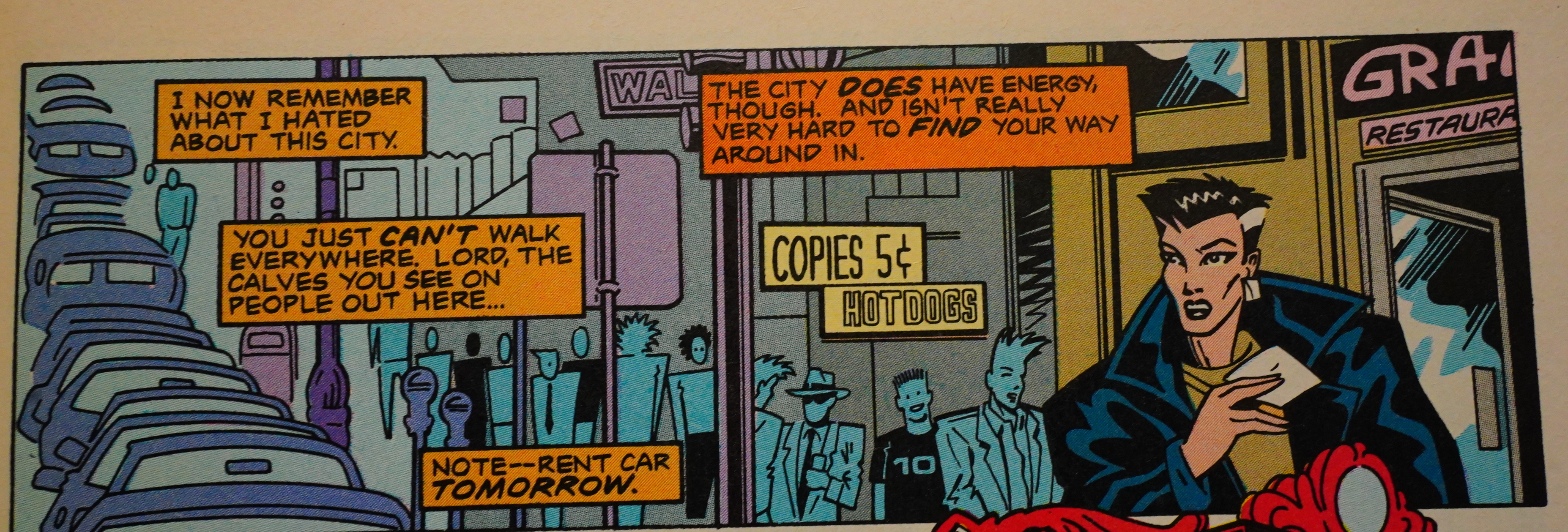
This takes place 50 years in the future, i.e., 2030-ish, but the world building feels razor thin. Everything looks and feels exactly like 1985, but there’s nods to the future: There’s flying cars now, and everybody’s racist towards “eskimos”, for some reason or other. Did the US invade Greenland or something!? That’d be prescient!

On a word by word basis, the writing comes off pretty oddly. It’s meant to be the diary of a writer working for a prestigious newspaper, so you can excuse the writerliness of it all. But Wagner doesn’t quite have the chops to pull off something like that, so you get the stilted comic-book-ness of things like “and isn’t really very hard to find your way around in”. Why is “find” emphasised? And newspaper writers don’t emphasise words at all that way.
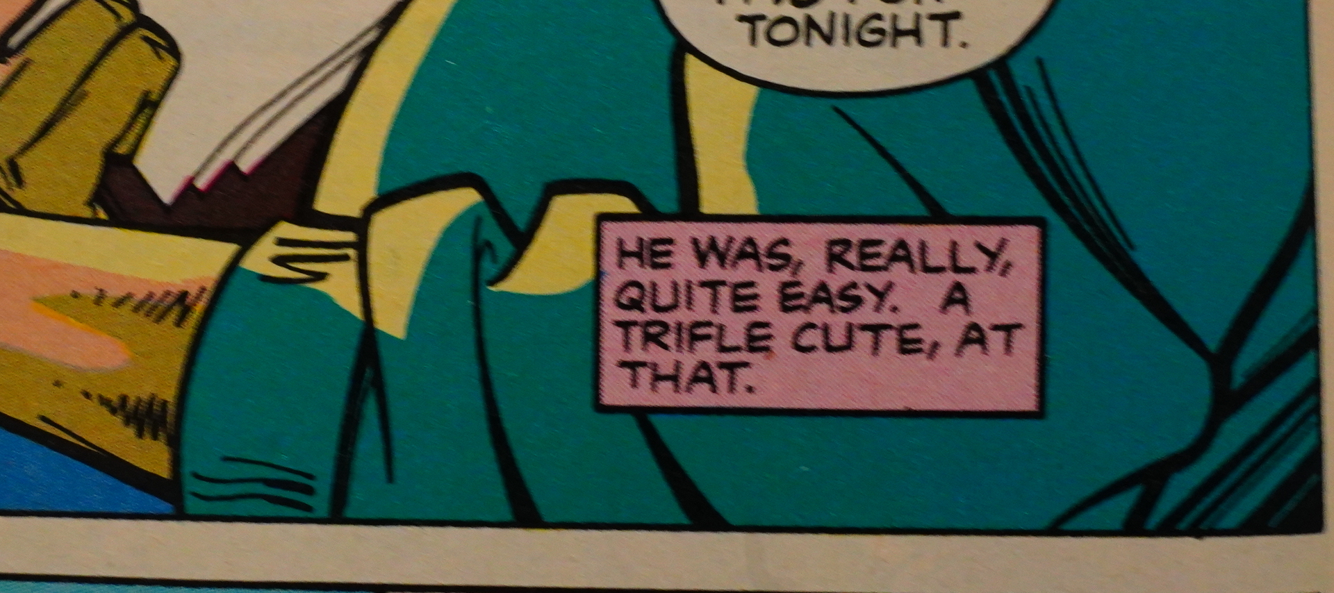
“A trifle cute”?
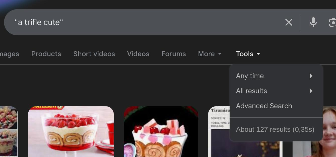
Well, those three words have been placed after one another by other people, but not often, but not in that meaning:
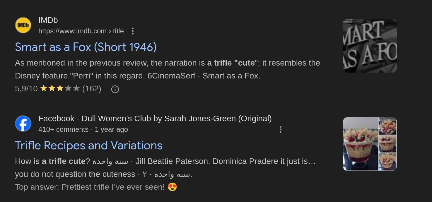
And so on.
The artwork isn’t quite in control, either — at random, the Pander Bros will drop out of Nagel mode and into Looney Tunes mode.

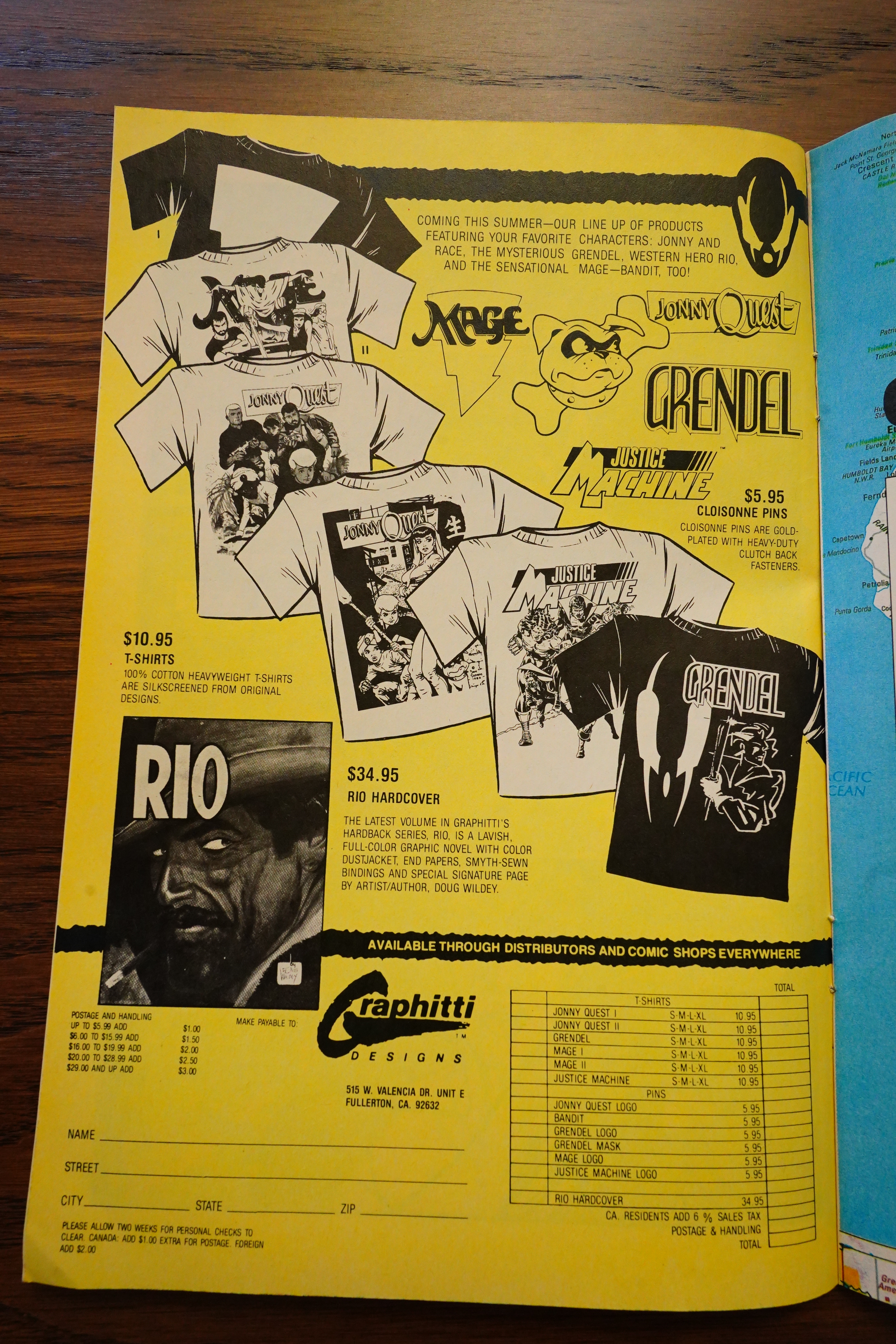
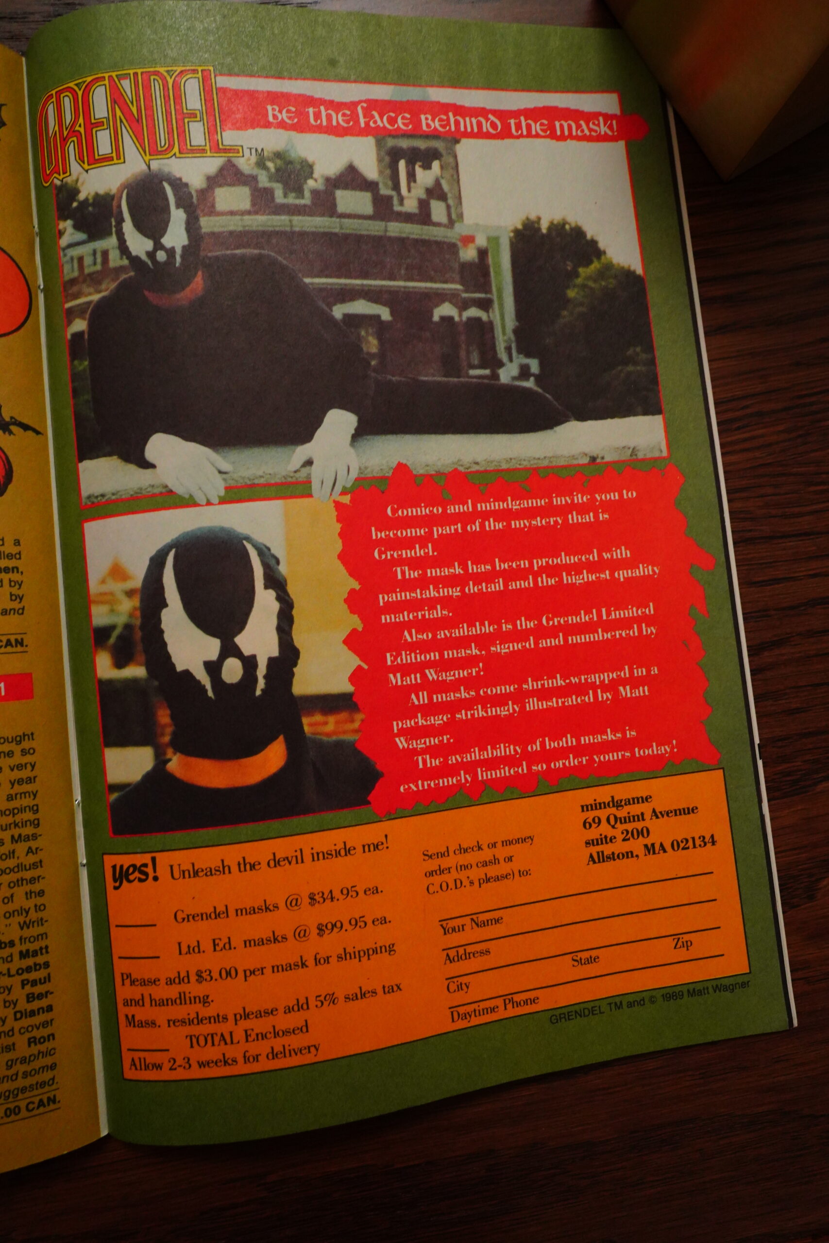
I don’t think I’ve mentioned in any of the previous blog posts how badly designed the in-house ads are? They seem mostly to be designed to be easy to do colour separations for (because that costs money).

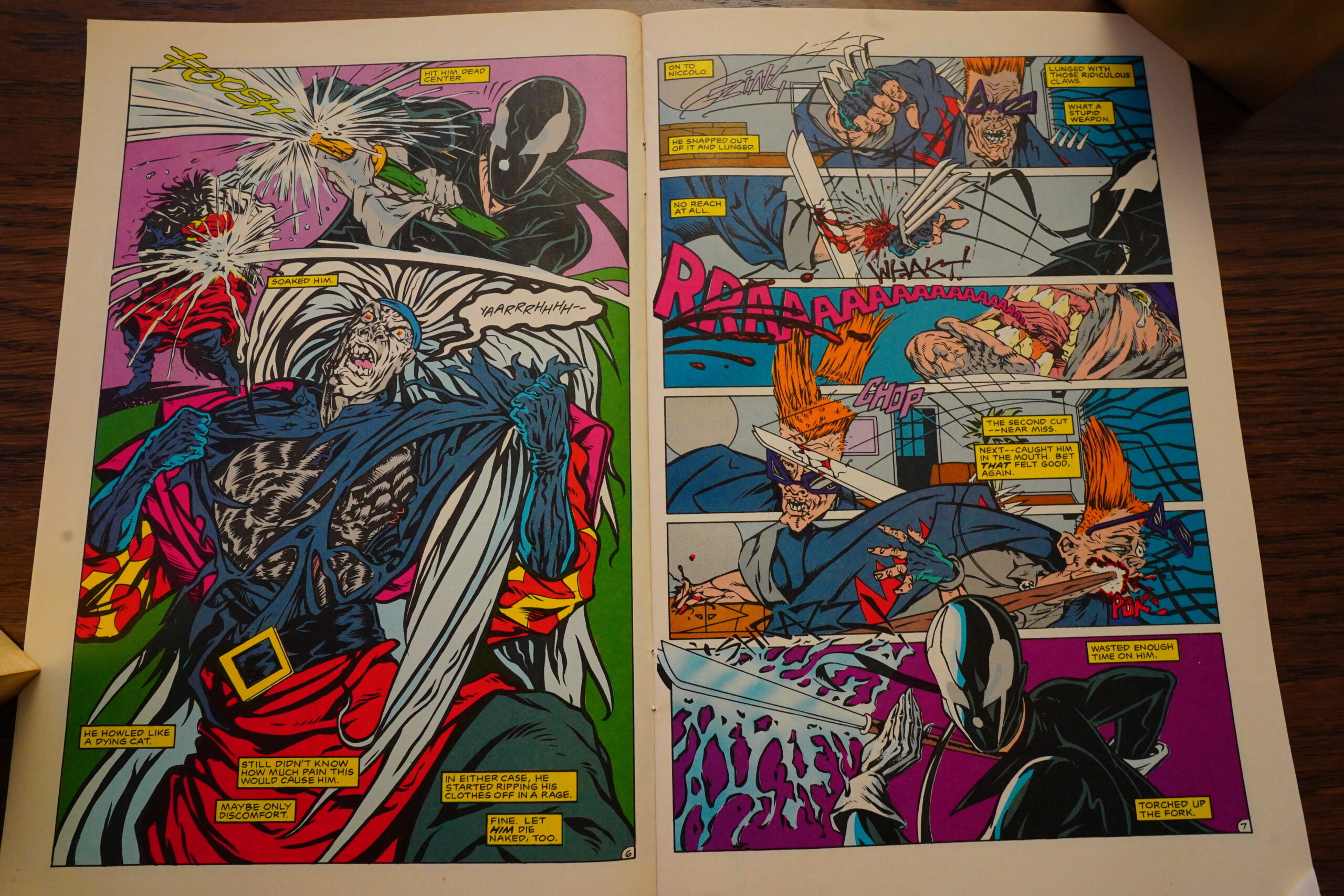
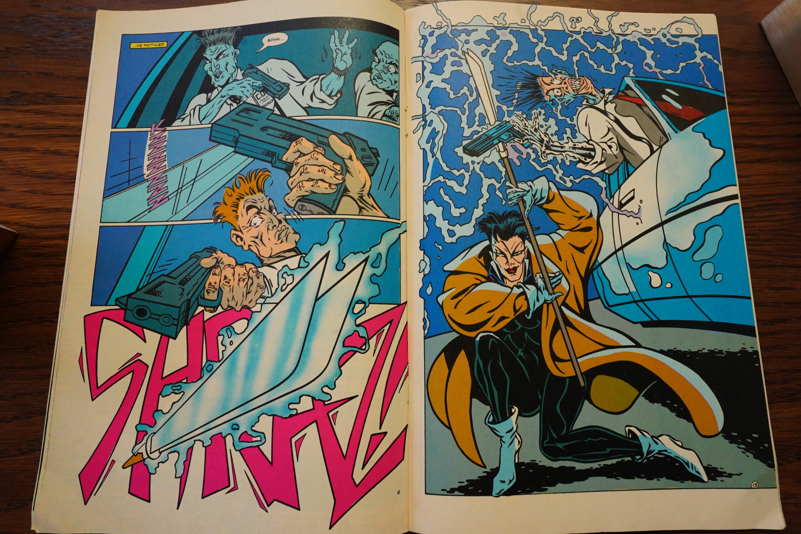
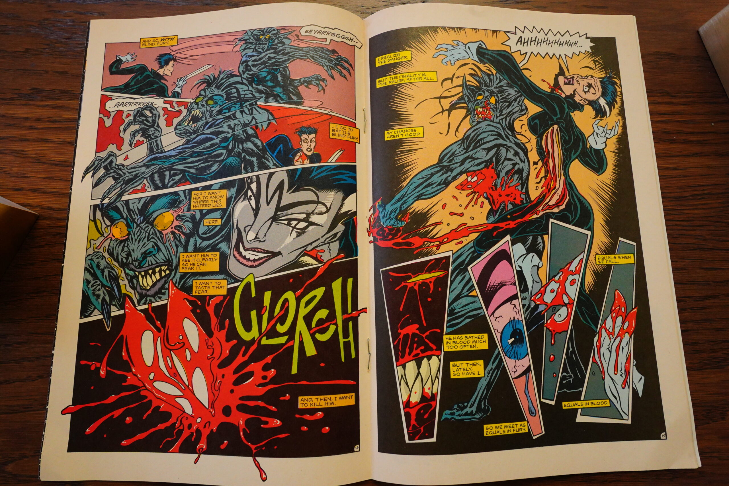
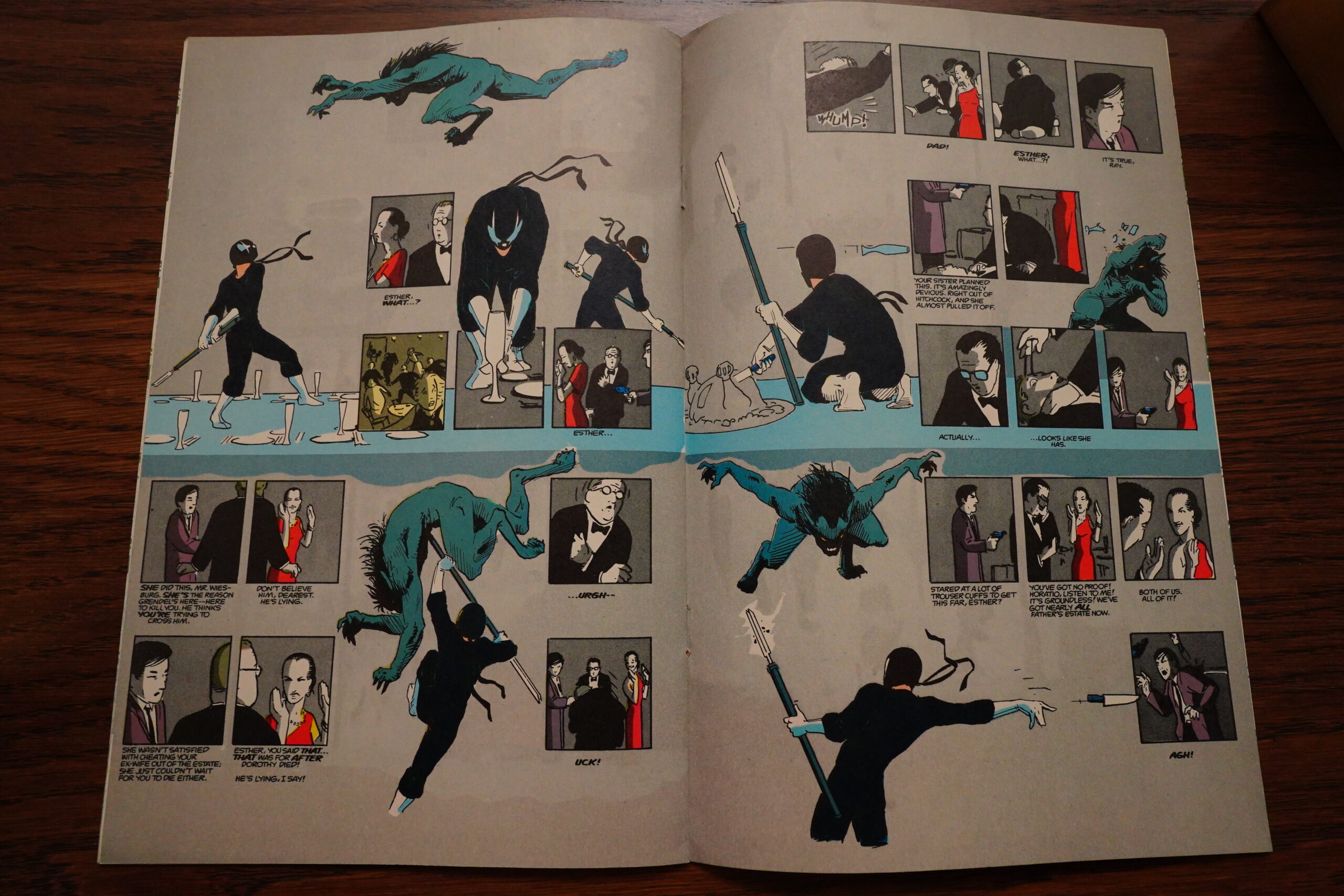
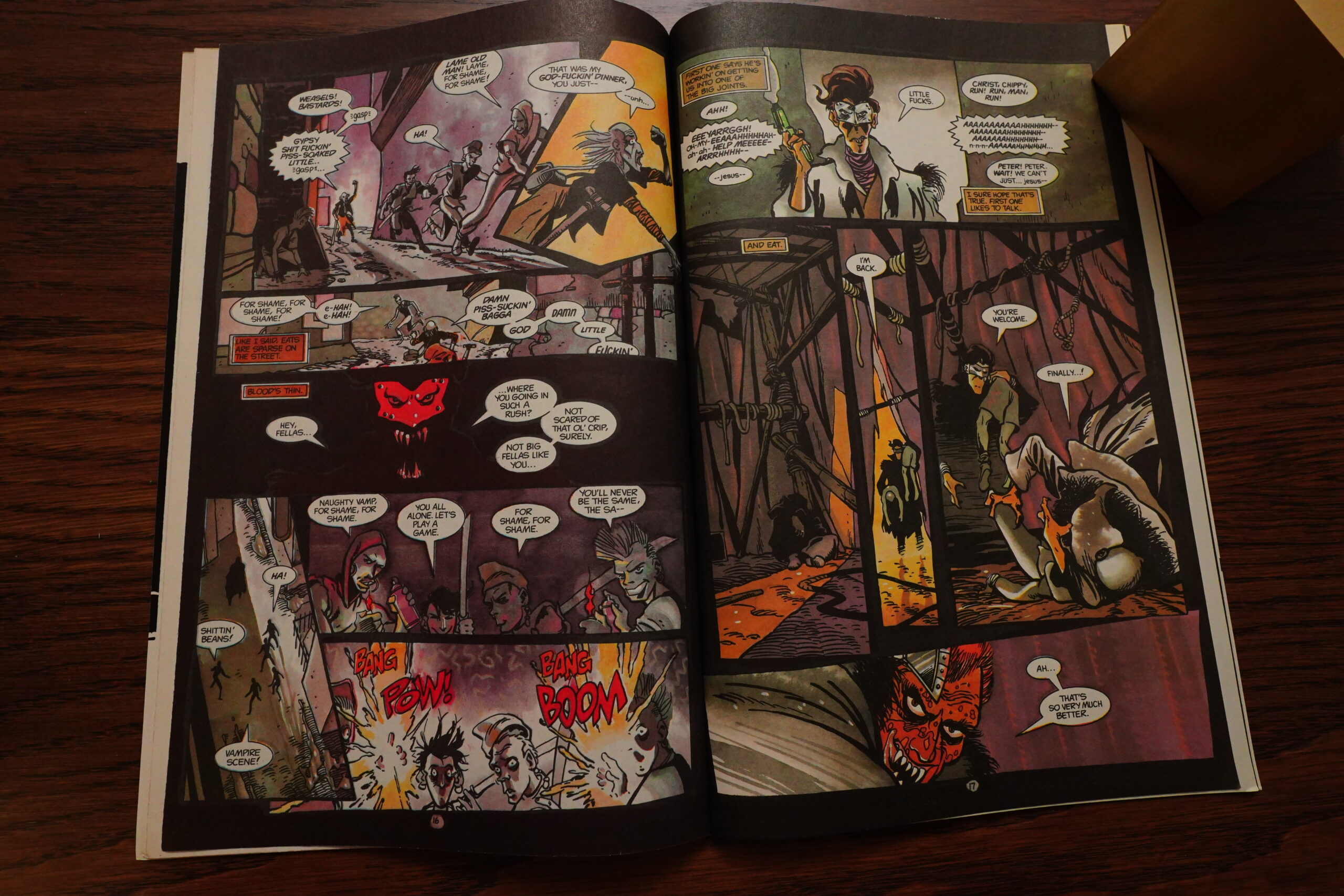
Hyper violence!!!
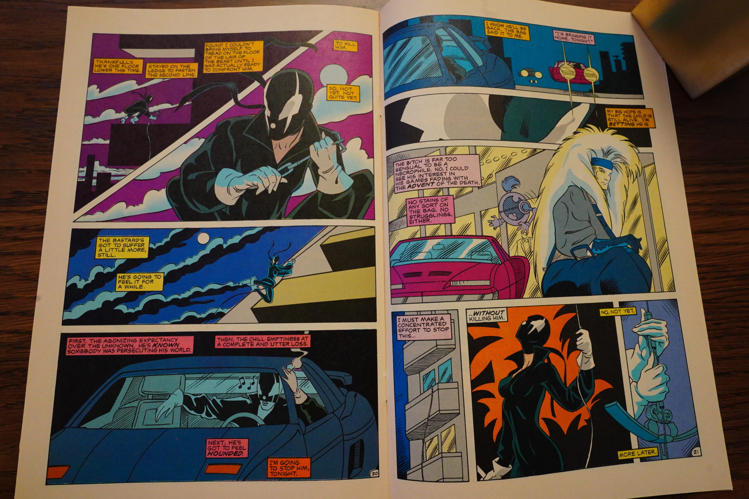
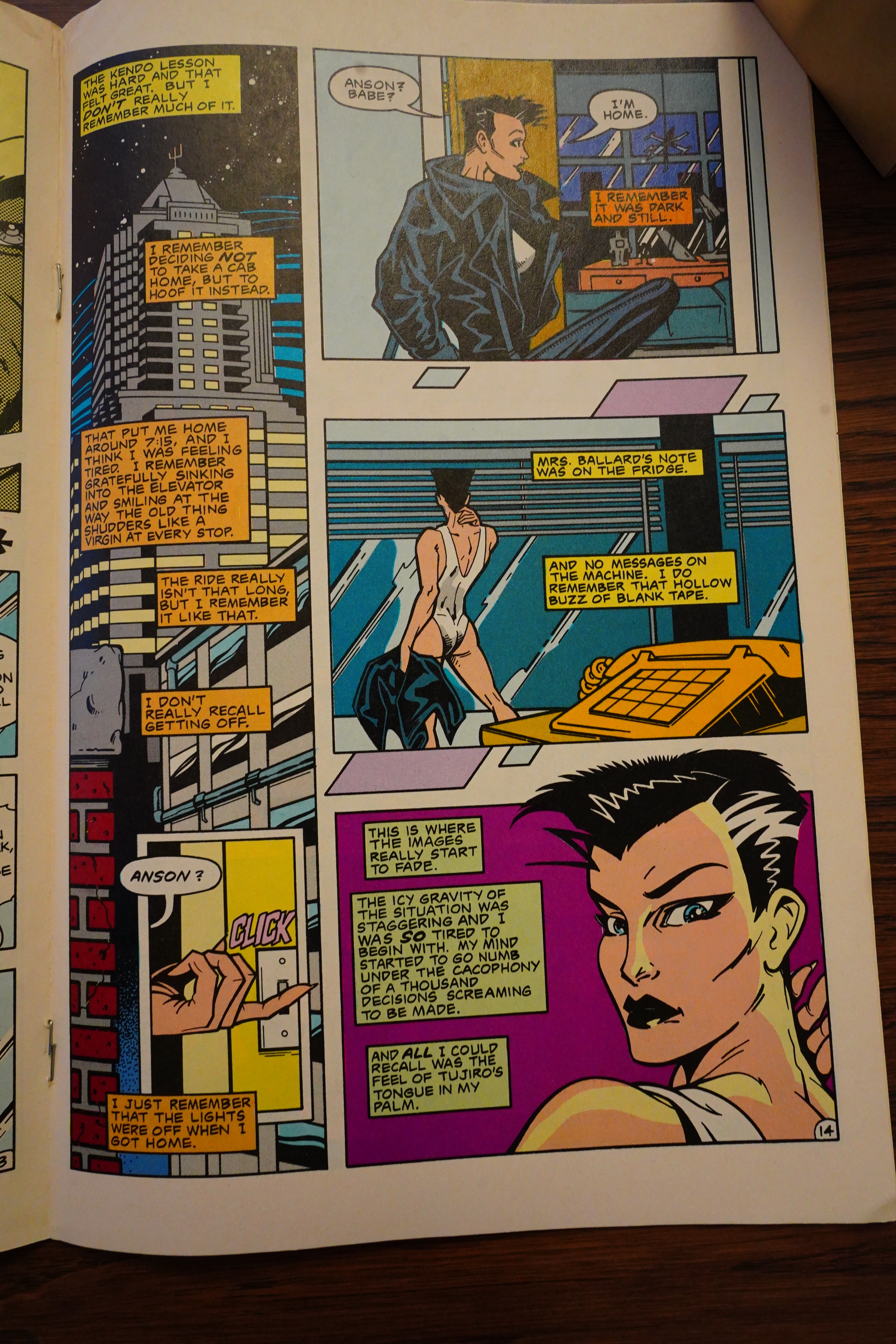
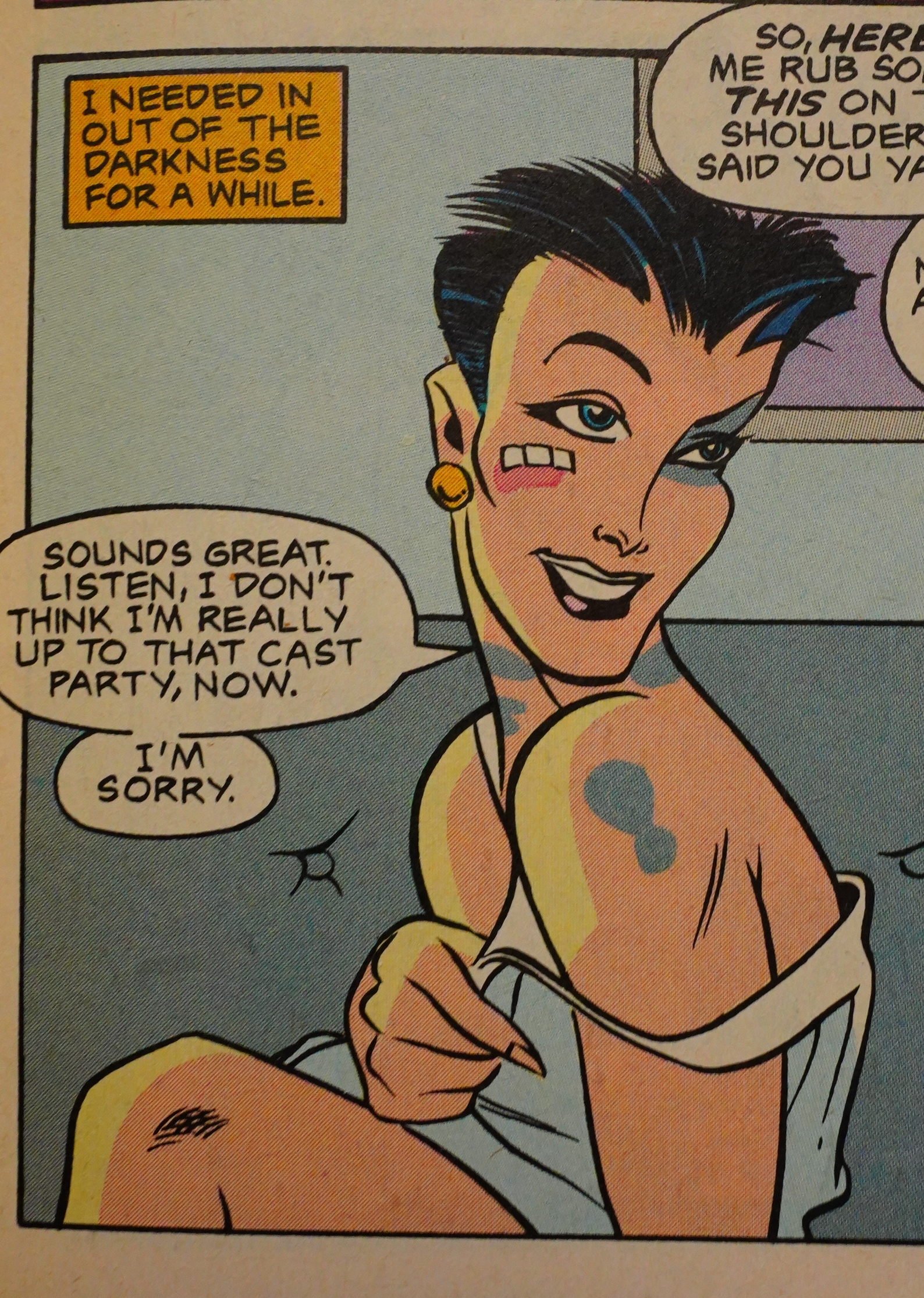
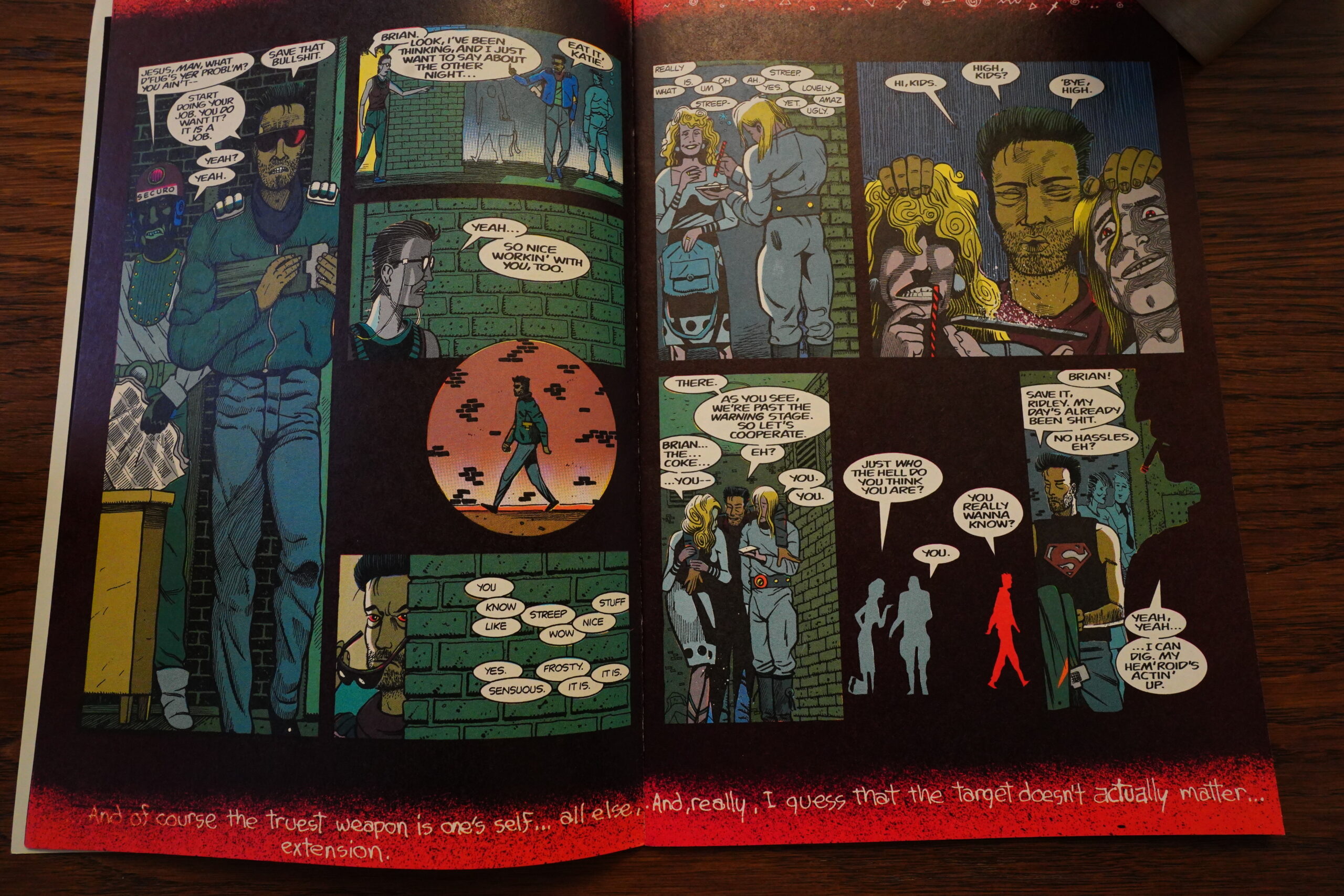
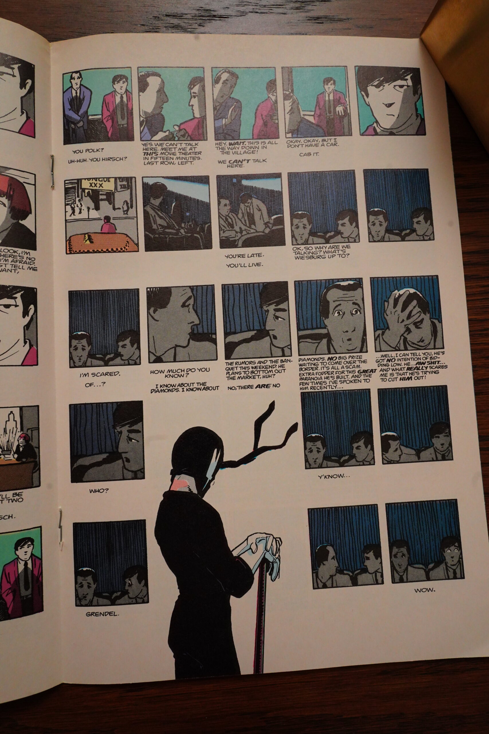
This book is very propulsive — reading it, each page leads you to the next one, pulling you in and driving you on. The storytelling chops are wonderful. But the plot itself suffers from an odd lack of urgency. I mean, her little son has been kidnapped, and she doesn’t know whether he’s dead or alive, perhaps being tortured and stuff. But instead of going in with guns blazing, she skulks around, trying to catch the kabuki vampire red handed, for some reason. She even knows that he’s out on the town kidnapping a new boy, but does she do anything? No, she waits around his hotel to see what he does with the new boy.
It’s not like she’s the cops and has to collect evidence — at this point she doesn’t know that he’s a vampire, so… it’s just bad plotting.

Tada! Shocking reveal of what everybody guessed from the start!
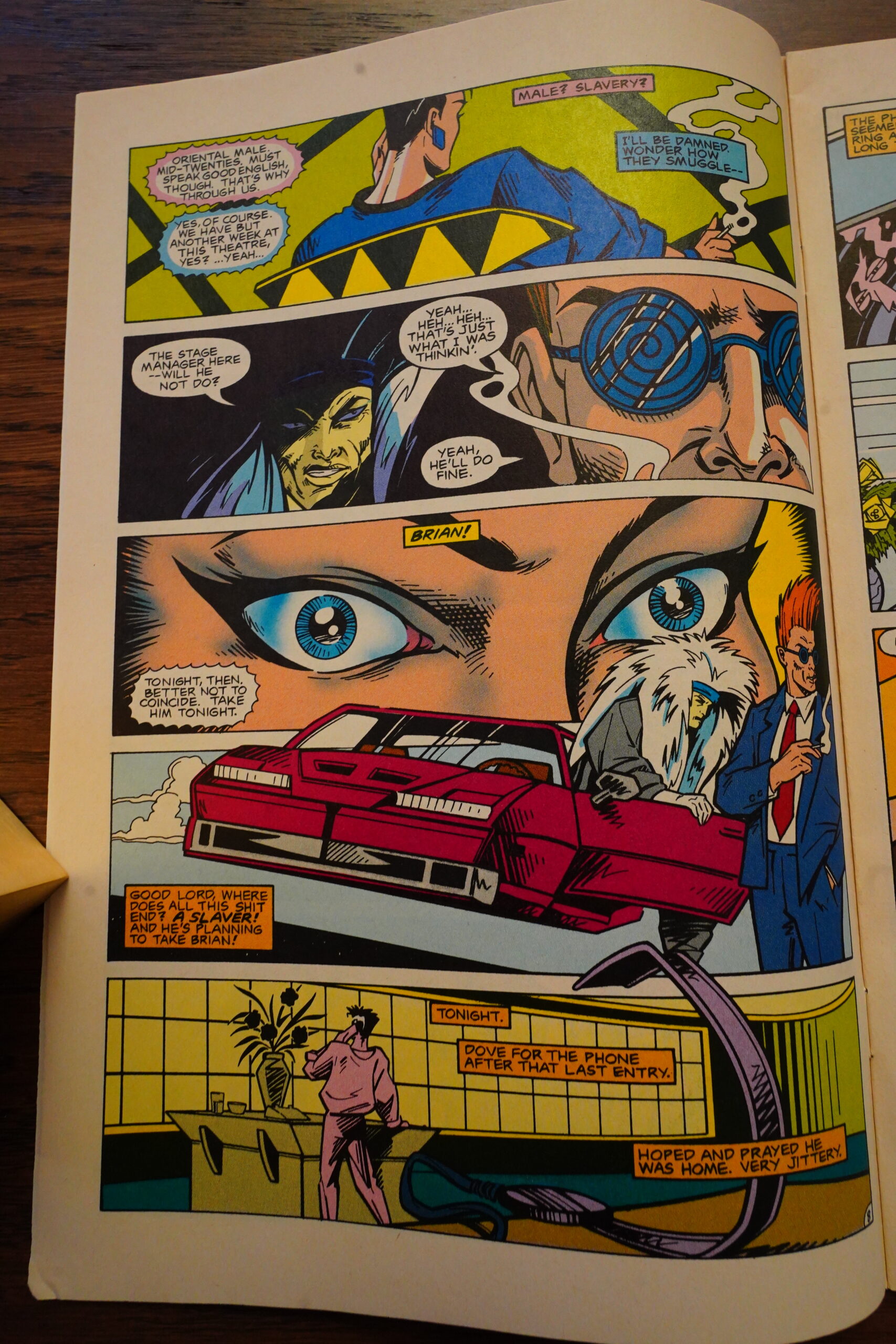
So… they’re in San Francisco (or “‘Frisco”, as everybody in the future calls it), and they want to kidnap a young, “oriental” man for unknown purposes. Yeah, that has to be difficult! How on Earth can they find one of those in “‘Frisco”?! I know! They can kidnap the stage manager in the theatre the kabuki vampire gives performances! That’s literally the only person of that description that exists in “‘Frisco”!

When reading sequences like this, it’s hard to tell whether they’re supposed to depict Spar’s descent into Grendel madness, or whether it’s just insanely bad writing.

Heh! Super-Nagel!
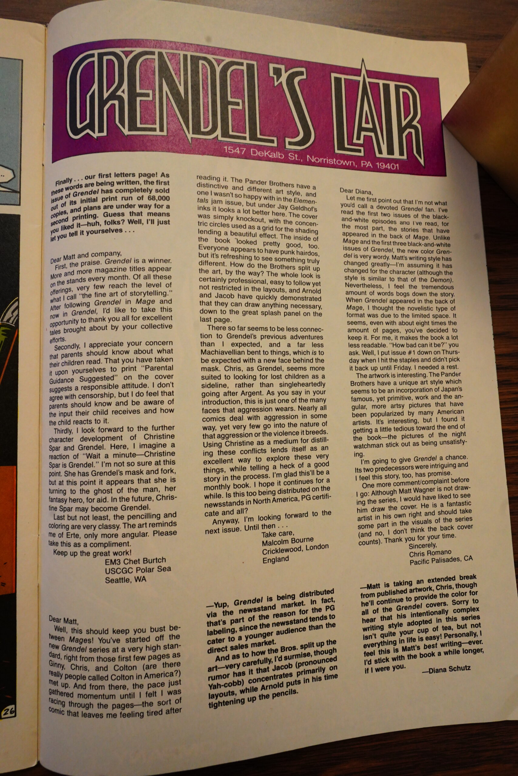
Wow, the first issue’s 68K run sold out, and they’re going back for a second print?
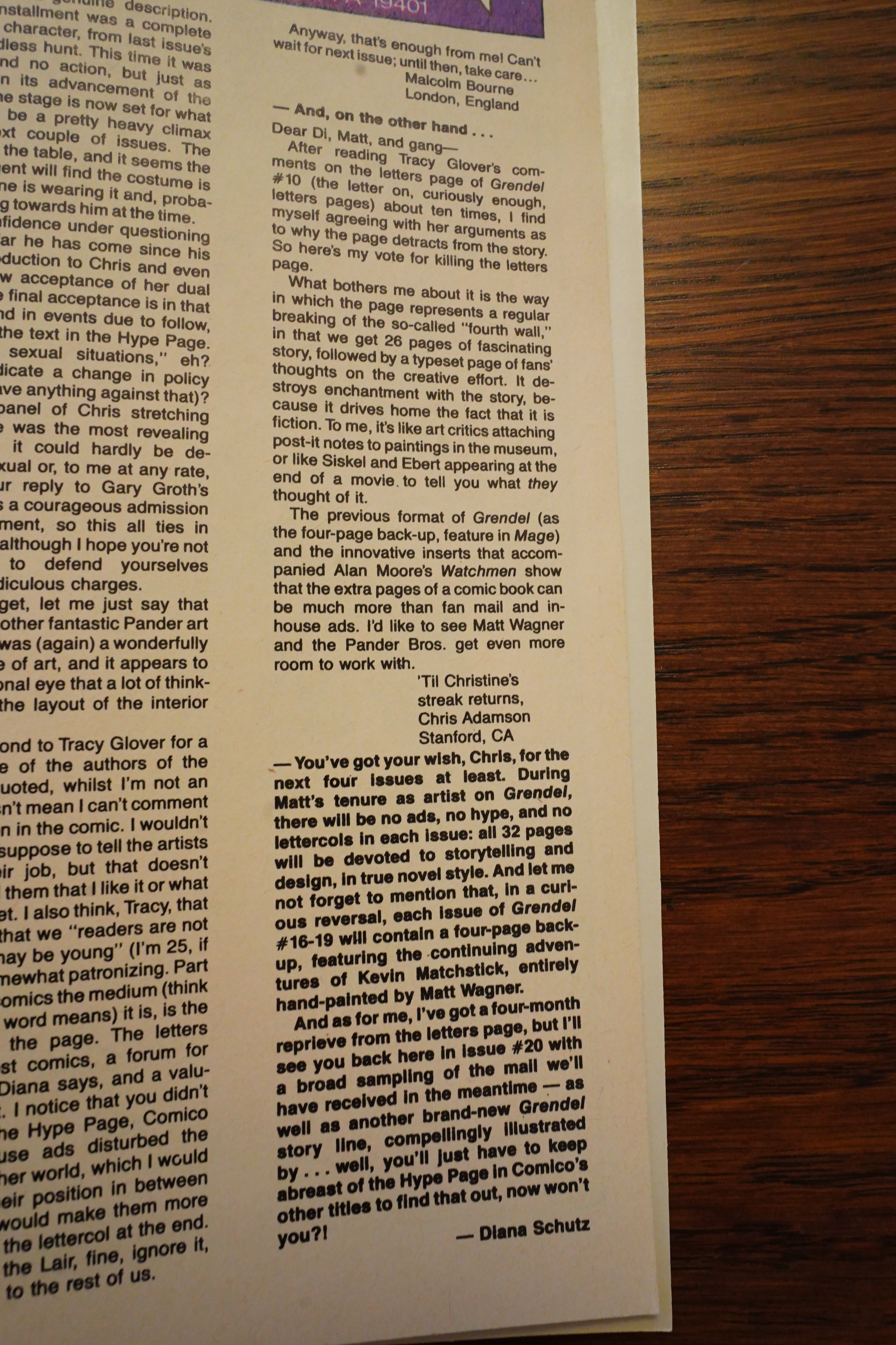
A reader writes in to complain about there being too many words, and that it makes his brain hurt, or something. Diana Schutz says that it’s “his intentionally complex writing style”, so there. (There is absolutely nothing at all complex about the writing — it’s 100% straightforward. But there’s a lot of it, that’s true.)
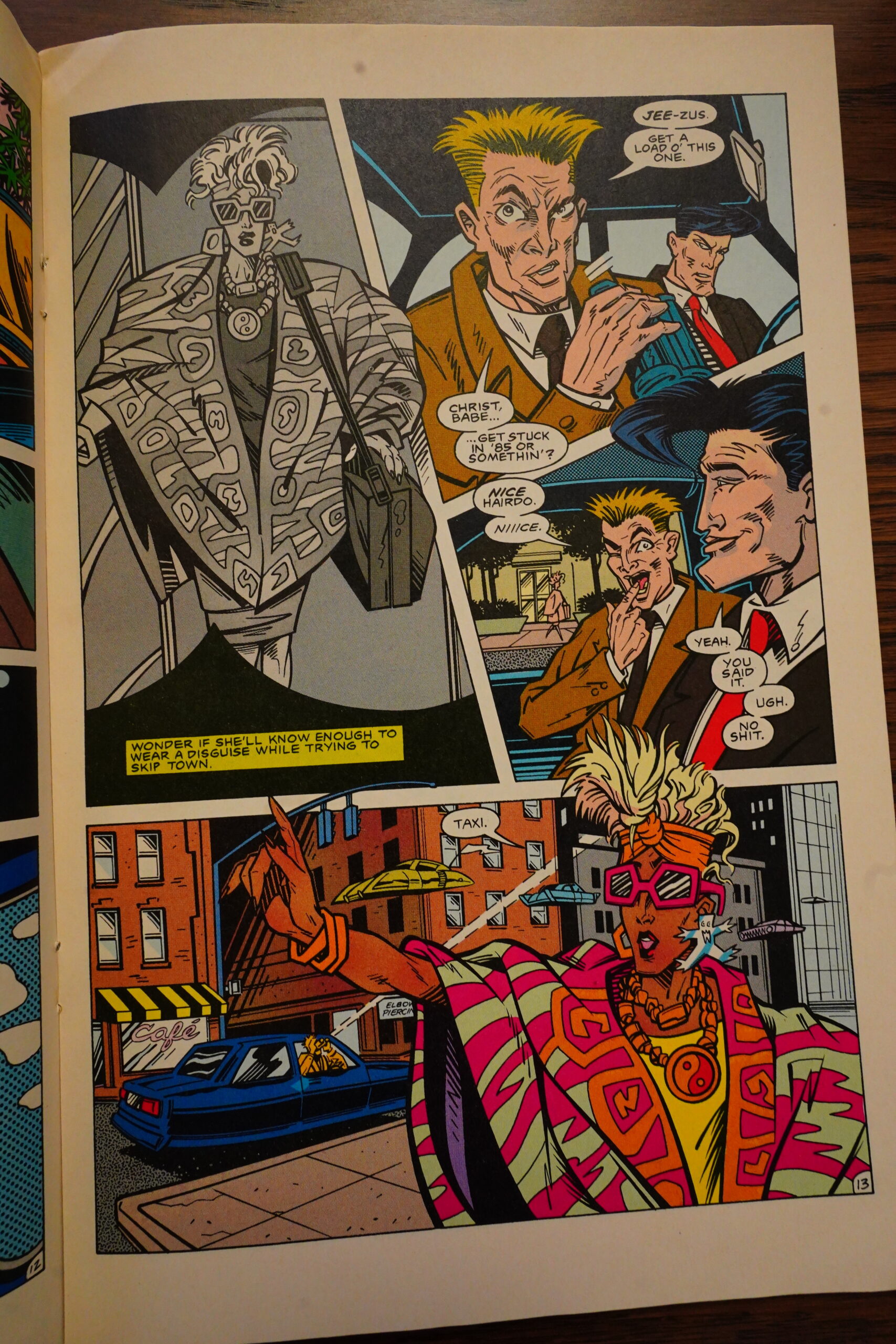
These cops are literally gagging over that hairdo.
If I come off a bit negative in some of these comments, I don’t really mean to — this is a solid comic book. It’s really intense — you don’t want to put it down. I’m really just kinda nitpicking some stuff that doesn’t really make much difference. Sure, the plot is stupid and extremely derivative — but the storytelling is so compelling that you don’t really notice.
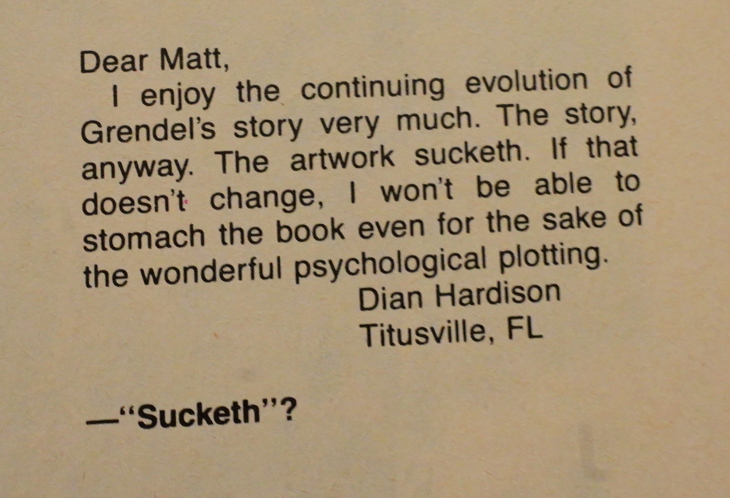
Sucketh?
I can’t quite put my finger on it, but sometimes the Pander Bros artwork reminds me so of something else… what is it? It sometimes has the dynamics of a Gary Panter panel… or a Richard Sala action scene… There’s something so dynamic about it, something a bit punk. Without them, this wouldn’t have been much of anything.
The Pander Bros’ pencils depend heavily on getting a sensitive inker. Jay Geldhof’s got the chops, but when you get a guest inker, like in this issue, the art starts looking rather wonky.
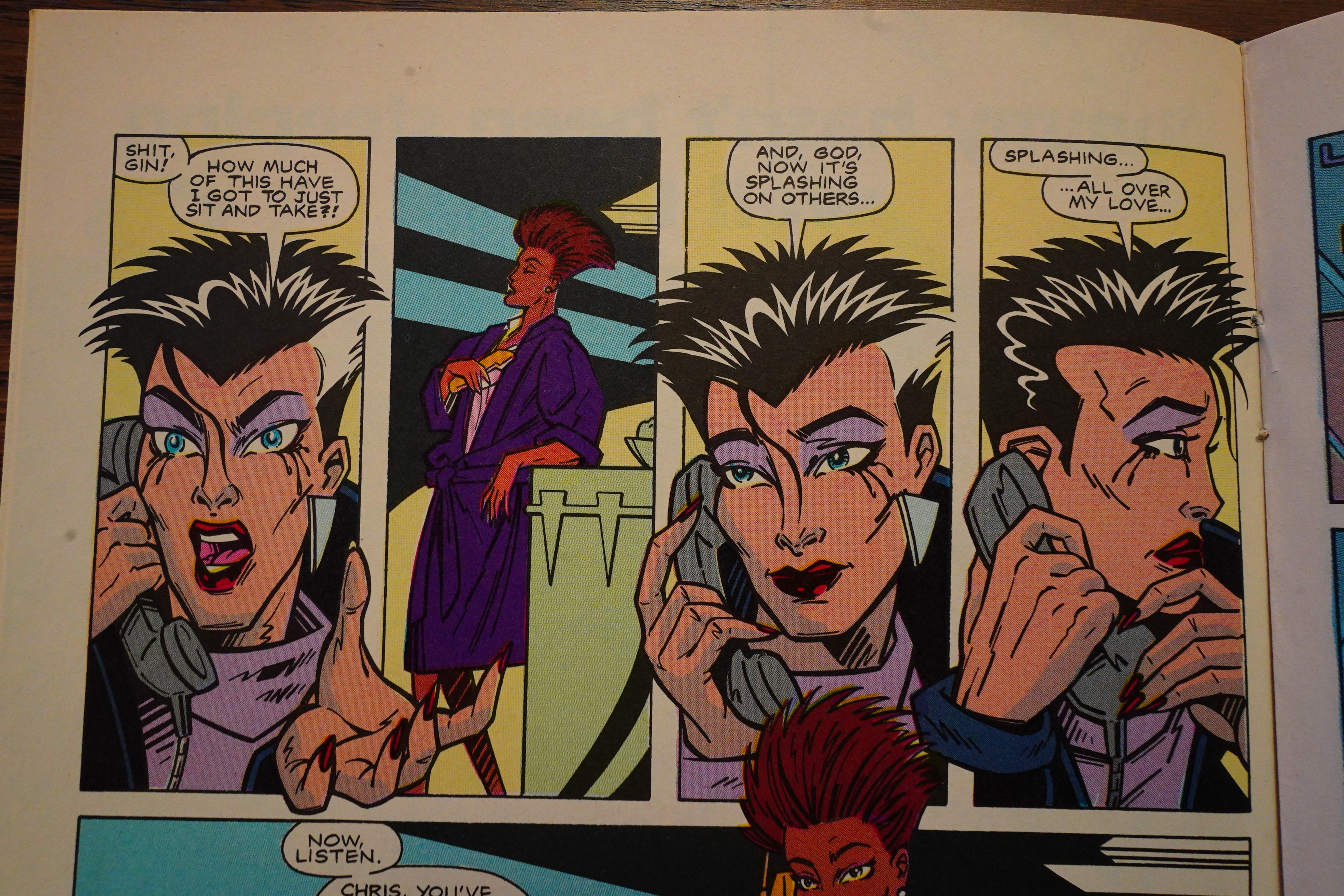
It’s a wordless issue about Christine Spar harassing this cop for most of the issue, and then killing him, so that’s all fun and stuff — but does it make sense? She’s mad at the cop for beating up her boyfriend, so I guess so, but… that’s a lot of energy being spent on something this trivial. I mean, she’s just shut down a human trafficking ring, and put less effort into it.

A reader writes in to say that he thinks Grendel veers toward being Orientalism. “Maybe you’re a little touchy on the subject?”

Hey, that’s a pretty good ad…

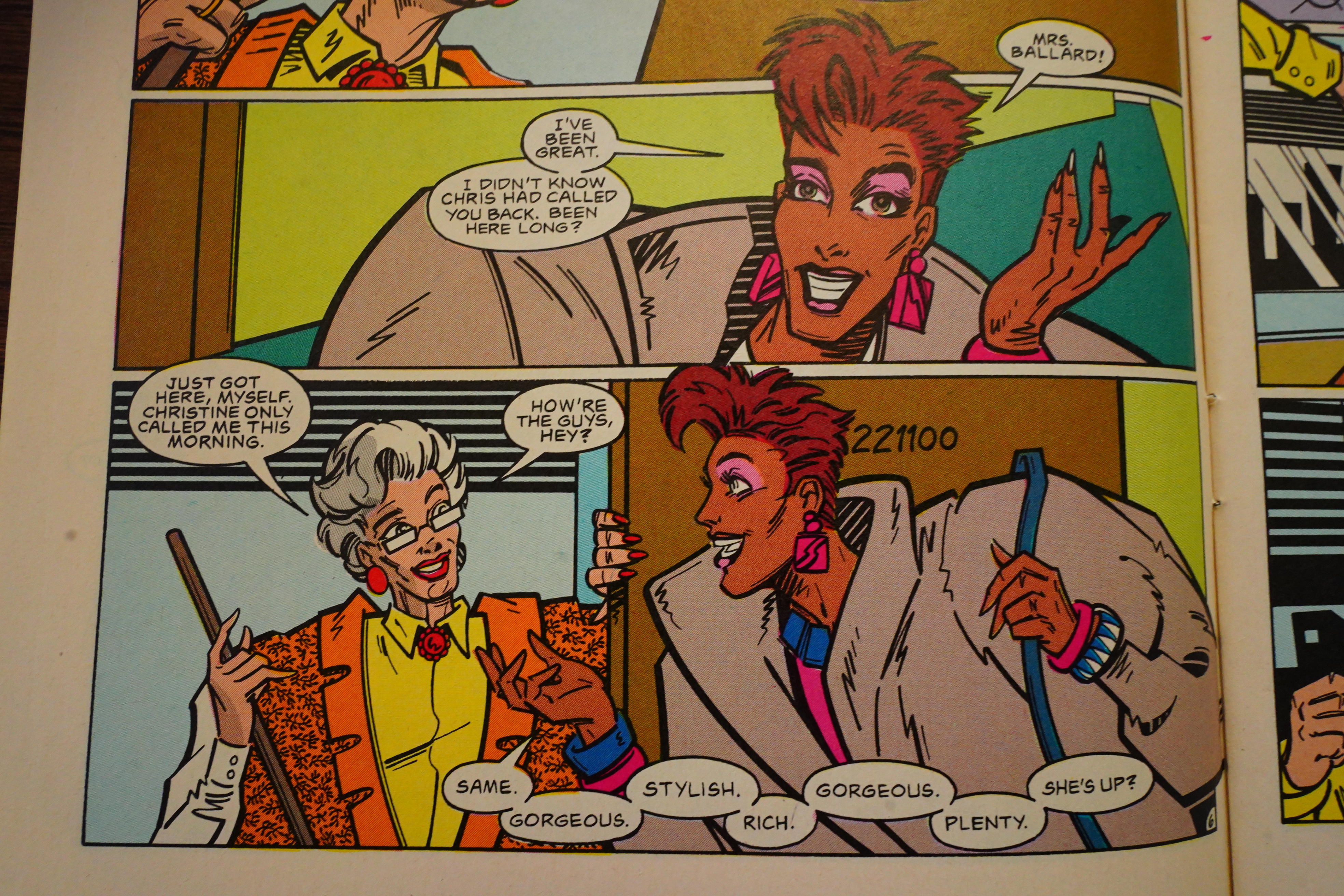
There’s that Greek woman Wagner was talking about.
You can totally see the Pander Bros going “can we make these shoulders bigger… can we? we can?”, which is fun. So 1986. But they sometimes land on designs that don’t really make sense if you think about it — for instance, what is that older woman’s physique, anyway? If you follow the line from her right arm up to her shoulder, the only way that works is if her shoulders really are 2x the size of her head, instead of just having a stylishly padded, er, vest.
Never mind, though — I don’t think you’re supposed to ask questions like that. It looks cool, anyway.
We’re in 1987 now, and Comico is in their imperial phase — lots of successful series, and lots and lots of merch.

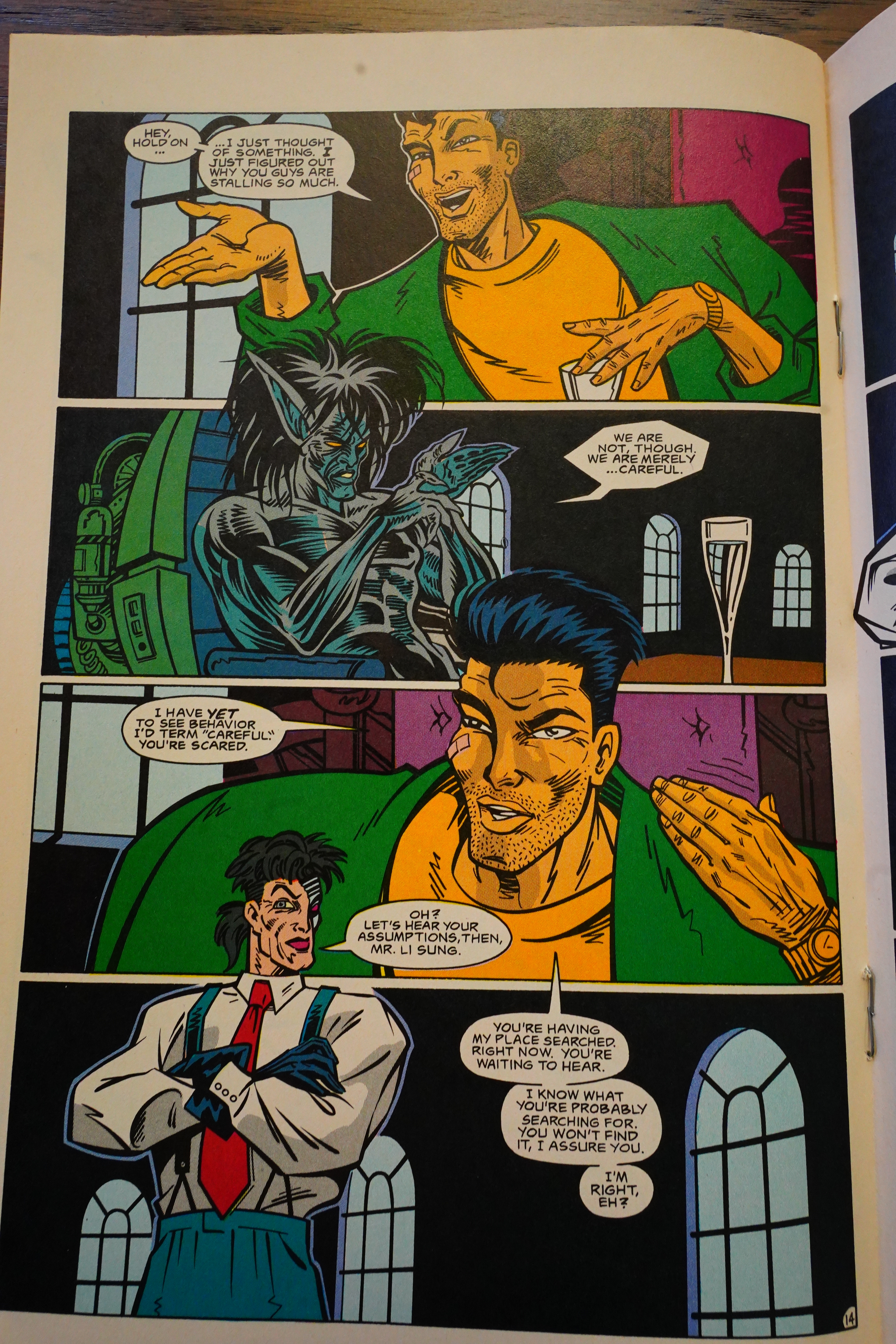
Speaking of the plot (which we weren’t), it doesn’t quite work. Throughout the series, we’re seen the Special Cops (the monster Argent and the guy with the eye) kidnapping people to interrogate them. Because they’re looking for Grendel. Sure, why not — the odd thing is that nobody goes “oh, by the way — there’s this vampire pedo guy who’s been running a slaver ring — can you cops take a look into that? It’d be nice if you stopped him; he’s still out there”.

Instead the interview (and a house search at her best friend’s apt) pisses Spar so much off…
… that she goes on a cop-killing rampage.
And then kills Argent. And is killed, too.
THE END
So… that’s a story that makes no sense: Christine Spar got into the Grendel business because a monster had kidnapped (or killed) her son. Did she determine whether her son was alive or not? Nope: The monster ran a slaving ring, so perhaps her son had been shipped off somewhere? Did she at least kill the monster? Nope: The monster ran away, and Spar said “ok, I guess that’s fine; let’s go back home”. Did Argent do anything except question people? Nope.
You can explain the sheer lack of any logical progression by “well, she’s being possessed by Grendel and what she does isn’t supposed to make sense”. But even insane people have some emotional logic to what they’re doing.
The series is a lot of fun to read, and perhaps the lack of coherence makes it more so? “Eject your brain; just have fun”. But there’s this unfortunate sense of the writer thinking that he’s being clever, too, so…
So if Christine Spar is dead, does that mean that the series is over? Nope — the series is structured as a number of shorter “novels”, with separate protagonists (and art teams).
This one was collected in Devil’s Legacy by Dark Horse. Before continuing to read the rest of Grendel, let’s have a look at some reviews for that one.
Yeah:
Although Matt Wagner’s vision and mystique of Grendel is a landmark in graphic storytelling, I felt that this collection of the first ongoing series falls short of the mark. The setting of a 2005 with flying cars and levitating phones seems laughable even by 1993 standards, as does the 1988 clothes and hair styles worn by people of the future. Christine Spar makes for a powerful and deeply conflicted character, and yet the longer she continues on her streak of vengeance, the less it makes sense and the more she is portrayed simply as an angry bitch.
True:
It’s hard for me to tell what is wrong with this book, but then I may not be the best person to judge: I don’t tend to like superhero books, and this is — in spite of its pretensions — a superhero book at heart. All the earmarks are there, right down to the hackneyed writing and utterly unbelievable characters.
I think that was just a bad inker, not “twisted”:
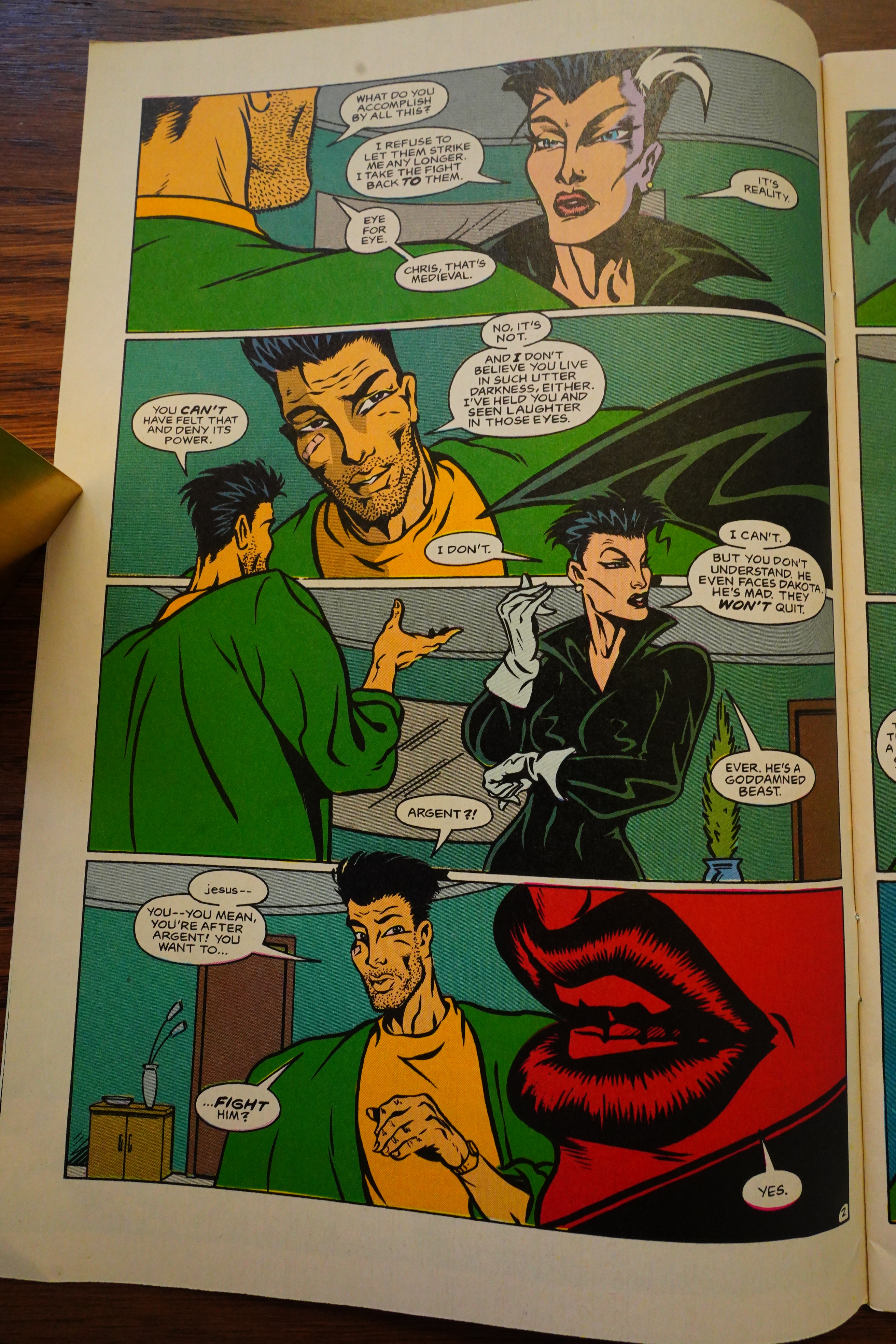
The art was so up to the minute in the 1980s, although the story is set decades ahead, so it now looks dated, but consider that period trappings and work past it. The serial killer section and what it evolves into is overextended in seven chapters, but the following five back in New York are taut cat and mouse with a well presented cast. Wagner’s characterisation is clever, showing them as they are rather than just as they see themselves. “I refuse to let them strike me any longer”, Christine explains toward the end, “I take the fight back to them”, and by that point we know there’s self-justification and possible delusion involved. The art becoming more twisted along with Christine is sophisticated storytelling, so don’t be fooled into considering it poor if just skimming through the book.
Sure:
They’ve got a good style as far as figures and bodies, but their faces, particularly the more intense expressions like pain and anger, are too cartoony and goofy for my tastes. Some of their action sequences leave something to desire, as we often see characters in more or less impossible contortions as they’re fighting one another (Yes! YES! The Panders ROCK! -feo). The laws of physics also don’t appear to apply, as often we see characters locked up, then suddenly apart from one another. This isn’t the superhero stuff where we’ve got teleporters and rubber men zipping around, guys.
OK, on to the next bits.

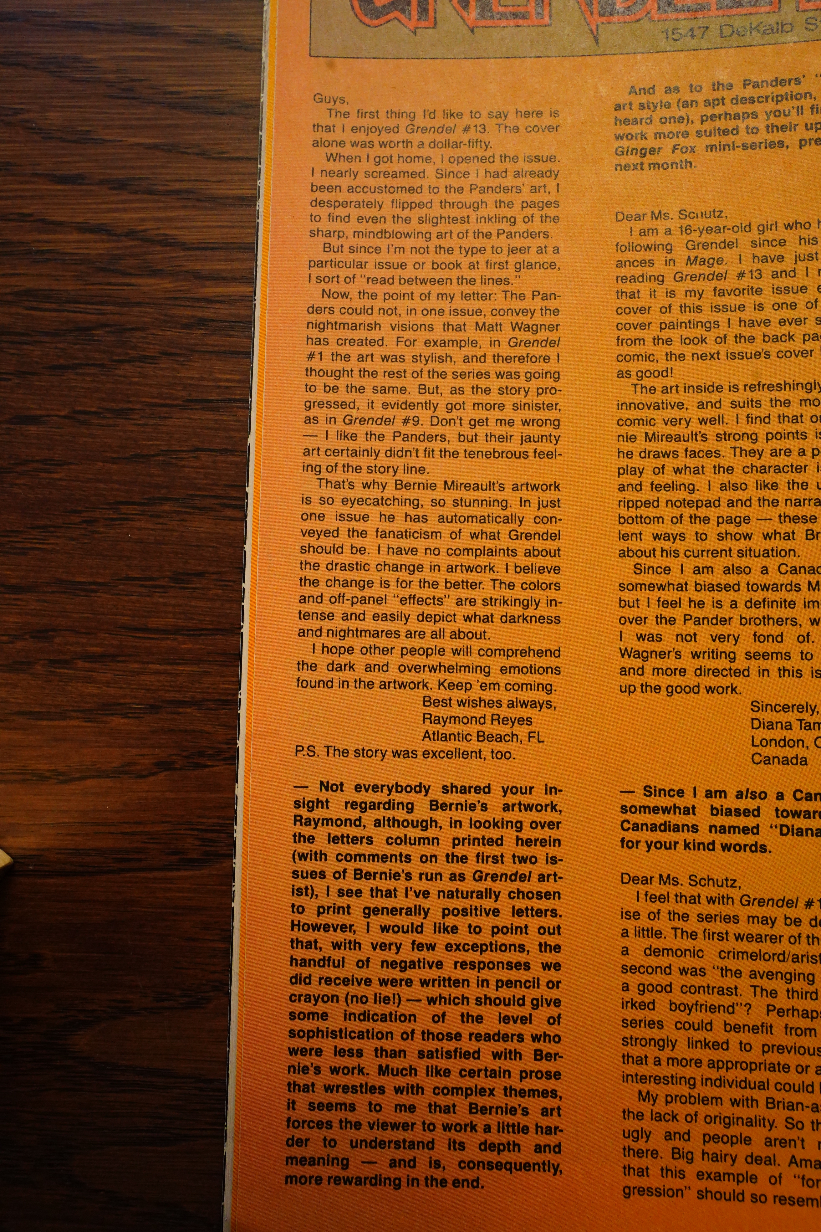
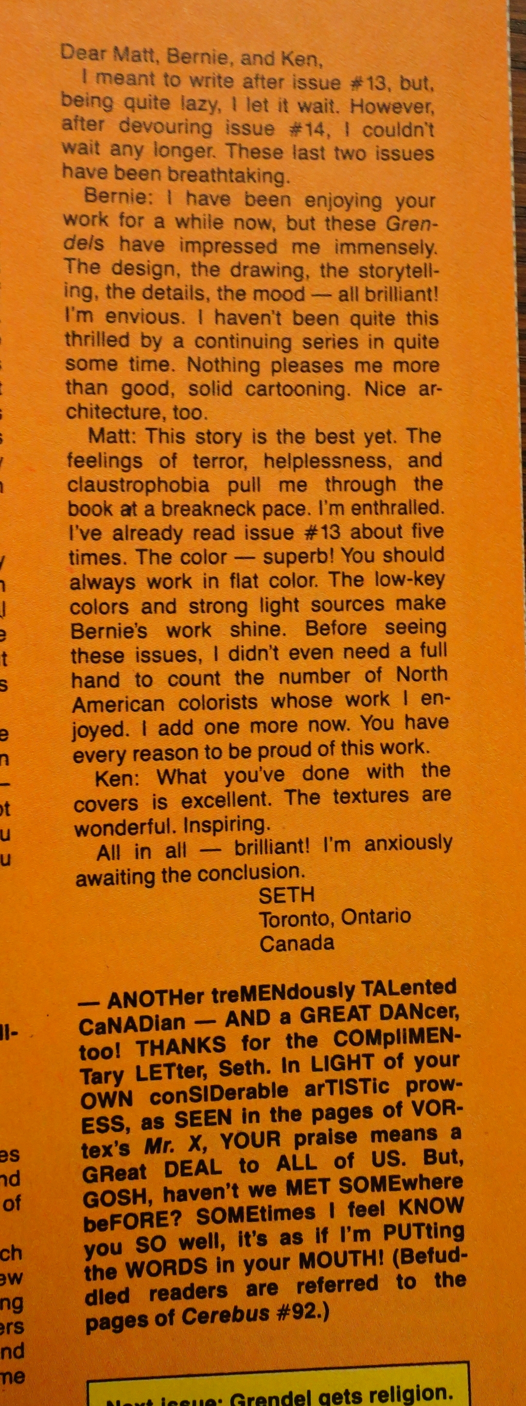
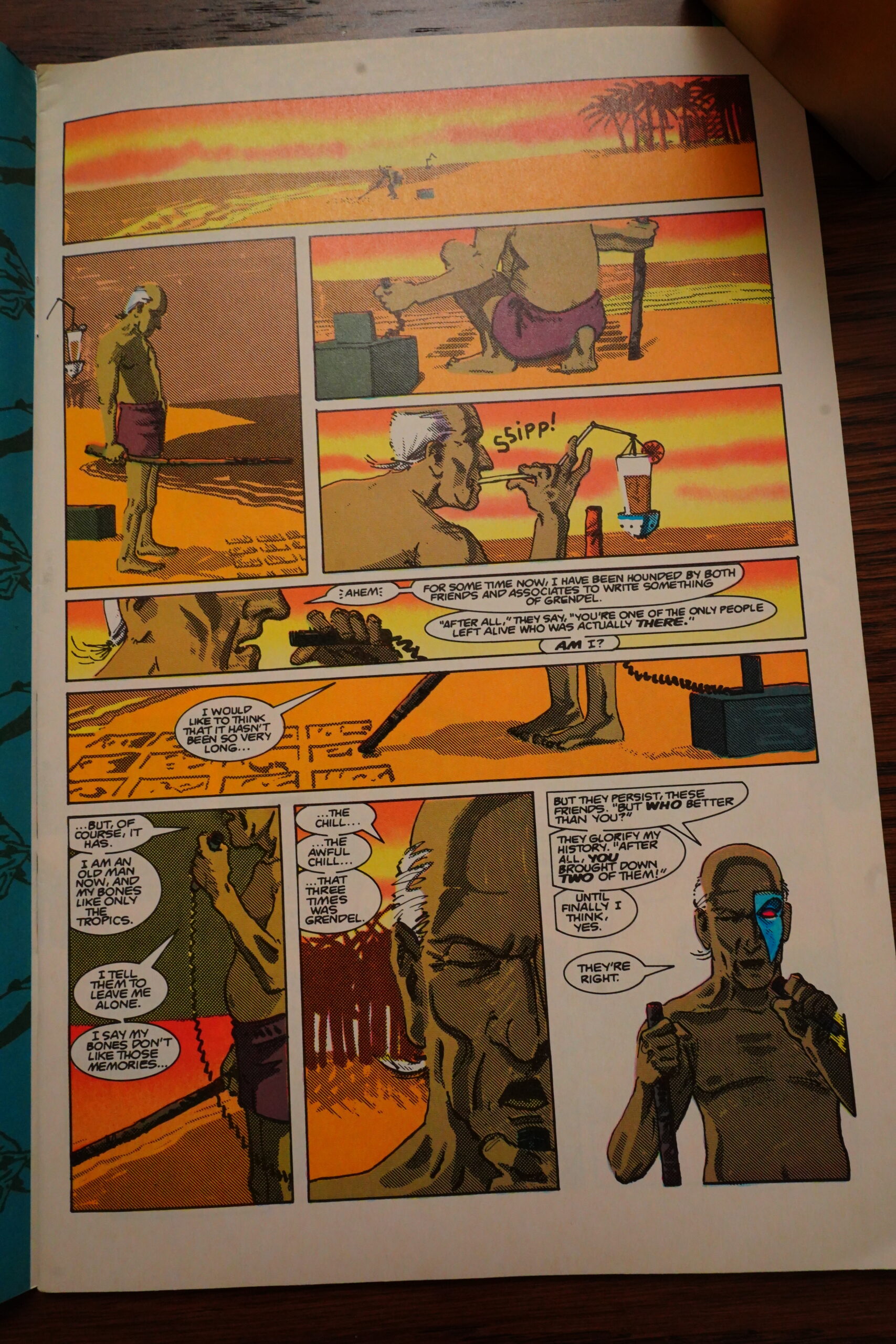
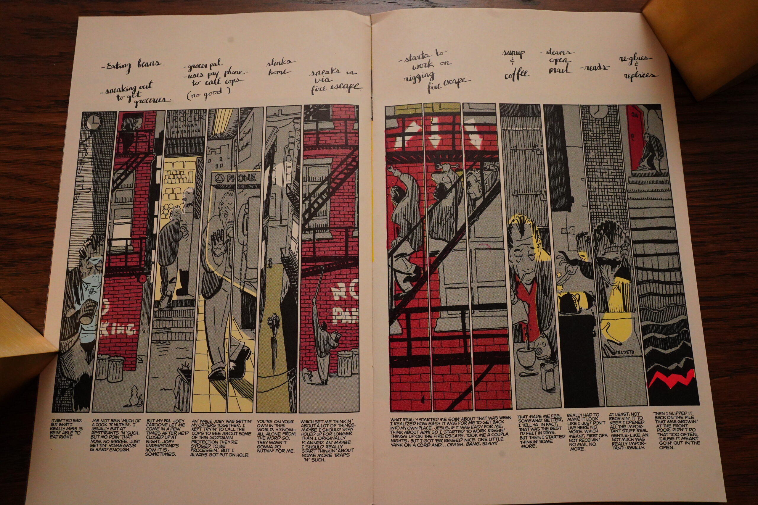
This is one of the few issues of Grendel I bought at the time — I was a fan of Bernie Mireault. I think perhaps I’d just read Mackenzie Queen at the time? And speaking of The Jam — it’s a shame that nobody has stepped up to reprint The Jam in full (or Mackenzie Queen, for that matter). Such a great book… or at least the issues I’ve read — I don’t think I’ve read it all, because the publishing history is so scattered.

Wagner explains that Grendel is going to be structured as a number of mini-series, each with different art teams.
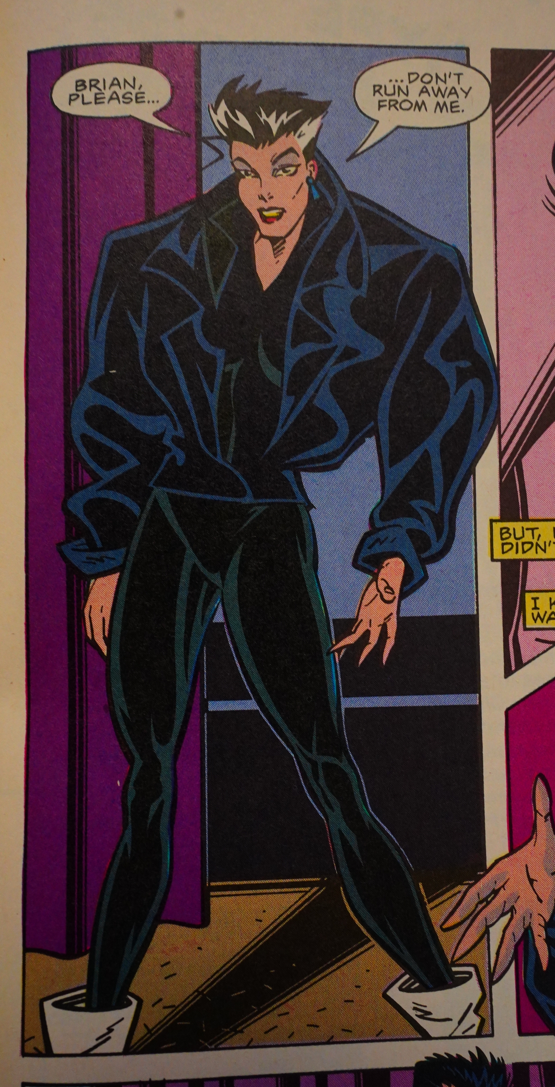
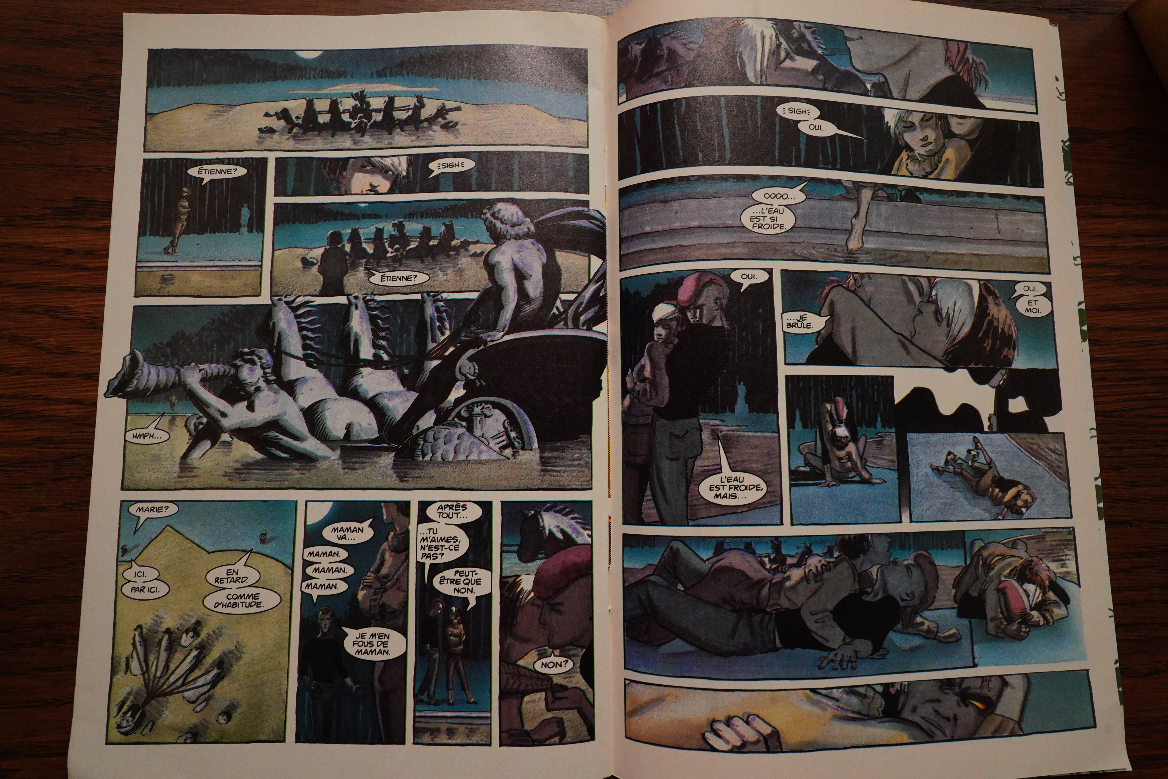
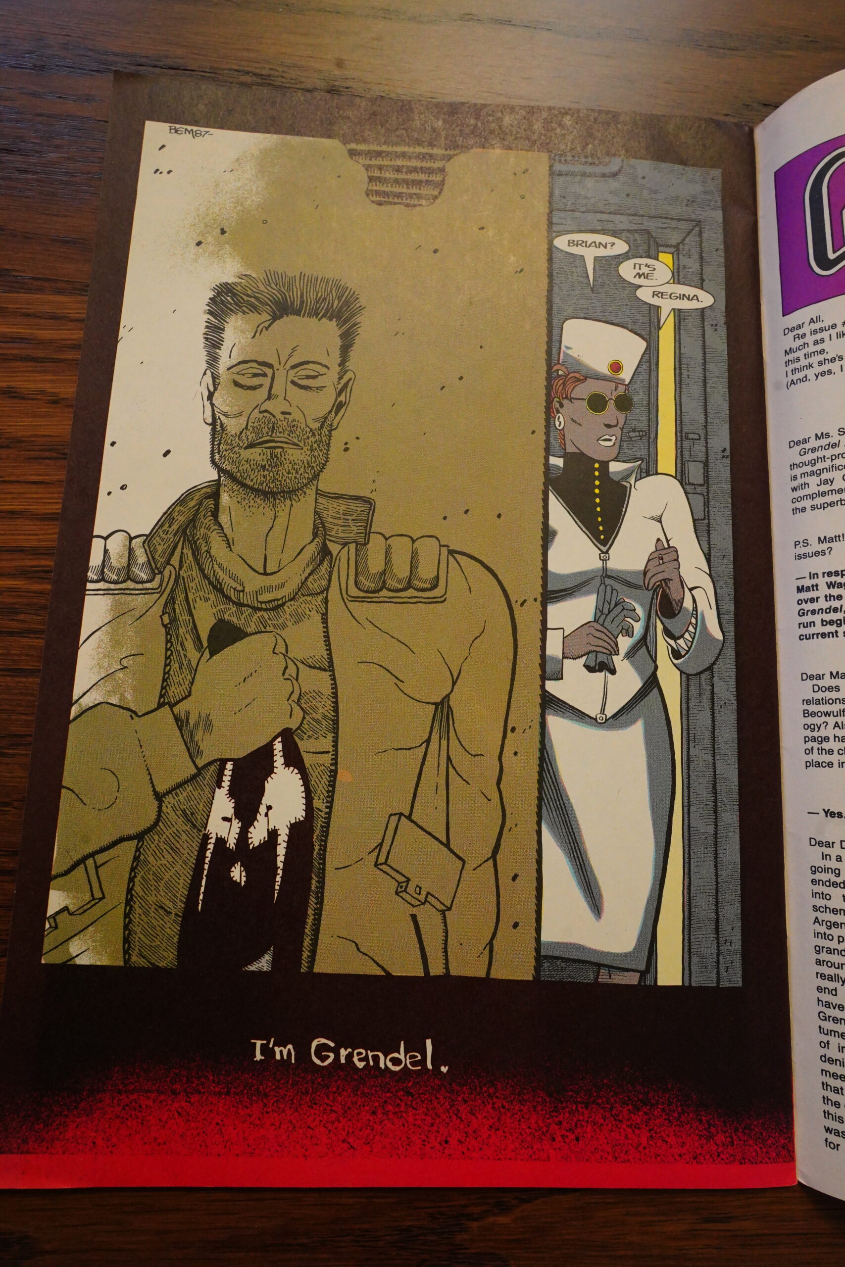
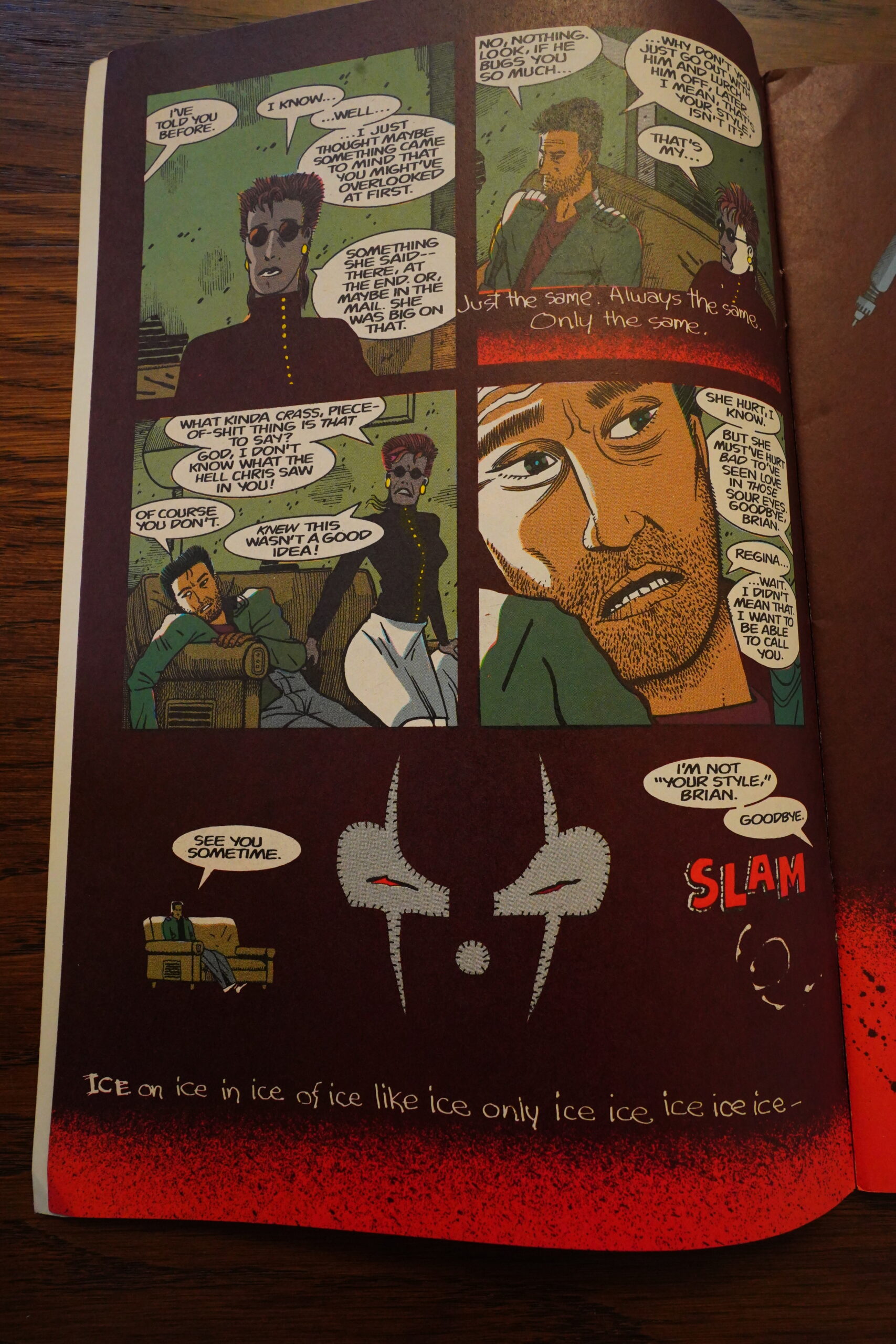
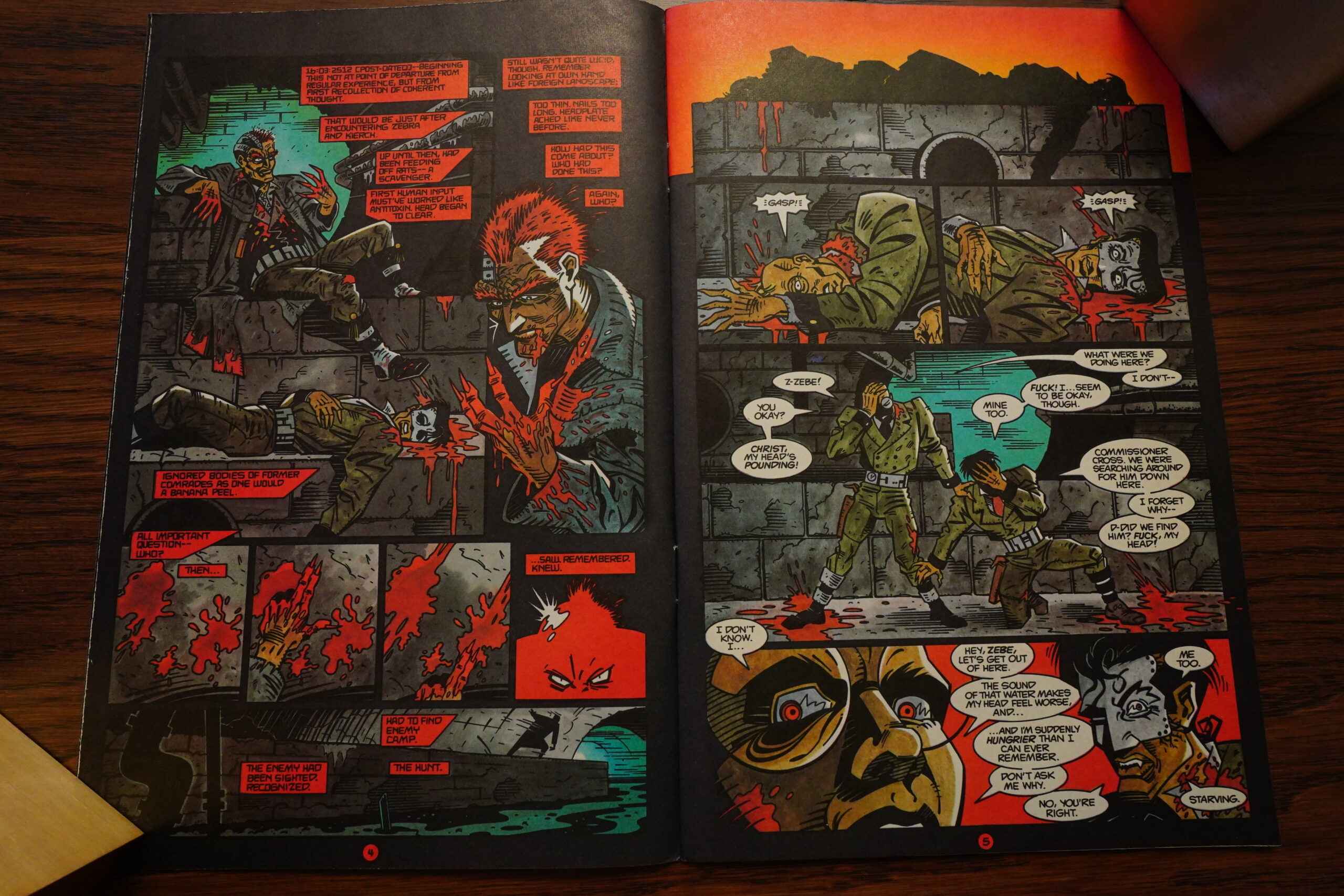
Wow, that’s pretty great. Mireault brings things down to Earth, and Wagner leans into the late-80s “overload” type of storytelling. So we’ve got fragmented notes, scattered conversations and a main character that’s going insane from stress and PTSD (or possibly being taken over by the Grendel spirit). So this is a direct continuation of the previous storyline, with the next Grendel being Christine Spar’s boyfriend.
Wagner does the colouring himself, and it looks really good. It all works well — I think you could read this as a standalone and not feel that lost (I did it in the 80s), but you’d miss a lot, because Wagner doesn’t really explain much of what’s going on.
*gasp*
And that depiction of Regina looks quite a lot like a Dave Sim drawing, doesn’t it?
Wagner only lasted one issue as the colourist, and the next two issues, Joe Matt (!) takes over. And… it’s not as good.
He does this red layer all over the pages, and they just look pretty washed out.
(Oh, the plot — it’s about the boyfriend being harassed by a cop who’s looking for Spar’s diaries… Too bad the cop didn’t just drop by while the boyf is reading them in his apartment…)
The third and final issue of this “mini series” is also coloured by Joe Matt, but looks much, much better. Perhaps his first issue just had production problems?
Anyway, Grendel has turned this wimpy doormat of a guy into a real man!!! Sure, he’s a real man who kills some bums who piss him off, but still. (Subtle thing with the Superman logo.)
Oh, this is set in 2007? I thought somebody mentioned “50 years in the future”…
The final issue is a bunch of pratfalls where the boyfriend tries to kill the cop, but the cop mysteriously avoids his arrows every time. And then the cop kills him. THE END.
So I guess Wagner was thinking of having the Grendel spirit pass from person to person this way? From Rose to Spar to Whatsisface… and then on to Regina next, perhaps? Or the cop?
It does make sense, I guess…
In the end, this arc wasn’t really satisfying on its own, but it was a thrill to read — Mireault’s artwork and the storytelling are on point. And it gives us a much better sense of “Grendel insanity” than the previous arc.

Schutz announces that Wagner is going to do the next four issues all by himself, and there’s not going to be any ads or letters pages. Sounds good.
And a Mage backup! How the turntables!
Back Issue #125, page #17:
TOM POWERS: Bernie, what was your process for illustrating
Brian Li Sung’s tragic story in Grendel #13-15?
BERNIE MIREAULT: Having the opportunity to work on
Grendel came out of the blue. Because Matt Wagner had just
then moved to Montreal and we shared a studio for a time,
I was able to exchange ideas with him and have some input.
As a result, I felt very connected to the work, and it was a lot
of fun to do. Experimentation with the form was encouraged,
and I think that we were successful in creating something
very different from the status quo, which has always been—
and will be—my aim.
Up until that point, I had always made comic art by the
seat of my pants because I just did it for myself by myself.
Now, suddenly, I was working from a detailed script written by
someone else. It was for money, and I was part of a large team
(writer/artist/editors/colorists/letterer/production staff), so I
couldn’t just do as I wished and had to get approval for the
work from higher up. Thankfully, the environment was very
supportive, and I was encouraged to
go on to develop some of the design
concepts that would connect the
issues visually and identify them as a
set, which I was very happy with.
POWERS: In particular, what did you
enjoy about working on these issues
with Matt?
MIREAULT: As stated in the first
question, Matt was supportive and
open to experimenting with the comic
art medium. We both felt that comic
art was an exciting art form that
deserved development and expansion.
As artists, it was our favorite mode
of expression, and we all wanted to
make comics with more personality
than the standard fare of the time and
perhaps forge a stronger connection
with the audience through more
personal work. It’s always a pleasure
to work with someone who actually
cares about the art form.

Comics Interview #83, page #56:
BERNIE: Talking about how we ended
up working on GRENDEL – when
what we do when left to our own devices
is so different – I think the obvious
reason of course is we’re doing our own
stuff, floundering around going from
meal to meal. Matt gives us a chance to
practice our art and get paid for it, too.
MARK: Bernie, you were aware of Matt
Wagner’s work even before he called you
up. And when we discussed his work,
there was always a sort of quasi-
symbiosis between you and Matt. There
were always parallels between your work
and his.
BERNIE: I was very jealous of his initial
success and spent many hours putting
him down to friends and family. “This
guy didn’t deserve a color book! Look!
He doesn’t even do backgrounds!”
MARK: But it went beyond that. It was
flying Volkswagens and thematic things
you were doing in MACKENZIE
QUEEN and he was doing in MAGE…
BERNIE: And the fact that THE
DEMON was my favorite Jack Kirby
character and in my most opulent fanboy
dreams there I was, doing THE
DEMON. And then I hear Matt gets the
deal to do it. At that point I wrote him a
letter saying “What’s going on? This is
like voodoo.” With GRENDEL …
okay, I’ve got a story. I was scared that I
wasn’t going to be able to get into
GRENDEL, because it’s very dark and
the general theme for the particular story
that I did was just depression. Somebody
starts out low and then just gets lower
and lower and lower until they’re dead.
MARK: What issues did you do?
BERNIE: GRENDEL #13 to 15, with
the character Brian. And I couldn’t
understand . . . I didn’t have any nega-
tive feelings to put into the book. But at
the time I first got the job I was trying to
see this girl, and she was being pestered
by an old boyfriend. One time I was over
at her house, and the guy kept calling
over and over again. I picked up the
phone once after she was reduced to tears
and I spent an hour talking with him, and
that was a horrifying, bizarre conver-
sation with what I thought was obviously
a madman on the other end of the phone.
I put down the phone, I just hung up
after the fiftieth death threat.
MARK: You mean he was threaten-
ing you because you were going cut
with her?
BERNIE: Absolutely! Lives were cheap
to him, obviously. But at the end of the
phone call, I was sitting there wondering
what I was going to do to save this poor,
beleaguered girl who has black circles
beginning to form underneath her eyes.
How can I convince this guy to lay off?
Obviously, he’s not open to reason. I’d
have to kill him. Hmmm. Obviously, 1
didn’t seriously consider that, but I
realized later on that’s a great deal of
what Matt’s talking about. Dealing with
these feelings and by sort of laundering
them through GRENDEL I’m sure it’s
very much an outlet for him and his
negative feelings.
According to comics.org, these issues were collected by Comico, but have otherwise never been republished? How odd! Dark Horse has been doing collections of (most of) the other stuff, so why not these issues?
Wagner’s solo issues are all classy and stuff — not only are they without ads, letters pages or editorials (thank god for the lack of editorials), but they have classé endpapérs and all.
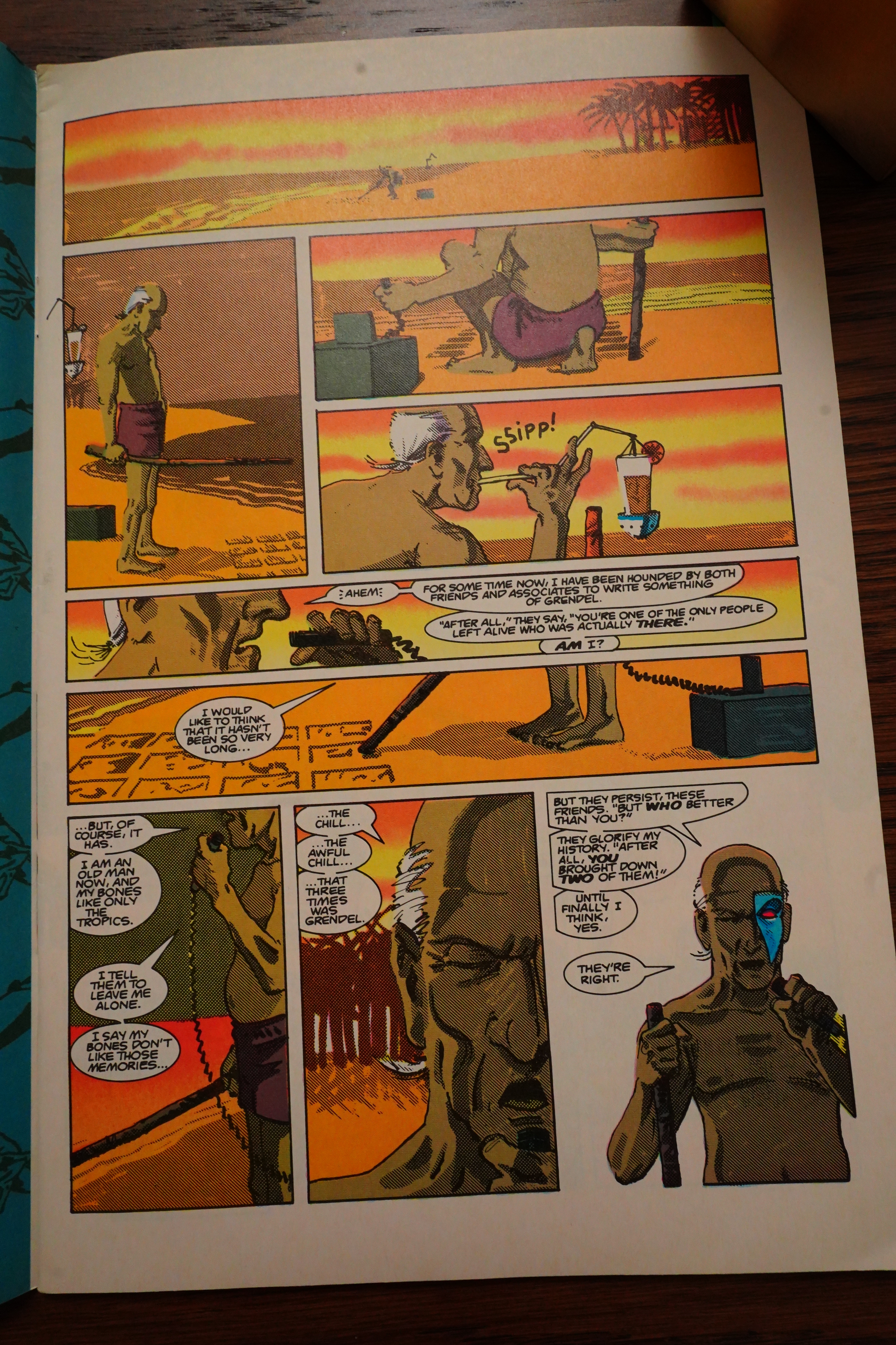
Over four issues, we get two complete stories, and they’re both told by the cop with the eye, and they’re both about the first Grendel character.
Well, that is, stories about other characters around that time, i.e., the 80s. I’m not sure we needed the framing story, but it’s fun in an of itself.
It’s sometimes easy to forget how young Wagner was at the time — he was around 25 when he did this, and like many other young artists, he’s a total magpie, picking up whatever’s cool and exciting around him. This looks like it’s influenced by Frank Miller and perhaps Floyd Farland by Chris Ware? Or perhaps it’s unlikely that he’d seen the latter — it didn’t get a collected edition until the next year. And Cowboy Wally by Kyle Baker was a couple years later, too? Did Wagner originate this style?
Anyway, it’s completely of its time — it’s dense and it requires the reader to pay attention and do some work.

The artist, however, does slightly less work — I seem to remember a reviewer back then being all upset by the photocopy/tracing look up this? I think it works brilliantly — with all these tiny panels, you can really get into the tedium of police work, but in an exciting way.

And Wagner has a lot of fun with his layouts, even while adhering to his grid.
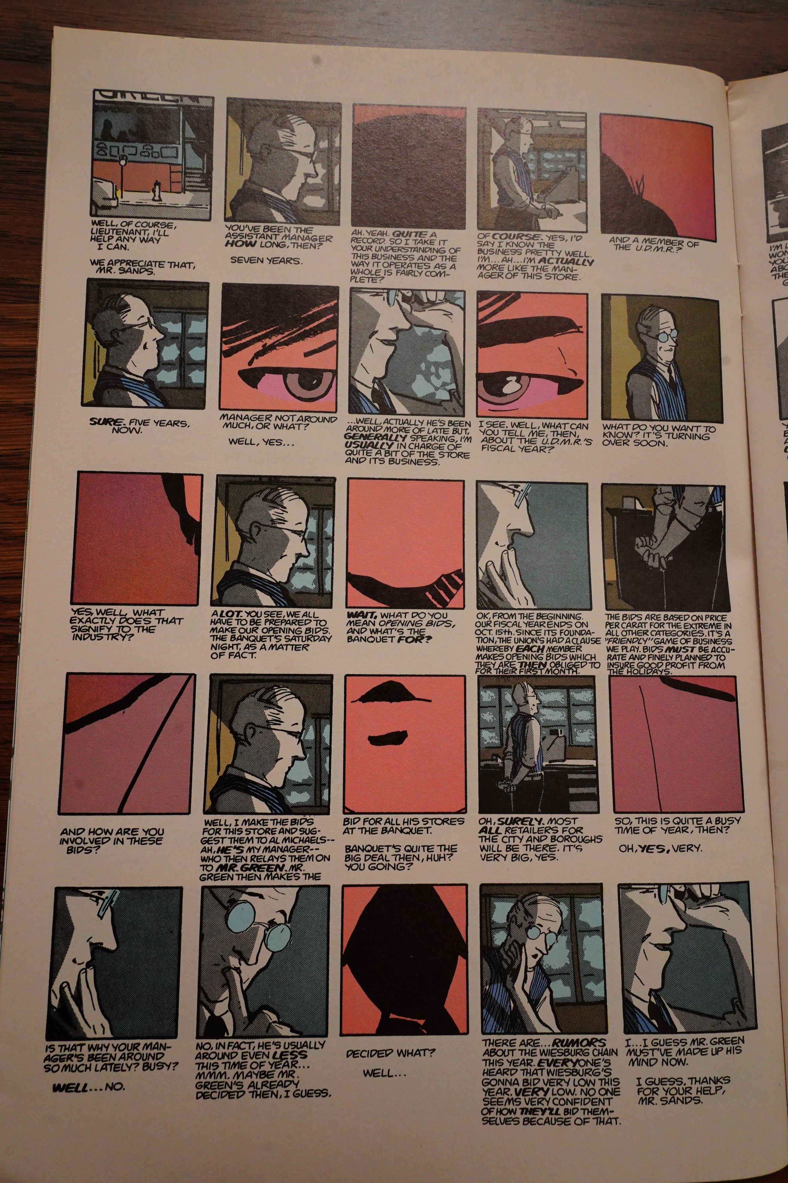
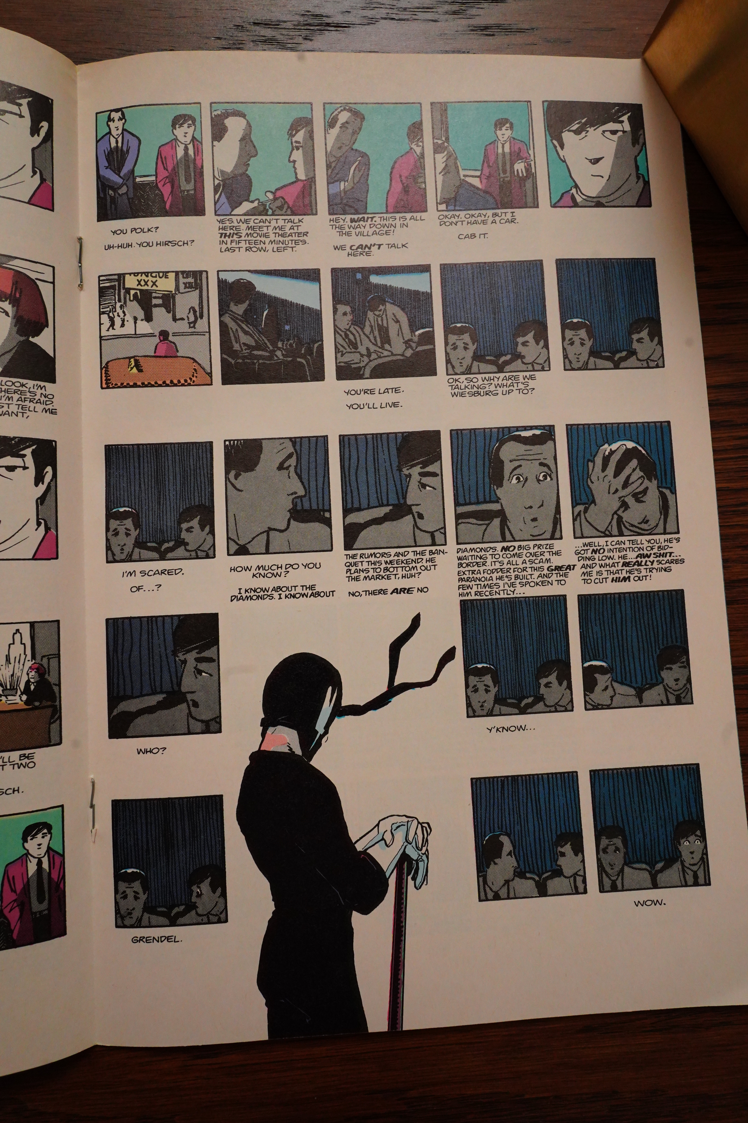
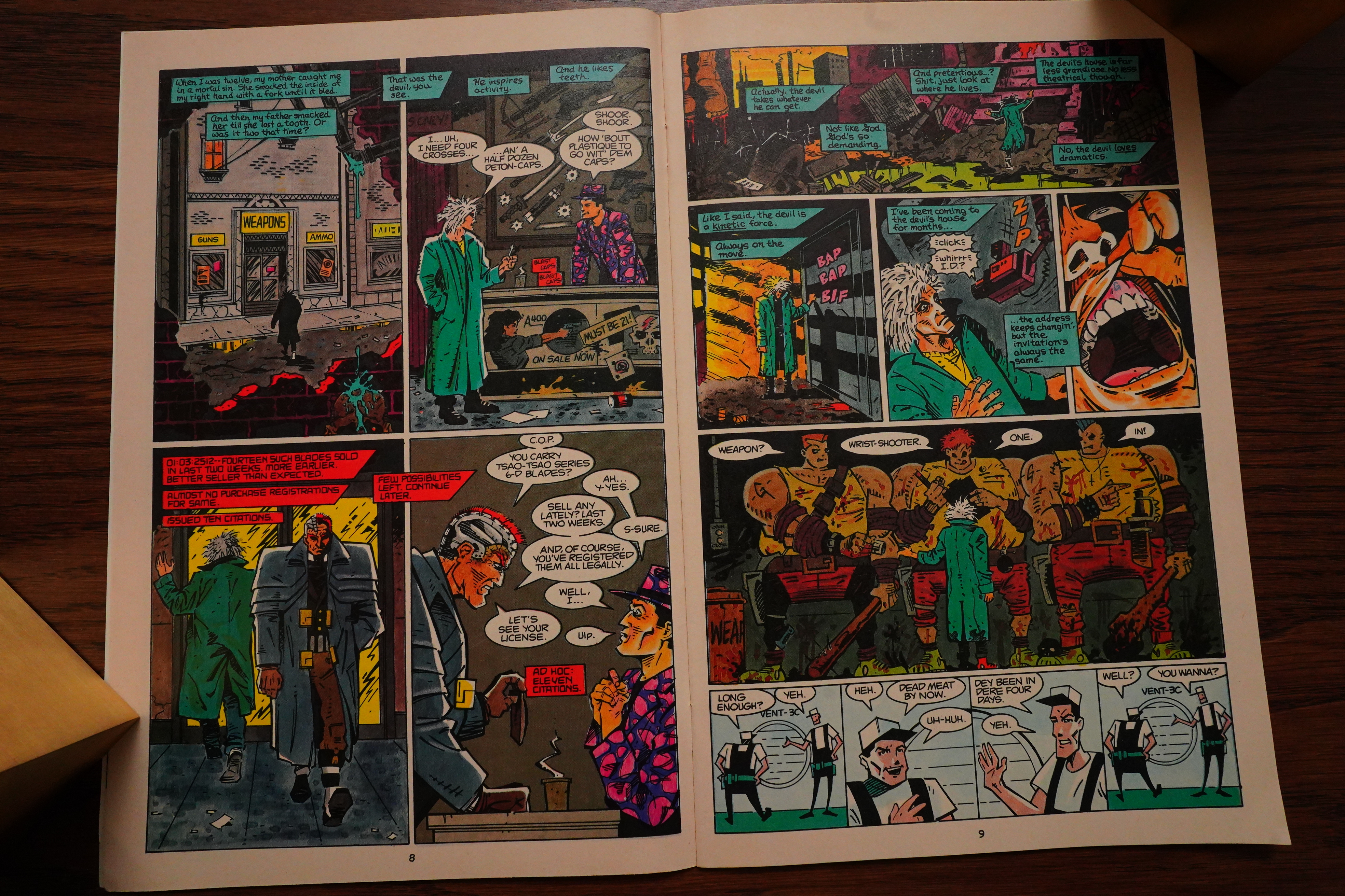
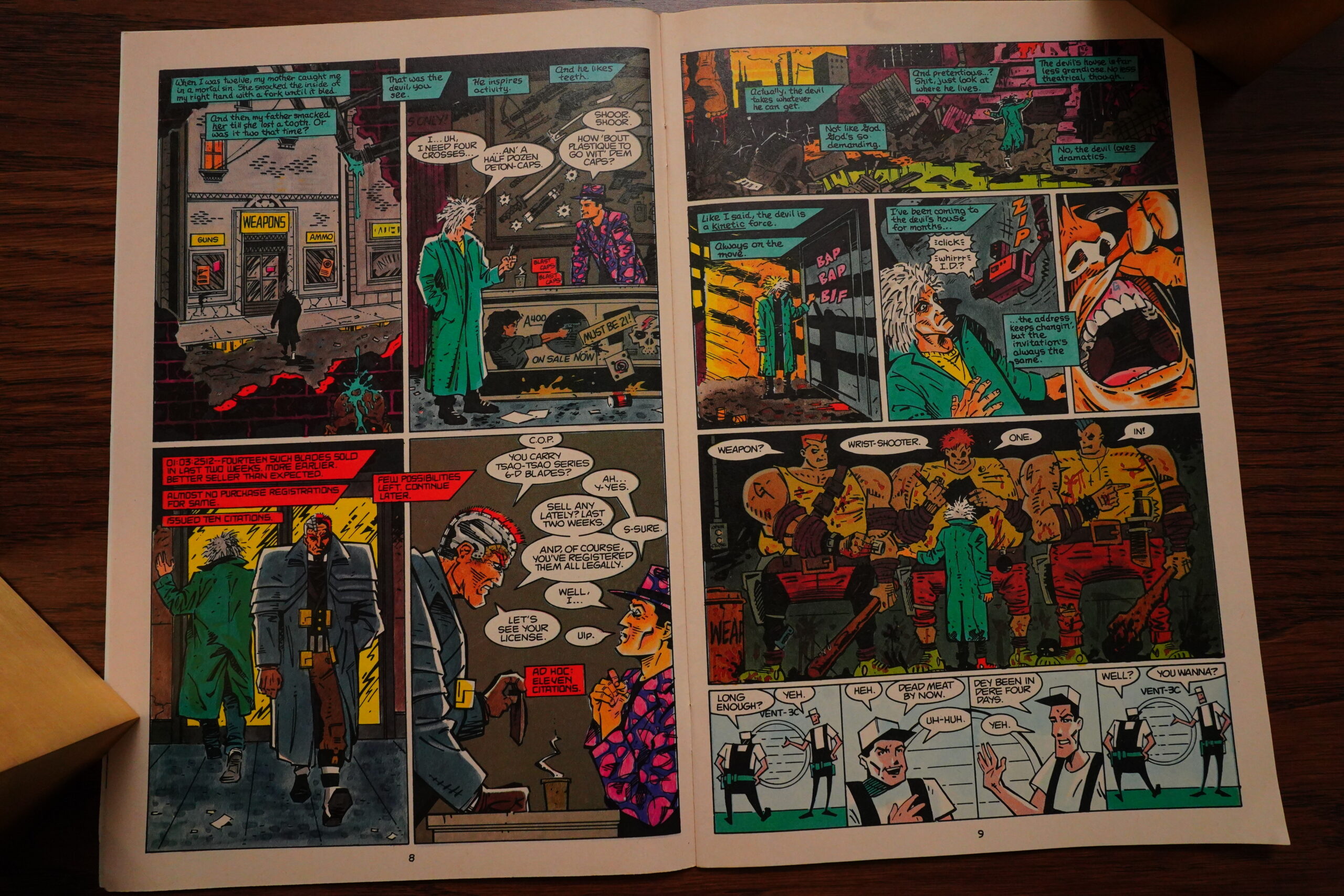
Oh, the plot — it’s about a cop trying to figure out a very complicated scheme, and there’s at least three conspiracies buried within each other, so it’s all very twisty and fascinating. I’m not sure the top-level conspiracy (which was fake, anyway) made any sense in the first place, though?

As promised, we get a Mage back-up, painted by Wagner. Looks really good. And I can sorta read French now, so I understood all of that. Hah! Three years of Duolingo pays off!

OK, now they’re calling each story arc a “novel”? A two issue novel, that’s something… OK, it’s a very dense two issues, but still.
And after all of that mystery and intrigue, Grendel finally shows up, and the grid ecstatically breaks down. The only problem is that I don’t quite understand why Grendel threw that knife at the cop? Or really… even what order to read this in.
But perhaps that’s the message: Grendel is chaos!!!1!
Anyway, two brilliant issues, and if I’d read these as a teenager, I would have been minorly obsessed. Very exciting comics, formally.
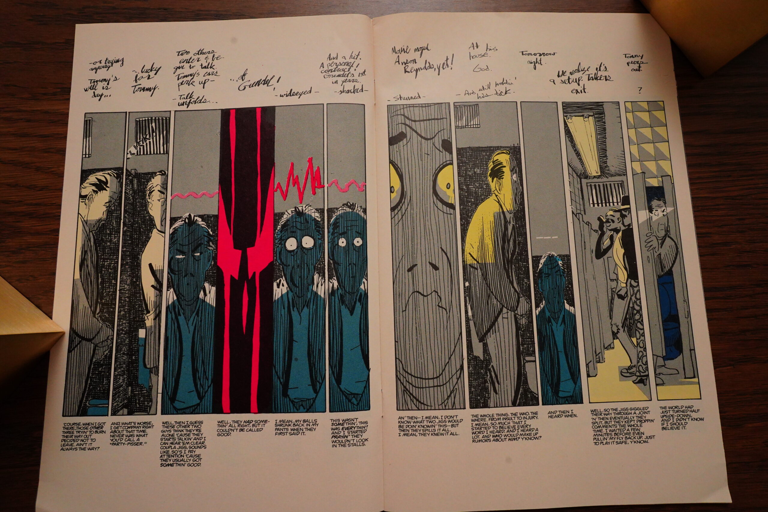
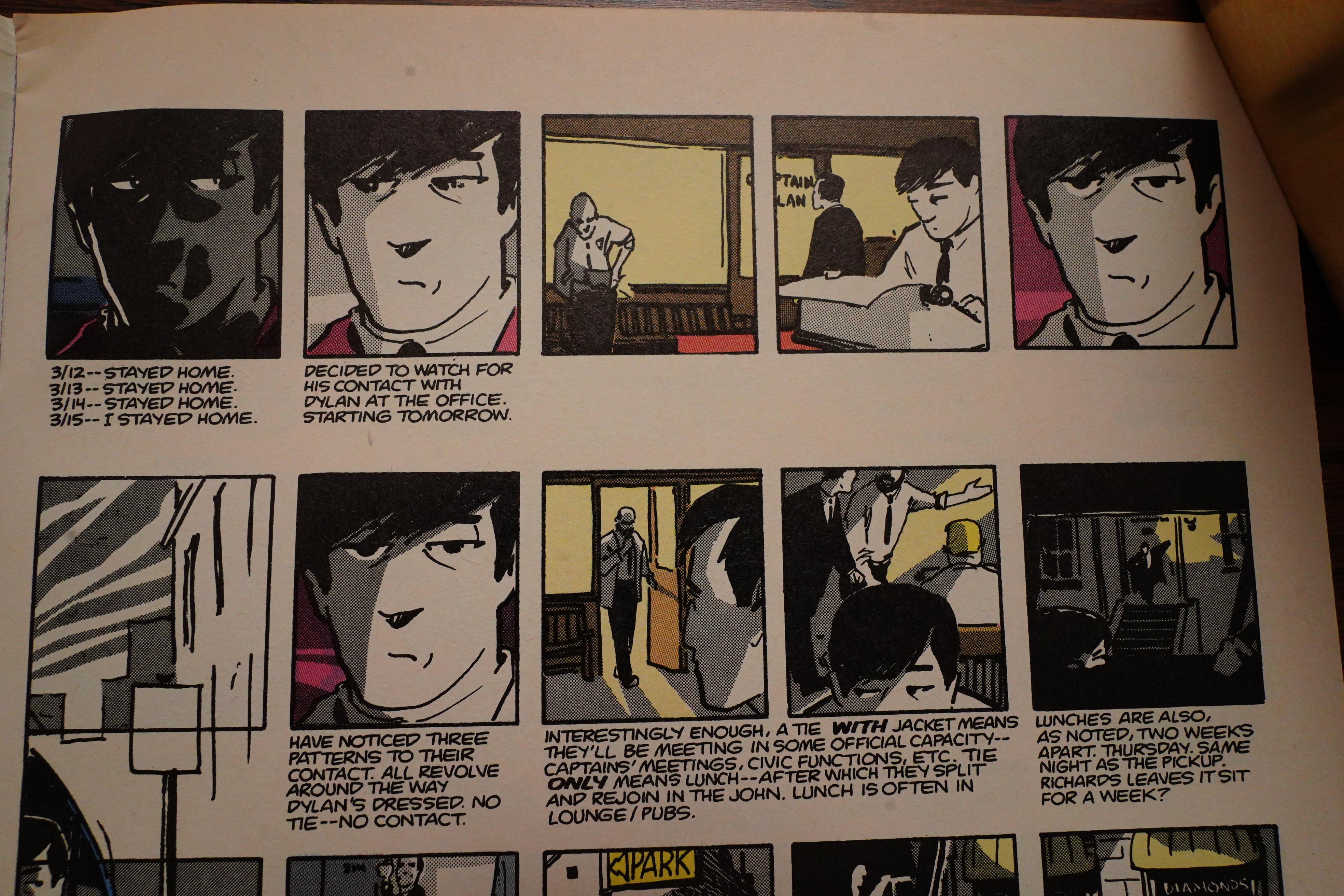
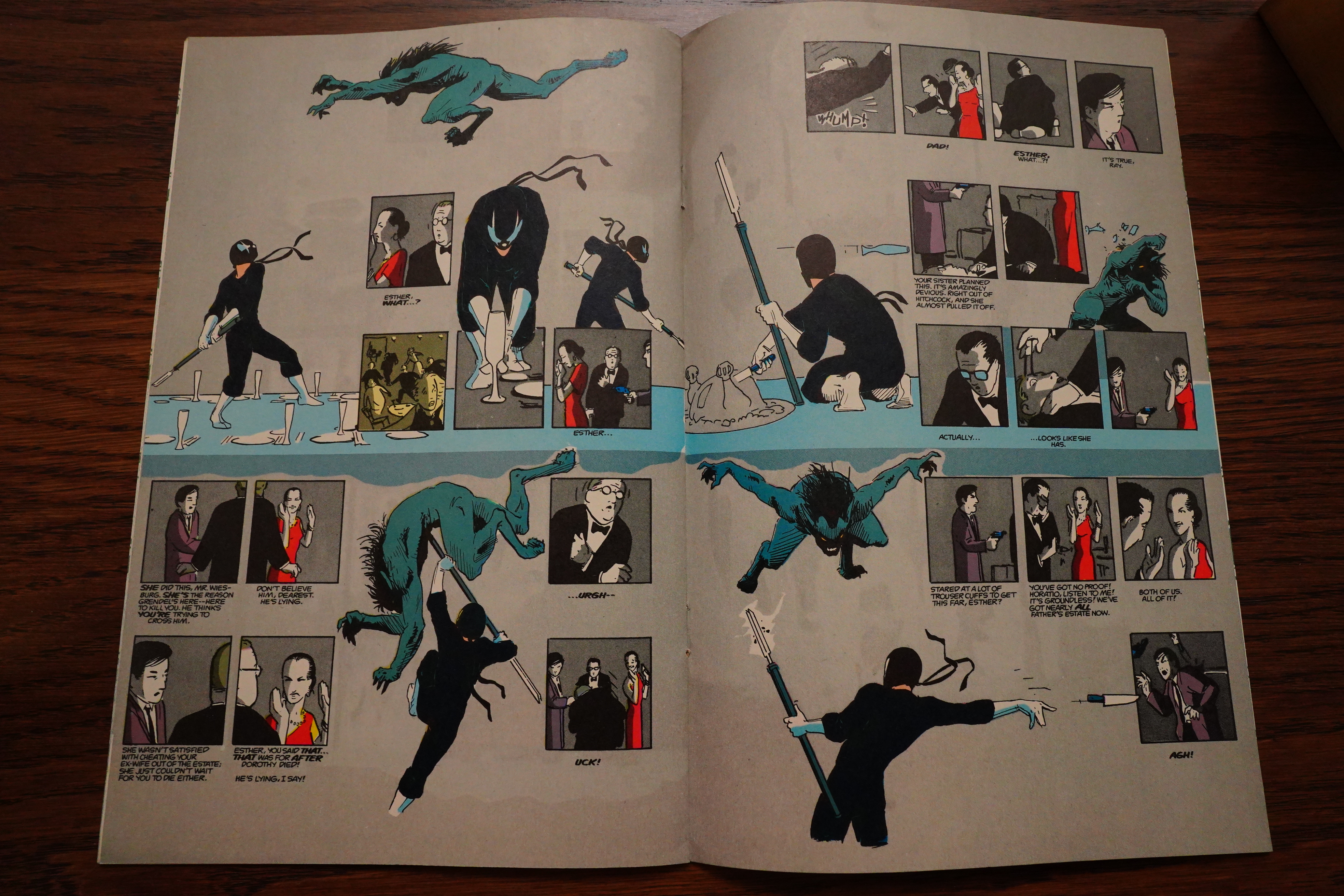
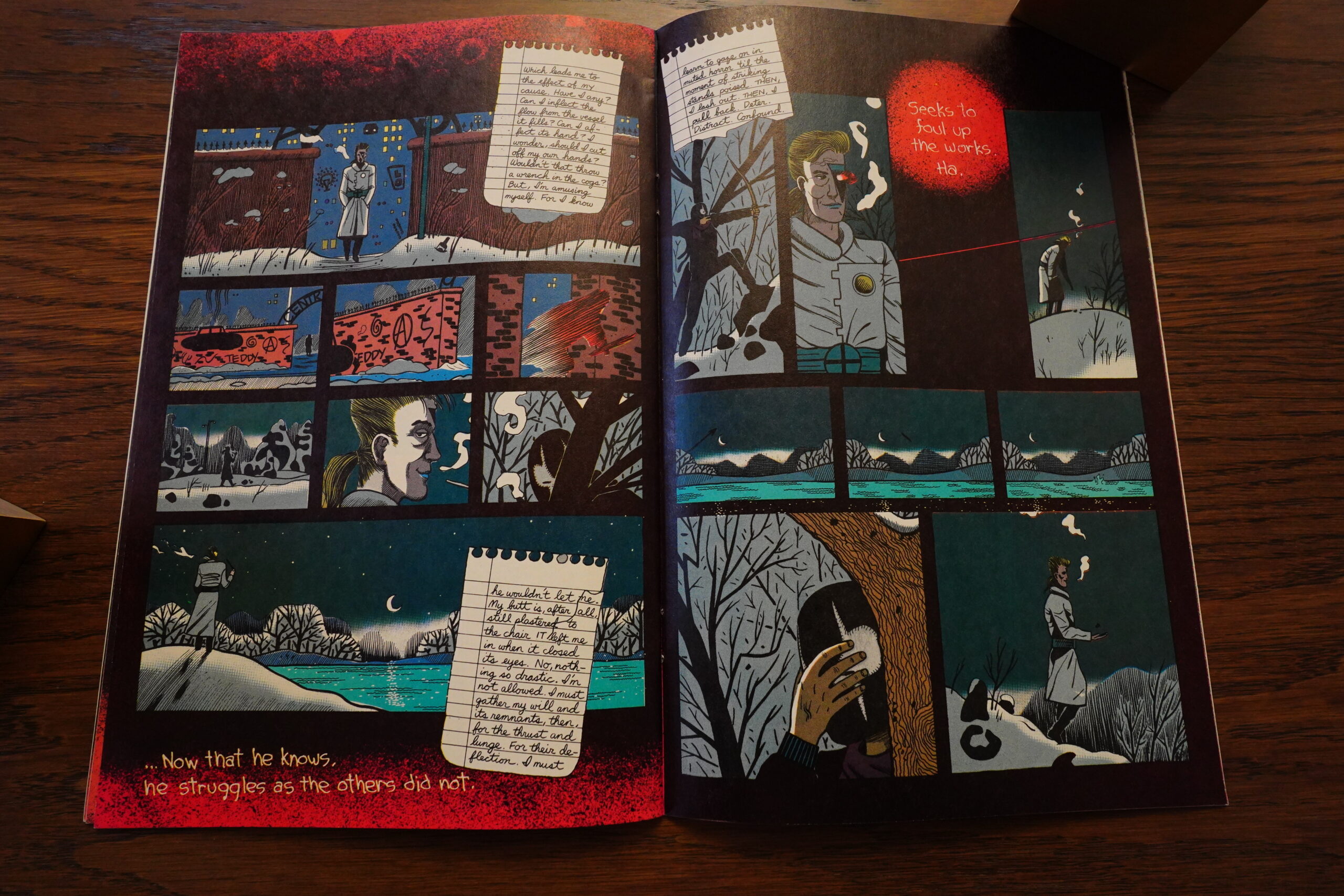
The next two issues are (of course) done in a totally different manner, one which I don’t think I’ve ever seen before or since. Every page has three tiers: The top tier consists of scrawled descriptions of what’s happening (I think these are supposed to be notes by the cop when he’s laying out the story). The middle tier are very tall, very narrow panels depicting the action. The bottom tier are the thoughts of the main character, who’s a schlub who’s gotten mixed up in a Grendel plot/conspiracy.
I’m not quite sure it’s totally successful. I wonder whether Wagner was thinking of Kriegstein while doing the layouts? And Kurtzman while doing the figures? It’s got something of an EC Comics morality play about it…
But it’s just exhausting to read this — the panels are so tall that you’re always moving eyes up and down and up and down, so you start wondering whether the payoff is going to outweigh the work you’re putting in, and the answer is: Nah.
The story doesn’t really make much sense: Grendel sets up what I think may be called a “prank” on Argent, and he does it in the most convoluted way possible instead of just sending a postcard to Argent saying “GRENDEL WILL BE AT THAT GUY”S MANSION TONIGHT”, which would have brought Argent without involving lots of people to do their jobs as if by clockwork.
And it’s really unclear why this guy thinks that Grendel will be mad at him, so his descent into paranoia, while fun, isn’t convincing.
So… two stylish little stories, and the first one is fantastically told.
Oh, and the Mage thing? Just a vignette, but it looks good.
These issues have been reprinted by Dark Horse twice: First as Grendel Classics, and then in Grendel: Devil Tales. But the last one was in 1999, so it’s about time they did it again.
The Comics Journal #165, page #74:
The point is the drama. I had a fellow writer say to me that
he thought “Faces” fell down flat at the end because it was
a contrived situation where Two-Face runs into a mirror-
image freak of himself at a side show; he said he found that
implausible. And my response was: fuck plausibility.
Yeah, it’s also implausible you’re going to tie a guy in a bat
costume to the front of a Zeppelin and fly him over the city.
[laughter] It’s a dramatic narrative that makes its point
with big, broad strokes. I’m echoing Alfred Hitchcock
here.
PINKHAM: How so?
WAGNER: He says similar things – have
you ever read the Hitchcock-Truffaut
book? It’s terrific. They talk a lot about
cinematics and drama and narrative.
Hitchcock had a pretty firmly critical eye
of his own work, which is enticing. But
you do owe a certain amount of respect to
the artificial structure you’re creating,
this narrative world. It has to work within
itself. That’s the important criterion. For
instance, in the first two-issue story arc I
did for Grendel, with all the little tiny panels (#16 and
#17), that involved a whole storyline revolving around the
business intricacies of the jewelry and the diamond trade
in New York – and it’s totally fucking fabricated. I just
made it absolutely all up. But it sounds like it works, and
that’s good enough.
Did it sound like it works? No, it sounded like complete nonsense, which made me spend five minutes staring out into the air and wondering whether there was some way that it could possibly make sense. But now I see I wasted my time, and the reason it sounded like complete nonsense was: It was complete nonsense.
When you’re doing something as
alien to my relative experience, and also as politically
sensitive as the ethnic minority cultures are, I think I owe
a little more responsibility to researching it. I’m trying to
inject this modern outlook on things to remind people that
these problems existed for a long period of time before we
had little catch-phrases for them. I have to continually
remind myself that the two main characters, who are the
most liberal thinkers in the book, aren’t from the modern
day. They still come with the experience limitations and
the cultural baggage of being born in that time period. So,
no Asians in the third storyline. A nice nasty white guy.
[laughs] Rich too! He’s even more of a bastard!
There you go.
20 Best Mainstream Comics, The Comics Journal #210, page #126:
5 Grendel # 16-19, Matt
Wagner. Wagner’s greatest cre-
ative strength is a formalist cu-
riosity about comics’ narrative
potential; his greatest creation is the Hunter
Rose Grendel. He combines the two in
this ambitious pair of stories: a filmic
police procedural with strong noir over-
tones, and a Kurtzman-esque farce that
plays as self-induced tragedy.
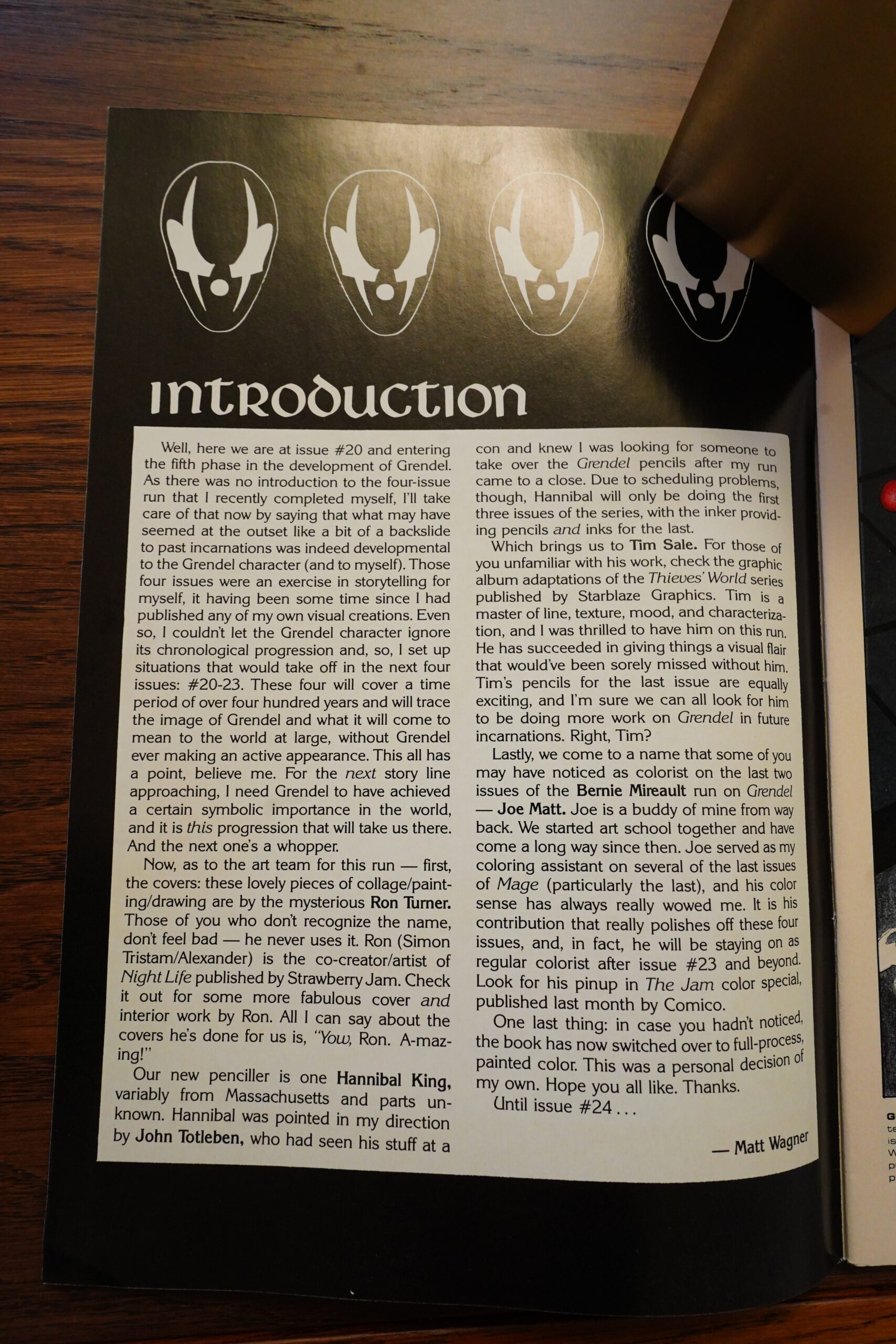
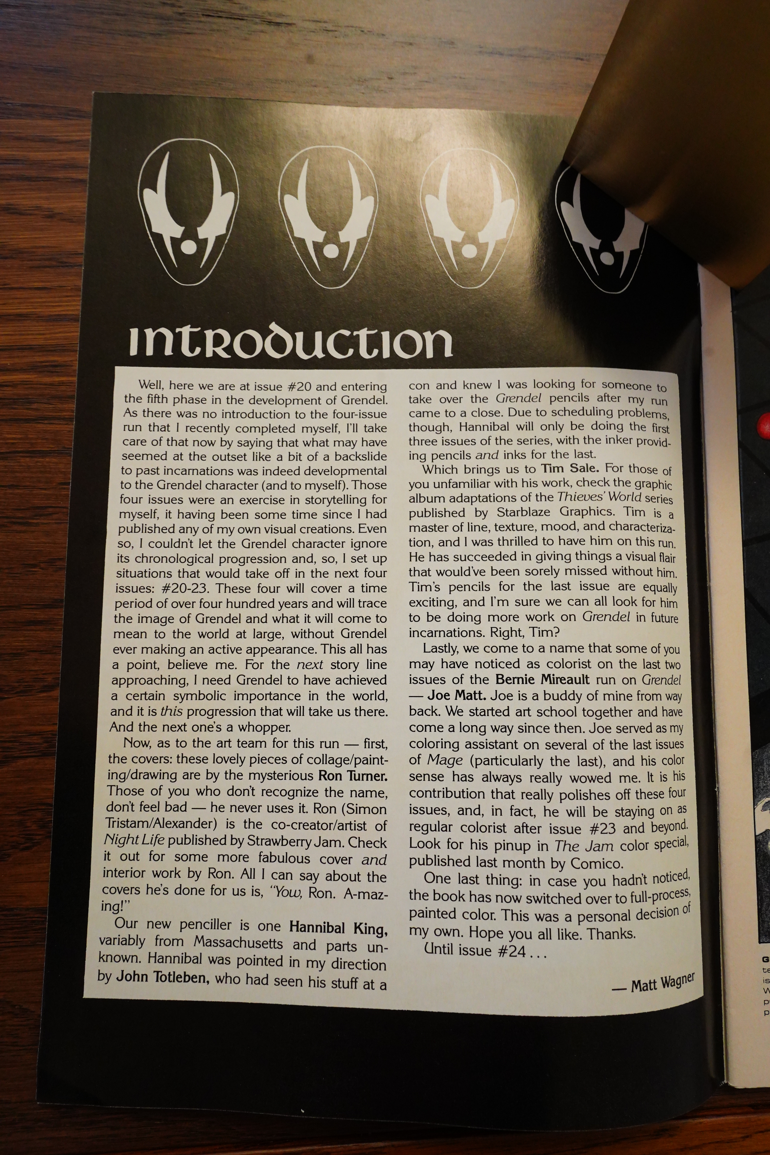
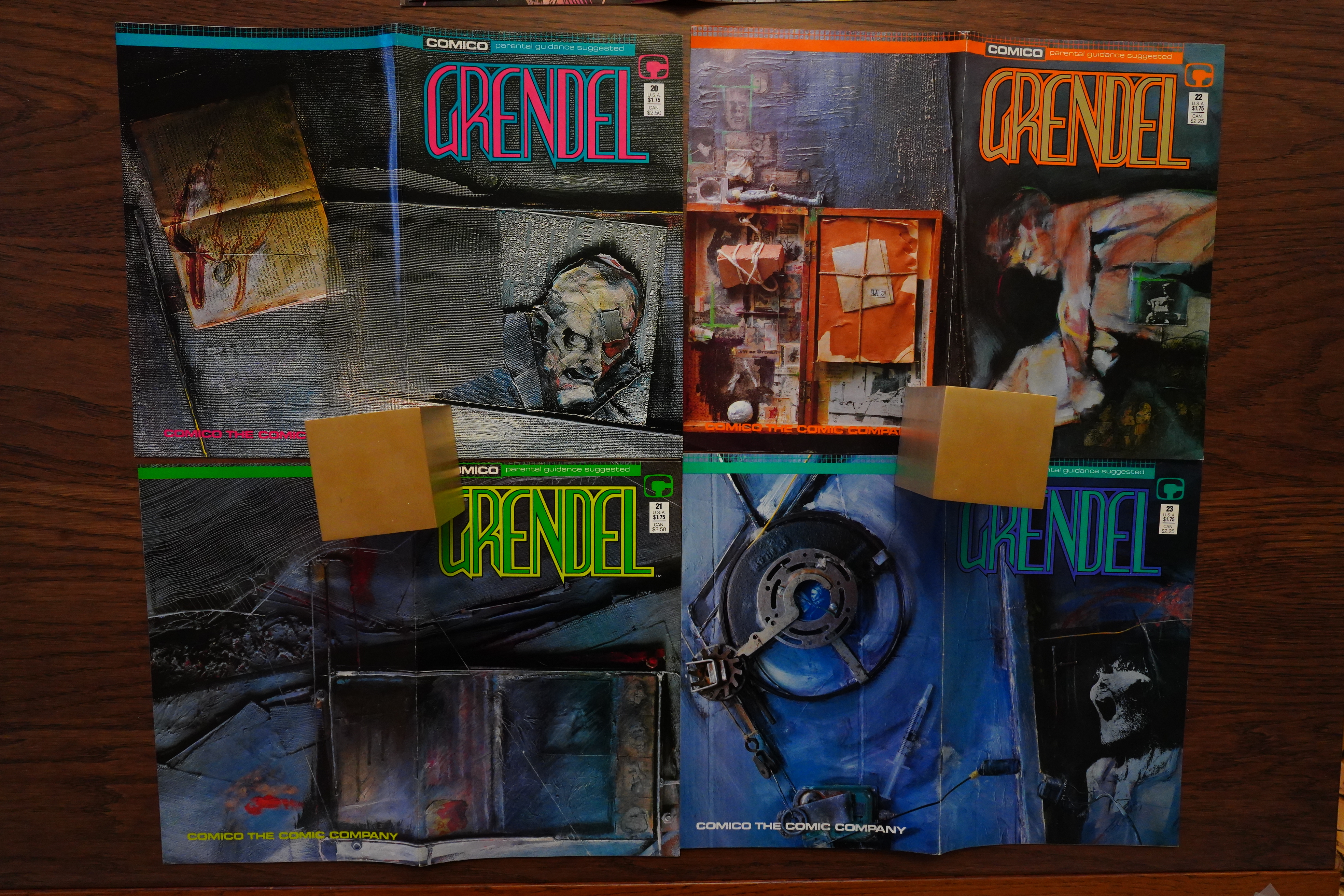
We get another editorial which explains what the plan is now: They’re doing four issues to skip ahead in time, and then we’re gonna get the next “proper” Grendel story. And the artwork is by Hannibal King and Tim Sale. Tim Sale went on to great fame, of course, but I’m not familiar with King. He apparently did stuff for various small companies like Rebel and Anubis, but also some jobs with bigger outfits. Not a lot, though.
And the covers are from a favourite of mine: Ron Turner/Simon Tristam/Alexander. (Perhaps he would have gotten more famous if he had stuck to one name… And if one of the names weren’t the same as the Last Gasp publisher, which makes him hard to google to see if he’s done more stuff after Night Life, which I remember fondly. I should do a blog series about Strawberry Jam! It’d only be, like, four blog posts, though.)

Pretty nice, eh? I guess this is the style that would later be known as “Vertigo Covers”, or “Dave McKean”.

Well, huh. This is indeed very different — and the difference is all Dave Sim, right? This both looks and reads extremely like Cerebus did at the time.

Wagner leans heavily into the disjointed storytelling he’d been doing with Bernie Mireault, and it’s really fun to read. Unfortunately, the story isn’t very satisfying — sure, we get the end of the story of the cop with the eye, but nobody could possibly care about him anyway (he’s a character without much character), so it’s not really very involving.
There are virtually no “real” ads in most Comico books (except Robotech, of course, and house ads), but this seems like it might actually be one? It’s probably not, though, since it has a Matt Wagner introduction and all…
The second issue looks even more Simian, and it’s told in an even more choppy way. Which makes for a fun read — it’s really interesting on that level, but the story is, again, not very gripping.
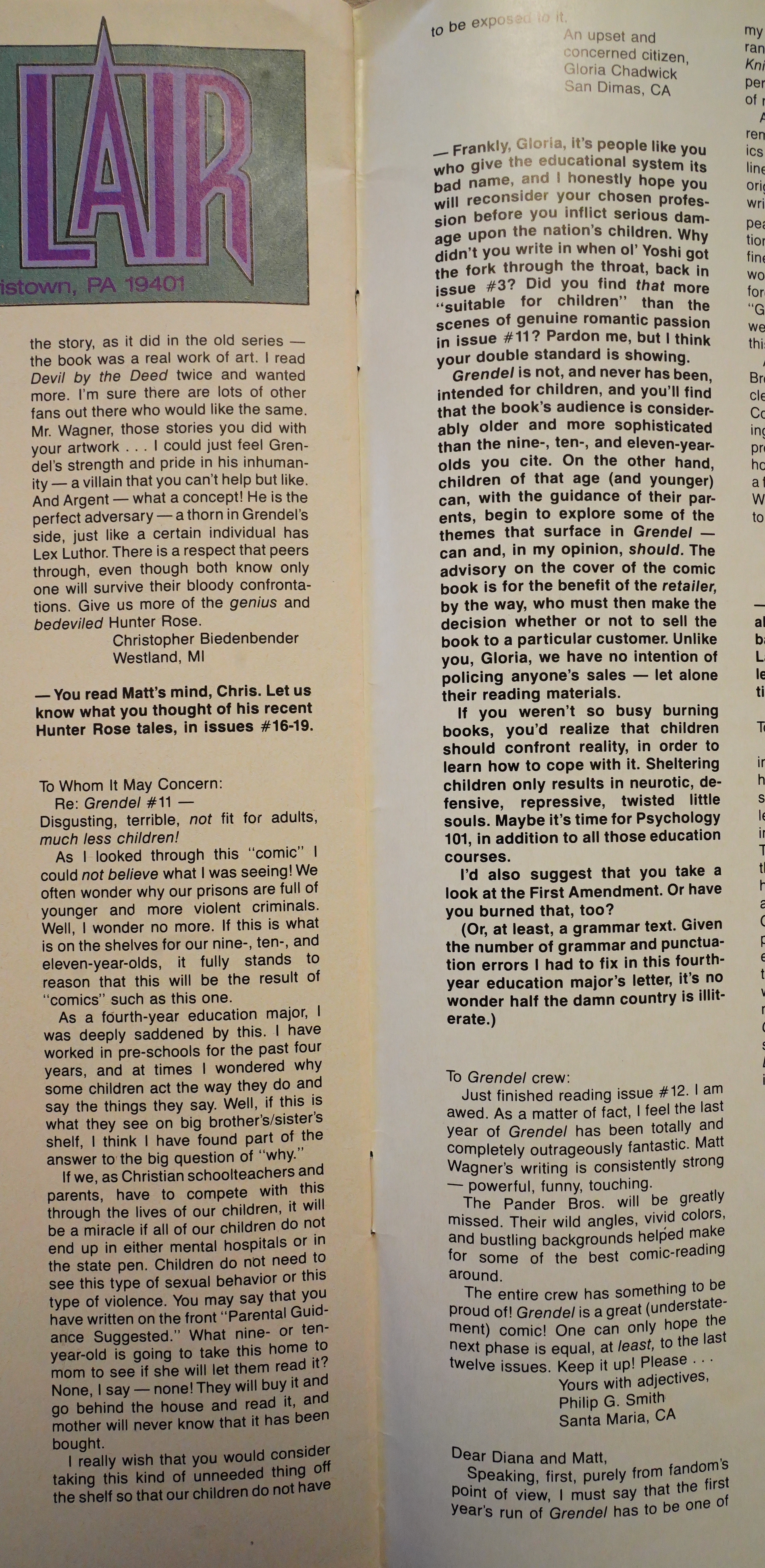
A christian teacher writes in to clutch her pearls, and editor Diana Schutz gives her the what for.
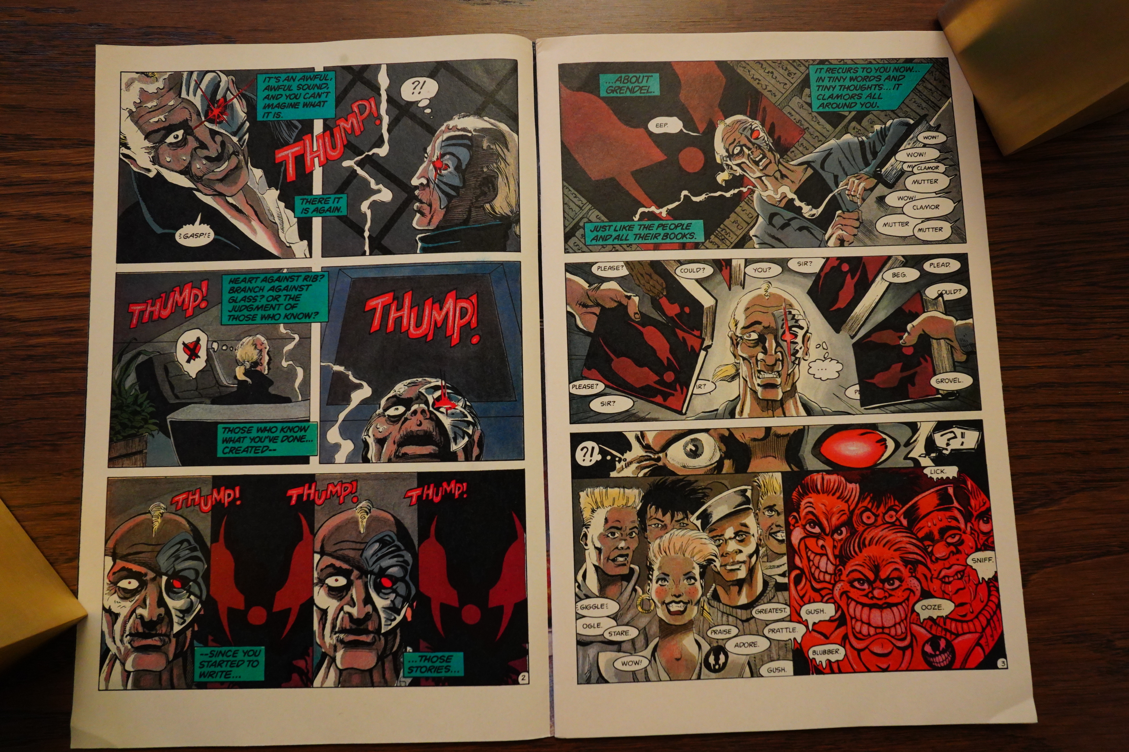
The final issue with pencils by King looks very different from the first two — gone are all the Sim/Gerhardisms.
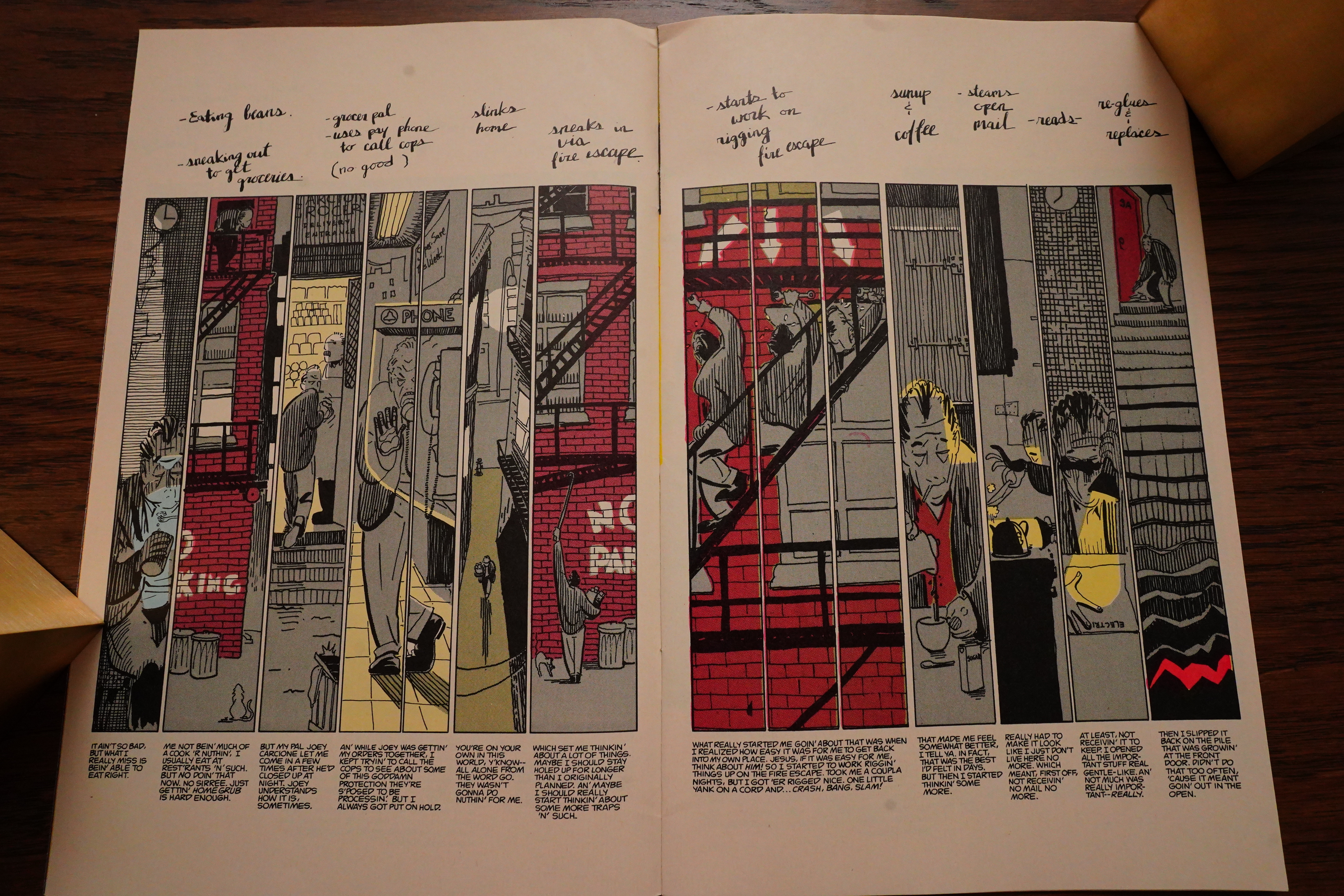
But instead it doesn’t quite work? There’s a bunch of spreads like this, where there’s a fight taking place in the centre, and then there’s plot happening in the surrounding panels, and you’re supposed to read them clockwise from the bottom left.
But it’s just… meh.

All the dialogue is in “verse”, because that’s what they talk like in the future, I guess. Why not? But it’s pretty bad verse. Poetry it ain’t.
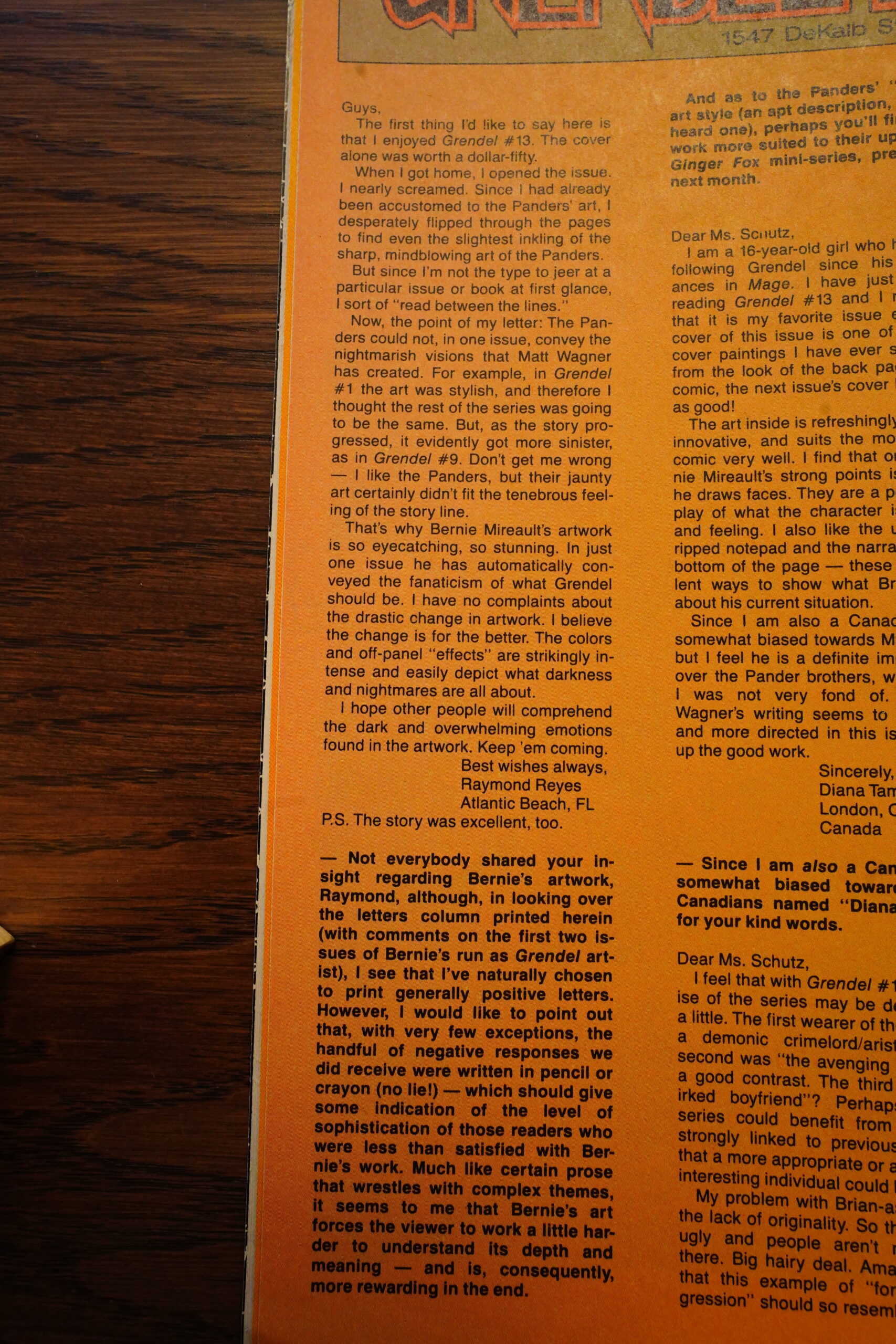
Apparently people didn’t like Bernie Mireault’s artwork much.
Heh, Seth writes in to say how good the book is, and Diana Schutz replies by making a reference to how they were depicted in Cerebus #92. (The gag is that in that issue, Sim caricatured Seth as a work-for-hire artist, but he’d never actually heard Seth speak, so he used Schutz’ vocal mannerisms when he caricatured the voice.)

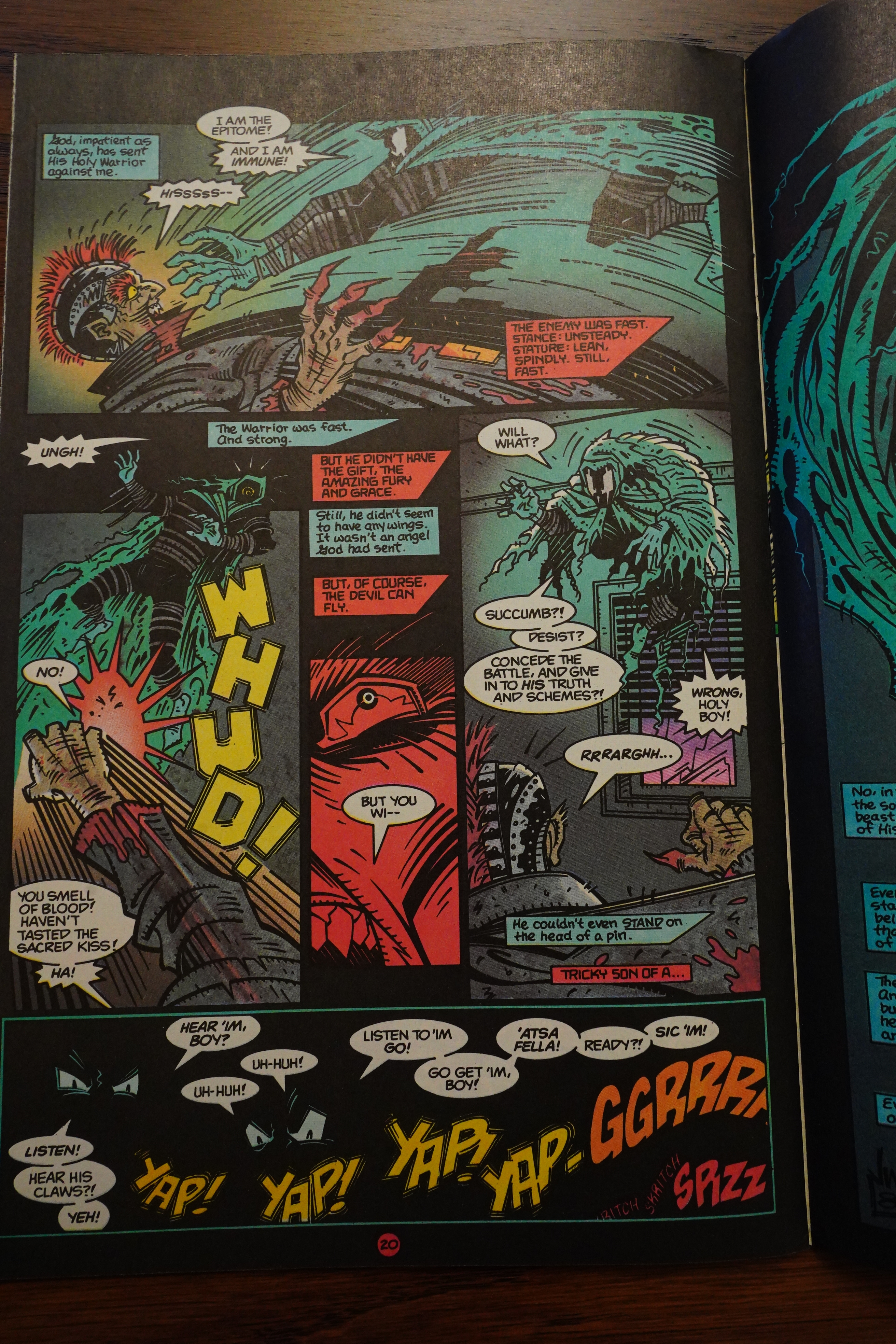
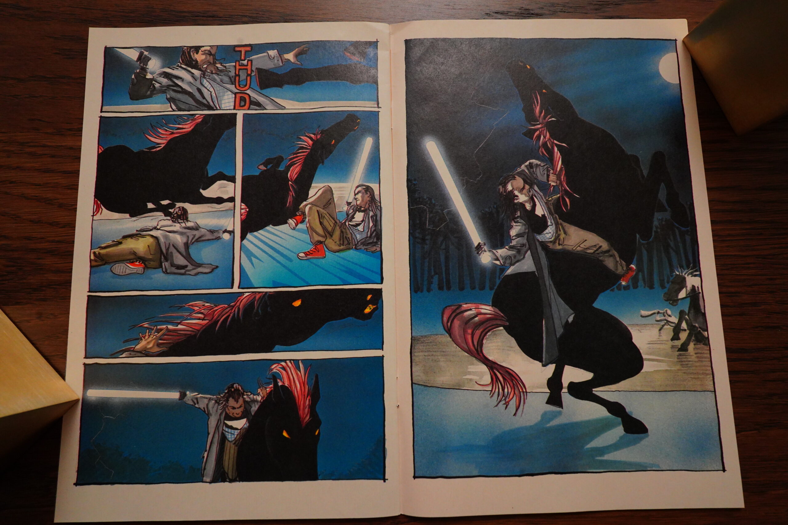
The fourth and final of these issues is drawn by Tim Sale only. While the storytelling continues, broadly, along the same lines as before, the layouts are very different. Now they’re more straightforwardly Frank Millerish, I guess?

With a dash of that “media overload” thing that was in vogue at the time. Again, it’s really fun to read, but the story isn’t that much — and the “twist” with the betrayal was downright boneheaded, the heavy way it had been signalled.
A reader writes in to say that he Grendel is almost as good as Watchmen… and he’s right in a way: It’s a really fun book to read, where almost every issue has something new, storytelling wise, going on. Even reading these issues now, forty years later, it’s pretty thrilling.
The problem is that the world Grendel is set in has all the depth of aluminium wrapper. That is, Wagner has grown to become an incredibly talented storyteller, but there’s not really much of a story to tell, and he obviously haven’t thought his world through — he’s just winging it, and having fun. Any comparison to Watchmen is bound to put Grendel is a bad light.
What I’m wondering about, though, is what the readers at the time were thinking of all these storytelling shenanigans. Many comics readers are quite conservative in what they like to read (when it comes to technique), so my guess would be that sales plummeted over these ten more “experimental” issues. I’ve been googling a bit what people say about Grendel (in general) these days, and I’ve seen a handful of people saying things like “yeah, Grendel is great, especially from the 90s on. Those early issues are very ‘indie comics’.”
Let’s see if I can find any reviews of these four issues, though…
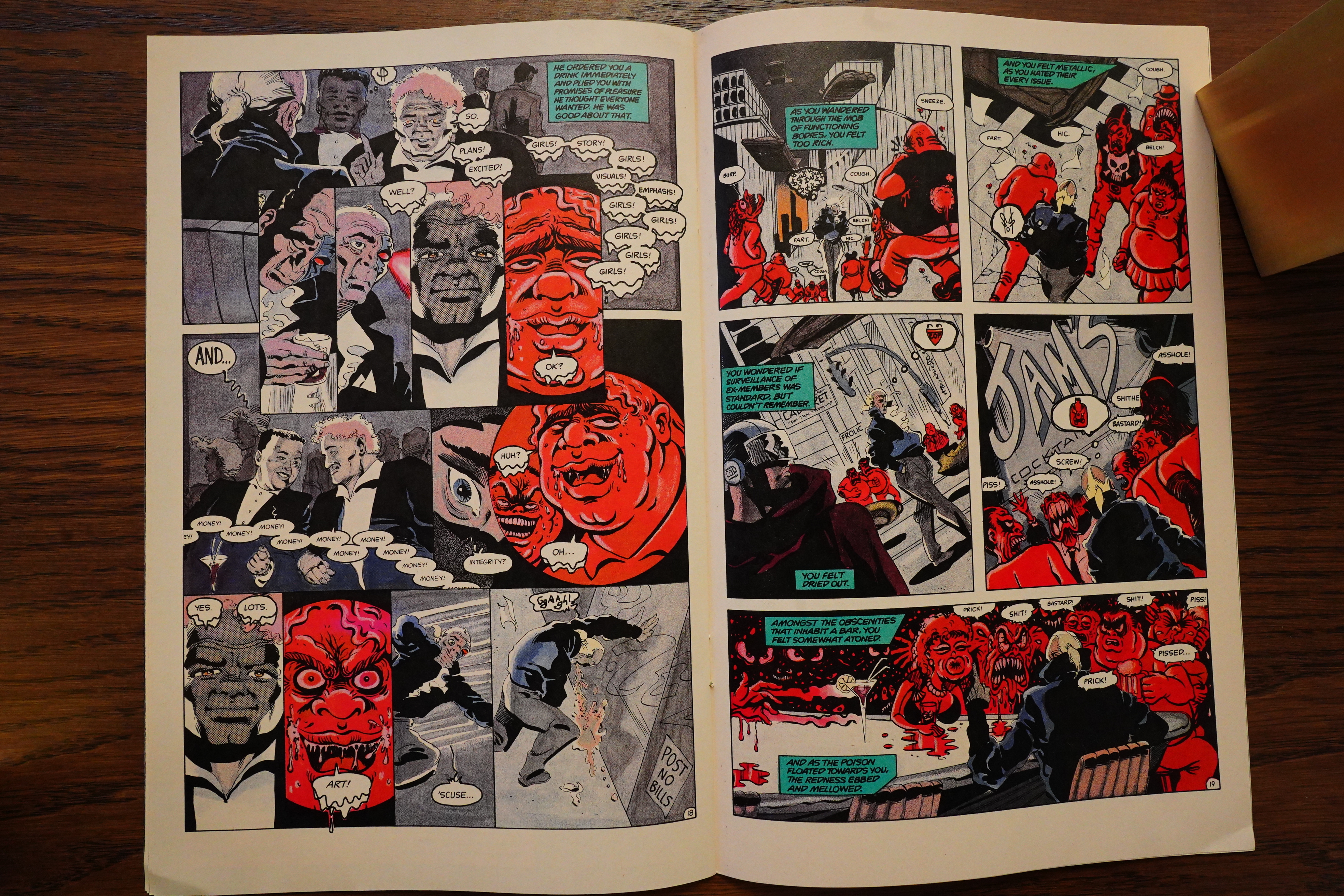
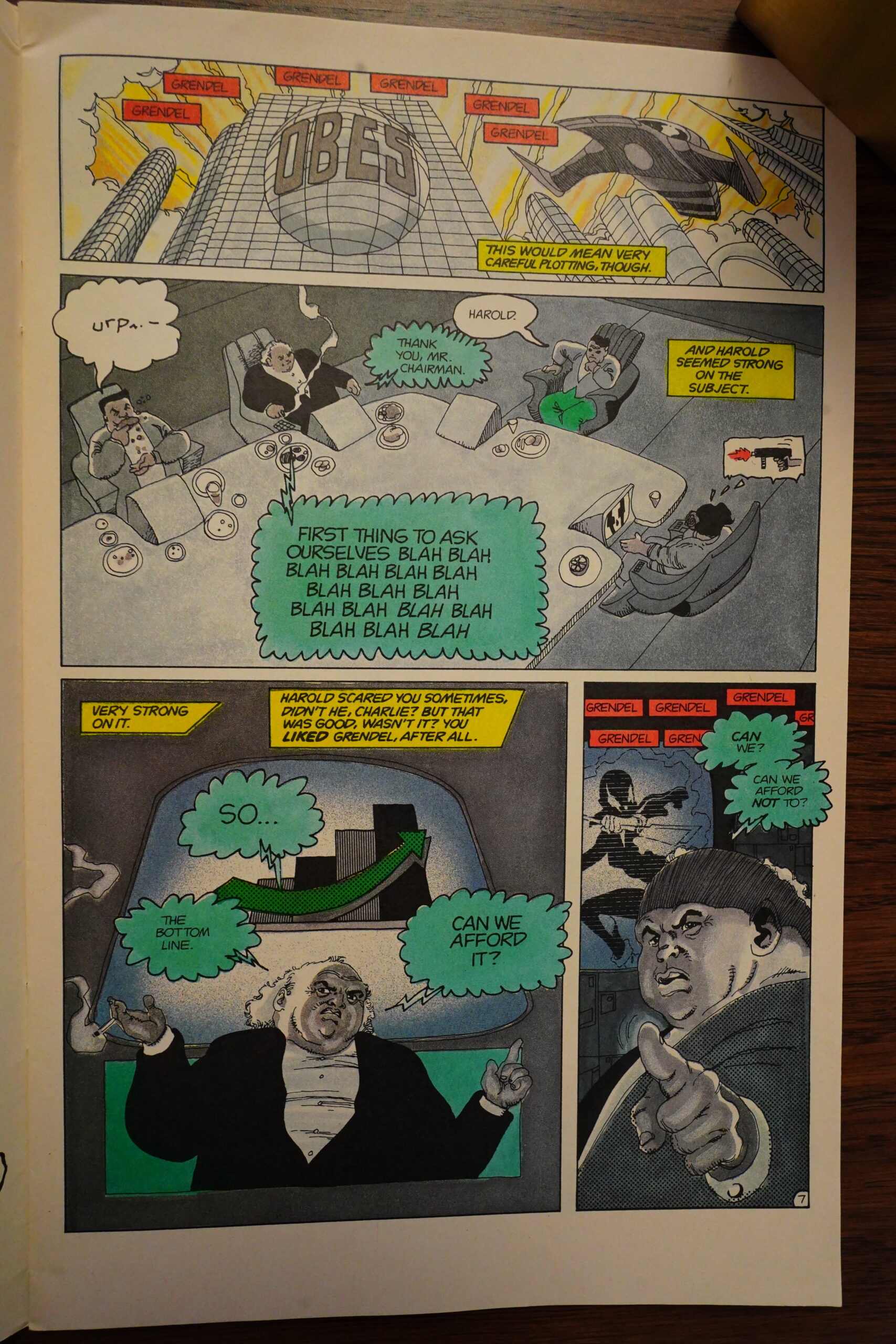
Andy Mangels writes in Amazing Heroes #146, page #75:
Grendel #21, “The Devil is Con-
spiratorial”; Matt Wagner, writer;
Hannibal King, penciller; Tim Sale,
inker; Comico; $1.95
I would normally recommend
Grendel without hesitation. It has
been one of the first-read books of my
stack of comics, and is probably in
my top ten. I say “normally” though,
because as of this issue, Matt Wagner
goes beyond my sense of obscurity
and into complete and utter abstract
unintelligibility.
Here is as much of a plot synopsis
as I can glean: It is October of 2170,
and a man named Charlie heads a
company, named OBES, which seems
to have something to do with the
public relations and merchandising of
the Grendel persona. When the pro-
fits and market shares start to drop,
the company decides to assassinate the
President and the current Russian
leader (?). Charlie doesn’t seem to
want to go along with plan much, but
he doesn’t have much of a choice
when the rest of the board of direc-
tors overrides his decisions.
Did any of that make sense to you?
I may be completely wrong, and the
plot could have absolutely nothing to
do with most of what I just said. I
can’t tell for sure, because I don’t
know what the hell is going on!
Okay, I’ll take my deep breaths and
try not to get so excited. Matt Wagner
is continually experimenting with
style—both art style and writing style.
Most of what he does works; this
doesn’t. Wagner is to be respected for
taking these chances with his styles,
and for not letting the popularity of
one style overshadow artistic experi-
mentation and integrity. However, I
feel that there is a line between artistic
integrity and artistic obscurity.
It could be said that Wagner has
passed into the realm of “real art”
with this issue, as the way most “real
art” critics rate a piece of art is by
its level of incomprehensibility.
Wagner dialogues the story in sym-
bols, sentence fragments, double-
entendre scatological references-
anything but a normal manner.
“Grendel,” and his/ her/their image
is super-imposed over most
everything in the issue, as if Grendel
pervades the entire lifestyle of Charlie
and his co-workers. After reading the
word “Grendel” 244 times (yes, I
counted!) I was getting a nervous tick
whenever I saw the word.
I cannot comment on Wagner’s
dialogue, storytelling, pacing, plot-
ting, or overall story much more than
this, solely because most of these
elements are non-existent. The art, by
Hannibal King and Tim Sale, is
nice—different enough from all of the
previous Grendel artists to be individ-
ual, as well as entertaining. The art
has a very European flavor to it most
of the time; at other times it dips into
Frank Miller-esque scenery. It’s too
bad that for their turn on the book,
King and Sale were not given a story
to illustrate, rather than this random
collection of thoughts and panels.
Better luck next time out, guys.
As I’ve said, normally Grendel is
very high on my list of comics, but
this issue is an atrocity of nebulous
esoterica. Comico rep Jeff Lang says
that the colors (always exceptional) by
Joe Matt add a great deal to the story.
Unless they add enirely new pages
though, I doubt they can save this
issue. If this were a few months ago,
I would be inclined to think it was an
April Fool’s joke.
Grade: Good
Heh heh, that’s about what I expected.
Back Issue #125, page #19:
WAGNER: For Wiggins’ part of this short arc, I was
operating off the old Nietzsche quote: “When you gaze into
the abyss, the abyss also gazes into you.” That souring
effect I mentioned eventually metastasized into something
far more sinister for Captain Wiggins, a festering situation
that ultimately leads a decorated veteran cop to commit
murder. And, here again, it’s fairly ambiguous as to how
that actually occurs. Is the Grendel force directly influencing
these disturbing visions Wiggins is having? Or is it merely
a side-result of his cybernetic eye’s malfunctioning and
causing his Grendel-obsessed brain to hallucinate? Either
explanation works, depending on the reader’s outlook.
POWERS: How does language function in the following
issue, #21 (July 1988), which depicts a United States and
Soviet Union corporate-instigated nuclear apocalypse,
and #22 (Aug. 1988), which shows two star-crossed lovers
from warring gangs who fight for oil?
WAGNER: I was attempting something really ambitious
with this four-issue arc, and I’ll be the first to admit that,
in this instance, perhaps my reach exceeded my grasp.
I knew my ultimate goal was to transform Grendel into
a worldwide phenomenon and, in the process, turn the
entire identity’s perception upside-down. What had begun
as the name of an infamous crimelord would eventually
become the term for a military rank of the highest honor.
And to get there, for it all to be believable, I had to go
through a lot of societal change in my narrative. Thus, in the
course of only four issues and leap-frogging quite a few
years of story-time with every turn, I tried to show how
“Grendel” went from being a personal vision to a corporate
property to a tribal identity to a religious icon. The language
and dialogue balloons attempted to help define this
transition in a manner that, again, I’ll admit wasn’t always
completely successful.
But my aim was to show society slowly breaking down as
reflected by how language was deteriorating, becoming
progressively simpler and less sophisticated. In this
increasingly dark future, communication is increasingly
reduced to single words and simple phrases, pictograms,
slogans, doggerel and ad jingles… what we’ve since come
to call sound bites and memes. It was maybe a bit too
theoretical, and it cost me a number of readers in the long
run. Additionally, we had no active Grendel-in-costume
for these four issues, and that made this arc something of
a hard sell as well. But, that’s part of the creative process…
sometimes you shoot for the stars, and you only make it
as far as the moon.
POWERS: What are your thoughts on Hannibal King’s
pencils for Grendel #20–22 and Tim Sale’s inks for those
issues, as well as his full art for issue #23 (Sept. 1988)?
WAGNER: Admittedly, that was not a super-successful
pairing. This was the first of several instances where the
ambitions of trying to weave an ever-changing aesthetic
got caught up in the grinding reality of producing a
monthly comic-book title. I forget all the specifics right
now, but I seem to remember that Hannibal was going
through some transitional stuff in his personal life at that
point, and those situations can really affect the, again,
unforgiving grind of monthly comics production. I’d wanted
to work with Tim Sale for quite a while, and, in fact,
he’d submitted some Grendel tryout pages right after the
Panders’ run. But at that point, we’d committed to doing
Bernie’s arc and then… again, kinda hazy on some of
the specifics here… I seem to remember that Tim’s
schedule briefly opened up for a bit. But we’d already
committed to Hannibal by that point, so Tim stepped
in as inker. In retrospect, I don’t think those two
were a good match, but the issues were completed on
schedule. And then (again, as memory serves), I think
Hannibal was moving cross country or some sort of
huge transition like that, so Tim stepped in to actually
pencil and ink the final issue of that arc.
Like I said, these issues were an ambitious story-
telling attempt that, in the end, wasn’t entirely
successful. One thing that does resonate from
that arc is the all-pervasive role of Big Pharma and
prescription drugs from the final issue (#23)—where
there’s basically a pill for every occasion, and they
all have these seductive, user-friendly names. I mean,
holy sh*t… I see exactly that same scenario every
time I turn on my TV these days!
OK, Wagner didn’t think this sequence was altogether successful either, but I thought the artwork was fine, anyway.
Andy Mangels, again, has a Top 20 in Amazing Heroes #149, page #54:
#19-Grendel (Comico, $1.75)
Matt Wagner’s first dynamic creation
was Grendel, the story of a malevolent
spirit that inhabits the bodies of
whomever will accept it. Until recent-
ly, this had been one of the more
riveting studies in obsession and
corruption comics had seen.
Currently, Wagner seems bent on
conducting an experiment in obscurity
within Grendel’s pages and the book
has plummetted in quality. Despite the
nice art by Hannibal King and Tim
Sale, I’m waiting for Wagner to get his
act back together at the conclusion of
the current four-parter.
According to comics.org, these four issues have never been reprinted? Weird.
Here’s a review from the web:
One thing Wagner always seems to do is find interesting artists work with. The Pander Brothers and Mireault are two examples, and in issues #20-23, he finds Hannibal King and Tim Sale, both of whom were just starting their careers (and one of whom, of course, went on to much bigger things). King, especially, does a wonderful job, and I’m not sure if he ever did much else or, if he didn’t, why not. His depictions of the “truth” that Wiggins sees through his red eye are grotesque parodies of real life (beautifully colored by Joe Matt), looking like something ripped from Mad magazine, which contrast nicely with the veneer of high society through which Wiggins stalks. When Wiggins finally goes insane, it’s amazing to watch as his wife, Dyna, comes to resemble the horrible creature he sees through his prosthetic eye
Oh, comics.org isn’t up-to-date here… Grendel Omnibus Volume 2: Legacy has this material, apparently.
Right:
I get the sense that Wagner wrote these during an experimental stage as a creator. There are all sorts of departures from standard comic book storytelling, in format, scripting, paneling, and point-of-view. These departures are interesting, but don’t always pay off.
Or… are they? I can’t find anything definite about what issues are reprinted where.
Perhaps somebody knows and can leave a comment here.

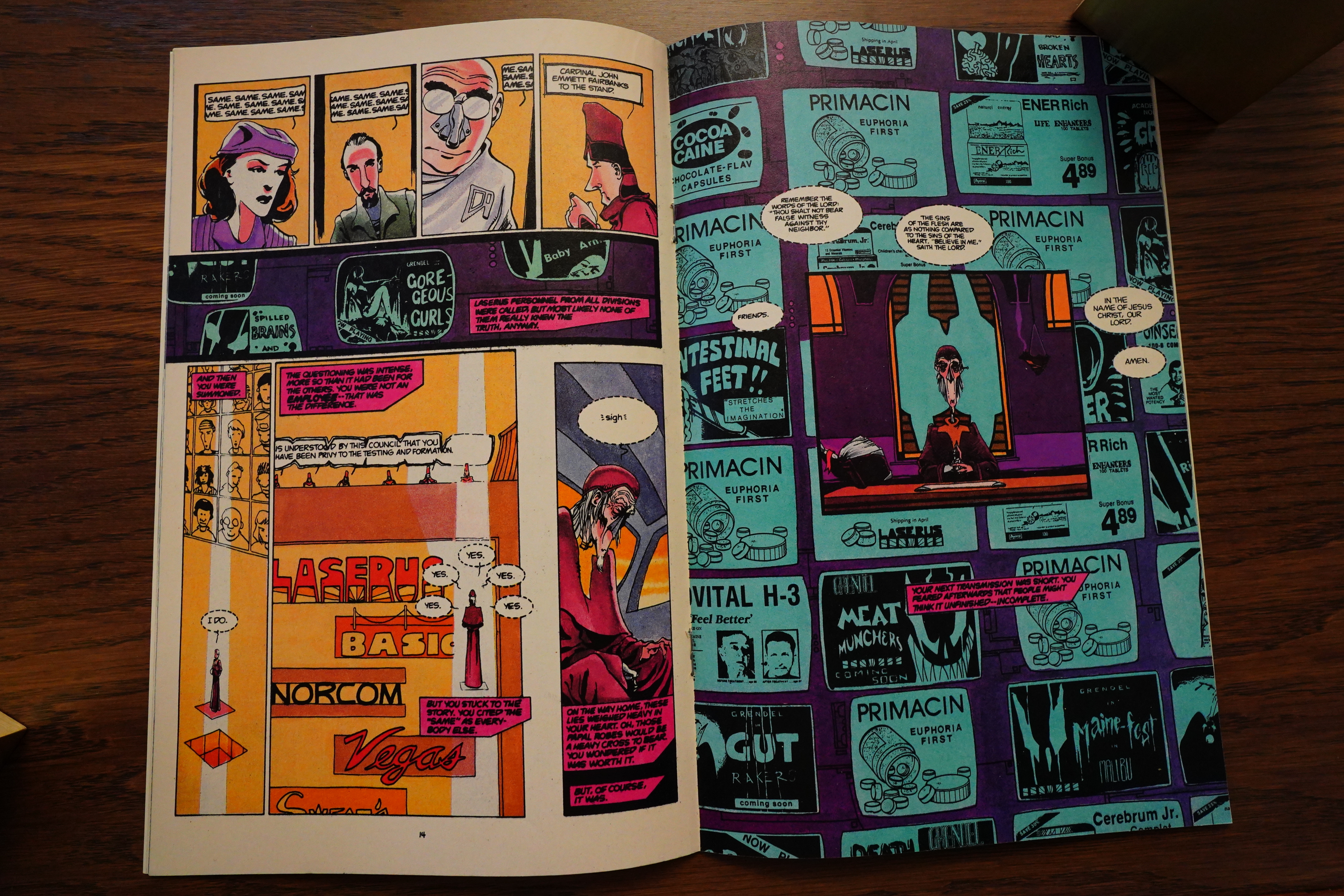
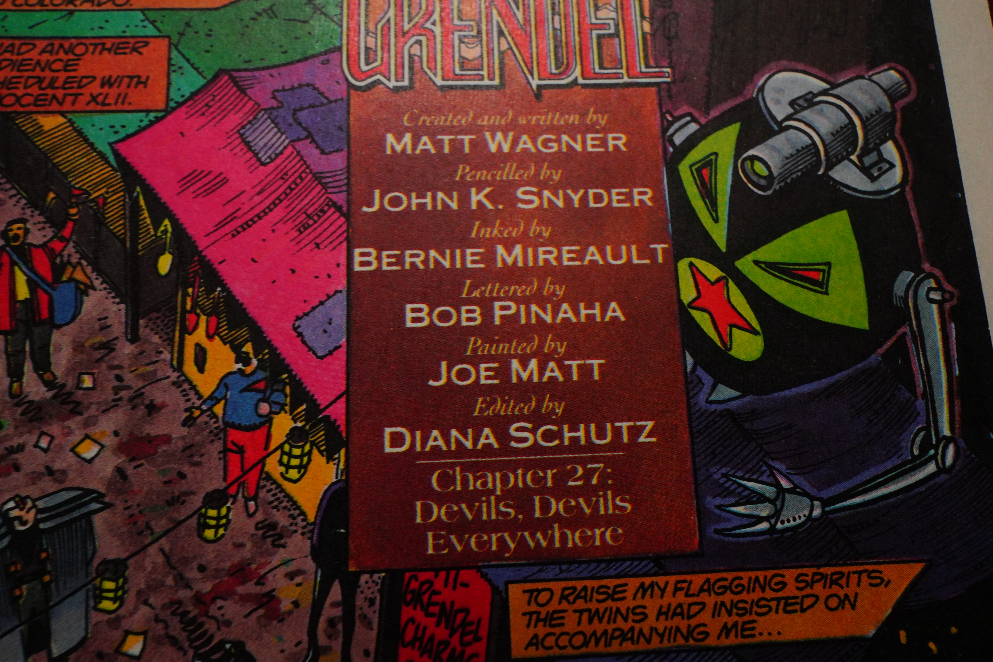
New storyline, so we get an introduction. Wagner explains what happened in the previous four issues, because apparently many people didn’t get what he was trying to do at all. And then we get an original take on an art team: John K. Snyder III is going to pencil two issues with Jay Geldhof inking, and then they swap for an issue, and then start all over again. I don’t think I can remember anybody trying something like that before? But it sounds fun enough, if the two artists are compatible enough, I guess.

Oh, OK — I guess Wagner has decided he can’t depend on his readers to not get what’s going on, but this text seems excessive, doesn’t it?
Grendel had been through several short arcs — one of three issues, two of two issues, and four of one issue each — and they’d all been pretty dense, which makes sense for shorter pieces in particular. So I had expected him to decrease the density with this storyline, which is supposed to run for ten issues.

But he doesn’t — if anything, he ups it a lot. In the first couple of issues, we follow possibly five different storylines that all happen at the same time? And we’re only introduced to the protagonists of a couple of them, and the rest we have to make sense of on our own — or try to figure out if any of the seemingly disparate threads are the same threads. And Wagner doesn’t really help us with any typographical tricks or anything — Alan Moore sometimes took the same cacophonous approach, but he was always meticulous in giving enough of a hint, typographical or not, to what we’re reading at any point.
Wagner attempts the same thing here, with four voices being coloured differently, but who on Earth is paying enough attention to remember which voice is mauve and which is magenta when we don’t really have anything more to go on?
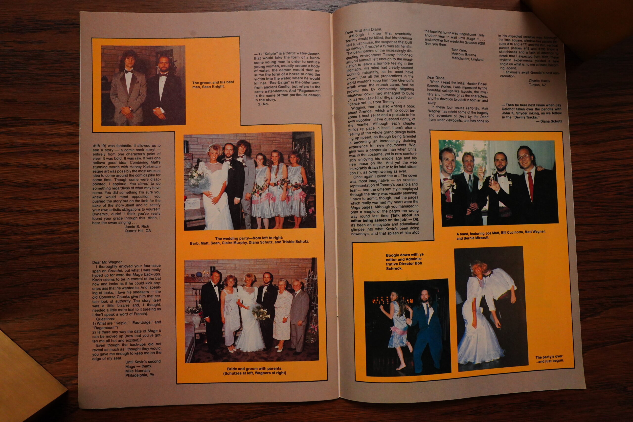
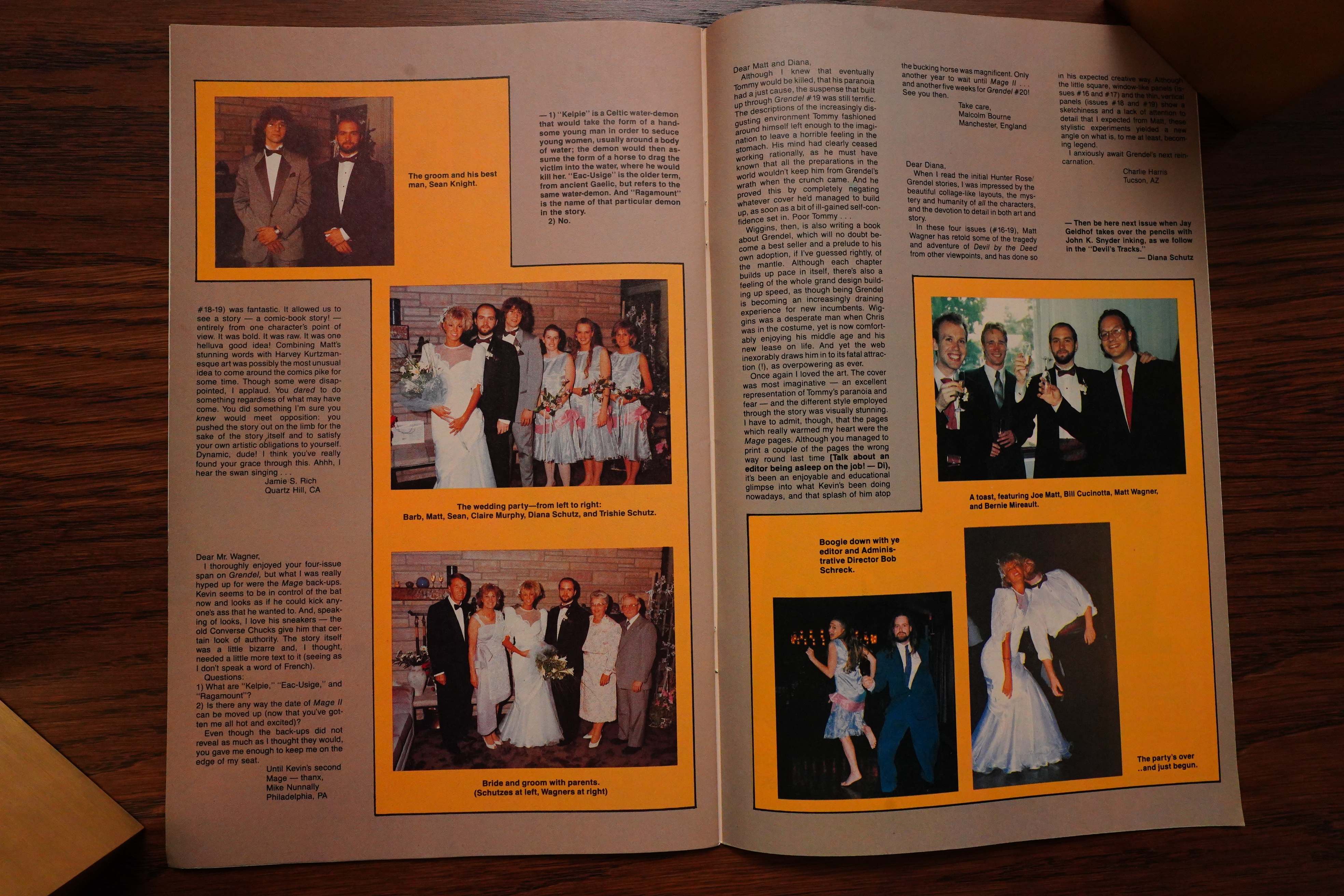
Wagner gets married to Diana Schutz’ sister, so we get pics from the marriage, which is fun.
So here’s the reverse-o issue — Geldhof on pencils and III on inks. And… uhm… I mean, I like this, but it’s quite different from when they did it the opposite way. Perhaps this wasn’t a good idea, anyway.
Heh heh what does a “C” look like reversed anyway? Nobody knows.

Oh, did Geldhof leave? All of a sudden Bernie Mireault takes over on inks…
Along with the increased density, Wagner seems to be experimenting with things like word balloon placement, too — to the detriment of general readability. Usually when doing a comic, you establish a balloon reading order and then follow it on all pages to avoid confusing the reader.
In this book, he deviates from the normal order a lot — I think the above is supposed to be read in the indicated order? I guess it makes sense — it has a certain flow — but it’s exhausting and tedious to do this page after page. Even if most of the pages are “normal”, you can’t be sure, so you skip around a lot to see whether things make more sense read one way or another.
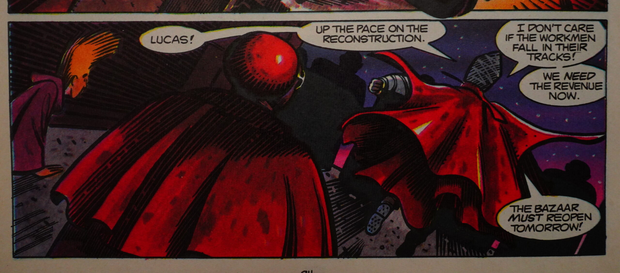
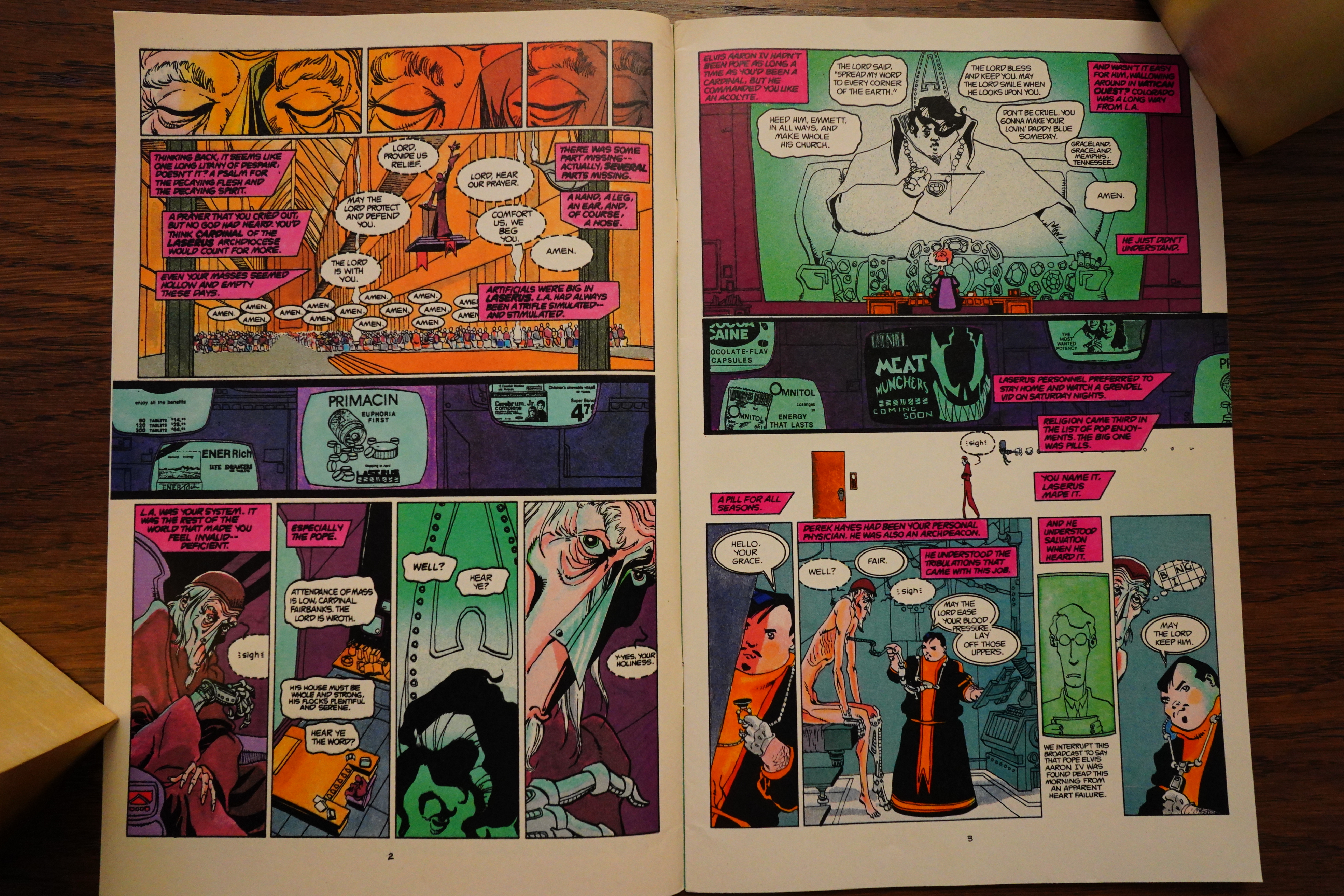
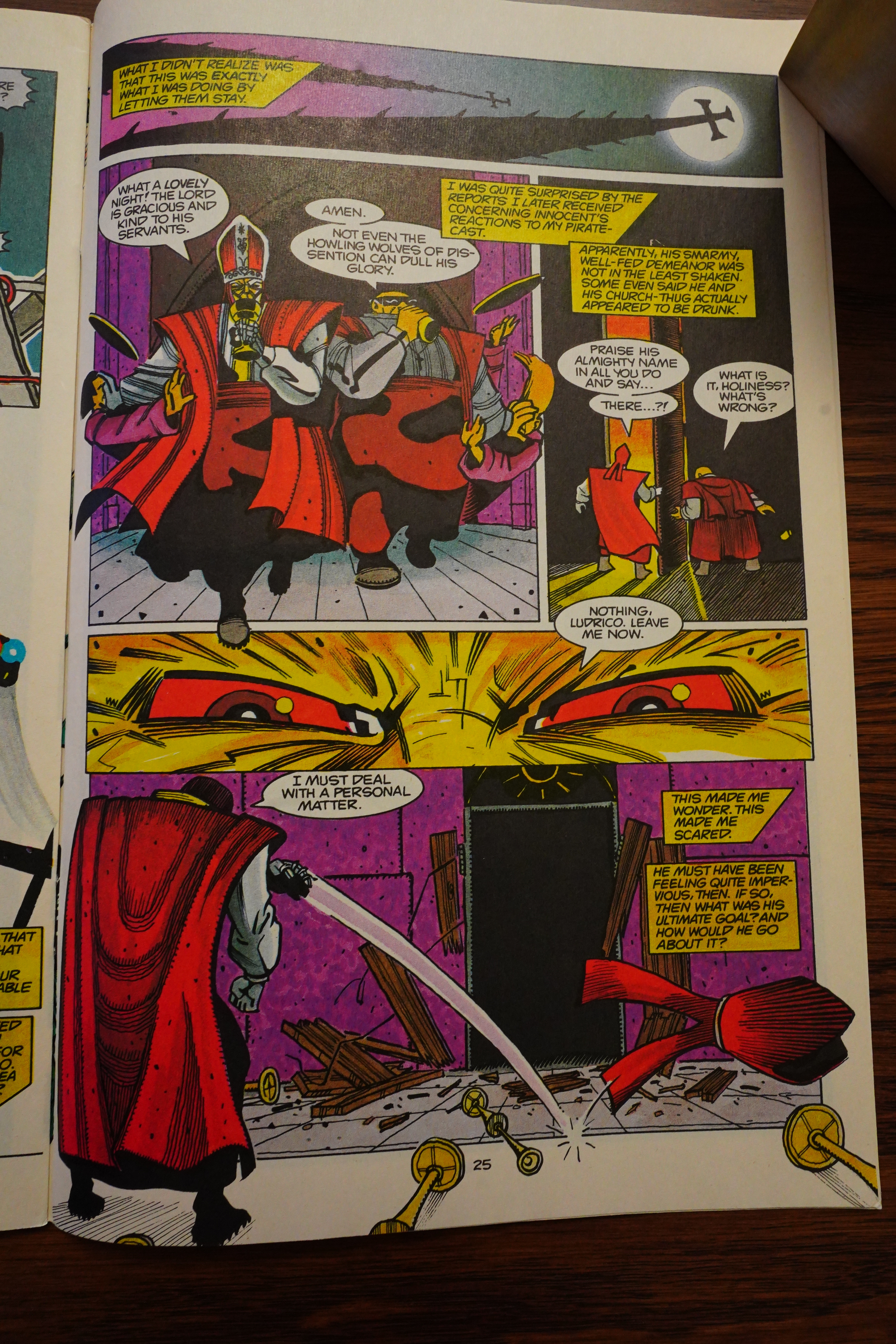
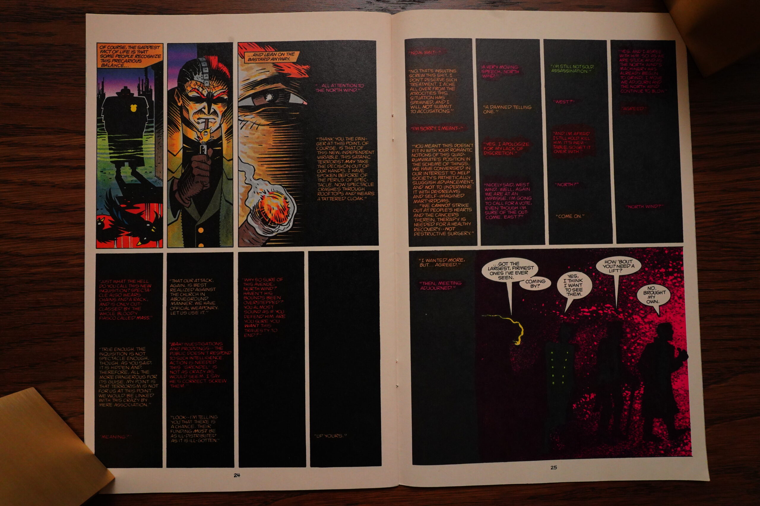
The book feels more complicated than complex: Wagner demands you pay attention, but the rewards for paying attention should be something interesting; something with depth. As I think I’ve touched on before, this world doesn’t seem very well-though-out; it’s mostly consists of babble. Like the pope above, who’s running a billion dollar church and creating a world-busting weapon — he’s here seen panicking over Grendel scaring people off from shopping in the bazaar outside the church. The bazaar where they’re selling religious toilet paper and soap.
That’s the amount of thought that has gone into the world-building here.
Heh, it’s fun when the art goes even more over the top, but it’s also kinda disturbing — I mean, it pulls you out of what you’re reading. And I’ve rather lost faith in the narrative by now, so it’s not really helping.
Hey, Geldhof makes a return… and the exterminators and the rat only appear in his issues? I’m assuming the rat storyline will end all ironically and stuff.

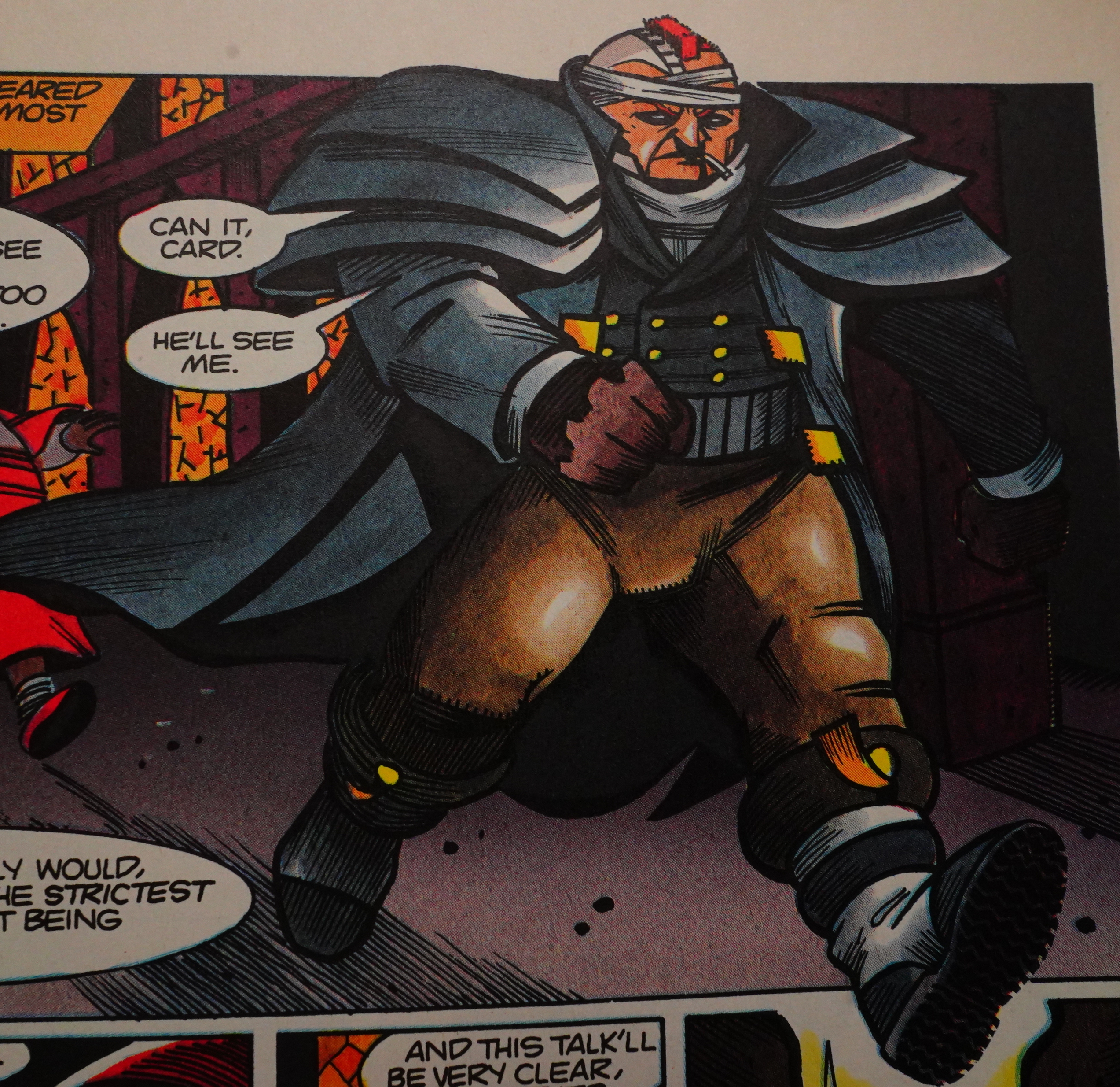
Wagner makes so many strange choices. For instance, he does a quite normal horrible-dead-end-job-where-they’re-treating-Grendel-bad (yeah, that hippie is Grendel now), but he fails even at this: Grendel is so horribly bad at his job that any sensible employer would have fired him several issues ago. They sure must have good workers’ protections in this future! They don’t fire him until he beats up his supervisor.

Well! That’s sure some ad for Ribit! by Frank Thorne.

Well! That’s sure some ad for… er… Comico.
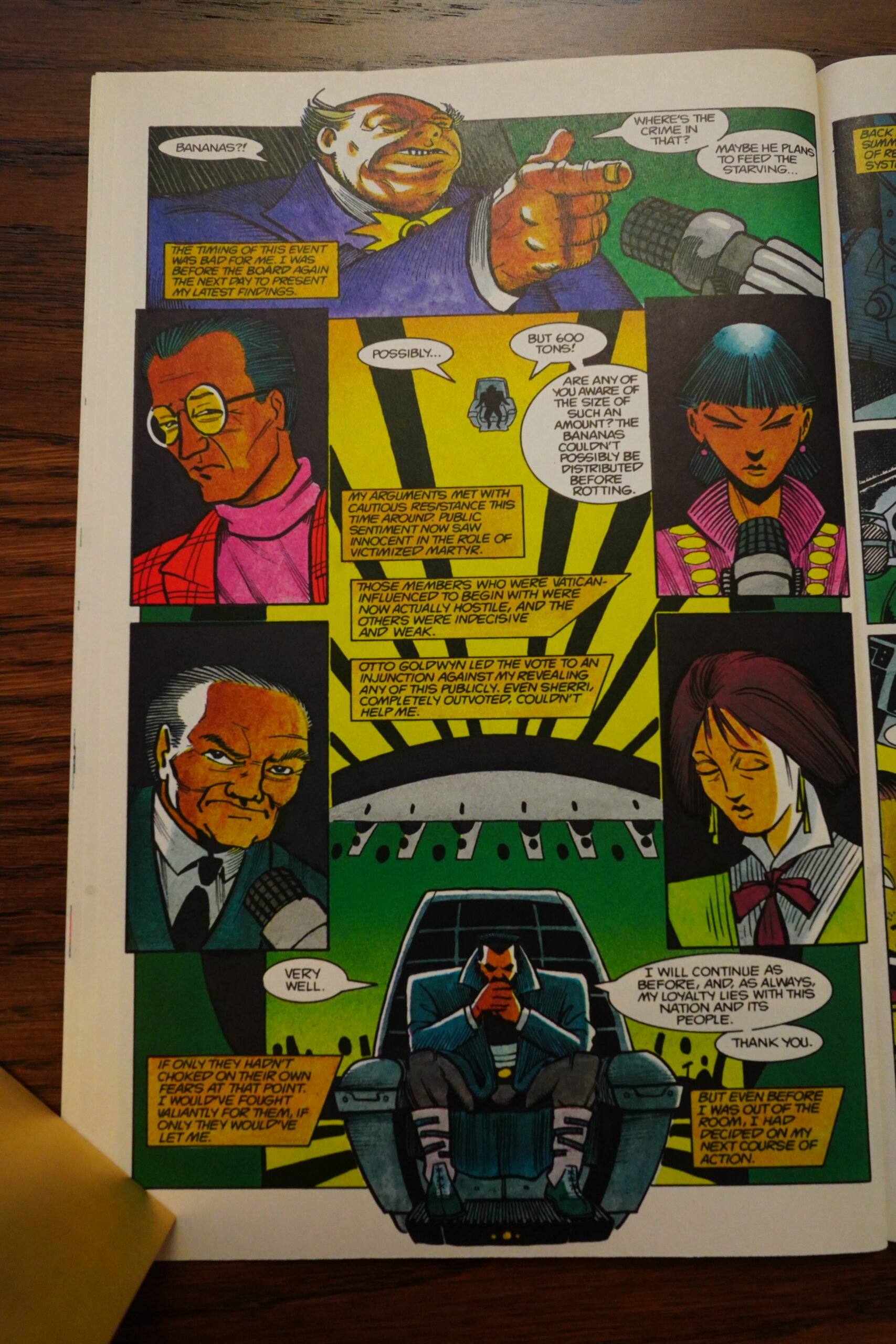
There’s quite a lot of these scenes, where the hero of the story (who’s an aristocrat) deals with Cowardly World Leaders, but they don’t really add up to anything, and again — this world just feels so badly thought out. These leaders have no personality or apparently any volition, but just move around like pawns.

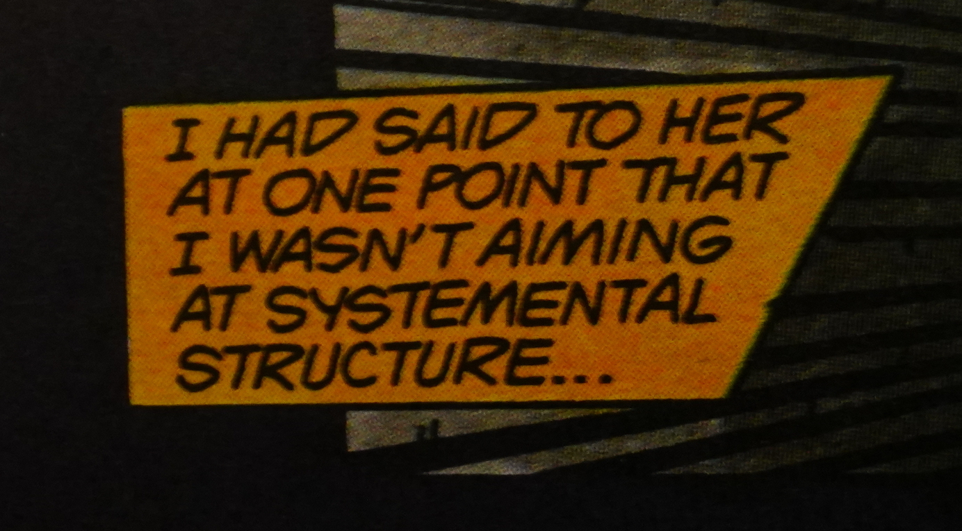
There’s also major storytelling issues. Our hero does most of the narration, but from a very inconsistent position. Most of the time he’s providing foreshadowing about things becoming really bad, and that he’s didn’t know how much terrible pain he’d be in, etc, but here: “I was quite surprised by the reports I received later” and then “This made me scared”. At what point was he scared? What were these reports? Who gave him these reports? (Spoilers: It’s just bad writing.)
Yeah, that’s good.
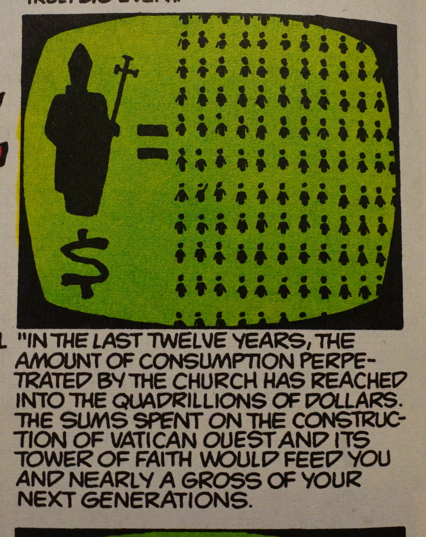
Oh, now the church has a revenue of “quadrillions of dollars”. I guess the church must have had more than one of those bazaars selling religious toilet paper. Perhaps dozens!!!
Oh, the plot… in a shocking twist, the pope turns out to be a vampire. Which, actually, I didn’t expect, but explains why he was always snacking on little boys. So he’s the Chinese guy from the first storyline!?
Or perhaps he was just somebody infected with the vampireness — in this world, when you snack on somebody, they immediately become vampires themselves. So the pope bit the head cop, who went on to bite other cops, so in the end the entire police force were vampires. But… why did the pope make the cop into a vampire in the first place? The cops then try to kill the pope, so… I guess he’s just bad at planning?

Oh, I have to correct something I was bitching about way up there — Wagner does use typography to distinguish between the different narrators. Sorry!
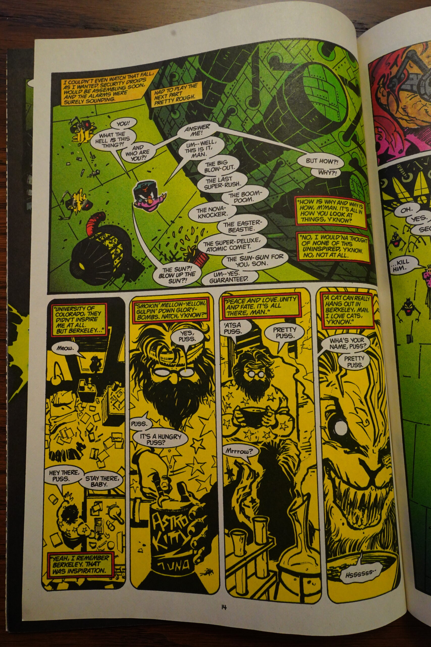
Tada! The pope planned to destroy the sun, and this hippie (who found the kabuki cat back in issue #7 or something) is behind it all, along with kabuki pope, I guess? It’s not really explained why he wants to destroy the sun — these vampires aren’t affected by the sun… I mean, it’s explained that this will make him rich, but…
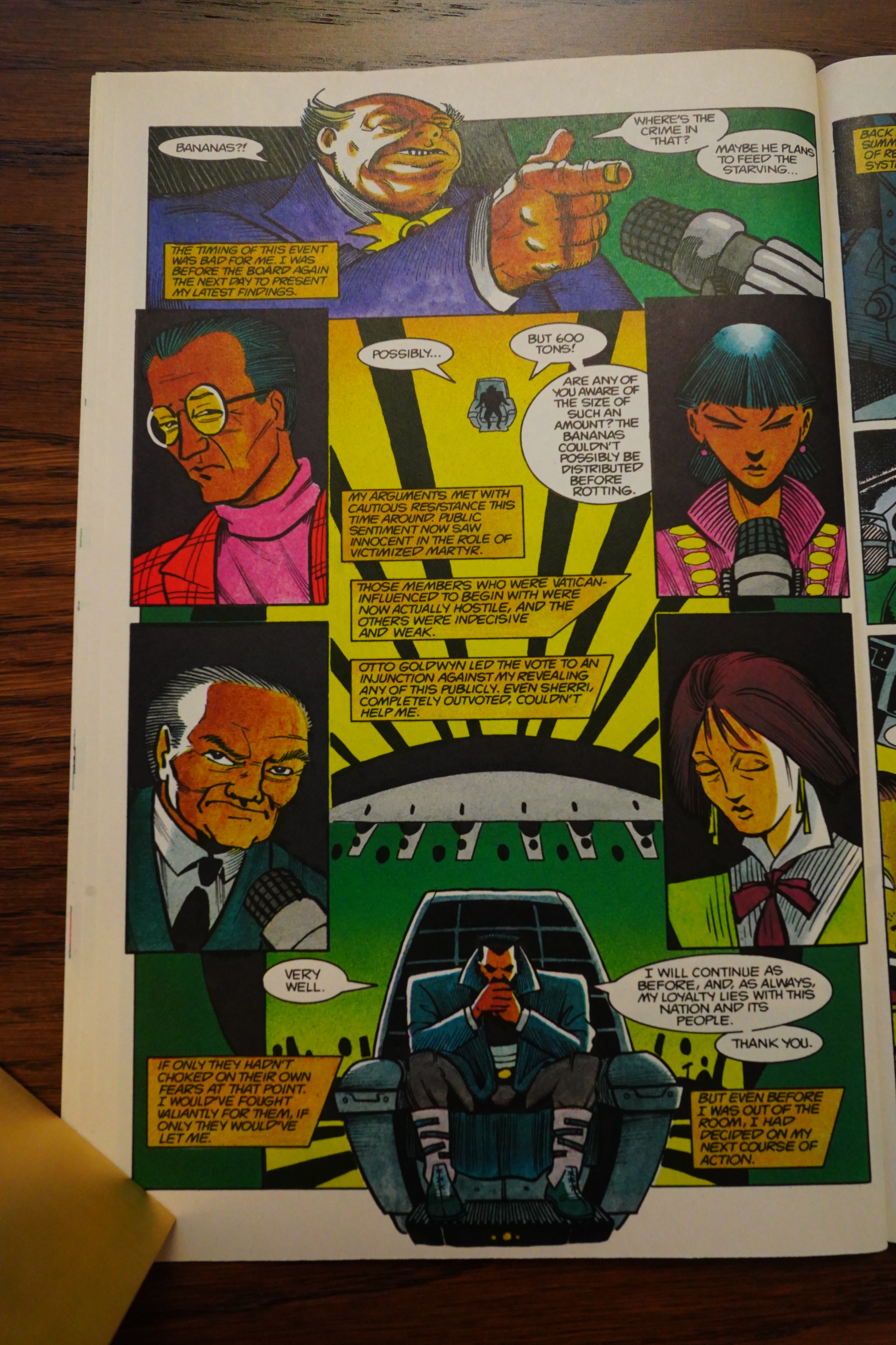
Oh, I forgot to mention the pope’s plot: He was going to use 60 tons of bananas, and then extract the radioactive isotopes from the bananas to charge this sun-killing machine. So you’re going: Right, this has all been a satire, and I’ve been bitching up the wrong tree this entire time. And sure, this storyline shares one thing with satire: It’s not actually funny? But you need more than nonsense-that-isn’t-funny for something to be satire: What’s the using-bananas-to-blow-up-the-sun supposed to be a satire of?

And of course, all the “political machinations” and the various factions and etc end up making not a whit of difference: The 40 page concluding extravaganza has one ecstatic concert that makes everybody go wild, and then there’s a slugfest, and then our hero sets of all the bombs that he has previously hidden (without telling the reader) in the sun-busting weapon.
Bang. THE END.
So that wasn’t just a chore to get through, it felt like being patronised by an imbecile: Nothing ended up mattering, and there was no significance to anything. And Wagner used the most mind-numbing bombast overload to get us there.
What a monumental waste of time for the reader.
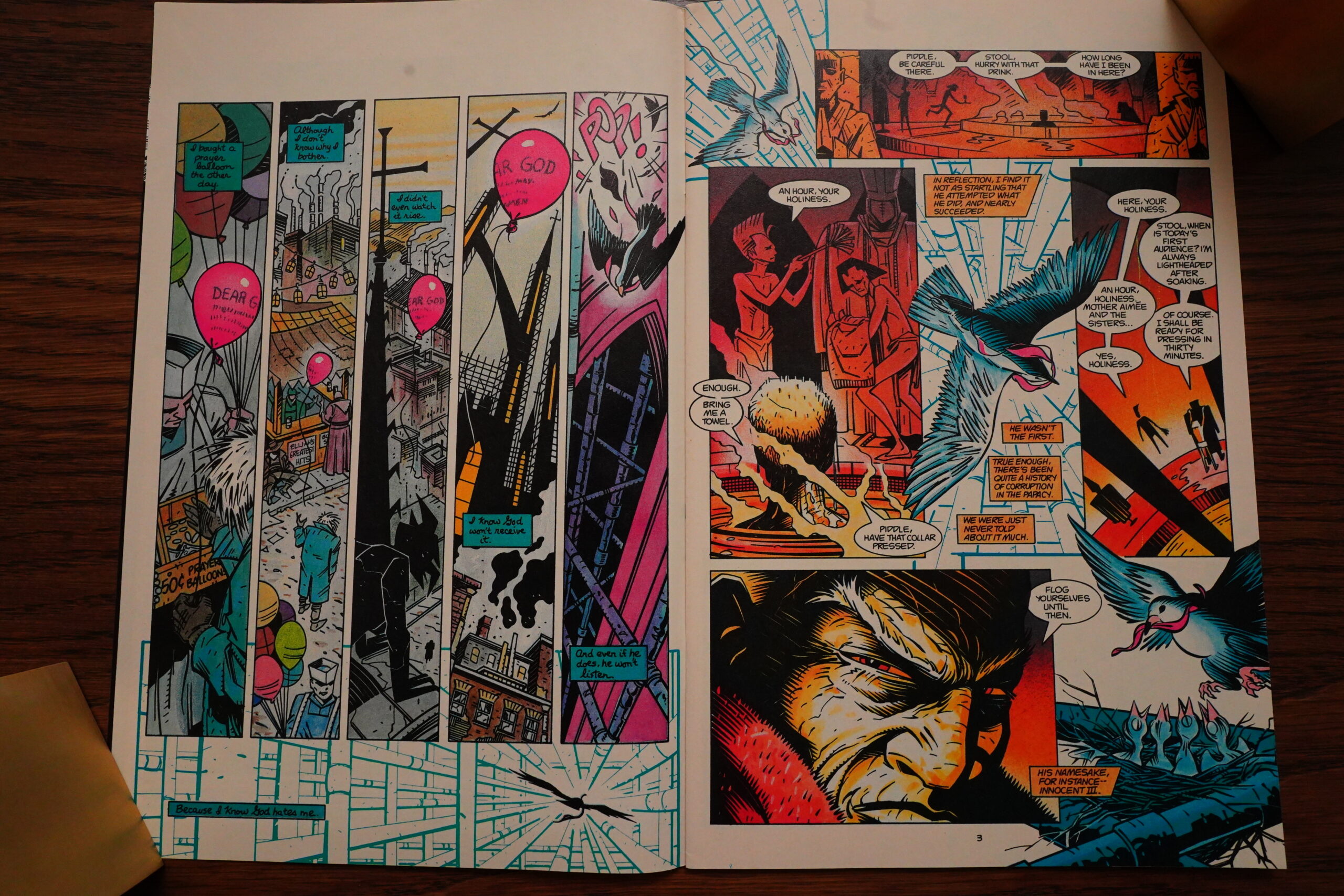
Fantasy Advertiser #109, page #14:
Grendel 24
by Matt Wagner, John Snyder and Jay
Geldhof; Comico.
My admiration for Grendel is public.
In the fascinating debate in FA106 between
Andrew Moreton and Malcolm Bourne, I
endorse the latter’s position: “one of
the best comics around”. Over the past
few months, it has given me great
satisfaction to be able to introduce this
highly satisfying comic to a few new
readers. And, for anyone who is a little
apprehensive after Andrew Moreton’s
description of the (undoubted) complexity
of some of the storylines, 24 is a good
place to start.
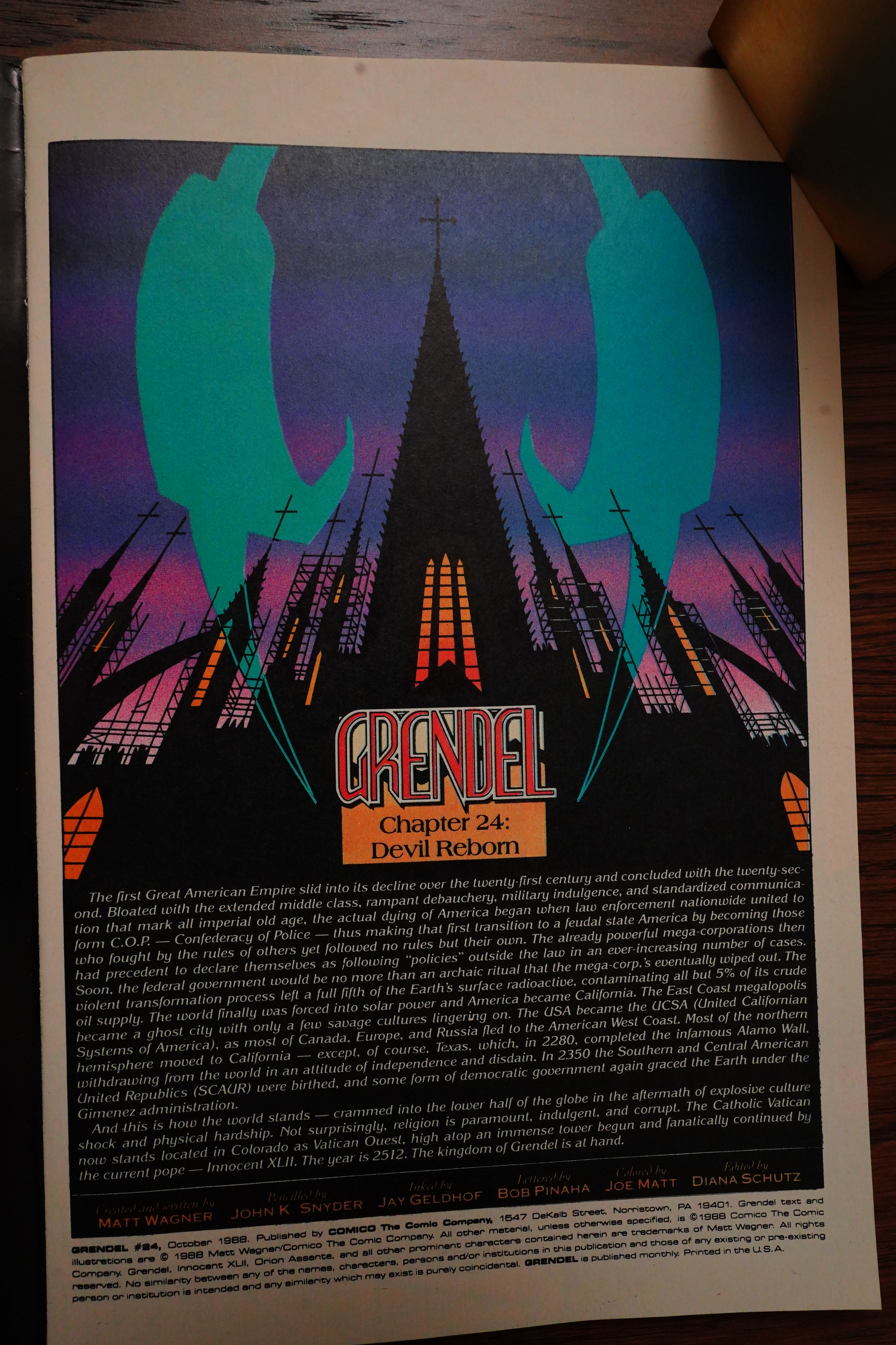
Set in the 26th century, all the
characters are new, and Wagner provides
an introduction that gives as much
background information as is needed. In
fact, my only quibble here is that he says
too much. All right, so the last four
issues were a little murky. They took a
second, or even third, careful reading
to work out how they fitted together.
Personally I preferred that to having them
reduced to one sentence, even by the author
himself. All the emotional atmosphere is
lost with this approach. Also lost is the
ambiguity of the nature of Grendel. The
letter page had quite a long-running
discussion – were previous ‘Grendels’ such
as Christine and Brian taken over by an
external force, or was it their own
violence, normally deep buried, that
emerged and destroyed them? Now we know
for sure. The ‘Grendel essence’ has
survived the centuries: “so Grendel is
now, undeniably, the Devil – the spark
of violence and destruction.”
Having made that quite clear, however,
Wagner goes on to produce another
disturbing comic. Originally his target
seemed to be the forces of “law and order”.
Now he turns his attention to another
“pillar of society” – religion. As the
story unfolds over the opening pages, there
are incidental panels of a bird feeding
one of its chicks with a scrap of a prayer
balloon. The chick chokes and dies. The
last panel on page 7 shows it slumped over,
dead, while its siblings strain upwards
hopefully for food. Higher up the same
page we see a group looking upward
expectantly, as they listen to the Pope.
One man has his arm around his son’s neck,
to keep him quiet. The boy’s bulging eye
and protruding tongue make him look
remarkably like that dead fledgeling…
The church as an institution, religion
as a product, these are dangerous
commodities to deal in. And I say that
as a practising Christian, before anyone
mentions bias. The vast amounts of money
involved, the emotional committment called
forth, all too often lead to frightening
corruption. Interestingly, Wagner makes
it clear he is not attacking Christianity
as such, but the organization that often
surrounds it: “It was a religious market.
Just like the one Jesus tore down.” There
is a rich vein to mine here, and I look
forward to the remaining nine issues it
will take to unfold this story. Many forces
have only been tantalisingly introduced
– as well as the Pope and the clean-cut
investigator (hero?), there are the unseen
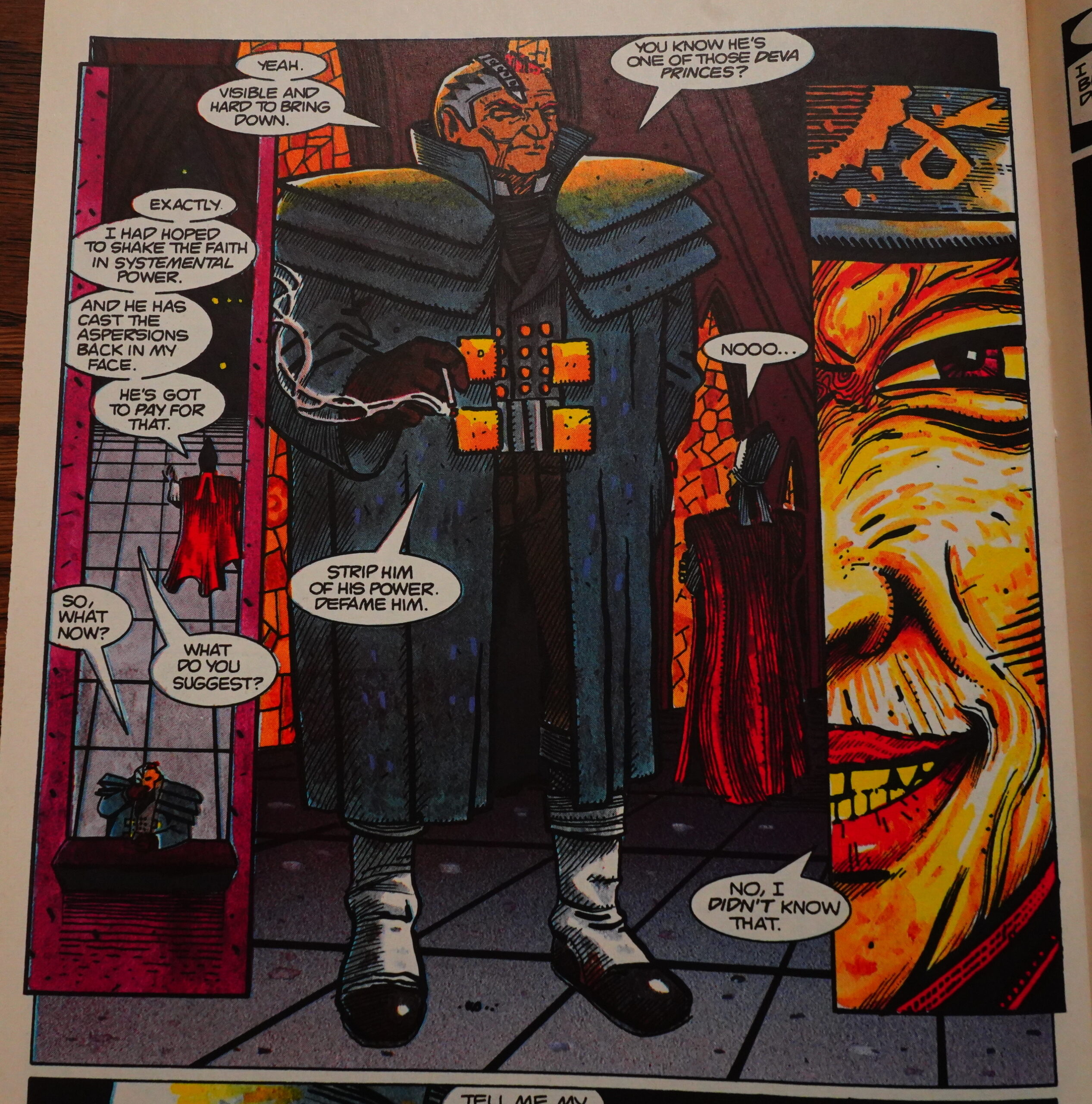
Deva Princes, who seem to be gangsters.
Not to mention the latest incarnation of
Grendel, who only appears in the last
couple of pages.
My only major worry with this storyline
is one that may not be shared by many
others. I have no objection to religion
in general or Christianity in particular
being attacked. I think it needs such
criticism for its health’s sake. However
here the attack is specifically centred
on the Roman Catholic Church, holding up
abuses which existed in the middle ages,
but which are absent today, except in
popular stereotype. I am not a Roman
Catholic, but this makes me uneasy. Maybe
the situation is different in the States,
but in Britain we have the example of
Northern Ireland to remind us of the
dangers of reinforcing religious prejudice
of any sort. Or am I over-reacting to
something that is meant to make me feel
uneasy?
– Huw Mordecai
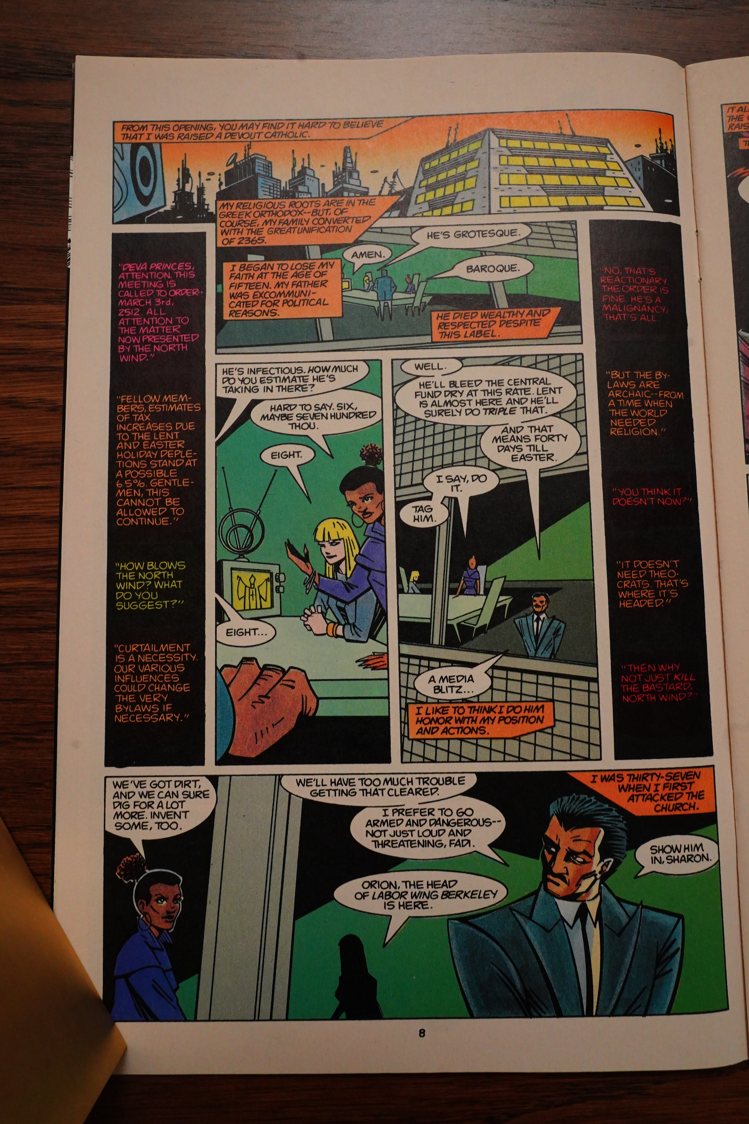
Amazing Heroes #151, page #69:
GRENDEL #24
Grendel is some
achievement in comics!
Issue #24, “Devil Reborn,” is one
powerful piece of work.
Set in 2152, this chapter of the
Grendel saga recapitulates several
examples of corruption in the Vatican
as a parallel to corruption in the
current Papacy. The Vatican is now
located in Colorado, and most of the
world has moved into different areas.
(Canada, Europe and Russia, for
example, have moved to the west coast
of the U.S.—California, in fact!)
All but 5% of the world’s crude oil
has been contaminated by radiation.
A full fifth of the world’s surface is
radioactive. In short, it is not a
pleasant world.
The church taxes everyone
mercilessly as a result of archaic laws
that were passed when religion was
everything. Since then, religion (and
most especially the Catholic church)
has waned and then come back—
stronger than ever.
America’s law-enforcement agen-
cies have been consolidated into a
single force that frequently acts
according to policies that are outside
the law. Federal government is now a
ritual: Megacorporations actually run
things that do not connect directly
with the Church.
We see this future world through the
eyes of Orion Assante, a highly
principled, naive, high-level executive
with Basic. He is in fact, Head of
Labor.
Through Assante’s eyes, Matt
Wagner allows us to view what could
almost be called the ultimate dystopia.
At the base of the Vatican’s ever-
growing tower (of Babel?) in Colorado
there are thousands of vendors of
religious artifacts. You can get “Blood
of Jesus soap on a rope” or prayer
balloons (really!) or any number of
things.
Throughout, the current pope,
Innocent XLII, is shown to be an
utterly disgusting, decadent and
corrupt as is possible to imagine. Yet,
next to Grendel he is as dust.
Most reviews require a bit of a
synopsis to let the reader get an idea
about the contents of the book being
reviewed. With Grendel, the synopsis
must be a bit more detailed simply
because creator Wagner manages to
cram so much information into each
issue.
The amazing thing about Grendel
#24 is not that there is so much
happening throughout (besides the
main storyline, there is a parallel
development centered around the
Deva Princes), but that it does not
seem forced in any way. Everything
flows smoothly, except where Wagner
wants to force a jolt. Somehow,
Wagner just seems to get better with
each new issue.
Of course, as you might expect, the
art is absolutely perfectly suited to the
storyline. John K. Snyder is a whiz
with layouts and his pencils combine
weird angles and gentle curves to
make a definite statement. Jay
Geldhof’s bold inks accentuate the
manner in which Snyder’s pencils
combine such dispate elements and
add subtle depth to the book.
If the “Kingdom of Grendel”
storyline continues to maintain this
level of excellence, it will rank at the
very top of comics achievement
anywhere in the world.
Hunt This Book Down and Buy It!!
GRADE: PRISTINE MINT -Sheldon Wiebe
Well… no, it really didn’t.
Back Issue #125, page #22:
Interview with John K. Snyder III
TOM POWERS: John, how did your collaboration work with Jay Geldhof on
God and the Devil (Grendel #24-33), in that you took turns in penciling
and inking this arc (with Bernie Mireault contributing inks for several issues)?
JOHN K. SNYDER III: The collaboration I had with Jay and Bernie was
spread out all over the ten issues, I did pencils for parts 1, 2, 4, 5, 7,
8, and most of the 10th for the ten-issue run; these issues
focused on the main storyline with Orion Assante and Tujiro/
Pope Innocent, and Jay penciled three issues, the 3rd, 6th,
and 9th parts that centered on Eppy/Grendel and the police
detective Pellon Cross. The inks were then split up with Jay
inking the first two issues of my pencils. Then I inked the
third issue with Jay’s pencils, to switch the tone from the
main story to the backstory. Starting with the fourth issue,
Bernie Mireault took over inking my pencils, and I inked one
more of Jay’s issues (part 6). Jay then went on to pencil and
ink his third planned story in the arc, the 9th chapter. Bernie
continued to ink my pencils through issues 5, 7, and 8. The
last chapter/10th issue was 40 pages, and I penciled and
inked 32.5 pages, Jay penciled and inked 7.5 pages. Bernie
was a big part of the series as well, inking one hundred of the 274 total
story pages. So it was quite a collaboration. Hope you could follow all of that!
It was all tied together with Matt Wagner’s story/scripting, and Joe Matt’s
electric 1980s coloring style. I should also note the series was lettered by
Bob Pinaha. And even a guest appearance by the legendary Canadian band
Jerry Jerry and the Sons of Rhythm Orchestra! When the series was reissued
by Dark Horse, the entire run was beautifully recolored by Jeromy Cox.
Back Issue #125, page #20:
POWERS: In continuing with this theme of the real
world shaping your story choices, how did your
thoughts on-or experiences with-organized religion
affect the telling of both Cardinal Emmet Fairbanks’
tale (“The Devil is Ecclesiastical”) in both issue #23 and
JKSNDEZW
WAGNER: Pretty much everything I’ve ever written
or drawn has been influenced by the events and
conditions of my life at the time. At that point, I’d just
married into a large Catholic family and was both
amazed and repulsed by so many aspects of that
theological monstrosity. I was raised Protestant, and,
although there’s plenty of weird sh*t on that end
of the spectrum as well, it wasn’t quite the same
as Catholicism—the strict adherence to ritual wasn’t
nearly as rigid, and the power structures weren’t
quite so established and severe. My wife’s family had
an unquestioning devotion to Catholic traditions
that really struck me as strange and somewhat tribal.
I’m certainly not trying to say that Methodism (my
family’s denomination) is in any way better or more
enlightened… I find any and all organized religions
to be pretty much the opposite of enlightened. But
Catholicism, with its enshrined rituals, hypocritical
gender divisions (Everyone prays to a female entity,
but only men are allowed positions of ultimate
authority), provided a bizarre backdrop that I knew I
could eventually fictionalize and satirize.
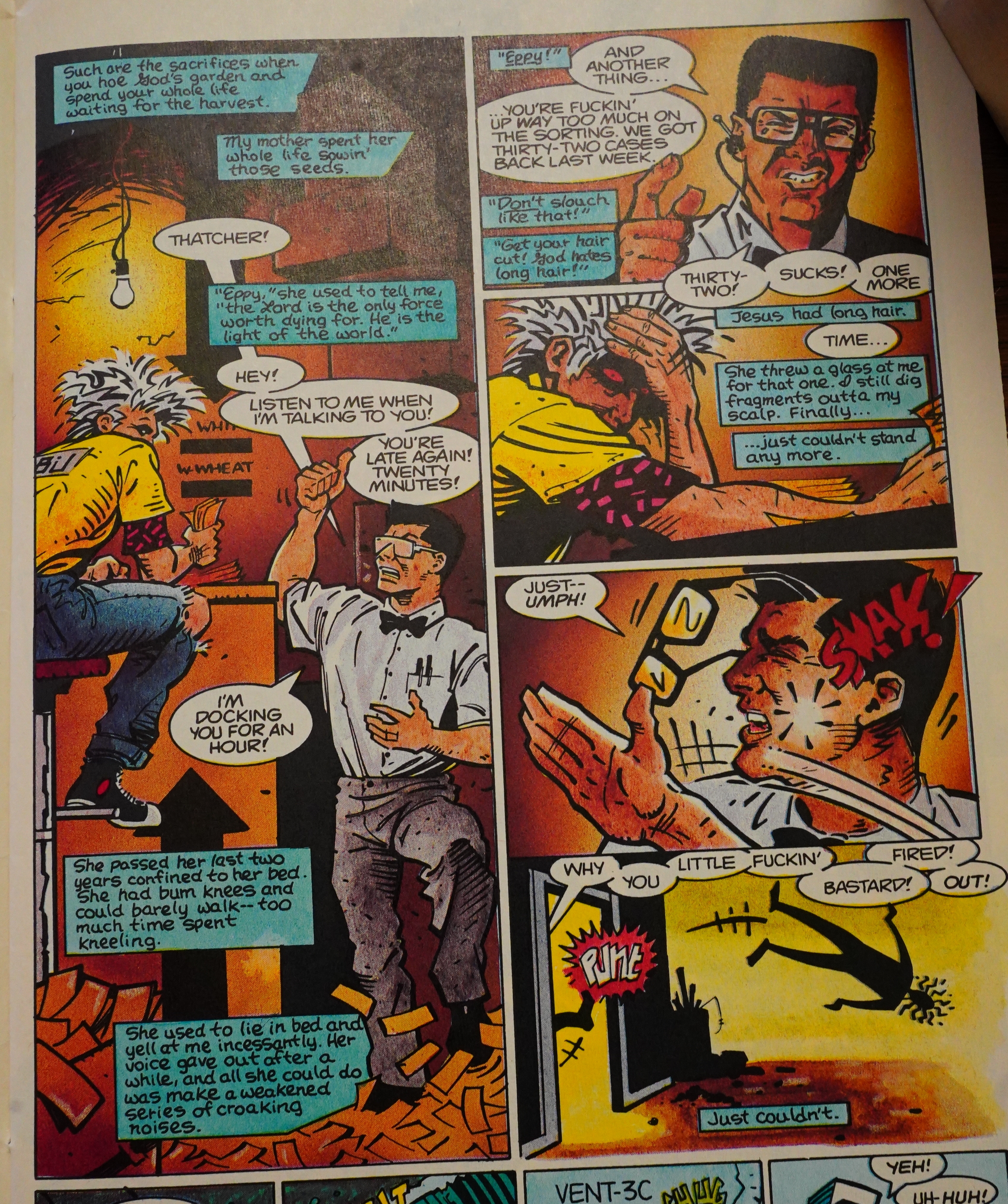
POWERS: In this tale, why is Eppy Thatcher, an addled
drug addict, the person whom Grendel inhabits?
WAGNER: Chaos, baby. The world of this future
had been through a lot of upheaval, and so society
had become extremely authoritarian. You’ve got
powerful aristocratic families controlling most all
commerce, most of the populace living on a bare
subsistence, and the renewed prominence of an
“official” church with an all-mighty and singular
figurehead. If the Grendel identity was going to
find expression in this locked-down and subservient
reality, it had to be as an agent of absolute chaos.
Eppy fit that role and then some. In a sense, he’s the
yin to Hunter Rose’s yang-absolute chaos versus
absolute control. This arc also showed the gradual
transition of the term “Grendel”… the fact that the
term was now applied to a dangerous street-level
drug as opposed to an individual or sect implied
that big changes were about to happen.
POWERS: Conversely, why is Pope Innocent XLII (a.k.a.
a long-lived Tujiro) the main villain for this arc?
WAGNER: Tujiro was a vampire, and I’d shown at the
end of Devil’s Legacy that he was still alive. I always
knew I was going to bring him back one day. Another
aspect that really puzzled-I guess I should say
disgusted—me about the Catholic Church was its vast,
institutionalized wealth. All the gold and glitz and
financial opulence that the Church embodied seemed
so obviously at odds with a religion whose messiah
often spoke about the evils of worldly wealth. And yet
I’ve almost never met a practicing Catholic who was
much bothered by that contradiction. Lastly, the role
of the Pope was confusing to me. Again, having been
raised as a Protestant, the concept that there was one
ultimate voice of authority for Catholics, a human being
who had somehow been chosen as God’s one true
representative on Earth, seemed utterly at odds with
the precepts of the religion itself.
And so I decided to make my pope a vampire…
a literal bloodsucker who sat atop a corrupt and
entrenched power structure that bled its congregants
dry in order to feed their leader’s own base cravings.
And that role seemed to fit Tujiro very smoothly. As in
his earlier incarnation, he dressed in ornate robes and
was a stage performer in every sense of the word. And,
of course, the Pope and all of the Church’s upper strata
of authority have always been men. With that gross
inequality firmly in place for millennia, I decided to
really crank up the phallic imagery in this story arc to
an absurd degree. Thus, the Pope lives in an immense tower that is
under a constant state of construction (erection), atop which he’s also
secretly building a powerful projectile weapon with which he hopes
to hate-f*ck the sun itself… and the whole thing is powered by vast
quantities of bananas. Vampire pope indeed!
This arc was collected in “God and the Devil”. Did anybody have anything to say about that?
Indeed:
And the entire story with the Deva Princes seems largely pointless, serving only to prove that the Church is a malevolent force to be reckoned with.
Heh:
While the story definitely delivers at the meta level that Wagner is famous for in his Grendel stories, I think it suffers from a couple different shortcomings. The first is the wildly differing art styles in this volume, none of which are particularly good. GOD & THE DEVIL reprints a portion of the old GRENDEL Comico series where indie artists like John K. Snyder III and Jay Gheldof were just getting their chops. The art in this volume goes from ambiguous to downright ugly.
Right:
The story lines are densely tangled, and Wagner’s penchant for overwrought narration and random moments of ultraviolence throws more layers on top of it all.
Heh:
Grendel: God And The Devil is first and foremost a really meaty, detailed and involving read. None of your decompressed storytelling here. Reading God And The Devil feels like reading prose. The buildup is slow, careful and complicated. There is a real pleasure in the words, the characters, the subtle action is no less devastating in it’s effects. All in all, it’s my favourite storyline of a series I’ve loved for many years. Sure, there are times when Wagner’s writing stretches itself too far and he has an annoying habit of overplaying his metaphors. But aside from that I can find little wrong with Grendel the series in general and Grendel: God And The Devil in particular.
Uhm:
This is an astonishing work of comics art. Wagner shows how confident he is in his storytelling, immersing us in this world more than ever, while his artists contrast each other wonderfully.
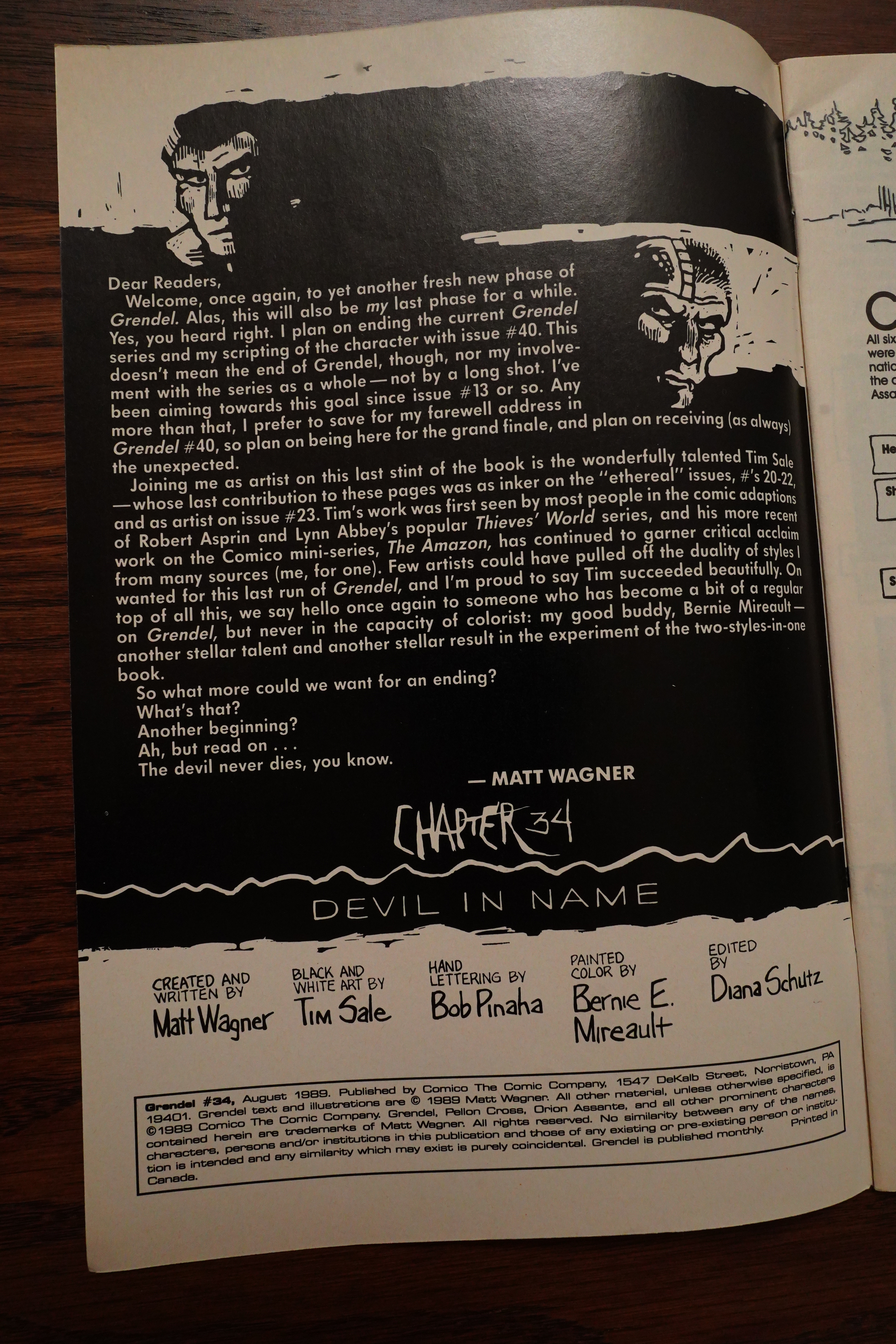
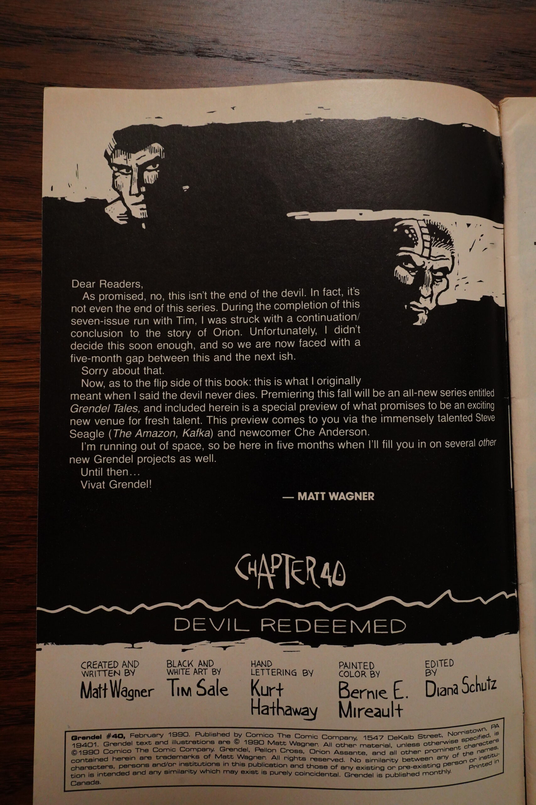
OK, that’s enough — onto the next story arc, which I’m not really looking forward to reading: I rather lost my faith in Wagner’s abilities during the previous one. But Tim Sale is taking over the artwork, so perhaps that’ll bring back some freshness.
Wagner explains that this is the final Grendel arc (sort of) — this series is going to end with issue #40, which is a pretty unusual amount of planning for an indie series. They have a tendency to just stop in the middle of something.
Oy vey. Half of each issue is told in this way. The form is basically “recap with some dialogue scenes in between”, and if there’s one format I hate, it’s this. But hey! That’s just me, I guess — many people love reading plot recaps.
The other half of each issue is the story of what happened to those darn vampires. (They’re in Vegas.)
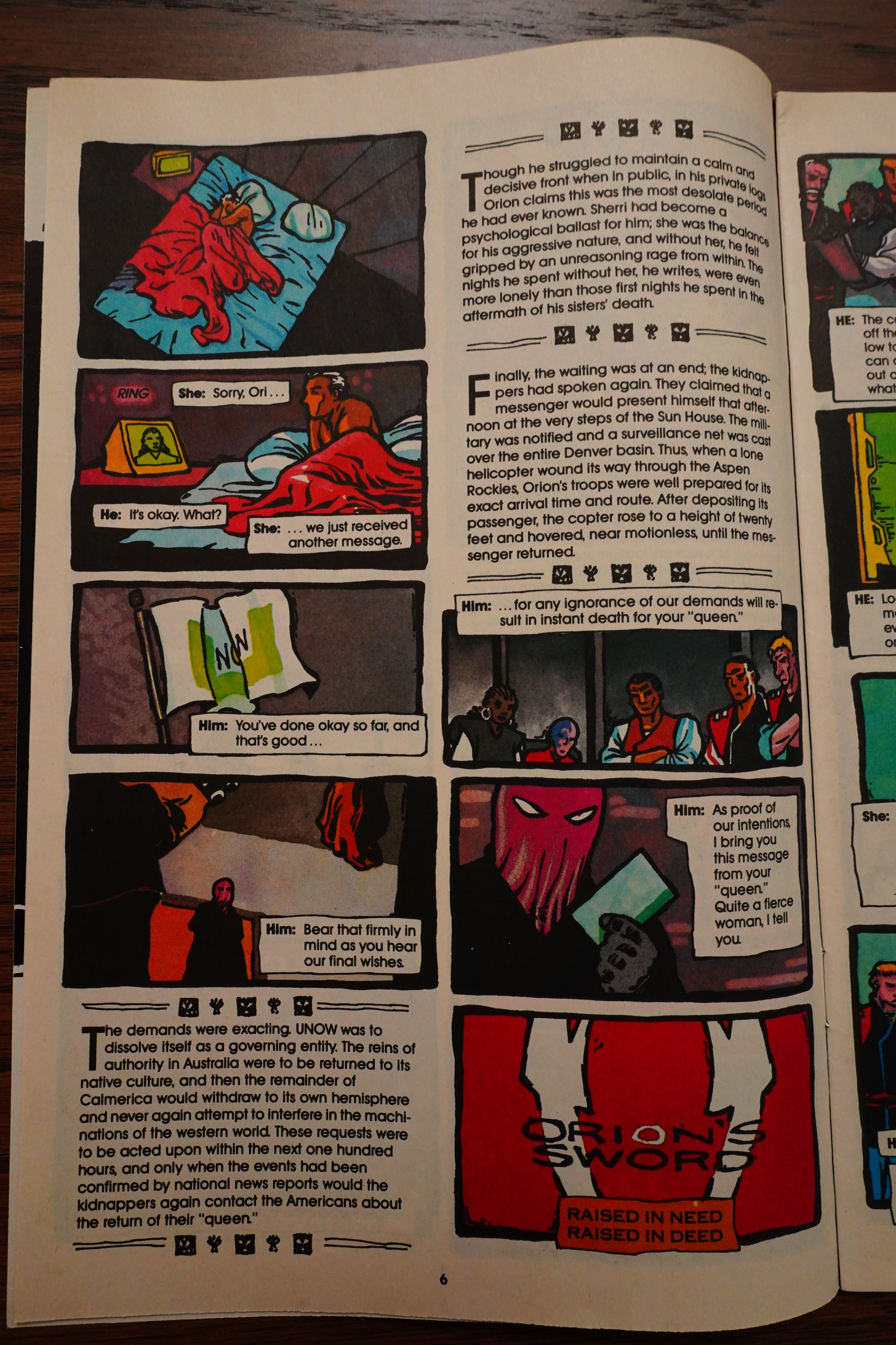
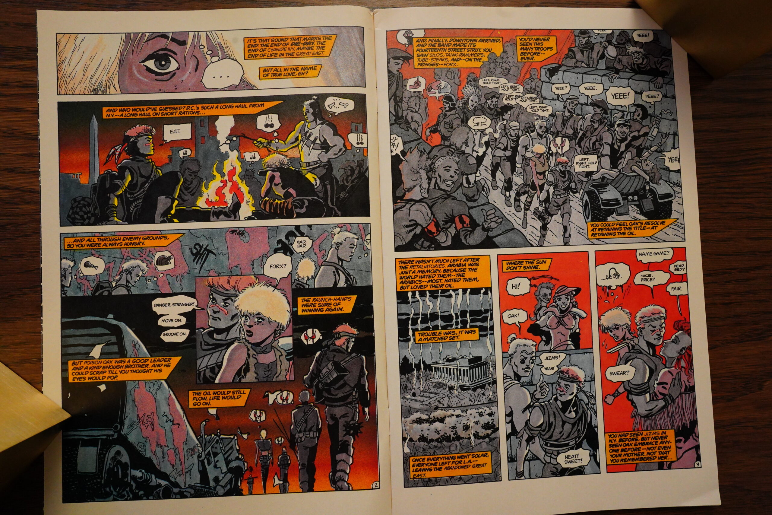
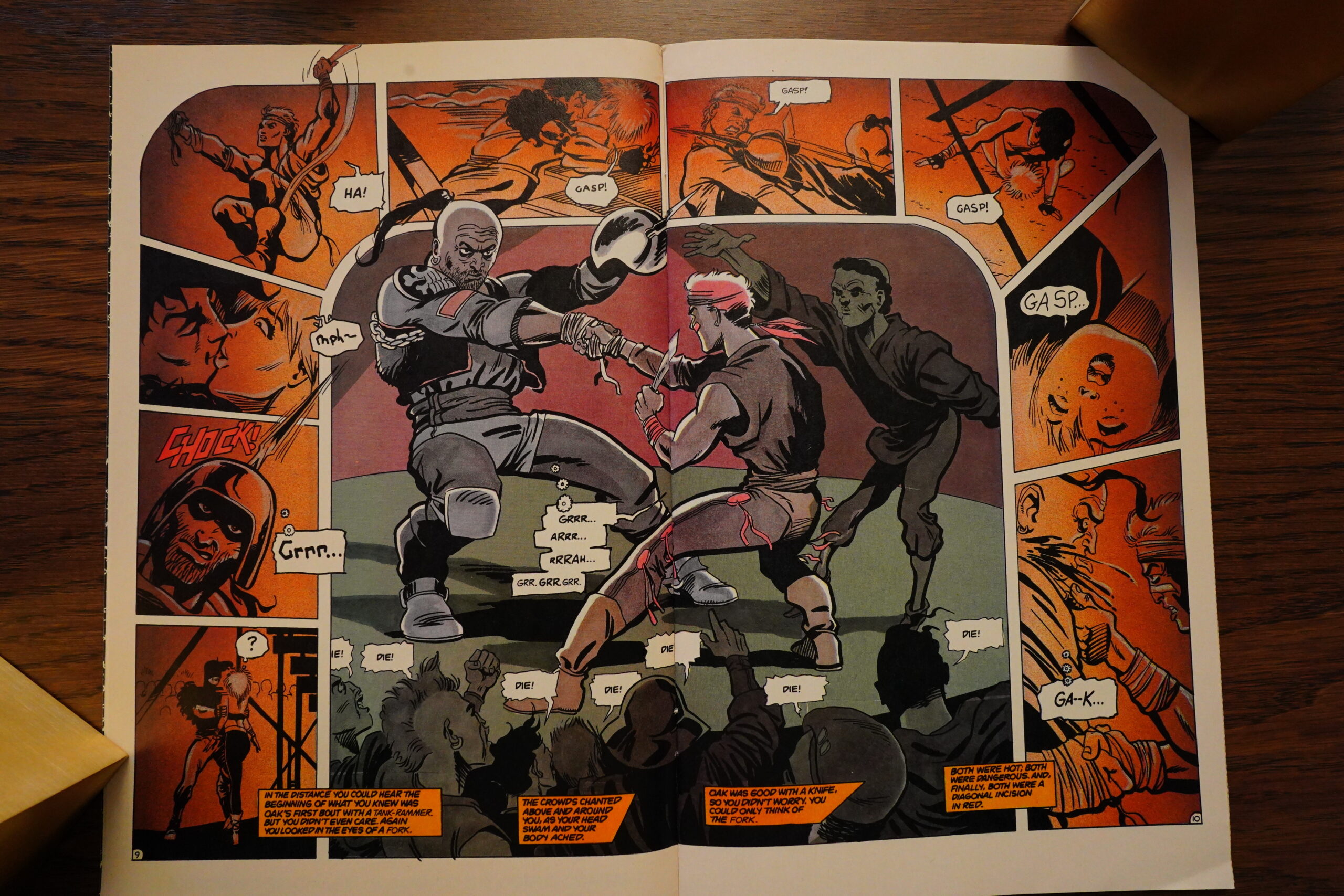
As has become a familiar complaint from me (if you’re read this blog post from the start — I feel for your sanity), while Wagner is going for a great complex science fiction story, with worldwide machinations and so on, it’s just so badly done. Like here we have the new leader of the United States (or Calimerica as they call it). There’s been several wars, so I don’t know how many people are still alive, but a couple hundred million, I guess? But this leader still handles bureaucratic disputes between local police forces himself.
From a throne.
It’s just…

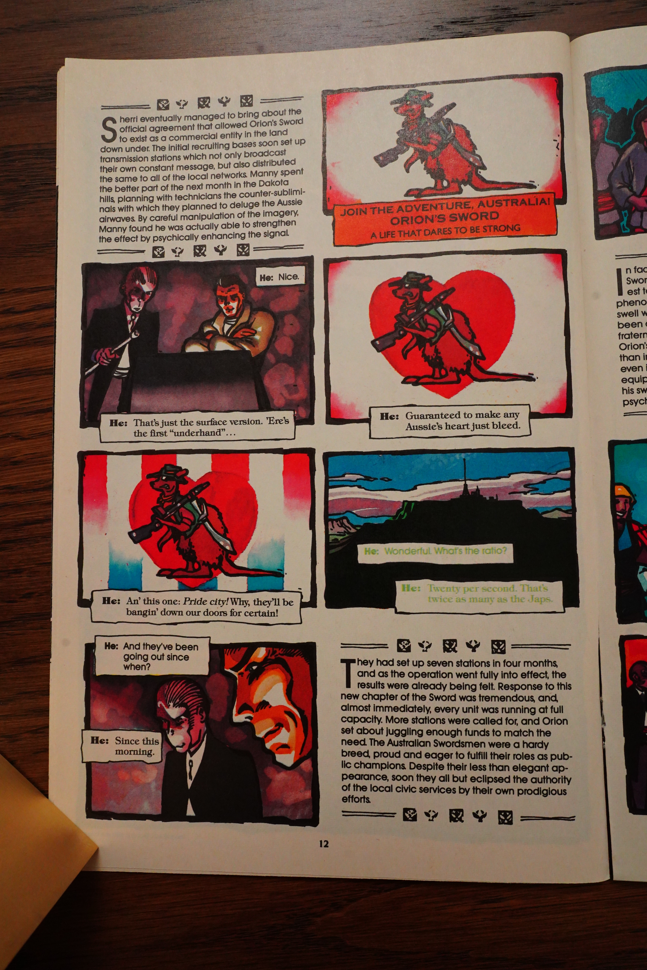
See? They’re Australians! AUSTRALIANS!
Wagner helpfully labels speech bubbles with “He:” and “She:”, which kinda breaks down when there’s only men talking (which happens a lot). So he tries to add additional variety with different lettering styles… and since we’ve got a Mexican guy in this scene, we get “El:”. Which means, of course, “It:”, doesn’t it? I think what he meant was “Él:”.

Man, what a change from the hype pages during Comico’s Imperial Period — they’re now down to three comics per month? Grendel, Elementals and Silverback (which is a Grendel spin-off). Bankruptcy coming soon…
But there’s still merch.
While the first half of each issue is pretty boring, the second half is just befuddling. You can sort of make out what’s happening overall, but on a scene by scene basis, it’s frequently hard to tell what we’re supposed to make of this.
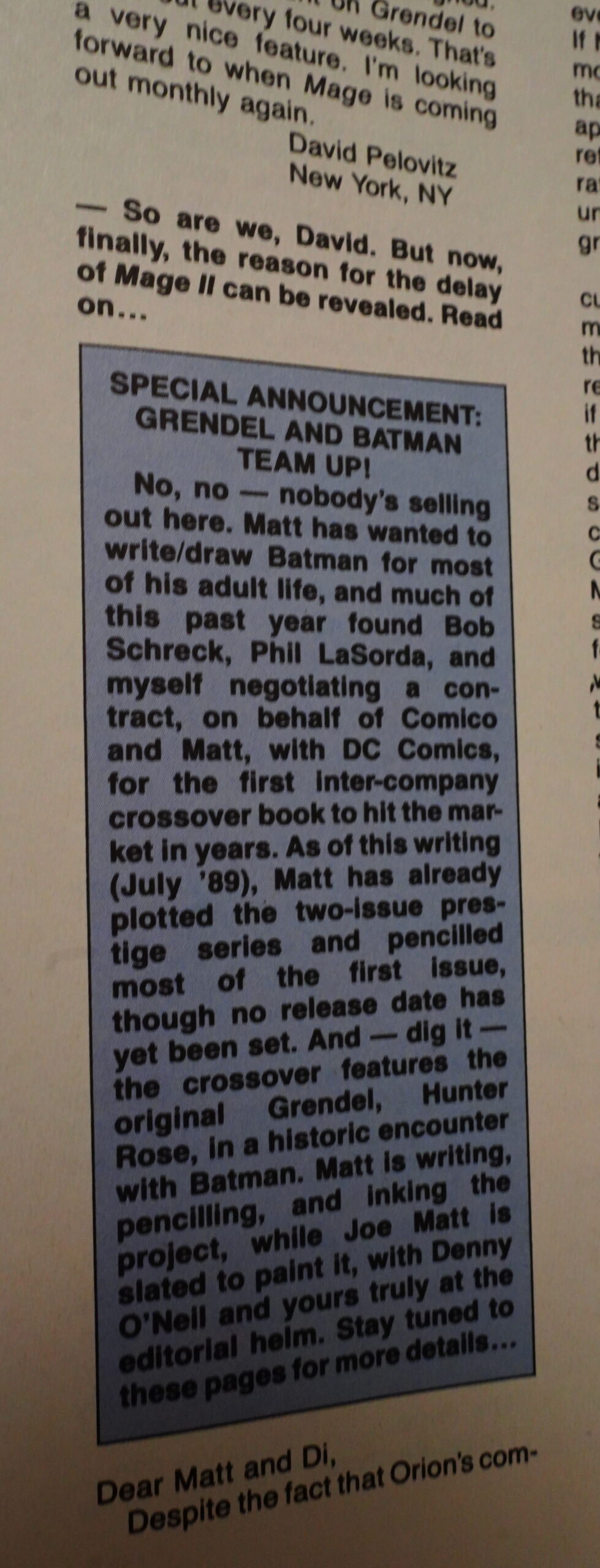
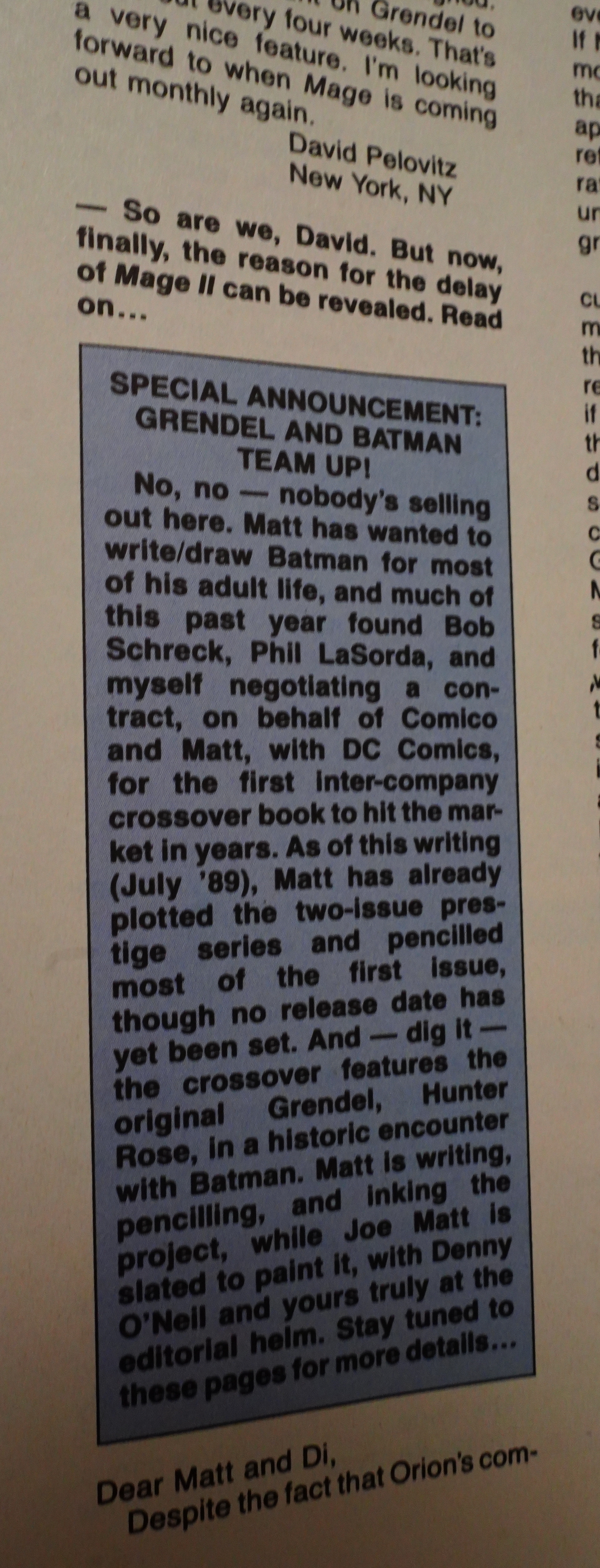
Ah, yes — the Batman/Grendel team-up. Perhaps Wagner’s mind wasn’t totally on Grendel these days…
I forgot to mention that Comico swapped their logo from the cool check mark thing to this lame one.

There’s a lot of political intrigue going on. Much manoeuvring, much smart. And so the enemies kidnap the UNOW’s boss’ wife and try to extort them to, er, stop being the United Nations or something? Now that’s sophisticated!
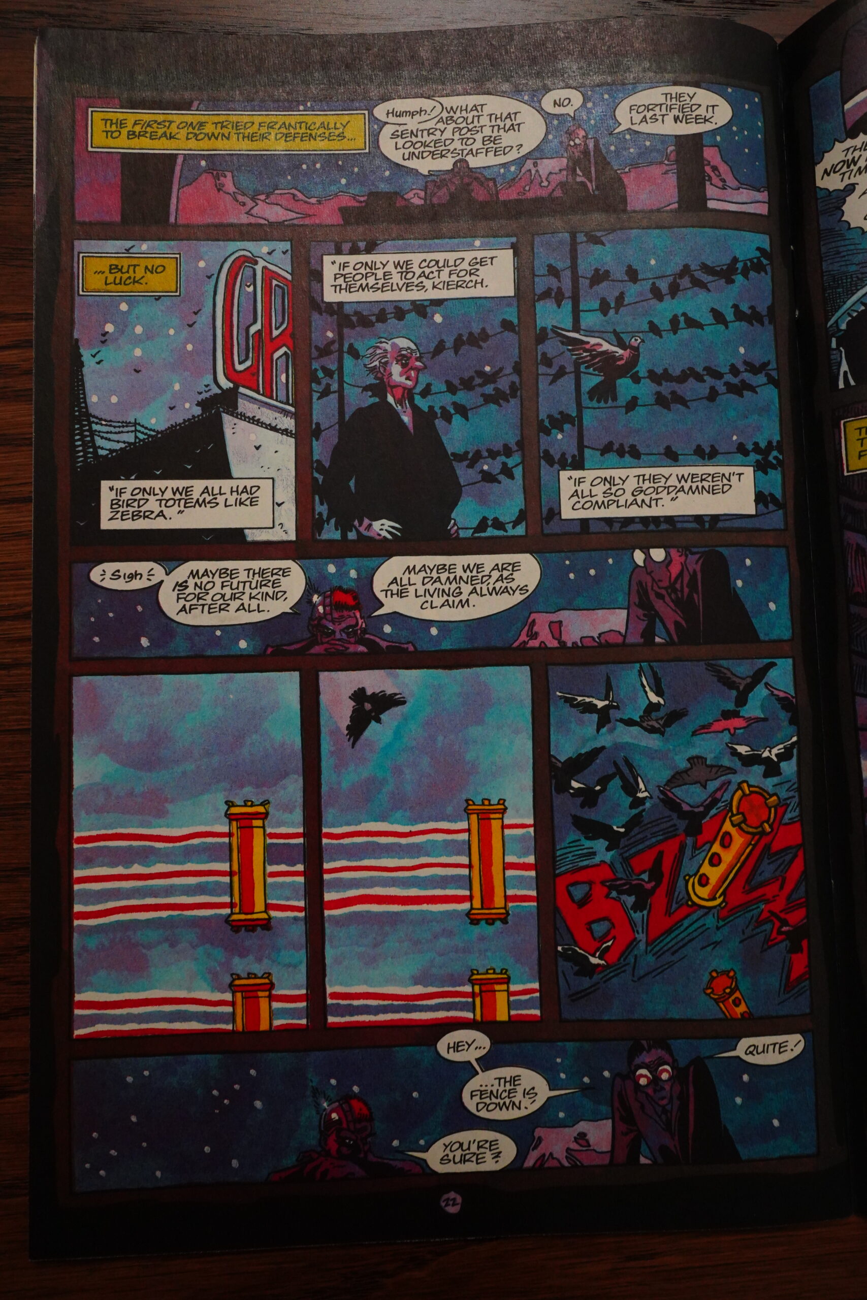
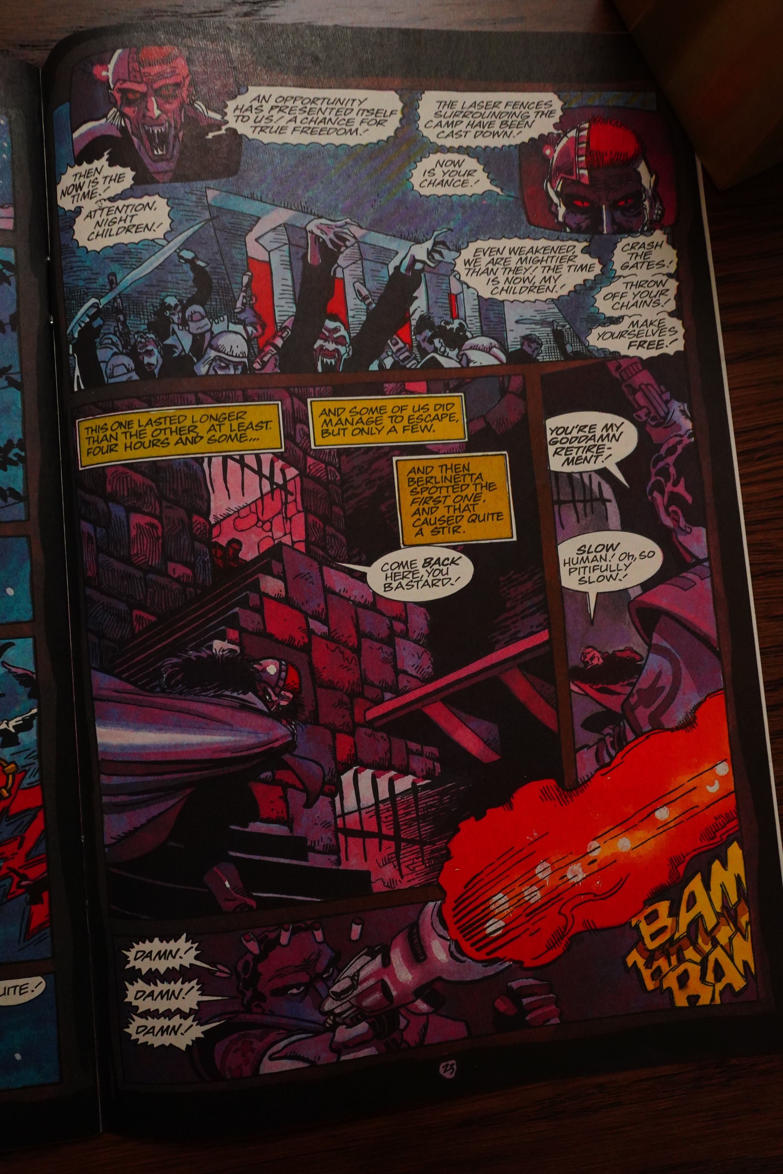
In Vegas, all the vampires have been secured within a casino. Extremely tight security, what with a floating laser light wall outside… that can be disrupted by a pigeon flying through the beams. Sophistication strikes again!

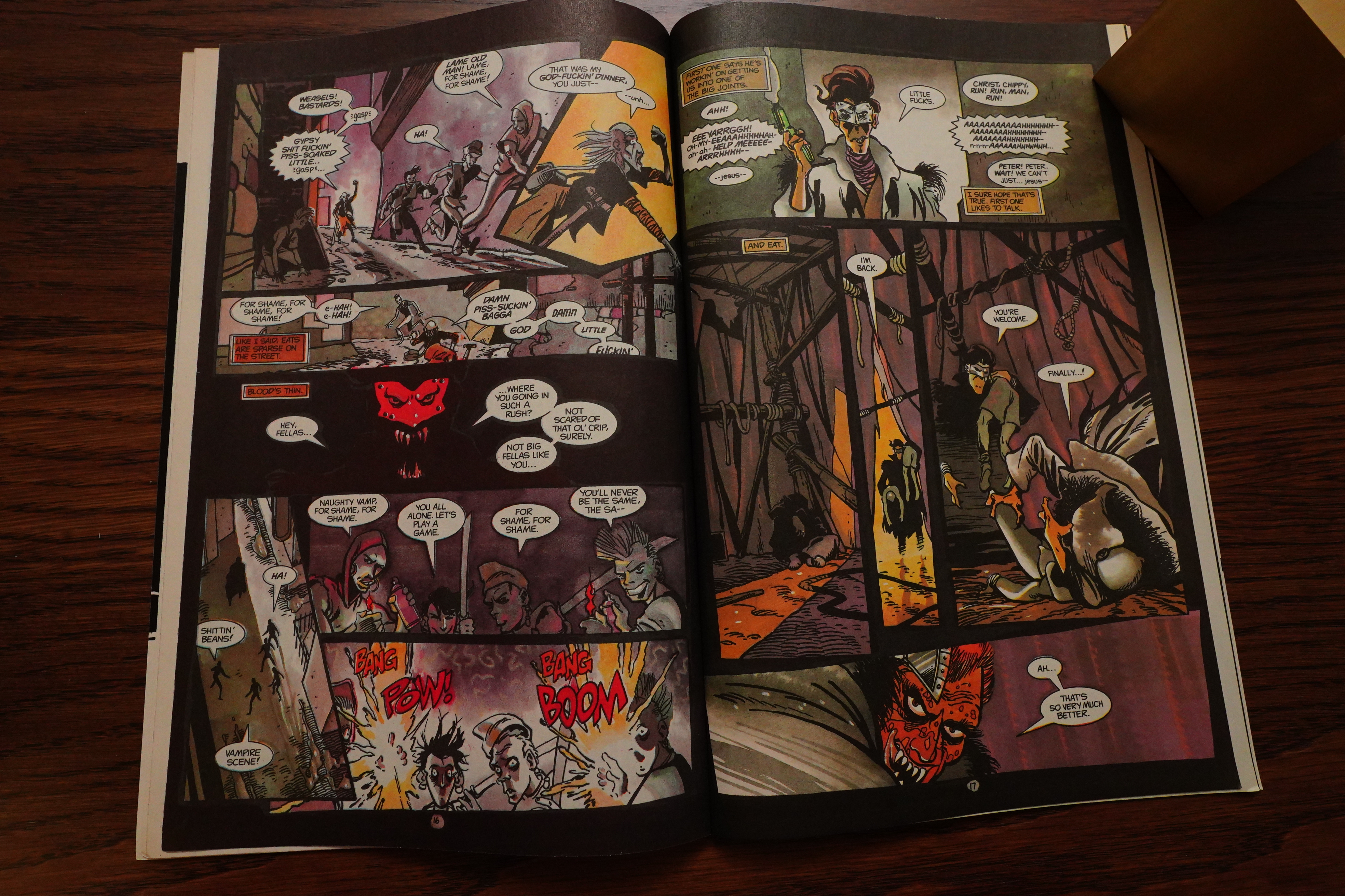
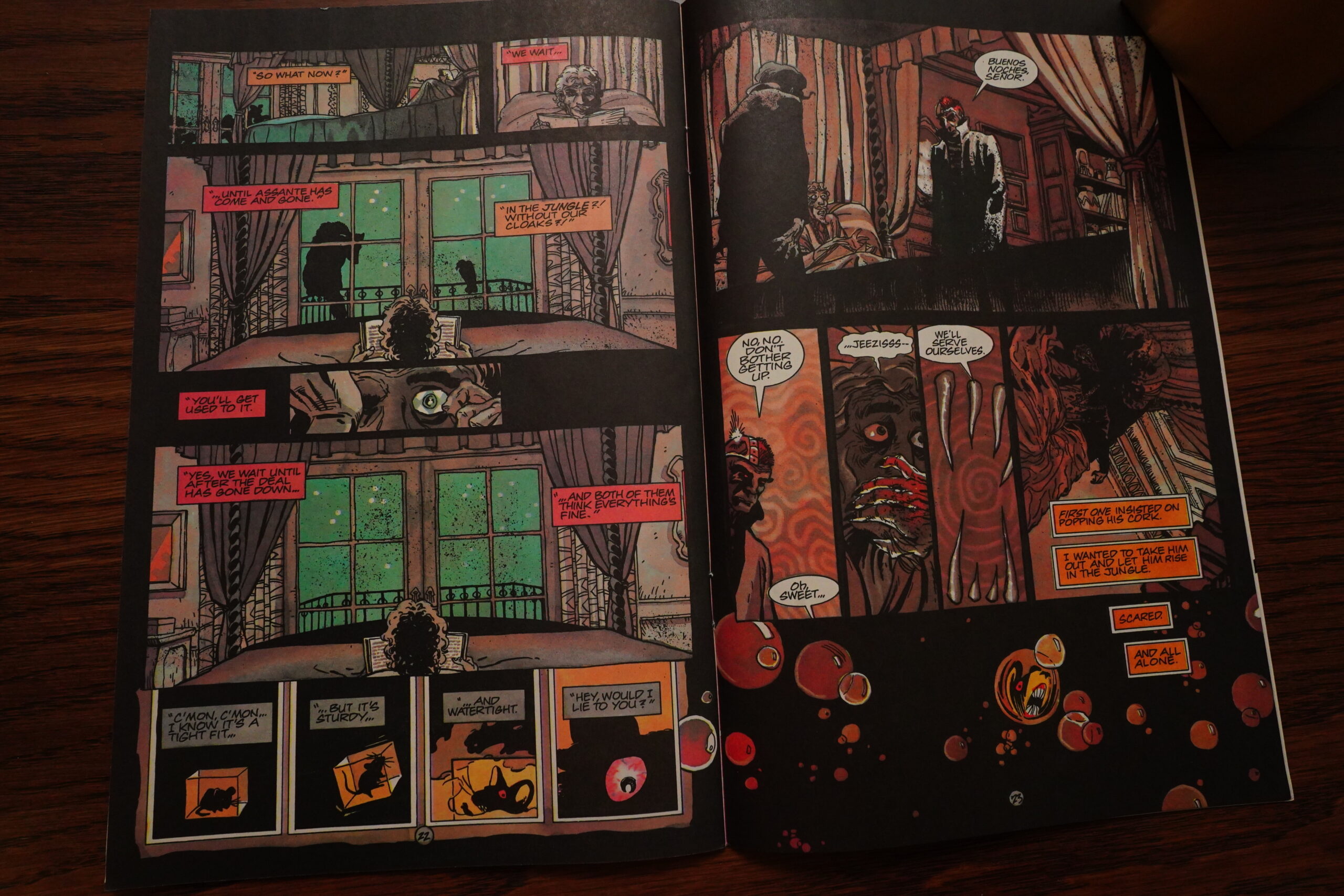
This plot makes no sense on any level — we follow the cop who was bitten by the Pope/kabuki guy, and he spends several issues on trying to break the other vampires out of their prison. But… why? We’ve established that the vampirism in this world is extremely contagious — he just has to bite somebody, and then a couple hours they’re hunky dory hungering vampires. Why not just leave the losers in the casino and go out and make an army? It’d take him all of half an hour.
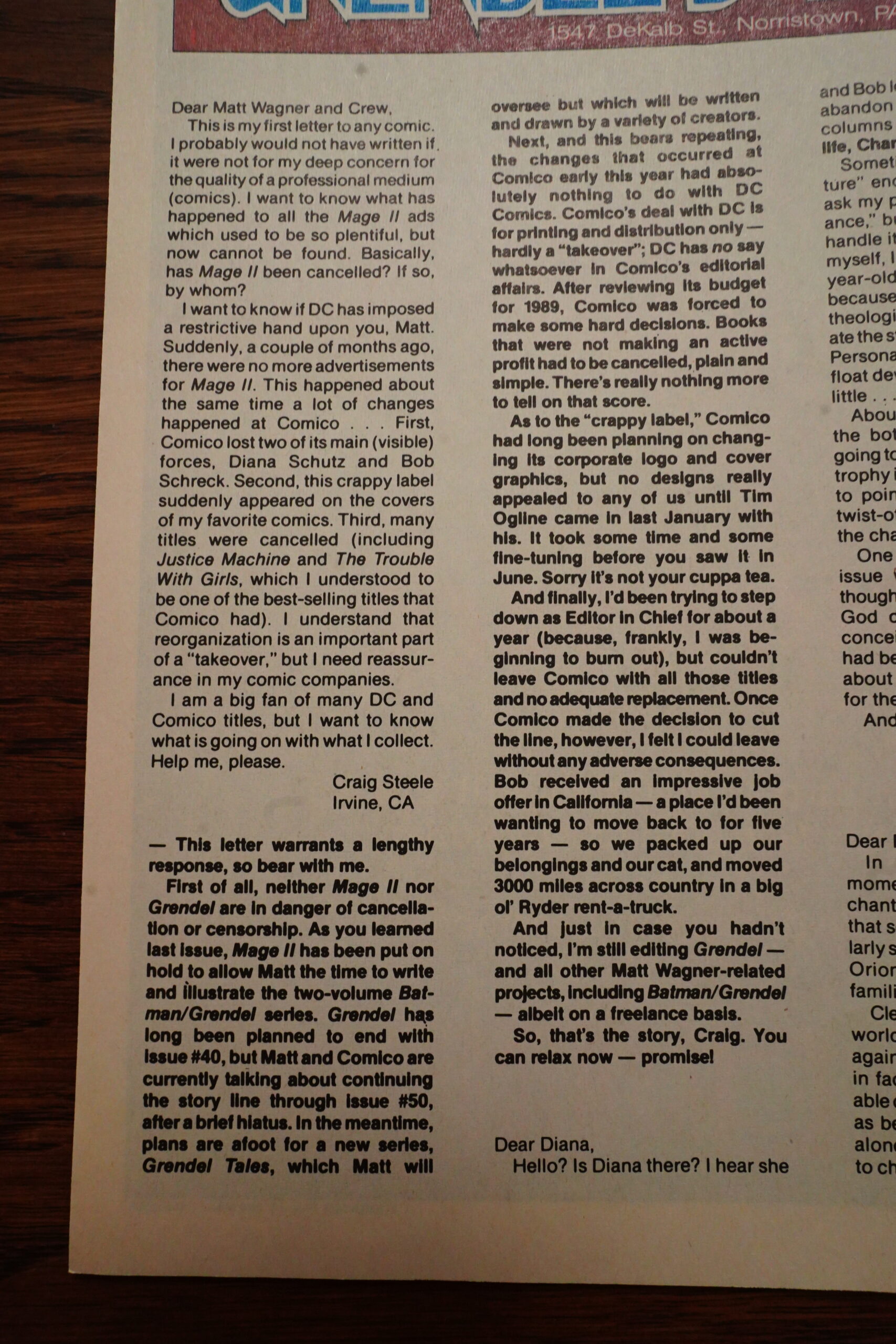
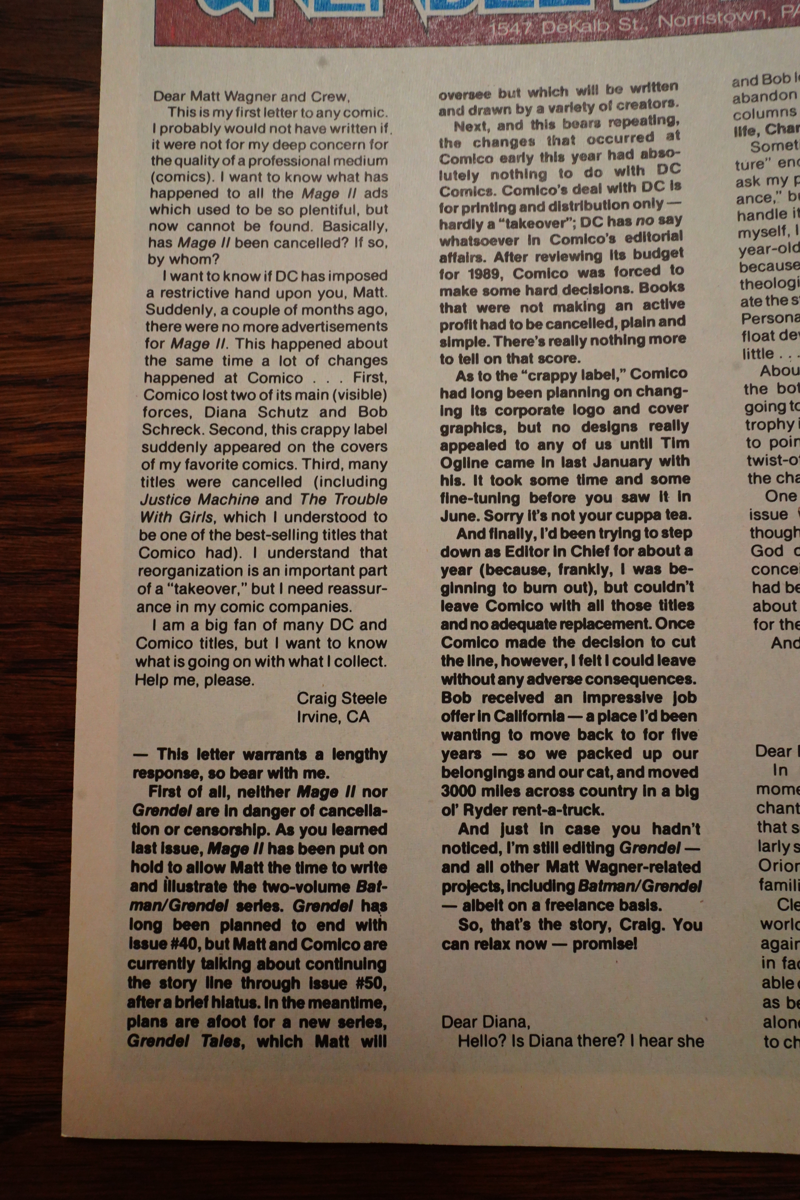
A reader writes in to say that the ugly logo is ugly, and also wondering about what’s going on business wise. Comico couldn’t pay their printers bills, so DC took over “distribution”, which I guess means “pay the printers”. This means that Comico had to cancel all their lower-selling comics, too… and apparently, Diana Schutz was among these who were let go. I mean, who totally quit because of being exhausted after being overworked for years. (She’d start working for Dark Horse pretty quickly, though, so I guess some relaxation did the trick.)
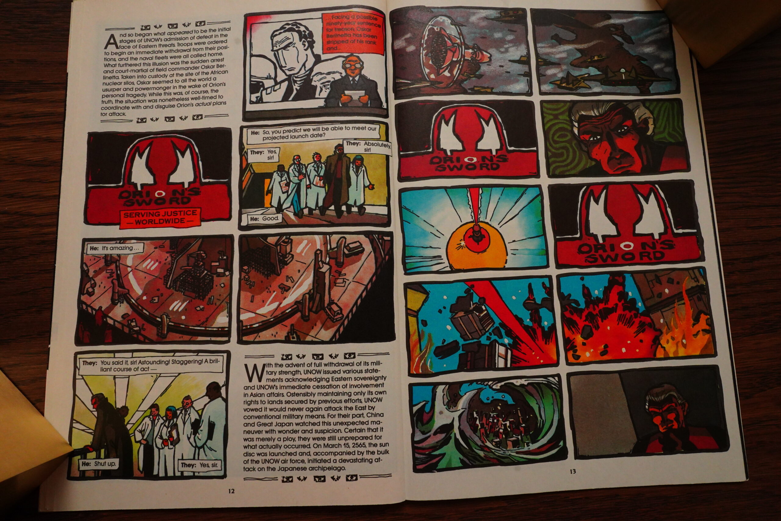
So, all those machinations… how did The Leader fix all the problems? Yeah, he whipped up a Super Weapon and destroyed Japan. So all the issues worth of yammering on about world alliances etc didn’t really matter much, but I was expecting that, anyway.
Hey, Wagner was giving talks? Perhaps on plotting?
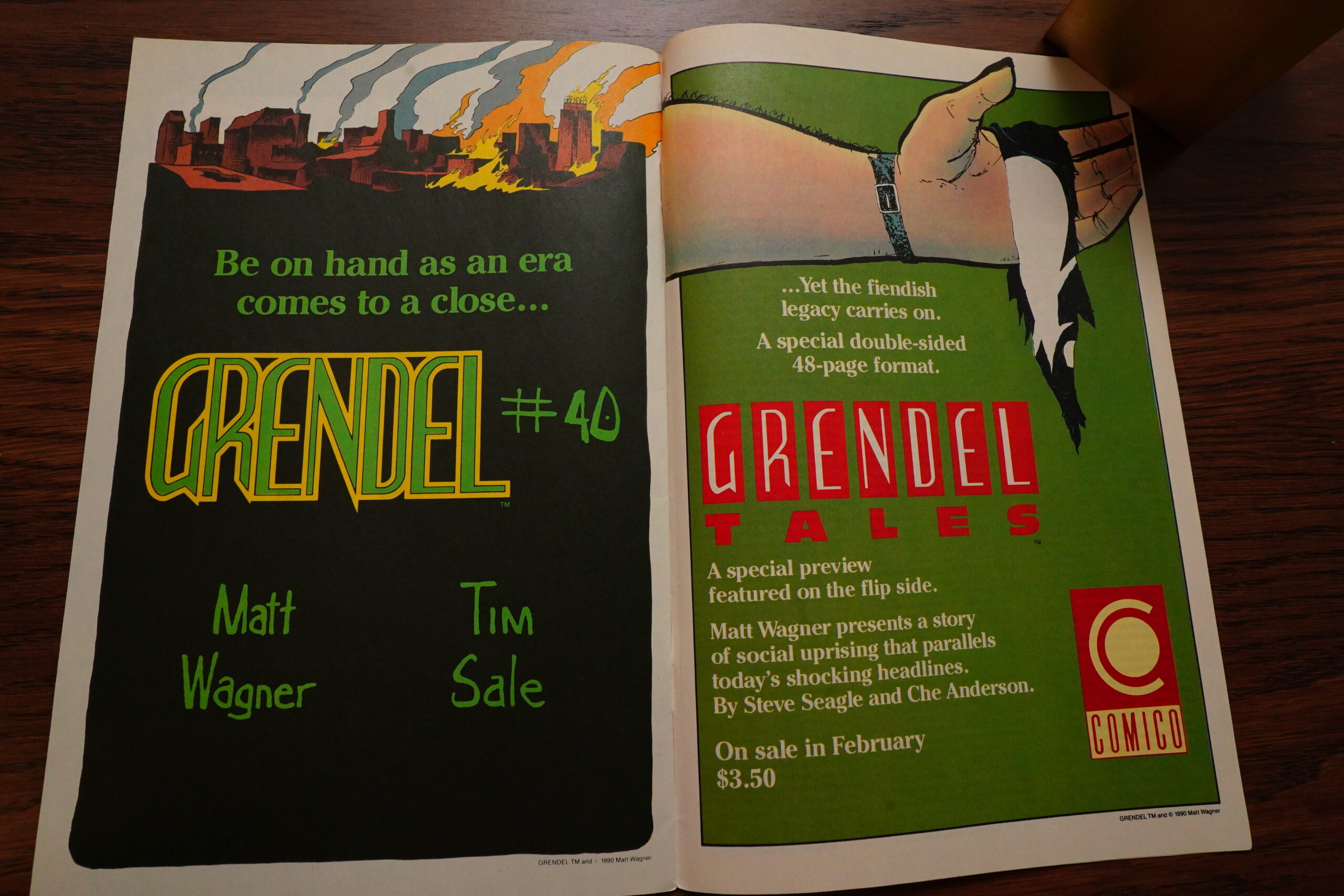
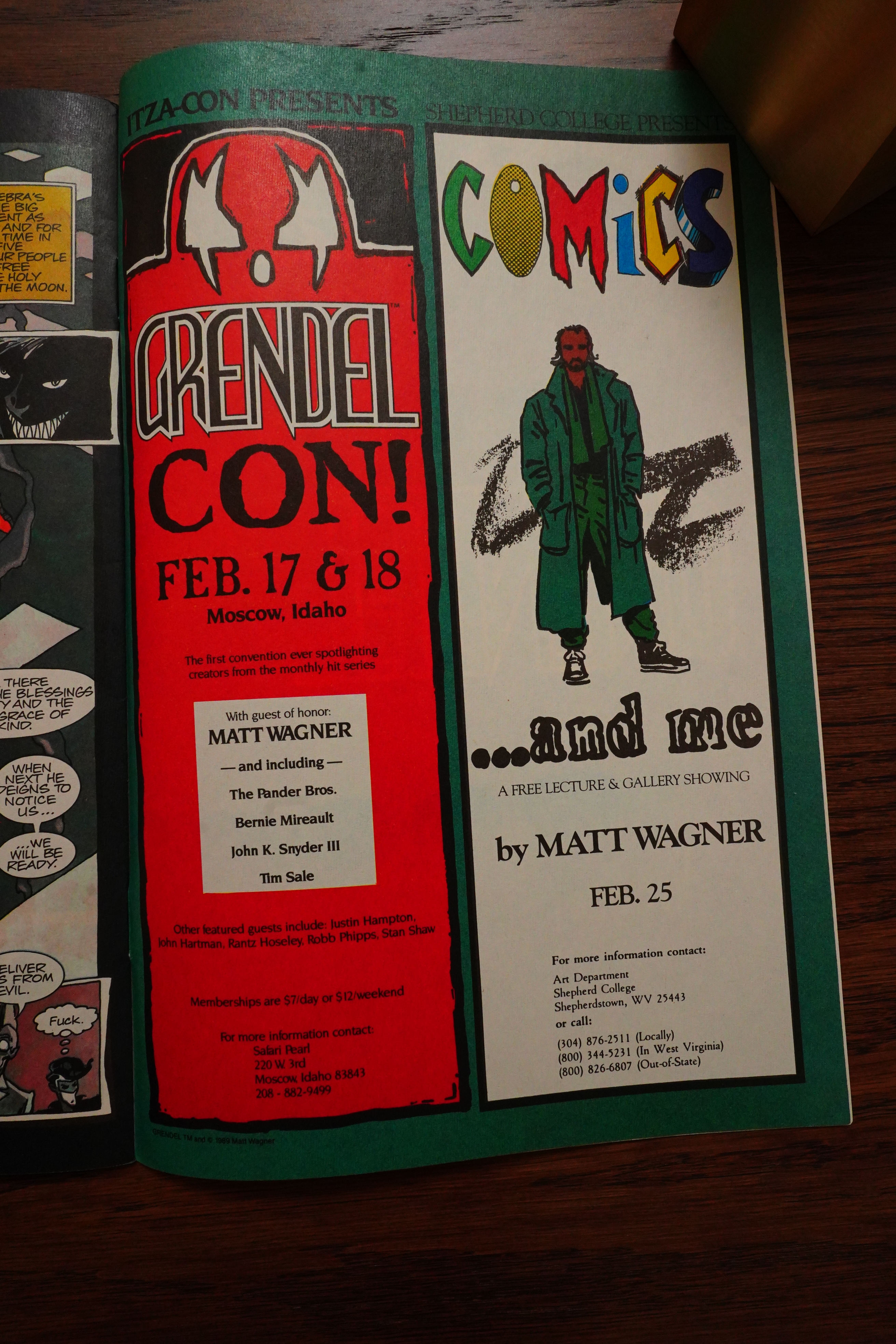
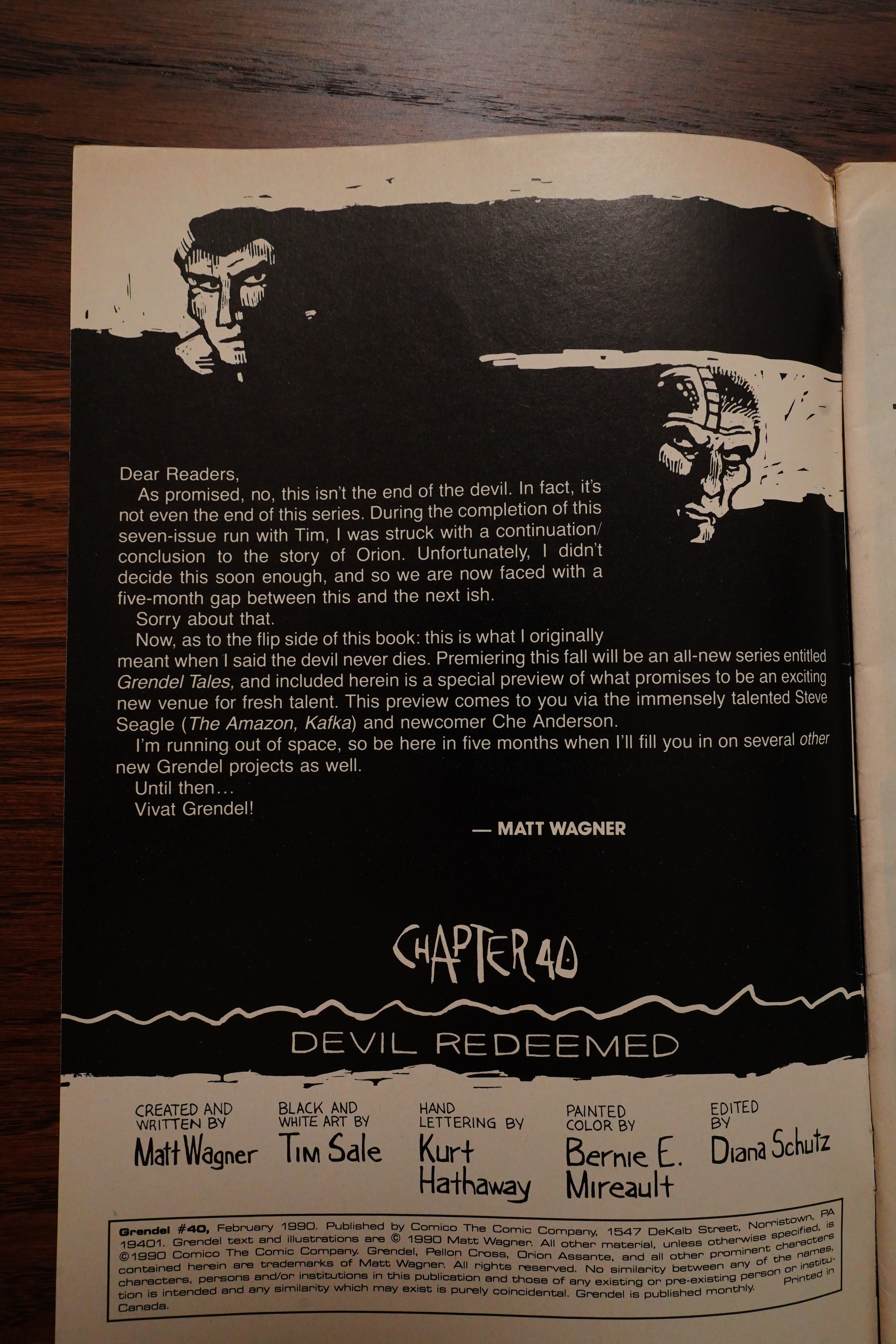
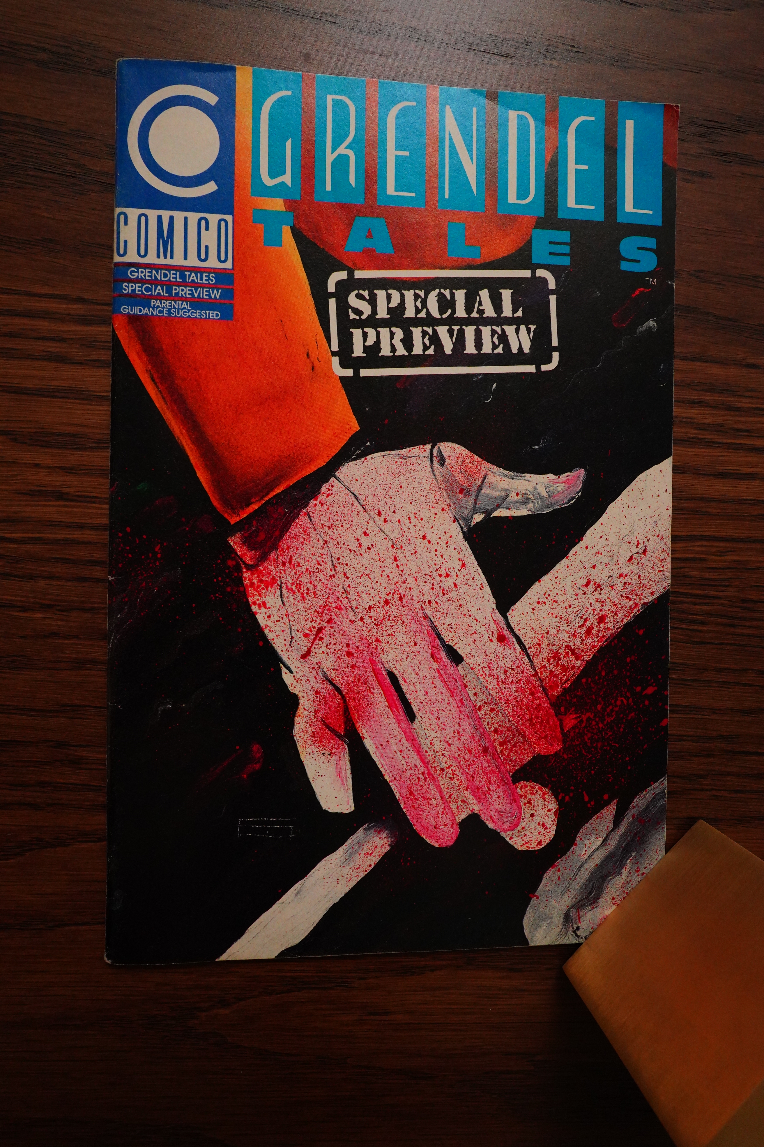
The final issue was 48 pages long, but has the first “Grendel Tales” — Grendel stories written by others. First out are Steve Seagle and Ho Che Anderson, who are both great choices, really.
What the… well, that’s a request, I guess.
The final issue is at hand! But Wagner has changed his mind, and there’s going to be an additional ten issues in a few months. This didn’t happen because of the bankruptcy, and since the new owners were so inept, Wagner managed to take Grendel over to Dark Horse and continue there. Which was nice, because the editor was already there…

And so ends the main storyline — with a whimper, as usual.

But there’s the preview of “Grendel Tales”.

And it’s got artwork by Ho Che Anderson, so of course it looks good, but the story? Eh. It’s one of those “touched by the spirit of Grendel… or not” things, and it doesn’t really bring anything new to the plate. Disappointing, because Steven Seagle is a solid comics writer normally.
*sigh* I’m sorry if I come off as totally nit-picking and angry in the above… It’s just that I really enjoyed the first two dozens of issues, but the remainder of the series I found to be both tedious and annoying. Which isn’t a good combination. It’s as little fun to write as I’m sure it is to read, so I apologise.
Amazing Heroes #170, page #48:
GRENDEL
Issue #34, out in August, begins a new seven-
issue cycle for Grendel, as illustrated by Tim
Sale (The Amazon) and colored by Bernie
Mireault. Each of the seven issues will be
subdivided into two sections. One, set in the
26th century, concerns Orion Assente, and is
done in a special graphic format that involves
typeset copy and woodcut-style art (see print-
ed example). The other concerns Pellon
Cross, and is done in a more standard style-
although, since this is Grendel, that doesn’t
mean it will be dull or ordinary.
These stories continue the basic conceit that
“grendel” is not so much a person as “a social
rank, like samurai, or judge,” as Wagner puts
it. This will also facilitate the transfer of the
series to a new creative team next year, as
Grendel ends and is replaced with Grendel
Tales.
Issue #40 is due in February, but since
we have the information on it, we might as
well spill it. It will be a double-sized issue
designed as a flip-flop comic (a la Brought
to Light). One side will feature the conclusion
of the seven-part series; the other will be a
special preview for the abovementioned
Grendel Tales, a new ongoing series that will
premiere next spring. Written by Steven Seagle
and illustrated by new talent Ho Anderson, it
will continue the Grendel saga without Wag-
ner’s direct involvement, except as creative
supervisor. Since Grendel is scheduled to end
with #50, that means there will be a few
months with two Grendel titles.
Or, actually, three. Because also planned for
next year is a Batman/Grendel team-up writ-
ten and illustrated by Wagner (and colored by
Joe Matt), to be released as two Prestige
Format comics.
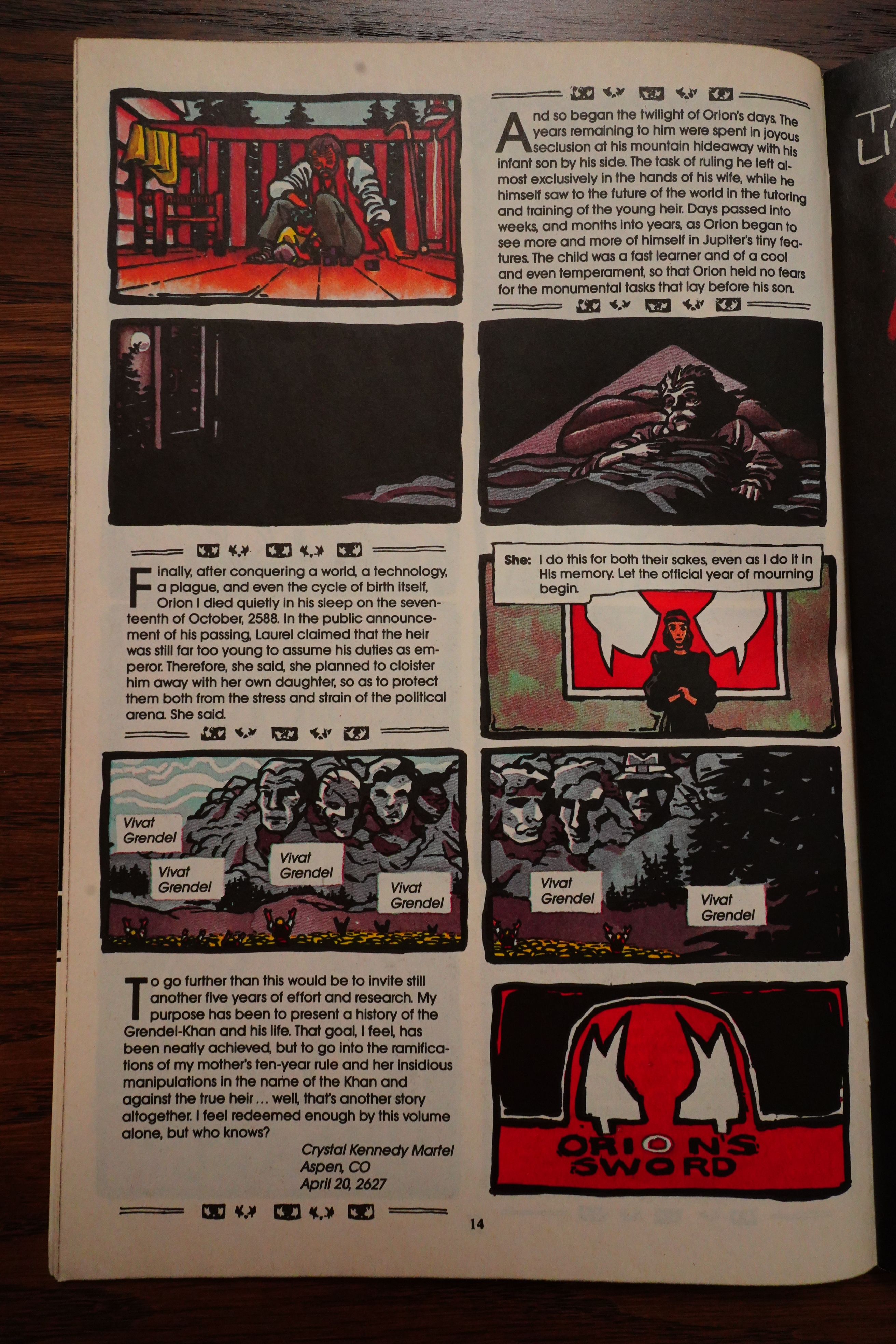
Amazing Heroes #177, page #73:
GRENDEL #40
Grendel is a masterpiece.
No hyperactive hyperbole, just a
simple fact; Matt Wagner has
masterfully crafted his tale. Grendel
evolved from the embodied spirit of
aggression in some ripping-good
horror stories to a worldwide force,
yet still manages to hold that
individual mystique. Watching the
development has been a fascinating
and often frustrating process, but it
paid off.
It would’ve been so easy for Wagner
to have taken the low road and focus
on “the adventures of Grendel” with
Christine Spar or Hunter Rose
hopping rooftops either fighting public
enemy #1 or becoming it. With the
black costume, mask, and fork it
would’ve been a hit, I’m sure. Instead,
he went higher and we’re the better
for it.
The last two storylines, with Wag-
ner examining religion in politics and
the political process on an interna-
tional scale, have been particularly
enlightening. He’s done an excellent
job of presenting Orion Assante as
both a man and a leader struggling to
unite a divided world.
And Wagner’s truly innovative sto-
rytelling techniques, in cooperation
with other artists, cannot go unmen-
tioned. This final two-tiered storyline
tells the first part with text and cap-
tions and no word balloons. It looks
imposing, but it isn’t and reads like
an illustrated history lesson.
Though it’s juxtaposed with a par-
allel story about vampires told in the
more familiar comic book style, it’s
very believable. There aren’t many
unrealistic situations in the first part,
though they are acknowledged as
existing. The second part becomes
credible with its links to the first part.
I’m going to miss Wagner’s pres-
ence with his collaborators on Grendel
every month while they take a break.
His talent is underestimated and un-
derappreciated. Even with his super-
vision on the new Grendel Tales, it
won’t be the same. It can’t be.
Speaking of Grendel Tales, this
issue previews the new series. The
story here, written by Steve Seagle
with art by Che Anderson, is set in
the time of the “Orion/Vampires”
stories, but takes place far away from
both. It effectively shows how
prevalent the spirit of Grendel is-
symbolically if not actually present in
force.
What Grendel Tales will probably
do best is show how Grendel affects
everyday people in numerous ways.
There must be a wealth of stories there
and using various creators is a good
way to bring them out.
Grendel is unique. It dares to ex-
plore situations few comics would and
does it with style and skill. Comics
with such vision are few and so far
between. I applaud its daring, diver-
sity, and dedication. You should, too.
Vivat Grendel!
Darwin McPherson
Back Issue #125, page #23:
POWERS. Amazingly, in the final issue of this story arc, Grendel
#40 (Feb. 1990), you have a 90-year-old Orion baring and
giving birth to his son, Jupiter Niklos Assante. What led you to this
startling story choice?
WAGNER: It was an attempt to show exactly how far he’d gone
by his descent into dictatorship and the isolation that would bring.
Following the deaths of both his beloved second pair of lovers—
Sherri and Fadi—he’s still left without an heir to continue his reign.
He’s such a totalitarian that he even decides to usurp the birthing
process, assuming he can do it better than any other participant. In the
end, he just doesn’t trust such an all-important task to anyone else.
POWERS: Regarding the art for these issues, what are your
thoughts on this dynamic collaboration with Tim Sale?
WAGNER: Tim did a fantastic job on this arc, very adeptly weaving
the two opposing narratives by utilizing two different art styles.
His visual approach on the Orion parts of this story were, in fact,
inspired by a completely different project that never came to fruition
for him. Back in the early ’90s, First Comics was producing new
and very bold editions of the time-honored Classics Illustrated
title, and Tim was slated to adapt the autobiography of Frederick
Douglass. To capture a vintage flavor for that time period, he’d
developed this really neat rendering style that echoed the look of
traditional woodcuts. When First folded the CI line, Tim showed
me his development work for that project, and I suggested
adapting that to fit the first half of our issues’ narrative. He toned
down the woodcut textures a bit but retained the drawing style.
Again, I loved everything that Tim did on these issues.
My one regret is in not really tapping into the sort of artist
and storyteller he has since so adeptly proven himself to be.
Tim’s a master of broad, expansive setting and action, told in
a deceptively simple approach. He loves to work big and with
a minimum number of panels per page, as shown by his many
successful collaborations with Jeph Loeb for both DC and Marvel.
I’ve always felt bad for constraining him in the tight structures I
already had in mind for this story arc, and I’d always hoped and
intended to one day write the same sort of big, cinematic tale
that he loves so much. Hasn’t happened yet but… who knows?
Perhaps some day.
Here’s a more modern review:
Great to finally read the missing piece of the GRENDEL mythos that had up till now never been collected. Reads like a histoire of the rise of the Grendel-Khan, Orion Assante, and the “modern” Grendel world that I became familiar with in WAR CHILD (the first GRENDEL story I ever really read). Somewhat tedious in places, but you can’t deny Wagner’s penchant for the experimental in his sequential storytelling techniques. There’s a lot of innovative stuff in here that I’ve never seen before. I’m amazed Wagner isn’t aped more often than not.
OK, and with that I’m well and truly done. Sorry! Eh… should I do a speeel check on this one? No, I can’t be bothered; already spent a week. Sorry again!