
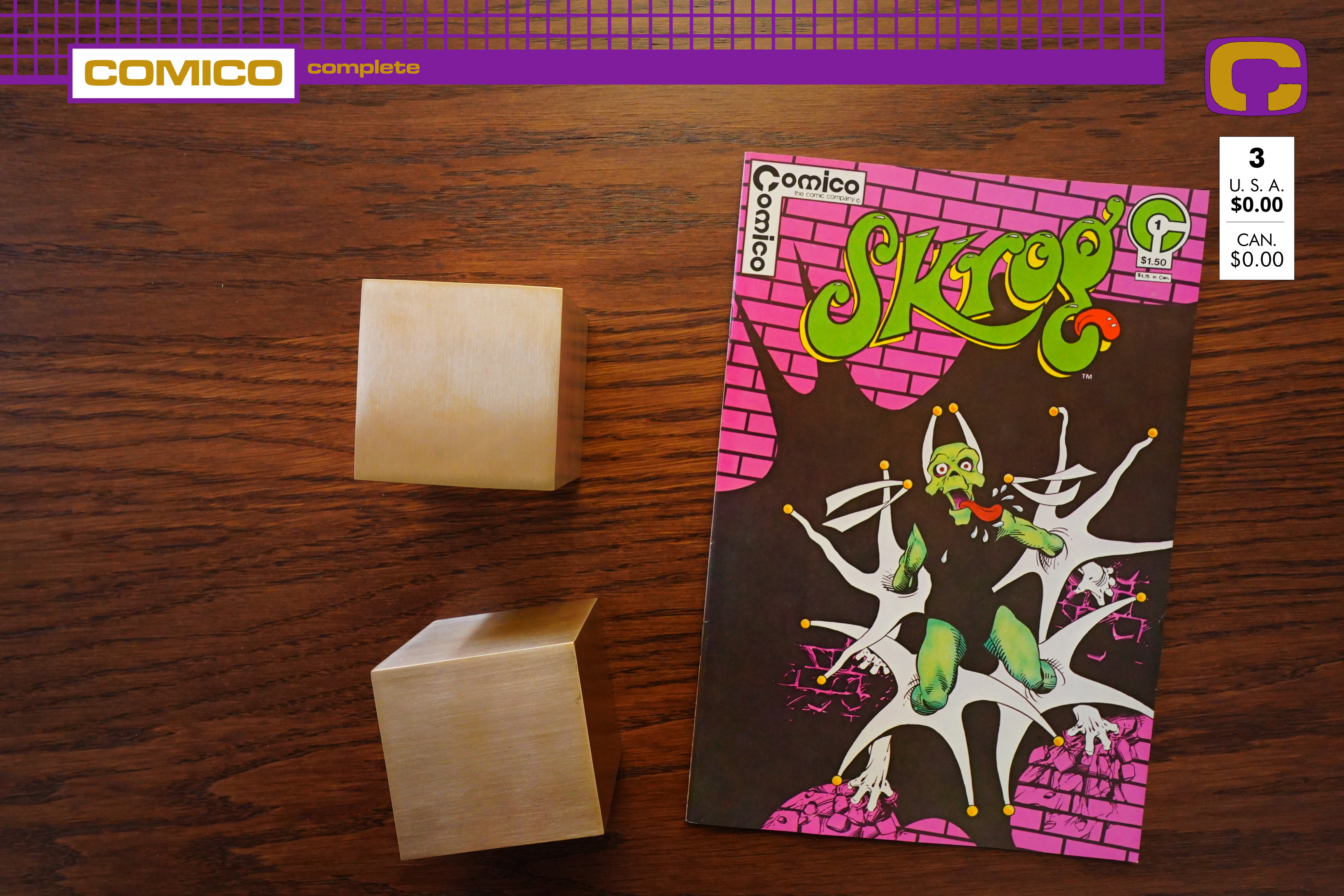
Skrog (1983) #1 by Bill Cucinotta and Bill Anderson
This is the second of the three original Comico series. And look:
I bought a lamp! Perhaps that’ll fix my problems with uneven lighting that I had on the previous blog posts…
Hm… do I see a Cerebus influence?
OK, this is one of those punny comics, which I approve of, but…
With extremely zany humour. But, er, it doesn’t really work, does it? I mean, it does seem kinda like high school humour, which is almost appropriate, because I think Cucinotta was in his early 20s here, but it’s really basic.
The artwork’s not altogether bad, but he attempts more than he really has the skills for.
Oh the puns.
That looks really, really Dave Sim-ish, doesn’t it?
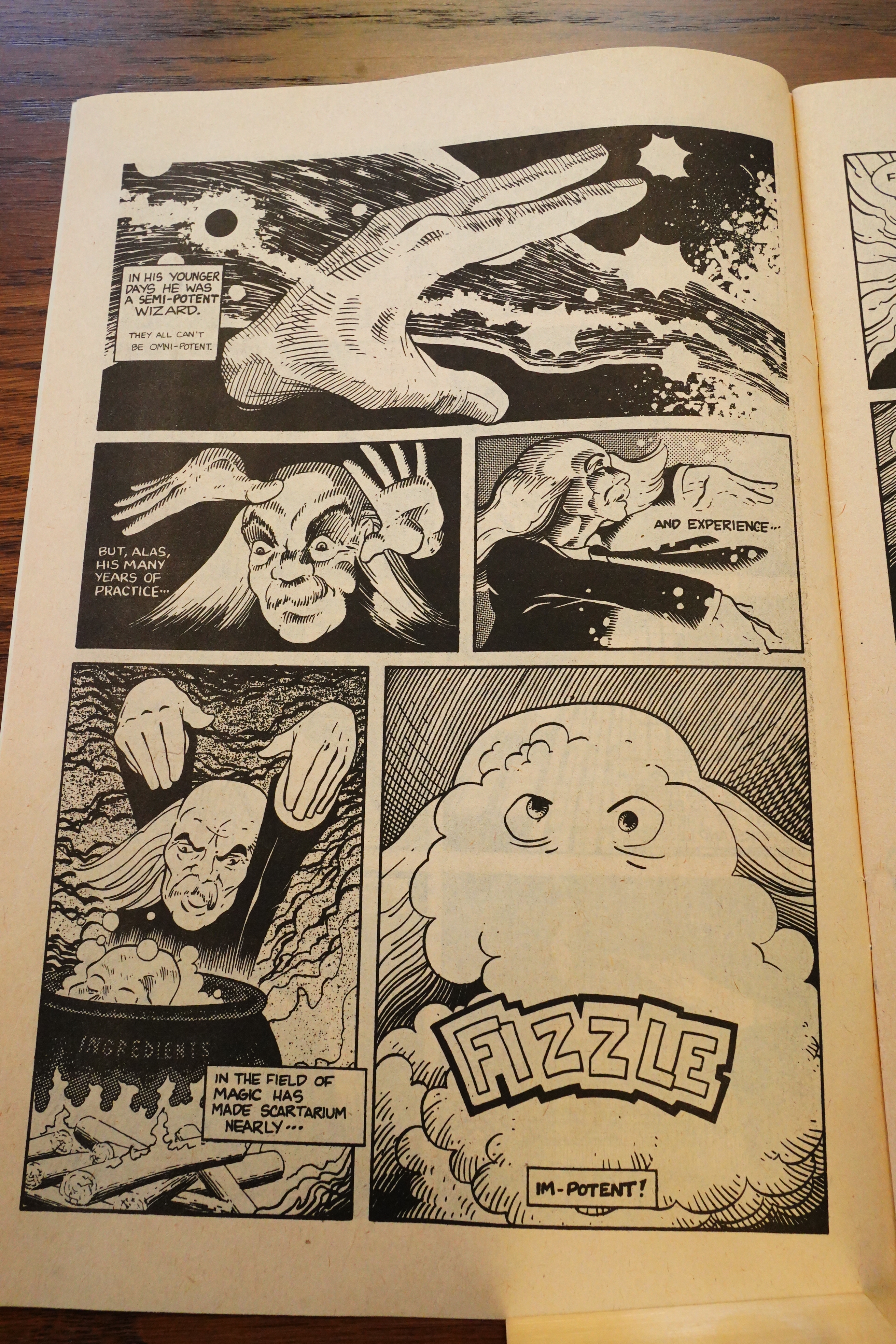
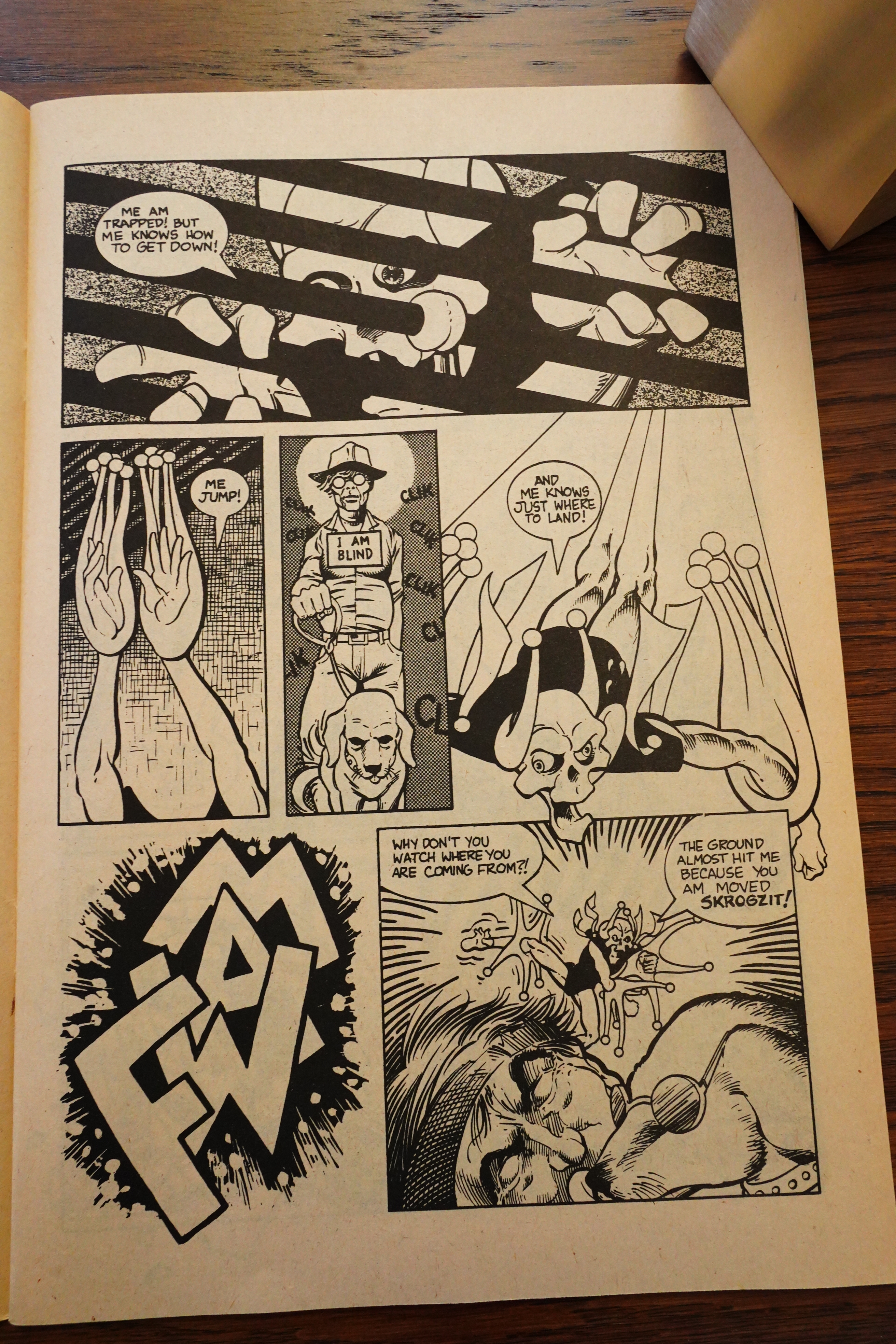
It’s sometimes not altogether trivial to say what’s going on, and even if you do understand it, it’s still a bit eh? Like here, Skrog has bitten off the tentacles of the henchmen monsters and then spits them into the wizard’s face, and … and… But why?
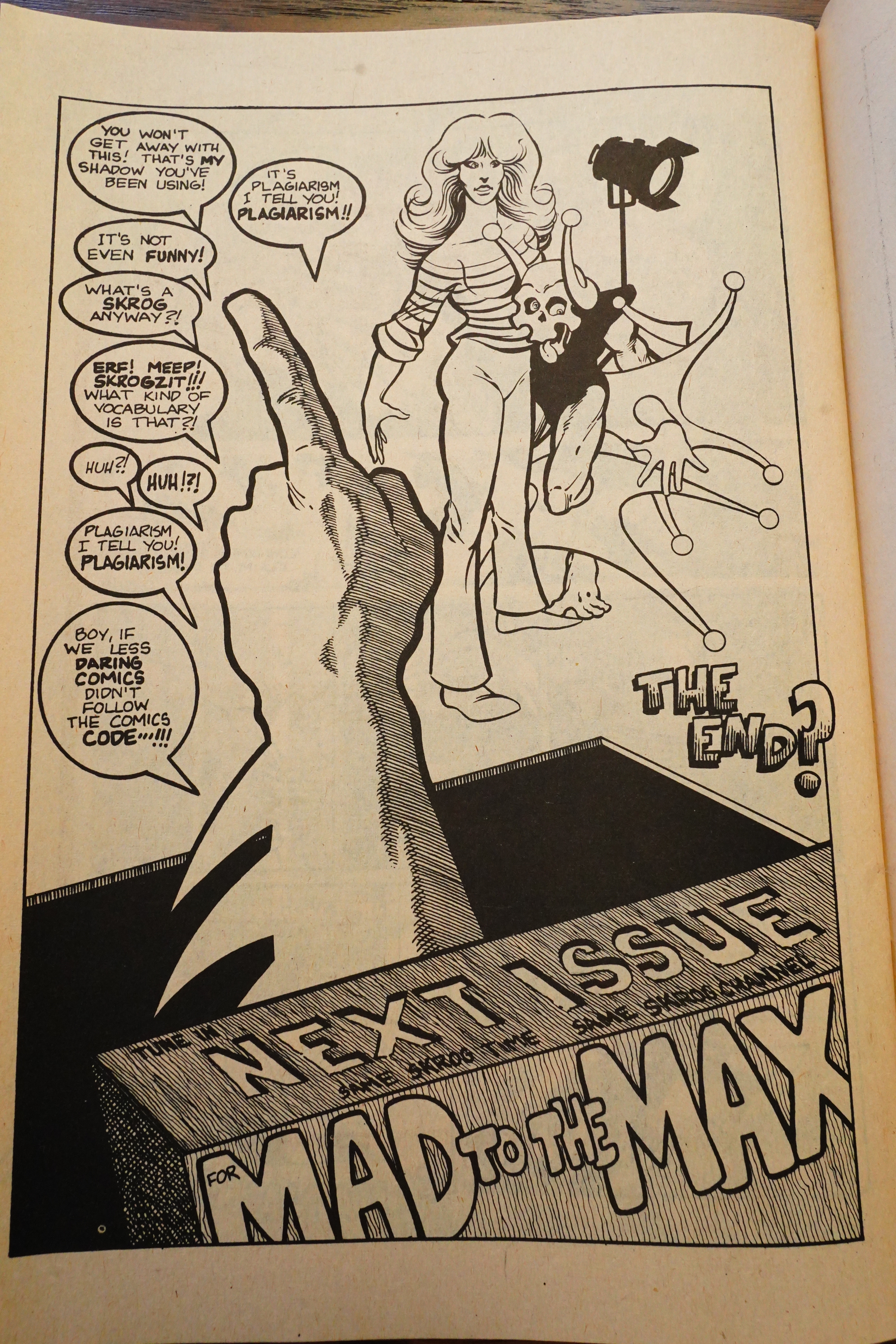
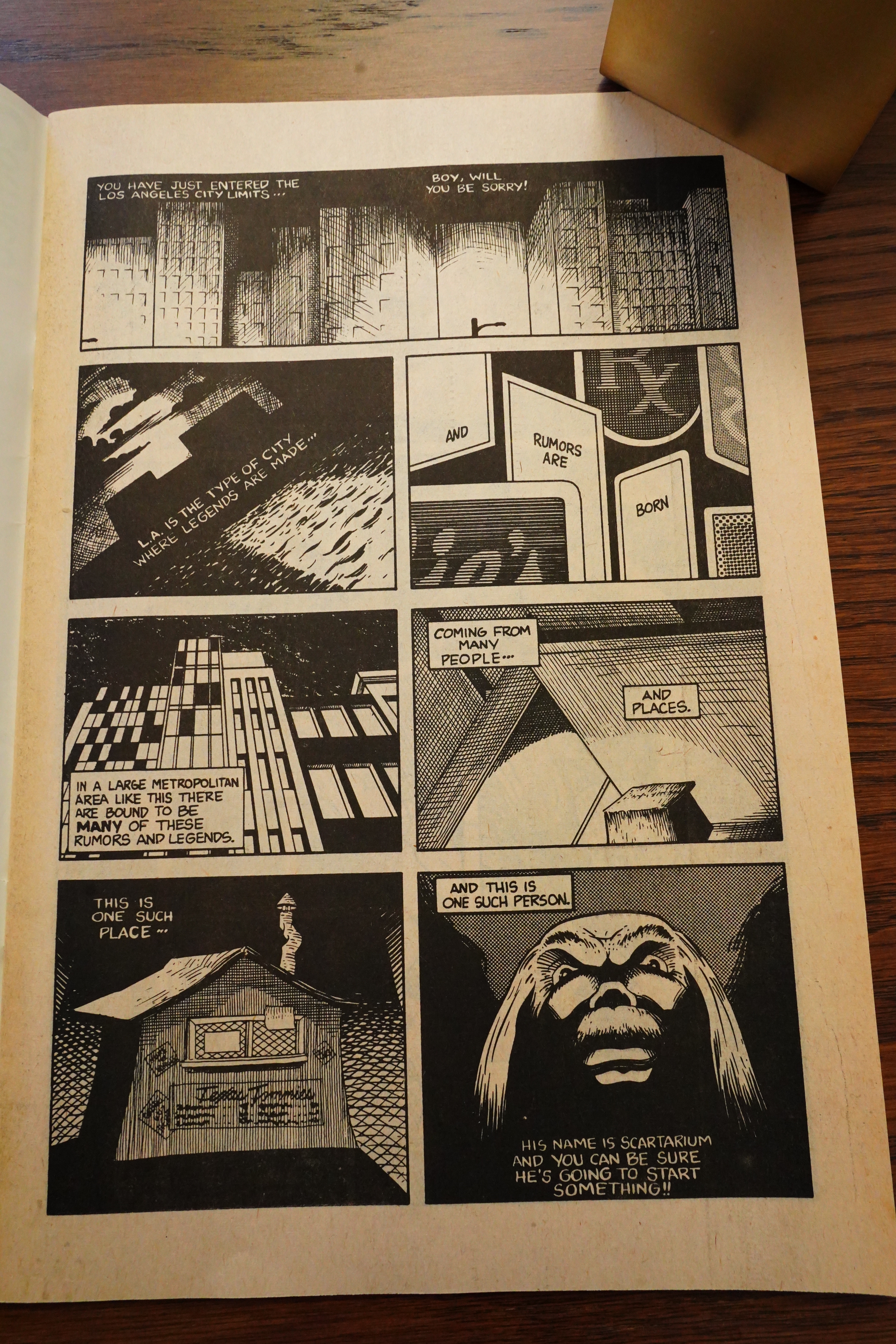
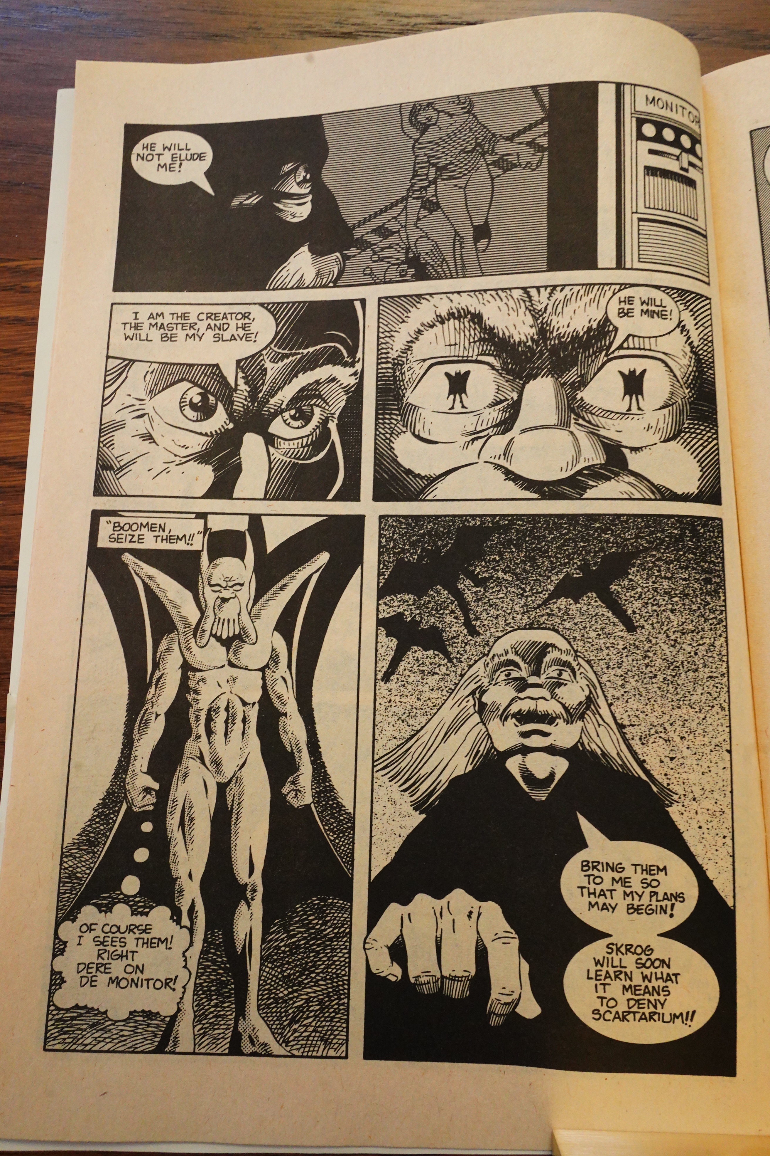
And this is how the issue (and the series) ends. Is that Batman’s hand? Did I miss something? Is this a total non sequitur? Oh, yeah, his shadow is on the cover… I forgot.
In 1987, Cucinotta released a sequel, and that’s apparently it for the character. Oh, and a story here?
Comico, the publisher of Az,
Grendel, Primer, Skrog, and
Slaughterman has been kind
enough to send me copies of
their titles for review purposes. I
in turn have decided to scruti-
nize the first issue of Skrog,
since it is in my mind the best of
the lot.
Make no mistake, Skrog is
very much a fan effort, but that
should not deter you as a
reader. It should in fact stimulate
your curiosity—all too often, the
mainstream comics seem to fos-
ter cookie cutter writing and art
styles, but the creator of Skrog
spurns the typical Marvel/DC
treatment for an individual,
iconoclastic approach.
Skrog is a freewheeling
conglomeration of ham-bony
humor, irony, and sheer extra-
vagance that avoids superhero
cliches by lampooning them.
And fine satire it is, consisting of
telling visual puns and succinct
witticisms (which is a welcome
contrast to something like
E-Man, which is starting to
resemble the walls of a bath-
room stall where the punsters
get paid by the word).
I feel quite assured in stating
that there has never been a
character/series comparable to
Skrog. It’s all mad, vivacious
fun, and sheer, goofy appeal.
And to me, that’s entertain-
ment.
Satire?
GERRY: That is an interesting thing
about our characters. None of them have
eyes except Skrog, and Skrog’s eyes
never focus. Too bad we didn’t bring any
early versions of Skrog. He used to have a
knife sticking out the top of his head!
PHIL: Like you said about us being
different . . . Dave Scroggy of Pacific said,
“You guys are so different, there is no
way you could say no to a book as
different as that.” People like the chances
we are taking with the books.
COOCH: The reason that we are different
is that everything is totally personal.
GERRY: Every one of us has something
to do with the character we are drawing.
Every time I look at SKROG I die –
because it is Cooch all over, every ex-
pression the character makes.
COOCH: Well, I do hibernate in trash
cans.
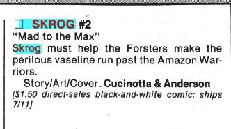
A second issue was put on the schedule, but cancelled.
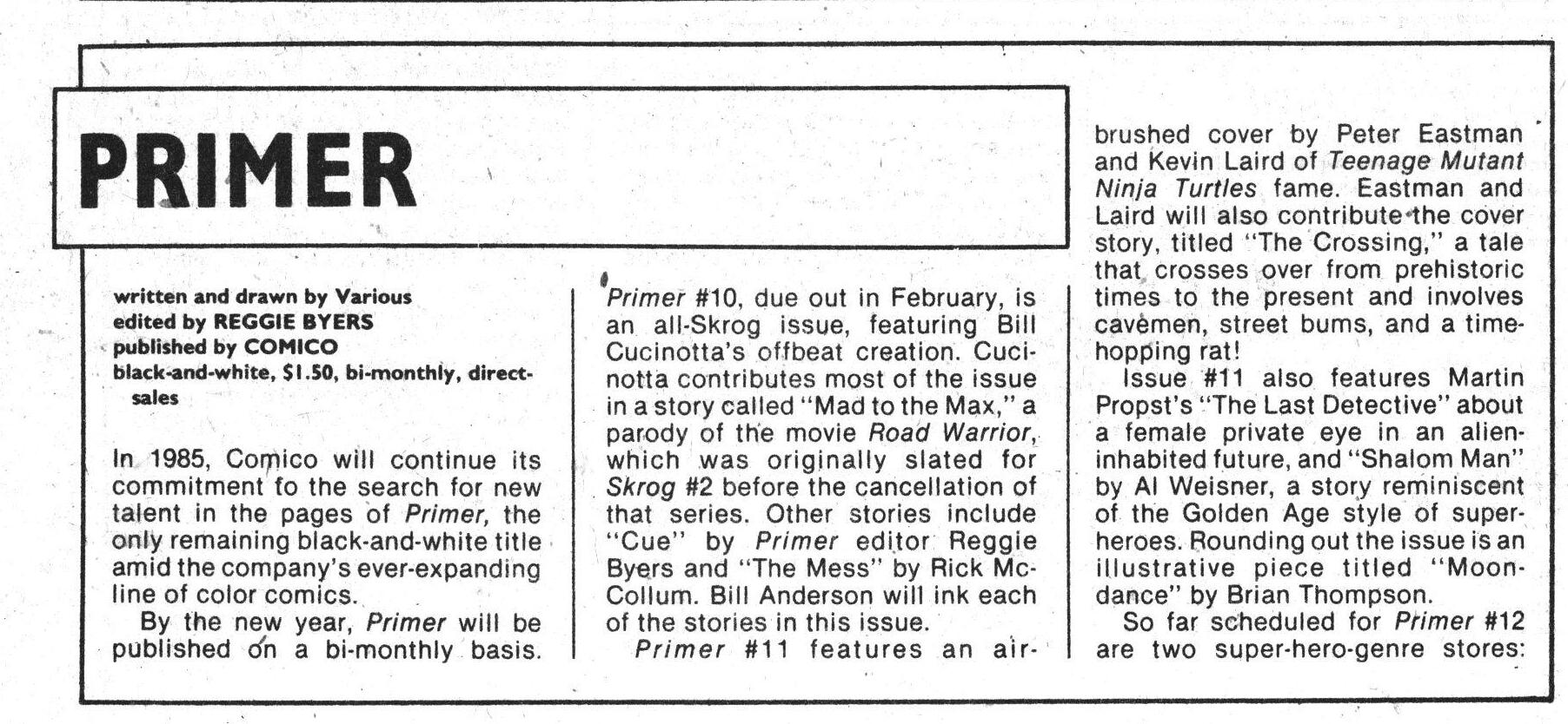
Heh, they had Primer planned up to #10, which ws supposed to be an all-Skrog issue?
Comics Interview #10, page #50:
SKROG has been skragged.
(Laughter.) Bill Cucinotta, the creator
of SKROG, is going to be working on a
much more refined character, a macabre
individual: PAIN.
That didn’t happen, either…
The Slings and Arrows Comic Guide #2, page #593:
SKROG
Comico: 1 issue 1984
Crystal: 1 Special (‘Yip Yip Yay’) 1987
Skrog is very much a prototype Mask, with the same mixture
of madcap whimsy and parody, which makes the title sound
far more interesting than it is. Unfortunately the wacky action
and stream of consciousness dialogue is hung on a two page
plot stretched to twenty. By the special the art has improved,
but it’s still a waste of paper.~WJ
Ouch!
From the infamous Alternative Comics Cadaver Derby in The Comics Journal #98, page #51:
If ever a comic book company got started on the wrong foot, this is the one. Com-
ico’s opening line, with titles like Az and Skrog, featured art that was as ugly as the
characters’ names. Dealers waved copies of Comico comics at me and cried
piteously, “I’m supposed to sell this?”
Beginning, then, with one of the worst reputations in the industry, Comico set
Evangeline. After a particularly homely first issue, Mage began to shape up. And
Elementals, the first issue of which did amazingly well for an alternative book,
about it.
The bloom may be off the lily, though. The creators of Evangelinehave cancelled
a comic book adaptation of a Japanese adventure cartoon.
This one could swing either way. Even odds.
CUCINOTTA LEAVES: BILL CUCINOTTA, who
had been a partner in Comico since May 1982,
has left to devote more of his time to pursue
his career as a freelance designed and
illustrator. Cucinotta was co-publisher in the
firm, handled the promotional efforts there, and
created Comico’s Skrog book.
I guess that explains why there’s no Skrog/Pain from Comico.
Comic Book Artist #15, page #69:
Chris: I seem to remember the Primer was in early ’82? Is that
about right?
Matt: Yes. Again, I think First Comics were around at that point, as
well, Eclipse and not much else in the way of… well, there was
WaRP and Aardvark, but they were self-publishing one book apiece,
so there were not that many publishing houses outside of Marvel
and DC, and the direct sales market had just crept up into existence,
and they were willing to take on independent publishers where the
newsstands weren’t. So we had this opportunity and we slipped in
to it. I will say the initial batch of books weren’t very well received
when they were actually shipped.
Chris: They were quite famously ill-received.
Matt: Yeah. Quite.
Chris: There was a point, I think, where retailers were just
ordering every independent book that came out.
Matt: You’ve got to remember, too, that this was in the days when
the ordering catalogs were nothing like these large, ornate, full-color
affairs you see now. You often had to order books off little more than
a tiny little paragraph of text, you usually saw no graphics. [laughs] I
think another reason they got ordered, too, was that Giovinco had
quite a nice little graphics sense, and so our ads always looked pretty
damn good! [laughs] But when the books came in, they didn’t look
so damn good. Oh man, it was kind of a desperate time! We’d all
quit school, and were really trying to do this, and realizing that
we probably weren’t ready for it, weren’t the professionals we’d
conceived ourselves to be. [laughs] Of the four books, Grendel was
the only one that was modestly received. I won’t even say it was
greatly, or even positively received, but it generally got more positive
feedback than the other three.
And how!
This is the only review I can find on the interwebs:
This is one messed-up comic – and a tricky one to grade, as well. From an objective perspective, Skrog is clearly more fanzine than professional comic. But the introductory editorial insists it’s a “fantastic, new, professional comic book,” one “ranking right up there with the best.” Comico would go on to publish some of the best indie books of the 1980s; this is not one of those. This series’ odd mix of fantasy, horror and humor might just work if the creative team had had time to grow. But Skrog would prove to be a one and done at Comico.
Can’t say I hate being compared to Dave Sim.