
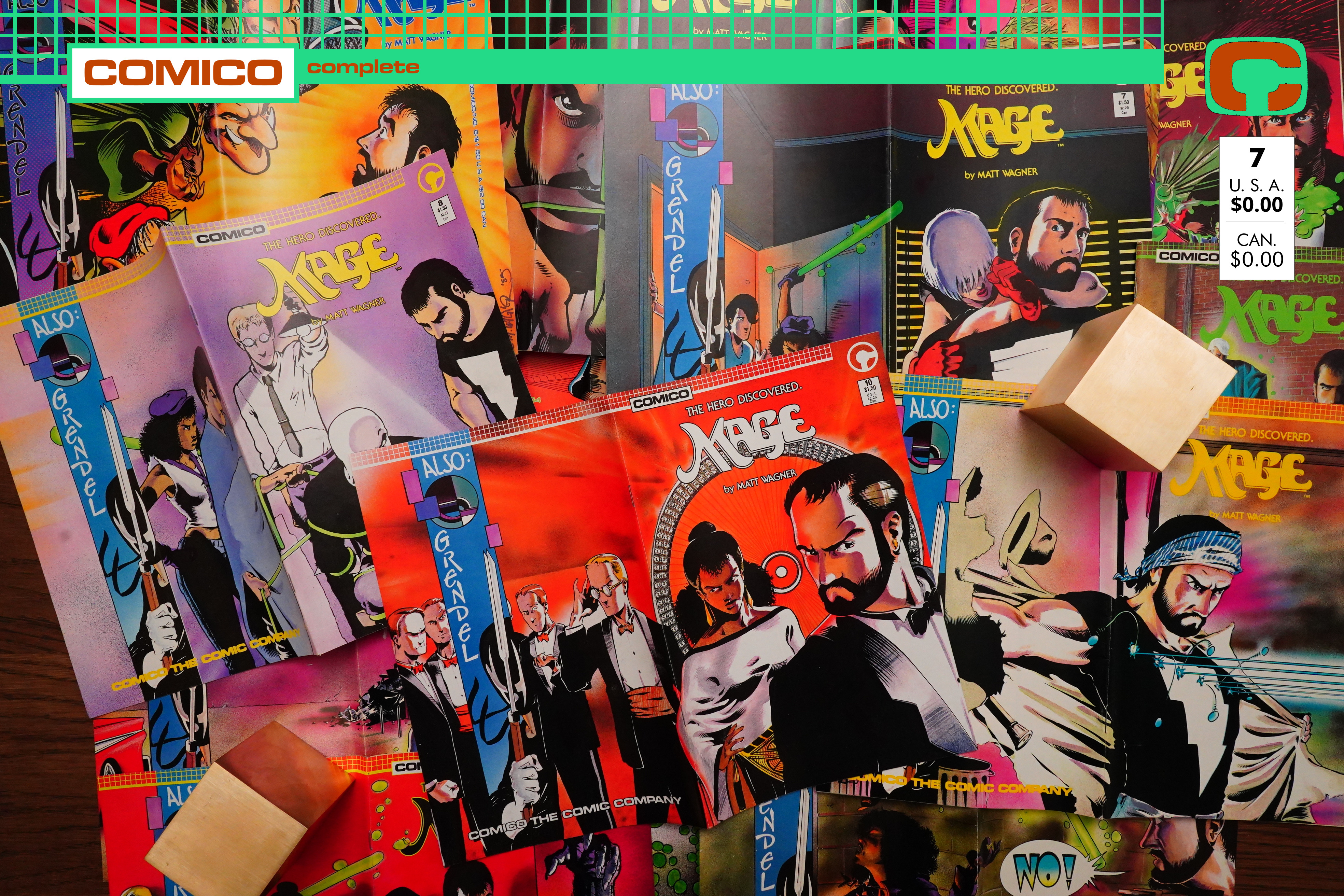
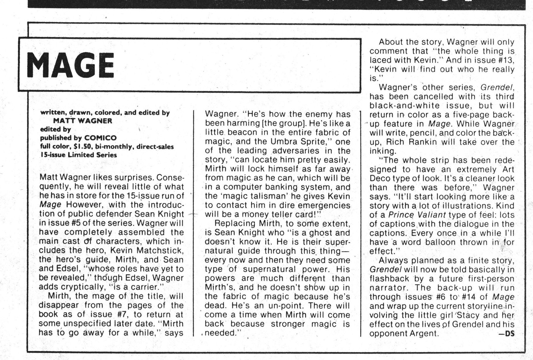
Mage (1984) #1-15 by Matt Wagner and Sam Kieth
Here we are — the first major Comico series, I guess — I think it’s a series that was both pretty successful commercially, and also well-regarded by critics? And it’s one that I read as a teenager myself, but only partially.
Let’s go.
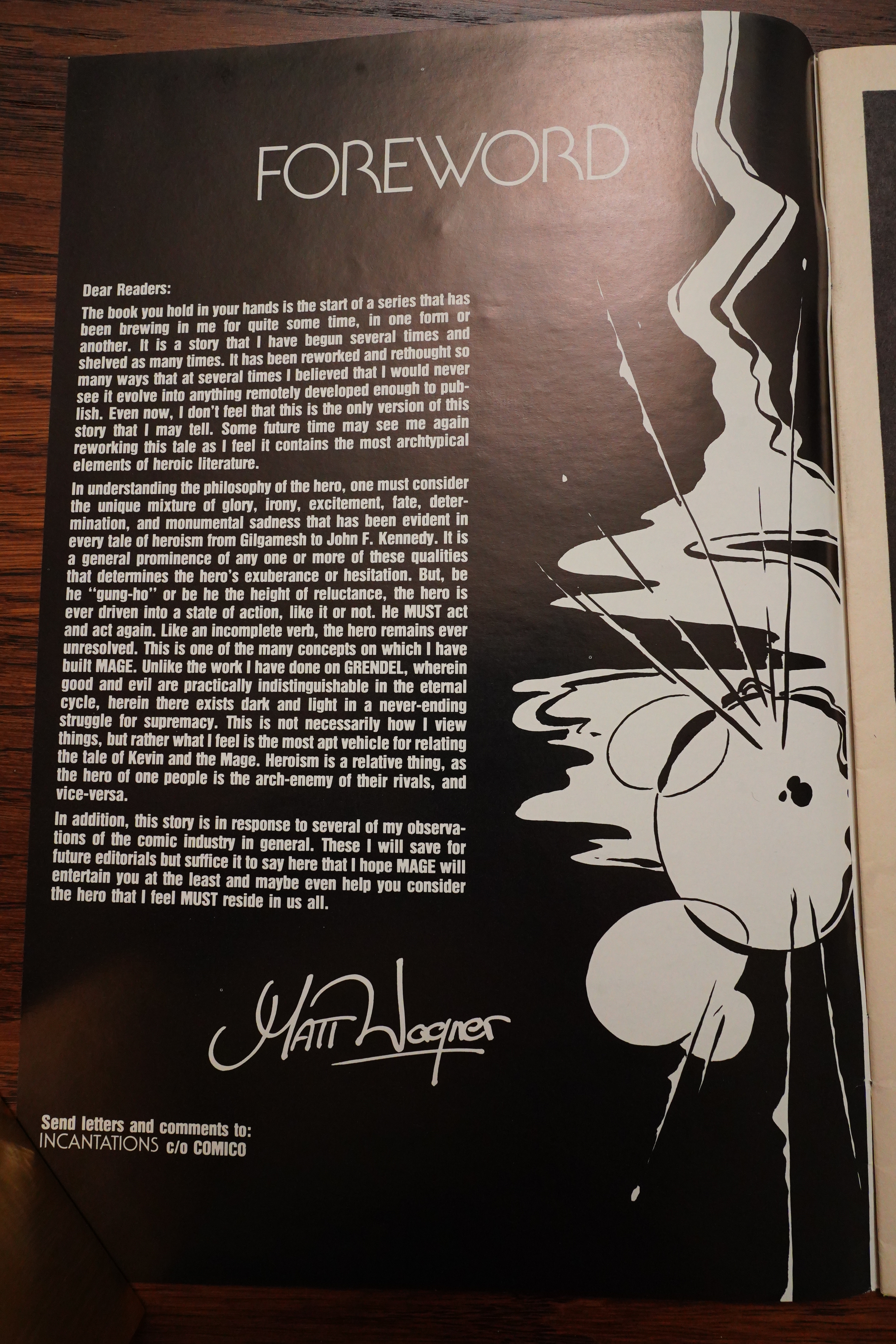
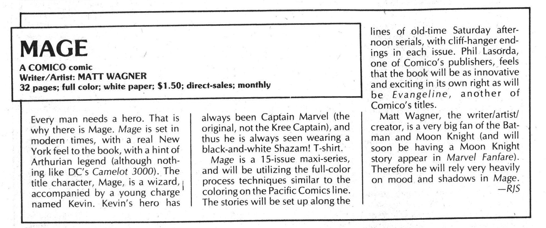
Oh, well — how old was Wagner at the time? Born in 1961, so 22-23, I guess. So you can excuse some of the verbiage here. It’s better to be ambitious than not, eh? But the realities behind Mage are more mundane:
Comic Fandom Quarterly #5, page #15:
They were
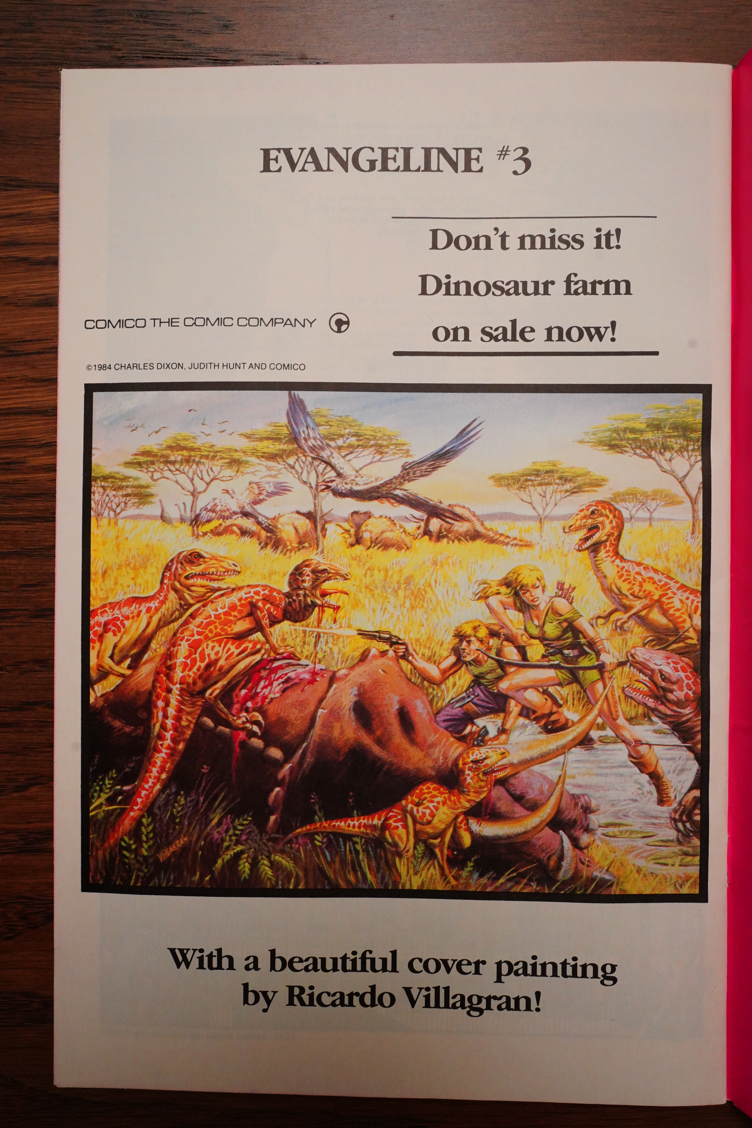
assigned to do a book called
Evangeline which was about a kind
of futuristic religious dystopia. They
were interested in doing what’s
known as gang printing. When
you’re printing any sort of book the
printing presses are so wide that
you can easily print two comic
books side-by-side, and you can
print two comics, two titles, for pretty
much the same price as you would
print one, because of a certain minimum number of copies
that they will run through. Well if you’re running through
those copies on X side, you can easily run through another
one over here, and in fact these days publishers do all
sorts of things in what they call the trim section. They’ll
print bookmarks, flyers, giveaways, all sorts of stuff. They
make absolute most use of the paper available. In those
days, as far as we thought about it, was just gang printing
two books at once.
So Comico in those days couldn’t really afford to sign
another outside talent, so it fell to one of the four initial core
group of creators to create this new book for color
distribution where we had been black and white before.
And I by default was the one who had the least amount of
negative fan mail on Grendel, so I got the golden ticket to
do up a new series in color and that turned out to be Mage.
I returned to this thought of kind of Arthurian legend
interpreted in modern day. At that time I considered
Grendel as kind of a failed experiment, like “All right, tried
that, didn’t quite take off, got this other opportunity. Let me
face forward and move ahead and approach that.”
Graphic Nonsense #2, page #7:
Well, originally with MAGE I had been adapting
the arthurian Tales along the lines of a super-
hero, futuristic, in fact it looked awfully like
the king Arthur that eventually came out in
(DC’s) CAMELOT 3000, and when I read that DC
were going to do that I shelved the whole pro-
ject, but when CAMELOT eventually came out I
didn’t really like it and felt I could do some-
thing different because basically here we just
had the legend of Camelot with space-guns and
I realised that that wasn’t what I wanted to do,
tell the same old story all over again, I wanted
to add some of my own personal attitudes and
reflections, so that’s when I decided to go
more for using the archetypal motives in legends
instead of the exactitudes, which is why we didn’t
have Guinevere or Lancelot in MAGE, we just had
the people that fulfilled the major roles.
So Mage spun out of Wagner being into Arthurian stuff, but then Camelot 3000 came out, so he had to drop his original project. And then the Comico guys needed, quickly, a new colour comic book to print to not lose money, and viola: Mage!
Saying that, though, might have made for a slightly less enthusiastic editorial introduction…
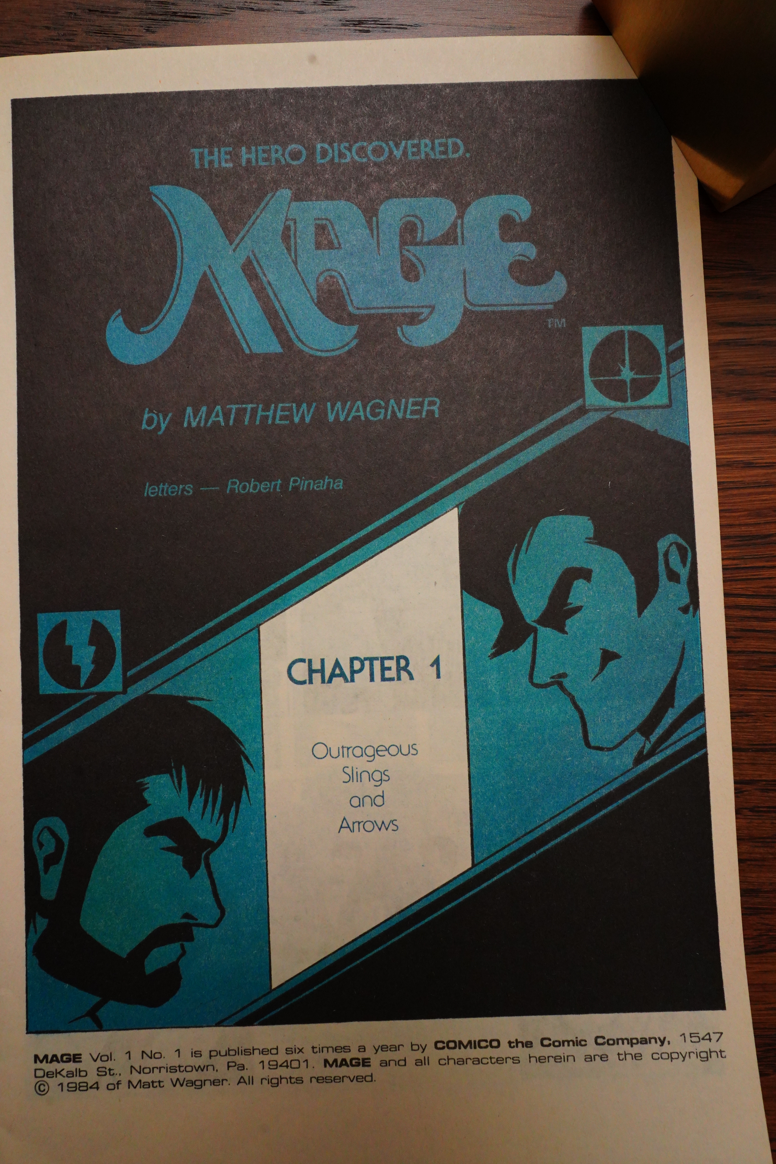
All the issues have a chapter title page like this. Kinda stylish.
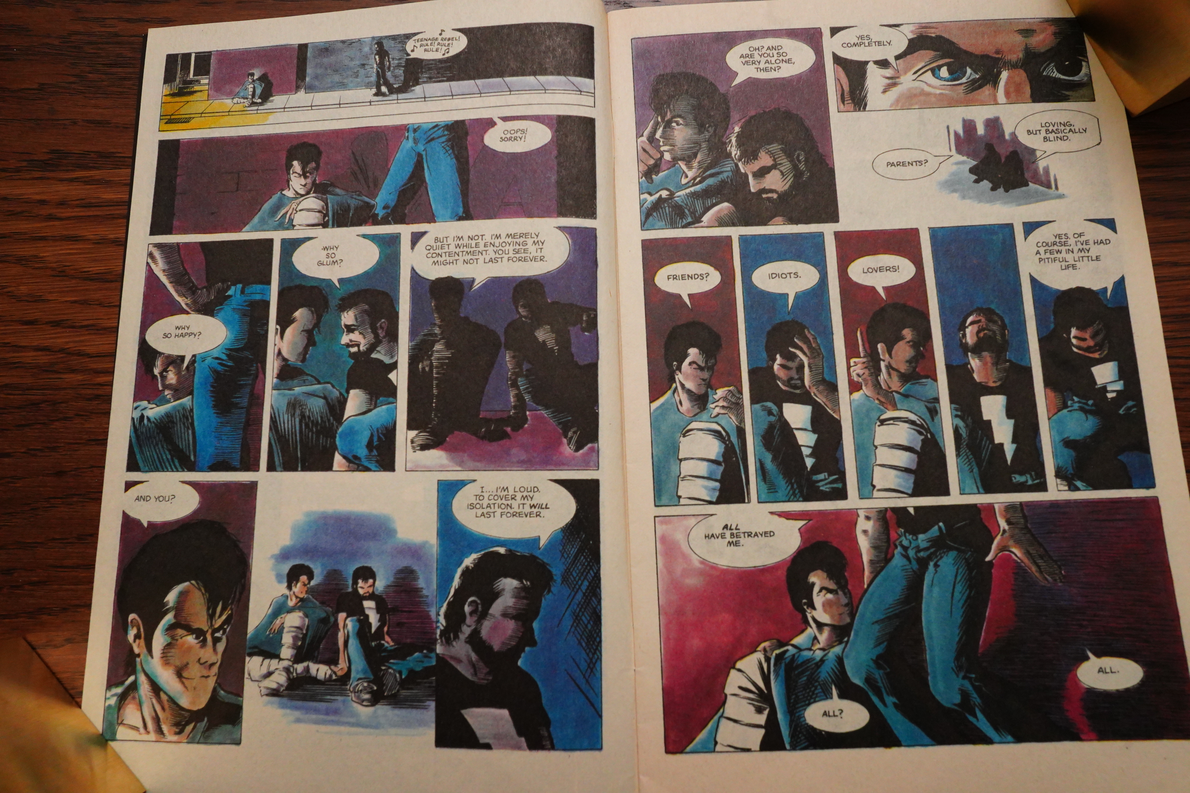
That looks really good — but we’re starting Mage just like we started Wagner’s Grendel series — with two guys sitting on the ground somewhere and talking. I guess sitting in an alley is a variation from sitting on a rooftop…
It’s clear from the start that this is going to be a more humorous book than Grendel — I mean, not in the overall (extremely serious) plot, but in scenes like this that show a lot of comedic timing.
But what’s up with the colouring? I like it a lot, but I’ve seen a lot of people talking about it as The Worst Thing Ever. And it’s certainly original — it’s very smudgey looking. But there’s a reason for that:
The photostat paper that was used had a polymer base that made the gray-line very durable and stable. They would not shrink or warp when the color, which was usually water based, was applied.
Unfortunately, the surface of the paper was not absorbent at all. Painting with translucent watercolors and dyes was difficult, often creating a streaky or smudgy look especially in areas requiring larger coverage.
They used this very labour intensive method to do the colouring. No colourist is credited in the books, but I guess everybody at Comico lent a helping hand, or something?
I think it’s a really interesting look — it’s gritty and dirty — especially in the first issue, which is printed on some kind of high grade newsprint. (The other issues are printed on a cream coloured (but higher grade) stock.)
Oh yeah, the story — I like how it’s being revealed — lot of intrigue from various intriguing characters.
Wagner tries a lot of differently things, storytelling wise. These shifting perspectives during a dialogue scene work well, for instance, but in other scenes, it can be hard to tell just what’s going on.
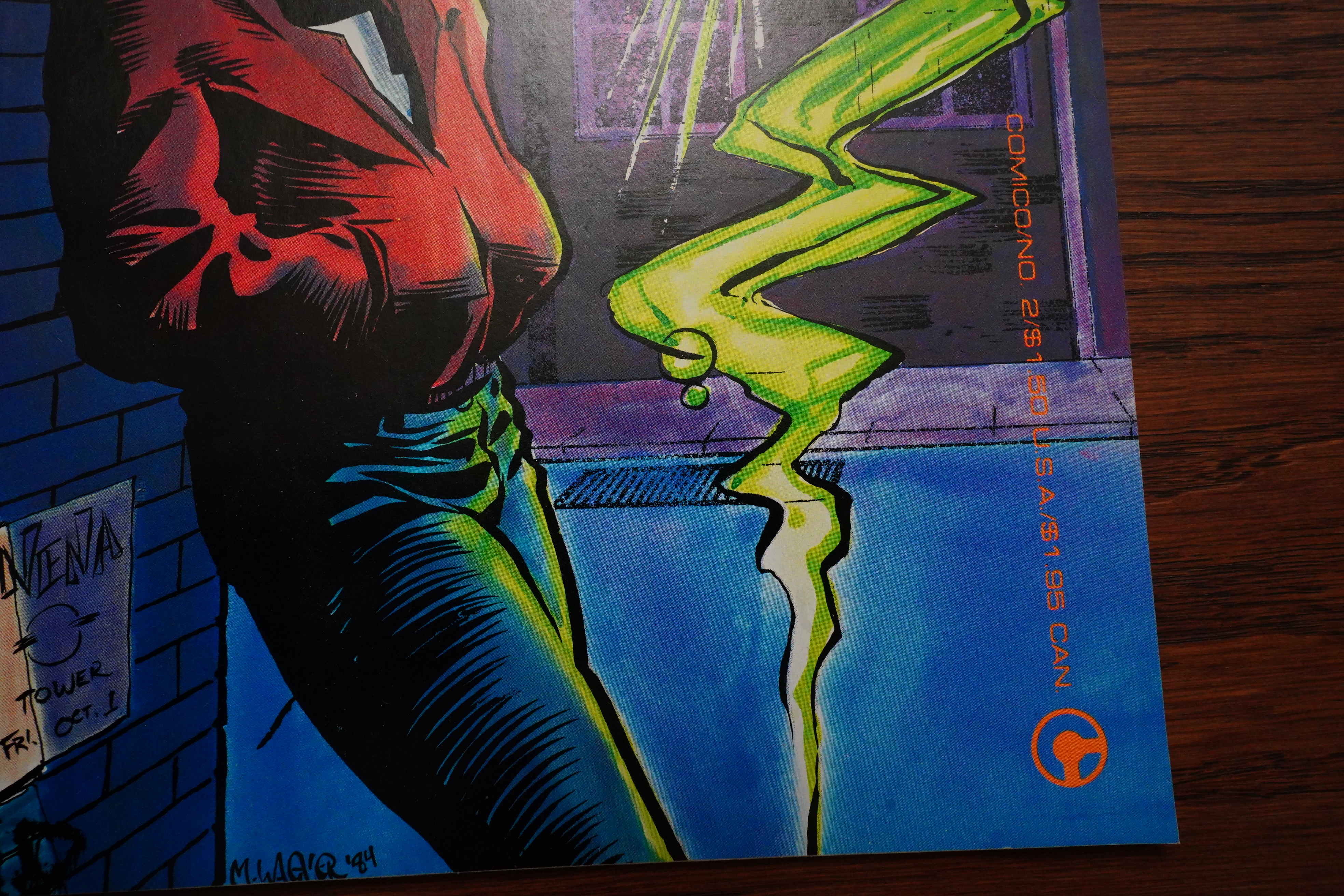
Early Comico issues had the worst cover numbering ever. They use random colours for the logo and text. Sometimes it’s easy enough to tell what the issue is, but sometimes it’s nigh impossible. I’m glad they redid this scheme after a while, because it’s just a pain to deal with.
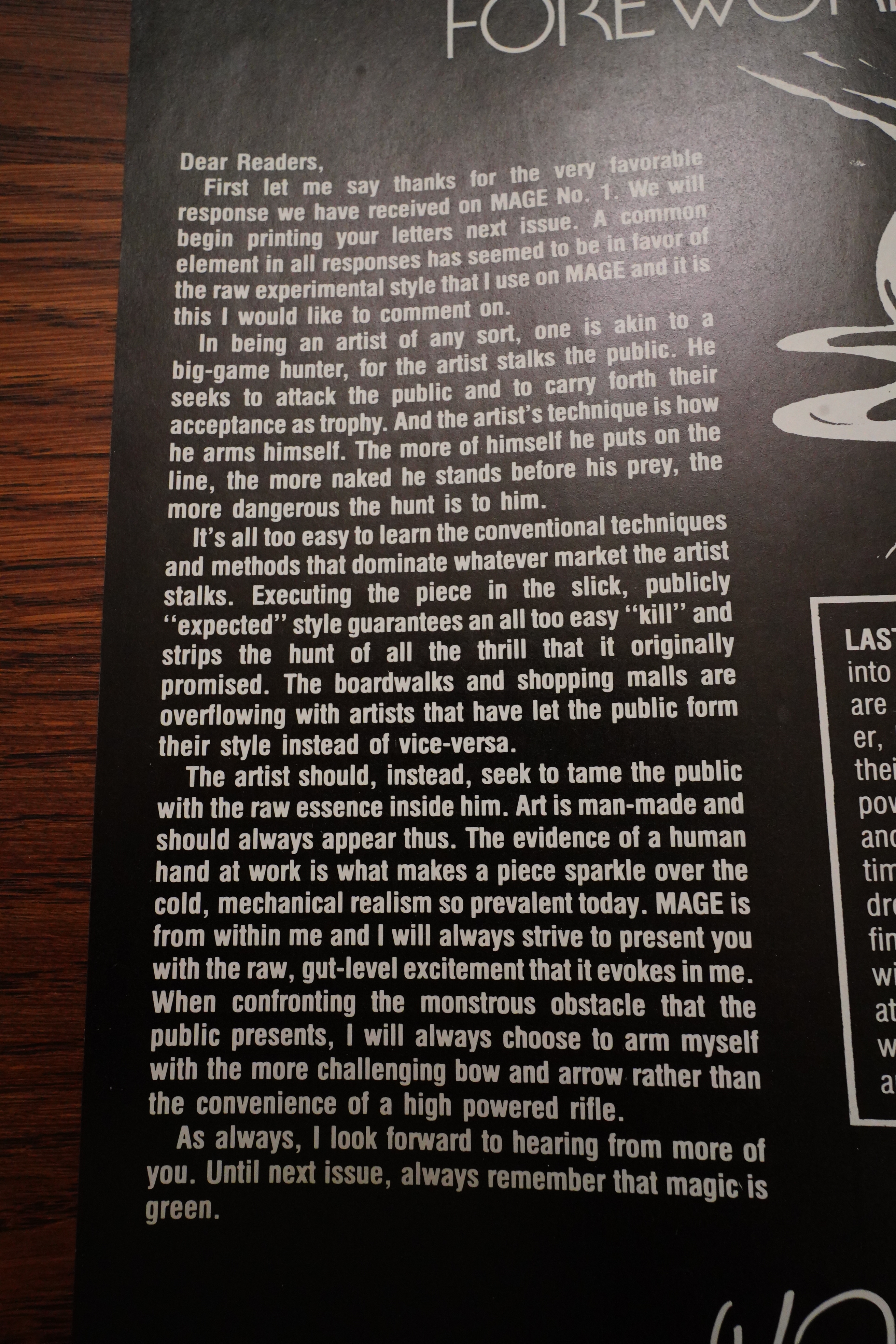
“The artist should, instead, seek to tame the public with the raw essence inside him.” Uhm… yeah, ok.
See? Whiter paper in the second issue. The colouring looks starker here, but it’s still works.
Unfortunately, Wagner starts infodumping a lot, which is something that continues until the next to last issue, really. One letter writer complains about not a lot happening in each issue, and how the lack of captions means that Wagner has to show everything instead of talking about it — but there sure is a lot of talking about things in dialogue form instead.
Wagner does this zip-a-tone thing only once? I guess he was getting bored.
There was a long fight sequence in Grendel that had a dialogue scene going on over the right-hand pages, and then a fight scene on the left-hand pages, and that worked very well, I thought. Apparently Wagner thought so to, because he repeats the format in Mage.
Heh heh. The look on his face.
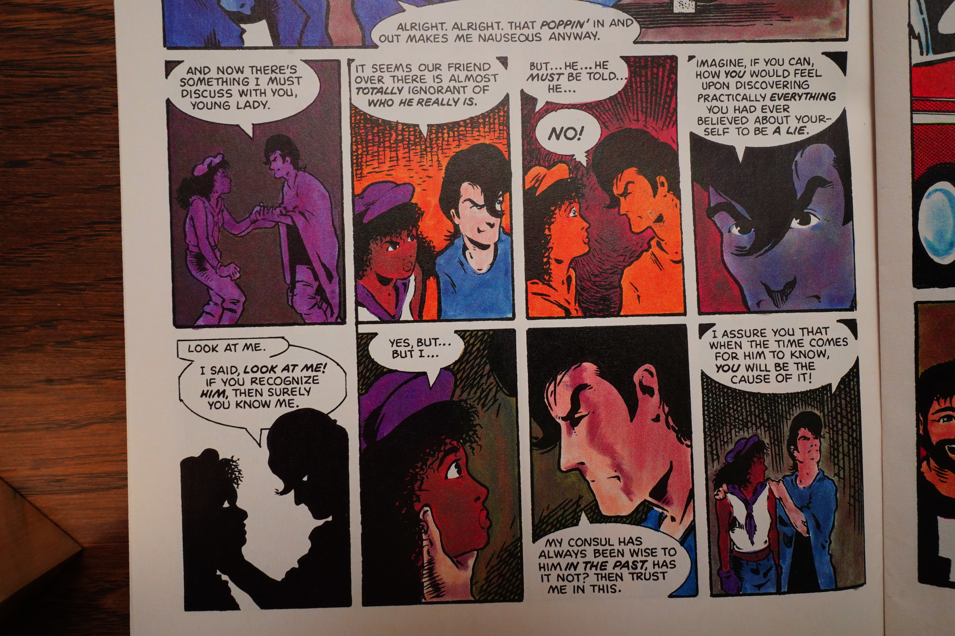
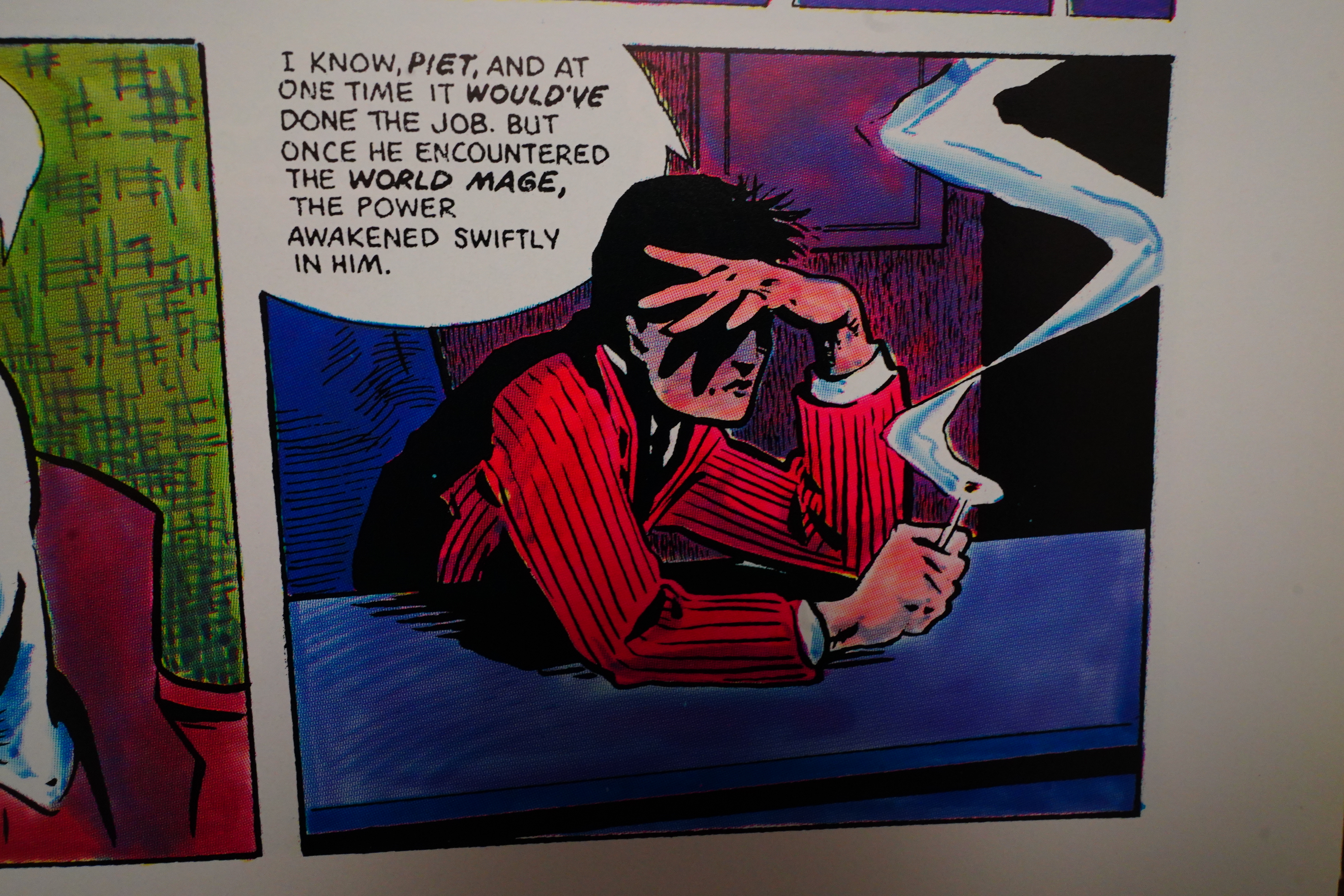
Wagner has the characters dropping mysterious hints about Kevin Matchstick’s (that’s the bearded guy) real identity. What can it be!
I appreciate that they have the characters explain things to each other this way — it’s certainly very effective. But it makes this setting seem paper thin: It feels as if Wagner is putting everything on the page; it doesn’t feel like we’re in a well-thought-out world, really. There’s just these elements needed for this story, and we’re being told what they are.
I think what Wagner is saying this time around is that it’s just easier to draw himself, because he can just use himself as a model? I’m not sure.
Whoah. That’s very Sam Kieth-looking, isn’t it?
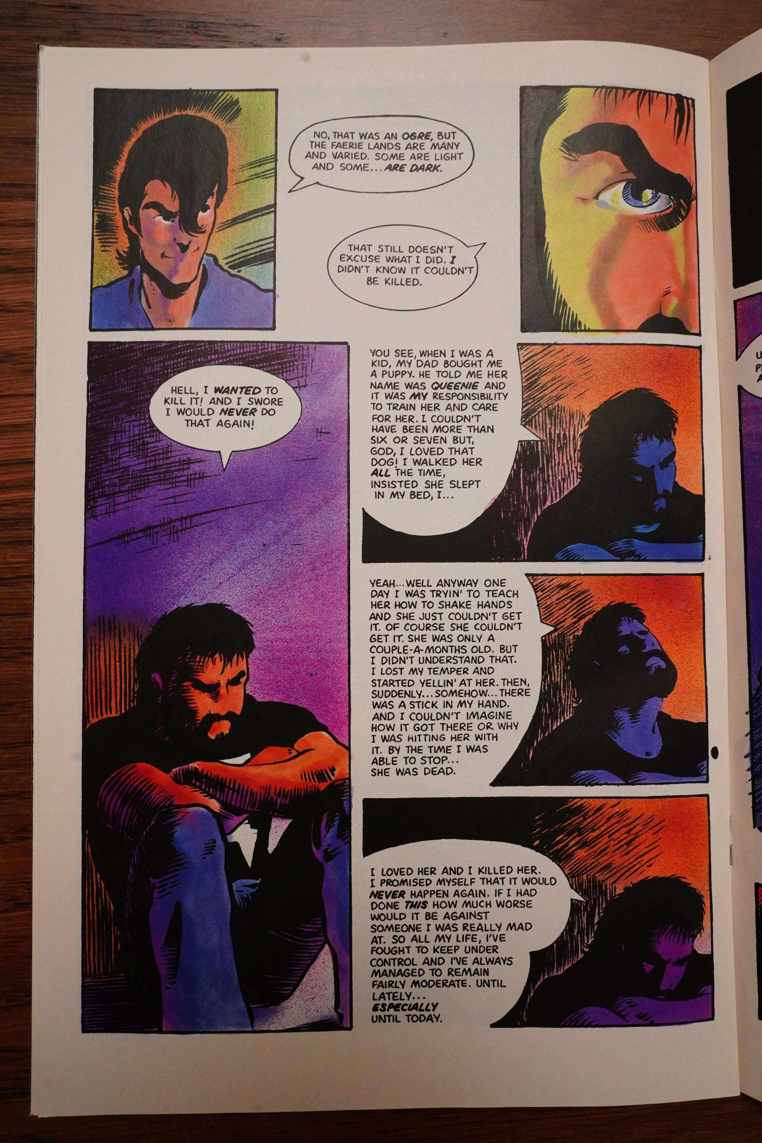
Wagner was ahead of his time. These days, all characters need to have a traumatic background (i.e., “depth”), but that wasn’t really the case in the 80s. But Matchstick gets one — and it’s that he… killed his pet dog when he was a child?! Well, ok then.
Another way he was ahead of his time (but seriously this time) is that there’s no recapping: This is a complete story that reads like a complete story. There’s a short recap of the previous issue on the inside front cover, but no in-story reminders, which was unusual at the time even for things that were meant to be limited series. Take, for instance, limited series published by Epic Comics at the time — recap-o-rama in every issue.
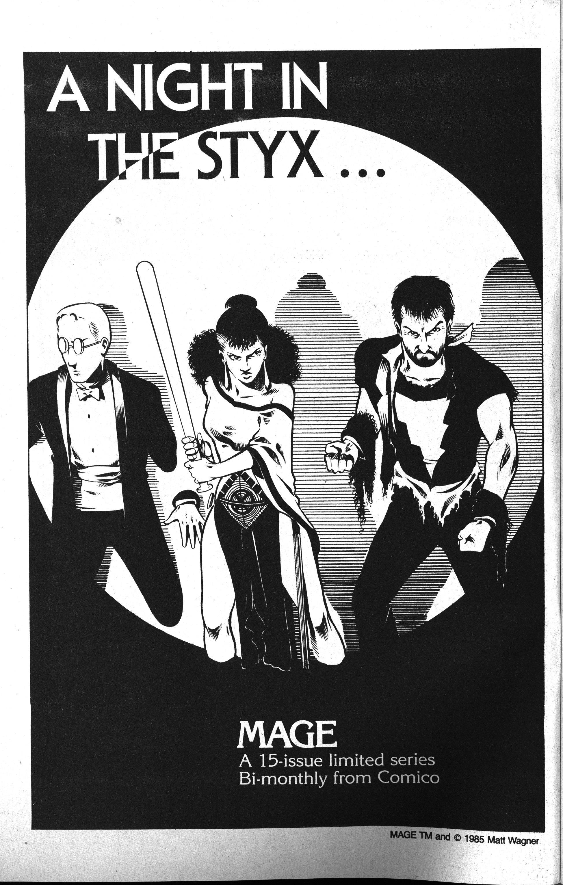
This was never published, and this is the first I’ve seen of any artwork for it. Looks good.
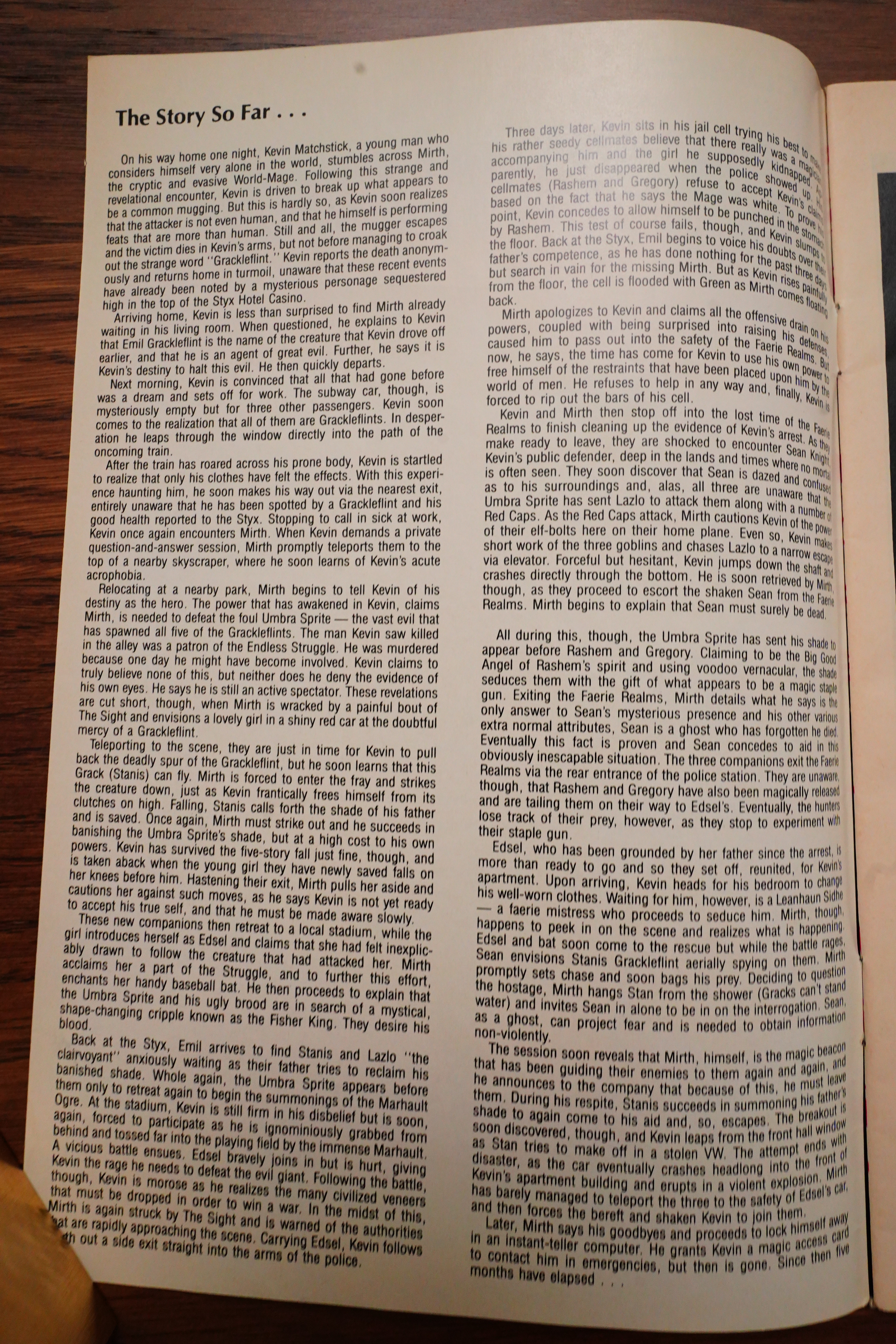
Aha! This is where I came aboard as a teenager — I think I’d read a positive review, possibly in The Comics Journal? So I started reading here… but I think I bailed again after a few issues?
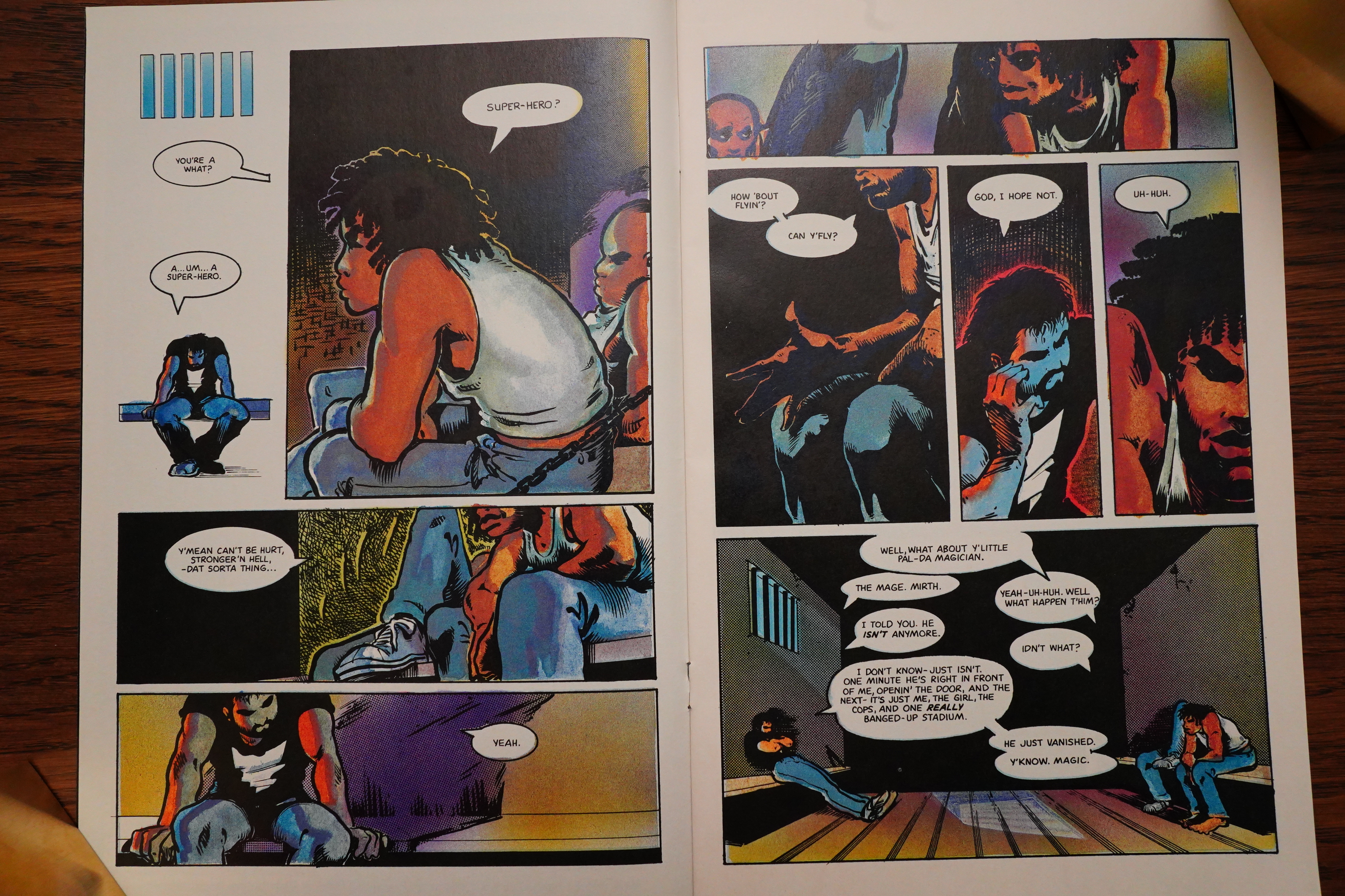
But I remember this issue quite well, at least — it’s all set in a prison.
“In process color on enamel coated paper”. Back in the 80s, people were very into paper quality.
And wouldn’t you know it: Sam Kieth comes aboard as the inker! It seems a natural choice, since Wagner’s artwork has the same kind of vibe, sort of. Very inky.
The first issue with Kieth looks pretty much the same as the previous issue, really.
Except that they start running these annoying ads in the middle of the story. I’ve never understood why they’d do something like this — it really distracts you from what you’re reading. And since these are all internal ads, they didn’t even get money for doing it. Ugly ads, too.
Is it to seem more like a “real” comic book, since Marvel and DC does it this way?
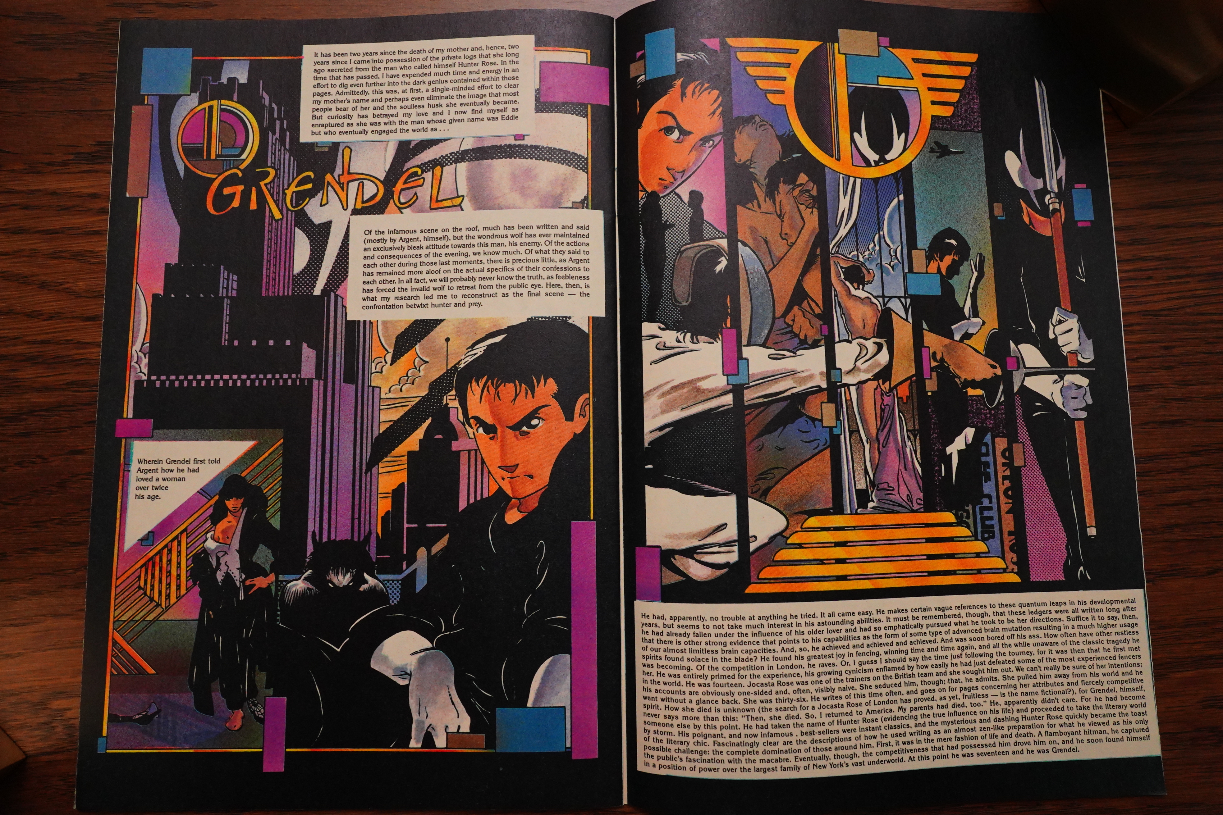
Mage also gets a back-up feature: Grendel. The first four-page part is a recap of what happened in the original three Grendel issues.
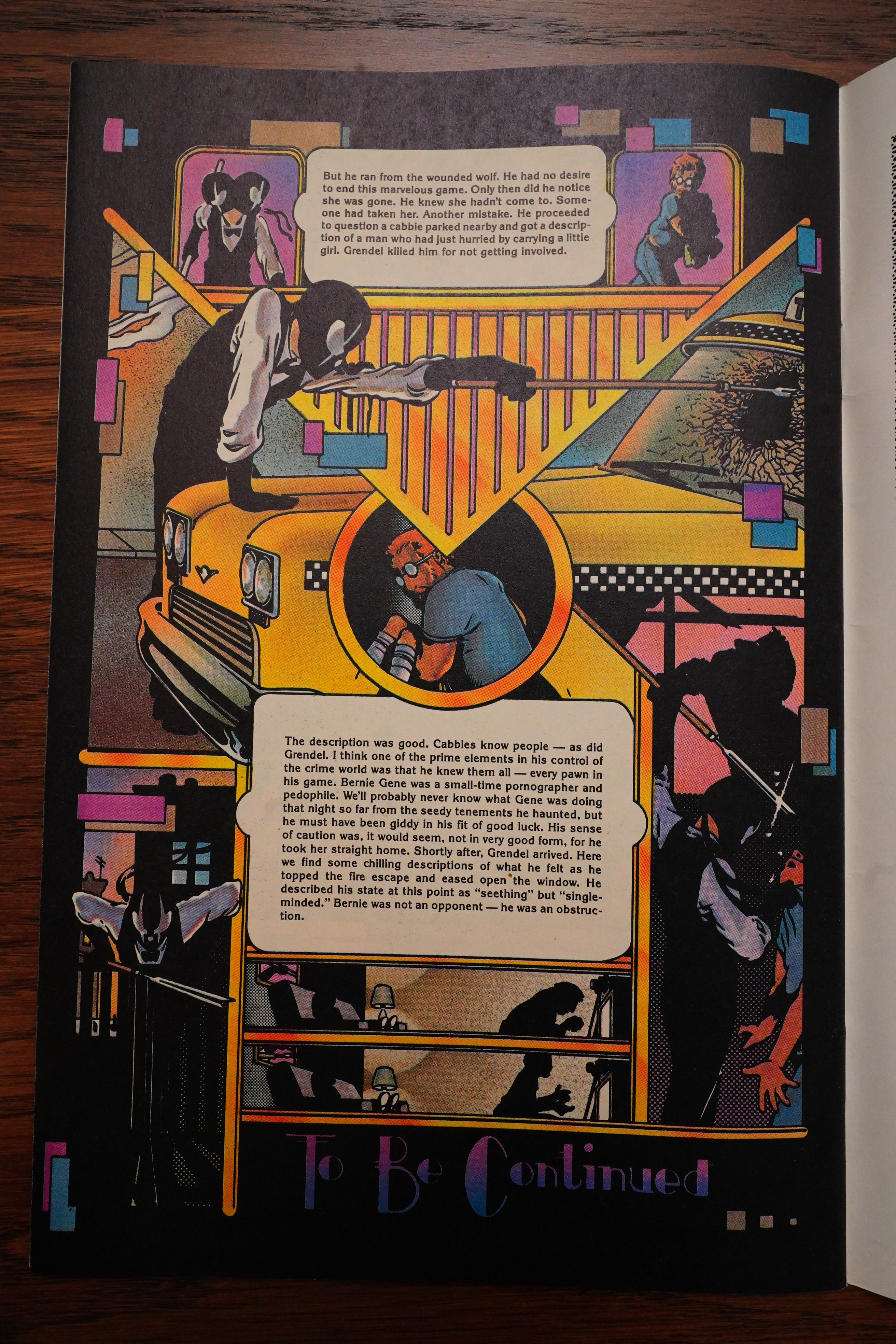
I like the look of these pages — very art deco — but this sort of non-storytelling is pretty annoying, in my opinion. It’s like reading somebody recapping a story, and it continues on this way even when the actual recap is done. But what do I know — most people love reading recaps. Just get the “plot” without any of that pesky storytelling.
These back-up strips were later collected in the Devil By The Deed graphic novel.
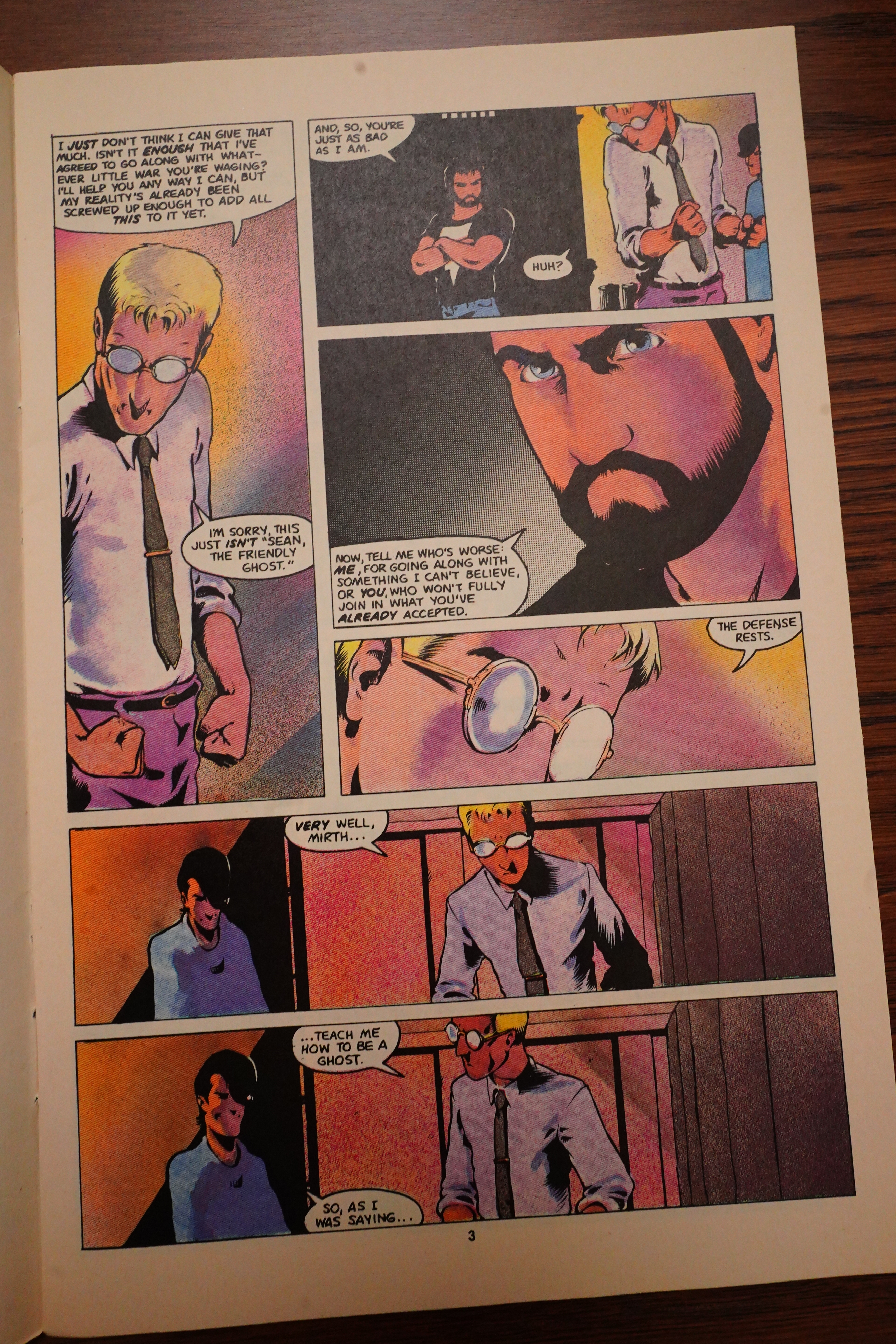
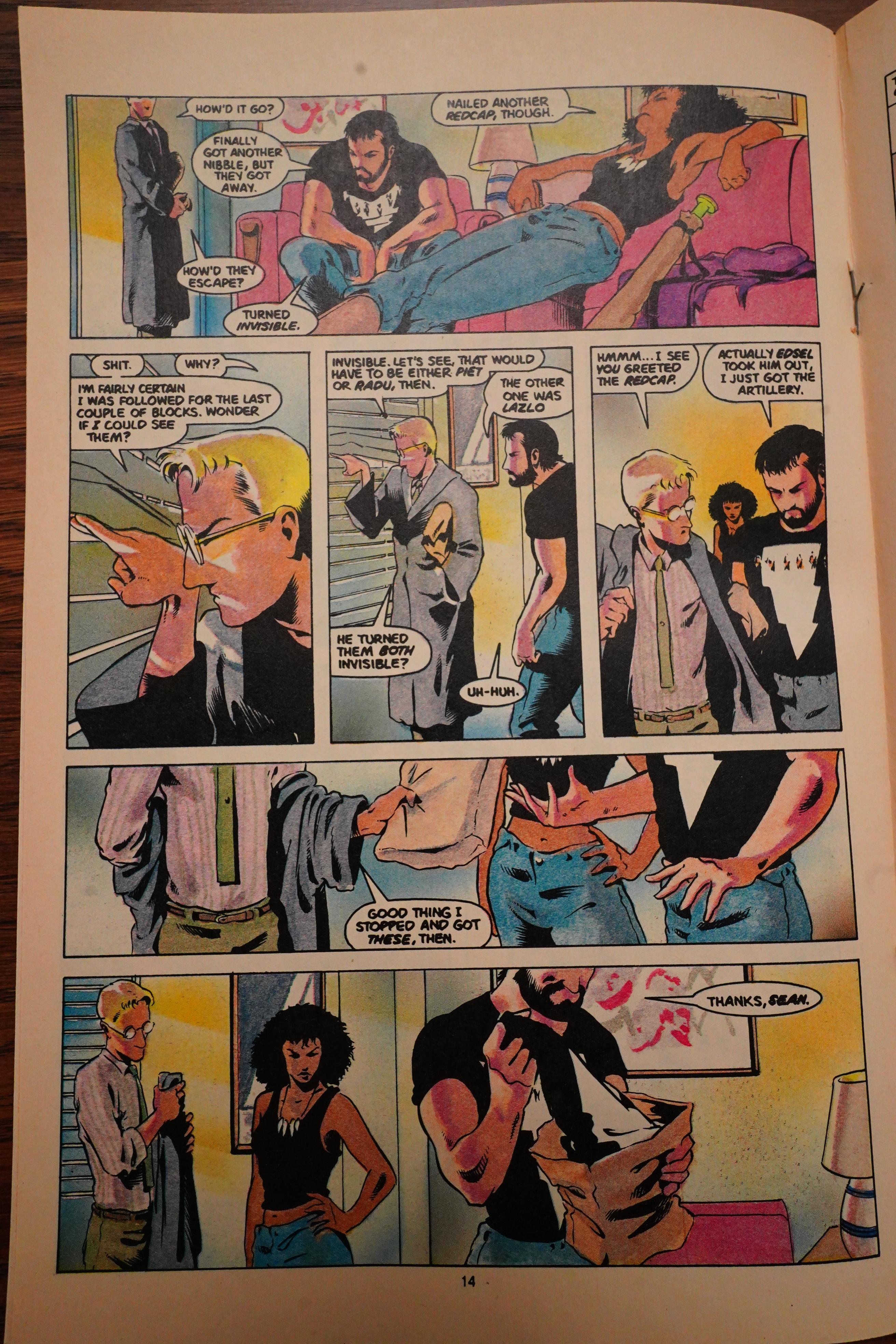
The Scooby Gang grows, as is common in these kinds of things…
But what’s not usual is that the wizard guy says that they’re not going to torture the bad guy, because they’re good guys. These days it seems like everybody’s learned from 24 that the first thing you do after capturing a bad guy is to torture them.
But! Instead the wizard guy just lightly threatens to kill the guy by splashing water on him. Because these white bad guys die if they get water on them.
So for the rest of the series, our heroes go around with spray bottles of water, right? Right?
No.
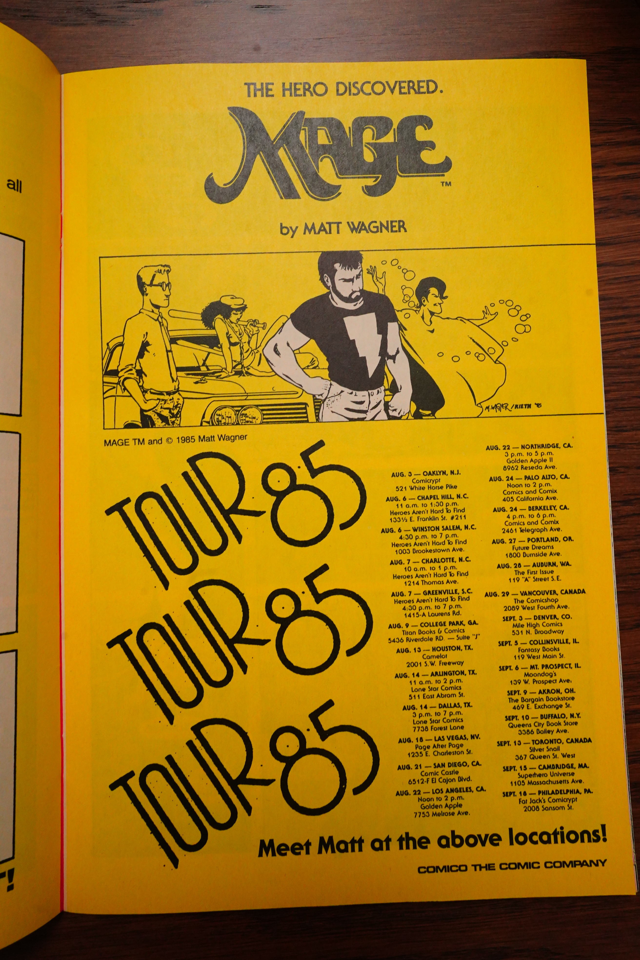
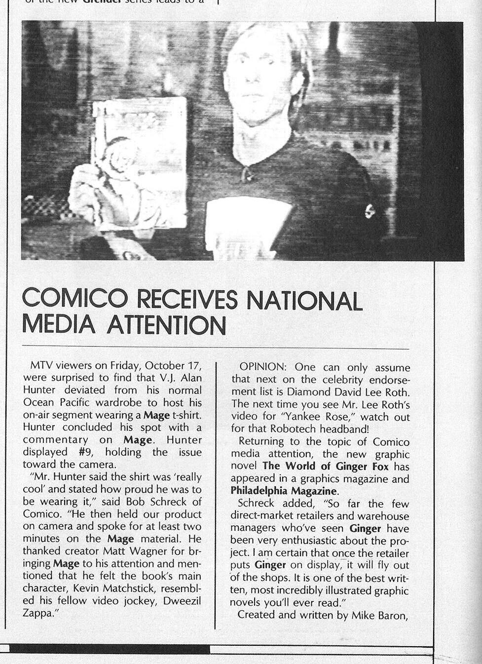
Wagner goes on a promotional tour.
This is unheard of these days, but the Mage readership grew as the series progressed. The final issue was allegedly the best-selling one. So I guess it makes sense to do a full recap in the middle of the series.
And speaking of t-shirts…
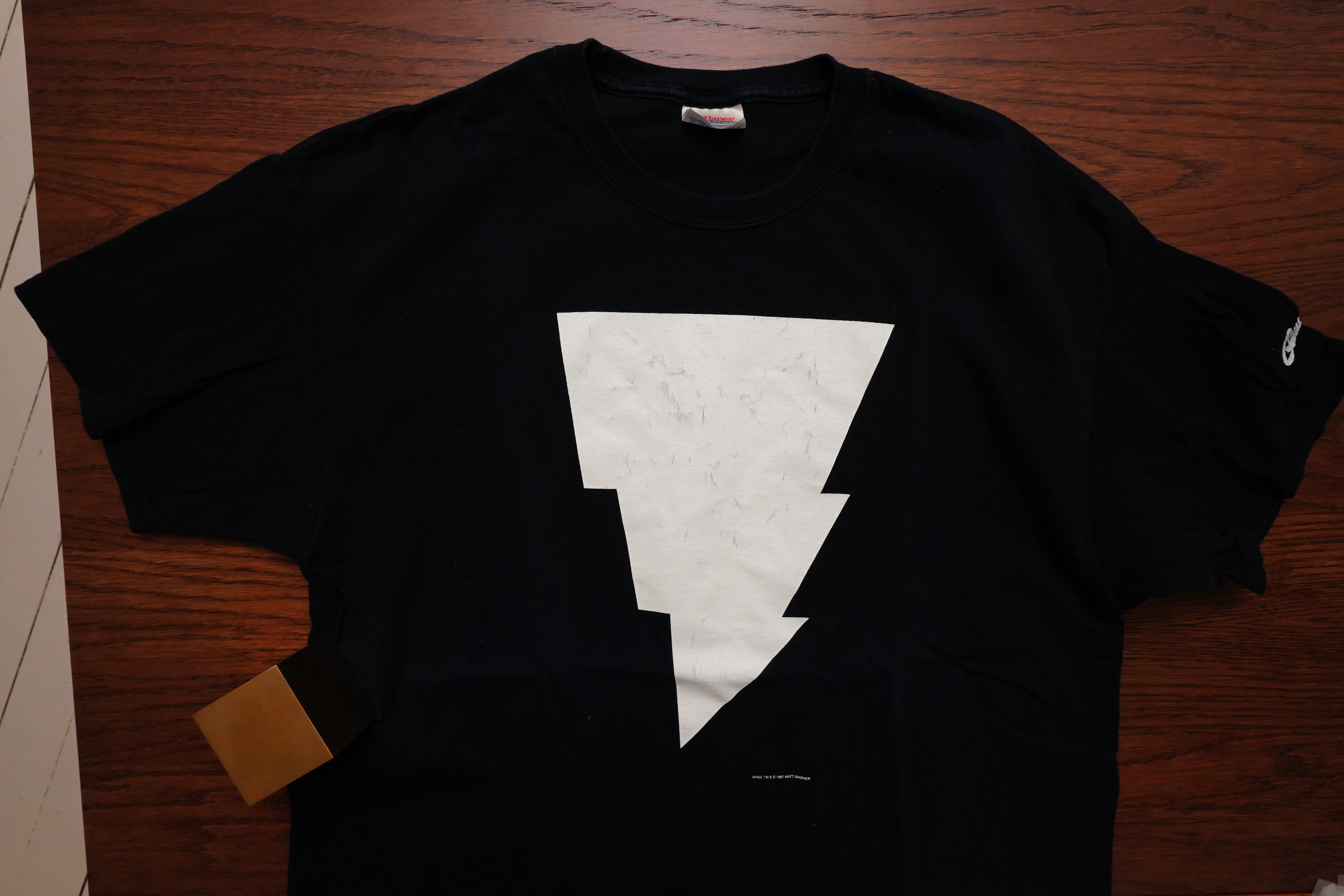
Look what I’ve got!
No, it’s not from the 80s, but I think I bought it, like, a couple decades ago? At least one decade? It’s Graphitti Designs and everything… It’s held up pretty well. Doesn’t look like they still do t-shirts?
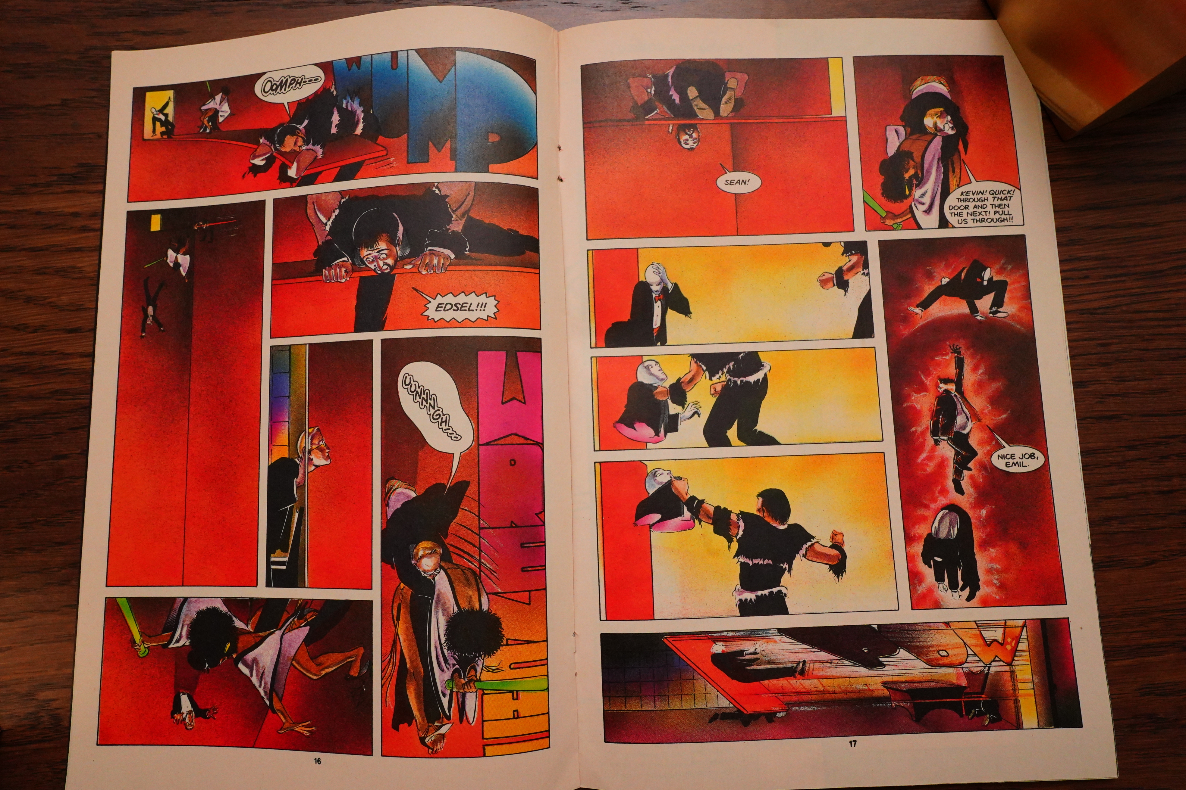
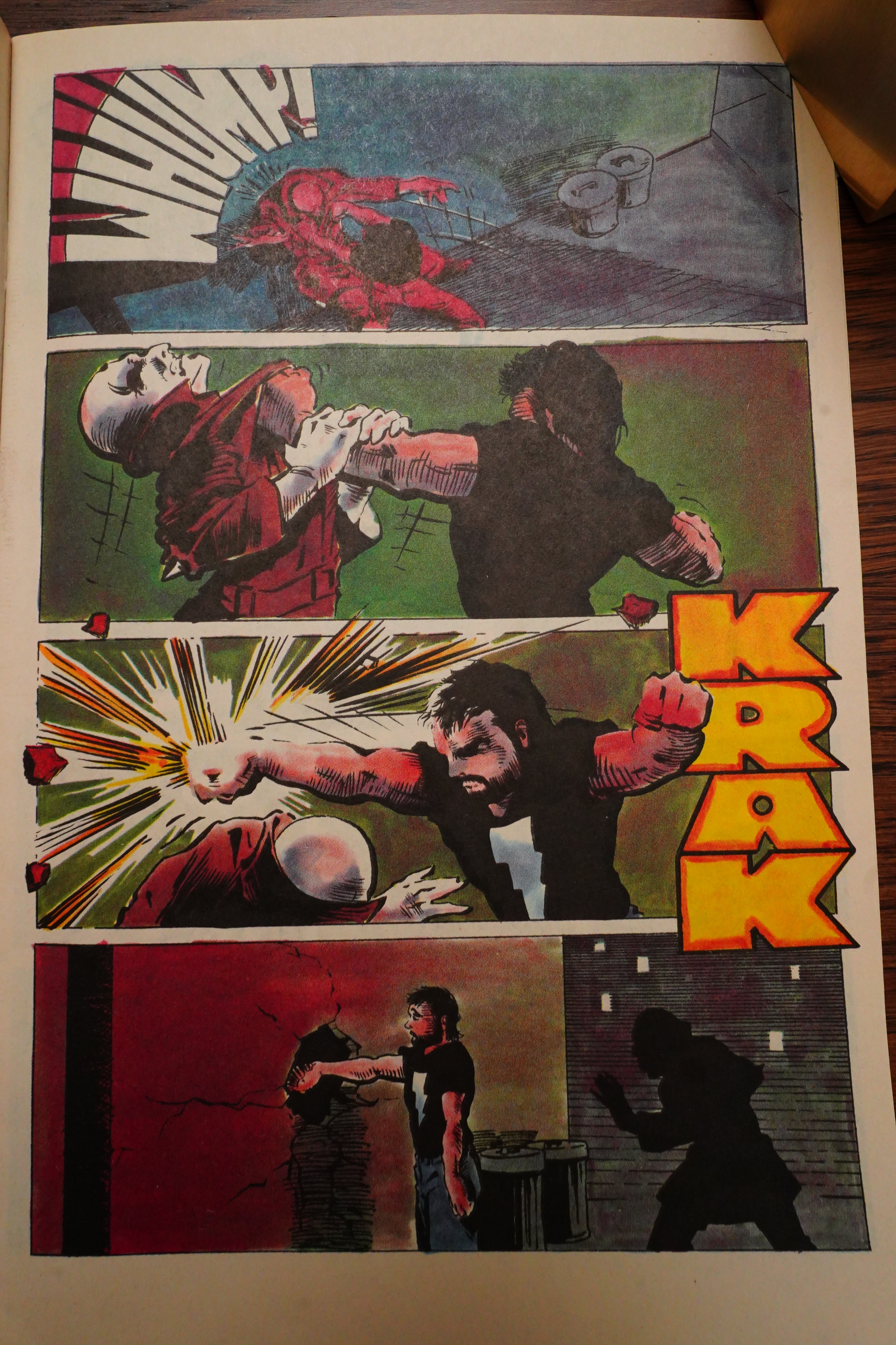
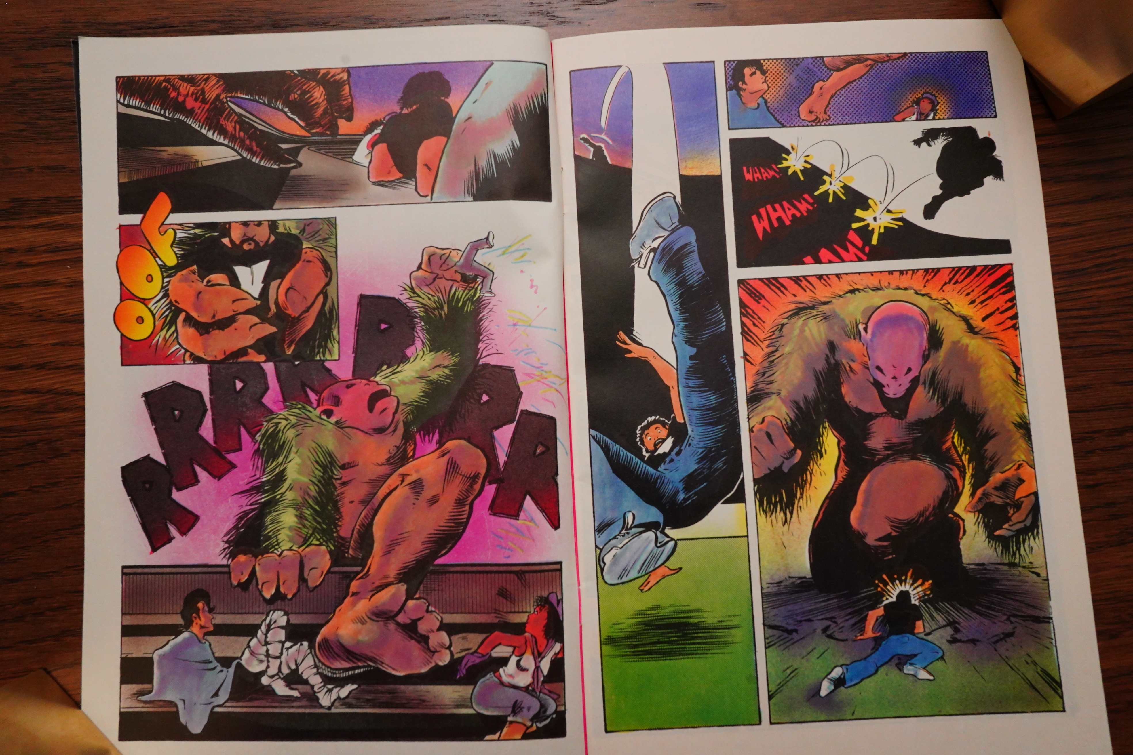
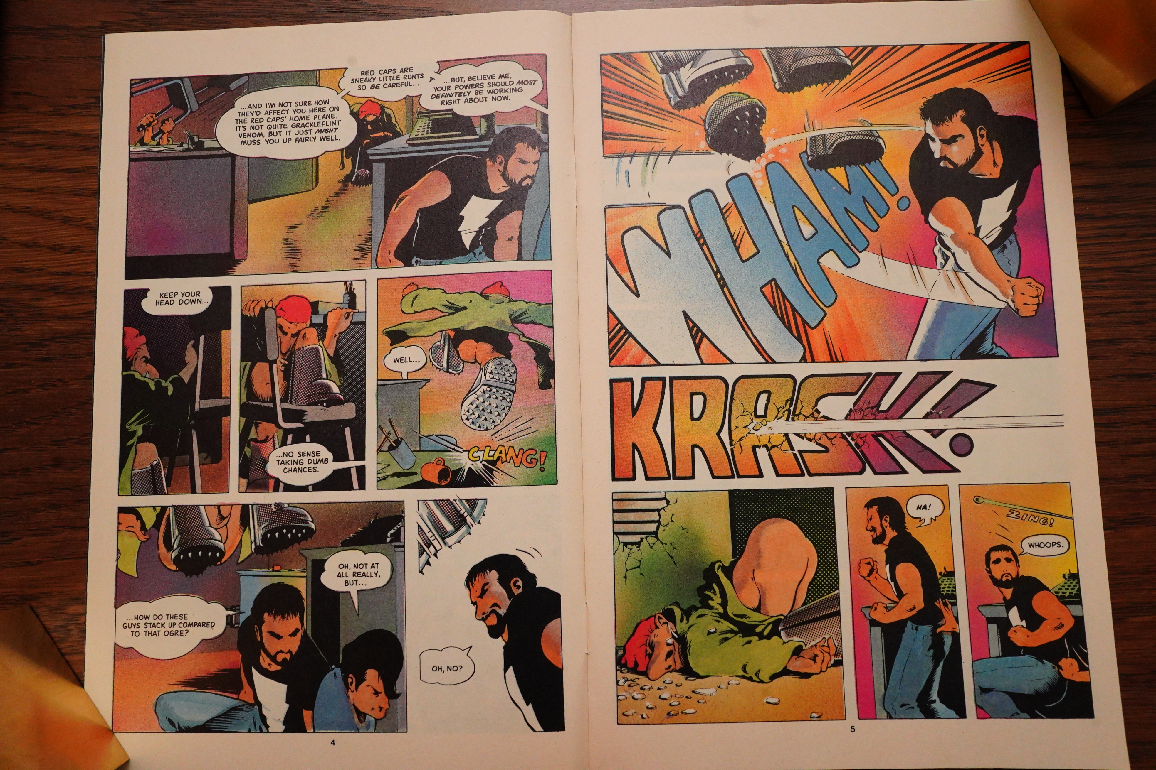
I really liked this fight scene — it takes place in a magical bottomless pit, and has people popping out of walls and stuff. It works very well.
Huh.
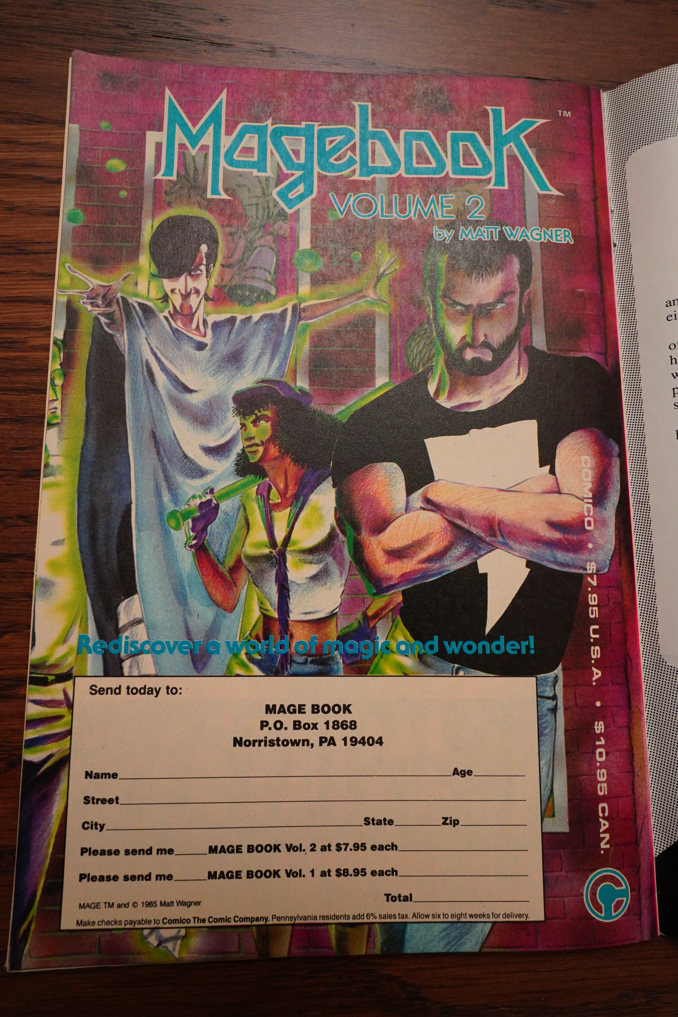
Magebook was produced in an interesting way:
Matt had informed us early on that MAGE, likewise, would be a limited series. The idea of collecting it in graphic novel format as well became a goal.
Then we were presented with a production issue. In an effort to minimize unit costs, our comics were being gang-printed and though MAGE was a critical success it sold in smaller numbers than most of our other books, resulting in an overstock of the title to be stored.
There, warehoused on a skid, was the opening chapter of what would become our first published graphic novel.
After the first issue we began not binding the interiors of the books, storing the excess signatures for future use. After four issues of MAGE had been published we collected the signatures and the overstock of the first issue and had them neatly bound in a graphic novel format producing MAGEBOOK for merely the cost of the cover and the binding.
MAGEBOOK was a collection of the original print-run of the first for issues; ads, letter pages and all. Due to its success, we repeated the process for the second volume which has notably larger size dimensions than the first volume because of the availability of trim area that was lost on the first volume due to the first issue of MAGE having been previously trimmed and bound as a comic book.
Very smart and very thrifty. I can’t remember reading about any other collections being done like this? Yes, publishers have taken already-published comics and bound them into paperbacks before, but not using left-over signatures…
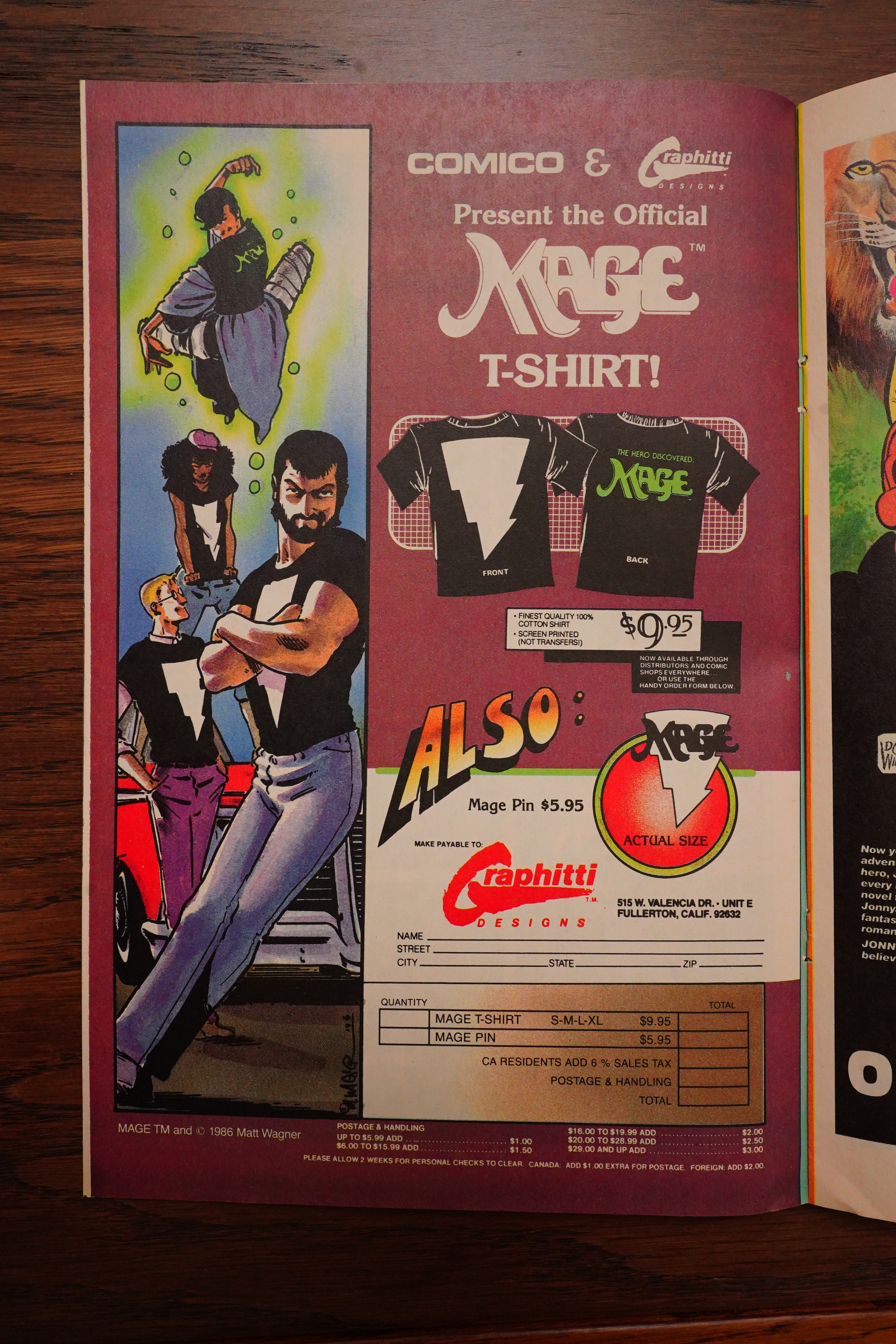
Oh, the original t-short had a bigger lightning?
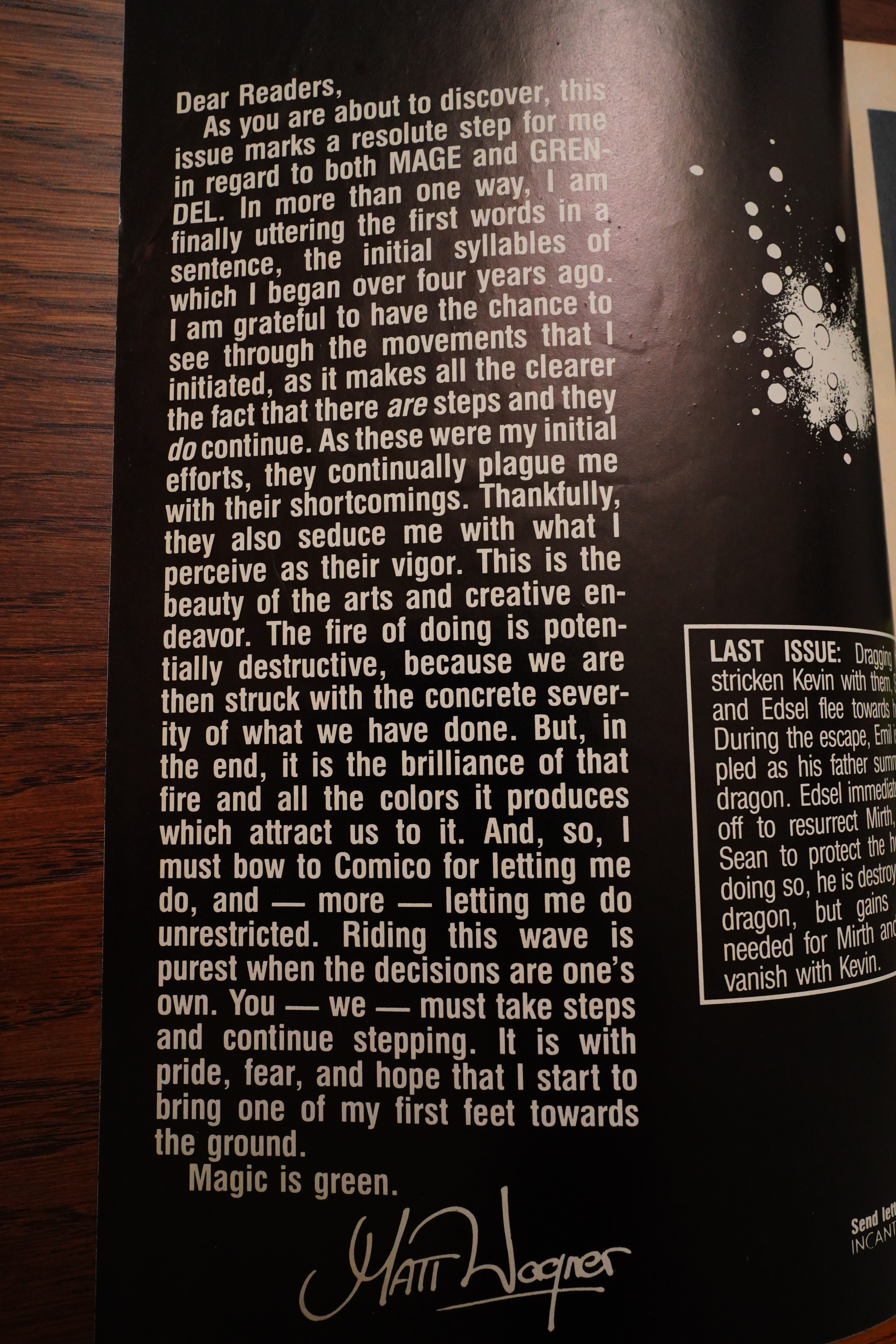
OK, we’re getting toward the end… “The fire of doing is potentially destructive, because we are then struck with the concrete severity of what we have done.”
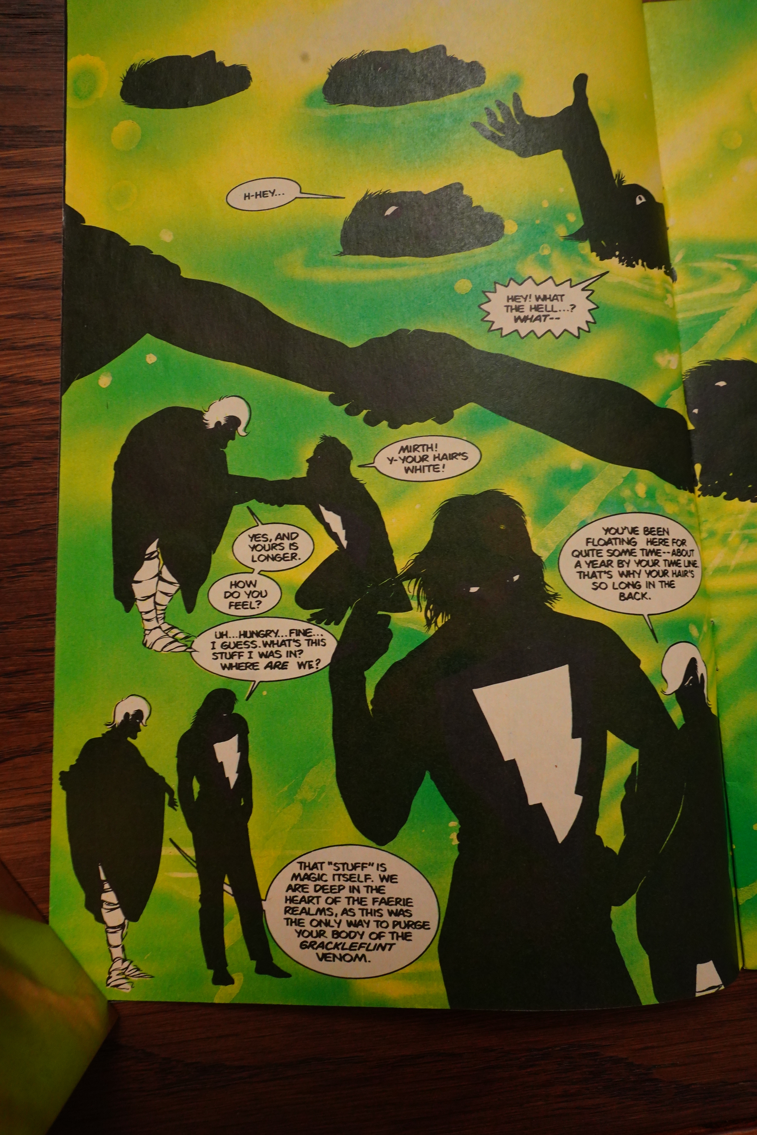
A year has passed, so Matchstick has grown a mullet. Because his hair had grown in the back while he was in a coma. But not on the top. I mean, it’s magic.
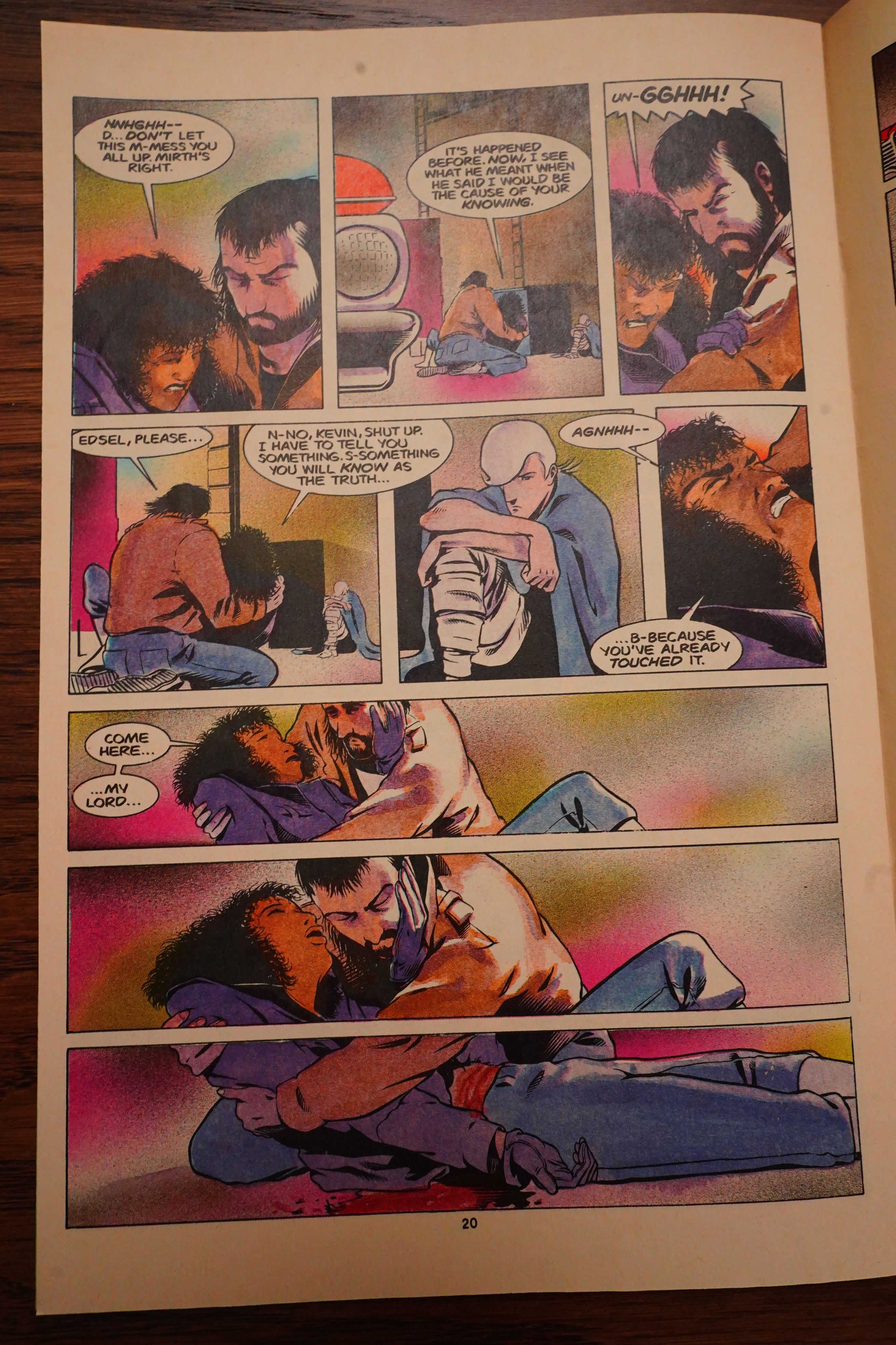
I was rather surprised that Wagner fridged the 18 year old kickass sidekick — because Wagner killed off another sidekick the previous issue, and I assumed that would be enough to instil in the Hero the proper Heroic Anger or something. But nope.
Oops spoilers.
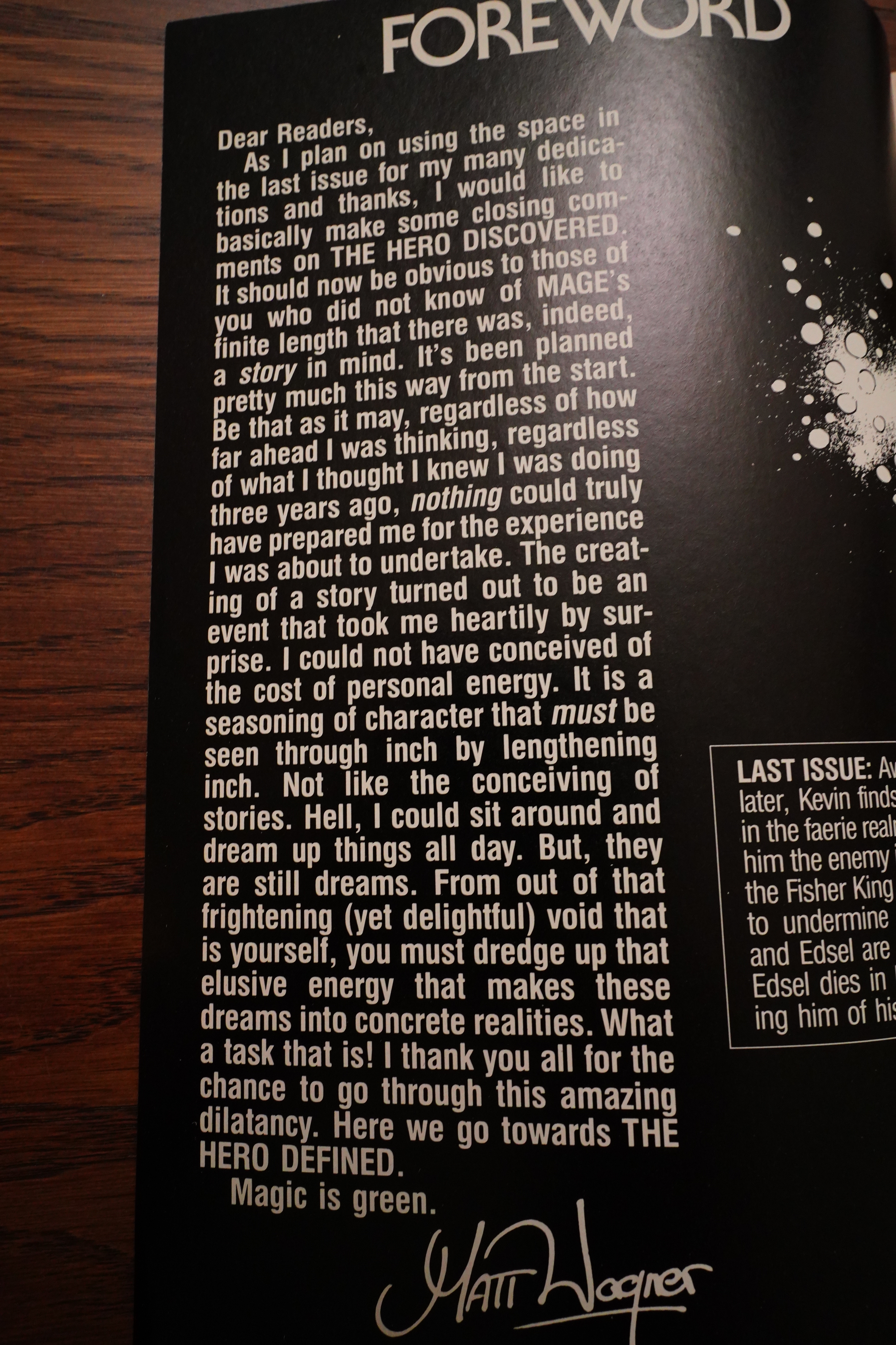
“From out of that frightening (yet delightful) void that is yourself, you must dredge up that elusive energy that makes these dreams into concrete realities.” I’m using my Secret Wagner Editorial Decoder Ring here, and I think what he’s saying is that drawing a comic book is a lot of work, and he’s going to try to avoid doing that in the future. But writing comics is a lark, so he’s going to concentrate on that instead.
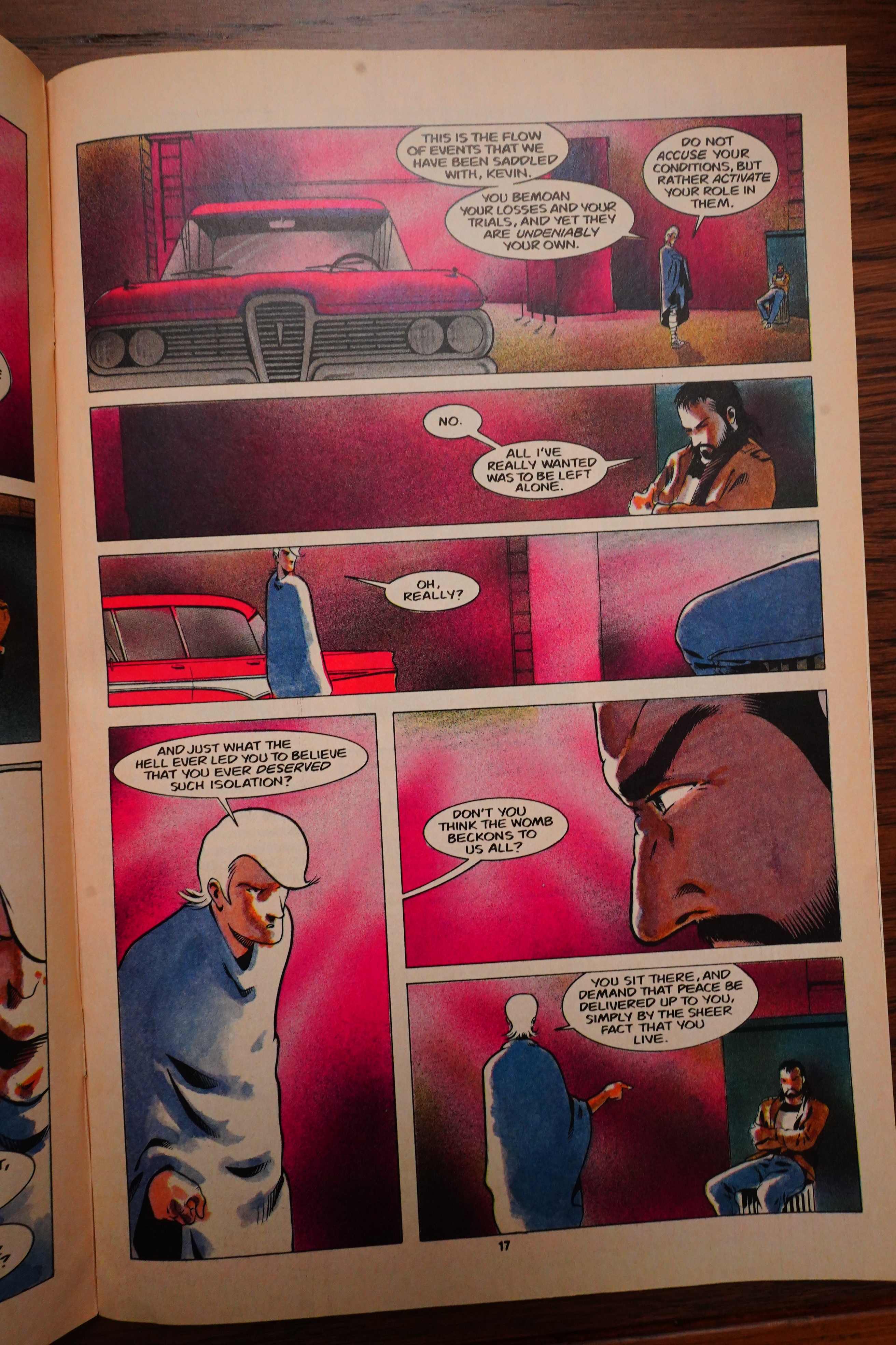
We enter into the final big confrontation in the traditional way — with somebody bucking up the hero. Pull yourself together, man!
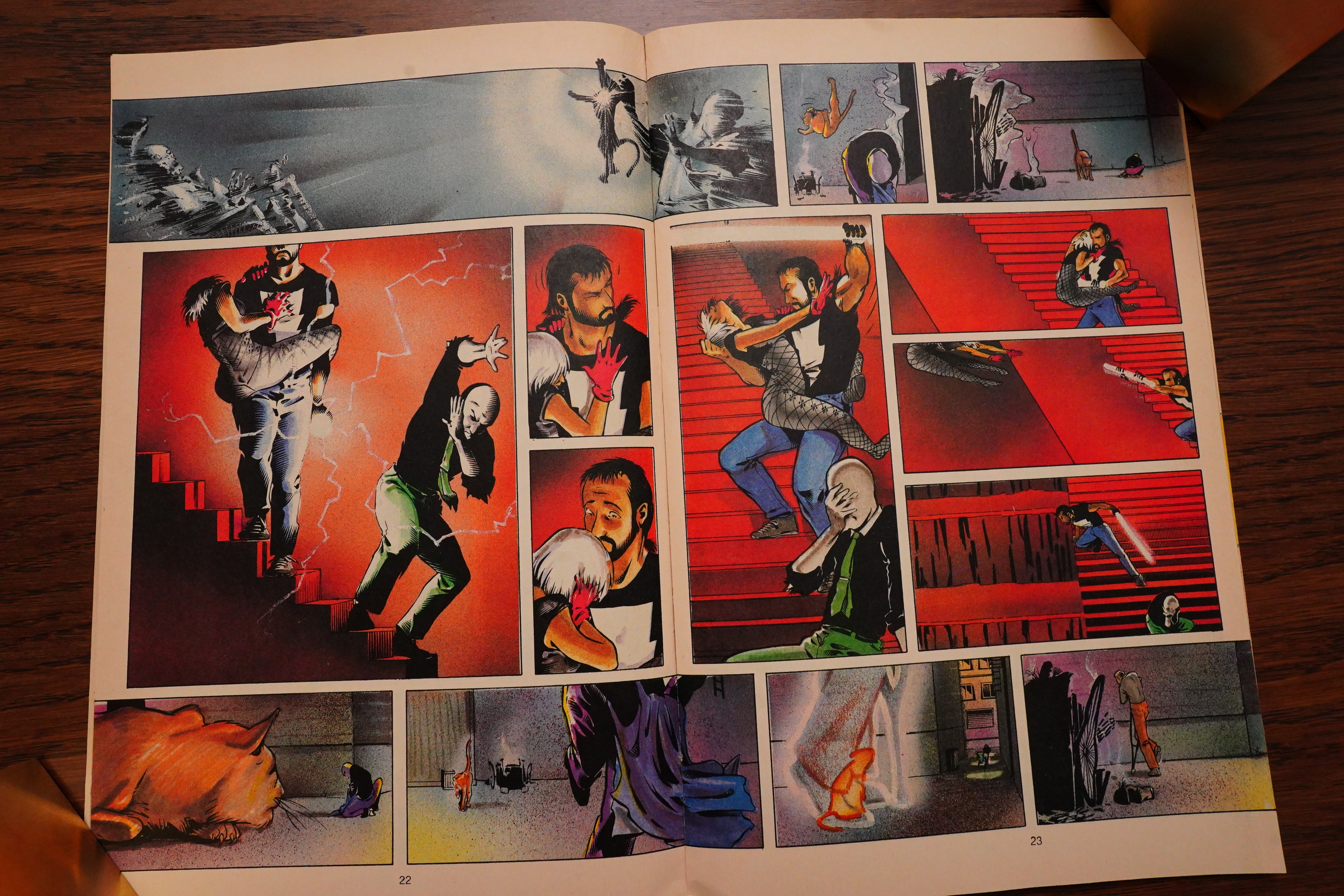
And then the final issue is a double sized fight sequence — sometimes two fight scenes at the same time.
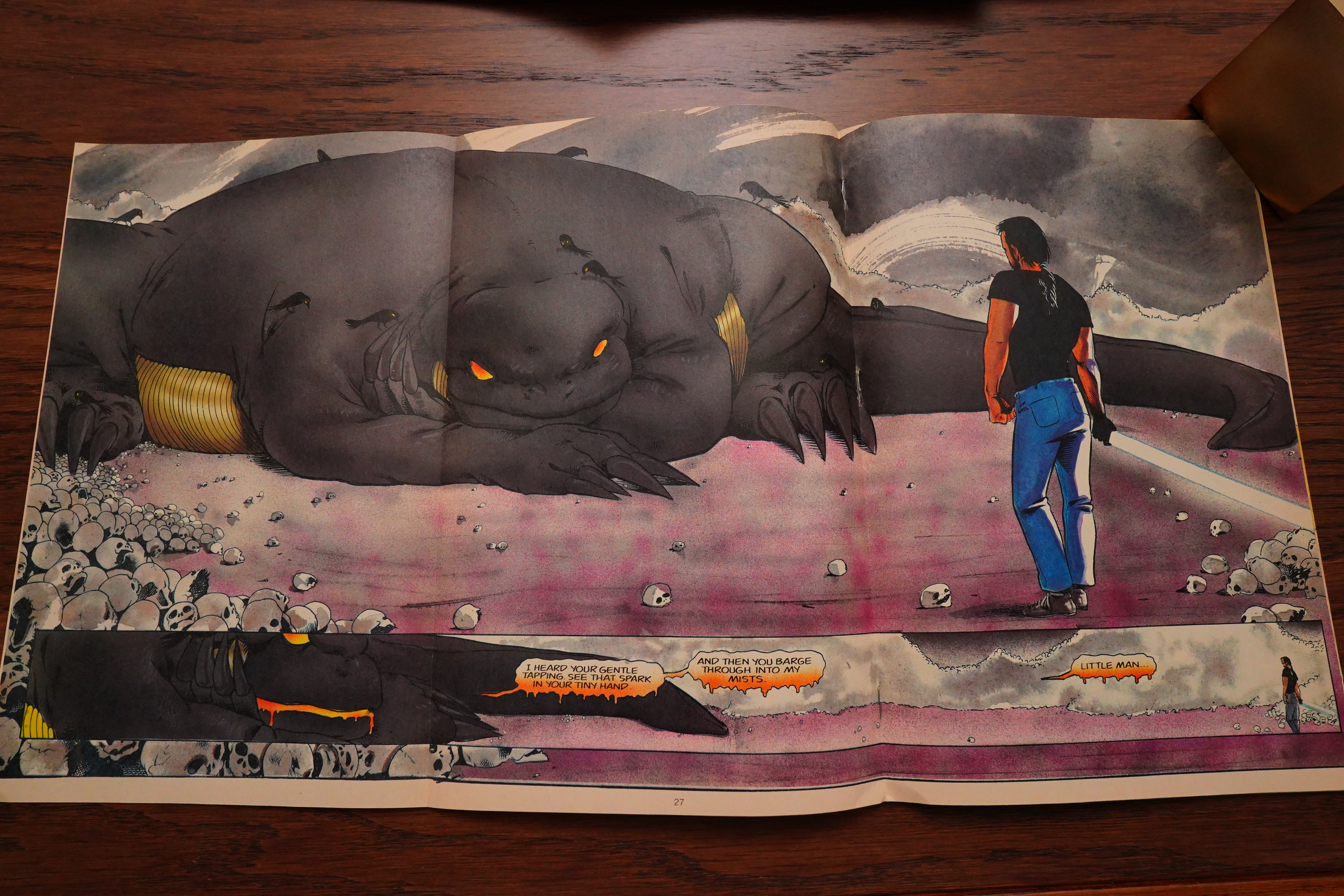
With fold-out dragons and everything.
And then it ends with a… fizzle, I have to say, unfortunately.
The next chapter didn’t happen until 1998, apparently.
Well… uhm… is Mage any good? Well, I did enjoy reading it today. I really liked the artwork — everything about the artwork, really: The line, the colouring, the many different storytelling approaches.
But the plot is just a bit weak. It seems like the series is in a stasis from the get go. It’s not that there’s little action — there’s plenty, but it comes in the form of the-villain-sends-out-challenges/they-are-vanquished, and then repeat repeat repeat until the final bit. That is, there’s no build-up, and we really don’t learn much of interest about this world as the series goes along. Probably because there’s nothing to learn — what you see is what Wagner’s figured out.
It’s pretty good? Not awesome, but pretty good.
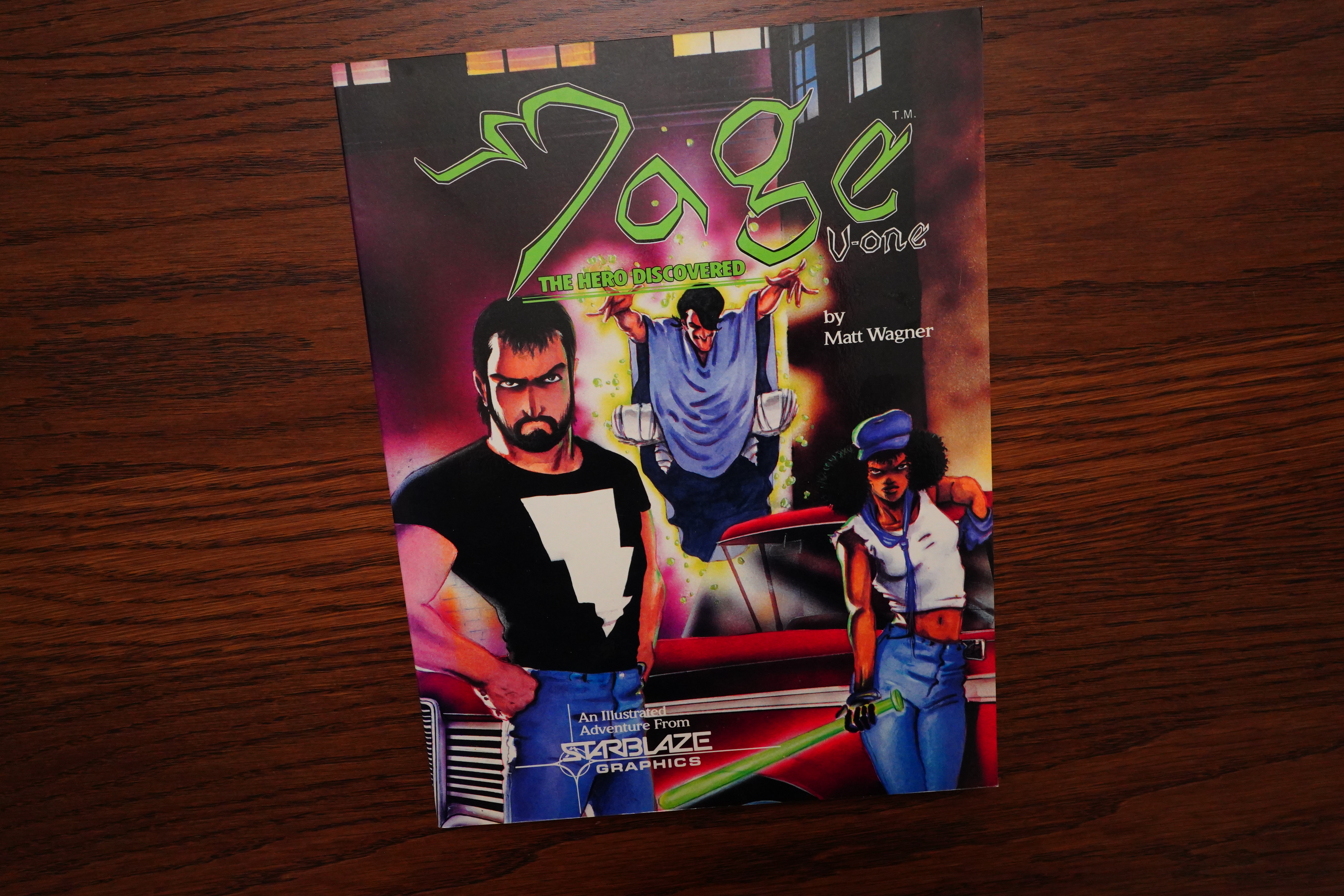
Mage has been collected many times — first of all as the Magebooks, but also in many different forms. The earliest one was from Starblaze/Donning.
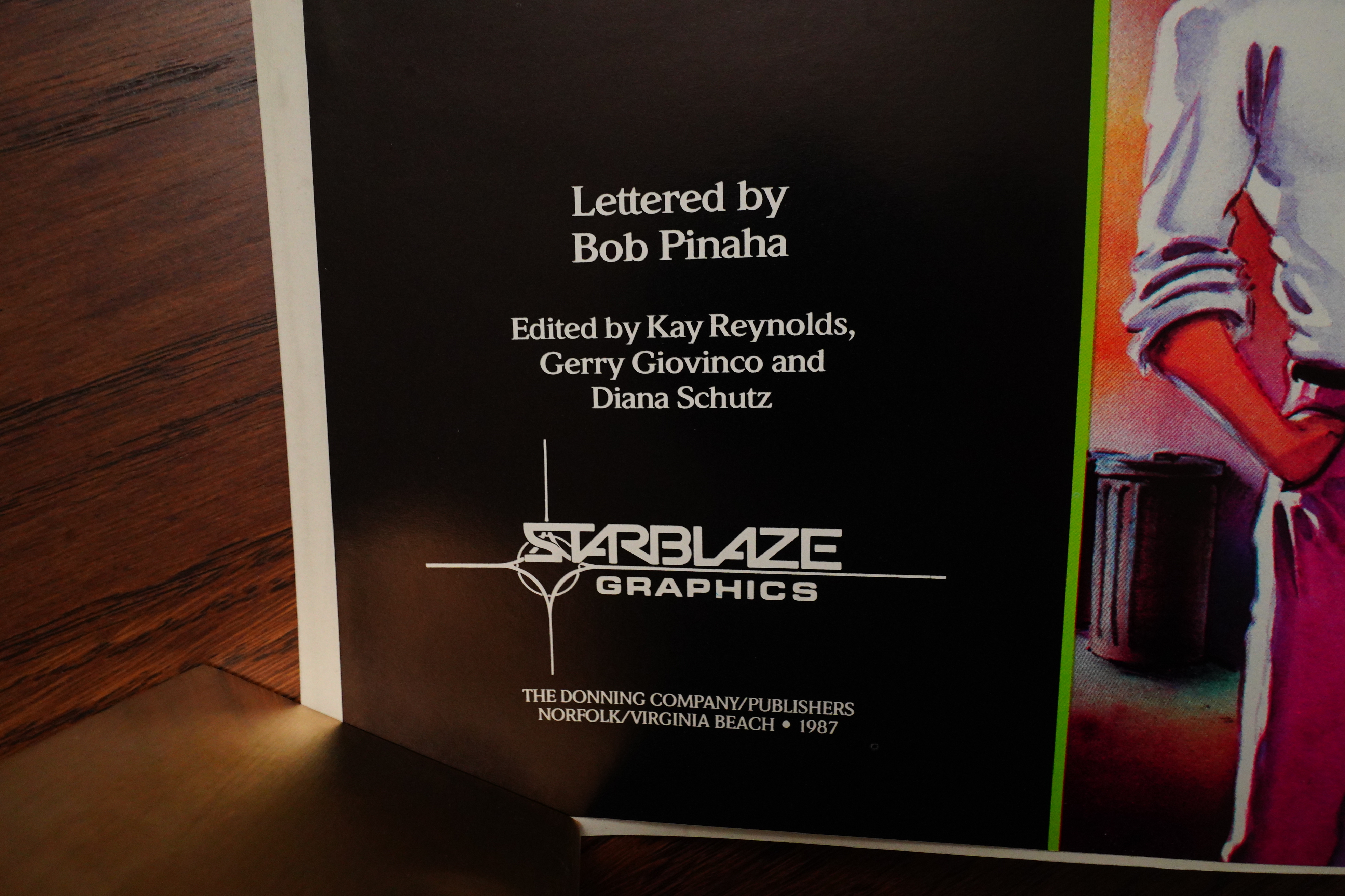
If you’ve read Coleen Doran’s Very Bad Publishers series of articles, especially this one, you’ll understand why I laughed out loud (on the inside) when I read this credits page. The first name there was the editor at Starblaze, and she had nothing to do with the contents in this book whatsoever — it just reprints the first four issues of Mage. But it’s very on brand to put herself there.
More confusing is why Diana Schutz is listed — yes, by the time this edition was published, she worked at Comico, but she didn’t have anything to do with these issues, I think?
Anyway, what I’m wondering is whether they recoloured the stories.
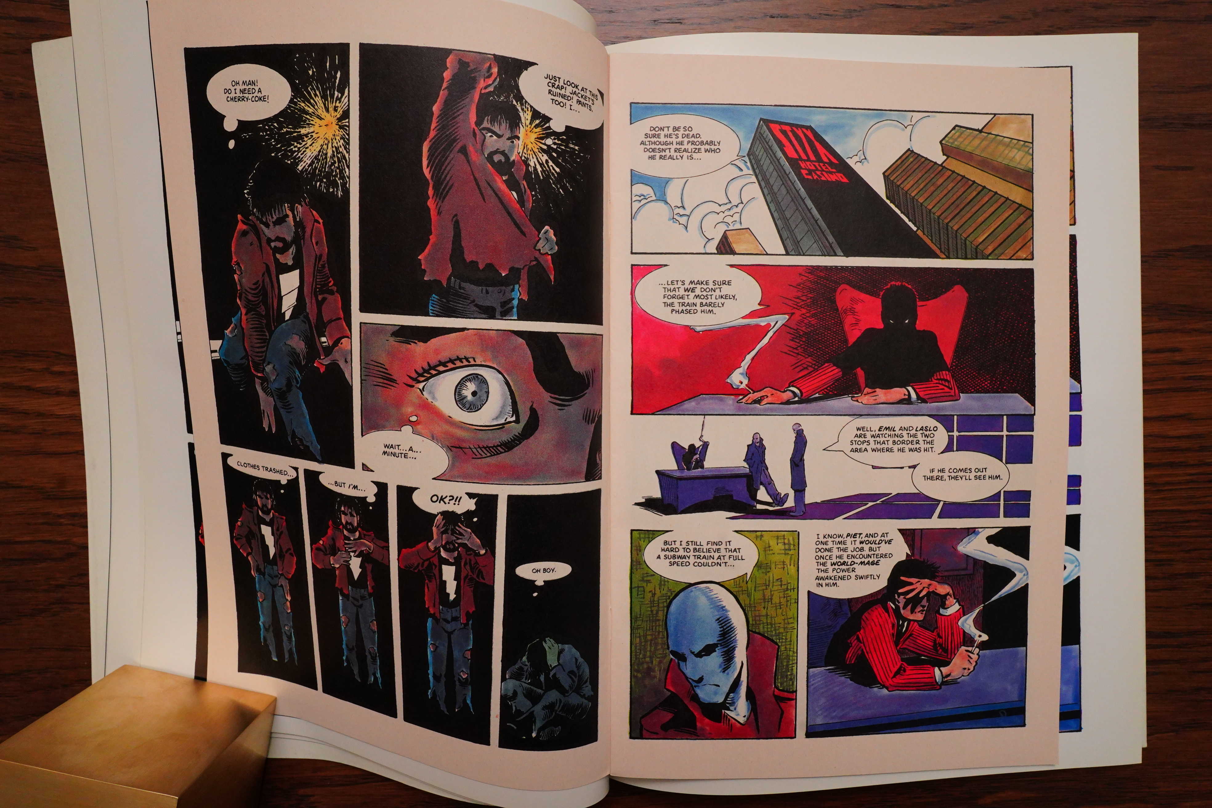
So here’s an original spread…
And here’s the Starblaze. It’s a larger format, but looks very similar.
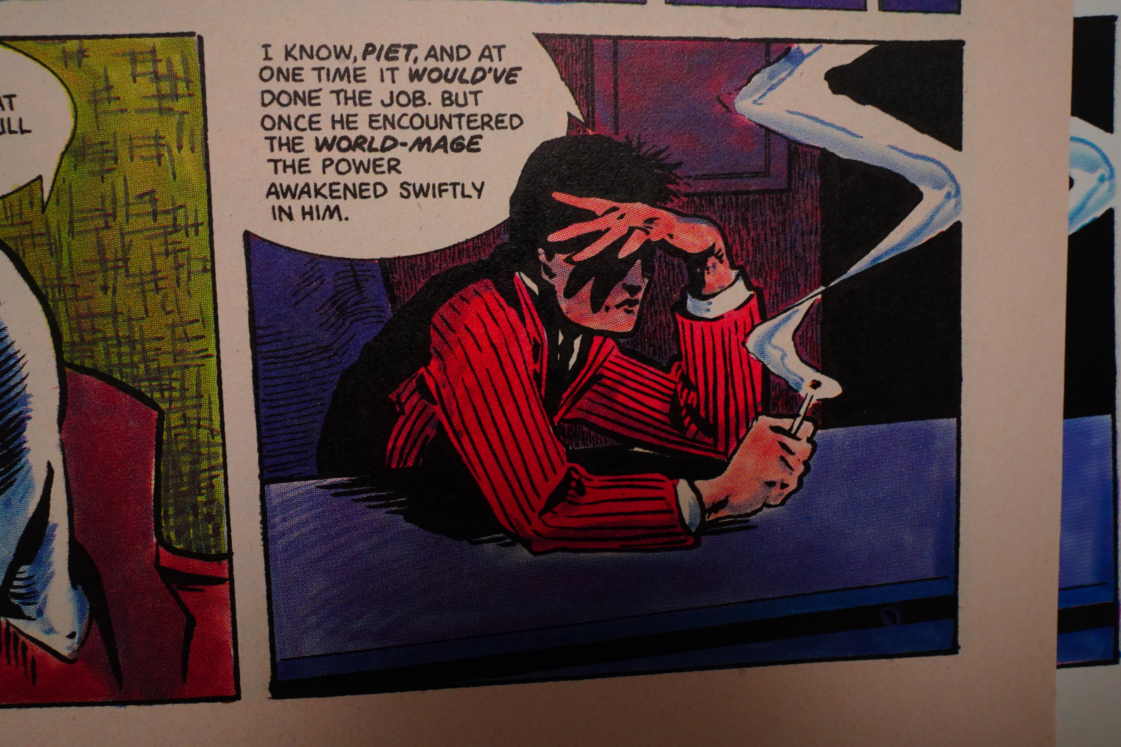
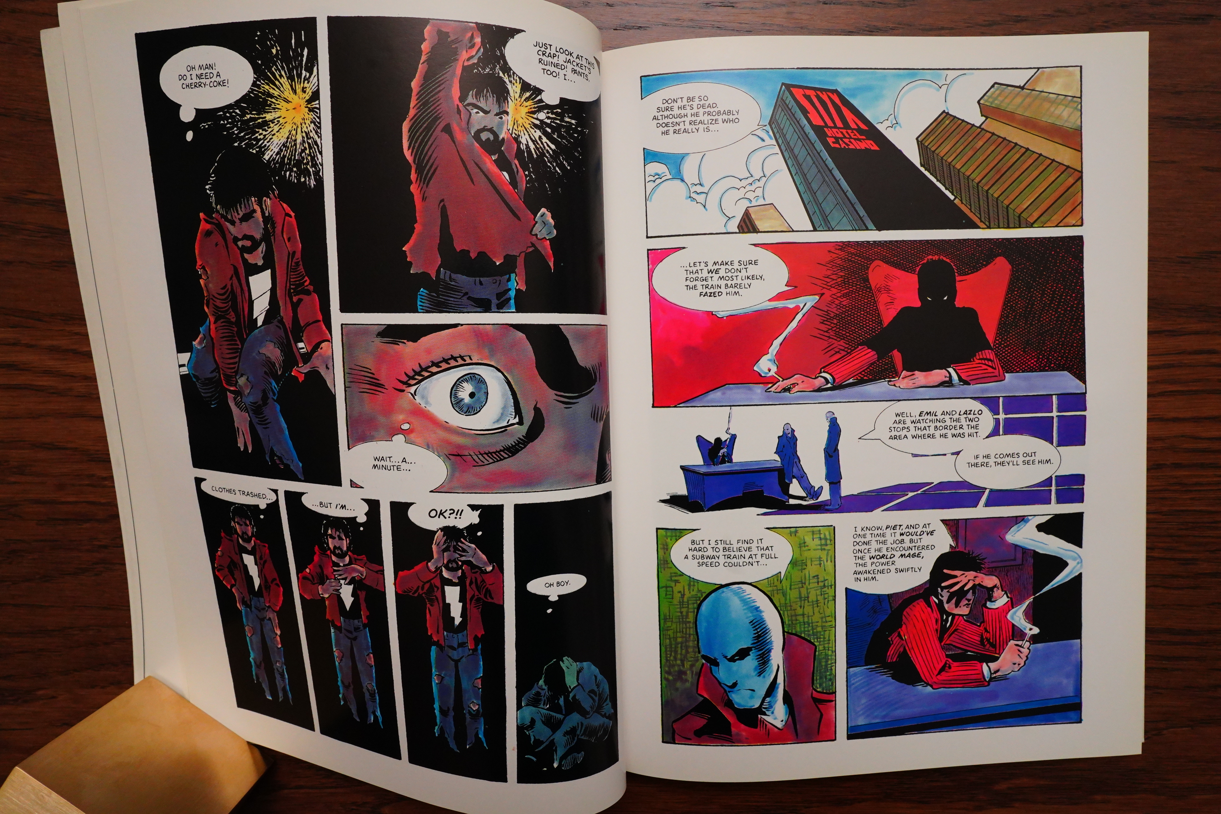
Here’s a detail from the original issue…
… and here’s Starblaze. Yeah, looks identical, I think. But better originally, I think — the white, shiny paper makes everything too bright, in my opinion.
The Panelhouse #2, page #23:
Mage (Comico) by Matt Wagner.
I suppose you’ve got to give Matt Wagner
credit for getting away with it for so long.
He’s managed to forge a career in comics
based on this dirge of a series where nothing ac-
tually happens! It’s kind of hard to describe. At
first glance it doesn’t look so bad, but careful
study rewards you with a tedious, pointless, fif-
teen-issue chase scene with Arthurian preten-
sions. Wagner gives a good impression of a story
without actually having one, and the longer
you look at his bland artwork (vaguely remi-
niscent of early Frank Miller on Prozac),
the worse you realise it is. Awful twee
characters with awful twee names,
(Kevin fucking Matchstick!), dull
story, dull art. All in all the perfect j
cure for insomnia, perhaps Mage
fans (fucking hippies!) enjoy it as
a zen experience. Honestly, the
whole fat-headed farce makes me
want to puke! Gong!
Heh, heh. It’s a list of The Worst Comics by Martin Hand. It also has Skateman.
Comics Interview #9, page #73:
For example, when I did the first issue of
MAGE for Comico, Matt Wagner, the
artist, had all the balloons inked in when
he sent me the artwork, so all I had to do
was place the lettering in the balloons
according to his script. But he’d have
enormous balloons where maybe four or
five words went, and in another panel
have twenty-five words in a tiny balloon!
It’s my biggest complaint. I guess the
pencillers aren’t aware of it, and don’t
keep in mind balloon placement and where
the words will go and things like that. It’s
the letterer’s job to place the balloons in
the best place – where they’ll move the
story along.
Fantasy Advertiser #87, page #22:
MAGE #3 (Comico)
“The Mousetrap” by Matthew Wagner
I reported on MAGE #1 a couple of issues ago, and
recommended it to you; I’m happy to confirm that it is
progressing nicely, and is one of the most innovative,
engrossing comics this side of SWAMP THING.
But it anyway, if you’re into buying $1.50 comics,
that is; you get white paper, keen colouring, and a
writer/artist who’s determined to do something new
with the old hero game.
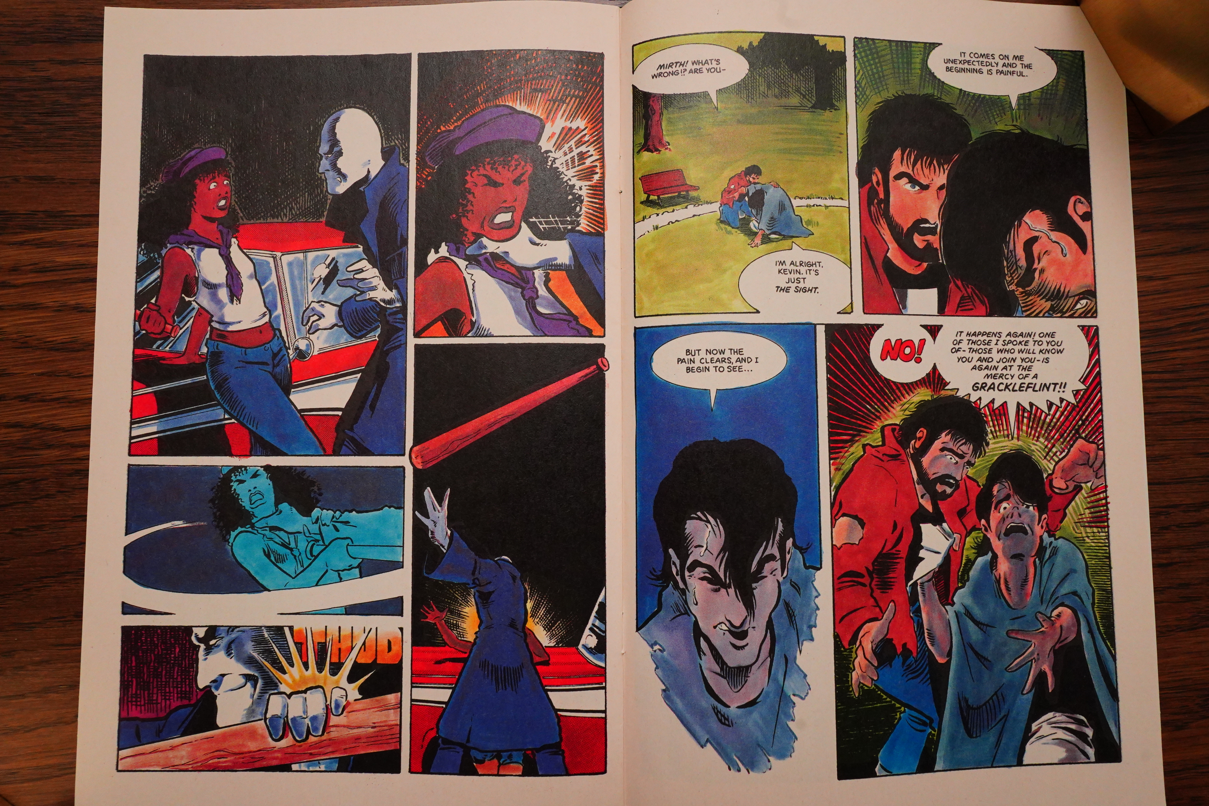
Plot you want? Well, okay, but it doesn’t sound much
out of context. Kevin Matchstick has been recruited by
Mirth, a good guy; in this episode they’re joined by
Edsel, a capable lady with a car of the same name.
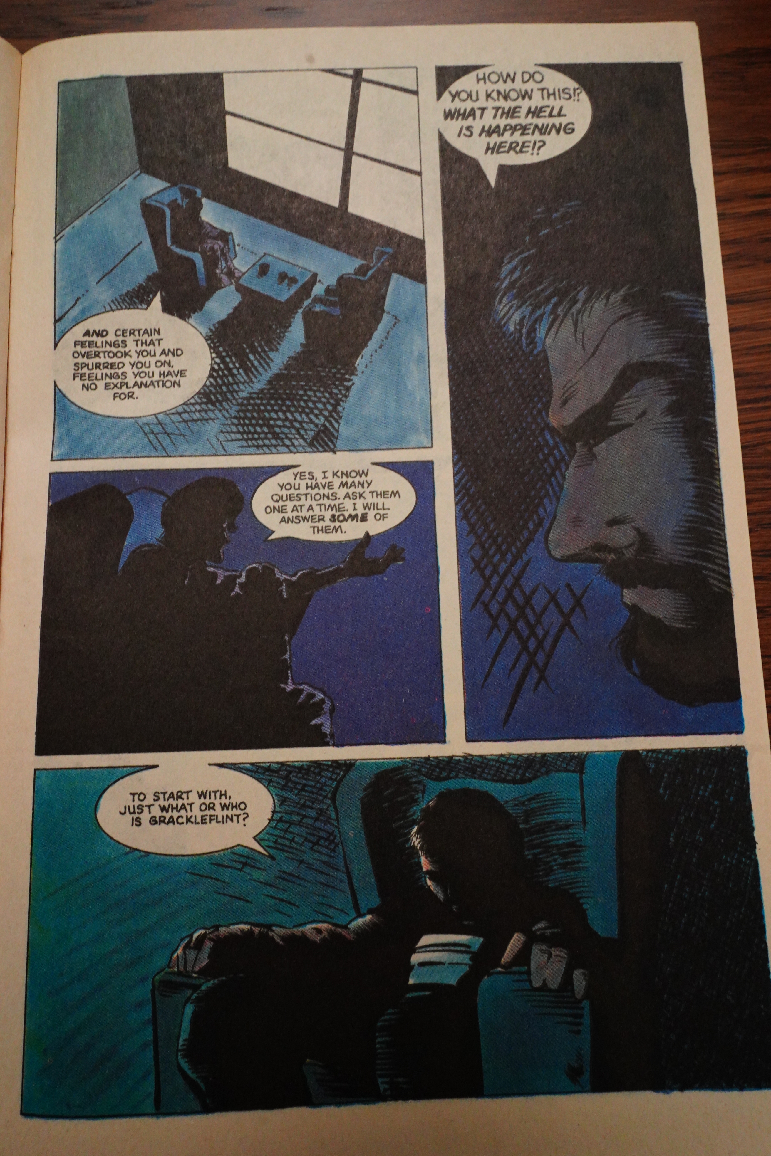
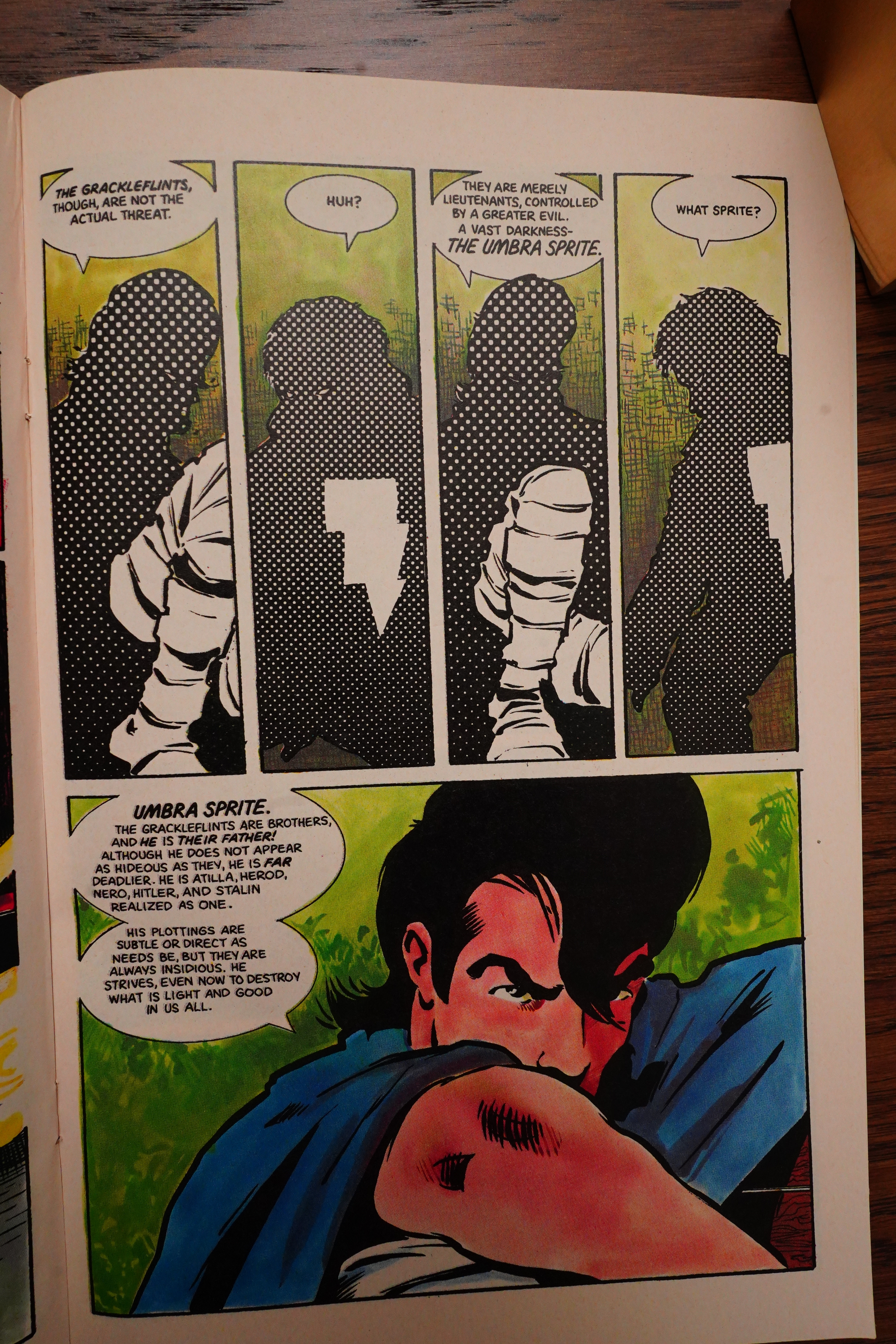
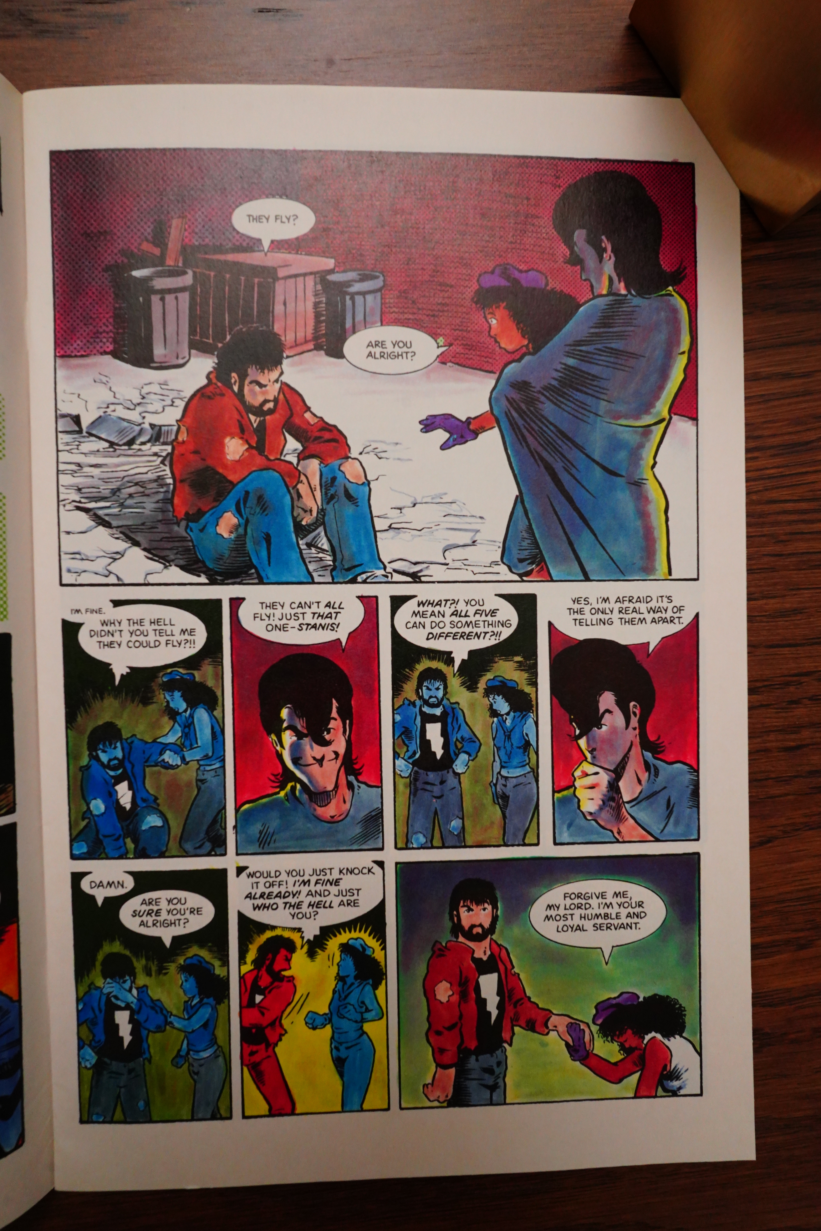
Against them are five grackleflints, each with poison
spurs on their bony elbows and an individual special
power, and their not-so-dear old father, the Umbra
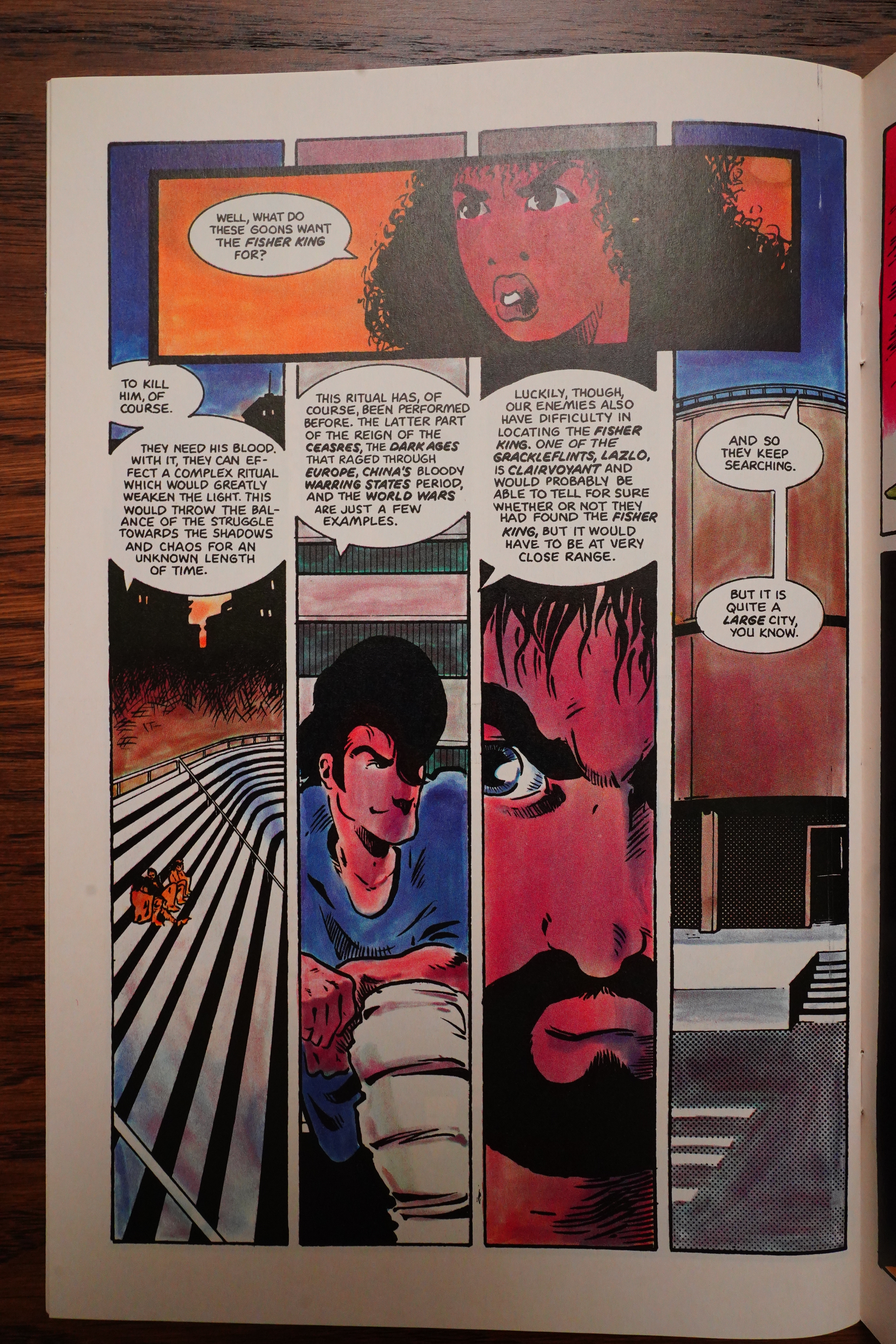
Sprite. And they’re all searching for that mythical,
mysterious character, the Fisher King. If he’s killed,
then the forces of darkness win the upper hand. Kevin
and his friends have to thwart the grackleflints…but
there are powerful magicks crackling in the New York
air…
It may sound hokey, but you must admit that it is
not your average super-hero slug-fest. Instead, let
me assure you that it is different; it is original,
and it is good.
-Christine Padgett
Back Issue #103, page #69:
EURY: How and when did you land in the editor’s chair
at Comico?
SCHUTZ: Not long after the Marvel Kerfuffle. I started
with Mage #6, containing the first color Grendel backup,
published in March 1985. Bob Schreck and I moved
to the Pennsylvania burbs, where Comico was located,
in May 1985.
How did I get that job? On Bob Schreck’s considerable
coattails! Bob had already begun working for Comico
in late 1984 from his home in Levittown, New York-
as the company’s entire marketing department. With Comico’s
move to color comics in early 1985, owners Phil Lasorda
and Gerry Giovinco wanted him in-house on a daily
basis, and Bob must have talked those guys into hiring
me as part of the deal.
EURY: Why was Comico’s work environment more
attractive to you than Marvel’s?
SCHUTZ: The seven-minute commute! And it was a
comfortably small company: five or six people working
out of the top floors of a creaky old house in Norristown,
Pennsylvania. More importantly, Comico was an early
publisher of creator-owned comics, a still-new idea in
those days and a political position that Bob and I supported.
People forget, now, just how hard many of us fought
for creators’ rights in the early 1980s.
Having put the literary screws to
Guardian, I was hoping to find
something a bit more palatable
in Mage. I was looking forward
to Comico’s first color comic,
expecting it would be a cut
above the rather amateurish
efforts seen in their previous
books.
It wasn’t. If anything, it was of
even lower quality than was
Guardian. Strangely enough, it
reminded me of that long ago
moment in my childhood when
I decided I would not buy Archie
comics. I found that I could read
them from cover to cover so
quickly that I felt I wasn’t getting
my money’s worth.
The same is true of Mage.
The book contains pages and
pages of nothing but silence and
sound effects. It’s just as well I
suppose. When words are used,
it is to present the most stilted
dialogue this side of a Victorian
novel; words your mind sheds
like drops of water.
The “hero” of the story-if
such an appellation can be ap-
plied—is one Kevin Matchstick
(!). Kevin is full of more self-pity
than the Thing in his darkest
moments. Since we see nothing
to engender such pity, the man
comes off as a whining bore.
Kevin strikes up a conversa-
tion-God knows why-with a
stranger on the street. The
stranger happens to be the
Mage, who-again for reasons
known only to God (and, one
hopes, Matt Wagner) — endows
Kevin with super powers.
Totally against his will, Kevin
is thus drawn into a conflict be-
tween the Mage and deadly vil-
lains known as Grackleflints!
Does it make any sense to you?
Me neither. Do you care?
Neither did I.
A disjointed story, forced
dialogue, and unimaginative art
do not make for a big time win-
ner. Comico’s titles have been
dropping like flies, and Mage
has only one wing to start with.
Skip this one-you’ll be glad
you did.
That’s the always-wrong R. A. Jones, and he’s even more wrong than usual, I guess. But he makes some valid points.
Fantasy Advertiser #85, page #15:
MAGE #1
“Outrageous Slings and Arrows” by
Matthew Wagner; Comico, $1.50
Here’s an interesting item – a 30-page
story, in laser-separated colour on a
Mando-type stock, that defies any easy
categorisation.
Colours are subdued and moody, a good
support for solid, workmanlike art. This
may or may not be a superhero comic, it
could go a number of ways–our protagon-
ist, the delightfully named Kevin Match-
stick, happens to be wearing a tee-shirt
with a lightning bolt insignia, which is
useful for the cover. But what of Mirth,
the World Mage? How did he give Kevin
his power? Who’s controlling the poison-
spurred Grackleflints?
This was the first Comico book I ever
picked up, and it’s left me hungry for
more, and to see what happens next – our
hero has just been chucked out of the
window of the subway car, straight into
the path of an oncoming train that’s no
more than four yards away, making the
large “To Be Continued” tag surplus to
requirements, somewhat…
I love the opening sequence, too, the
first meeting of Matchstick and Mirth.
In fact, I like the whole thing; it has
more to do with the 1980s than any other
normal-format comic I’ve come across for
years. There is, in more ways than one,
magic here.
-Chris Padgett
Comics Scene Volume 1 #3, page #56:
The success of Mage gave Wagner the
opportunity to bring Grendel back. “Start-
ing with Mage #6, a fuller more elaborate
retelling of the Hunter Rose-Grendel
stories was published as a four-page back-
up,” Wagner relates. “That ran straight
through to Mage #14. I told it from a jour-
nalist’s point-of-view and decorated the
text with full page art deco illustrations.”
Although Mage sold well, issues in-
cluding the Grendel back-up sold the
most. Both Wagner and Comico were
flooded with mail from fans asking for
Grendel to be reprinted in full. The back-
up pages were compiled and released as
Grendel: Devil by the Deed, a graphic
novel with a new wrap-around cover
painting by
Wagner. So far, it’s
Comico’s bestselling graphic novel.
The Telegraph Wire #22, page #17:
DIANA: It’s pretty evident that all through MAGE there
are many references to Arthurian legend. Do you want
to comment on that?
MATT: Well, many many people have pointed that out.
I get a lot of letters on the subject. I should also
point out that many many people are pretty sure that
they know what’s going on. Some are close, some have
some points right, nobody has gotten it completely
right because they’re taking it very literally, and
I don’t take Arthurian legend as literal. It is
probably the most archetypal legend in Western liter-
ature. You can find traces of it in just about any-
thing. The places it reaches…the Arthurian influ-
ence is just immense. Not necessarily in the specific
characters intruding on literature, films, etc., but
the general plot, the general feel. It just has so
much in it: It has glory, it has happiness, it has
irony, it has despair, it has sadness. It covers
just about the whole spectrum.
Comics Interview #14, page #40:
BILL CHADWICK: How did you get the
idea for MAGE?
MATT WAGNER: Often just one little
word will be the foundation of an idea, and
you start building on it. I just liked the word,
“mage,” and started building a sorcerous
character from there. I did a few sketches
of this wild, semi-punkish-looking guy. The
Mage is toned down now, somewhat, in his
appearance. Originally, he was a little more
extravagant. And then I decided I wanted
him to be the title character, but not the main
character. And as it turned out, this main
character, Kevin, is modeled after me,
physically.
BILL: Why?
MATT: For several reasons. One, I’m a
real cheap model. (Laughter.) And I have
an easy visual reference in myself. I am also
the negative counterpart of what the Mage
looks like. I’m built big and solid and a lot
more down-to-earth looking than the Mage,
who’s little and whimsical-looking. You see,
I had started to see things happening in com-
ics that are very reminiscent of Hollywood
during the Thirties and Forties. The com-
ics industry is becoming Hollywood – that
big a business. We’re getting many stars in
the comics. There are trade journals in com-
ics reminiscent of the movie publications
that were very popular during the Thirties.
And they’re both escapist entertainments,
for the most part. The big difference is that
in comics you have no actors. You have the
characters, but you have no flesh-and-blood
counterparts to these characters. Therefore,
in comics, the creators are becoming the big
stars. I’ve noticed that the creators pop up
in comics nowadays – sometimes more
often than the characters themselves. It
seems like John Byrne draws himself into
every other issue of the FANTASTIC
FOUR. And I wanted to take that one step
farther and make the creator and the main
character the same person.
BILL: And that person is Matt Wagner.
MATT: It’s not totally biographical. Visual-
ly, Kevin looks like me, and some parts of
his philosophy are like mine. He talks an
awful lot like I do, and his mannerisms are
an awful lot like mine. He even dresses like
I do. I also give him a certain amount of my
personality, asking myself, “How would I
react if all of a sudden I was being thrust
into this kind of situation?” – if all of a
sudden somebody was doing things around
me — and I was doing things — that weren’t
supposed to happen, according to rational
thinking, and if this Mage were telling me
that I’m the hero and that I’m destined for
greater things. And so you can have an ob-
jective and subjective view of Kevin at the
same time.
Wizard Magazine #86, page #34:
After 10 years, Mage writer/artist Matt
Wagner has found a way to reprint
old and coveted issues of Mage: The Hero
Discovered, the first Mage story published by
Comico from 1984 to 1986. When Comico
went bankrupt “[Mage] film was scattered to
the four winds,” according to Wagner.
Wagner’s current Mage: The Hero
Defined from Image Comics spiked inter-
est in the old Discovered. New readers were
shut out of previous tales of Kevin Match-
stick, the modern-day representation of
King Arthur. After discovering an old
printer that had copies of the archived film,
Wagner is now “remastering, recoloring
and relettering everything.”
OK, you get the idea — there was a lot of attention paid to Mage while it was being published.
But what about on the interwebs now? Here’s one:
As a look back at some early attempts to break away from the outline of the “superhero comic”, Mage: The Hero Discovered is a fantastic piece of work.
While I enjoyed this book and will definitely return to it, I think it would have reached maximum impact for me years ago. It’s a simple story with distinct good and evil; while as the story progresses, shades of gray may come into the tale, these gradations are not there now.
Mage: The Hero Discovered #13 is a bitterweet shocker, but a transformative experience for character, creator and reader, earning 5 out of 5 stars overall. If you haven’t read it, I highly recommend that you do so, NOW.
And:
A pleasure to revisit this cult 80s indie comic, not so much for the story – Arthurian urban fantasy folderol, albeit done well – as for Matt Wagner’s delightfully clean art and storytelling, with very sympathetic inking by Sam Keith making things even smoother.
There’s a lot out there.
I haven’t read Mage II or III — perhaps I will? I mean, I’m not opposed to reading them, but I don’t really feel the need, either.