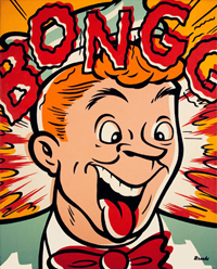
Lou Brooks Drug Store
Color in comic books had a specific look for fifty years prior to the 1980’s. Flat color was the norm and part of the charm of the comic books that I grew up reading. There was just something about that limited palette and those pronounced dots that seemed to define the medium as much as the words and pictures that they illuminated. Others agreed and focused on this idiom when referencing comic art in pop culture.
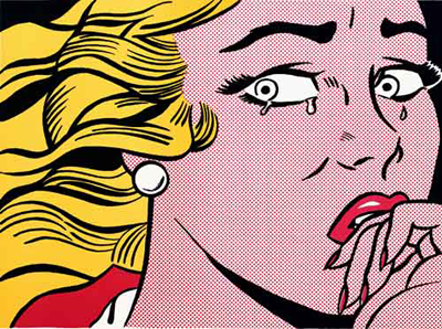
Roy Lichtenstein
Roy Lichtenstein and Lou Brooks are two artists that took full advantage of exploring the idiosyncrasies of comic book color establishing themselves as masters of Pop Art.
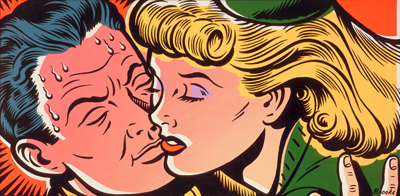
Lou Brooks Disgrace Me
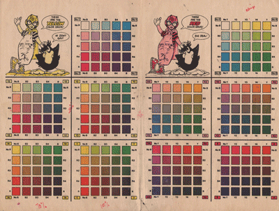
The production process that produced the color in comics was intended to print color on highly absorbent newsprint with rubber plates on web offset presses at the World Color Press plant in Sparta, IL. Color separations were done by Chemical Color Plate in Bridgeport, CT. The colors were made by combinations of three percentages, 25%, 50% and 100% of each of the primary colors; blue (cyan), red (magenta) and yellow to be printed with the black line art. CMYK refers to these four colors used in printing.
A layer would be produced for each percentage of each color making nine layers of film that would be compressed to form three negatives, each containing the three percentages for its corresponding color. There was one more film for the black plate which would print the line art. The printing plates would be burned from these final four films.
Colorists used a guide provided by Chemical Color Plate to assist them in making their own color guides for each page that the separators would interpret into films.

Chemical Color Chart
By the 1980’s the alternative independent publishers that began peppering the comic market were using better, whiter paper and were able to produce better color. Many comics were printing with processed or full-color using the coloring techniques that I’ve described in my earlier blogs on this subject. Some publishers were still attracted to the notion of flat color but realized that they were being limited by the old color guide.
The 64 colors with the course dot grid intended for newsprint produced harsh, garish colors on the brighter paper stock. A new color percentage of 70% was added for each color producing 124 different colors as shown by this color guide produced by Eclipse Comics in 1983 and again engraved by Chemical Color Plate. The line screen also changed from 60 to 120 lines per inch making the dots less noticeable on the printed page.

Eclipse Color Chart side 1
Eclipse Color Chart side 2
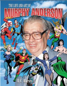
Murphy Anderson
By the time Comico was ready to make our transition to color there was a new color separator in town. Renowned comic illustrator Murphy Anderson had entered the field with his own company, Murphy Anderson Visual Concepts Inc. that he operated with his son, Murphy Jr.
Murphy had a different scheme for producing colors. By making a minor shift in the color percentages and adding two shades of black Murphy could stretch the color palette to 372 colors! The new formula was 20%, 50%, 70% and 100% of each of the primary colors plus an addition of 10% and 20% of black to every color on the palette.
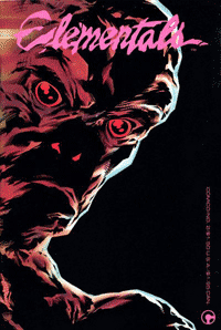
Elementals 2
Our first color books had been produced using processed color techniques and we were very happy with the results but our next project, Bill Willingham’s Elementals was a clear superhero comic and we wanted it to look like one. We all felt flat color was the way to go and we only had one choice when it came to choosing a separator. Murphy Anderson’s company was already doing most of DC’s prestige work and had proven his incredible quality. Murphy is also one of the nicest guys you will ever meet and proved it with his patience bringing us up to speed on his technique.
In 1987 I designed a color chart that had long been missing from the process. It soon became a staple in every production department in the industry. I would imagine that it would have been the last of the color charts for comics since not long after the computer took over most of the color chores as we know them today.

Comico Color Chart - Click for larger view
I might like to mention that this complex looking piece was not done on a computer. It was done the old fashion way by creating a mechanical with typesetting, tech pens, x-acto knives, photostats and a good old waxer. Of course the color separations were done by hand as well.
To be continued…
Gerry Giovinco
Making comics because I want to!
Tags: alternative independent publishers, Bill Willingham, Chemical Color Plate, CMYK, color guide, color separations, colorists, comic books, comico, comico the comic company, DC Comics, Eclipse Comics, Elementals, flat-color, Lou Brooks, Murphy Anderson, Newsprint, Pop Art, pop culture, Roy Lichtenstein, rubylith, superhero, Visual Concepts Inc, web offset presses, World Color Press
Great little bit of pre-digital comics production history. As someone who does current comics production, it’s fun to see this — love the color charts!
[...] a ’90s flashback to an ’80s one: a little bit about comics coloring from Comico [...]
The Comic Company:True Colors – Part 3 « CO2 COMICS BLOG: By making a minor shift in the color percentages and add… http://bit.ly/bYOUjZ
I often wondered how this was done traditionally. Will you cover how it went from the colorist to production.? How were those mechanicals created?
comic colorists and production people, you will probably find this bit of pre-digital comic prod. history fascinating: http://bit.ly/diOqpv
RT @Avatarpress: comic colorists and production people, you will probably find this bit of pre-digital comic prod. history fascinating: http://bit.ly/diOqpv
The Comic Company:
True Colors – Part 3
http://www.co2comics.com/blog/2010/09/28/the-comic-companytrue-colors-part-3/
Wow, the brngs back some memories. In the mid 90s, I worked on graphics for a video game. 256 colors, which is what most video games ran at the time, but this one had a hard coded pallette of 256 of the most appalling colors out there.
It was rough trying to figure out how the heck to choose specific colors for sprites from that pallette that didn’t look horrible or garish on the screen.
This post and the 64 color pallette reminded me of that so so so much of those days.
[...] This post was mentioned on Twitter by Avatar Press, Spiraltwist, Kamel Al-Asmar, Fadia Hamdi, CO2 Comics and others. CO2 Comics said: The Comic Company: True Colors – Part 3 http://www.co2comics.com/blog/2010/09/28/the-comic-companytrue-colors-part-3/ [...]
Joe, the colorist would color in a photocopy of the BW art then identify each color with its specific code. Flesh color, for instance would usually be marked Y2R2 which is 20% yellow and 20% magenta.
I have a couple of color guides from a few pages that I worked on, I will work on posting them next week or put them on facebook if I can’t fill a decent blog with them.
RT @aranim: RT @Avatarpress: you will probably find this bit of pre-digital comic prod. history fascinating: http://bit.ly/diOqpv
RT @aranim: RT @Avatarpress: you will probably find this bit of pre-digital comic prod. history fascinating: http://bit.ly/diOqpv
Great pre-digital comics production history http://bit.ly/aCbfXO (via @aranim)
Nice! Thanks for sharing. Love the time of the flat colors!
This may be of interest in regards to Lichtenstein:
http://www.flickr.com/photos/deconstructing-roy-lichtenstein/
Wow! Joe, that was amazing! It reminded me of the day one of our teachers at PCA pooh-poohed Barry Smith’s work by showing me how certain pieces were “Inspired” by pre-raphaelite paintings.
Cool News Friends, You Are Amazing, and the Art is Osone, Gerry, Bill, Whem Send Me One Interview to The Spanish Speakers, Notified Me, To Send The Question, And Promote The Work Of CO2 Comics, in Southamerica
My Best Gretting
Your Pal
John Mulder
lou brooks gave a lecture to my class in SF last year, where he swore his current digital work didn’t use any programs… however, tools like Mr Retro’s Photoshop Plugins mimic much of the old school dot screen feel without going to print: http://www.misterretro.com/image_filters.html
I love that look, but haven’t found many situations in my illustration work to purchase the plugin.
[...] last blog that I wrote about the flat color guides in True Colors Part 3 was very well received and prompted inquiry about how the colorist used the guides that I [...]